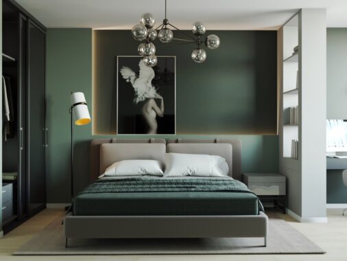
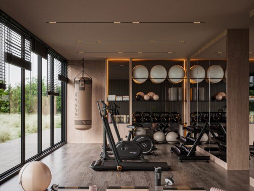
We all like to feel cosy and relaxed when we’re in our homes, and the colours that we fill our place with is a great place to set the tone. These two single bedroom apartment tours, each with open plan living areas, may differ in size but each of them have incorporated a similar colour pallet. Both utilise warming wood tone anchored by notes of black but one has unexpected pops of bright colour thrown in just for fun. We can also see the effects here when ‘painting with light’. Stripes of light thrown over opportune areas creates not only definition and interest but an undeniably inviting glow.

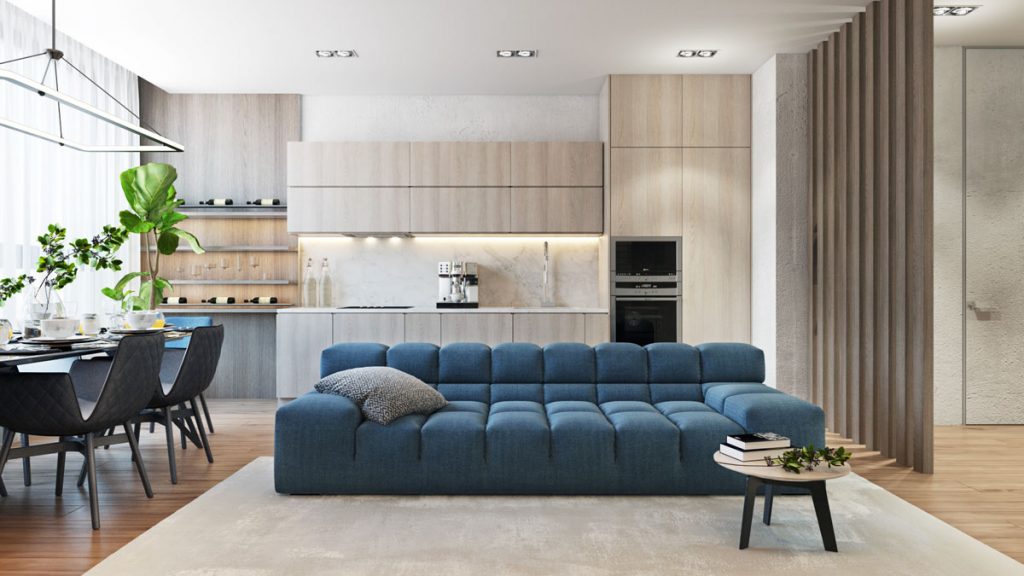
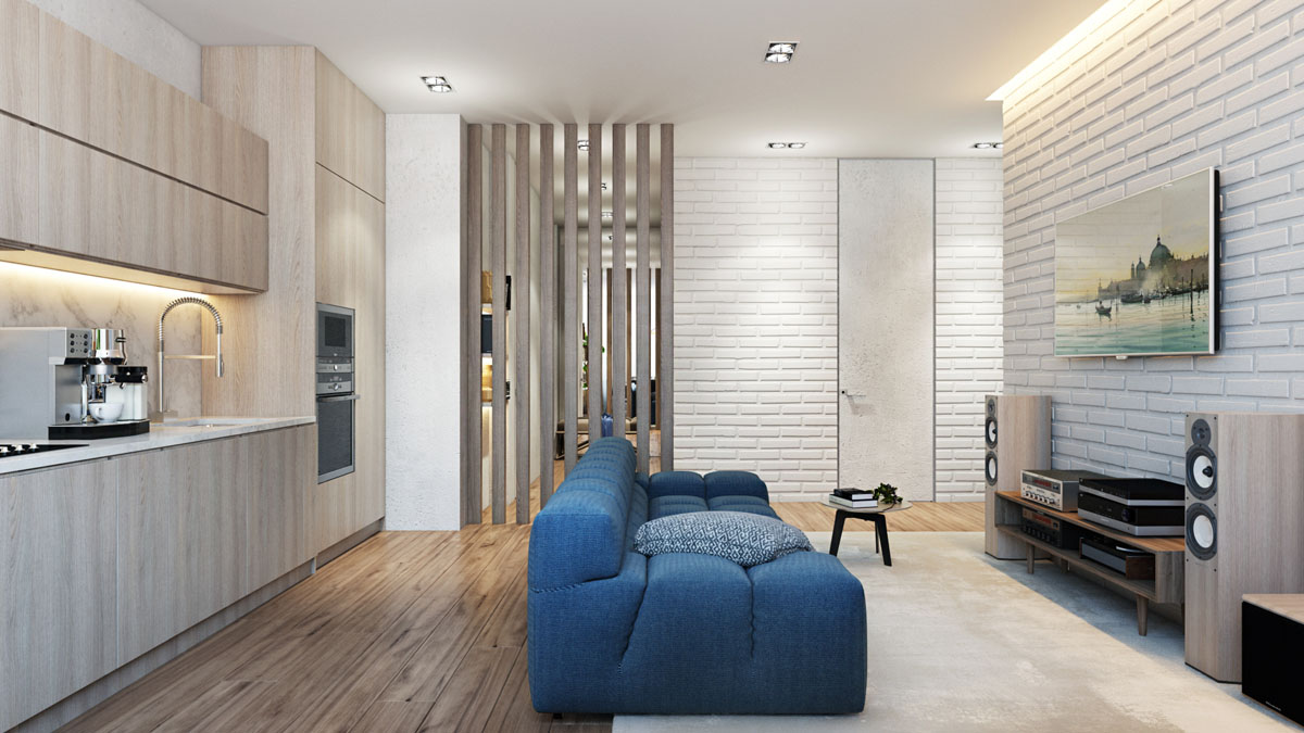
We’re greeted with an initial blast of blue in the first of our two home tours. The early infusion of colour is a little misleading as the blue couch living room barely sports any strong colour other than its hero furniture piece. The kitchen fills the wall behind the lounge. The cabinets are a light wood that complements the floor. A bank of illuminated shelving highlights the wine storage.
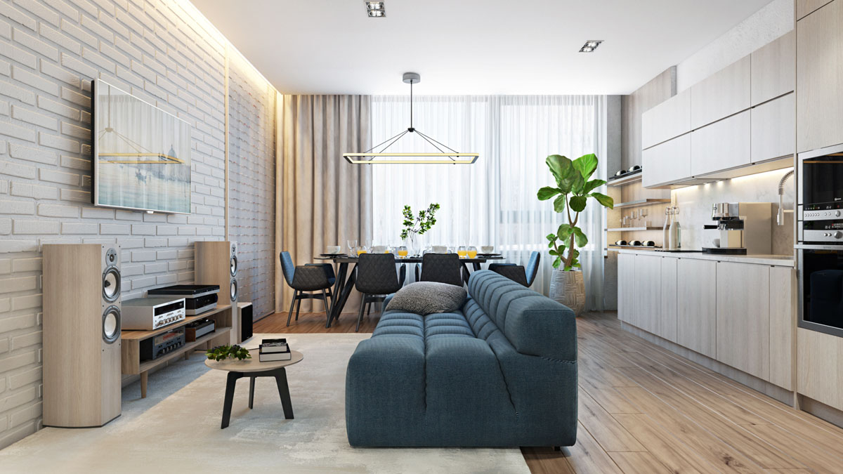
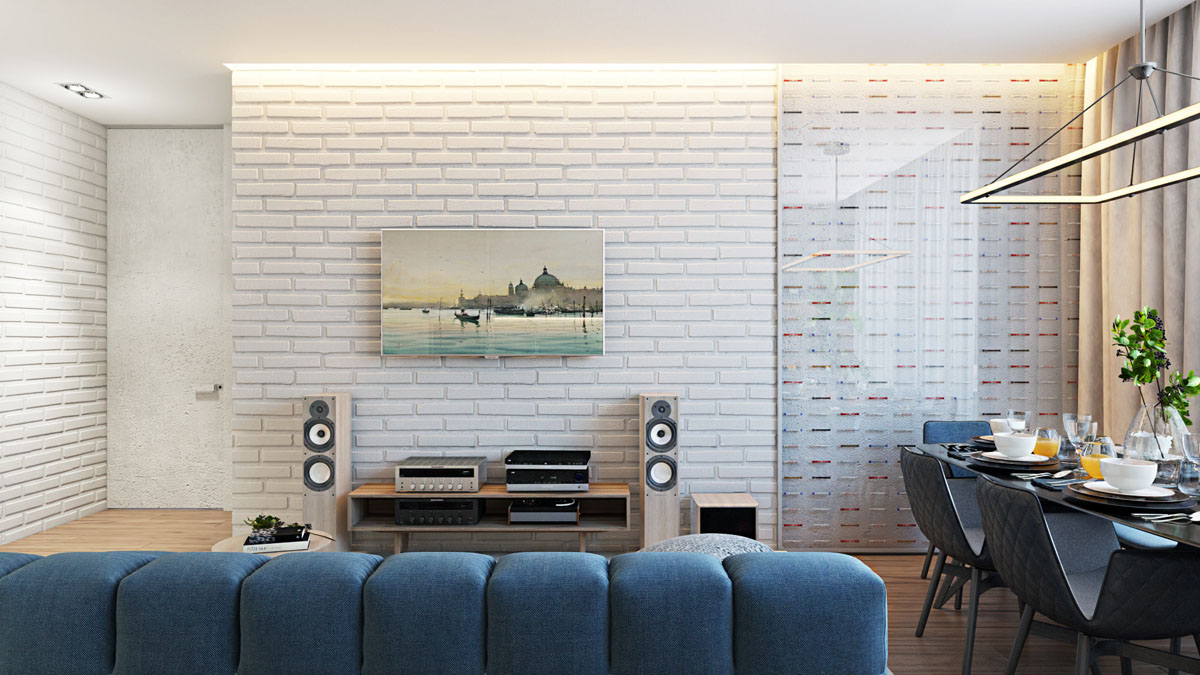
The sound system is of the same pale wood as the kitchen cabinetry, as is the small coffee table. A large potted plant adds a blast of natural greenery to the subtle scheme, a fresh contrast against the blue seating.
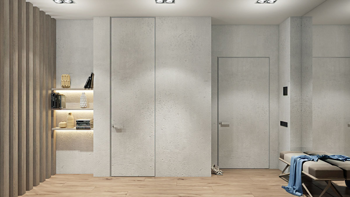
In the entryway, a set of underlit shelves hold an array of decorative knick-knacks. The illumination from the LED strips create a welcoming glow.
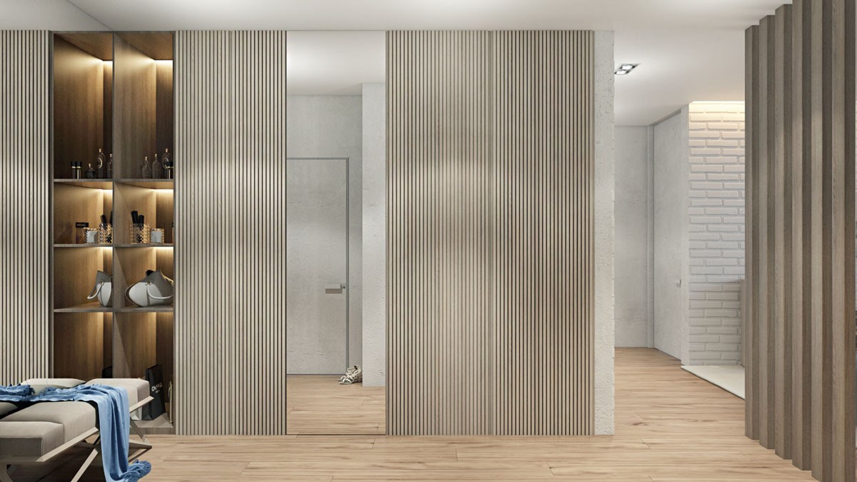
A small bench has been situated by the front door as a place to be seated whilst putting on shoes. The small seating area is backed by a huge mirror that gives the optical illusion of doubled space. A second mirror stands tall directly in front of the front door so that you may check your appearance as you leave – or allows you to greet yourself at the door!
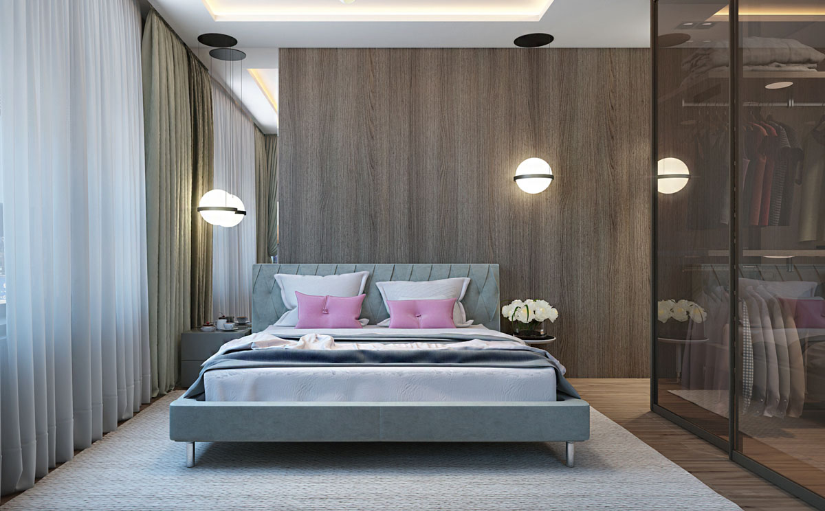
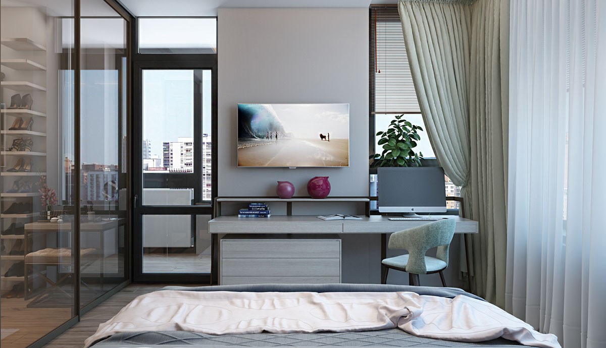
In the only bedroom, a feminine dash of pink decorates the space. Two solid pink throw cushions brighten up the grey and white bed.
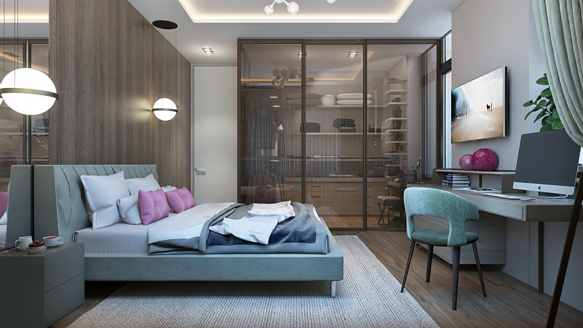
Over on the desk, a couple of deep pink vases pop in the home office area. One wall of the bedroom has been glazed, making the walk-in closet is visible from the sleep space.
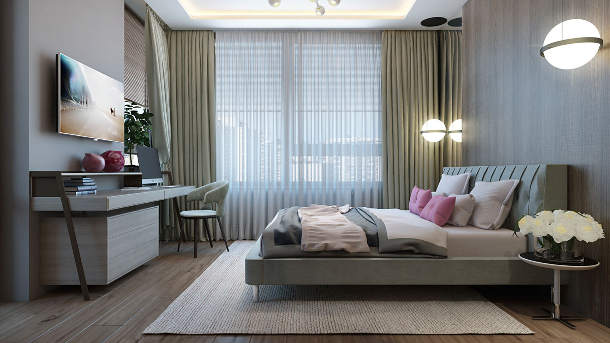
Two large orb pendants are suspended over one bedside storage unit and one bedside table on opposite sides. The overhead light is a sputnik style, centred in a recessed panel that has been edged with LED strips for extra ambiance.
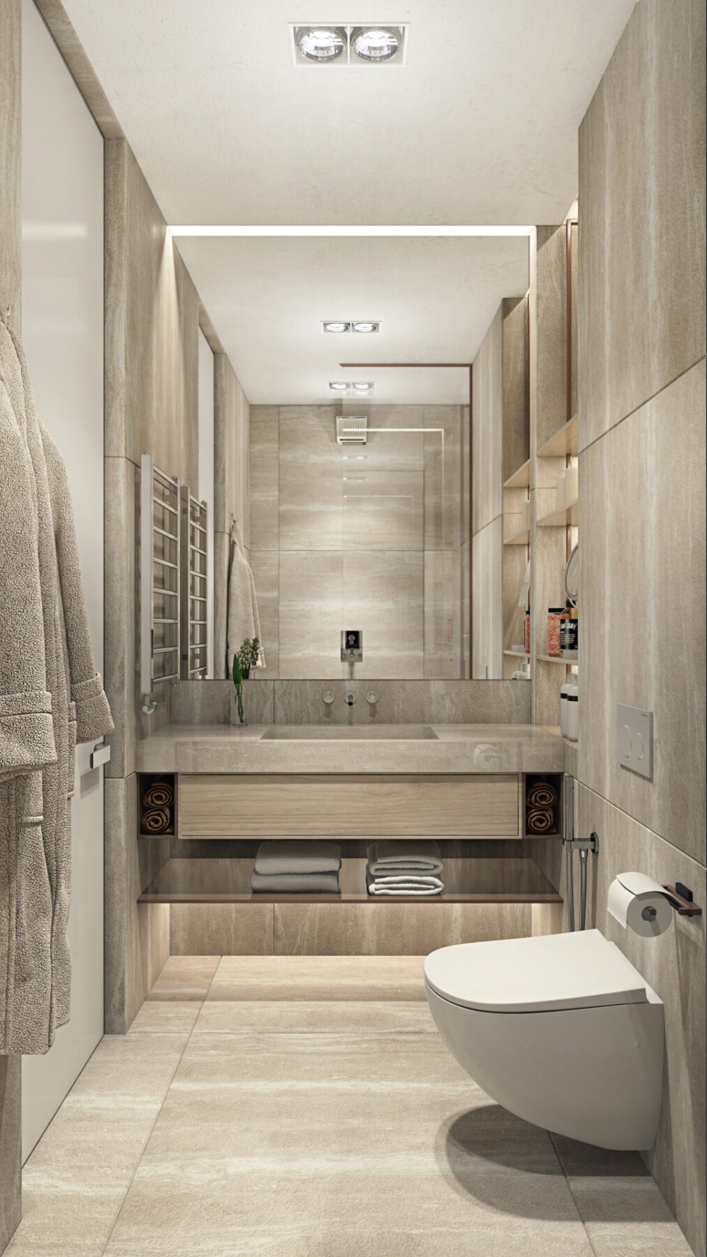
A luxurious scheme creates a spa like experience in the bathroom. Huge tiles cover the walls, floor to ceiling. The marbled effect extends all the way over the countertop and basin, and blends perfectly with the tone of wood that has been selected for the vanity drawer and towel shelf beneath. A small heated towel rail flanks the bathroom basin, ensuring face towels will always be dry and toasty. The large mirror increases the sense of space in the compact room.
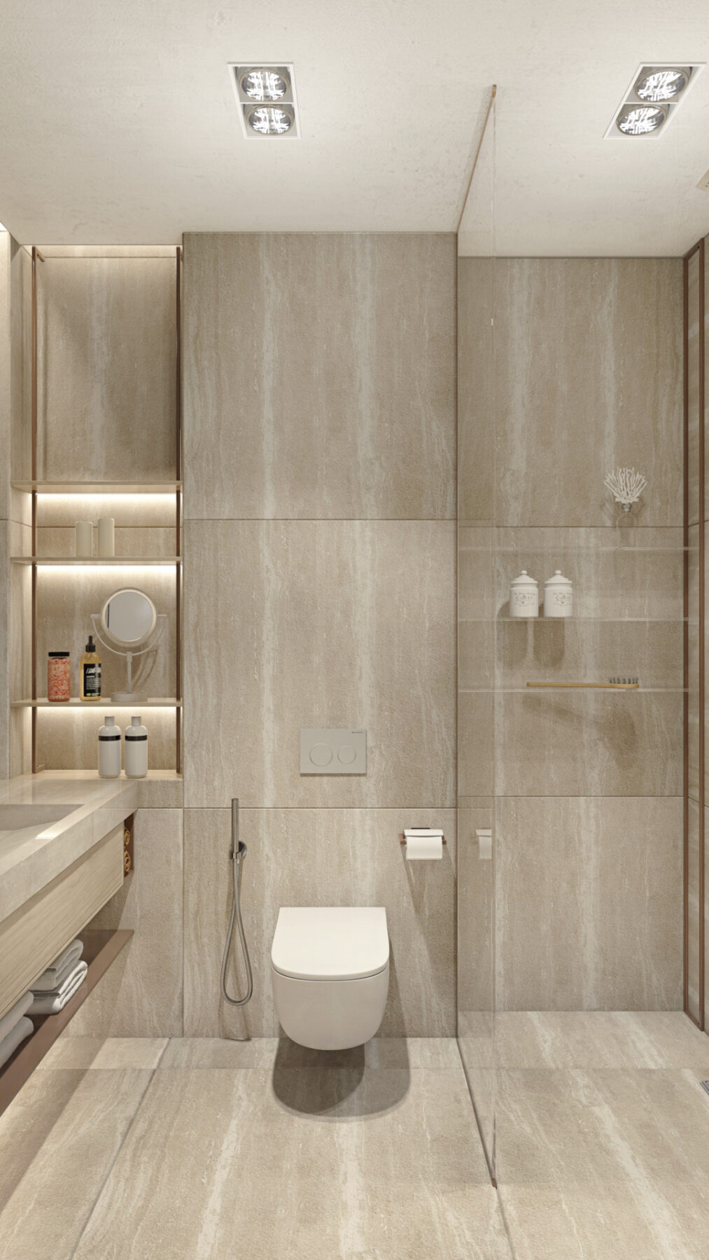
The other side of the basin has a small bank of shelving that is perfectly situated to hold cosmetics and lotions. The shelves are underlit to illuminate the products, like in a department store. The subtle lighting makes the bathroom feel sparkly and special. A wall hung toilet exposes the maximum area of floor space to further expand the illusion of space.
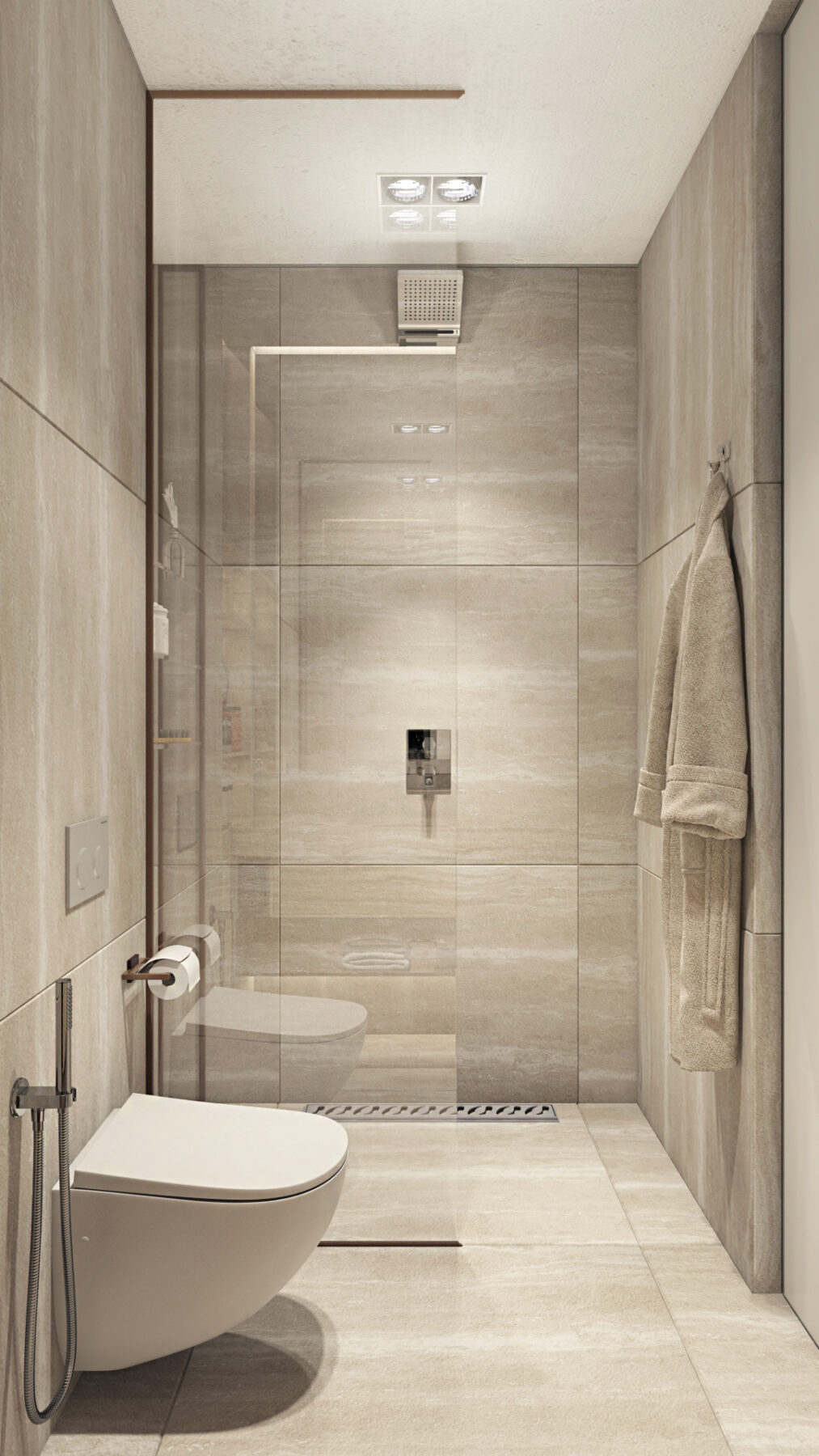
The shower is a minimalistic walk-in design. A small set of shelves hold wash items close at hand beneath a square rainfall showerhead.
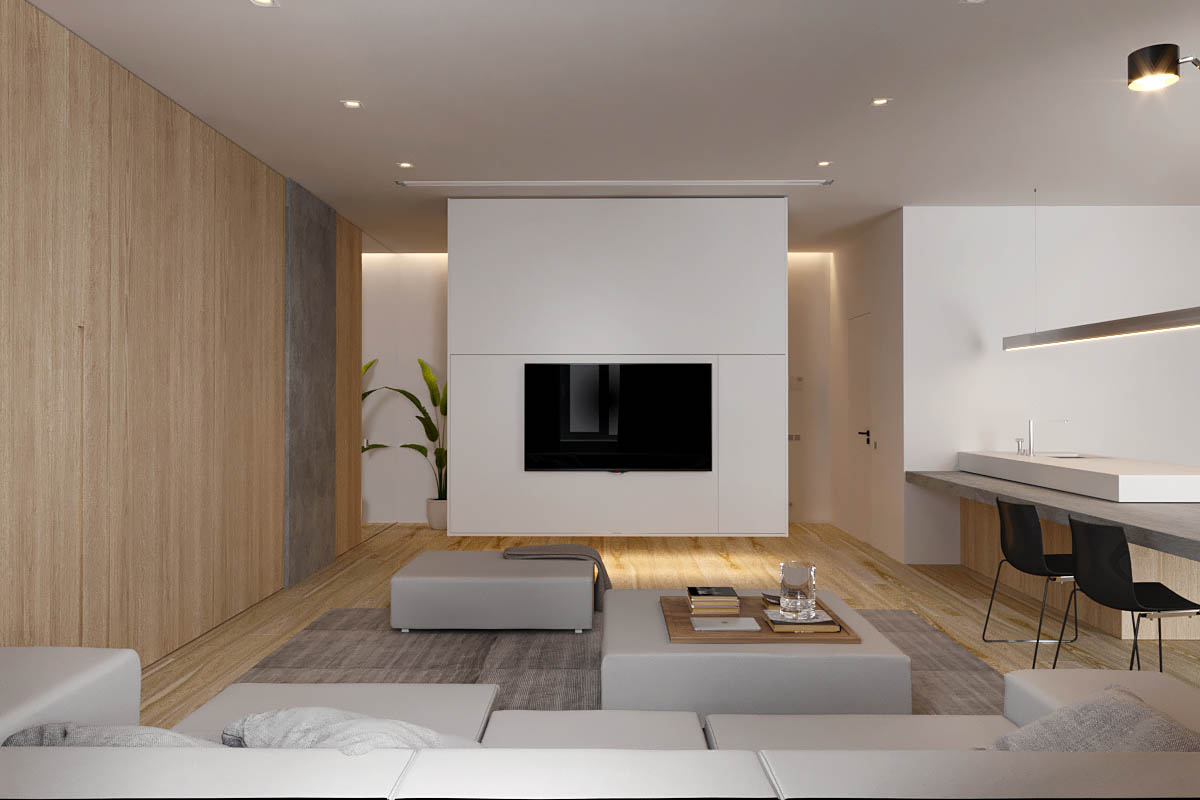
In the second of our two relaxing home interiors, the living space is a little larger and more minimal. The walls are clad with wood or painted in white in even proportions, which balances the warmth and cool of the tones.
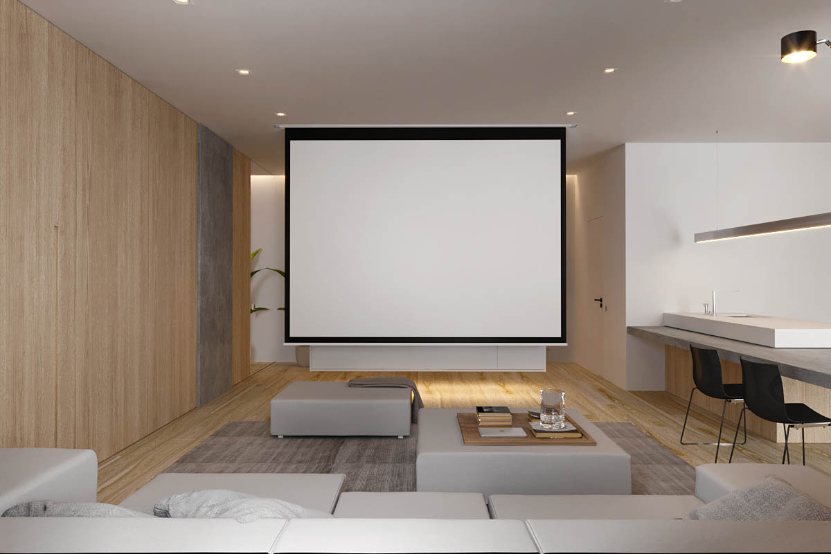
A huge projection screen descends from the ceiling in front of the flatscreen TV for a more cinematic experience on movie night.
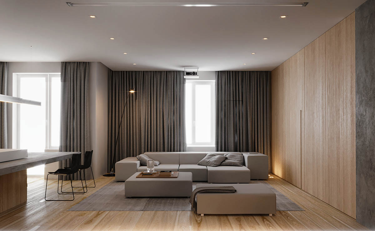
Heavy curtains hang at the windows to block out the light for brighter picture projection. The grey sofa is a contemporary design large enough for several movie fans to gather on. Two matching ottomans are utilised as coffee tables, staggered across the centre of the room.
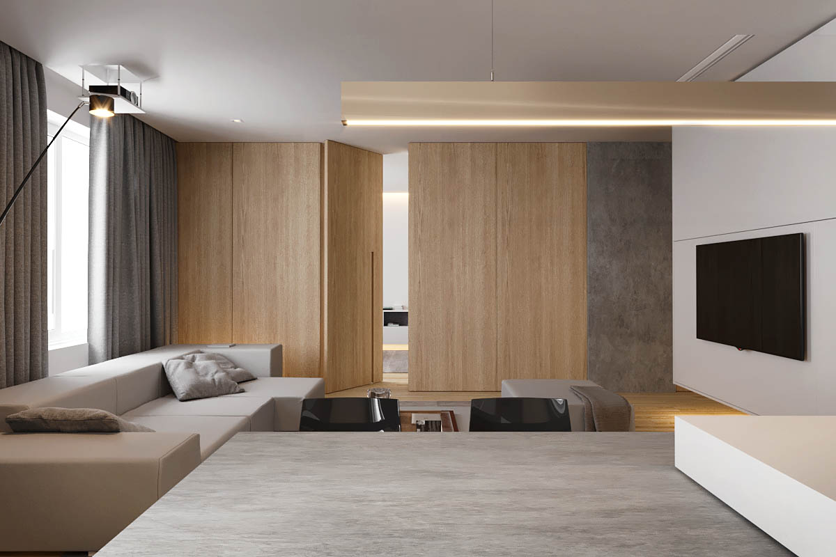
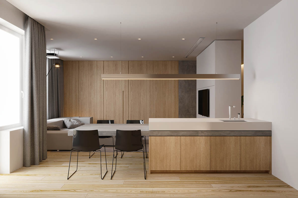
The concrete dining table is attached to the kitchen, with most of its length fixed directly beneath the kitchen countertop. A long overhead light illuminates both the eating area and the prep space. Black dining chairs contrast with the lighter surroundings.
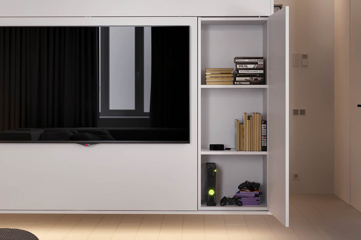
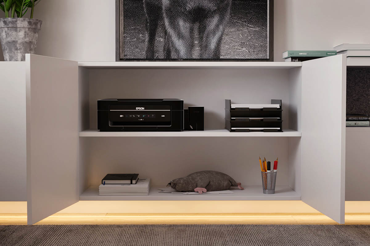
The wall behind the television reveals hidden storage, perfect for hiding away games consoles, magazines and DVDs.
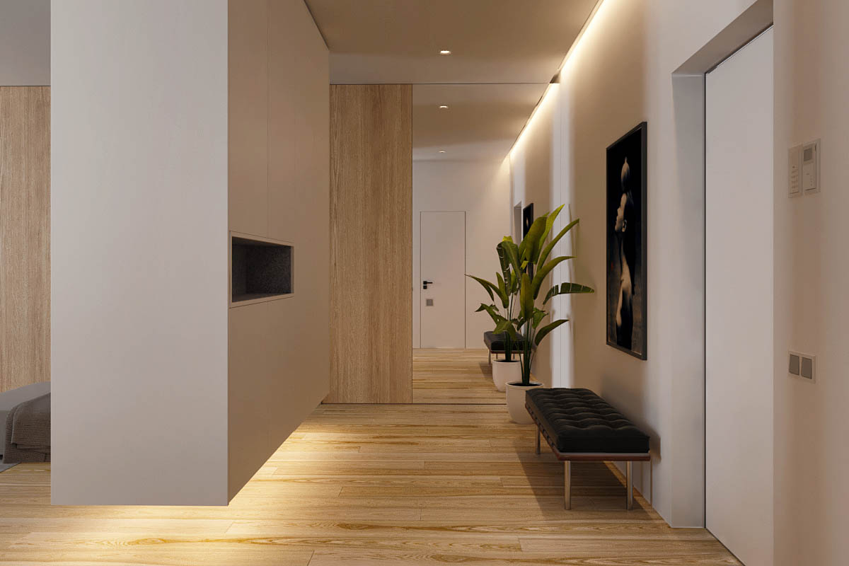
The entertainment wall forms a divide between the living room and entryway. This is a floating volume that is underlit for a ‘hovering’ effect.
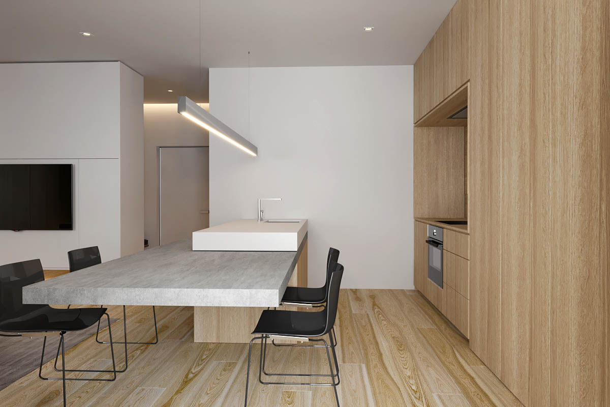
The kitchen material matches the mid-tones in the light wood floor. The design is unfussy with no decorative pieces or handles.
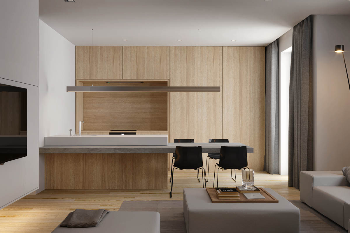
In this image we can see better how the concrete dining surface runs the entire length of the kitchen, sandwiched between the upper worktop and the base units.
