It doesn't take a lot to make a beautiful space. In fact, it is in the editing of furniture and even color that true style is discovered. Like Coco Chanel said, "Before you leave the house, look in the mirror and take at least one thing off." Perhaps it is best to style a living room or a house with the same idea in mind -- before the room is done, take one thing out. The two modern homes featured here are not necessarily minimalist, but they have both edited their style down to just the essentials. With natural colors and clean lines, these homes are a testament to the old adage that "less is more."
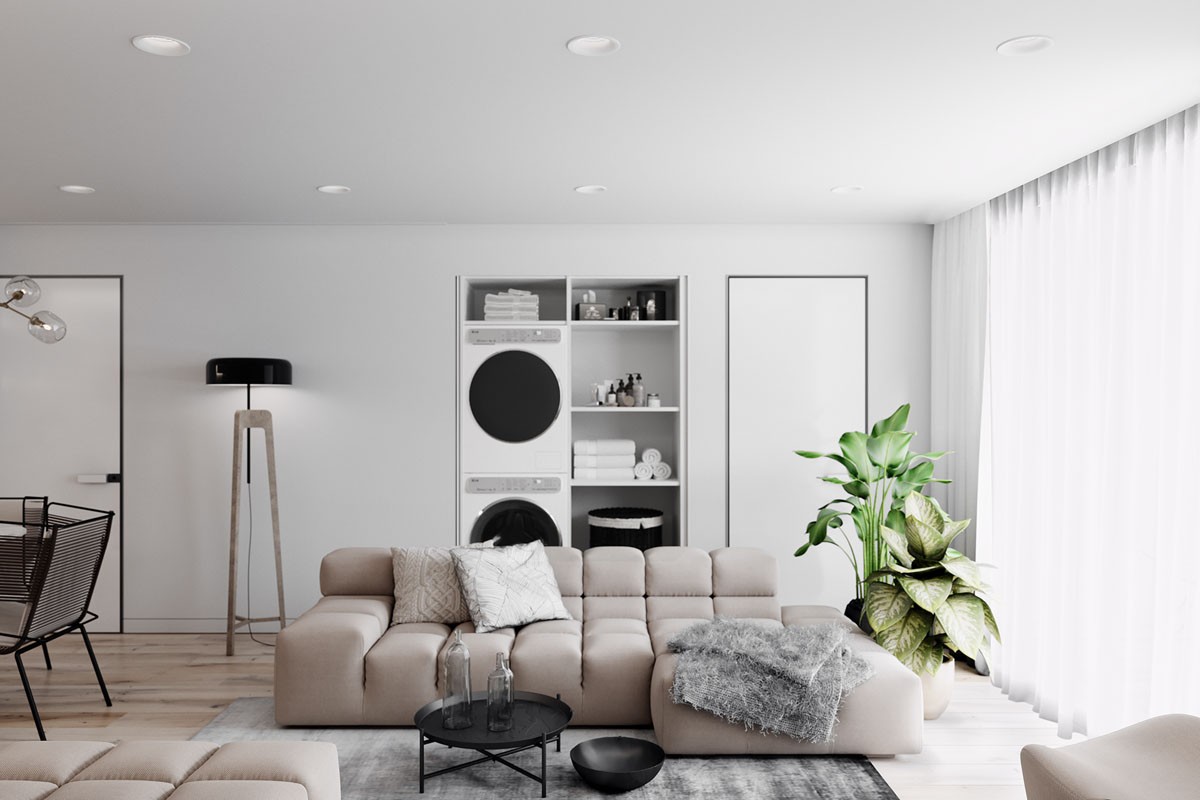
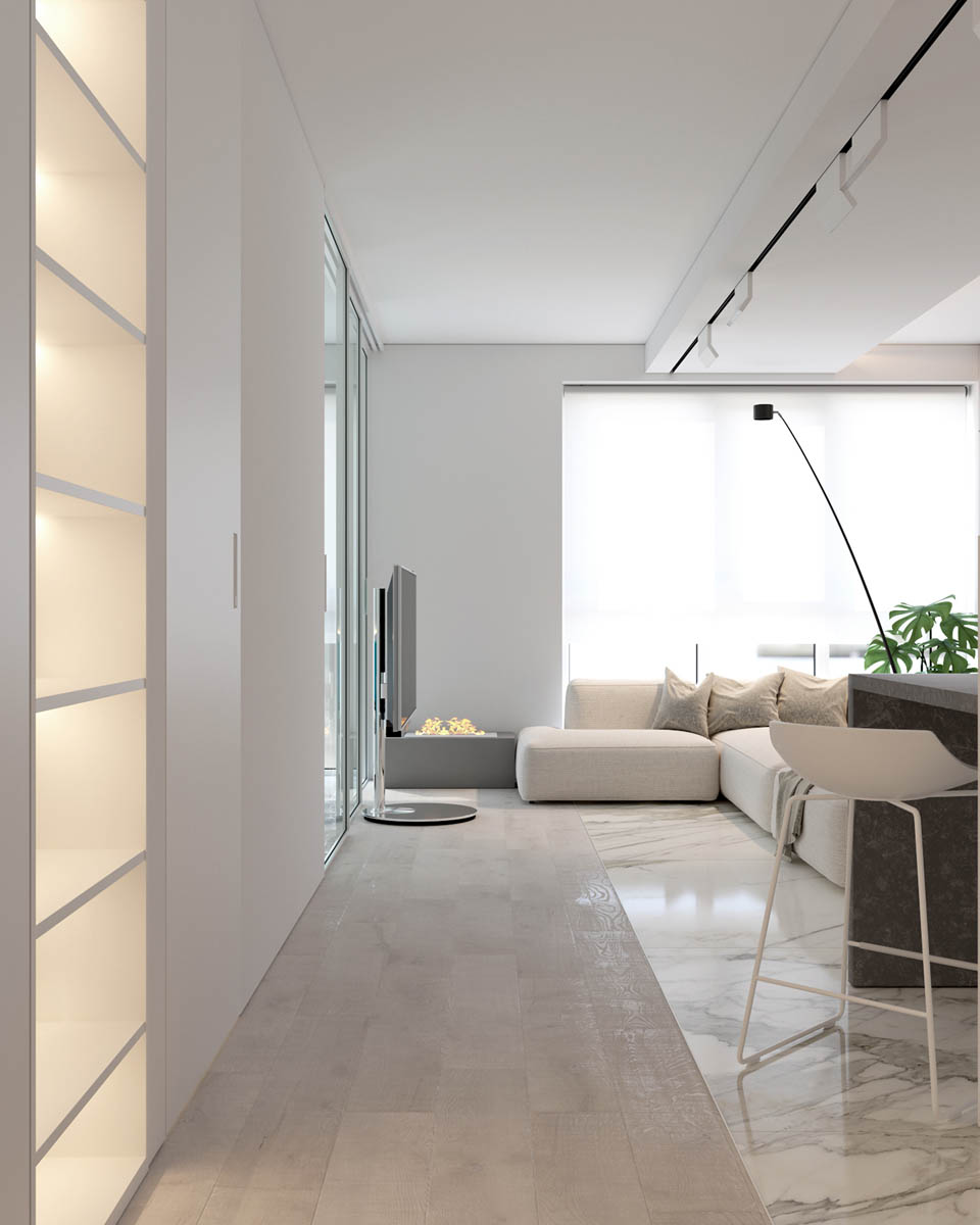
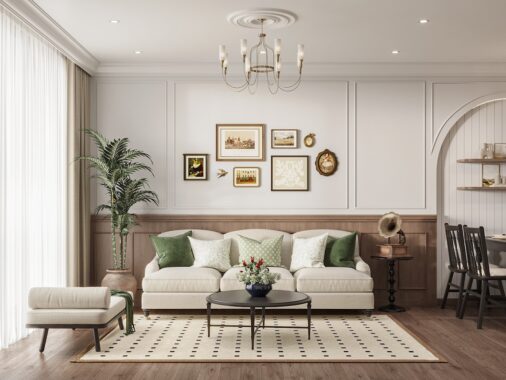
In the first home, we can immediately see the neutral color palette take hold in the living room, with only indoor house plants to add a bit of brightness.
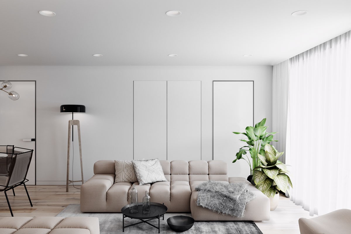
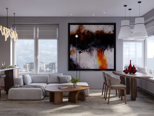
A range of lighting options is important in building a comfortable space. Here, unique floor lamps add to the overhead lighting for different moods.
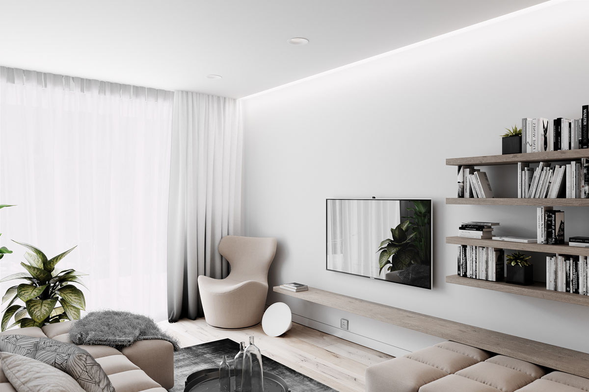
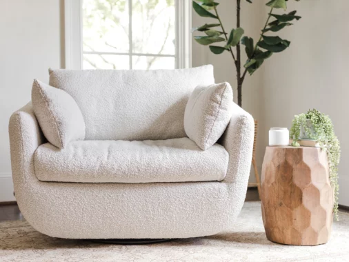
In one corner, a comfortable reading chair gives the homeowners a little spot to retreat to, by the window, for a bit of down time.
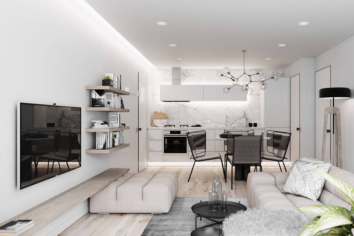
By utilizing unique wall shelves, the designer is able to keep the space more open, since a standard book shelf or table can take up more room.
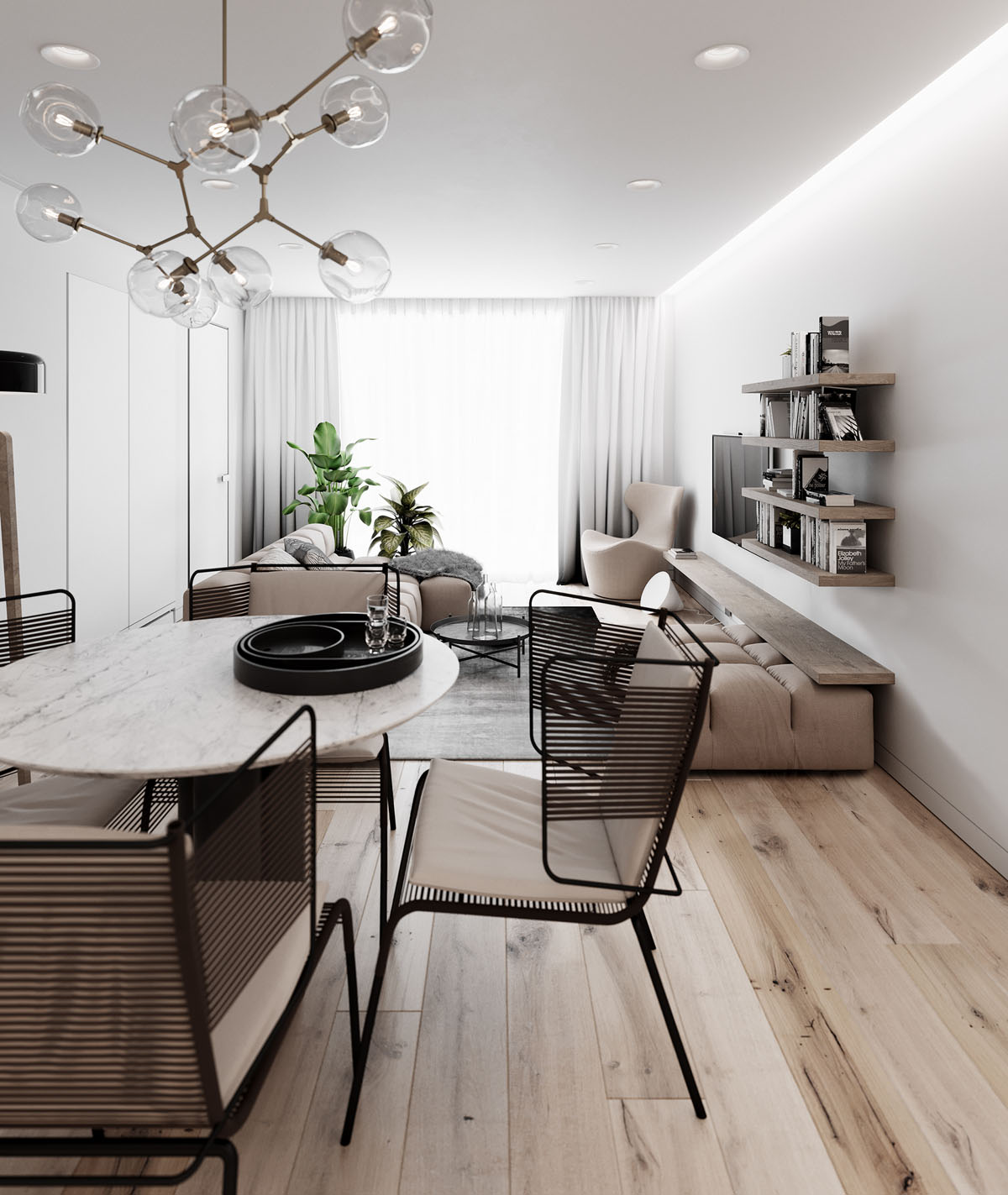
In the dining area, modern dining chairs in a black wire design are simple and chic.
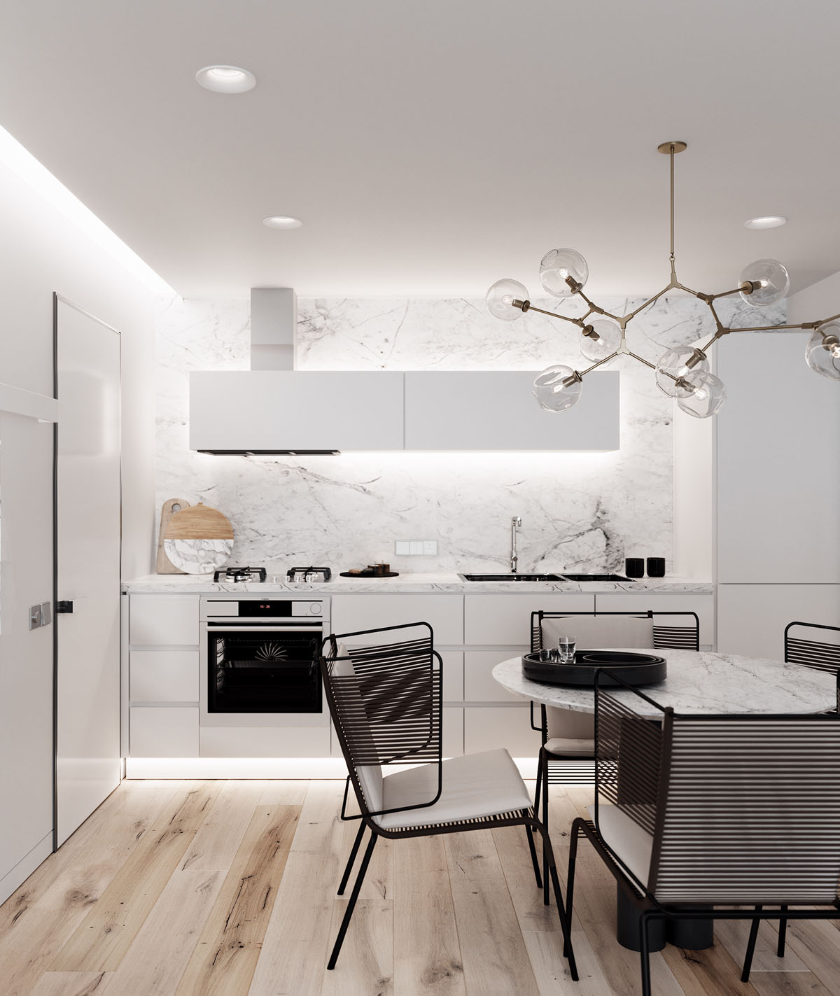
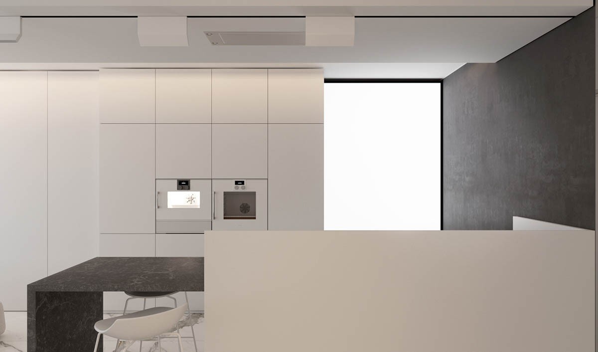
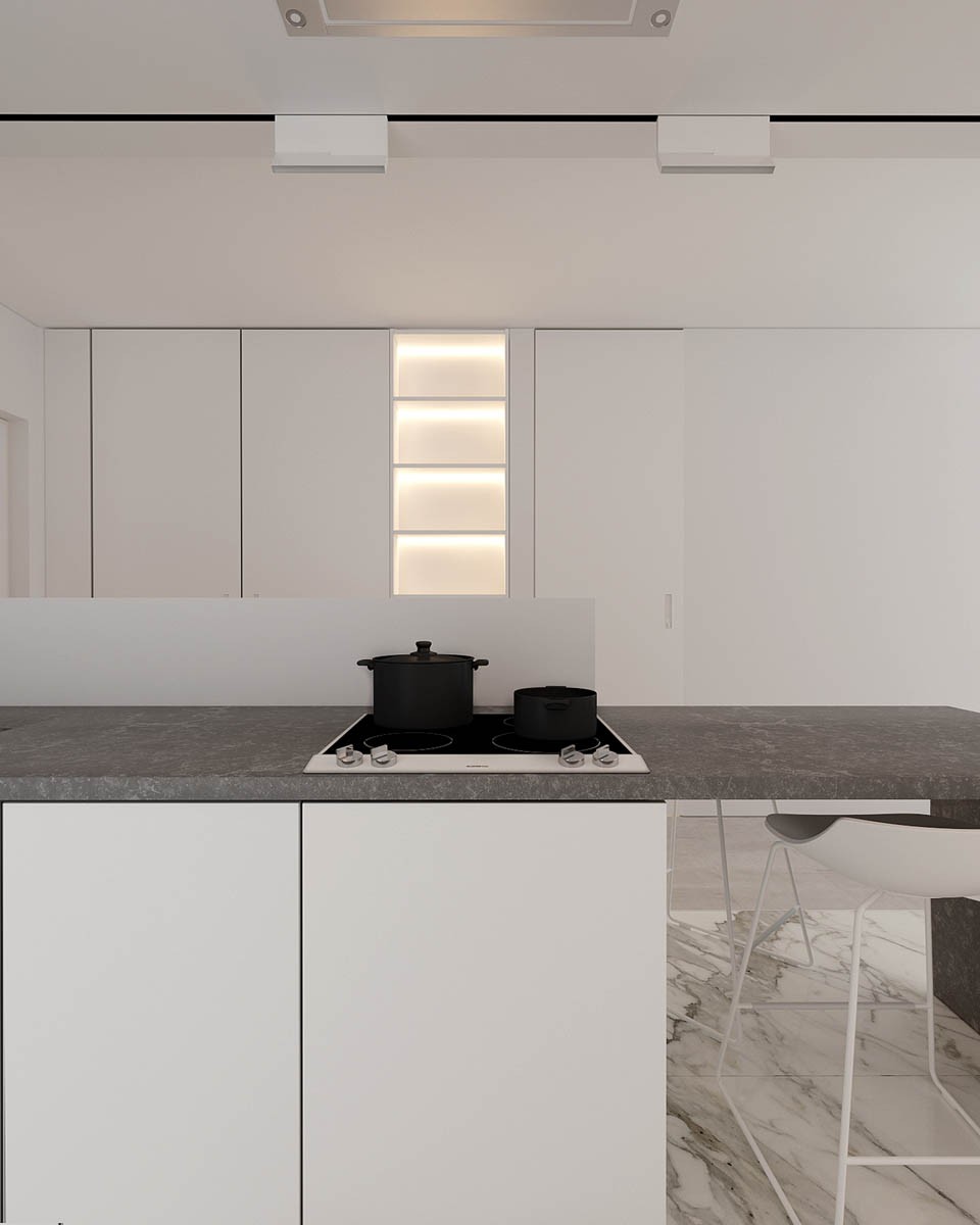
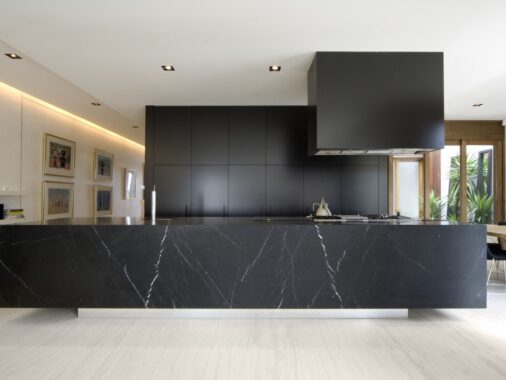
As with many marble kitchens, this design works best with lots of white.
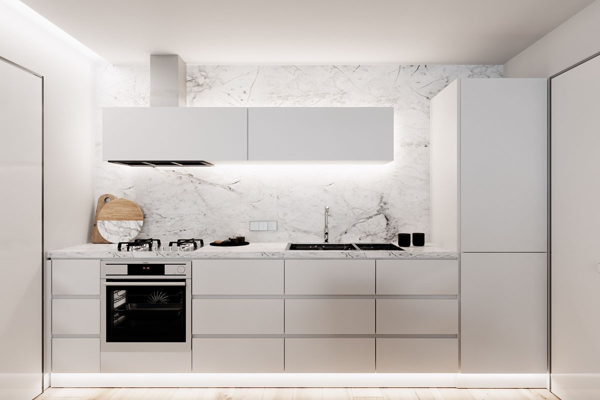
A kitchen essential like a cutting board can be on display in this type of kitchen because everything is so clean and well chosen.
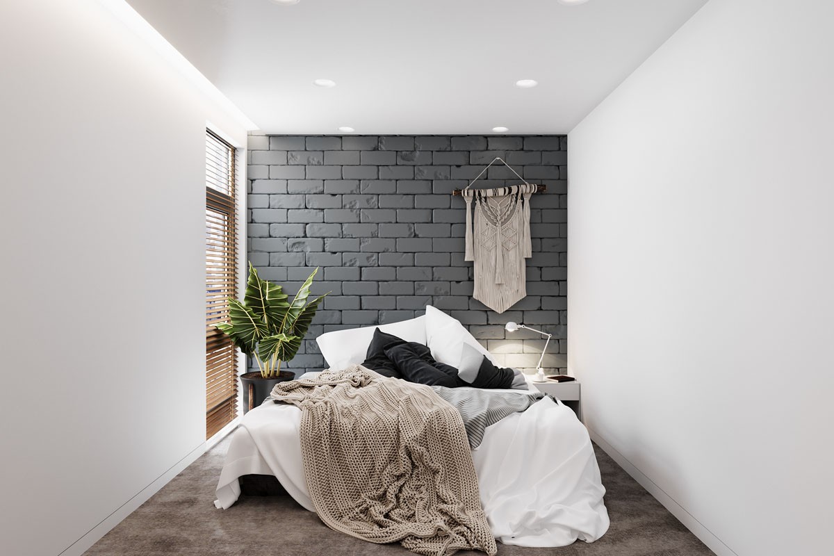
This cozy modern bedroom includes bedside lamps for nighttime reading or just a bit of ambiance.
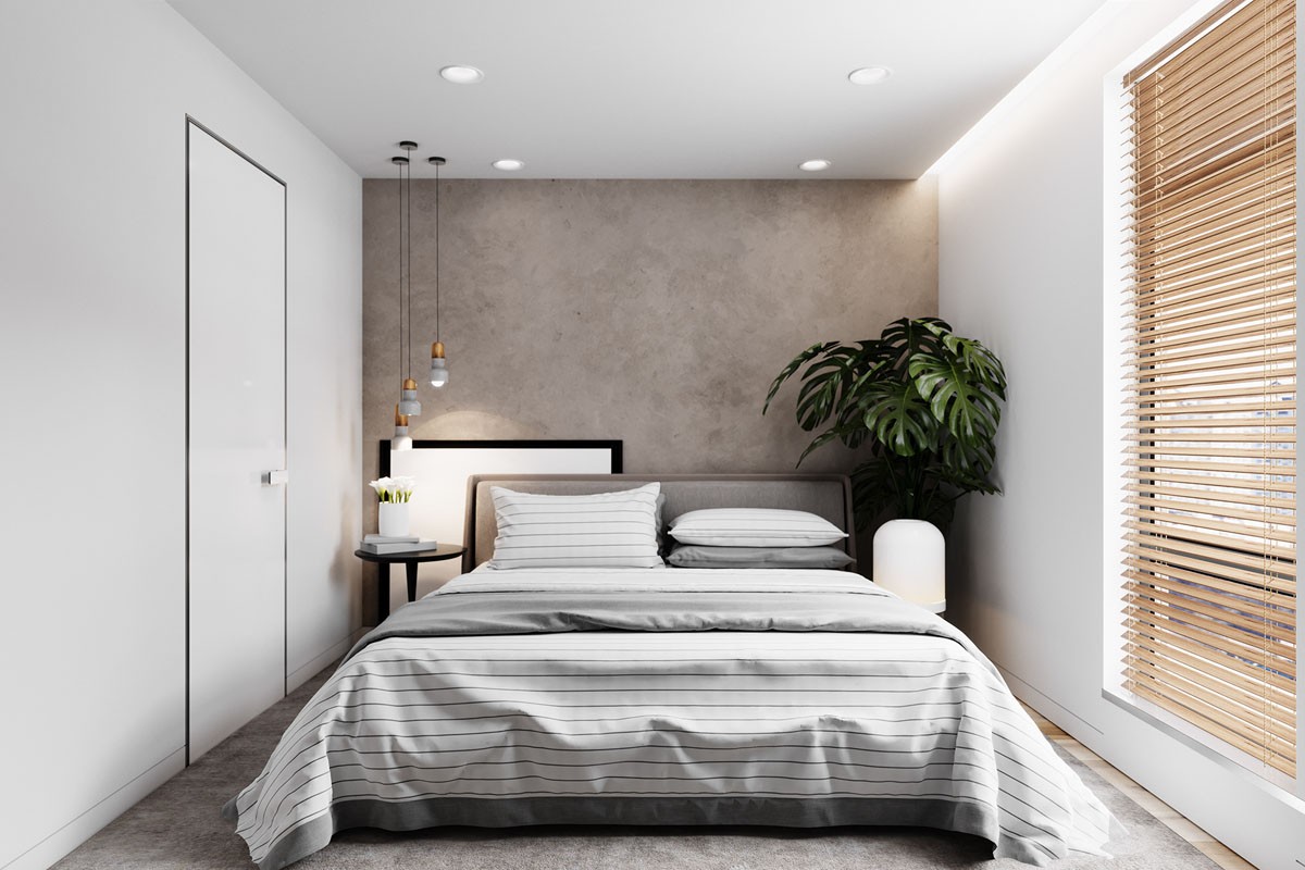
Another bedroom chooses a bedroom pendant light, specifically the Rochester pendant lamp.
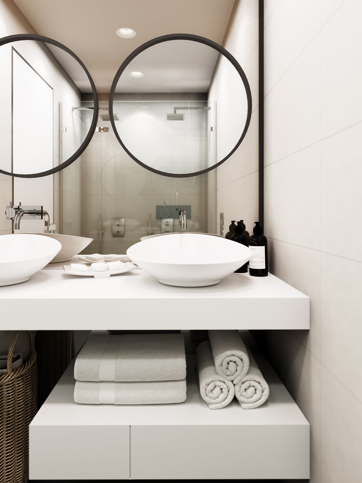
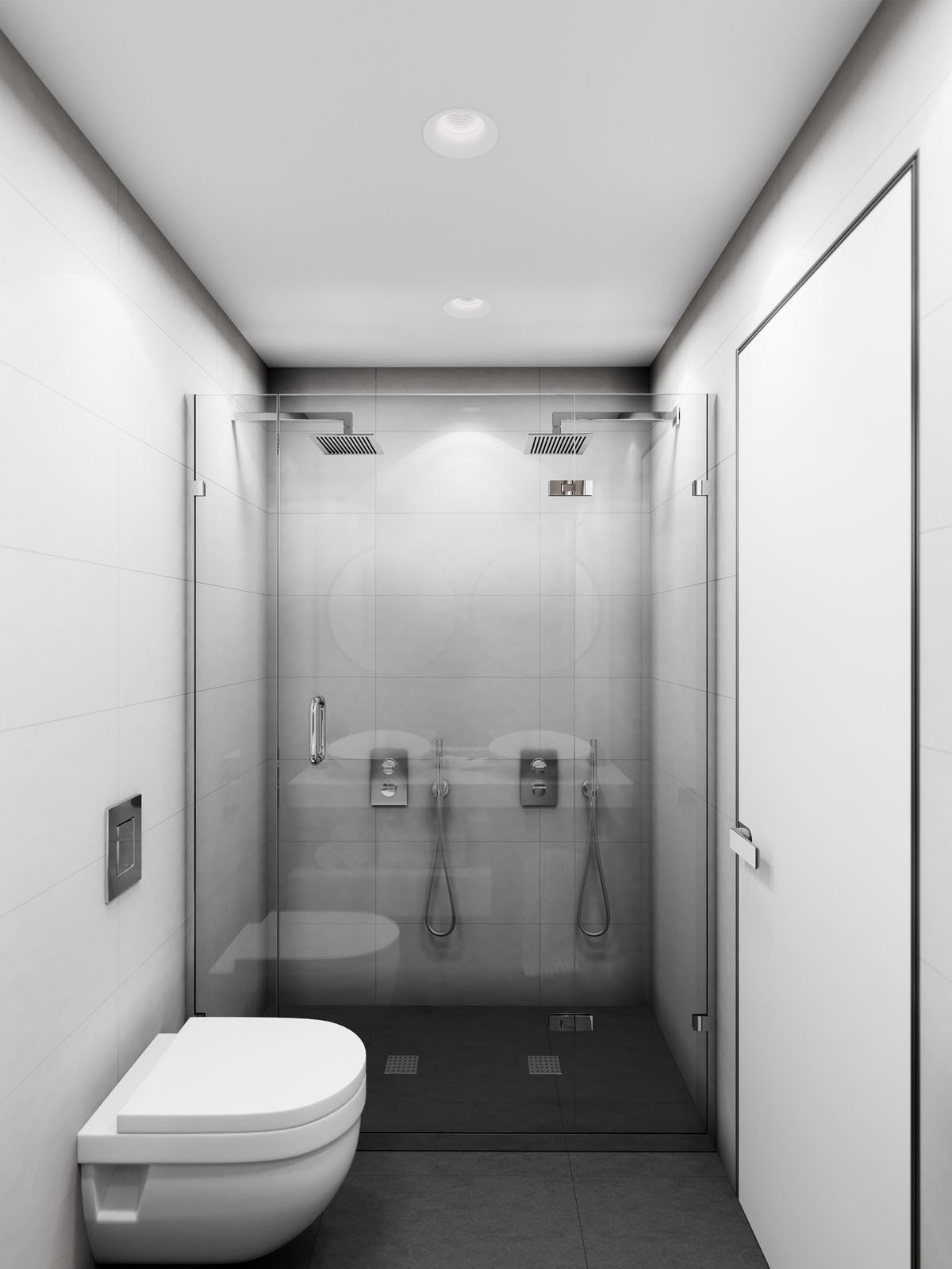
Double bathroom sinks are always a desired luxury for married homeowners. That way, everyone can get ready without getting in the way.
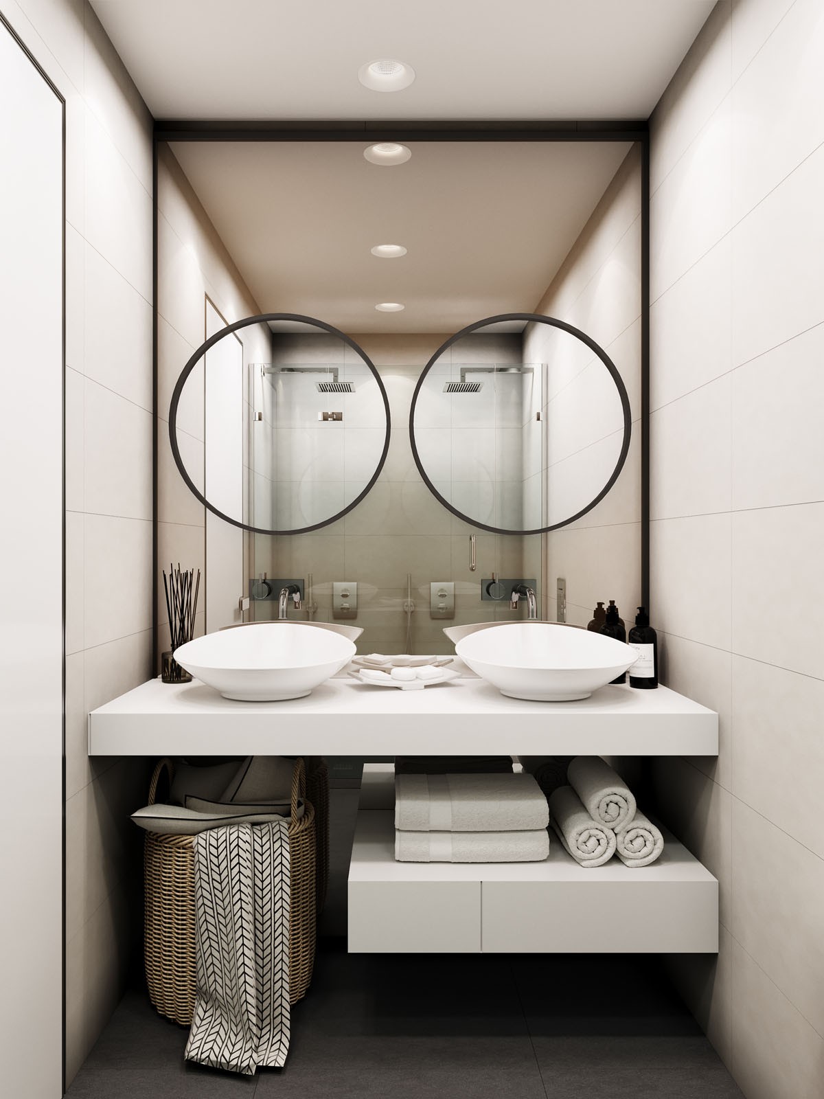
Choosing from many unique laundry baskets, this designer has gone with a simple basket style.
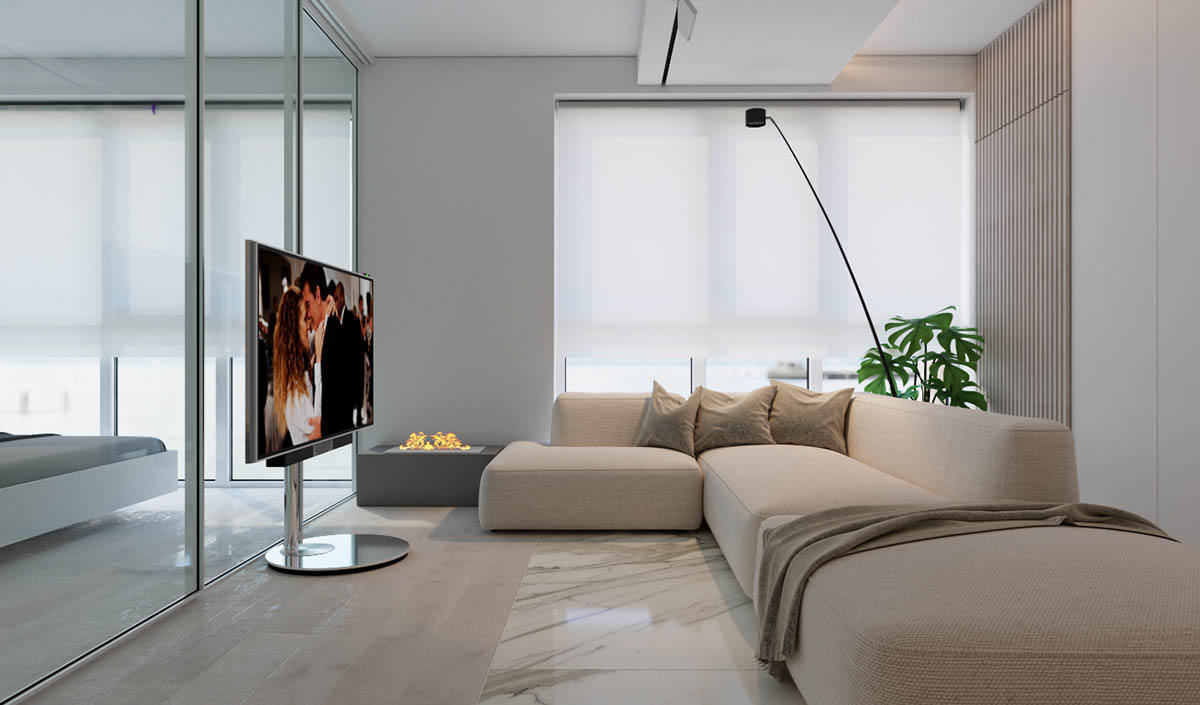
In the second home, we once again get the contrast of natural greenery with neutral furnishings -- this time with a Swiss cheese plant.
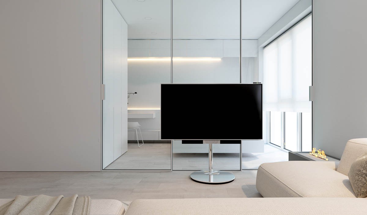
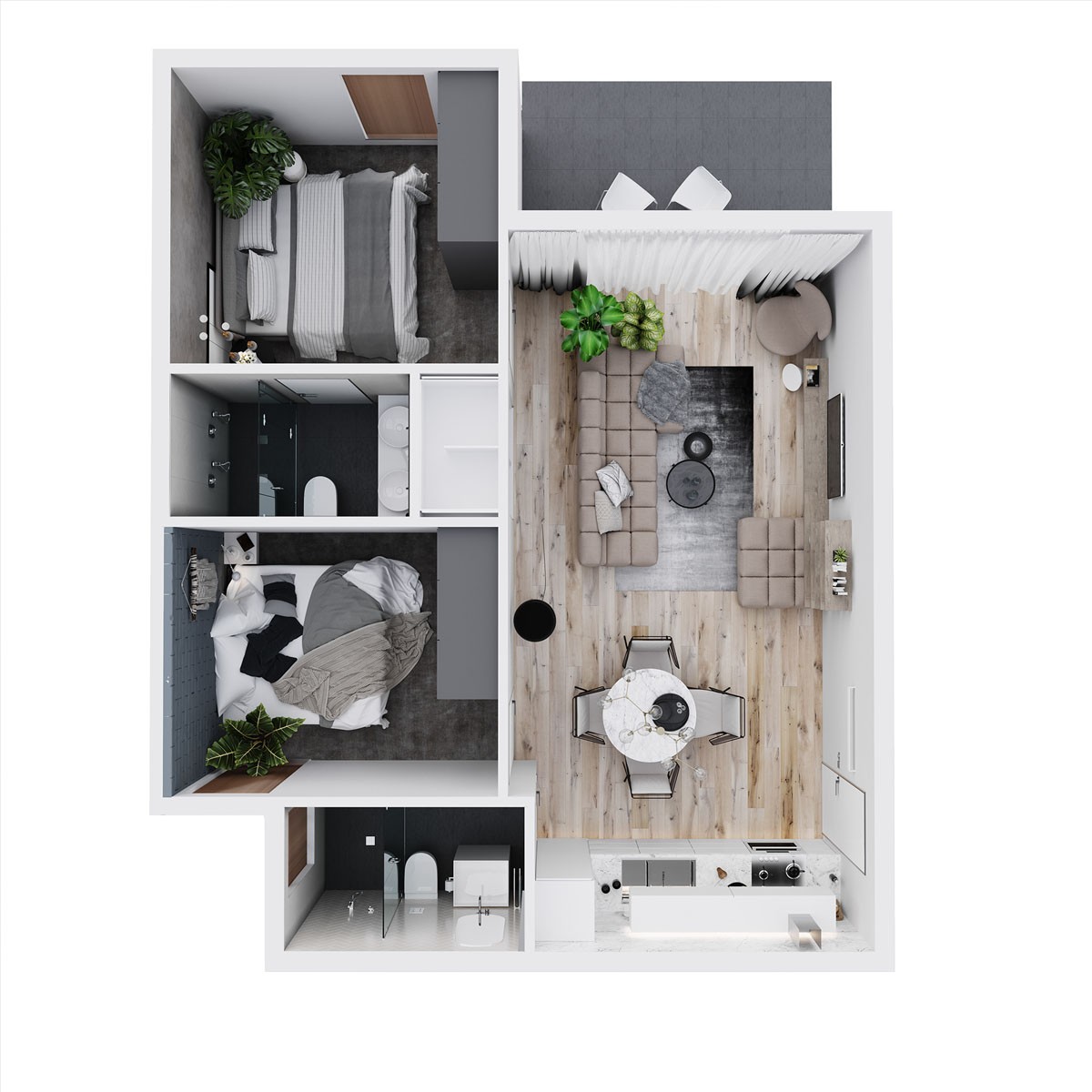
This apartment, designed for lawyers, measures 50 square meters (538 square feet), but feels quite a bit more spacious.
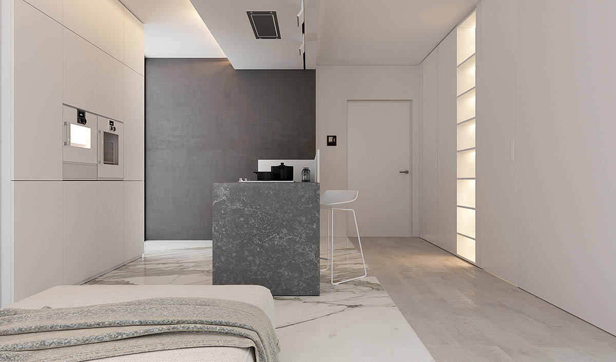
Of course, the open floor plan helps and also gives us a view of the simple, white kitchen bar stools.
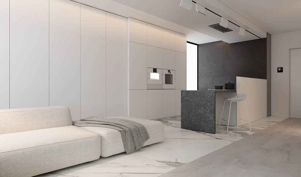
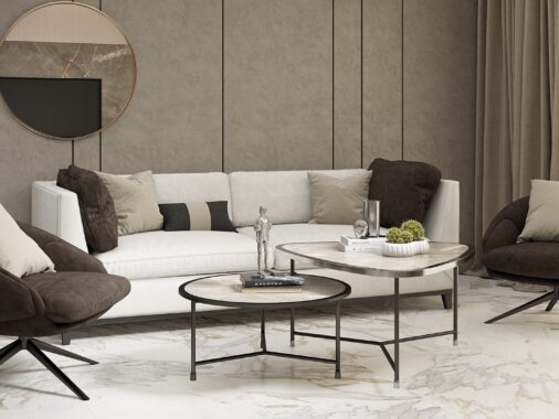
The nubby texture on the sofa provides a delicate contrast to the slick marble flooring that extends into the kitchen area.
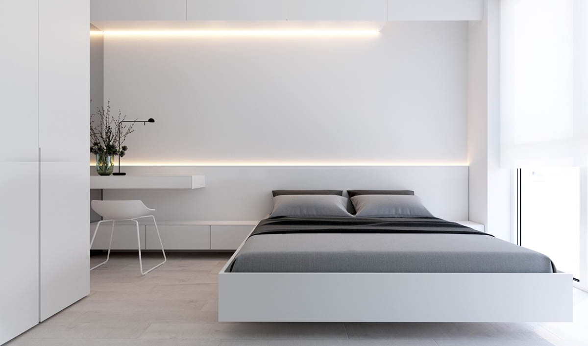
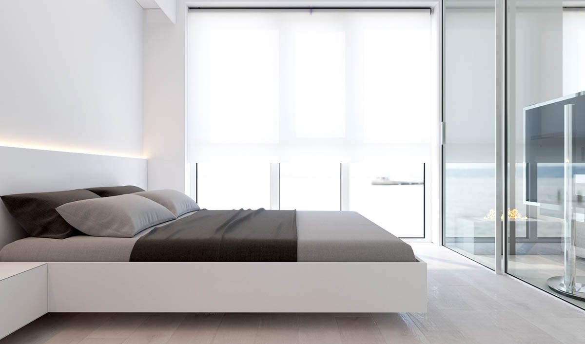
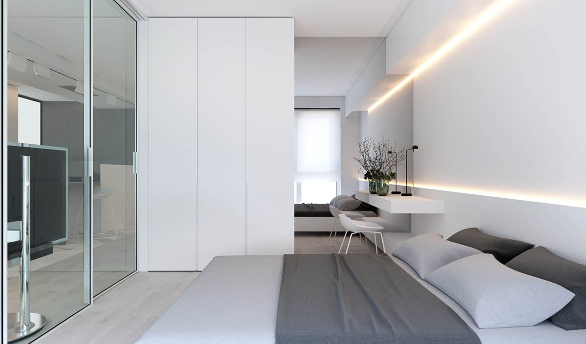
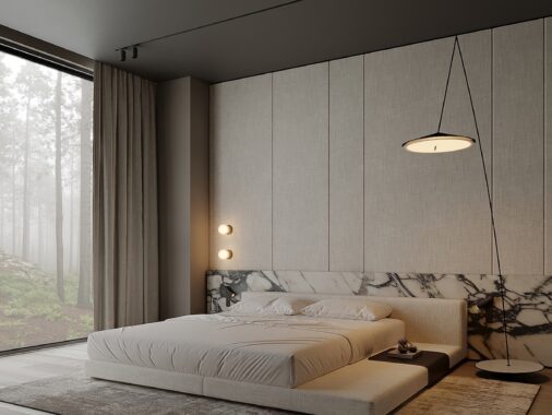
As with many minimalist bedrooms, the decor here skews towards white and gray.

