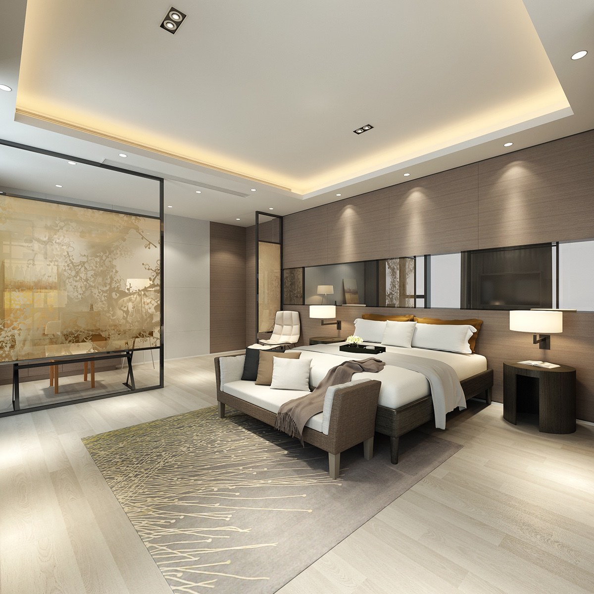
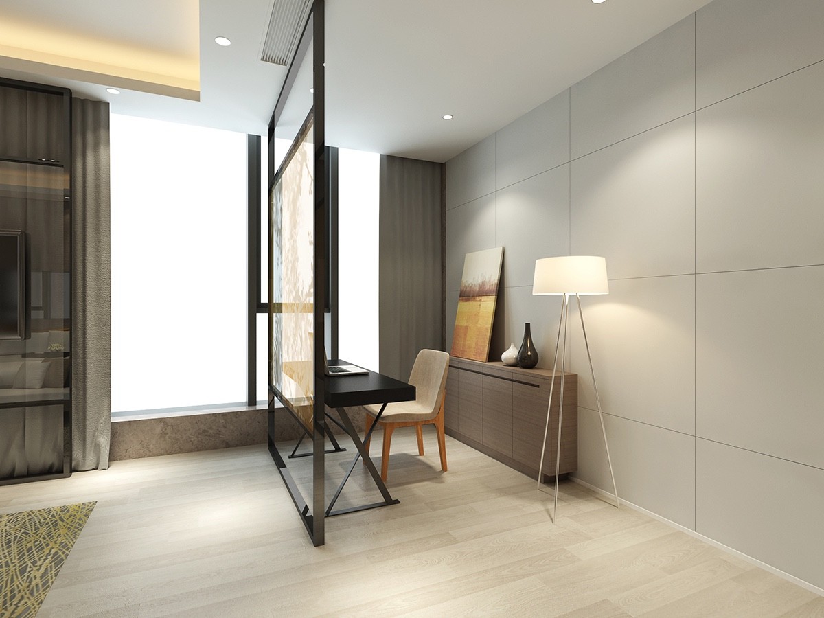
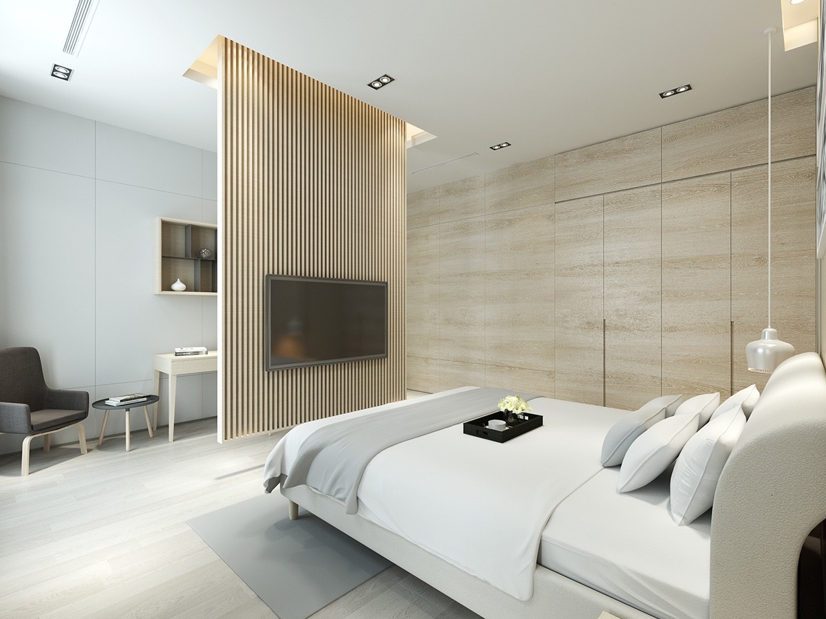
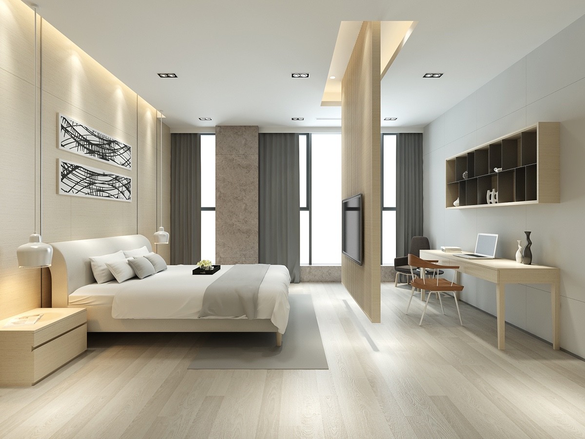
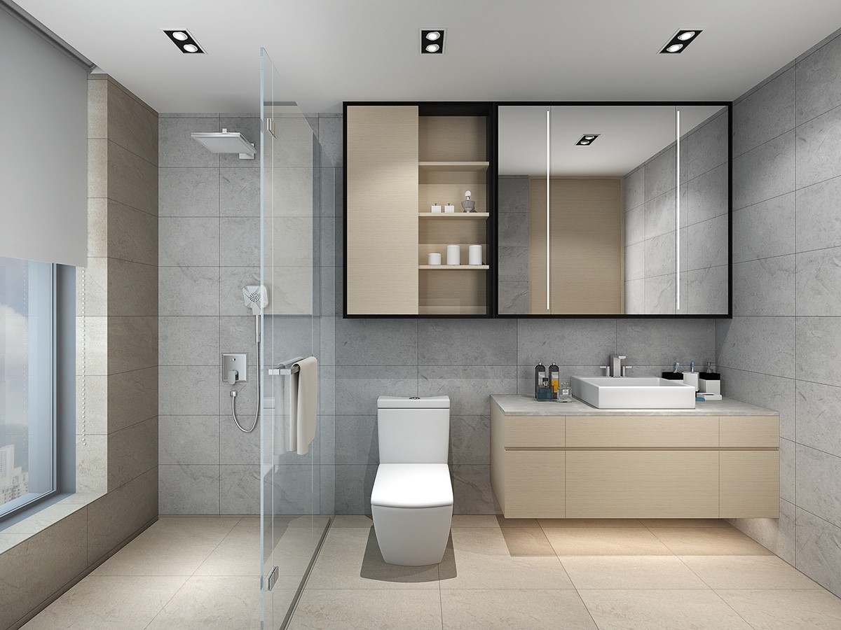
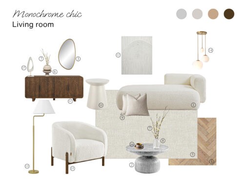
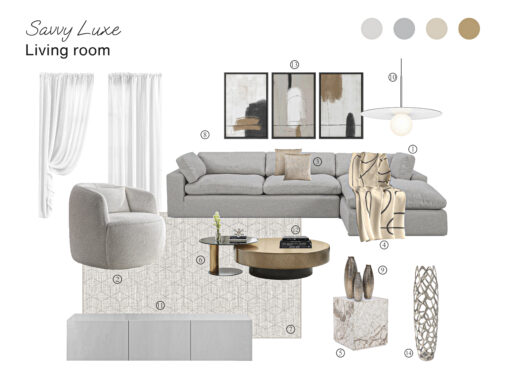
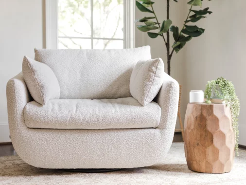
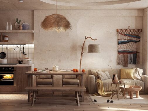
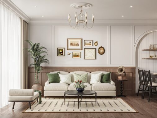
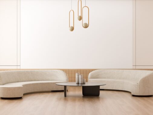
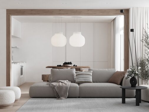
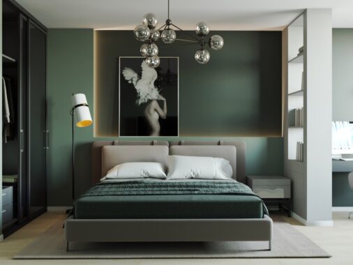
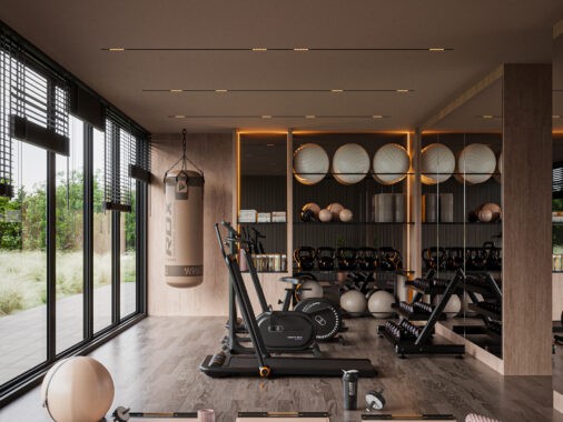
Beige is not typically a color associated with beautiful design. While rich mahogany, stark white, and even trendy brights like orange or yellow have a luxury feel, beige can feel a bit boring and dated. However, in the right hands, beige can be used as a comforting neutral, to pull focus on the details of a space that make it truly special. The home featured in this post both use beige throughout, along with other soothing tones of white, gray, and brown. The resulting interiors remind the viewer to look up, around, to focus on texture, touch, and even scent. By using non-distracting colors, the space itself is really allowed to shine.
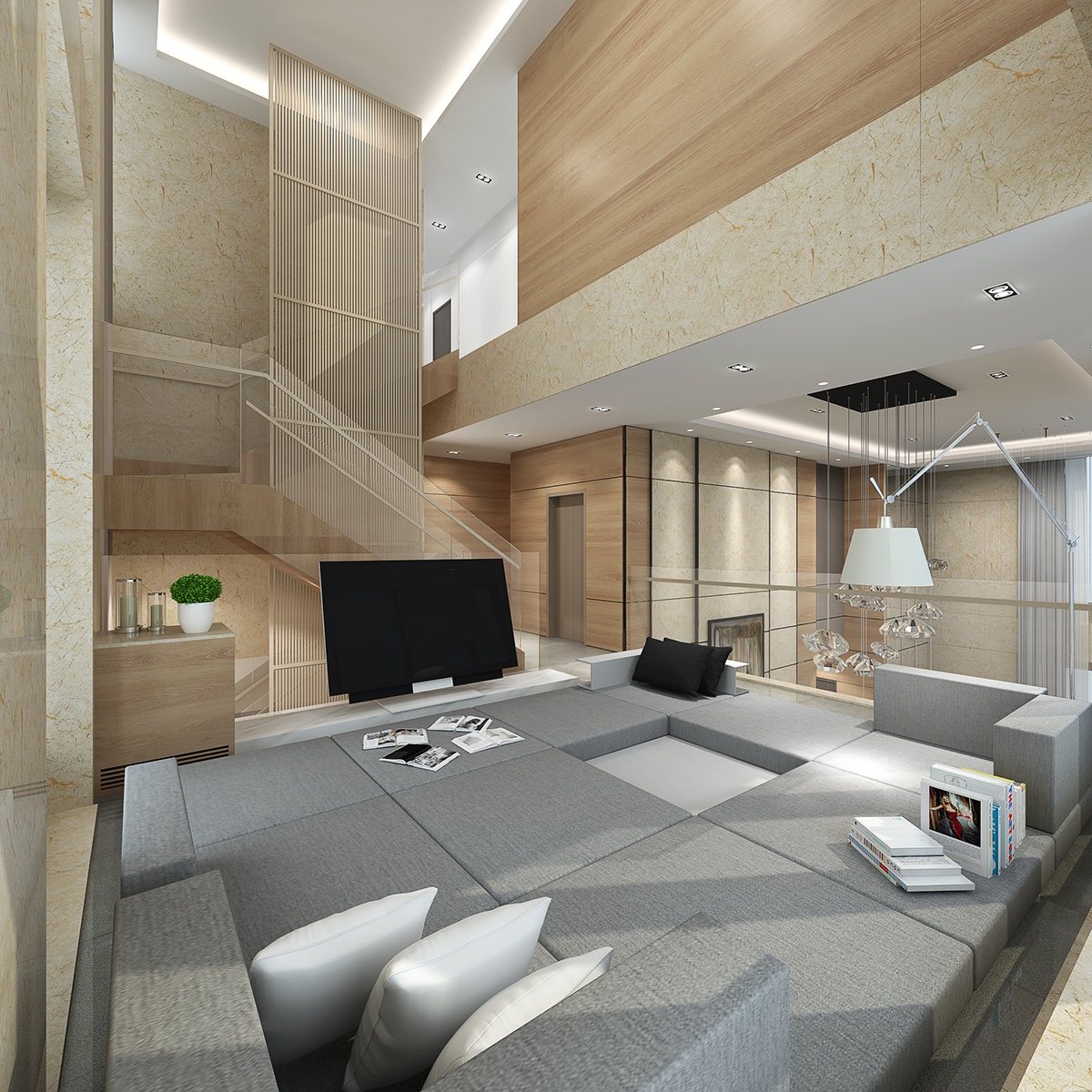
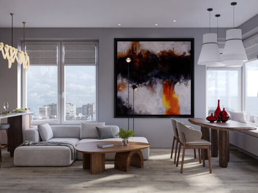
This home, with its similarly vaulted ceilings and largely neutral color scheme, takes a bit more liberty with contrast.
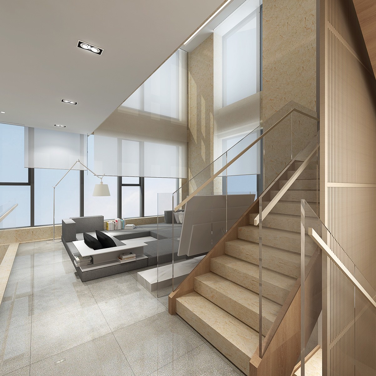
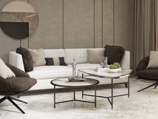
Whereas the first space existed largely within the same tones, this one shows immediate variation between items as simple as a black throw pillow and a white floor lamp.
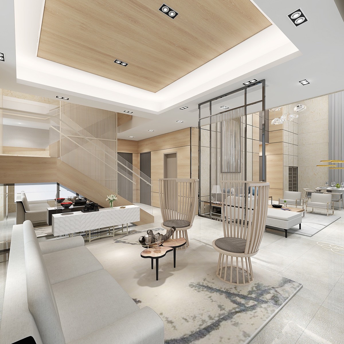
Beige still pulls its thread through the interior, offering a backdrop for unique coffee tables and creative chairs.
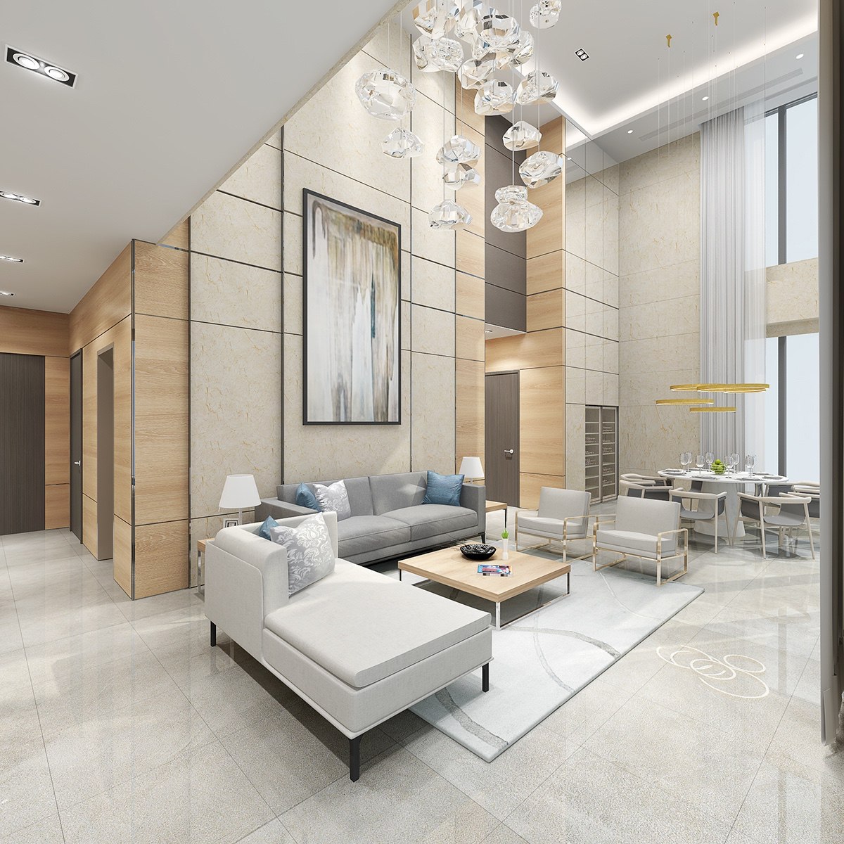
In fact, this home features many unique furnishings that create focal points, including a stunning overhead light fixture and large abstract painting.
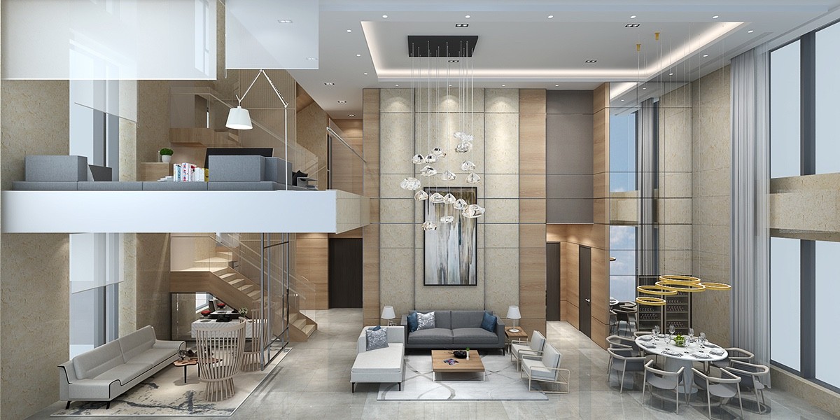
The multilevel home also makes use of that popular neutral material -- glass --for a really stunning cross-section.
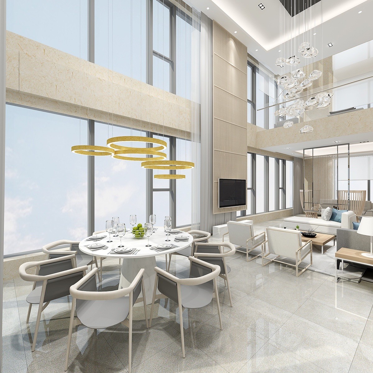
The home makes great use of the vaulted ceilings with floor-to-ceiling windows, letting light stream in easily over the modern dining chairs and chic yellow light fixture.
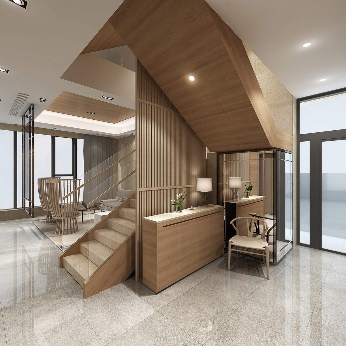
While near white characterizes the dining area, other spaces are a bit darker with a much heavier use of wood.
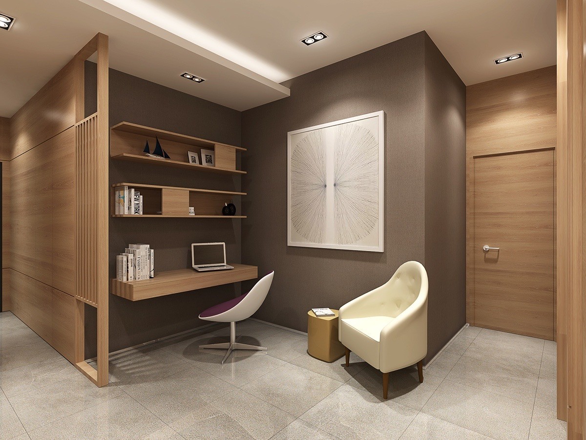
The working nook, for instance, uses wood paneling in conjunction with dark brown walls to create a studious feel.
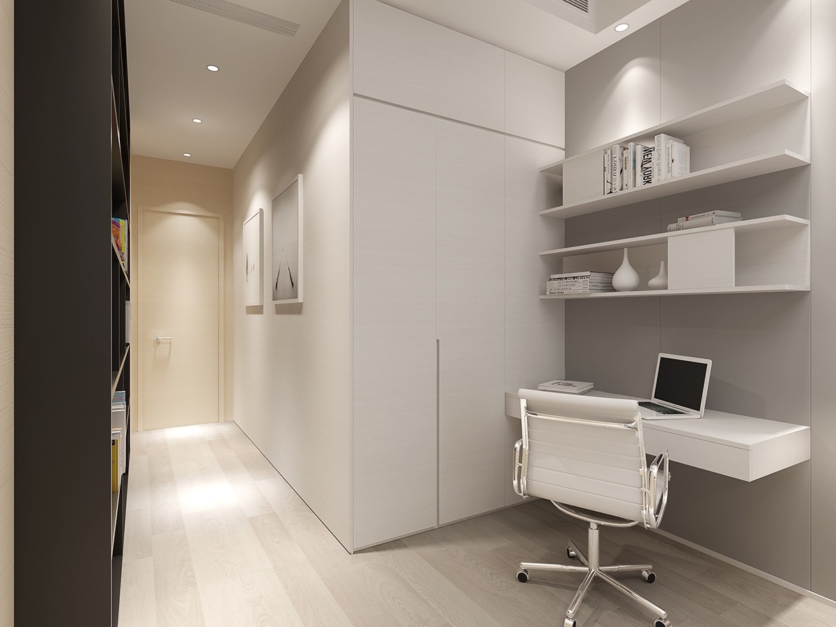
In another area of the home, a small workspace uses light gray and white. Cleaner and more modern, but just as effective for getting things done.
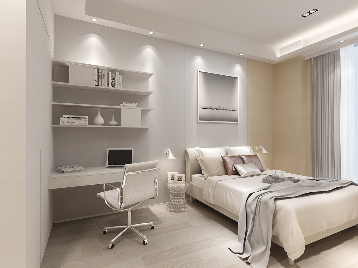
This workspace is actually part of one of the home's bedrooms, and utilizes a stylish ergonomic chair
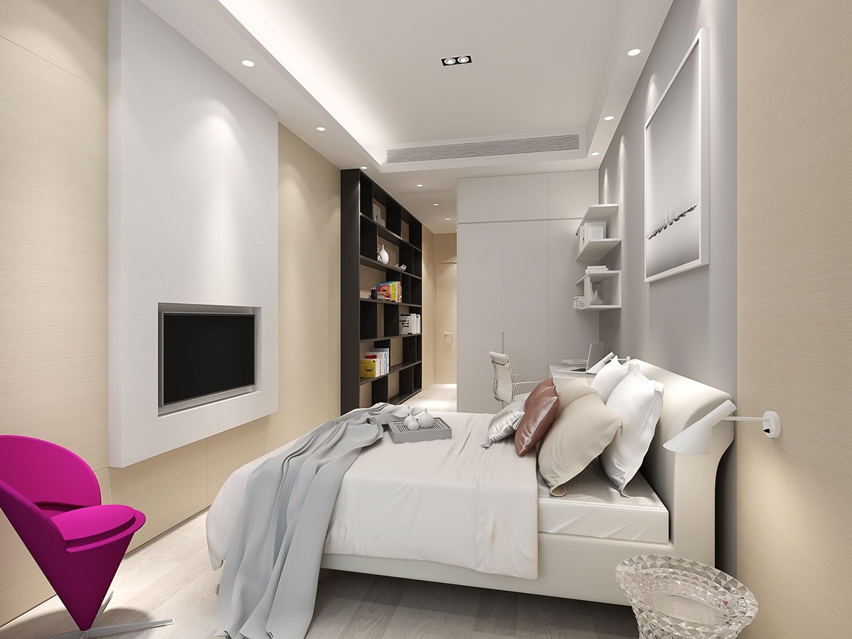
One of the few pops of color in this design comes in the form of a bright pink chair in the corner of this room. The chair sits opposite a pair of modern wall sconces, which are in the Arne Jacobsen Style.
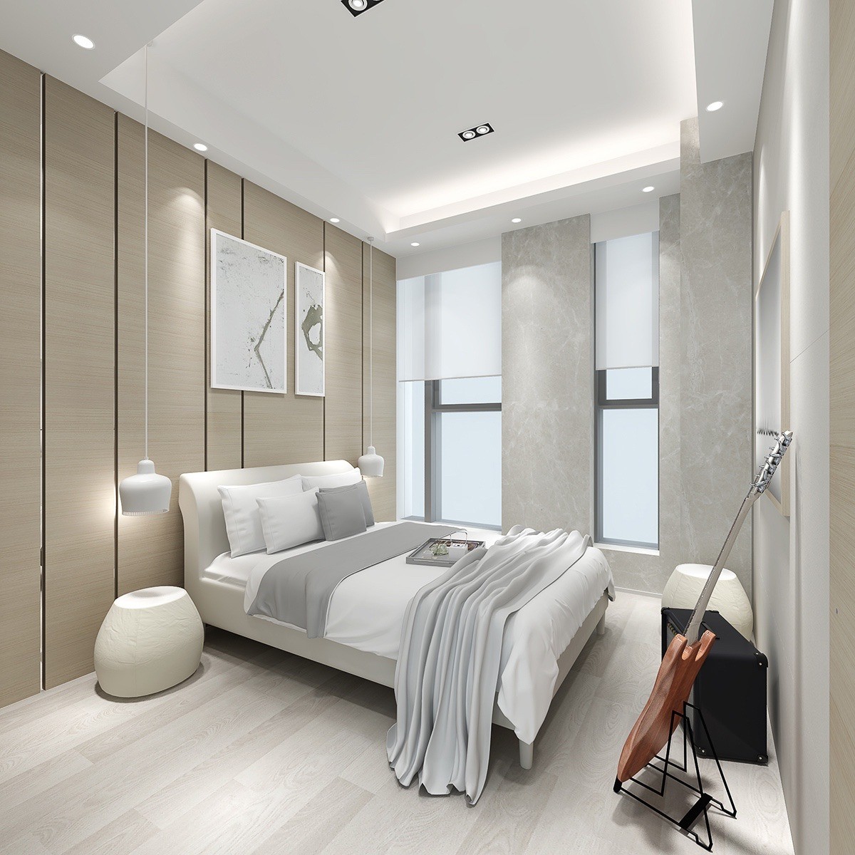
A second bedroom eschews the wall sconce look for bedroom pendant lights, also in a white, modern style.
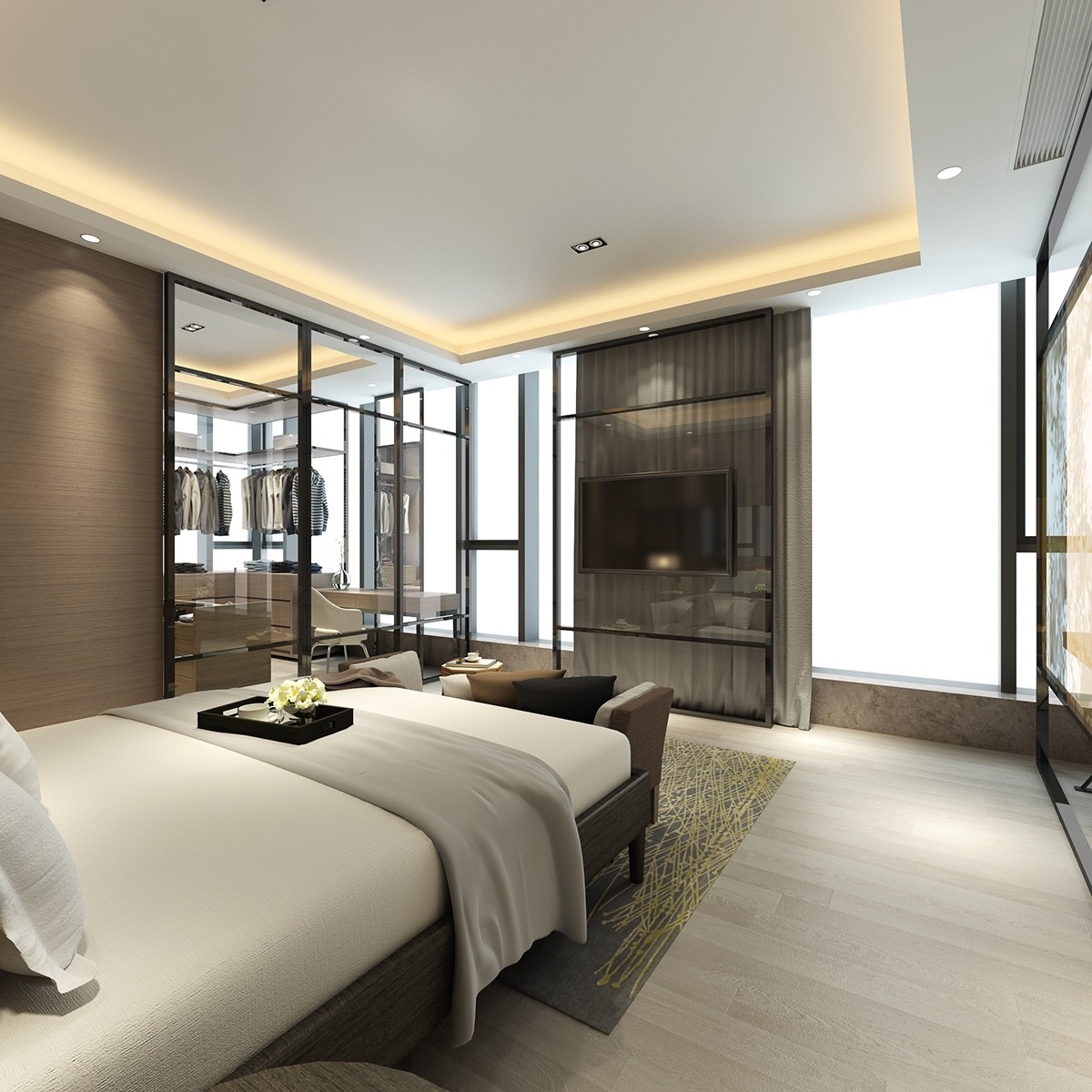
The recessed ceiling design not only adds visual interest and height, but offers a unique lighting possibility with recessed lights.
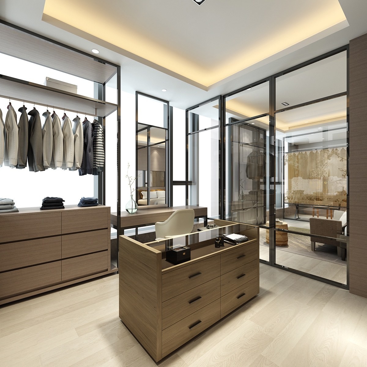
An enormous walk-in closet is the height of luxury, using a spectrum of different wood grains. Ample storage solutions provide easy organization, putting select items on display to inspire the day's fashion choices. In the corner, a vanity table provides a convenient place to change cuff-links or apply cosmetics.

