You can’t go far wrong in applying a modern neutral grey as a base for your decor scheme - or can you? Actually yes you can. Too much of a good thing can become monotonous or dull, too little and your interior design may come across as half-hearted and wishy-washy. So, what to do? These two beautiful attic apartments have achieved the perfect balance, using high volumes of grey balanced out with brightest white and base notes of black. Accessories have been carefully curated into interesting collections to make the schemes appear anything but boring. Take these two home tours to look and learn how to hit it just right.
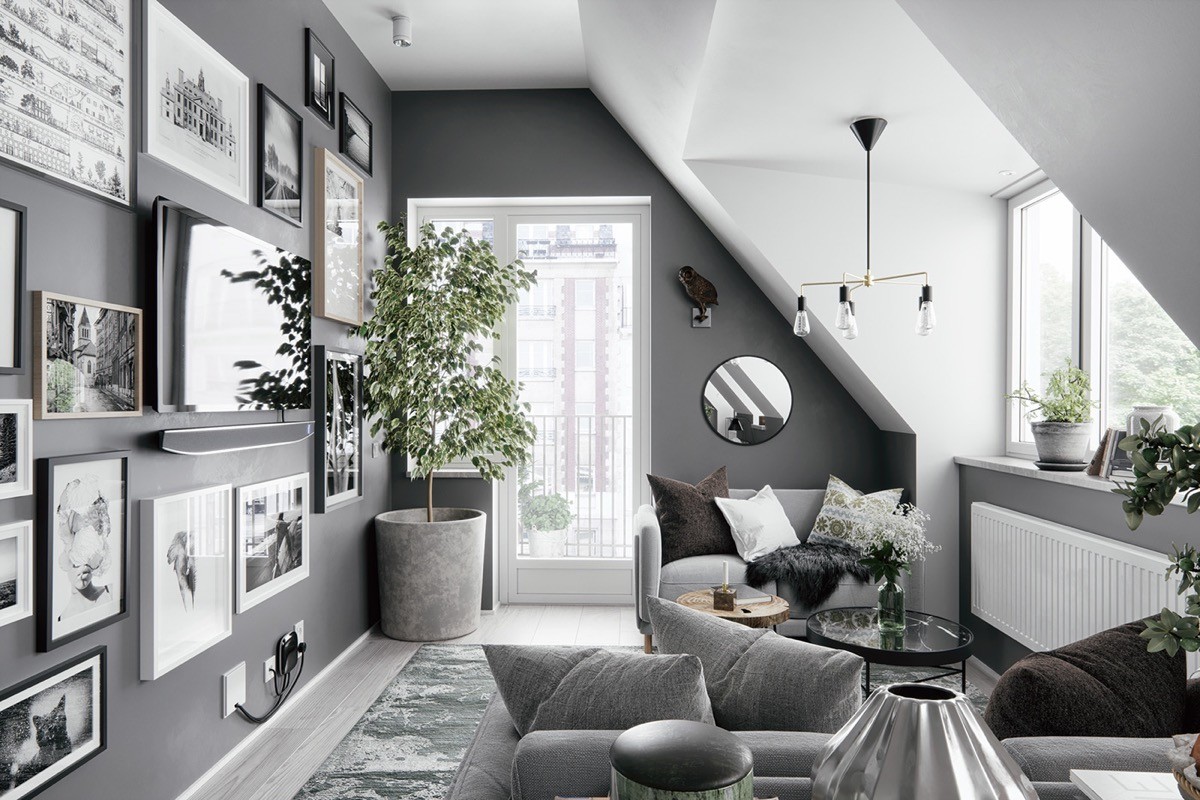
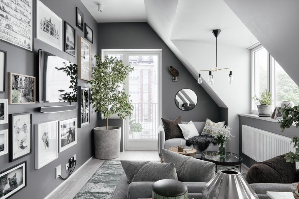
The visualizations of our first interior were made based on an actual home. A grey gallery wall has been created down one side, where a flat screen television blends in with a menagerie of frames that are each a different size and depth. The picture frames contain monochrome art prints and photography to meld with the palette of the room. At the end of the gallery wall a concrete planter adds another shade of grey.
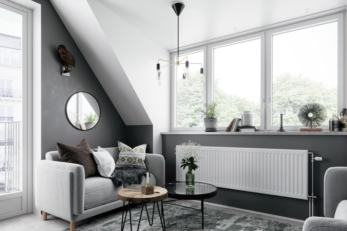
To balance out the shade, large areas of white have been used on walls, ceilings and accessories. A couple of chocolatey tones warm things up a little here too. Over the sofa, a small decorative wall mirror reflects natural light from an adjacent large window.
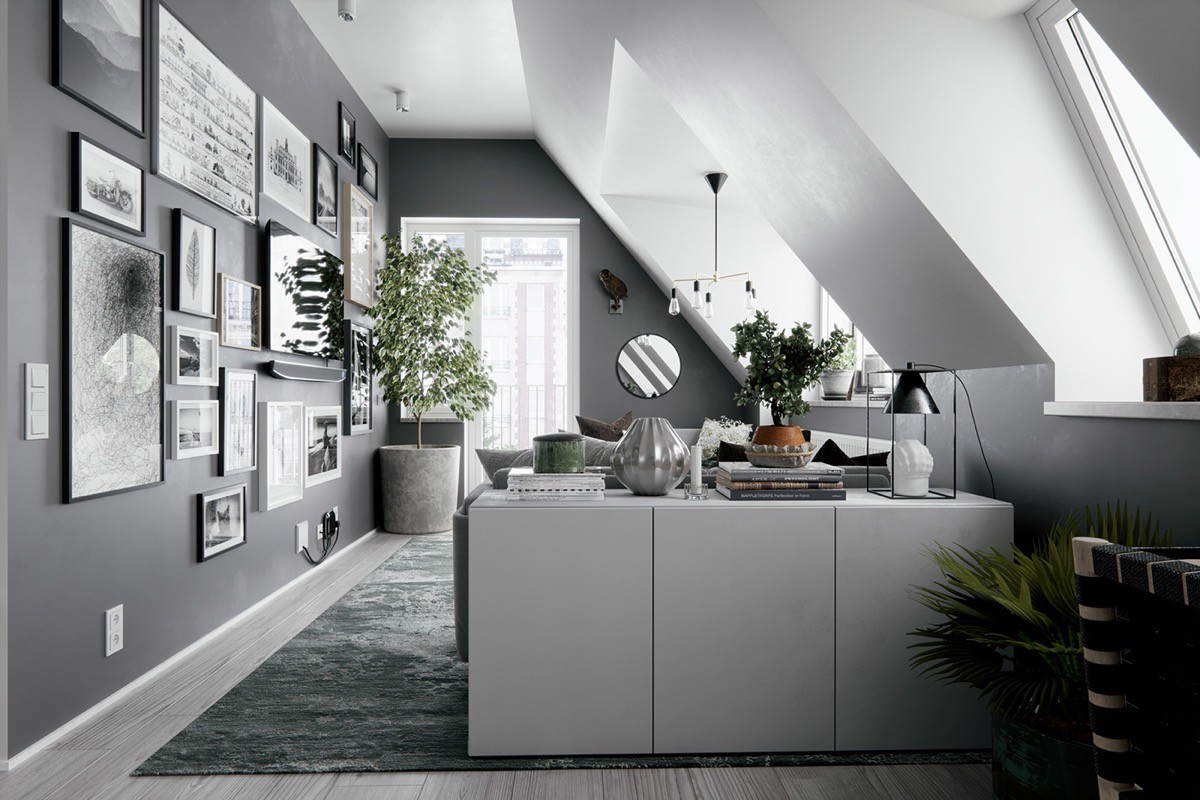
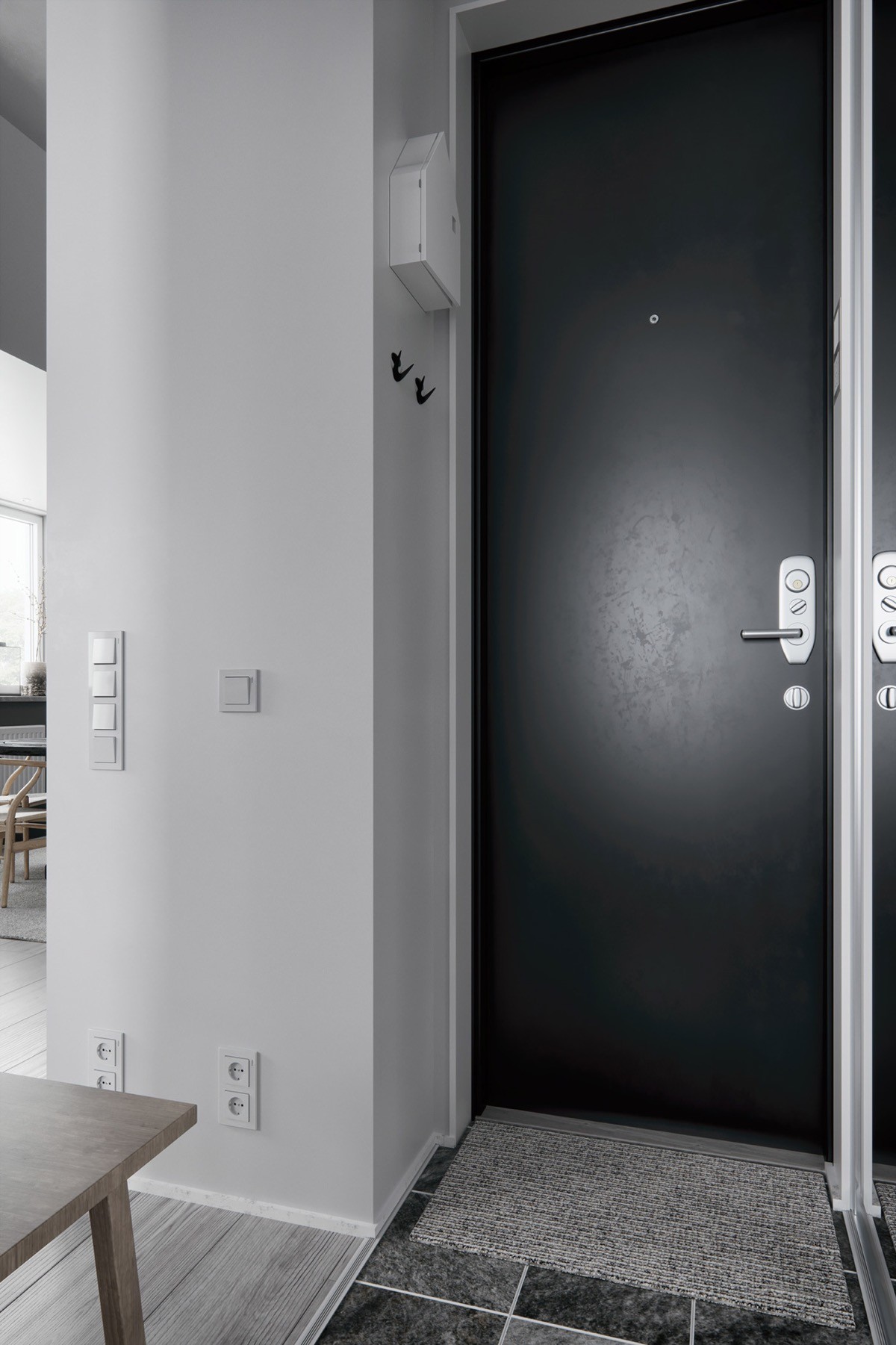
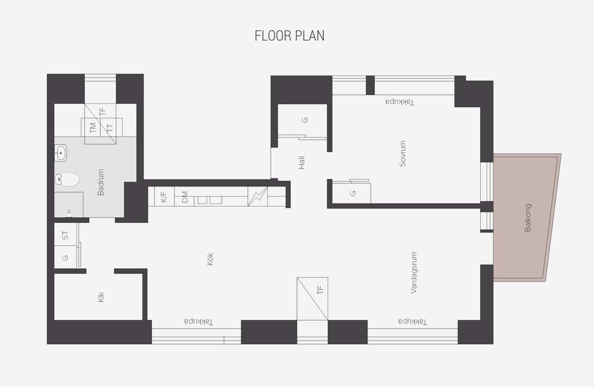
provide the only splash of vibrant colour, and they are threaded at regular intervals throughout this apartment layout.
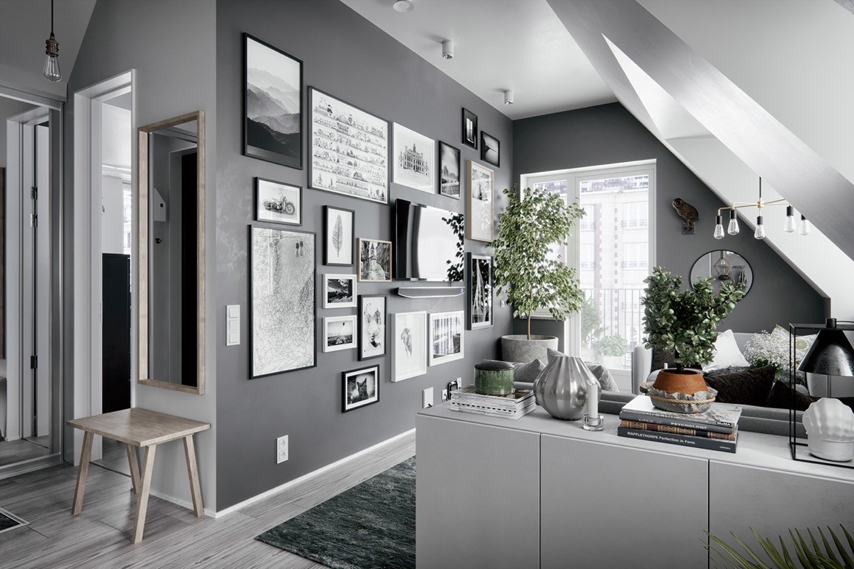
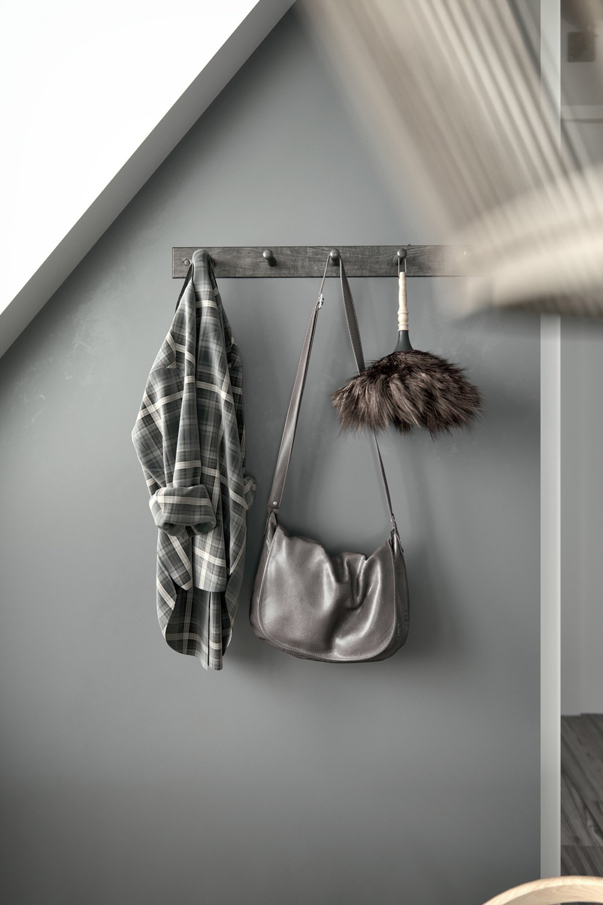
There are many, many home accessories inside this apartment; from the large gallery of pictures to random decorative vases and stacks of books. The smooth grey colour scheme holds all of these items together neatly as one cohesive and sophisticated collection.
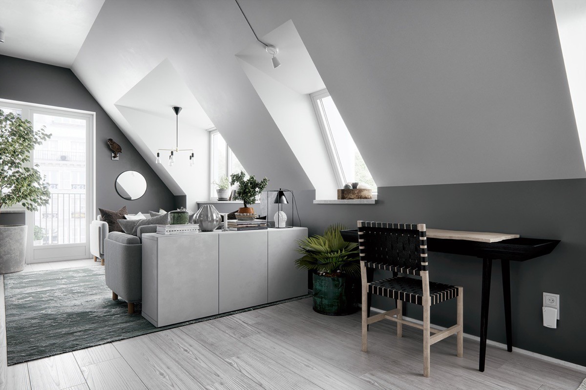
Between the busy living room and a kitchen/dining area there is an area of calm. This is a home office spot, equipped with a simple black desk and chair.
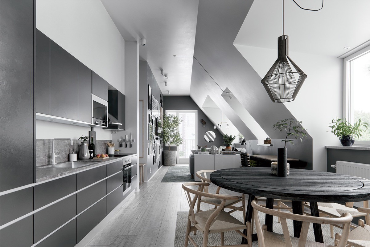
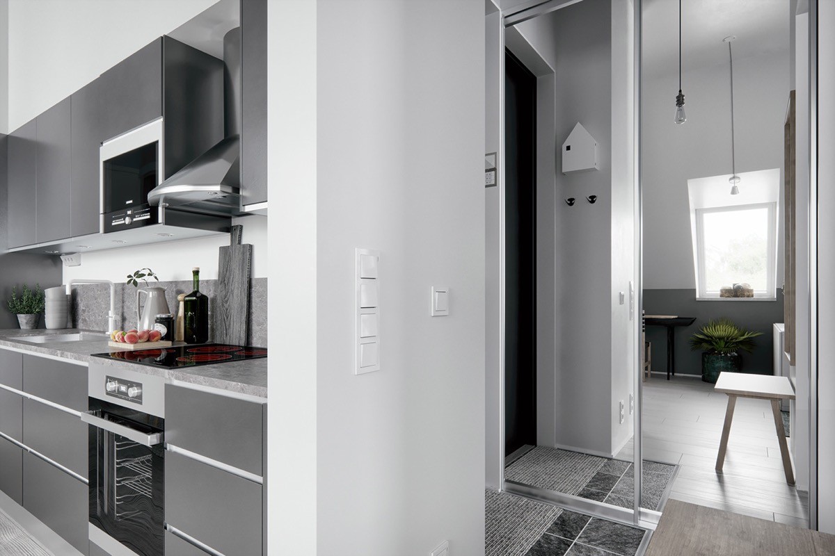
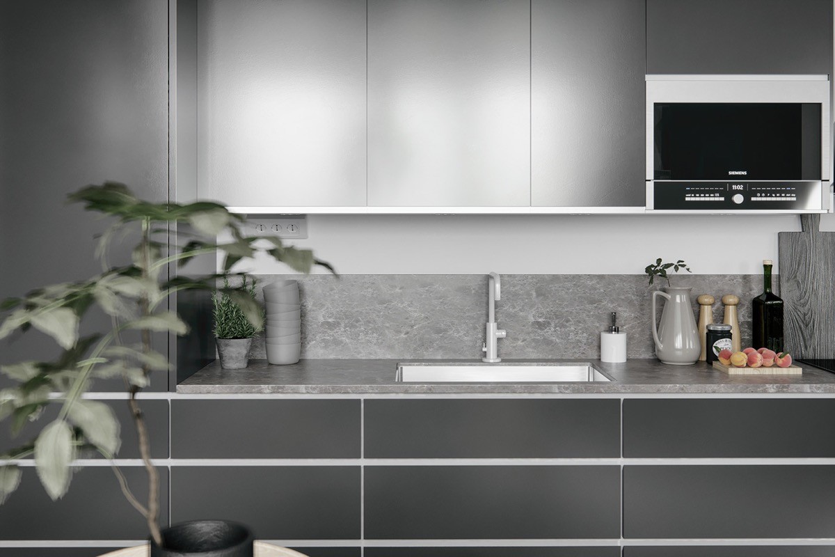
The kitchen itself is made up of modern flat-fronted charcoal coloured cabinets, with a grey countertop and backsplash.
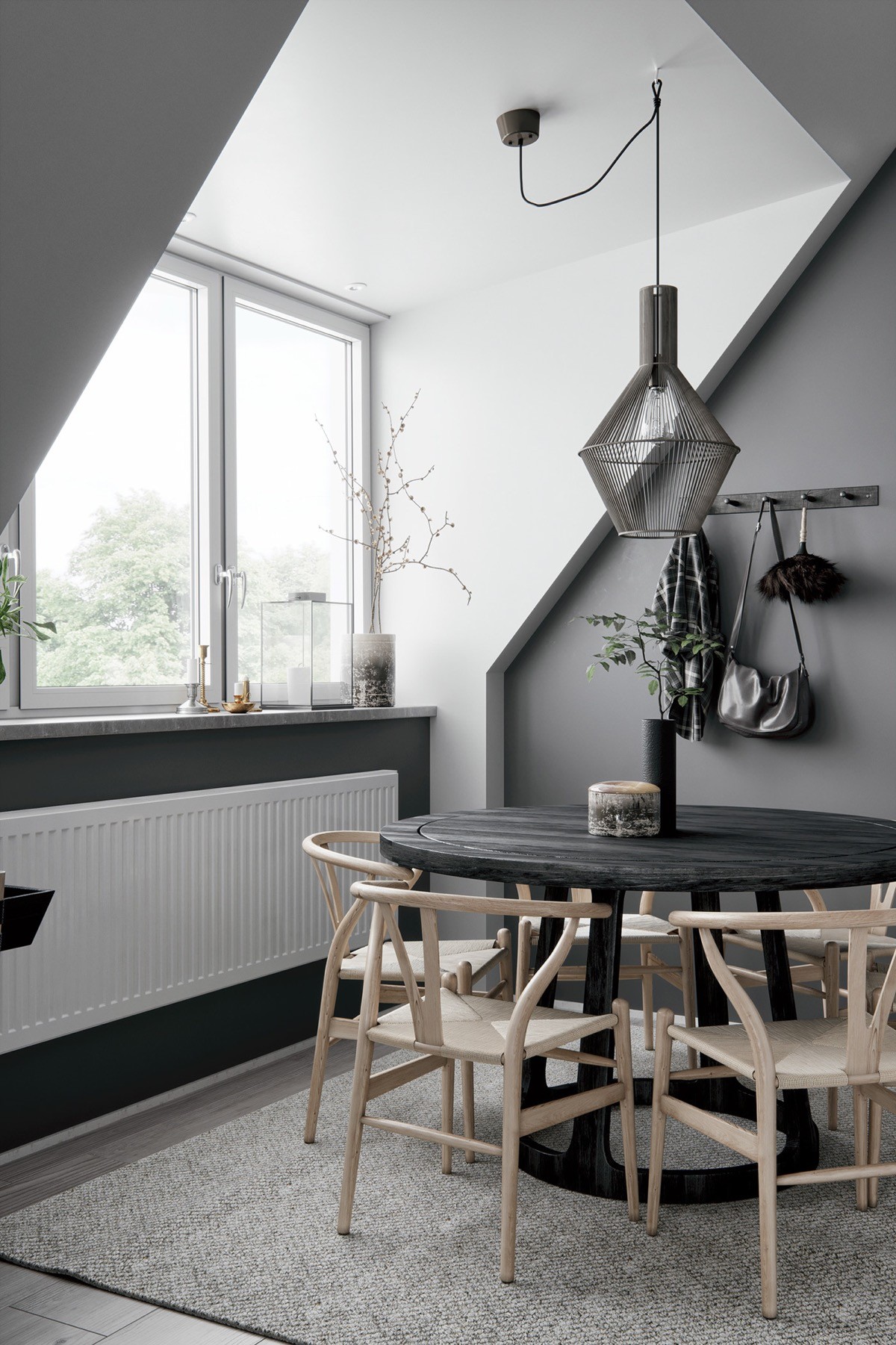
The dining suite comprises of a round black table encompassed by six light wood Scandinavian style chairs. The Wegner style Wishbone chairs sit atop a textured grey area rug to clearly define the eating area.
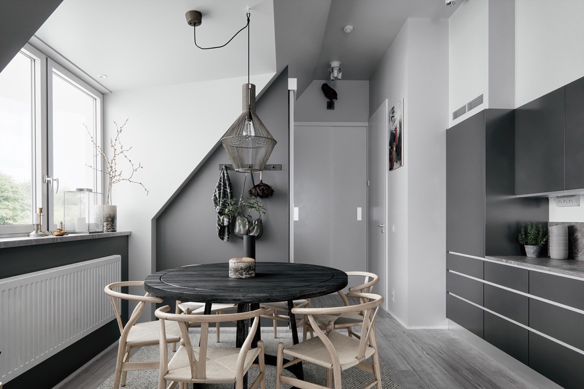
Above the table, a wire framed dining pendant light further anchors the eating zone in place.
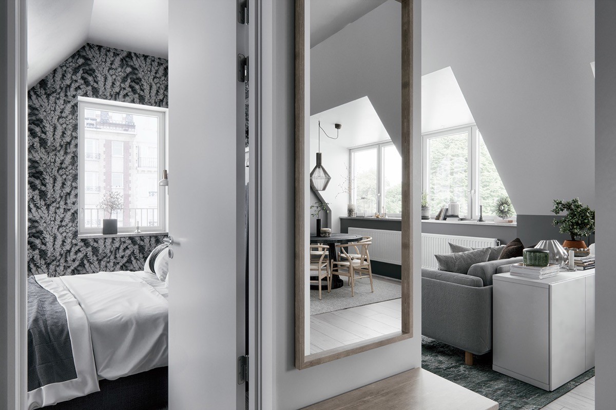
Another flourish of light wood tone is found in the form of a full length entryway mirror and a small bench. Around the corner is the master bedroom.
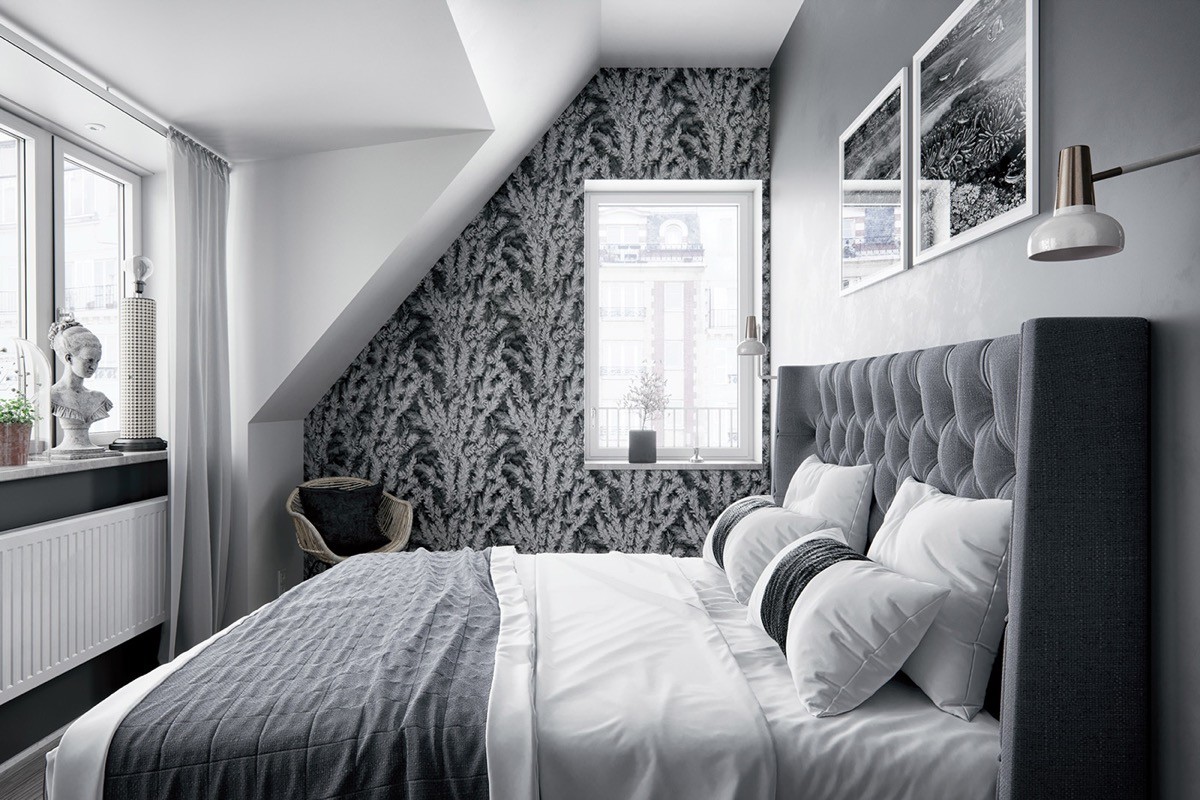
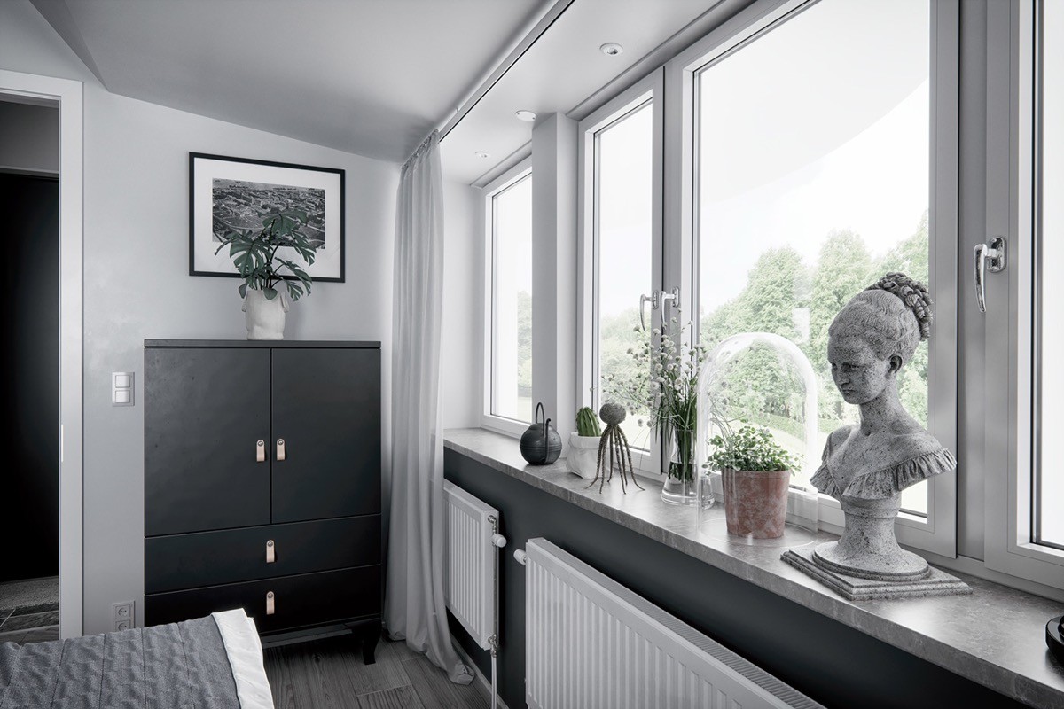
Heavily patterned wallpaper over one small section adds a little flourish to the scene. A bedroom wall sconce introduces a flash of metallic at each side of a classically tufted and winged grey headboard.
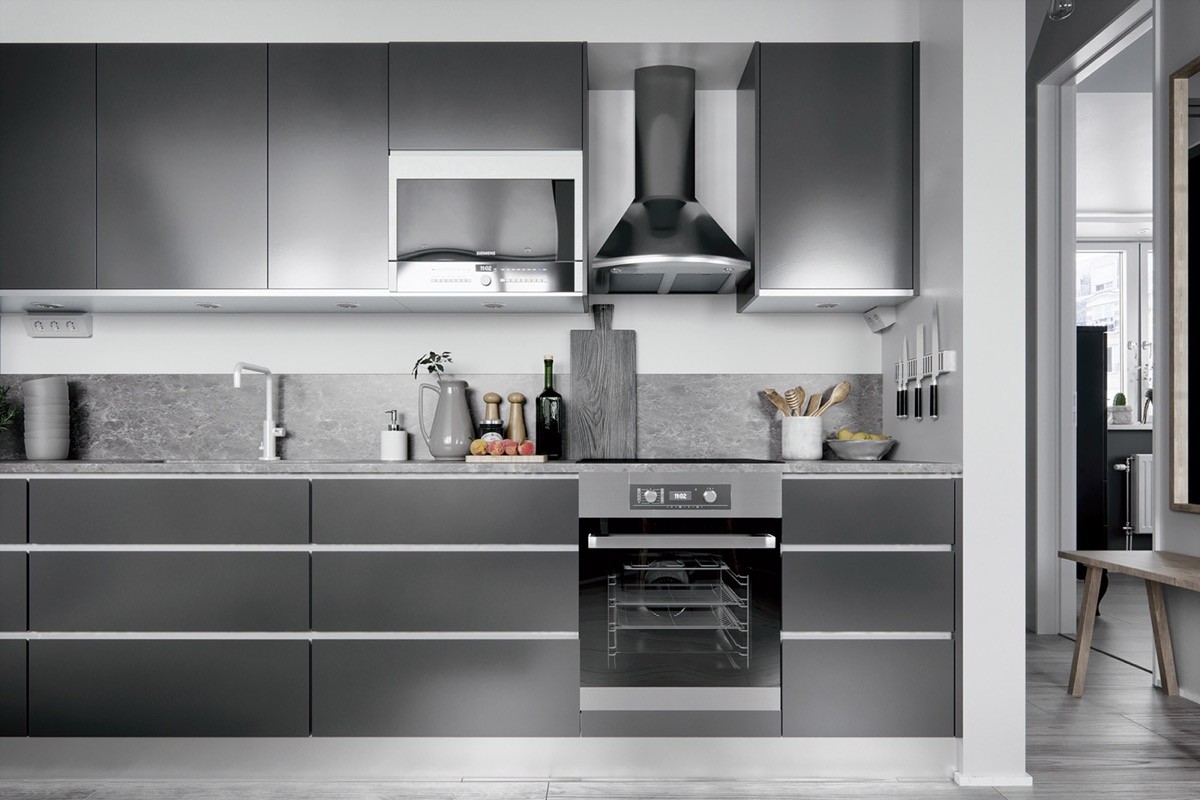
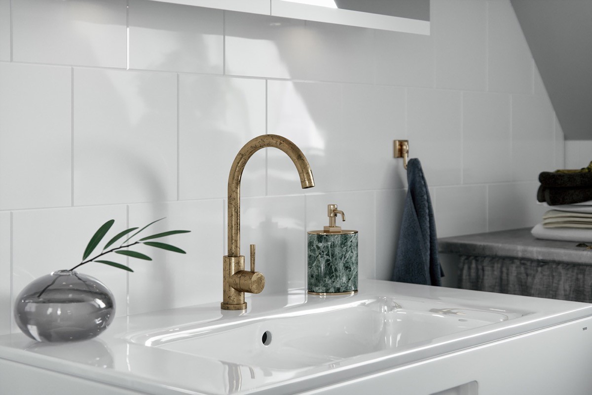
are a great base for contemporary white fixtures like this solid white faucet.
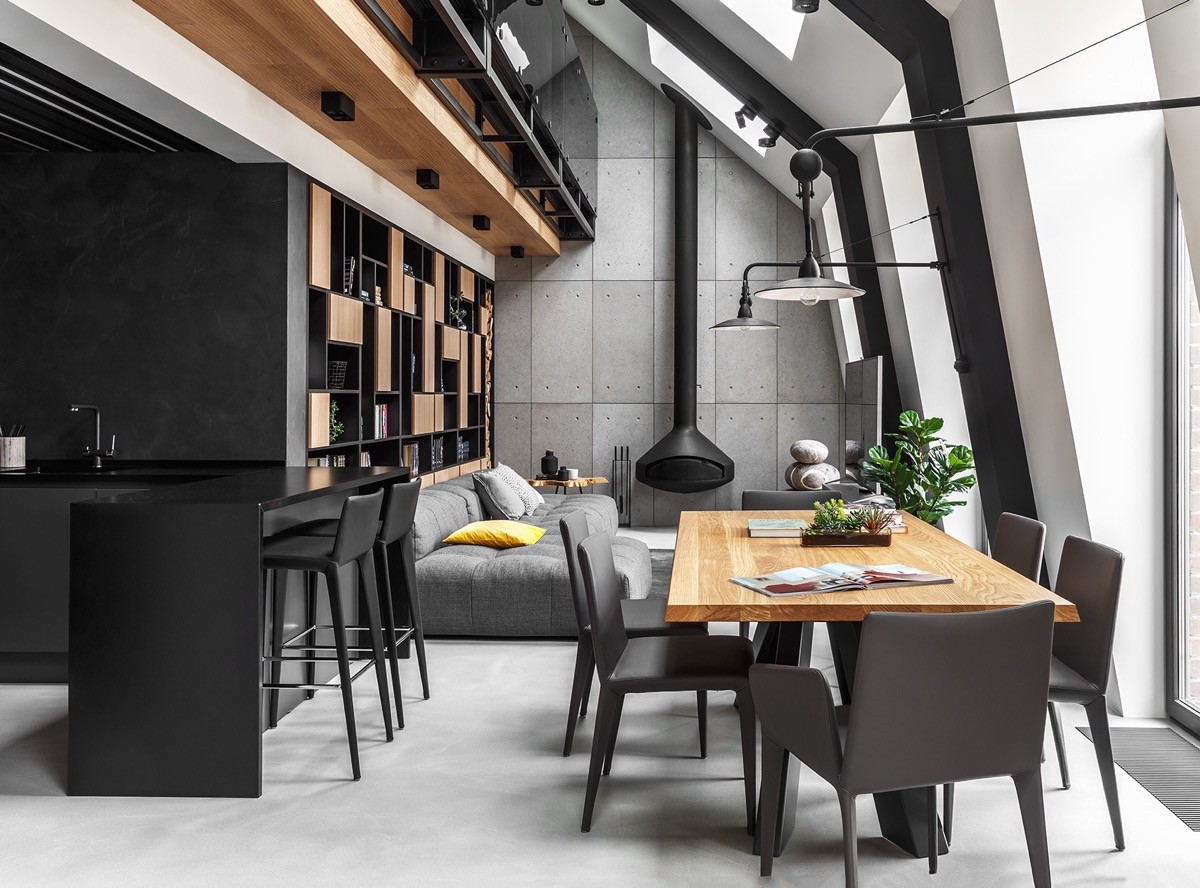
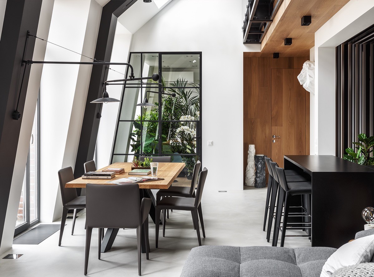
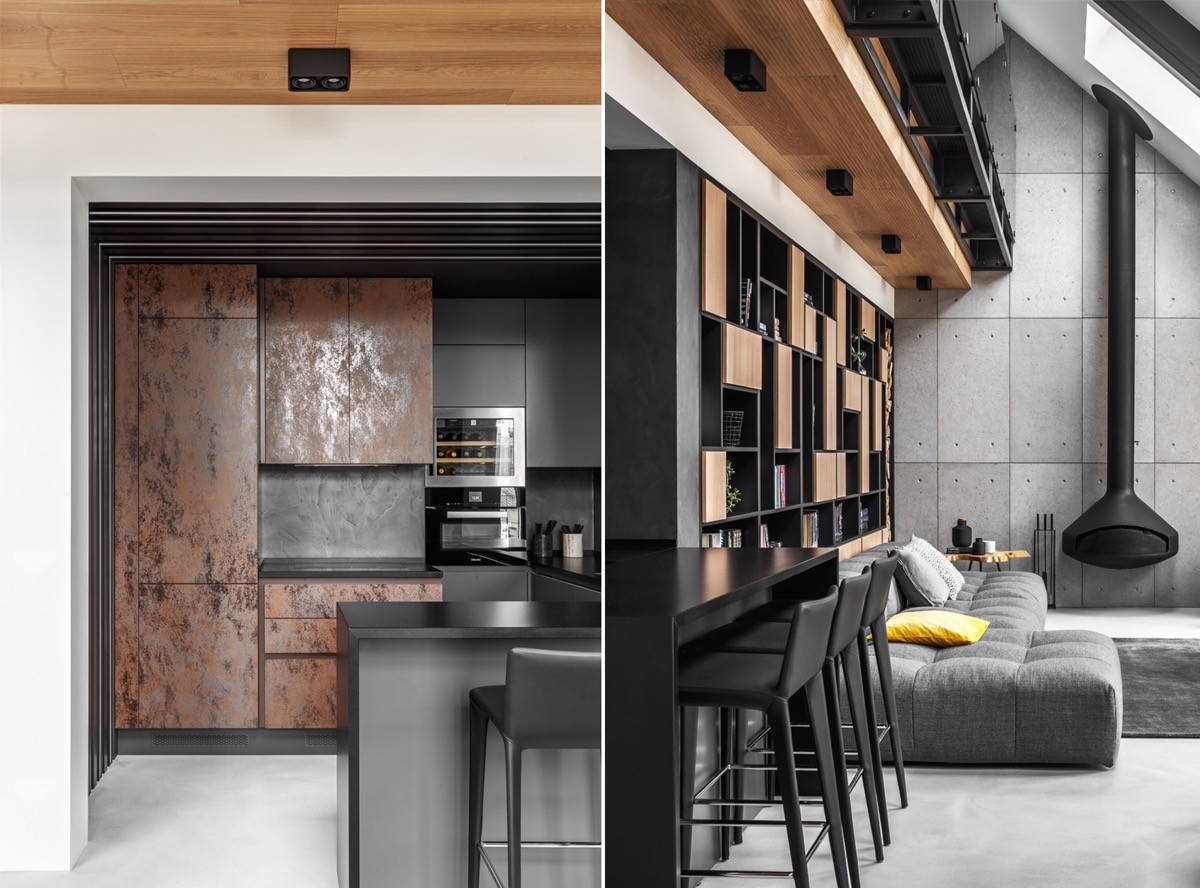
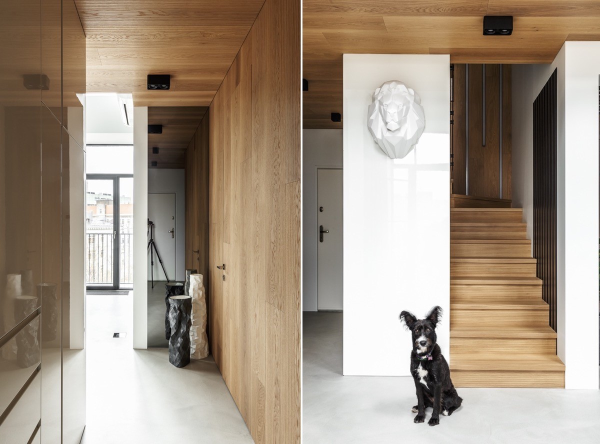
Attic apartment number two gets added oomph from a large dose of honey coloured wood tone over it’s industrial grey base. Concrete living rooms provide a strong and edgy approach to a grey palette.
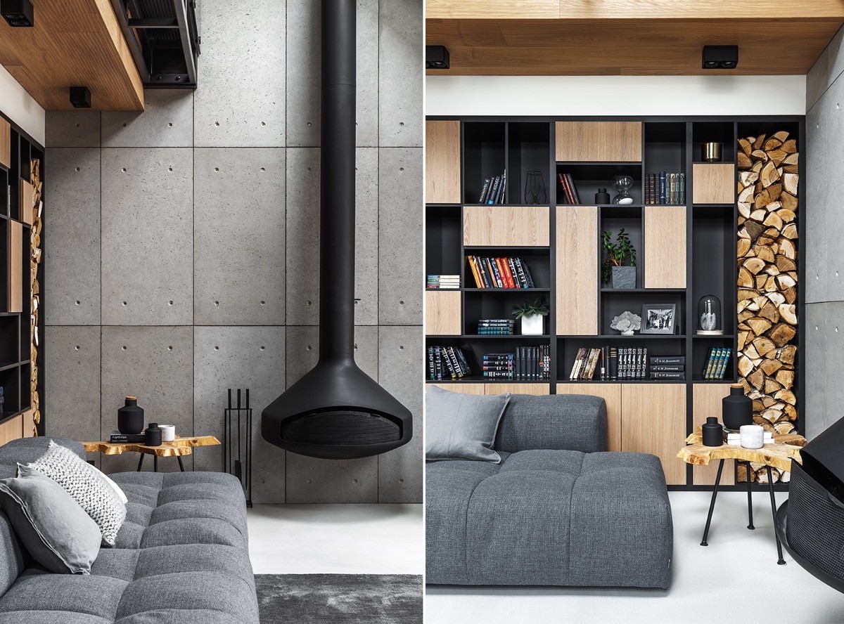
A ceiling mounted fireplace acts as an unusual focal point at the head of the room, but a bespoke storage unit with wooden cabinet doors competes for attention. The unit holds a stack of logs for the adjacent wood burning stove.
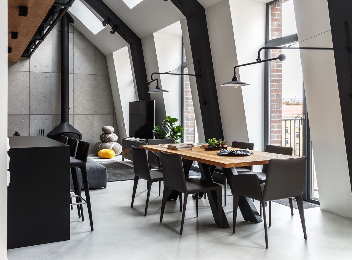
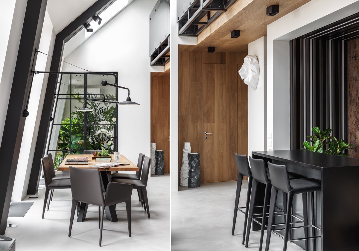
Two swing arm wall lamps stretch out over the dining area creating an unusual look.
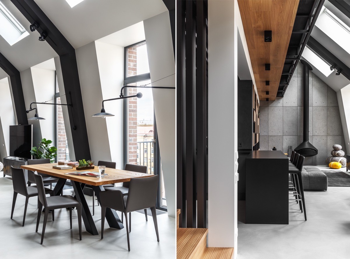
A long breakfast bar is installed as a second eating area, above which a length of wood tone disguises the underside of an overhanging mezzanine level.
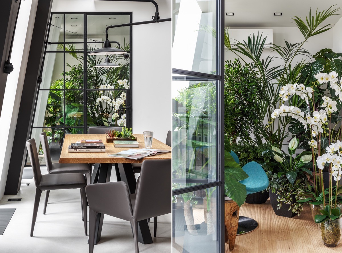
Beyond an glazed wall we can spy a multitude of indoor plants.
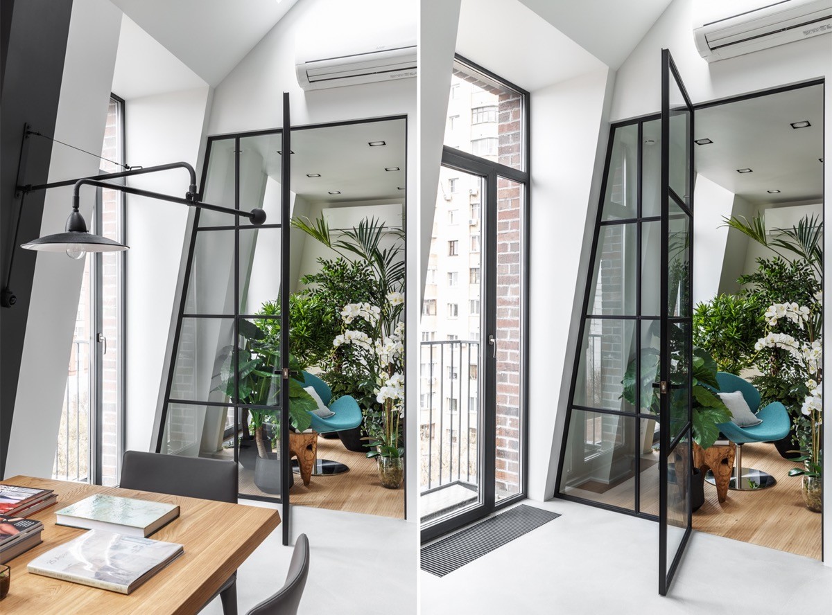
The indoor garden makes a tranquil sitting area with the introduction of a bright teal accent chair.
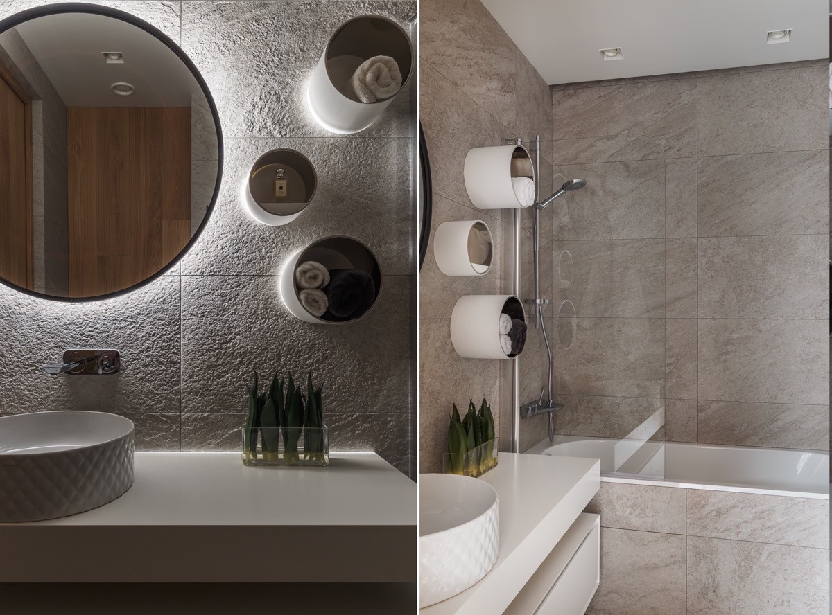
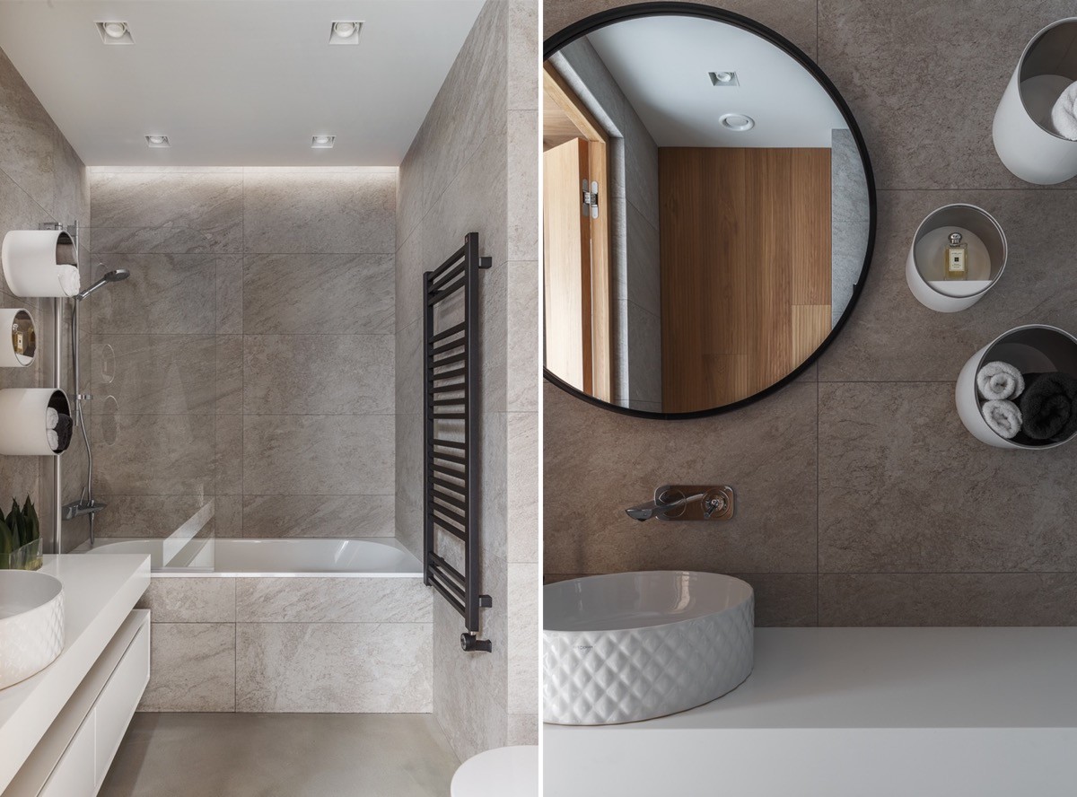
This lighting scheme draws attention to a textured wall and a set of handy wall mounted storage cubbies. The bathroom basin also has an interesting texture to its outer edges.
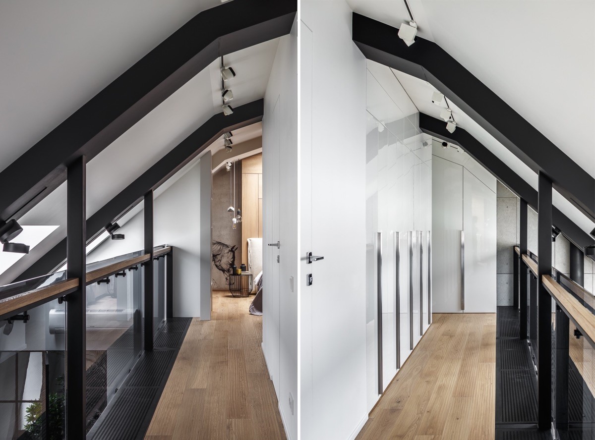
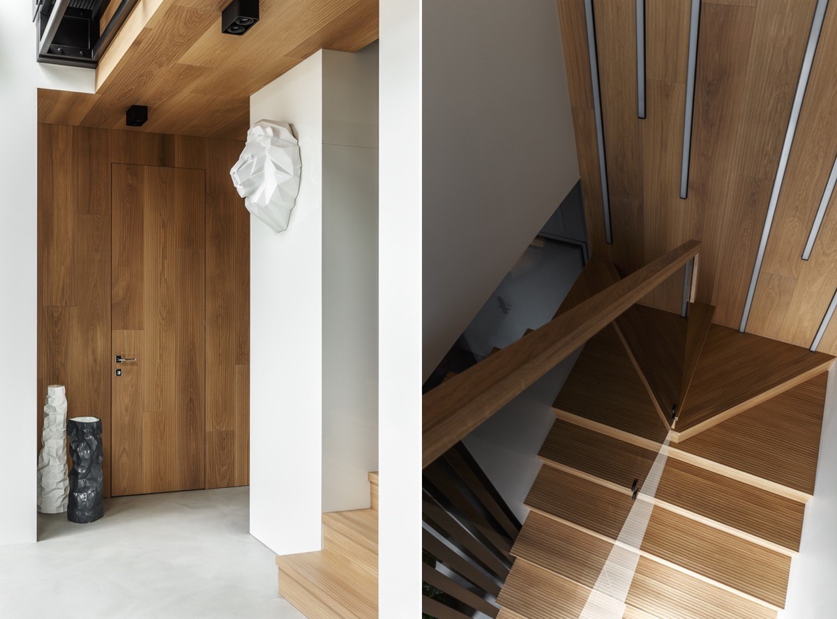
The staircase leads up to the mezzanine balcony where we find an extensive row of white gloss closets beneath black ceiling beams.
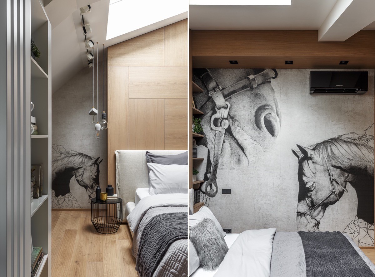
At the end of the closet run, a master bedroom reveals an interest in the equine, with monochrome horse murals applied over concrete walls.
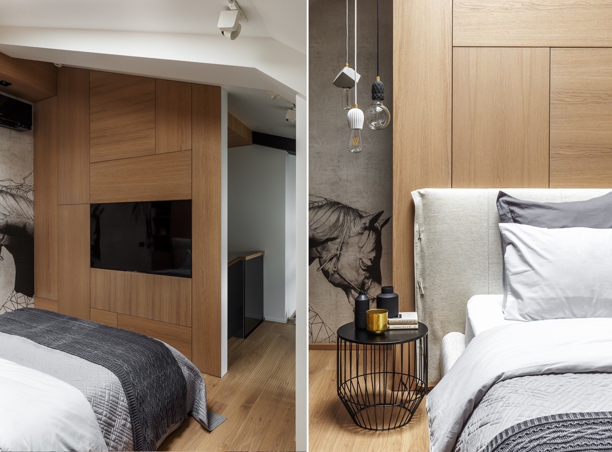
A series of wood panels have been applied across the headboard wall to create an attractive feature. The same design has been implemented on a partially dividing wall at the foot of the bed, which also holds a built-in TV screen. A simple black wire frame table acts as a bedside unit. A trio of industrial lights are suspended above it.
