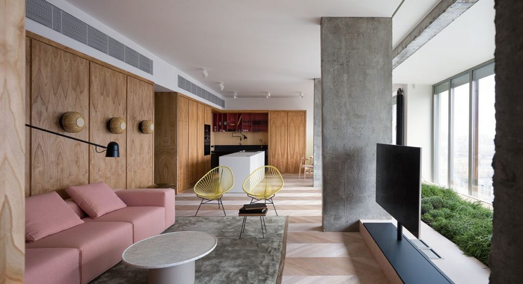
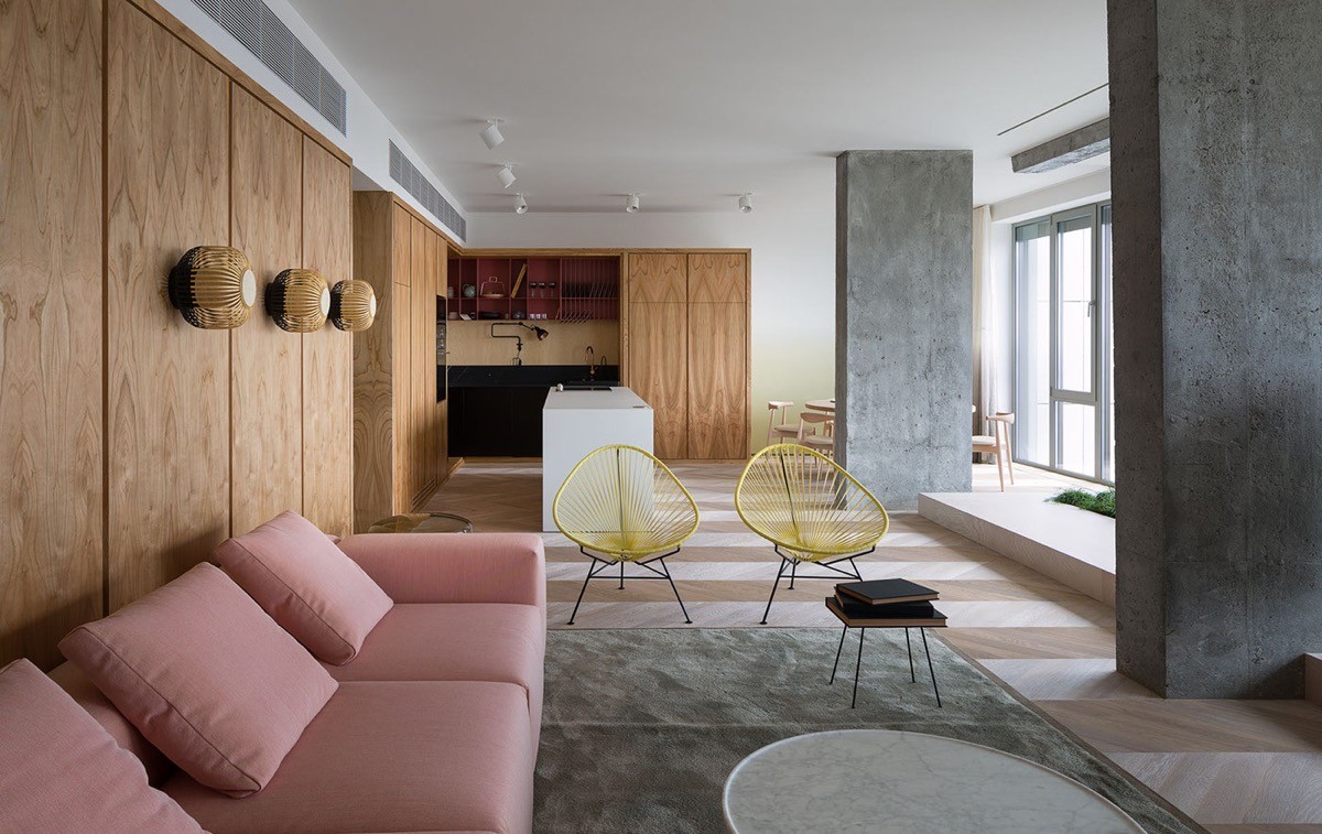
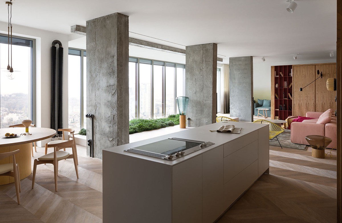
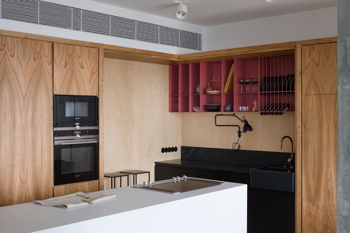
The visually warming effect of wood tone can make for a very inviting interior. Most popularly lately, we have seen expanses of wood tone working beautifully alongside shades of grey and white. Monochrome always looks chic but what if you fancy a splash of something a little more playful? The colourful elements of this wood covered interior, designed by Olha Wood, come in cheerful tones of coral pink, sunny yellow, muted red, pale turquoise and azure blue. The 1940’s inspired palette is juxtaposed with industrial styling, such as raw concrete accent walls and minimalist lighting fixtures, plus a selection of much heavier looking black pieces that appear throughout.
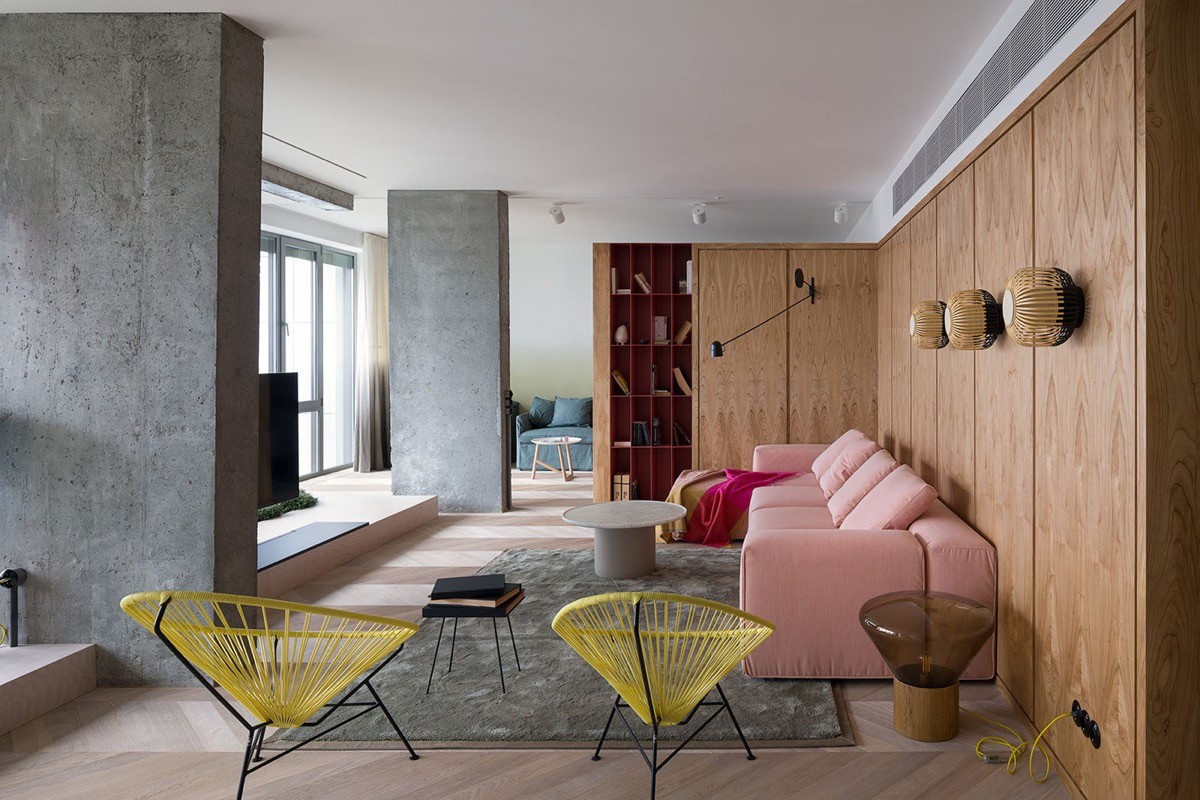
Starting in the living room we get a flavour of the 1940s colour clash right off the bat. A coral pink upholstered sofa sits in the same space as two cheerful yellow chairs and a roof red bookcase. The scene is set against a wooden backdrop that looks onto concrete columns, between which a flat screen television nestles. Matching the grey of the concrete columns is a stout grey coffee table by the sofa.
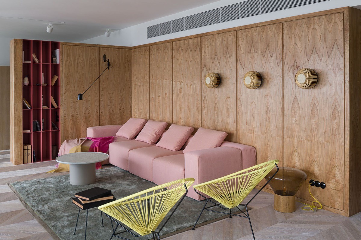
A black swing arm wall lamp lights the chaise part of the four seater pink sofa. The Counterbalance Swing Arm LED Wall Light is well situated for use next to the book collection.

The yellow modern outdoor chairs have an open weave that allows the line of sight to move on into the kitchen area with little obstruction, though the colour of the Acapulco Chair does coax the eye to linger a little.
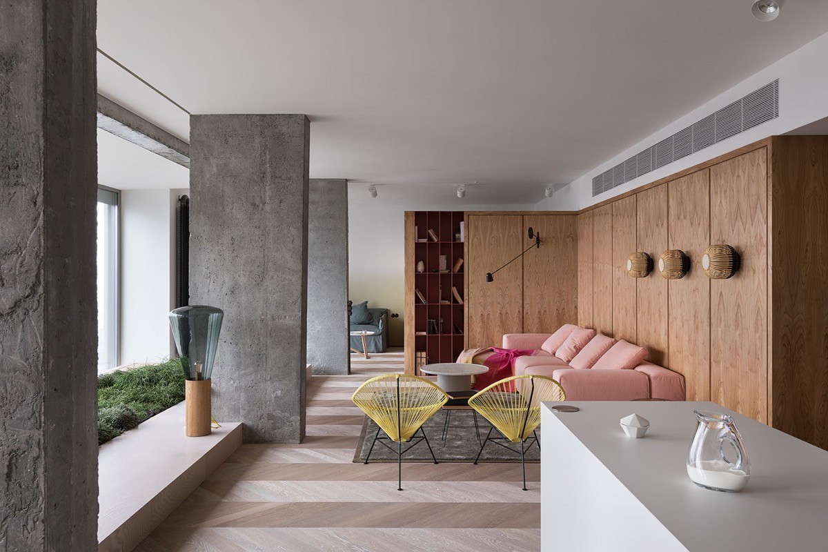
make easy decoration in an open plan lounge-kitchen-diner.
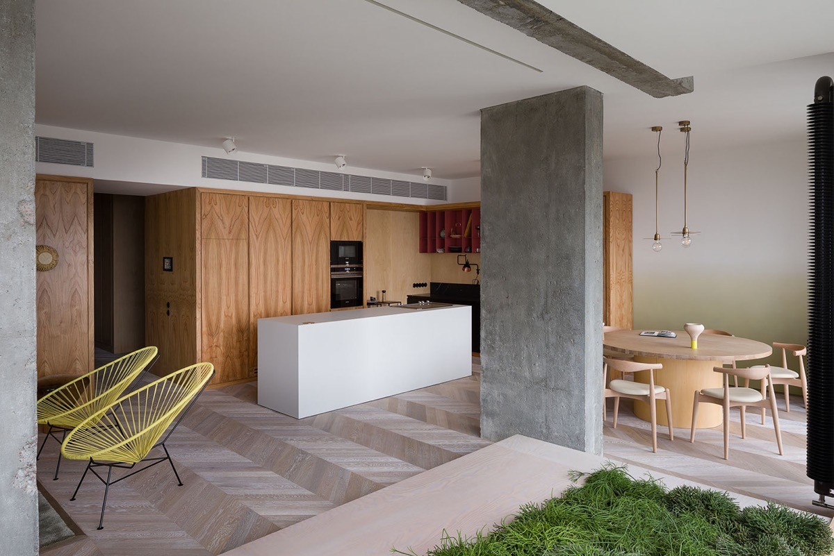
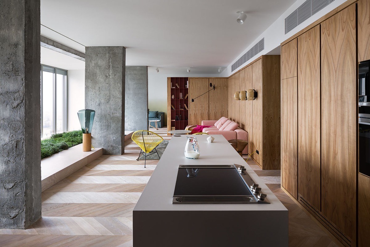
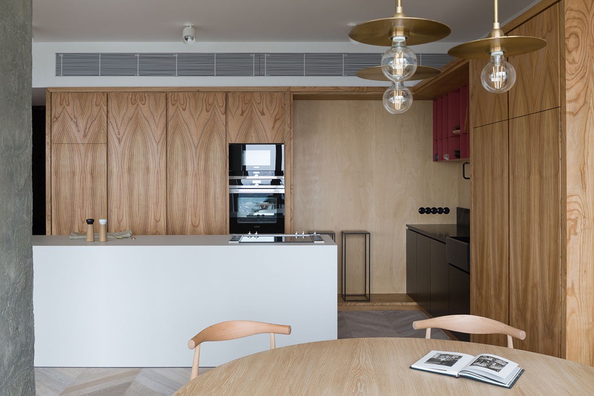
The kitchen is another imposing installation of wood tone, forming almost a mirror image with that found over in the lounge. Here the expanse of brown is broken by a crisp central kitchen island.
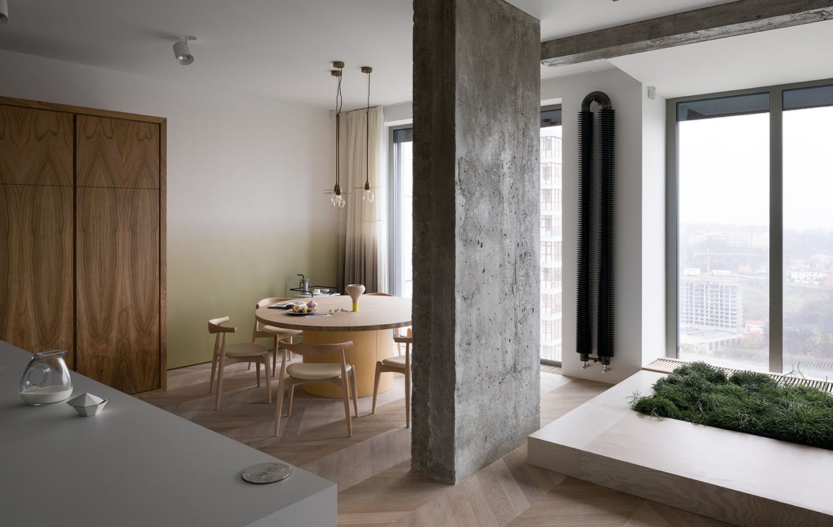
Behind one of the concrete pillars nestles a wooden dining set with Scandinavian style chairs.
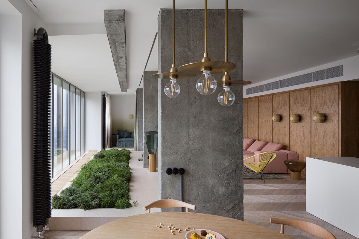
Gold coloured industrial style lighting decorates the space above the dining table. Here we can also see the extent of the built-in bed of shrubs that runs the entire length of the room, situated beneath the large windows. A concrete beam runs above it.
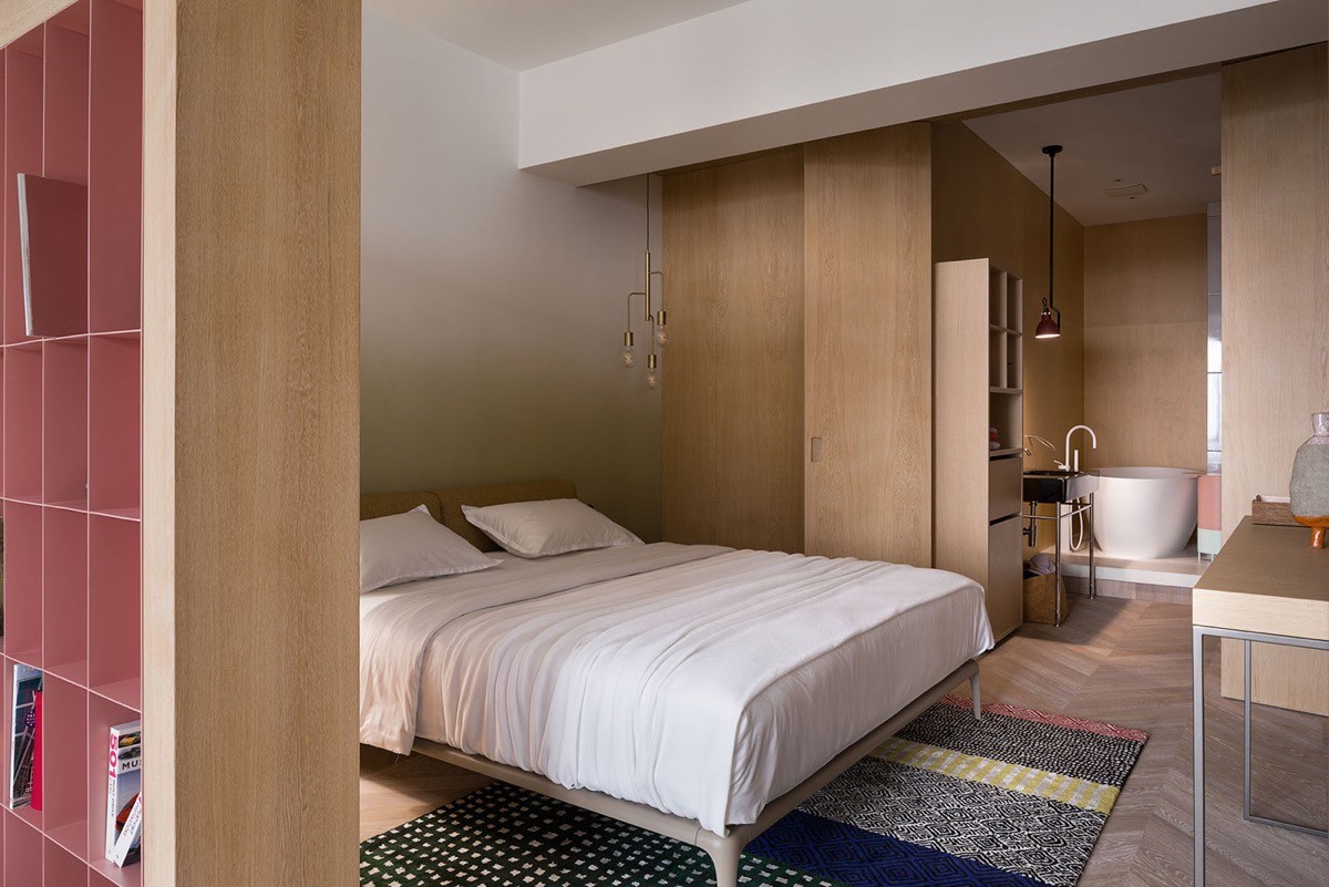
A patterned multicoloured floor rug brings all the hues of the apartment so far together in one place.
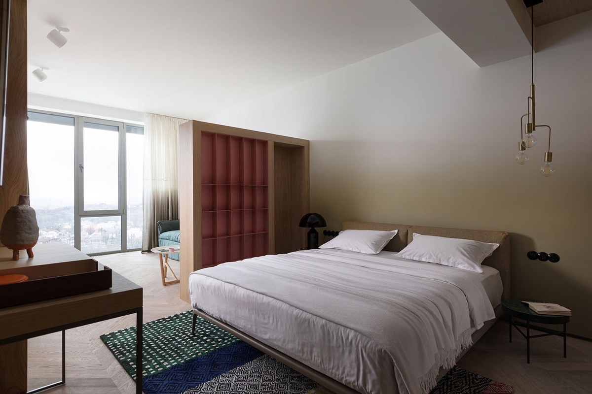
Here a bookcase doubles up as a room divider between a sleeping area and a small bedroom lounge where the spectacular views can be enjoyed, or a book can be read from the bookcase in bright natural light.
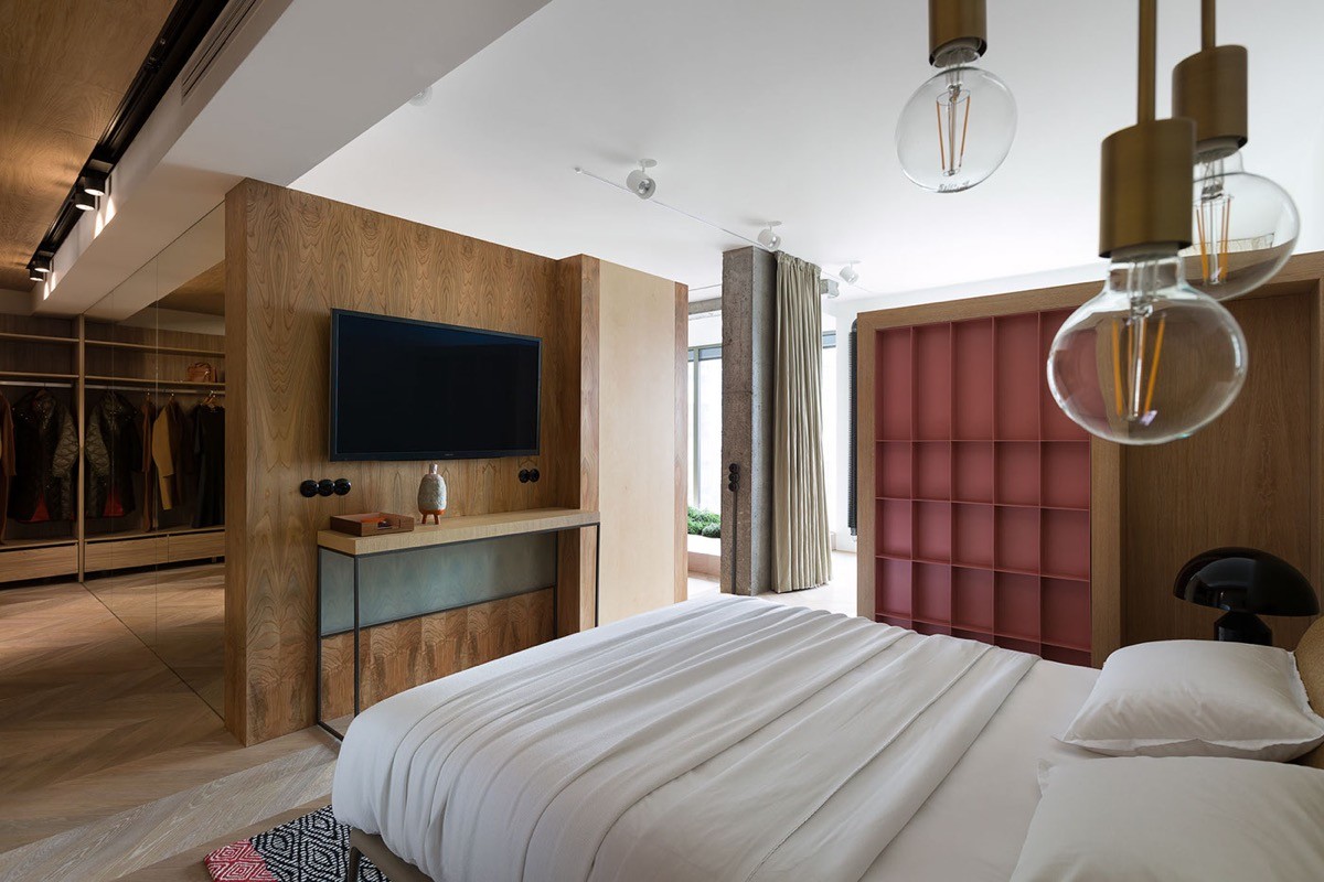
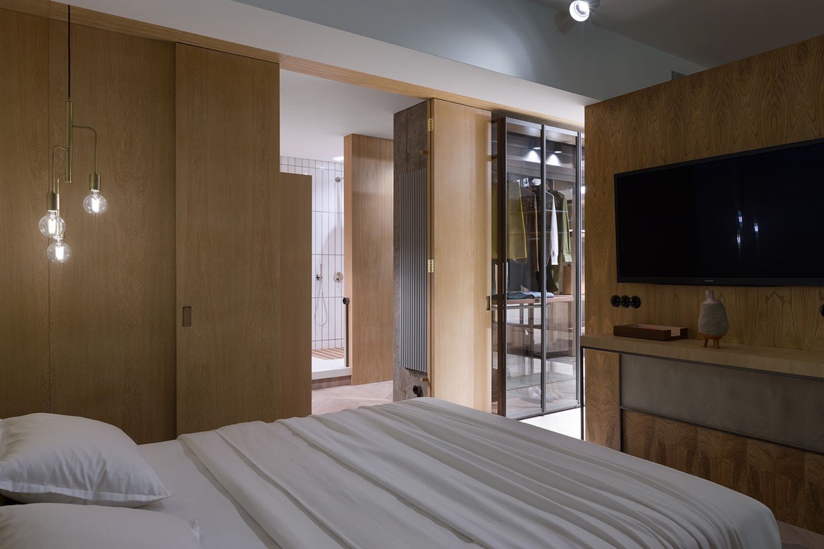
A wood console stands against another wooden dividing wall. This time the other side of the divide takes us into a closet.
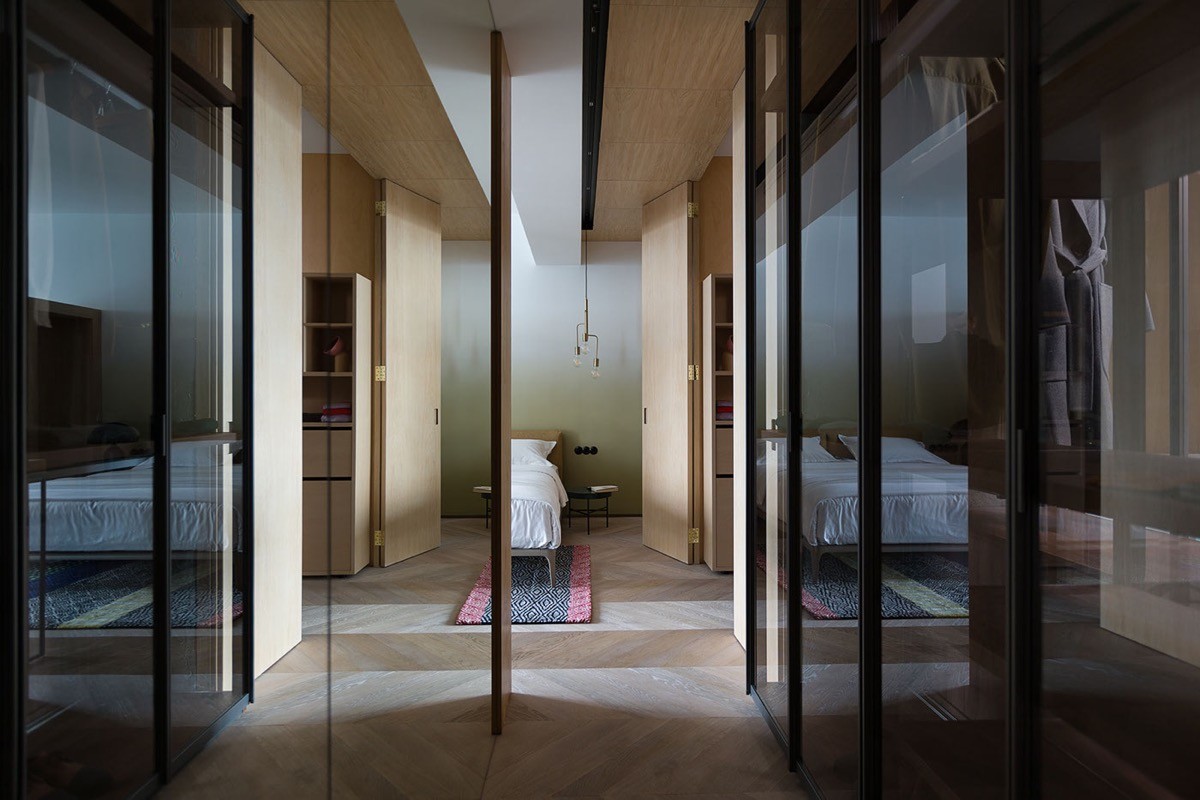
One wall of the closet is lined with mirrors, which makes a narrow hallway appear more open and bright.
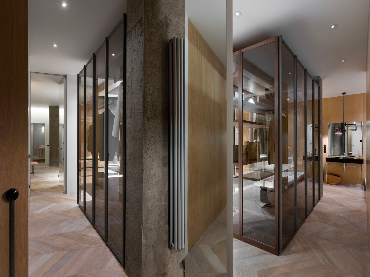
The closet doors are fully glazed, and the contents are able to be viewed from both sides of the closet volume that backs onto the bathroom.
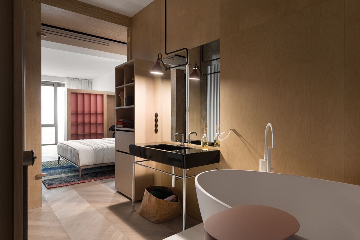
In the ensuite bathroom a black basin and industrial light contrast against a white freestanding bathtub and white faucet.
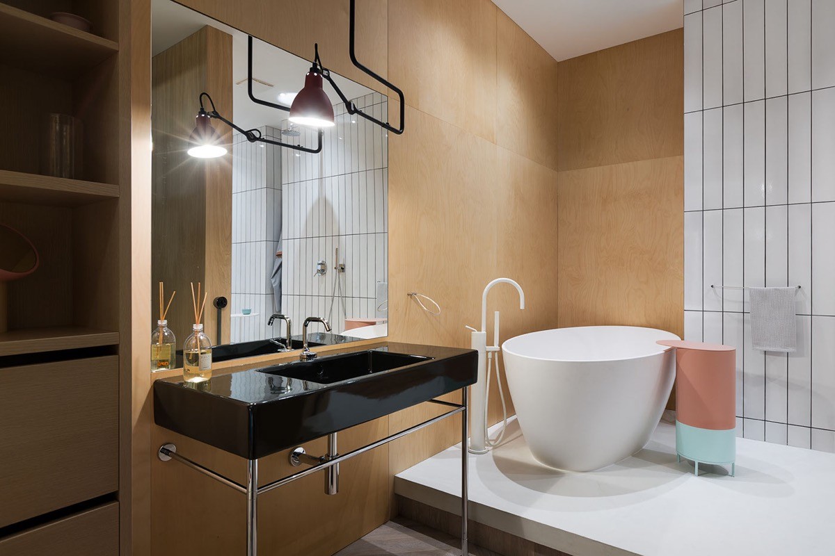
A cylindrical coral pink and light turquoise side table is situated by the bath. The bathtub is set upon a higher floor level, which gives the bathing area a look of being centre stage. A feature wall of white tiling matches the white floor of the platform.
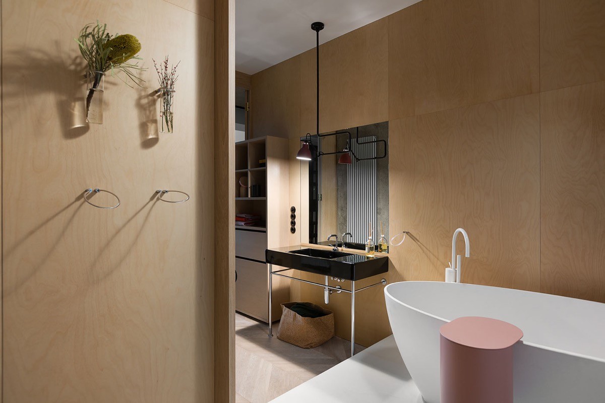
An installation of wall vases hold a sprinkling of greenery in the bathroom to bring in a relaxing hint of nature.
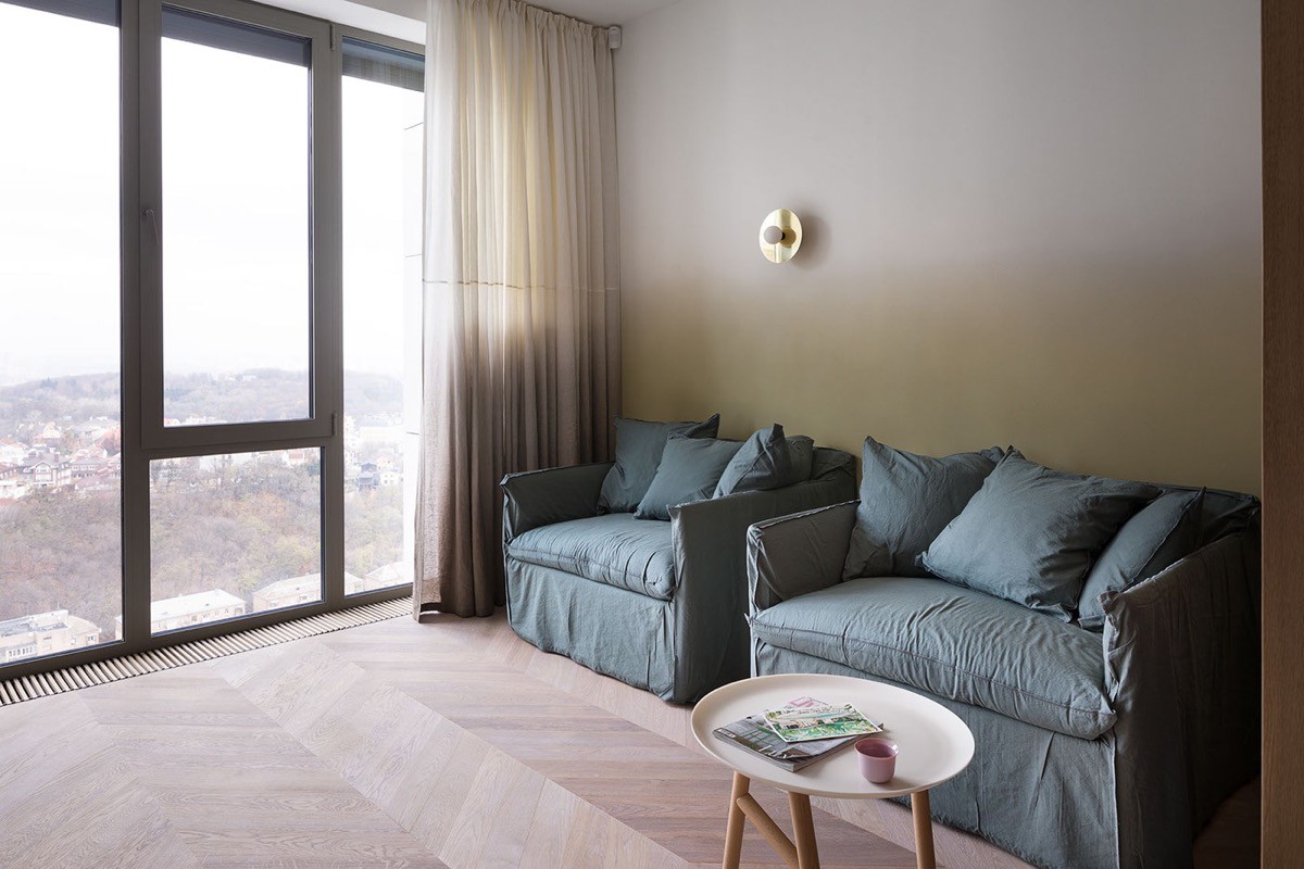
Back in the bedroom we get a better look at the reading area beyond the room dividing bookcase. Two soft armchairs make this a spot for a couple. A golden wall sconce provides some extra lighting. A small round end table gives a place to rest the morning coffee cups and a few current magazines.
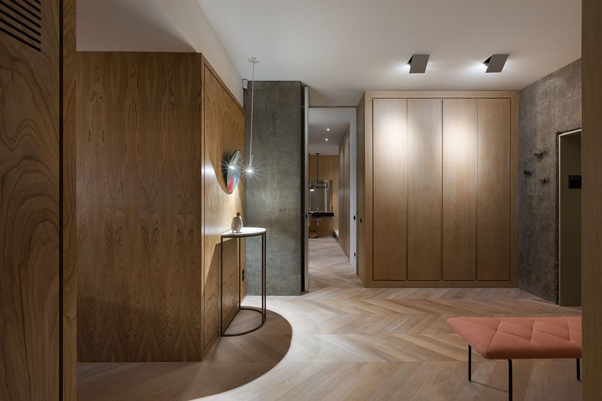
In the home entryway we find a continuation of attractive herringbone floor, and more wooden storage options.
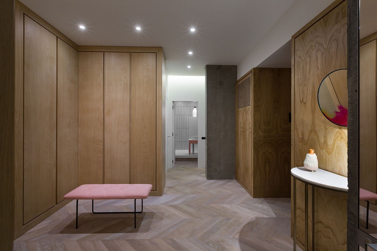
A coral bench brings a splash of the 1940’s colour through into the welcoming area, set to make a bright first impression.
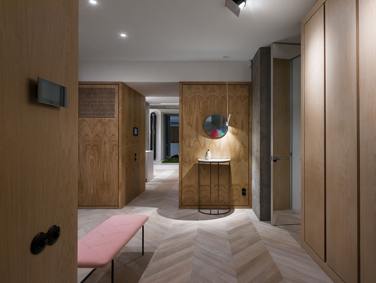
A neat half moon console table stands beneath a small round mirror and a minimalist light. This providing an opportune place to check ones appearance before leaving and drop keys on return.
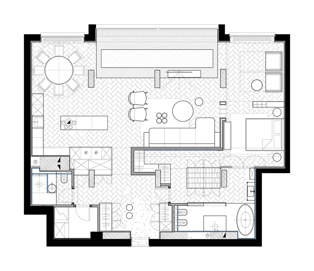
The home plan gives us a much clearer view of how the glass sided closet runs along a narrow hallway off the bedroom toward a separate end closet, whilst also being accessible from the bathroom. We can also see on this plan how the platform that runs beneath the bathtub seems to continue on for some distance, where it holds a shower cubicle, WC and bidet. Through this digital sketch it becomes clear that the reading area in the bedroom looks directly out into the living room, giving more weight to the implementation of the bookcase room divider between the sleeping area.
