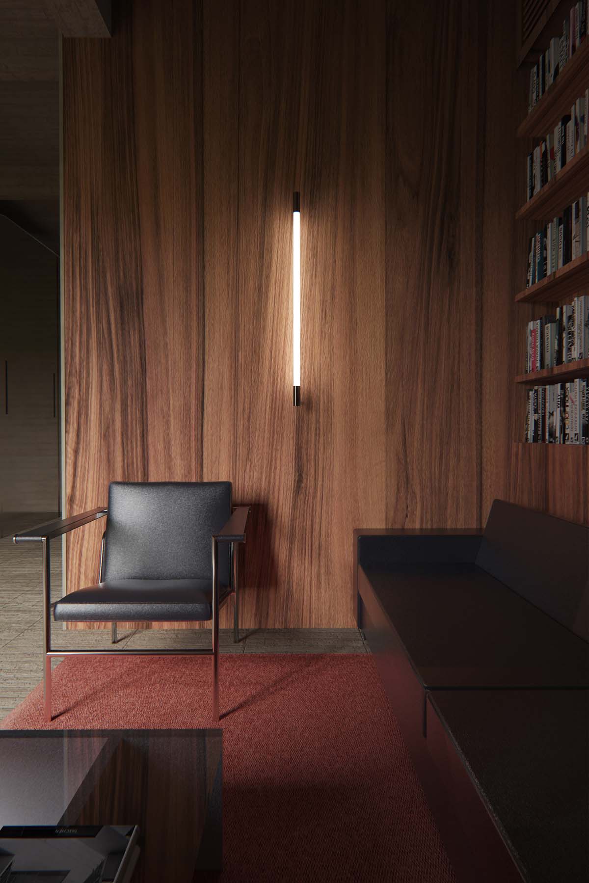
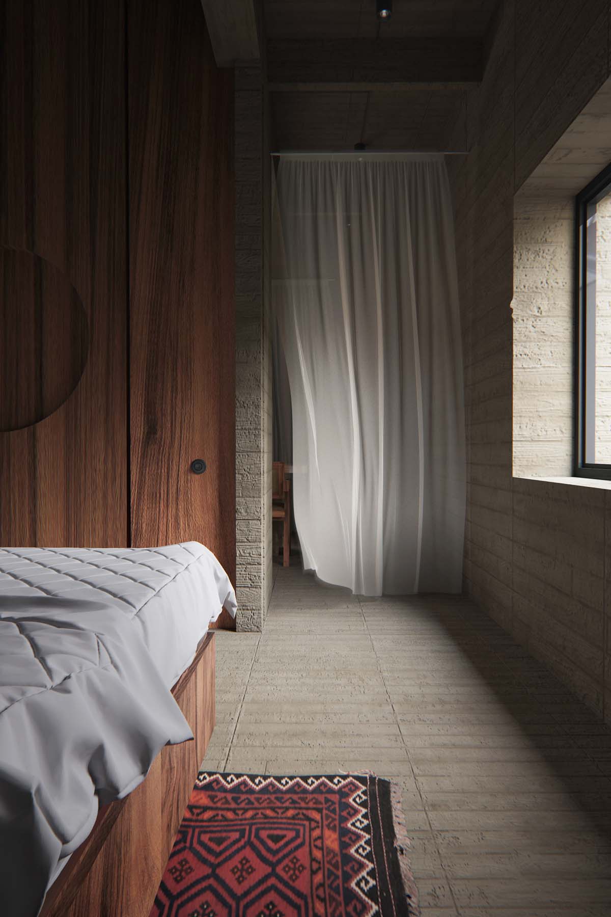
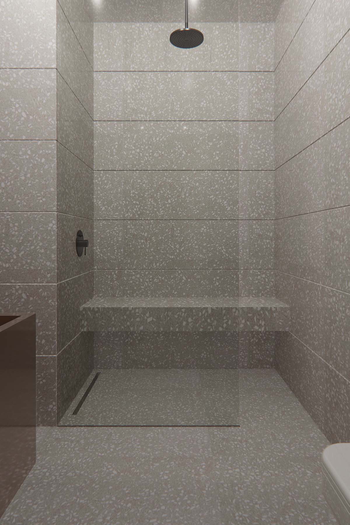
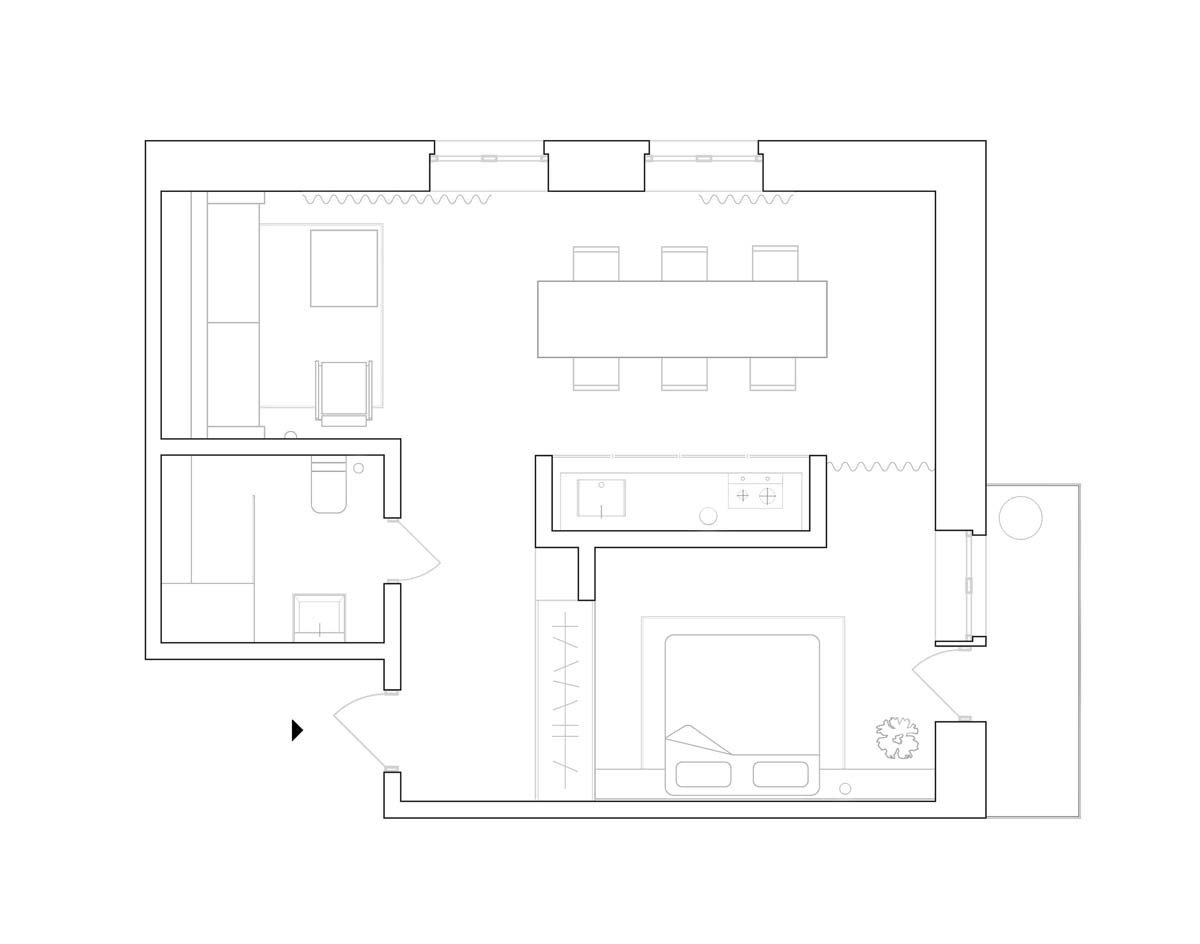
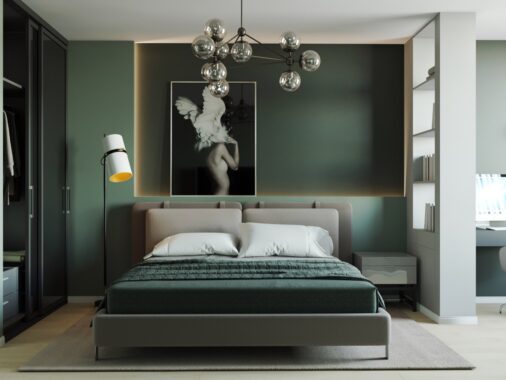
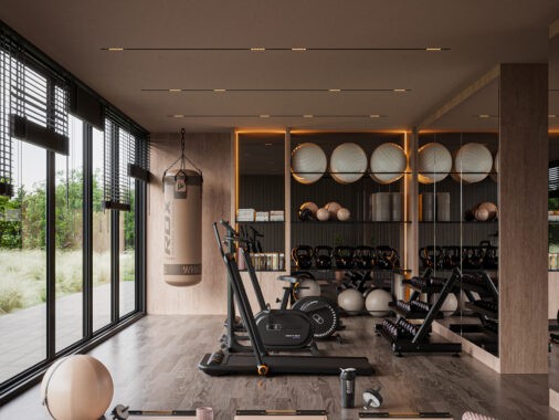
Dark themes are great for creating a sophisticated looking home. Sometimes though, homeowners who have smaller scale apartments may shy away from darker themes in fear that it may cause their living space to appear more cramped, especially if there isn’t a huge amount of natural light to begin with. However, dark sophisticated decor can work over any room dimensions, just like the rooms of these three apartments that are all approximately just 50 sqm in area. These home tours use charcoal grey walls and dark wood panelling interspersed with white walls and lighter pieces of furniture to break up the deep tones and maintain a spacious look.
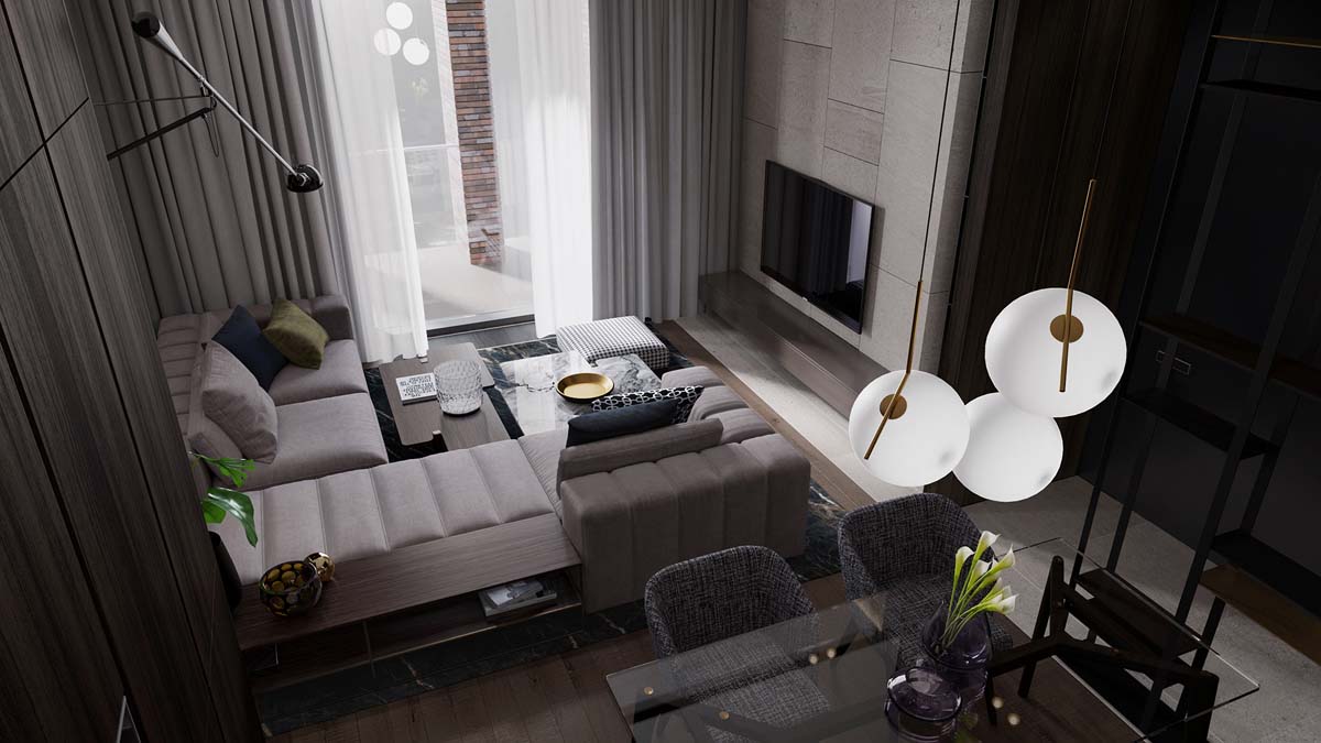
The first of our three dark decor apartment schemes utilises shades of grey to create light and shade across a compact open plan living area. The window does not flood the home with vast amounts of natural sunlight but the instances of stylish modern lighting are well placed around the layout.
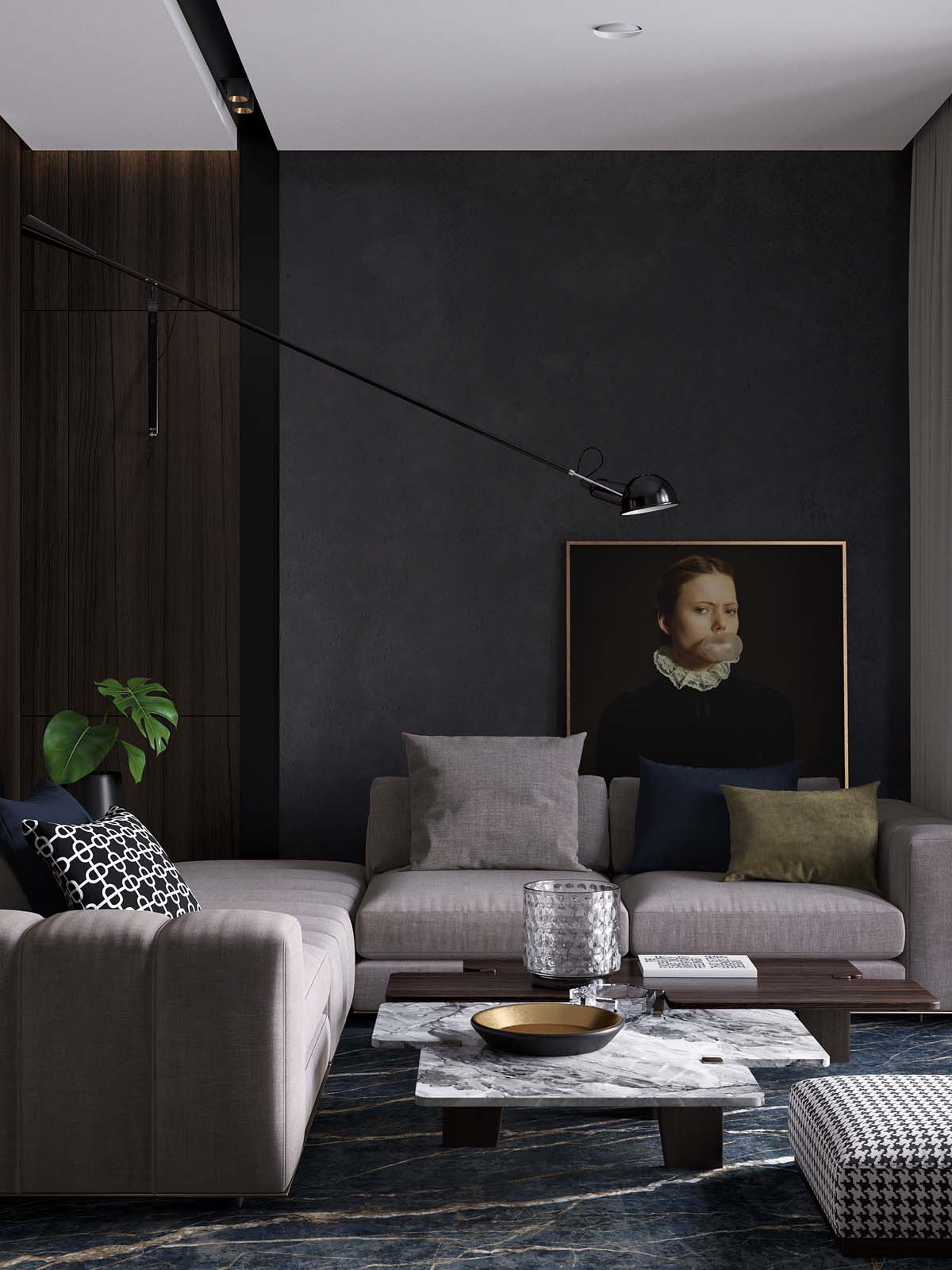
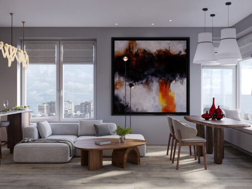
The couple who live here have items of humorous artwork on display to further lighten the mood of the home, like this portrait where a serious looking subject is seen to be blowing bubble gum. The long reach of the Flos Mod 265 Wall Lamp places the light source directly over the artwork that is tucked casually behind a pale grey modular sofa.
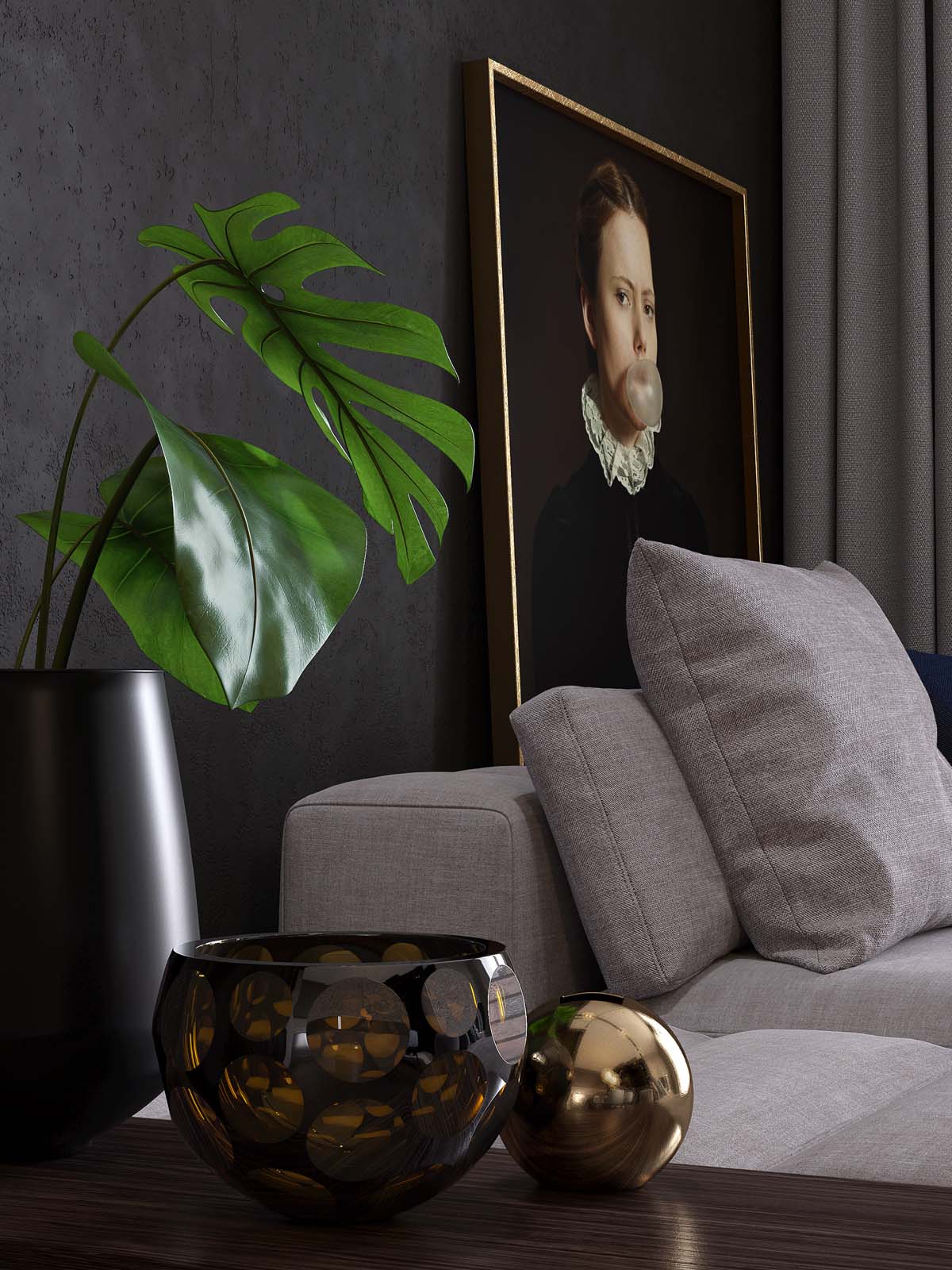
A decorative vase holds a display of artificial tropical leaves to add a small boost of fresh colour. Accents of gold bring a subtle sheen to the scheme.
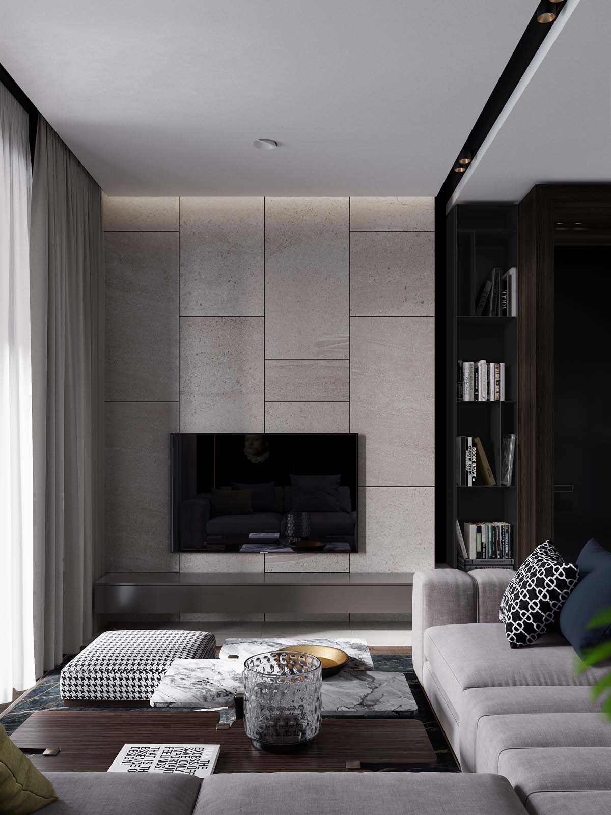
Scatter cushions on the sofa are either of a solid deep blue hue or a patterned monochrome design that matches a nearby footstool, and works to lift the look of the small room.
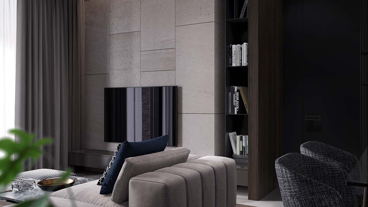
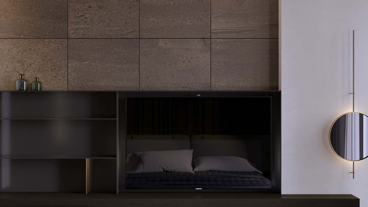
A stone clad wall behind the television matches the lighter tones of the upholstered sofa. The stone comes to a stop at a set of black recessed bookshelves, up against a deep walnut wall.
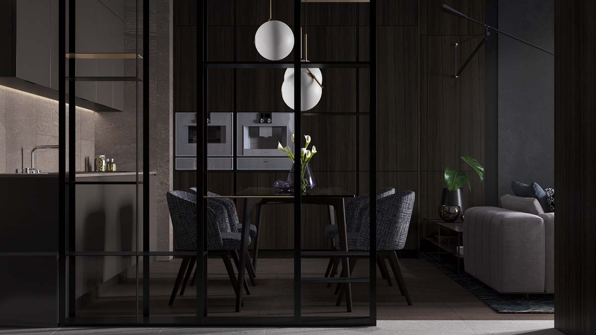
The dining pendant lights are large and white, providing orbs of bright contrast against a solid wall of rich walnut kitchen cabinets. Modern dining chairs are upholstered in textured dark grey fabric.
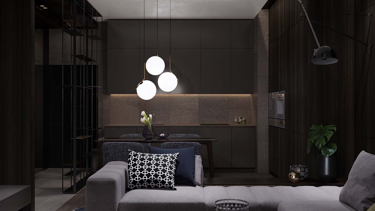
The other wall of kitchen base units and wall units are smooth grey. A strip of LED lighting runs beneath the length of the upper cabinets, washing the backsplash with warm white light. The differing colour of cabinet and the lighting effects work in tandem to produce a more spacious effect.
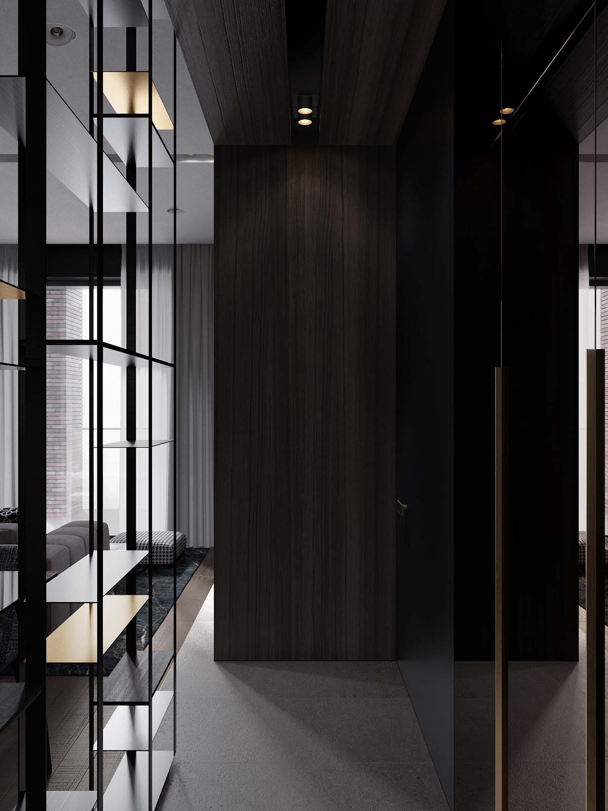
In the entryway, we’re faced with one wall clad in walnut effect where the vertical grain helps the wall appear tall, so enhances the ceiling height.
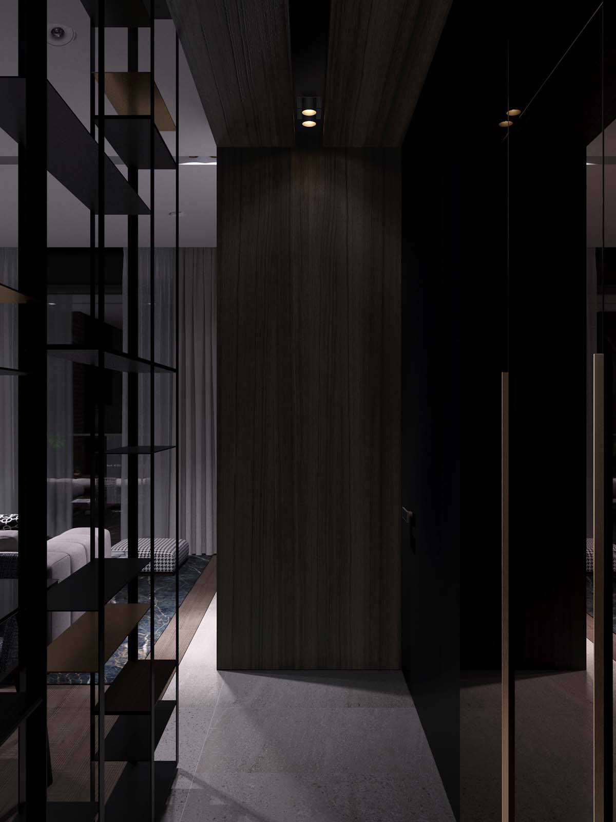
To the sides, one wall is a reflective black gloss finish and the other is a dividing wall between the entryway and the living room. The dividing wall is a series of open shelving that allows both light and the line of sight to pass straight through it so that the small area does not feel confined.
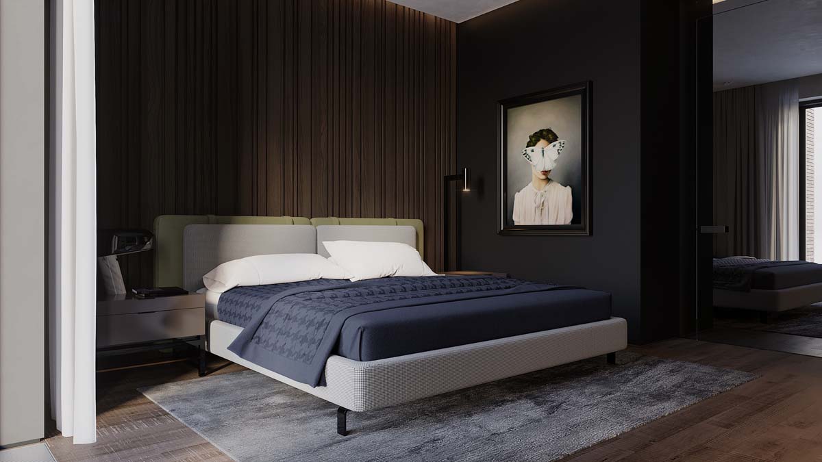
In the double bedroom we find a second piece of wall art mounted on a charcoal wall. The double bed is upholstered in a light fabric to offset the dark walnut effect behind it.
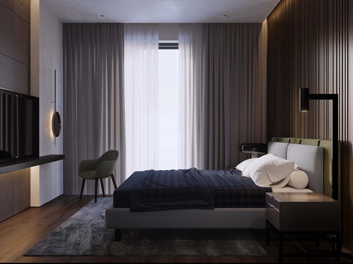
The curtains obstruct a large amount of natural light in here but a careful artificial lighting plan ensures each area is well lit, like the cool modern floor lamp by the bedside.
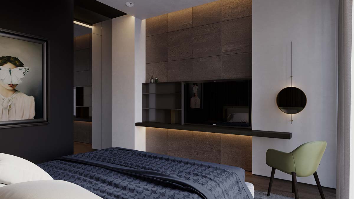
The mirrored disc over by the television is in fact a unique wall sconce.
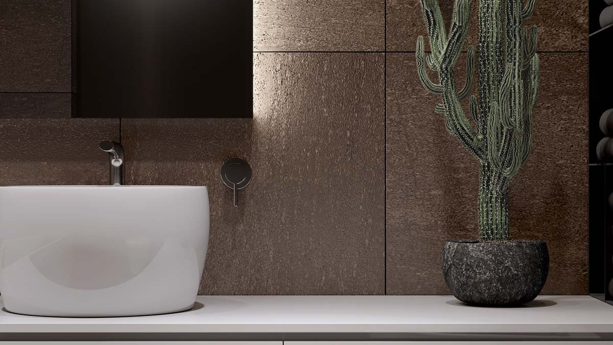
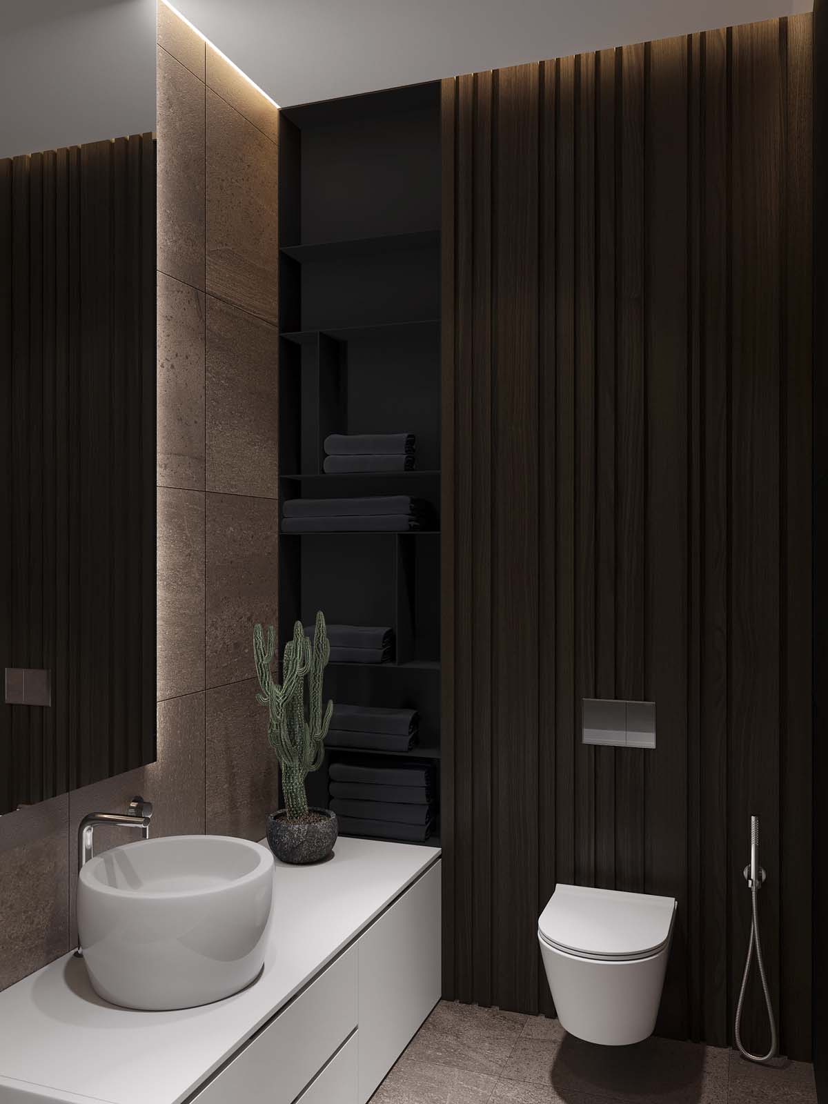
A heavy concrete planter adorns the light vanity.
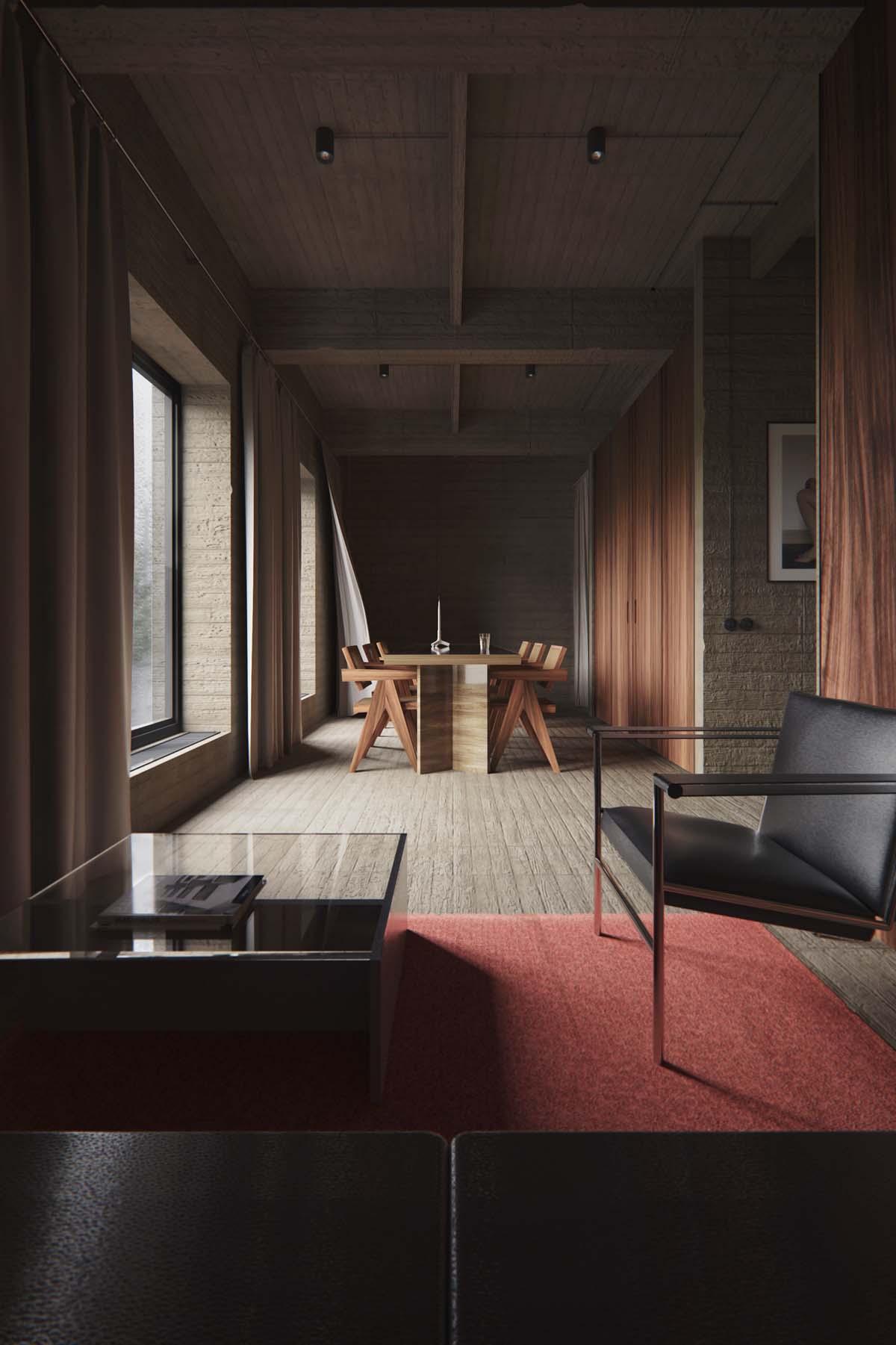
Located in Belgium, Antwerpen, the beige floors and stone walls of our second apartment counterbalance rich wood tone here too.
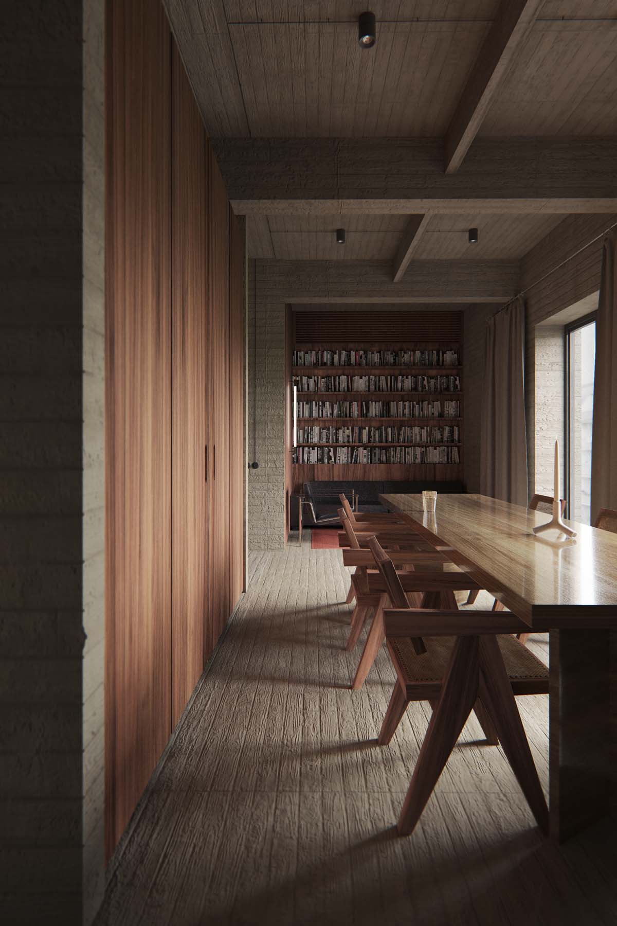
A decorative candle sits in the centre of the long dining table, ready to create added mood lighting in the evenings.
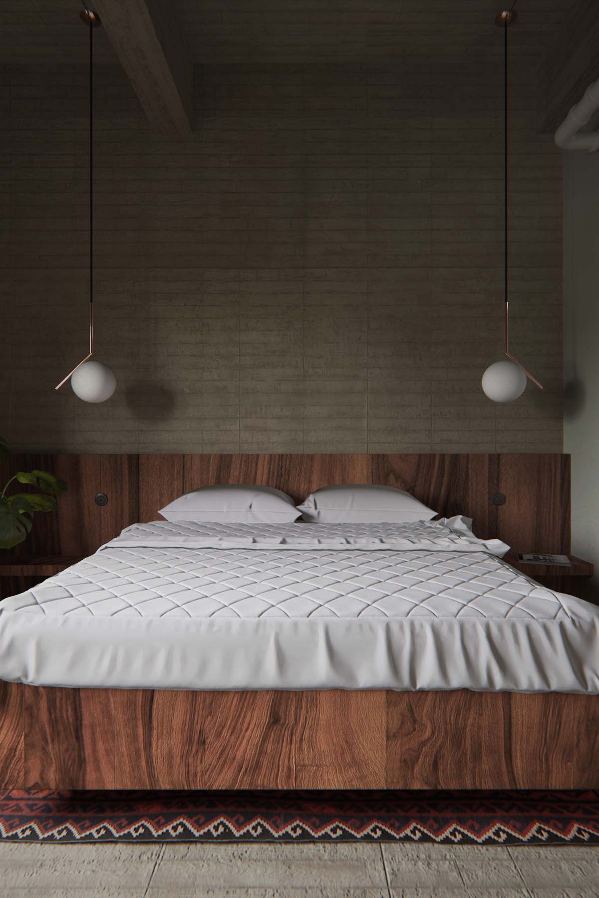
Two bedroom pendant lights decorate the space over each bedside shelf. These are the IC Lights S Pendant lights with copper trim.
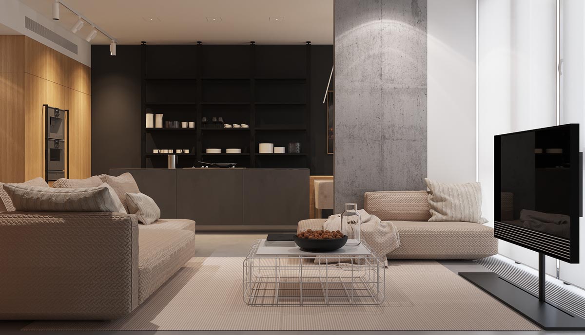
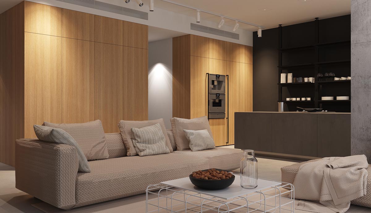
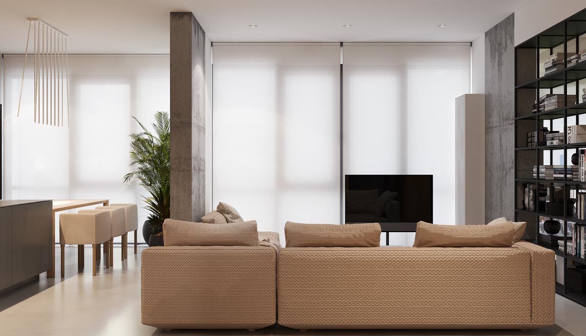
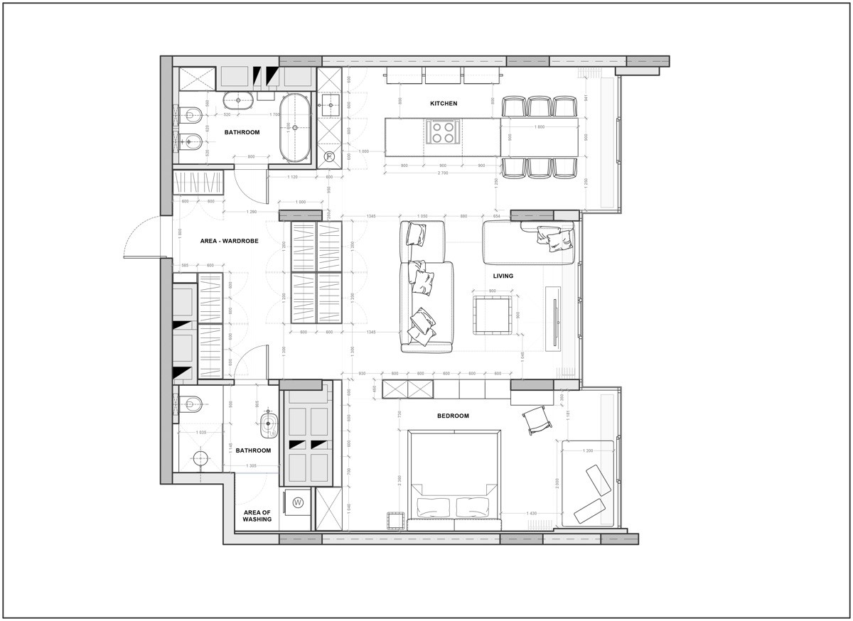
In Novopecherskiy Lipki, our third home uses a much lighter honey toned wood alongside expanses of black and charcoal.
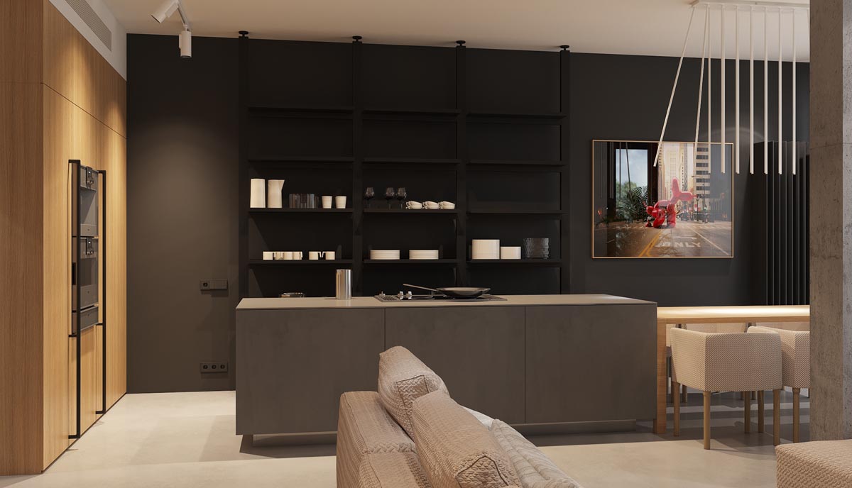
The kitchen itself is made up by a charcoal central island and a bank of exposed kitchen shelving that increases the sense of space.
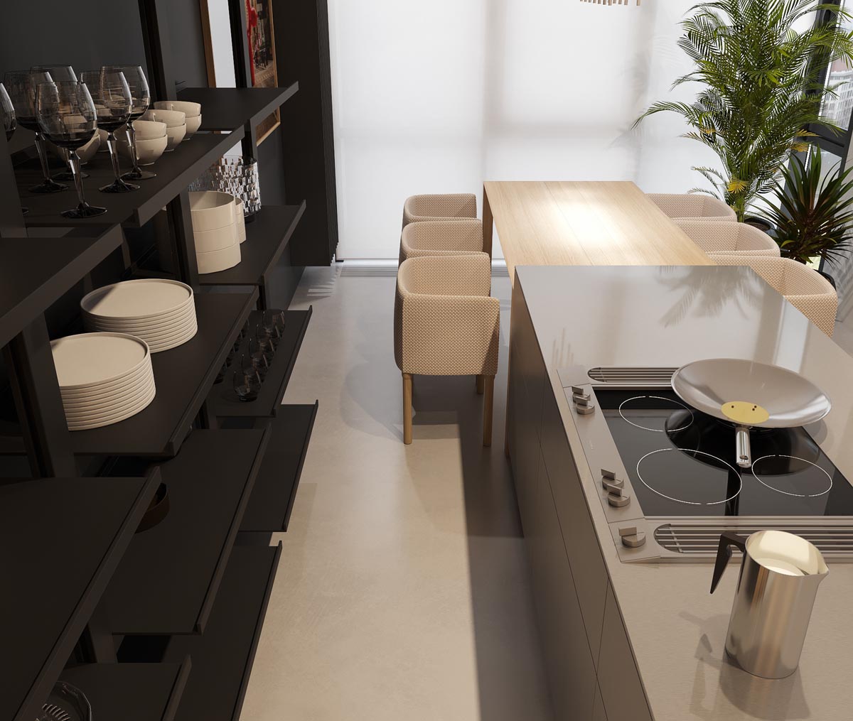
The kitchen dining table has been butted up against the central island to allow a walkway right around the perimeter of the room. White crockery lightens the dark shelves, and chrome accessories like the modern pitcher brighten the bench.
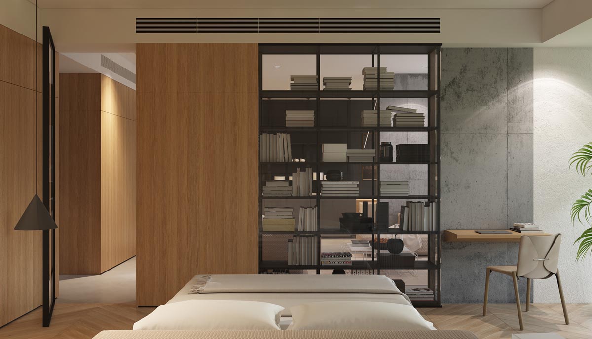
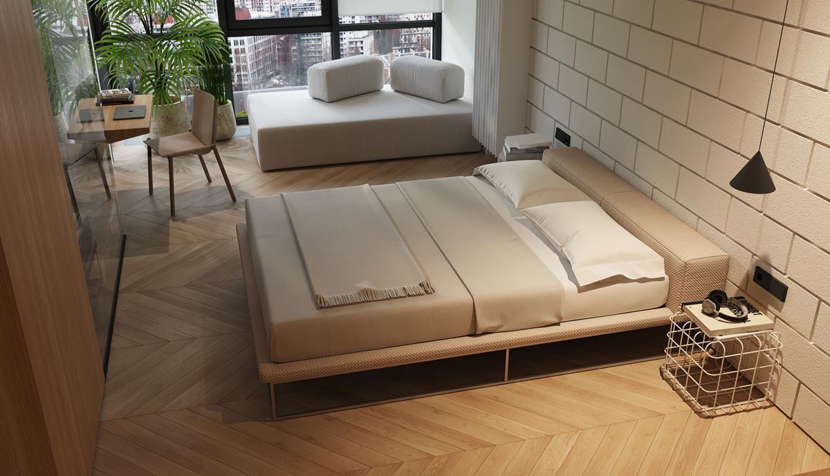
Beside a stylish desk chair, a section of the dividing wall between the bedroom and the living quarters is an open shelving arrangement that allows a view straight through.
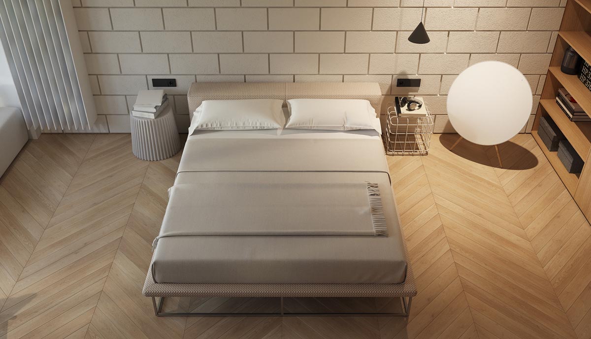
While similar bedroom configurations might use a globe pendant light beside the bed, this one takes a different approach with a large low floor lamp.
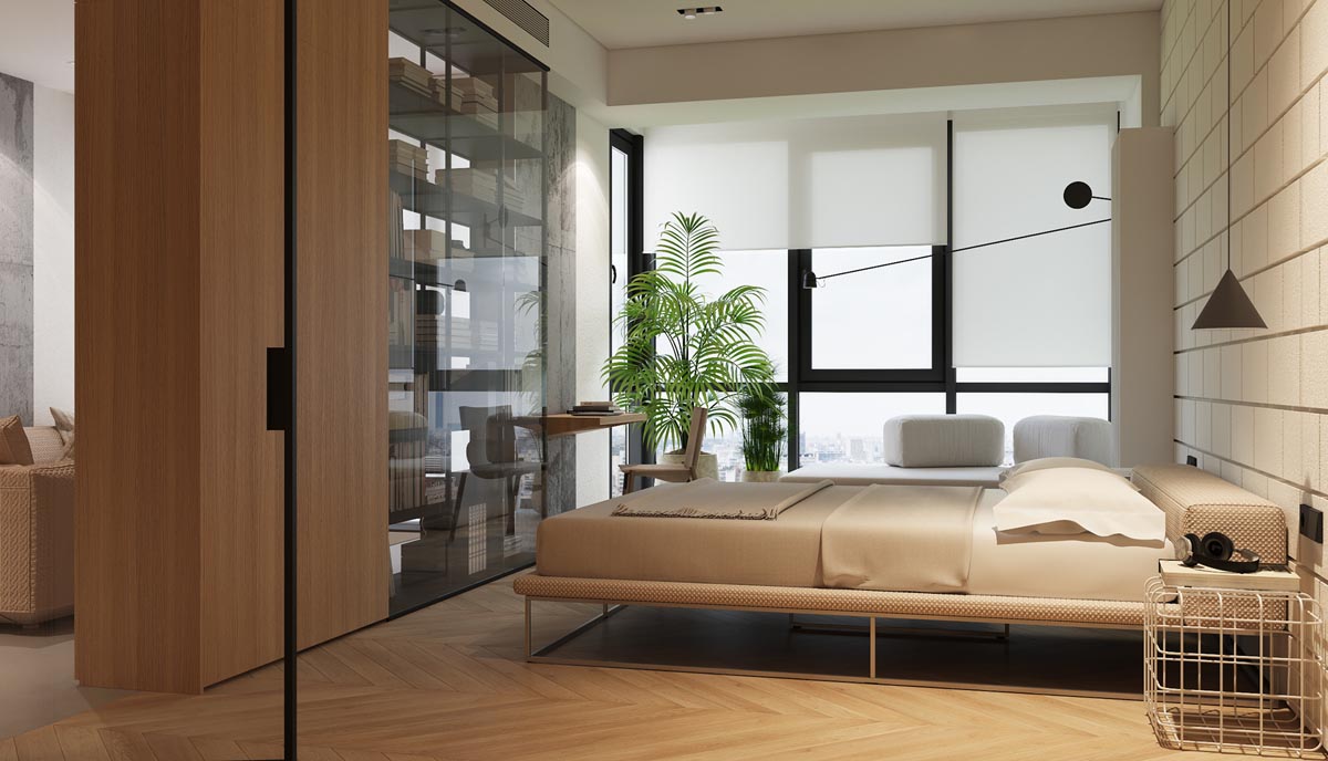
An indoor plant adds colour to the scheme.
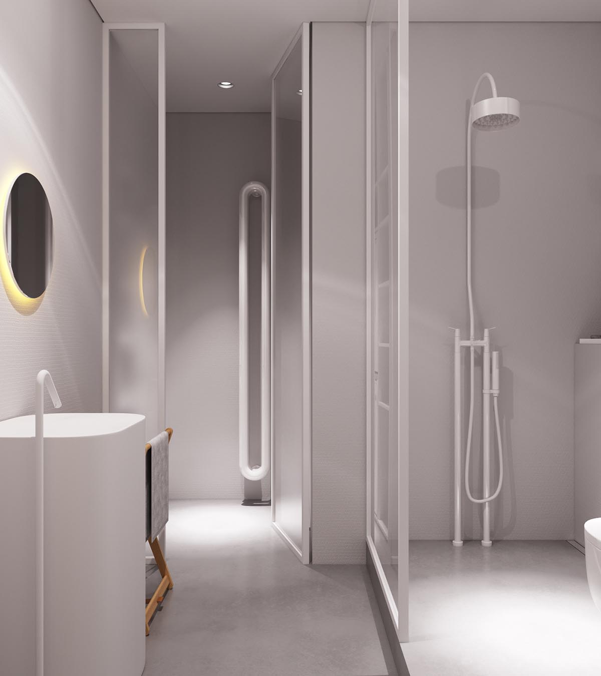
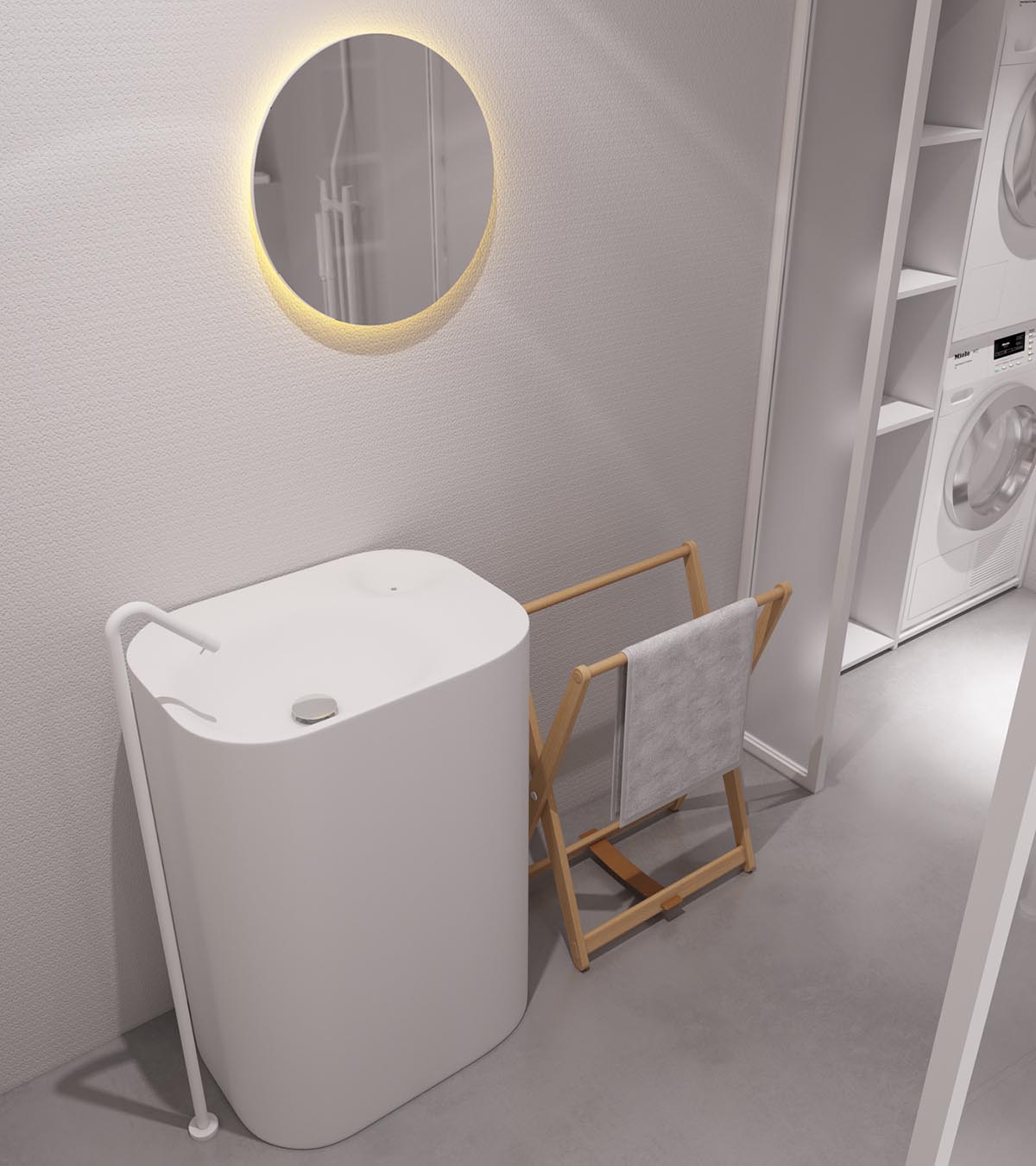
This bathroom takes leave from the dark decor trend and is awash with pure white. White walls, white ceilings and floors, white shower and contemporary radiator.
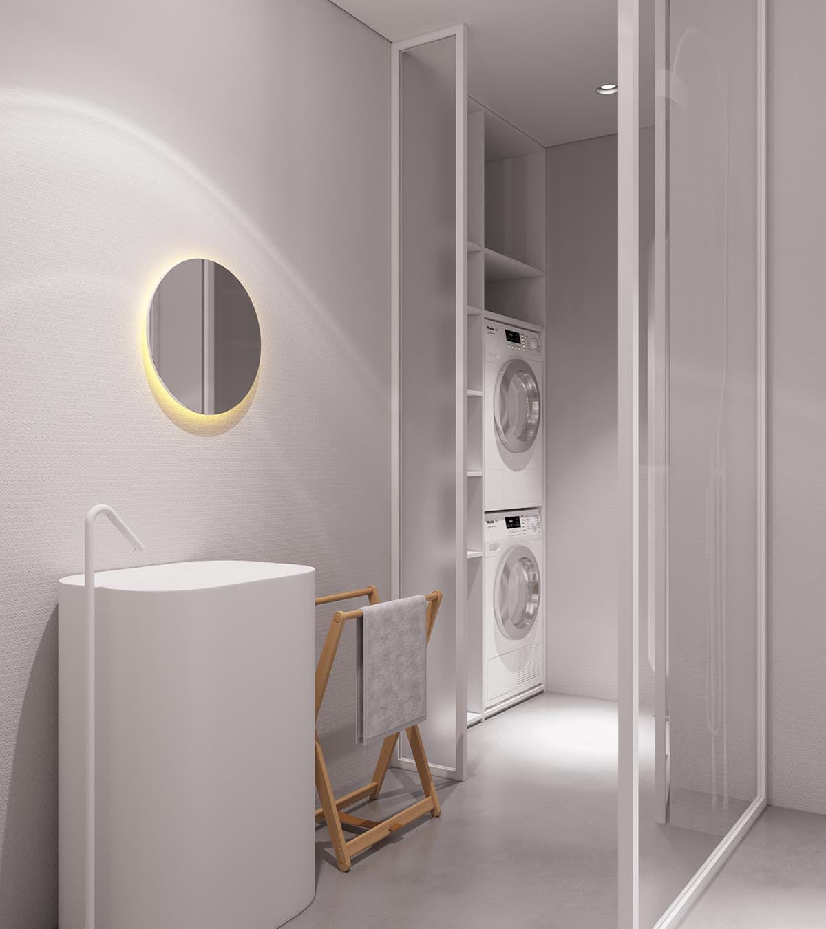
Even the unique faucet is simply white with no metallic embellishments.

