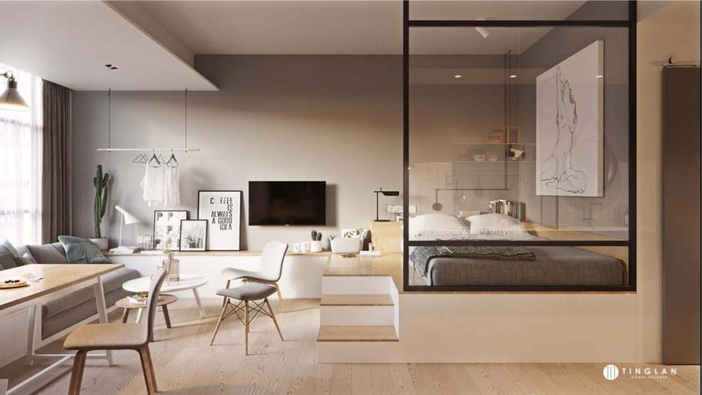
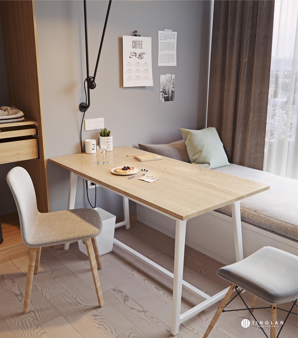
No matter how big your home, you want to be able to maximize your use of the space. In a larger area, this is a bit easier to do with the careful placement of furniture and organized storage solutions. However, as a home gets smaller, space-saving solutions have to get a bit more creative. One way to maximize space in a small home is through the use of levels. We see this often in lofted bed designs, but there are myriad ways to use vertical space to keep a small home organized and feel spacious. The three homes featured in this post are a bit undersized, but in their design, certainly don't feel that way.
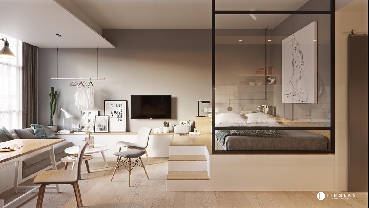
The first home featured is a studio apartment that takes full advantage of natural lighting and a color theme to create an open, comfortable space.
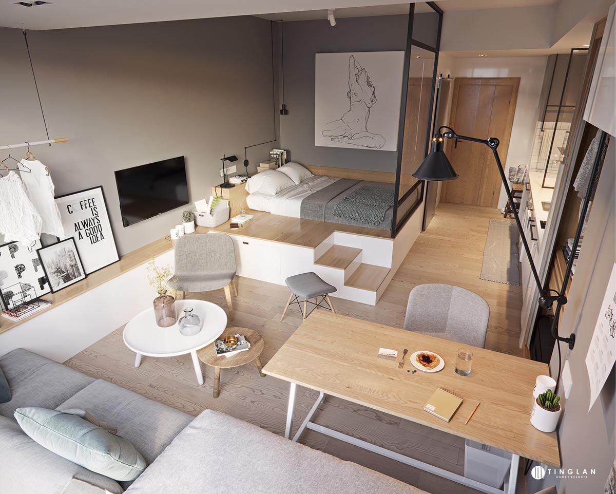
It can feel like a challenge to pack an entire life into what is essentially one room, but this design manages to do it elegantly.

The way that vertical space is used is particularly interesting, staring with the bed, sitting above floor level, and creating a shelf from there that extends around the apartment.

A smaller bed for guests, or a child, can slip out from underneath the larger bed for extra sleeping space (and of course there's always the sofa, too).

Furniture is also used to create different levels with chairs, sofas, and coffee tables nesting underneath one another. Further, decorative vases and the AJ style table lamp create levels even on top of the furniture.

The bed is not really separated from the rest of the living space, but an interior window gives the illusion of separation for the glass wall bedroom, which can be nearly as powerful as a wall. The swing arm wall lamp near the dining/workspace is good option when you need the light to double up as a task lamp.
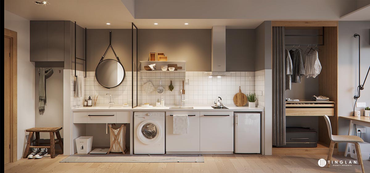
By keeping the entire apartment's design to white, gray, and wood, the space is allowed to feel more open.

Common in certain parts of the world no matter what size the home, a washing machine in the kitchen is another space-saving tactic here.

Finally, a carefully designed entryway ensures that any guest does not feel cramped upon his or her arrival.

The second apartment measures 60 square meters (646 square feet) and uses a somewhat similar color scheme. In the main living area, the eye is immediately drawn to the minimalist large wall clock.

An overstuffed modern sofa and angular modern coffee table play well together in the main living area.
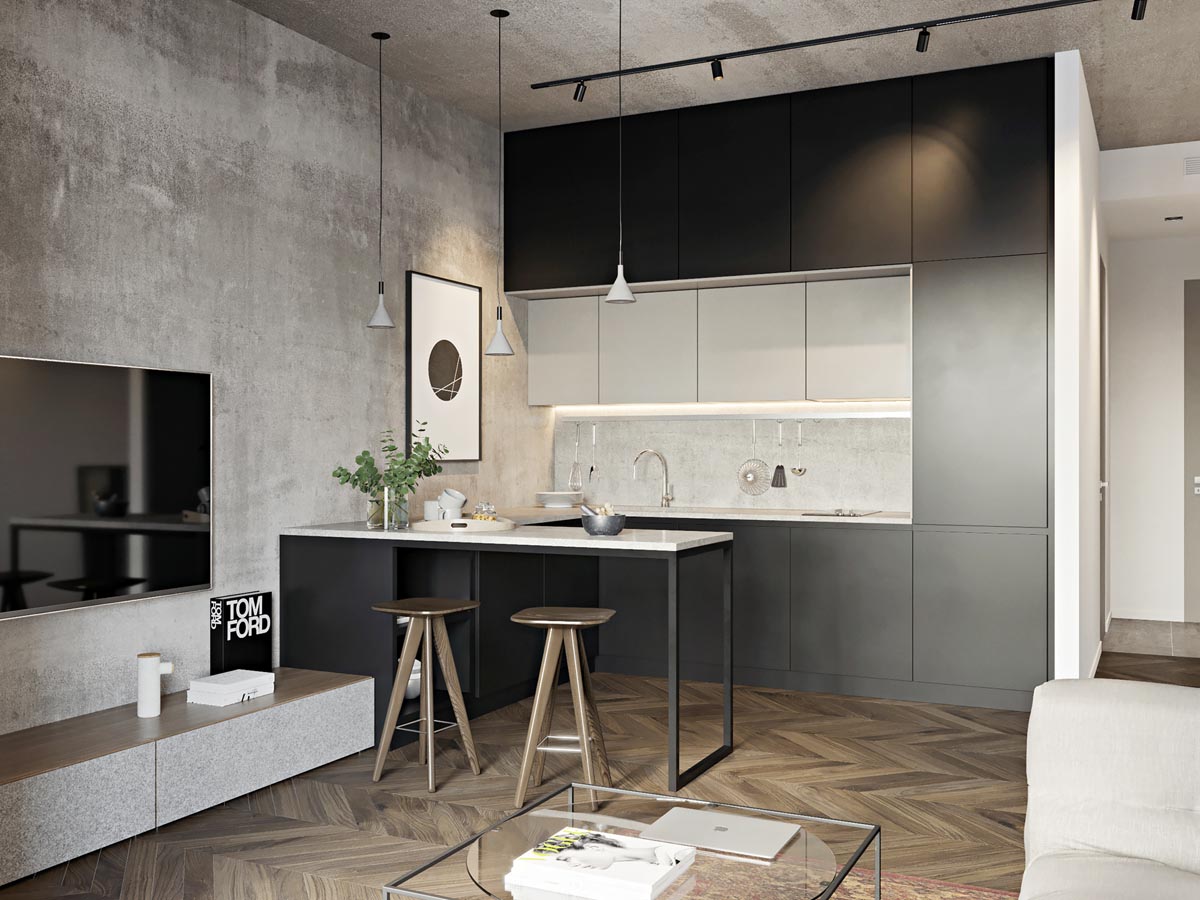
This apartment certainly has a more industrial feel than the first, with concrete walls and quite a bit more black, especially here in the kitchen.

The kitchen pendant lights and kitchen stools are a bit contrasting, with the lights more industrial and wooden stools a bit rustic.

Mounting a television to a concrete wall is no easy feat, but it is worth it for the sleek design appeal.

In particular, the chevron flooring and accent wall unite the bedroom design with the main living area.
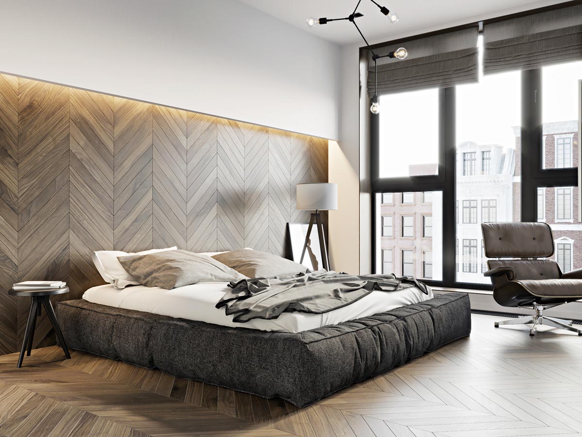
A tripod floor lamp is another sleek touch.

The Eames Bird replica is a stylish and on-trend element as well.

In the bathroom, a shiny faucet and simple soap and lotion dispensers lend their minimalism to the design.

A beautiful laundry basket is a must for a beautiful bathroom -- as well as keeping things organized.

The final apartment measures 55 square meters (596 square feet).

While indoor planters are not among the space-saving elements, this apartment takes storage solutions to another level.

Pocket doors between rooms are just one way to save space in a small apartment, eliminating the need for the door swinging area.

A stylish ergonomic chair is an important element for a home office...

A simple sofa sits beneat tons of storage space in the way of overhead cabinets, again maximizing vertical space.

Light wood is used once again, which allows for a variety of colors to come in as decorative elements.
