The renovation of a 75 square metre space into a multi-faceted family home presented some challenges for the designer team at Buro White. The brief called for the new layout to include an open plan lounge/kitchen/dining room, a separate children's area, multiple bedrooms, a dressing room, a family bathroom, a shower room, a laundry room and entrance hall. Since the apartment is located up on the top floor of the Litsa residential complex, Moscow, the interior is endowed with wonderfully high ceilings. This generous 3.6 metre ceiling height meant that the designers could elevate the bedrooms onto mezzanines, successfully presenting the downstairs living room with much needed space to breathe.
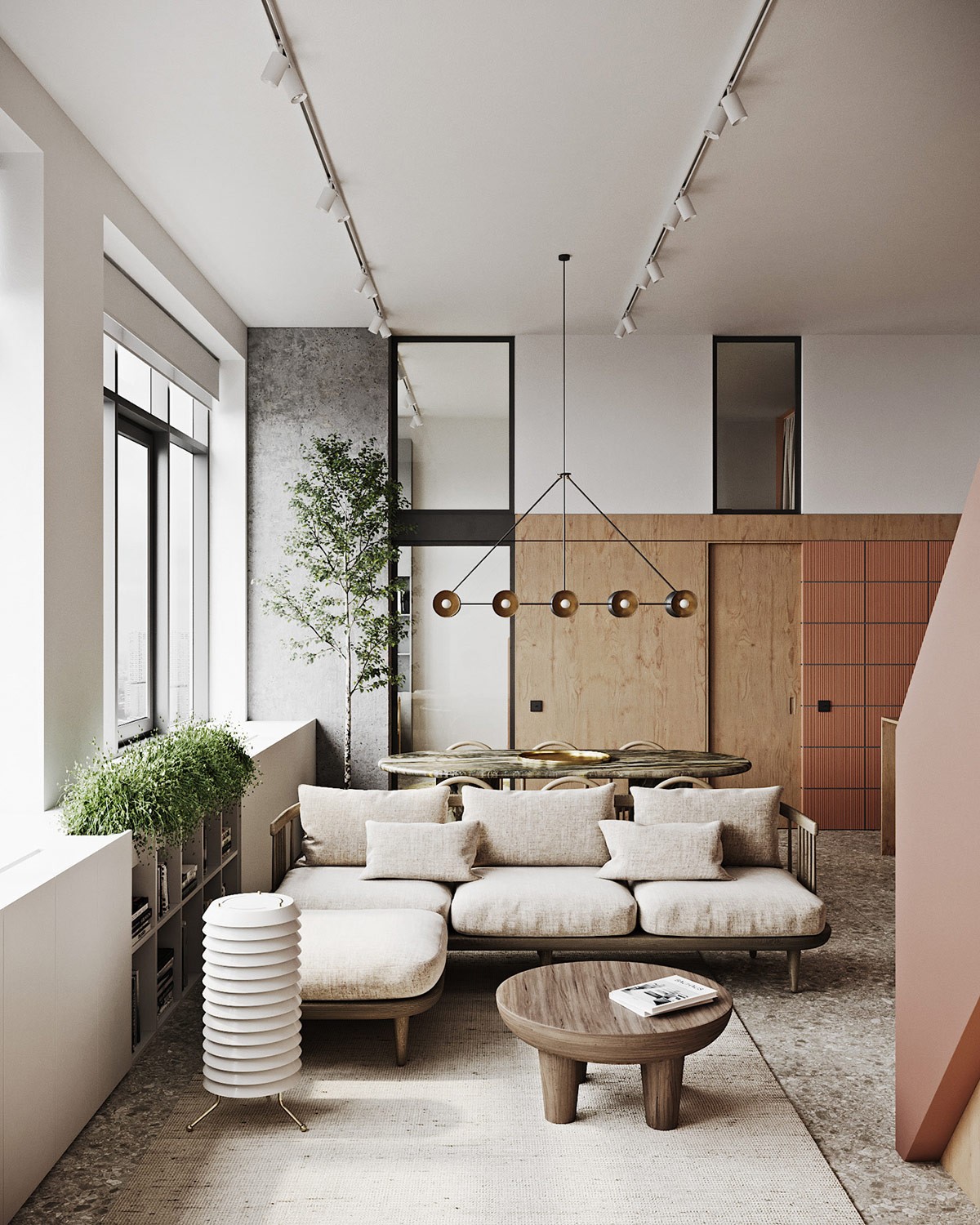
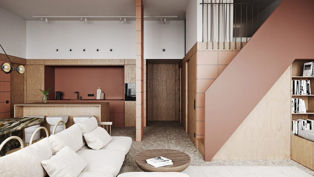
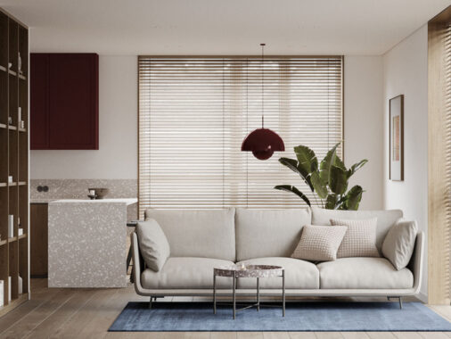
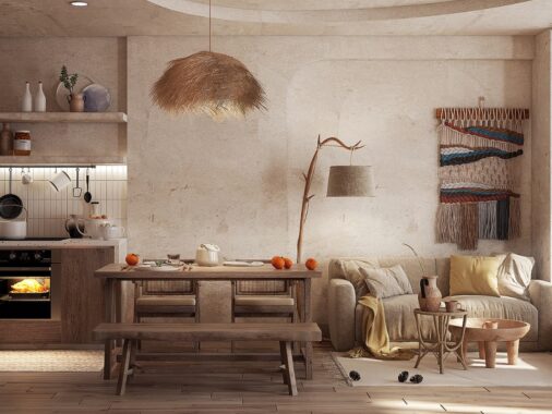
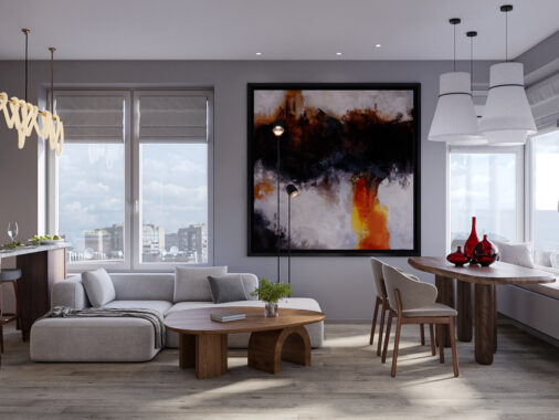
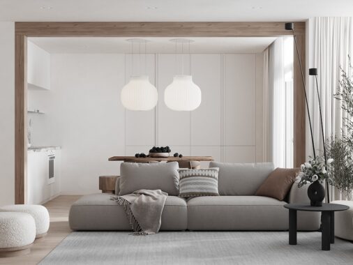
A combination of white, autumnal brown accents, natural wood and stone was used to fashion a light but warm interior with a somewhat utilitarian style. The modern sofa stands on slender legs to increase the sense of space in the small layout.

The cohesive colour palette pulls together all of the different zones inside the entirely open plan living room.
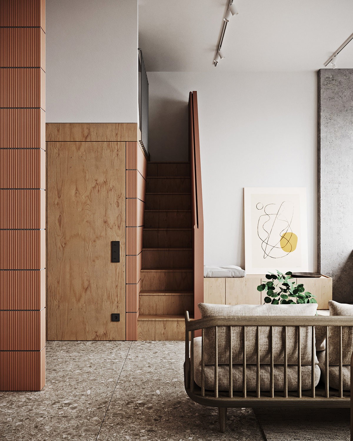
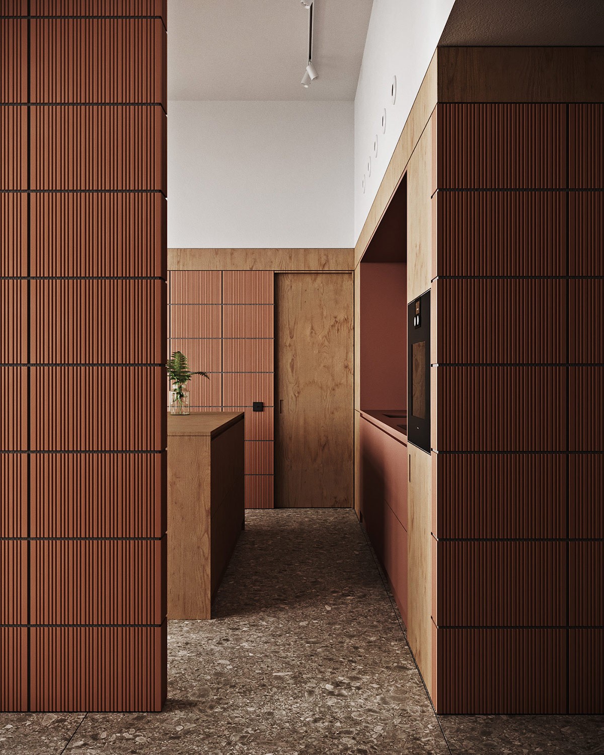
Textured tiles clad load bearing walls. A matching russet balustrade boxes in the raw timber staircase.
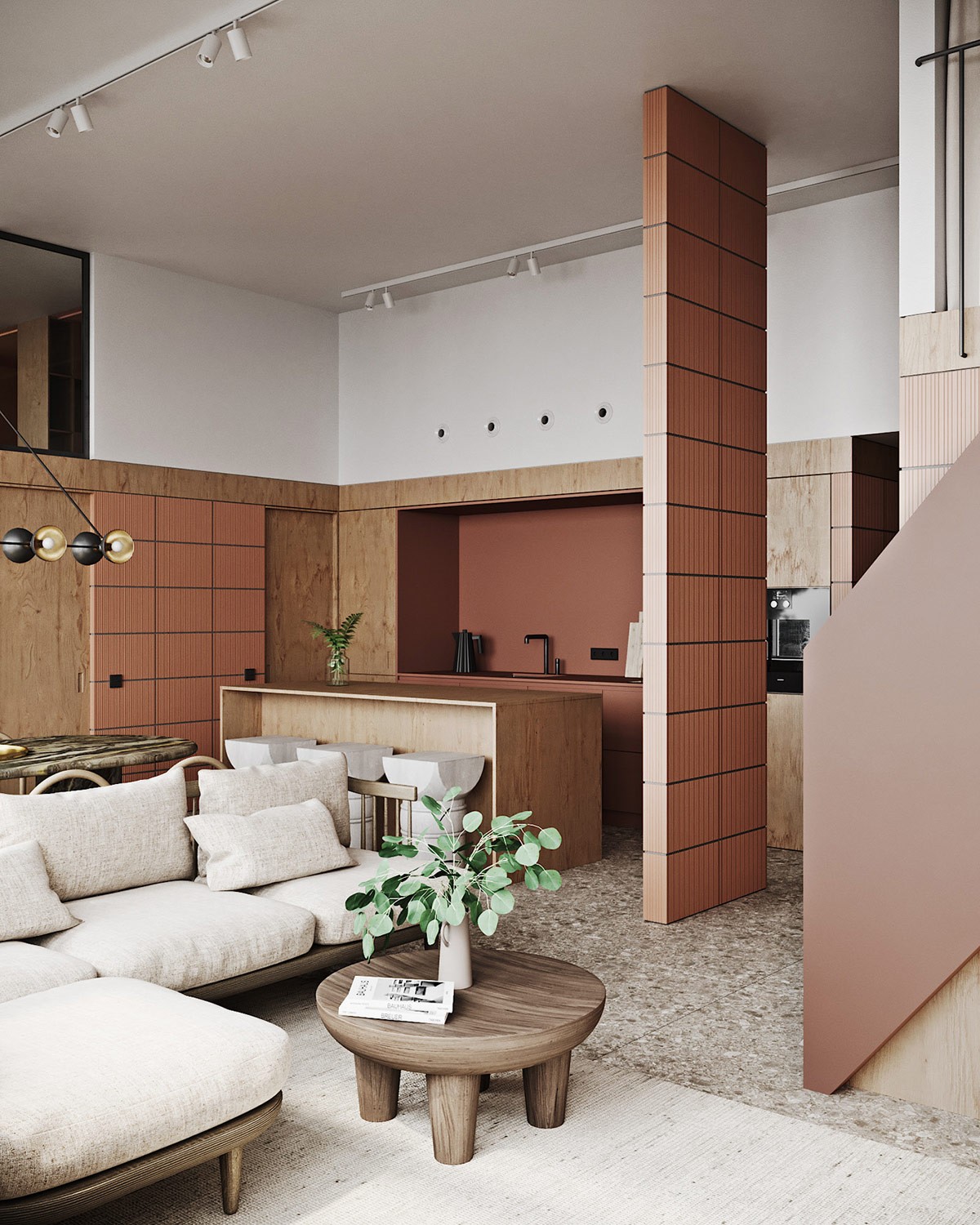
A rustic round coffee table creates a small visual stop between the compact lounge area and the stairs.
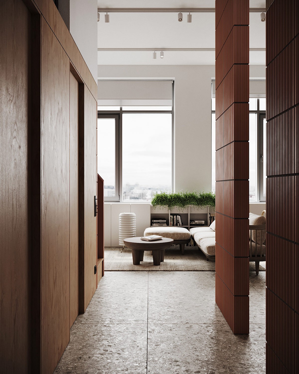
Large format stone tiles cover the whole first level floor of the apartment, right from the entryway.
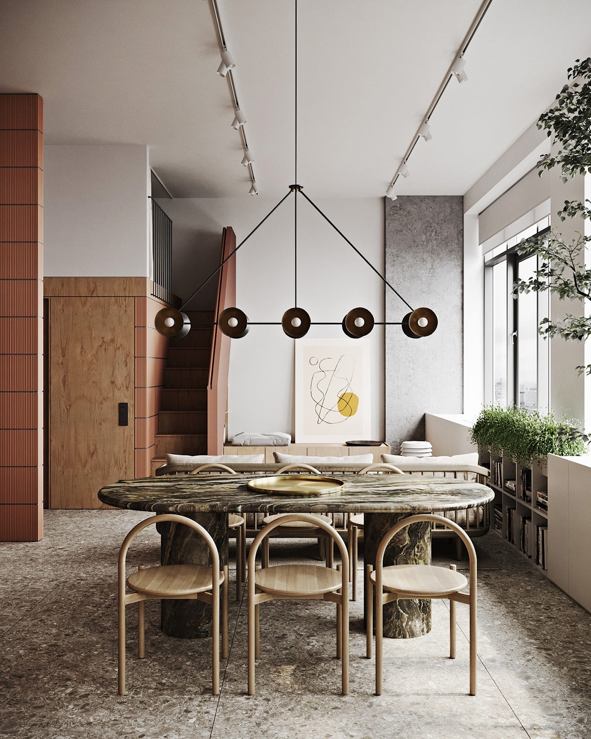
The racetrack shaped dining table makes a practical choice for such a small area, cutting out sharp corners that could catch on hips. Arch backed dining chairs complement the curved shape of the table, and create a modern silhouette.
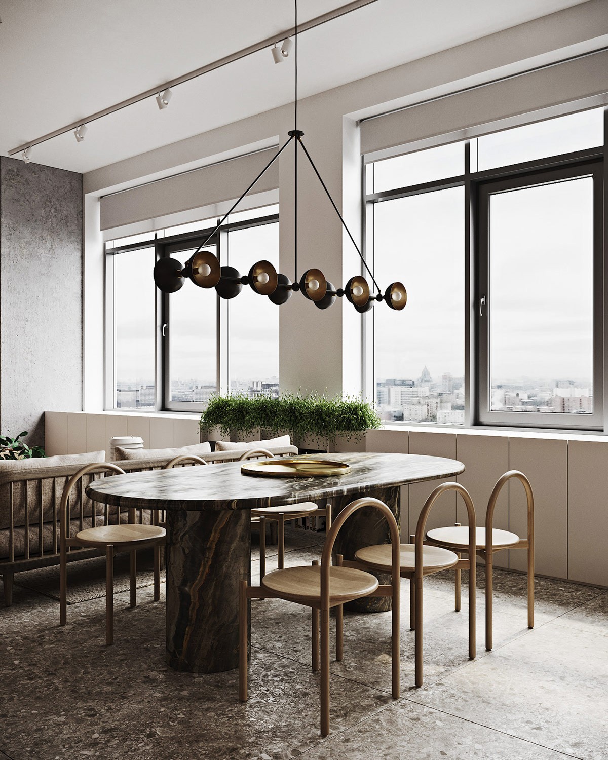
An industrial style dining room chandelier complements the dark vein of the marble table.
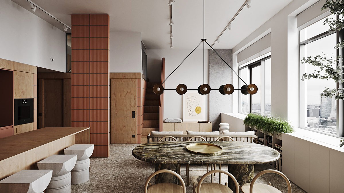
Storage cabinets run the entire length of the window wall, with a bank of bookcases set at the centre.
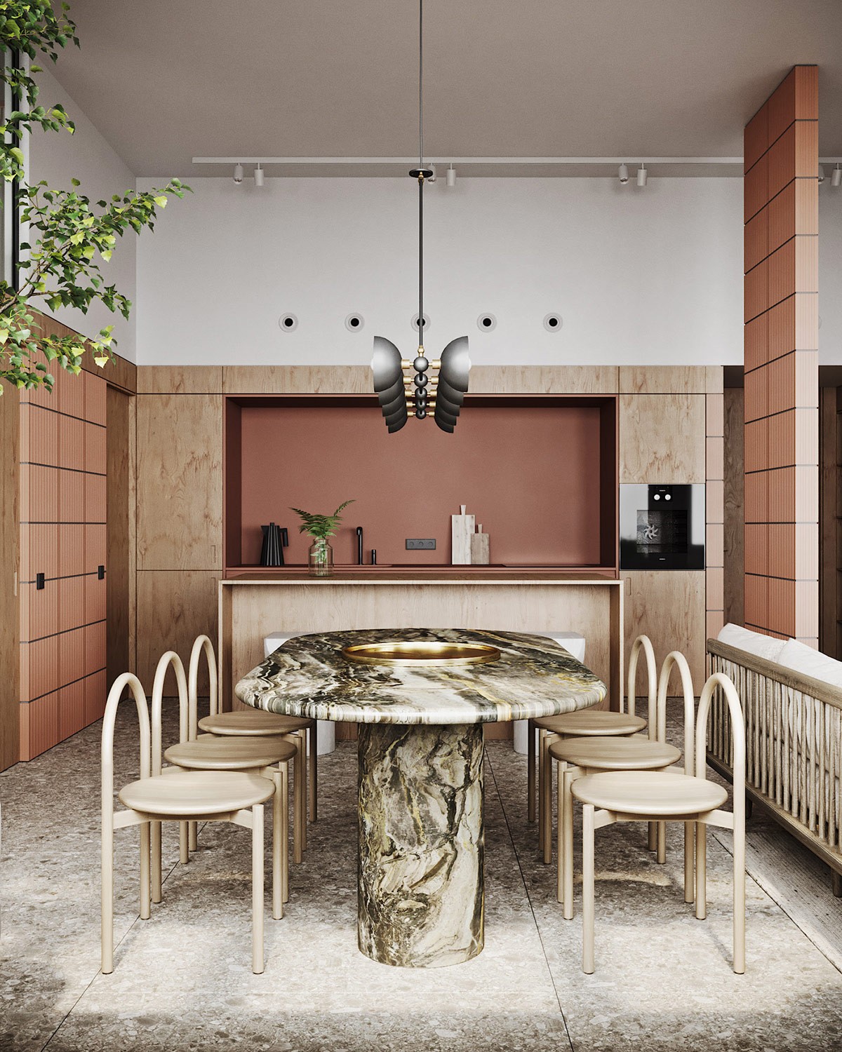
White track lights run in three strips down the sides and core of the room to ensure bright family living space.
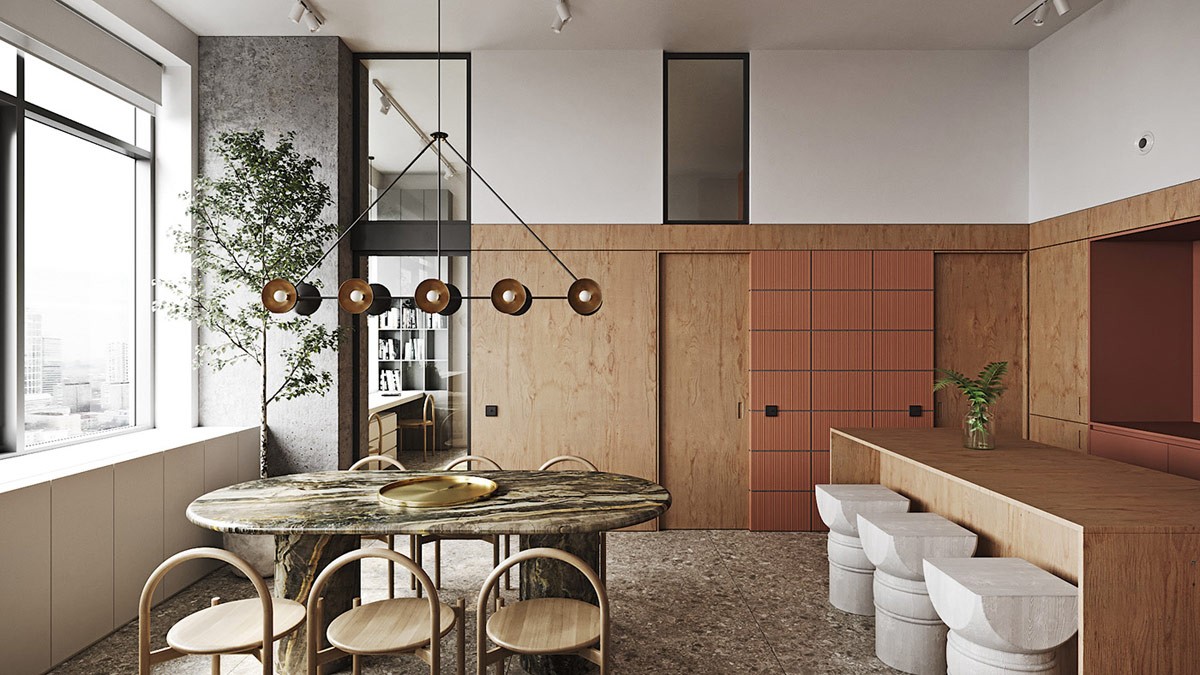
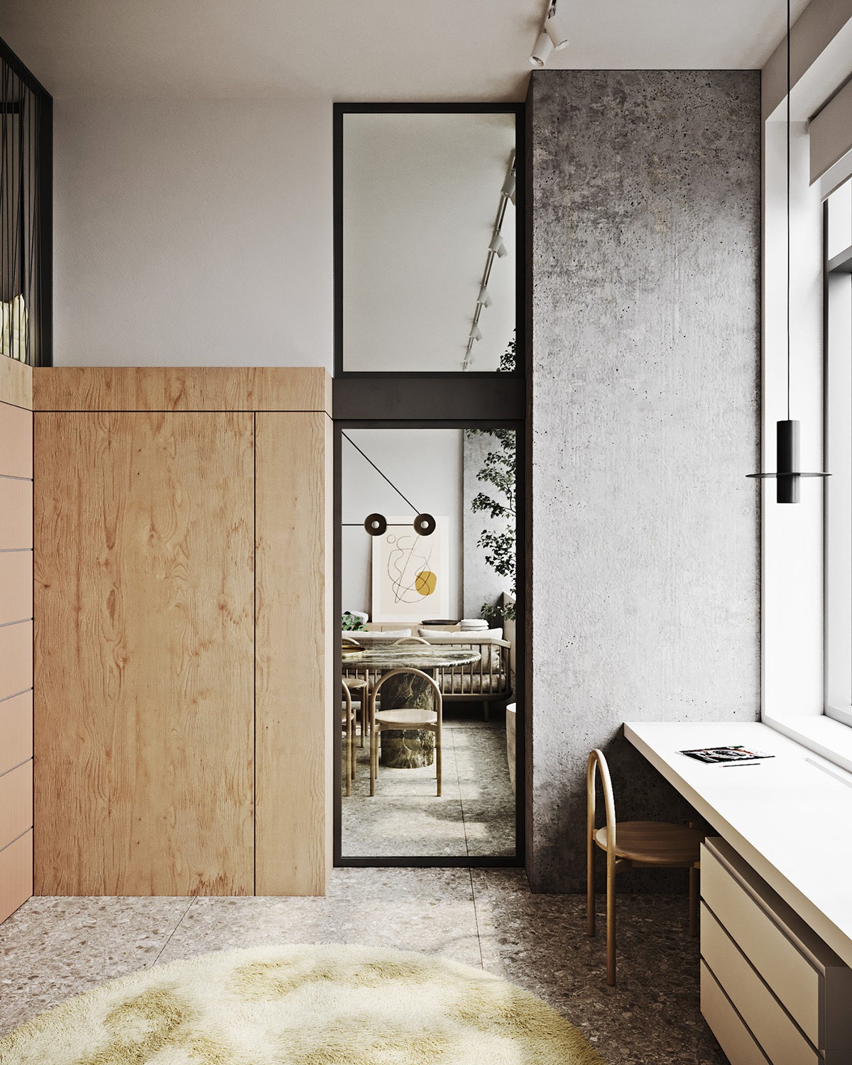
The wooden kitchen island is equipped with unique bar stools that serve as a second dining spot. In the background, we can see the entryway to the kids’ room, which is equipped with a double study desk and three ingenious sleeping areas that span two levels. An interior window marks the kids’ mezzanine.
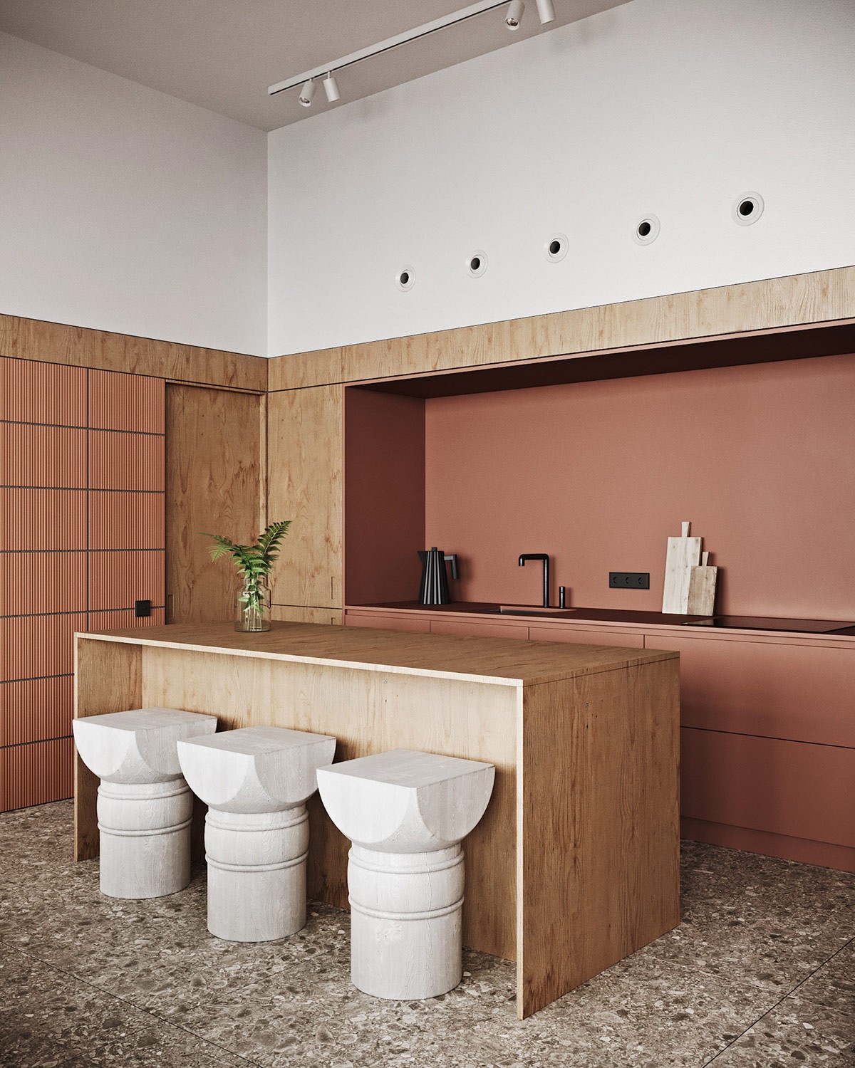
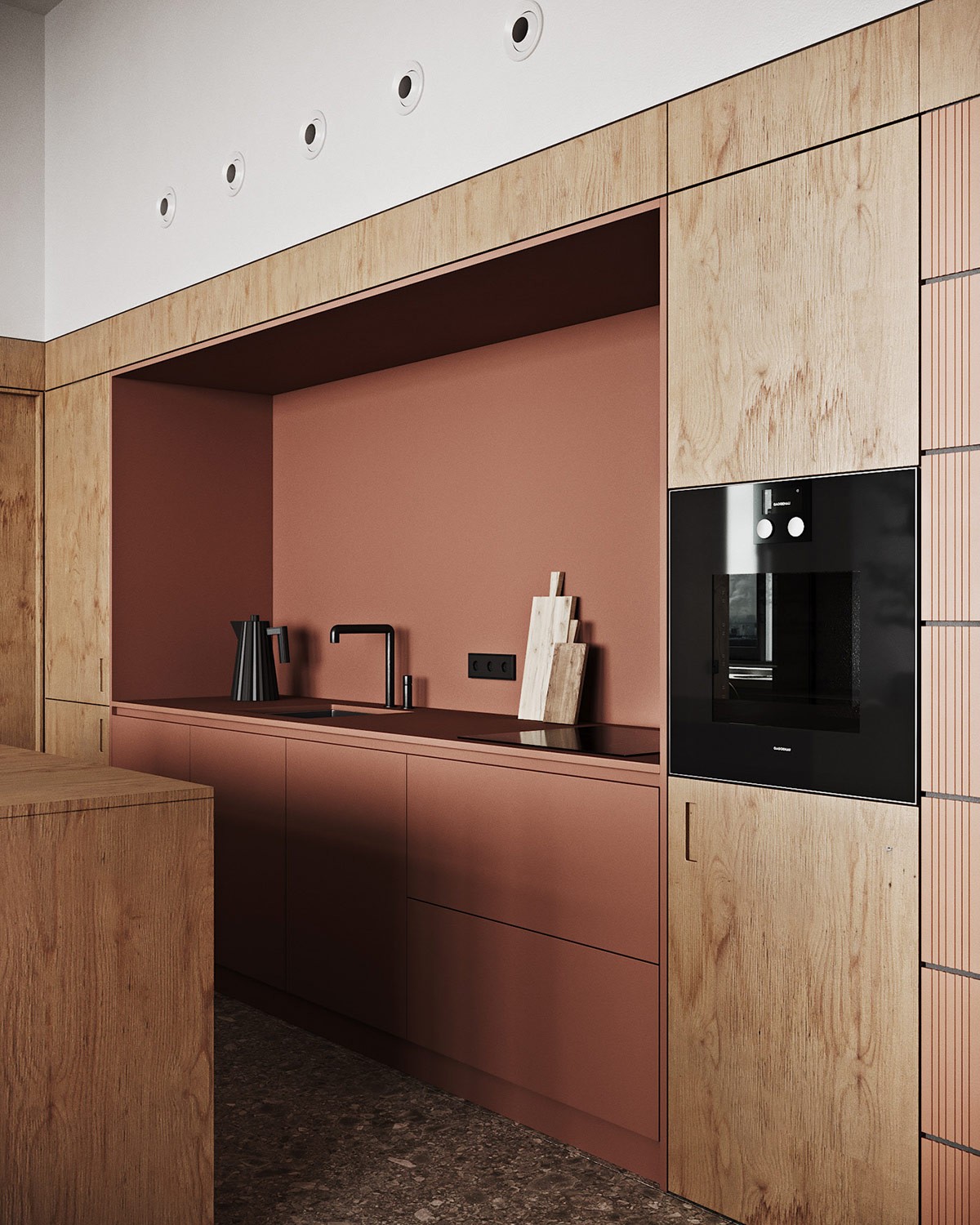
The kitchen bar stools introduce an impressive structural element that juxtaposes the simplicity of the raw timber and brick red kitchen design.
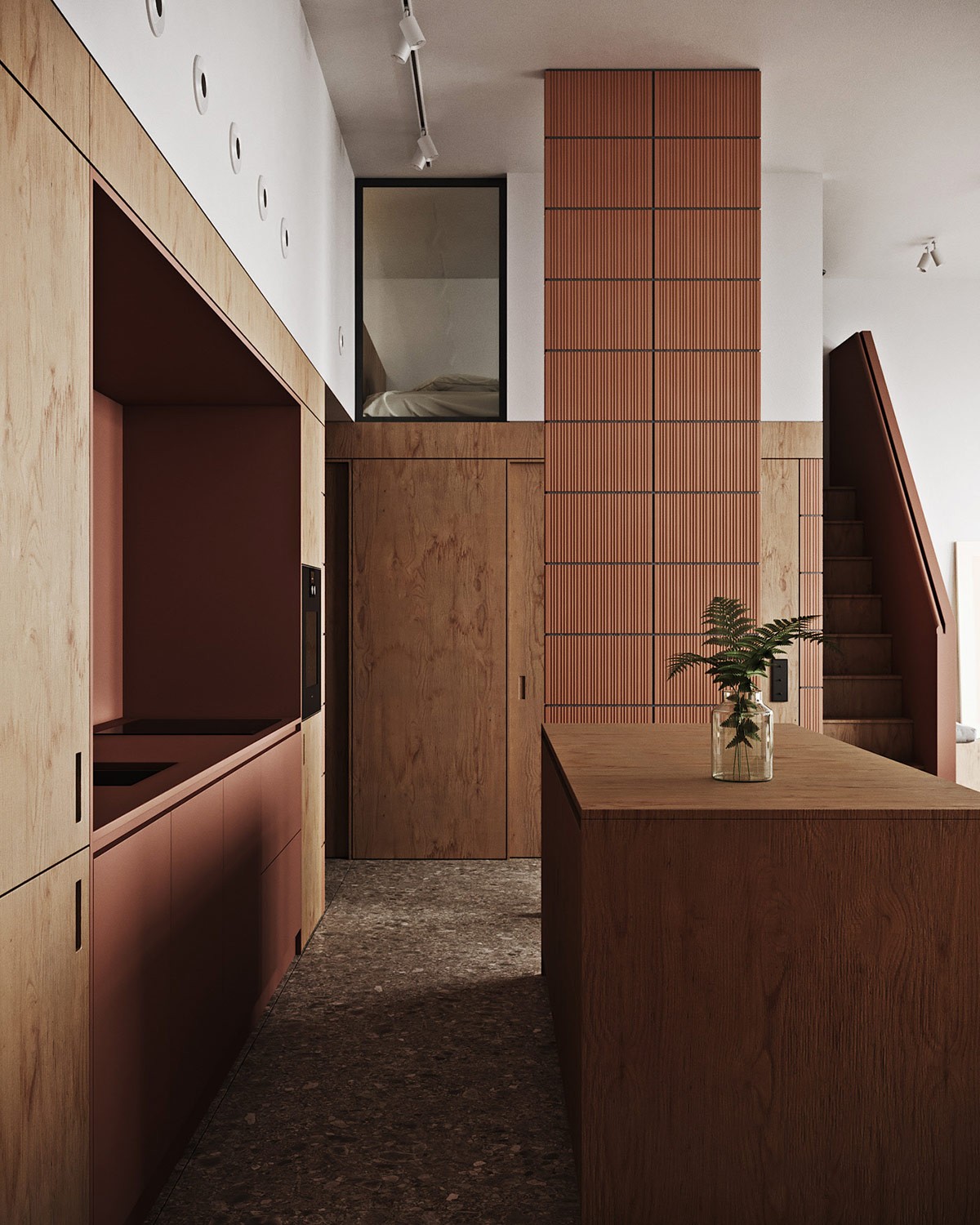
Brick tiles climb the full height of a structural support column, boldly leading the eye up to the second level of the interior where the parental bedroom lies. An interior picture window reveals a glimpse of the compact master mezzanine.
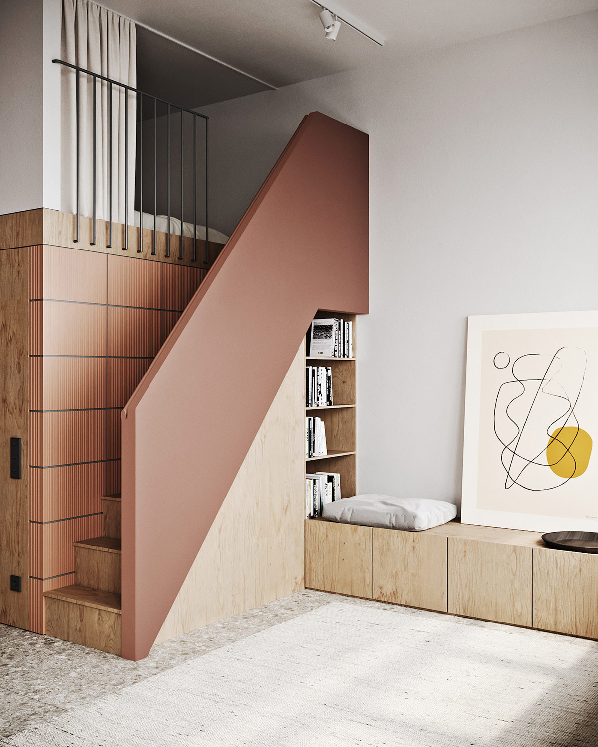
A nifty reading nook has been built into the side of the staircase, with the bookcase recessed right into the void left beneath the treads. A custom storage bench is set with seat pads to offer a comfy spot on which to read or converse with family members on the couch opposite.
A staircase inside the kids’ study room leads up onto the private mezzanine. A unique design has been implemented in order to accommodate two kids’ bedrooms in very limited space.
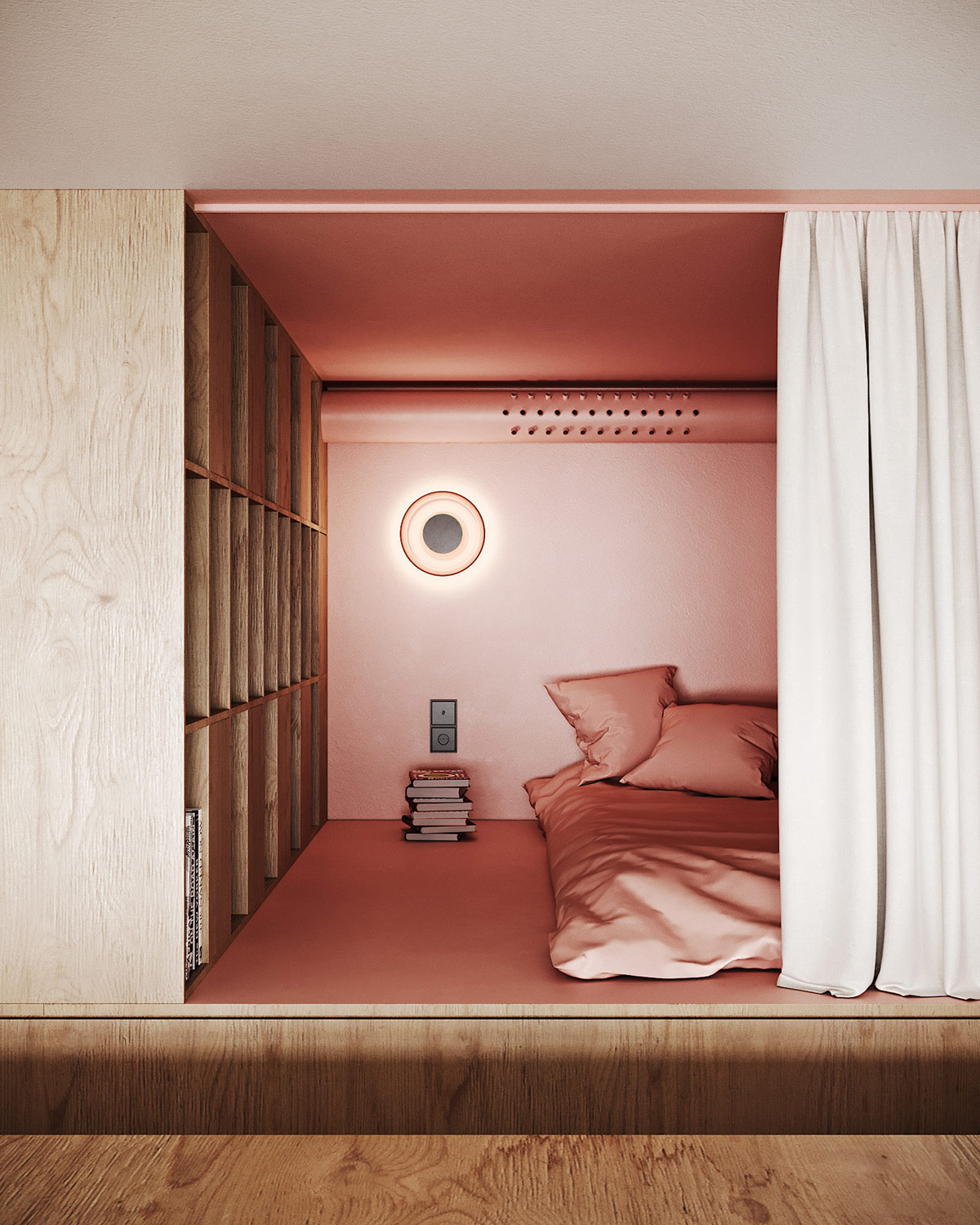
One side of the raised level has been divided into sleeping cubes. A modern wall sconce serves as a bedside lamp.
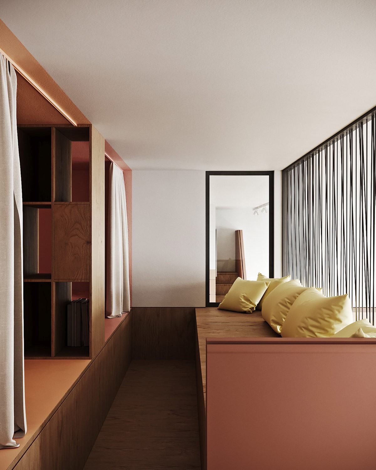
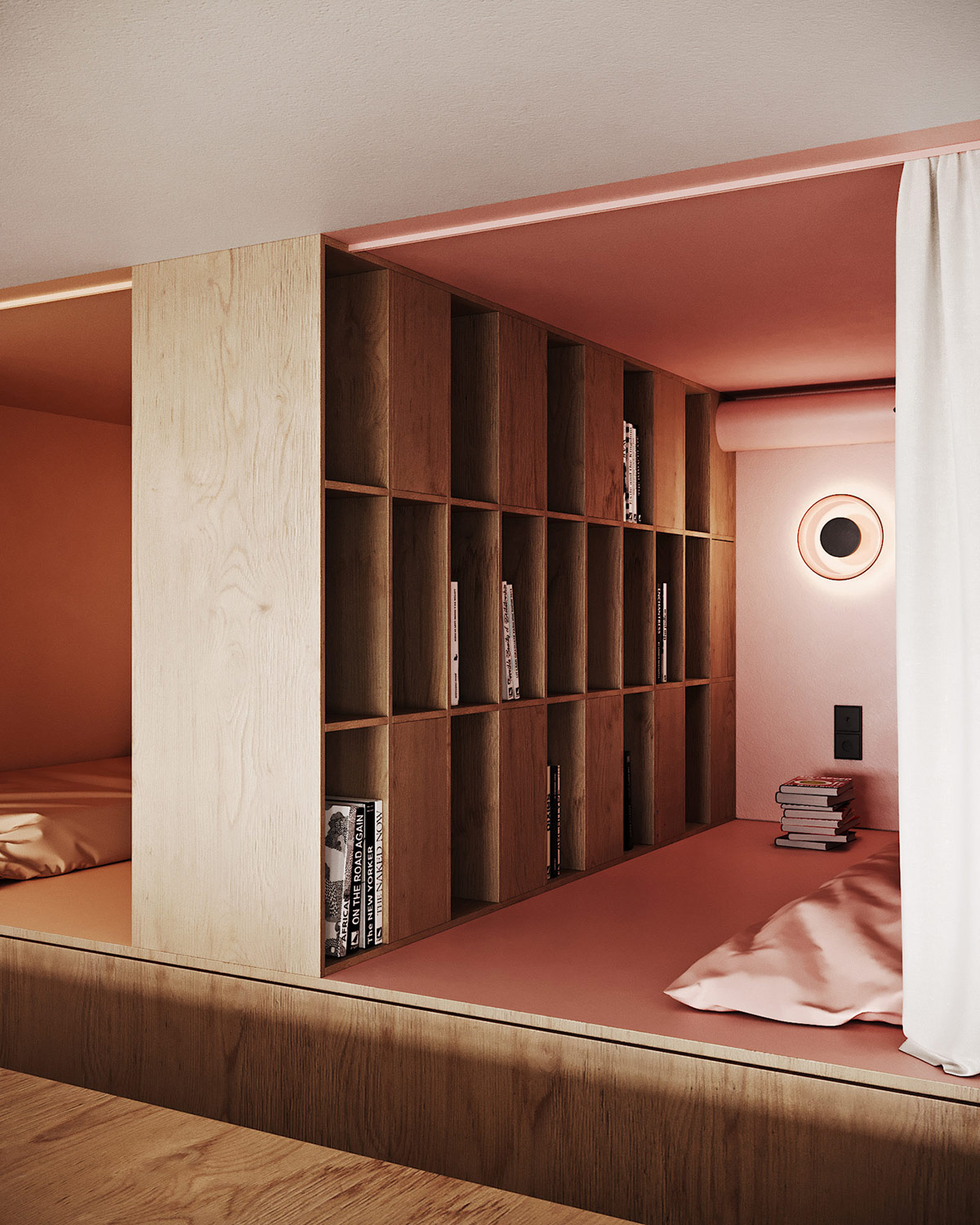
The dividing wall is a dual sided bookcase, which opens a link between the children’s sleep spaces. A bench seat furnishes the communal landing area that overlooks the study.
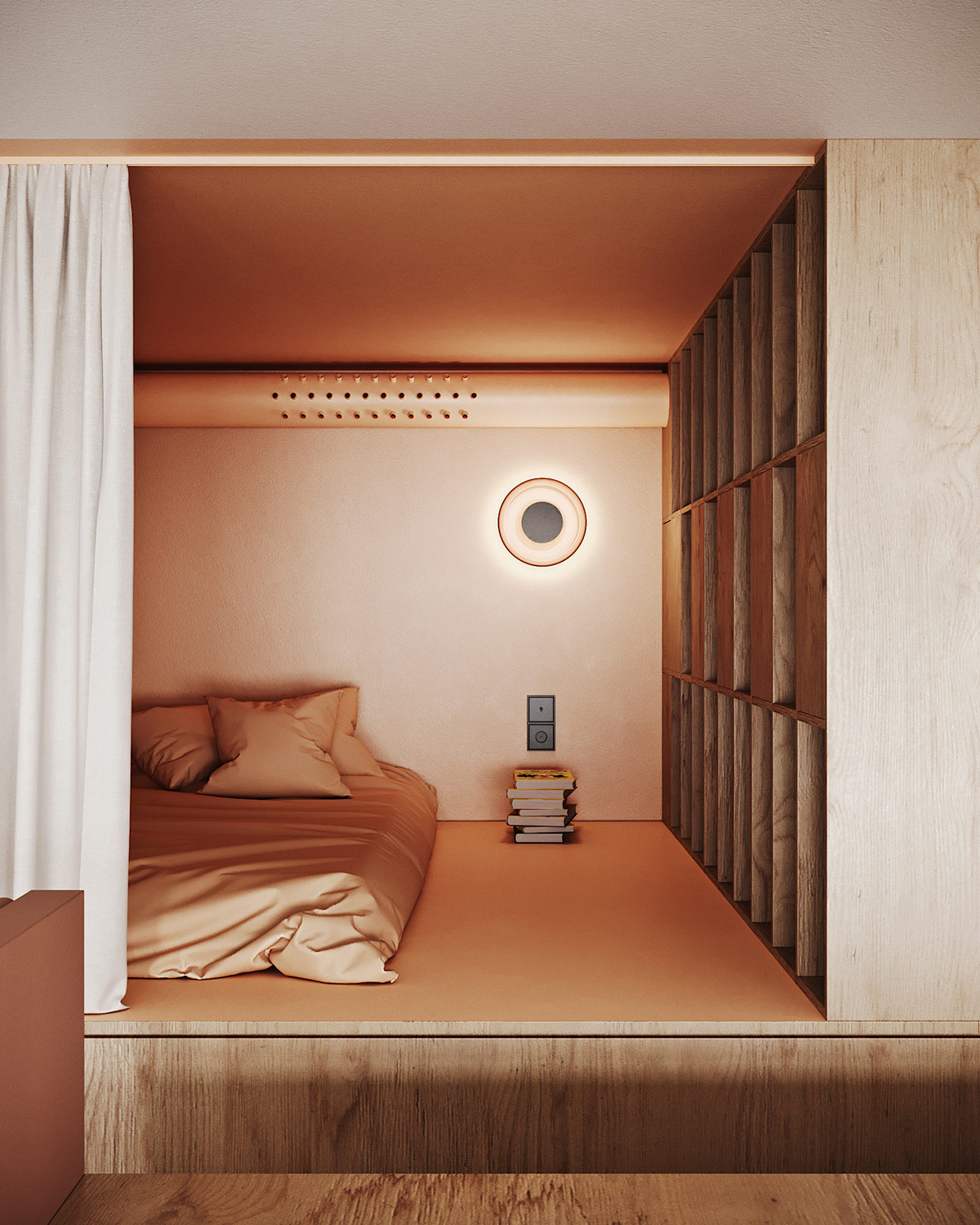
The same warming materials and colour palette creates cohesivity between the two floors of the home. The base of the bedroom cubes are raised to create a cosy floor bed design.
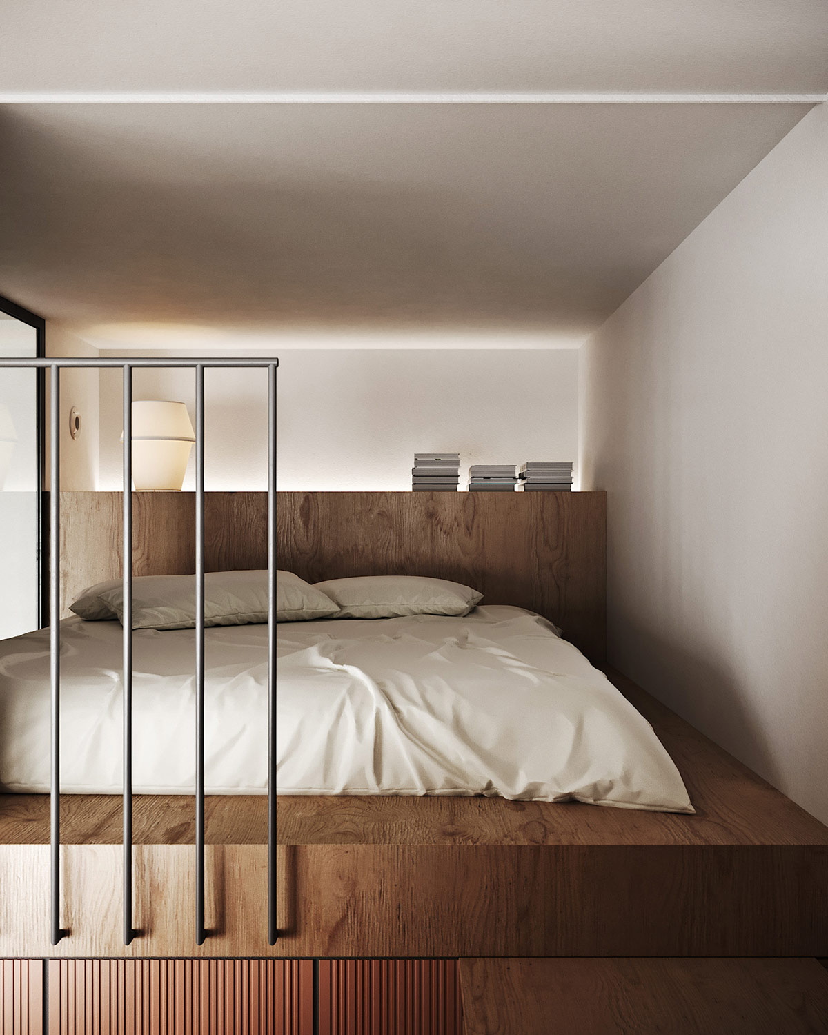
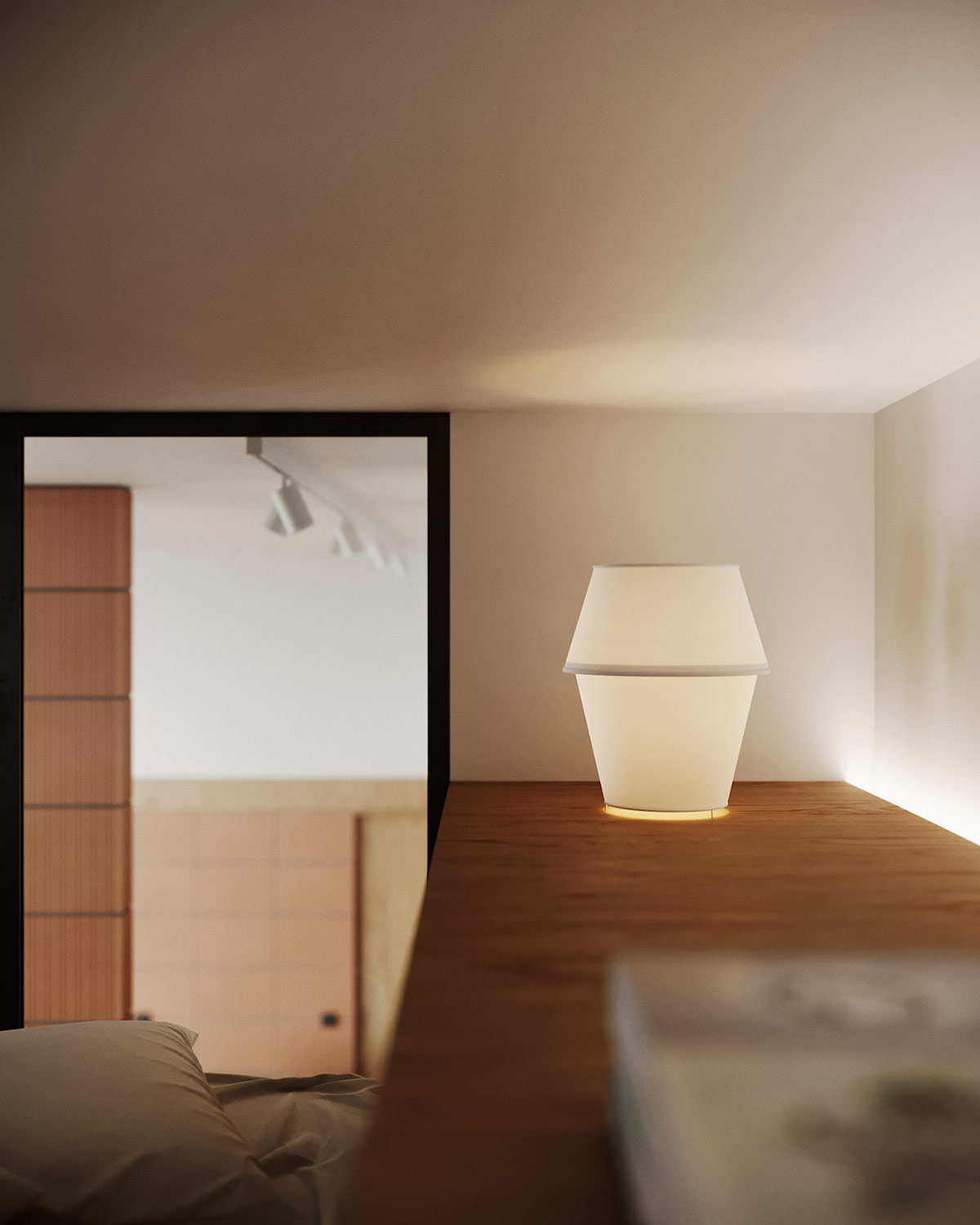
The master ‘bedroom’ is afforded a level of privacy away from the kids’ cubes, with a window that overlooks the main living space.
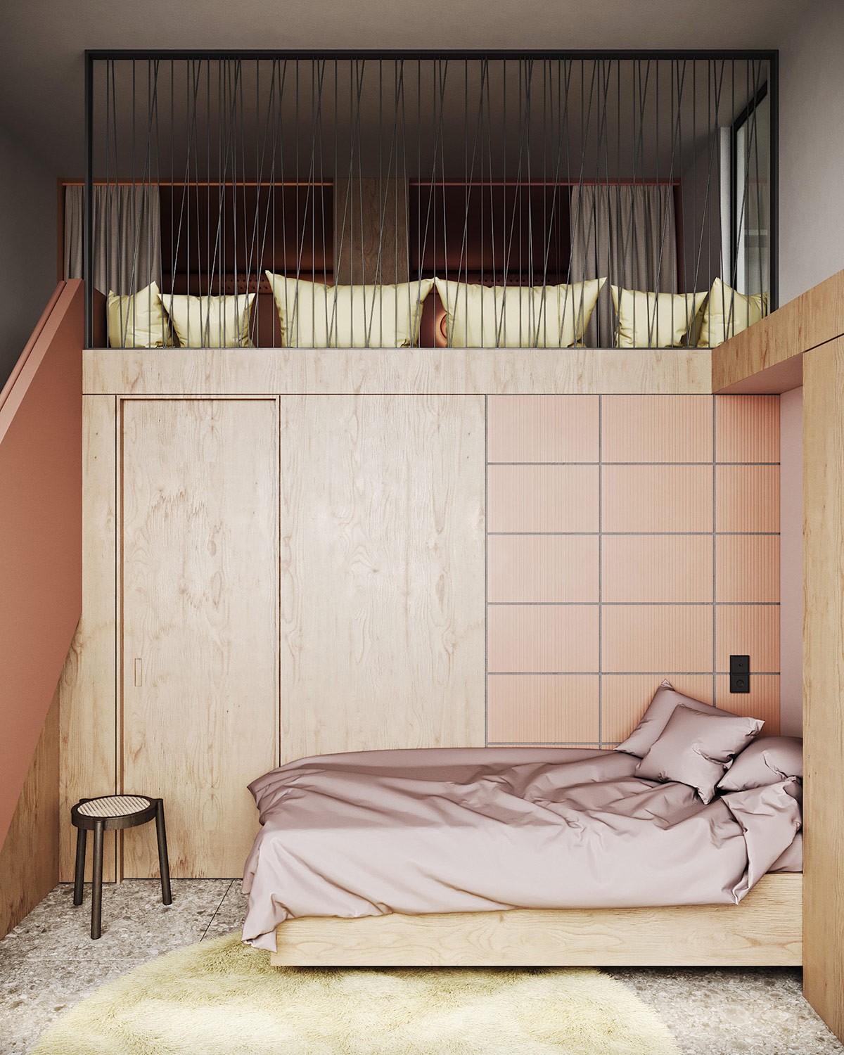
A third kid’s bed is situated at the base of the stairs, behind the kids’ study area. A yellow rug creates a colour link with scatter cushions up on the partially exposed mezzanine.
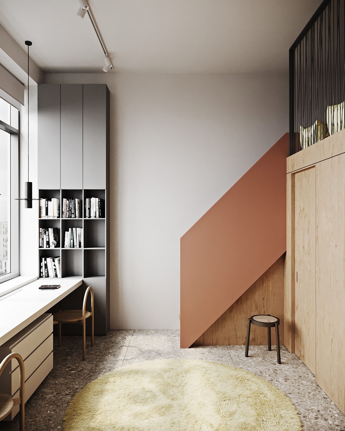
The solid balustrade that climbs the kids’ staircase makes a perfect match with the living room, linking each side of the apartment as one easy flowing model.
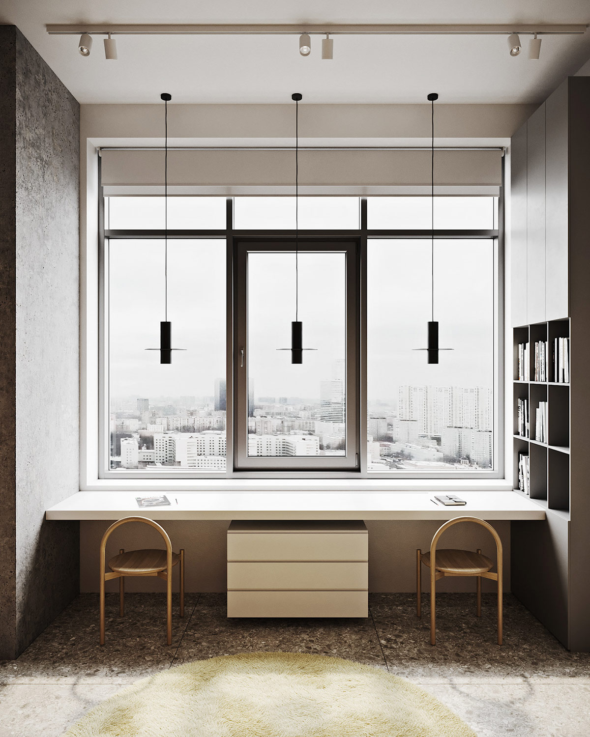
An inspiring view of the city stretches across the desktop of the kids’ double workspace. A trio of minimalist black pendant lights drop down to provide task lighting without hindering the view.
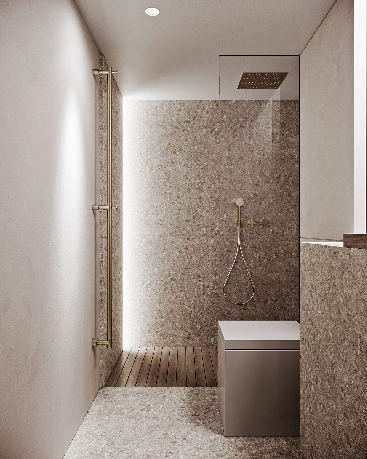
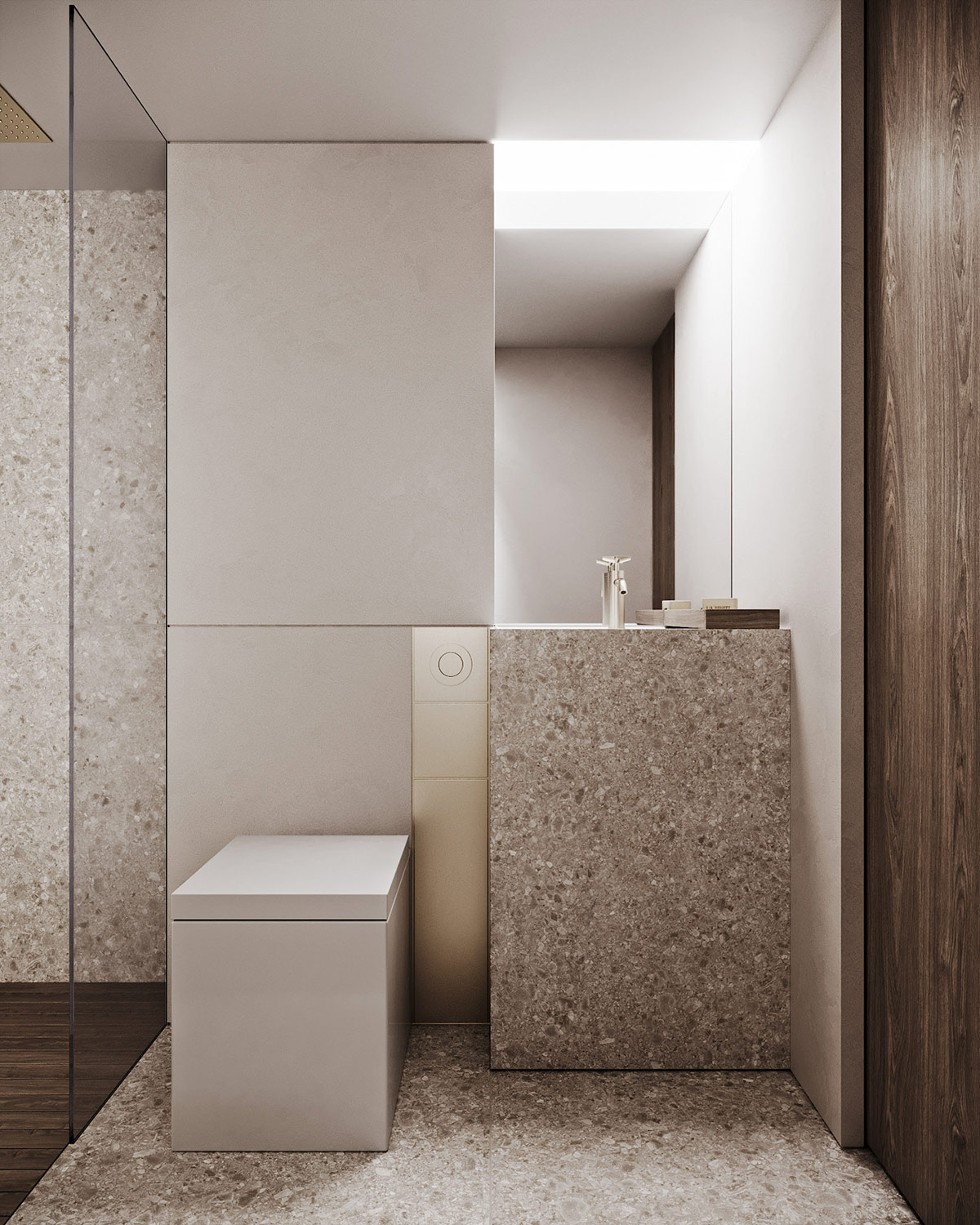
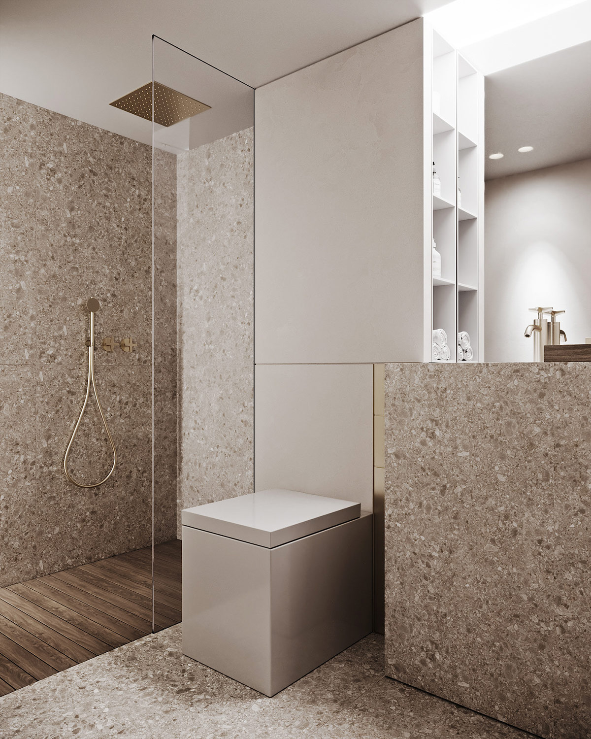
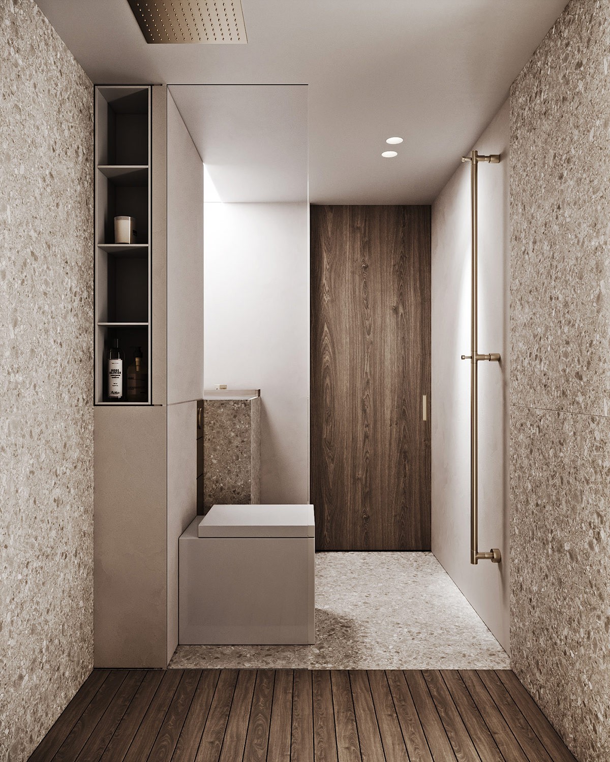
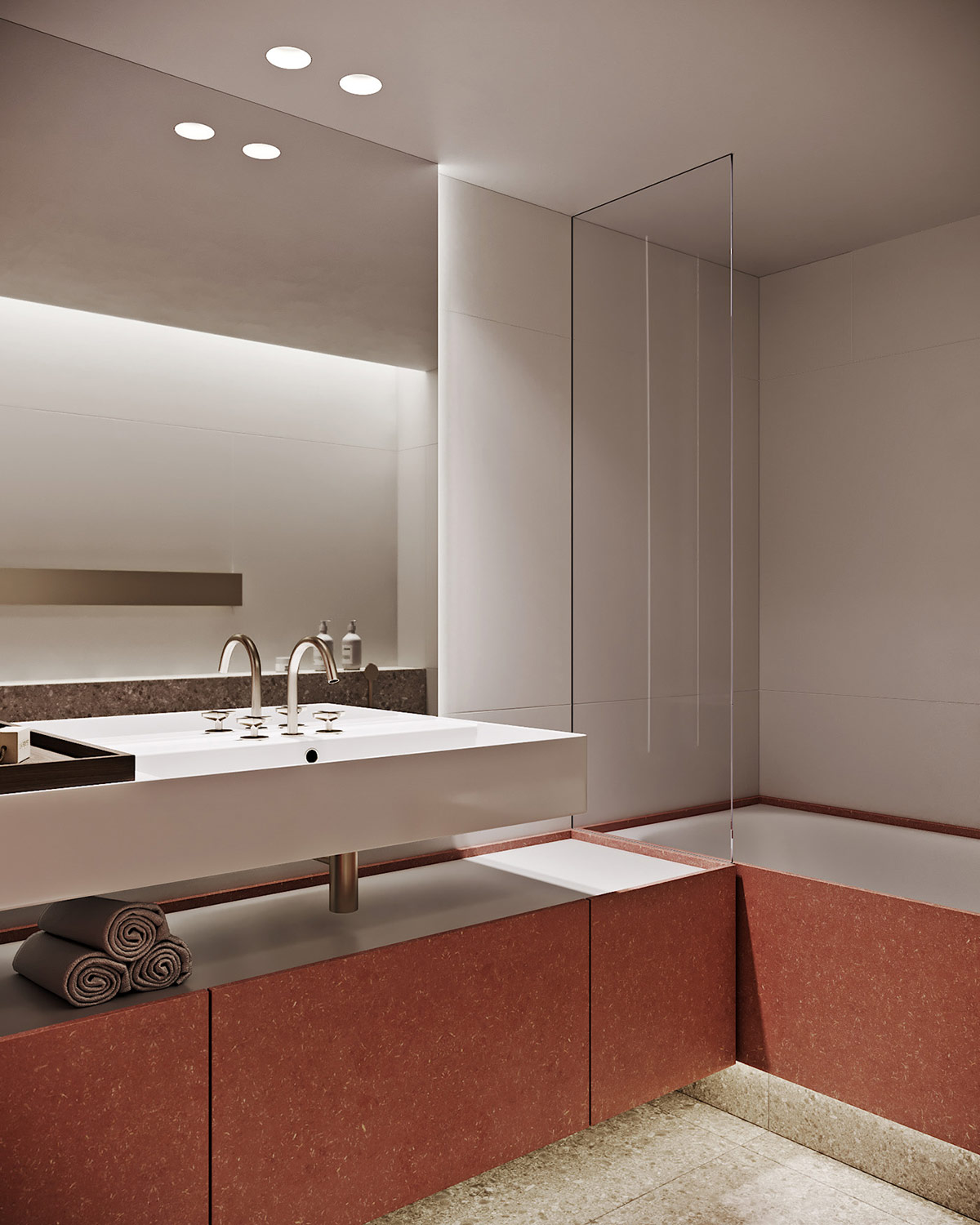
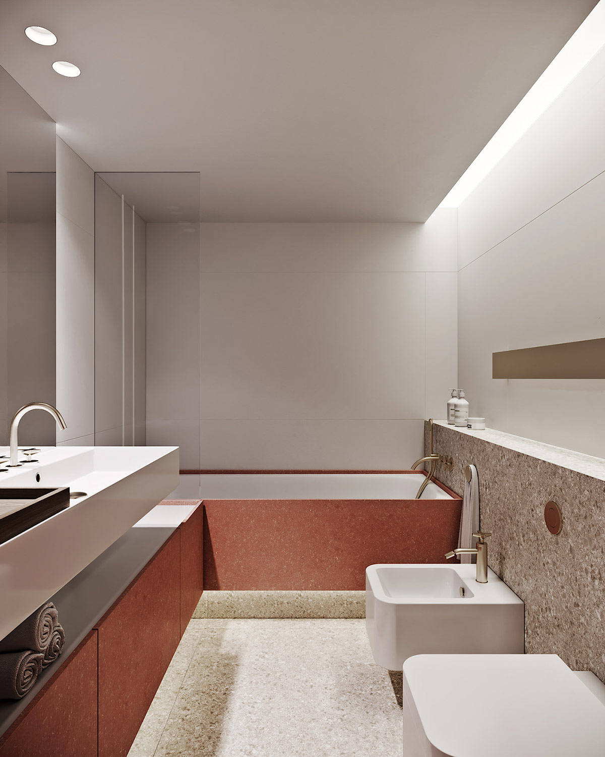
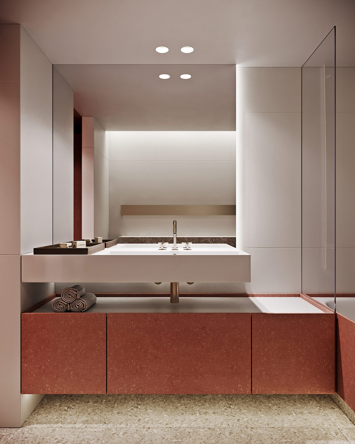
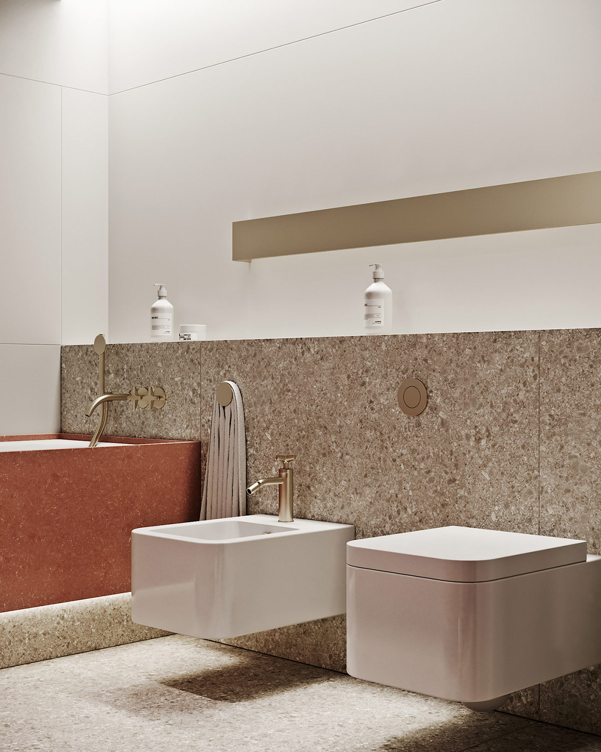
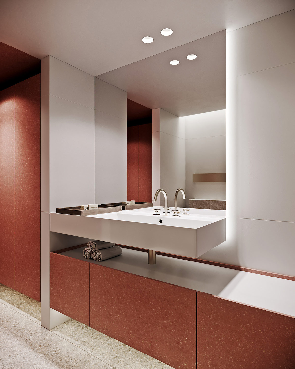
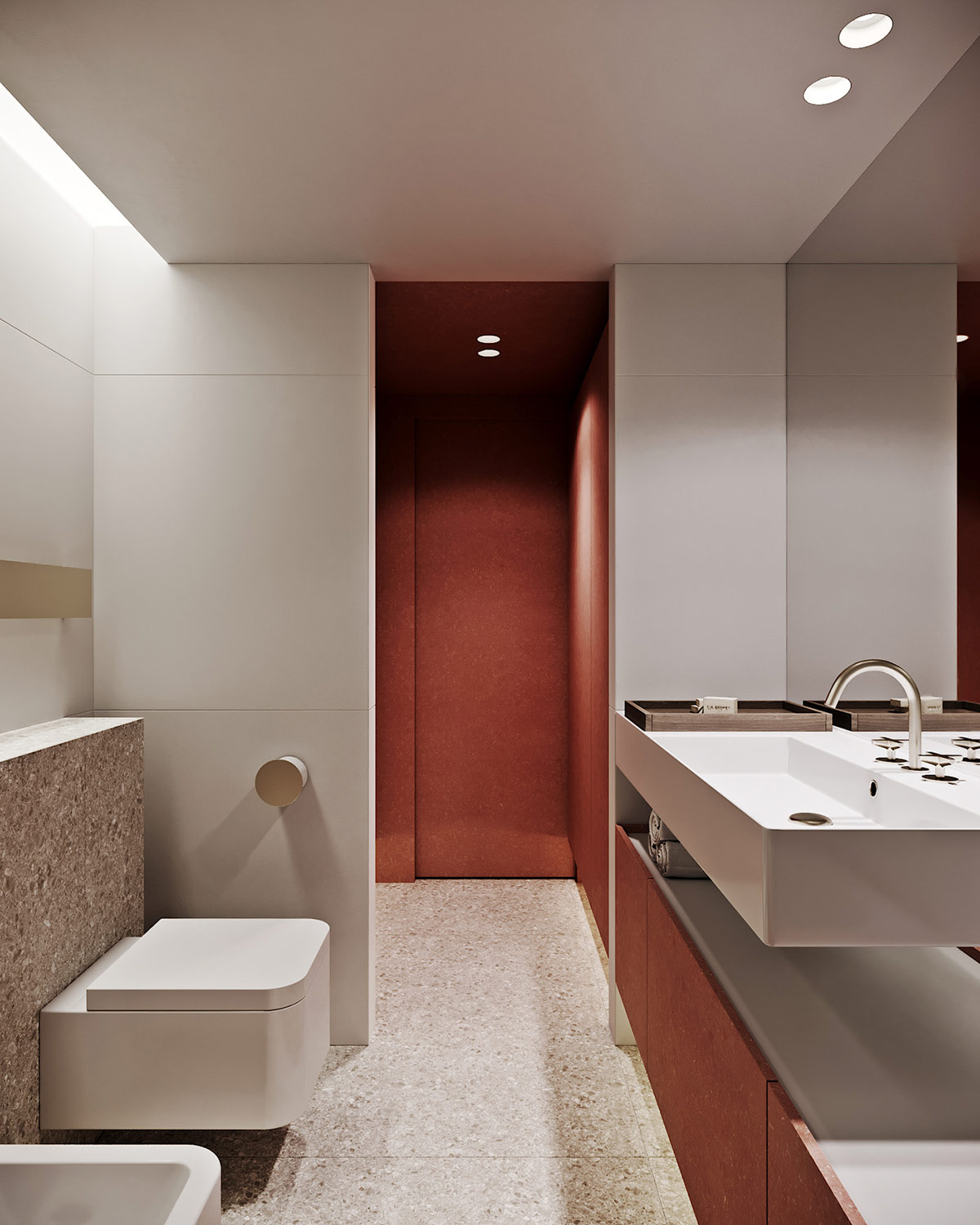
The shower room is an ultra contemporary and elegant design, with sharp edged sanitaryware silhouettes and champagne gold fixtures.
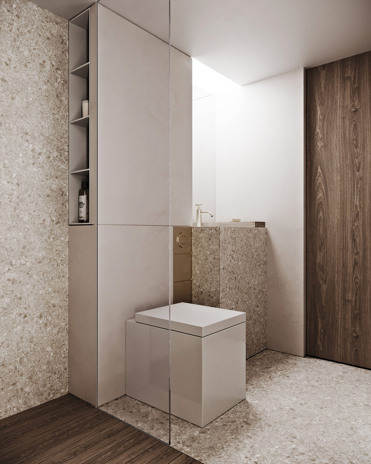
Granite has been selected as the material of choice to clad the wet zone, the main floor and the vanity as one luxurious module.
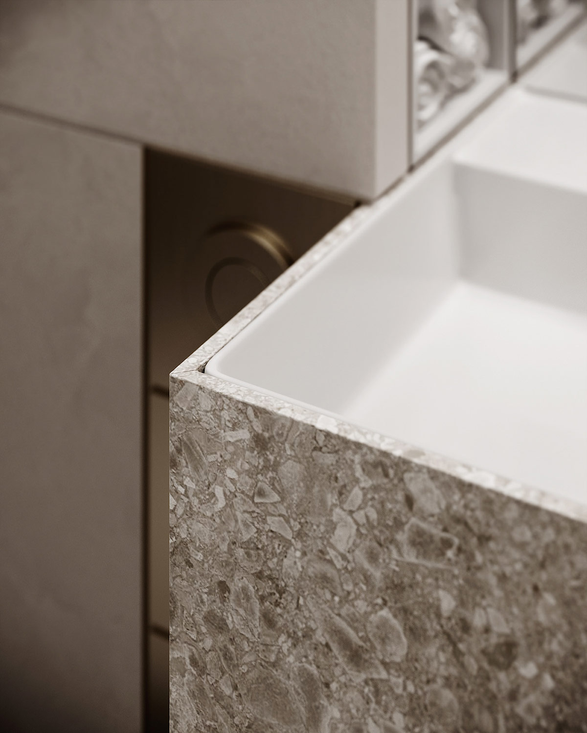
A unique gold flush plate drops vertically down the side of the stone covered cistern concealment wall.
