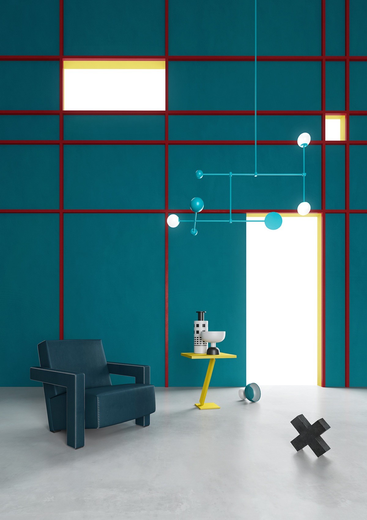
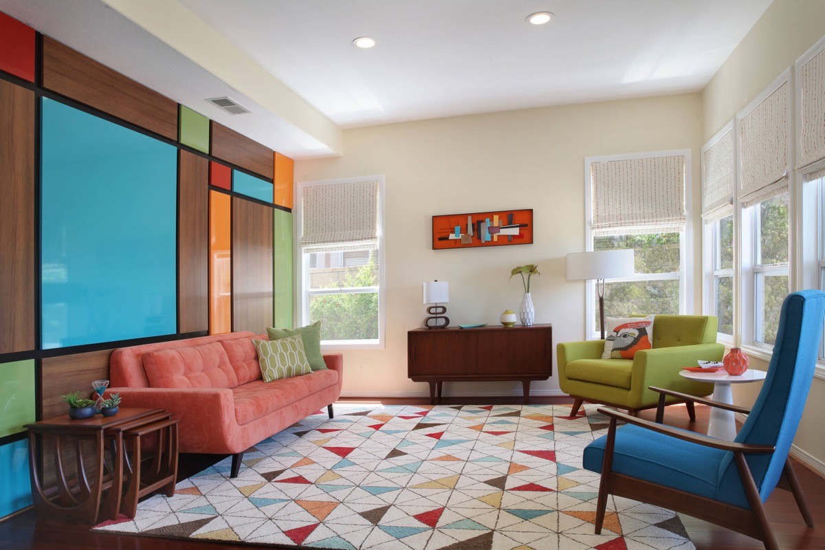
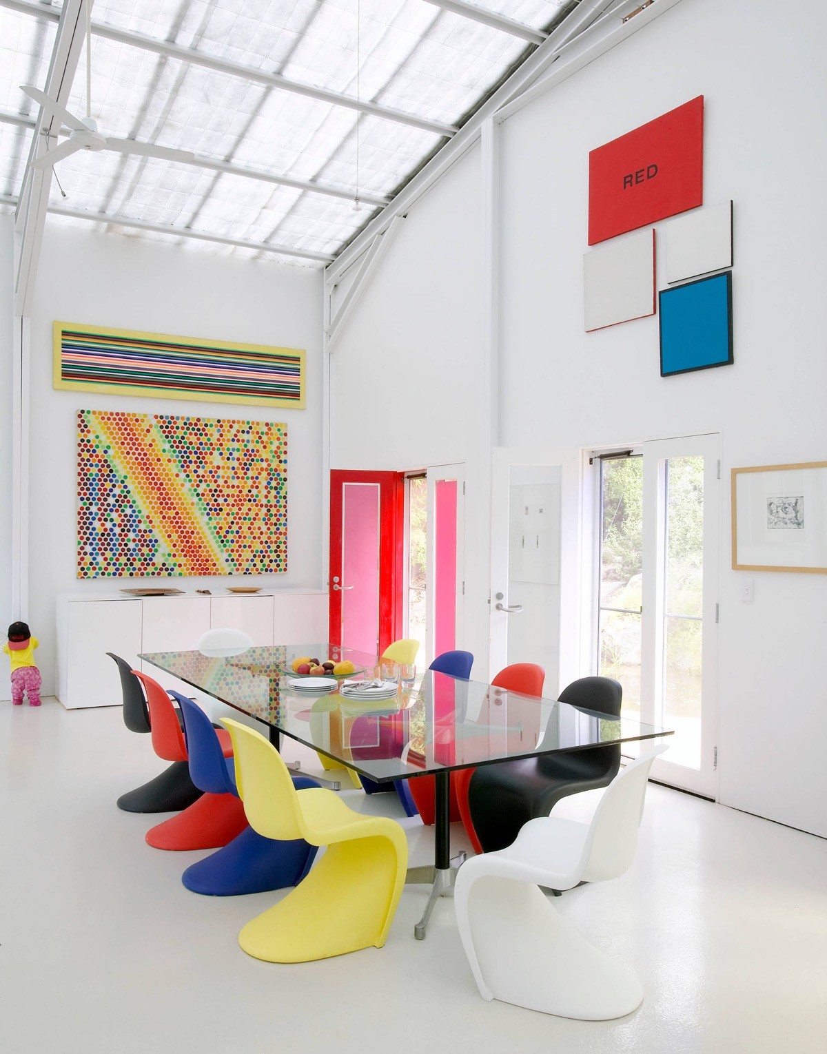
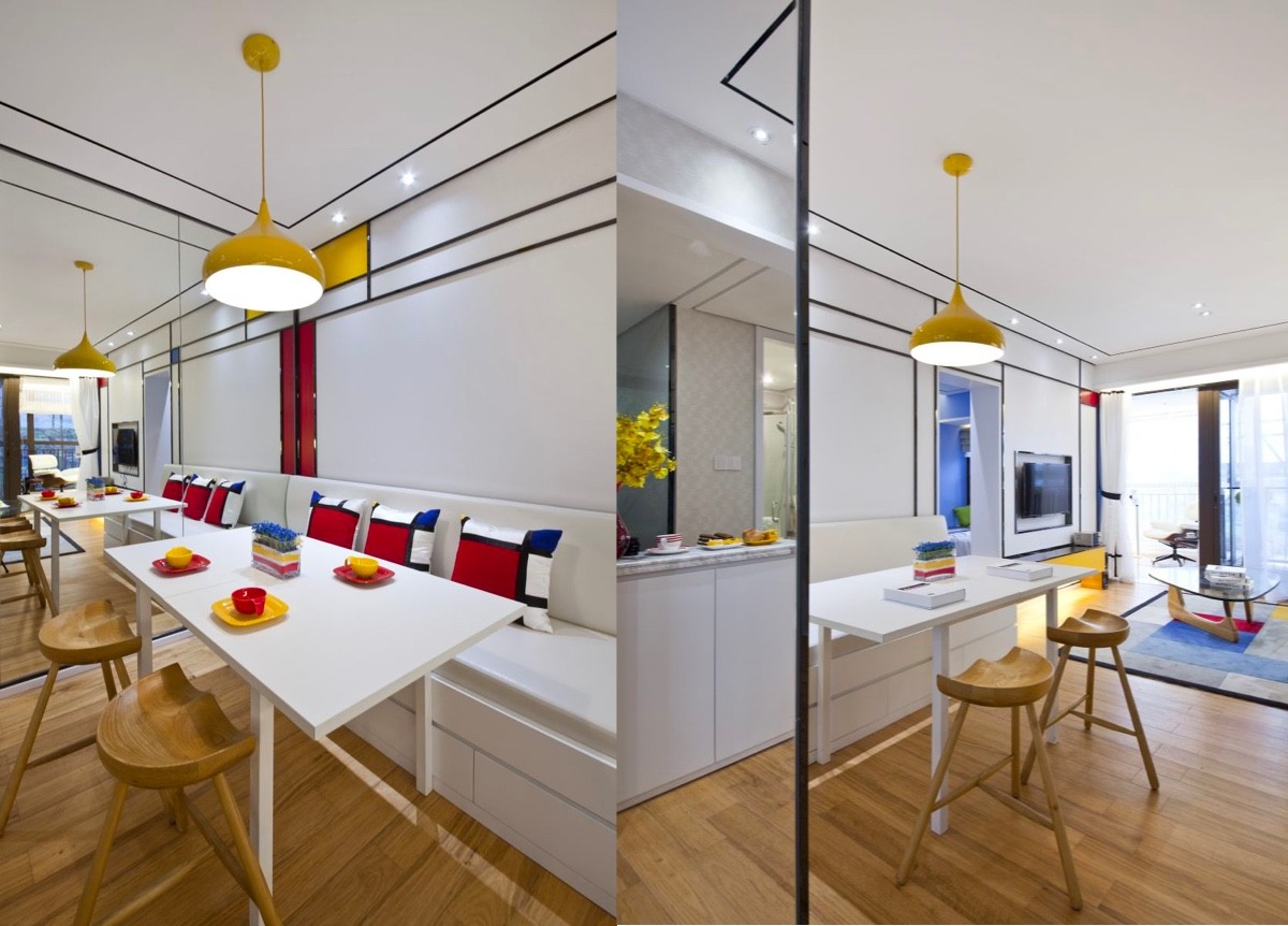
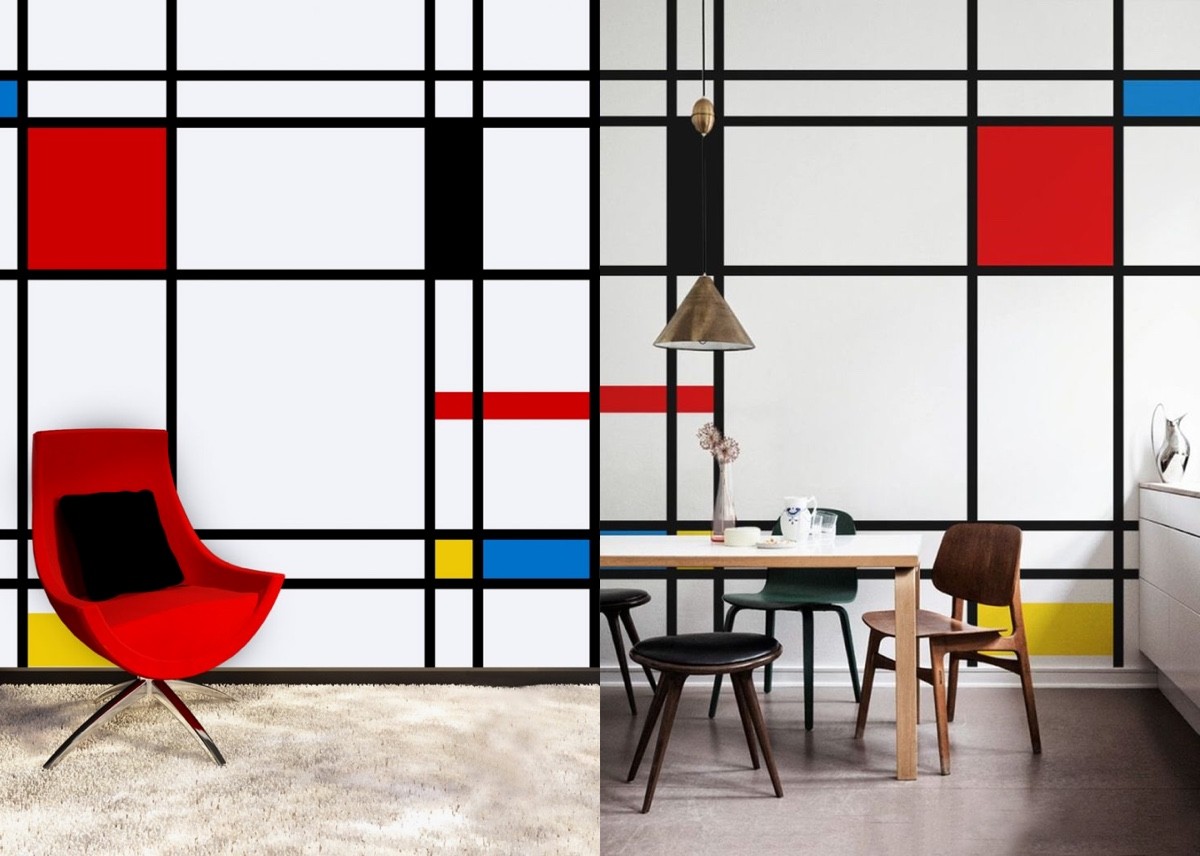
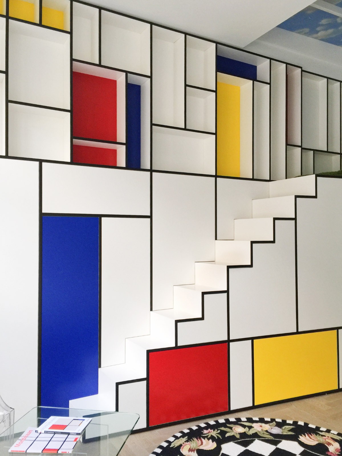
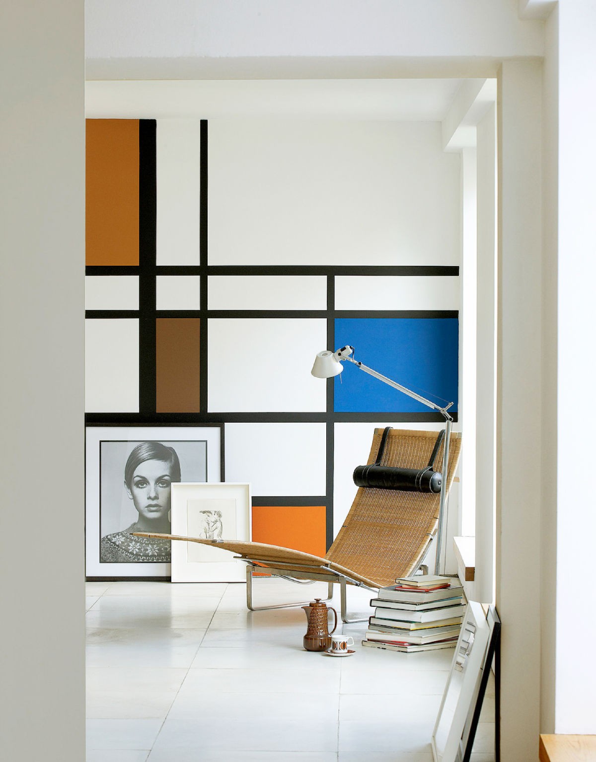
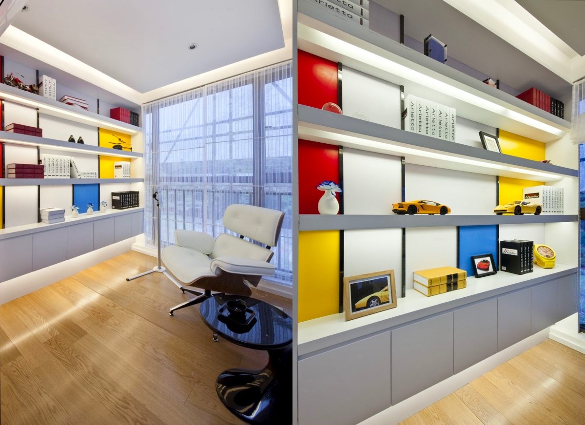
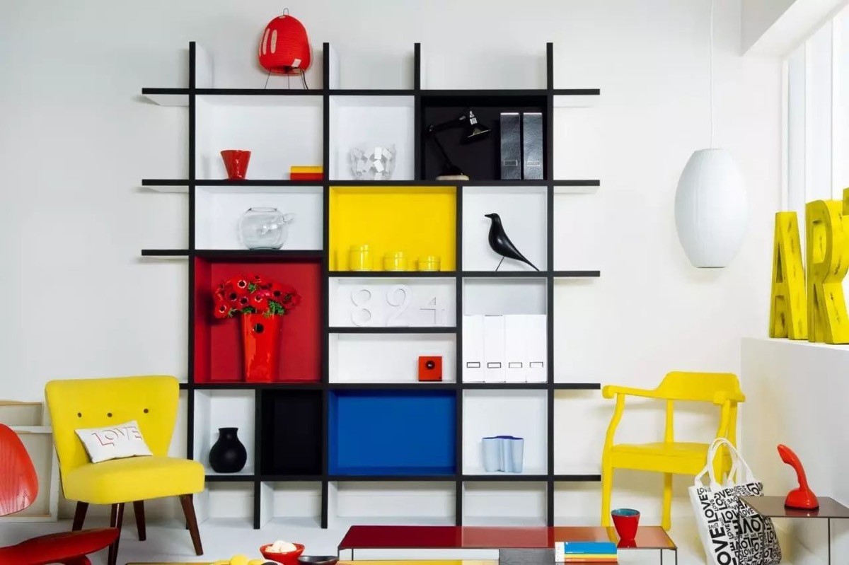
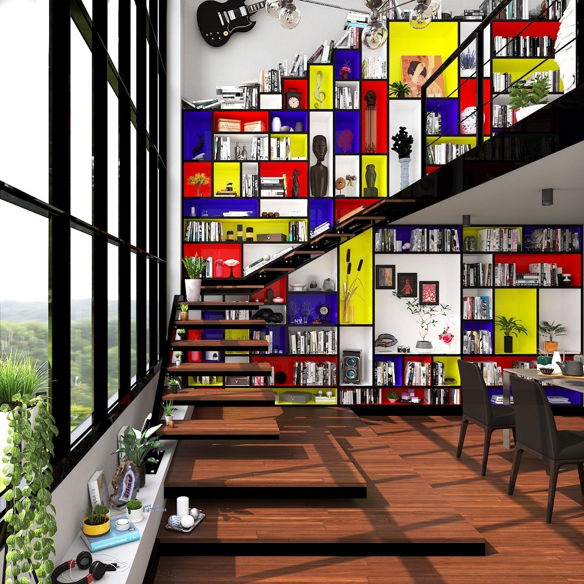
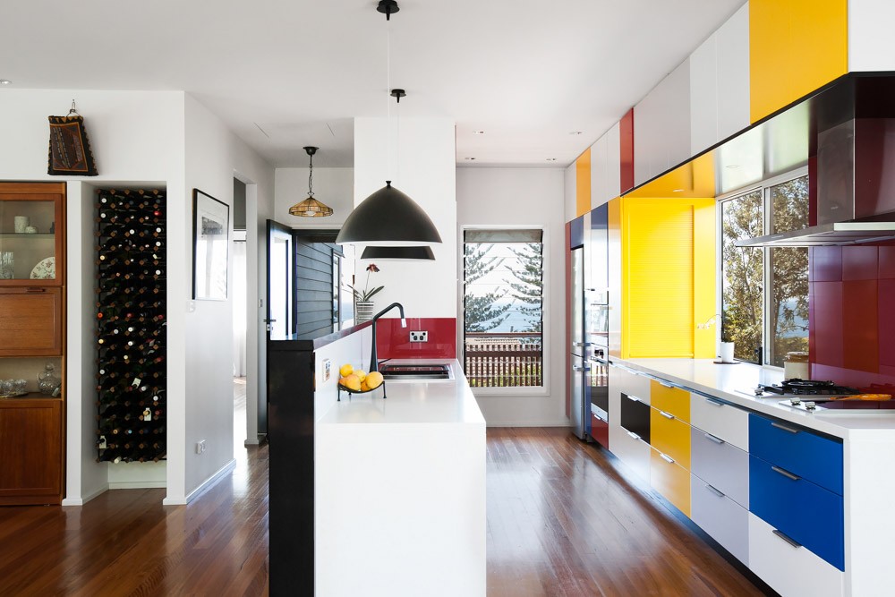
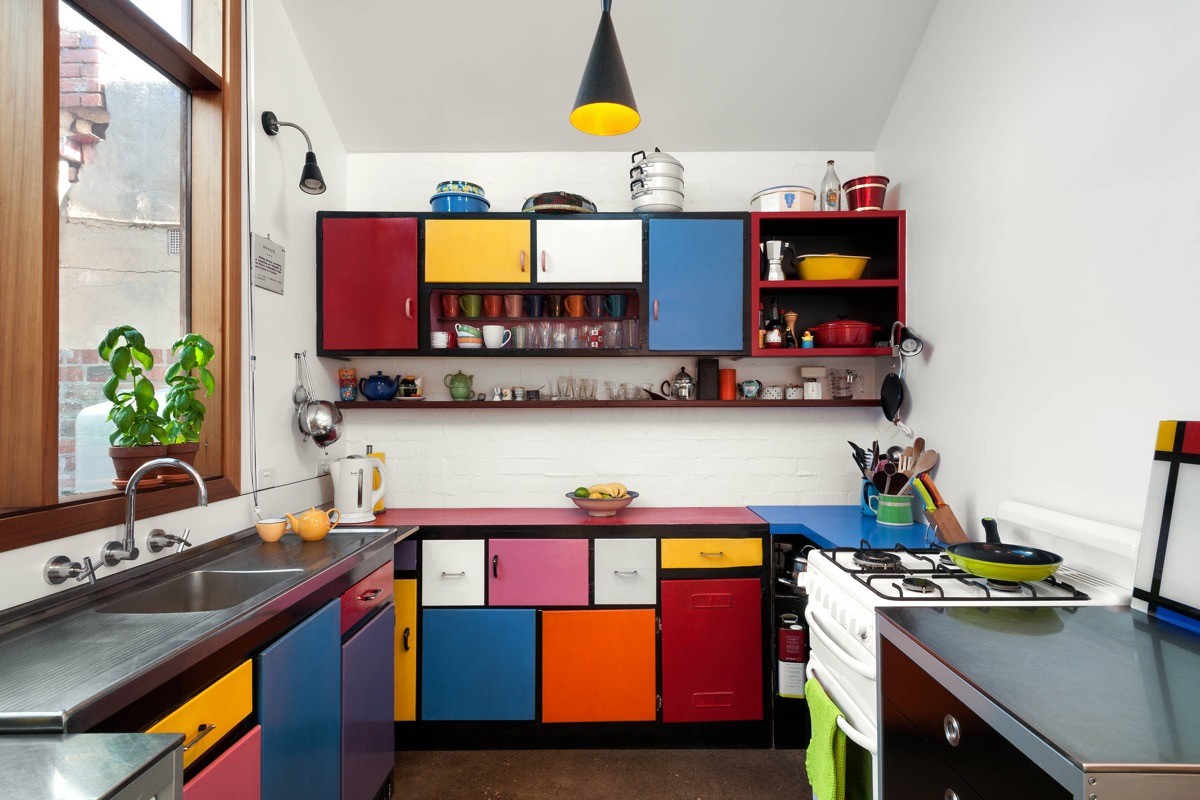
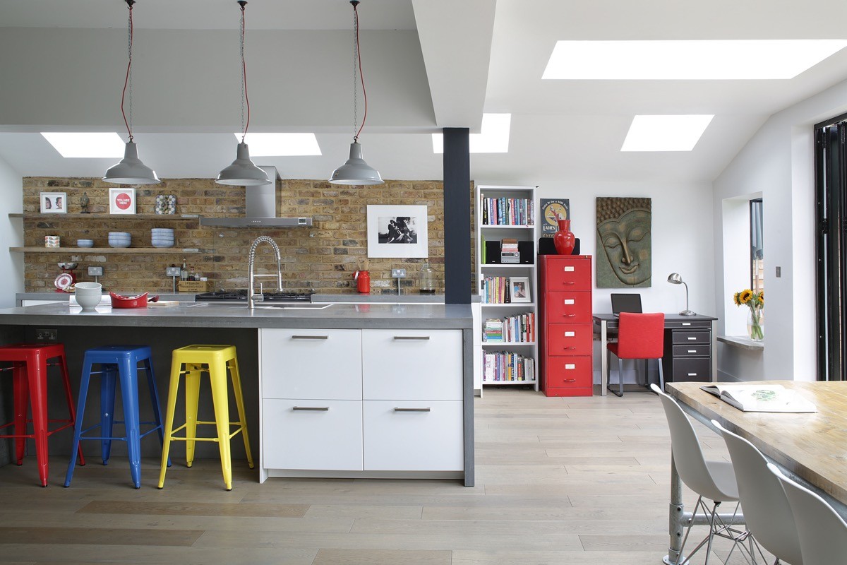
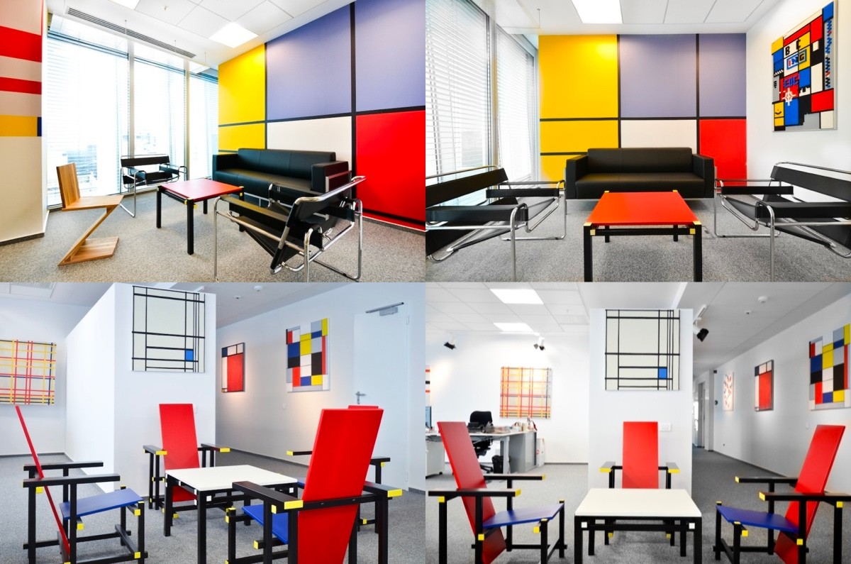
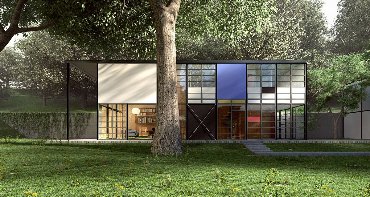
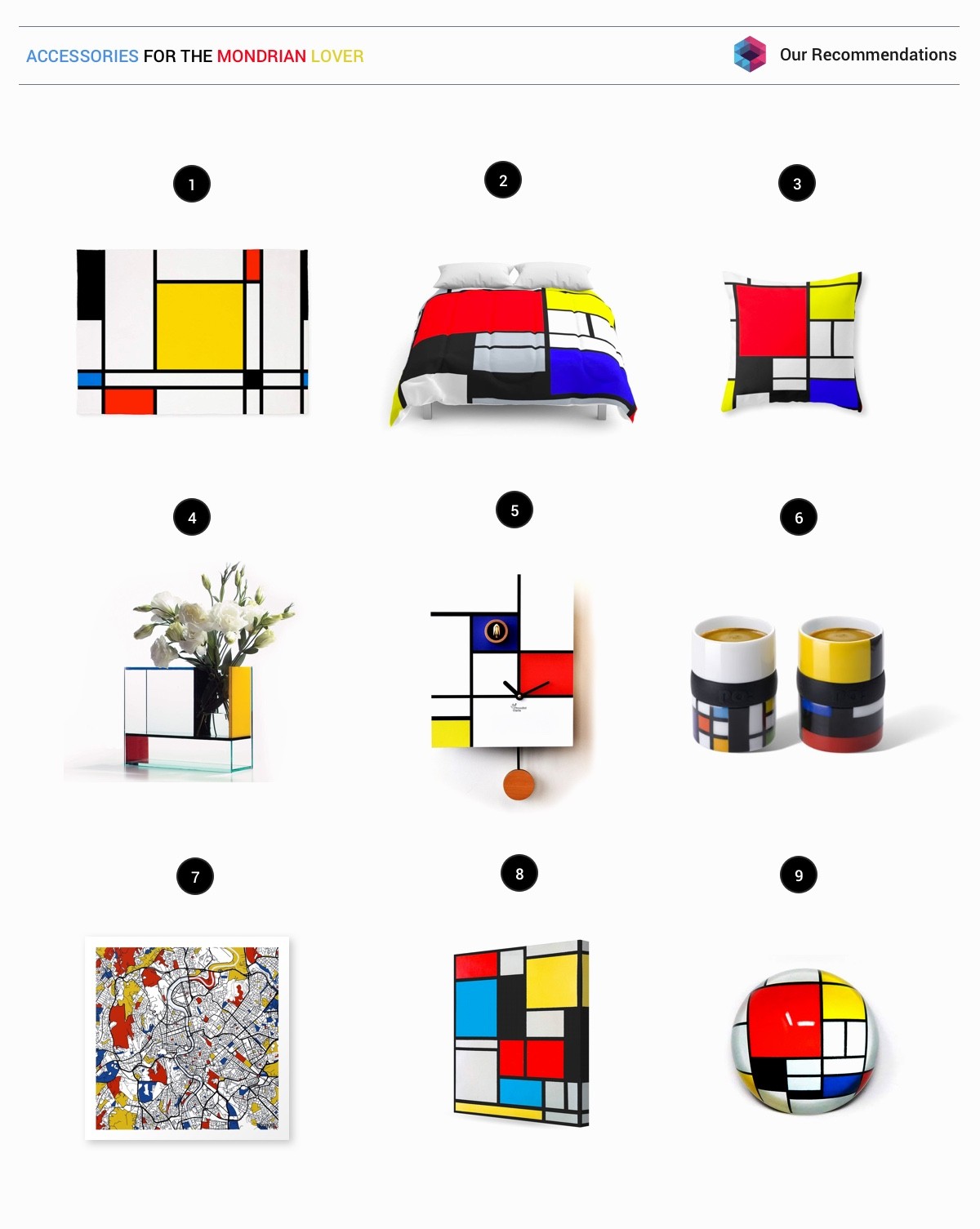
To appreciate the Mondrian look, let’s take a look at the De Stijl artistic movement: Dutch for "The Style" (aka Neoplasticism, “the new plastic art”) the Dutch body of work spans from 1917 to 1931. Strictly speaking, De Stijl works within constraints of only primary colours and non-colours, vertical and horizontal line compositions and strong asymmetricality to achieve pure abstraction. Though painter Piet Mondrian is perhaps most popularly known, the group was rich with artists and architects. The works of De Stijl went on to influence the Bauhaus style and cubism in interior design. Here, we’re featuring four homes that pay homage to the Mondrian style, plus a selection of other inspirational rooms decorated in the theme.
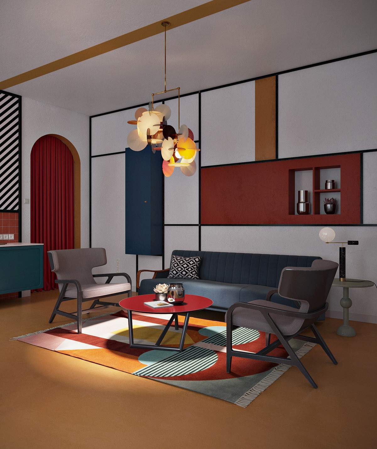
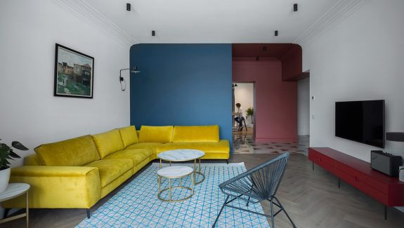
 Straight horizontal and vertical lines, plus square and rectangular forms were key in the De Stijl movement, however curved lines were not completely unseen. This lounge decor presents a beautiful balance between the two by accentuating an arched doorway in primary colour paint–an easy way to bring a little Mondrian flavour into your scheme. More contrasting curves are introduced through coffee tables, chairs and abstract pattern in the rug.
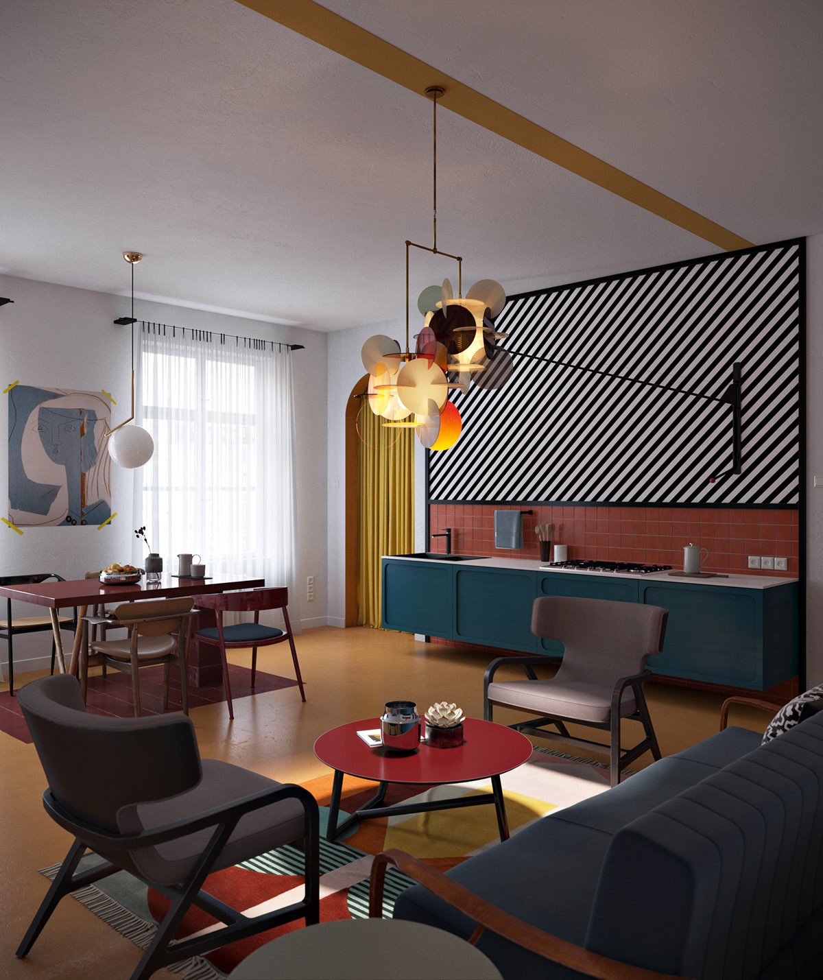
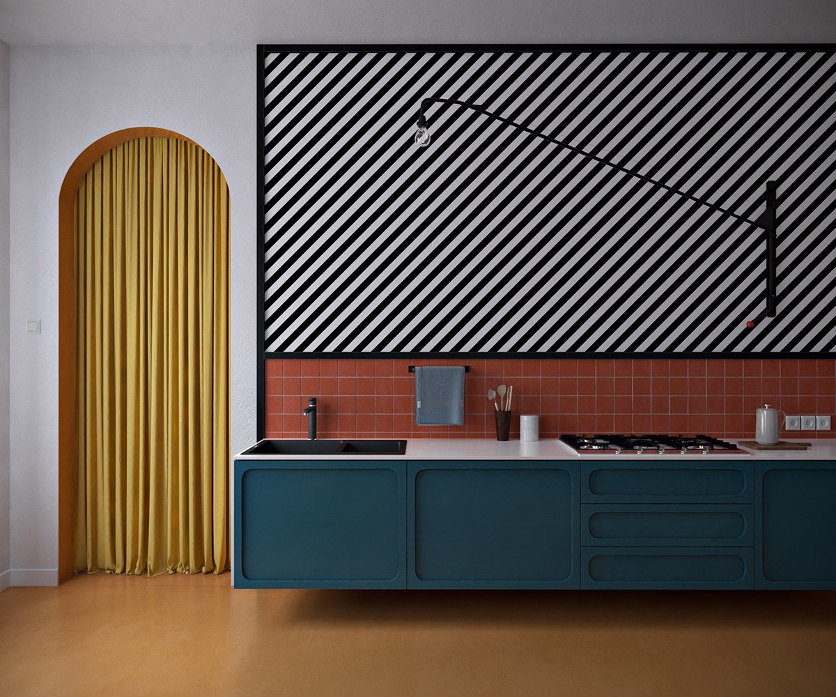
  An area of ‘non-colour’ is fashioned as a panel of black and white diagonal stripes over a compact one-wall kitchen. The black and white feature wall is accessorised with a black swing arm wall lamp. A circular chandelier adorns the centre of the room.
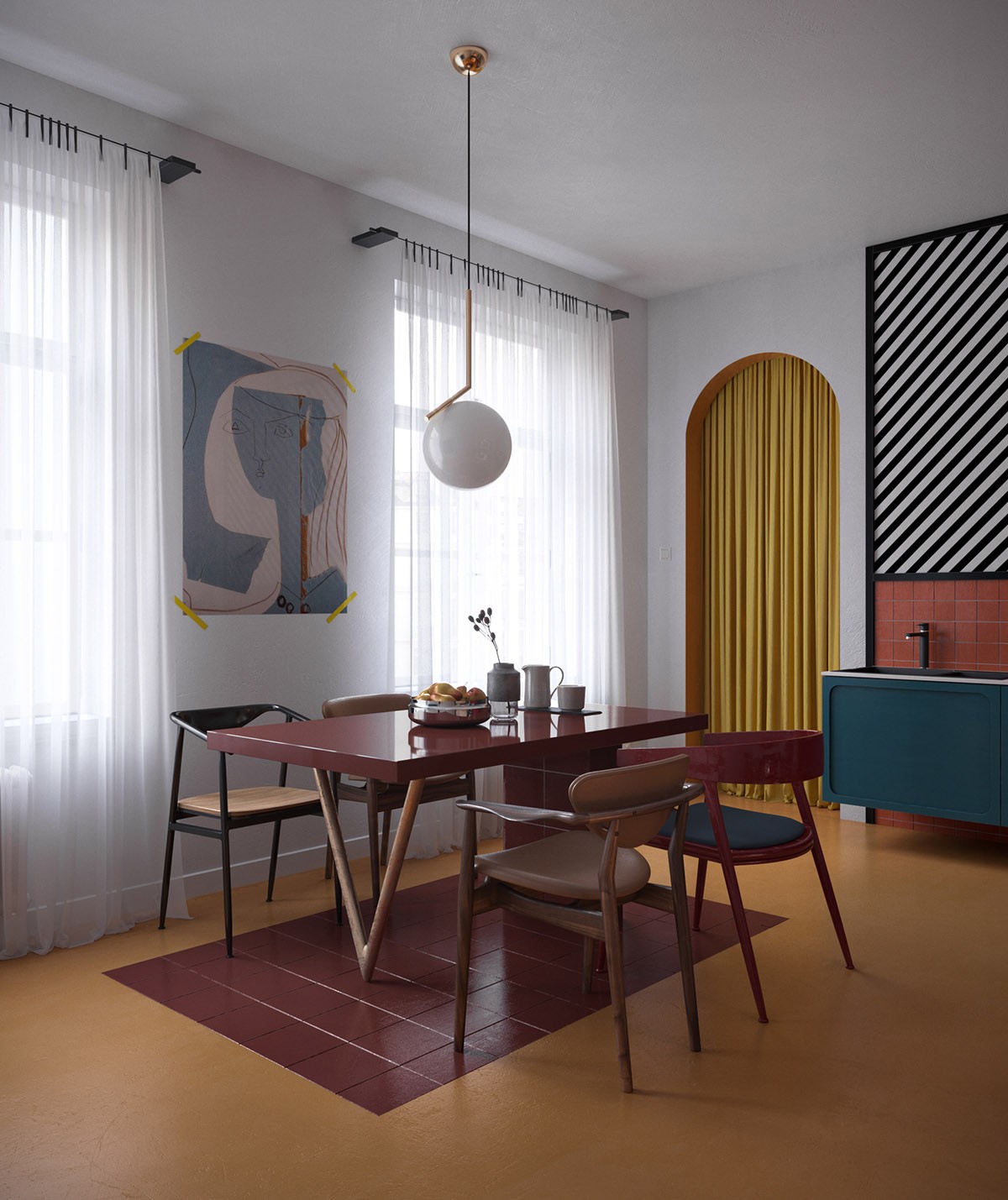
  Another curvaceous light is suspended over the dining combination of mismatched chairs. At first glance, the dining table appears to be impossibly balanced on the point of a triangular leg formation, however, the other side of the table reveals a support. The De Stijl works always avoided symmetry, and instead found aesthetic balance by use of opposition. This embodies the second meaning of ‘stijl’ that is “a post, jamb or support”. The rectangle of tile below the table makes a practical cubist flourish that’s easy to mimic.
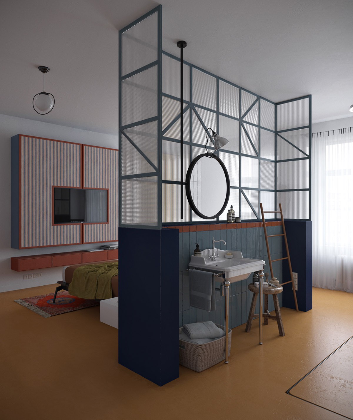
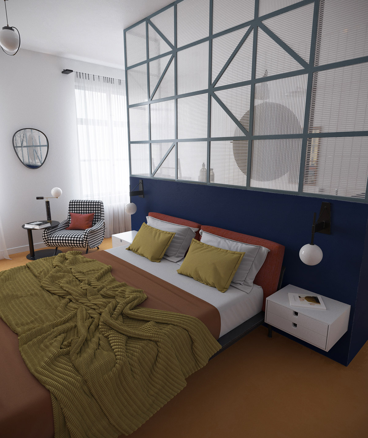
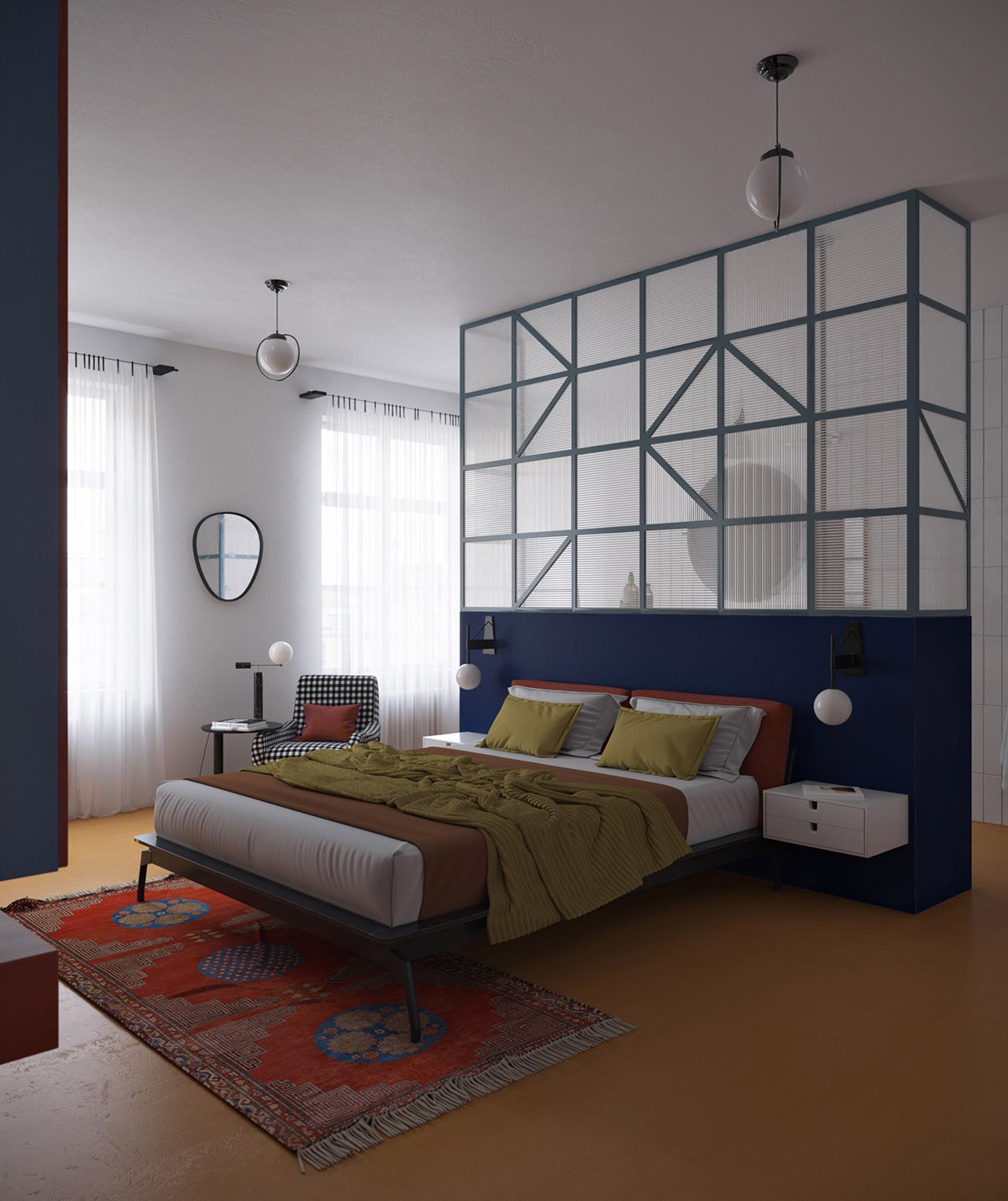
  A partially dividing wall sections an ensuite bathroom from the master bedroom. The half height wall is topped with cubist framing holding panes of obscured glass. You could commision one of these for any space with the help of a capable carpenter or metalworker.
  The opposite side of the cubist dividing wall acts as a headboard feature wall for a double bed. Again the bold colours of the room are balanced out by a black and white feature piece, this time in the form of a monochrome bedroom armchair.
  Floating rectangular bedside units are reminiscent of the De Stijl group’s three-dimensional works where vertical and horizontal lines are positioned in layers or planes that do not intersect, allowing elements to exist independently and unobstructed.
  When implementing a Mondrian inspired interior design, always keep neighbouring colours in high contrast, and intersperse with black, white and grey.
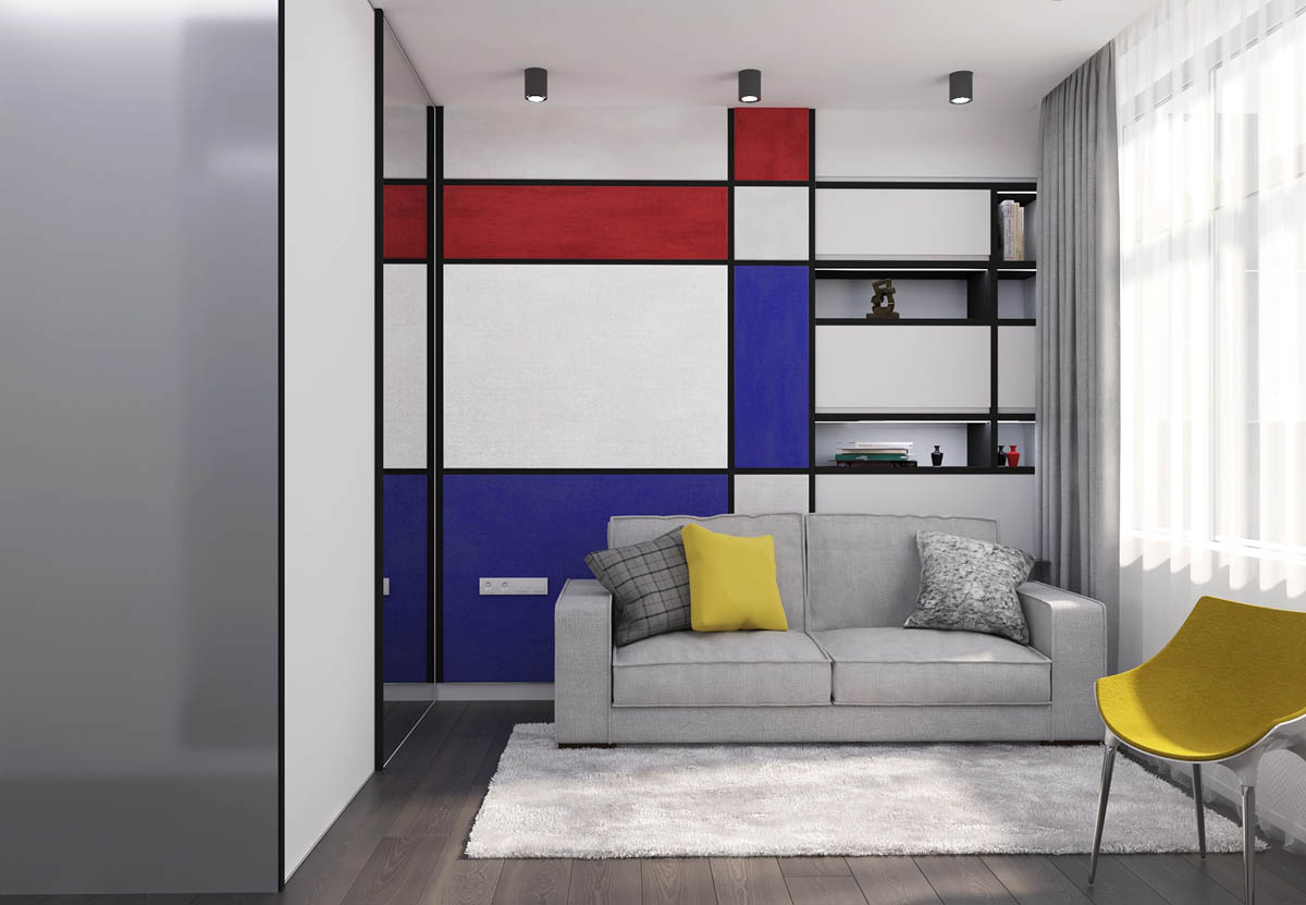
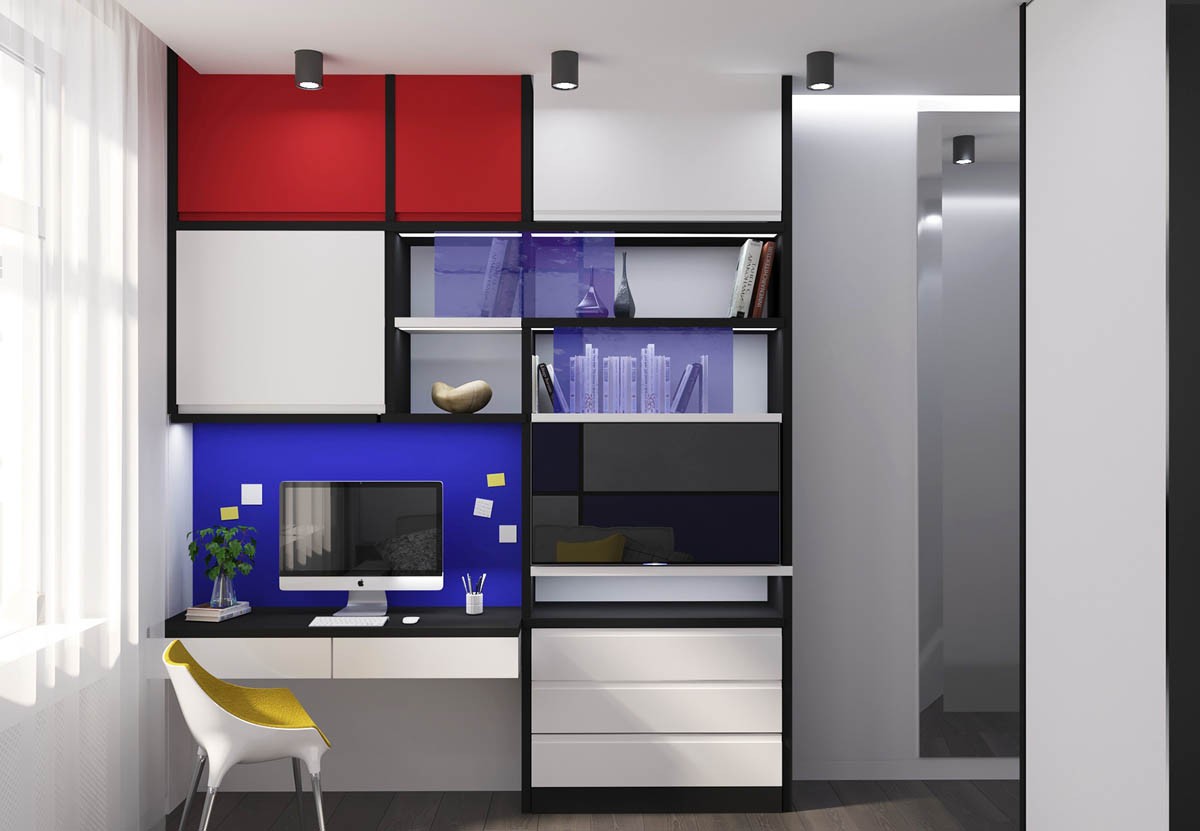
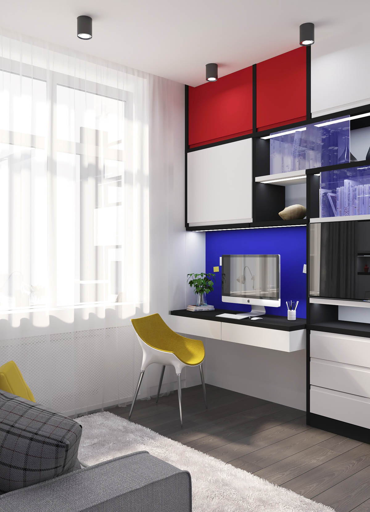
  In our second home interior of the Piet Mondrian style, a children’s’ room follows the primary colour rule more rigidly. Primary colours have always worked well in kids’ rooms due to their simplistic nature and high energy look.
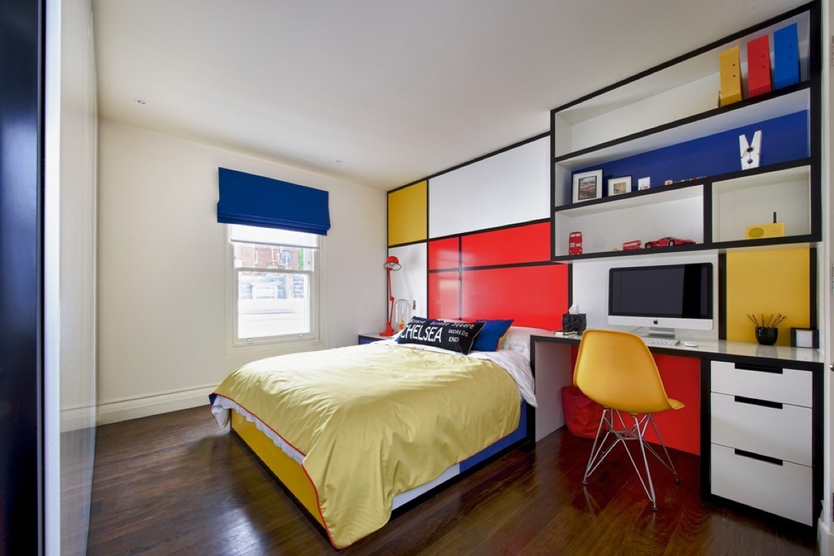
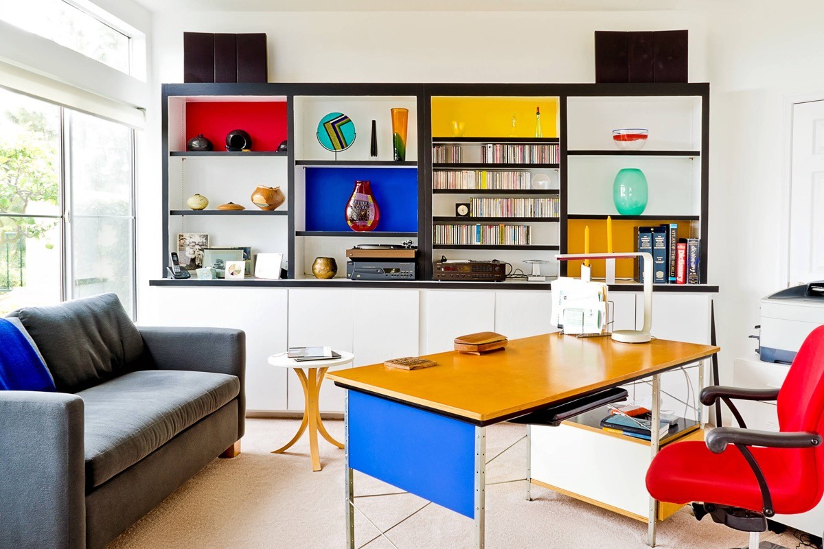
  The modern workspace in the room is a graphic and crisp interpretation of Mondrian paintings, with black lines forming intersections for colour fills and negative space. The cubist style is easily translatable into work areas that include storage: Simply install black unit carcasses, worktop and shelving, then select cupboard doors in red, blue, yellow and white colourways.
  Finish the look with a primary colour chair.
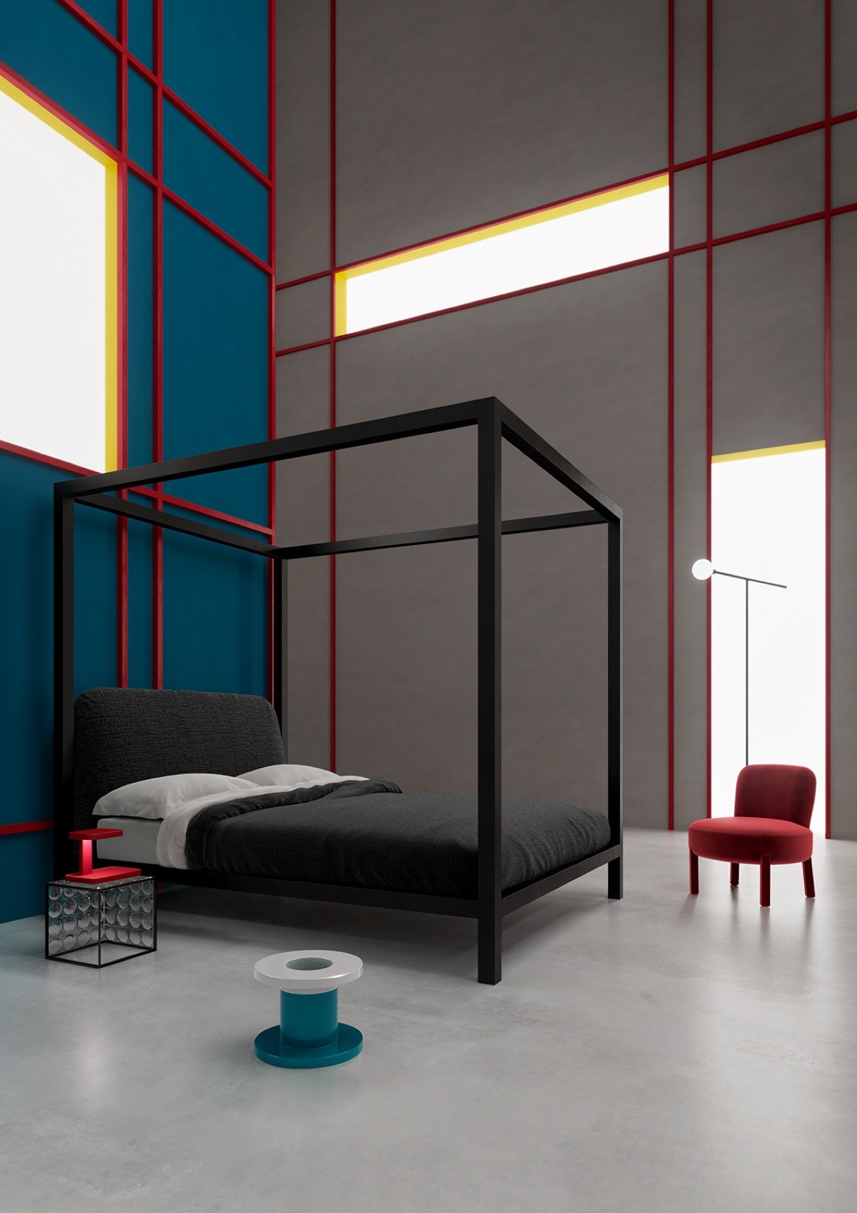
  In our third home with De Stijl flair, timber battens have been applied to interior walls to divide into eye-catching cubist sections. The battens have been painted in red, and mounted on blue and white walls; black framing in this style would give a cool monochrome look that could also be filled in with intermittent sections of colour. In this instance, black notes come into the scheme via a 4 poster bed and matching black side table.
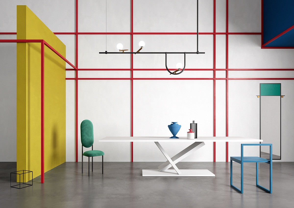
  In some areas of this home, the red framing stands independently of the walls in a 3D effect. The dining space is like a living Mondrian painting, with objects reduced to their simplest form.
  Mondrian wrote, “this new plastic idea will ignore the particulars of appearance, that is to say, natural form and colour. On the contrary, it should find its expression in the abstraction of form and colour, that is to say, in the straight line and the clearly defined primary colour”.
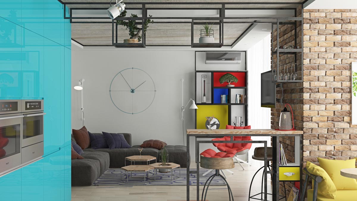
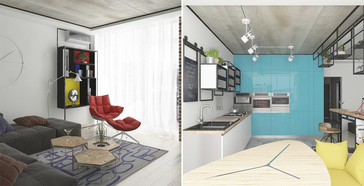
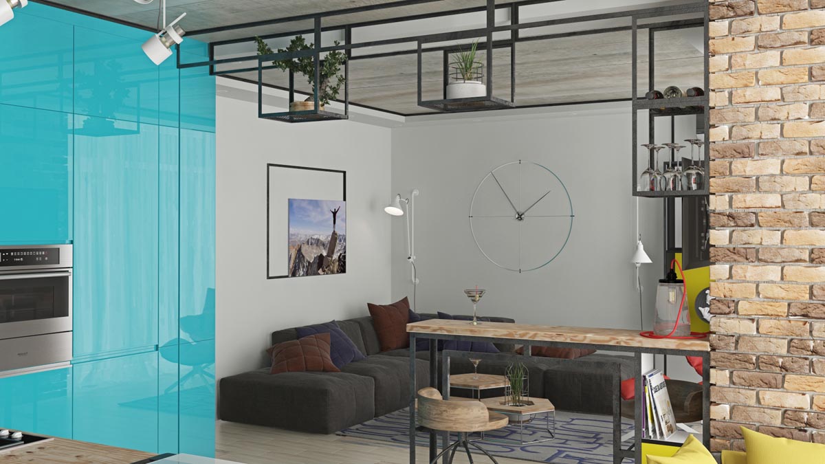
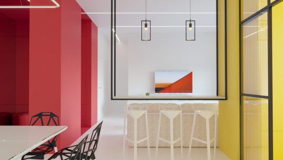
  Our last cubist home interior is located in Chernivtsi, Ukraine, and contains perhaps the most adaptable ideas of the four.
  A simple black display shelf is backed in the instantly recognisable primary colours of Neoplasticism. The adjacent kitchen is bold in colour and contains black framed wall units.
  A special installation of shelving has been fashioned as volumes suspended from a ceiling support. The cubes hold a selection of indoor plants and glassware above a breakfast bar. Over in the lounge, a circular large wall clock contrasts with the straight lines.
De Stijl was a collective of ideas. Here are some more artistic ideas collected by us to help inspire Mondrian home style in all different kinds of rooms…
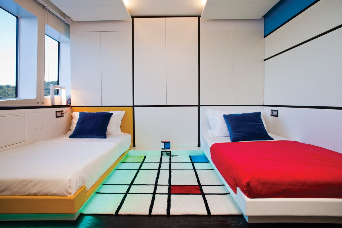
  This is a luxury yacht interior that uses relatively minor touches to create a big impact. One yellow bed, a cubist pattern rug and a few black lines on the walls with a single blue section is all it took to create this stand out scheme.
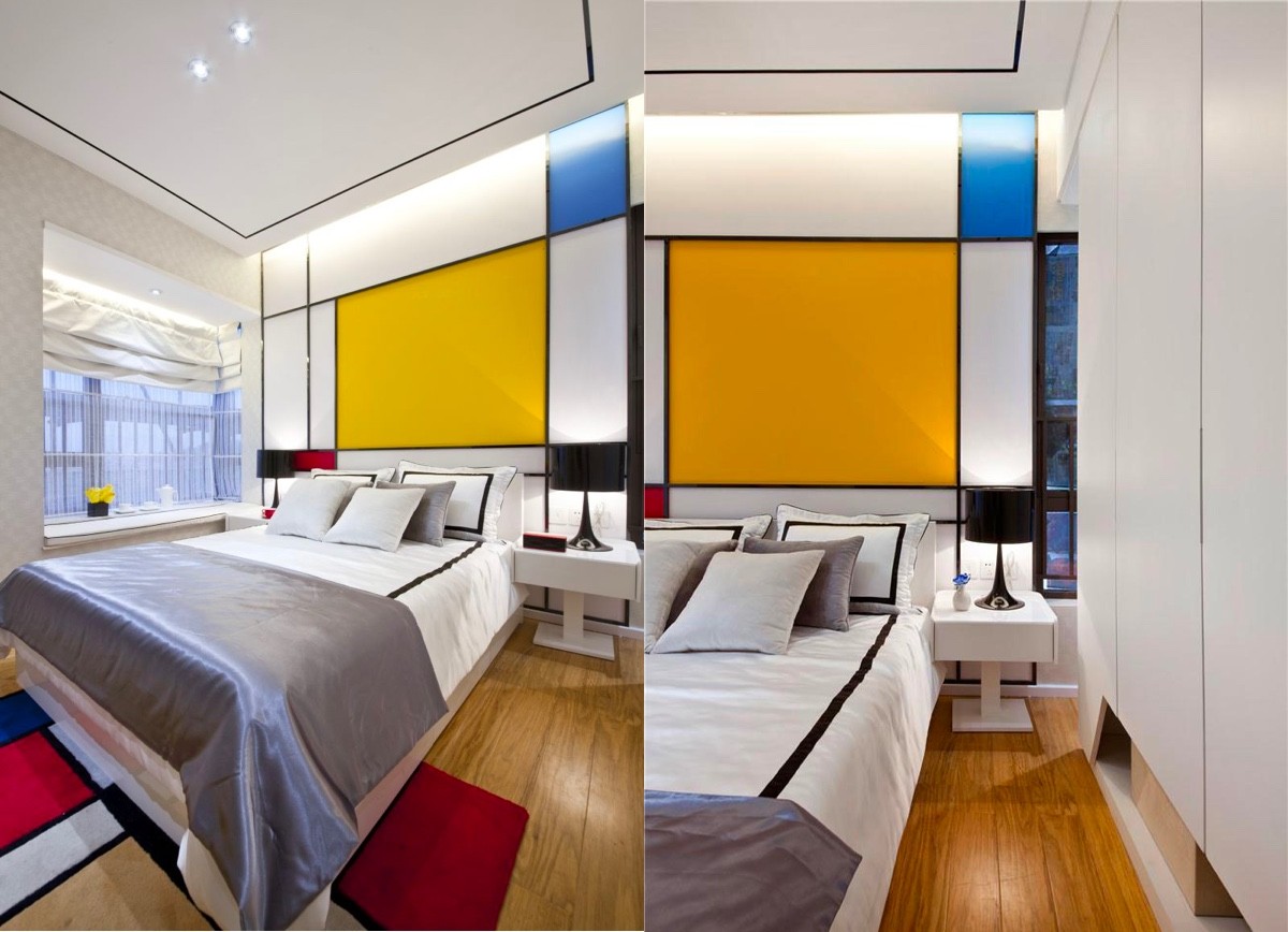
  This double bedroom features a Mondrian style headboard wall and bedroom rug to complete the look. The black border around the duvet cover and pillowcases makes a perfect accompaniment. The same effect could be created by sewing your own black trim onto a plain white bed set.
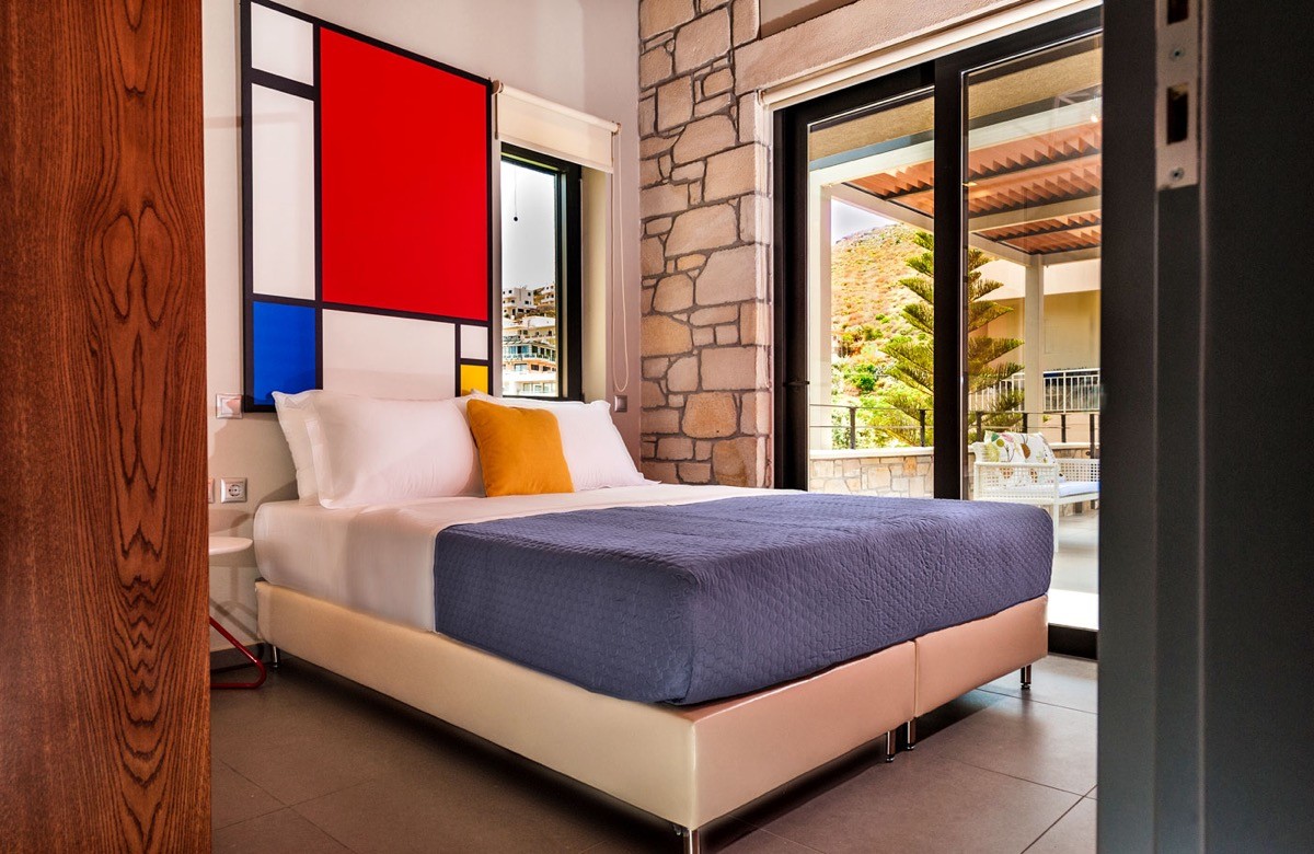
  If you’re not sure about committing fully to a Mondrian medley, then you can still enjoy the cubist aesthetic with a smaller panel above the headboard, and simply dress your bed with a primary colour bed throw over a basic white duvet. Accessorise with a contrasting square cushion. This bedroom has the added benefit of existing black framed windows and doors to tie in with the look.
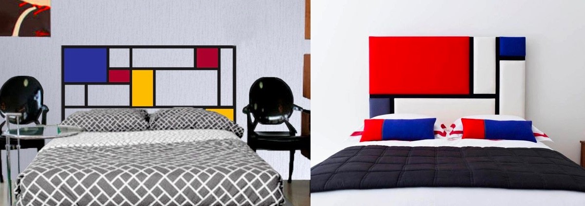
  A Mondrian headboard decal is a quick way to bring the theme into a bedroom. Alternatively, a fabric cubist headboard can be created with squares and rectangles of primary colour stitched onto a white base. Finish with lengths of black trim.
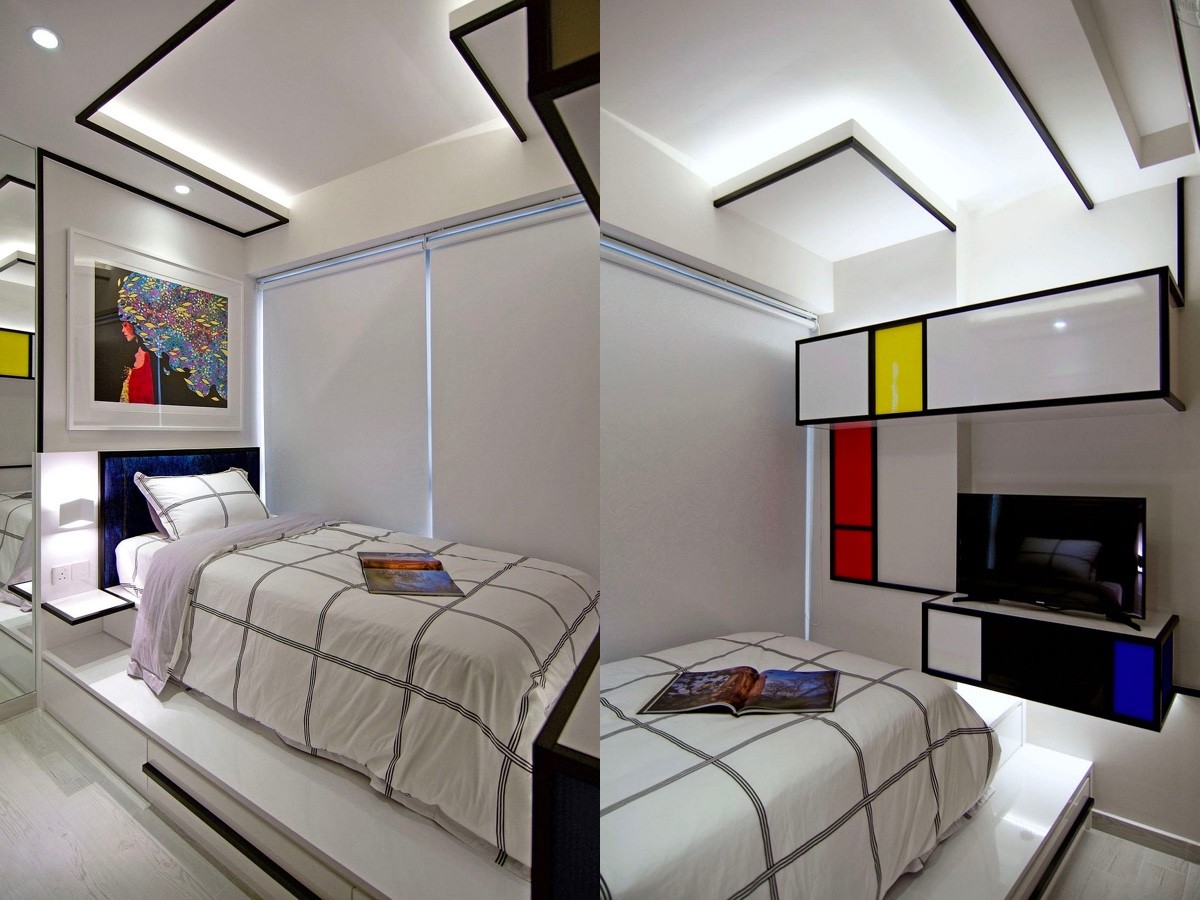
  This bedroom explores the relationship between positive and negative elements in an arrangement, using a cool extruded ceiling design and wall units. Recessed LED strip lights highlight the edges.
  This scheme encompasses both a headboard wall and a work desk area. A blue window blind, yellow desk chair and blue and yellow bedding complete the effect.
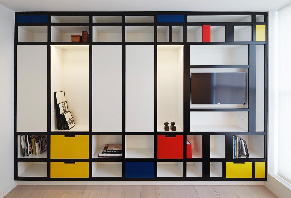
  The “plastic vision” of De Stijl as tv wall decor.
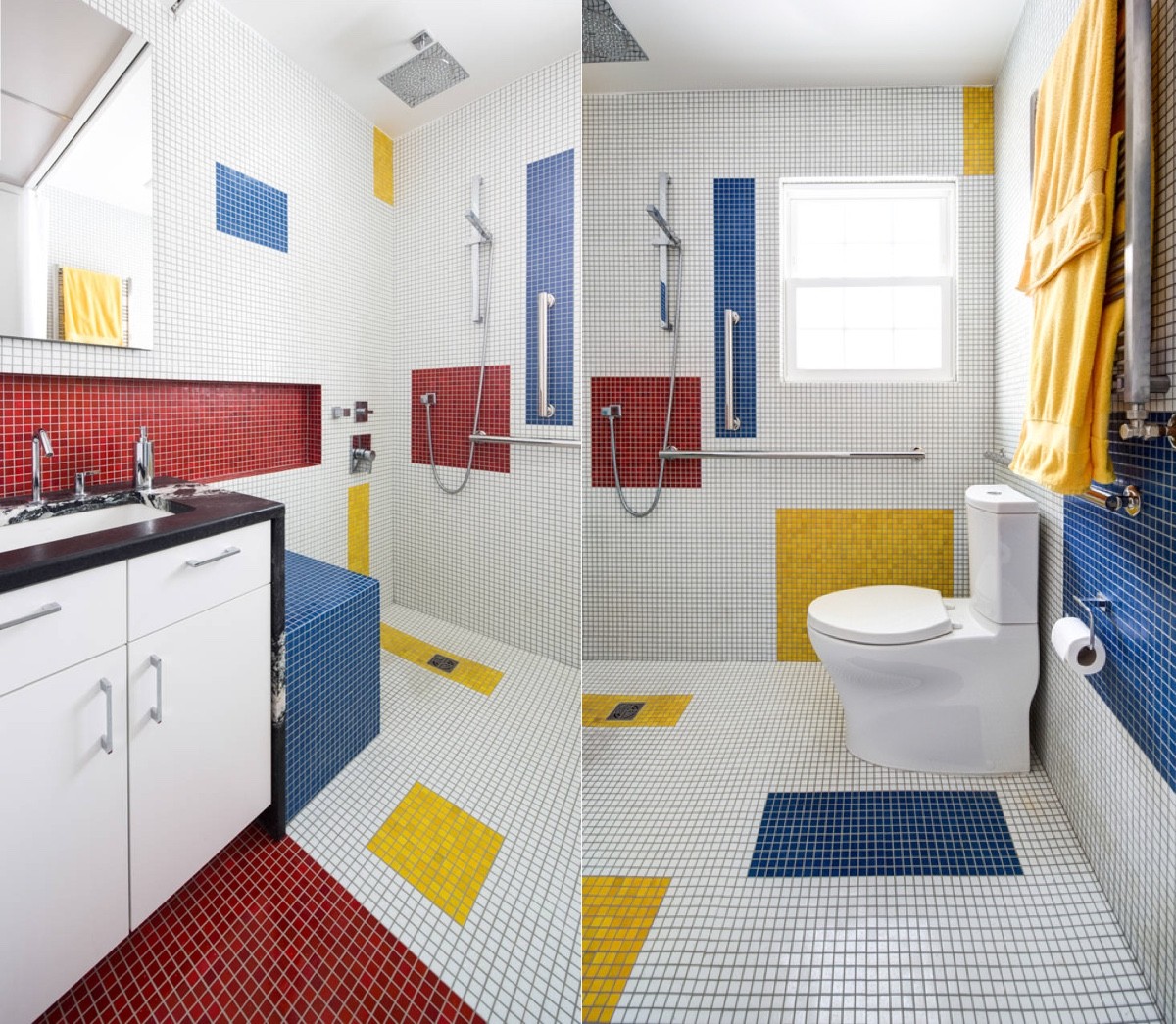
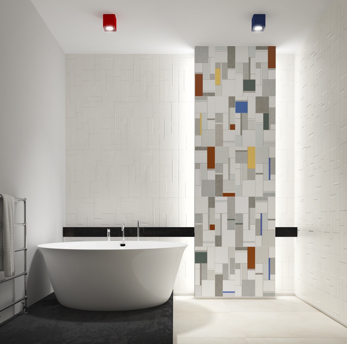
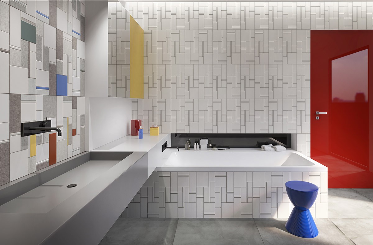
  Square and mosaic bathroom tiles adapt easily to the cubist style.
  You could cover the whole bathroom or pick just one focal point.
  This cubist tile design is reflected in the texture of the white wall tiling too.
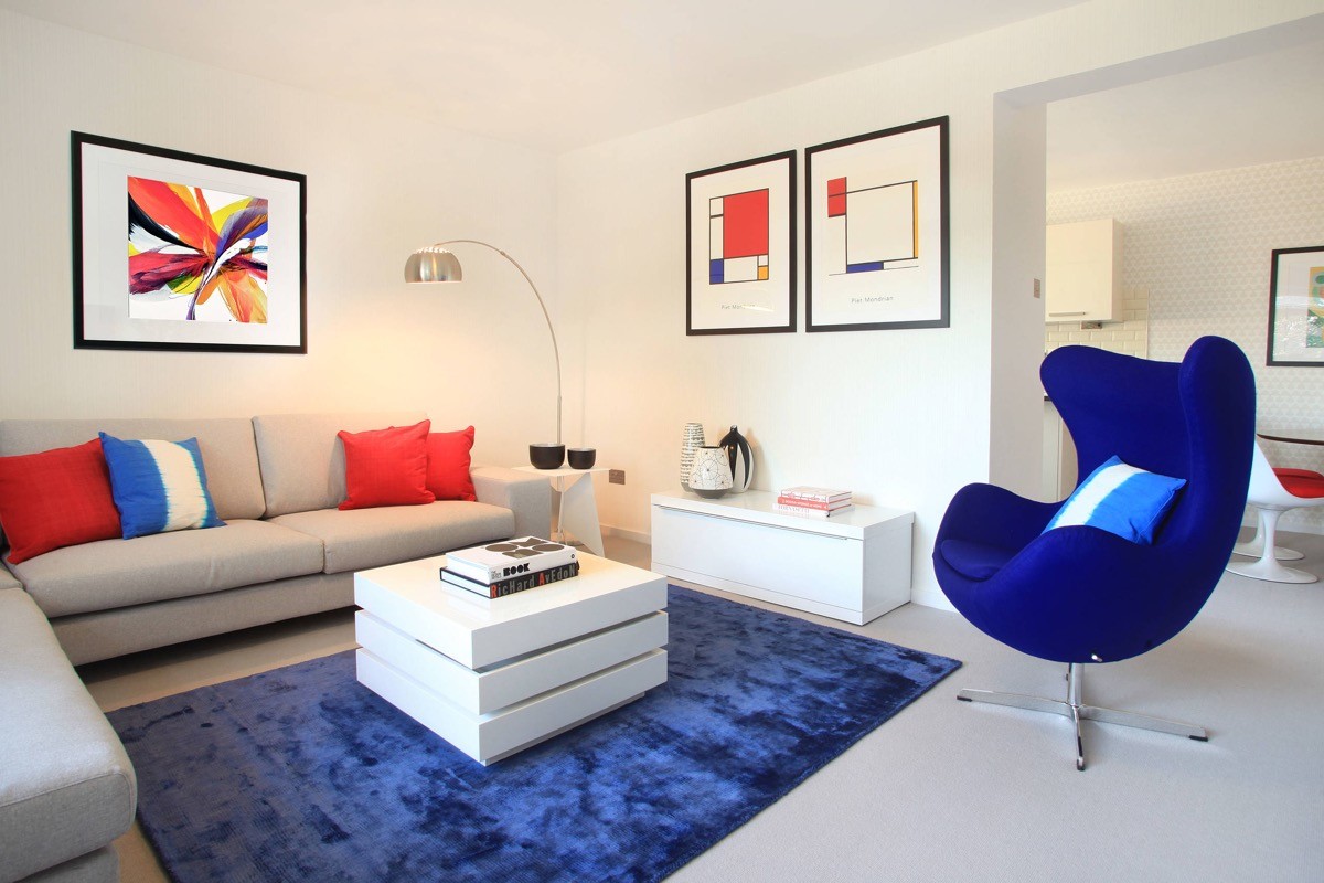
  Mondrian art prints can be complemented by solid colour accents.
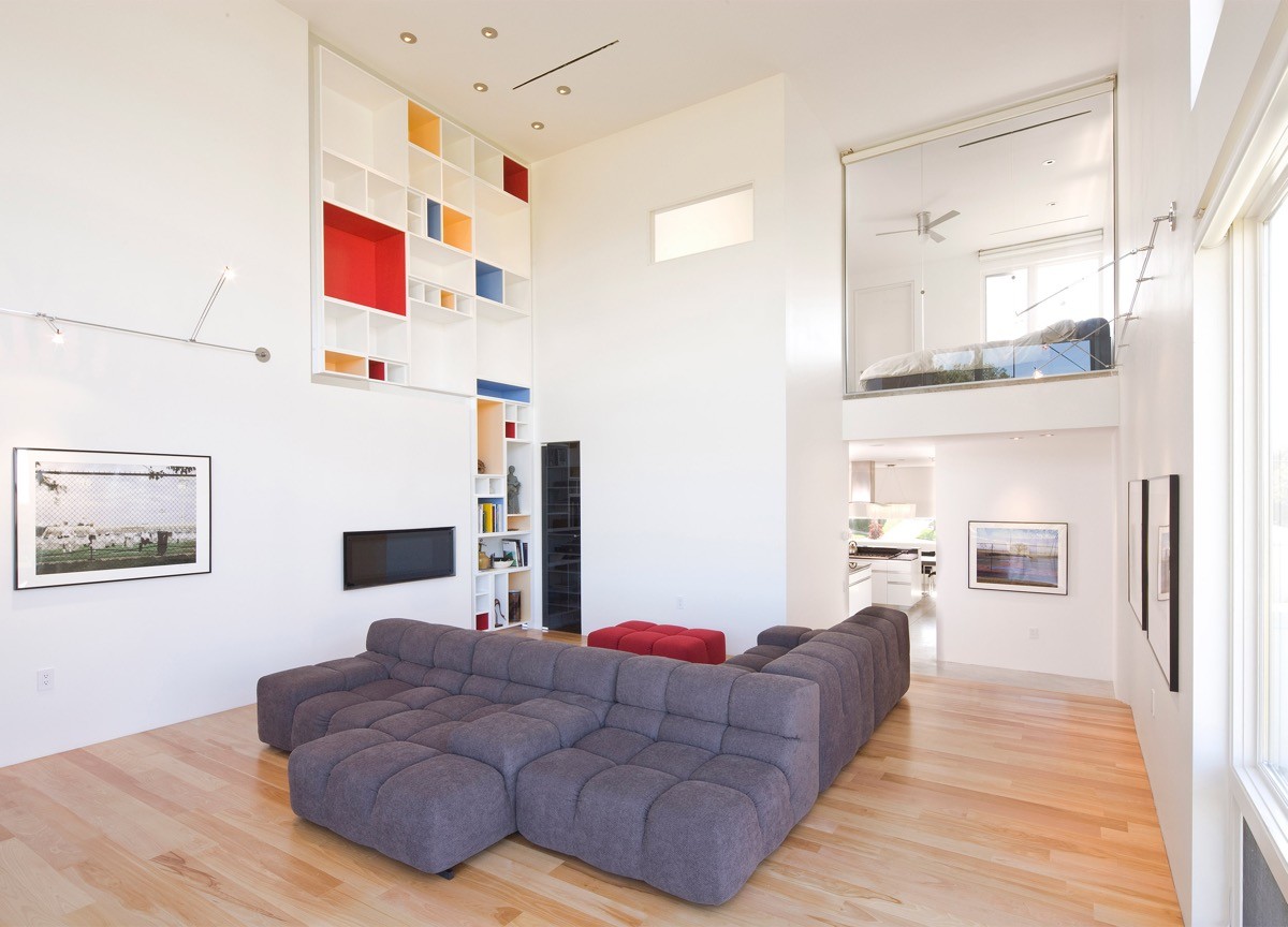
  Create your own Mondrian art by colouring the inside of shelving niches.
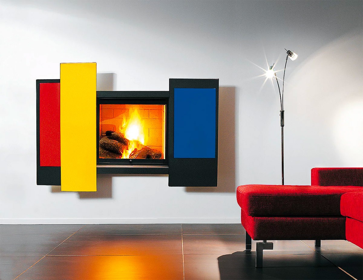
  Fashion an original feature fireplace around a wall mounted design, or paint up a basic floor model.
  Gerrit Rielvield’s masterpiece, the Schröder house (1924).
  Add coloured sides to a desk to evoke the Mondrian spirit.
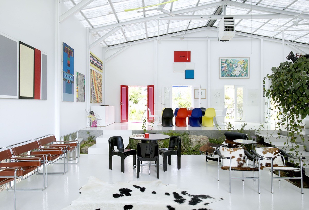
  Dot colourful art canvases around a white room to create a cubist effect.
  Mix and match dining chairs.
  Always punctuate furniture with a contrasting cushion.
  Apply a black outline to the edge of an open staircase.
  Under shelf lighting keeps colours bright.
  Colour coordinate home accessories to the backgrounds of your Mondrian inspired display shelves to keep the sections looking solid.
  There’s no limit as to how big your multicoloured display can climb, but consider pairing back the rest of the scheme.
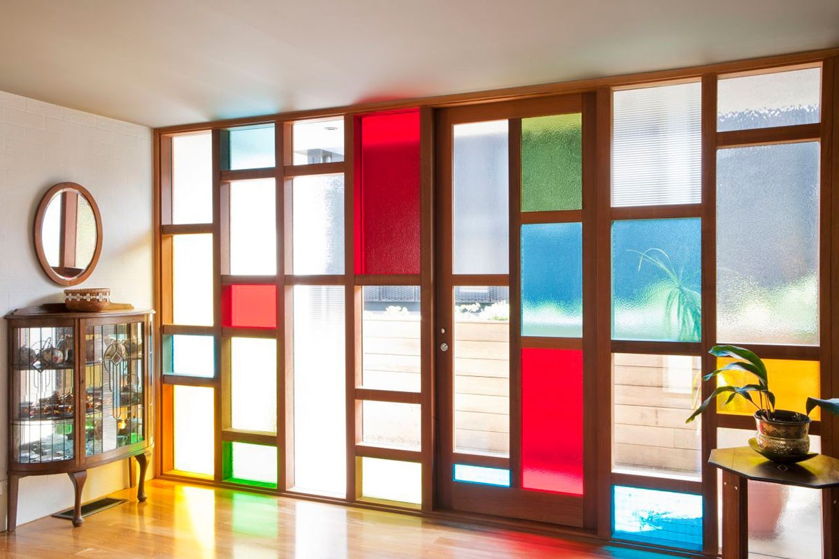
  Tinted glass windows will paint your floor with colour too. Mondrian window film is a cheaper alternative for small areas.
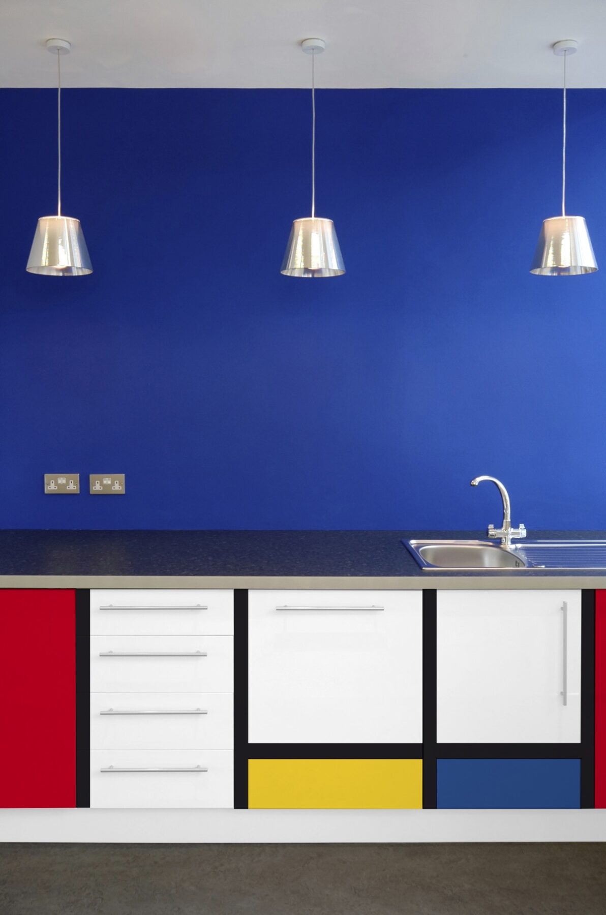
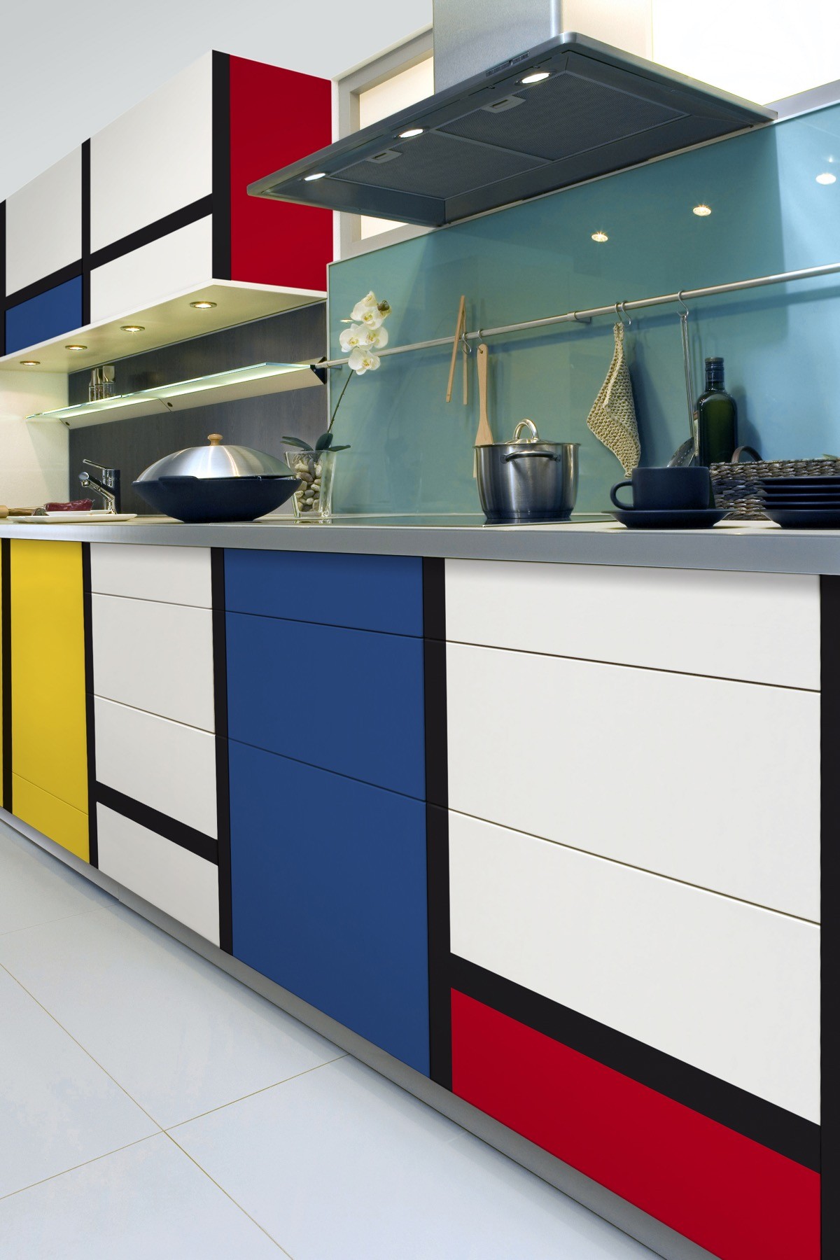
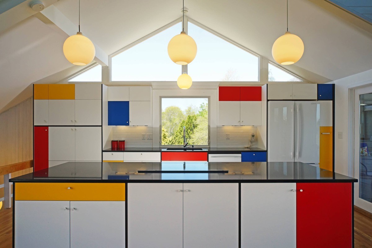
  Make a Mondrian kitchen design.
  Keep the cabinet colour composition asymmetrical to stay true to De Stijl.
  You can respray existing white cabinetry…
  … Or choose new contrasting doors and drawers like this galley kitchen.
  The cubist aesthetic isn’t just for slick kitchens, this u shaped kitchen has a laid back shabby chic vibe.
  Primary colour bar stools can be added into an established scheme.
  Offices of ING Bank, Romania.
 Recommended Reading: Cubism In Interior Design
Did you like this article?
Share it on any of the following social media channels below to give us your vote. Your feedback helps us improve.


