Filled with modern color palettes, genius storage solutions, and exquisite furnishings, you won't want to miss these humble homes. From an apartment that uses bold patterns to make a statement to another overflowing with simplistic Mid-Century Modern charm, they may all differ in style but are equally captivating with their meticulously crafted floor plans and design. Get ideas for layouts, color palettes, furniture selection, and textile choices from the expert visualizers behind these cozy apartments. These homes may be small, but they know how to use style in a big way!
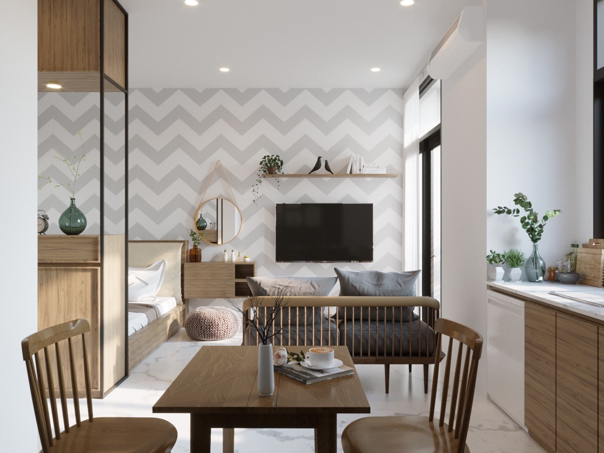
This Vietnamese apartment makes a bold move by utilizing graphic patterns in such a small space. While many would be afraid this would close off the room, DA Visual fearlessly incorporates a bold chevron pattern wallpaper on this bachelors apartment's back wall. Not only is the soft white and grey hues a lovely addition to the room, but they really help small accents, like the famous Eames birds on the shelf, come to life.
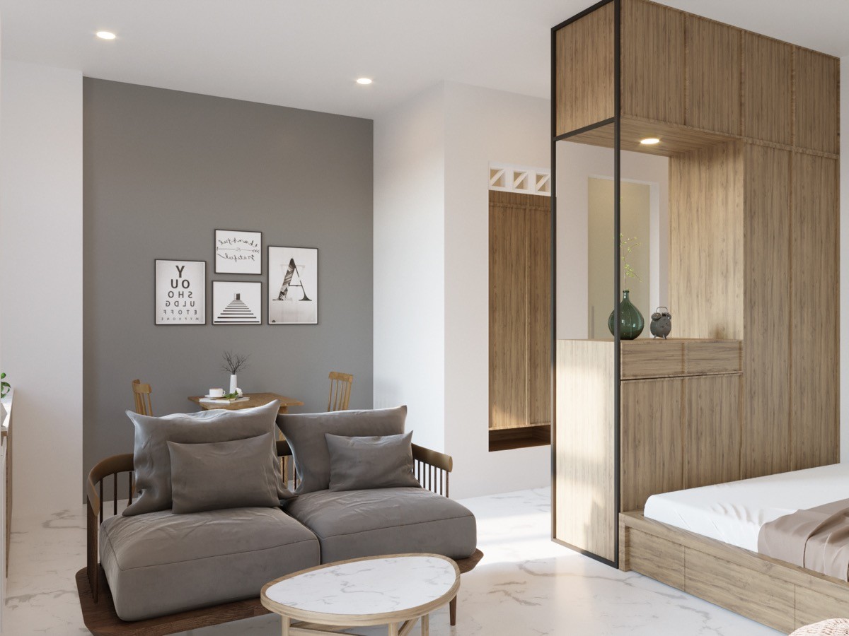
A small alcove that houses a small dinette set is made in to a cozy and intimate spot thanks to the charcoal grey accent wall and mini black and white picture gallery. Room has even been saved for a comfy loveseat with plush cushions. This apartment is practically a romantic haven!
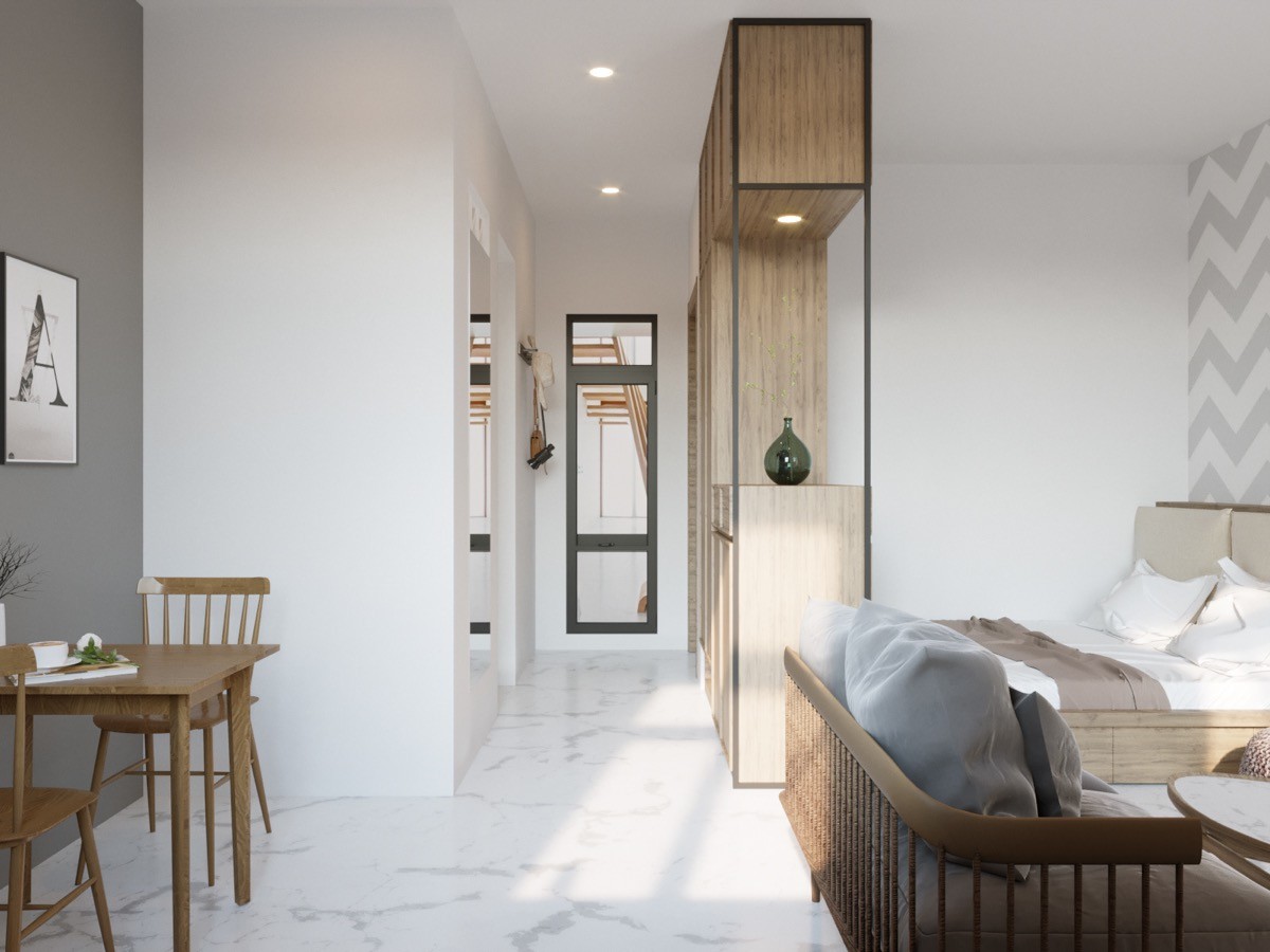
A view down in to this hallway and we spot stylish wooden cupboards that work two-fold by creating storage space and giving the bed its own little nook to nestle in. We love that this minimalist design lets every single item have its time in the spotlight. Accents like the ordinary green glass vase really get dramatized with its lightly colored surroundings.
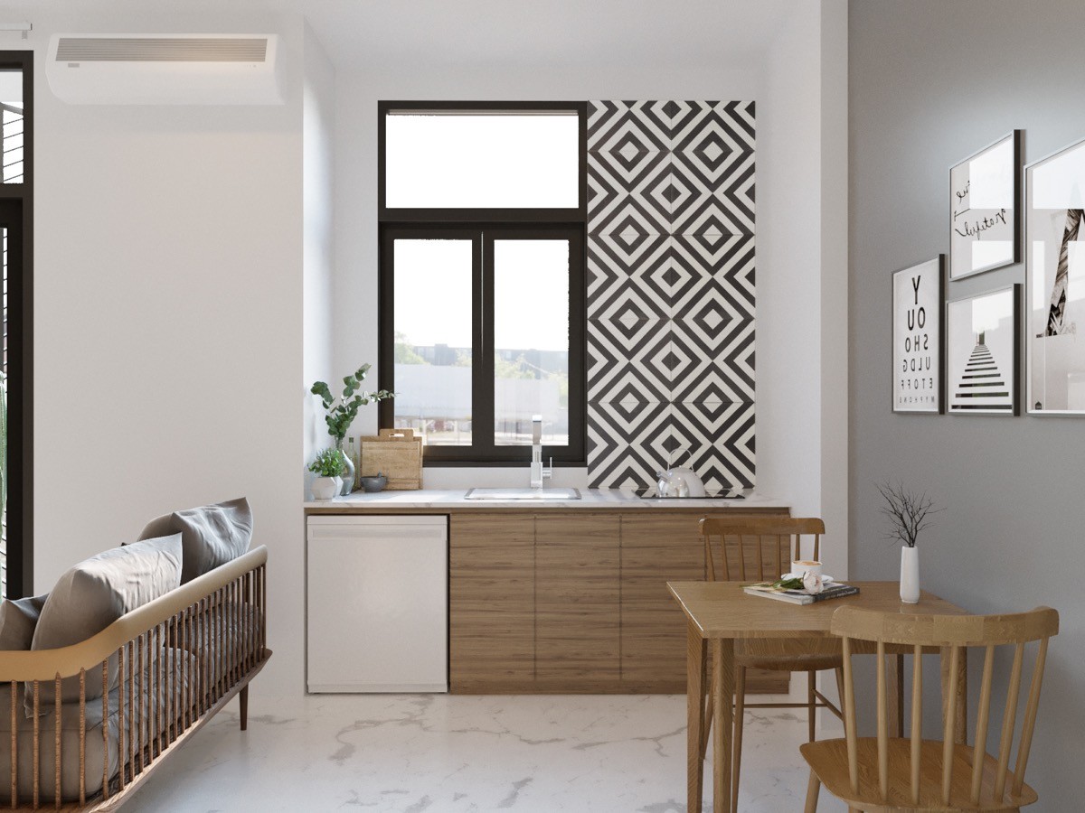
A bold black and white pattern has been used to add a youthful flair to this small kitchen. Much like many of the furnishings and fixtures that we have already seen in this apartment, a light wood has been used in the kitchen as well. The use of the same color helps create a natural flow and is a great way to give a space a sense of unity.
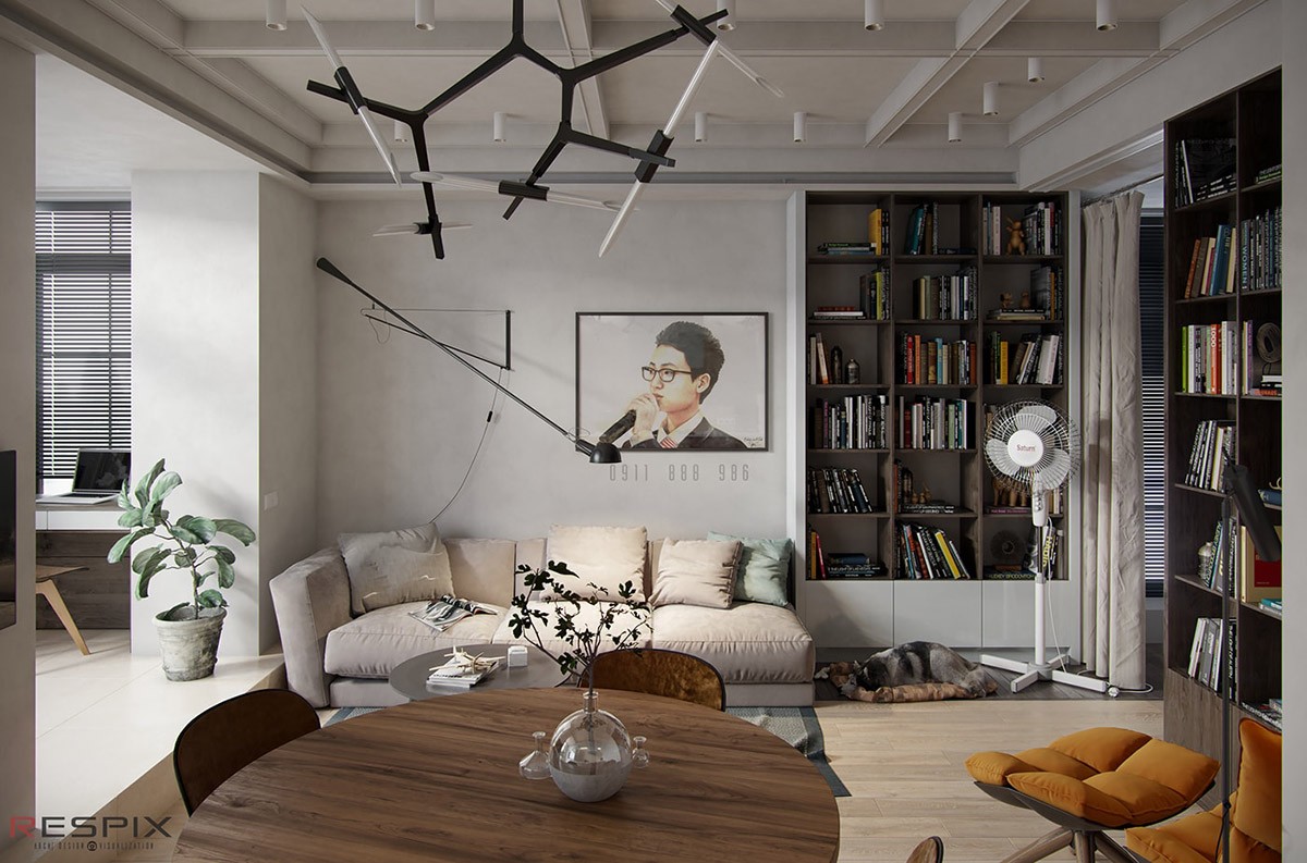
A book lover's dream, this small apartment's living room is practically a personal library! Filled with books stylishly displayed on the floor-to-ceiling book cases, there are tons of tales to choose from. There is even a swing arm wall lamp mounted over the couch for late night reading sessions.
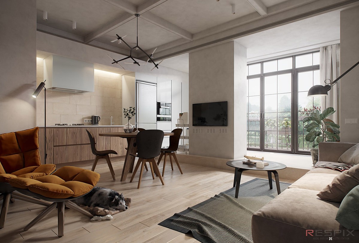
A glance over and we find an eat-in kitchen fitted with a funky modern chandelier, as well as a slightly separated section of the apartment that is fitted with a full wall of windows.
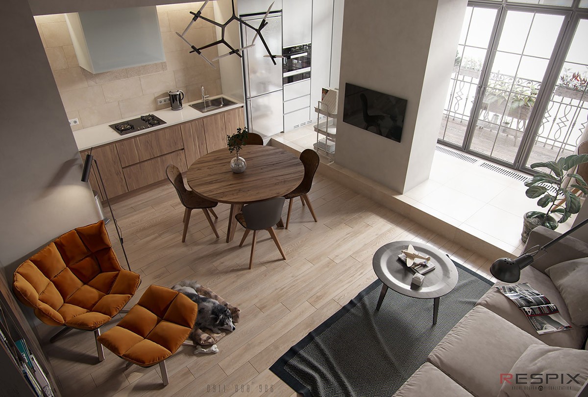
A view from the top. The ultra-stylish burnt orange reading chair is a Mid-Cenutury Modern treat that infuses this space with just the right amount of color.
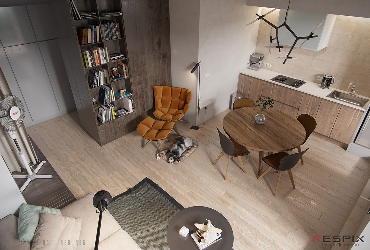
A comfortable reading chair paired with a floor reading lamp and a puppy by your side. What more could a book lover want!? There is even a bookshelf at arm's reach.
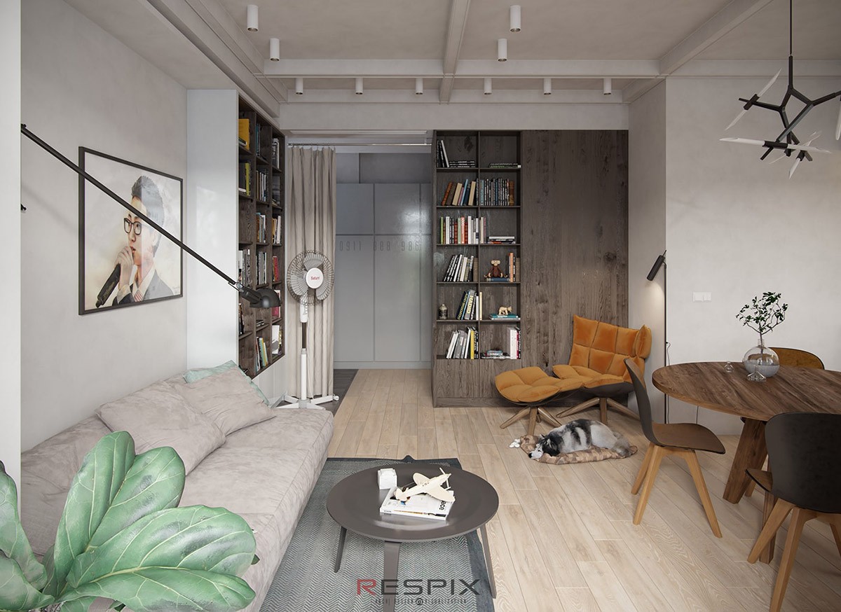
Catching a corner of the Fiddle Leaf Fig Tree, we see that this home's design left room for a bit of greenery. A sprig in a vase can also be spotted on the kitchen table. Indoor house plants are always a great addition that can add either a playful or serene vibe, depending on which plant you pick.
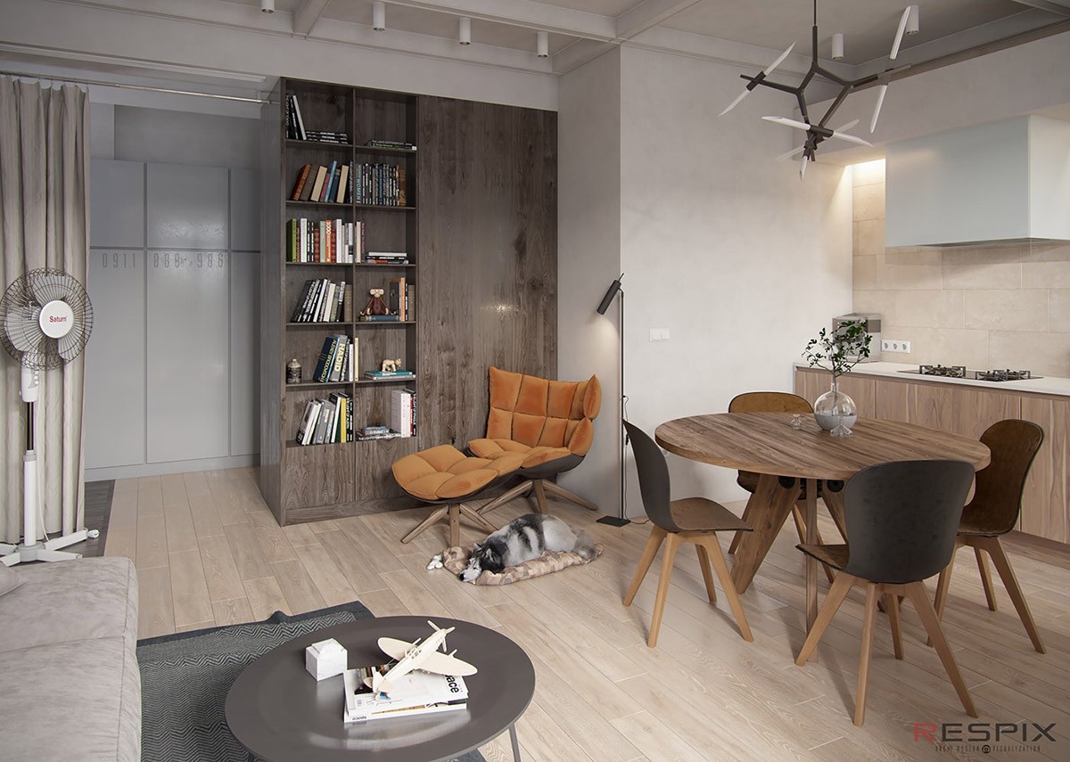
With small homes that don't have much divide, sometimes you have to get creative. By the bookcases we see that a simple curtain has been installed to be used as a makeshift divider. A quick and chic solution for when you need a bit more privacy or division.
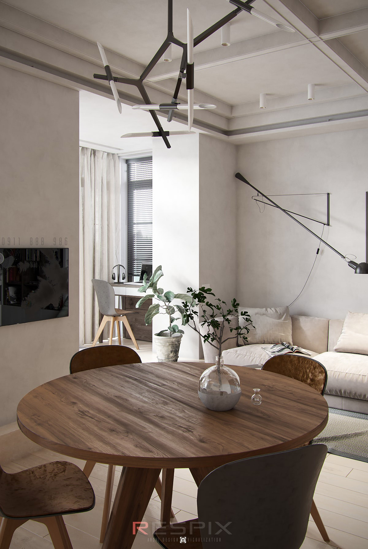
An elegant kitchen table that is oozing with a Mid-Century Modern charisma. If we look behind it, we see a small home office nestled in a cozy nook.
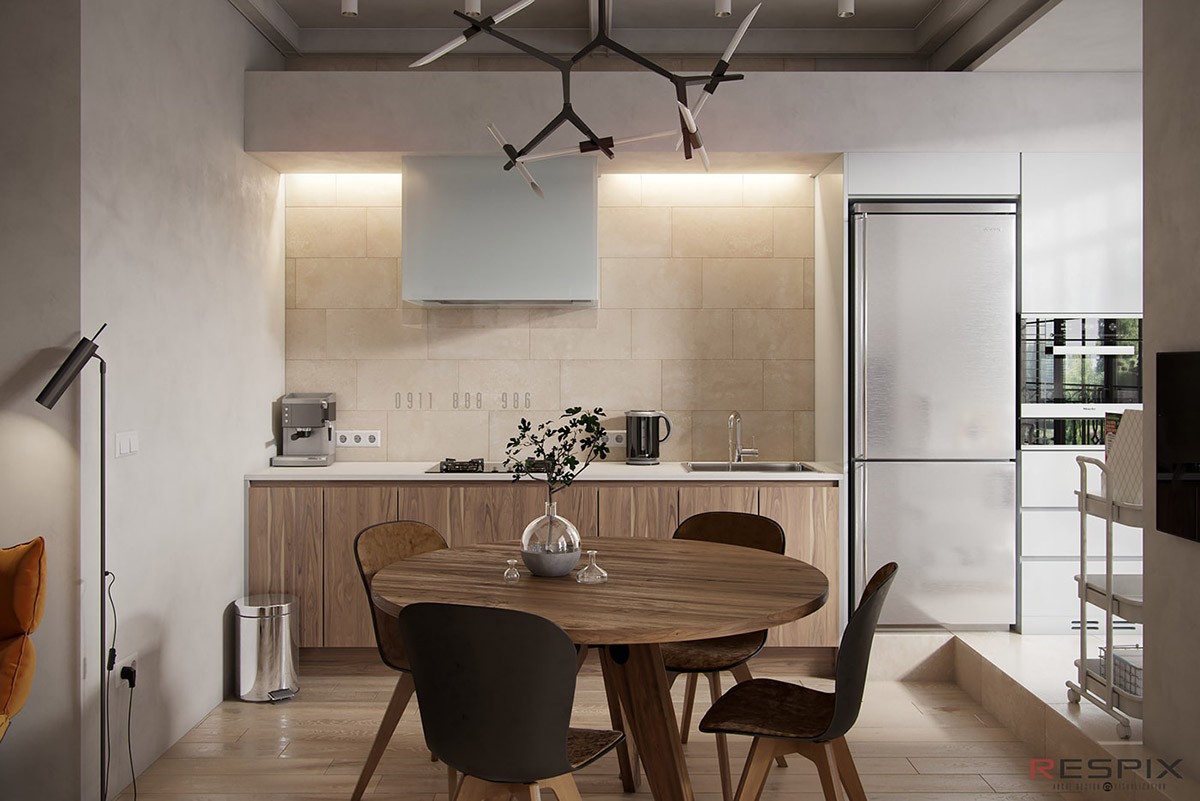
This one wall kitchen is small and simple, yet it still found ways to incorporate things that you don't necessarily see in your usual bachelor style apartments. This layout managed to find room for full-size fridge, a hood range, and a large chandelier.
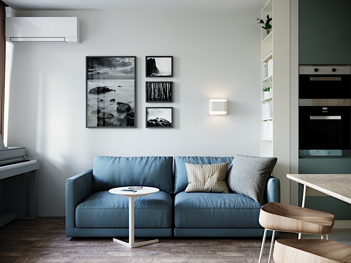
A wash of blue is the first thing that greets us in this apartment as we are instantly captivated by the colorful loveseat. The wall art above it is uniquely offset to the left and the right side has been balanced out by adding a modern wall sconce.
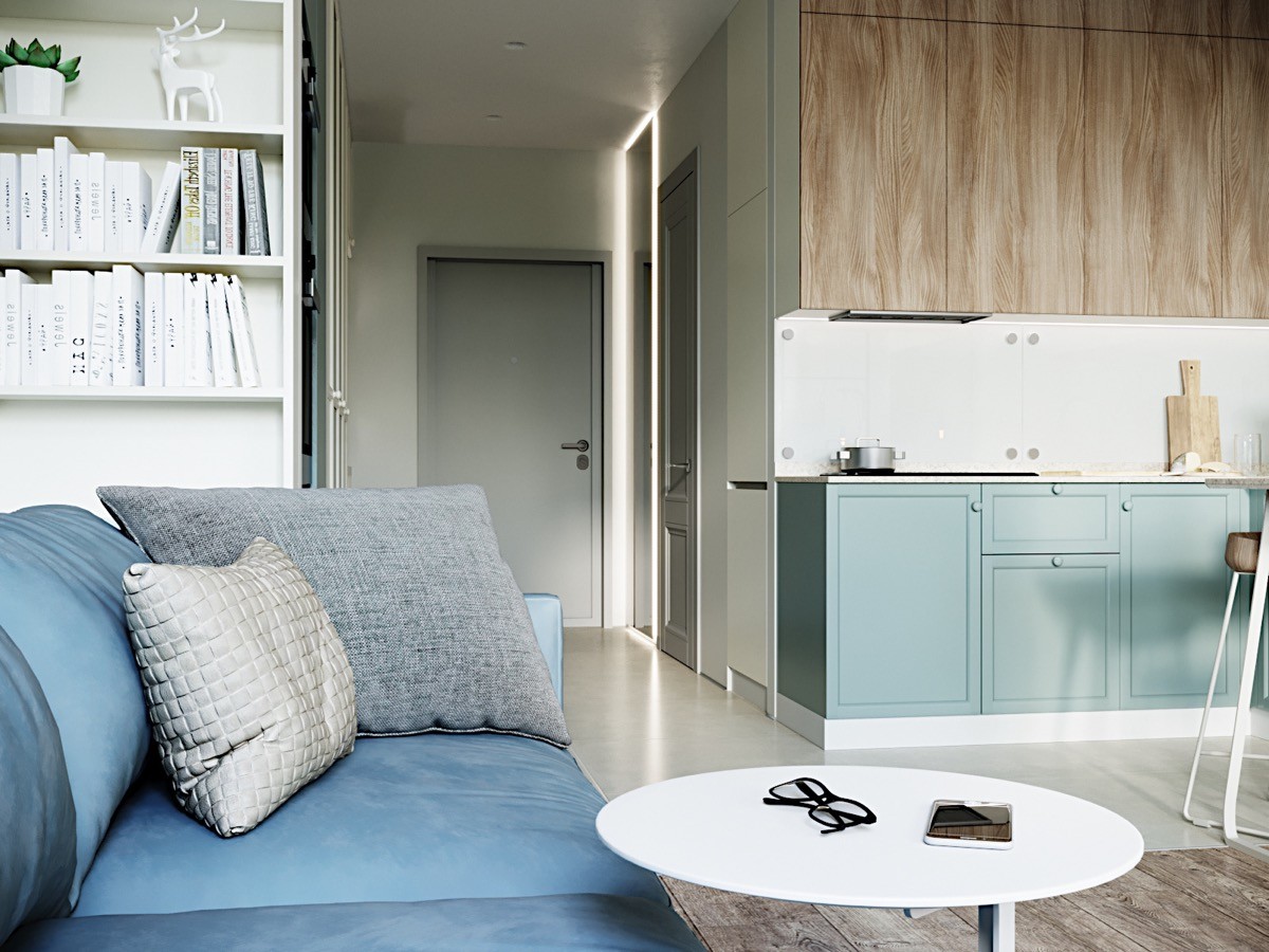
A soft blue has been carried over in to the kitchen and envelops the bottom cupboards. We love the mix of real wood top cupboards and painted bottom ones. The combination of texture and color makes it in to a playful and vibrant kitchen design choice.
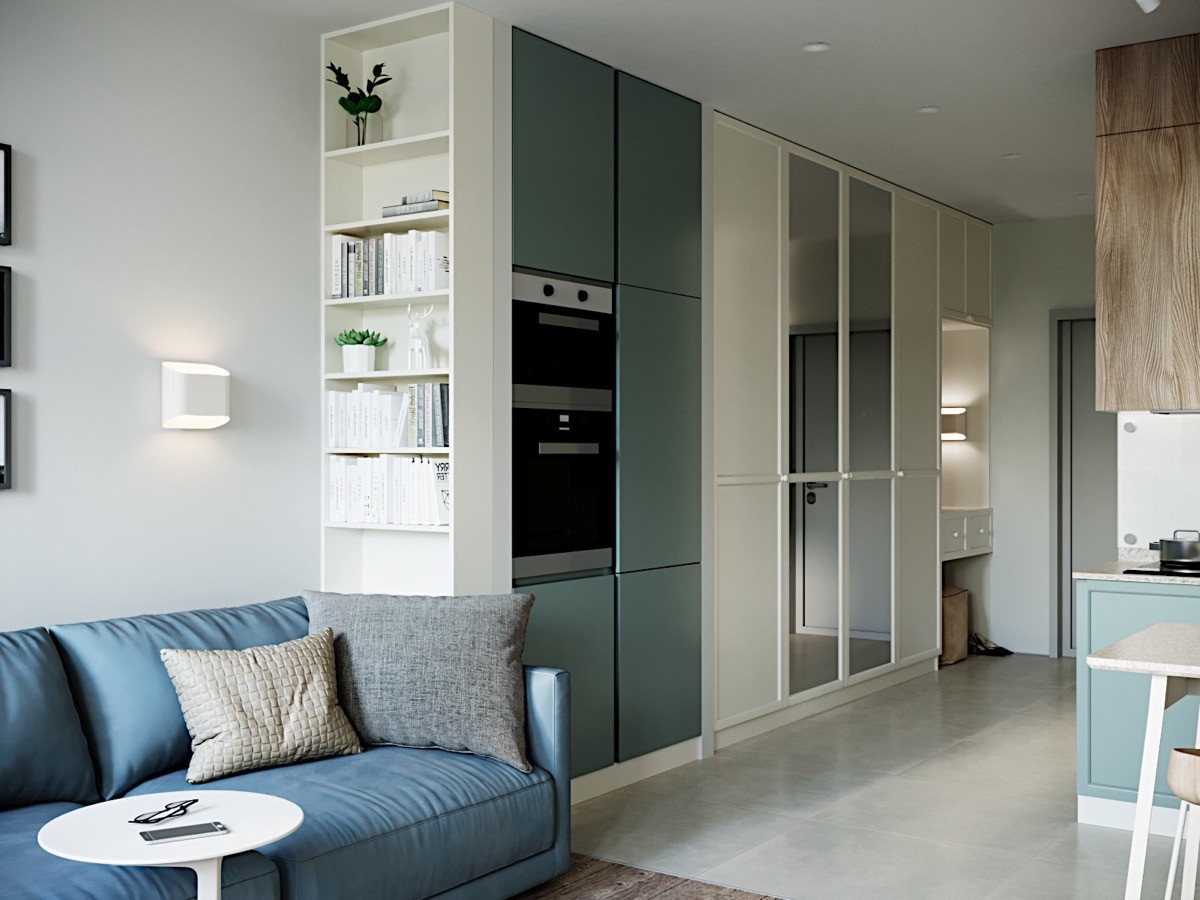
Built-ins can help utilize every inch of space and are great to create storage. Here we see that they even added a mirror to some of the doors. Mirrors are also a wonderful asset to small spaces, as they create the illusion of more space.
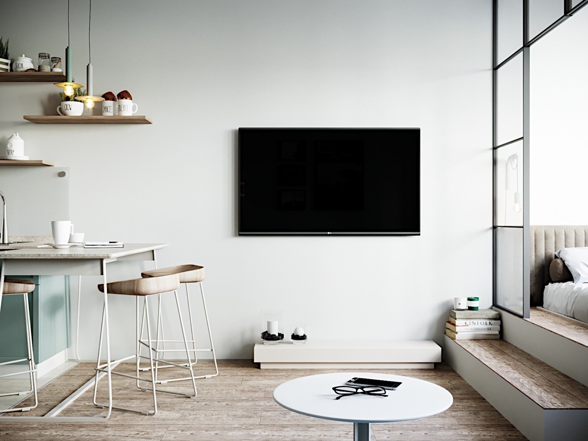
This design makes room for a large flat screen that can be viewed from both the kitchen or couch. The same wall has also been fitted with floating shelves that hold various kitchen items and decor.
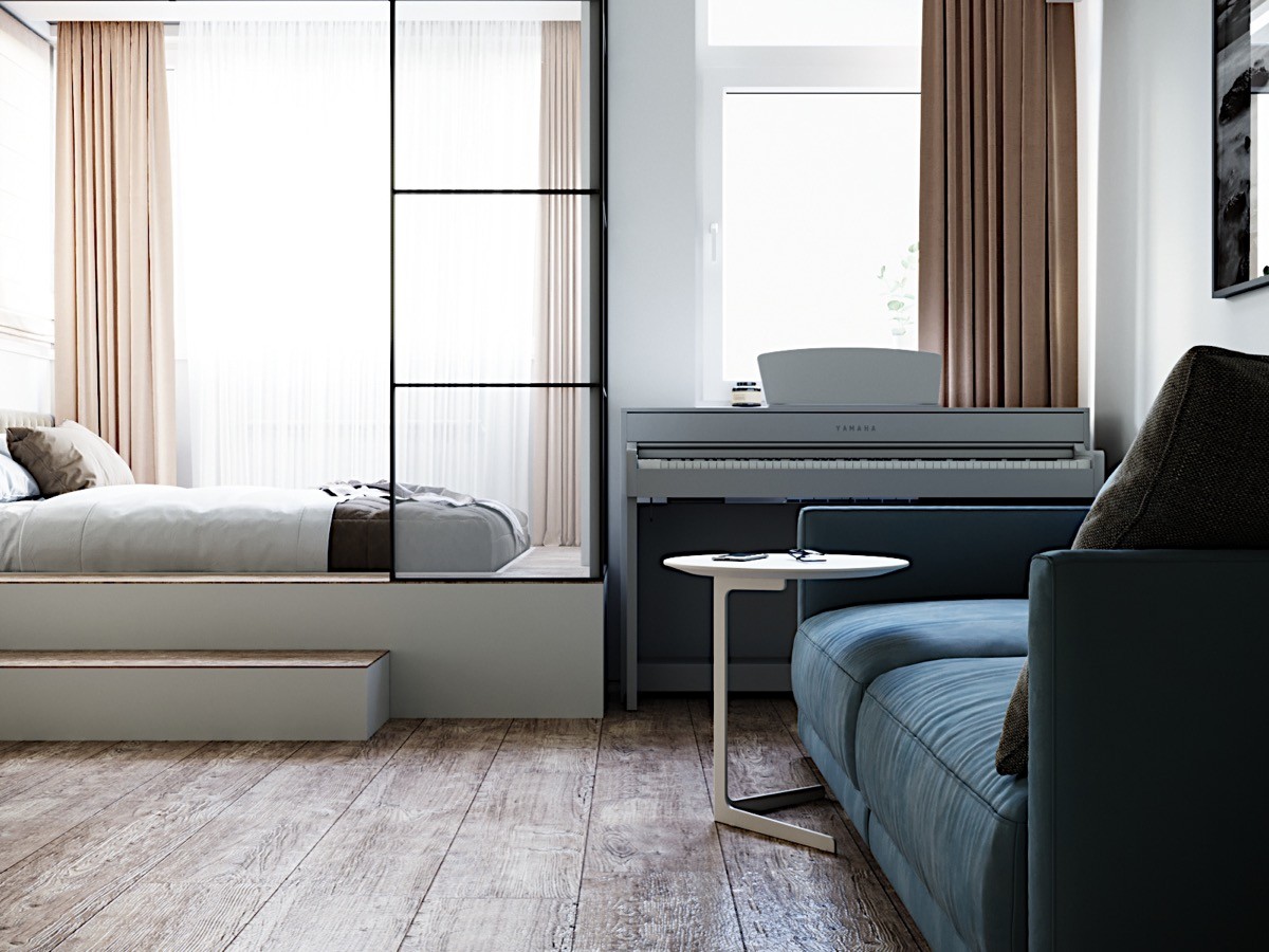
Small living doesn't mean that you have to go without your wants and needs! This cozy corner perfectly fits a full-sized piano.
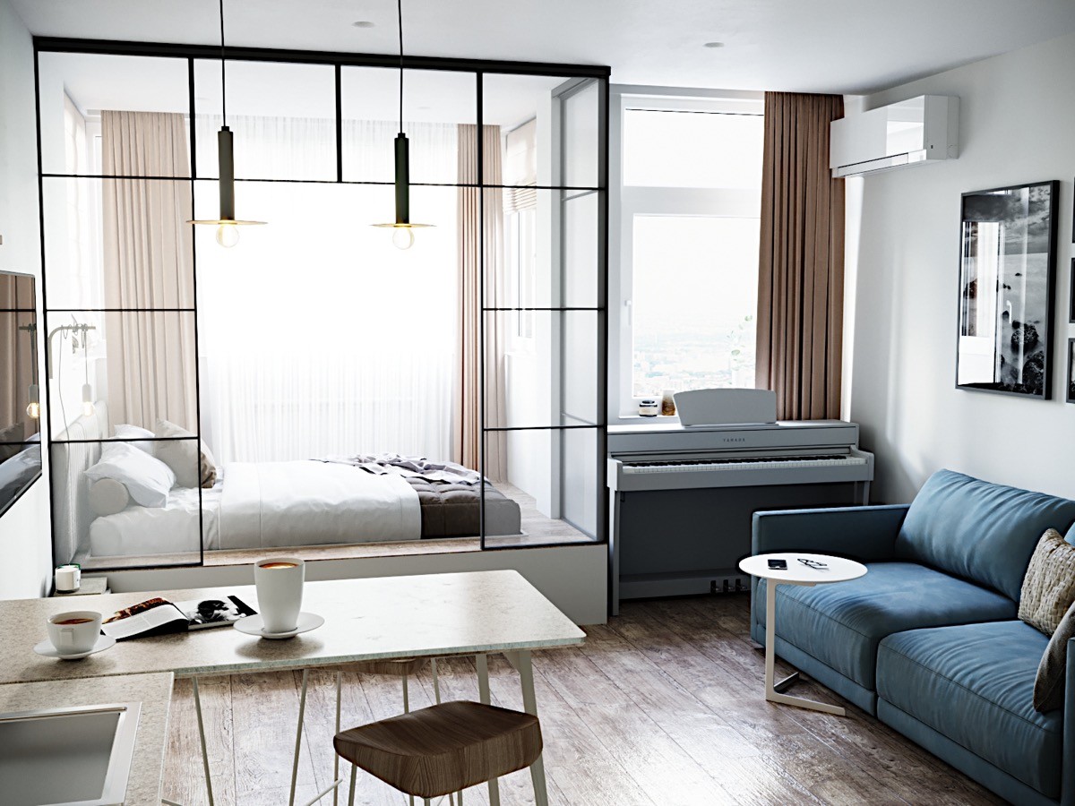
The large glass panes not only give the bed a bit more separation from the rest of the home, but their transparency assures that it doesn't become a claustrophobic corner. Of course, the large window fitted with sheer curtains also helps by infusing the space with a filtered natural light.
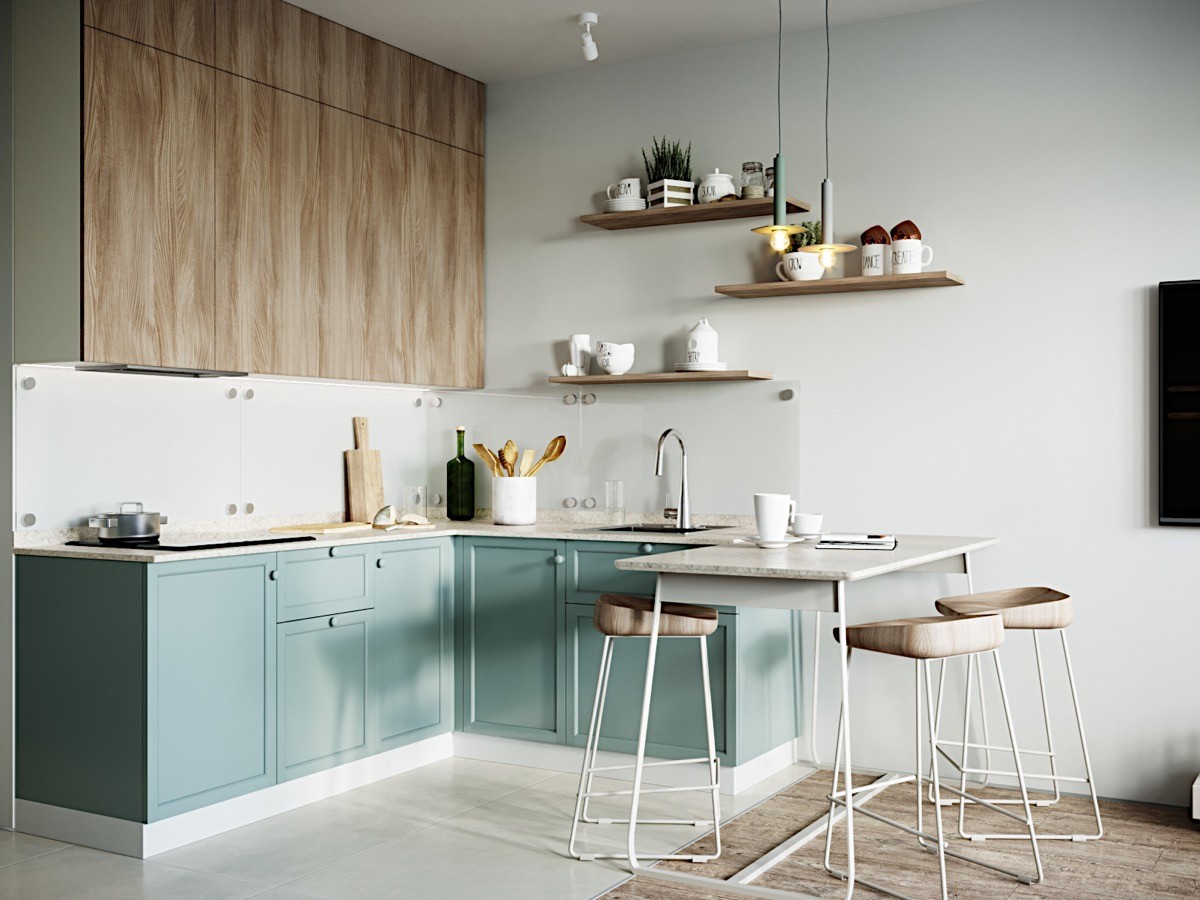
This serene L-shaped kitchen forgoes the usual kitchen table and instead makes the peninsula in to a stylish breakfast nook by adding a few kitchen stools. Their lightly stained wooden seats that match the cupboards make them seamlessly blend in to this space.
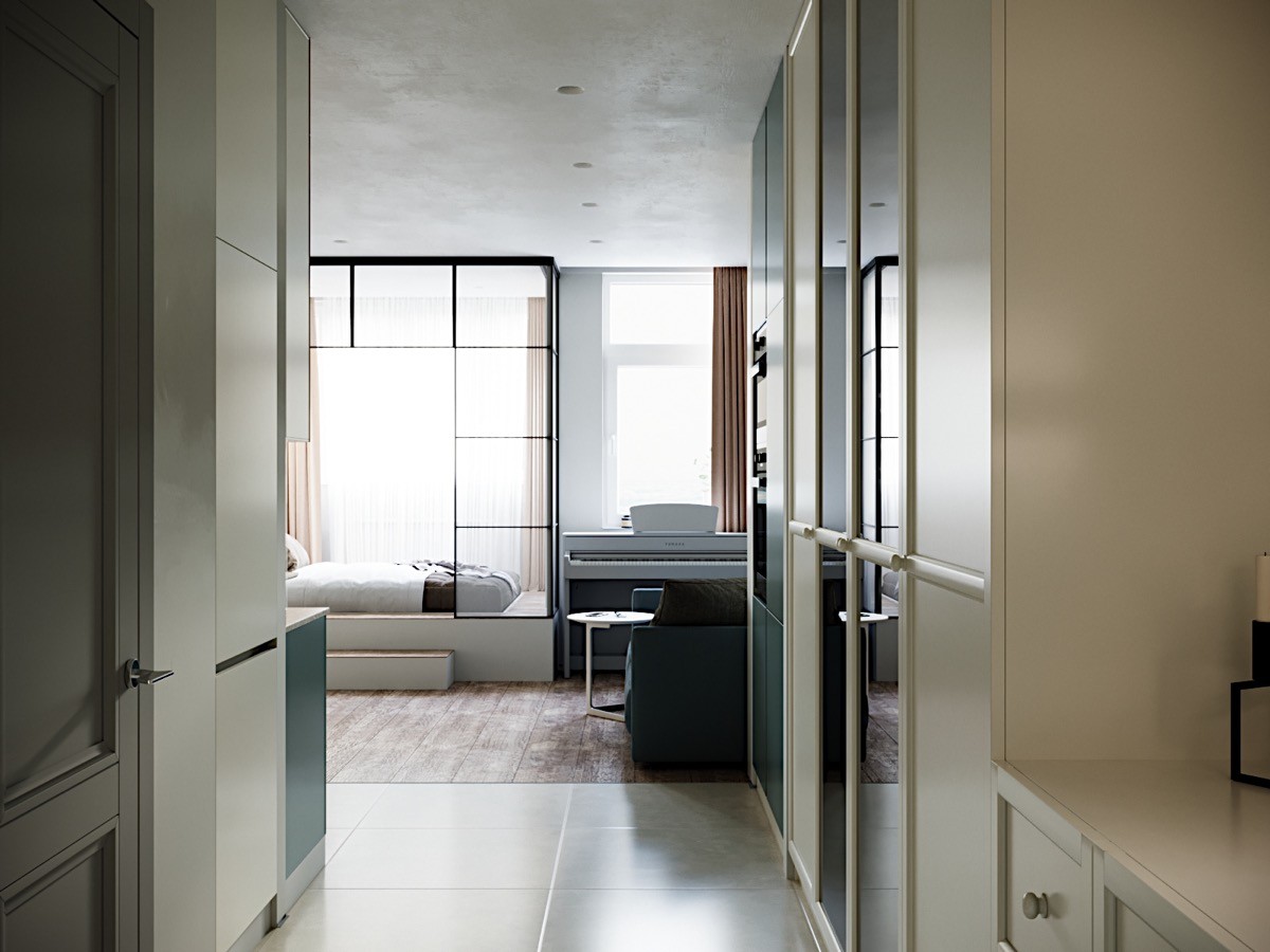
A view from the entrance. We get a great glimpse of how both tile and wood flooring are utilized in this space. While many small spaces use one type of flooring to ensure flow, this one boldly (and successfully!) makes the separation between the kitchen and living area clear by switching things up.
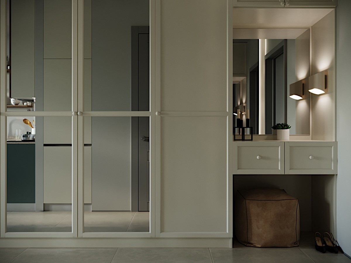
The entrance of this home has been fitted with built-in drawers and a mirror. With the easily movable ottoman stashed underneath, this is the perfect makeup vanity for all those finishing touches before heading out the door.
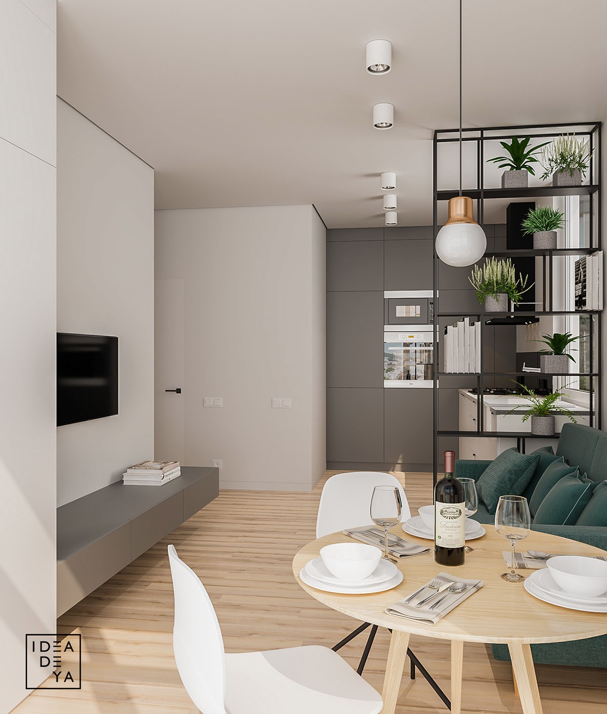
Located in Lviv, Ukraine, this apartment is only 40 square meters. Its white and grey color scheme is offset by the kelly green couch and small potted plants. The open face shelving makes the kitchen feel more like its own space, all without overly closing it in.
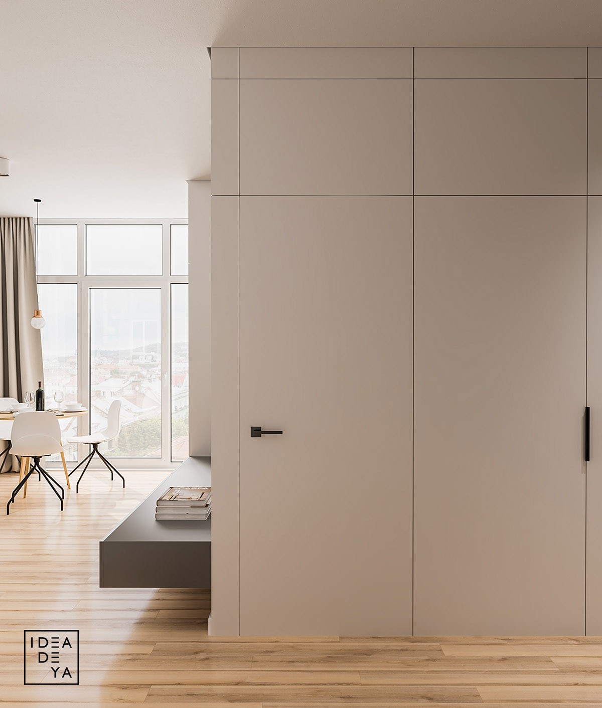
Flush mount built-ins are always a great solution for small spaces. Because the walls and doors are white in this home, door handles and other hardware really stand out, so well-thought-out selections are a must.
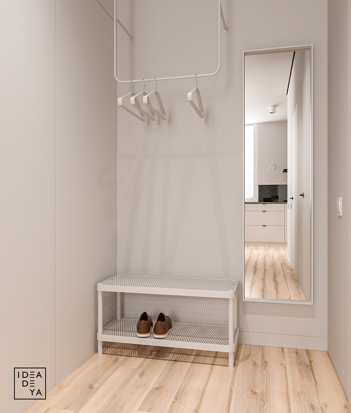
A contemporary entryway with everything you need, which includes a full length mirror, a hanging bar, and shoe rack. It may be simple, but it is also sleek and highly functional.
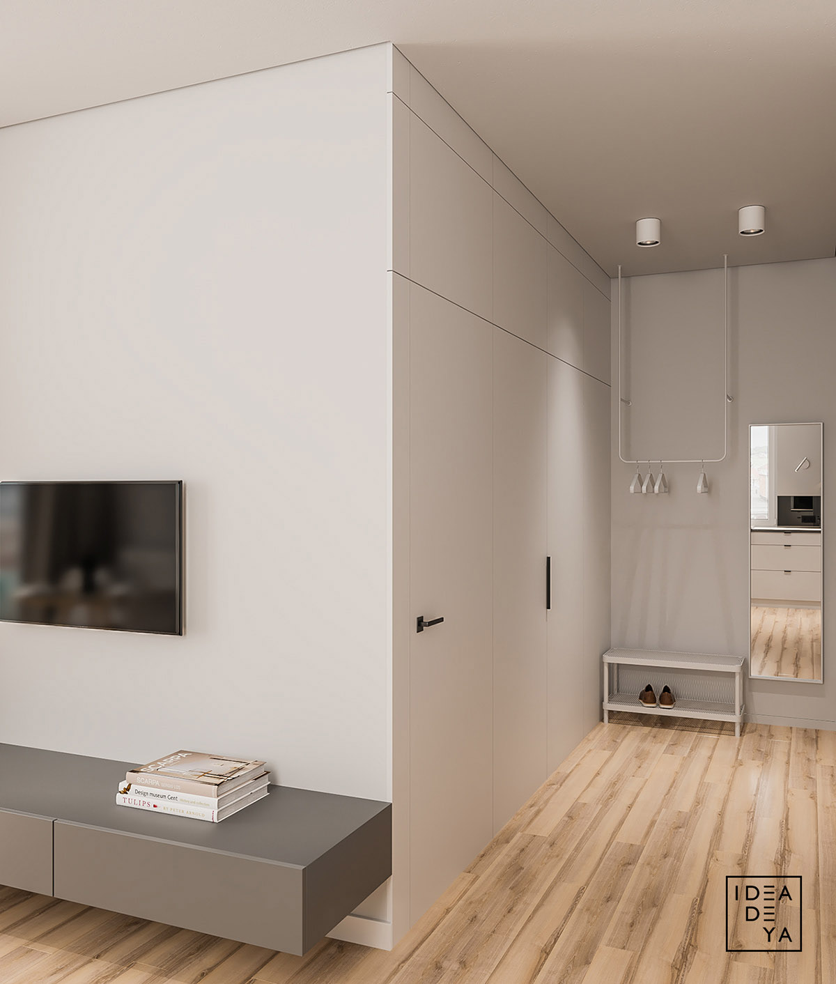
Another view of the entryway, along with the TV and floating console table. By not being directly on the ground, even just a few inches off, the gray console table assists in making the room look more spacious than it is.
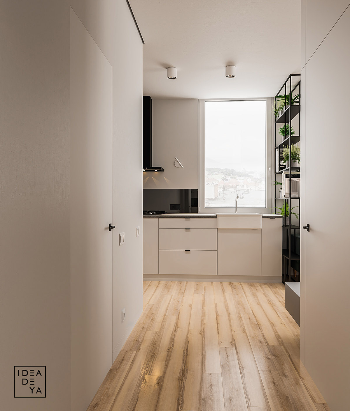
Much like many parts of this humble abode, the kitchen is simple and has a fair bit of white. The white finishings paired with the large window really give the space a clean and spacious vibe. A dynamic combo that can be used to lend the illusion of spaciousness to any room.
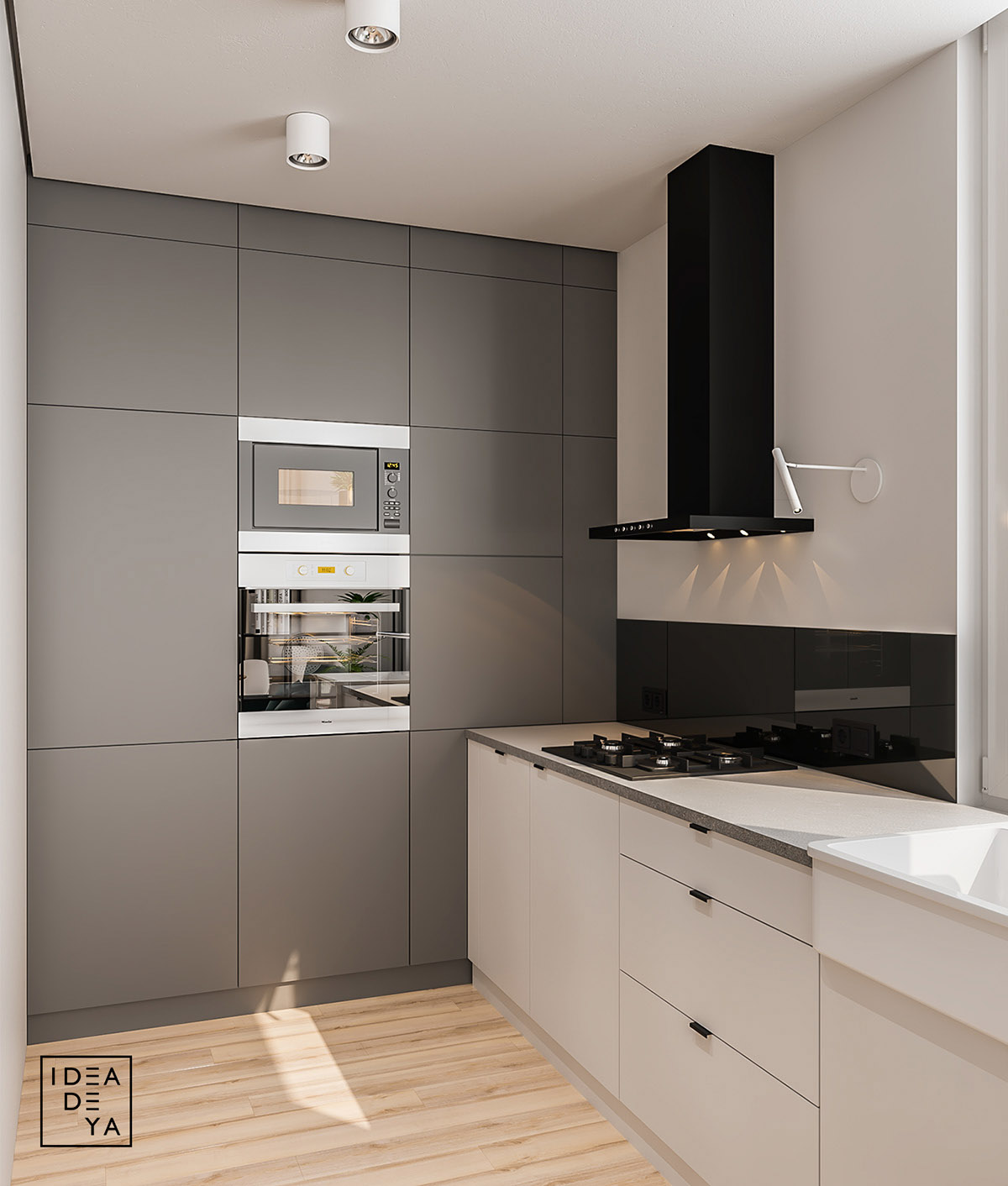
On the other wall of this grey and white kitchen there is more cupboards, a built-in oven, and a contrasting hood range. Everything a chef might need to create an intimate meal for two.
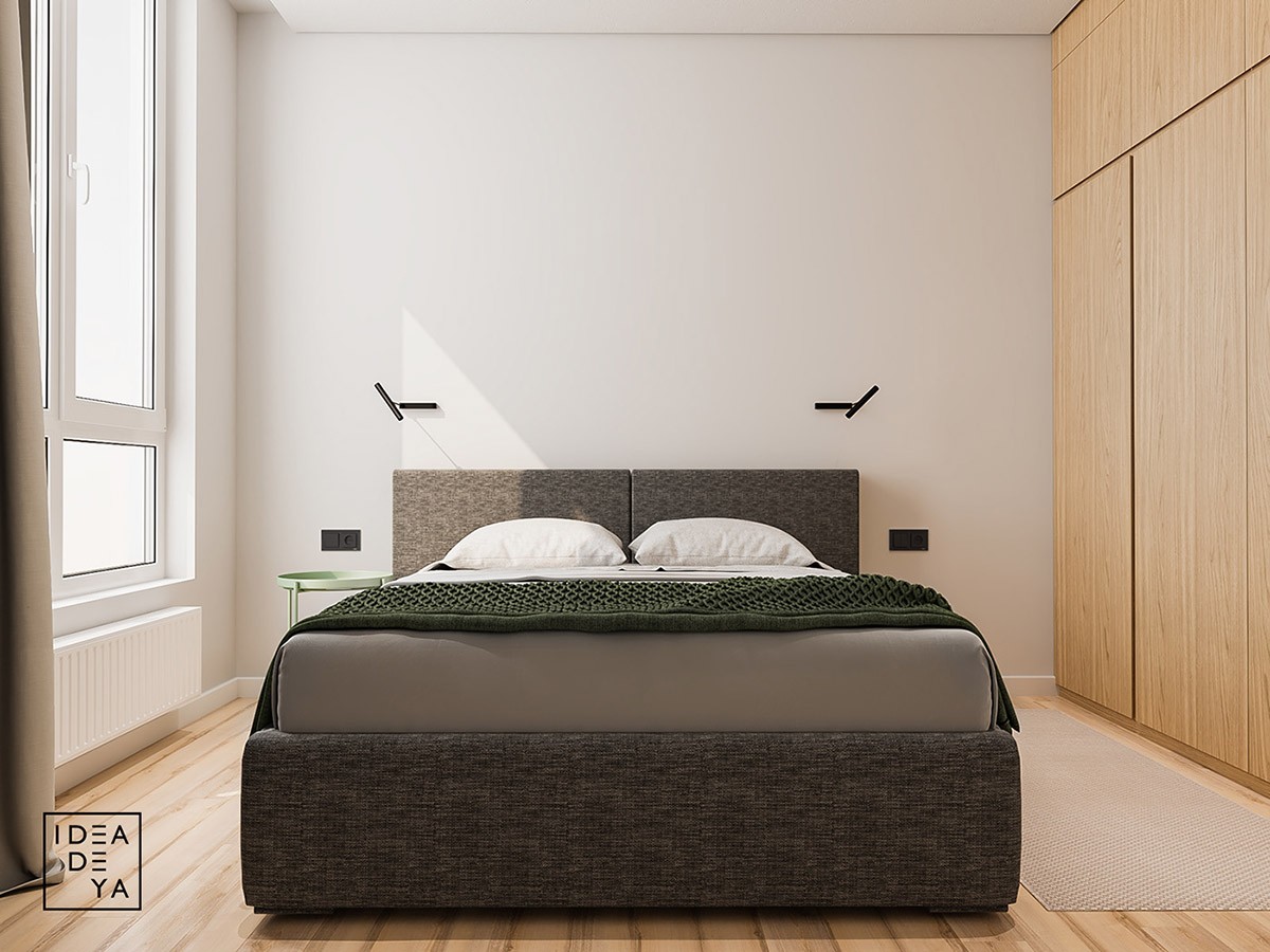
You might of noticed that all 4 apartments up to this point have used the same colors throughout their entire design and this home is no exception. The bedroom makes use of a the same white, gray, and green color palette coupled with a with a light wood finish that we have seen in the rest of the home.
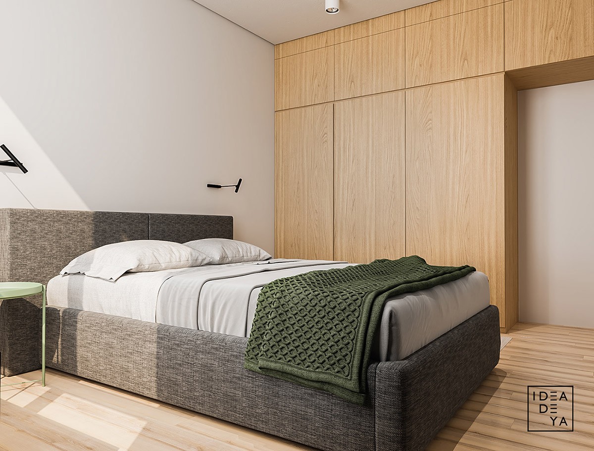
The gray upholstered bed frame and knit green throw add a variance of color and texture to this minimalist bedroom. If you don't want to vary colors too much, varying texture is an approach that will keep your home's design on point.
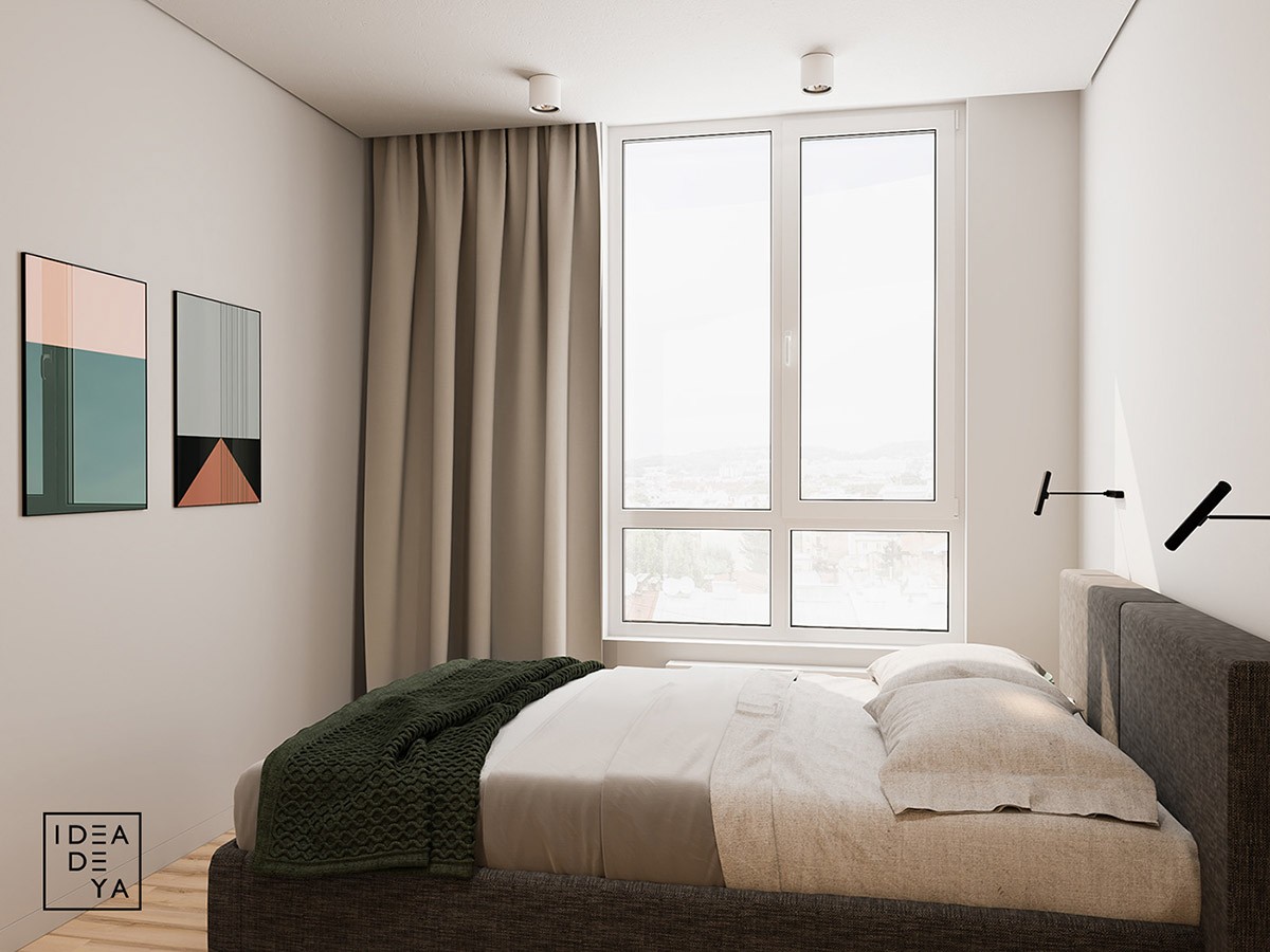
Abstract wall art illuminated by large windows adds a slight flair to this bedroom. Little additions make a big difference, especially in minimalist spaces.
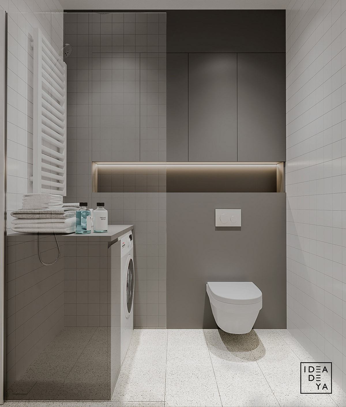
This grey and white bathroom is tiled from floor to ceiling and is equipped with a modern toilet and washing machine. The simple color scheme and decor ensures that such a small space isn't overwhelming.
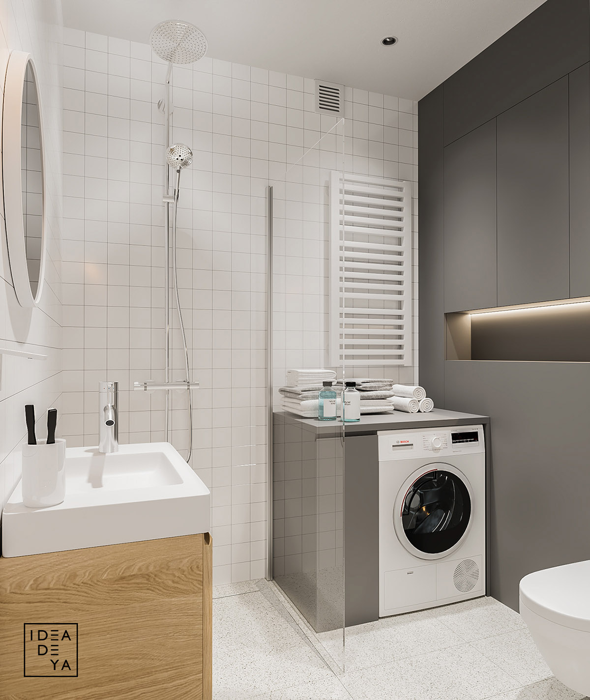
A washing machine is a unique and undoubtedly great addition to such a small space. The perfect place to throw in some laundry before enjoying a shower with the luxury rainfall shower head.
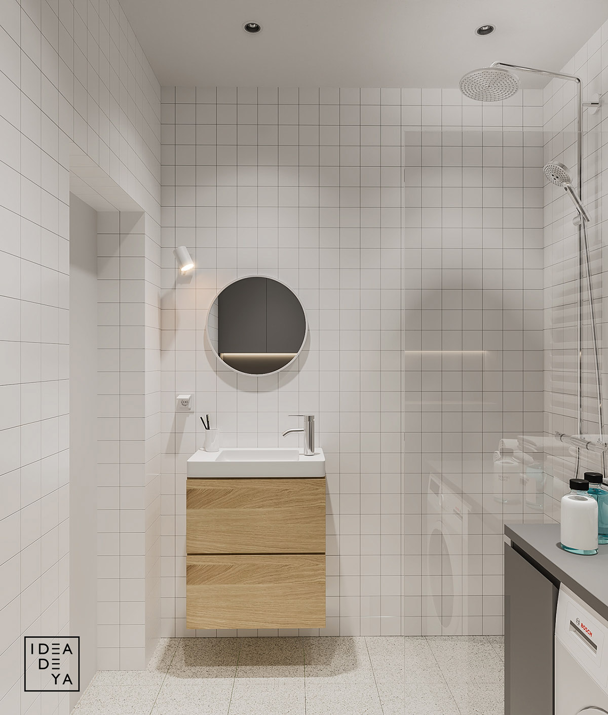
Much like the living room's floating TV console, IDEADEYA maximized the feel of this minimalist bathroom by incorporating a floating cabinet.

