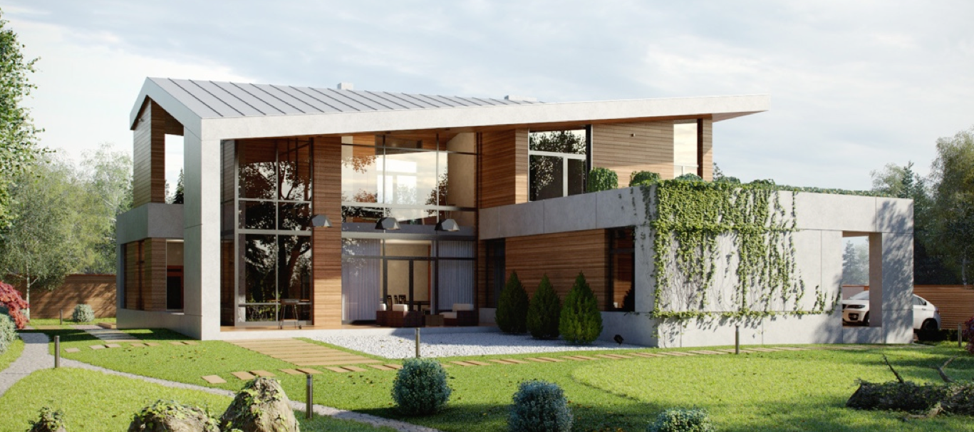
Minimalism can get a bad rap. It can conjure images of homes with no character and no personality, focused only on how little is there. But when done right, as is this home from visualizer Oleg Trofimov, minimalism can be beautiful and warm. The house featured in this post has many elements of simplicity, from its odd sofa to its white on white kitchen, but it also has plenty of playfulness. A vertical garden, a colorful children's room and a number of inviting elements make this house much more than an exercise in design or denial -- this house is designed to be a home.
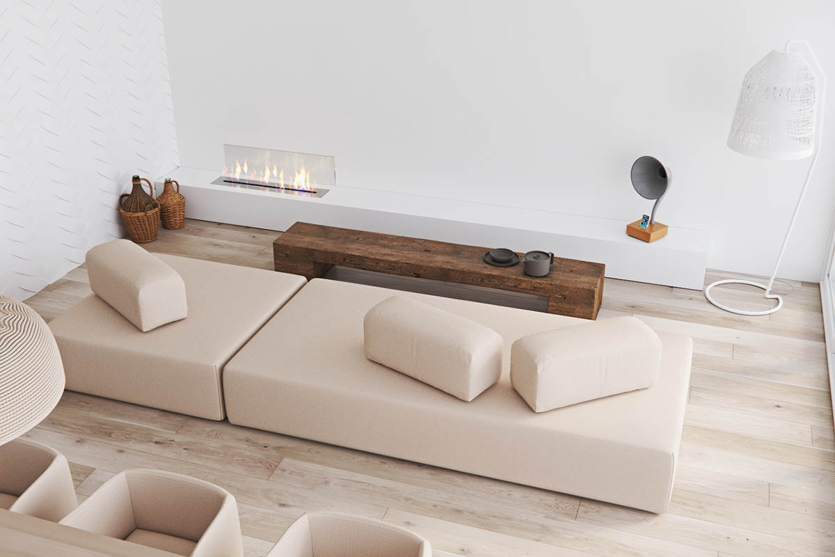
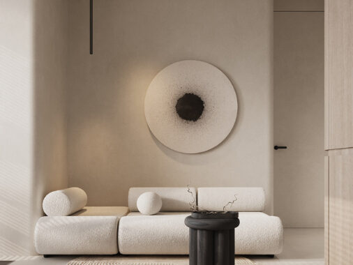
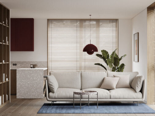
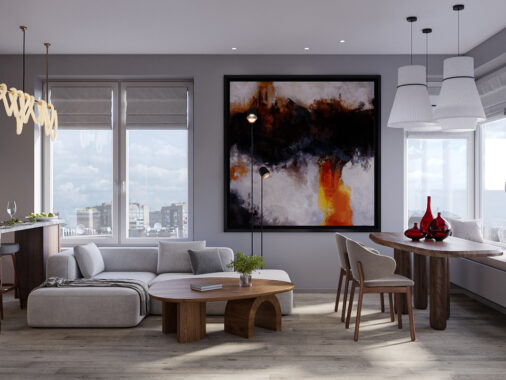
The minimalist design of this home is immediately apparent as you step into the living room. From the geometric beige sofa to the unique floor lamps perched in the corner, clean lines and simplicity abound.
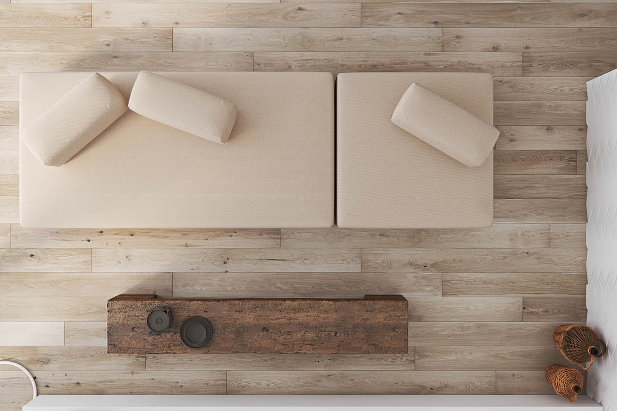
The grain of the wood flooring and simple decorative bench adds interest to the otherwise sparse design.
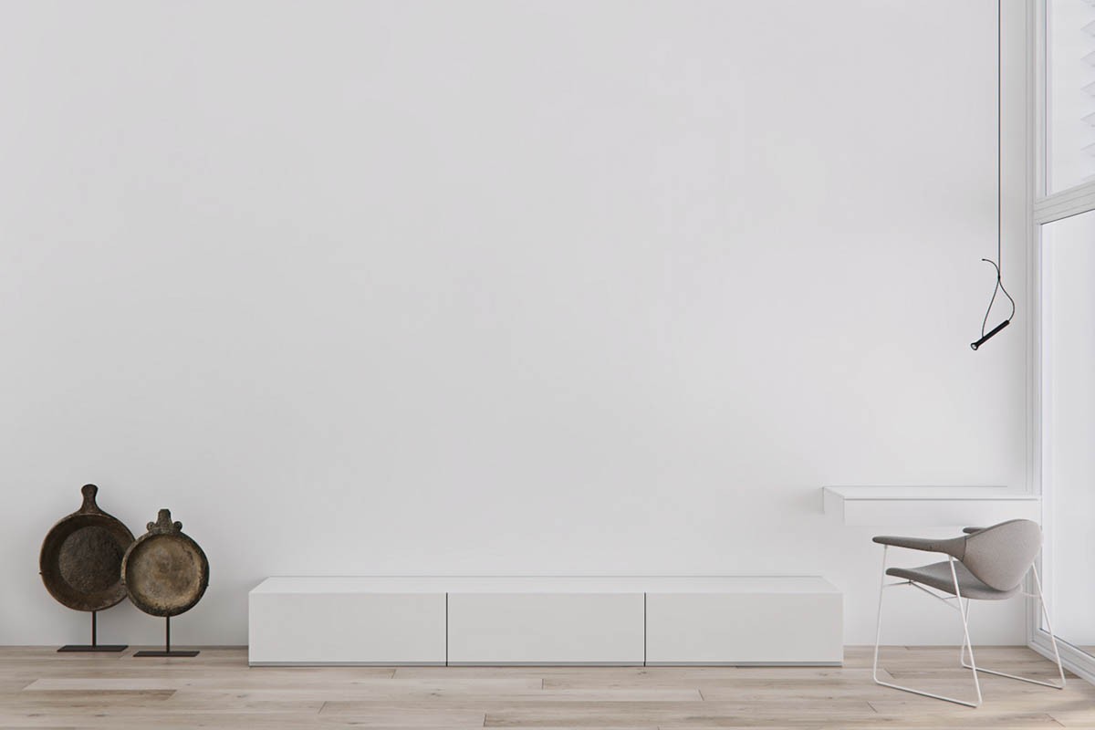
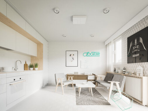
When it comes to minimalism it is difficult to beat white on white. A small bench all but disappears into the expanse of the vast white wall.
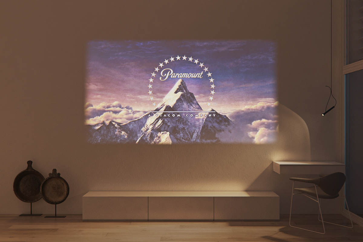
Of course, that vast white wall is not only a design choice. The white expanse allows for movies and TV to be projected, which means that these minimalists do not have to make space in their lives for a flatscreen.
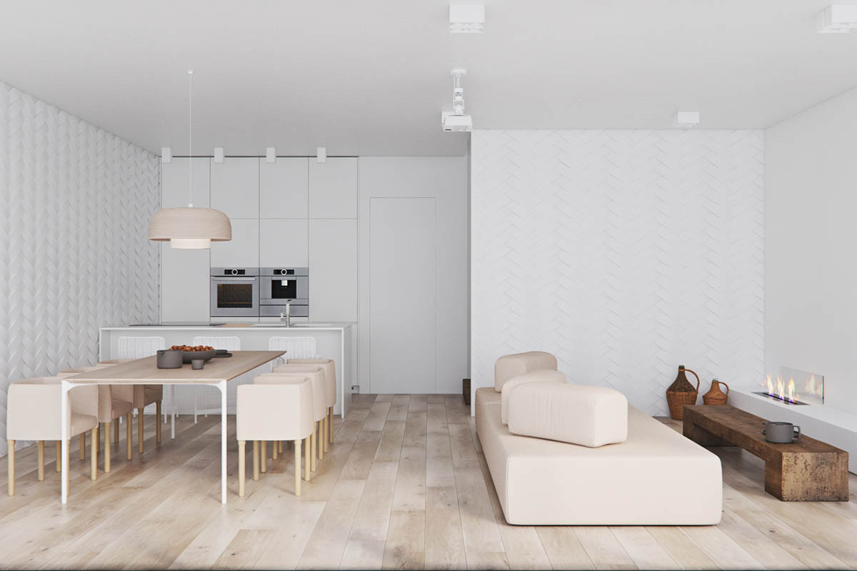
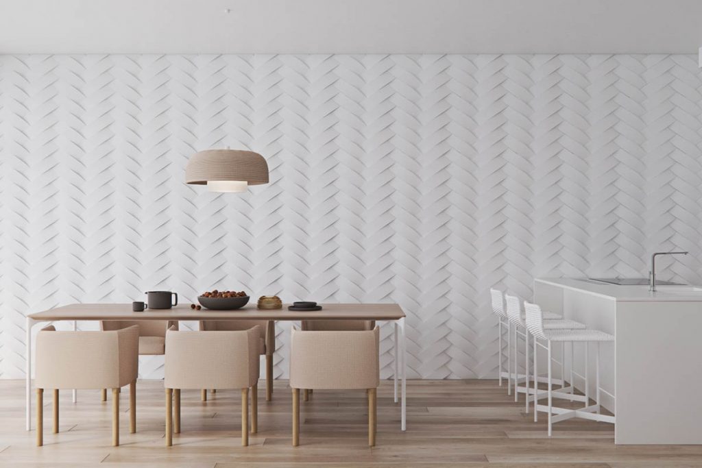
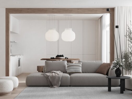
The space is not huge, but the use of white throughout makes the main living area feel enormous. The cream color of the furniture breaks up the white just enough that there is nothing institutional about the design.
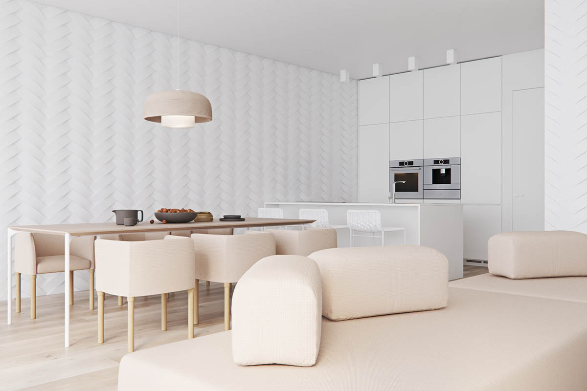
The sofa and dining chairs are the same almost rosy color. It is clean and simple, but still a bit warm and not as stark as white would be.
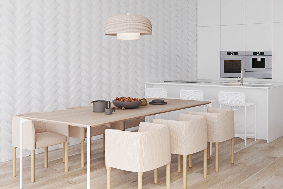
The dining area features modern dining chairs that are cushier and more comfortable than the hard backed wood chairs you sat in last Thanksgiving. These types of chairs are not only stylish, they make you want to stay a while.

For another seating option, white kitchen counter stools stand ready underneath a white countertop.
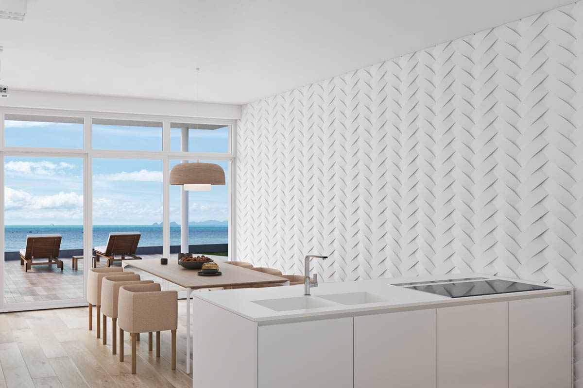
The white kitchens is what beachside dreams are made of -- clean and spacious. And we cannot forget the detailed wall texture that unites the dining and kitchen areas with a bit of whimsy.
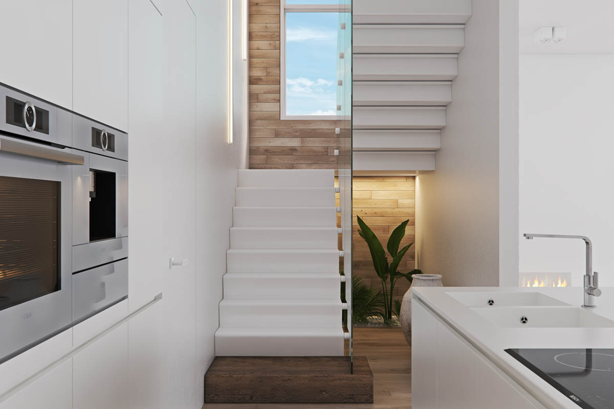
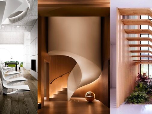
Guests can take the beautiful modern staircase to explore the second floor, where we can expect to find a bit more color.
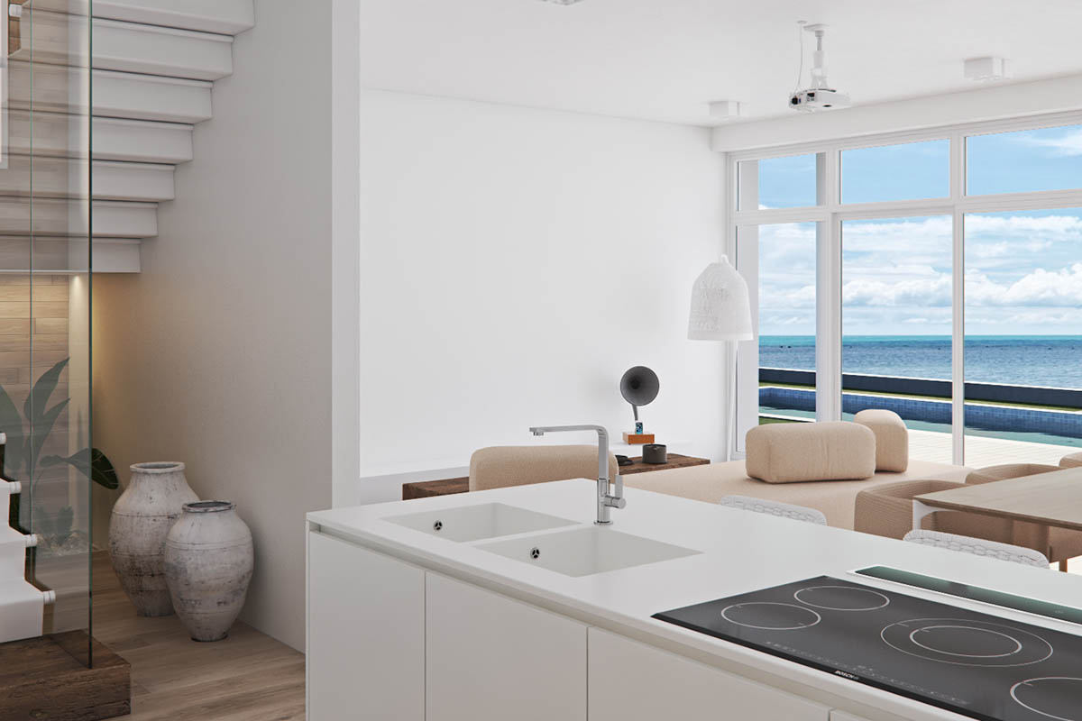
Natural light from the wall of windows really livens up the entire bottom level, bouncing off the white walls and breathing life into the minimalist design.
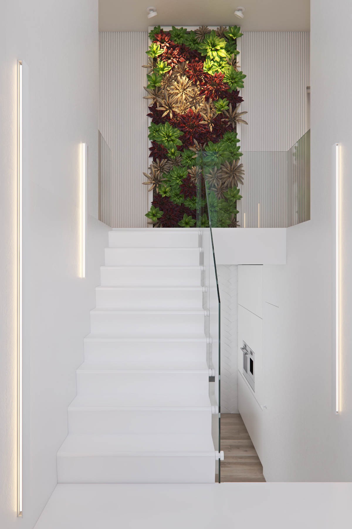
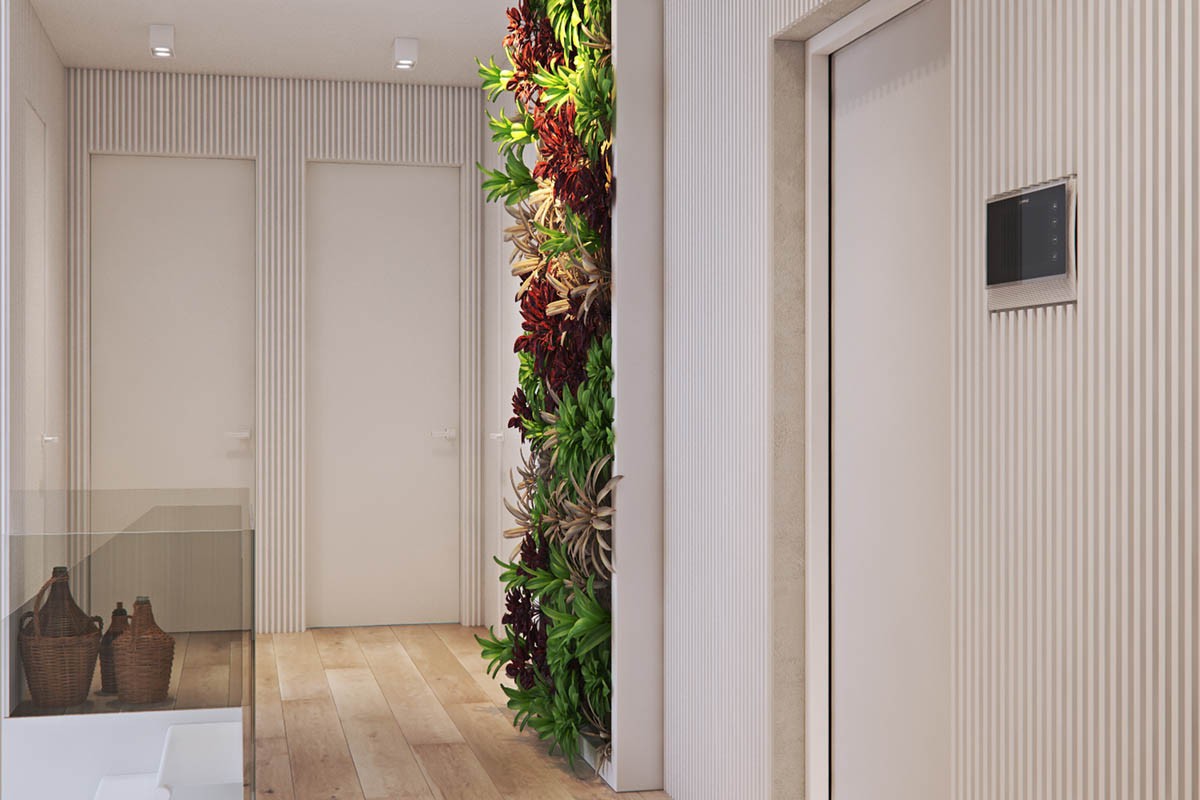
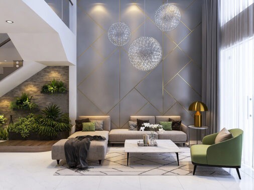
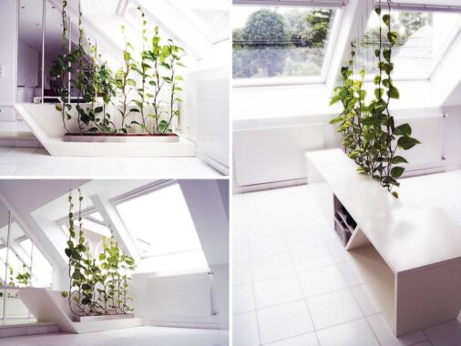
Speaking of breathing life into the design, a stunning vertical garden at the top of the staircase is impossible to ignore. The greenery is a much needed splash of color and texture, welcoming you to the more intimate bedroom portion of the house.
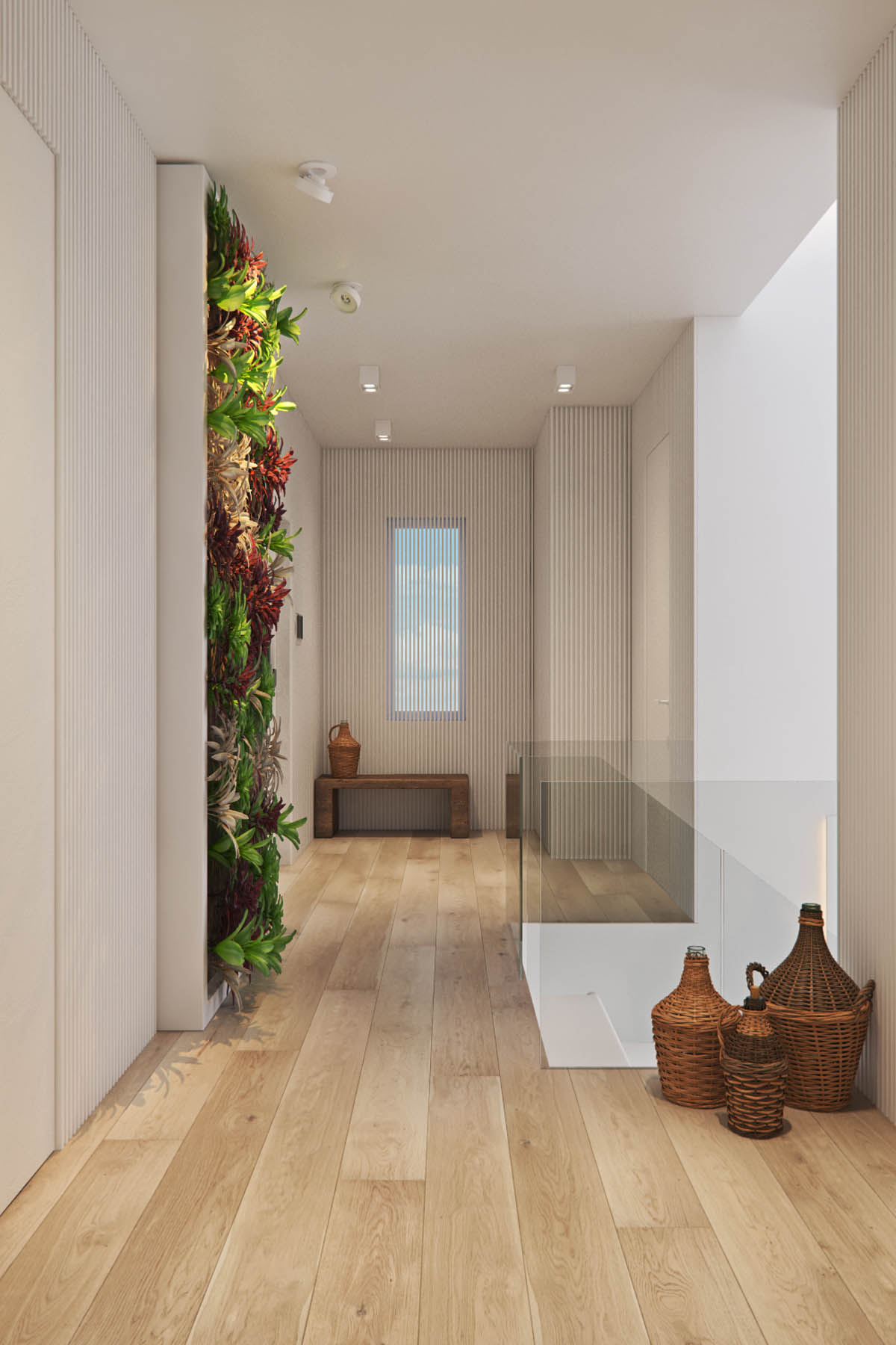
Glass railings let lower level viewers see the vertical garden unobstructed. Hopefully this design element does not attract too many fingerprints.
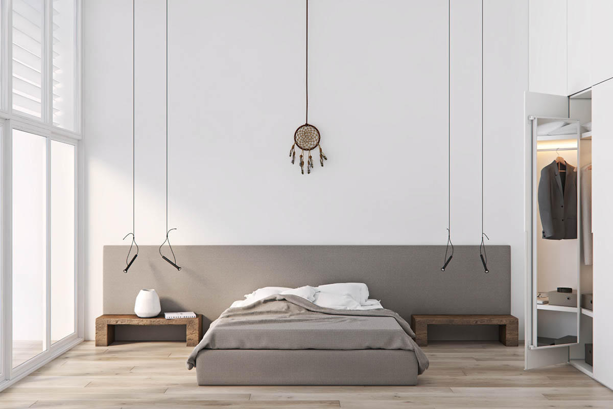
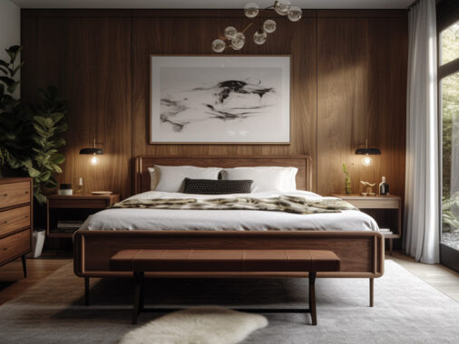
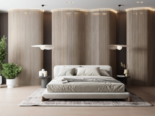
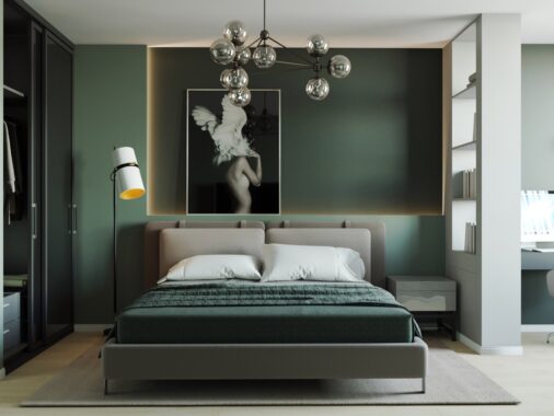
In the master bedroom, we see a gray color that is not uncommon in minimalist bedrooms-- it is cool and simple.
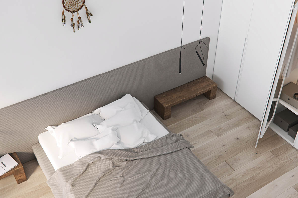
The simple and slim bedroom pendants that dangle from the vaulted ceiling are unique and modern.
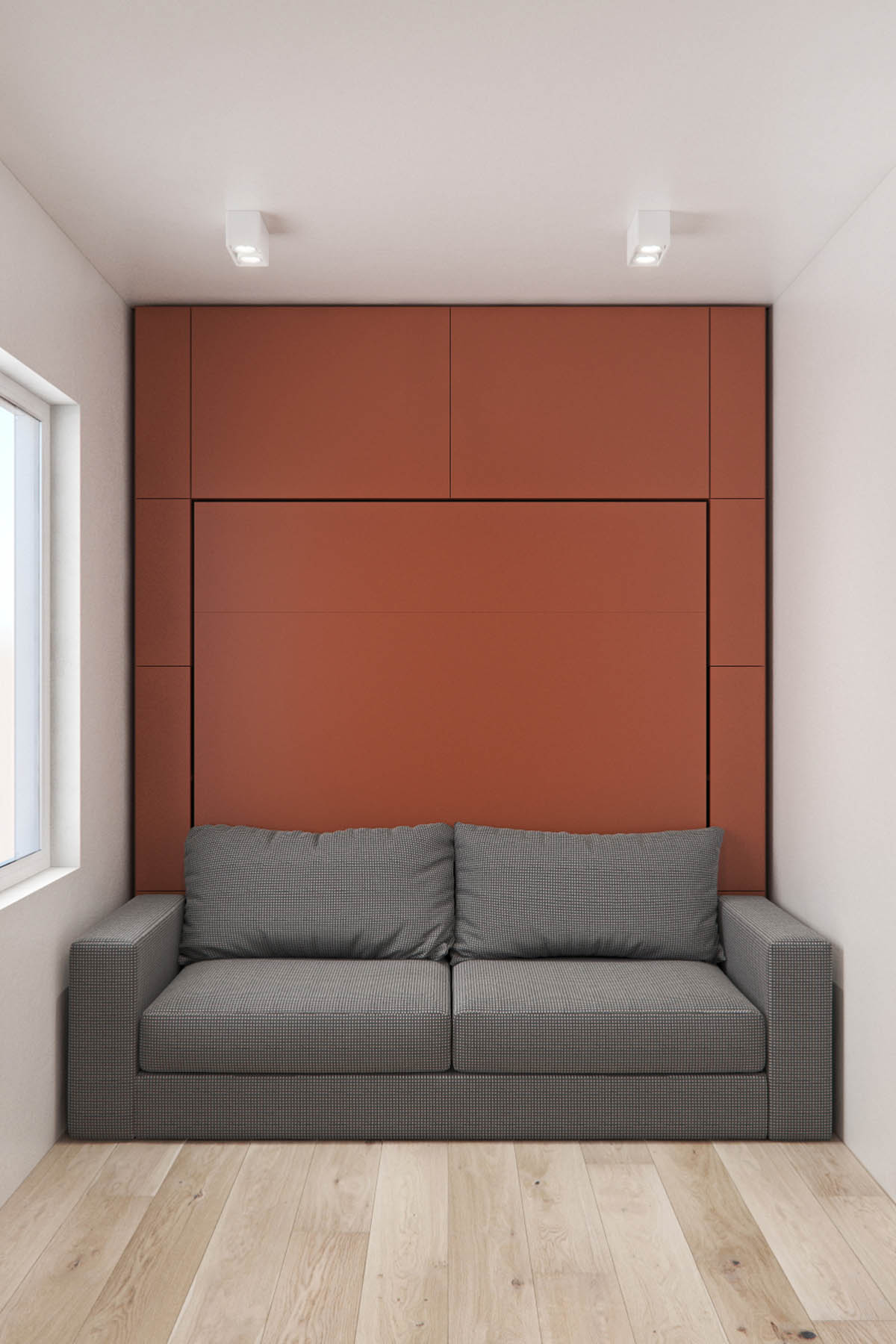
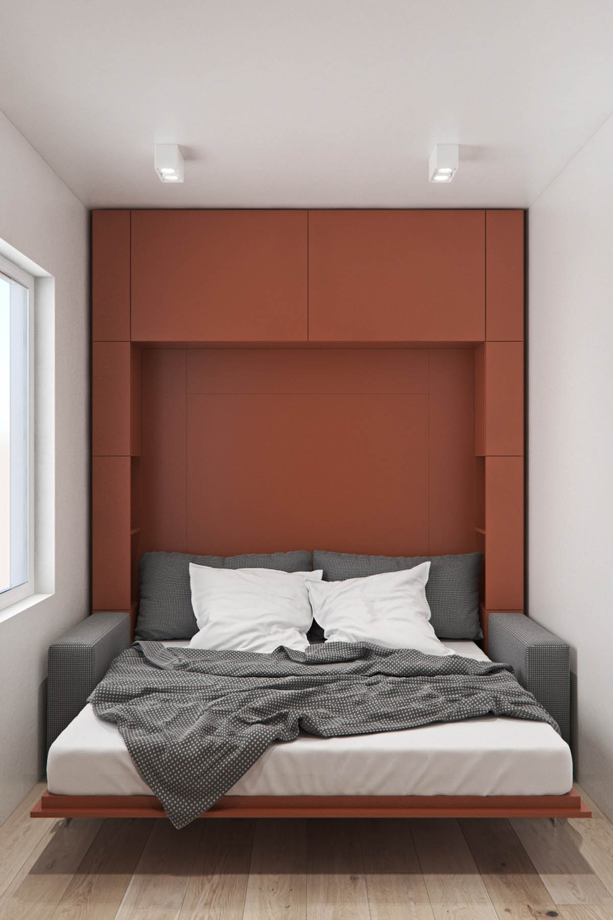
Of course, even minimalists have guests at times. The guest room dilemma can be solved without sacrificing the minimalist aesthetic if you know what kind of furniture and design to invest in. This home features a surprisingly modern murphy bed.
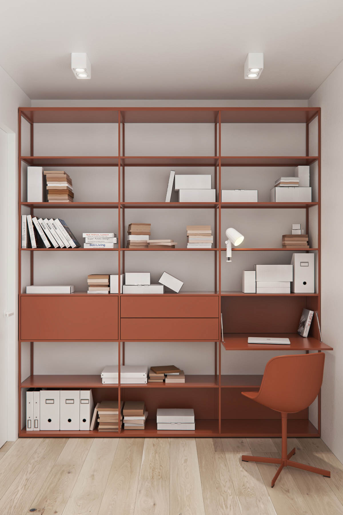
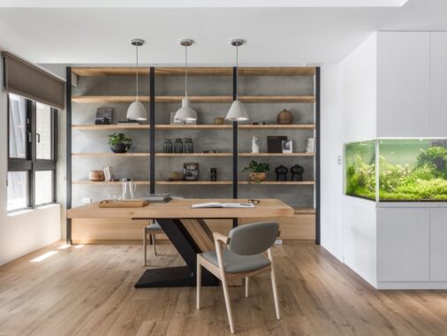
The rust color also provides a bit of warmth for the small but practical home office and storage area.
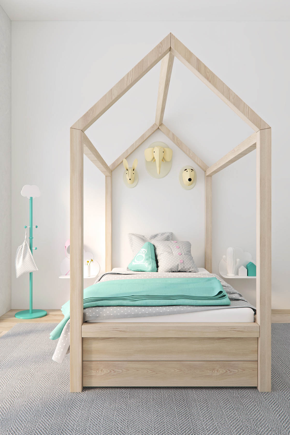
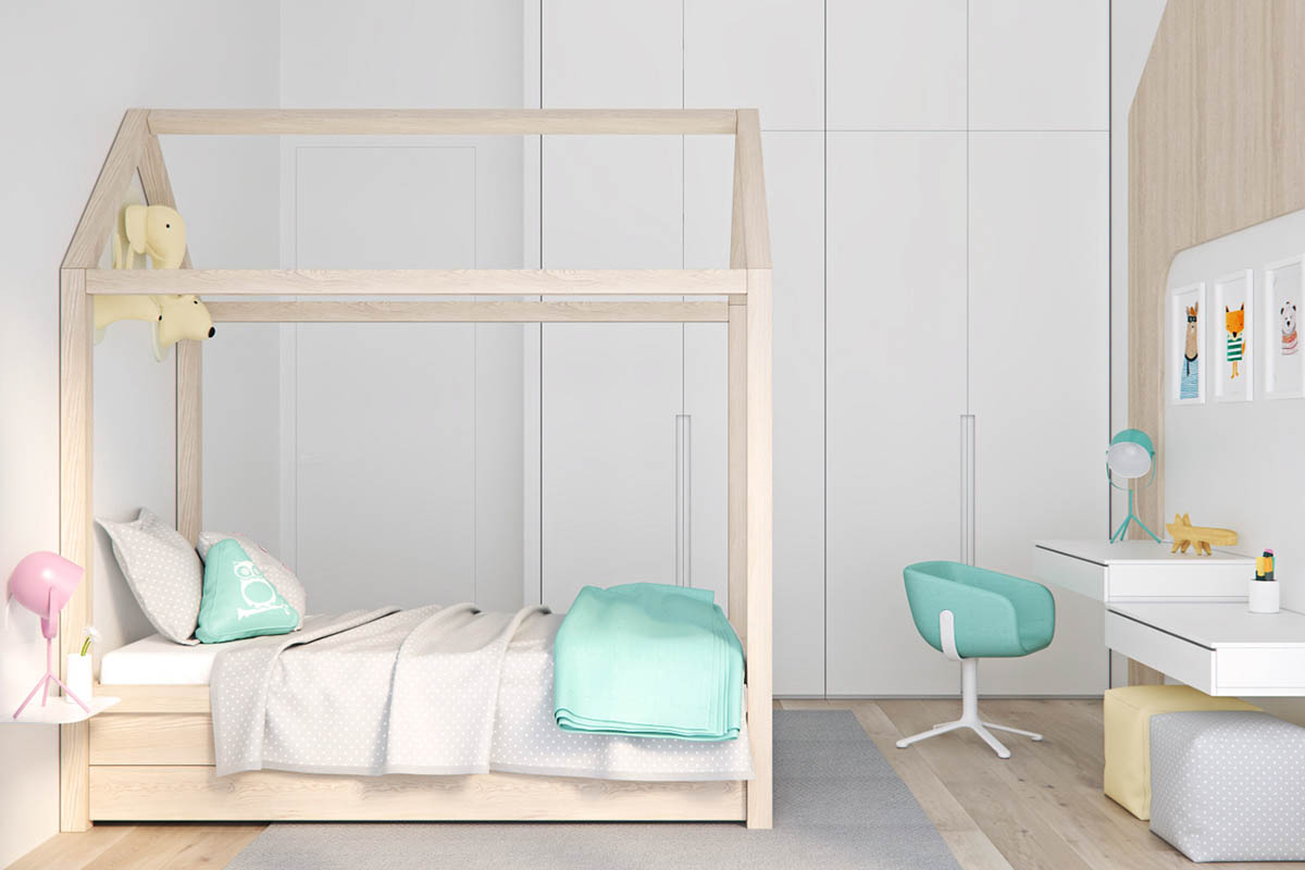
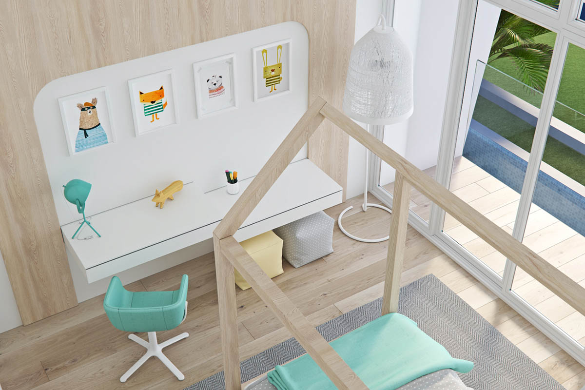
While four poster beds may not be the most minimalist, this design is simple and fun without skimping on kid-friendly decor.
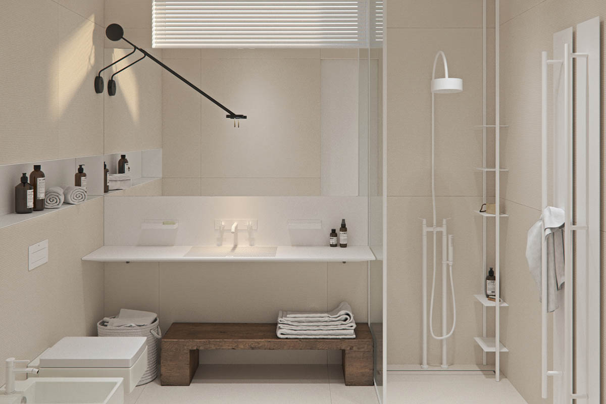
In the bathroom, carefully chosen elements like unique laundry baskets and a custom storage bench make for a space where the whole family can feel comfortable.
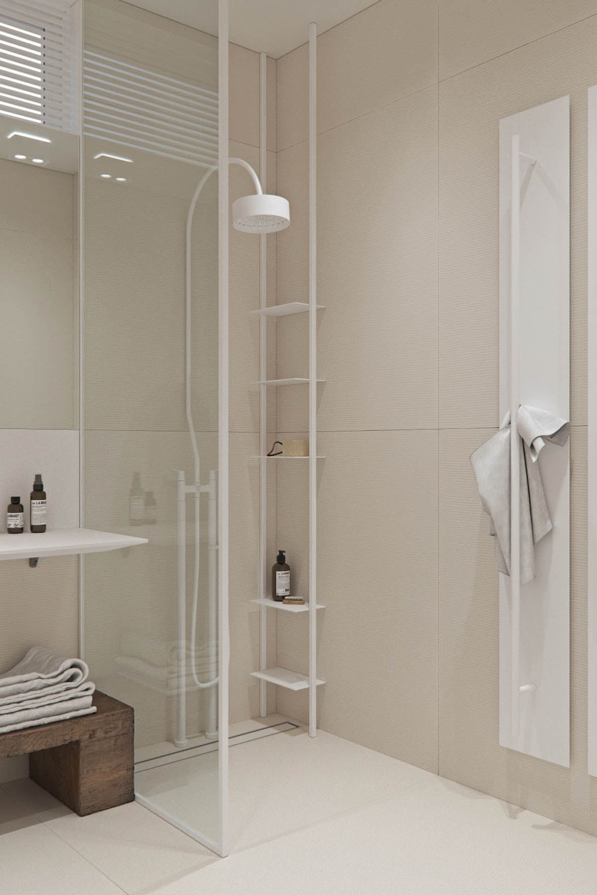
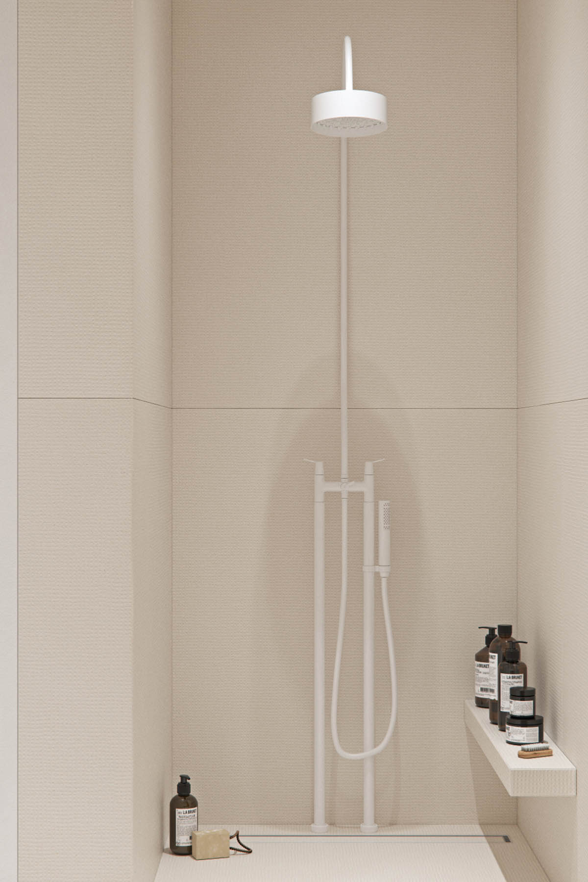
A stand up shower is clearly a minimalist choice for the design-lover who cannot imagine having the time to soak in a tub.
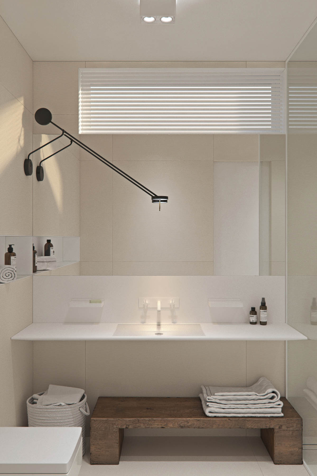
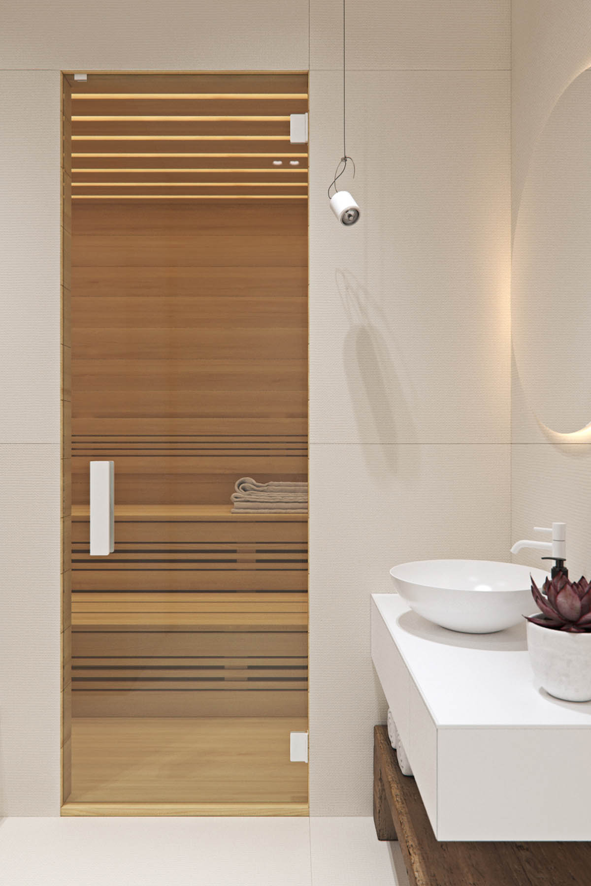
Choosing from a number of available unique faucets it is easy to see how this white on white design stood out. The black swing arm wall lamp brings in beautiful contrast.
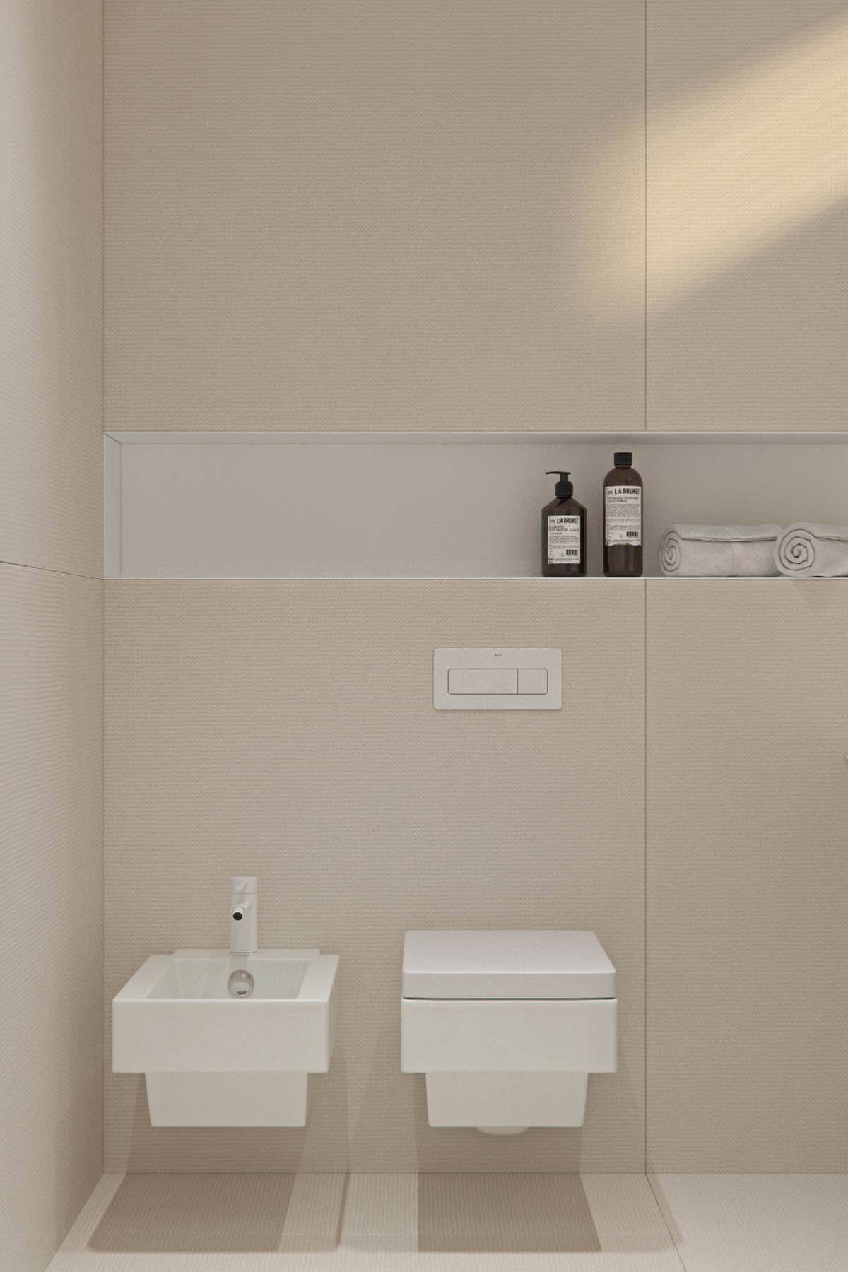
Even foregoing unique soap and lotion dispensers for simple bottles makes for a non-fussy look.
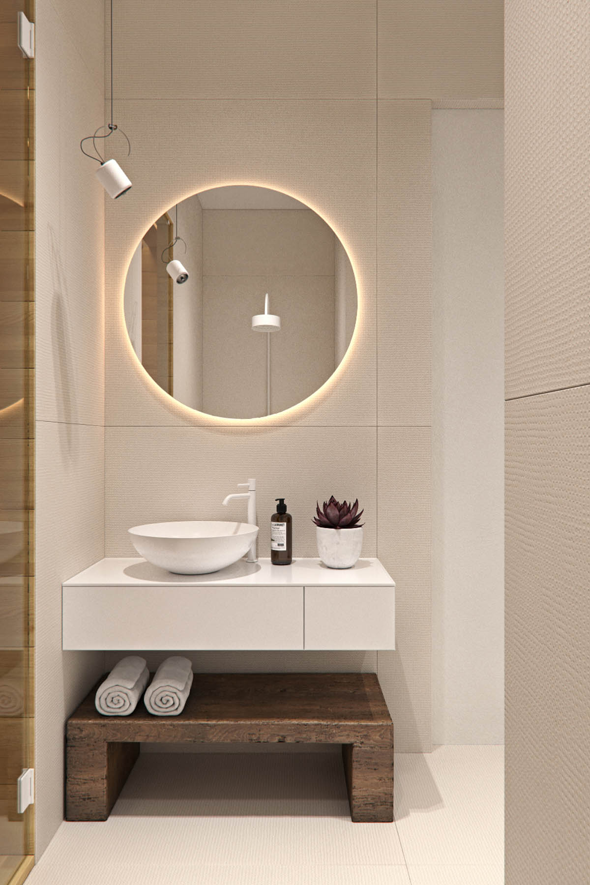
Every guest will love how they look in this glowing circular mirror. And great bathroom lighting is definitely important.
