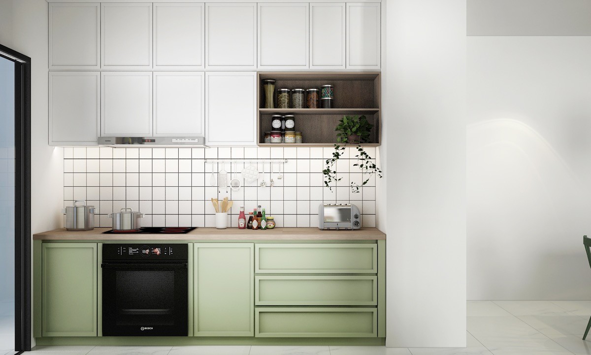
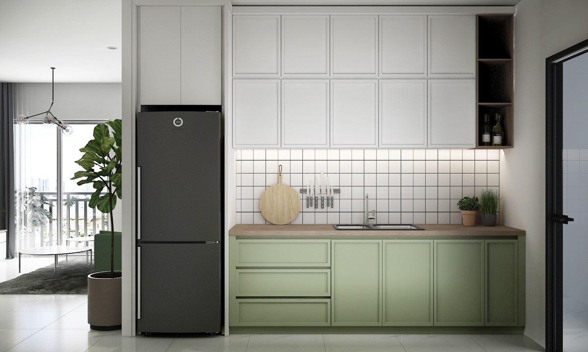
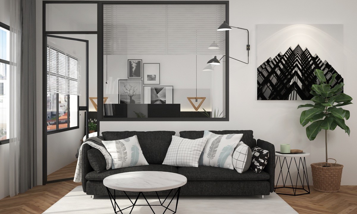
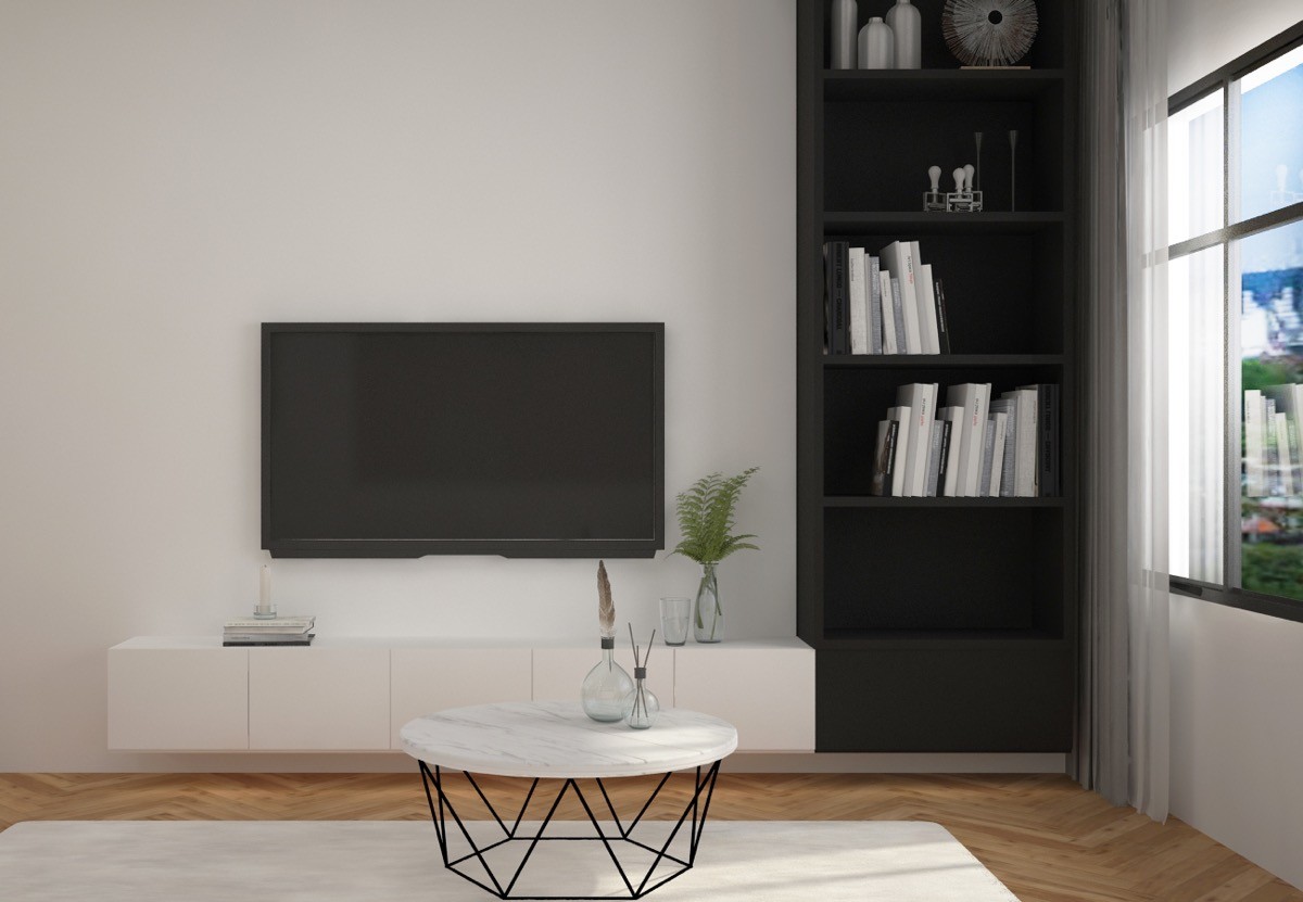
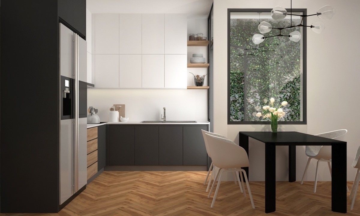
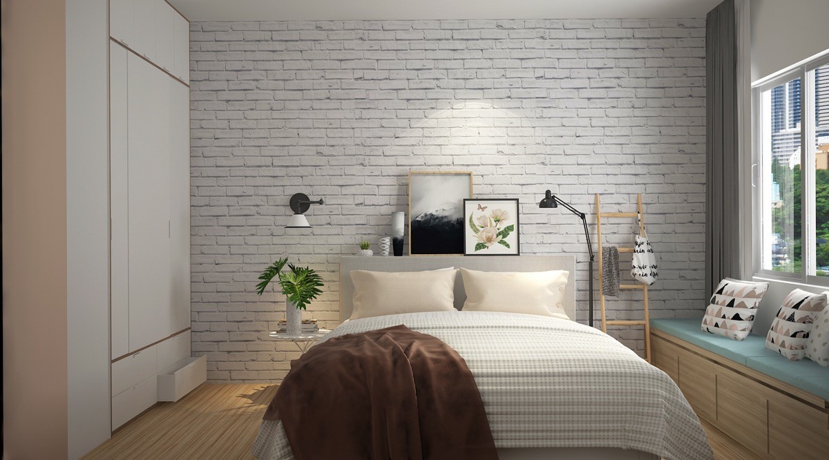
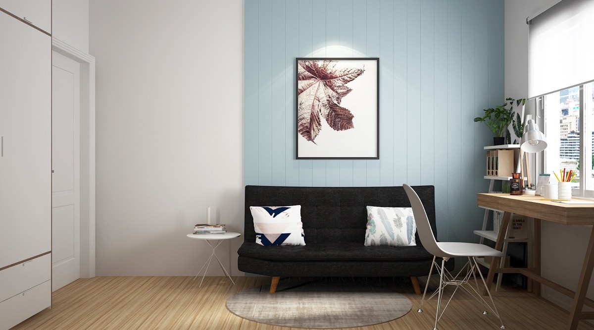
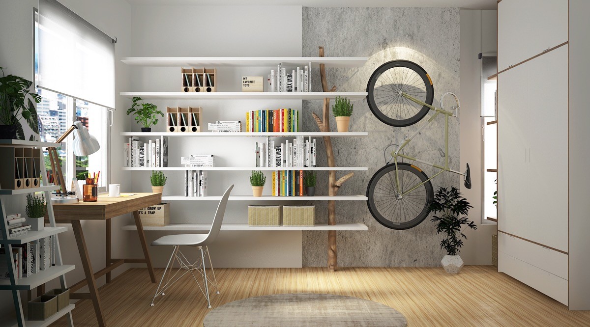
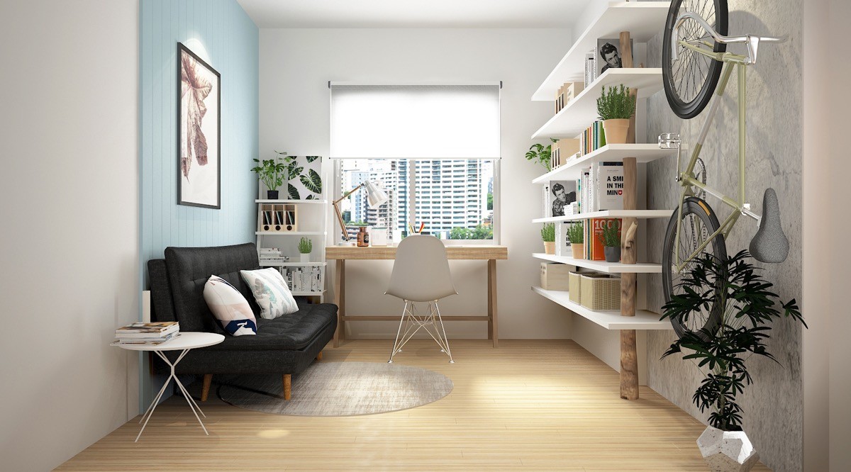
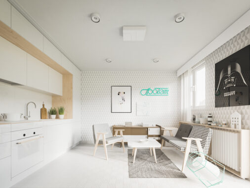
Four Spaces, visualised by Hung Le, serve as great inspiration as to how a blank white canvas can be layered upon to create a joyous homey living space. Using isolated sections of breezy colour, modern artwork and clever furniture layout, the modest scale of these four homes become irrelevant. Small wall spaces are dominated by bold typographical displays that feature quirky mindful quotes. Furniture fits flush to its location but does not overbear. Accessories are patterned and plentiful but surfaces do not appear overly cluttered. It’s a balance that’s not easily achieved, but these four home tours will guide you through it, one intricately styled room at a time.
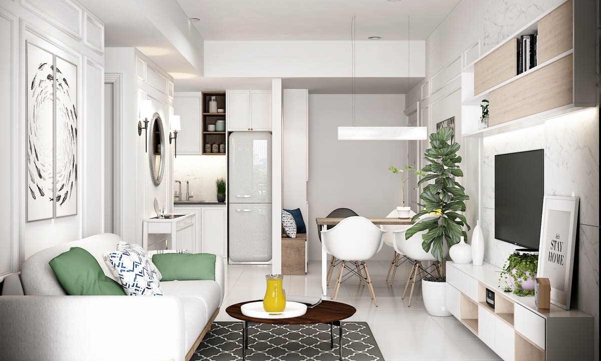
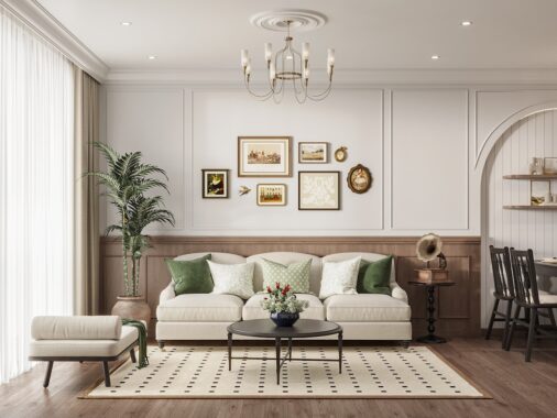
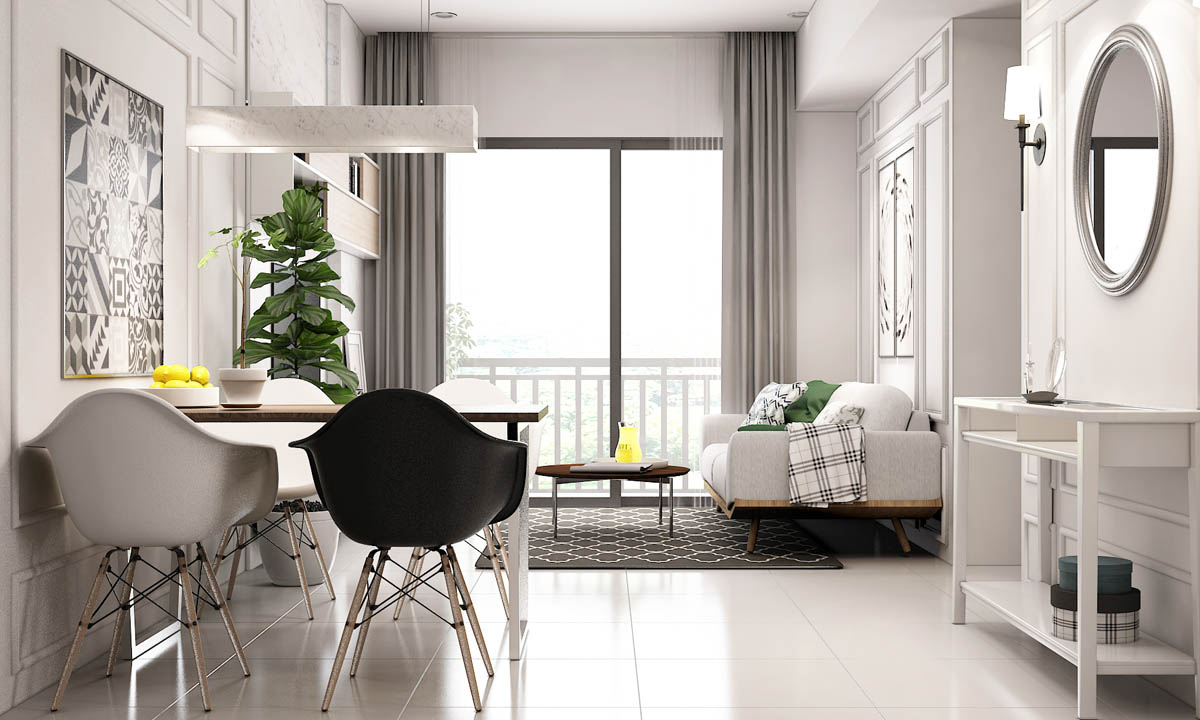
The accent colour in our first home tour has been lifted straight from the house plant, with scatter cushions on the sofa matching its green waxy leaves. A subtle thread of blue runs through accessories here too.
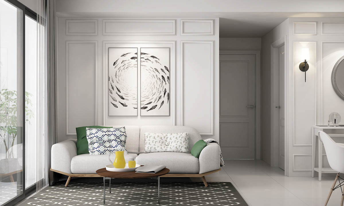
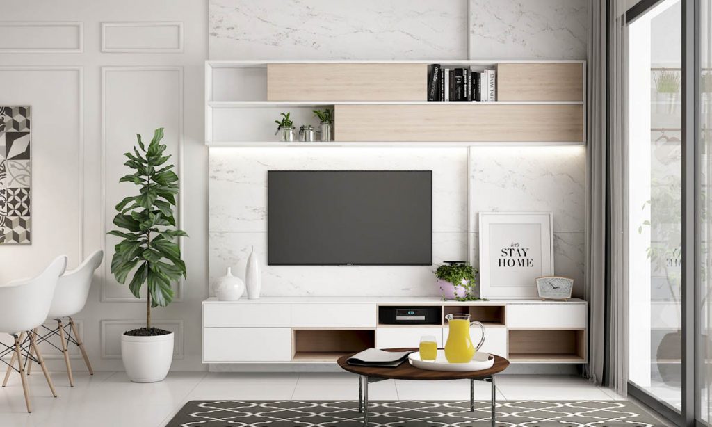
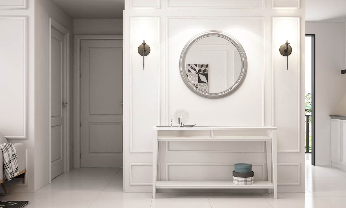
Boiserie decorates the white walls, giving the place an air of sophistication. A polyptych nestles within one of the panels with a dreamy swirling fish design. The furniture in this space is also predominantly white with just a few wooden accents pushing through, like the base of this contemporary sofa.
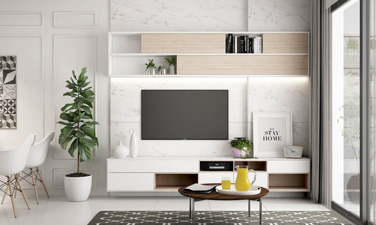
In front of the sofa, a small round coffee table is finished in a darker hue, but is brightened by a white serving tray holding a clear glass pitcher. Beneath the table a monochrome rug brings interest to a white floor. The patterned rug is complemented by a geometric art print on the far wall by the indoor plant, which is a Fiddle Leaf fig.
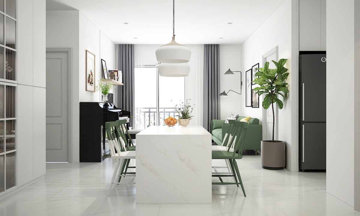
The wall art and pendant light work to anchor the dining table set within an open plan scheme.
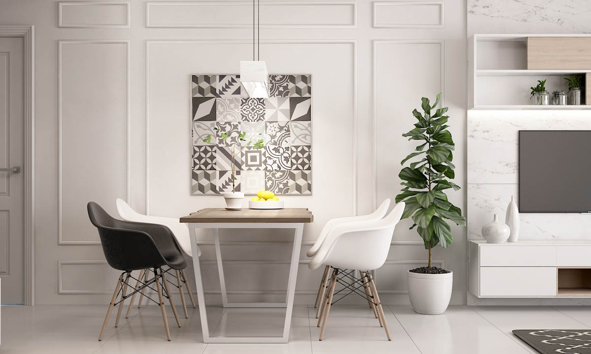
One black Eames armchair has been selected in offbeat contrast to three white ones.
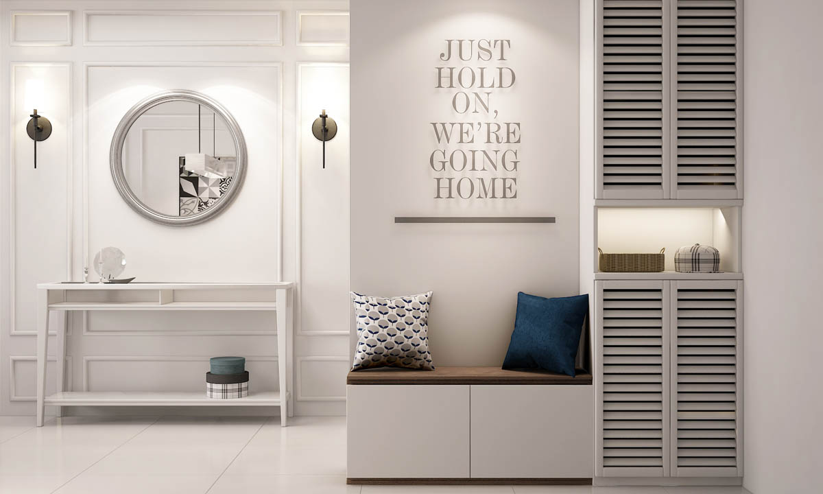
By the home entryway we find a small shoe bench adorned with a couple of cheerful scatter cushions. A quote decorates the wall above, dramatically lit by a spotlight. Built in cupboards with louvre doors provide a neat storage spot, and feature a small recessed shelf for stowing keys.
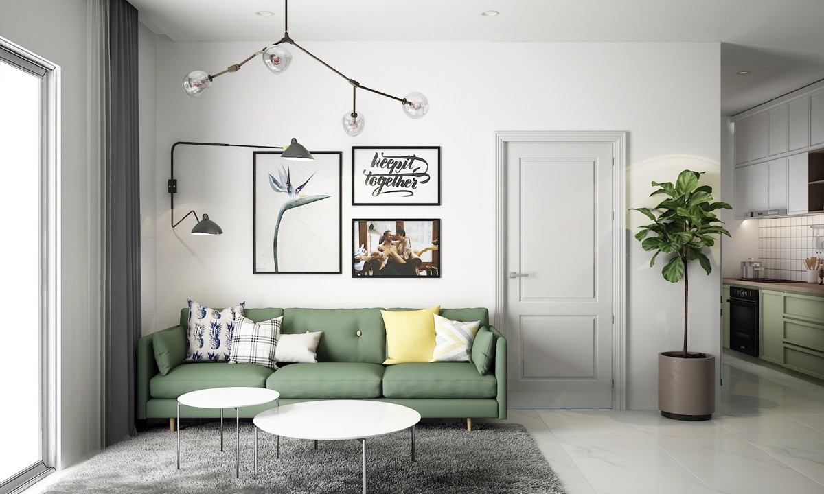
The second space follows a muted green scheme too but this time with a pop of cheerful yellow. Picture frames, overhead light and swing arm wall lamp create a network of black lines over a plain white wall. The Serge Mouille style double swing arm wall lamp makes the sofa into a practical reading spot for two bookworms, without cluttering up space with an additional floor lamp.
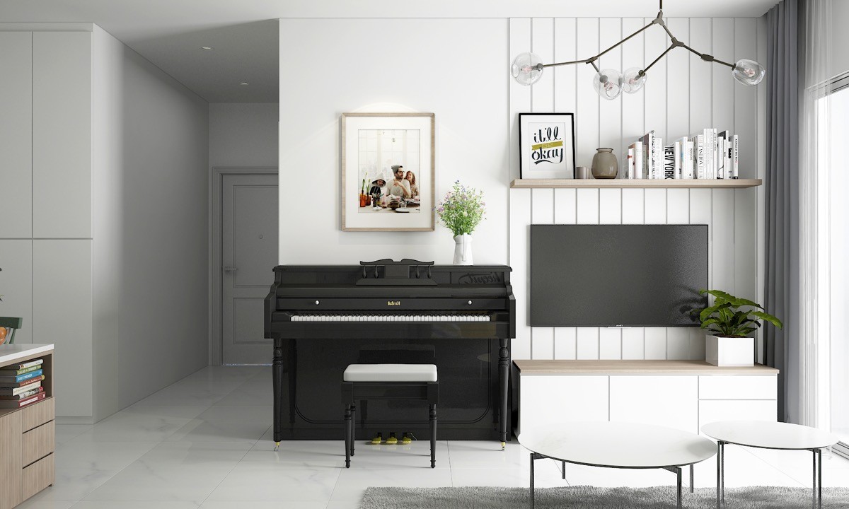
Despite limited proportions, this lounge doubles as a music room. To define the dual use of the area, wood tongue and groove planks have been installed behind a television, console unit and an in-line bookshelf. A picture and house plant sit above the keyboard to give it a standalone look.
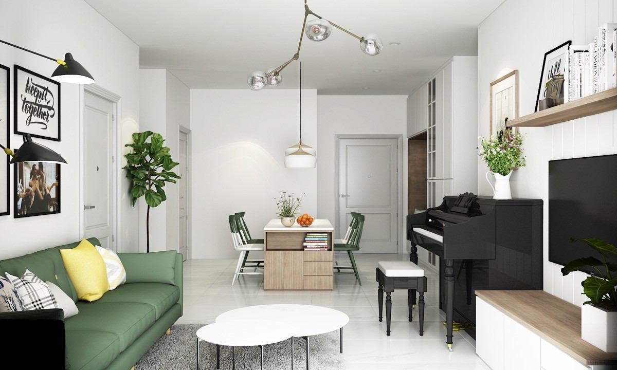
To separate the dining spot and lounge in this small open plan living space, two entirely different styles of pendant lights have been used. In addition, one side of the dining table is actually a storage and display unit, which works to divide the area by creating a visual stop point.
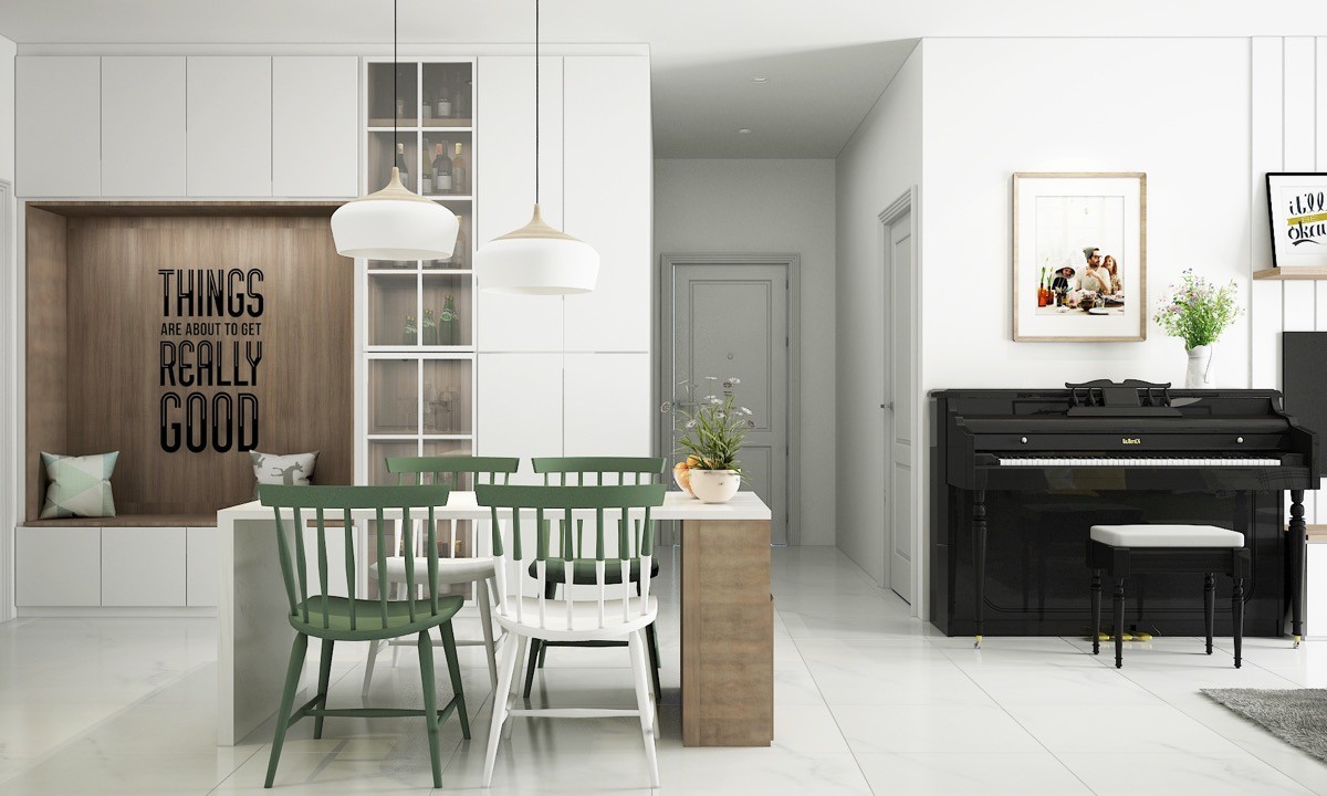
The wooden unit gives the white dining table a cool asymmetric look. Two of the four Scandinavian style chairs at the table, these being the Salt Chair by Tom Kelley, have a ‘dipped’ paintwork effect that marries well with its quirkiness. Behind the dining area a sitting nook has been created within a bank of storage units. It’s clad in wood that matches with the table feature, and harbours a positive message in decorative wall letters.
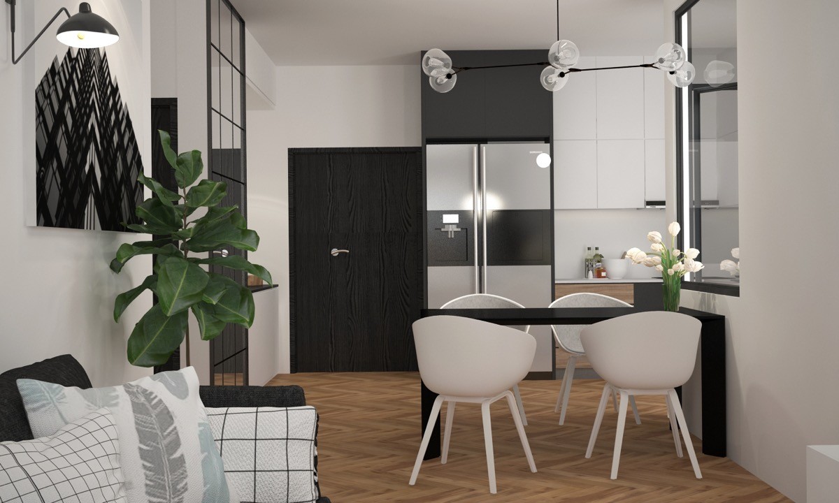
The dining table is ebony black with four white dining chairs, which are an About A Chair by Hay Replica.
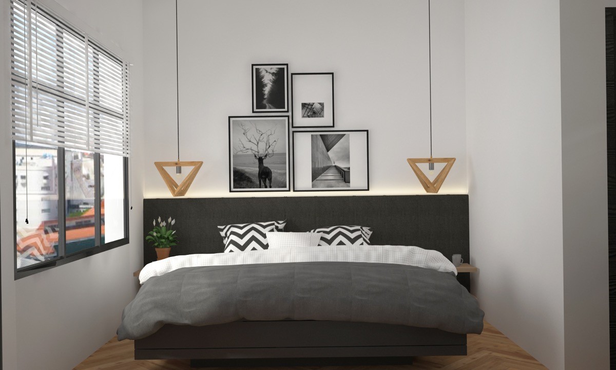
Wooden bedroom pendant lights lift the look of monochrome decor.
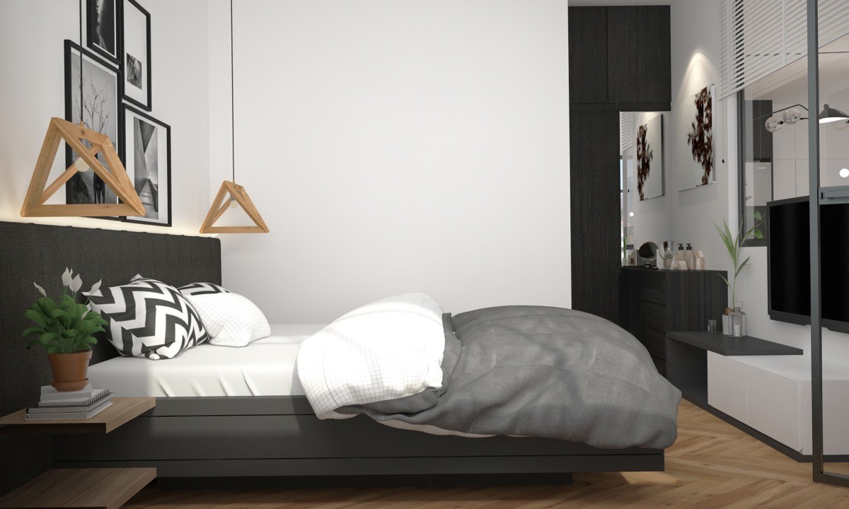
The geometric look of the pendant shades is very sculptural, demanding as much attention as the wall prints.
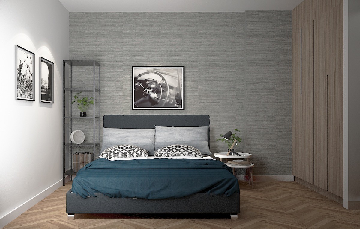
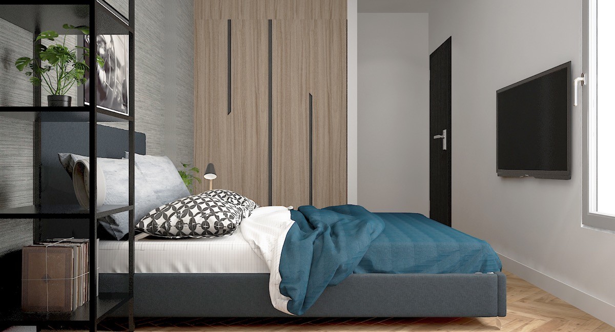
A second double bedroom is decked out with teal bed sheets, charcoal display unit and a set of white nesting tables that hold a bedside table lamp.
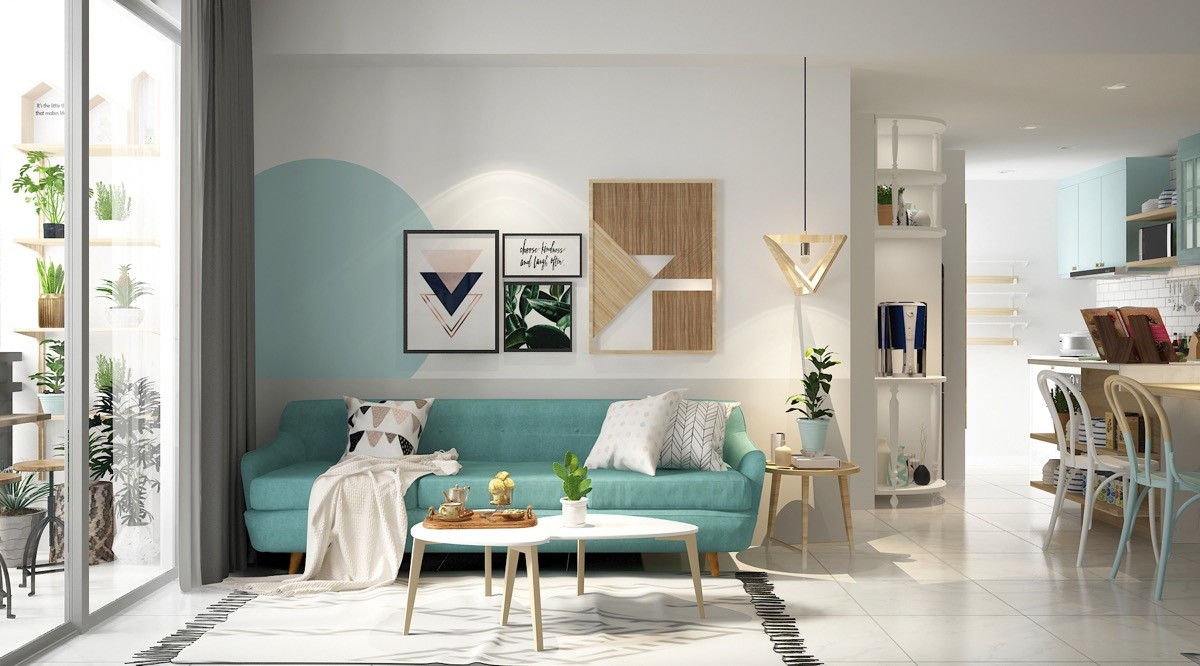
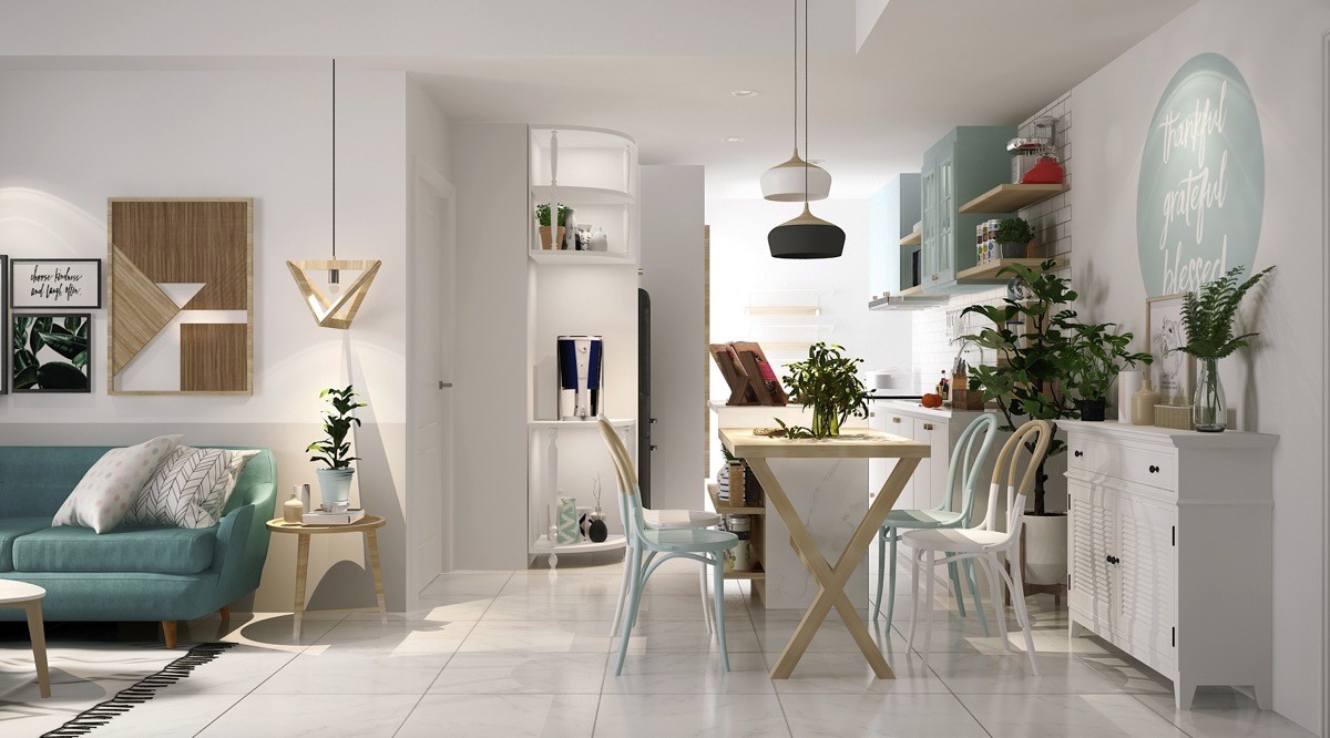
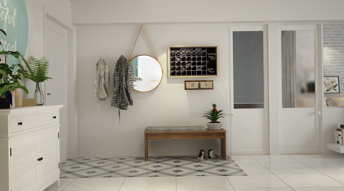
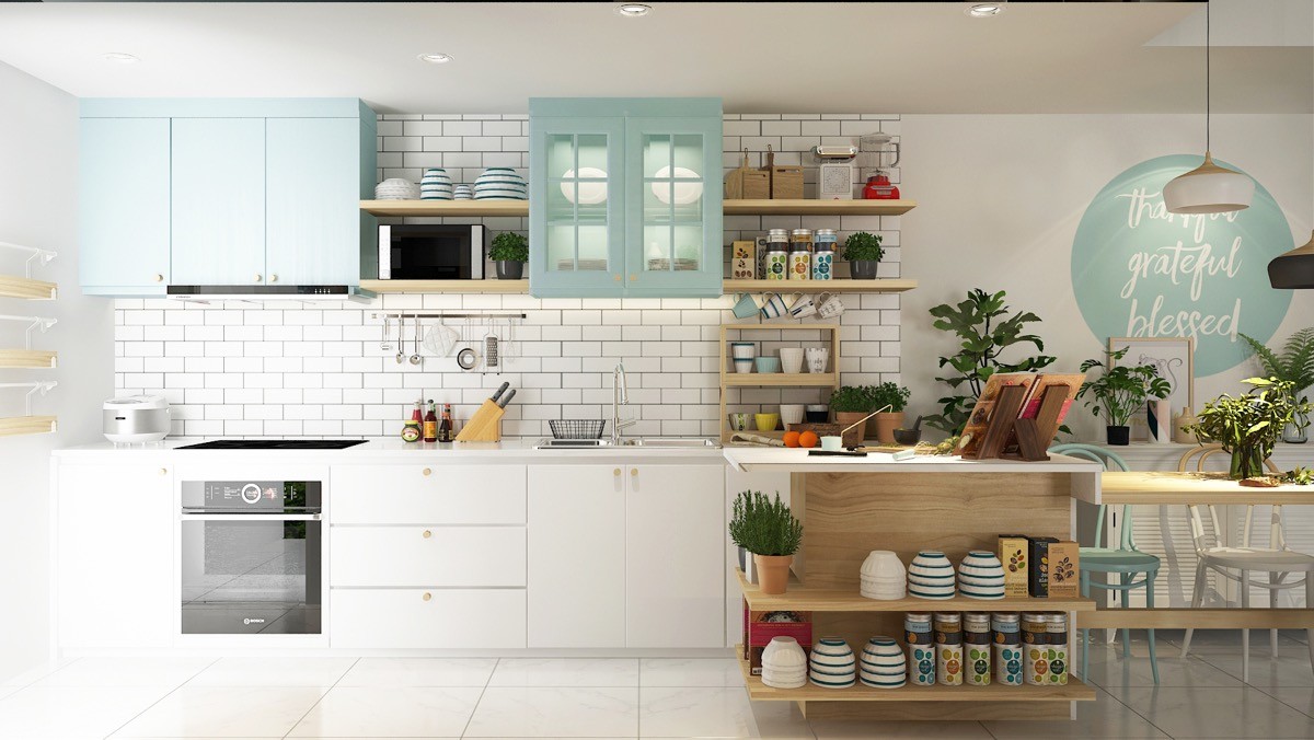
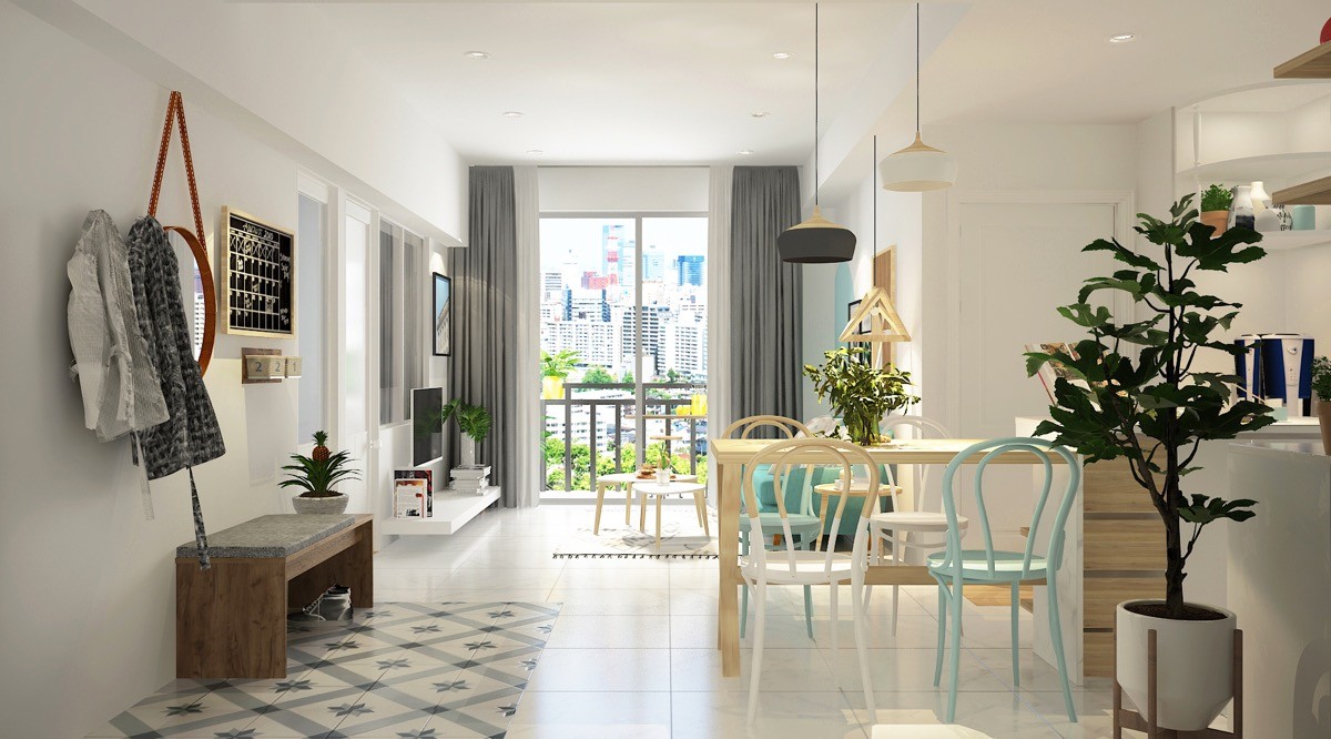
Lastly, this home blasts you with a cool splash of turquoise, like seaspray from a tropical ocean. Sandy hues are here too via a plentiful selection of light wood elements.
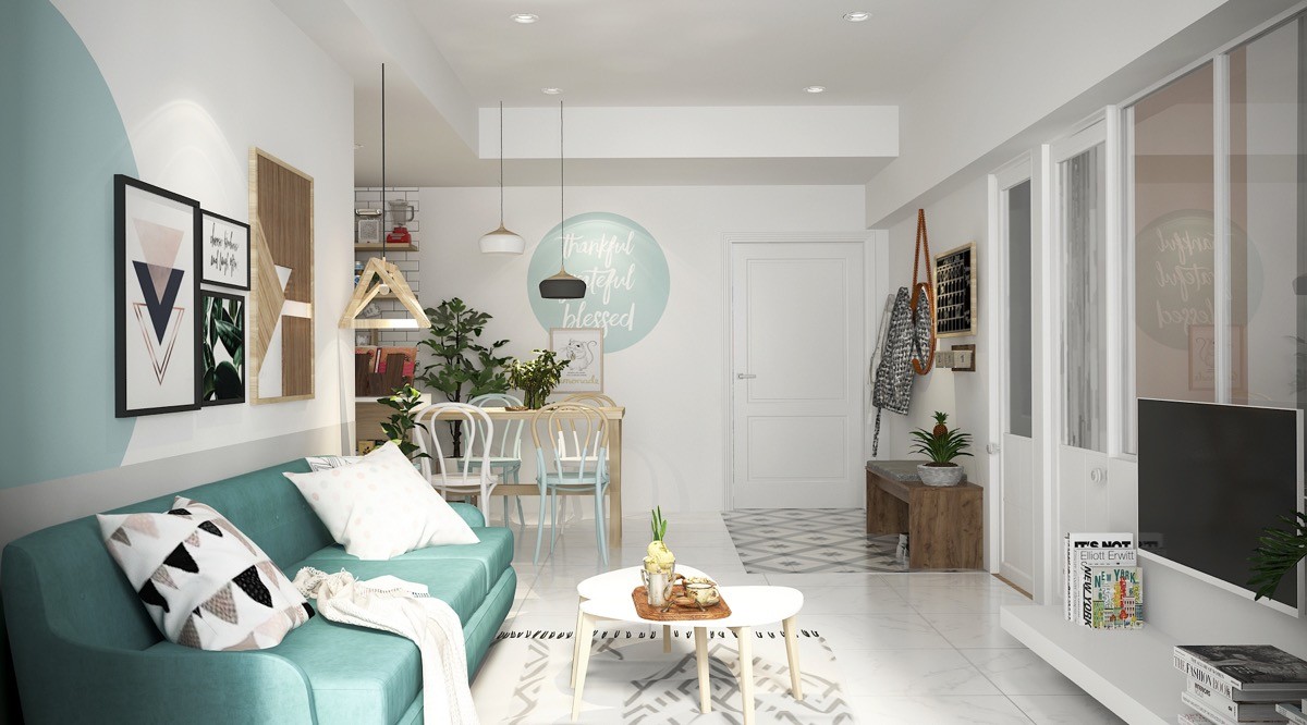
Geometric prints are a strong feature of this interior. Angular shapes are juxtaposed by large circles applied here and there over the walls.
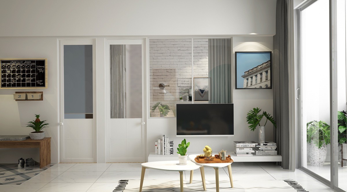
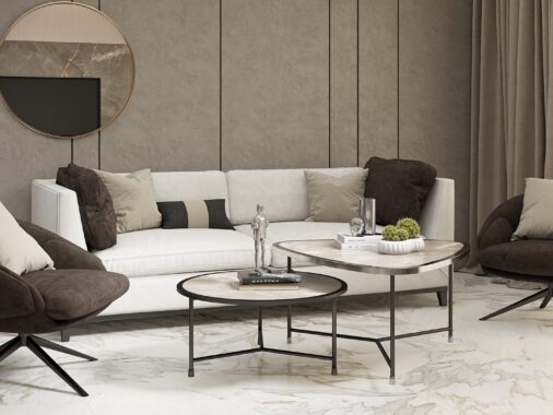
A duo of coffee tables in a mid century modern triangular design nestle together to create a larger surface area.
