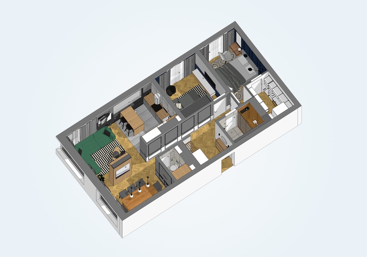
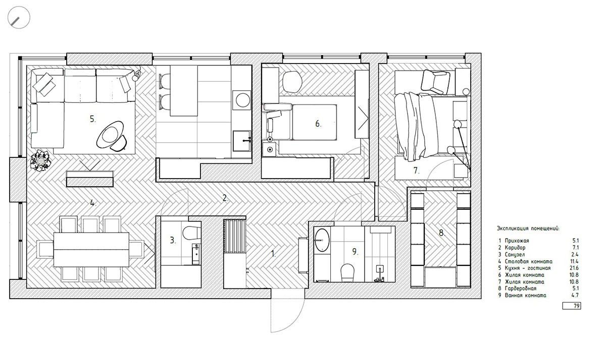
If you're on the search for versatile color accents, jewel tone palettes tend to remain flattering throughout every season. This contemporary apartment by Shubochkini Architects starts with a base of powerful neutrals with walls divided into light and dark grey, softened by monochromatic textiles layered throughout. Select jewel tones use this subdued canvas to their advantage – the eye immediately drawn to every pop of emerald, sapphire, and citrine. Find fresh color palette inspiration and explore this gem of an interior concept through the captivating visualizations below.
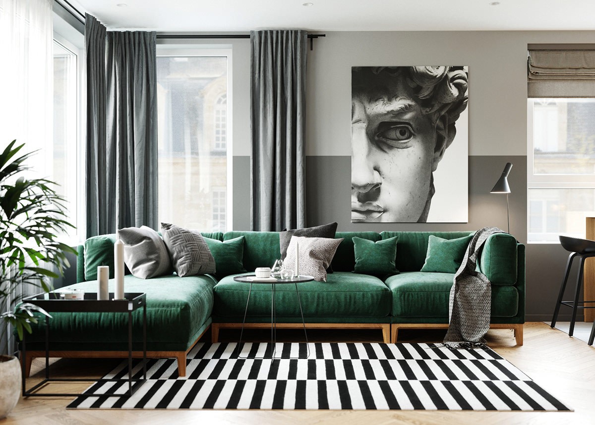
This tour begins with a glimpse of the living room, the landscape centered around a modern sofa that captures attention with elegant emerald upholstery. A color like this can be subtle in other contexts – but in a space dominated by such stark neutrals, it becomes a beacon and anchor for the entire space.
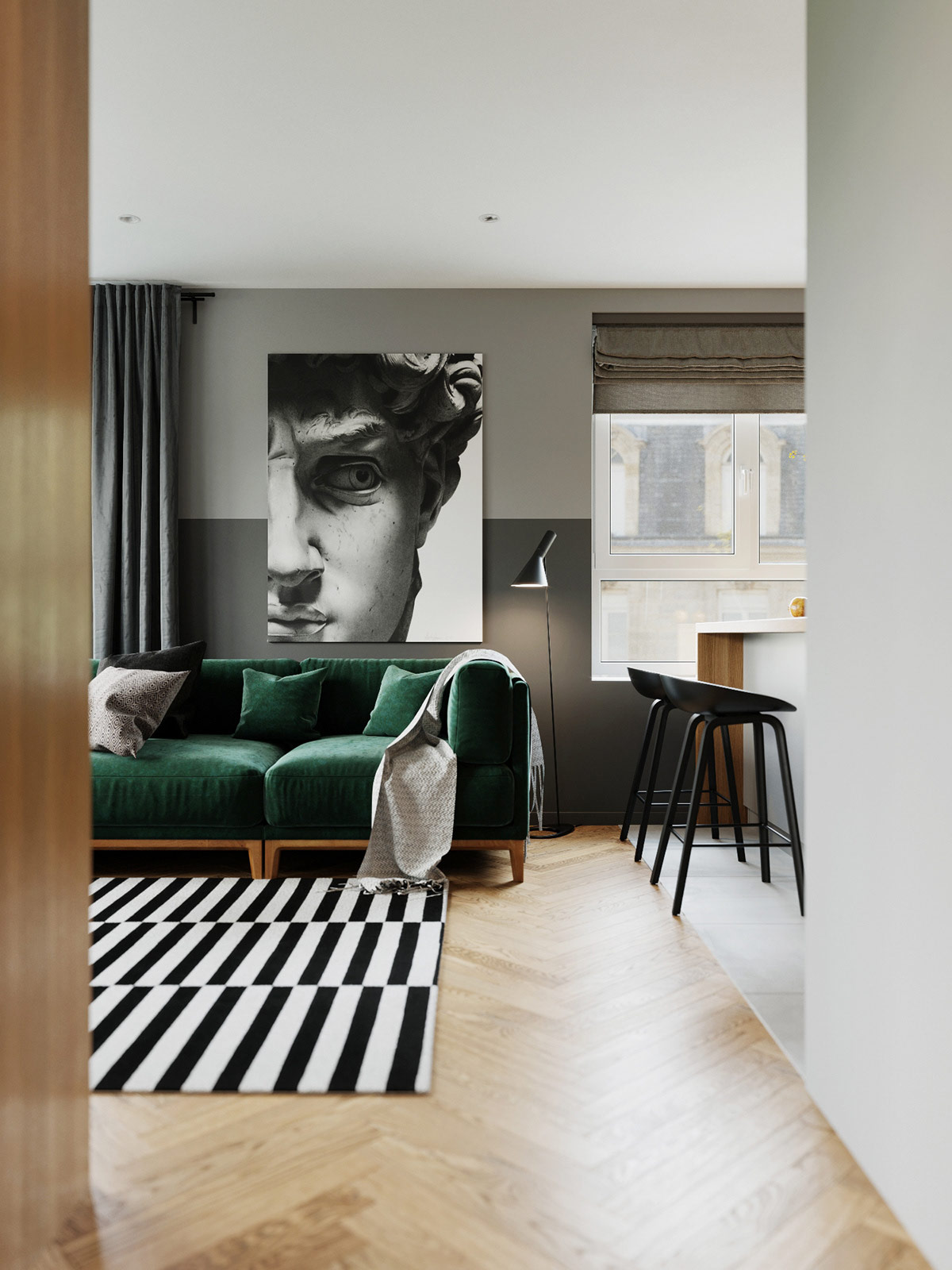
Of course, even the neutral elements deserve appreciation. The furniture and décor selections draw from a vocabulary of iconic designs. Here you see the famous AJ floor lamp by Arne Jacobsen.
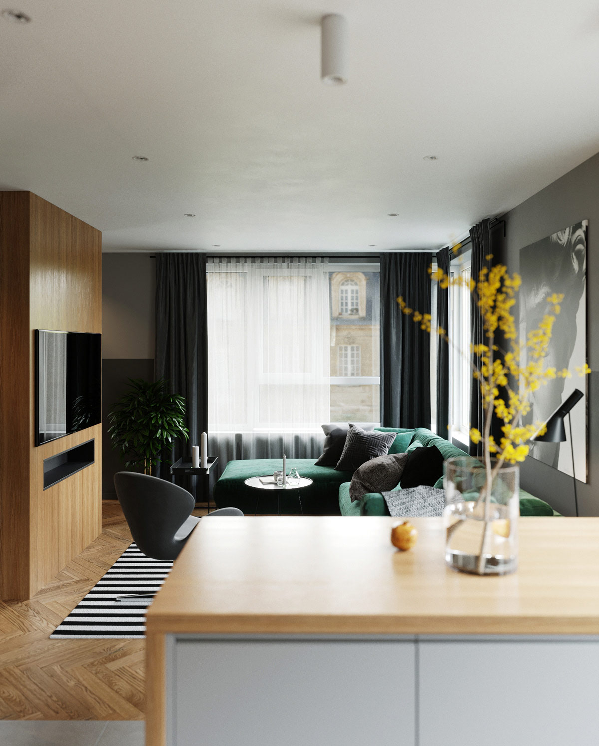
Natural elements also play an important role. Interactive spaces enjoy the warmth of natural wood, like the chevron floors and partial wall in the living room.
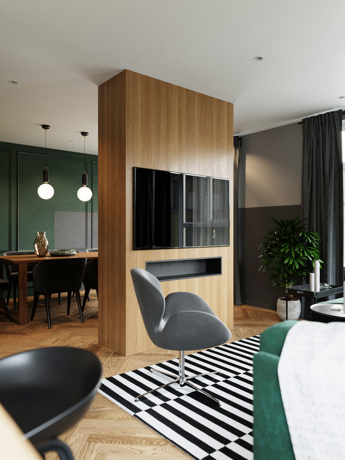
With limited seating in the living room, this accent chair makes a mark with its sculptural shape. This piece is the classic Swan Chair originally designed by Arne Jacobsen.
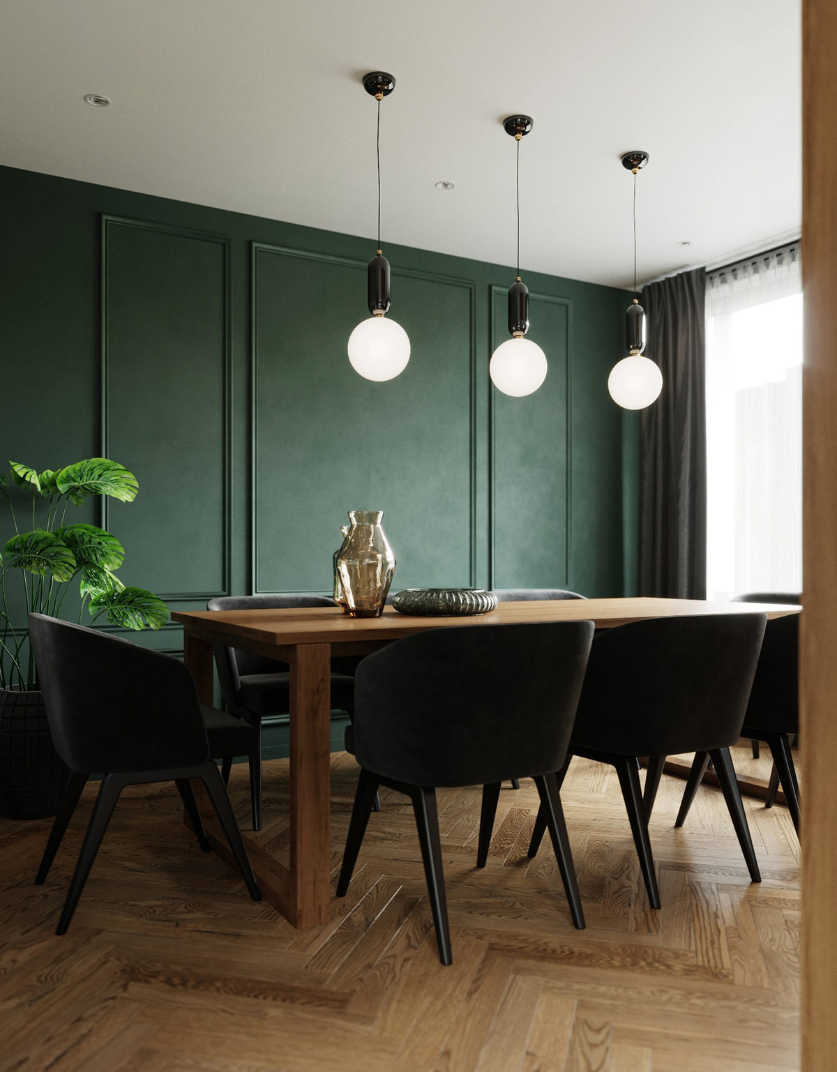
Classic meets modern in this spectacular dining room. The decorative wall paneling embraces a vintage look, updated by the smooth Creed dining chairs from Rodolfo Dordoni.
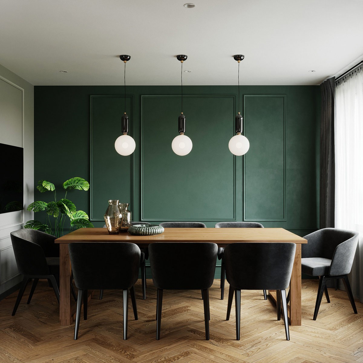
Beautiful dining room pendant lights by Jaime Hayon hang in a row above the table. Not only do these create a focal point against the emerald green wall, they also provide a soothing mood light alternative to the primary recessed lights.
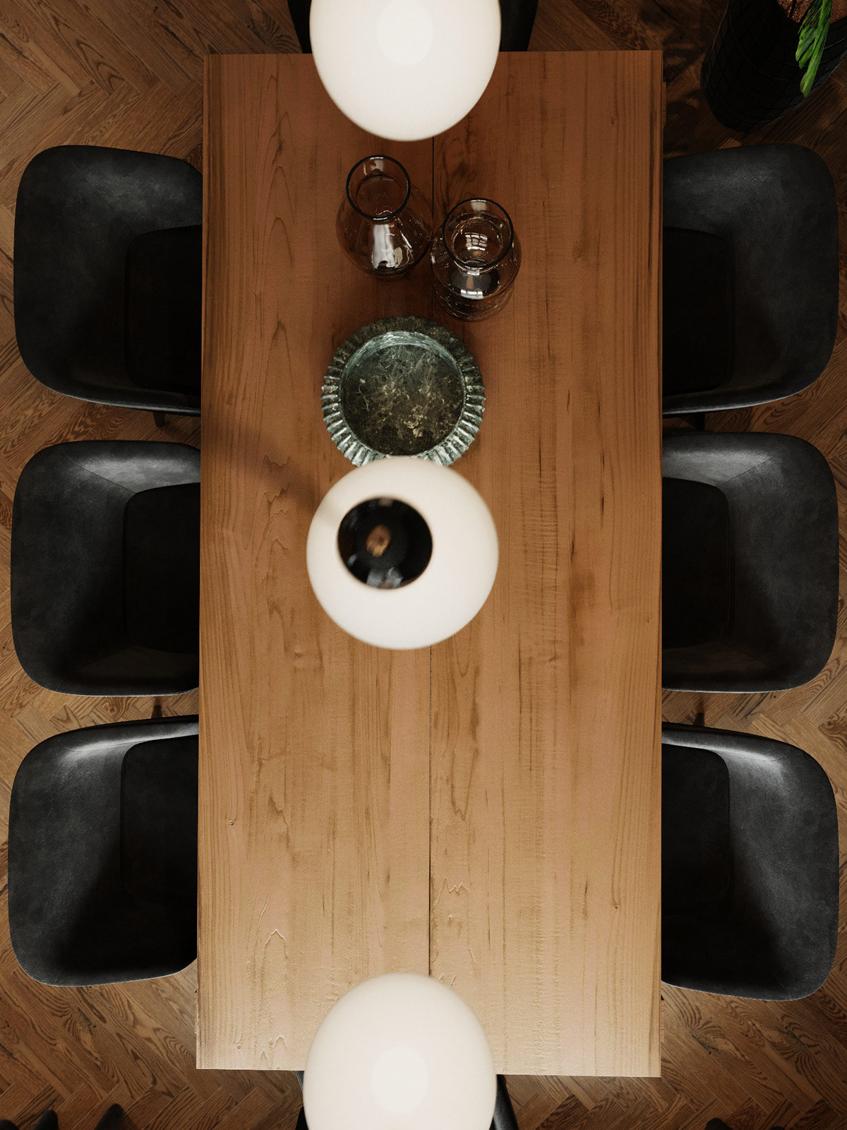
Such a distinctive combination of elements calls for unique tableware to tie the themes together. A gorgeous stone fruit bowl brings out the color of the accent wall.
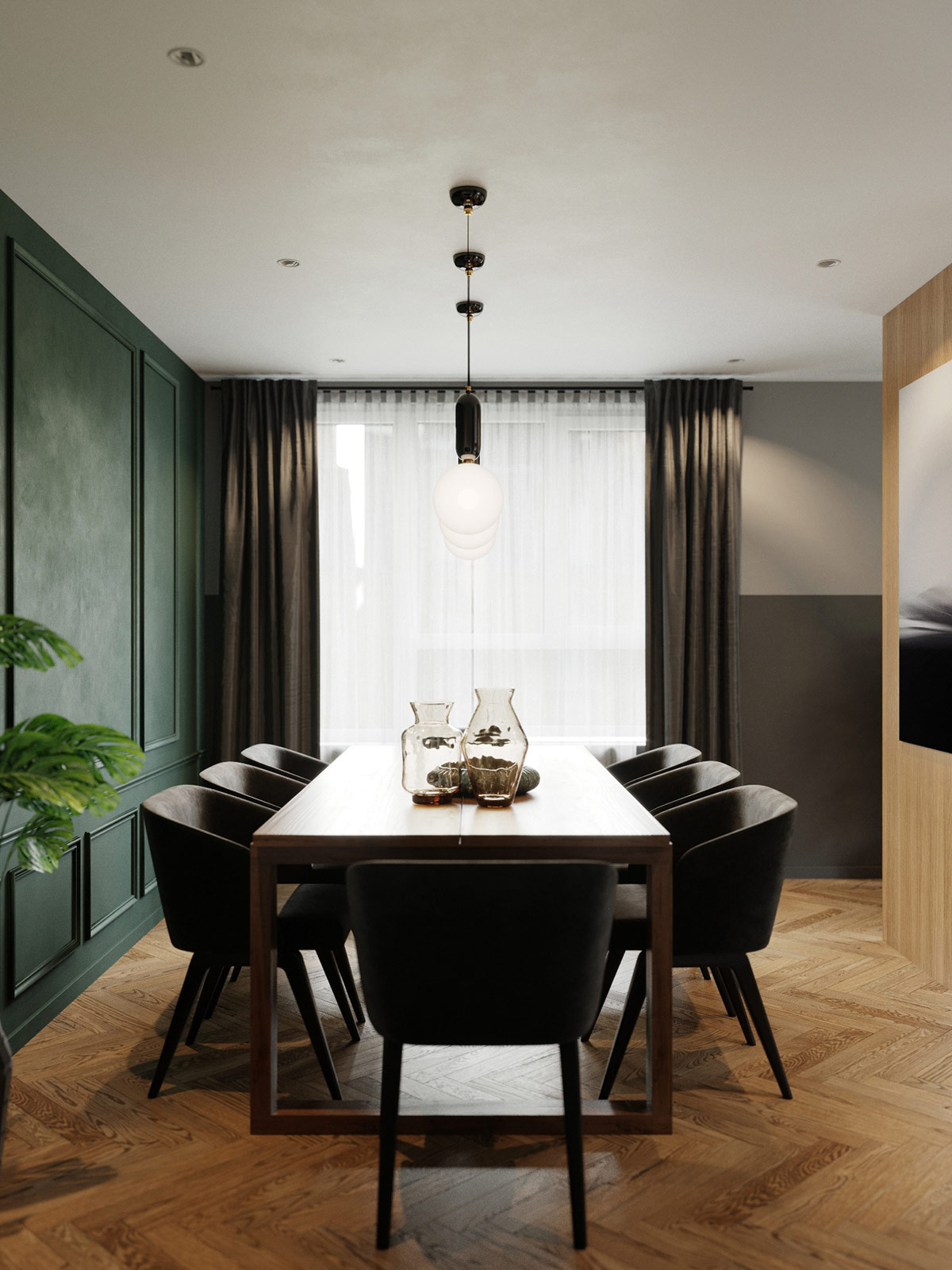
Lovely glass vases in amber continue the natural palette.
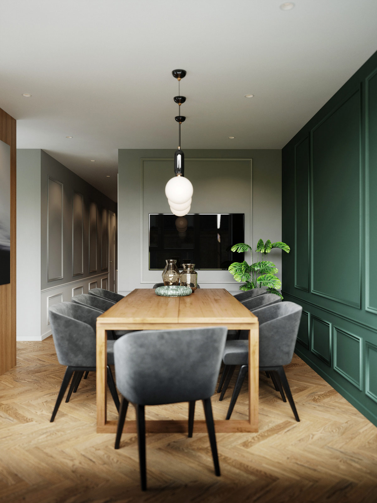
While a television would ordinarily make a formal dining room feel more casual, this one benefits from the flush mount installation and border of decorative trim.
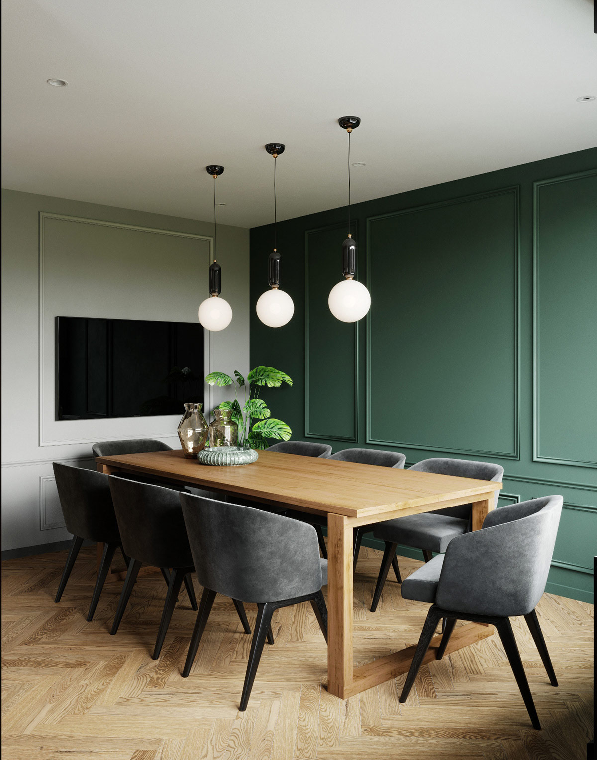
Black chair legs and pendant bodies ensure the television does not break the color palette. This is one example of how small details can have far-reaching implications.
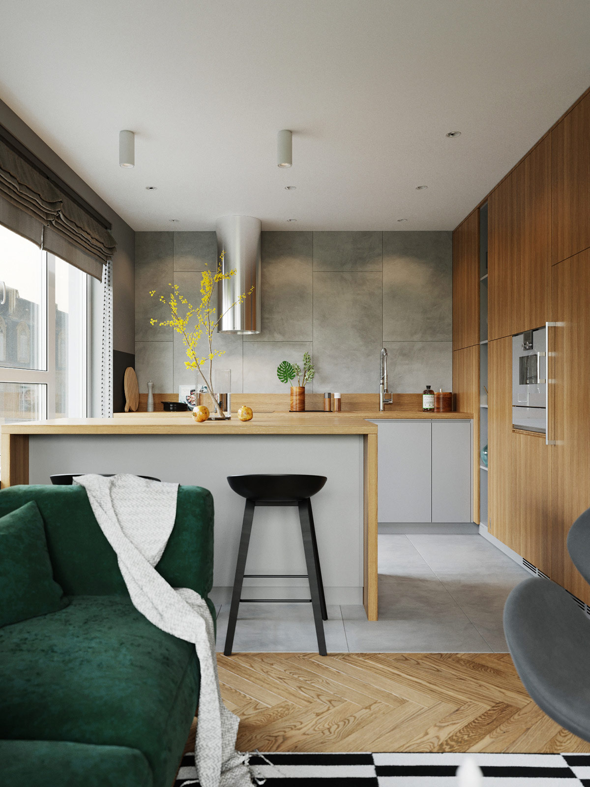
Adjacent to the living room, you’ll find a comfortable kitchen that feels endless thanks to its generous floor-to-ceiling window.
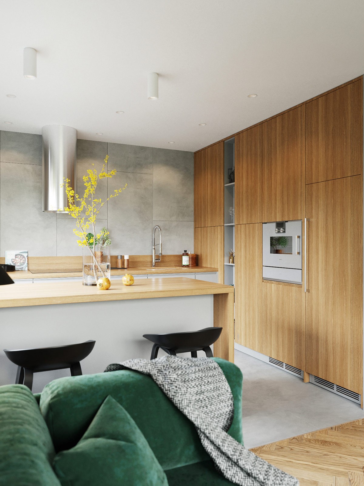
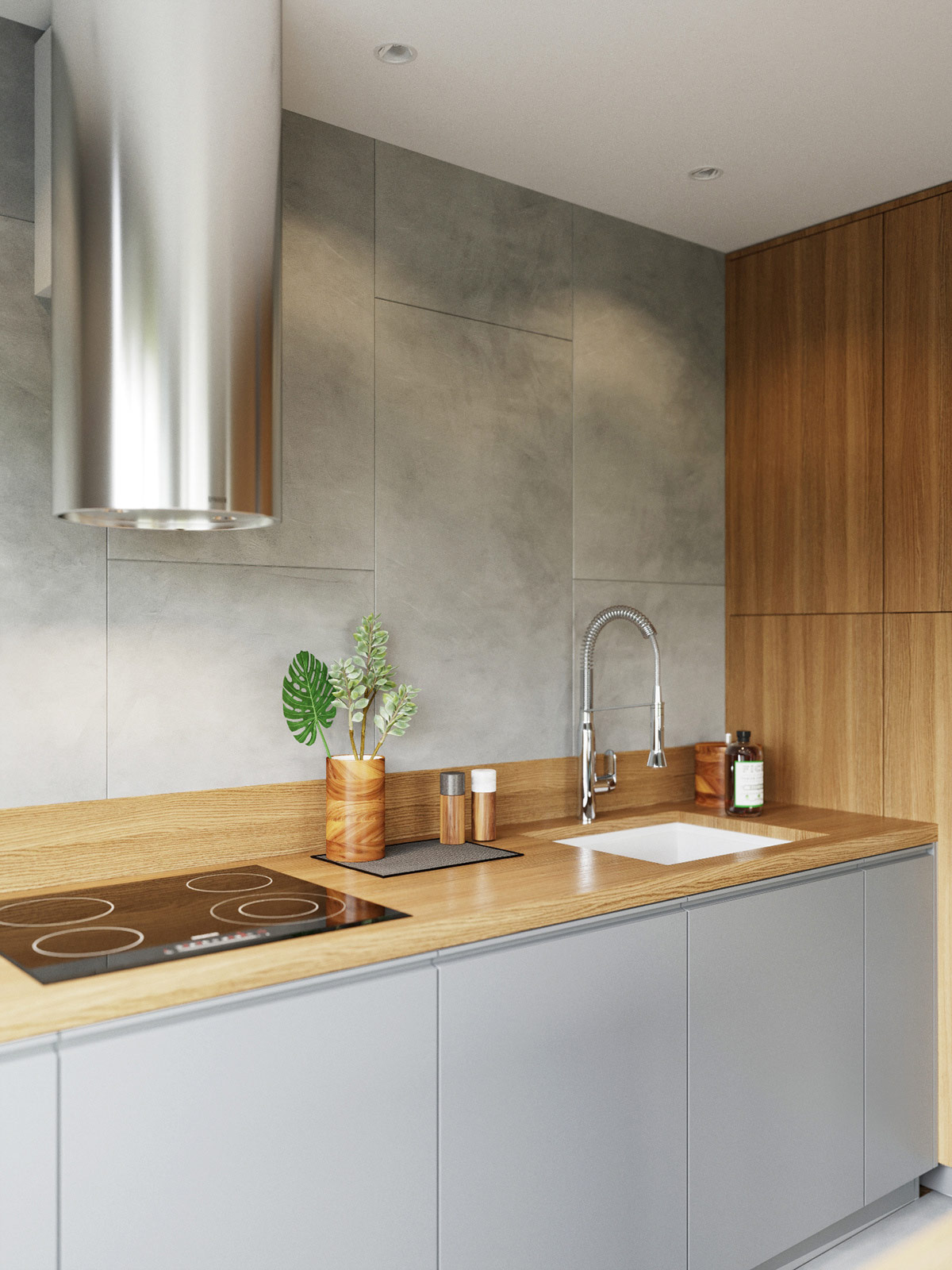
Natural materials again make a statement here. Grey stone cladding spans the full-wall backsplash while vertical wood grain creates a seamless continuation between countertop and cabinetry.
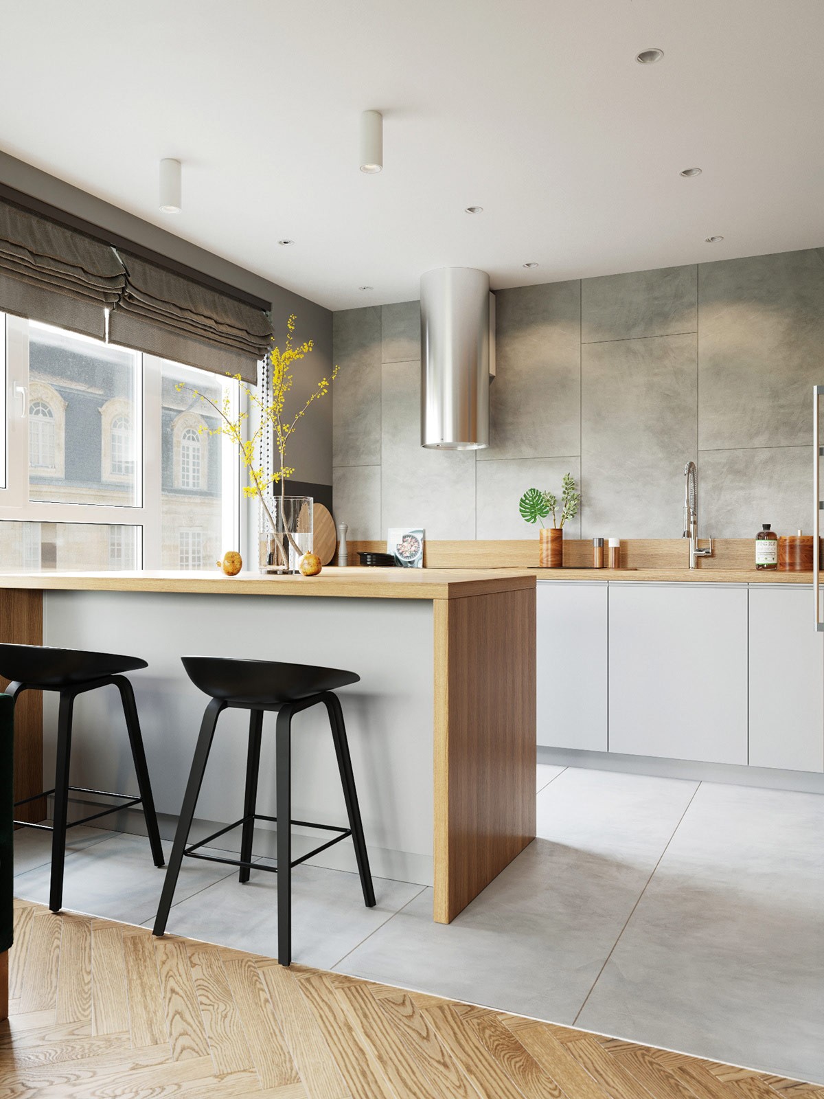
These sleek kitchen bar stools are the work of Danish furniture designer Hee Welling.
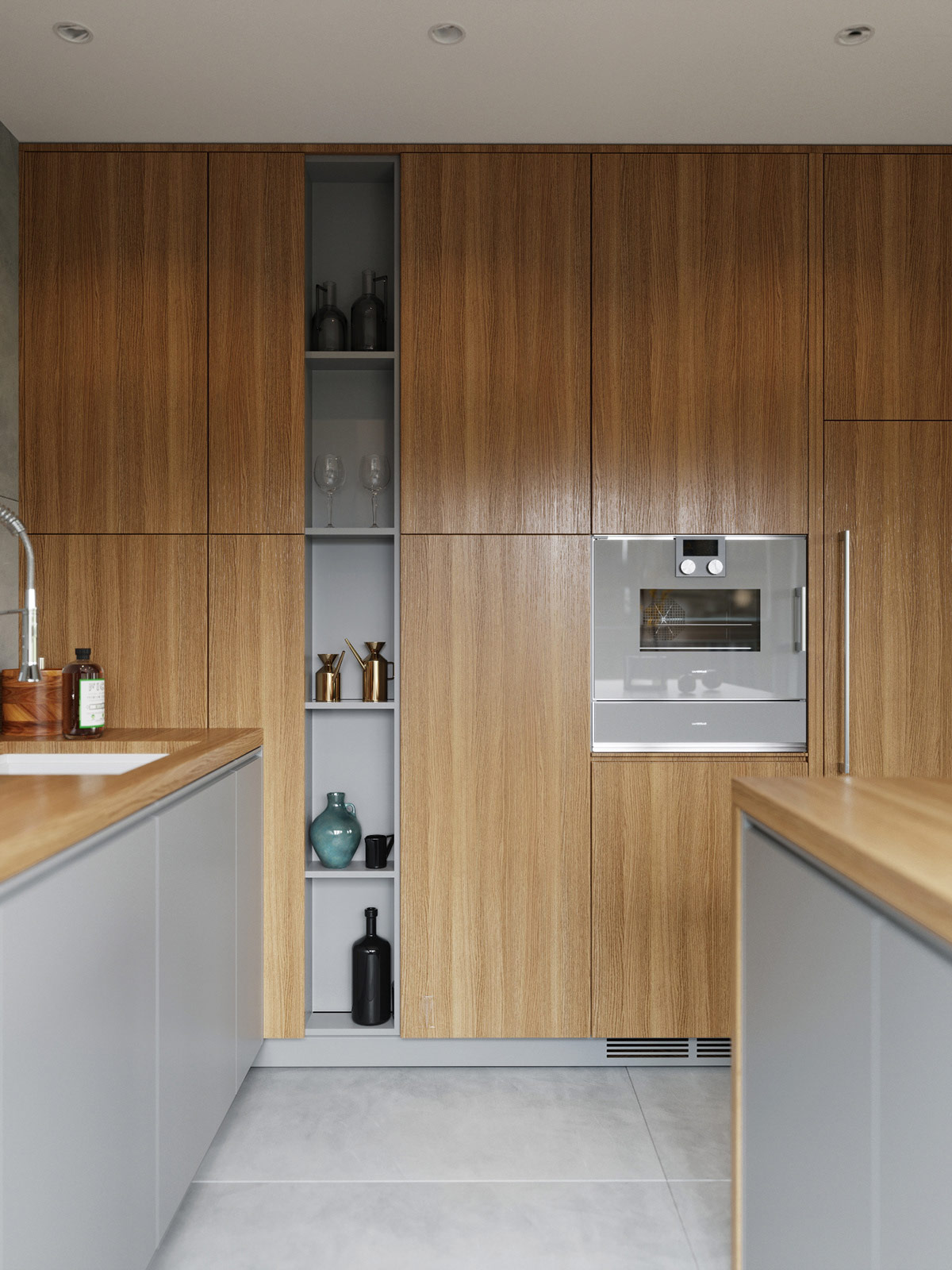
Not only does the kitchen host ample storage space within the large cabinets, it also offers a stylish cutout for decorative display or easy access to essentials.
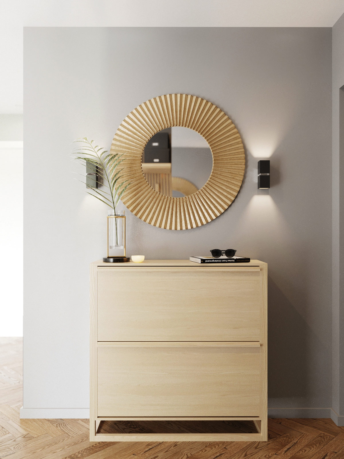
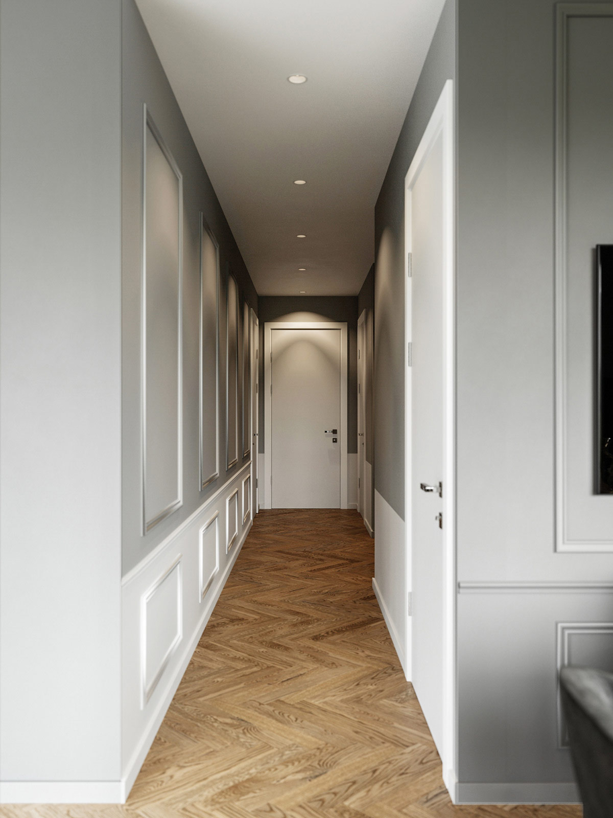
What could go better with jewel tones than a touch of tasteful metallics? This brilliant decorative wall mirror glimmers with gold, accented by a gorgeous designer vase alongside. This space is tucked into the entrance along the hallway.
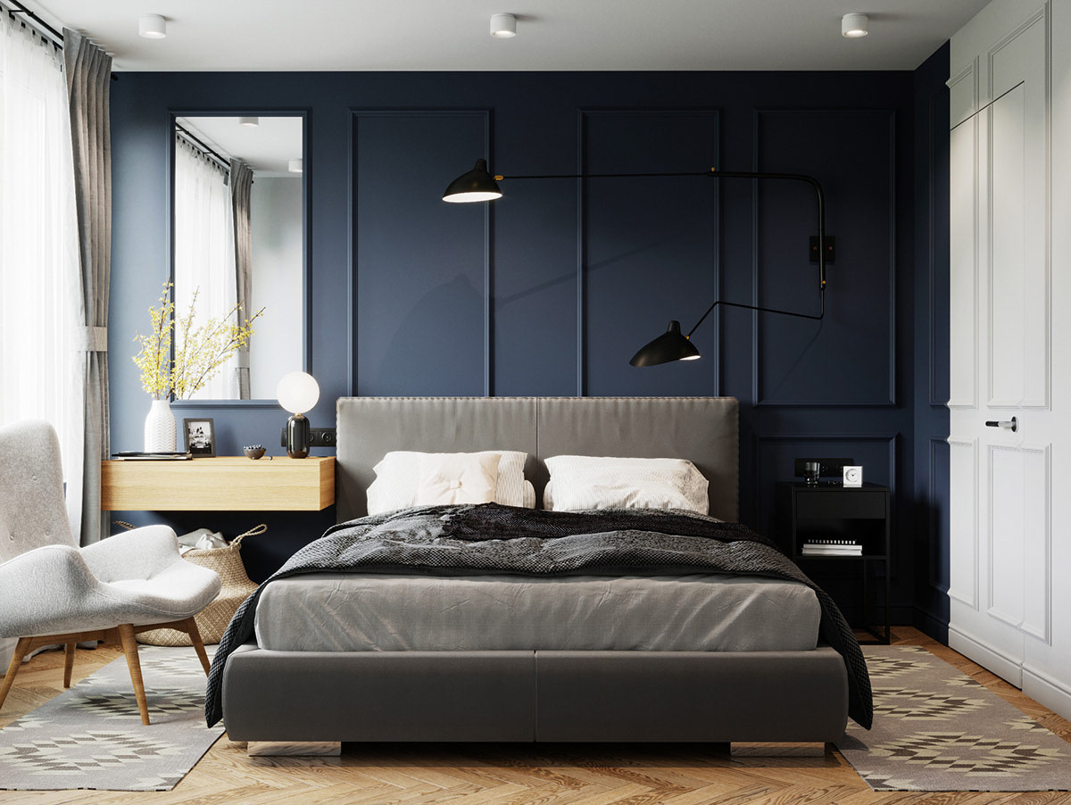
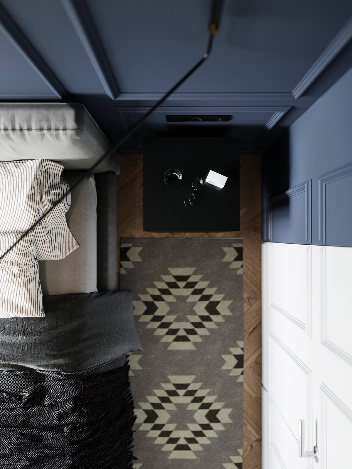
In the master bedroom, the jewel tones take on a more subdued look. This blue bedroom embraces a muted sapphire hue – classic, calming, and a brilliant way to elevate the neutral furniture theme.
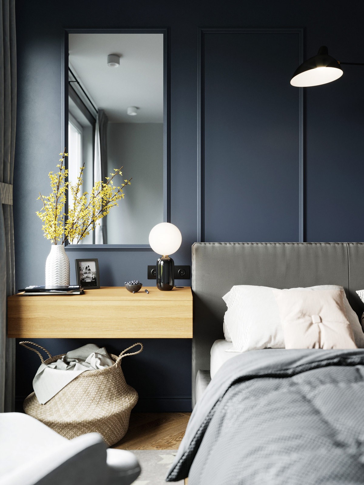
On the wall-mounted vanity, a decorative vase holds a spray of yellow flowers that stand in bold contrast to the blue wall behind it. The designer table lamp is from the ABALLS Collection by Jaime Hayon – the same line as the pendant lights found back in the dining room.
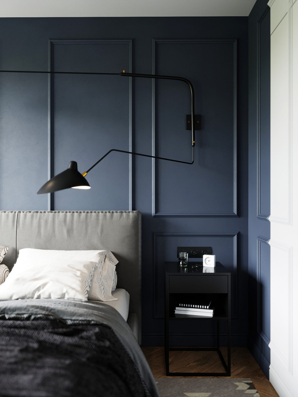
Small bedside tables are stylish yet offer less room for essentials. This gorgeous swing arm wall lamp provides focused adjustable lighting, a step above the traditional bedside table lamp.
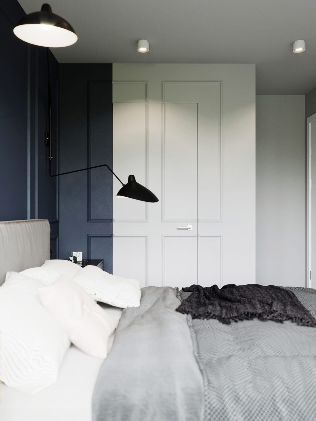
This wall treatment is especially engaging. The color from the accent wall overlaps the corner, while the closet door slices right through the boiserie – the result is playful and slightly surreal.
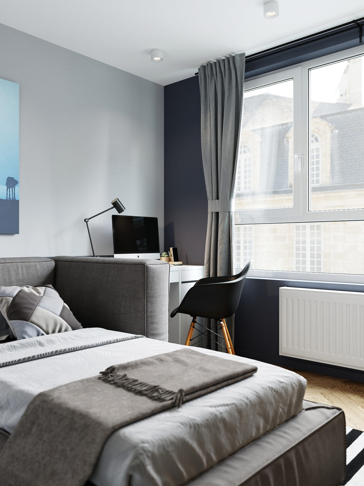
While the wrap-around headboard allows this bed to double as a chaise, it also creates separation between the sleeping area and workspace.
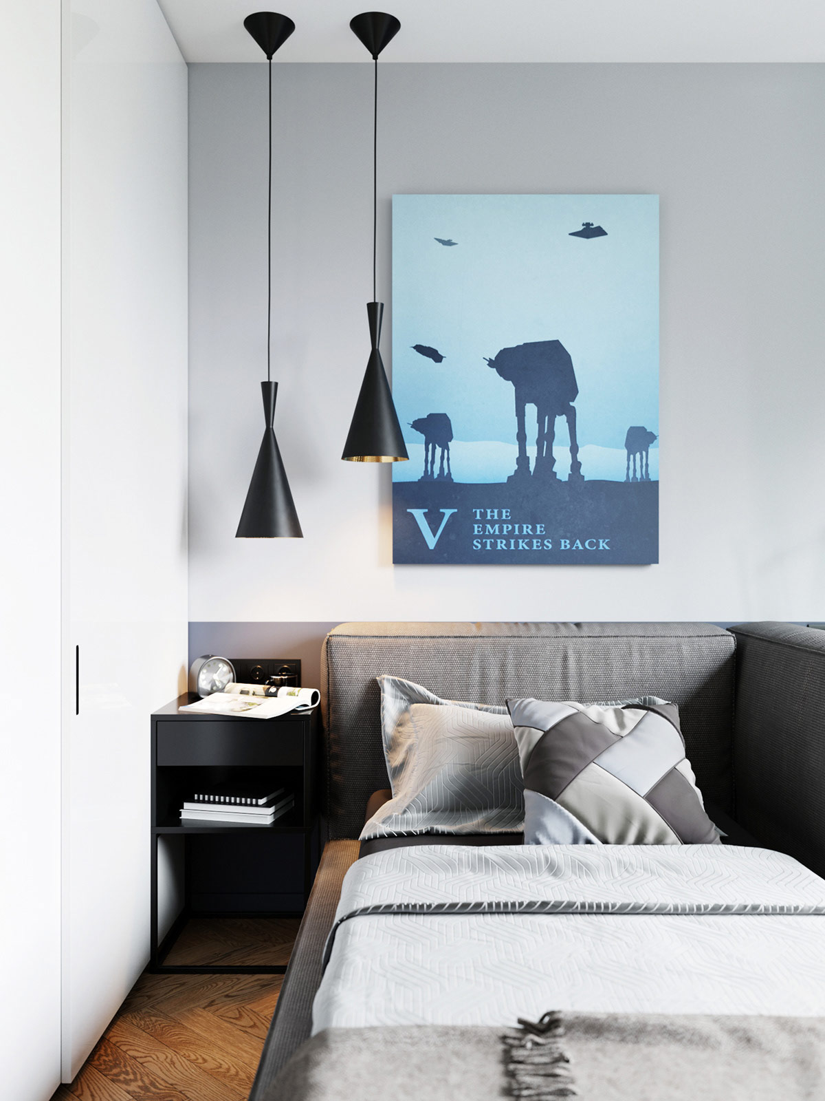
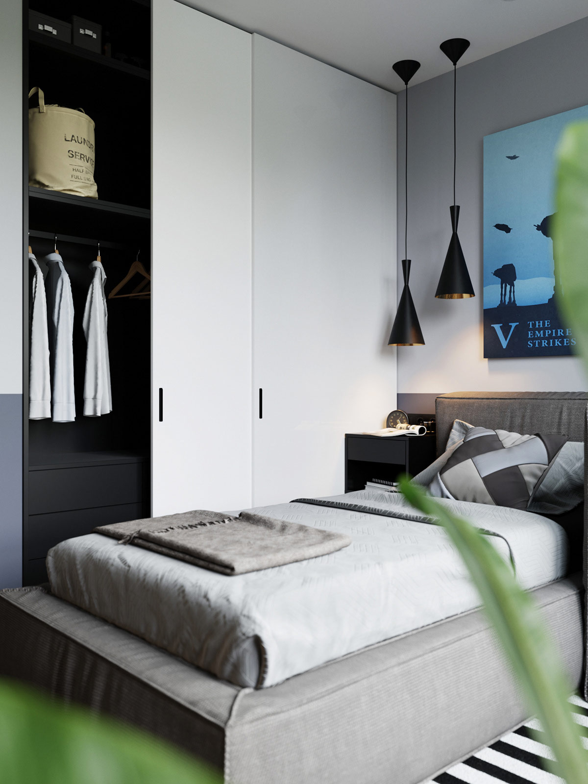
The famous Beat collection by Tom Dixon works well anywhere in the home – here, a pair of the Tall model serves as stylish bedroom pendant lights.
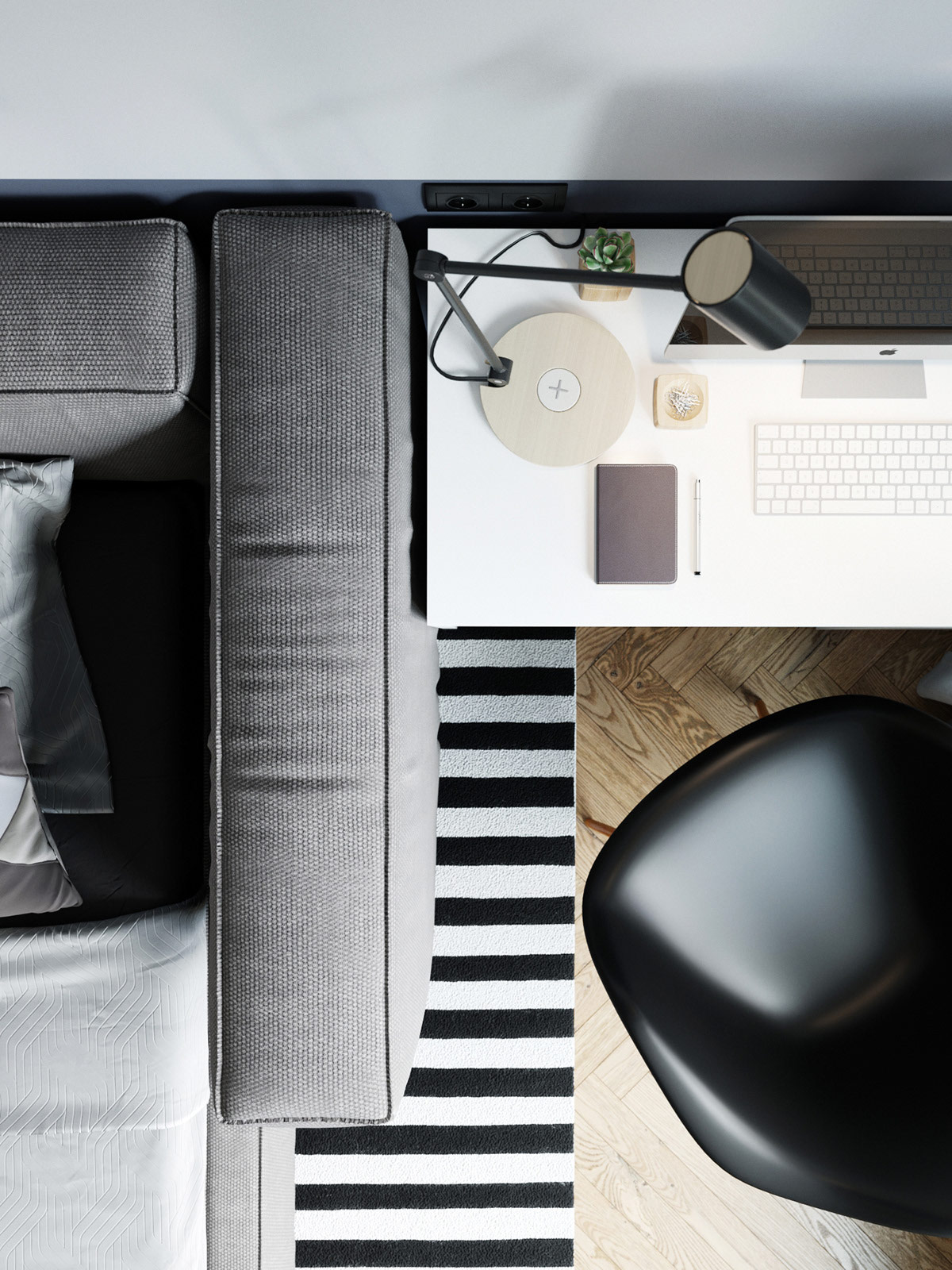
Continuing the rug pattern from the living room ensures a continuous visual flow throughout the interior.
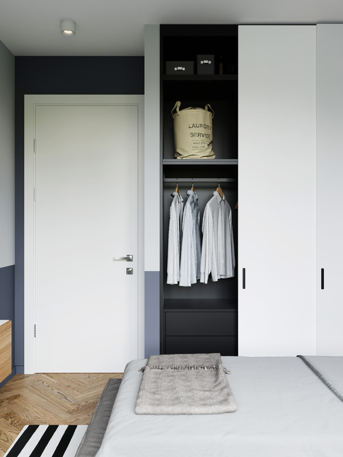
Sliding closet doors accommodate the limited clearance between wall and furniture. Inside, smart organization maximizes space – drawers on the bottom, racks in the middle, and varied shelves above.
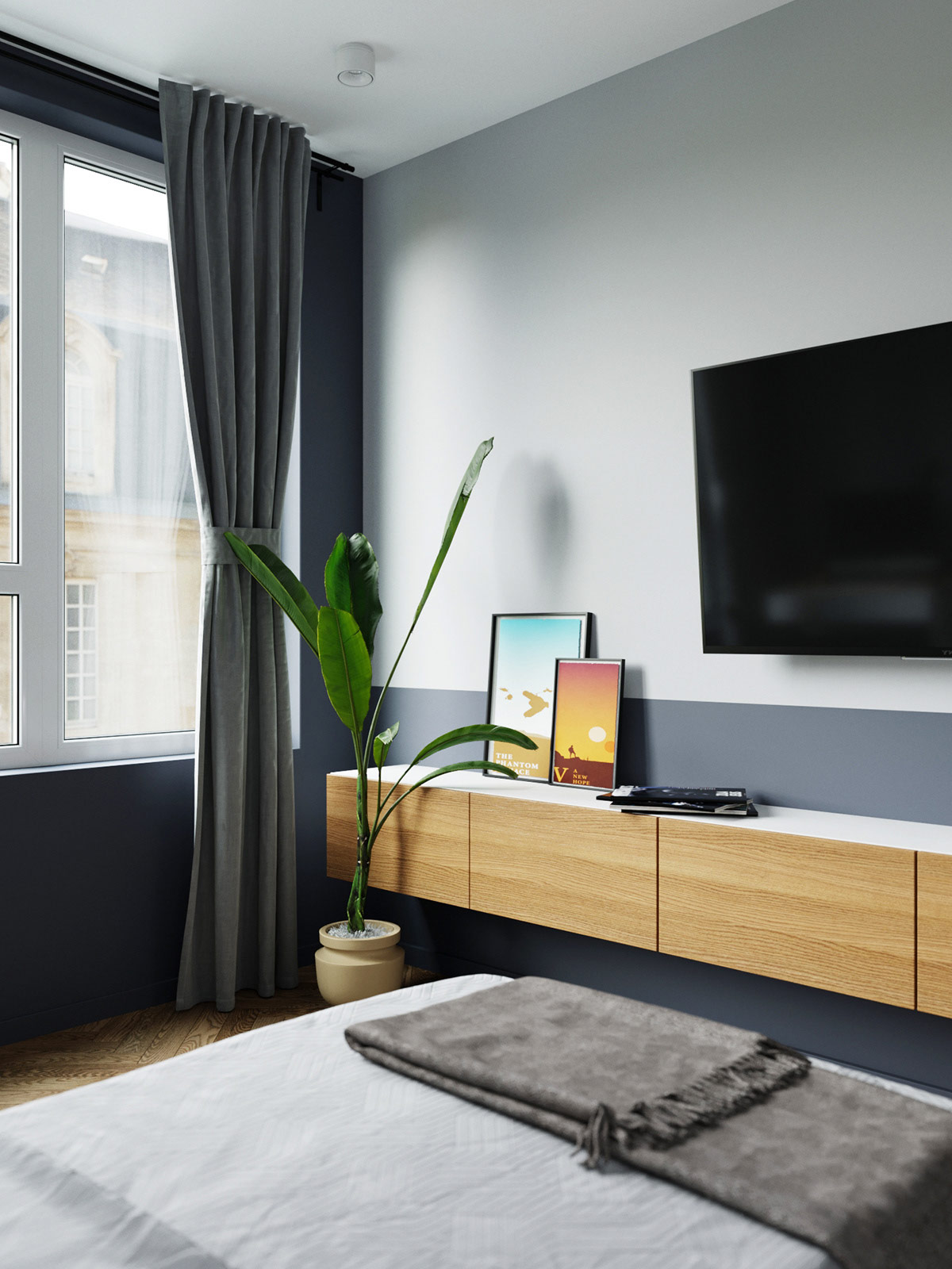
The wall-mounted console provides storage for media and accessories. In this room, the jewel tones are more subtle – the verdant plant, the citrine and aqua prints.
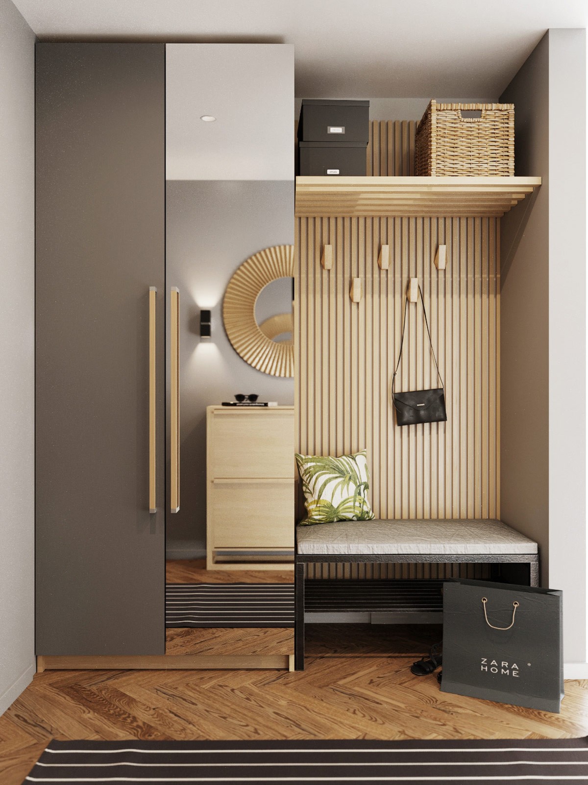
A full shot of the entryway reveals an excellent combination of utility and style. A seating bench with storage rack offers a convenient place to remove shoes, hooks hold scarves and handbags, and the spacious wardrobe features one mirrored door so residents can make sure their outfits look great before a night out.
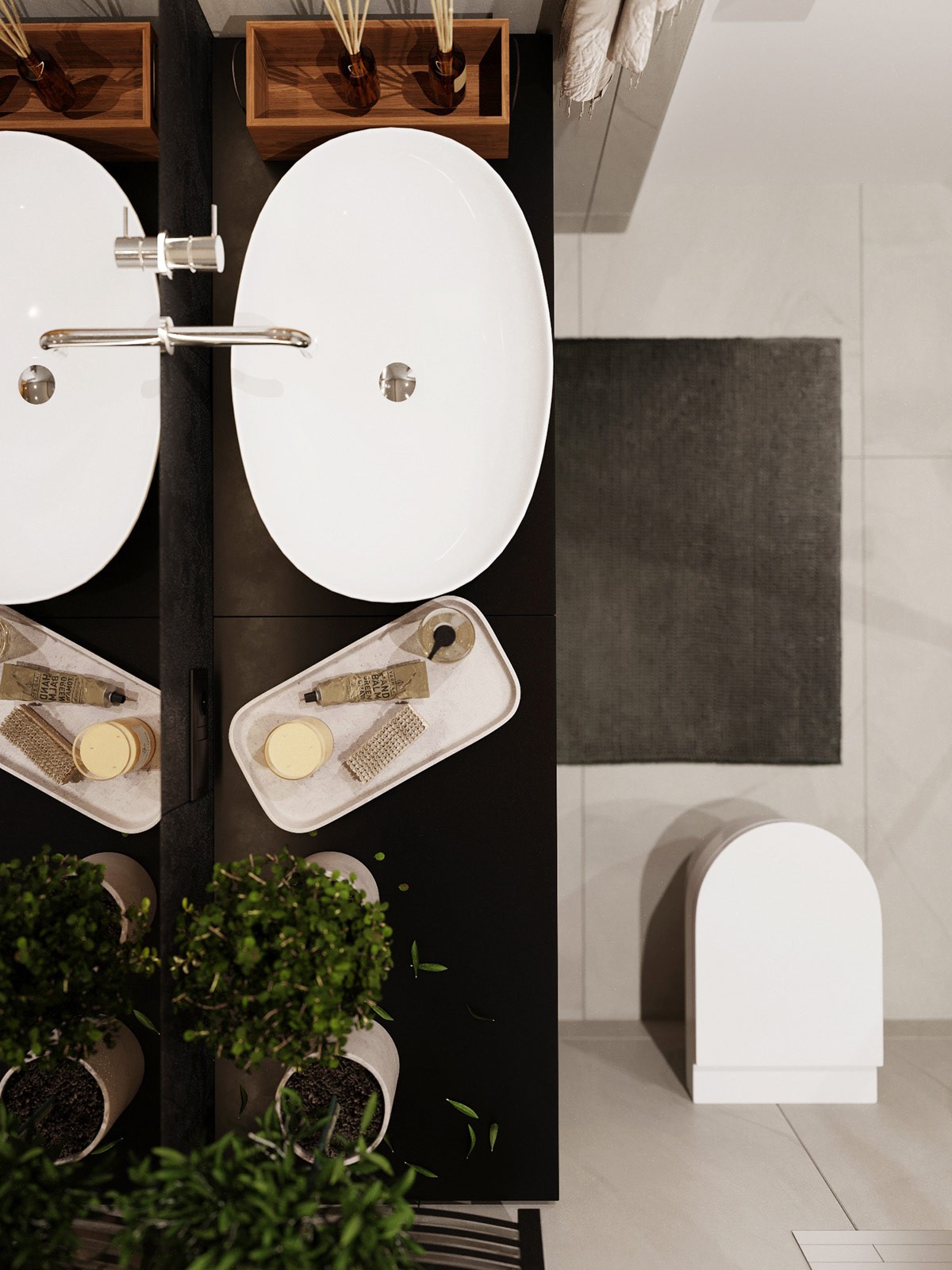
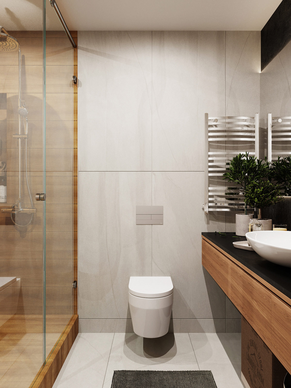
Natural themes and neutral palettes define the master bathroom. A quick tour reveals a range of enviable features that promote relaxation and reinvigoration.
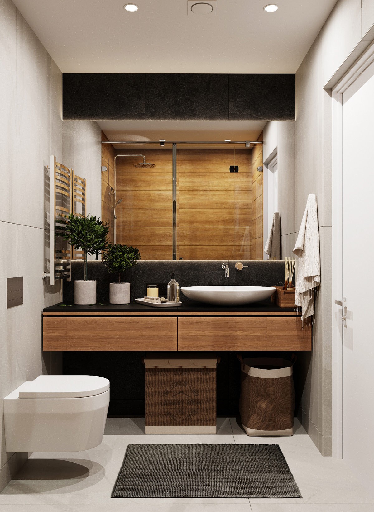
Among the natural elements are surfaces of stone and wood. Decorative details include small ornamental trees in marble planters, and organic accents like the unique laundry baskets.
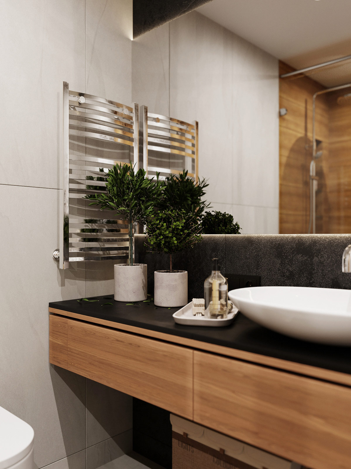
In a space that lacks luxurious amounts of storage, the in-vanity drawers offer a place to hide away essentials.

