Minimalist interiors can raise questions when it comes to lighting. The furniture and accessories have been honed down to the perfect level of sparse, so do you top off the refined scheme with a stand-out sputnik chandelier over the living room? How about a network of spotlights, or just put it all inside the walls? These two minimalist apartments, designed and visualised by Z Design, are great examples of how to make lighting a main feature, without it being a feature at all… Find rooms lit with recessed perimeter light strips, tucked around ceiling seams and baseboards, plus sleek installations of the latest single circuit track lighting systems with repositionable spotlights to cover all bases.
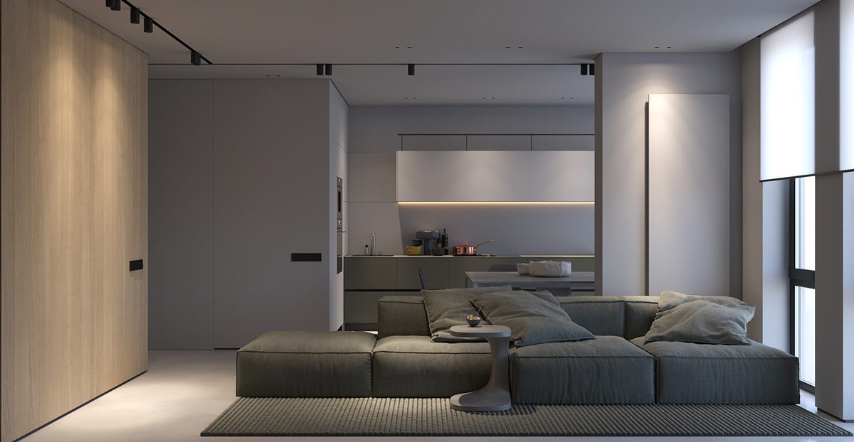
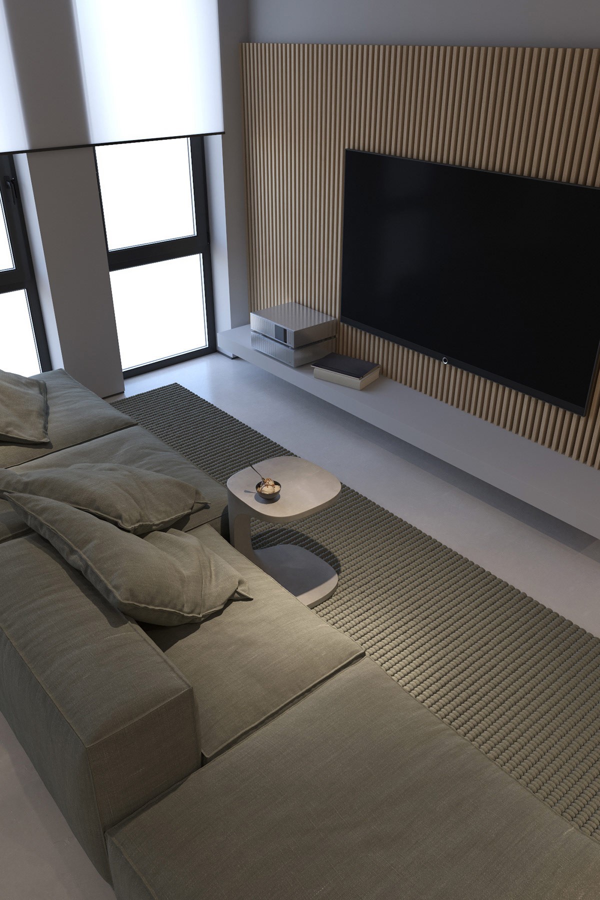
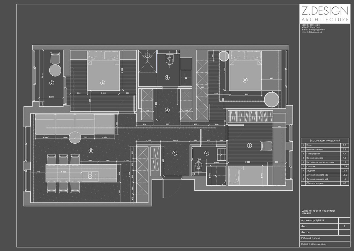
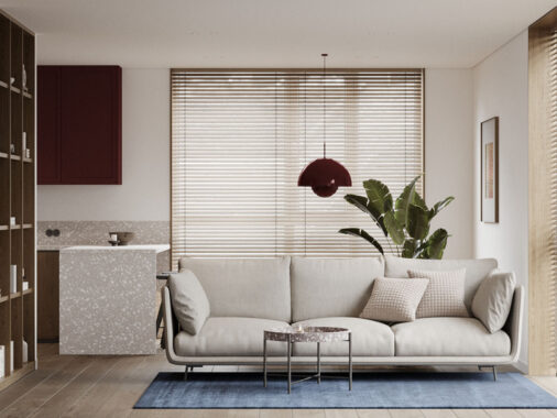
Flicking on the light switch in the first of our two minimalist apartments, each measuring just short of 90 square metres, we find a cool grey and wood tone living room that’s gently lit around the edges. Pools of light fall upon a modern sofa in the centre of the room, which is reached by the multi-directional spotlights of a black single circuit track, and a number of LED mini ceiling fixtures.
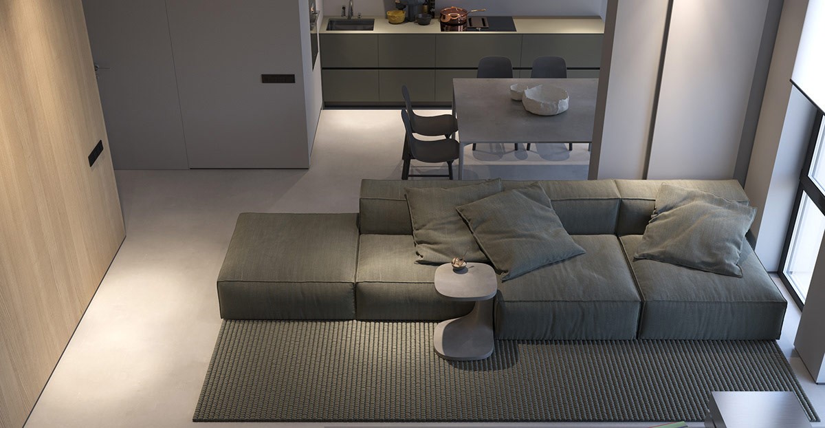
The soft lighting gives the grey living room a cosy and welcoming appeal, with no harsh illumination from large pendants. The deep texture of the lounge area rug is exaggerated in the glow.
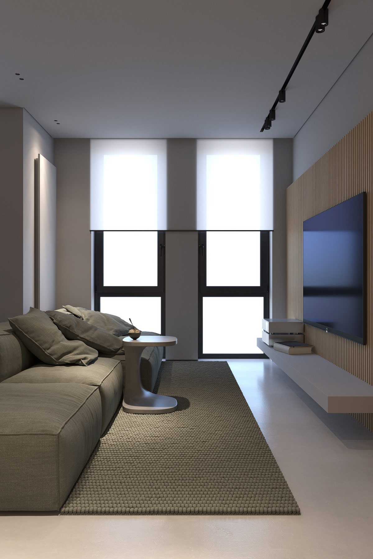
Texture and home lighting go hand in hand, particularly in minimalist room schemes where additional decorative pieces are few and far between. In this apartment, the smooth and reflective curves of a small side table are highlighted, negating the need for lavish embellishments.
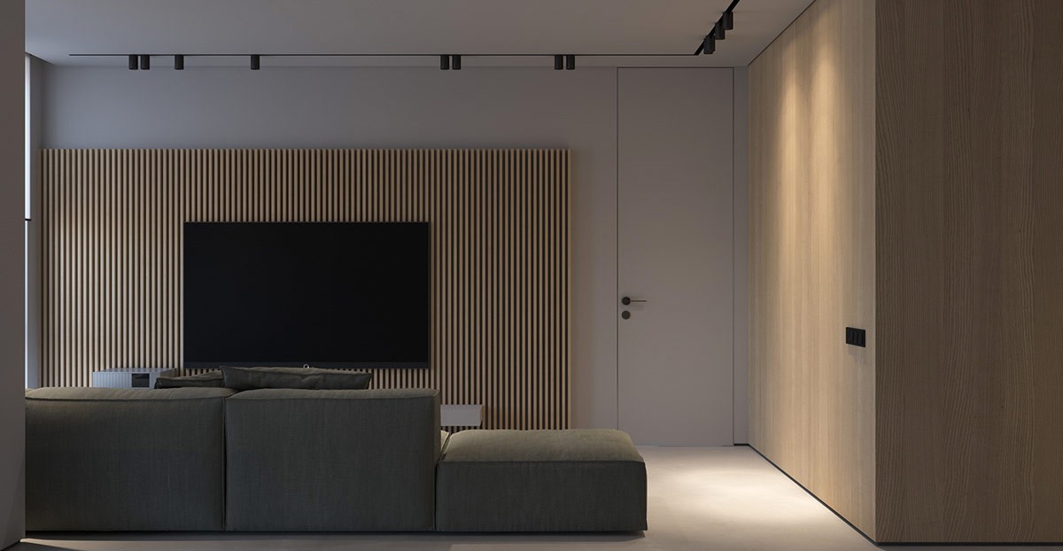
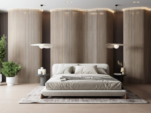
The ribbed face of a wood slat wall is accentuated in light and shade.
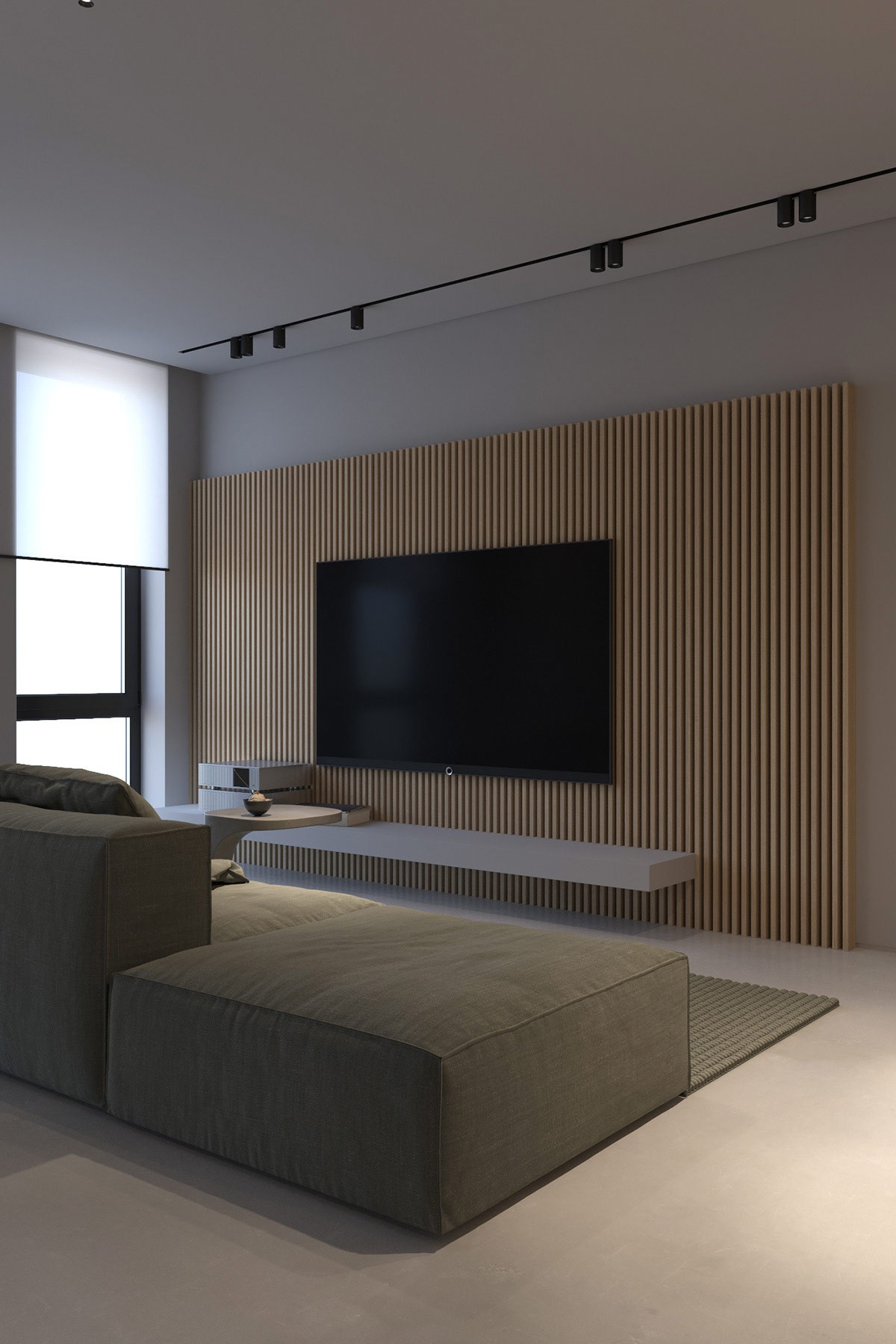
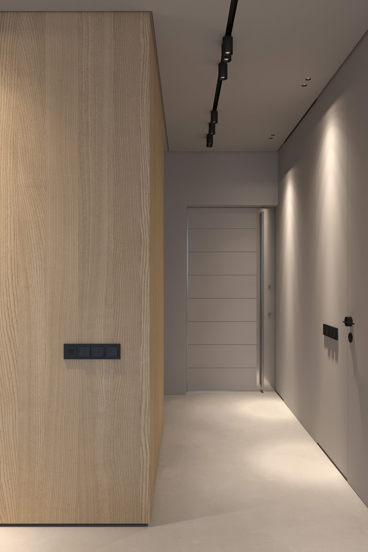
A single circuit track lighting system cuts into the ceiling expanse, striking a black line above the TV wall.
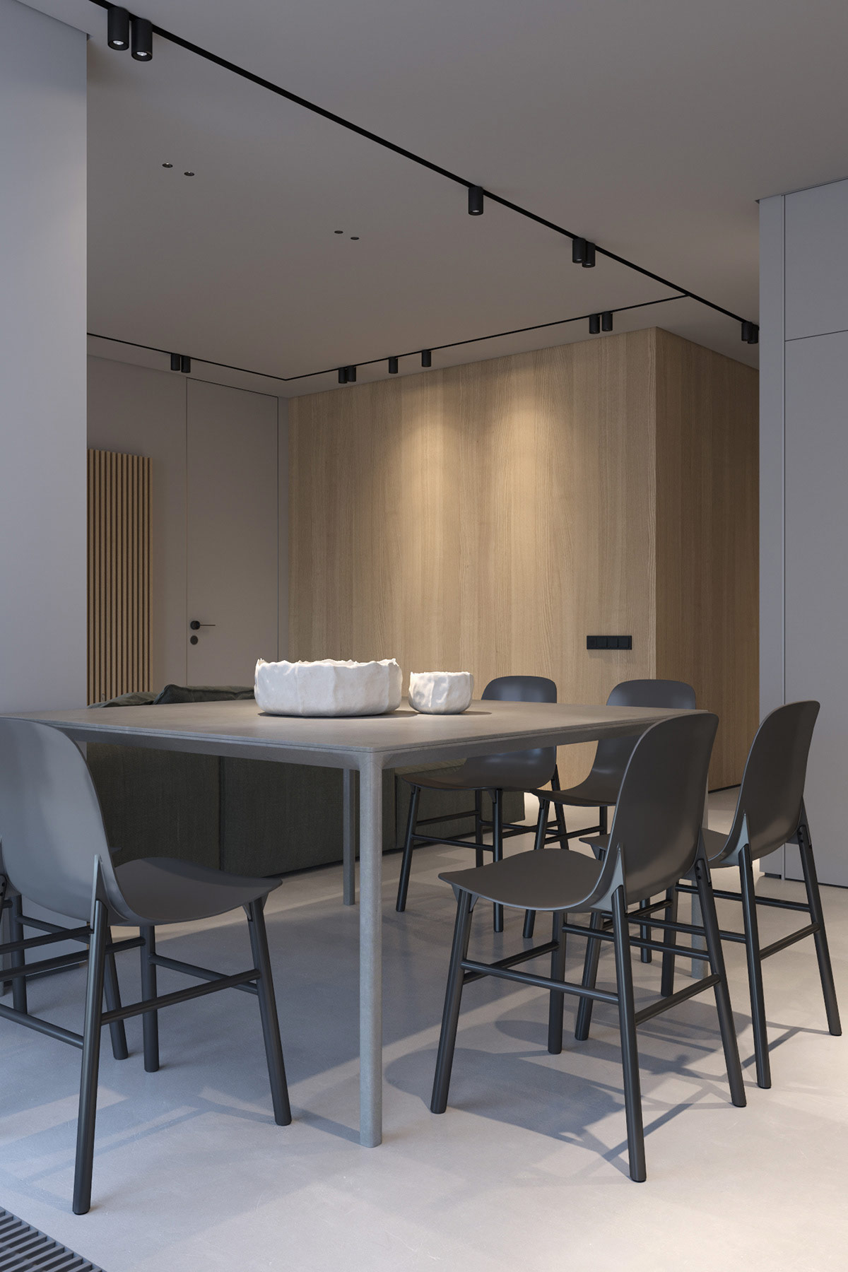
There’s no pendant light swinging low over the dining table of the minimalist apartment either. Recessed track lighting prevails. The focal point comes instead in the form of deep decorative bowls in a table centrepiece.
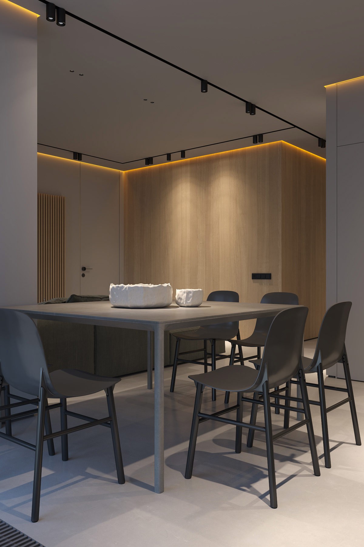
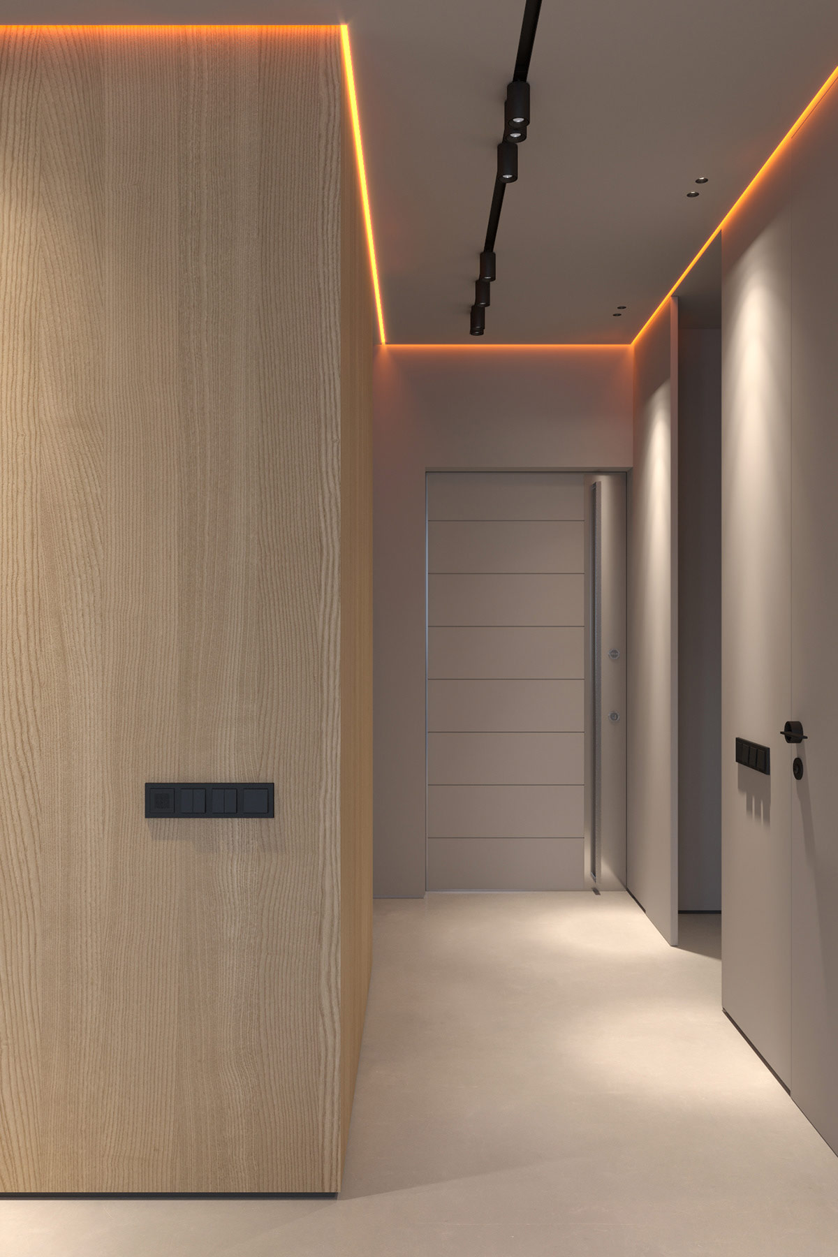
Lack of a dining room pendant light does not mean a lack of late night dinner ambience though. Warm LED strip lights burn down from a seam around the ceiling of the open plan room, building a cosy and intimate atmosphere.
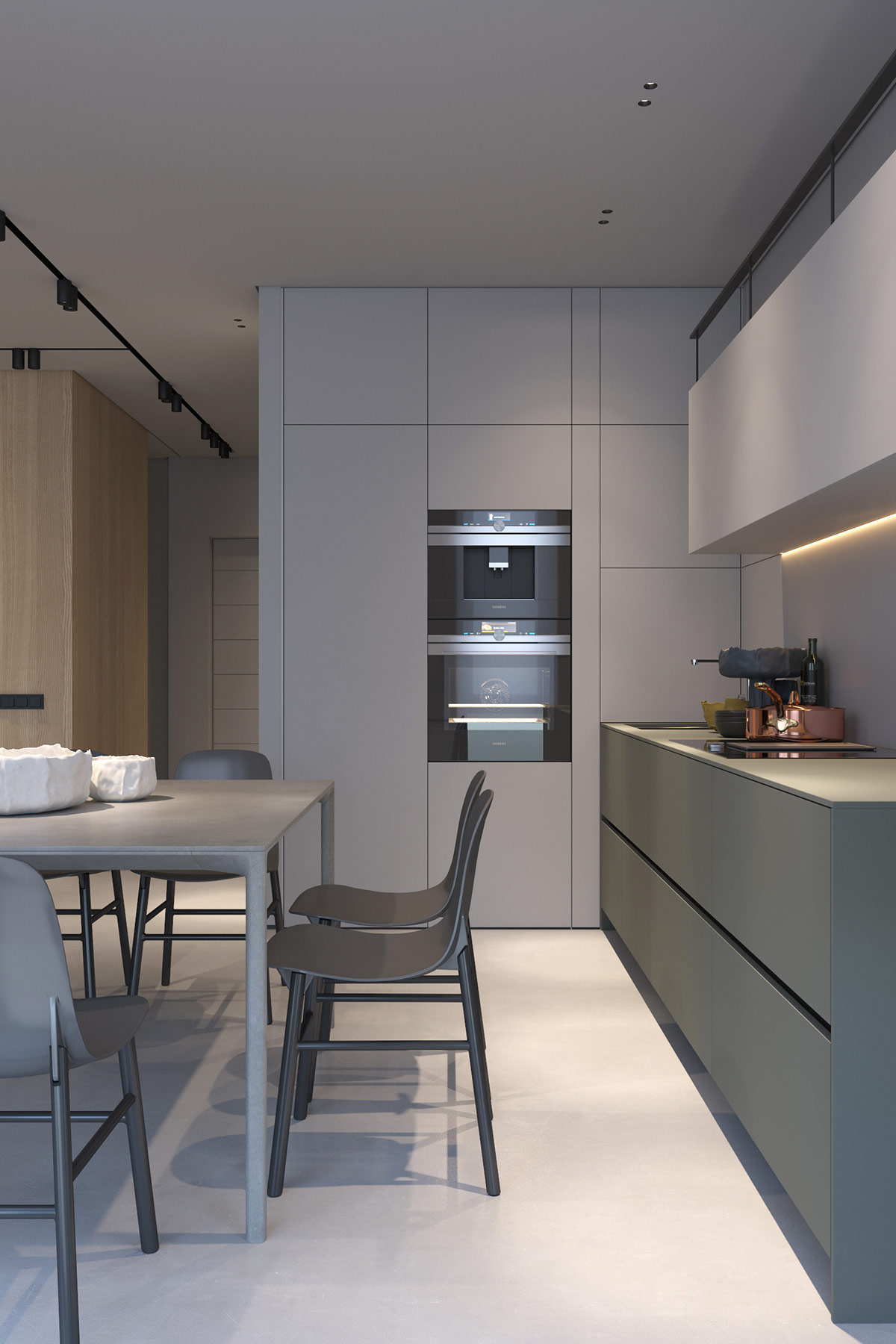
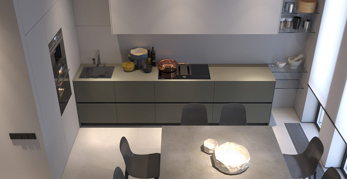
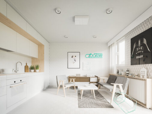
Another LED strip strikes beneath wall cabinets in the kitchen, giving crisp definition to their slab fronted handle-free aesthetic.
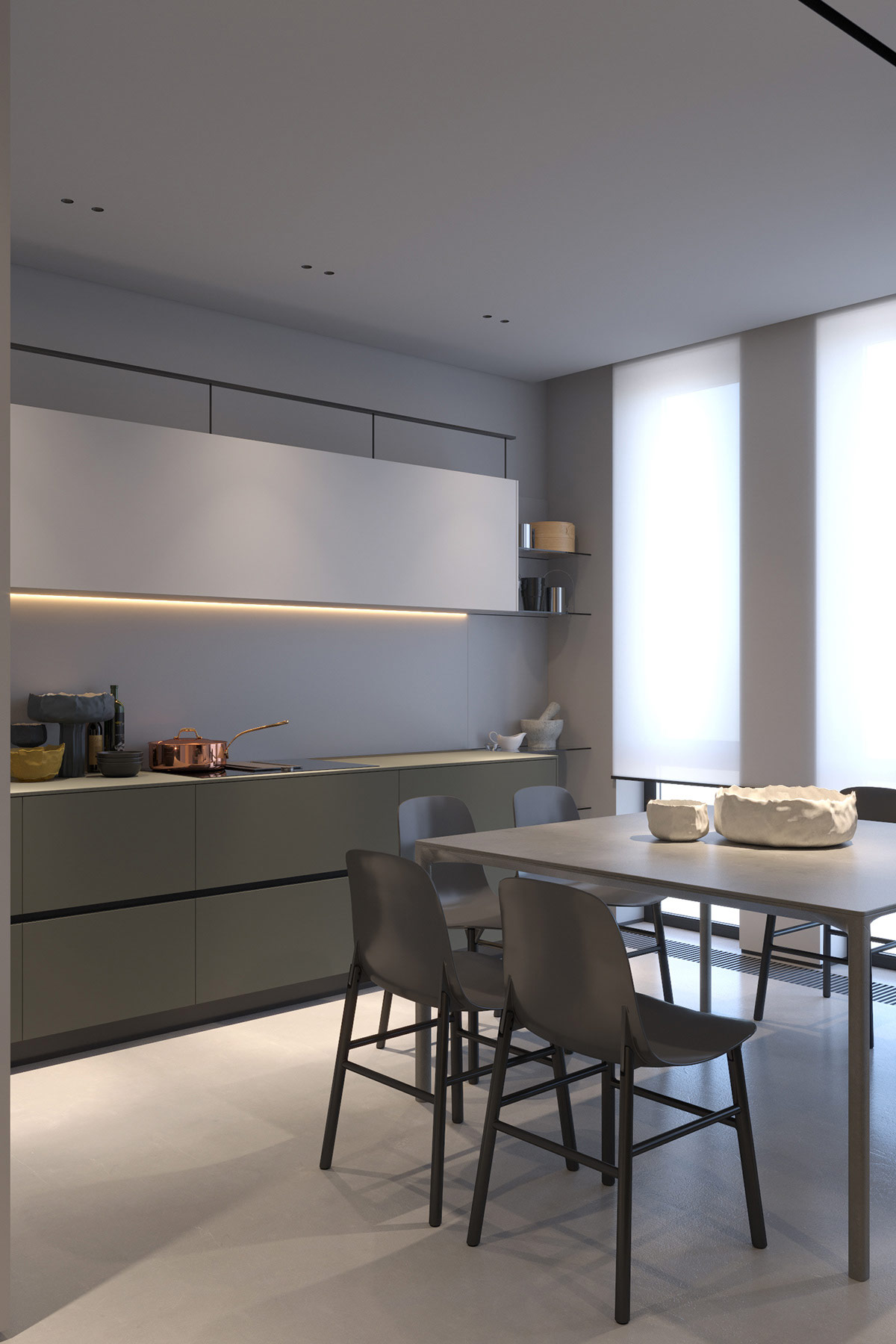
The white light becomes part of the wall decor, contrasting pleasingly with grey elements in the room scheme.
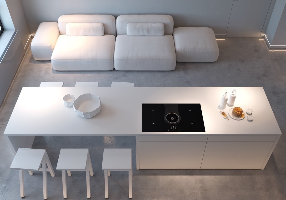
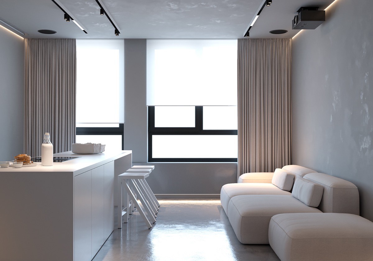
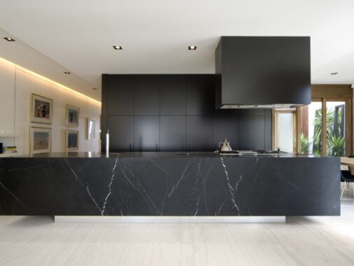
In our second example, an impressive kitchen island and stylish kitchen bar stools have an immediate impact on the living room, but its baseboard lighting that sets the mood of the place.

Linear track lights run parallel over the kitchen island, holding a combination of repositionable spotlights and strips.
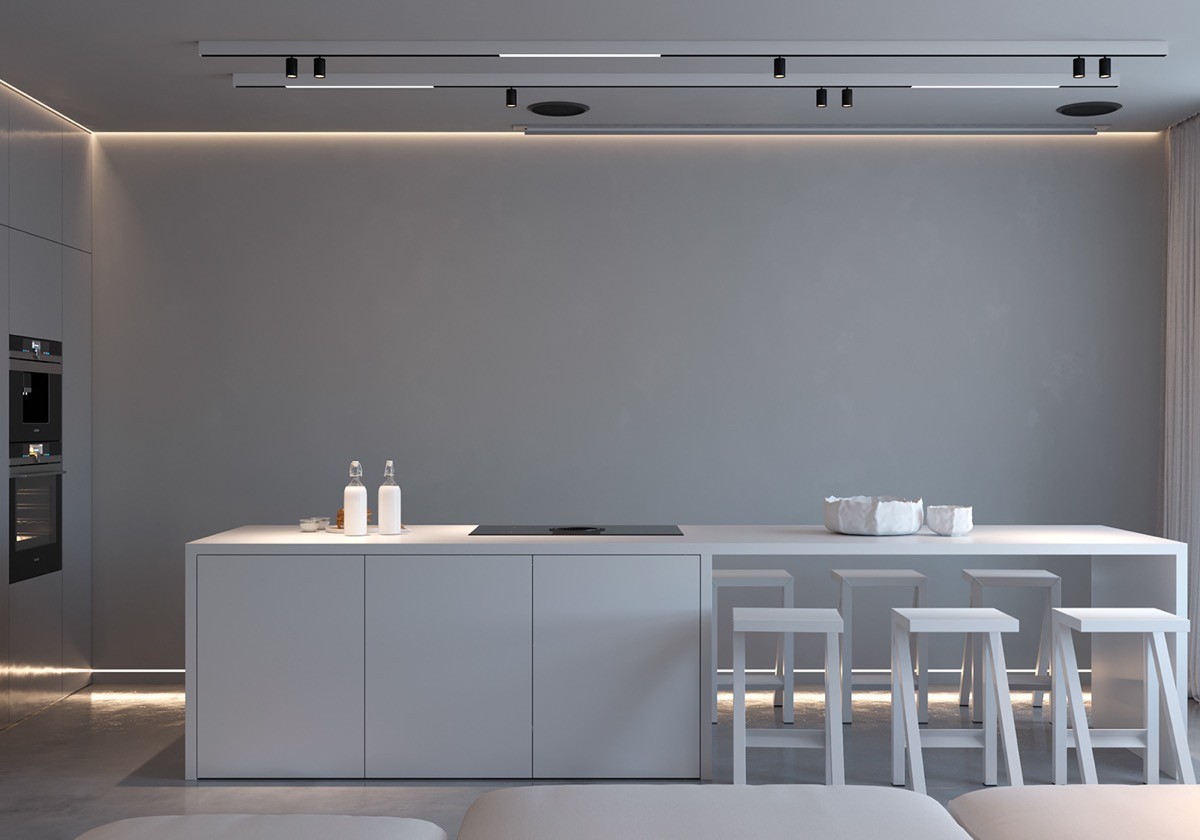
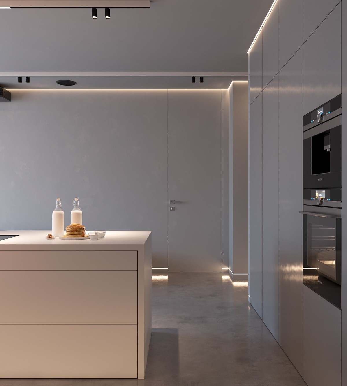
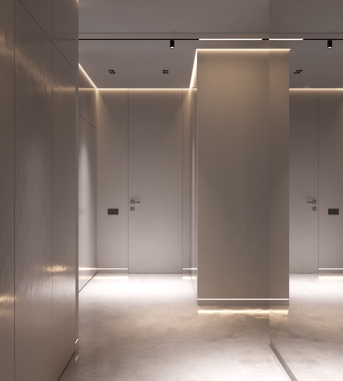
Ceiling perimeter lights trickle gentle light down a blank wall behind the kitchen island, and along a bank of tall kitchen units.

A projector screen pulls down over the blank kitchen wall for movie night. The subtle perimeter lighting causes no significant issue with the clarity of the projected image.
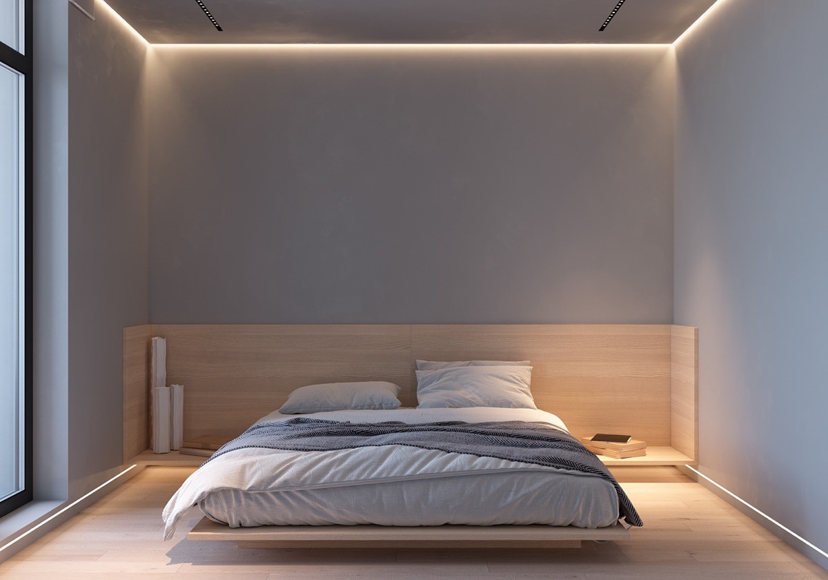
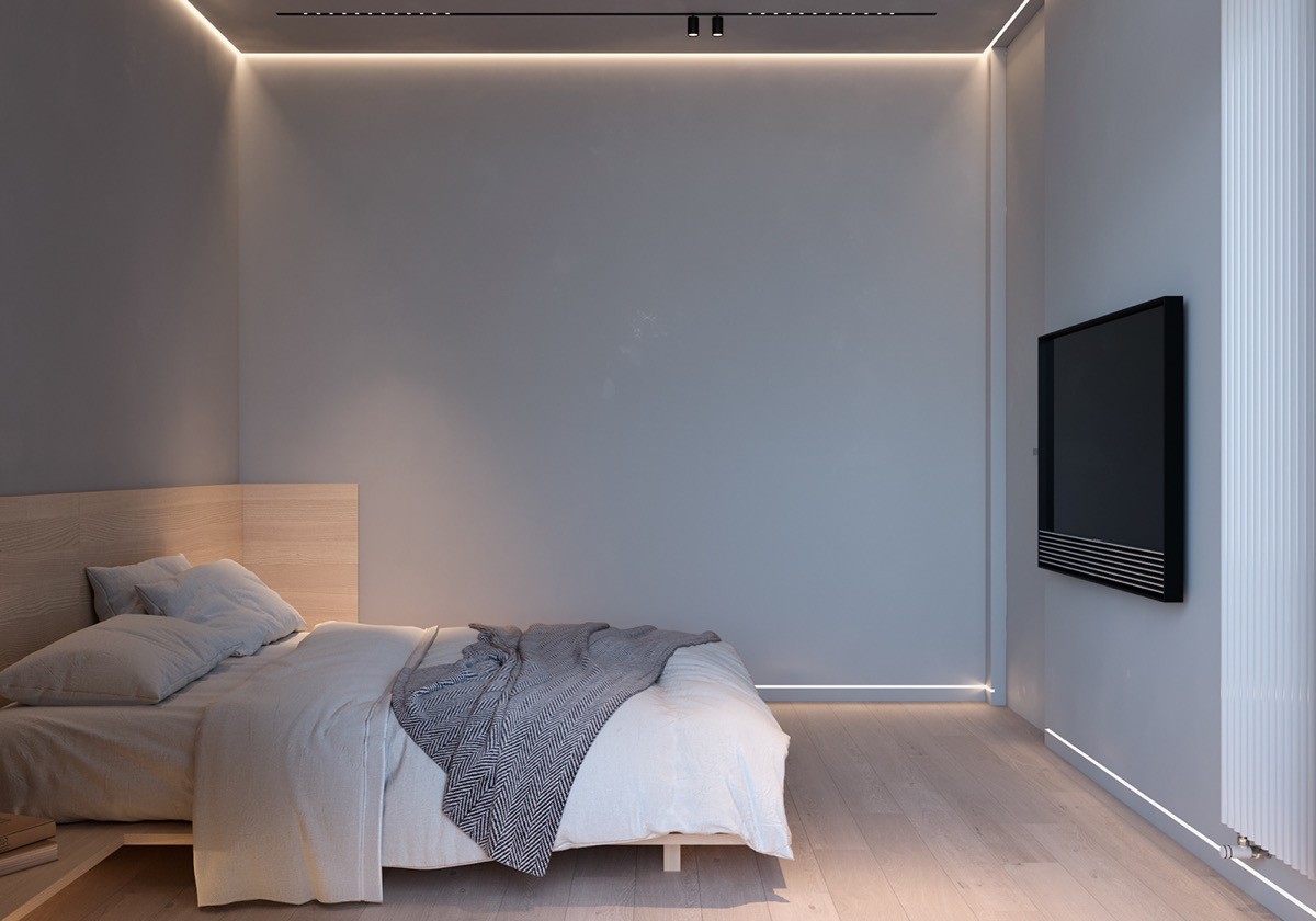
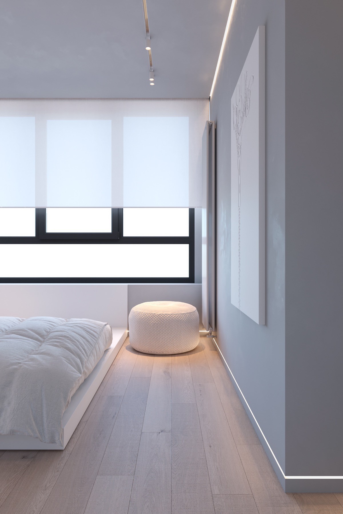
Moving on into the minimalist bedroom, baseboard lighting runs directly underneath an elevated headboard design, making it appear weightless.
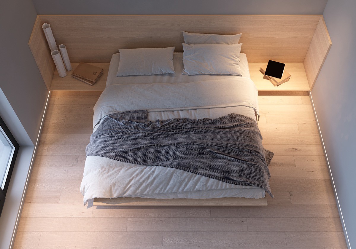
The repositionable track lights mean that the homeowners can choose to keep the glare away from one side of the bed whilst providing focussed light to the other, depending on the preference of the person.
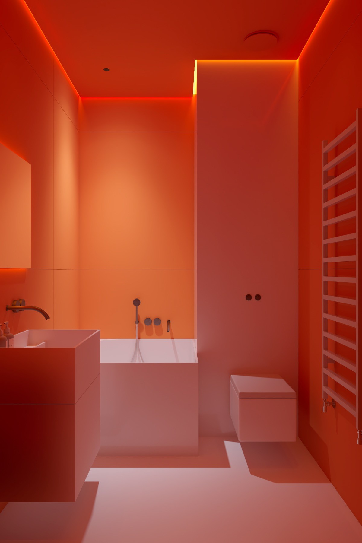
This home holds a surprise colour scheme. A red bathroom design hits like a bolt of lightning when coming in from the cool grey surroundings in the rest of the home.
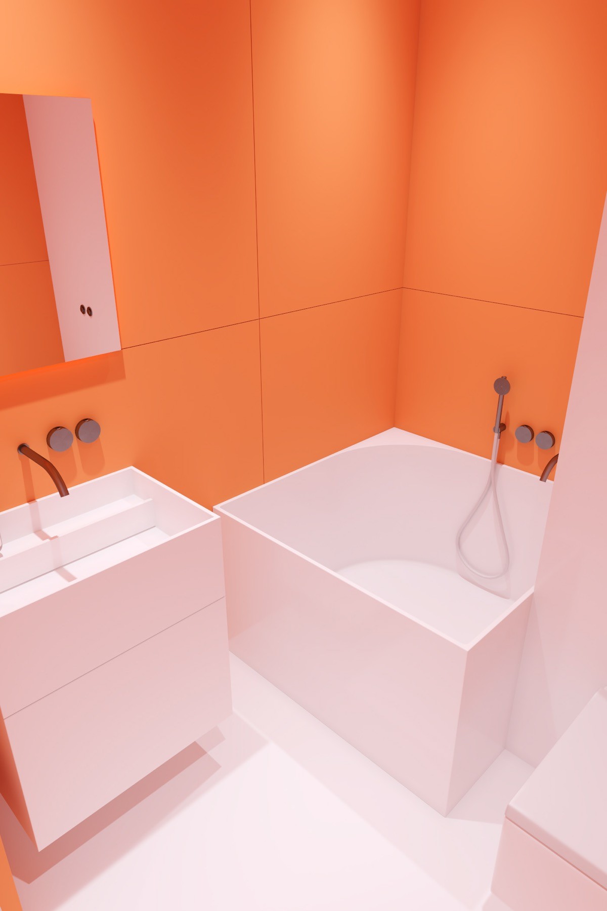
Bright bathroom lighting boosts the colour contrast between bold wall tile and the clean white acrylic of a Japanese soaking tub and sanitaryware.
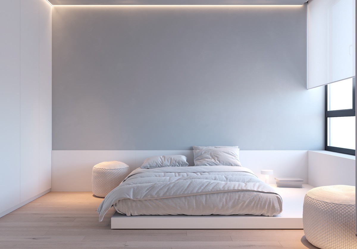
Back in the grey realm, lighting returns to its subdued form. A bespoke white platform bed lightens the grey bedroom with its presence too, filling the lower quarter of the room with an elongated headboard strip.
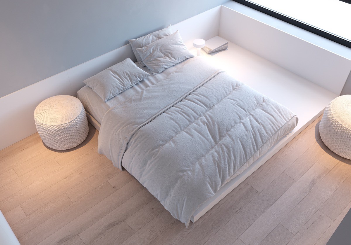
White poufs provide more light accents around the bedroom.
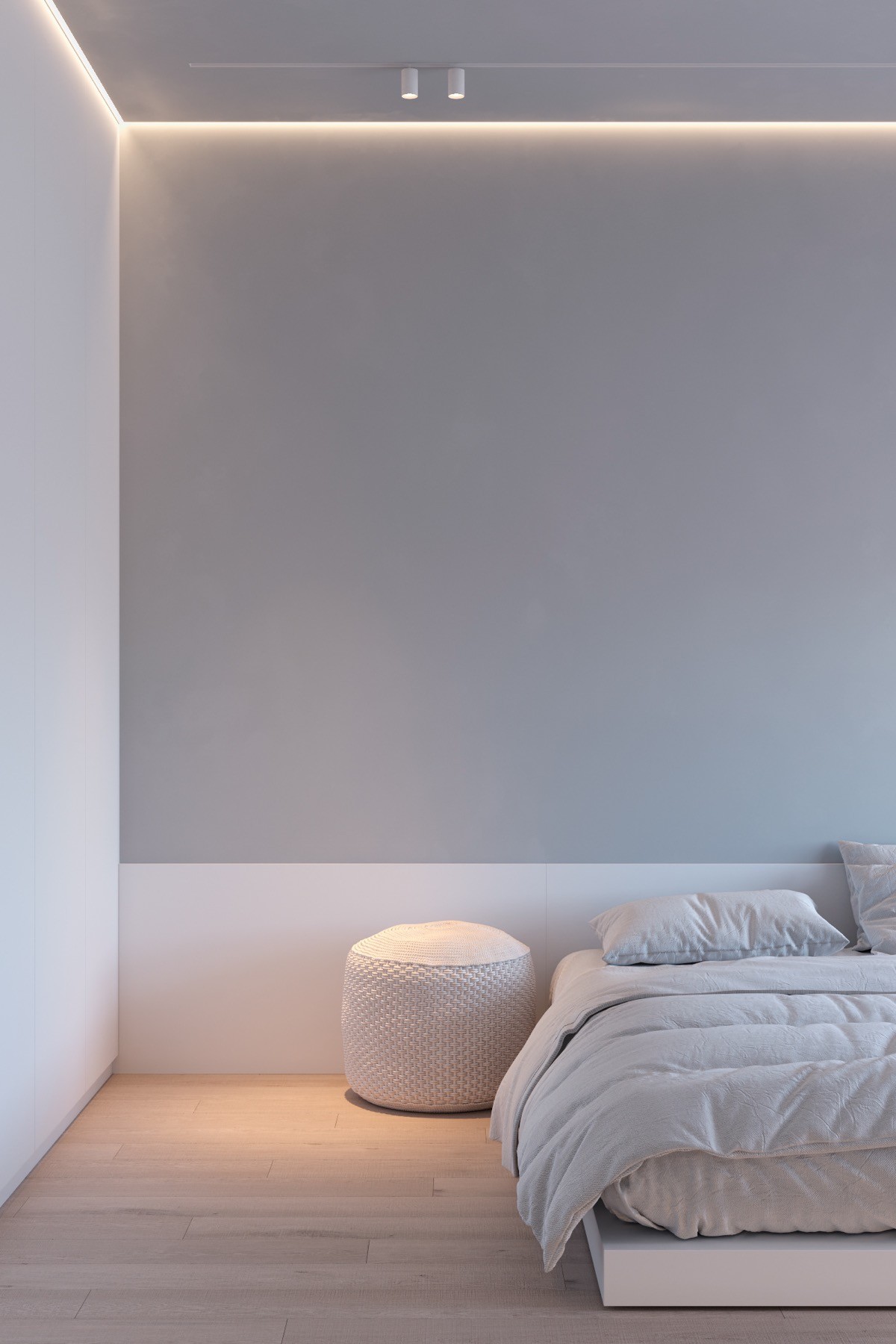
Black single circuit tracks are swapped out for the white version in the bedroom, to help cultivate a serene energy.
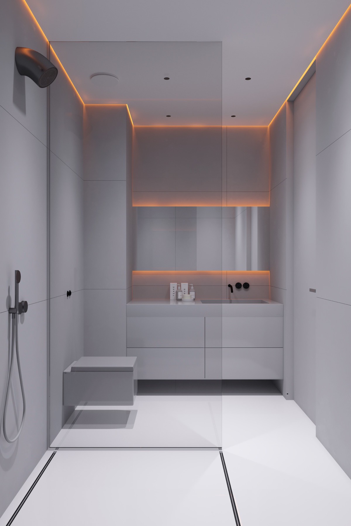
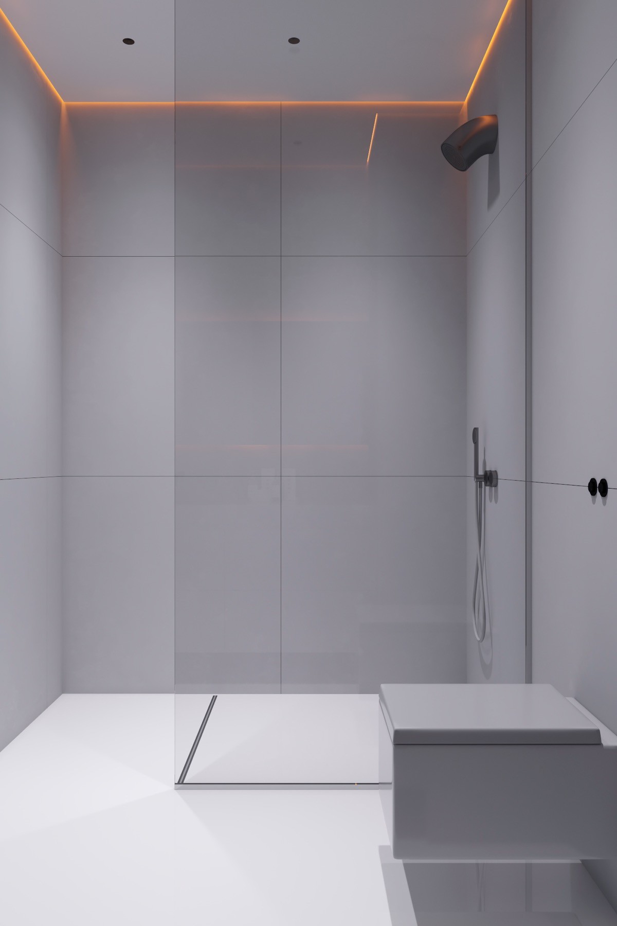
The second minimalist bathroom in the home hasn’t a red tile in sight. This time the same cool grey and white colour scheme favoured in the rest of the home is carried through.
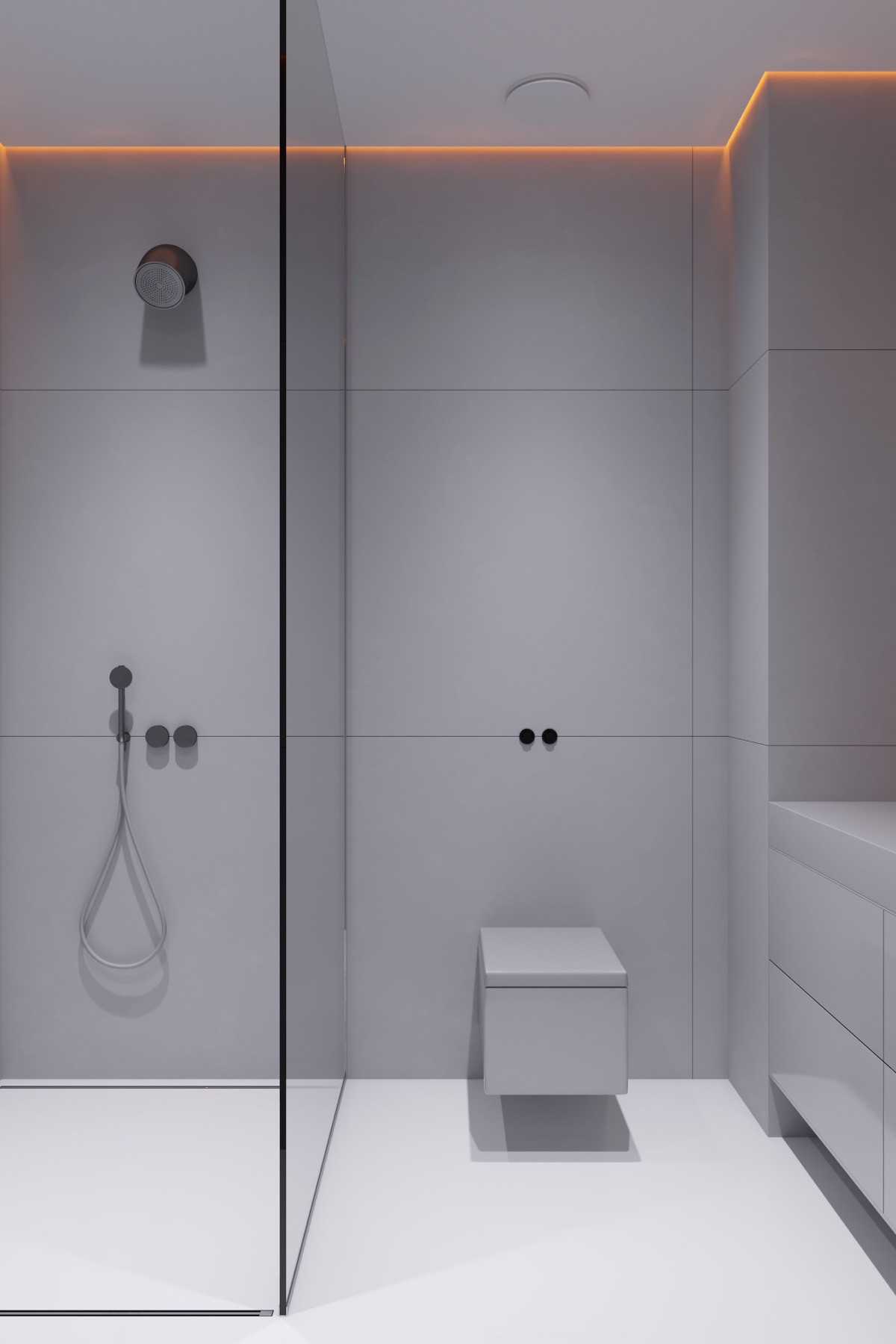
However, the same hot ember-like LED strips burn where walls meet ceiling, and fizz from behind a landscape vanity mirror.
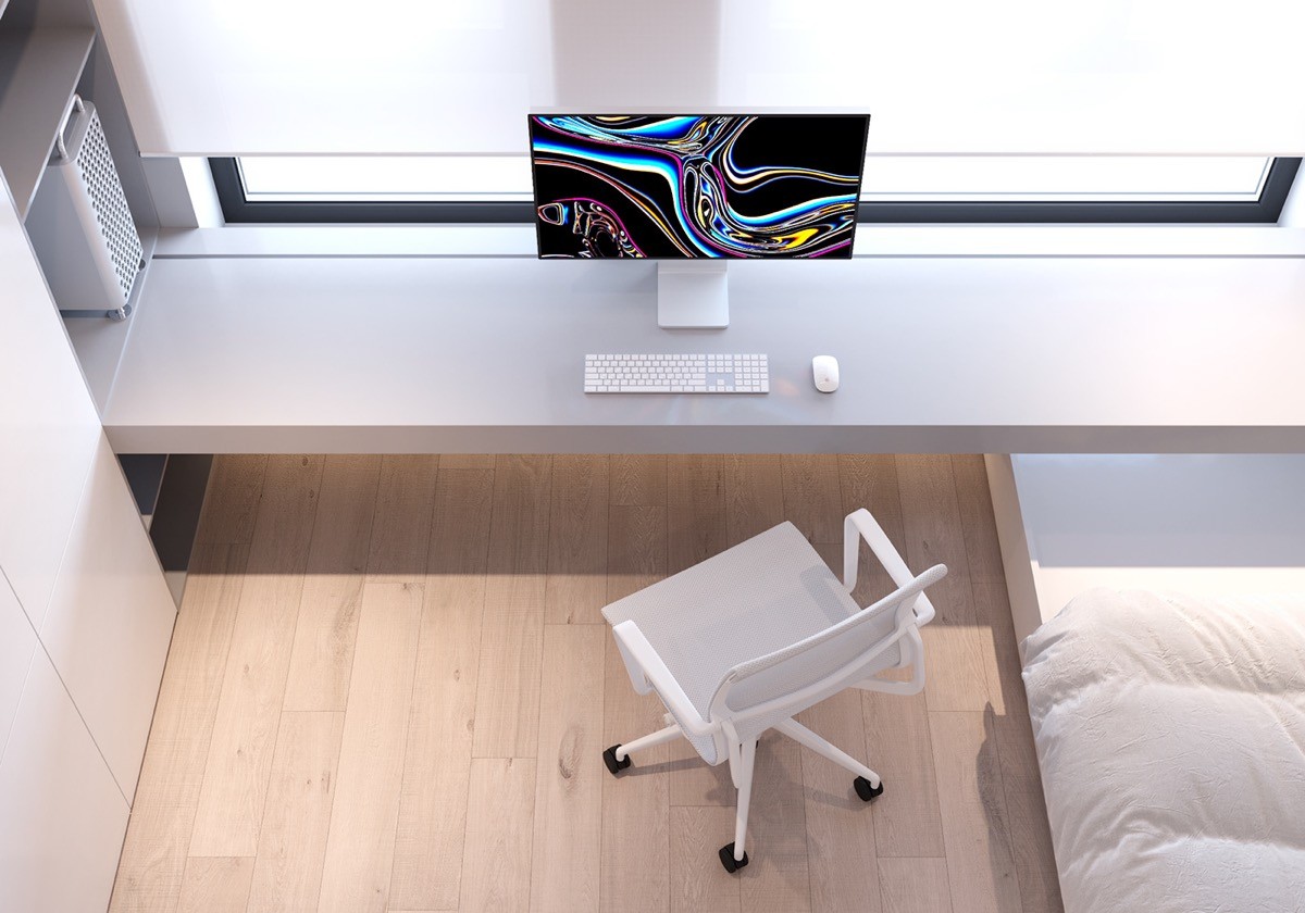
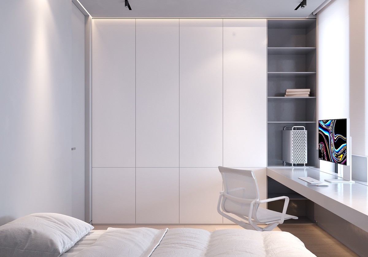
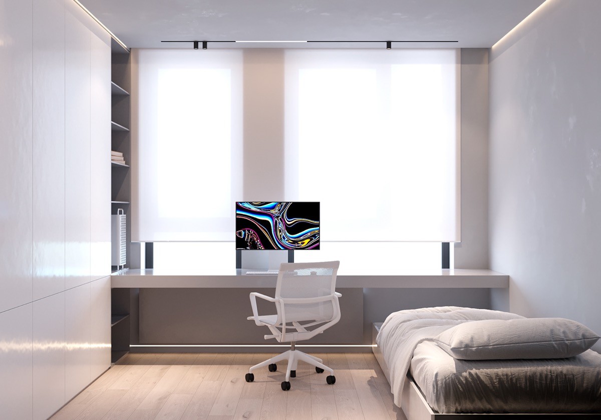
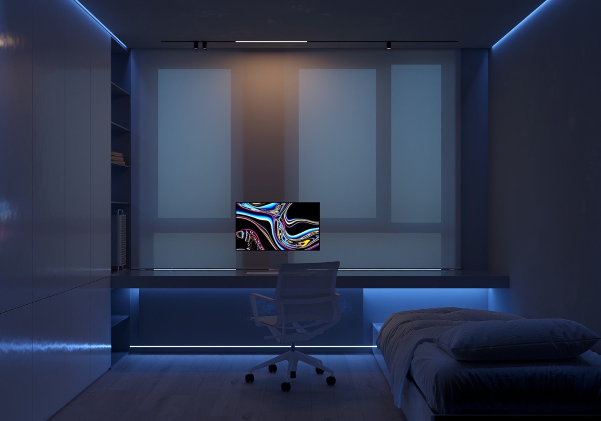
The Mac Pro with Pro Display HDR swirls its own colourful illumination over the desk and computer chair.

