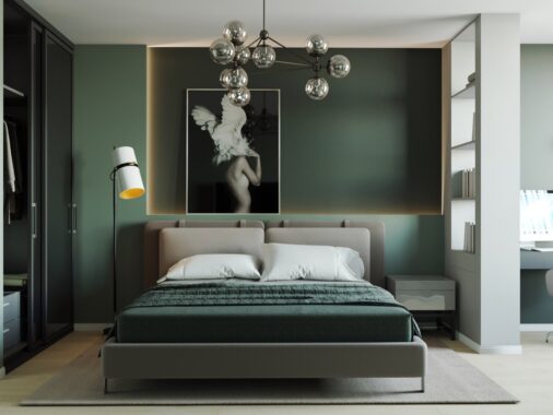
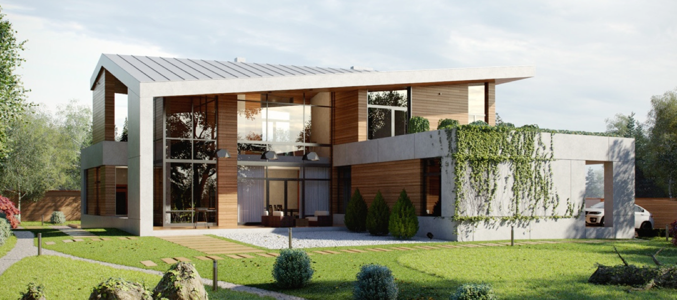
Sometimes luxury comes in small packages – while many may envision a "luxury home" as necessitating a sprawling floor plan, these stylish spaces take a more modest approach. Each of these three compact homes measure at less than 60 square meters but make a huge impression thanks to their streamlined decor, high quality furnishings, and thoughtful design. If you're looking for ways to make your small or medium sized apartment feel more sophisticated, maybe one of these inspiring interior tours could spark some ideas. Which one of these fabulous homes is your favorite?
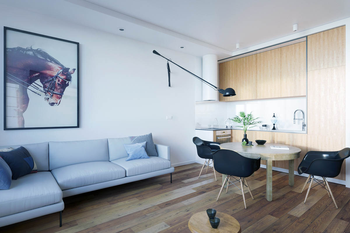
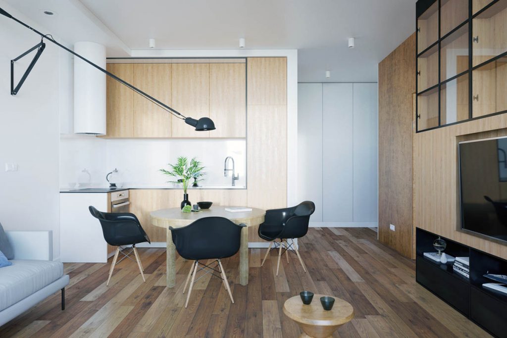
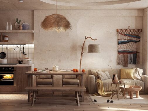
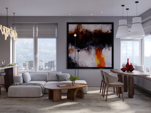
While the other homes in this roundup definitely made an effort to make each functional area feel like its own distinct space, this one features a more open-feeling layout where everything works together. The Flos Mod 265 swing arm wall lamp adds drama to the lighting.
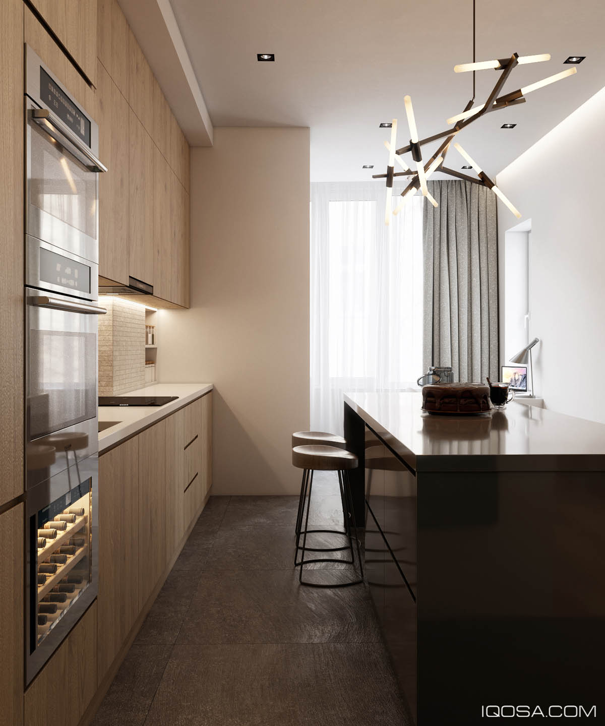
The kitchen proper uses warm wood cabinetry and textural tiles to express the comfort of rustic design without sacrificing an ounce of contemporary style.
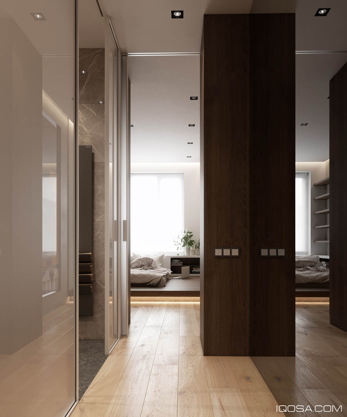
To make the narrow hallway feel larger, the designer chose to use highly glossy materials to maximize the amount of natural light and to increase perceived spaciousness.
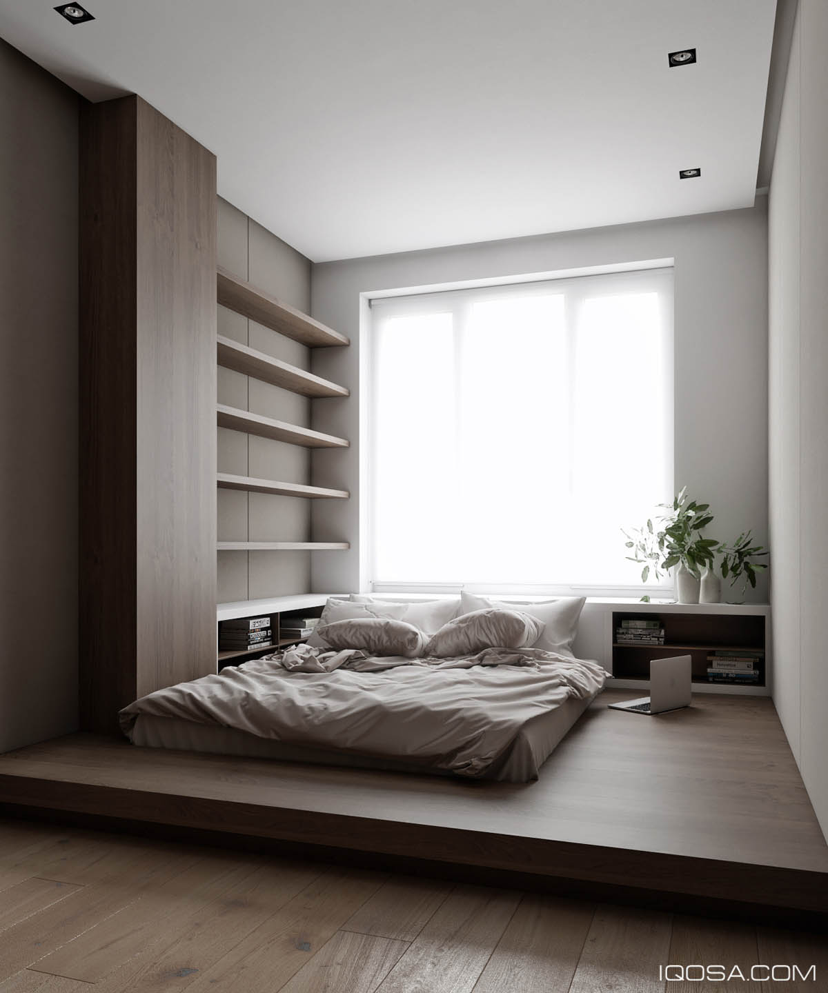
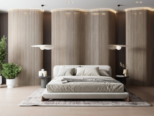
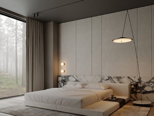
With a low bed and simple wall cladding, this bedroom just begs for a minimalist decor treatment. The vases and plant trimmings are a nice touch that vibe with the natural feel of the space.
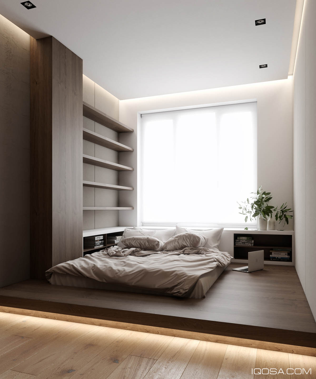
Check it out! The platform beneath the bed lights up to make it easier to navigate at night without the need to turn on any bright overhead lights.
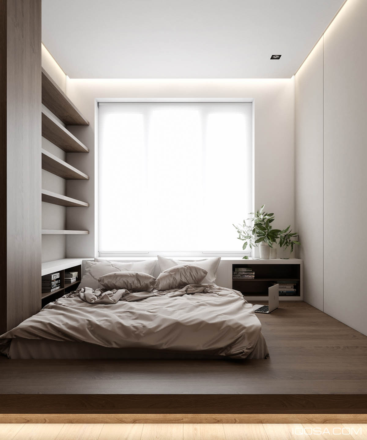
Low beds like these pretty much remove the need for side tables, although the wrap-around storage space serves as a clean-looking stand-in here.
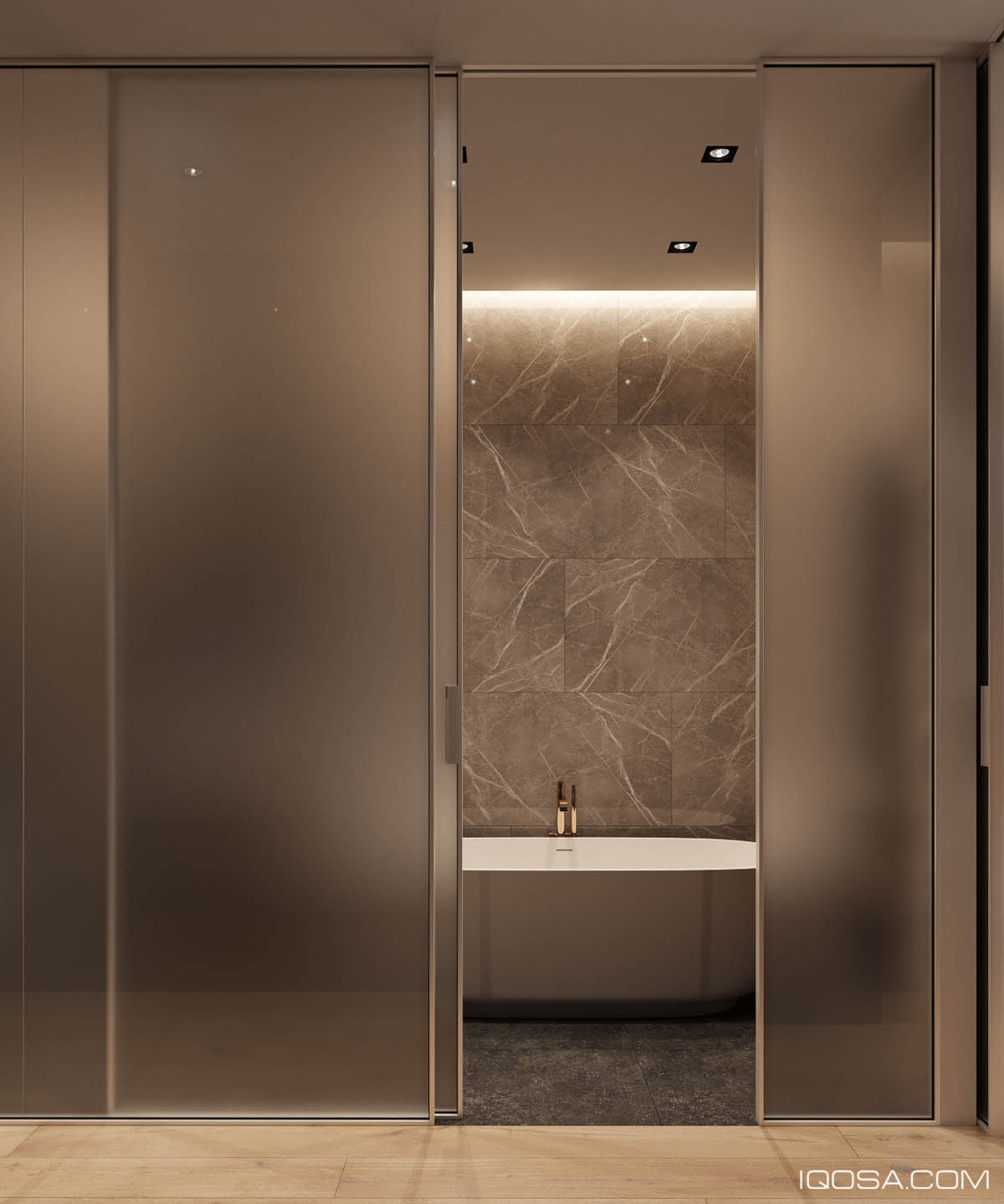
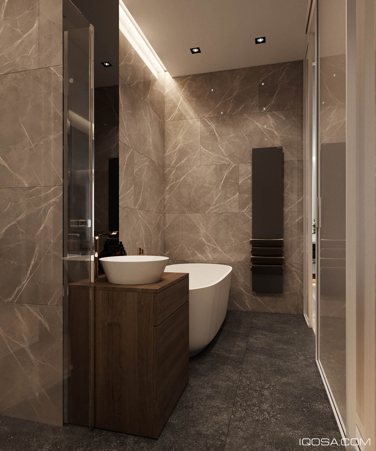
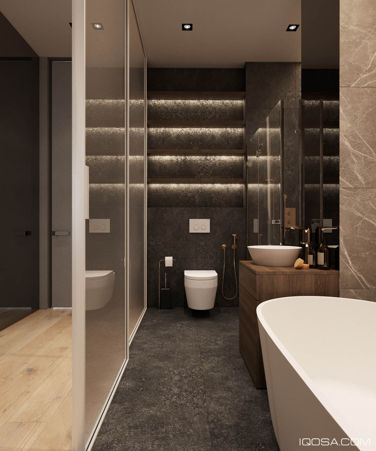
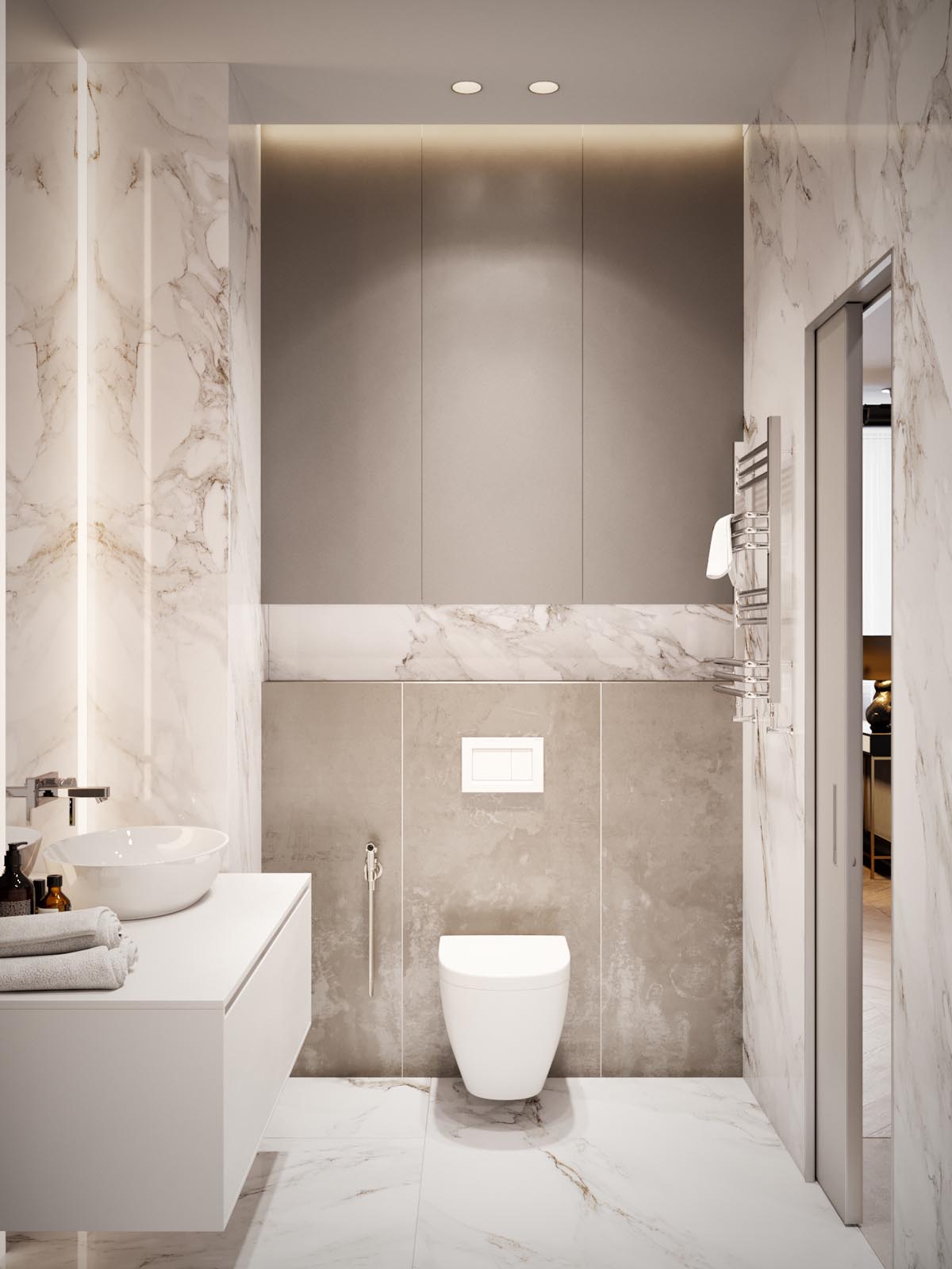
Of course, no tour is complete without a quick peek at the bathroom – just as luxurious as the rest of the home.
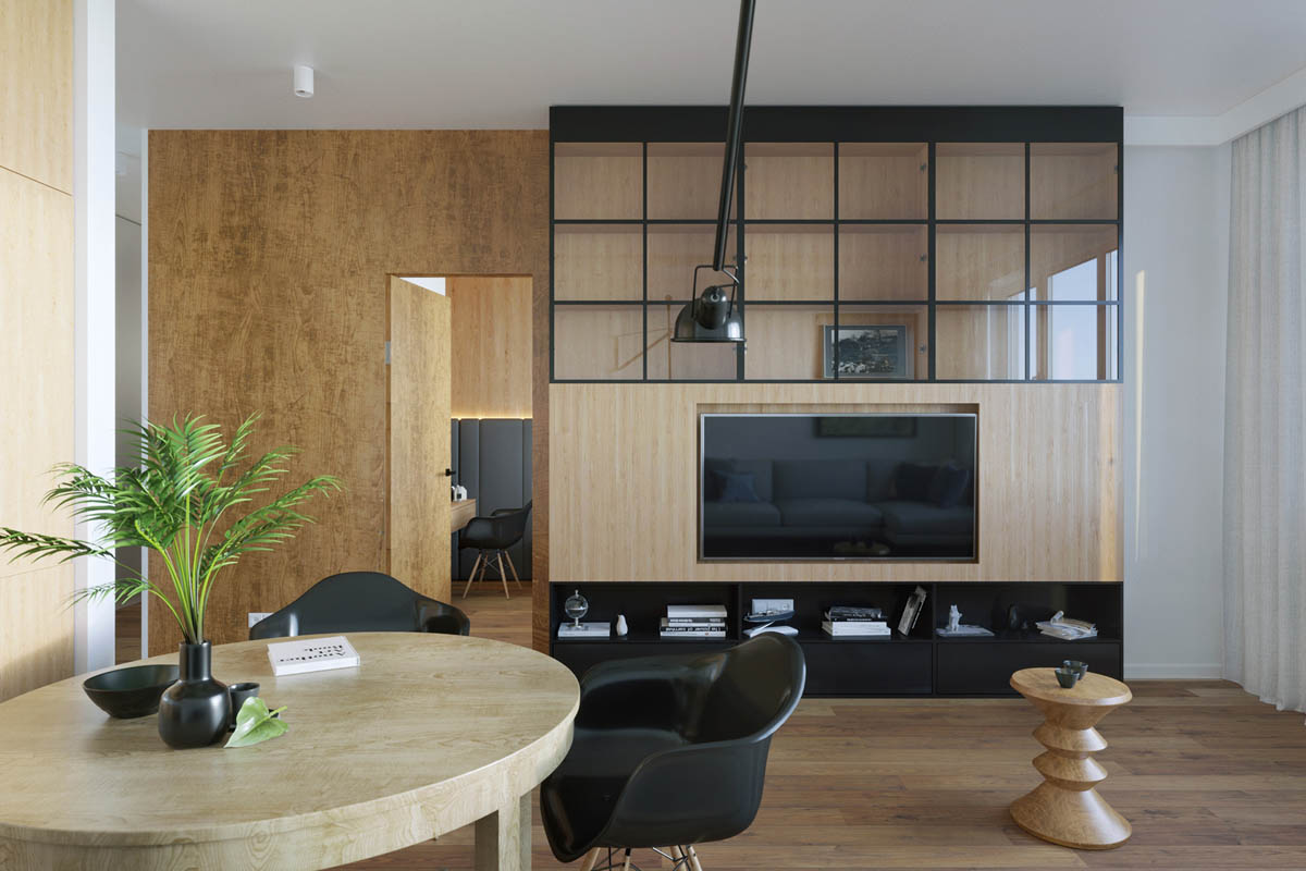
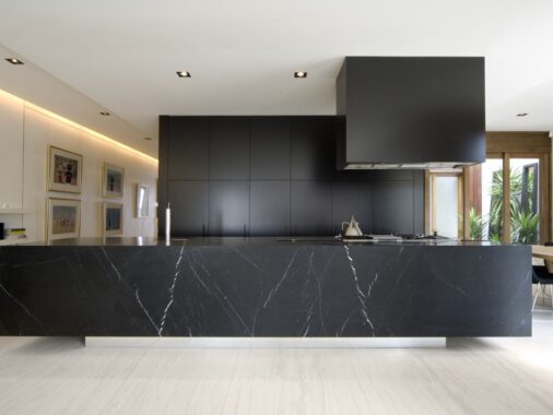
This next space is a concept for a small apartment in Gdansk, Poland. Its natural interior takes advantage of multiple varieties of wood for a warm and welcoming aesthetic, but adds plenty of polished glass and matte black surfaces for contemporary style.
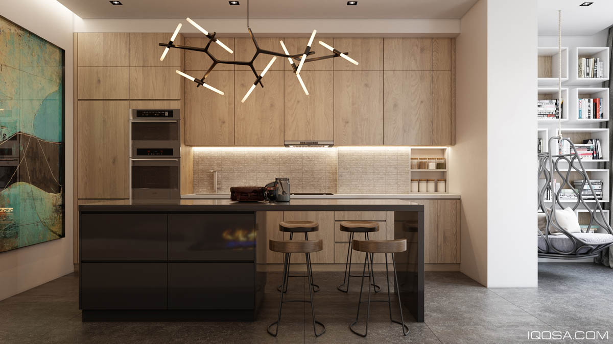
And, because the home isn't quite large enough to support a separate dining room, these kitchen bar stools offer a space-saving alternative, doubling up the kitchen island as a breakfast bar. You can find similar stools here.

The modern dining chairs make a sculptural and artistic statement in the absence of other decorations. They also serve as extra "living room" seating when the residents are entertaining guests.
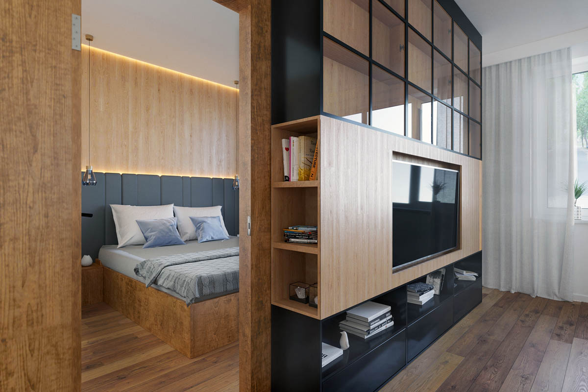
The modern dining chairs make a sculptural and artistic statement in the absence of other decorations. They also serve as extra "living room" seating when the residents are entertaining guests.
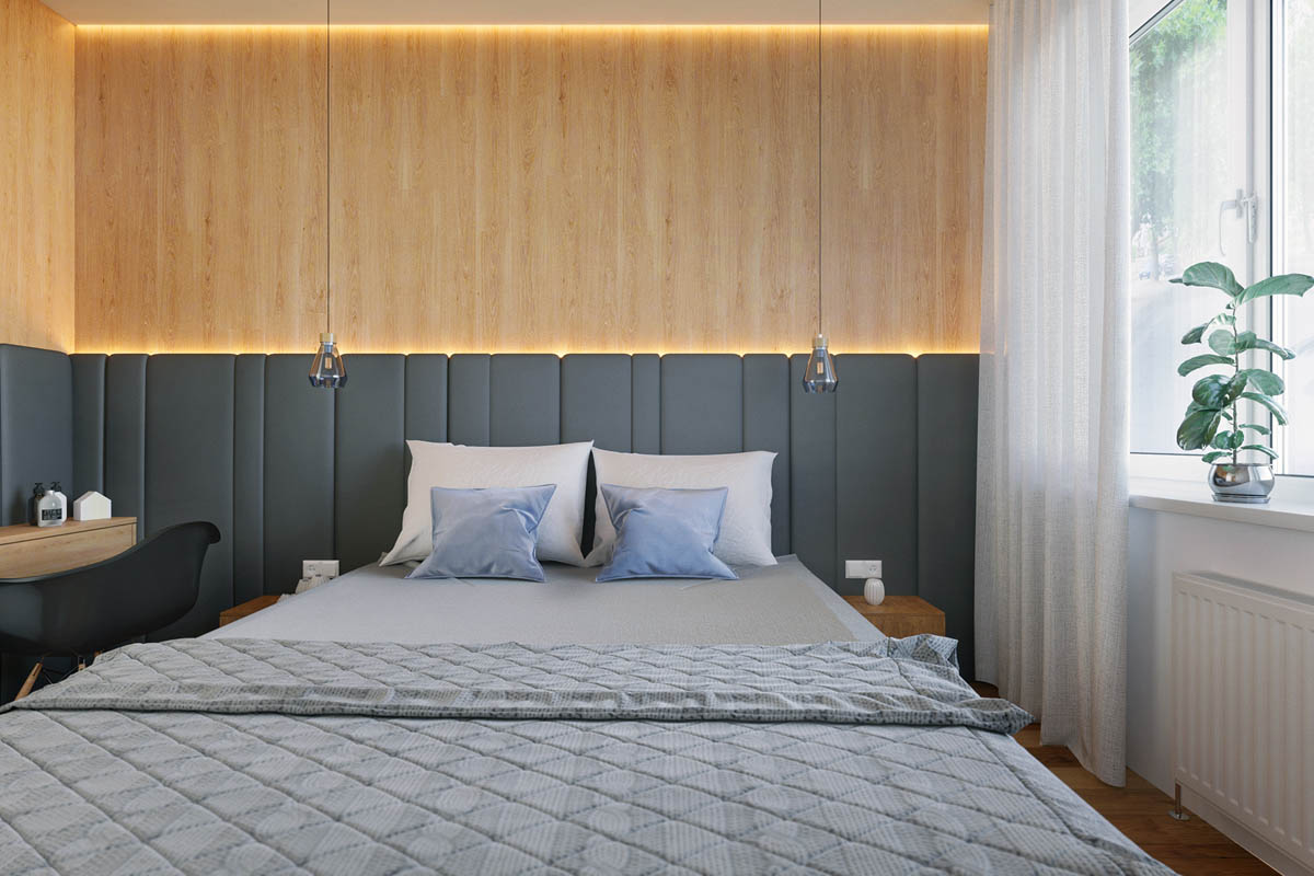
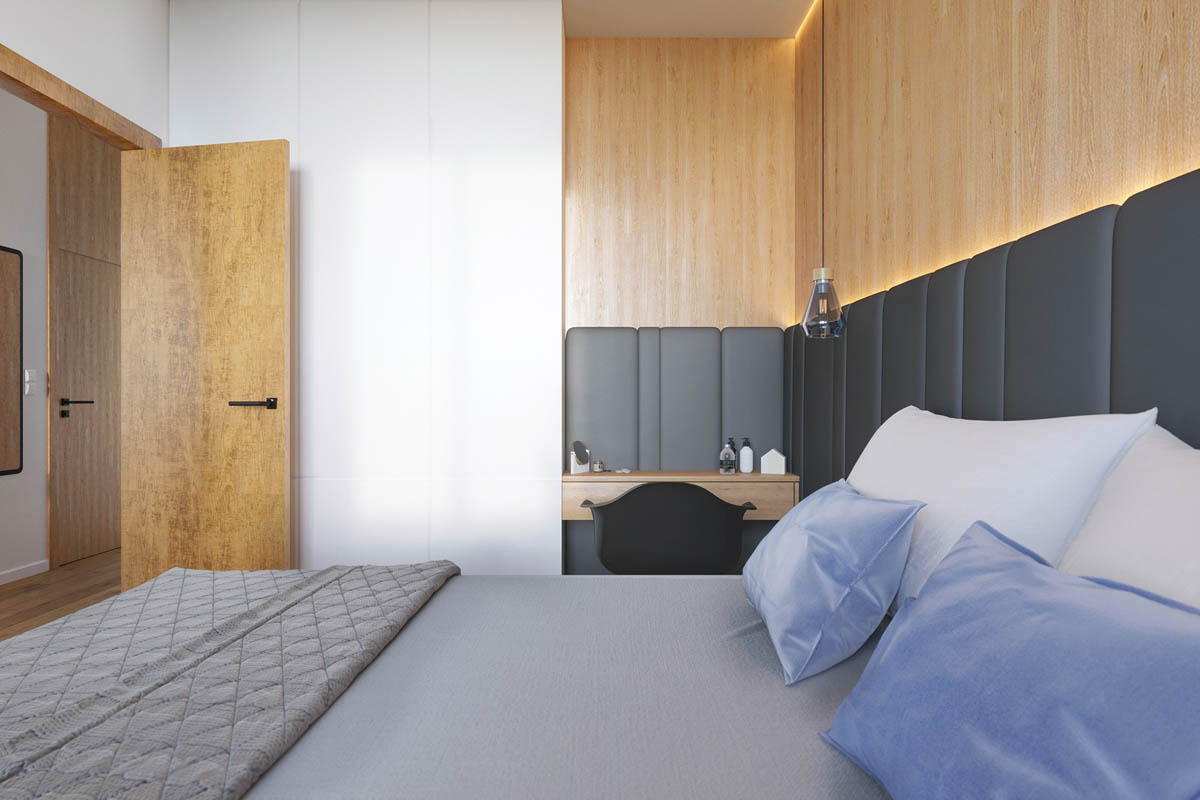
Overall, the bedroom design feels exceptionally comfortable, from the soft indirect lighting to the plush upholstered headboard wall.
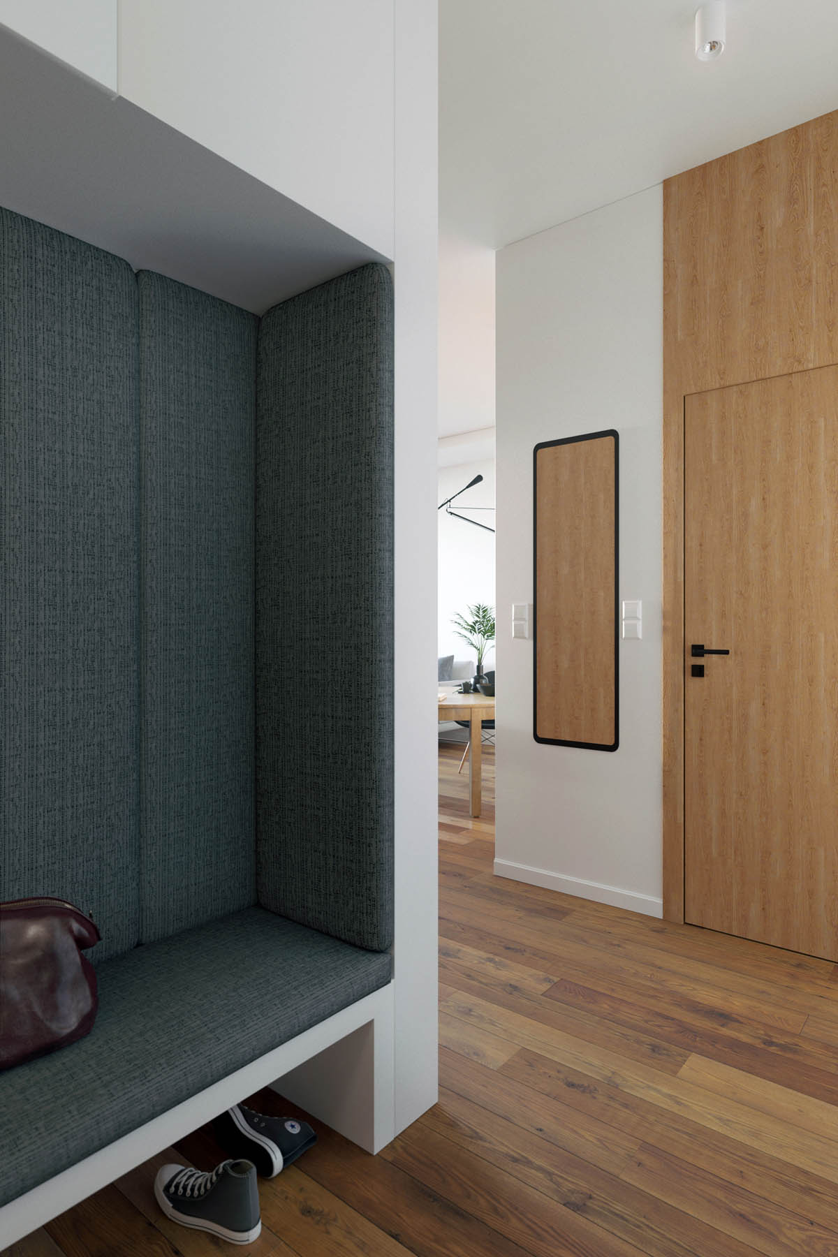
What a cozy entryway! Upholstered from top to bottom, this little niche looks like a relaxing place to empty pockets and untie shoes after a long day at the workplace. And the mirror makes it easy to check hair and outfit before leaving in the morning.
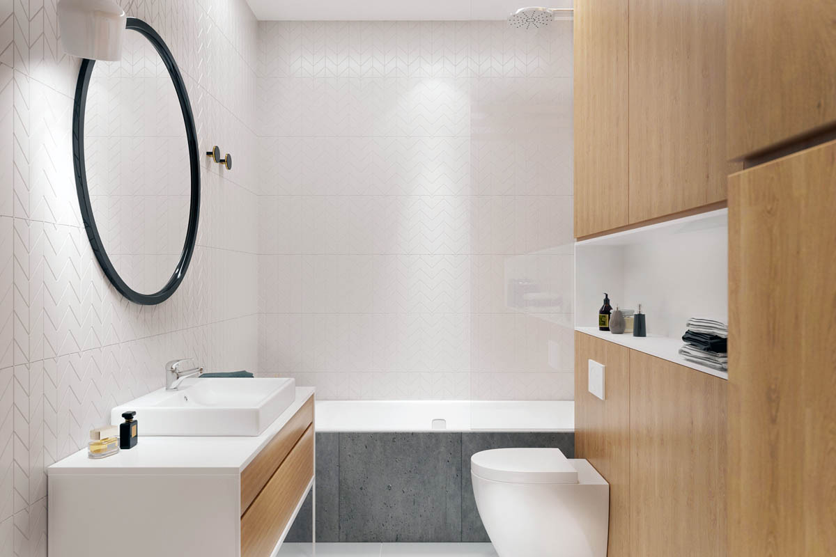
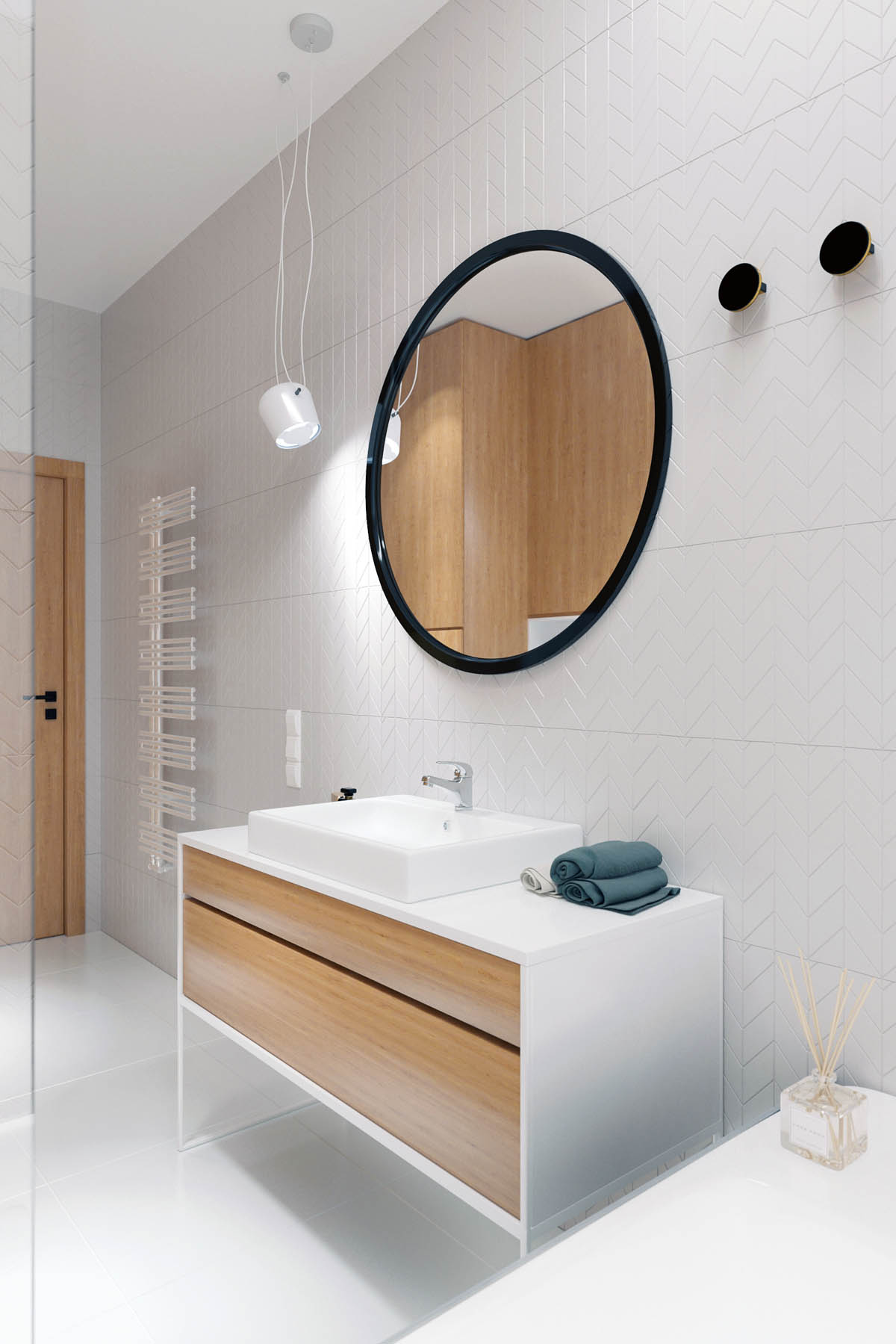
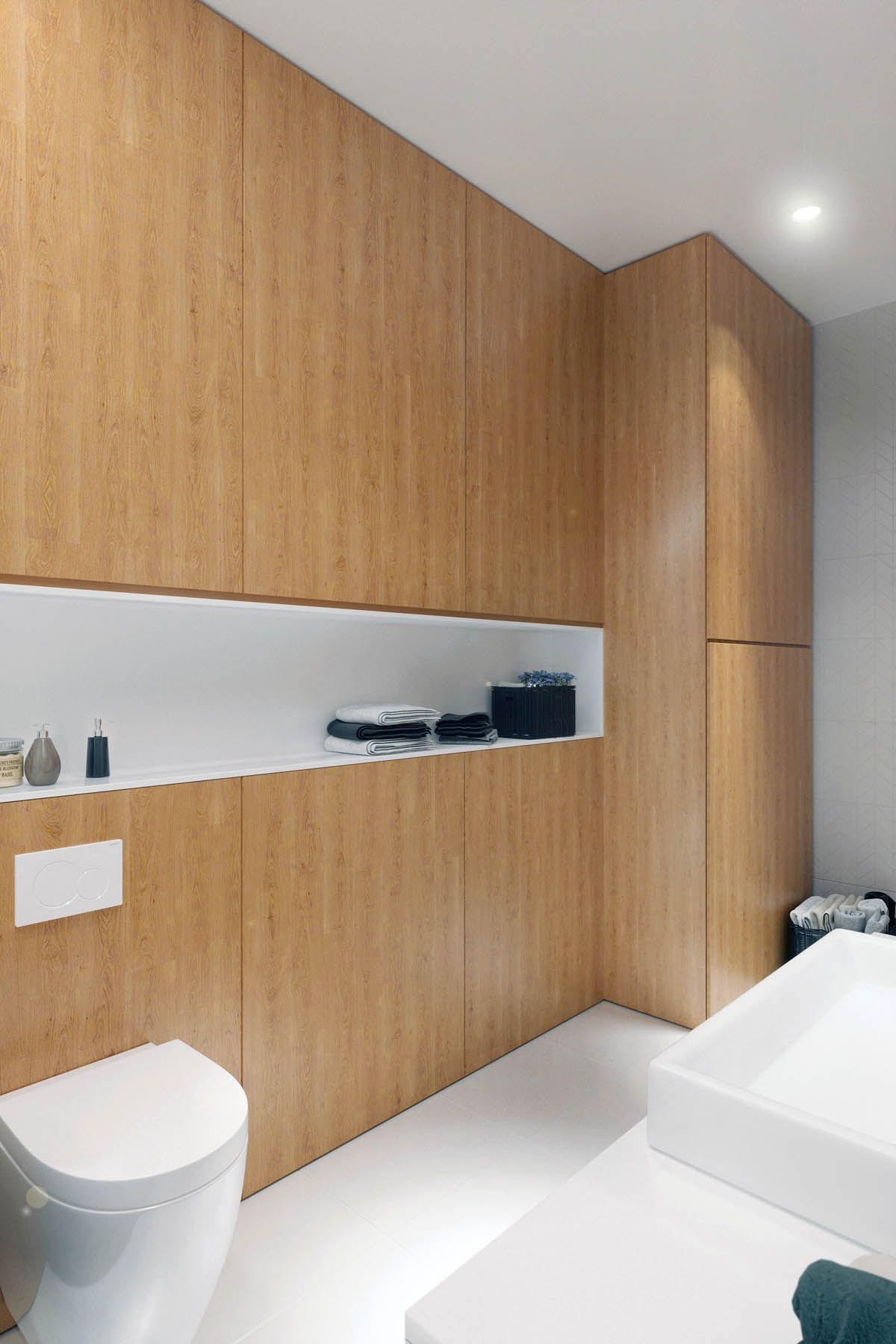
While the bathroom looks very similar to the rest of the home, it does make more extensive use of plain white surfaces for a "clean feeling" appearance.
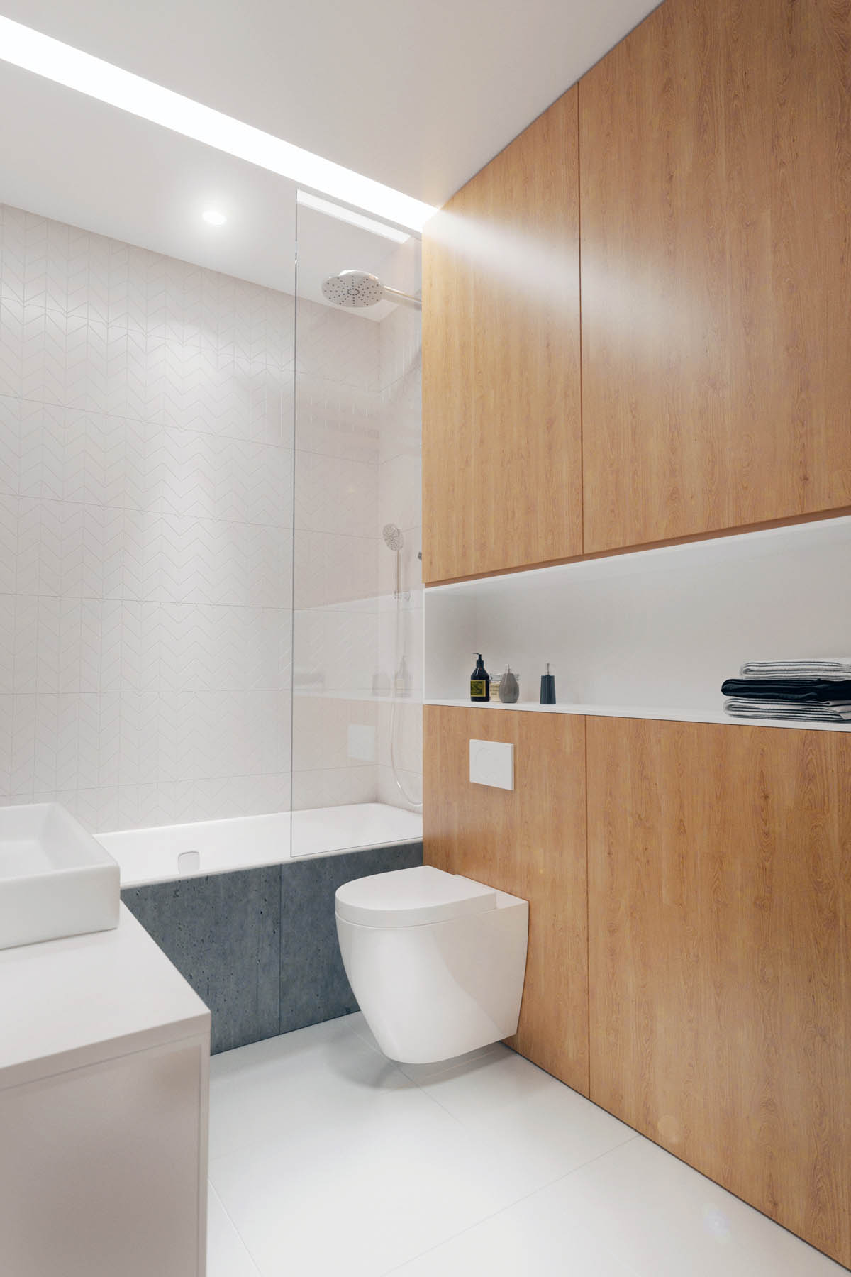
The open shelf is a great place to hold extra hand towels, simple decorations, or spare soap and lotion dispensers.
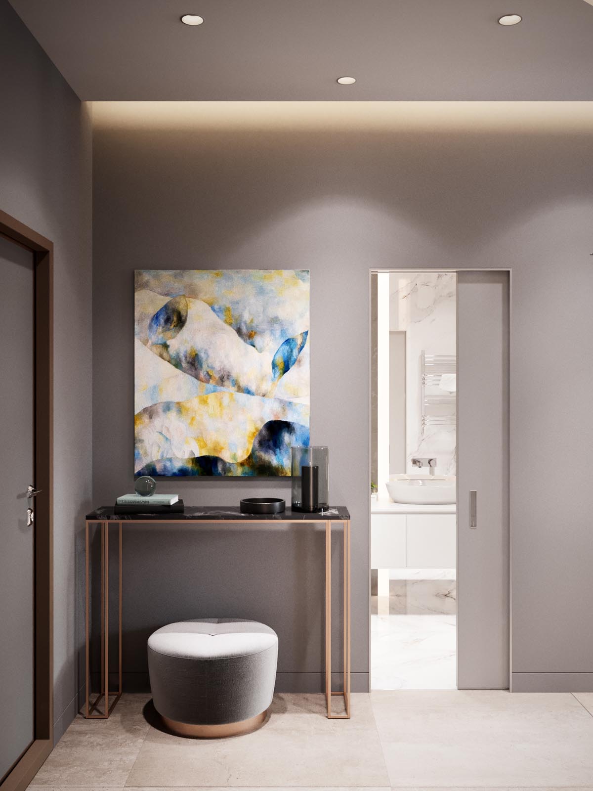
While there isn't much artwork hanging in this home, that only means that pieces like this make an even bigger impression! This handsome vanity sits between the entryway and the bathroom. The candle holders are a nice touch too.
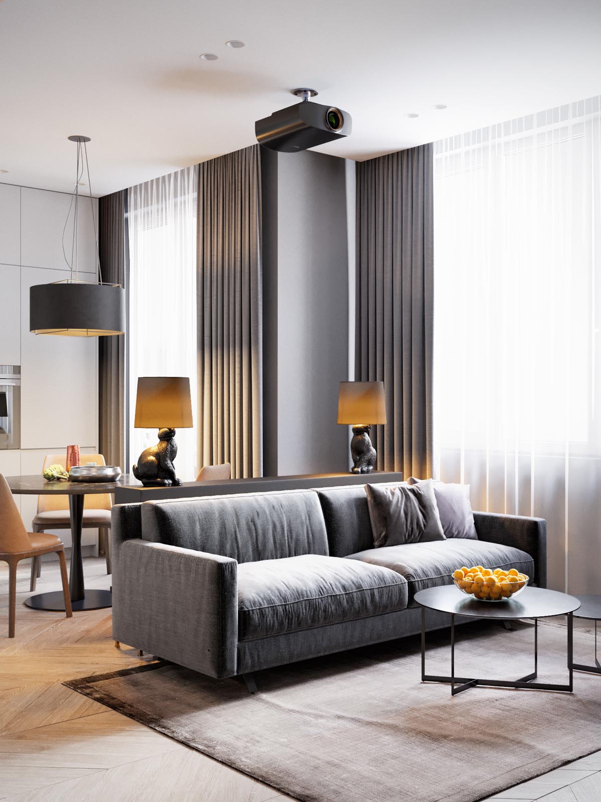
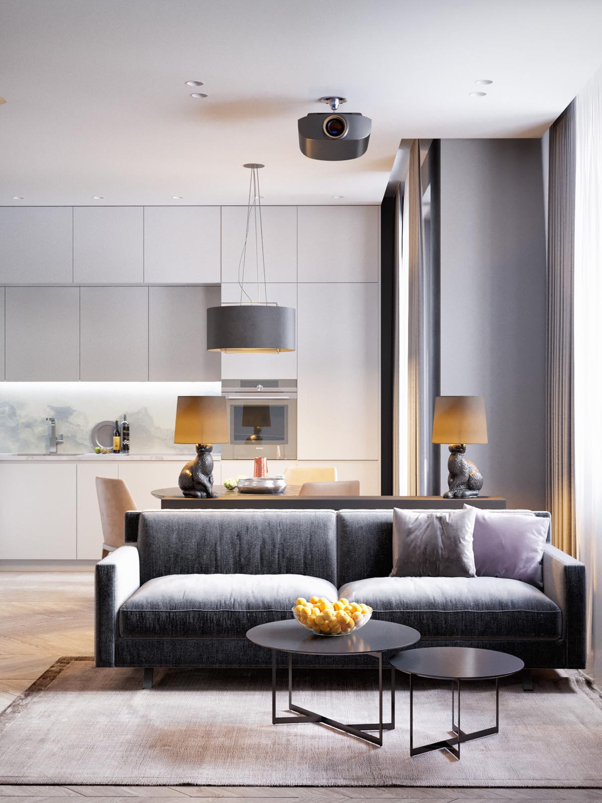
Decor remains simple. While there are a few statement pieces like the lamps, most of the color and creative personality comes from the simplest everyday objects like the fruit bowl on the table.
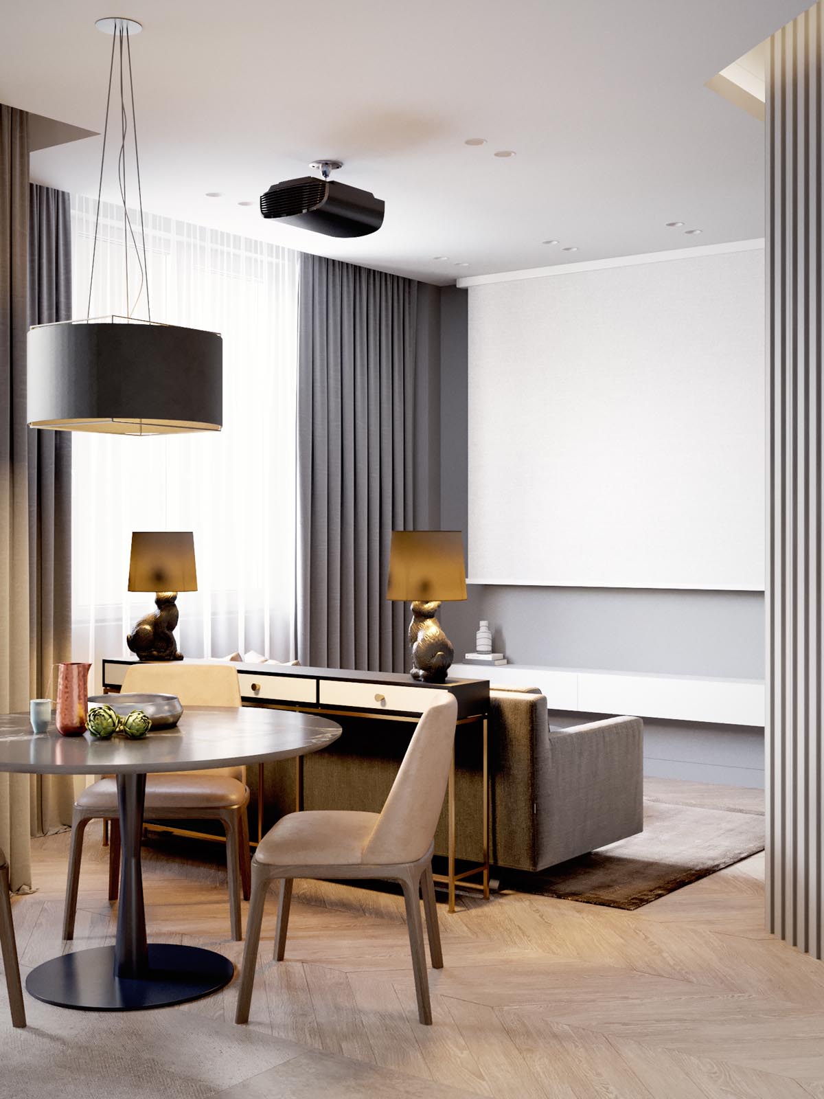
Rather than taking up valuable visual real estate with a traditional television, the designer opted for a projector paired with a retractable white screen. It's still a great place to entertain despite the home's small size – guests can simply pull up chairs from the dining room.
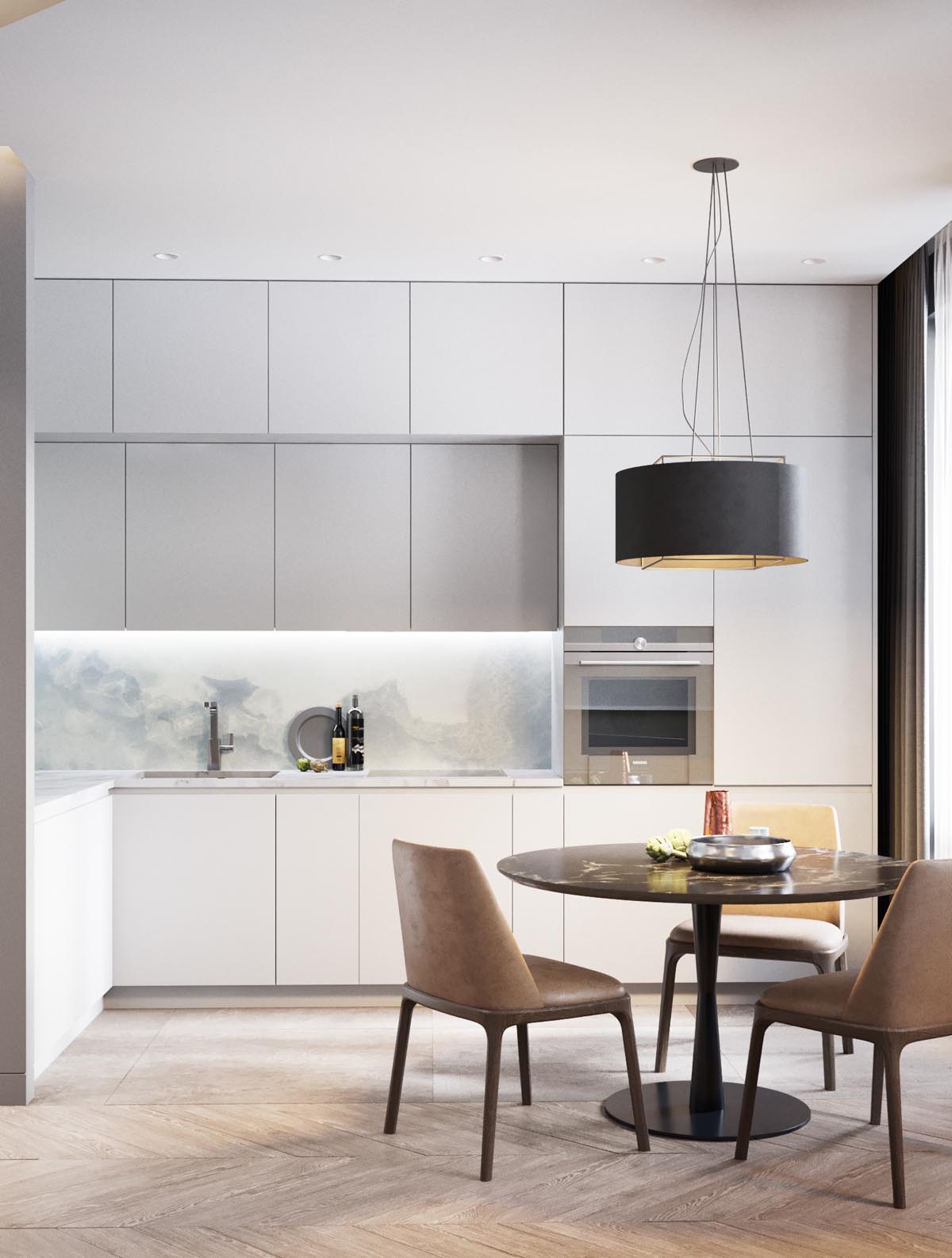
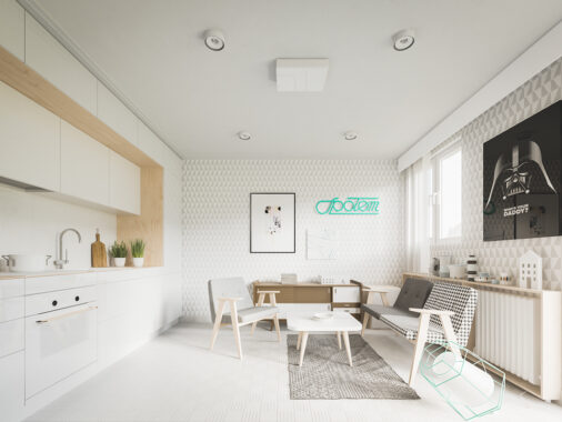
While the kitchen uses white-on-white design to maintain a low profile, the dining area stands out with cozier appeal thanks to its warmer color palette. The sense of contrast helps separate each functional area.
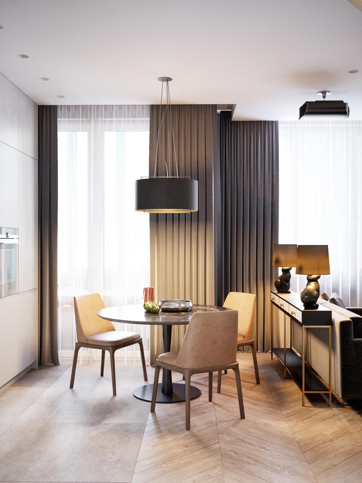
A variety of lighting options sets the mood. A low dining room pendant provides soft illumination for meals, while a pair of creative rabbit lamps casts light into both the living and dining spaces.
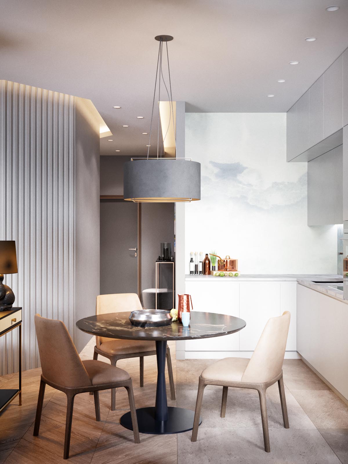
Without much extraneous decoration, every accessory has the potential to make a big visual impact. The bowl, bottles, pans, and pitcher are all functional items yet their stylish designs add character to the space.
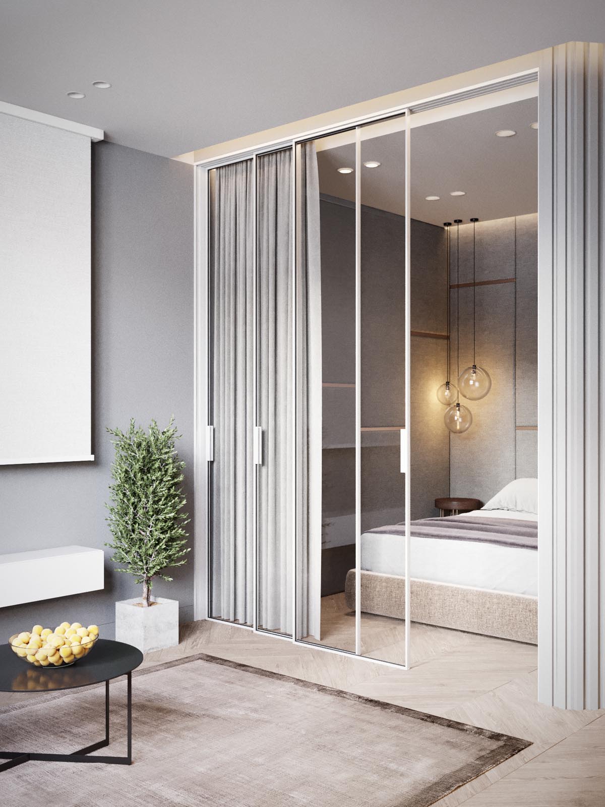
The simple and stylish bedroom hides between sliding glass doors, easily concealed with neutral grey curtains for privacy.
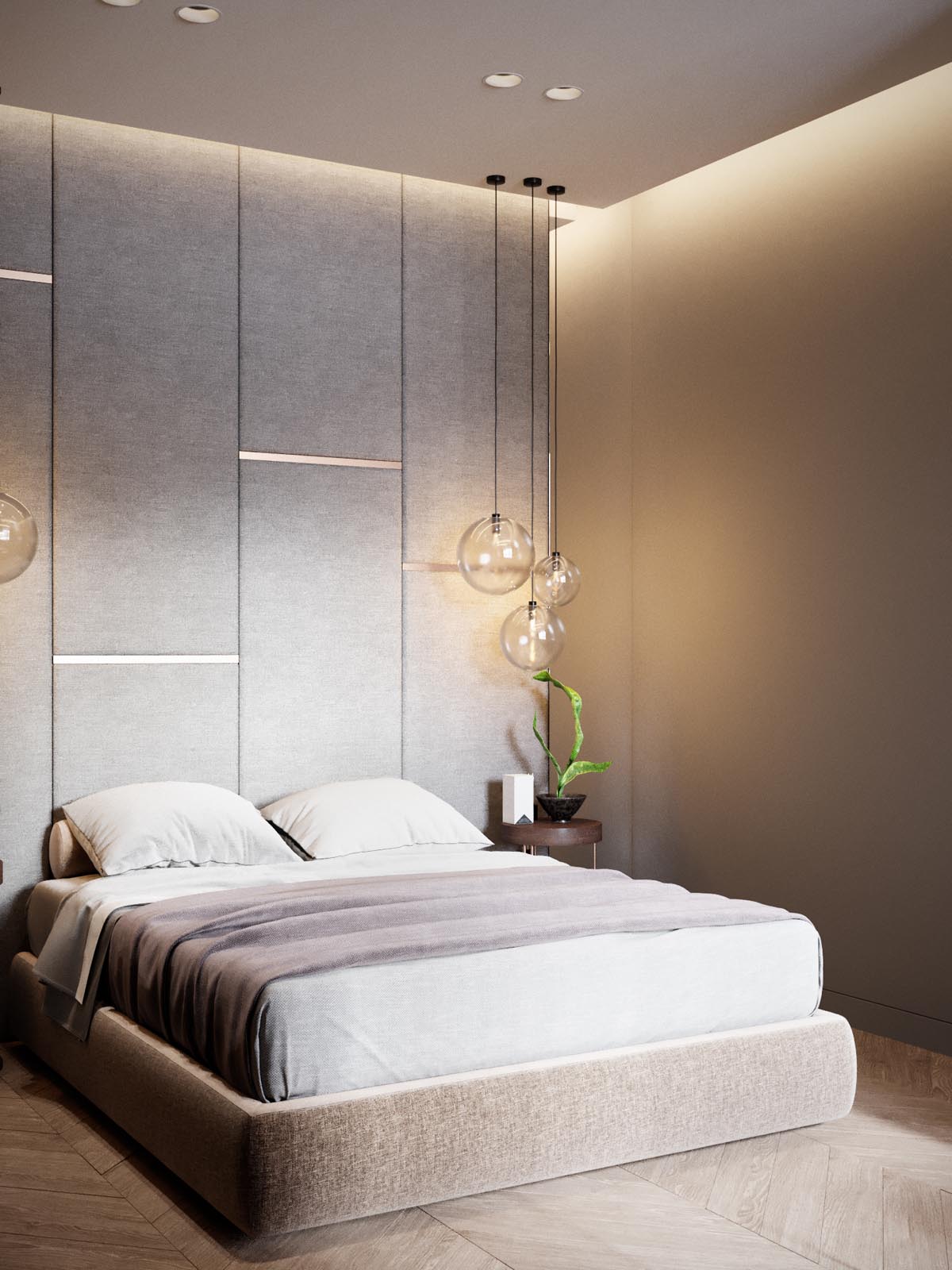
Instead of decorations, the bedside tables simply host indoor house plants to add a touch of color and a splash of outdoor charm in the absence of windows.
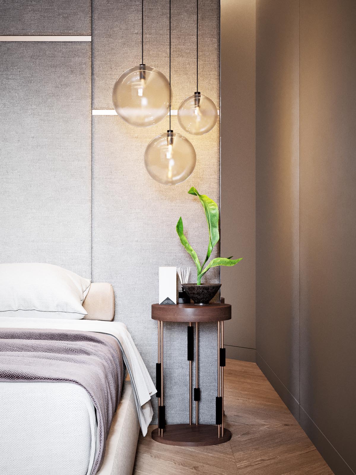
And because the bed stands are already occupied by useful items, these bedroom pendant lights are a great way to save space compared to ordinary table lamps.
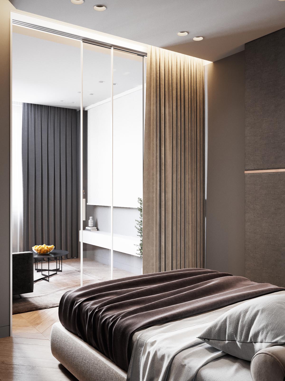
Extra lighting built into the ceilings and walls provide a little extra mood lighting for relaxing evenings in bed.
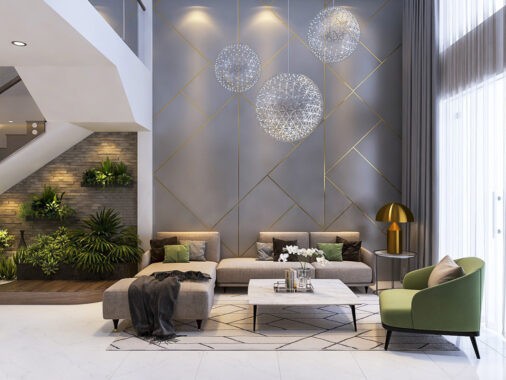
At just 50 square meters, this attractive apartment makes up for its limited floor plan with space-enhancing features like tall ceilings, massive windows, and a wide open layout.
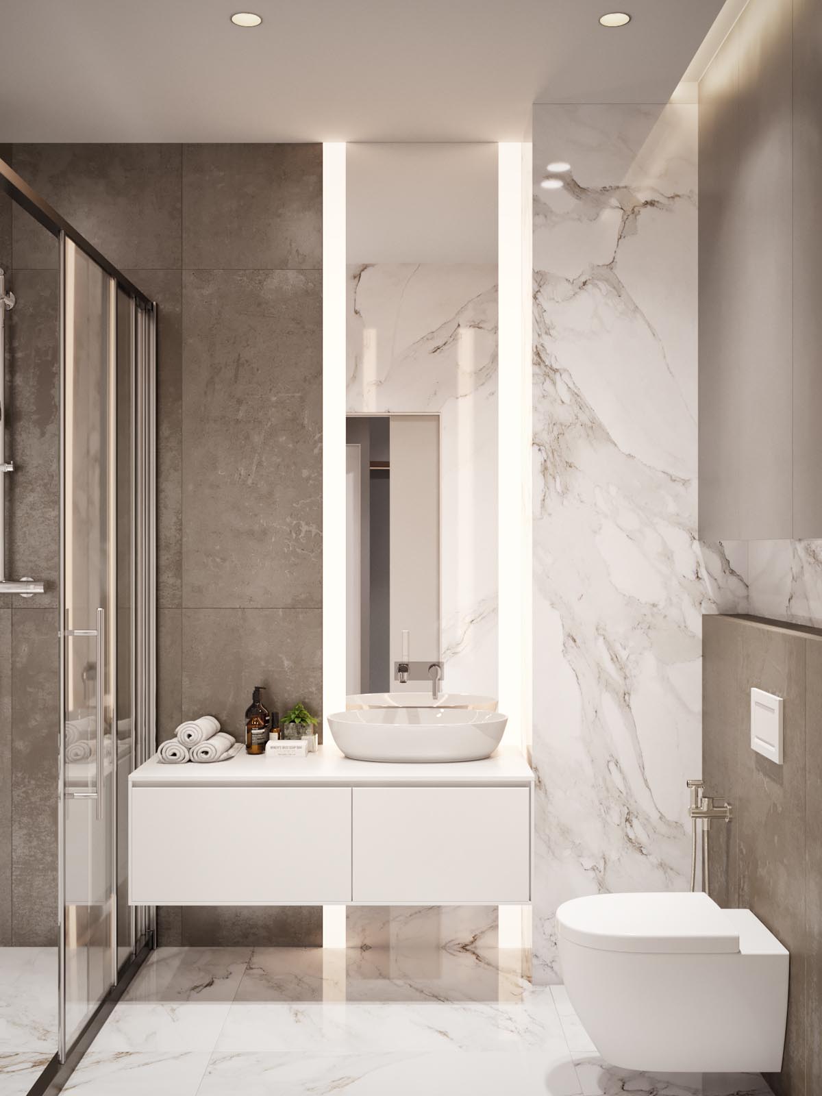
Clad in marble, concrete, and plenty of pure white surfaces, it definitely has a high-end "clean" feeling vibe.
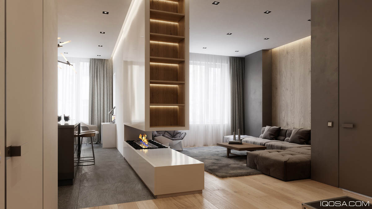
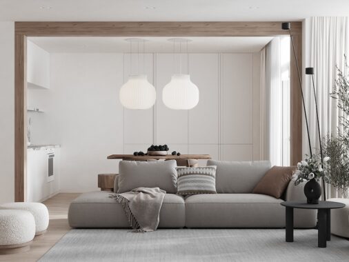
Next is a home that uses both material and layout to foster a sense of warmth and intimacy. The main living area and the combined kitchen/dining room is separated by a wall that contains a cozy faux fireplace, with the lower section remaining open to still allow a sense of connectedness between the two functional areas.
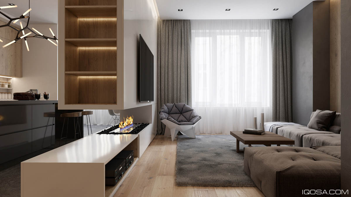
The comfortable reading chair is the Q1 from ODESD2.
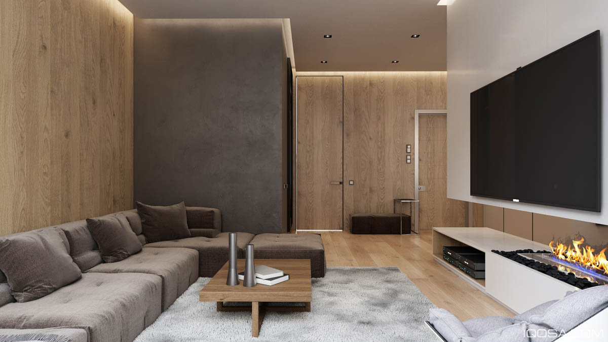
The living room itself is absolutely ideal for entertaining guests – a spacious sofa, a large format television, and plenty of room to spread out makes it easy to get comfortable and enjoy a movie or good conversation.
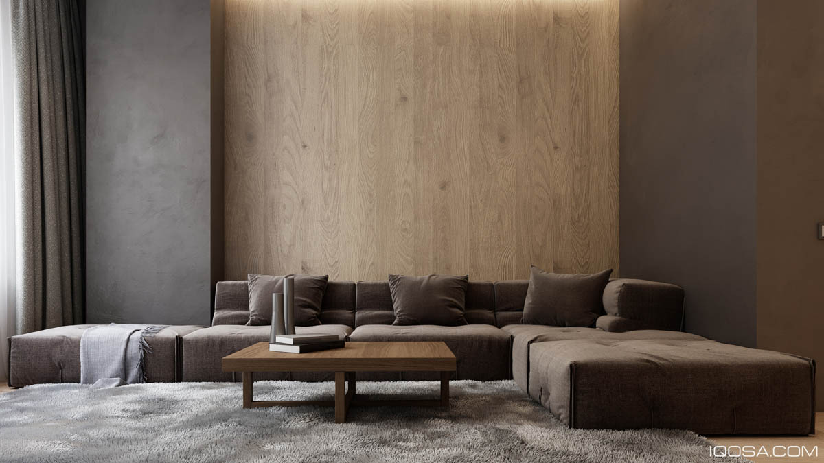
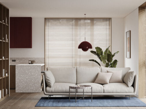
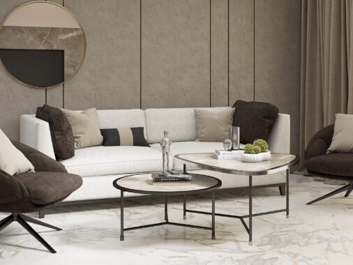
Sometimes it's difficult to find unique coffee tables that work well with low sofas like this one, but this pairing looks fabulous.
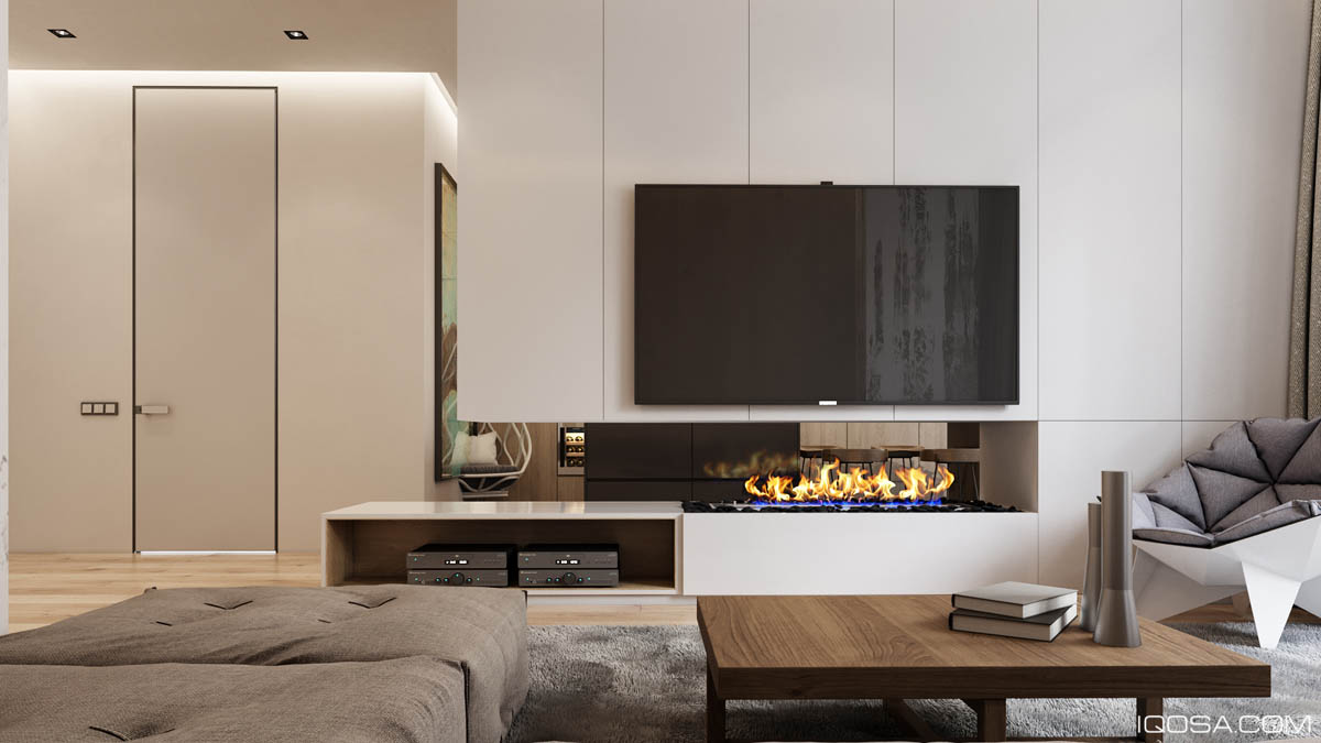
From this angle it's really easy to see the effect that the semi-open portion of the dividing wall has on this space. The two areas feel separate but neither room feels any smaller as a result of the wall thanks to the visual continuity.
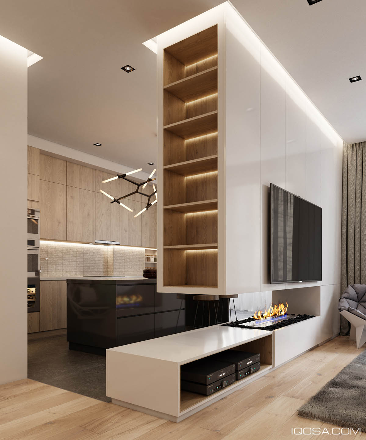
Another benefit is the extra storage. Shelves on the edge would make it easy to display books or treasured collectibles, while the cabinets on the living room side keep clutter at a minimum.
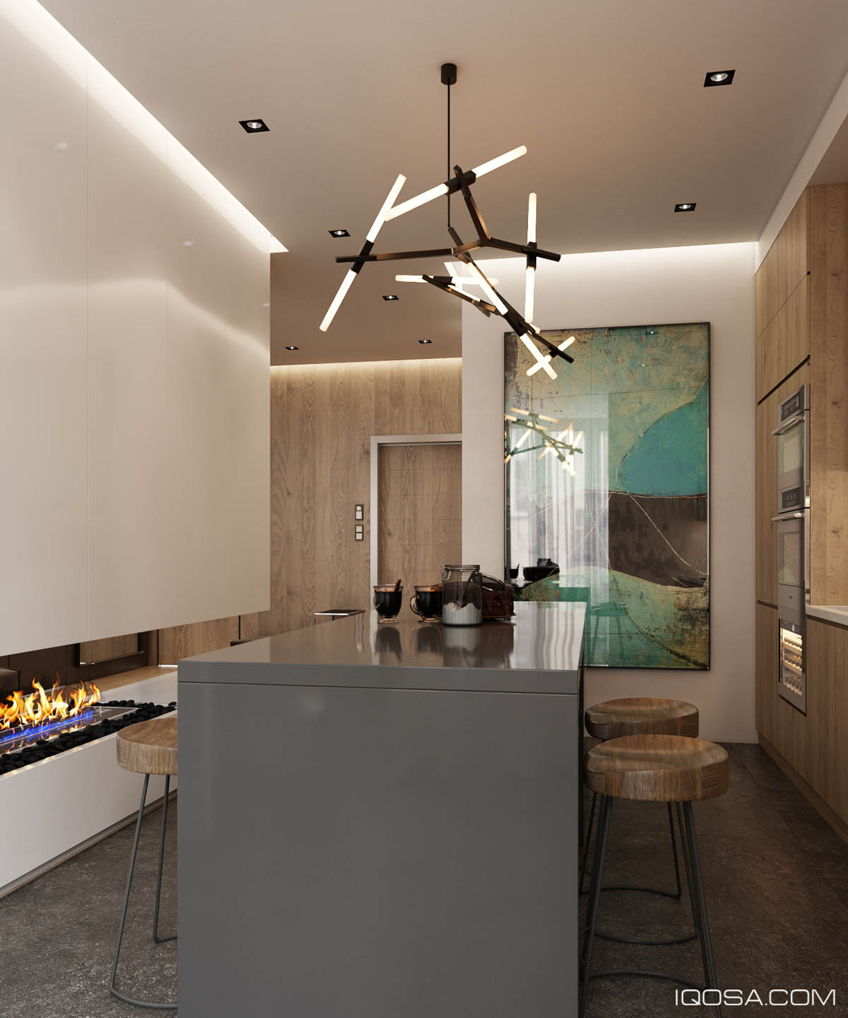
Although it's extremely functional, the actual floor space of the kitchen is rather limited. In spaces like this without much decoration, unique kitchen pendant lights can make a huge difference – this design by Lindsey Adelman definitely makes a stunning statement.
