If you're all set to tackle the installation and decoration of a narrow kitchen, then this set of inspirational kitchen designs should be right up your galley! A galley kitchen is defined by two rows of cabinetry that face one another with a narrow walkway in between. The name is derived from the kitchen area of boats, where space is very limited. The domestic galley kitchen allows a lot of cabinetry to be squeezed into a sliver of culinary space, and can facilitate doors or walkways at either end of the run. It can be completely contained or be part of a larger open plan living space.
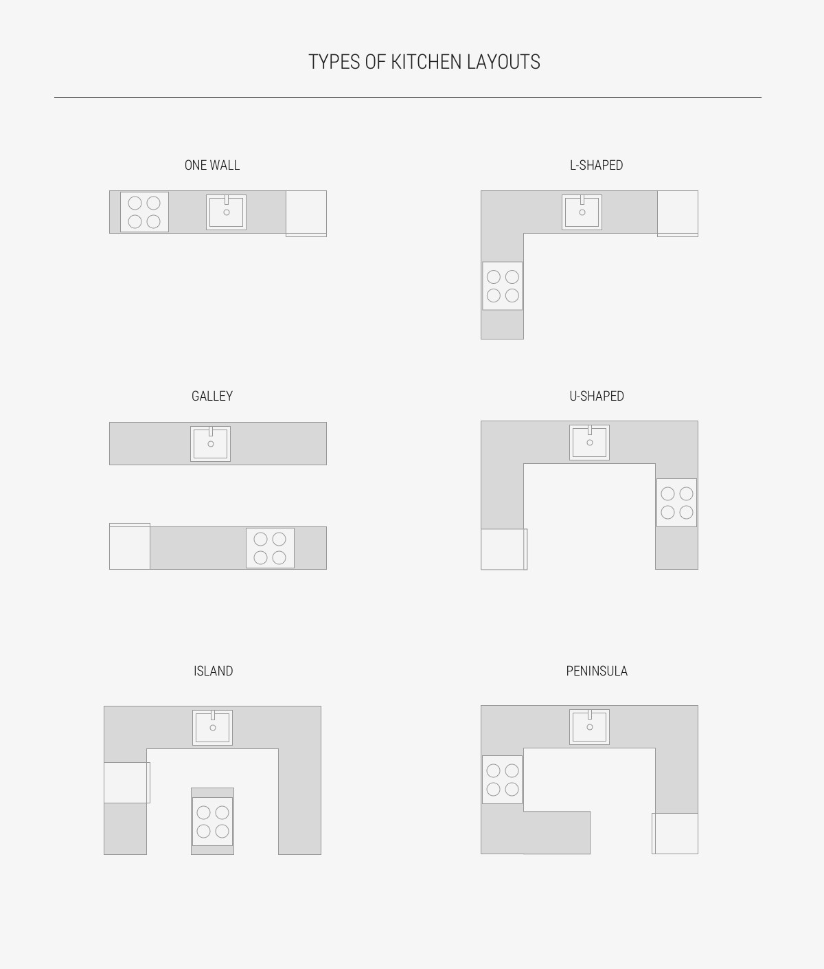
Generally speaking, there are six types of kitchen layouts: The One Wall, Galley, L-shaped, U-shaped, Island and Peninsula. There are no strict positions in which to order the stove, fridge or sink, and a kitchen can be combinations of one or more of the typical layouts. For example, you could have an L-shaped kitchen with an island or a peninsula, or a galley kitchen that is linked at one end. In designing a functional kitchen, the kitchen work triangle should be considered, which means that the distance between the sink, stove and fridge should be no more than 1200mm apart. Though, the concept of the kitchen working triangle is now evolving further to take into account multiple cooks, as well as new gadgets and appliances.
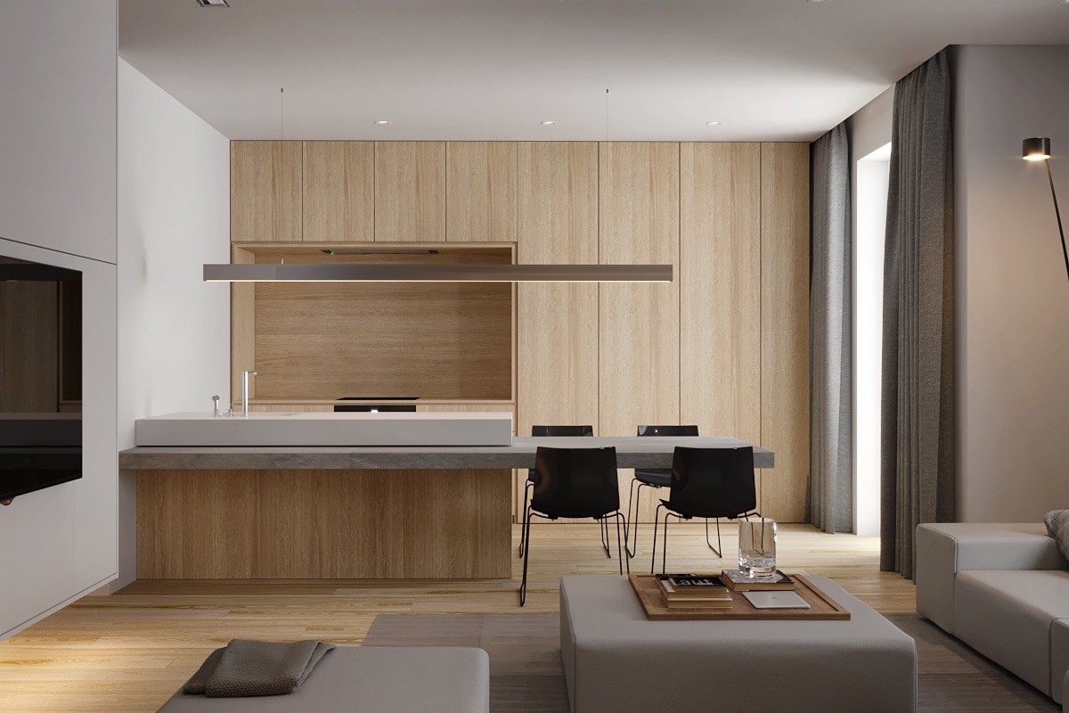
Add a dining extension. Traditional galley kitchens would not typically have included any type of table, but a breakfast bar or dining bench extension will make a limited space work even harder for you. Open plan galleys offer the benefit of having seating around each side of an eating surface, but a closed capsule galley can still benefit greatly from a single sided dining installation.
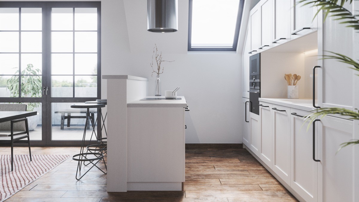
Screen off the mess. Fashion a partially dividing wall that climbs just a little higher than the back of your units in an open plan layout. The added height is just enough to screen off unavoidable cooking mess and dishes from the rest of the living room. Attach a narrow countertop on the divider to create a neat coffee bar, and finish with a few bar stools.
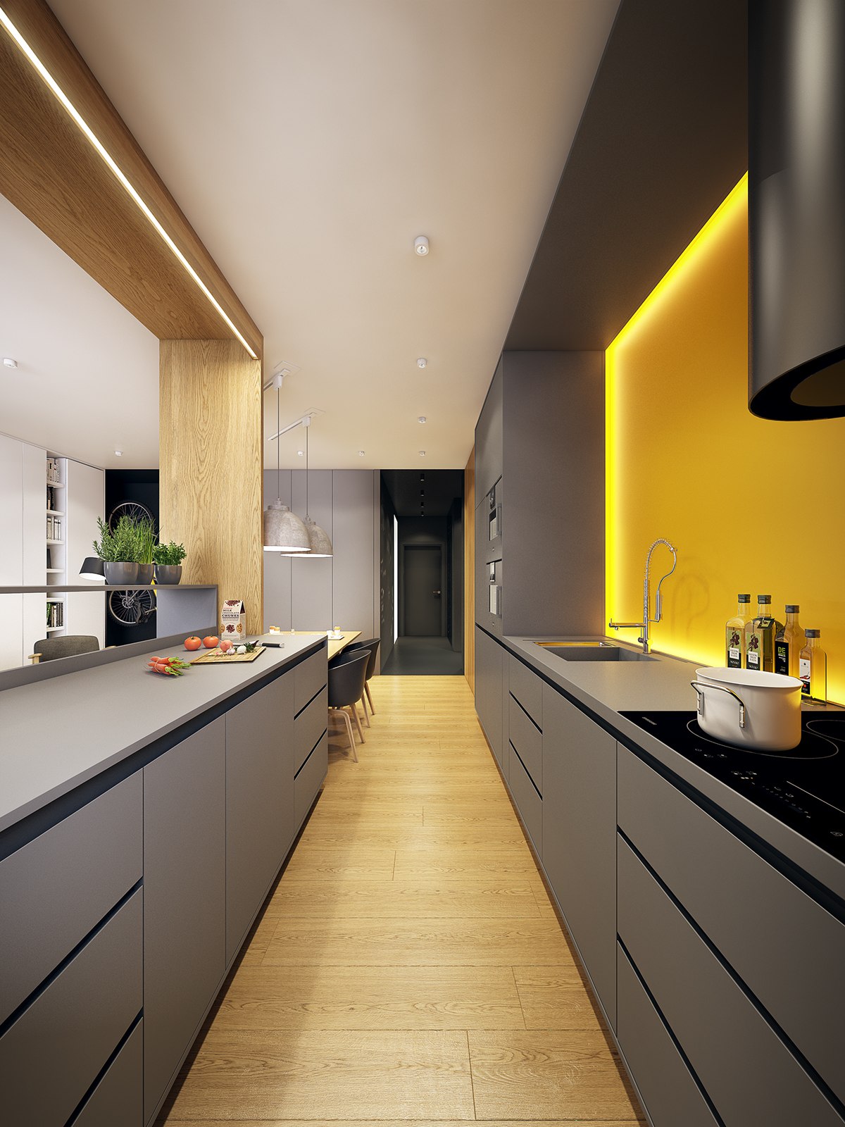
Create connections. Check out the overhead panels in this layout. The connectors create a wonderfully cosy, complete and decidedly slick finish. Highlight the additions with ambient lighting for a really eye-catching effect.
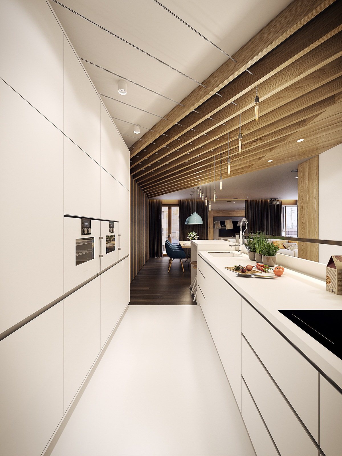
Add pattern in unexpected ways. This straight kitchen run receives some surprising twists up at roof level. Diagonal wood slats cut across the ceiling, with industrial style lighting hung in triangle formation.
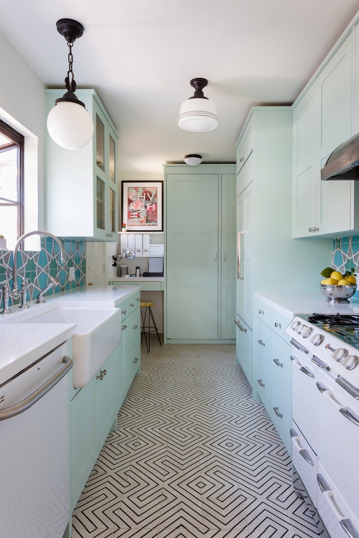
Galley kitchens can sometimes be U-shaped. Although this kitchen isn’t your typical U-shape, the galley run is somewhat linked by a large end unit and desk combo.
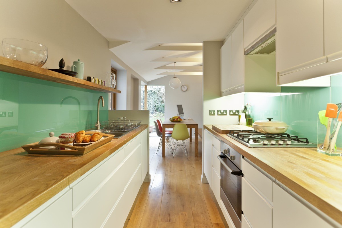
Make a galley kitchen feel wider by installing the wall cabinets only on one side. An open shelf can provide extra storage on the opposite wall without closing up the space.
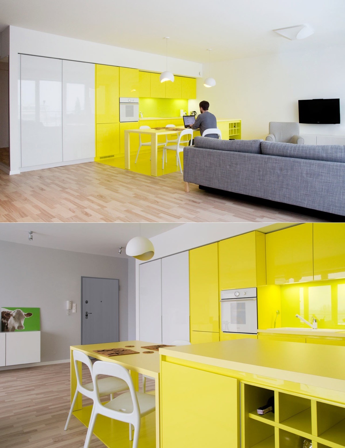
Break up a long run of units using colour sections, like this yellow and white minimalist kitchen.
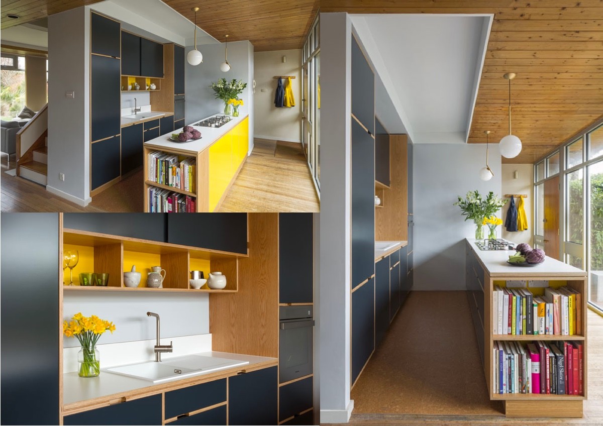
Another one for the yellow accent kitchens collection. This time yellow panels brighten the back of units and pick out display shelves. Decorative vases hold matching flowers on the bench.
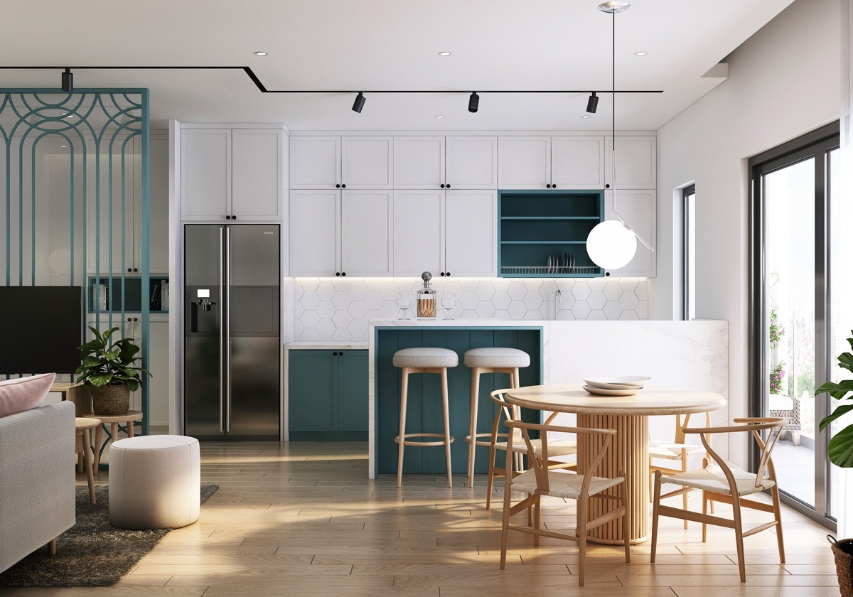
Use coloured accents to highlight key areas, like a breakfast bar or plate rack.
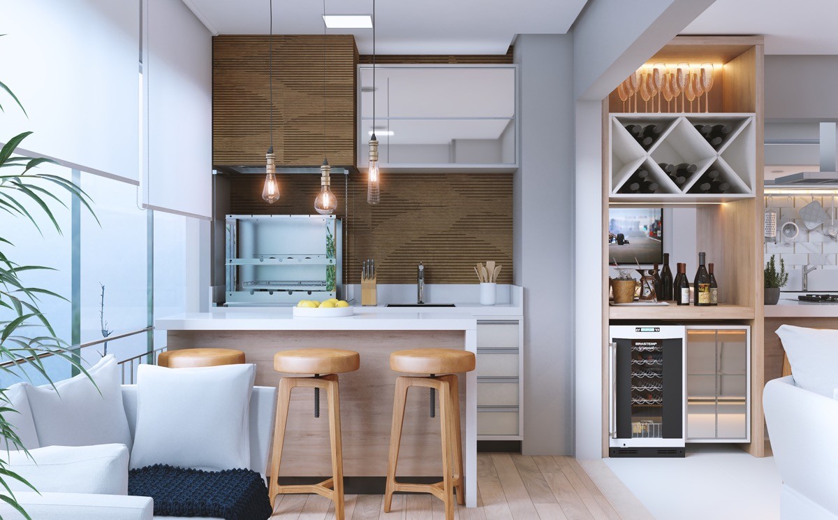
Mix and match to suit your space. This tiny galley kitchen is in fact extended over on the right as a single wall kitchen. Three swivel bar stools transform a prep area into a dining spot. Storage is organized neatly as well. A knife holder and kitchen spoon holder flank the sink.
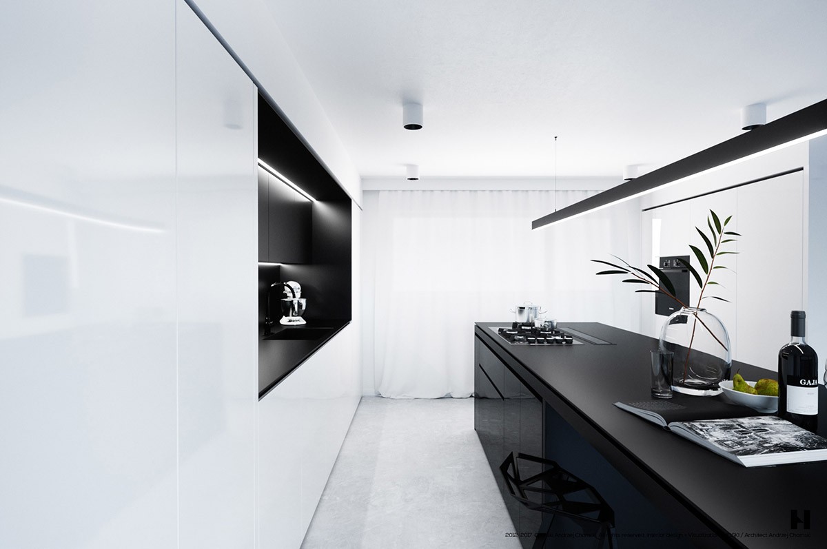
Trick the eye with high contrast. The larder units in this black and white kitchen go almost unnoticed. All the attention is drawn away from the slab fronted white cabinets by the unrelenting black base units and countertop combo opposite.
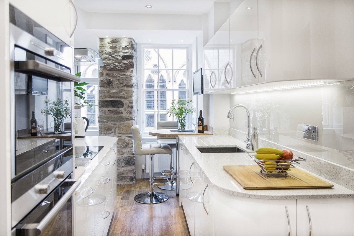
Just a small feature wall, like this rustic stone column, can completely transform the look of a room. A plain white facing wall at the end of this kitchen would have a very different effect.
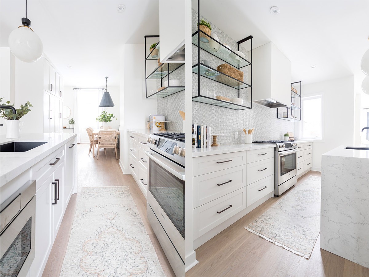
Are you a tidy sort of person? If you are, then open kitchen shelving can be used in lieu of all wall cabinets. If you’re not, better swerve this one.
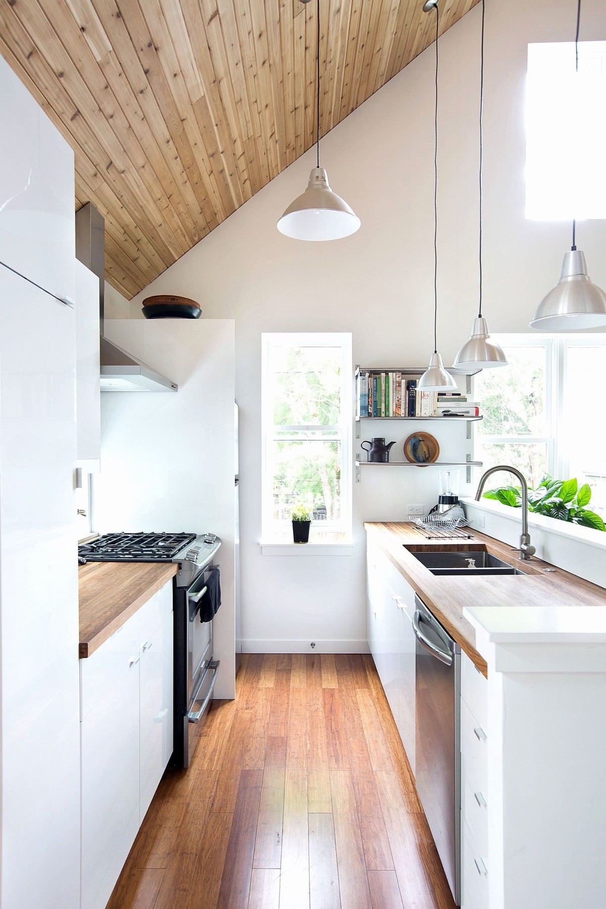
Open a window. If you’re not lucky enough to have a window at the end of your galley kitchen then consider having one put in. A small window can make a narrow space appear drastically more spacious, bright, and ultimately a more pleasant place to spend time in.
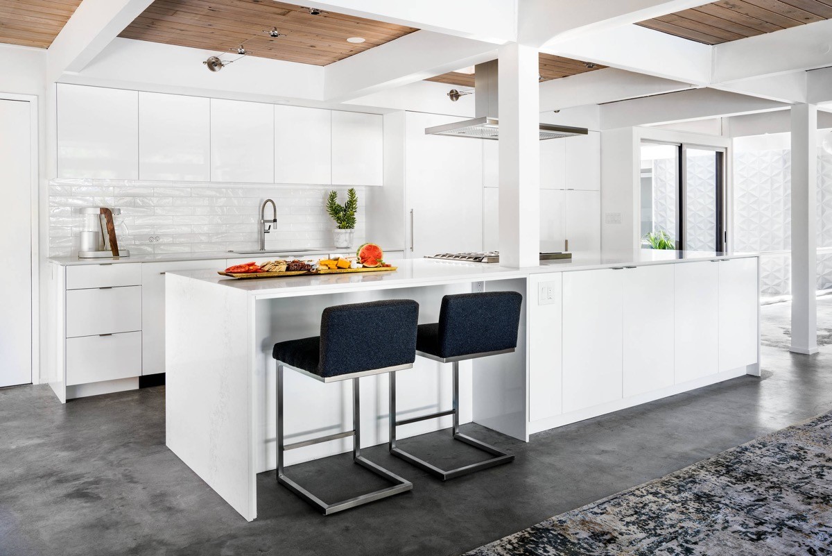
Don’t let obstacles stand in your way. This white kitchen runs straight through an architectural support by having the units wrap around it.
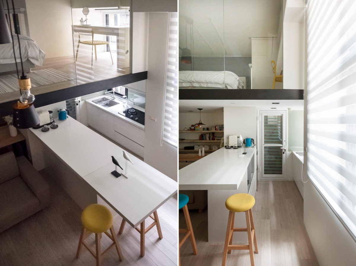
Brighten a bland scheme with small pops of colour; think bar stools and countertop appliances.
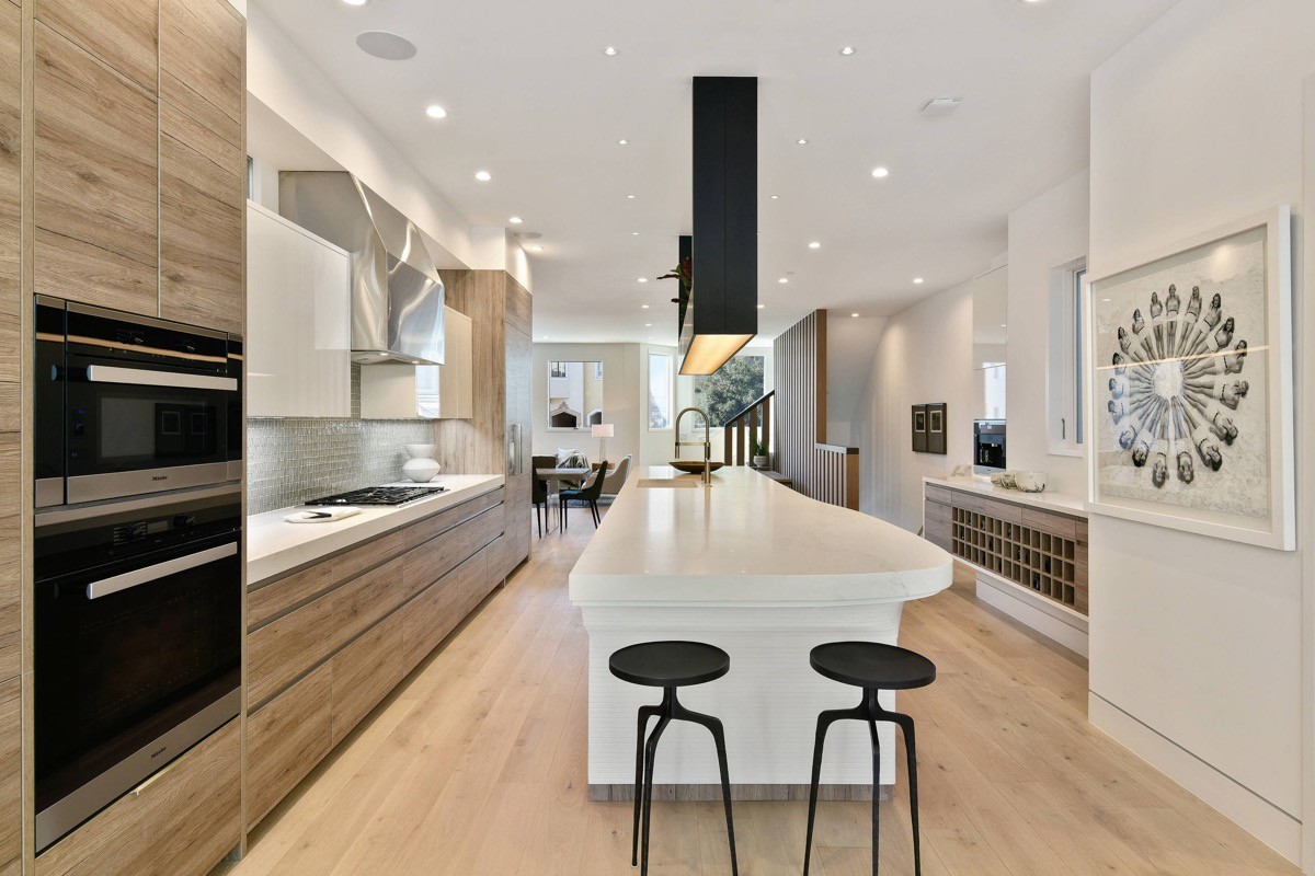
Black decor accents add weight to a white and wood kitchen.
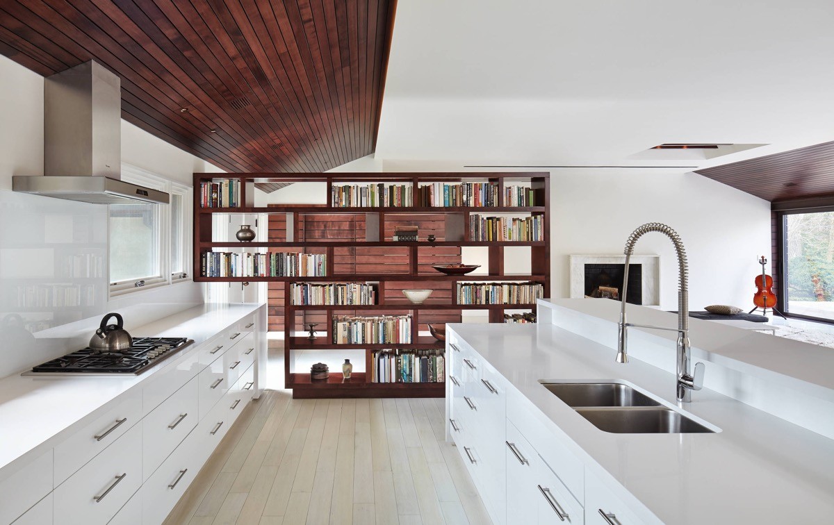
A bookcase acts as a rich feature wall at the end of this plain white setup.
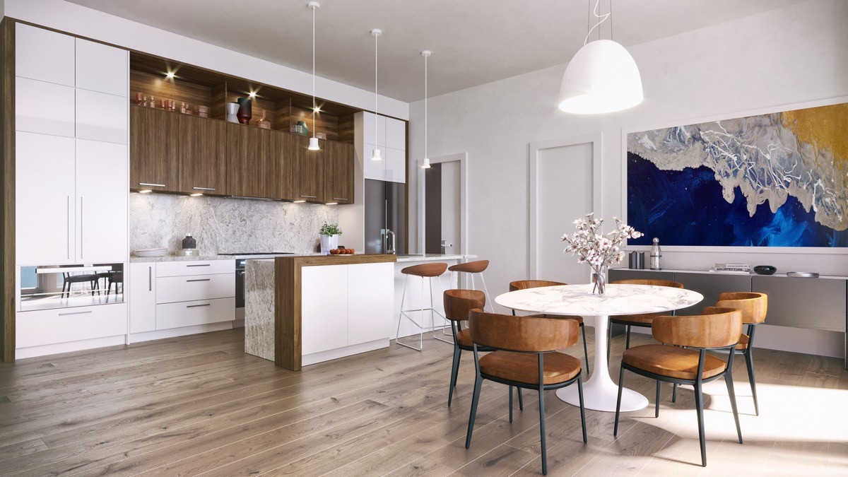
Introduce a wooden section to warm a white kitchen.
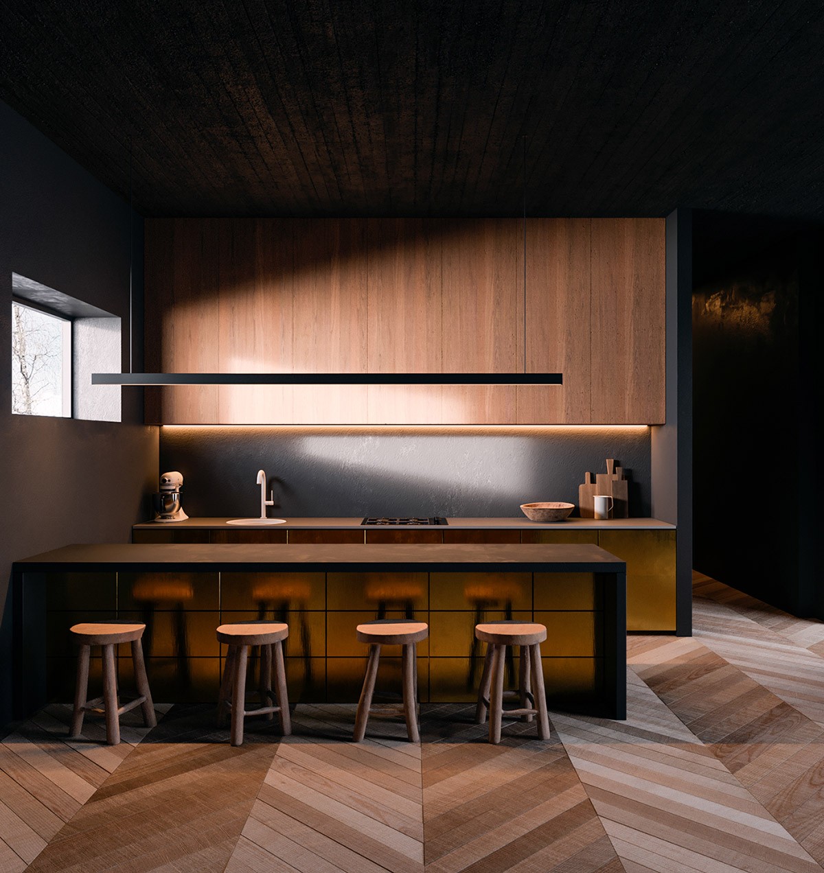
A linear suspension light accentuates a galley setup. Wooden bar stools reflecting off the metal surface of the counter add to the beauty.
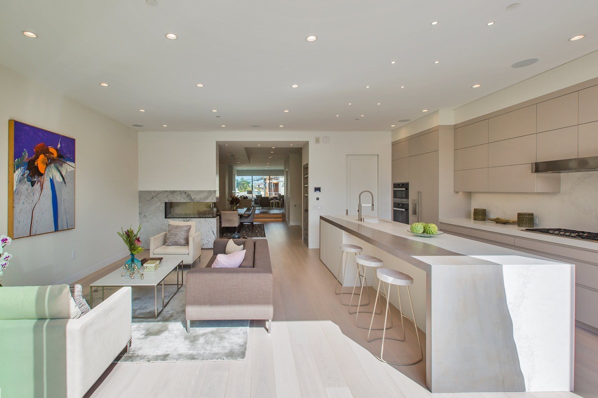
Break the boundaries. These kitchen bar stools are pulled up to a strip of cabinetry that is open at each end, which technically straddles this kitchen design between the galley and island categories.
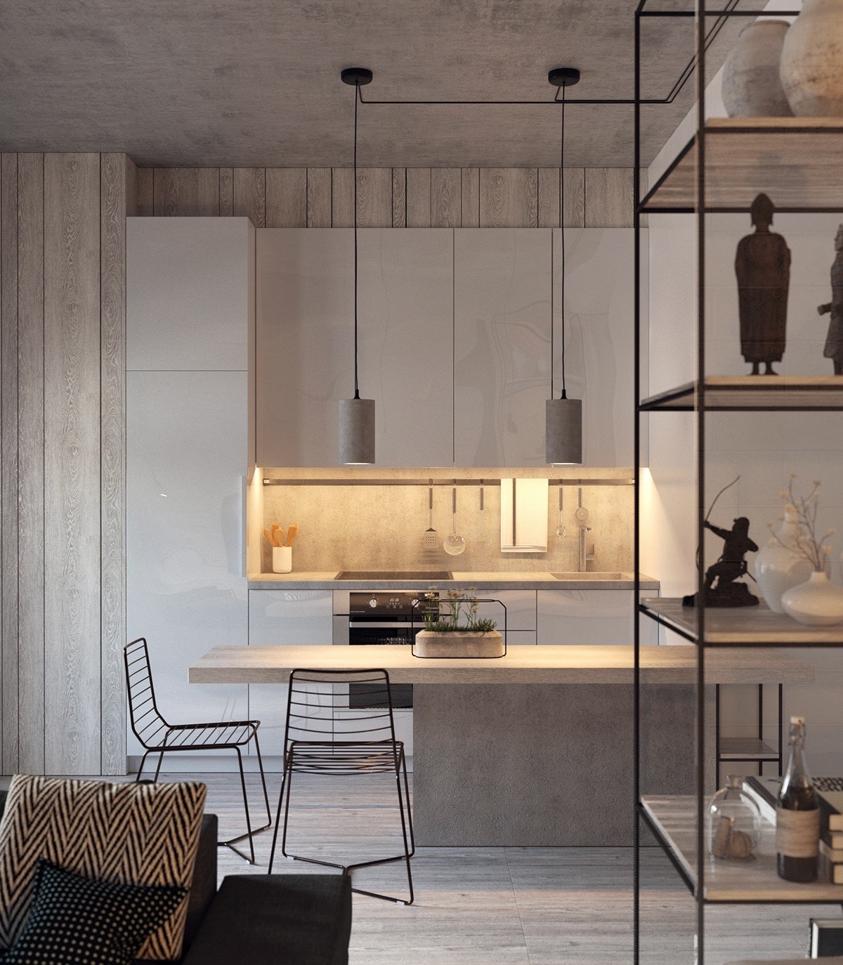
Lowering one side of the galley allows regular height dining chairs to be used instead of high bar stools.
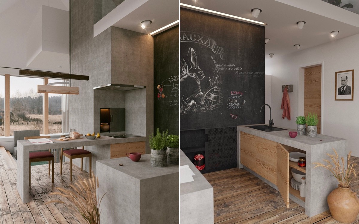
A chalkboard makes a cool and useful feature wall at the end of a kitchen galley space.
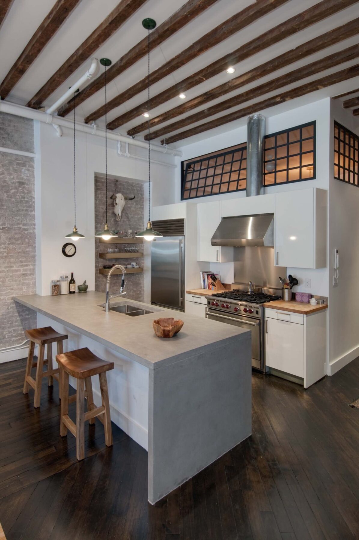
This industrial kitchen makes use of the end wall with a set of narrow shelves.
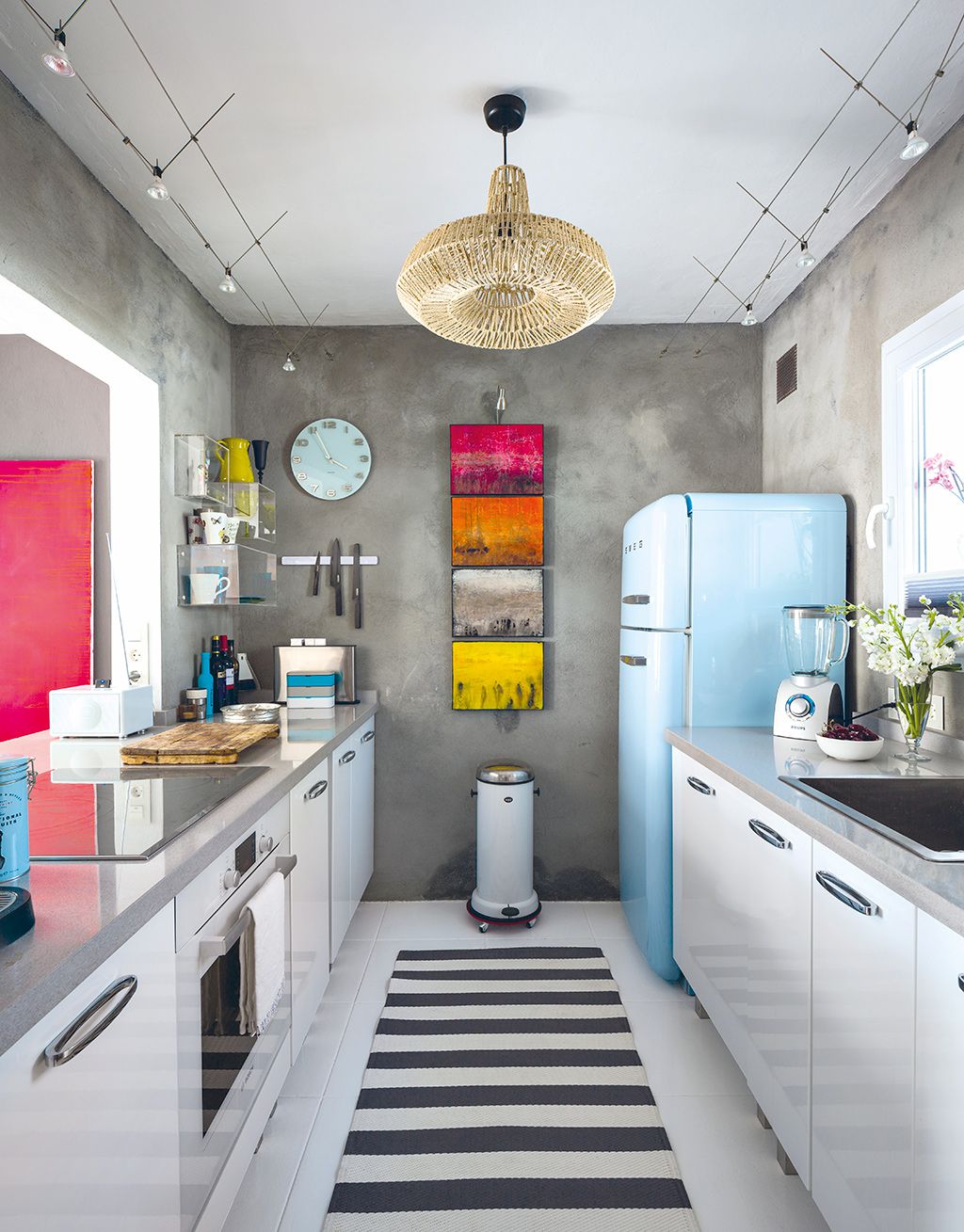
Choose a mobile trash can. A pedal bin on castors is a great idea for a long kitchen, as it can be wheeled easily from one end of the prep bench to the other.
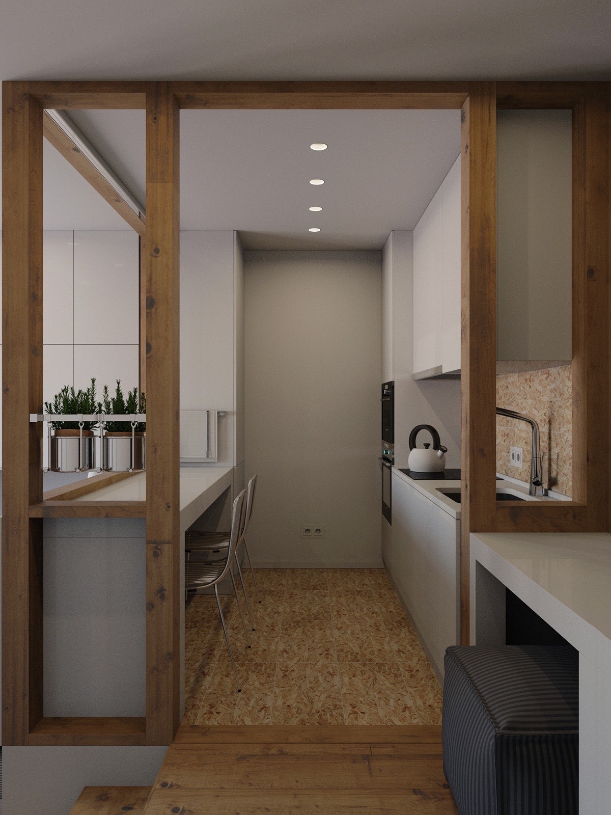
Open up the walls to make limited spaces feel more airy. You don’t even have to remove the supportive struts, simply eliminate the plasterboard.
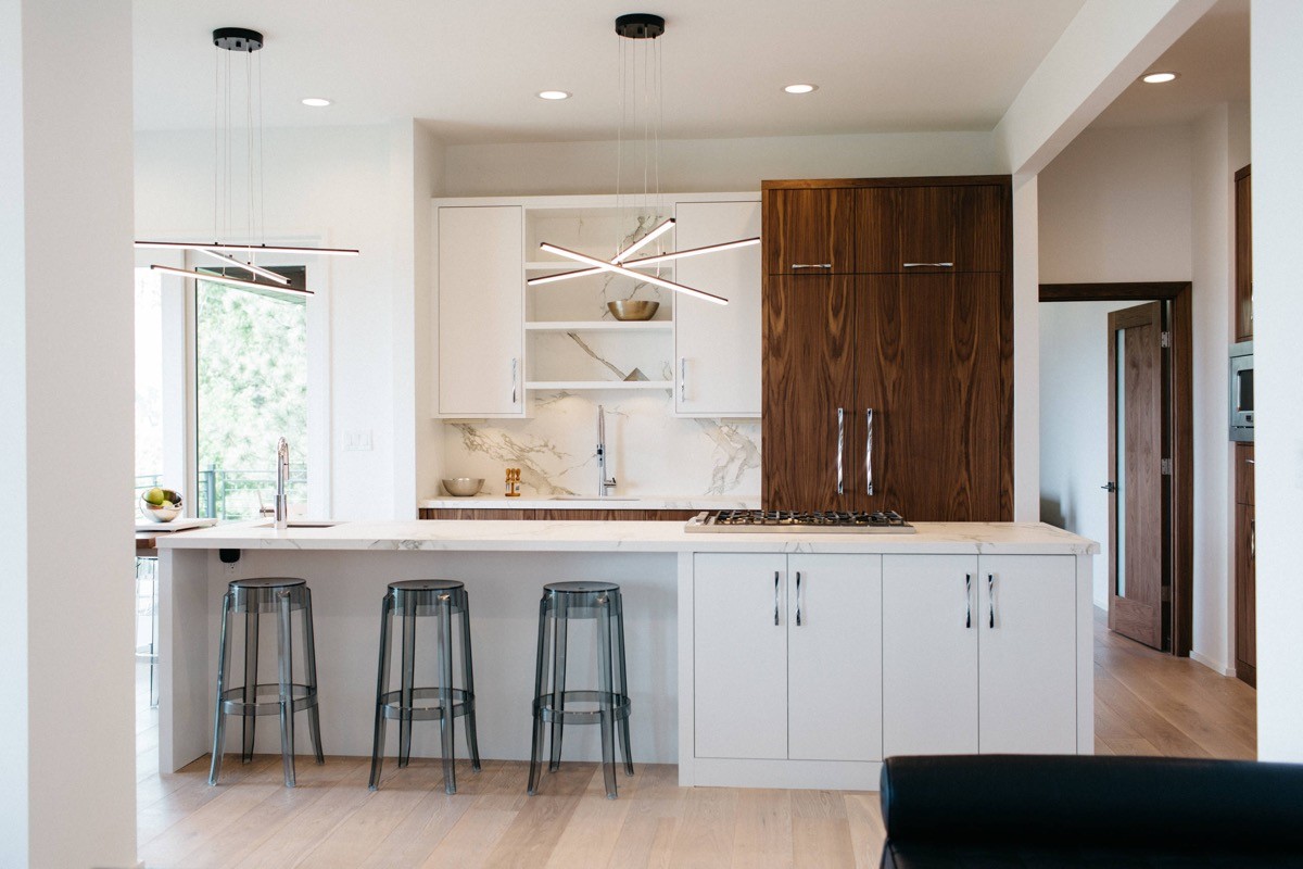
A large modern chandelier (or two) adds flair and grandeur over an open galley arrangement.
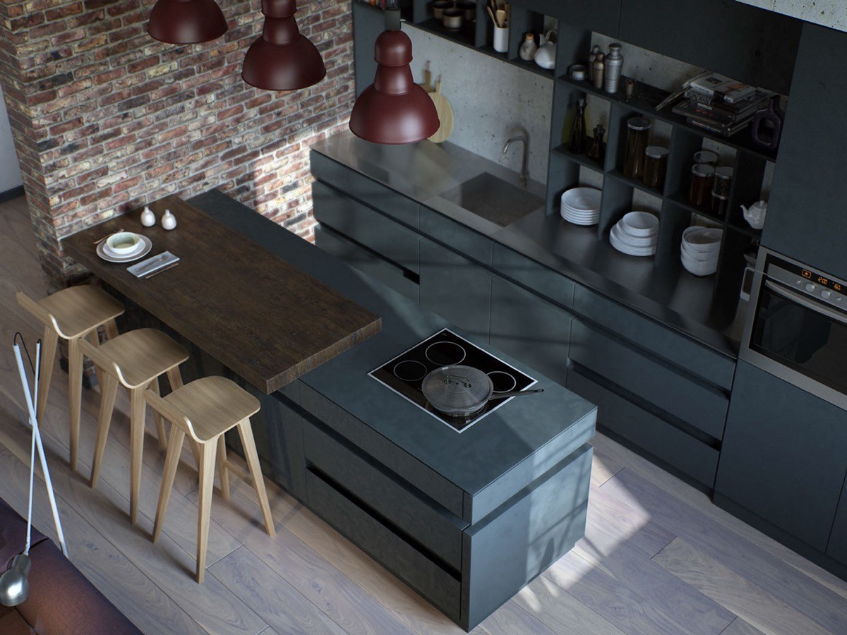
Create an overlapping dining top. This grey kitchen bench is overlapped by a dark wooden top with an overhang, to create a comfortable and isolated dining spot.
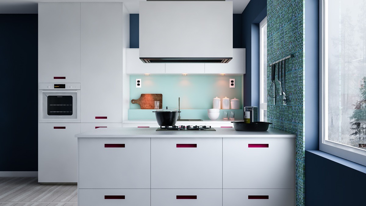
Island extractor hoods mean that stoves can be situated on the outer perimeter of a galley.
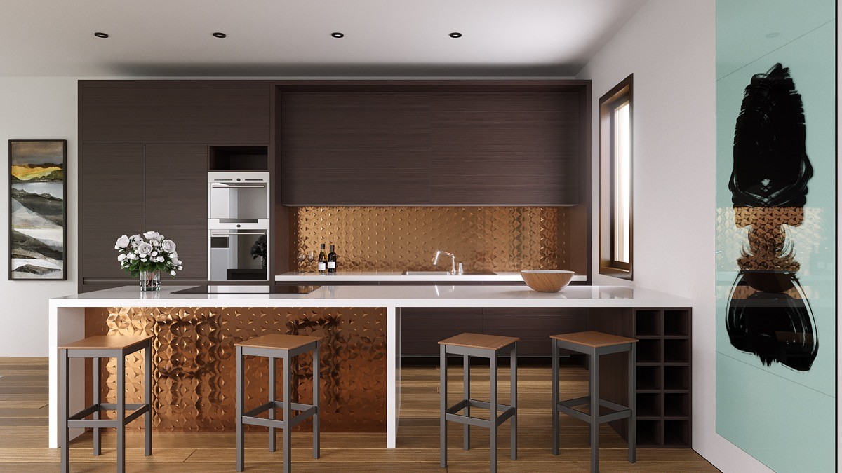
Look high and low. Copper panels tie the two sides of this design together, with the copper at the back situated higher to keep it visible to the rest of the living room.
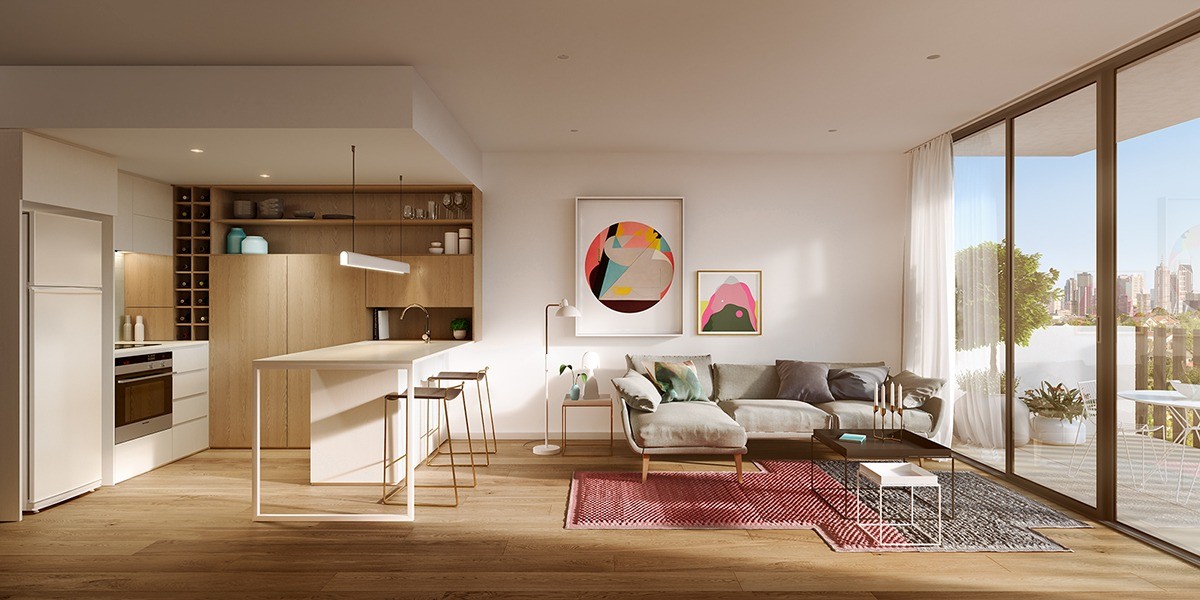
Use the full height of your kitchen. This one has a wine rack that extends from bench height up to the ceiling, plus a set of high shelves that skim the rafters. Keep seasonal items and special occasion crockery in higher volumes so that you’re not having to climb up step ladders on a regular basis.
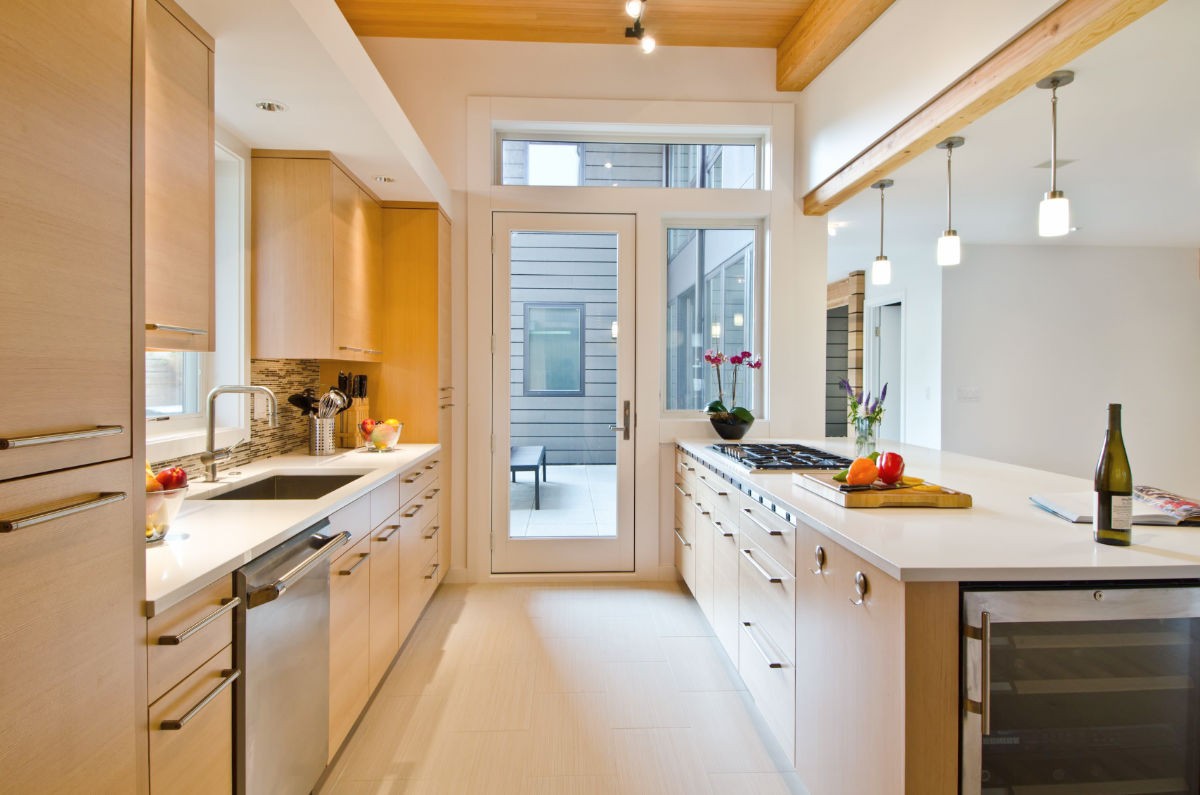
If you are considering installing a window at the end of a galley kitchen, then how about going the whole hog and making it a glass door out to the garden or patio area?
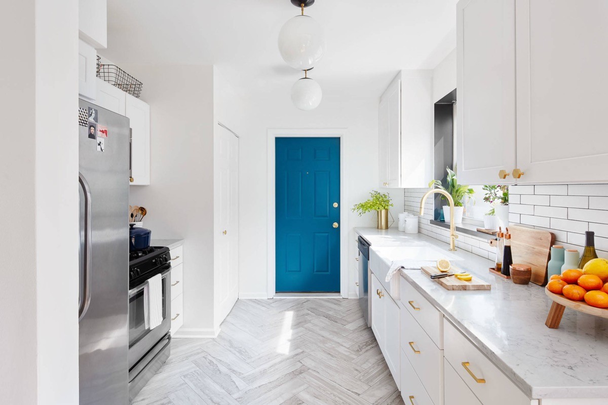
This blue door provides an interesting effect. A white door in the same space just wouldn’t give the same punch to the pale scheme. Note how the adjacent door has been left white though, because sometimes less is more.
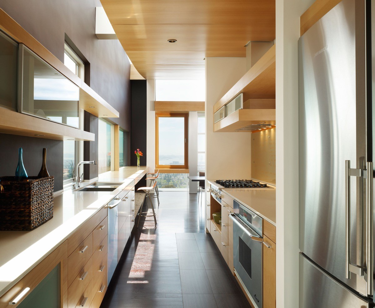
Create handy niches. The space below this stovetop has been left open to hold cooking pots close at hand.
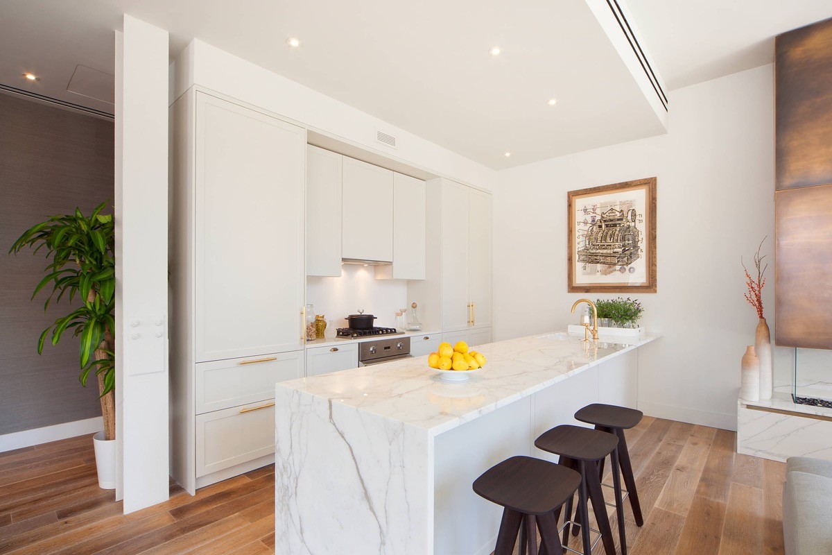
It’s always about the finishing touches. Whether it’s shiny gold handles or a stylish modern fruit bowl to dress the countertop.
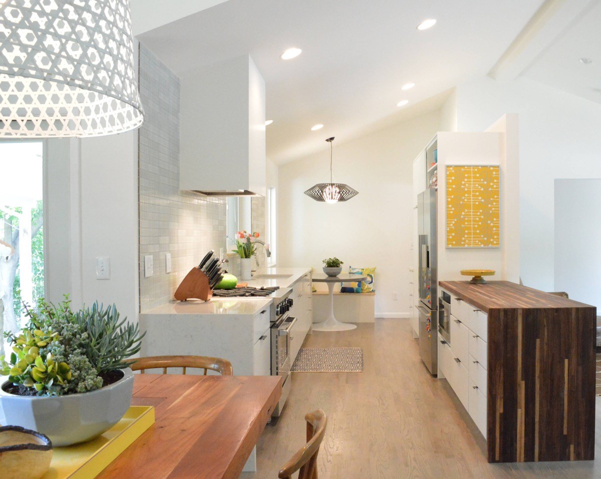
Mix and match countertops to add interest.
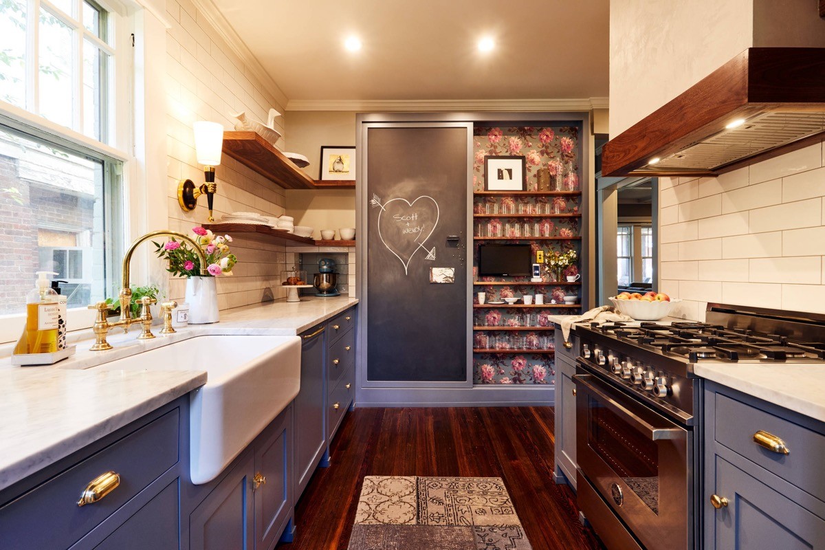
Wallpaper the back of a shelving unit. A beautiful floral print or a striking geometric design gives a personalised touch.
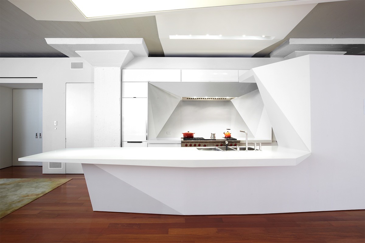
Galley kitchens don’t always look strictly straight...
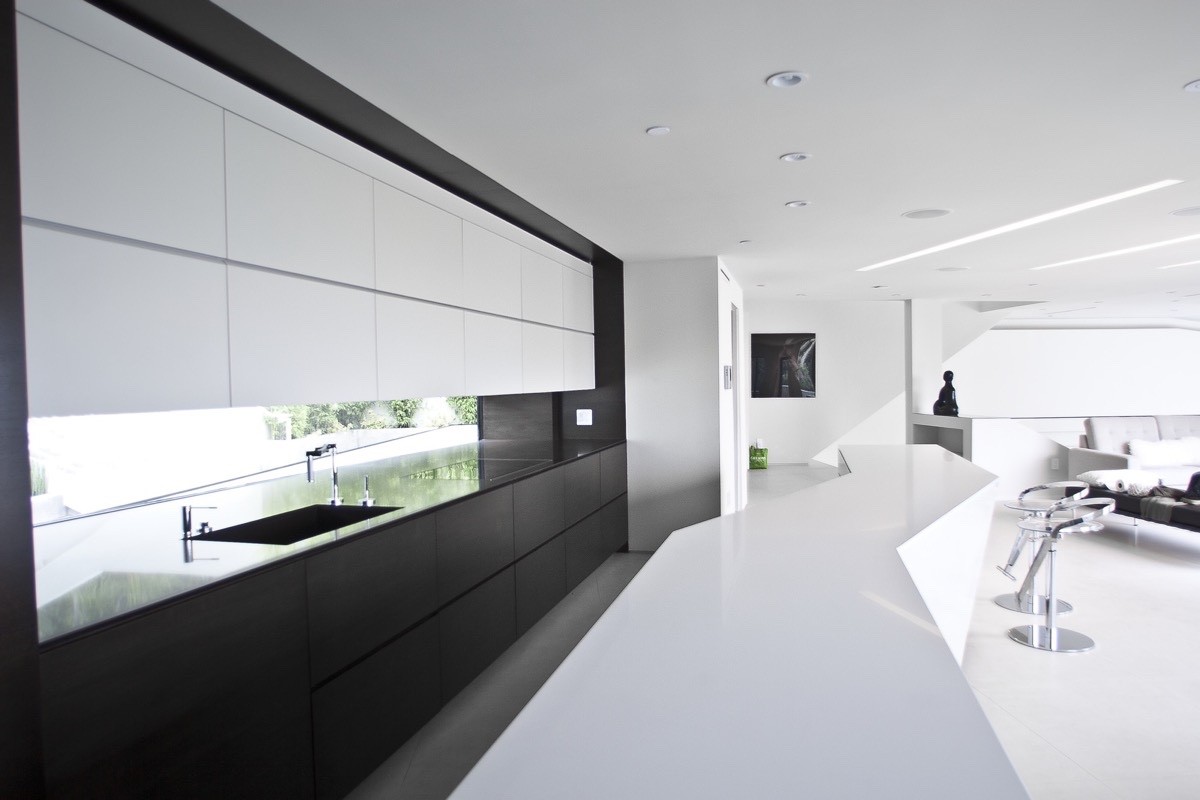
… The open side could be a geometric cut unit, a zigzag or waved volume.
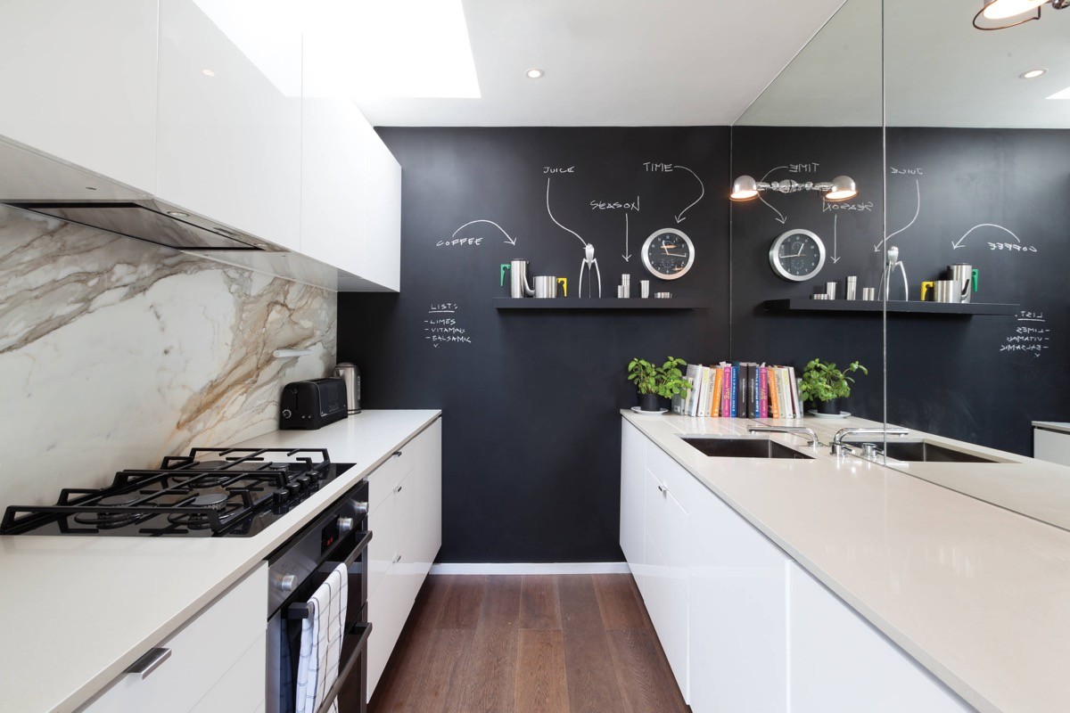
Can’t trust yourself to put things back where they belong on open shelving? Then how about this quirky chalkboard labelling technique to keep you on the straight and narrow. A “juice” label points to the Juicy Salif citrus juicer by Philippe Starck for Alessi, and there’s even a pointer above the kitchen clock labelled “time” - just in case you forget!
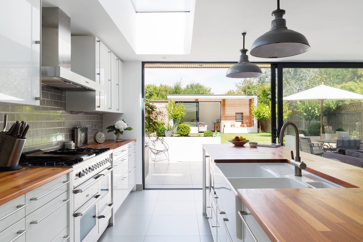
Think about how you use your kitchen before you start. This huge galley kitchen sink takes up a lot of bench space, but if you’re not a fan of dishwashers then it’s worth the real estate to keep the bench clear of used crockery.
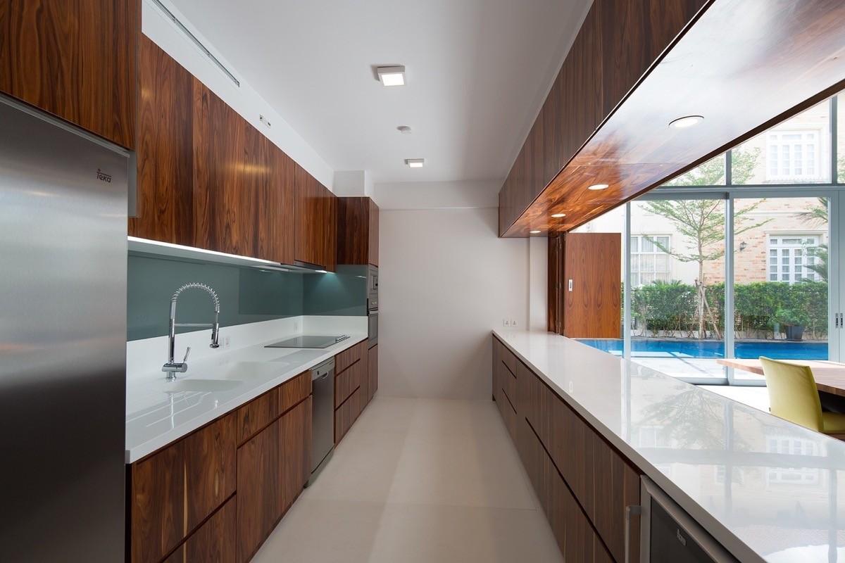
Install a lighting soffit rather than low hung pendant lighting for a no-fuss sleek modern kitchen.
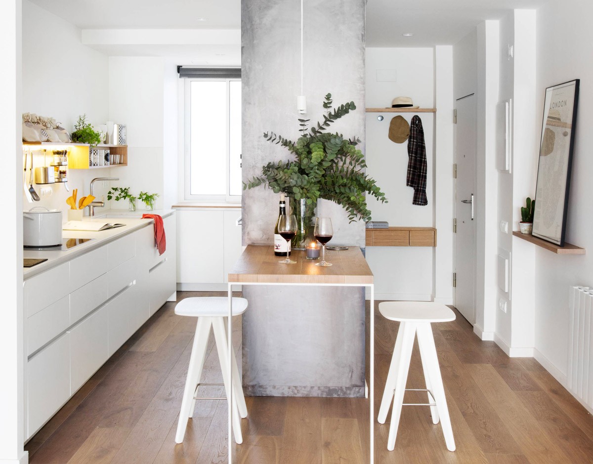
Perch a table at the end of a wall of integrated units.
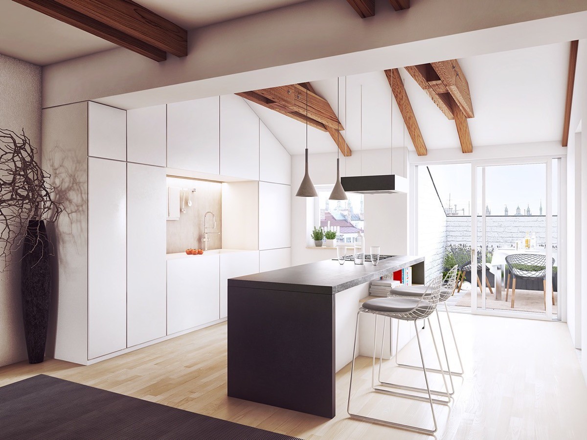
Shape wall units into the eaves to maximise storage.
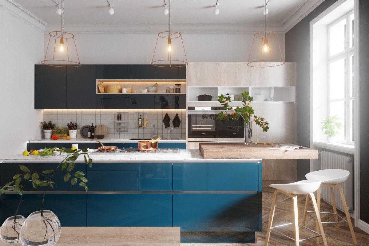
Clear glass and wirework lights keep a space looking open. These unique kitchen pendant lights allow the eye to see straight through.
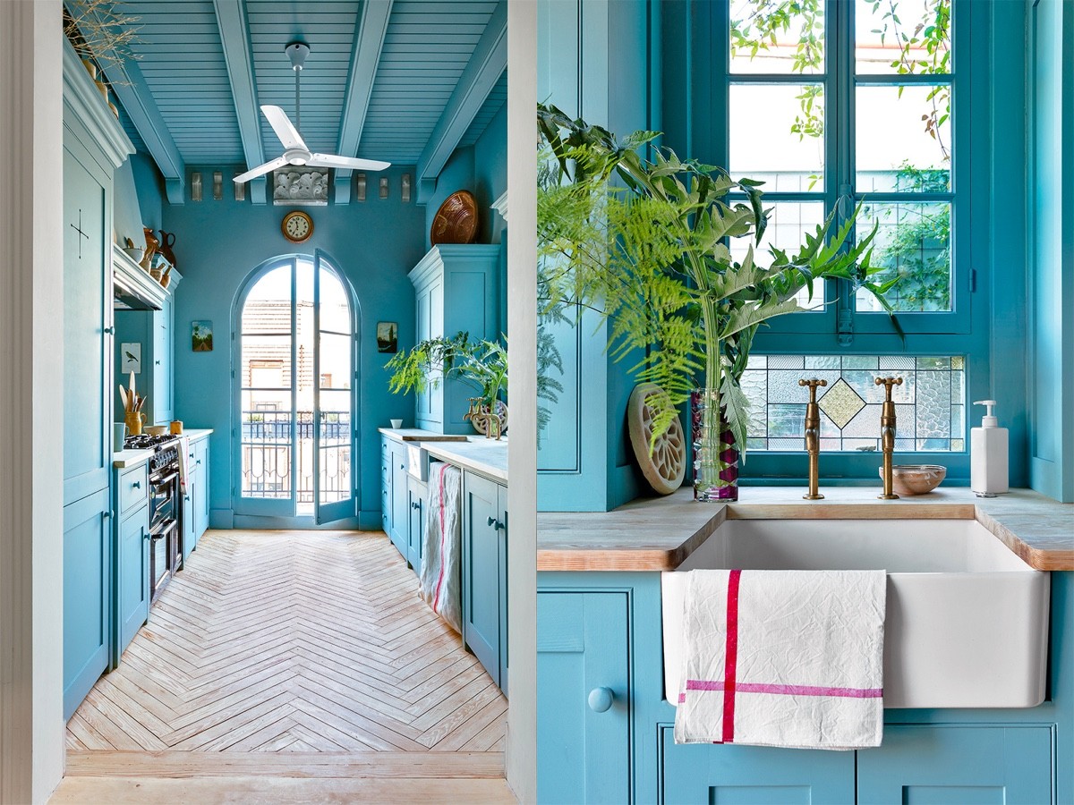
Go all out on a colour theme. This blue kitchen has the same shade of blue units, walls and ceiling.
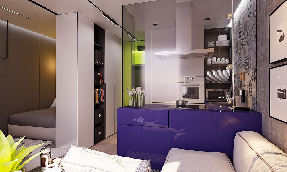
Prevent cooking splashes over an adjacent living area with a glass screen.
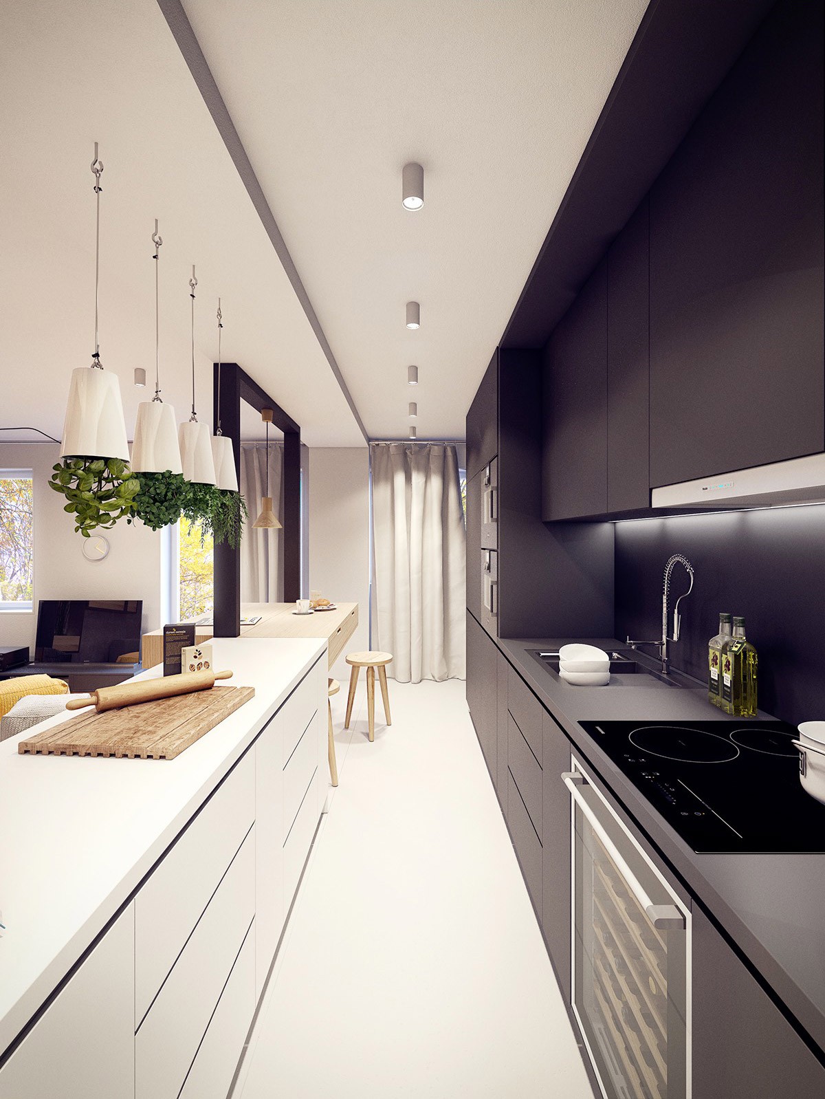
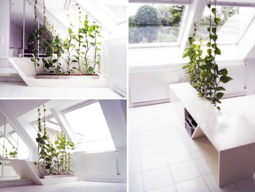
Grow your own. Check out these unique hanging planters that don’t take up a single millimetre of bench real estate.

Play to the strengths of the room, and play up the quirks too.
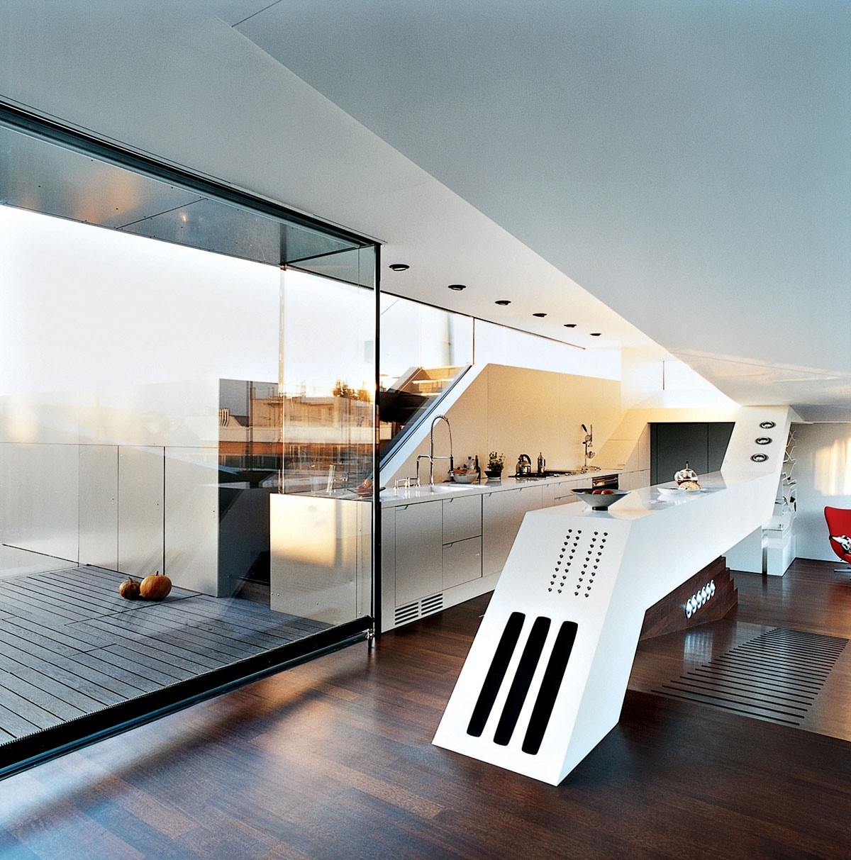
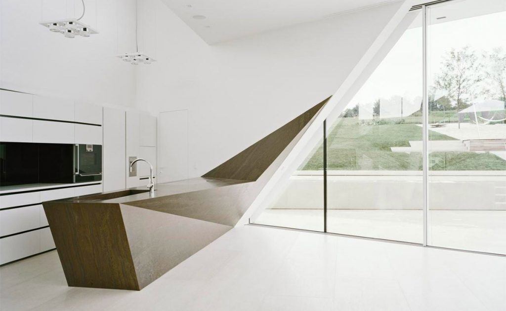
Think outside the box. This slanted futuristic kitchen bench skims straight over a slope in the floor.
