Wood is the champion of versatility – easily shaped, pressed, painted, refinished – a truly multifaceted resource that has shaped the world of interior design from the beginning. But for all the ways you can change this material unbounded by imagination, the inherent beauty of natural wood has proven to withstand the test of time on its own merit. The photosets below show that even the most modern interiors can benefit from the warmth and organic appeal that only natural wood can provide. Are light natural finishes the right choice for your dream home? Browse the photos below to see how it looks in the context of five different homes.
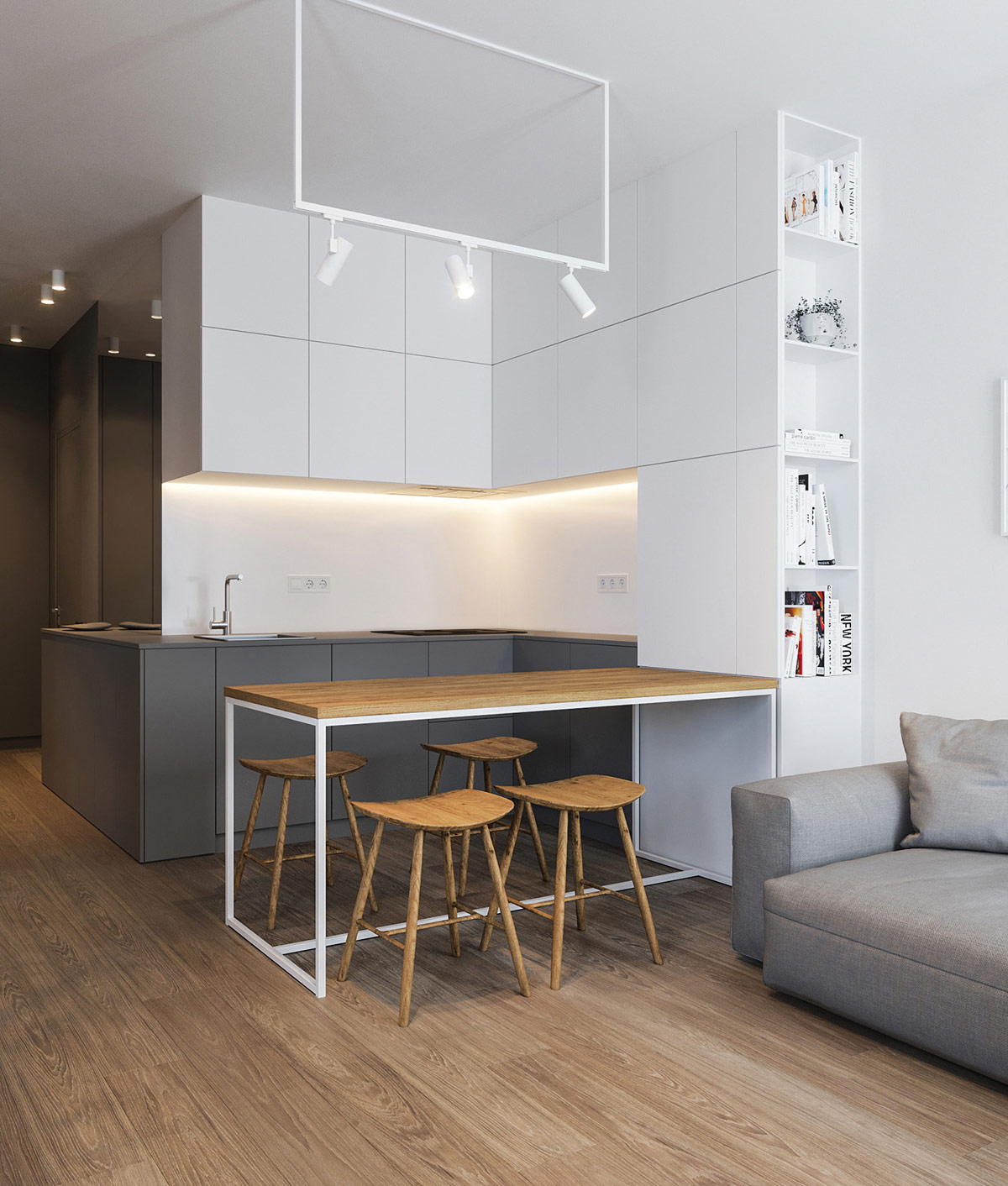
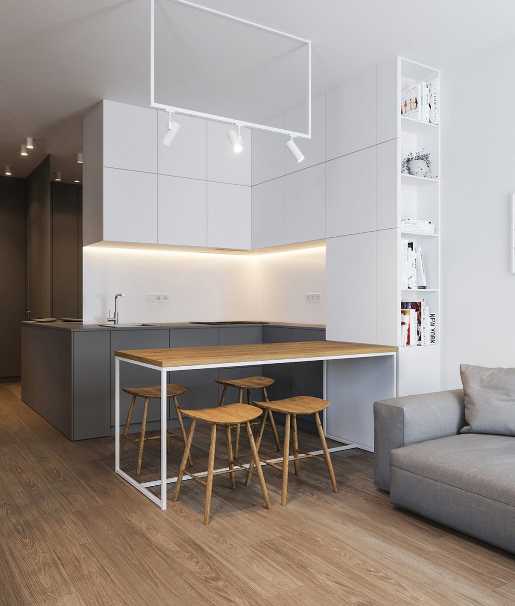
Let’s start with the grey and white kitchen of a fabulous minimalist home. While the interior itself feels sharp and refined, the natural wood stools seem to add a touch of familiarity that feels like home. In a space without extraneous decoration, every knot and ribbon of grain puts its effortless artistry on display.
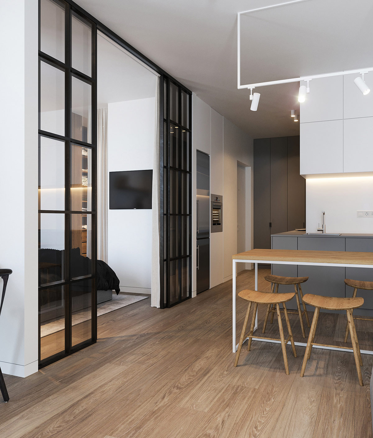
Of course, the saddle stools are not the only wooden element here. The floor features straight and clean wood grain while the chairs stand out with a more rugged rustic character.
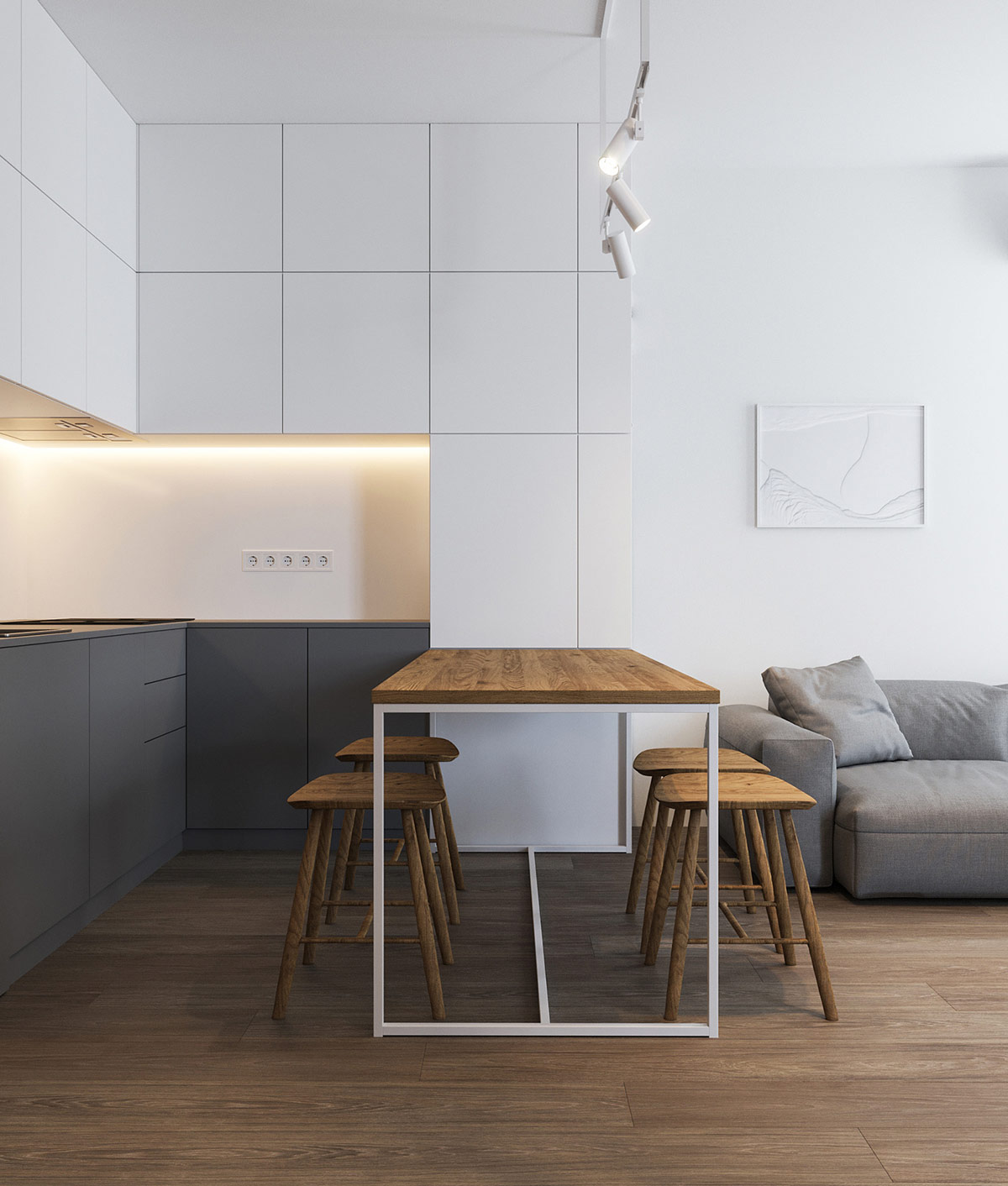
While wood is naturally decorative, the backdrop is as starkly minimalist as can be. The white and grey cabinetry betrays no hints of handles or hardware. The lighting and table frame echo the clean lines found throughout.
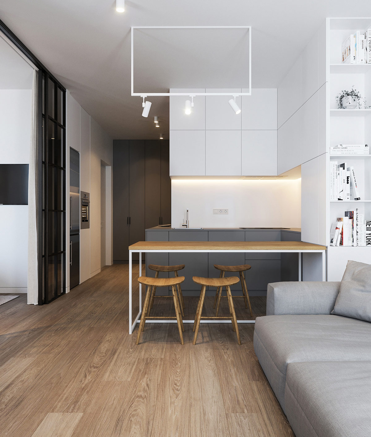
This white and grey theme continues throughout the home, from the lower cabinets to the tall closets in the hallway.
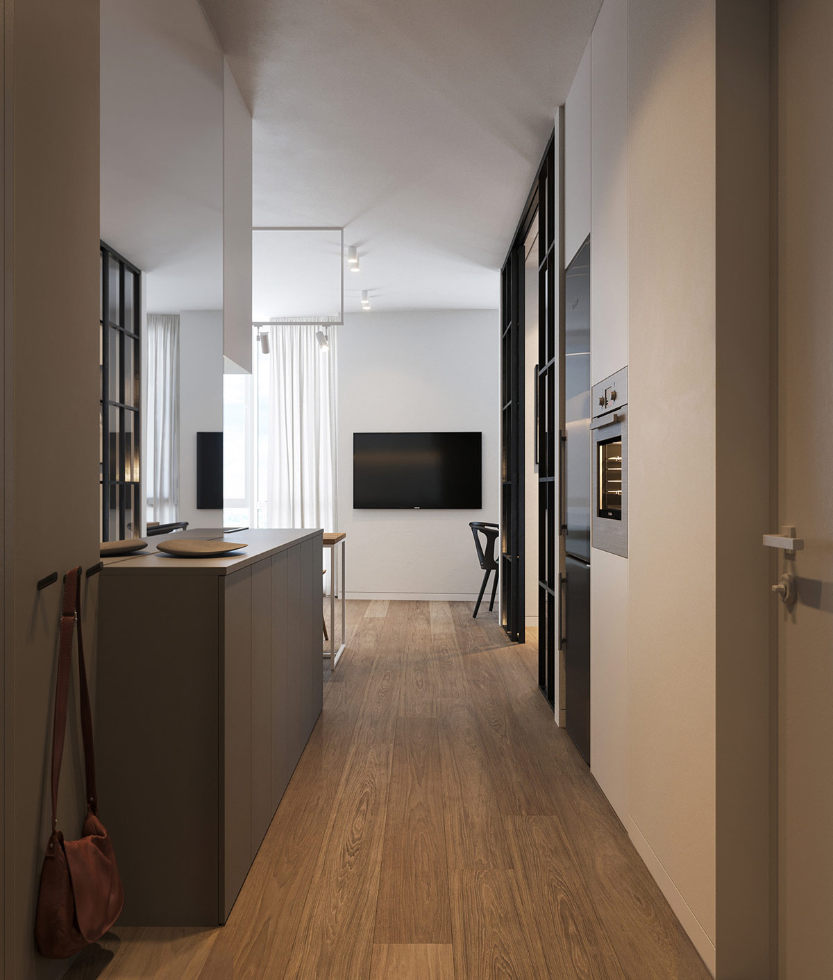
The hallway is simple yet functional. Small hooks hold essentials on the left. The side of the kitchen counter wraps around into the hallway to provide extra storage.
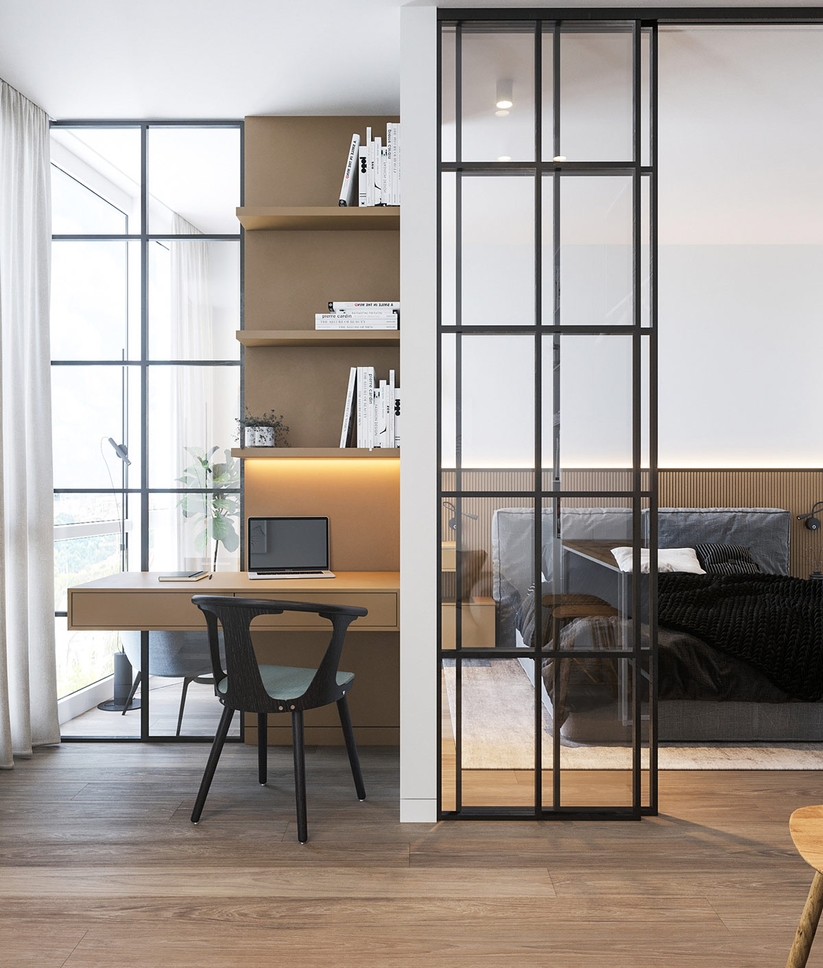
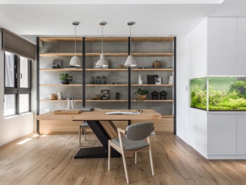
Tucked into a cozy living room niche, a small home workspace doubles up on sunlight. At night, cove lighting built into the bookshelf creates a calm yet productive ambiance.
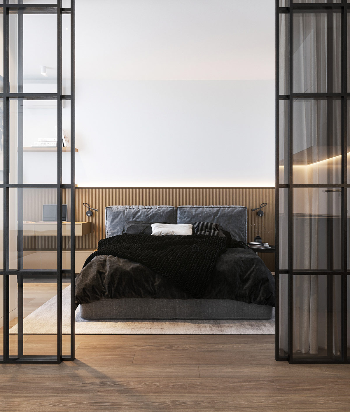
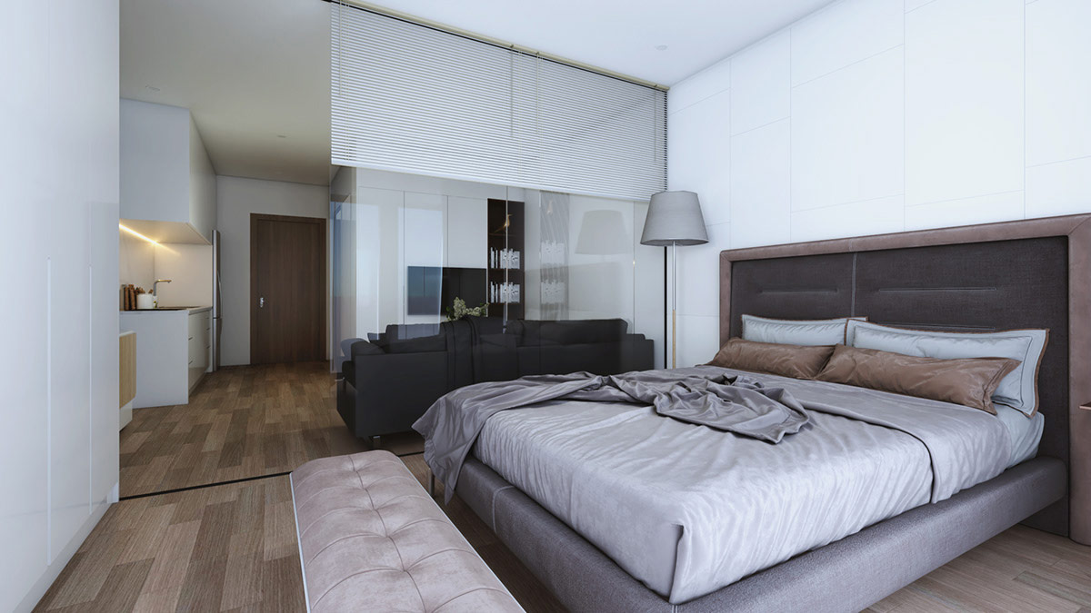
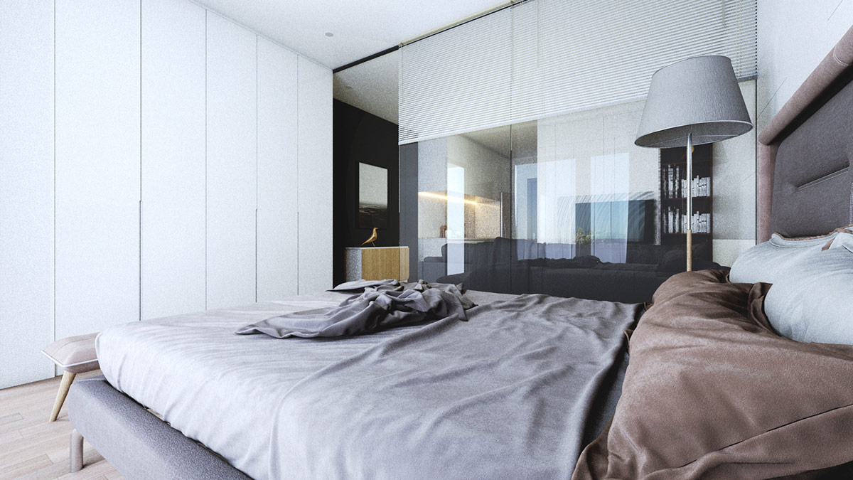
With sliding doors backed by thick curtains, this glass wall bedroom can mingle with the open living area or become a private retreat on a whim.
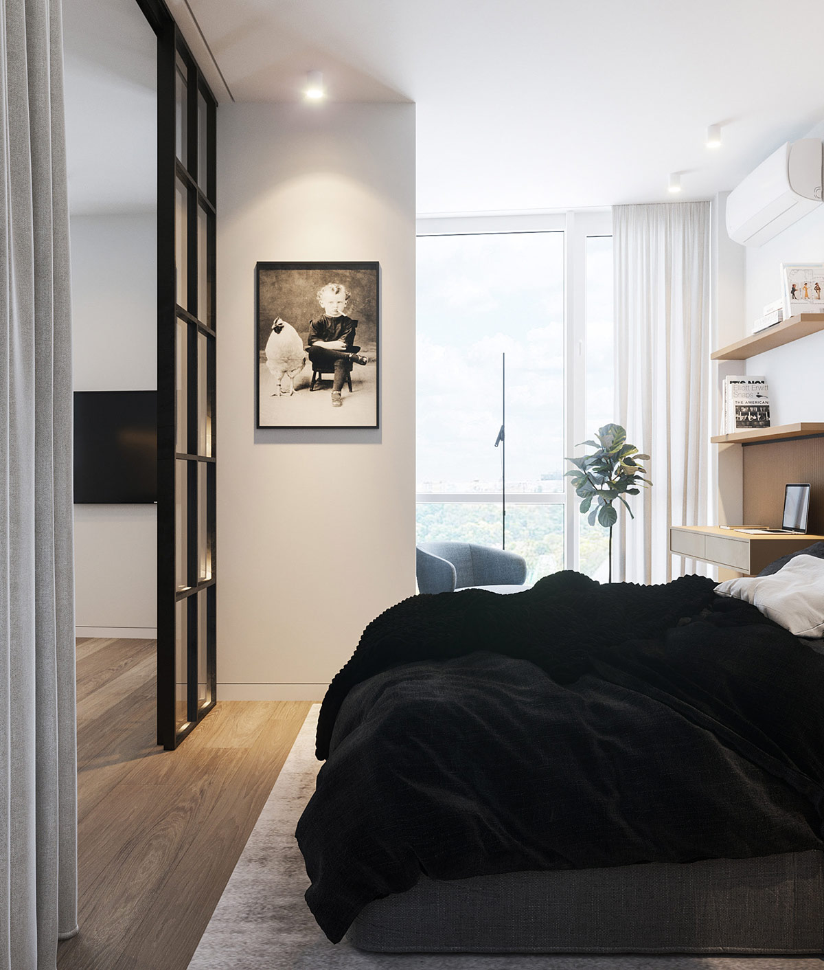
Natural wood plays an important role throughout this home. It could be left as the star of the theme or played down to become an underlying constant that ties the décor together.
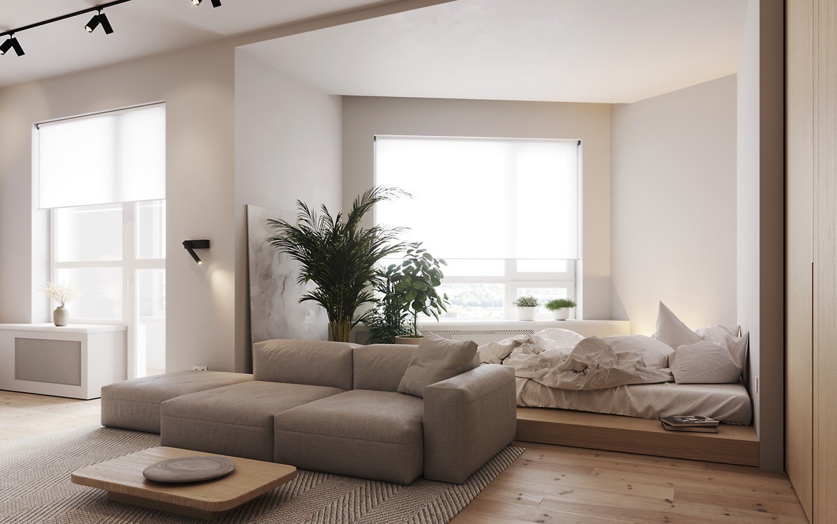
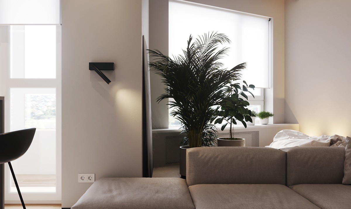
In this next interior, natural wood tones play an even more important role. In fact, this entire theme seems based around what feels and looks the most natural. Wood occupies a substantial amount of the surface real estate while indoor plants bring in a verdant slice of the outdoors.
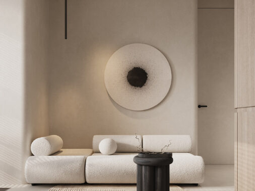
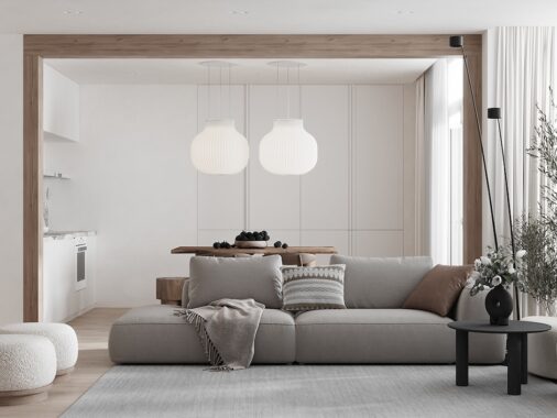
Even the sofa takes cues from the outside world, low and rounded like river-worn pebbles. The stone plate on the low wood table seems to underscore this choice.
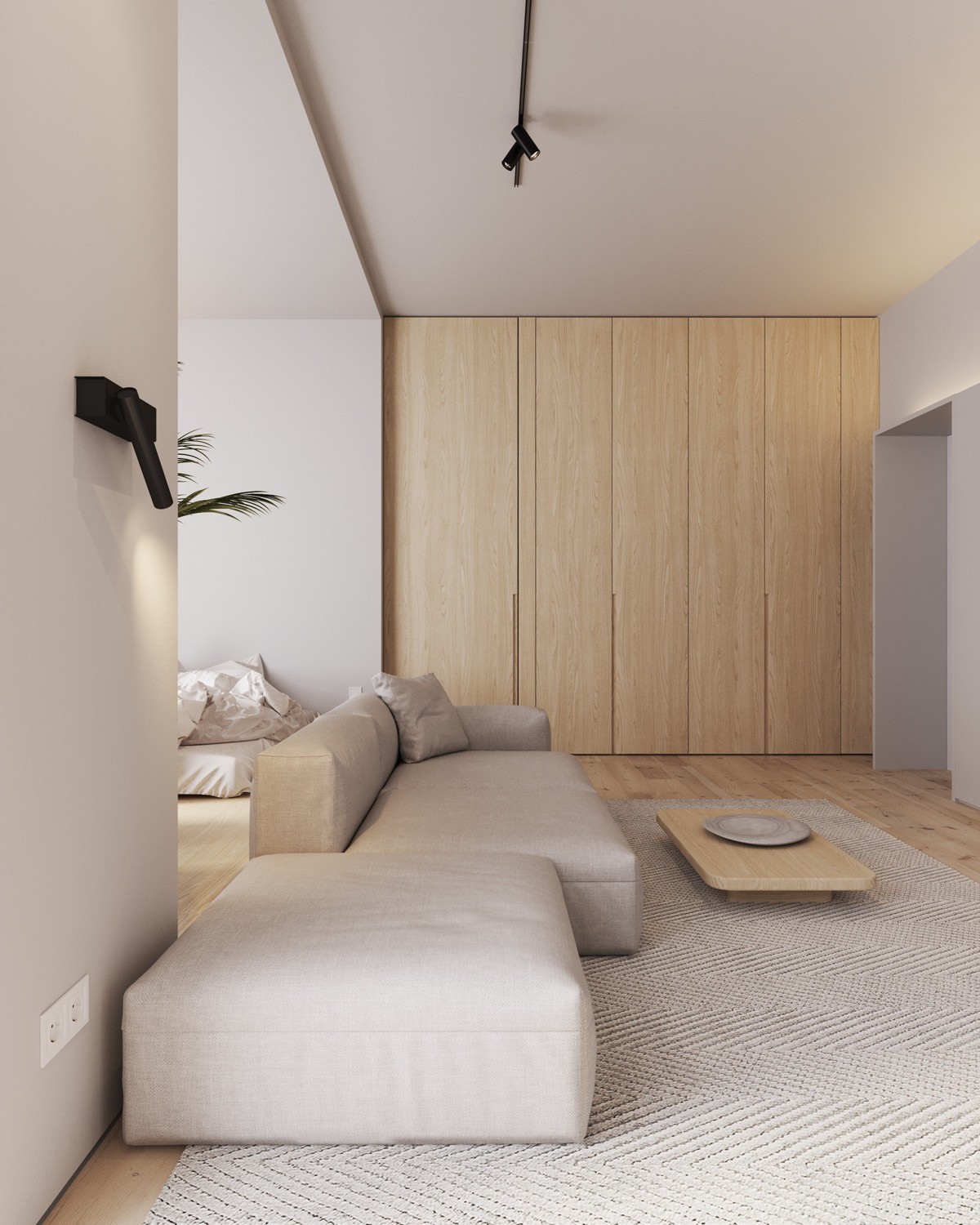
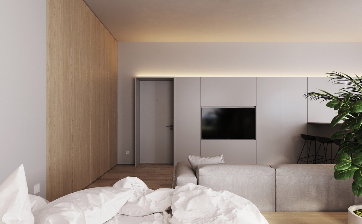
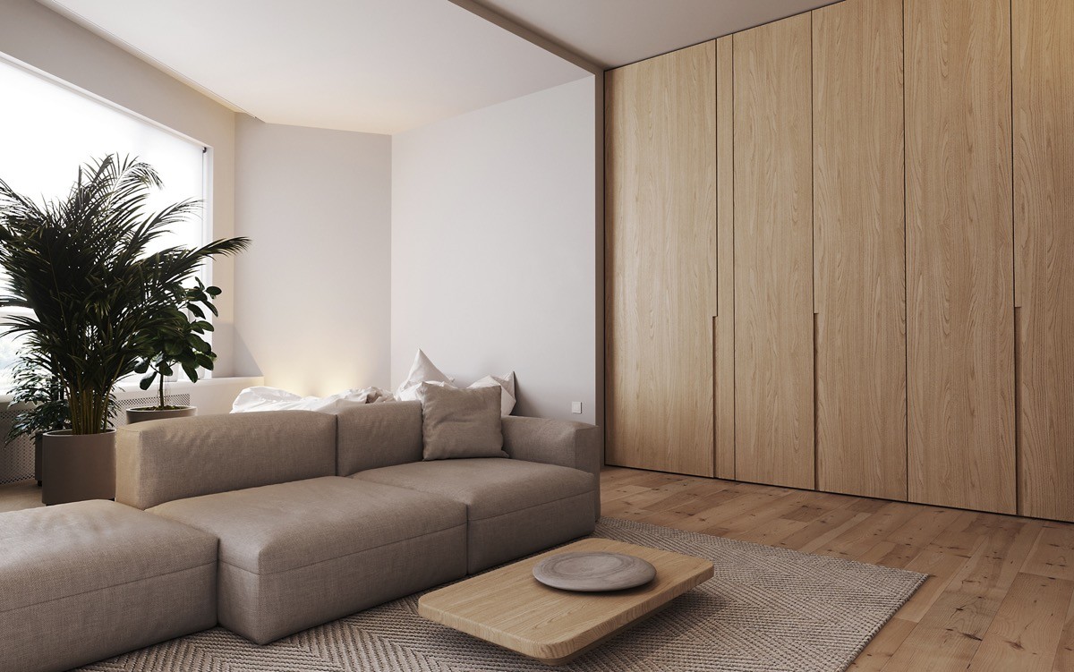
Large wood-clad cabinets facilitate the clean simplicity of this minimalist living room. Maintaining a clutter-free environment is always easier when everyday objects are hidden easily within reach.
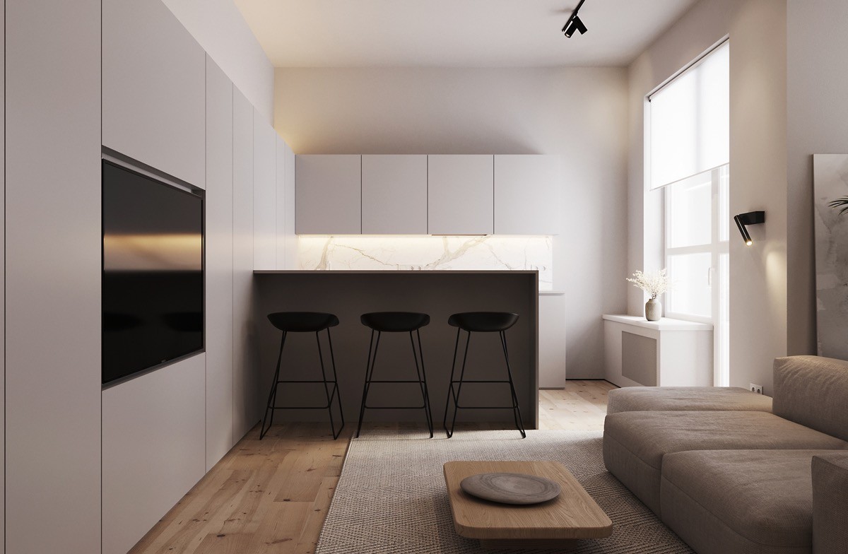
This open living space includes the kitchen as well. The transition between living room cabinetry and kitchen cabinetry is seamless.
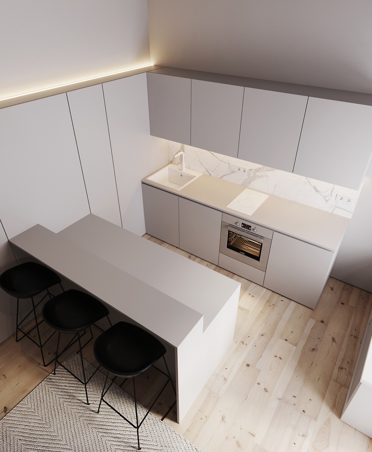
This galley kitchen design includes natural elements as well. Besides the natural knotty wood floor, the backsplash makes a luxurious impression with the look of rich marble veining.
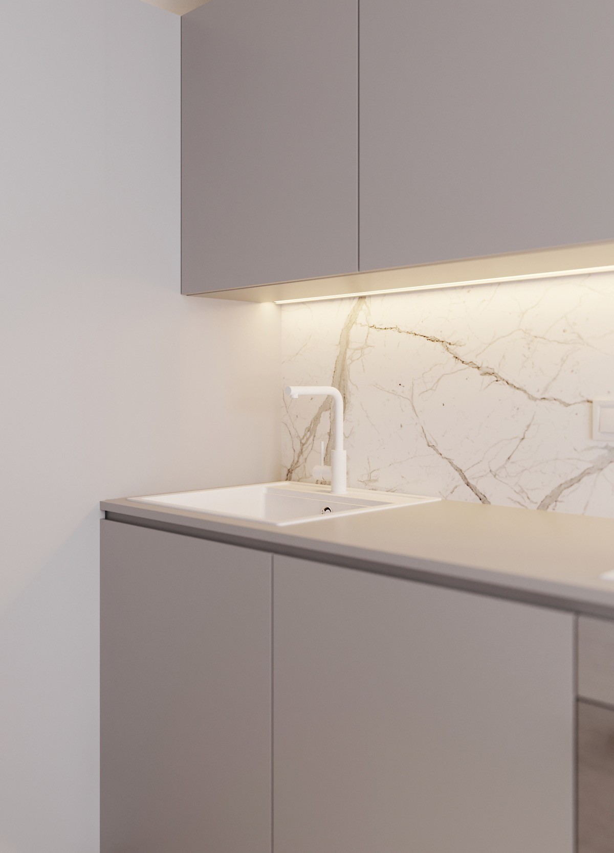
Minimalist spaces like this one require full attention to detail. Even this unique faucet keeps with the theme, finished in white to match its surroundings flawlessly.
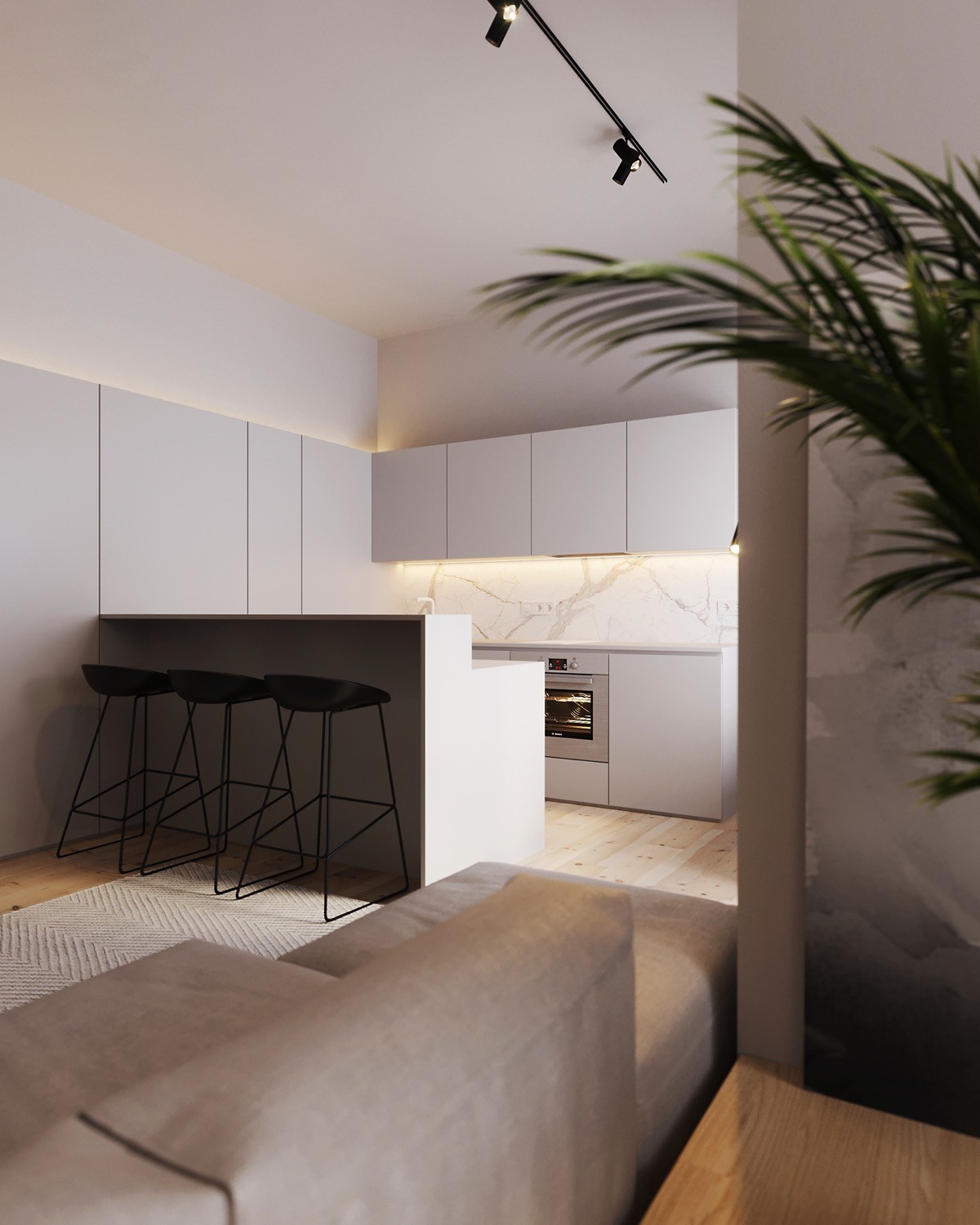
Light and shadow are another natural resource utilized here. The space beneath the breakfast nook is bathed in darkness and the stools beneath embrace it. These handsome stools are from the About a Stool collection by Hee Welling.
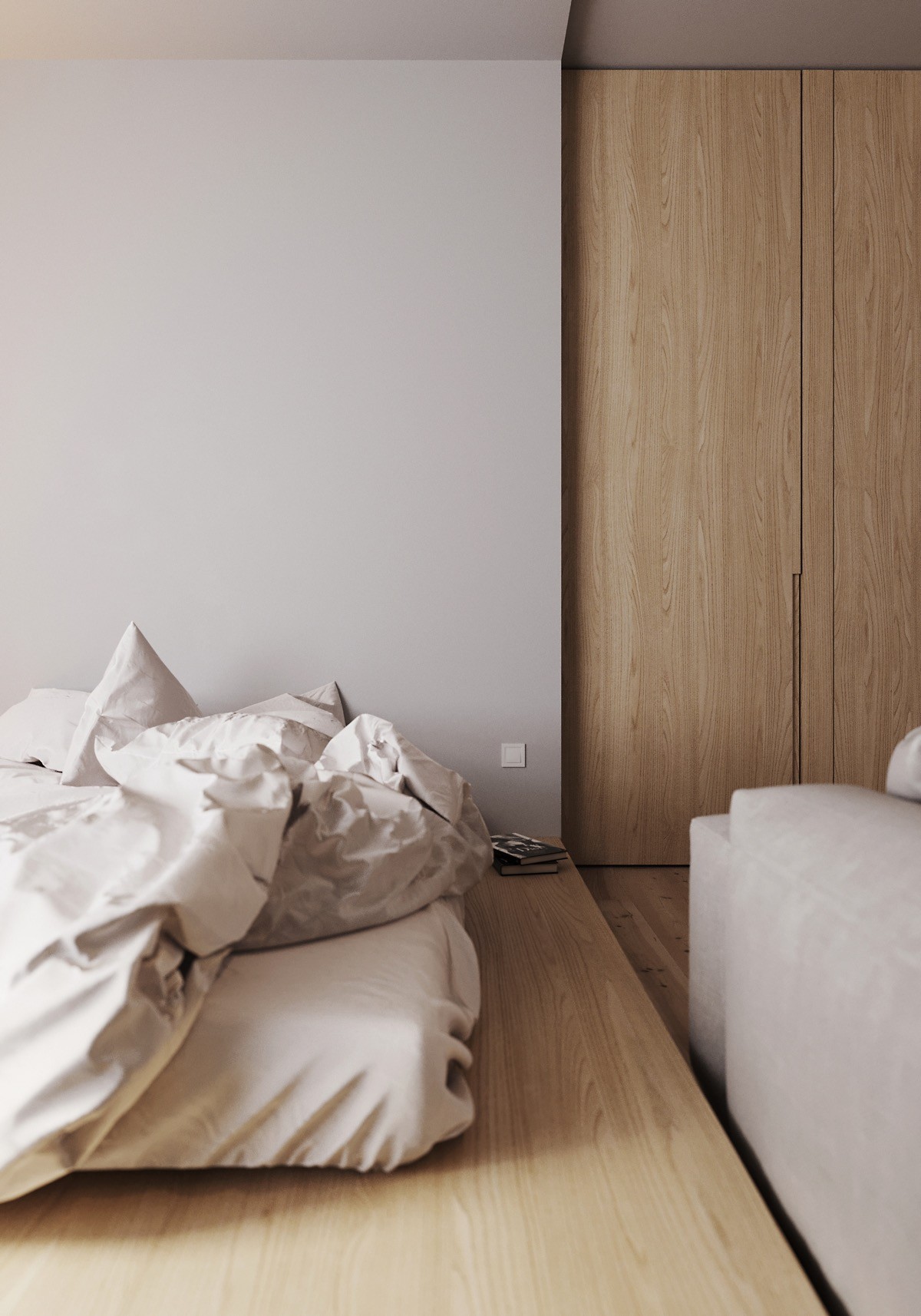
Light wood finishes are finding renewed popularity for good reason – more modern than the orange hued finishes of yesteryear, while retaining the warmth lacking in other contemporary favorites like grey and onyx.
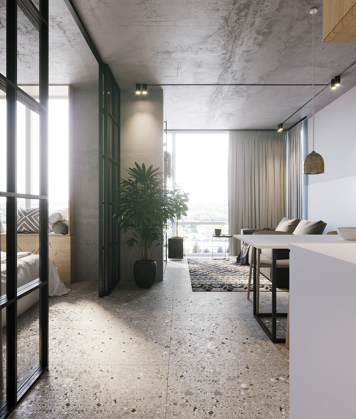
Here is a home that demonstrates how natural wood elements can fit within industrial spaces as well. Industrial interiors typically rely on heavily weathered wood, or wood with especially dark finishes. This space uses wood sparingly but chooses light natural finishes in every instance.
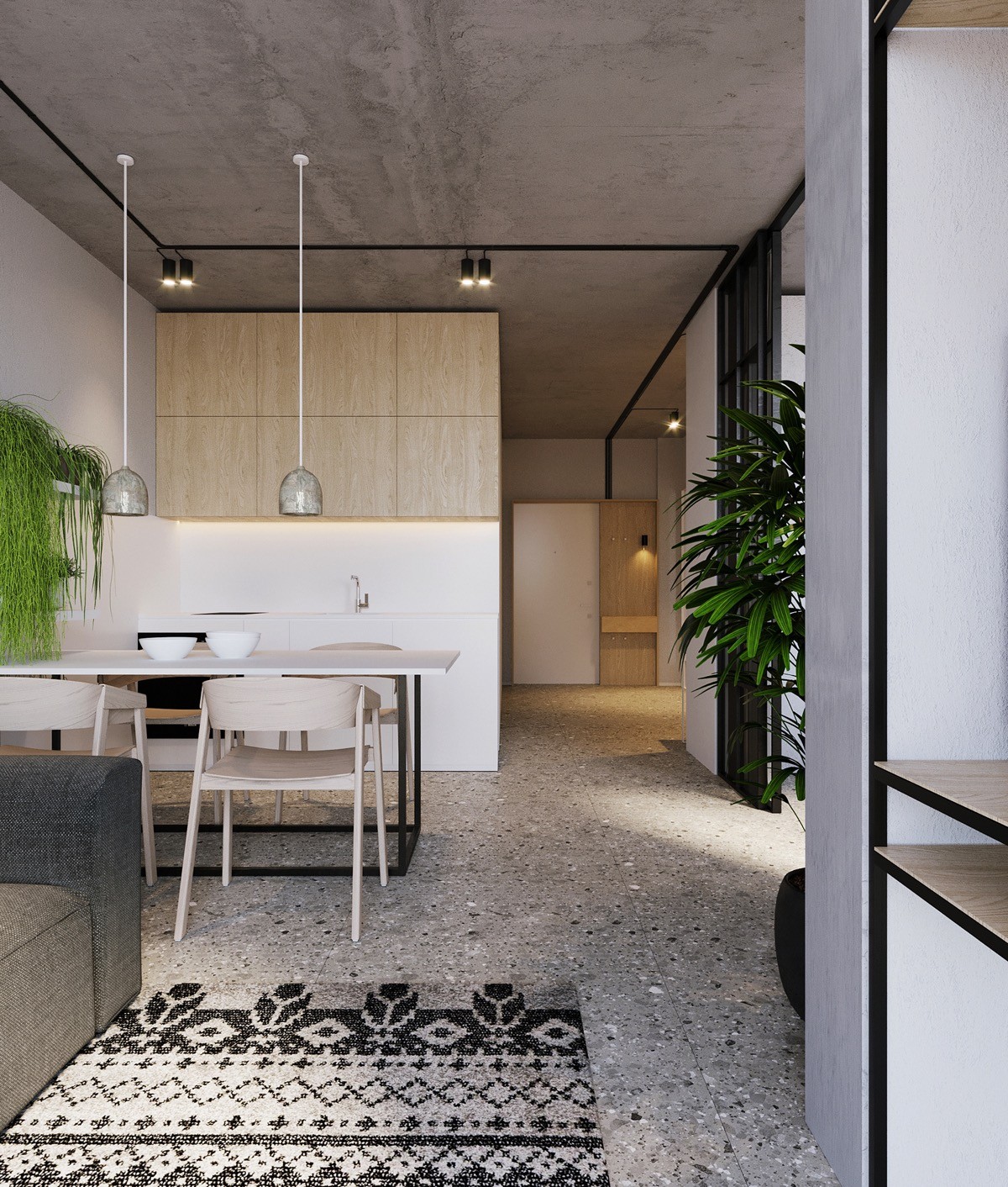
You may notice that the wood elements mimic the look of plywood – large panels of uninterrupted grain rather than traditional boards. The look is undeniably industrial and well-suited for this type of design theme.
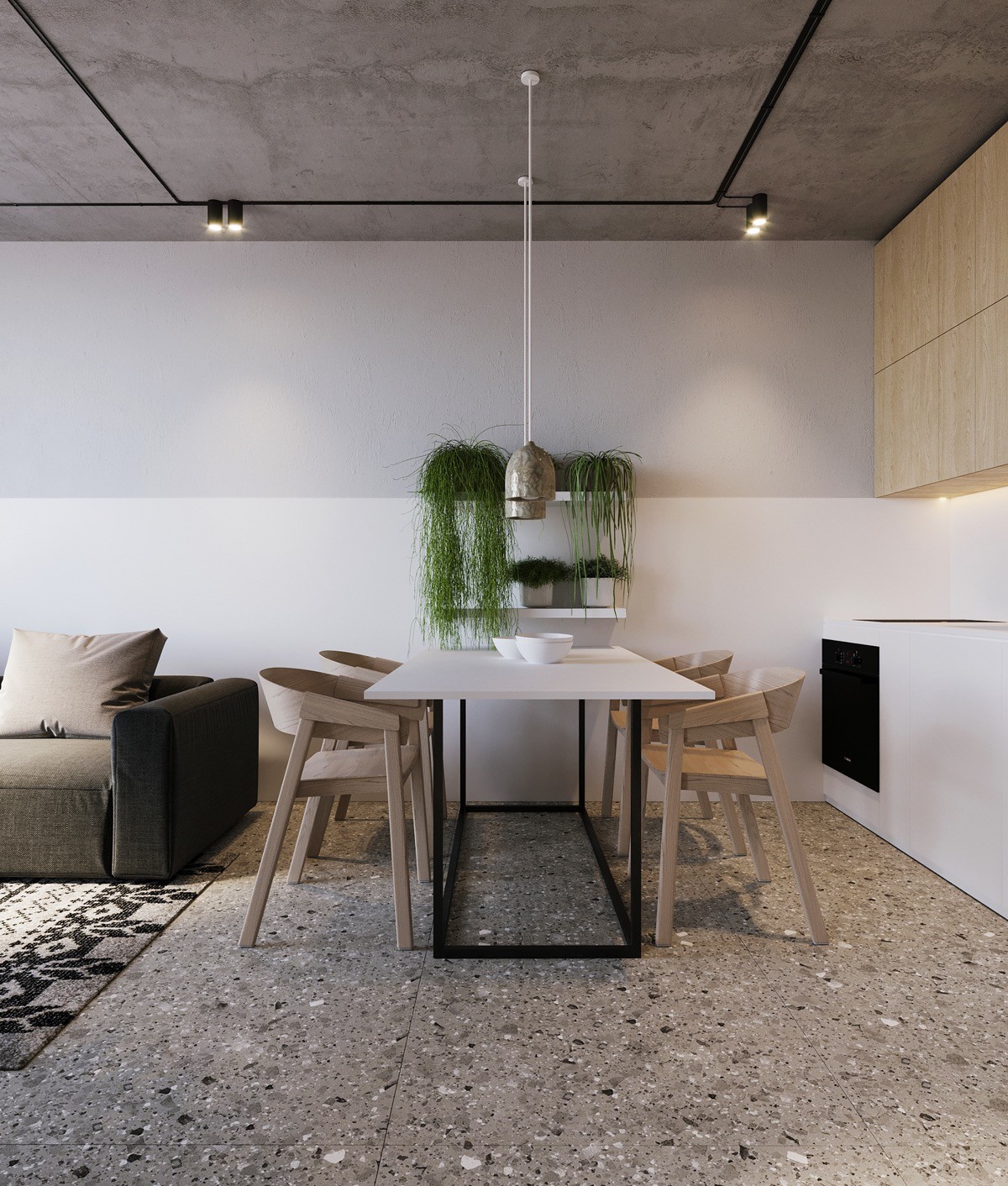
Even the chairs bring a high-end look to humble plywood. These are from the Cover Chair collection by Thomas Bentzen. The way the chairs tie into the cabinetry, the dining pendant lights tie into the concrete floors and ceiling. Modern planters cascade greenery over the arrangement.
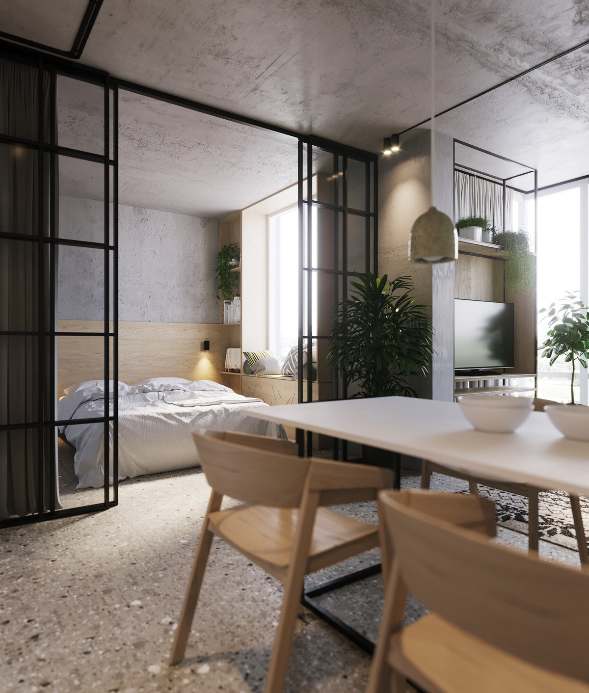
More plywood elements are revealed from this angle. You can see this versatile material used on the inside of the television stand as well as within the bedroom.
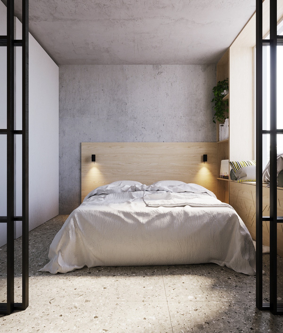
Industrial yet light – in a room clad with concrete, the smooth blonde plywood has a tremendous grounding effect, making this space feel warm.
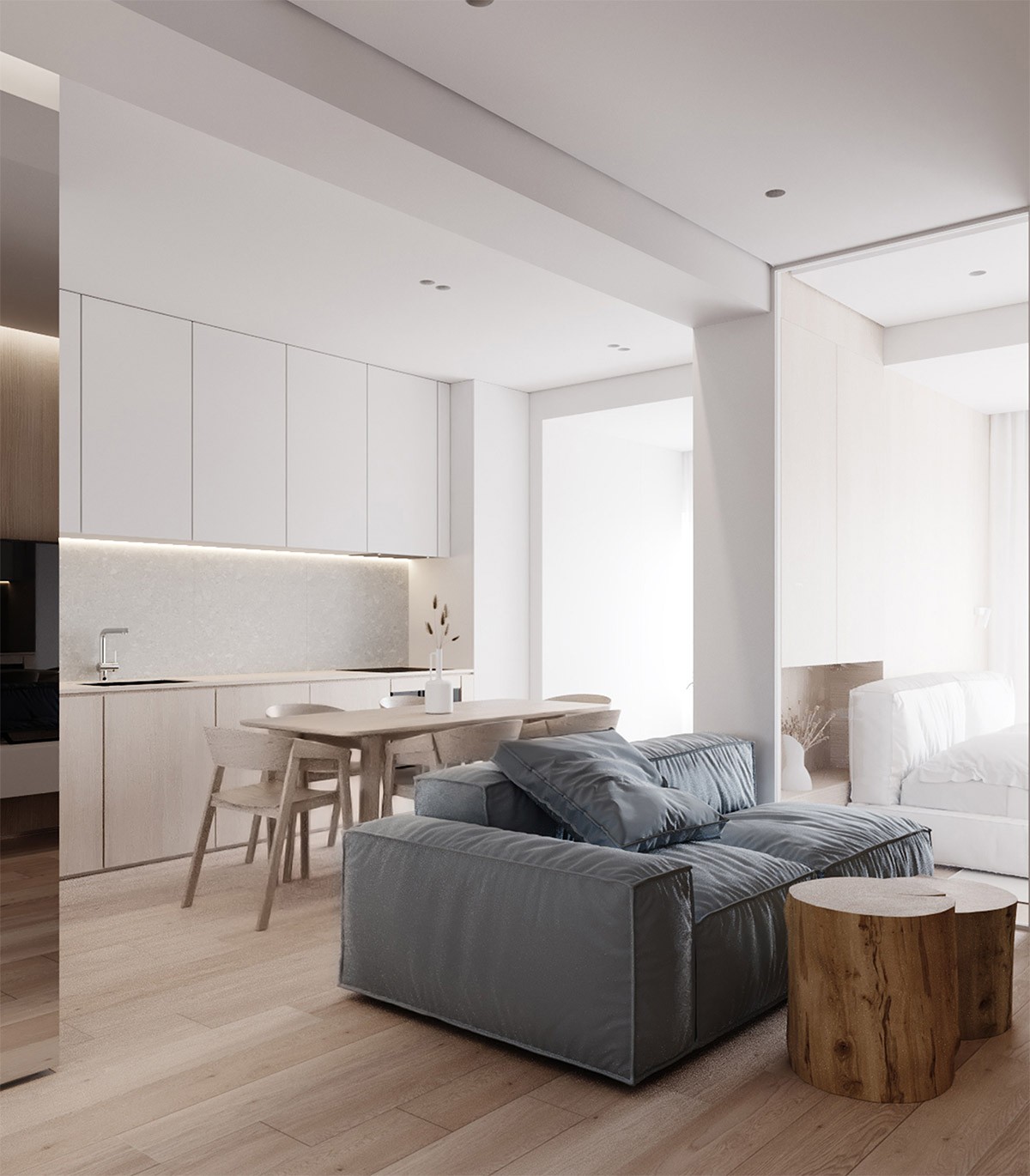
Another minimalist interior, and more light wood treatments. This interior begins with sharp modern lines and uses smart techniques to soften the effect – the super plush sofa, the soft indirect lights. Texture plays an important role throughout.
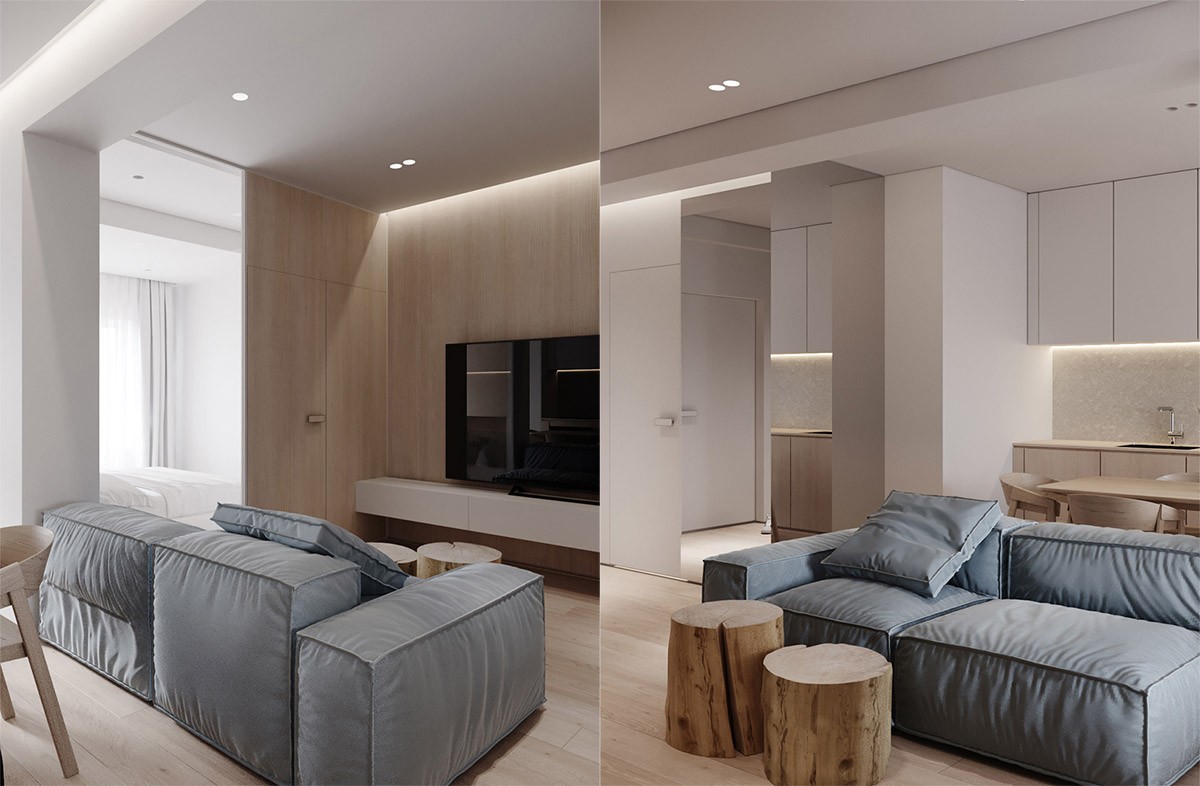
Perhaps the most creative use of wood is the pair of tree stump coffee tables. These go beyond a natural finish and present the beauty of the material in its most basic form.
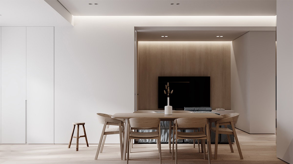
Another great application of the Muuto Cover chair by Thomas Bentzen!
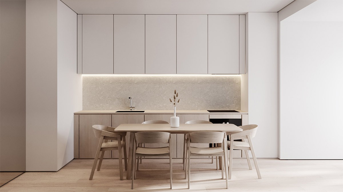
This white and wood kitchen occupies just one wall, leaving plenty of space for the dining arrangement next to it. For serious meal prep, the table could double as another work surface.
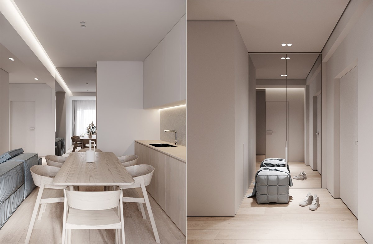
Light wood surfaces play a different role in every space. It unifies the dining room and kitchen and softens the effect of the minimalistic hallway.
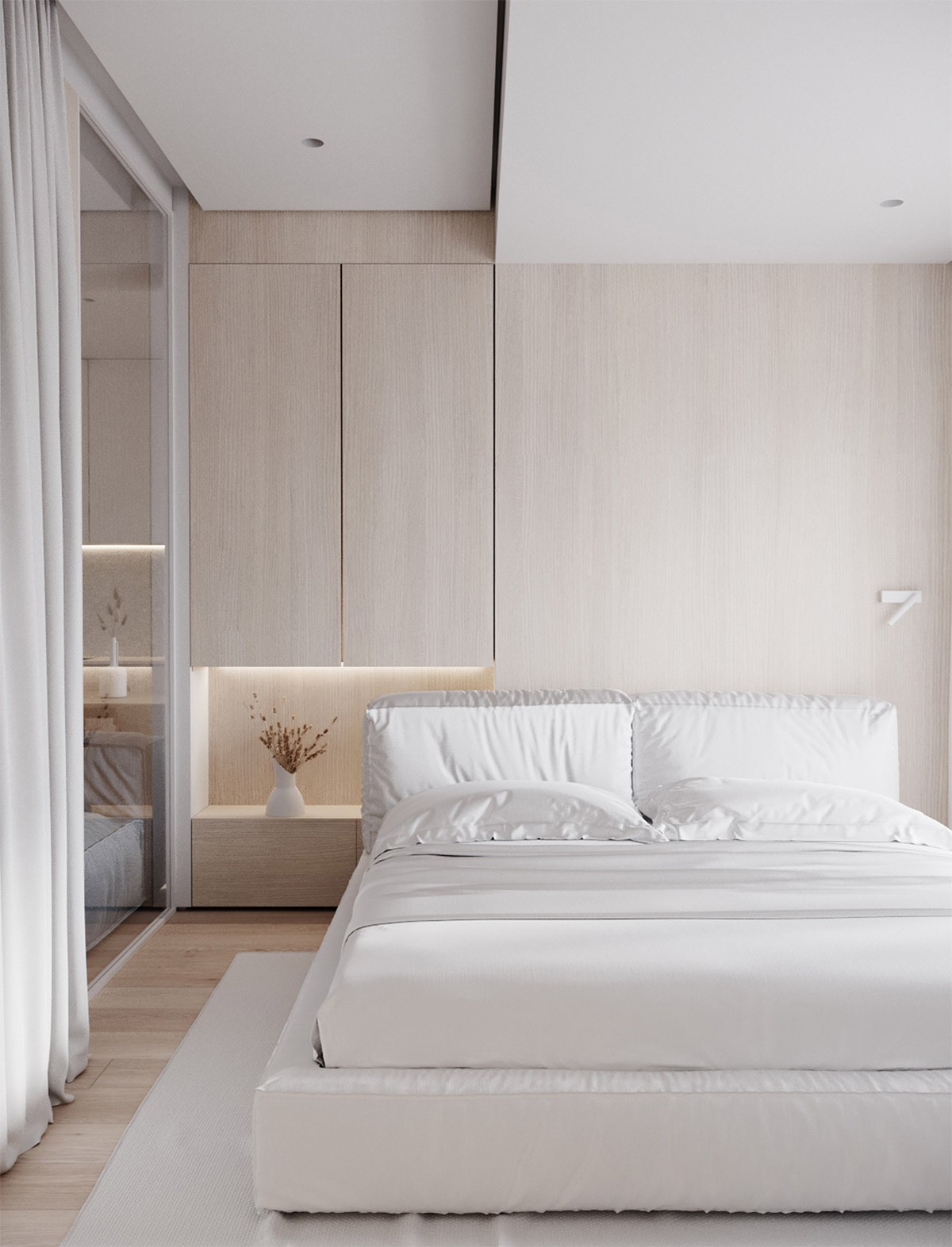
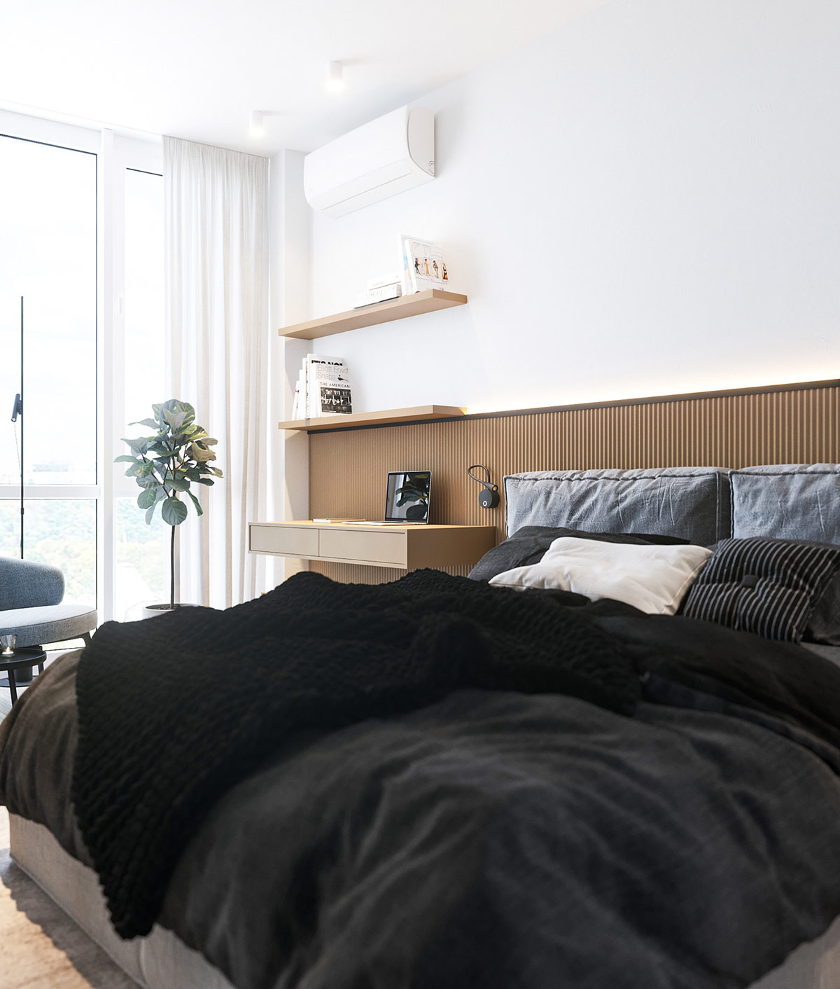
The bedroom follows the same streamlined theme as the rest of the home. A light wood accent wall hides built-in cabinetry, punctuated only by a single decorative vase and a matching wall sconce.
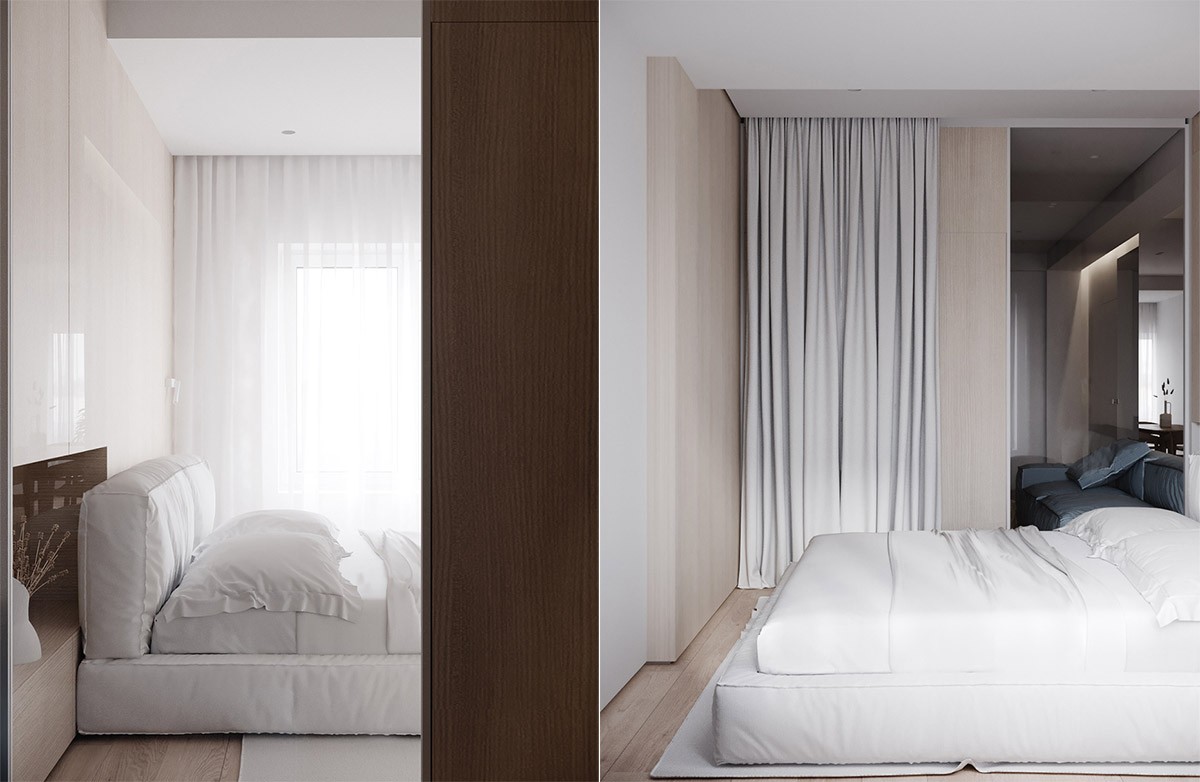
On one side of the bed, the windows are made to appear even larger by floor-to-ceiling curtains. On the other side, a sliding glass door and curtain create separation between the living room and bedroom.
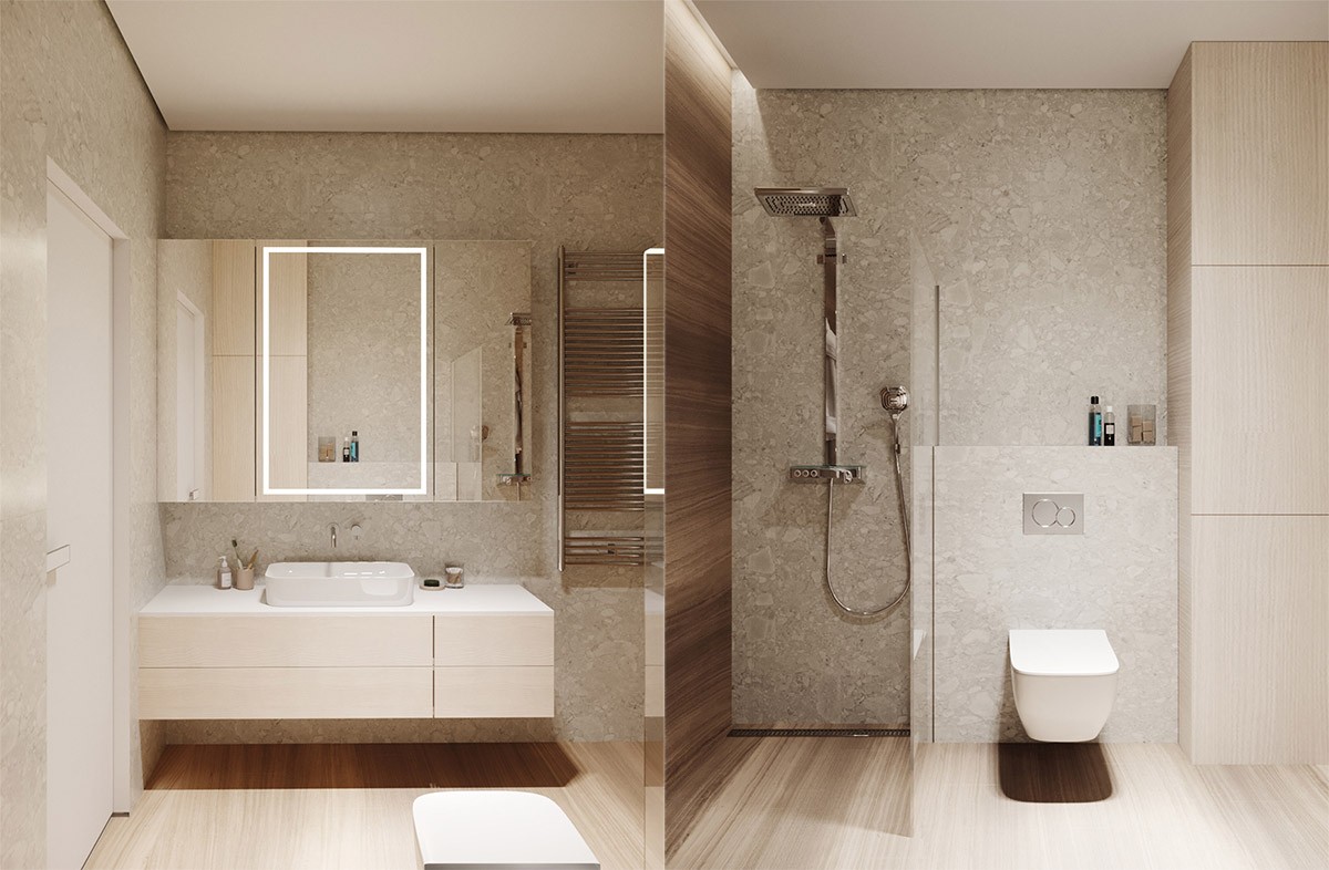
The bathroom combines dark and light wood finishes seamlessly. This effect adds intimacy to this private corner of the home.
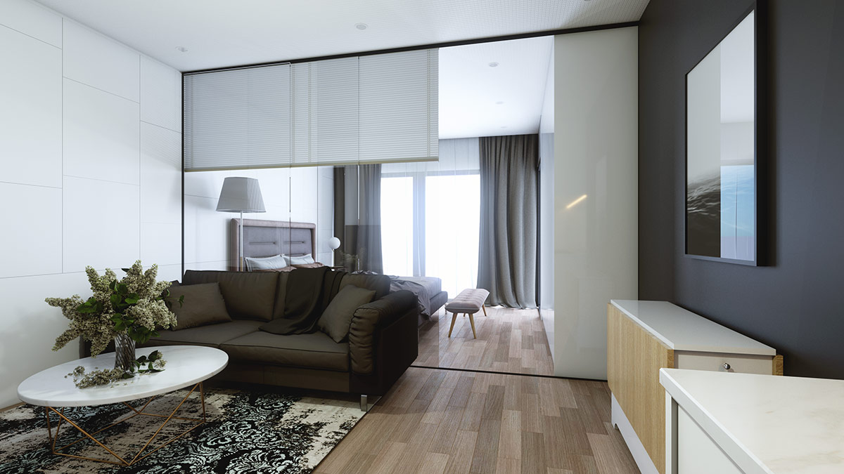
Finally, this last home combines a variety of wood tones – light, dark, and in between. Such a unique combination works well along with the transitional design elements found throughout this interior.
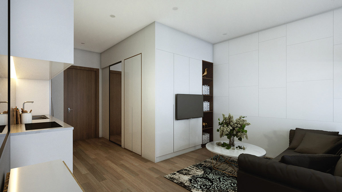
But how do you tie so many types of wood together? This multi-tonal wood floor demonstrates a brilliant solution.
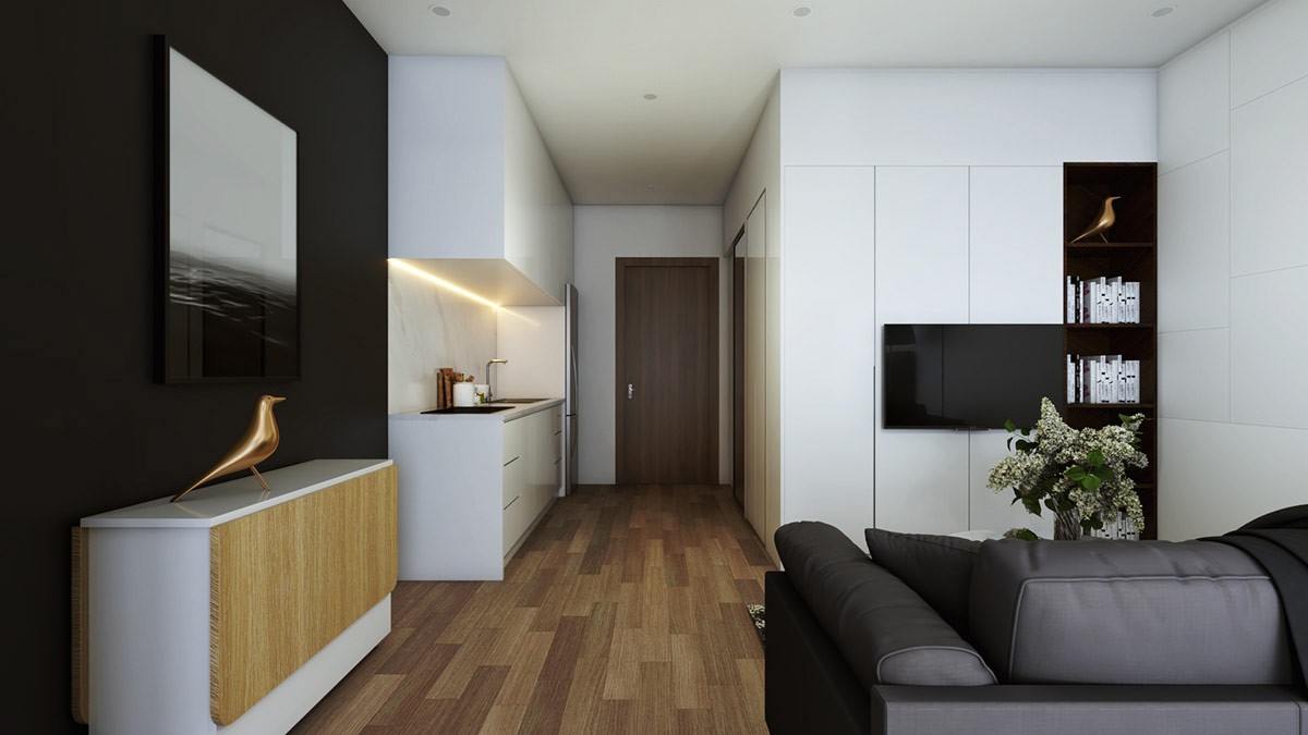
Metallic accents add a luxurious touch. This copper Eames bird looks radiant against the matte black accent wall.
