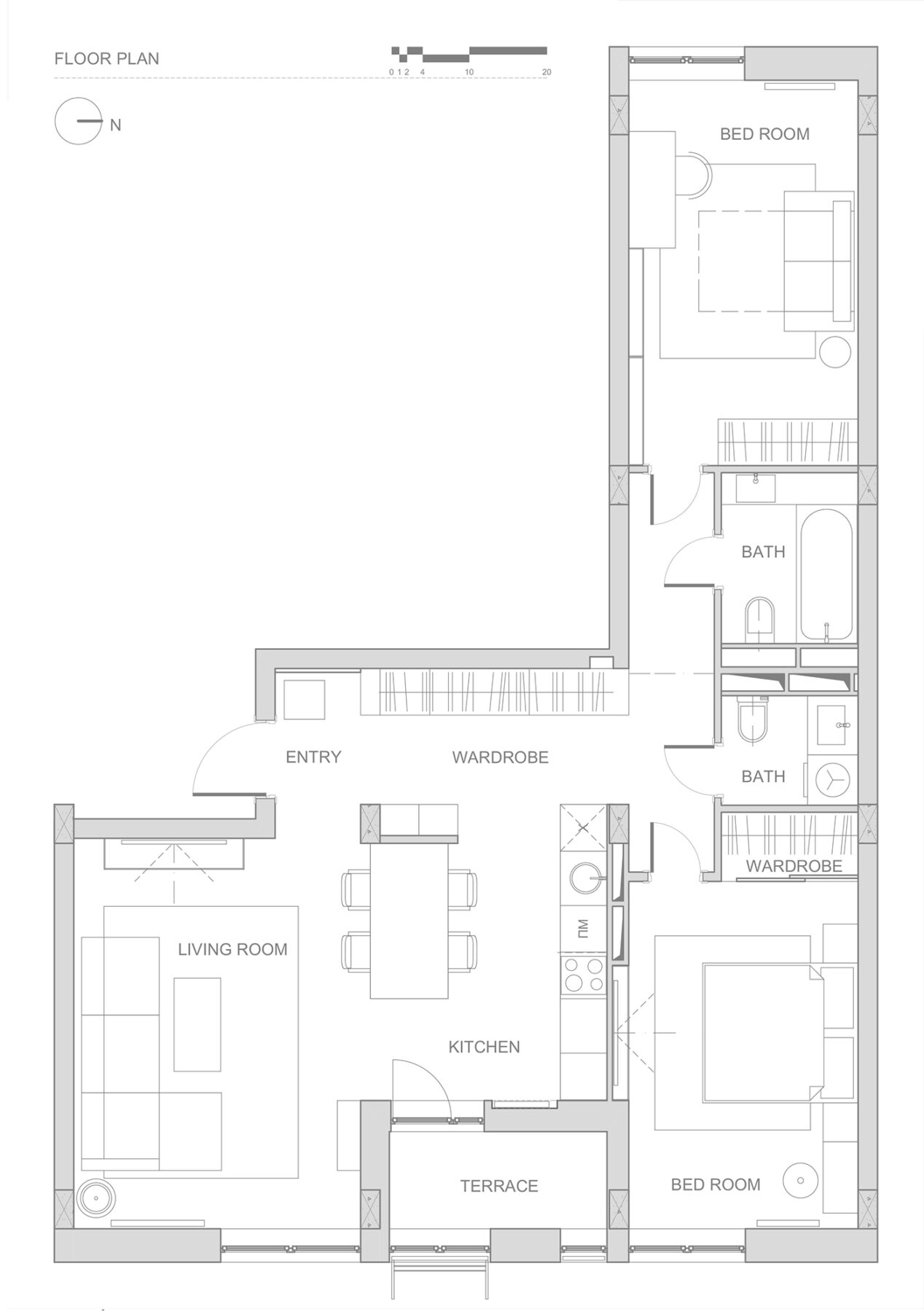
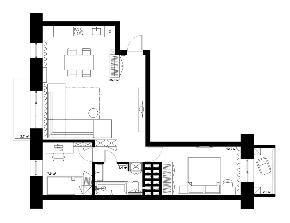
The layout of a home can have a significant impact on how the design takes shape. The different nooks and crannies that are created by a layout determine where best to put the sofa, how to arrange a dining room and even what colors will look best. The two homes featured here both have the distinction of being L-shaped. The two-bedroom homes utilize this somewhat unique layout well, making sure that light penetrates different portions of the home, that there are not too many dark colors that could serve to shrink the space, and that the flow of foot traffic makes sense. Take a look at these two homes and see how they use this layout similarly -- and what's different.

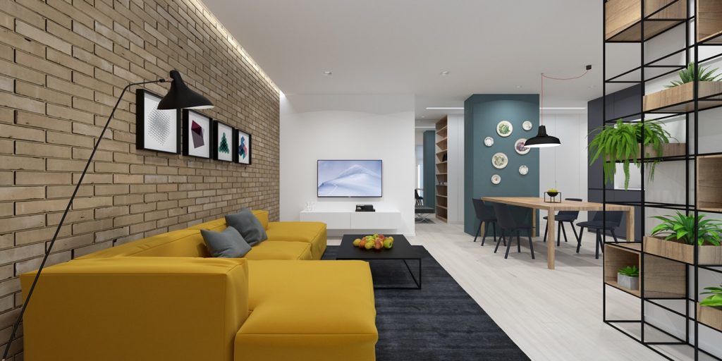
Immediately we can see how the first home uses its main living area as a simple, open gather spot. The living room features a unique mustard-colored sofa as well as a selection from the many unique floor lamps that are available.
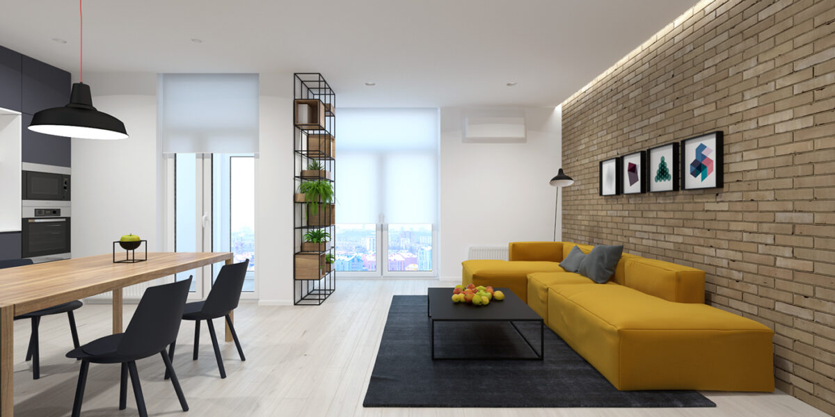
While there is not a tremendous amount of natural light coming in, by using plenty of white near the windows, that light is able to reflect into the rest of the living area.
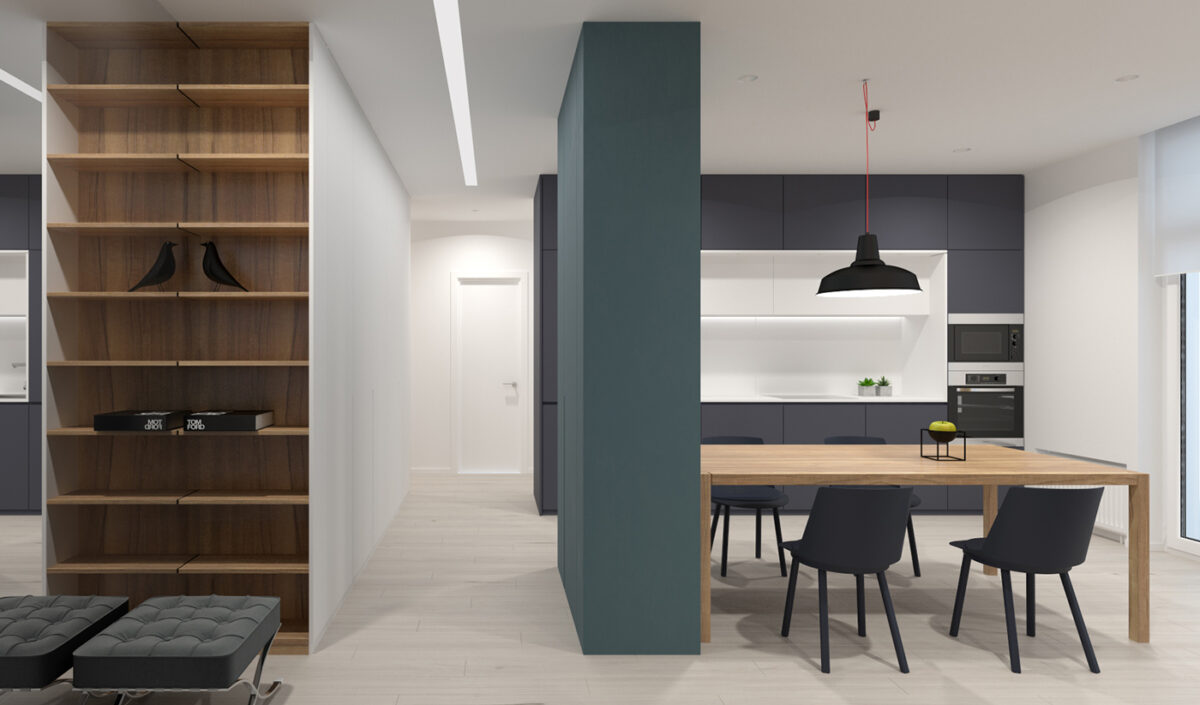
An open floor plan works best when there is still separation, like this partial wall. We can also see the Eames Bird replica positioned on the bookcase, which is not the only midcentury nod in this home.
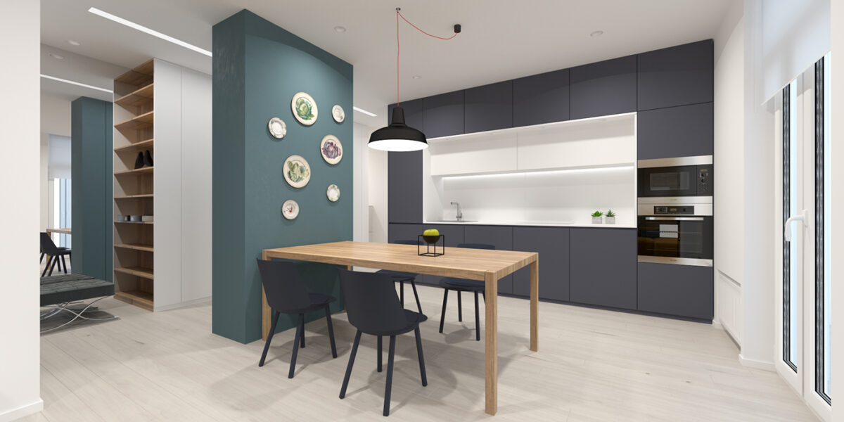
The accent colors used in this home have a rich, earthy feel to them, giving the space a soothing tone.
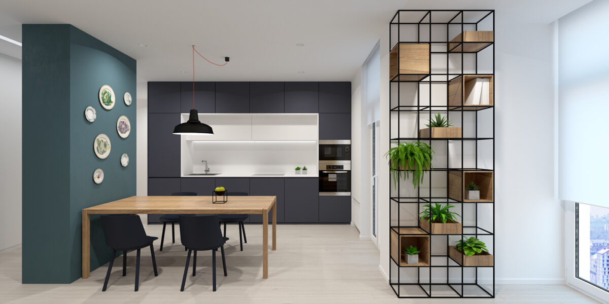
Greenery is always welcome in a well-designed home, and if you can display it on unique plant stands like this one, it really captures the attention.
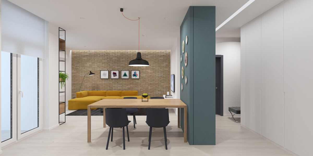
The lighting in the home is fairly simple, but very effective. The use of dining room pendants is popular but practical, while hidden lighting along the ceiling casts a lovely glow.
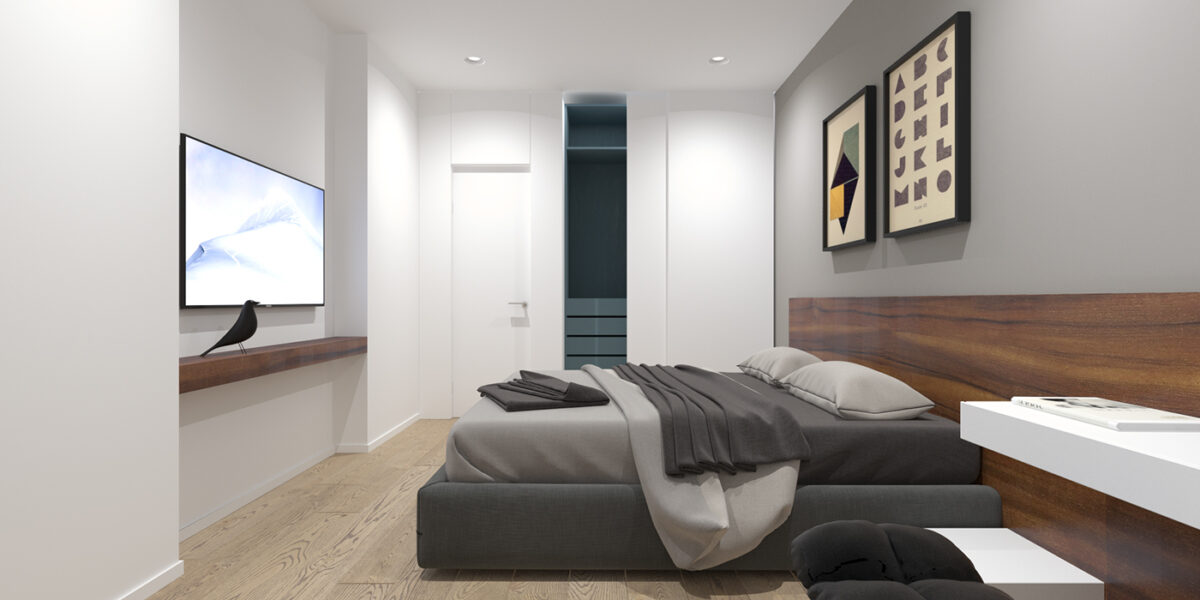
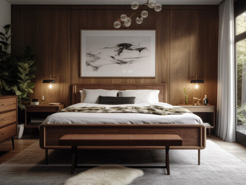
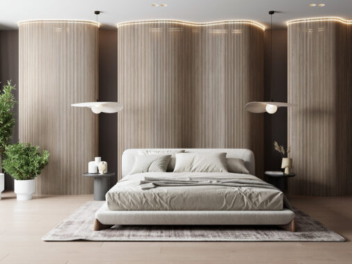
The master bedroom uses beautiful natural wood accents for the headboard and shelving, while the same cool colors keep the space calming and zen.
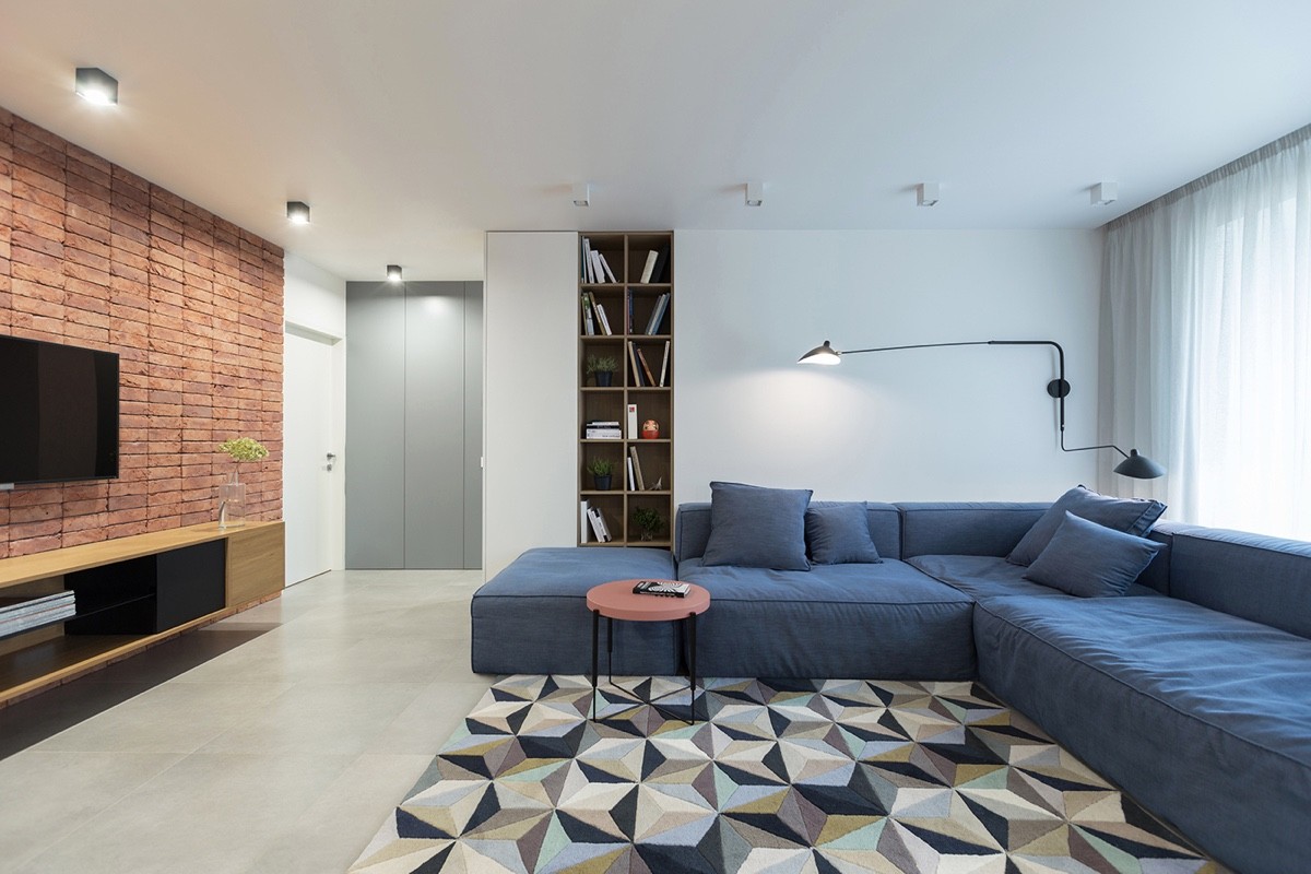
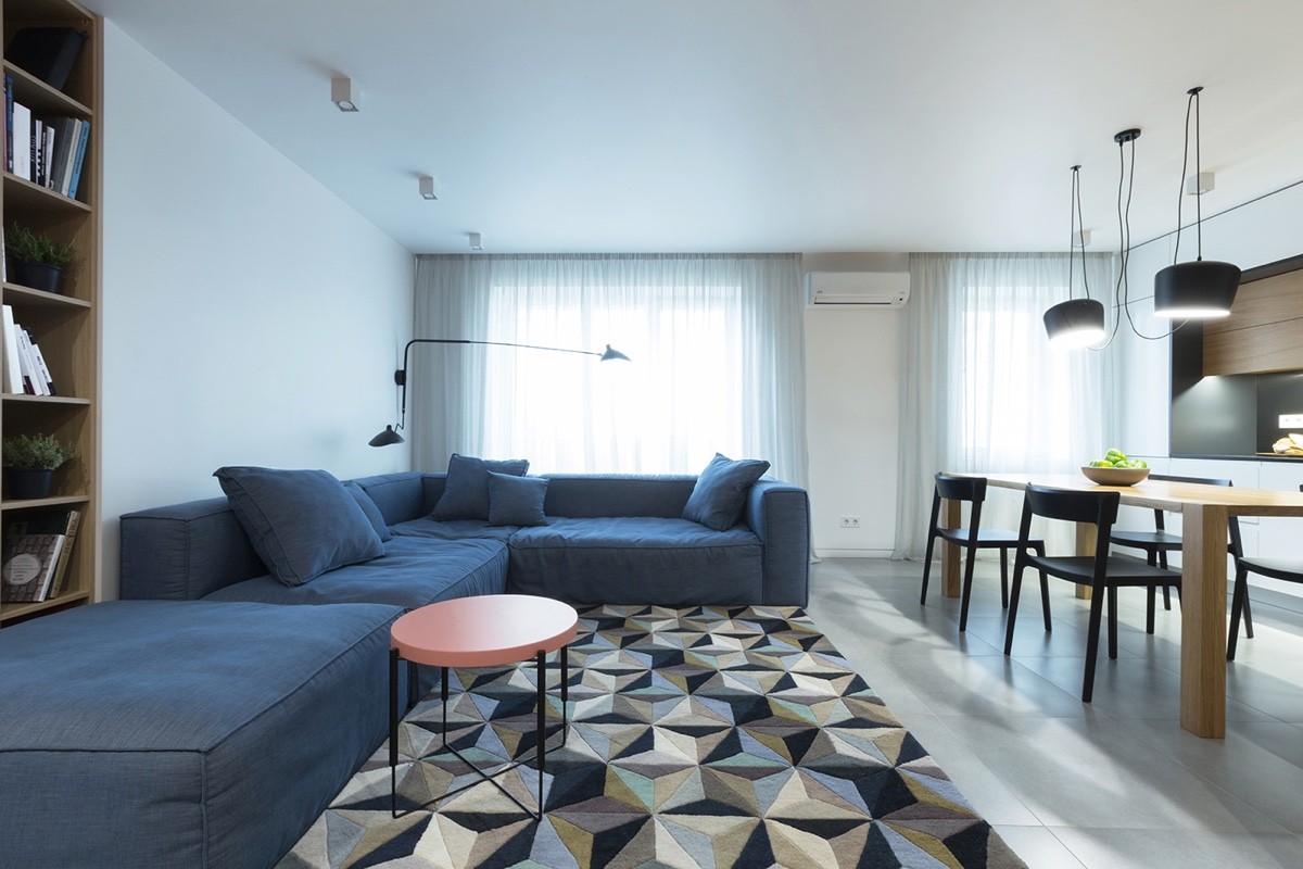
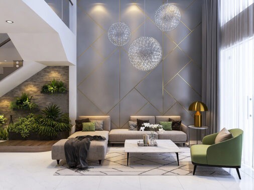
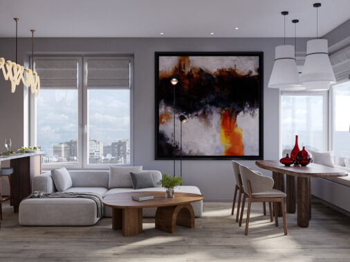
This next L-shaped home is strikingly similar, starting with a statement sectional sofa in the open living room.
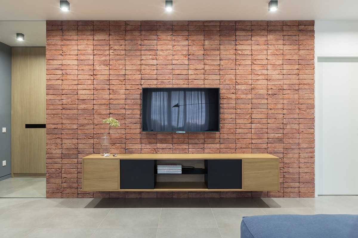
This home also clearly features midcentury inspiration, including this long and low entertainment center that's mysteriously hovering against an exposed brick wall.
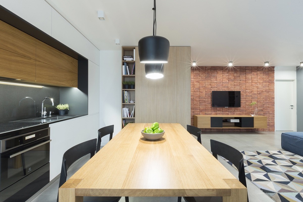
In the cozy dining area, touches like a light wood table and classic fruit bowl are nice.
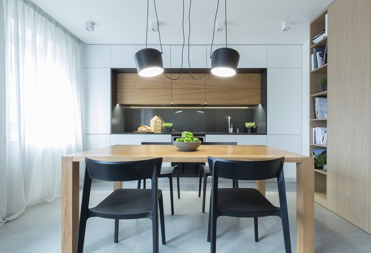
and light fixtures against natural wood furniture and cabinetry has a distinctly modern look.
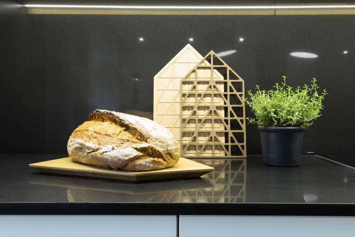
For a bit of fragrant greenery, this space decides on indoor herb planters.
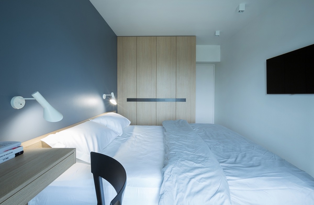
The master bedroom is incredibly simple and soothing, with light blue, white, and gray creating an ethereal feel.
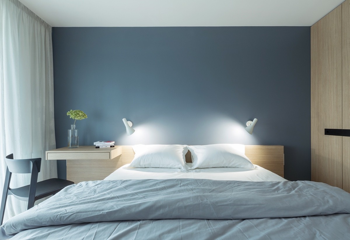
like this one can help with relaxation at the end of the day. Who wants to go to sleep in a cluttered, loud room?
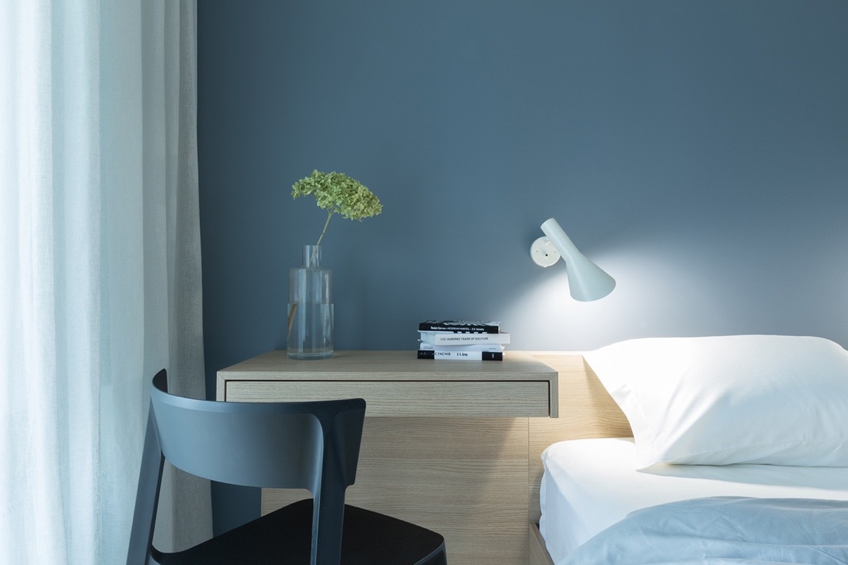
Simple glass vases like this one are an easy way to liven up a space, and add a burst of seasonal color every now and then.
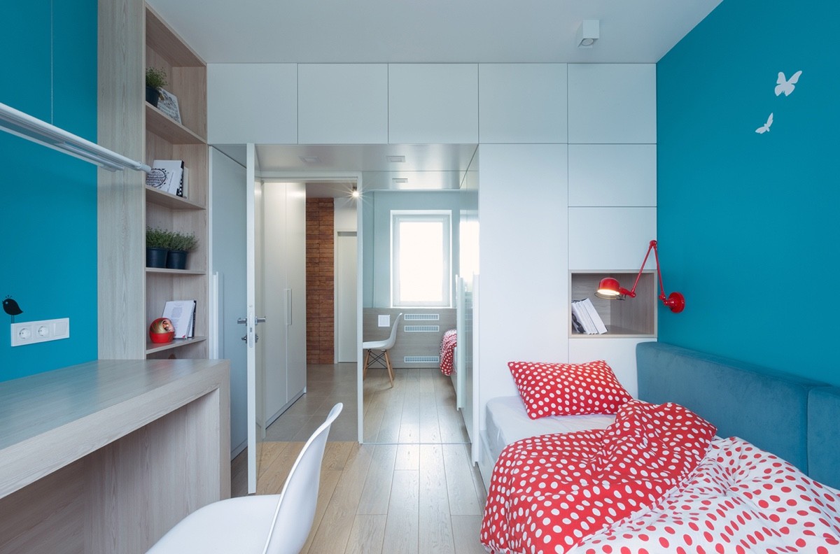
In the child's bedroom we have a bit more color in addition to stylish kids' night lights. The desk chair in use here is the Eames Molded Plastic Chair.
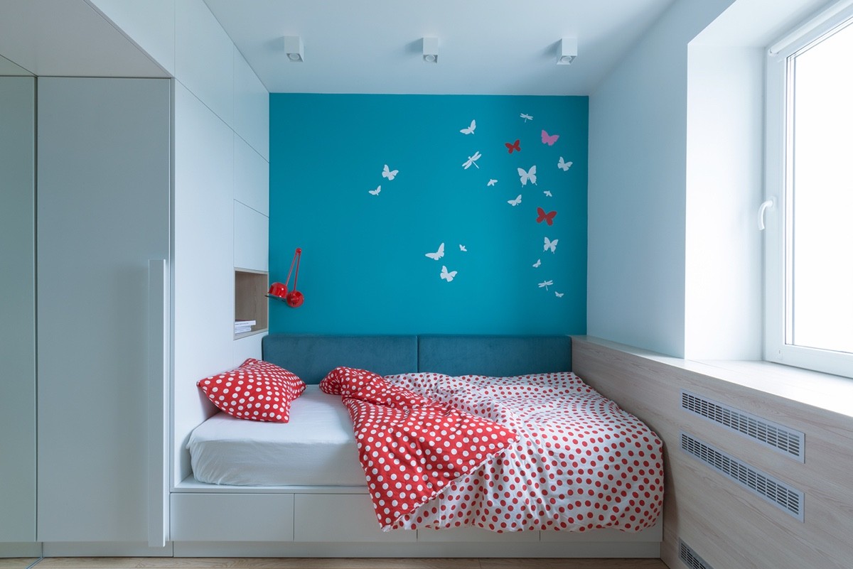
The kids wall decor complete with butterflies and dragonflies is subtle but whimsical.
