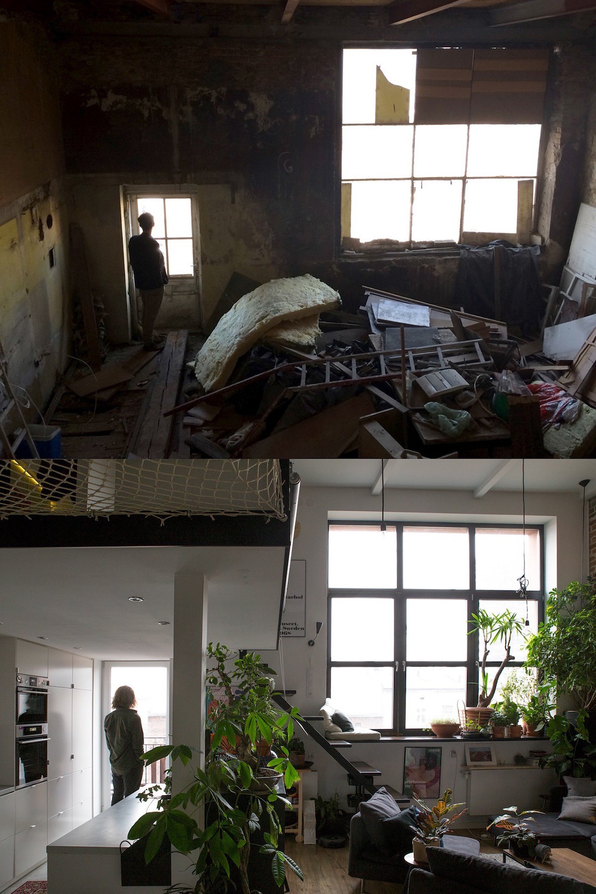
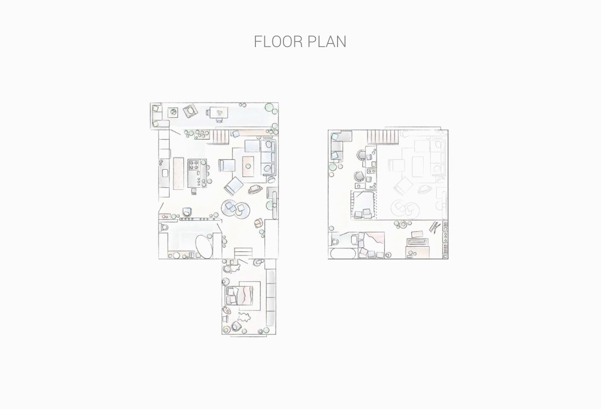
Once a place of manufacture, then an art workshop, and now a private apartment in a 1906 tenament house near Old Town in Krakow, Poland. Studio Zapraszam has transformed a rare devastated loft space into a bright showhome. The full renovation was designed to demonstrate a mix of the studio’s favourite styles and visions. The interior has been designed to be both motivating and calming in a horizontally and vertically open space. The layout is balanced, and customisable between open flow and privacy, which makes it compatible with work and rest, parties or guests. It incorporates space saving ingenuity and multi-functional optimisation in an aesthetic that will stand the test of time.
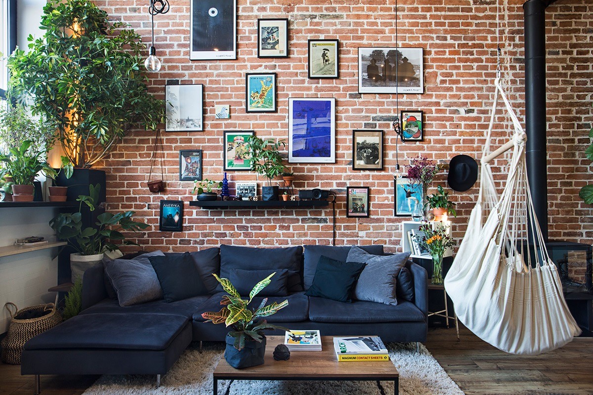
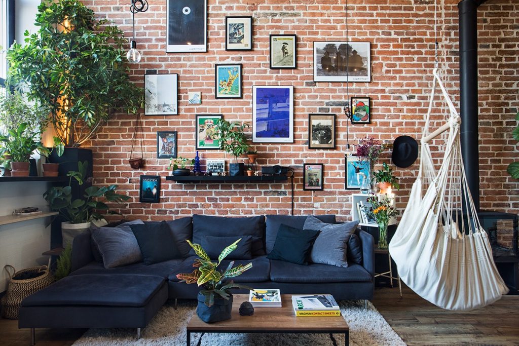
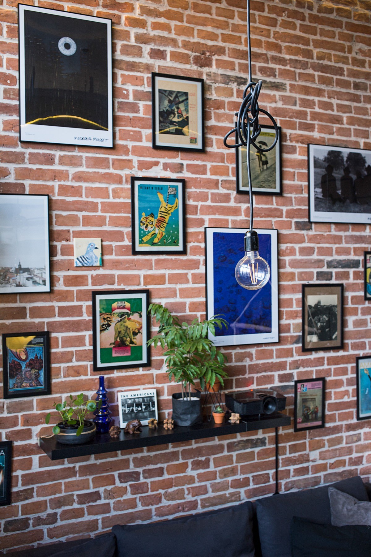
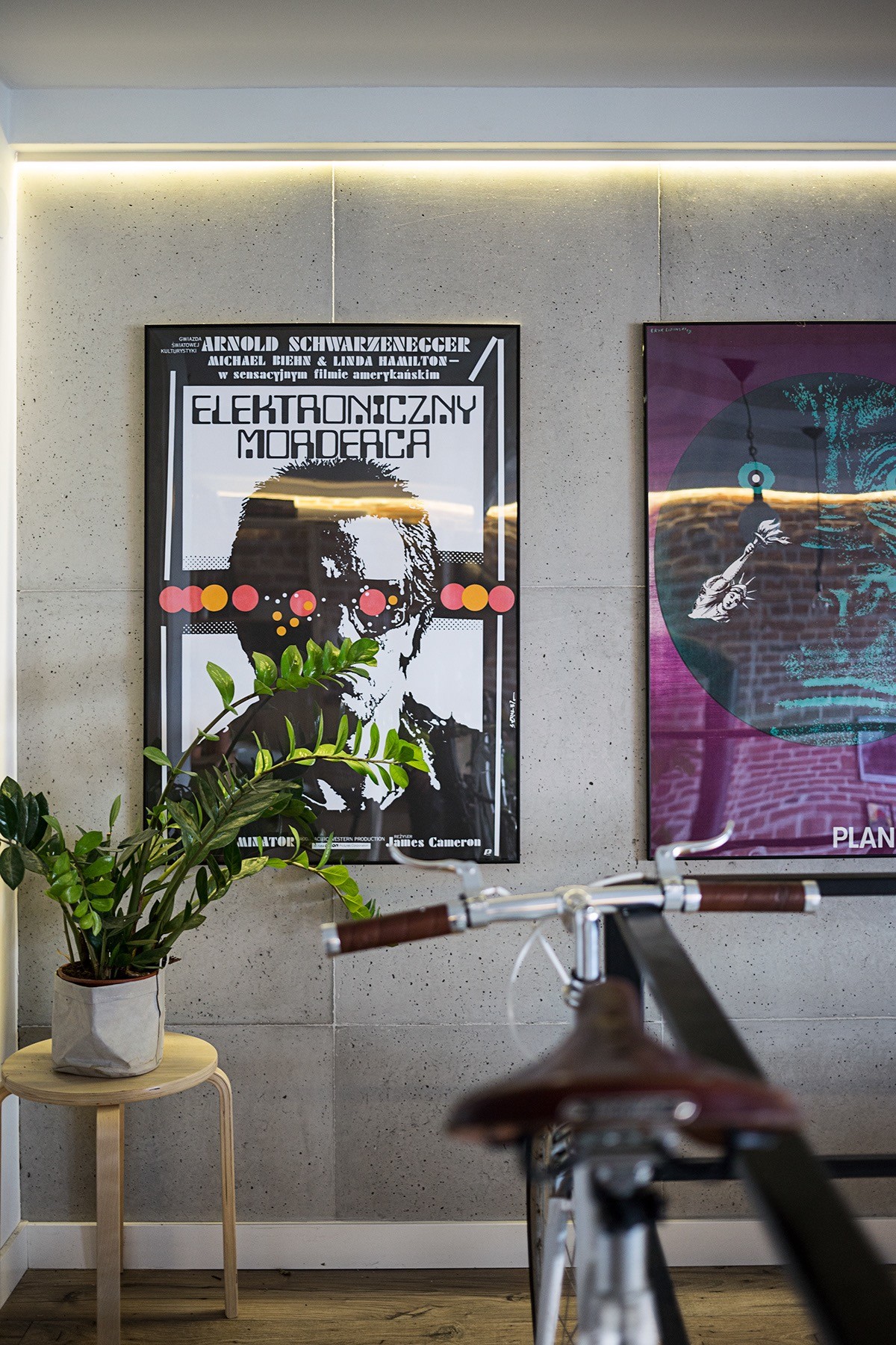
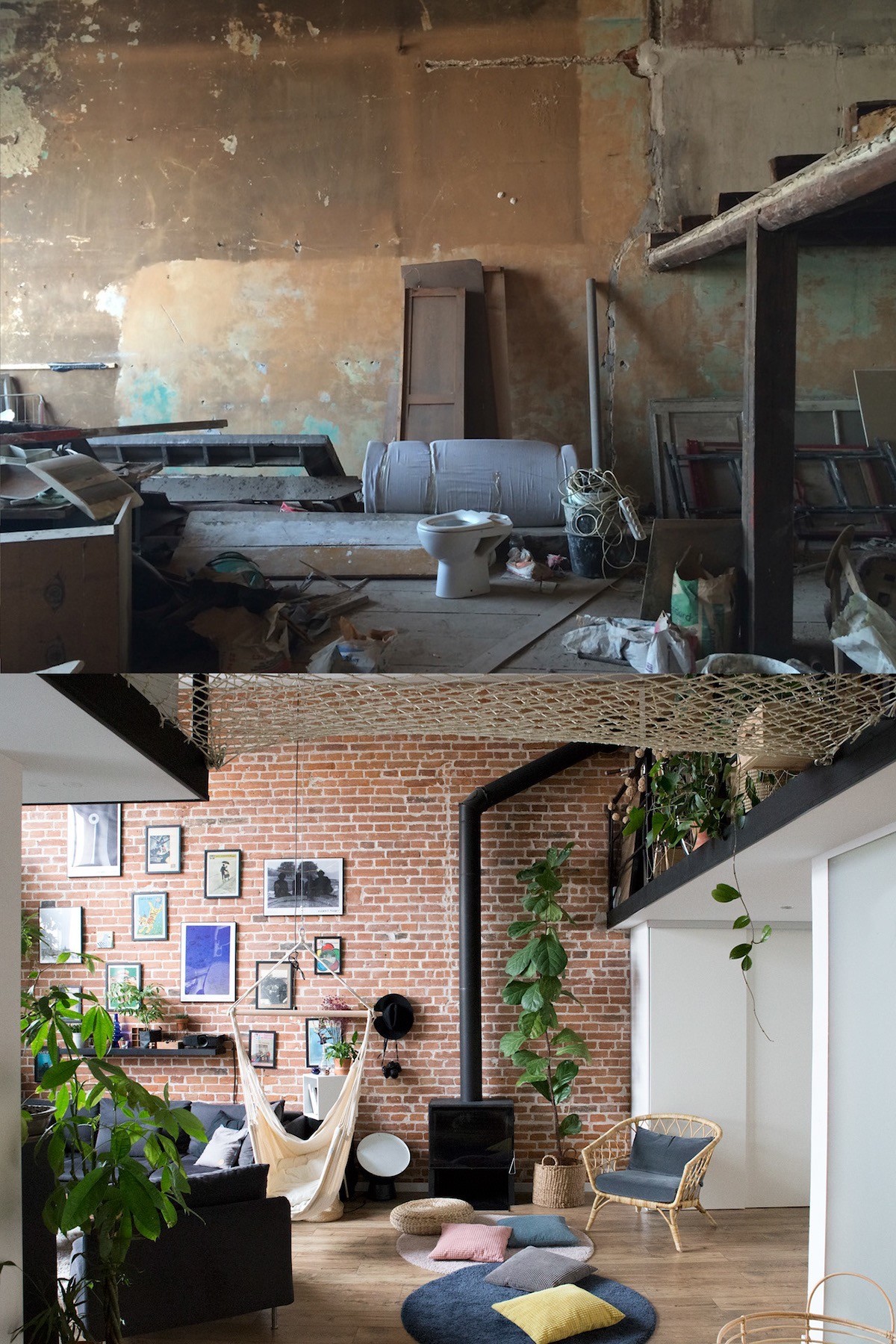
The scheme was designed to be highly cost-effective, with elements of easy to implement DIY. A casual gallery wall has been fashioned across an exposed brickwork wall in the lounge area to give the loft a more homey feel.
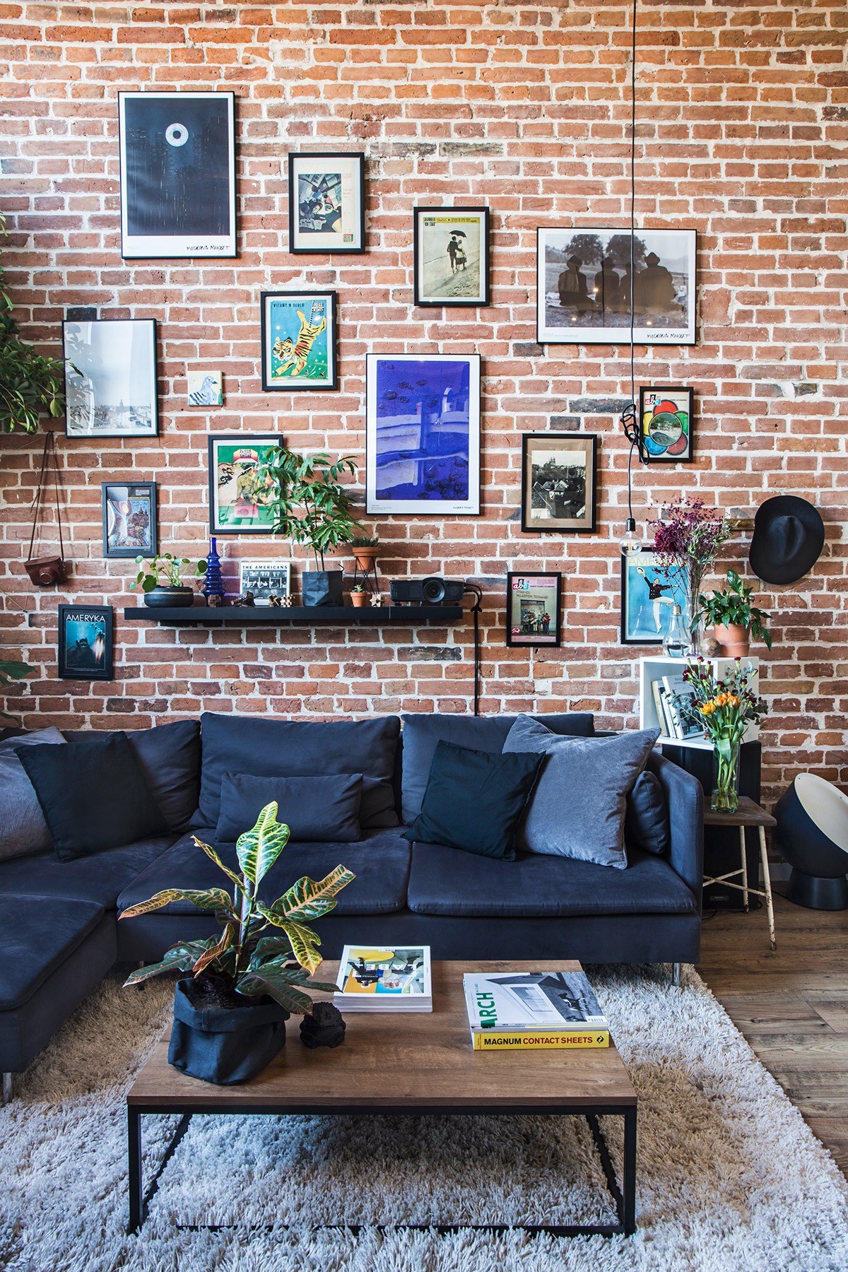
A blue modern sofa contrasts richly with the red brickwork. A deep pile area rug makes the room plush and cosy.
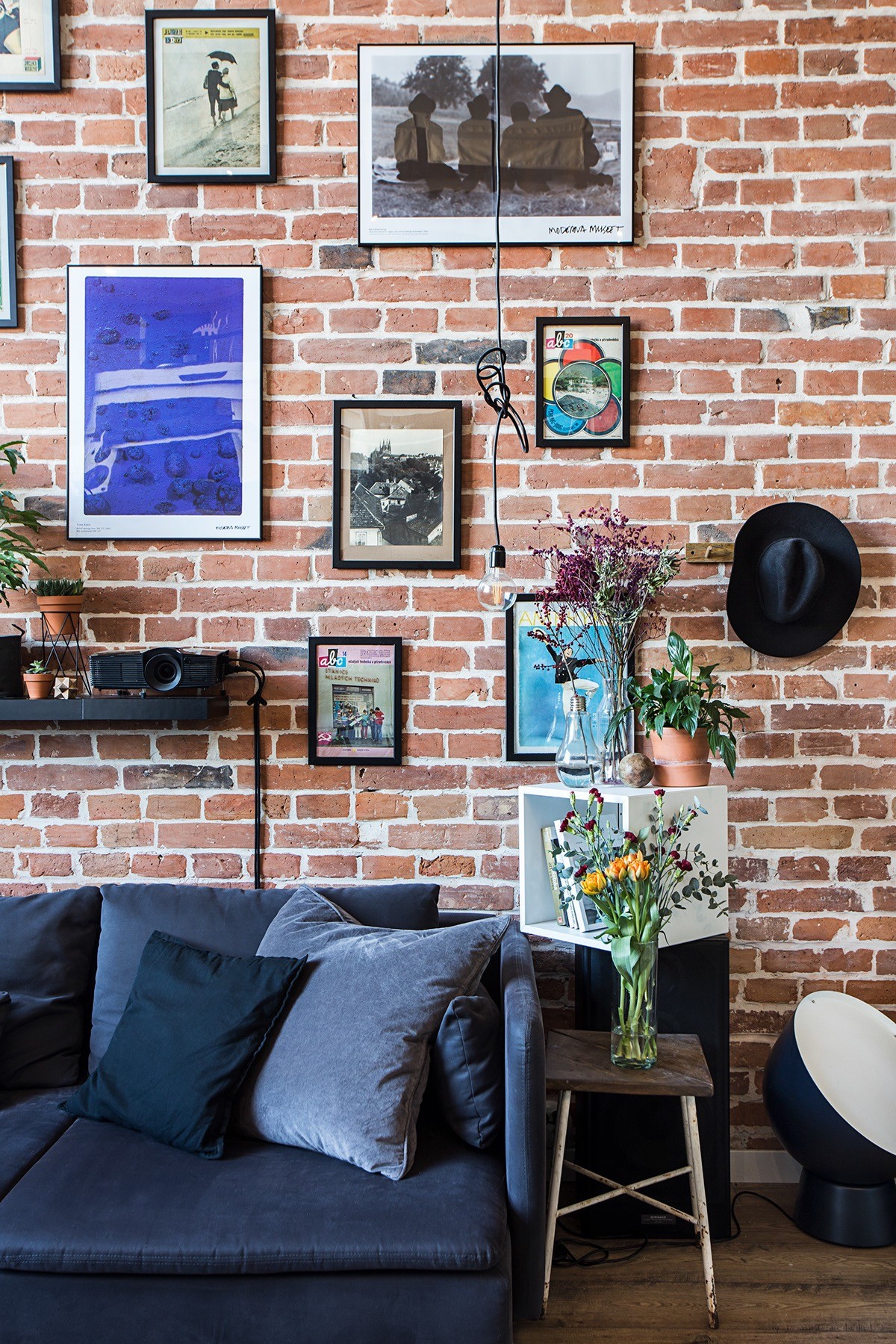
Industrial style lighting dangles all the way down from a double height ceiling. The electrical cables are casually knotted to adjust each length to suit.
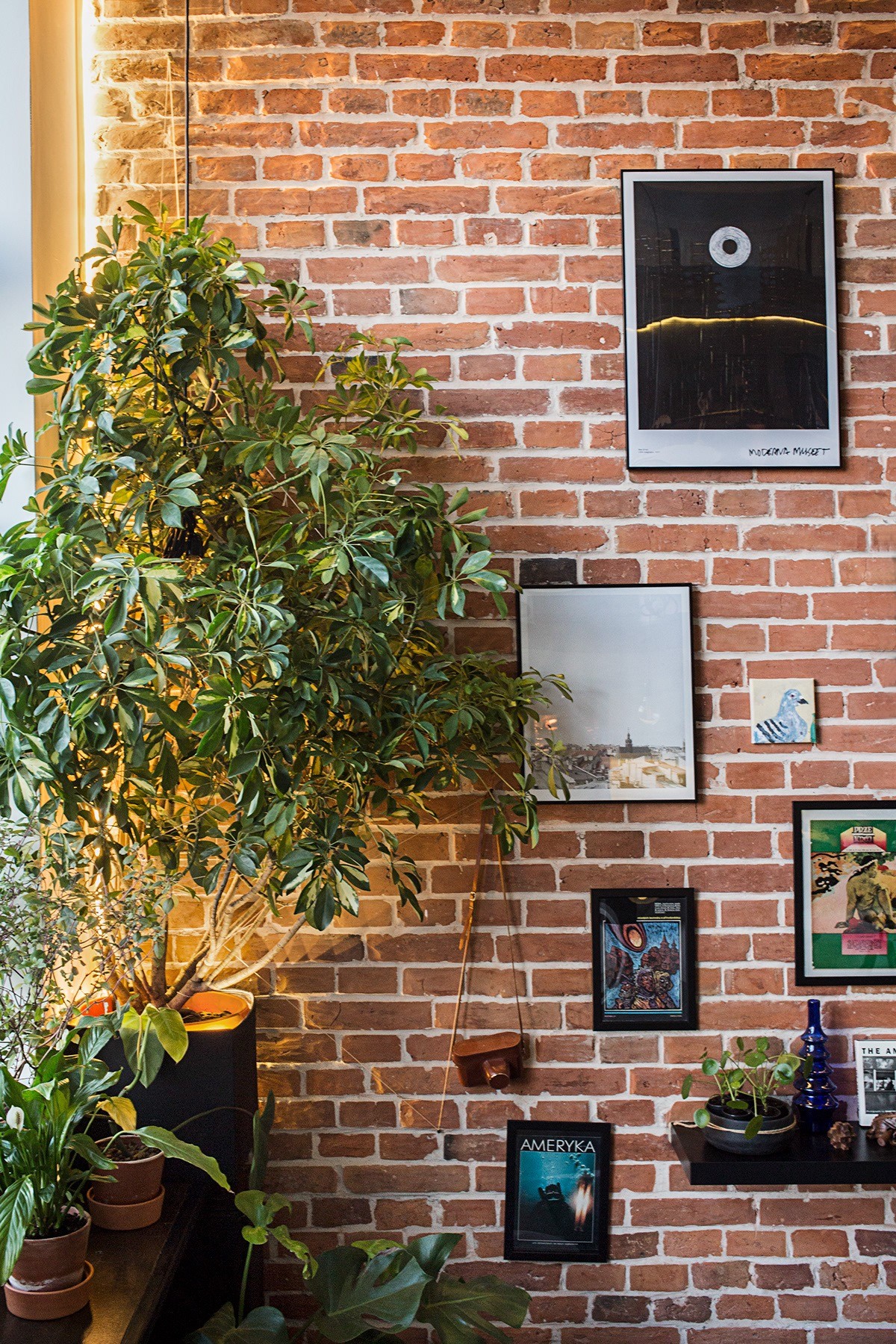
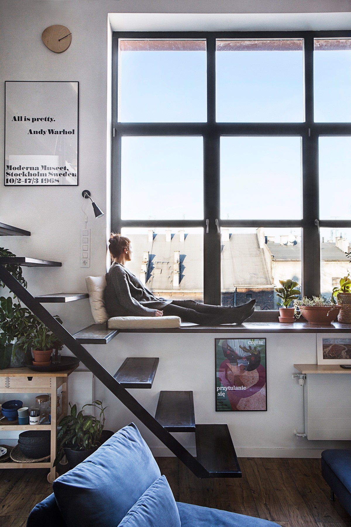
More indoor plants dress the window sill beside the sofa. A strip of LED light glows through the leaves and branches.
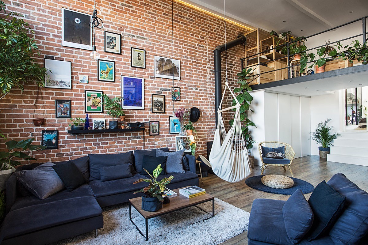
A wood topped rectangle coffee table nestles into the soft cream carpet at the centre of the seating area. A canvas hanging chair makes a novelty hangout at one side of it.
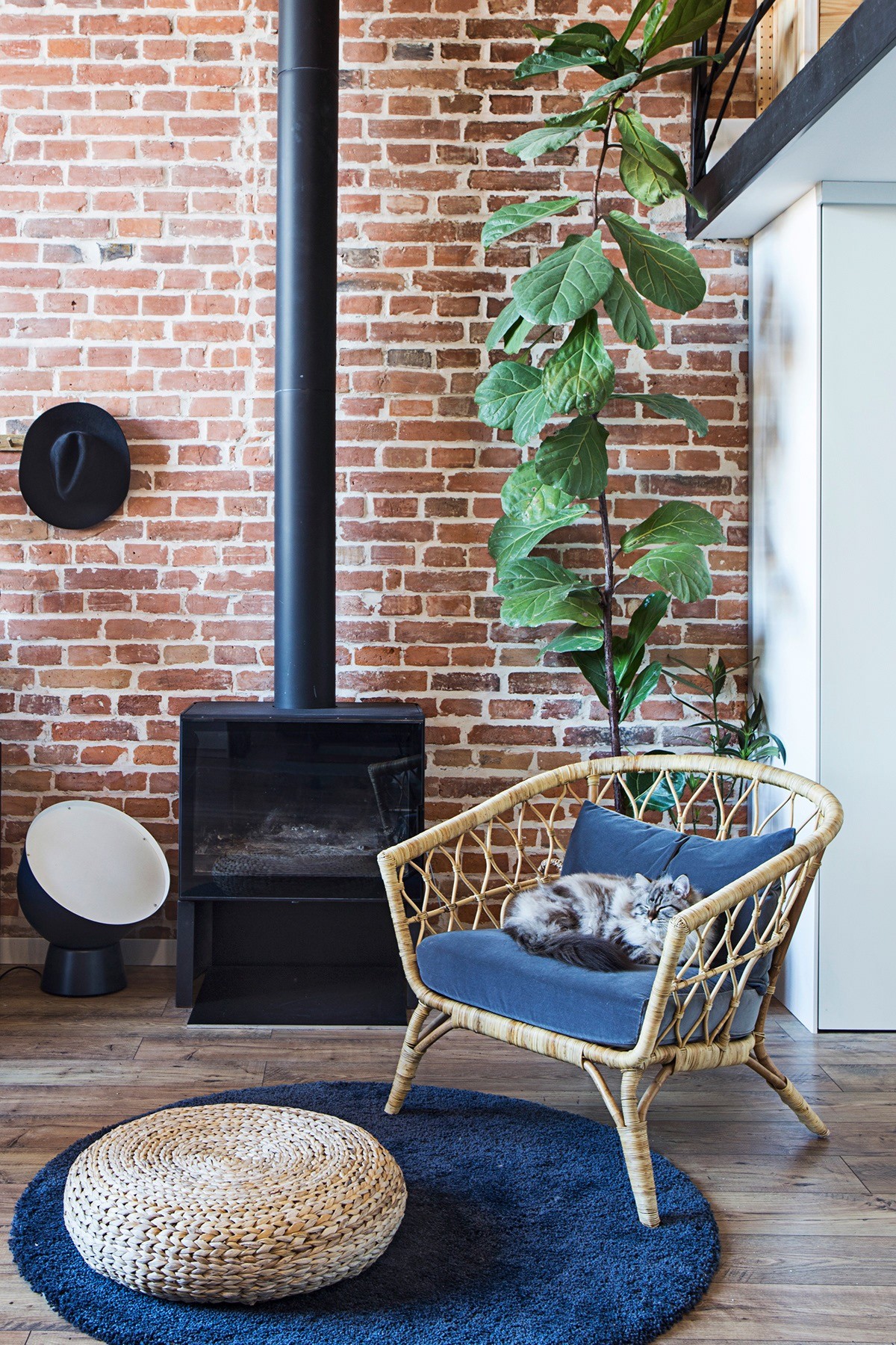
Just behind the hanging chair there is a wood burning stove. A wicker chair and pouf pull up at the warmest spot in the place–and the cat knows it.
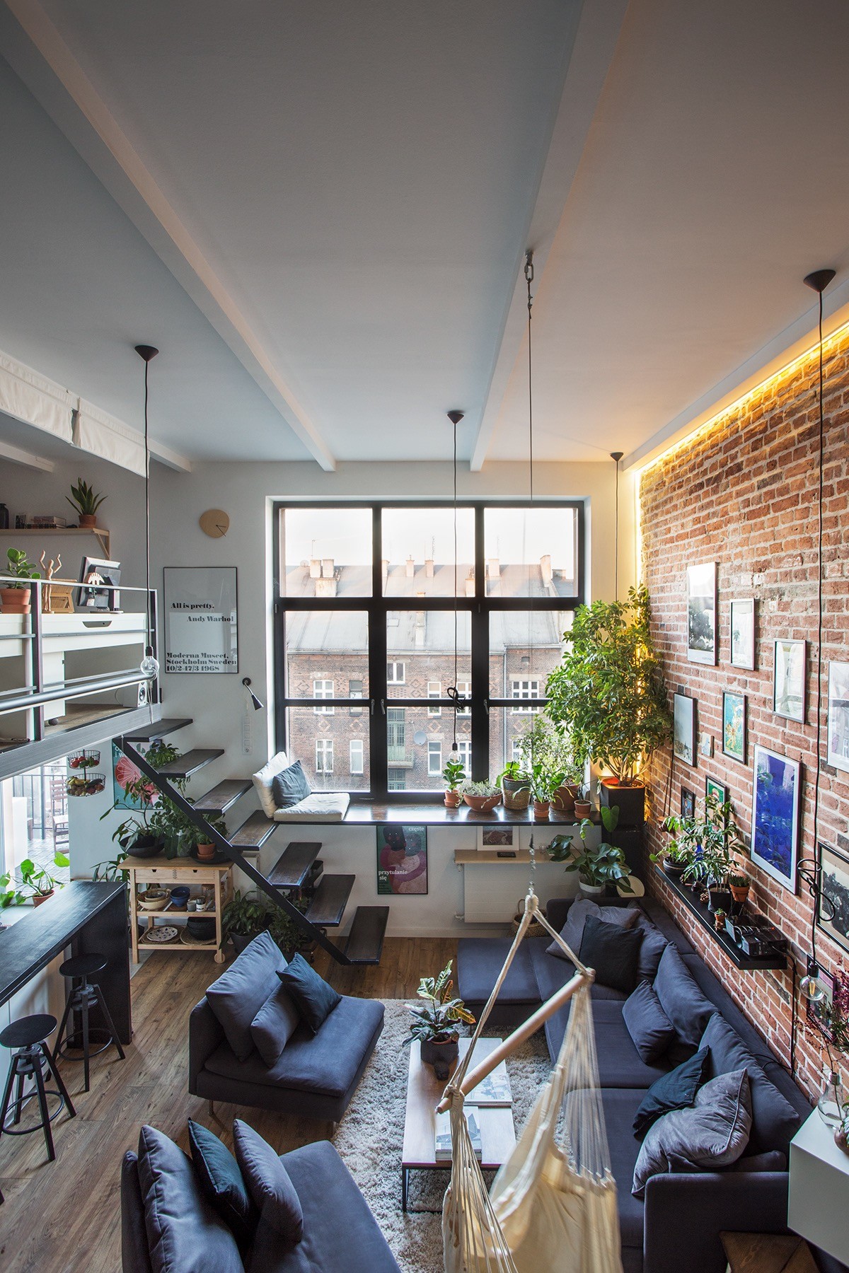
The treads of an open staircase design leap past an elevated window seat, en route to a mezzanine level with a home office.
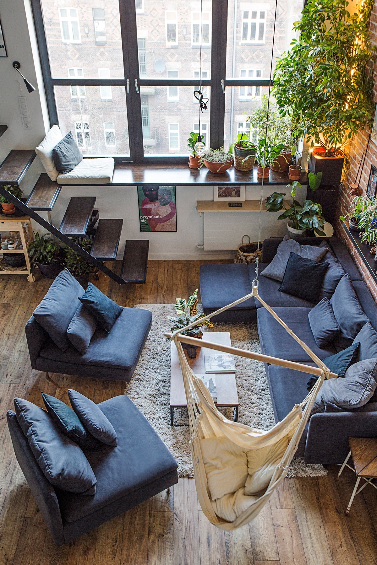
Two blue lounge chairs form the final edge of the lounge furniture arrangement. The chairs form a relaxed divide between the lounge and the kitchen behind.
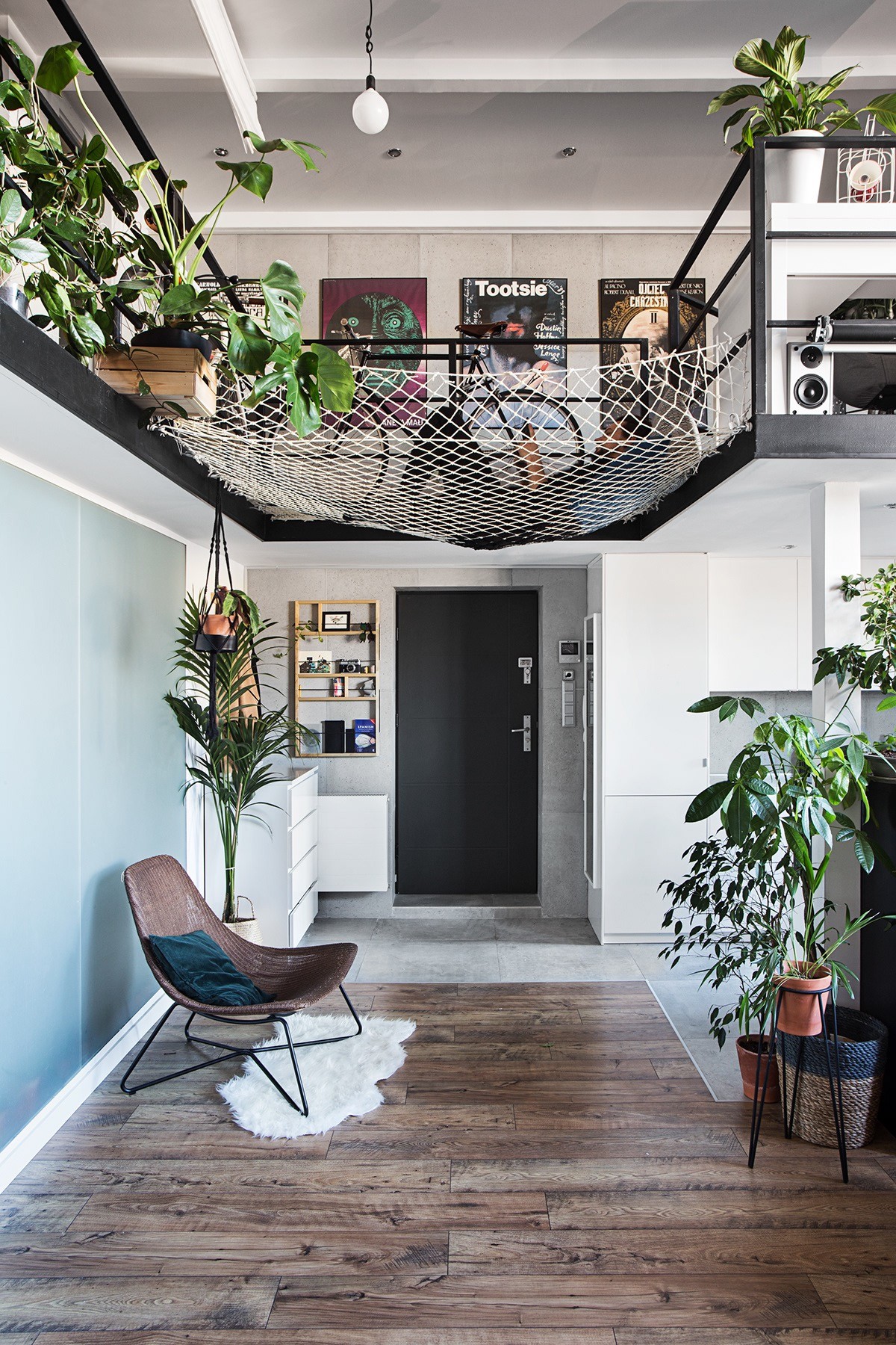
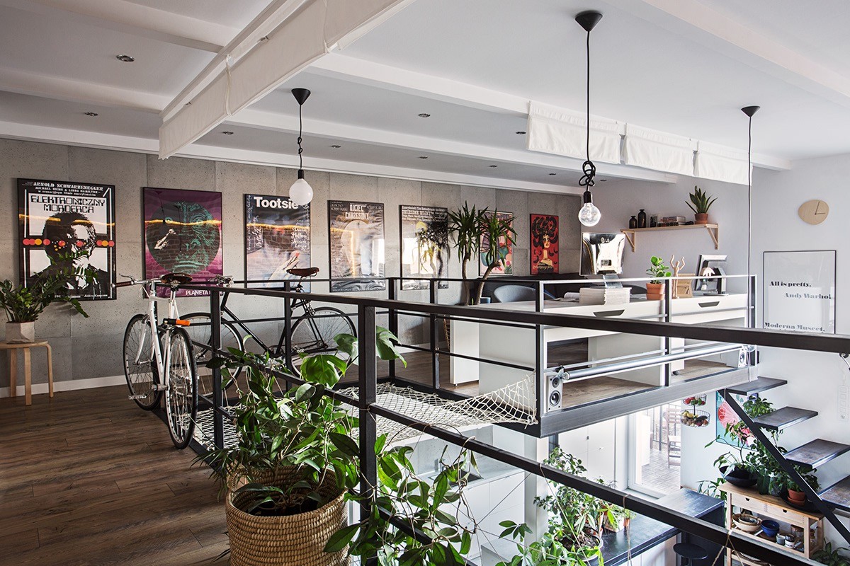
A small lounge chair and faux sheepskin rug make a stylish vignette by the home entryway. Above the entry, a hammock platform is attached to the mezzanine’s steel frame. The transparent feature extends the mezzanine’s usable space without taking away any light or sense of space from the downstairs module.
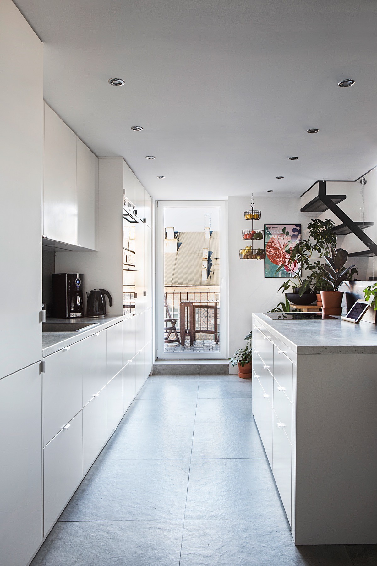
Beneath the mezzanine, the galley kitchen employs a white gloss finish to extend its sense of space and light. A balcony door is installed with clear glass to bring in a taste of the outdoors.
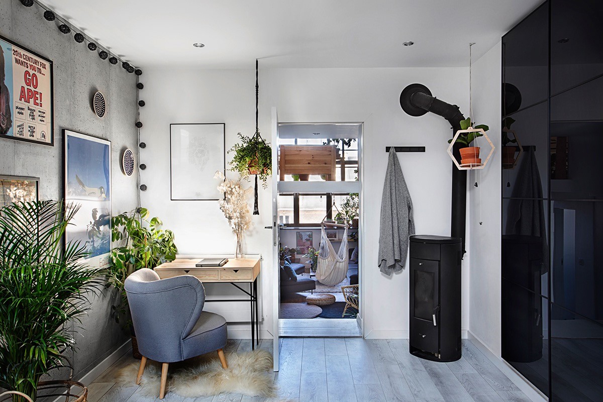
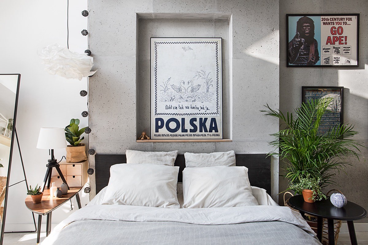
The private bedroom leads off the living room. It is equipped with its own wood burning stove to make evenings cosy.
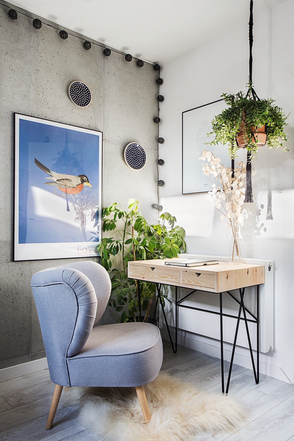
A modern home office desk is positioned in one corner of the room. The desk is surrounded by indoor plants and uplifting blue accents to calm and motivate.
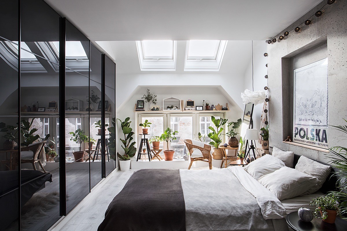
Black wicker string lights are pinned up and over the bedhead in reflection of the black gloss wardrobes at the foot of it. A small dressing area is arranged by the windows.
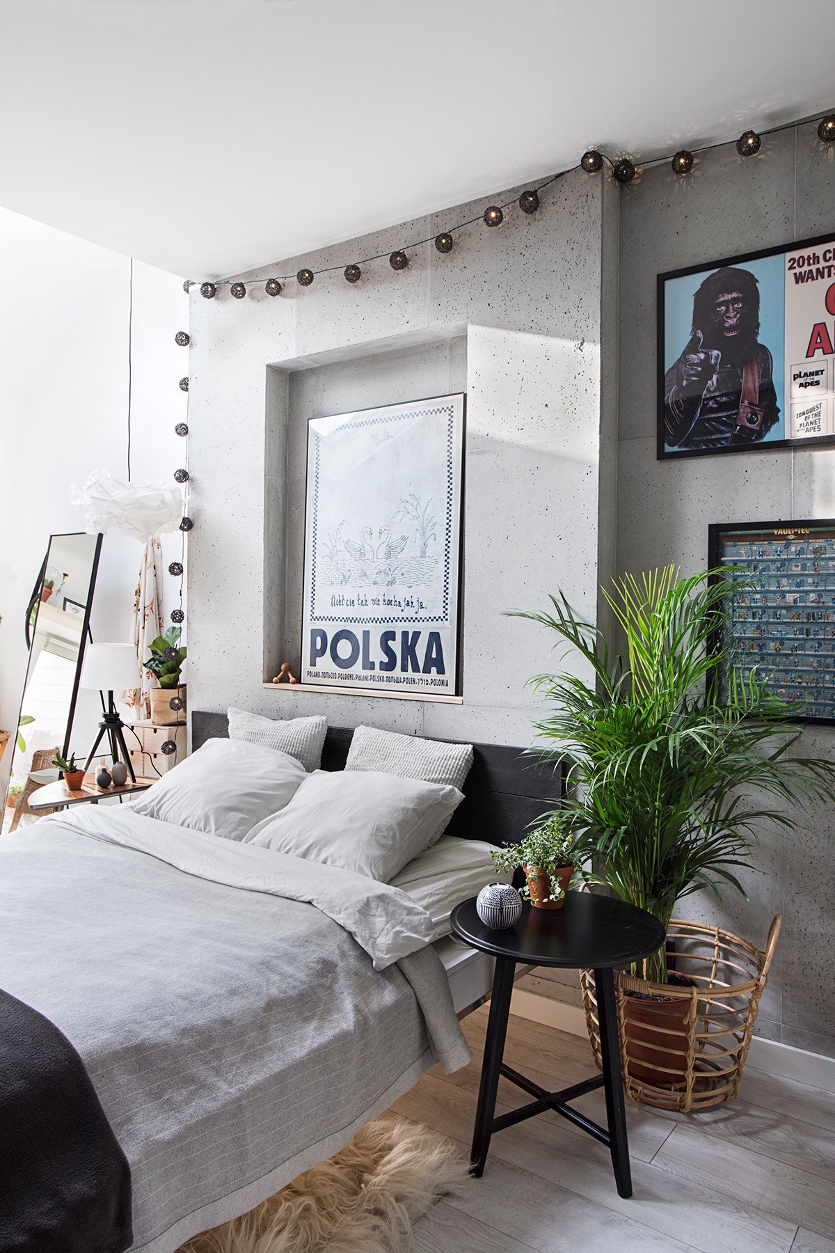
A mature plant thrives by one small side table, which grows a grounded earthy vibe.
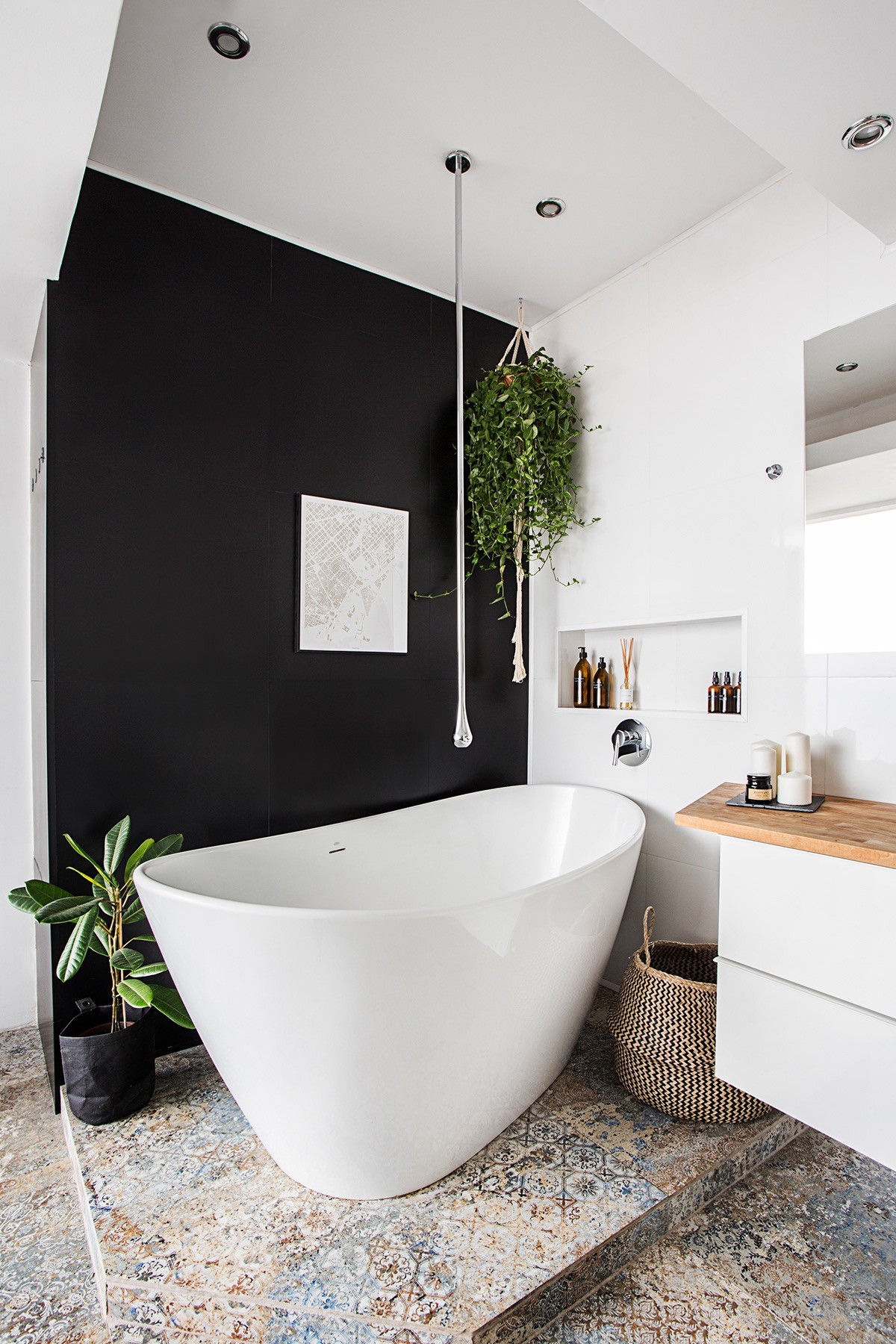
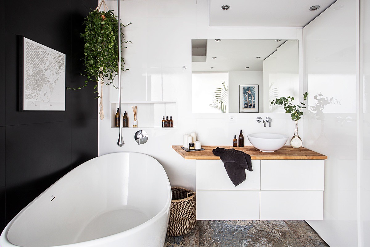
A stunning bathtub stands out cleanly against the pitch backdrop. Beautiful blue and beige tinted tiles pattern the floor.
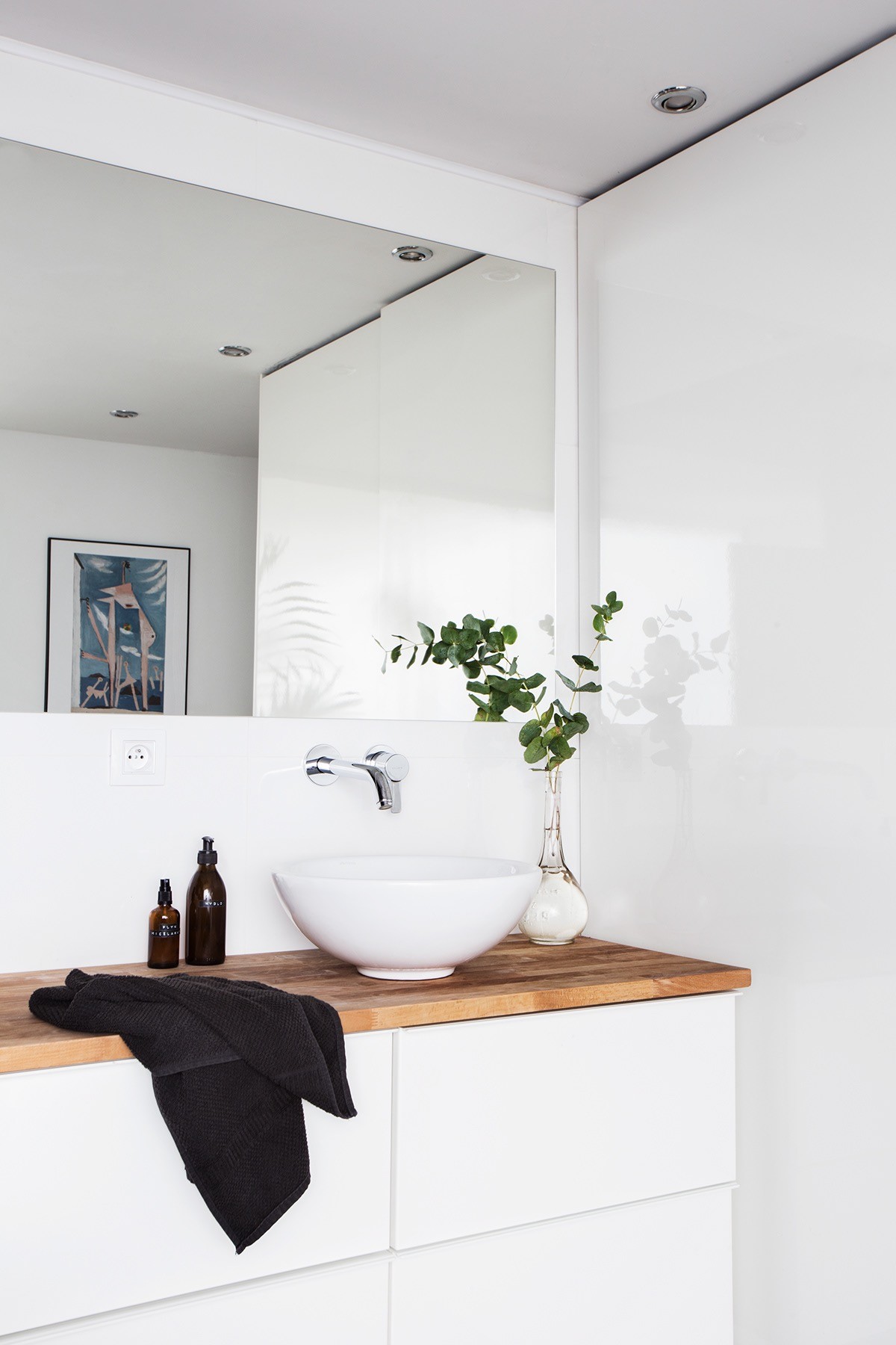
The bathroom sink sits upon a wooden countertop, which gives the black and white scheme a moment of natural breath.
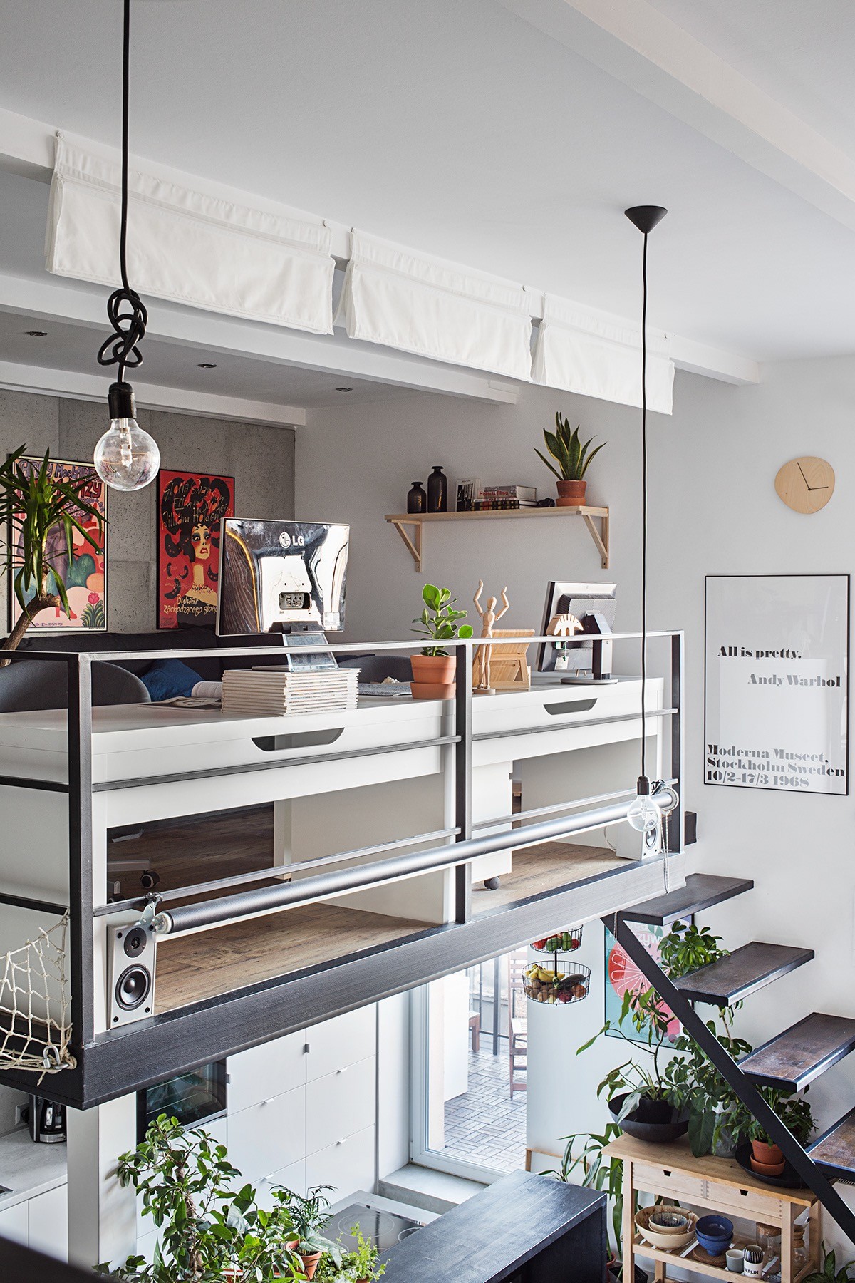
Up on the mezzanine, a speaker is situated under each side of a desk. They face outwards to the living room so that music can be played into the whole apartment.
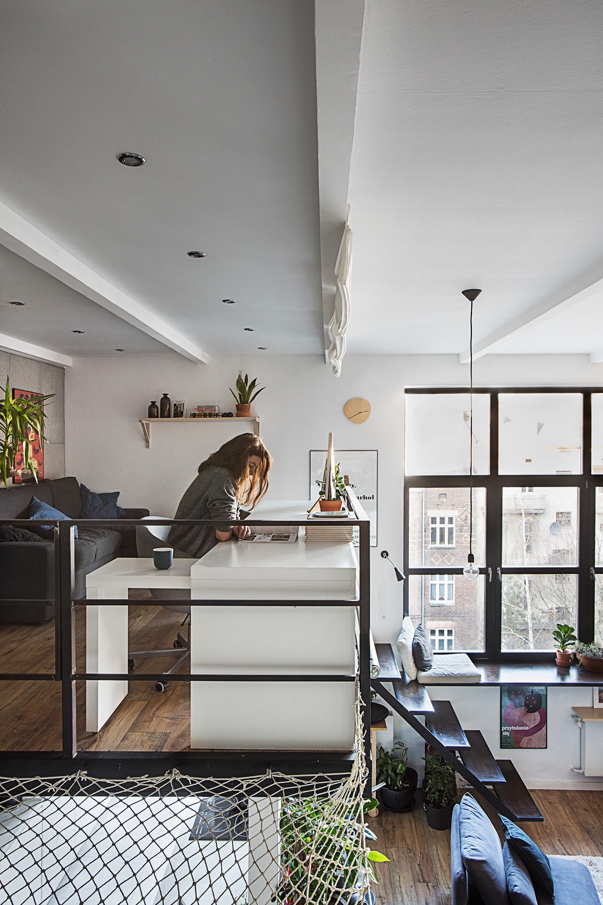
White blinds can be pulled down in front of the home workspace to shroud it from the living room, or to block out intense sunlight from the huge windows.
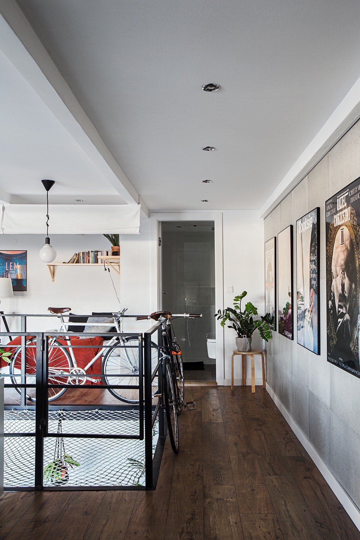
A daybed/guest bed is set up at the end of the mezzanine, with blinds installed for privacy when required.
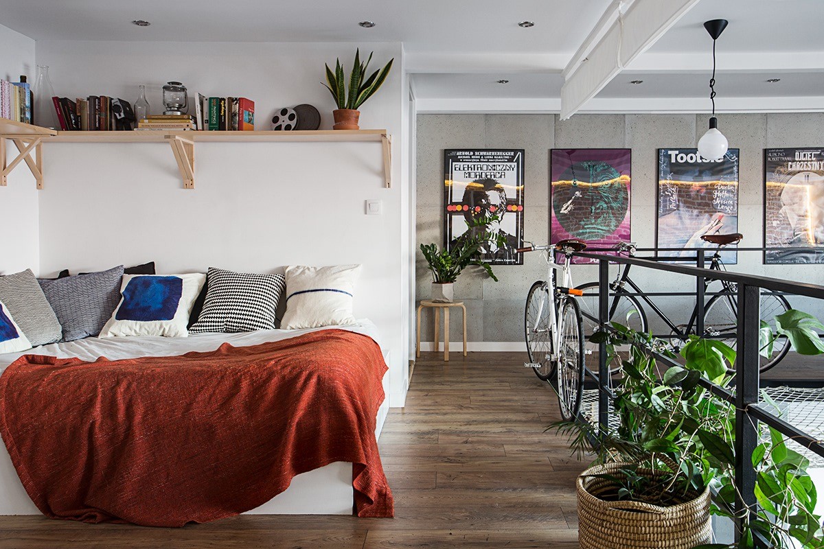
Simple wooden wall shelves hold reading material.
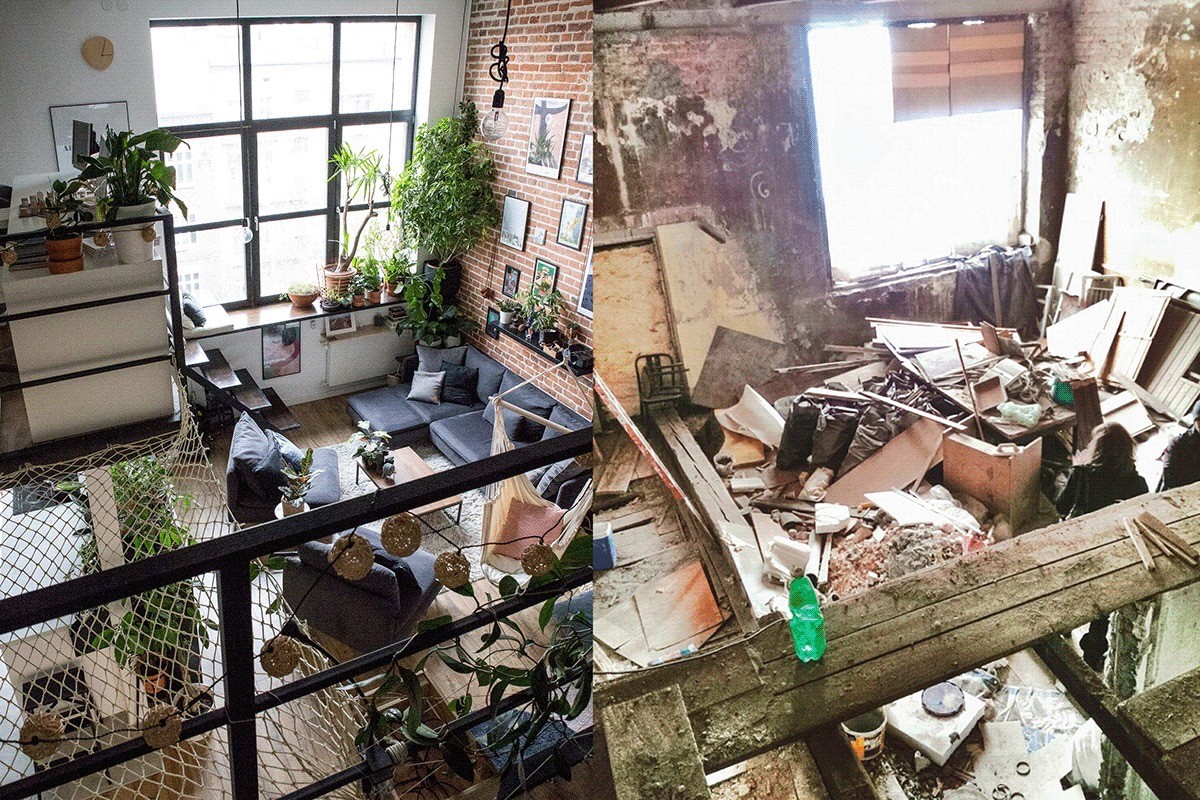
Before and after shots of the loft renovation. The scale of the job was immense, with no obvious starting point outside of sheer imagination.
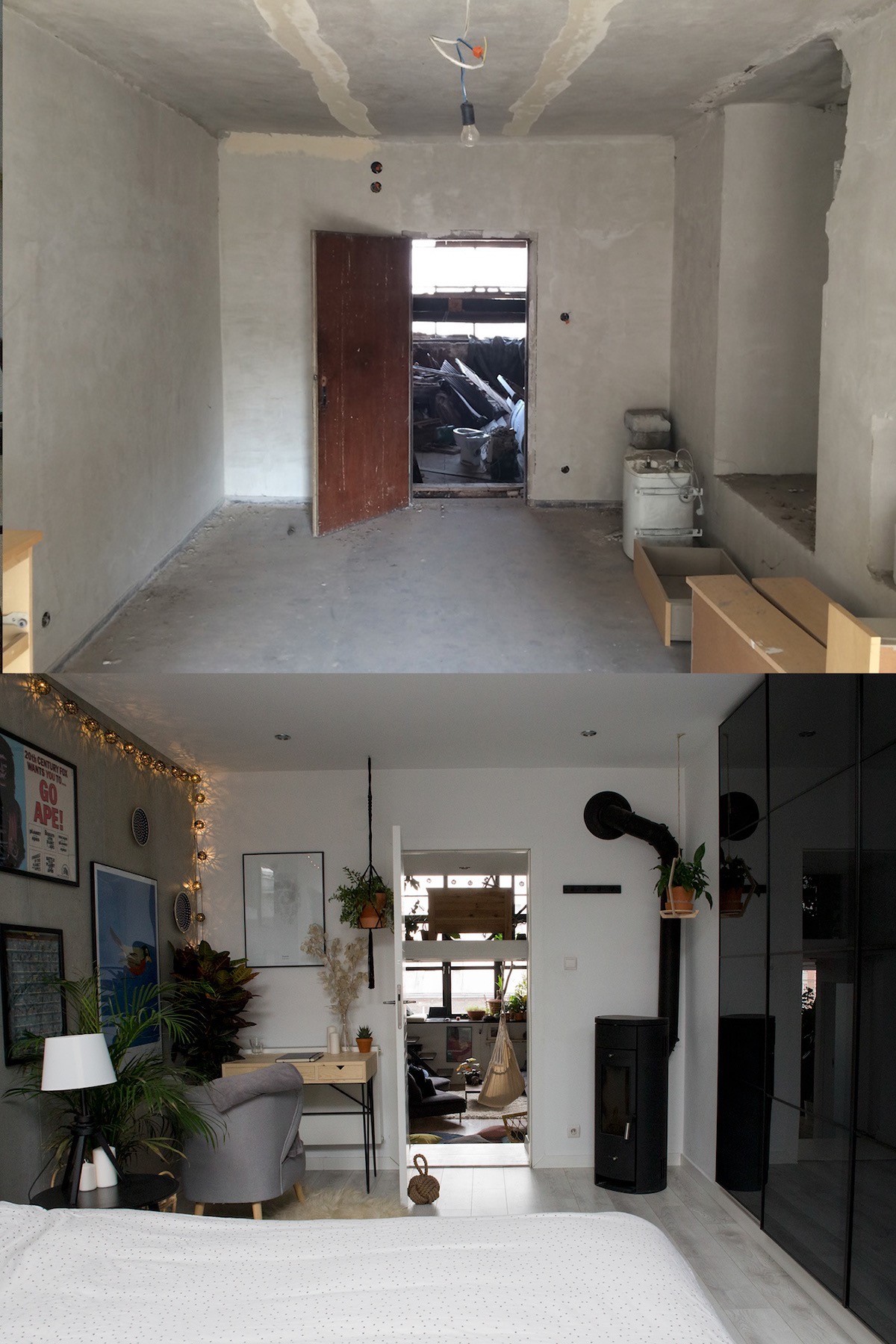
Bedroom before and after shots. New plaster reveals the first glimmer of a usable, comfortable space. We can also see how shiny new wardrobe doors disguised an irregular void in the wall plane.
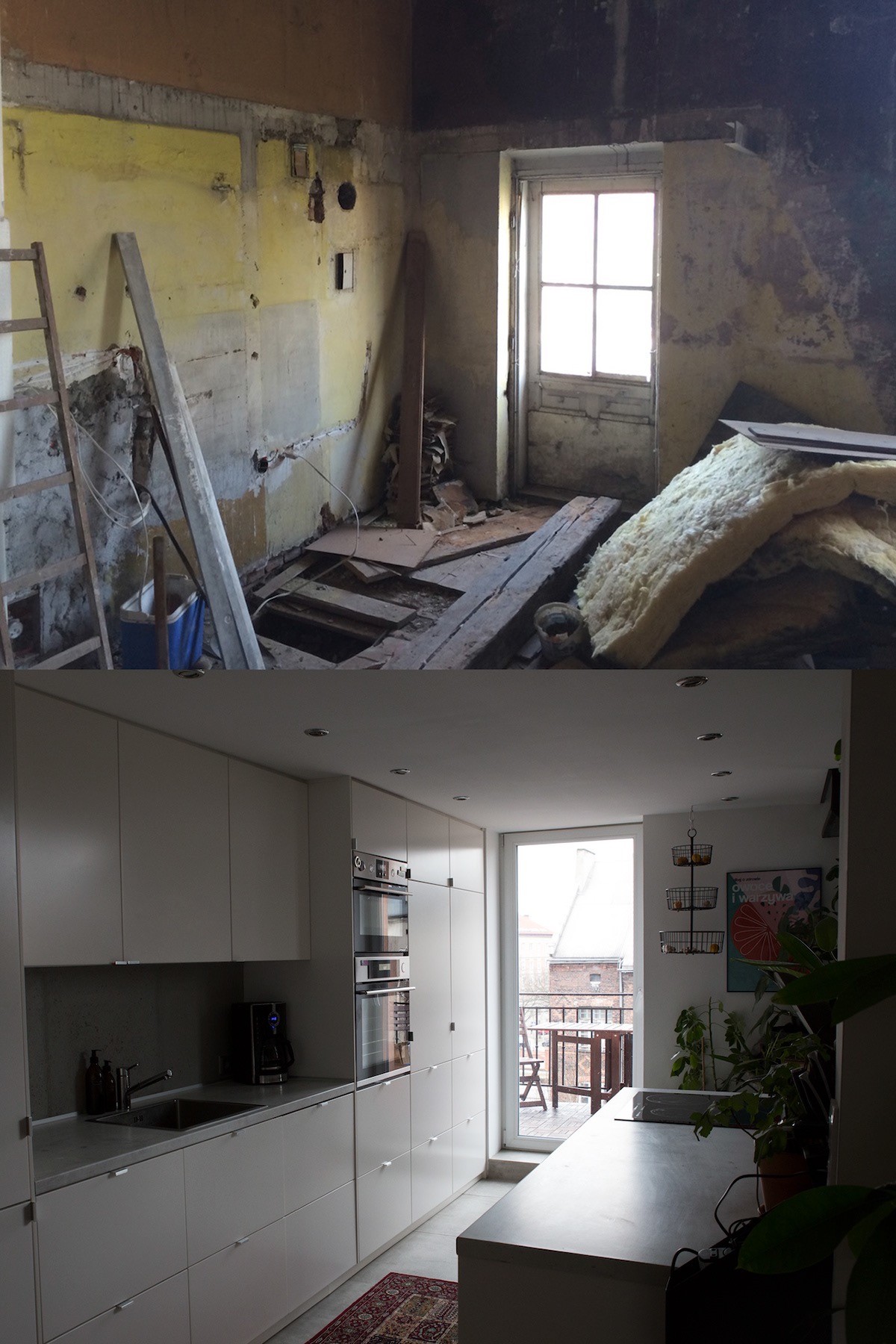
The kitchen before and after shots show how an uninspiring corner became a clean and pleasant galley.
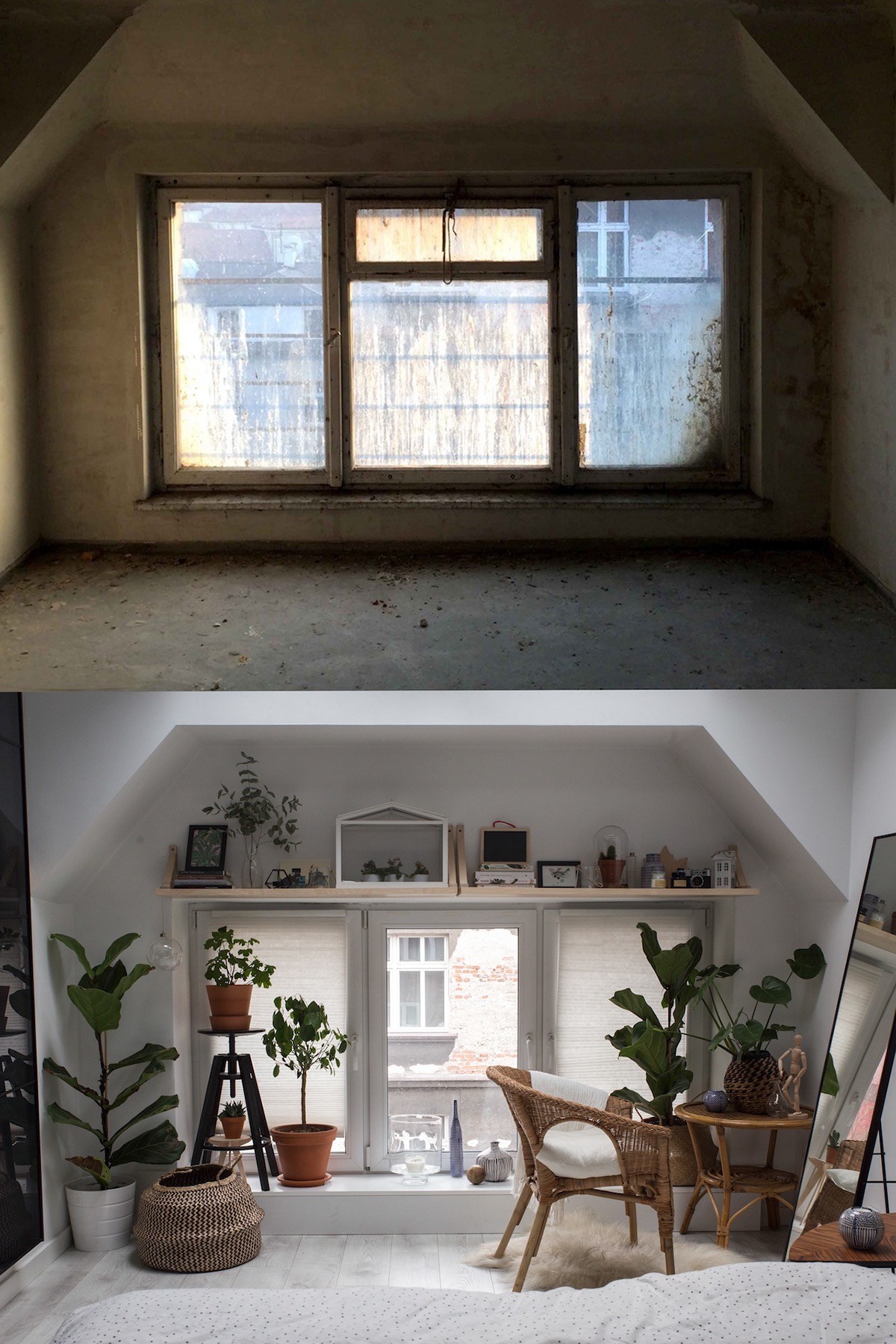
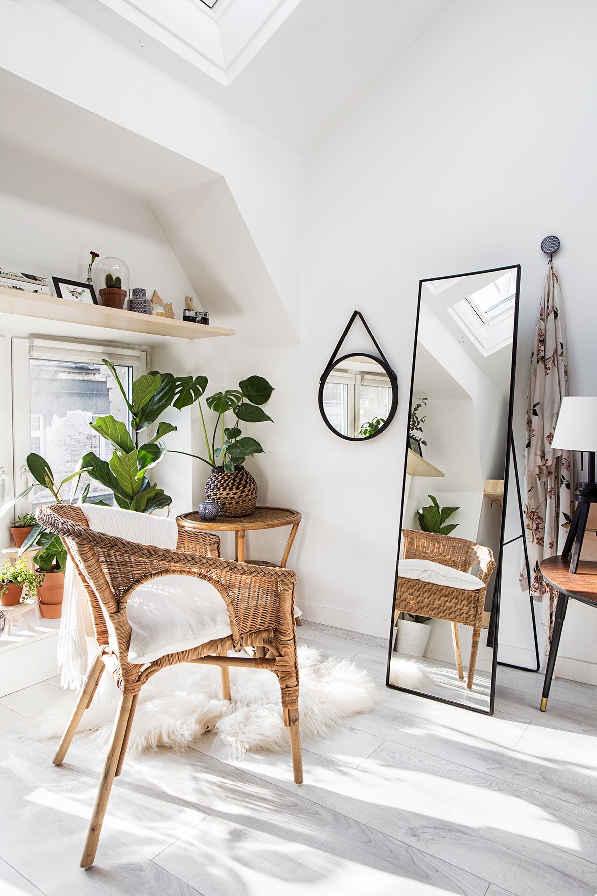
The bedroom window is a gorgeous shapely feature that draws you toward it. There are a pair of velux windows installed above this area too, which creates a light and open feeling like being out on the rooftops.
