Because of work and family ties, a couple of homeowners came to choose an old apartment located in Tianmu, District of Taipei. Despite the location meeting approval, the interior of the apartment was far from what the couple had envisaged for their first joint home. The pair dreamed of a home with a clean and simple aesthetic, a clear space awash with white. The team at ST Design Studio decided to take the interior all the way back to a blank canvas, before moderately embellishing with different textures to add interest and visual warmth. The project developed into a bright space where green plants flourish and exist freely among select furniture pieces that the homeowners enjoy.

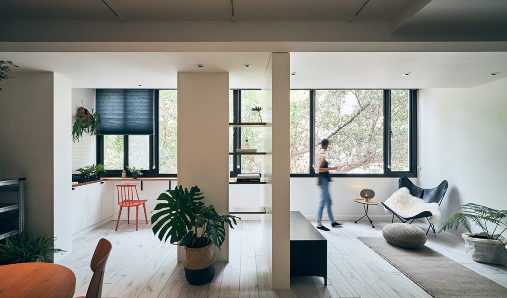
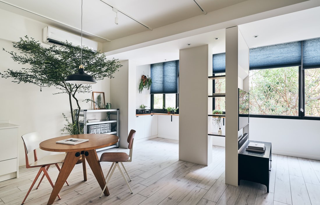
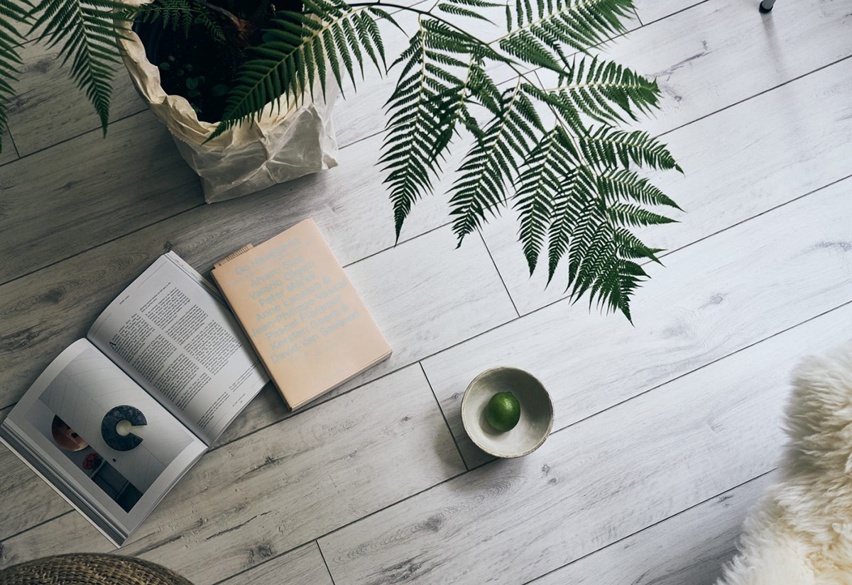
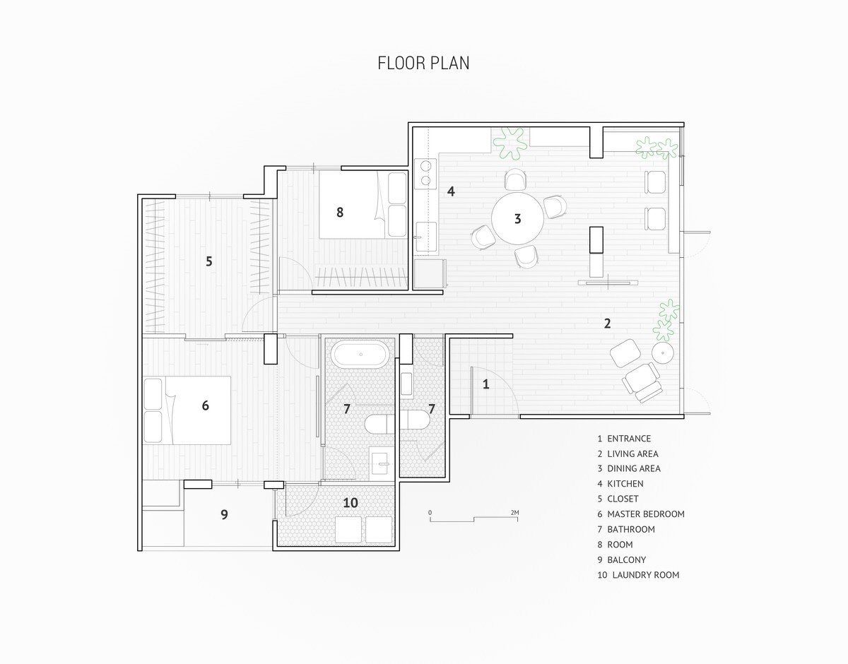
Entering the home, we see that only structural support columns remain in the common areas, all partition walls have come out to restore the original spatial scale of the apartment. The bright and refreshing white decor and green plants are key to the atmosphere of the easy living room, where the clutter of cabinets have been reserved to a minimum. The wear-resistant flooring is a light oak plank, which works to exaggerate the sense of openness.
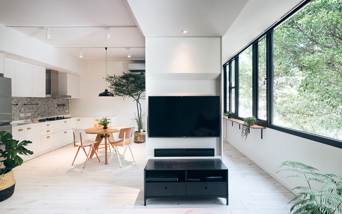
A lounge area has been configured between one corner of the room and a central tv wall. The view from the lounge also observes the entire kitchen diner, to keep lines of communication and interaction open and unobstructed.
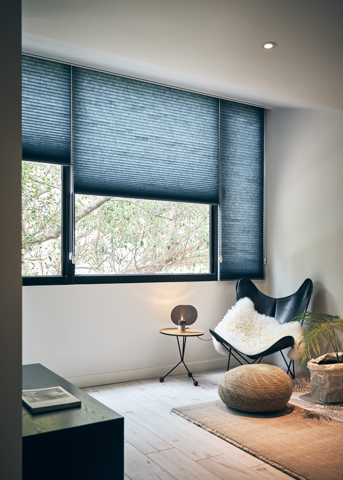
The ‘lounge’ is a single black accent chair and an accompanying woven footstool, placed on a natural runner. A small side table holds a lamp. The homeowners and design team decided against a sofa, so as not to bring in an obstacle that would affect the open formation.
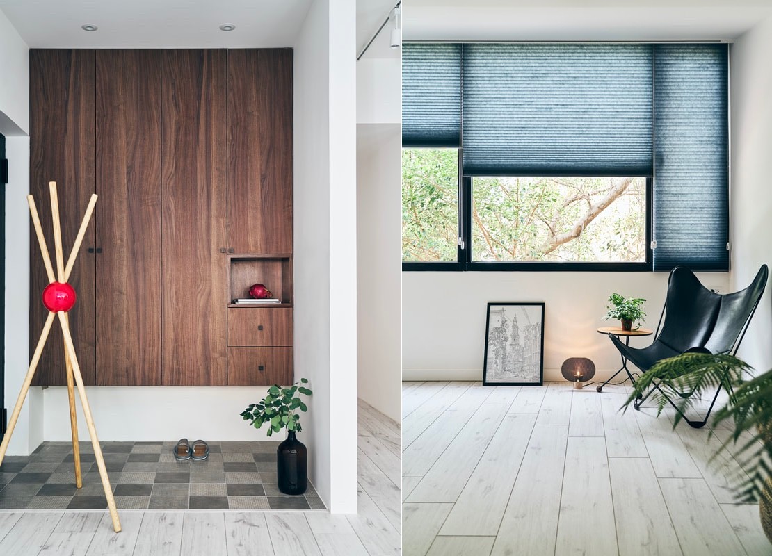
The lounge also has a direct view of the home entryway to its left. The home entryway has been sensibly stocked with storage options, to act as a catch all for items coming in through the door. Four dark walnut veneer cupboard doors hide away bulky kit, whilst a couple of small drawers take care of the smaller bits and bobs. The made to measure units have been mounted up off the floor to leave a nook in which to place shoes. A modern coat stand is placed nearby, bringing in a lighter wood tone and a fun pop of red.
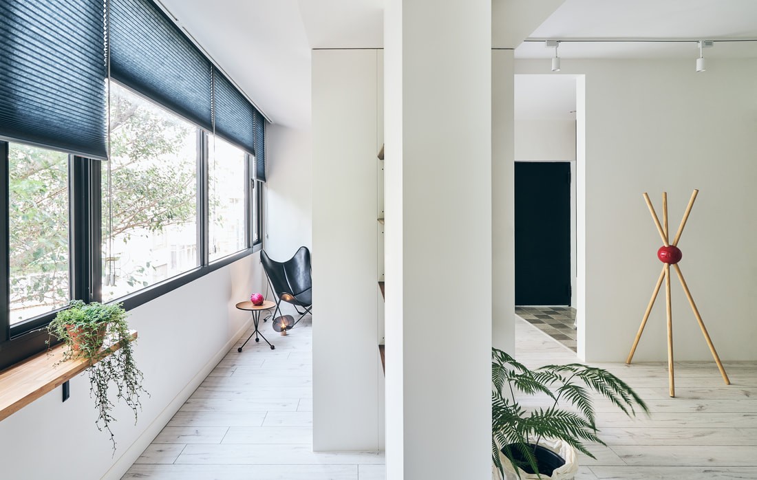
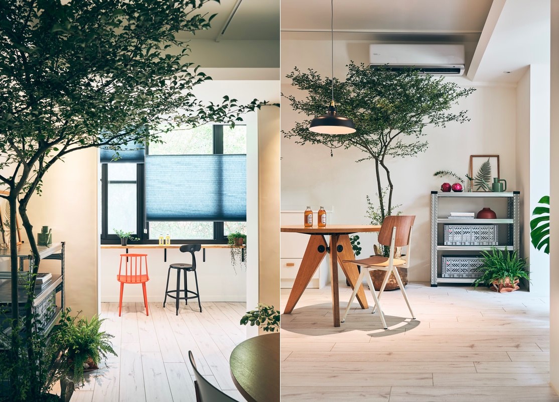
Blue window blinds offer adjustable opening arrangements; partial shading means that the indoor brightness can be enjoyed at a maximum without suffering any unpleasant glare. Structural support columns force a slight separation in space in the vicinity of the kitchen diner. Beyond the column, a narrow rest bar area has been fashioned along the window wall.
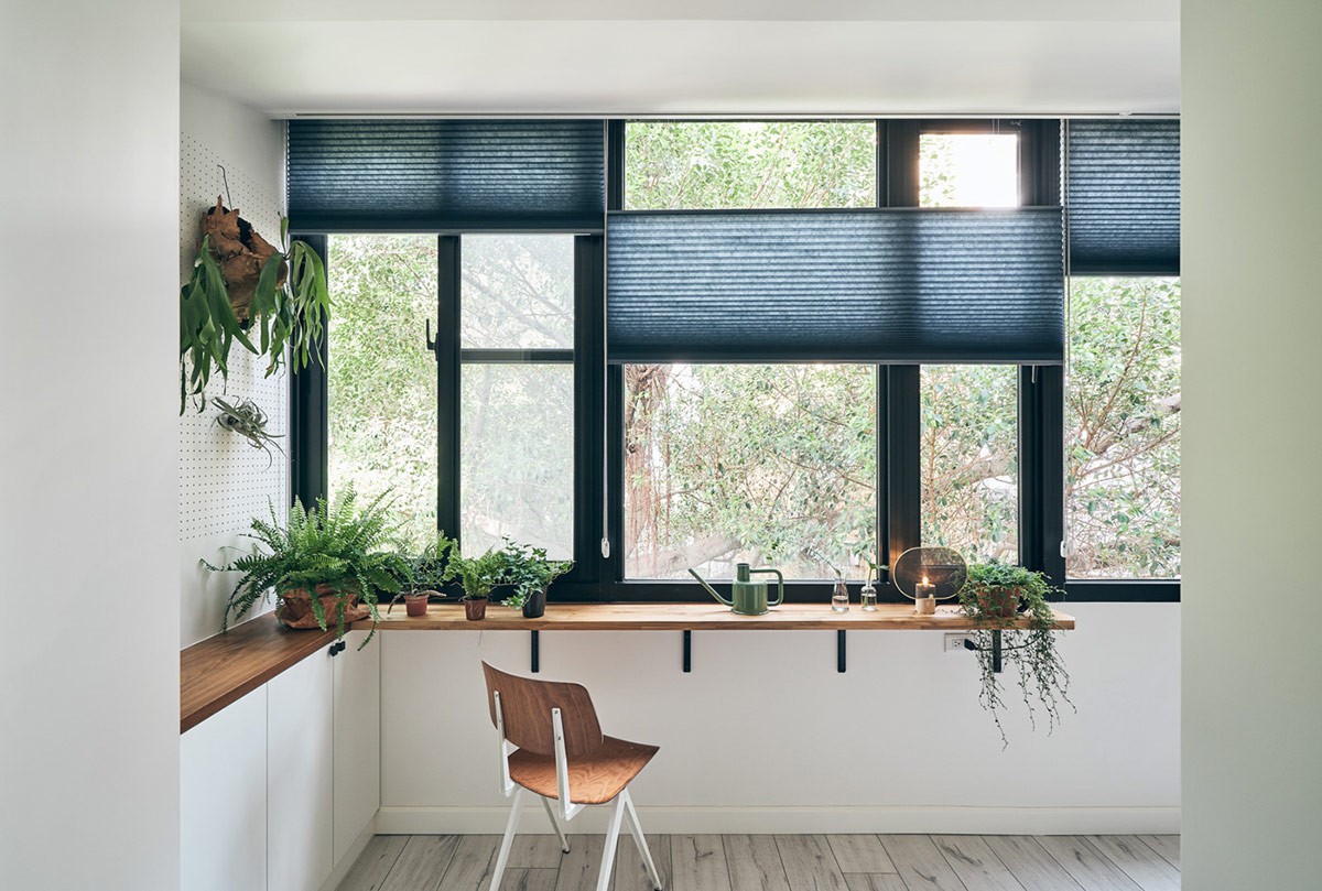
The ledge serves as a home office for one of the homeowners who is a blogger. It can be utilised as a convenient place to sit and chat, whilst enjoying a drink together. A collection of indoor plants share the shelf too, waiting for a drink from that unique watering can.
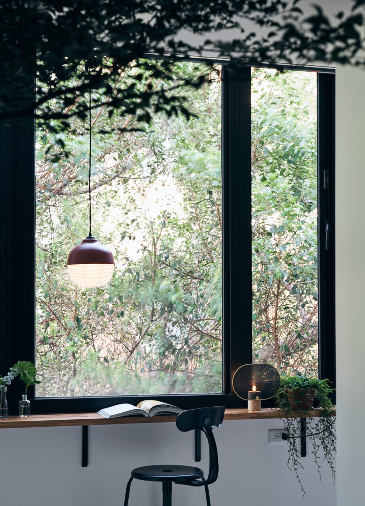
The shelf is also a serene place to read, with a gorgeous view of the leafy treetops outside. The large window, plus open plan layout, introduces tree views into the whole room, which is the main reason the couple chose this particular apartment.
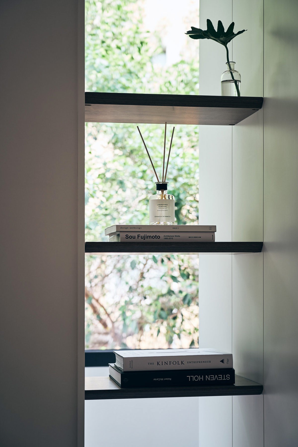
The tv wall and another support column are bridged together by a set of shelves that lay open to each side. Books, plants and reed diffusers dot the shelf surfaces.
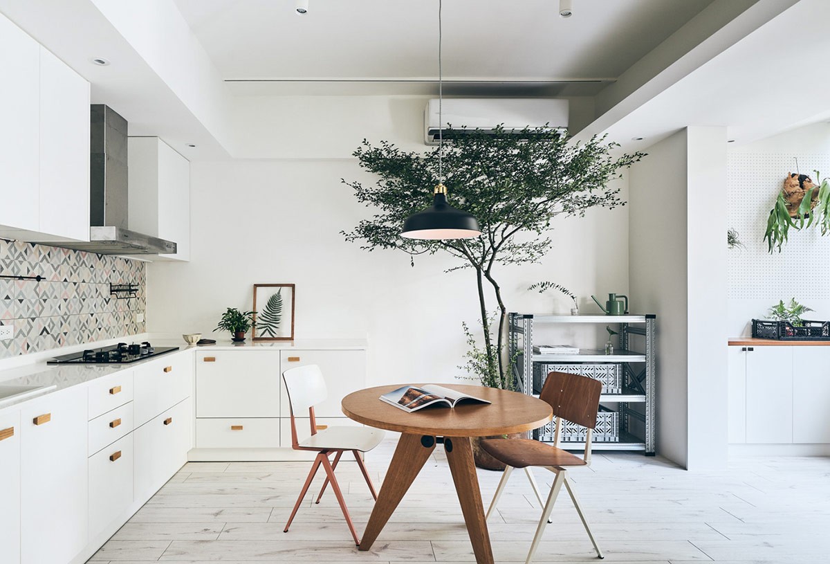
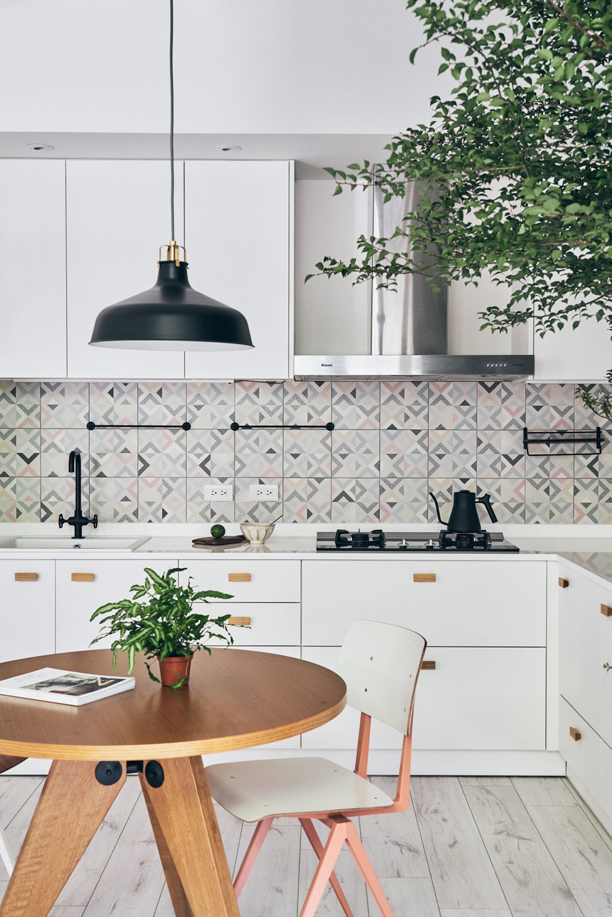
The kitchen and dining area share natural wooden textures that bring definition to the space, and add a welcome hint of warmth. An elegant black dining pendant light punctuates the light look.
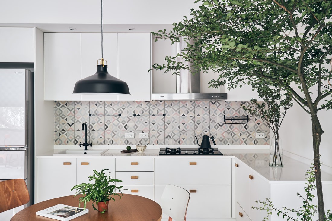
Colorful backsplash tiles and solid wood handles bring personality to the simple practical white kitchen.
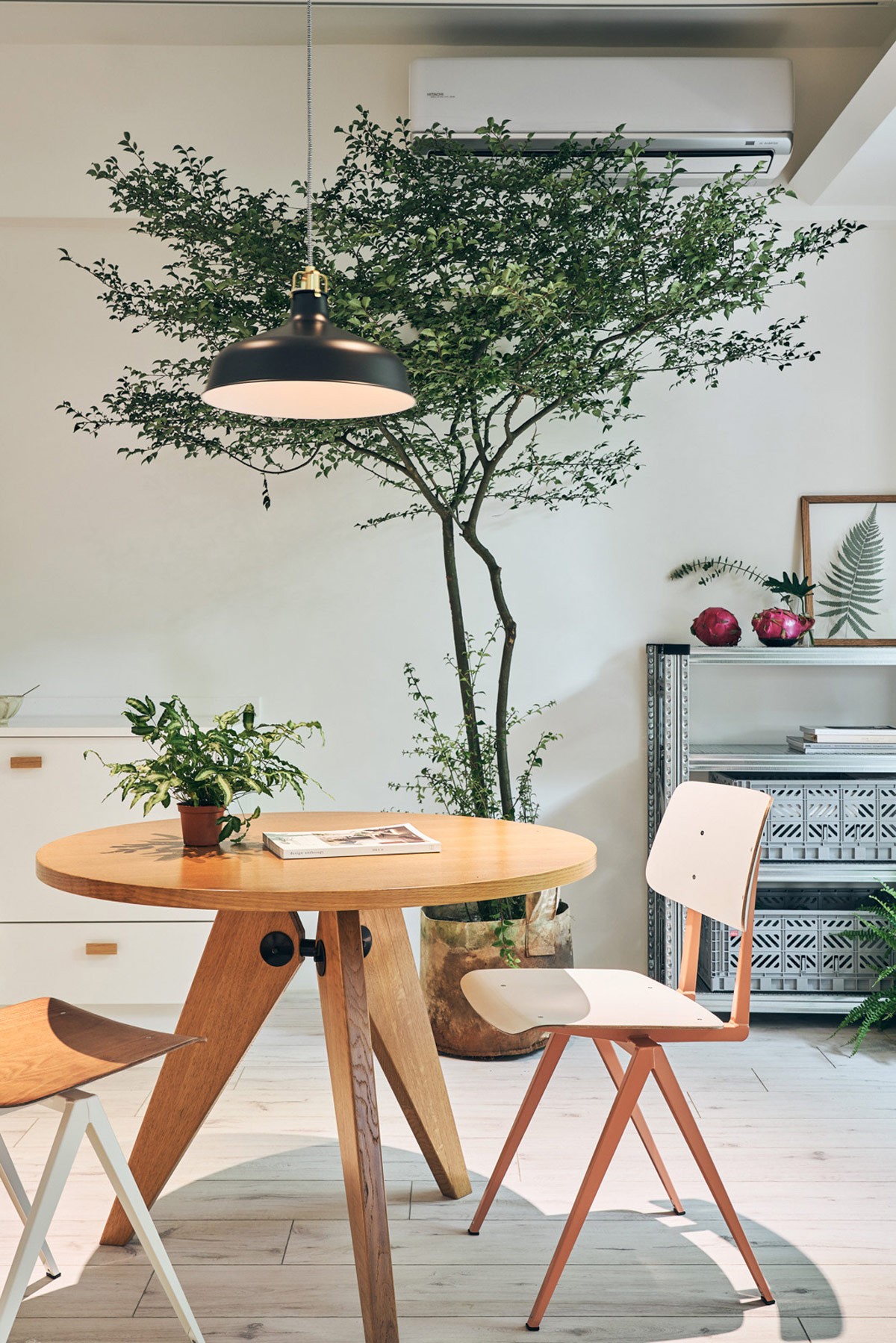
A charming tree grows beside the Nordic-style dining table and chairs, which gives the indoor eating area an outdoor ambiance.
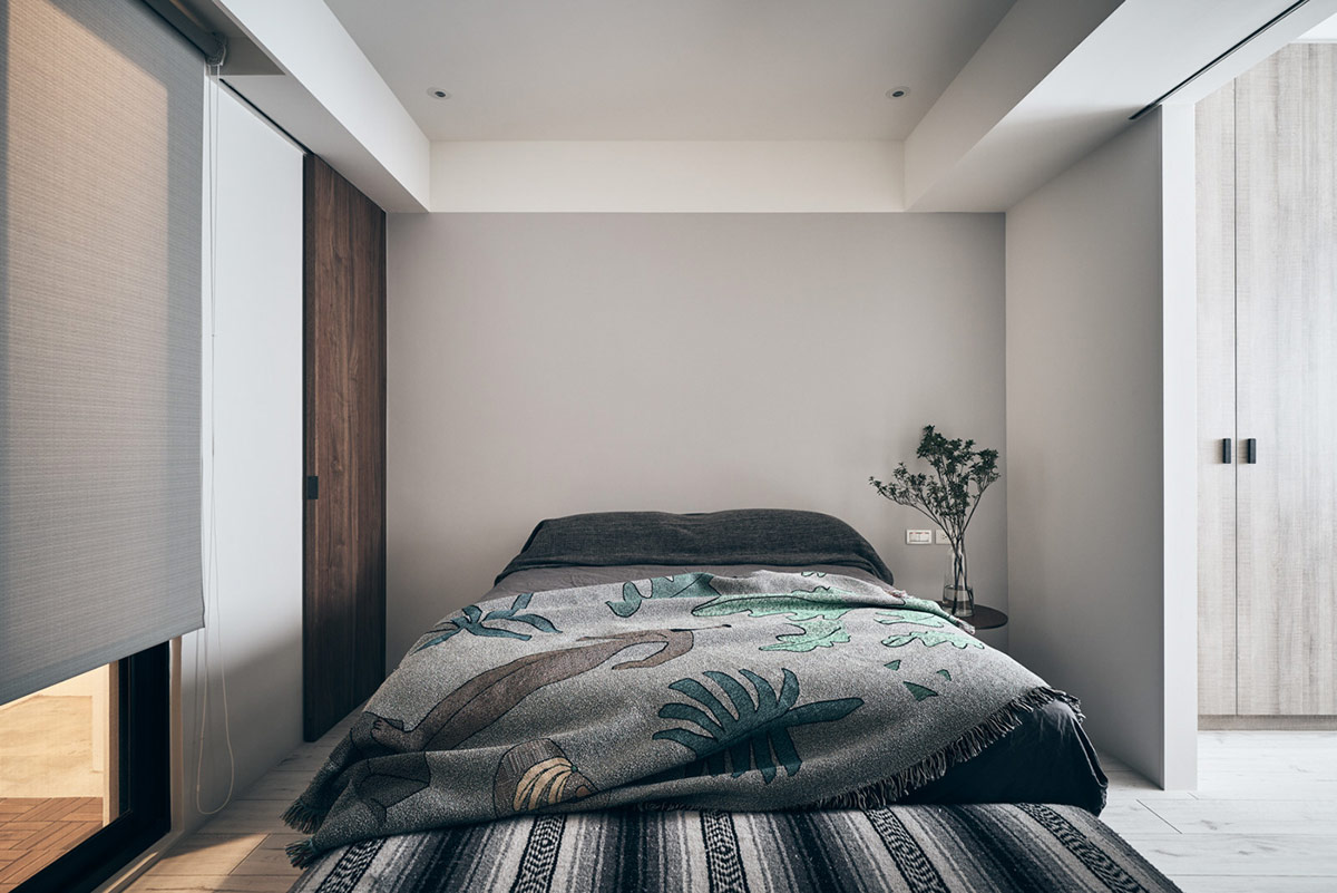
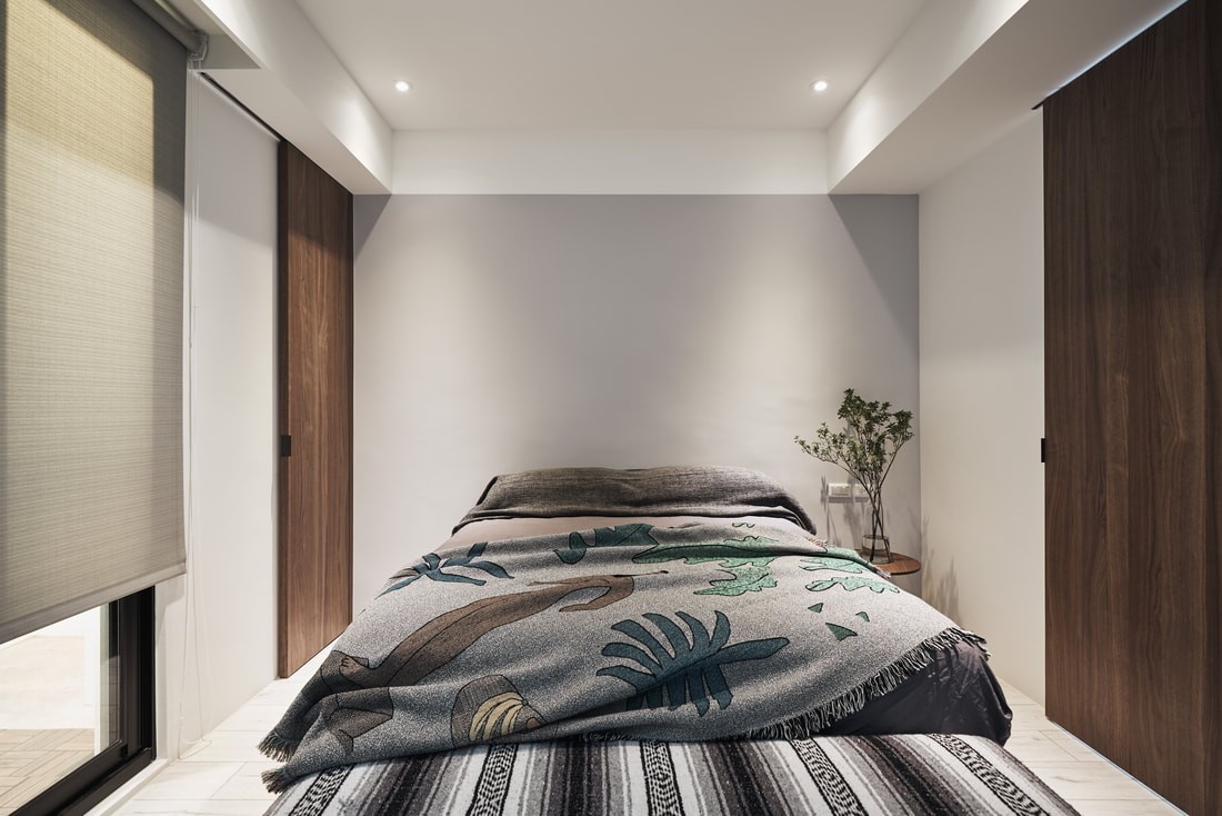
Maintaining the clean and clear style, the master bedroom features no headboard or bedside units. A simple pale grey accent wall leaves the cozy bedroom calm and quiet.
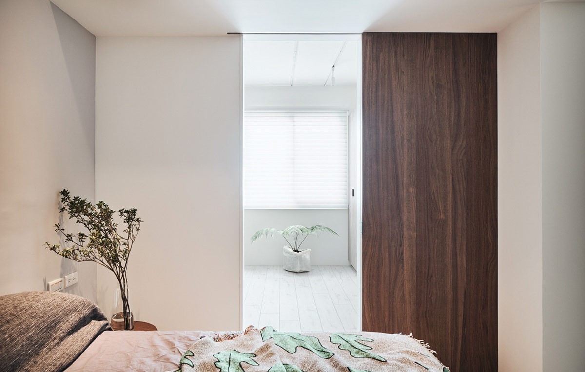
Walnut sliding doors lead to a dressing room. The large dressing room is used for much of the homeowner couple’s storage needs. By having a dedicated area like this, it is possible to tuck away any excess items that might ruin the minimalist quality and simplicity of life in the main living area.
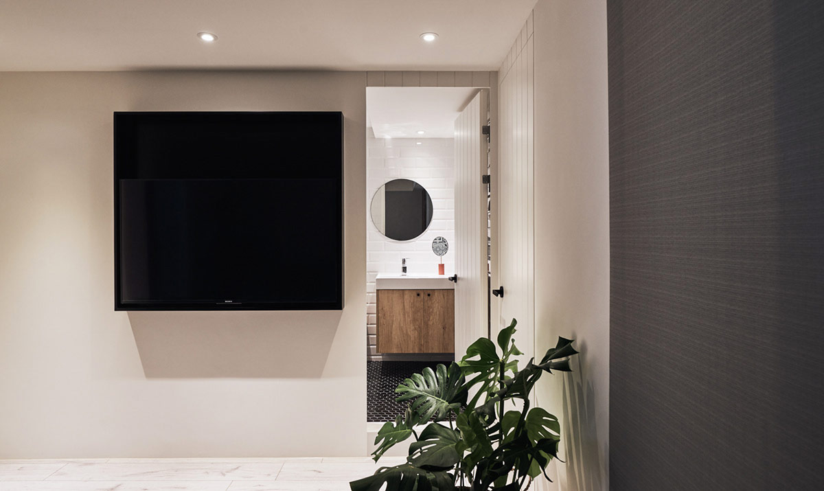
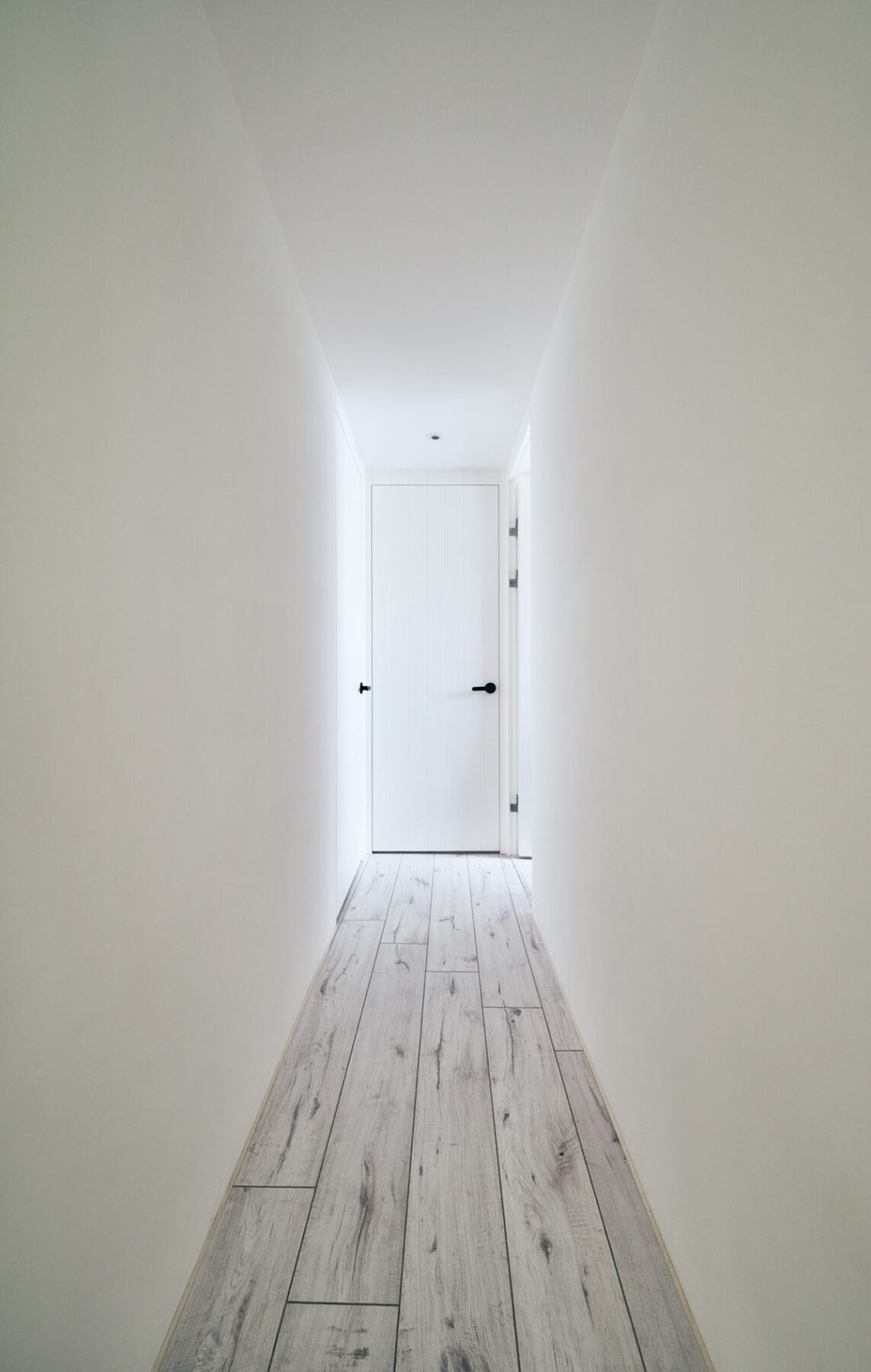
Opposite the foot of the bed, two white doors lead to an ensuite bathroom and laundry room. The door panels have been given the same line cut decoration as their surrounds so that they subtly blend in.
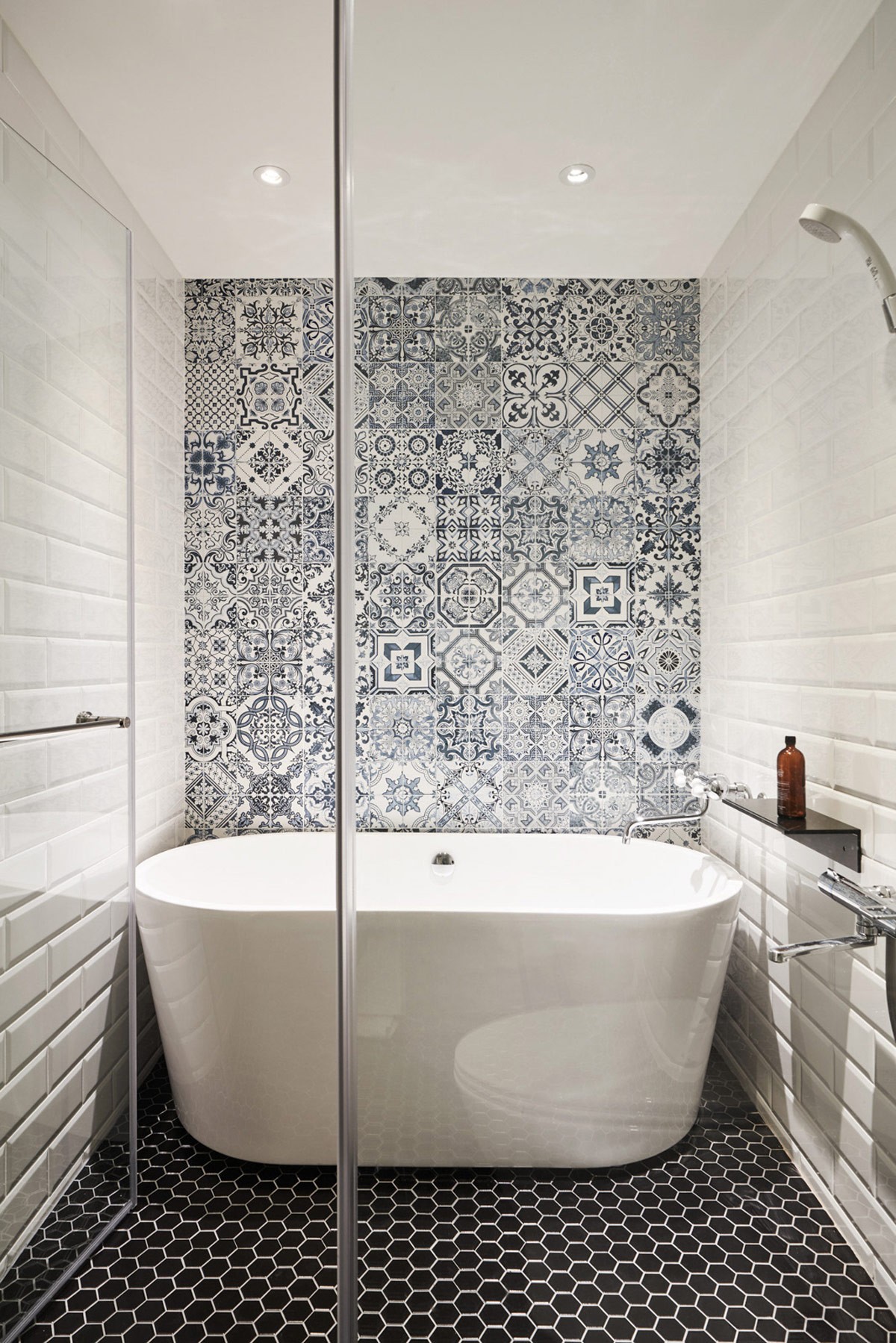
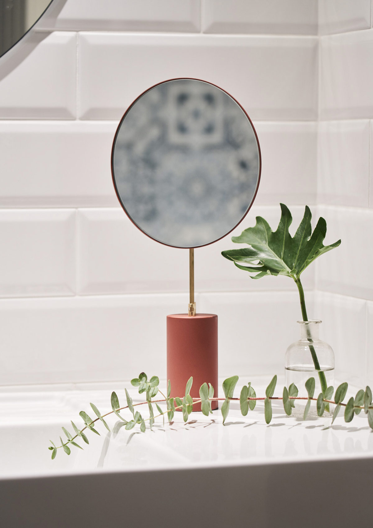
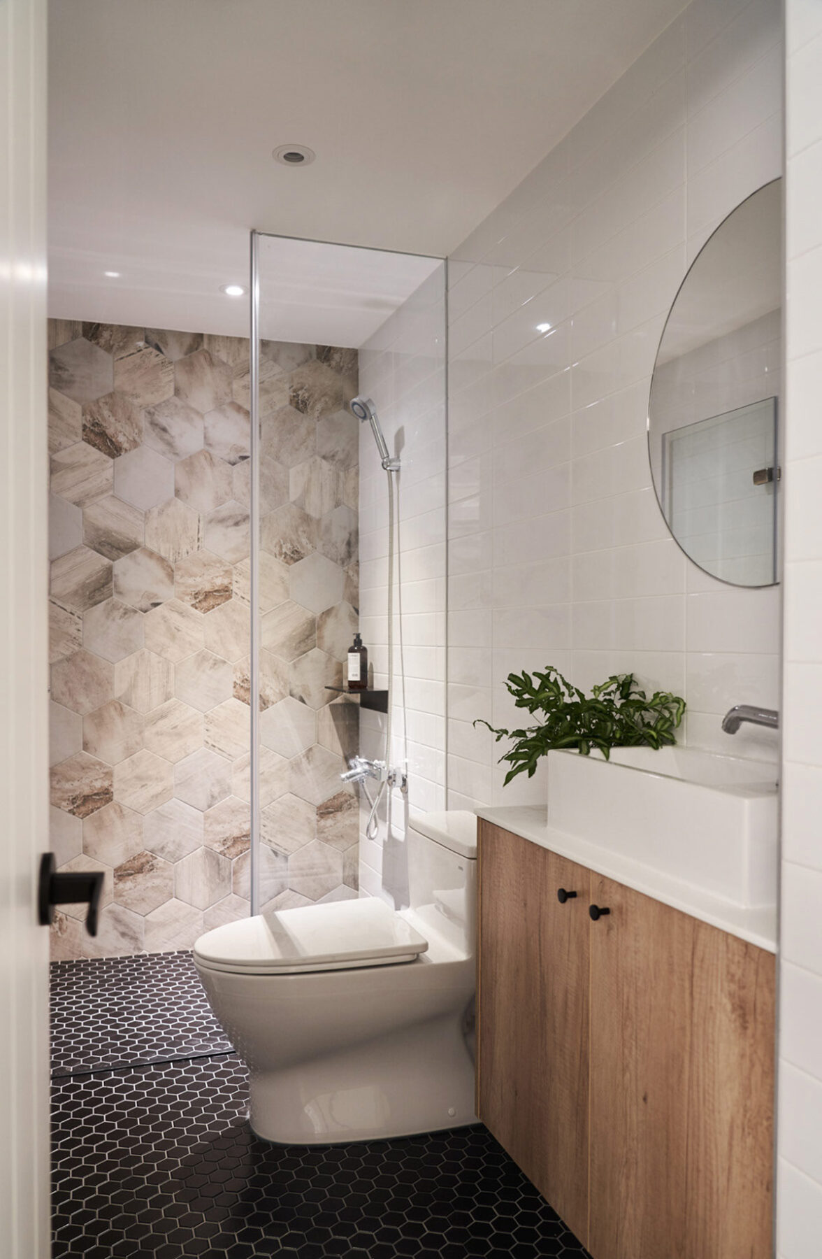
Different types of tile come together in the bathroom to stunning effect. Blue patterned wall tiles meet black geometric floor tiles beneath a freestanding bath. White metro tiles crisply texture the remaining walls.
