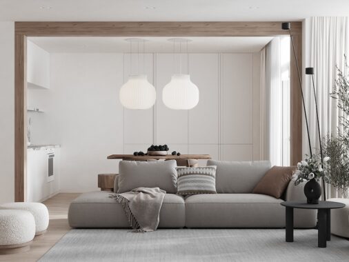
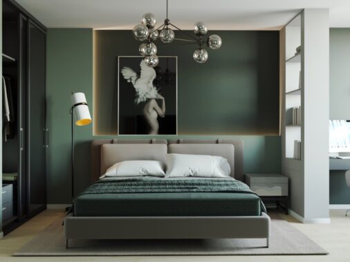
The Scandinavian style of interior design is one that has found its way into hearts and homes in many different parts of the globe - take these three homes for example. An apartment in Poland explores a dramatic interpretation of the Scandi style through large areas of dark colour and deep wood tone. When we take a trip to Vietnam we discover a decor scheme that is filled with rich brown and teal hues on a light biscuit background, and a rounded shape theme. Settling finally in a Ukraine apartment, there is a plush atmosphere derived from soft blush and grey furniture pieces, smooth wood, and bespoke feature walls.

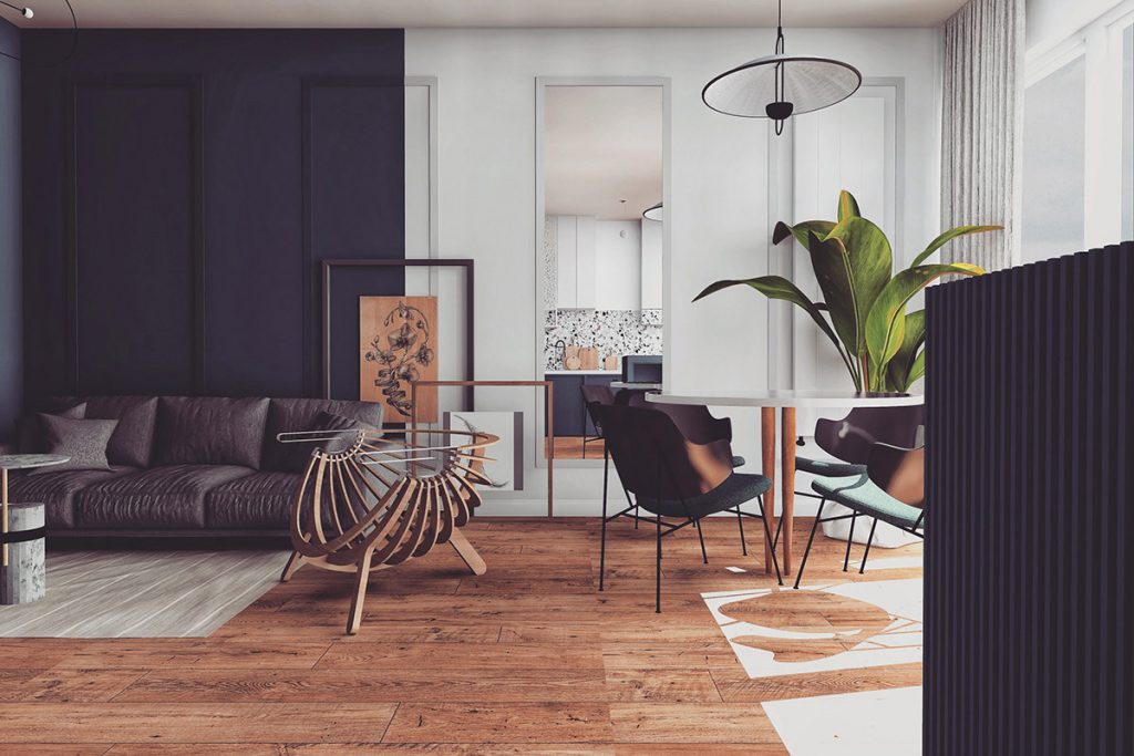
Our first stop is at the apartment in Warsaw, Poland. A dark section of wall makes a bold backdrop in the lounge area. A larger percentage of light paintwork has been used in the open plan room to comfortably balance out the darkness.
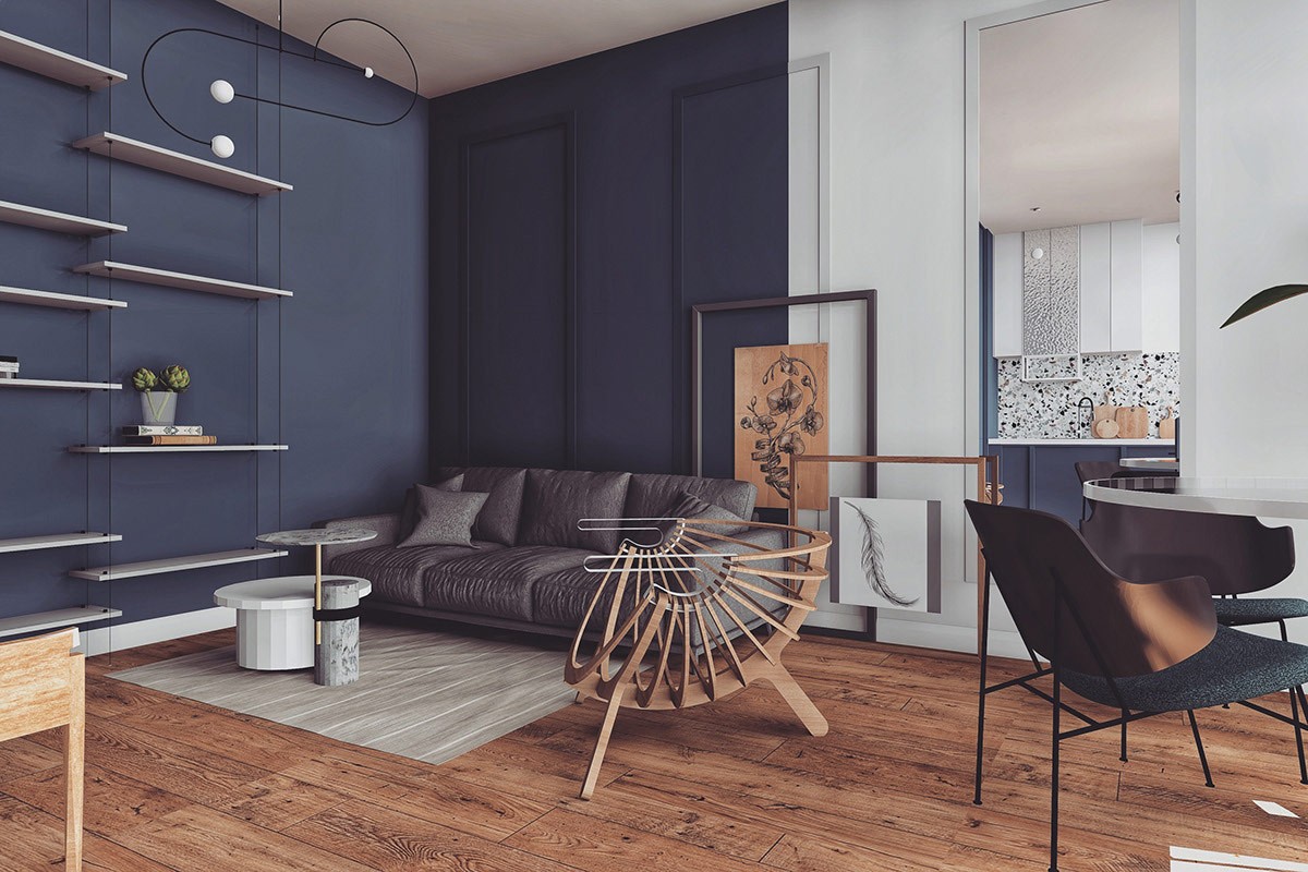
The sculptural chair seen here is the Shell chair by designer Branca Lisboa. The stunning chair acts as the centrepiece in the apartment.
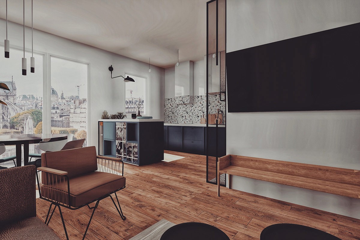
Below the TV, a narrow bench can be used either as extra lounge seating or as a place to set up consoles.
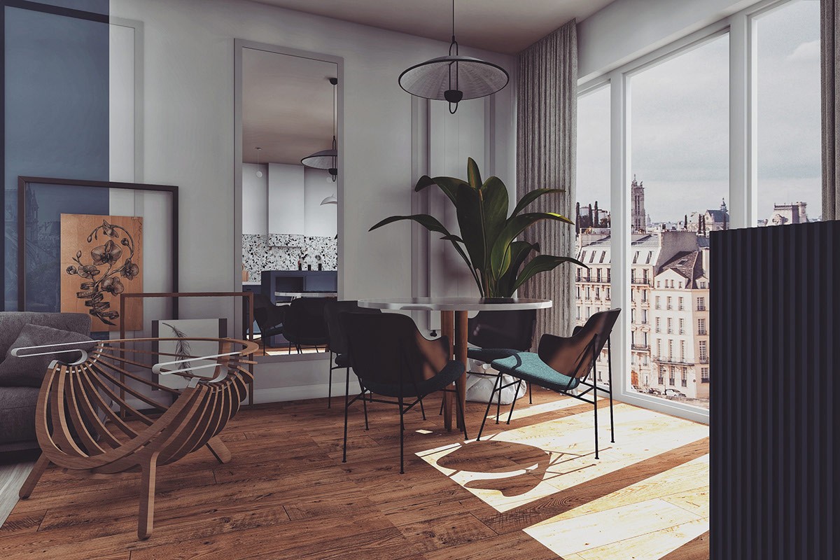
A dining area is set out adjacent to the lounge. Dark dining chairs encircle a light tabletop by the window. A tall mirror hung on the wall behind the modern dining bounces the natural light coming into the room. The reflective surface counteracts dark accents in the room, and creates a sense of added space.
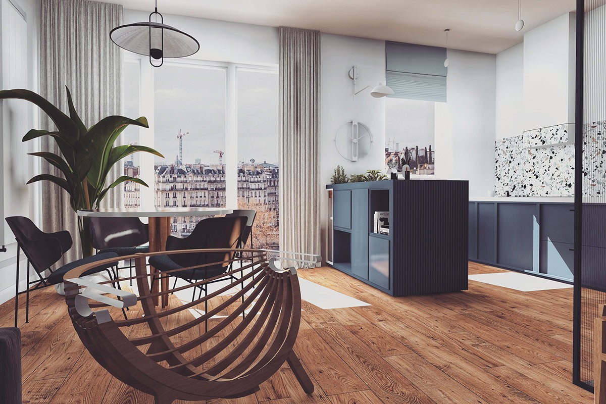
An indoor plant softens the corner of the room and shrouds a tall radiator. Light drapes dress each side of the windows.
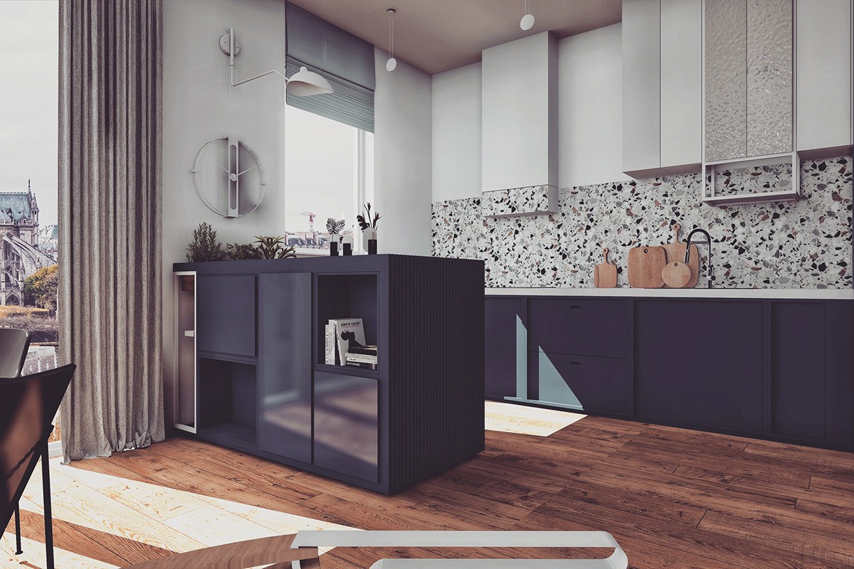
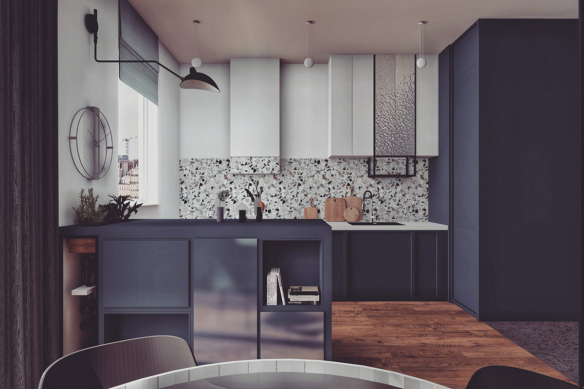
Opposite the dining area there stands a kitchen with peninsula. Dark base units are teamed with light wall cabinets and a multi-tonal backsplash.
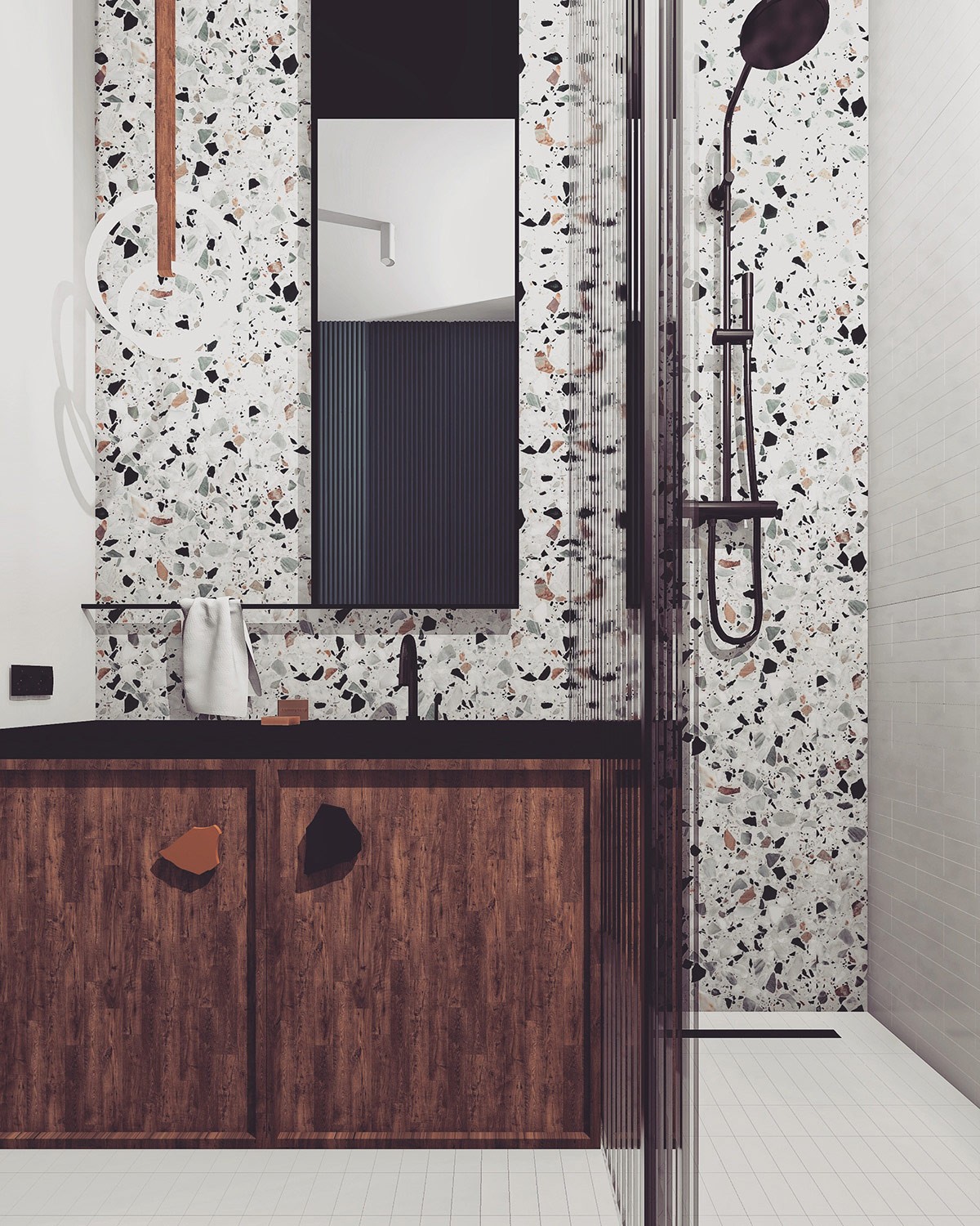
In the shower room we find a wet wall that mimics the multi-tonal backsplash in the kitchen. Cupboard handles on the bathroom vanity unit echo the freeform shapes scattered in the wall pattern.
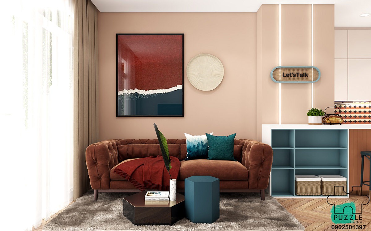
Apartment number 2, Vietnam. Teal and rich brown accent pieces add depth to a space painted in biscuit colour. A set of unique coffee tables bring modern geometric shape popular in Scandi style decor schemes. However, we can also note a rounded shape theme coming through, from an elliptical wall sign and a circle patterned backsplash in from the adjacent kitchen.
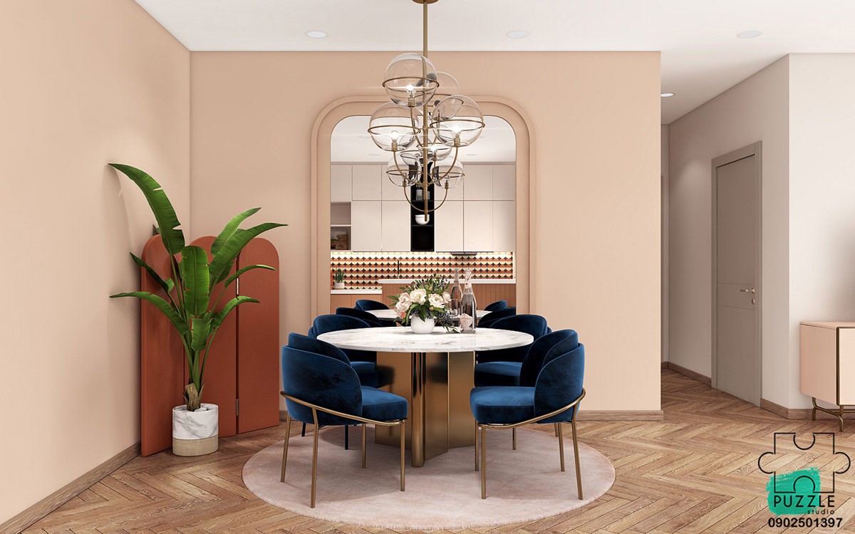
Arched panels make up a decorative screen in the dining area. A modern chandelier supports a group of glass globe shades over a curvaceous dining set.
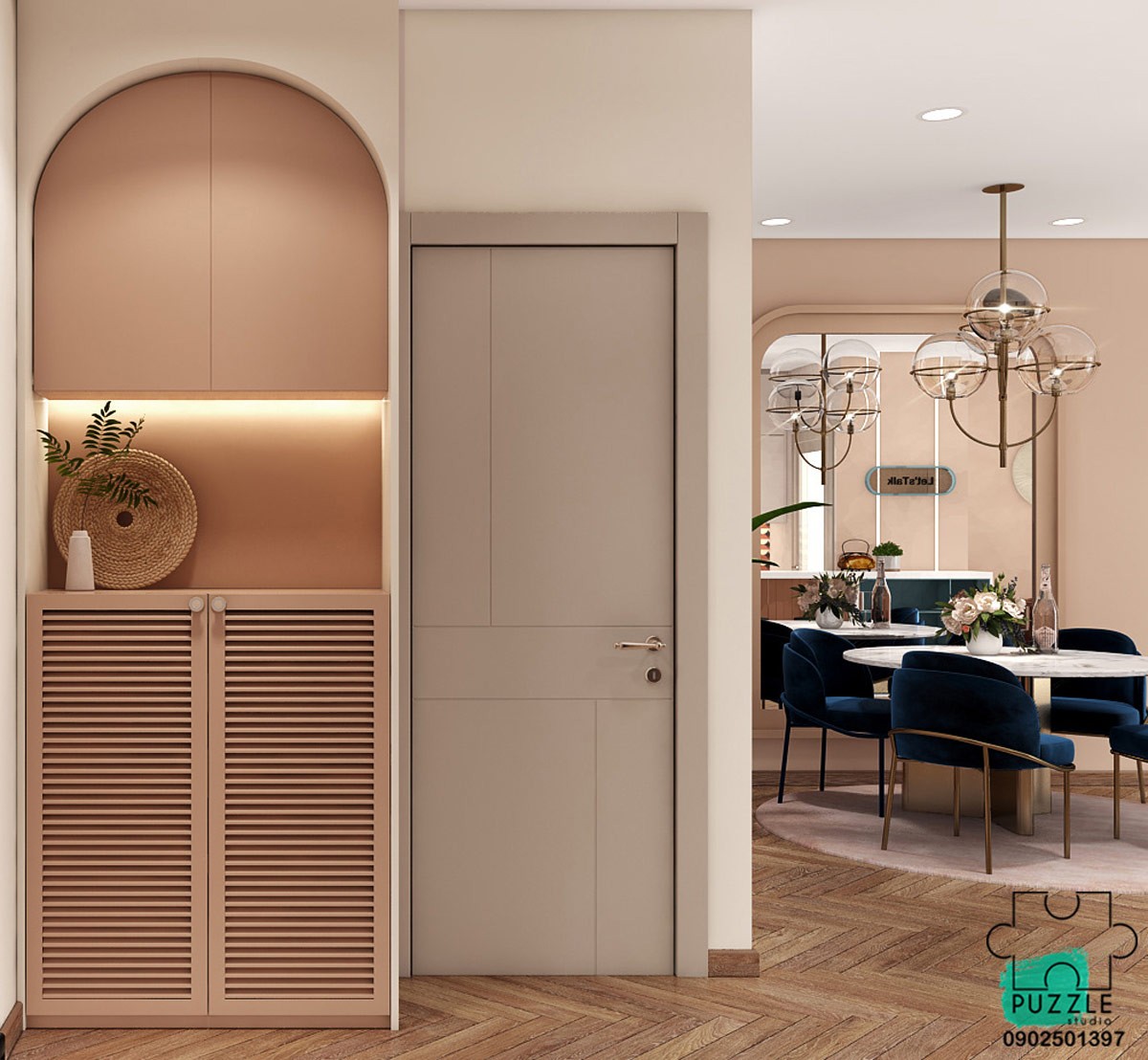
Hallway storage is built into an arched alcove in the entryway. A little lighting under the wall cupboards gives it a warm and welcoming touch.
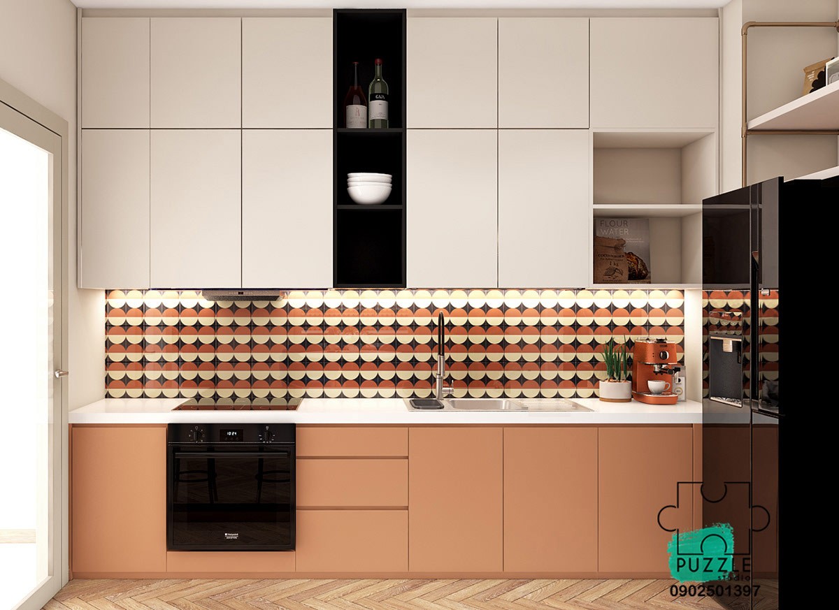
Base cabinets pick out the warmer shade in the kitchen backsplash. White wall units have been double banked to utilise the full height of the room. Some open shelving units break up the monotony of flat cabinet fronts.
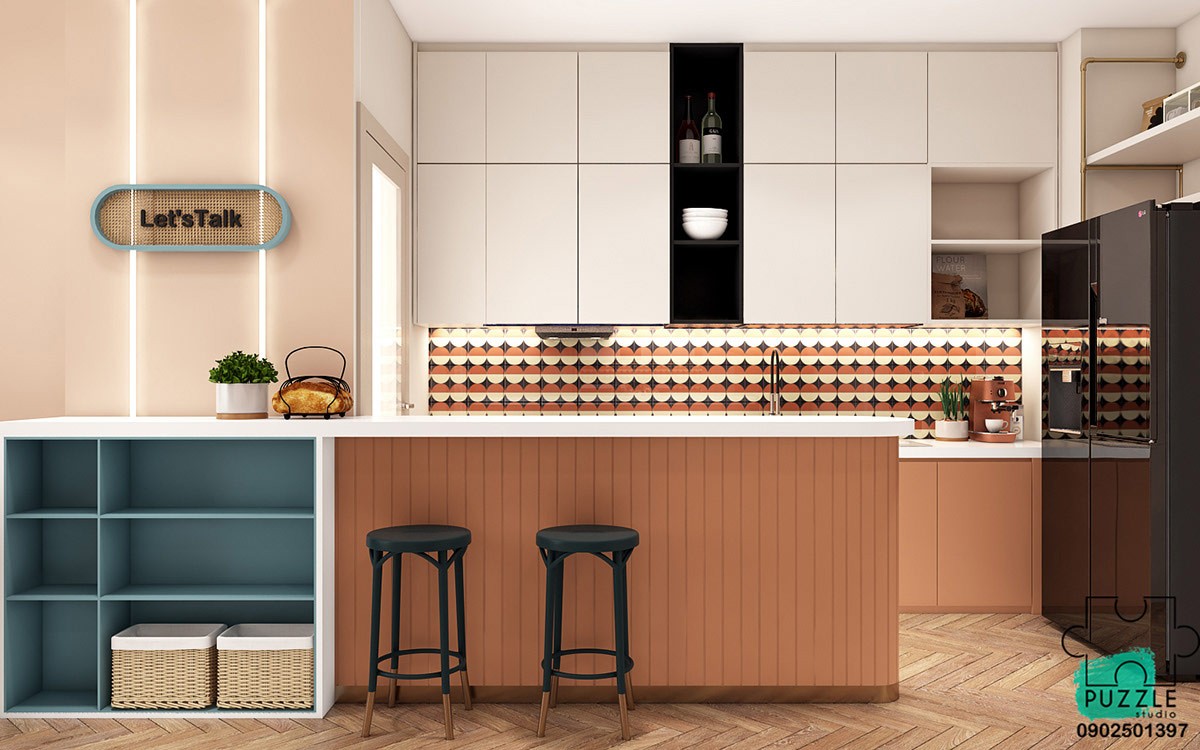
Bar stools are pulled up at the kitchen peninsula as a casual breakfasting spot. A teal shelving unit works as a transition piece between the kitchen and the lounge.
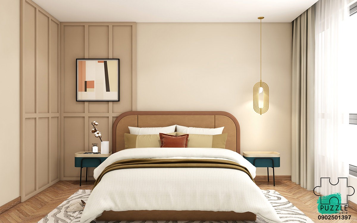
Biscuit coloured panel work decorates one side of the bedroom, a gold bedroom pendant light accessorises the other. Teal bedside cabinets liven up the palette.
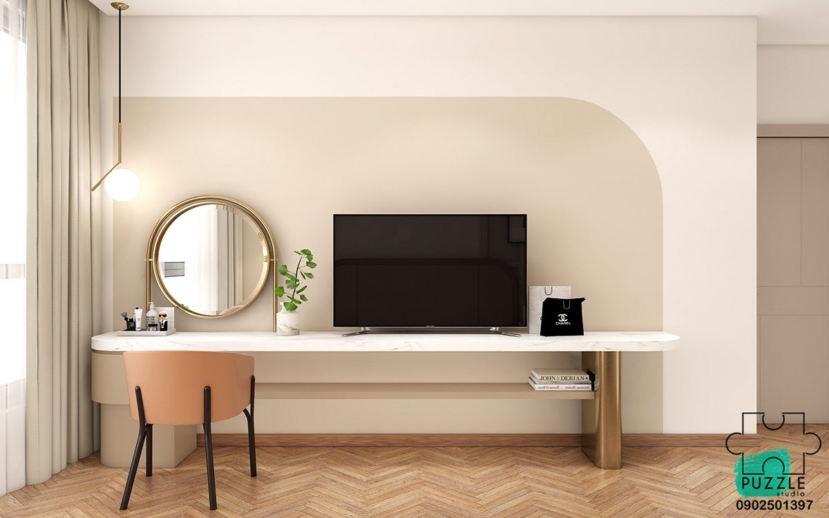
The light over the dressing table is the IC Lights S Style Pendant. The original is available here.
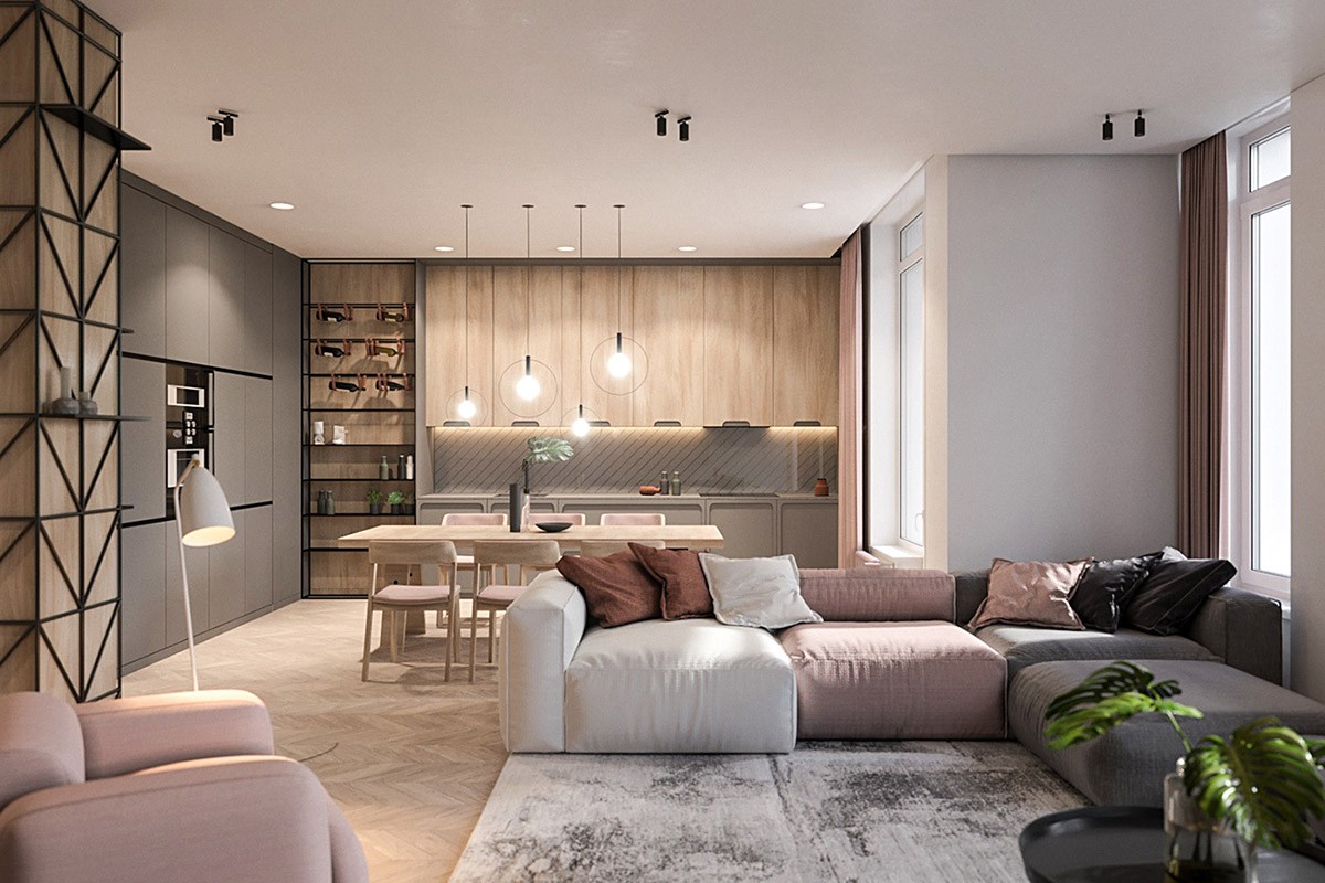
Last up is an apartment designed by talent in the Ukraine, who approached the project with minimalism in mind. Elements of the Scandinavian style are felt in the colors, textures and illumination around the home. The young female homeowner required an ordered, and organised space that still had youthful elements - like this multi-coloured modern sofa.
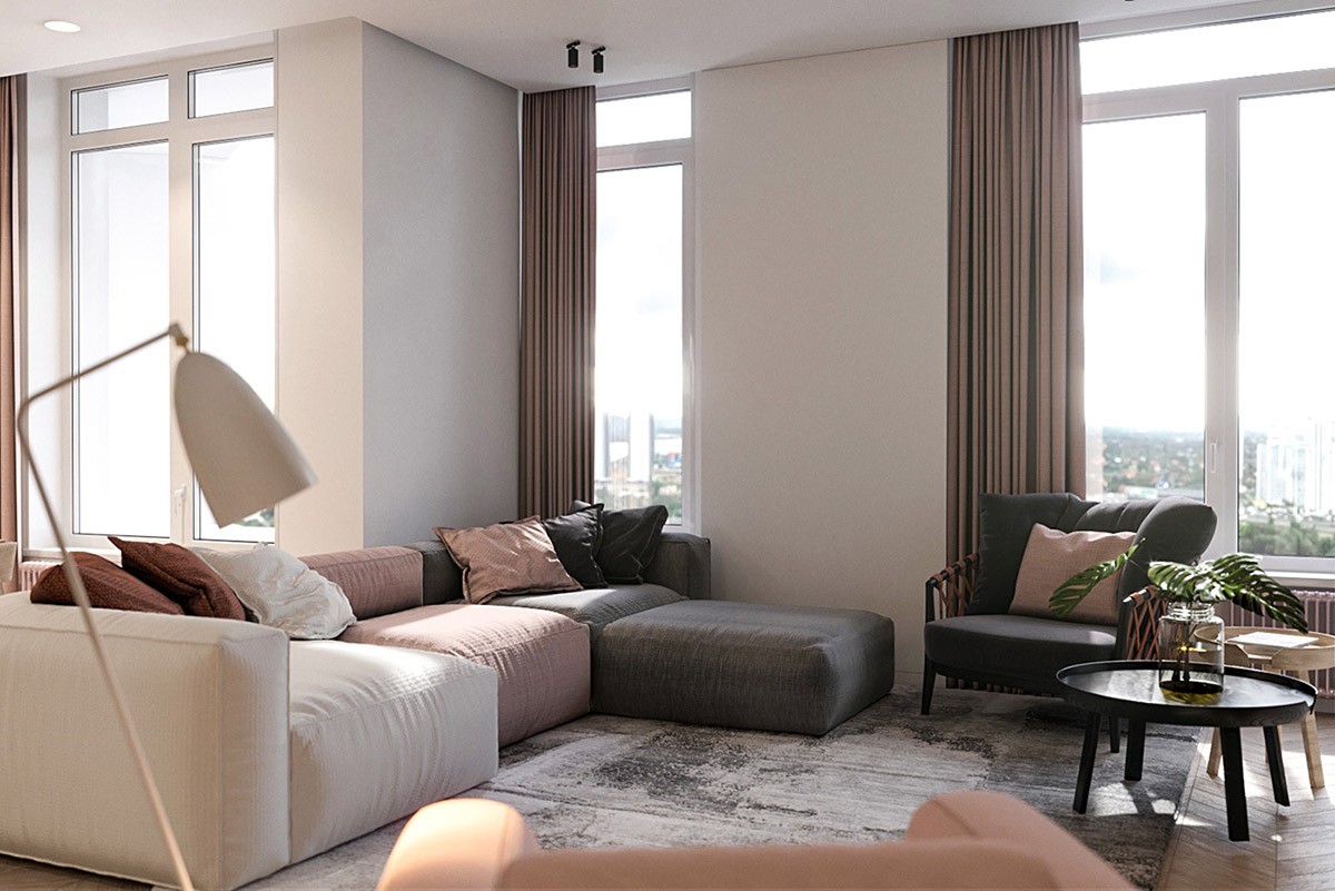
Each of the three sofa sections have been picked out in a different yet complementary colour to the next, changing from white, to blush, to grey.
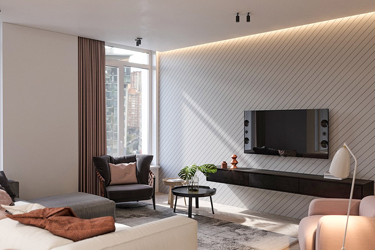
The tv wall is cut through with a fresh diagonal wallpaper design. A slimline black wall mounted console unit underlines the flat screen tv.
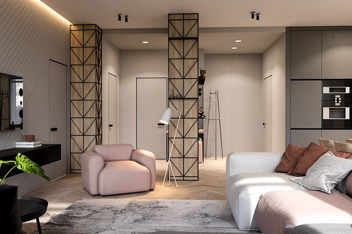
The design team ‘dismantled’ a non-functional corridor of 16 meters, allowing the space to become one with the main living area. A pink modern accent chair partially divides the entryway from the living room; the cute floor lamp seen here is the Grasshopper.
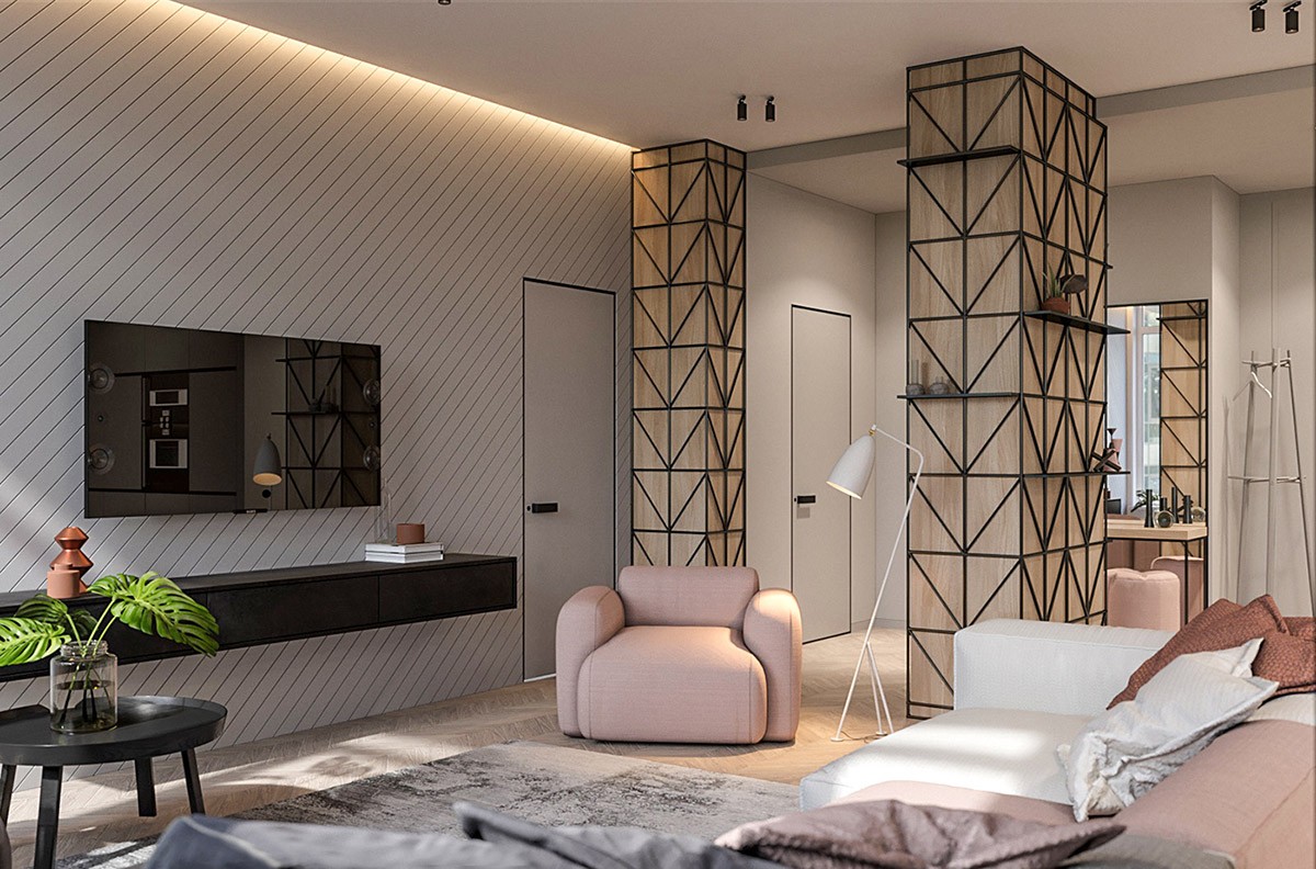
The load-bearing columns denoted the living room area, and the homeowner chose a lattice design around veneer panels. The unique design not only makes a pleasing aesthetic but performs the role of practical shelving, which can even be filled with live green decor.
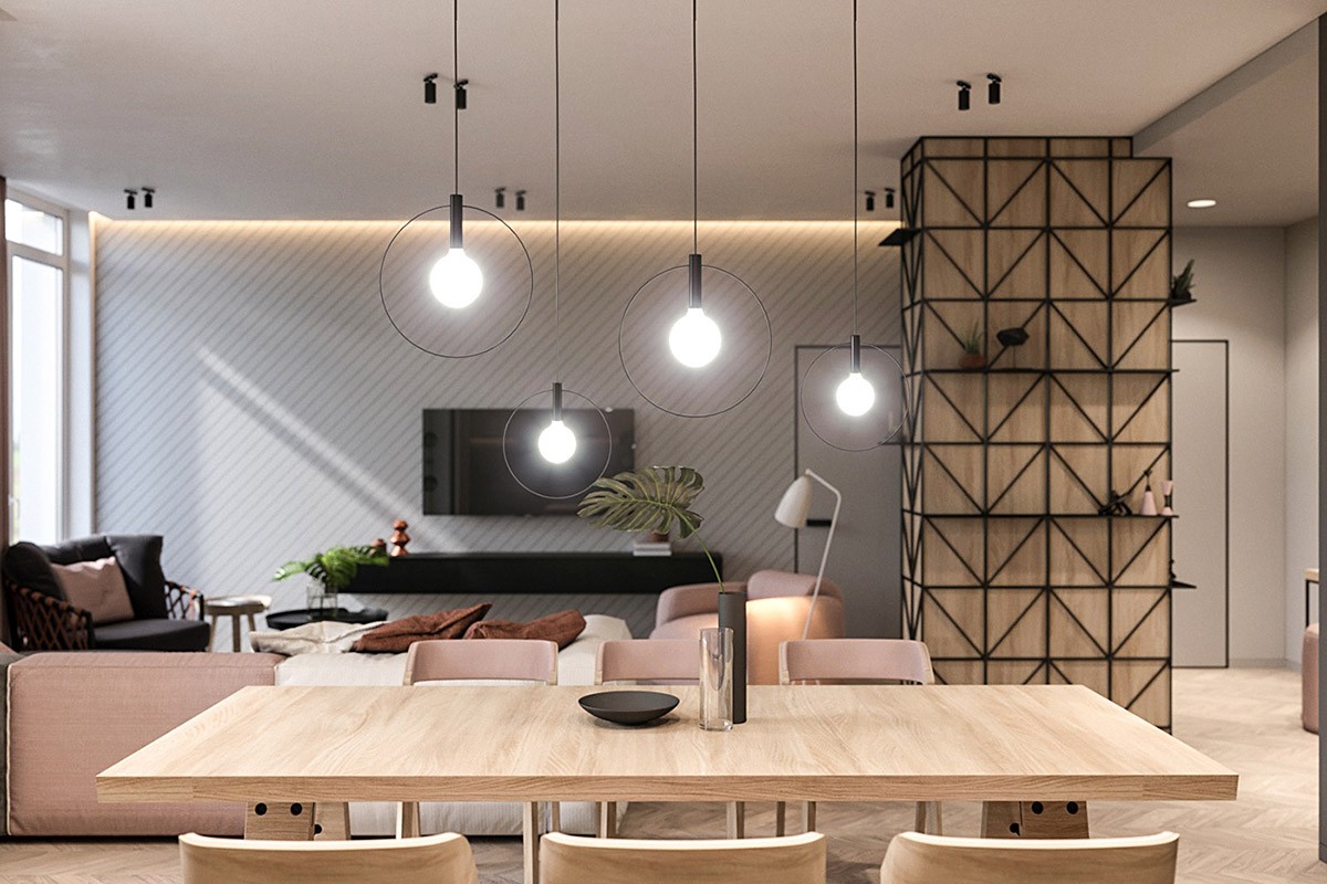
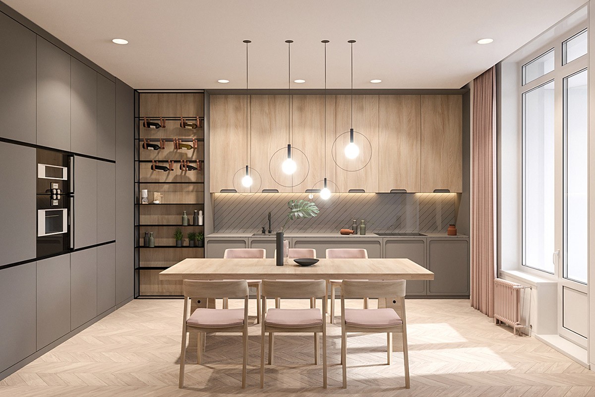
A series of dining room pendant lights shine over a rectangular dining table.
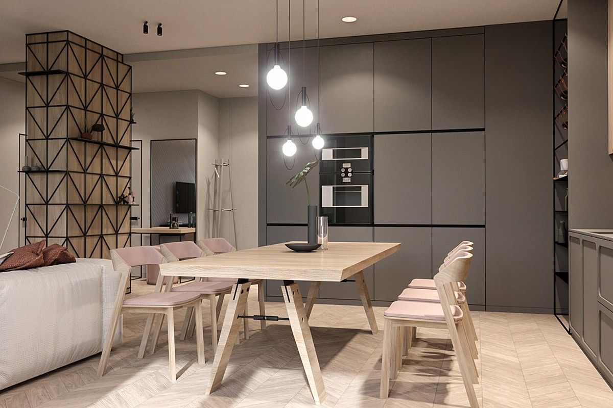
One solid wall of grey kitchen units match the base cabinets on the other side of the L-shaped kitchen.
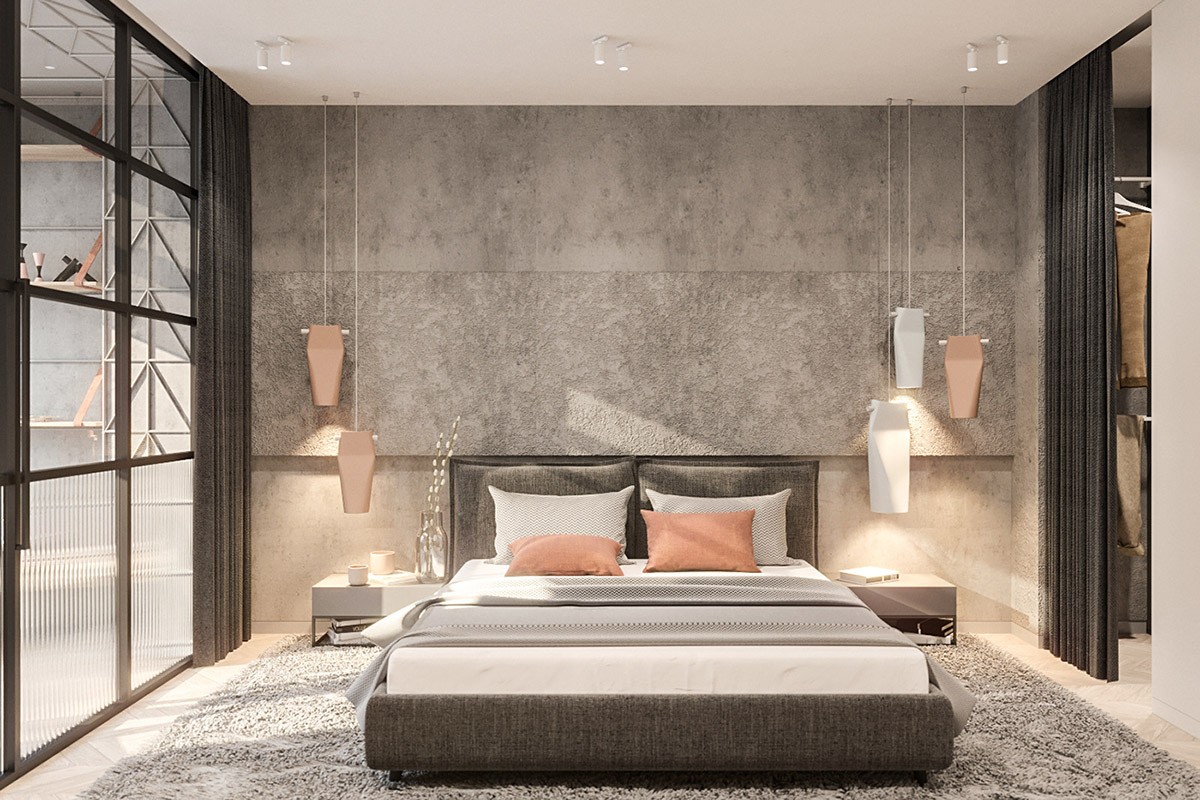
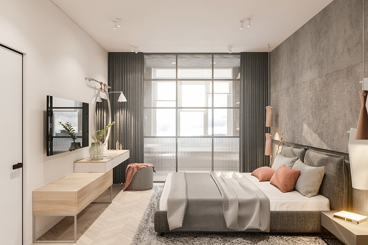
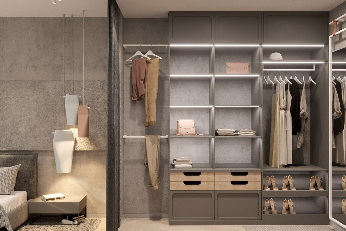
Clusters of bedroom pendant lights hang against a raw concrete headboard wall.
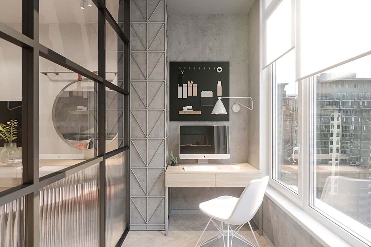
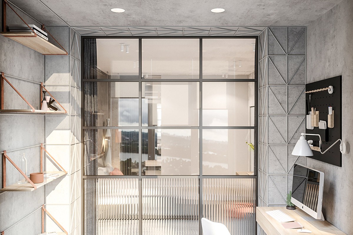
The closed-in balcony serves as a minimalist home office. A small swing arm wall lamp illuminates a dinky desk.
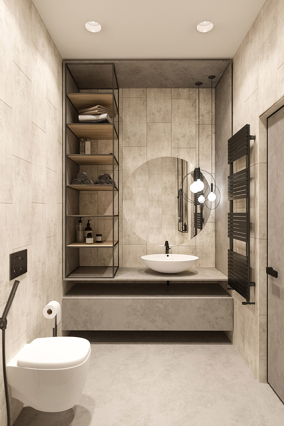
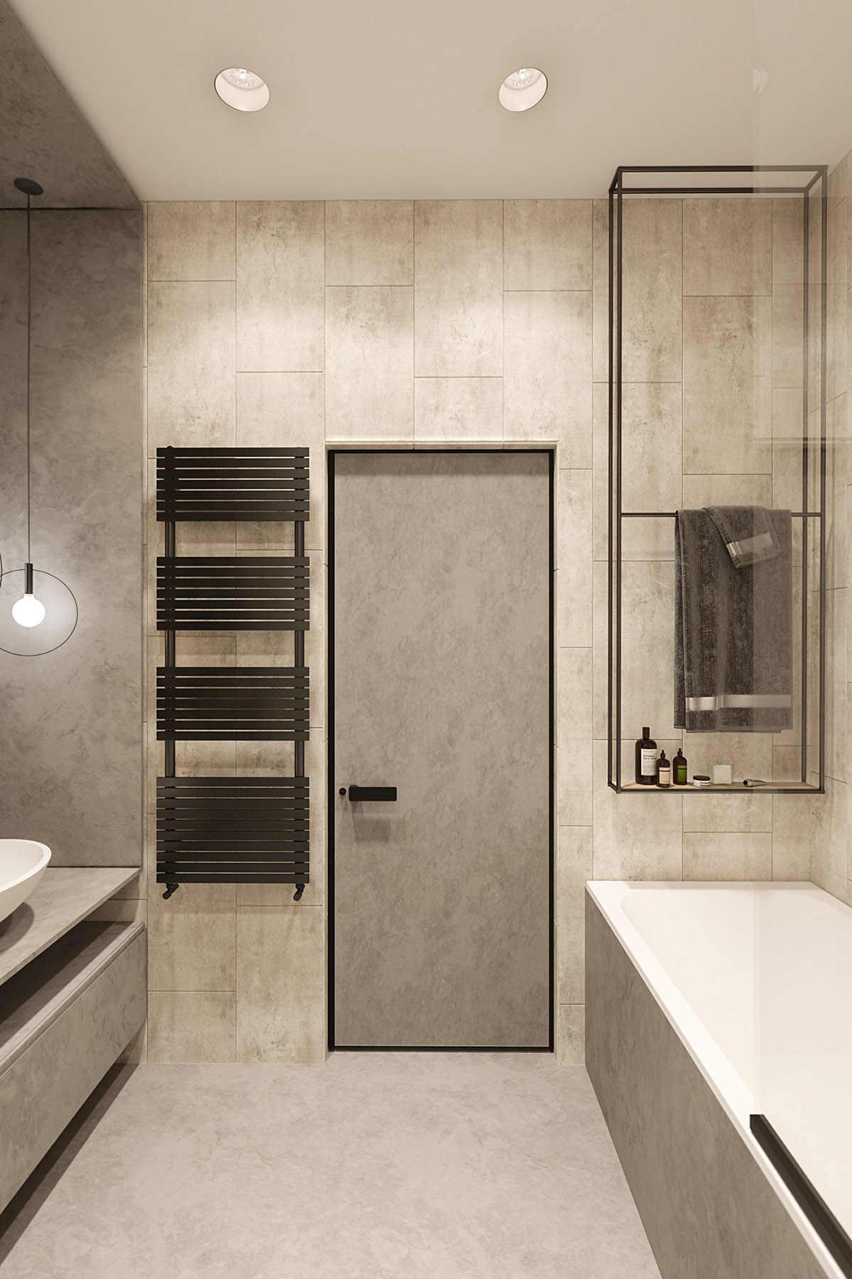
The bathroom is small but perfectly formed. Circular pendant lights echo the shape of a round vanity mirror.
