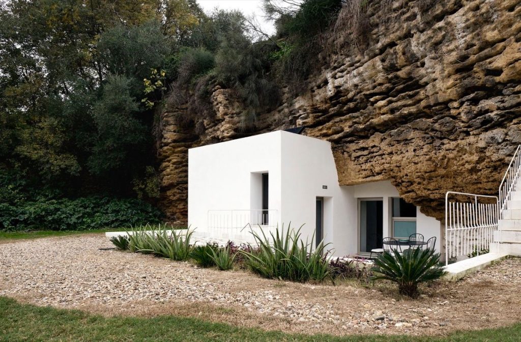
Modern man has gone full circle. During the dawn of mankind, people used to dwell in caves. Slowly, we made our way into brick-walled houses. But lately, man has gone back to our roots. And we have to say, if we could all live in houses like these, we'd all go back to being cave dwellers without a second's hesitation. Cuevas del Pino estate by UMMO Estudio sits nestled on the slopes of Sierra Morena. An area renowned for it's Calcarenite rock, arranged into layers that form geological formations. For centuries these formations have been used by local herders. Today, one of those formations is now a comfortably chic cave home.

Traditionally the caves of Sierra Morena have been used by agricultural workers as a shelter from the elements. But the Cuevo del Pino estate has recently been developed for new purposes and this rural hotel has been modernized, transformed into a beautiful home.
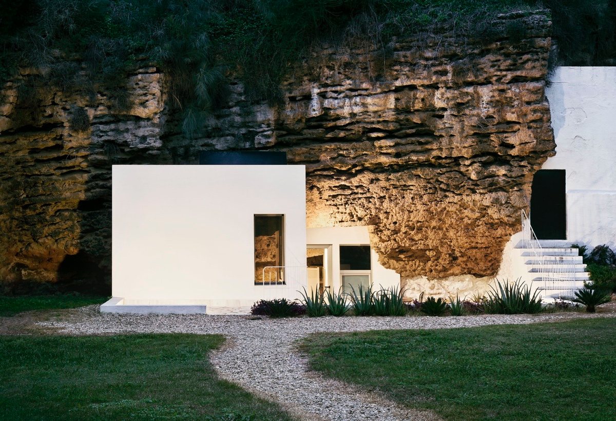
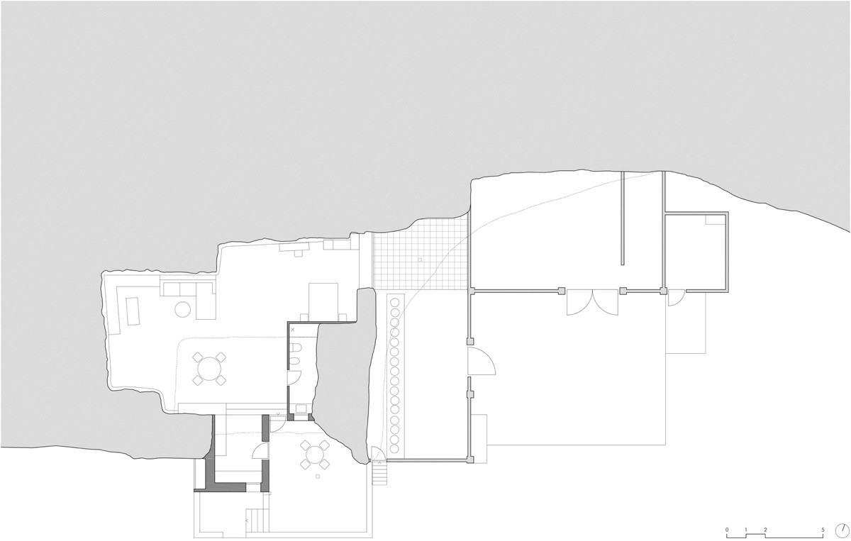
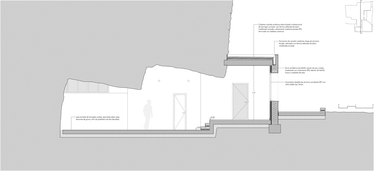
The Architects were careful to respect the pre-existing elements, they molded their design around the natural elements of the cave. The end result is a yin-yang type blend of organic and modern architecture.
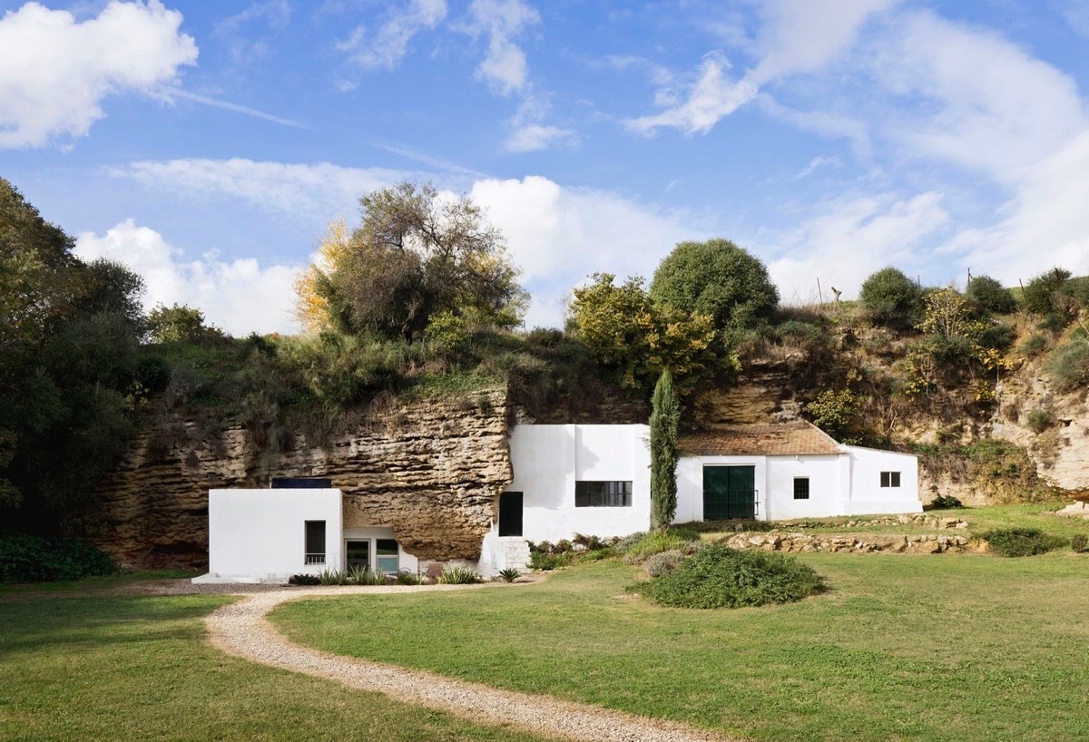
The landscape has been kept simple and natural. Most of the original landscape has been kept as it always was. A manicured lawn, bush garden and gravel pathway are the only human contributions. The layers of rock weren't removed, rather grass was planted on top of it turning this into a natural garden feature.
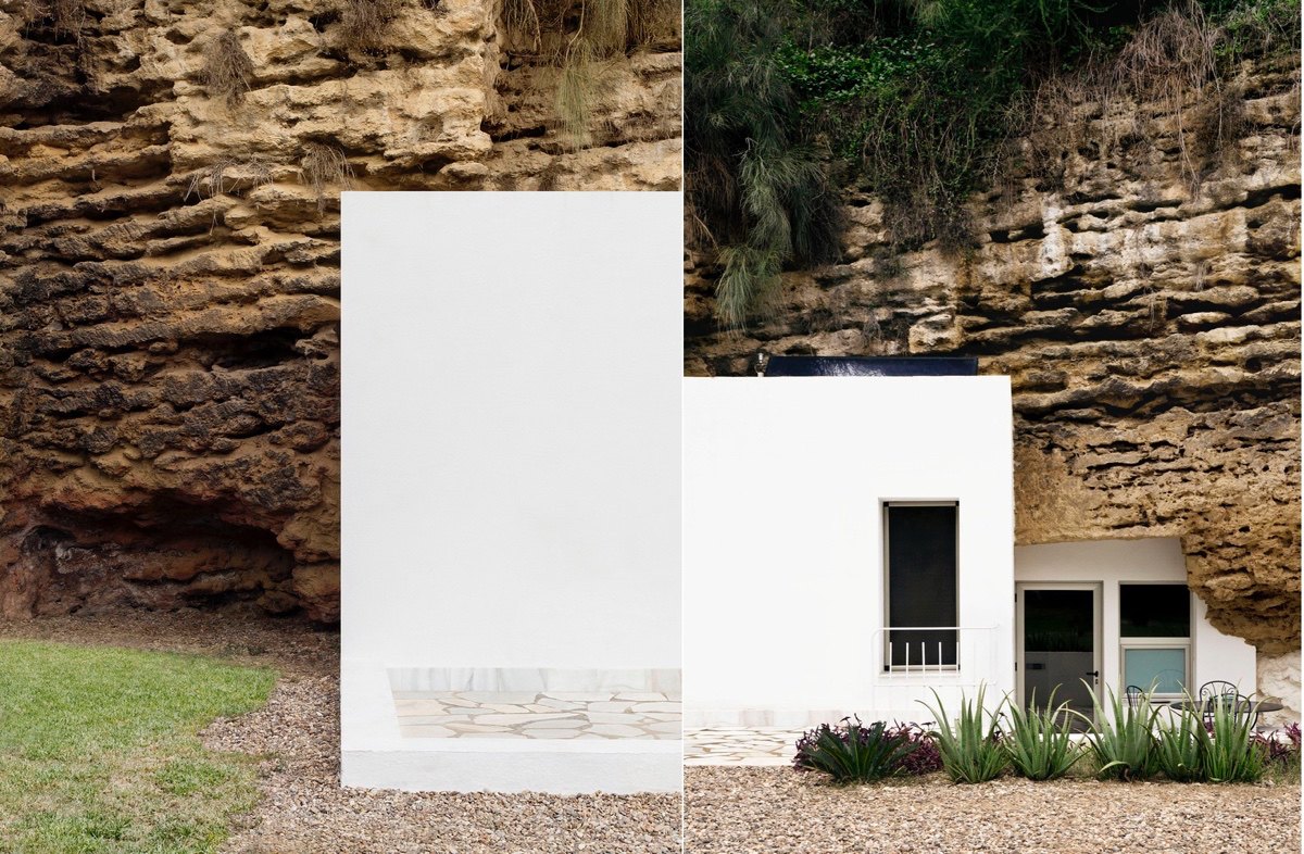
White walls instead of a more neutral color are a clean canvas that highlights the beauty of the surrounding landscape. The designers knew better than to try and match the ageless beauty of the scenery.
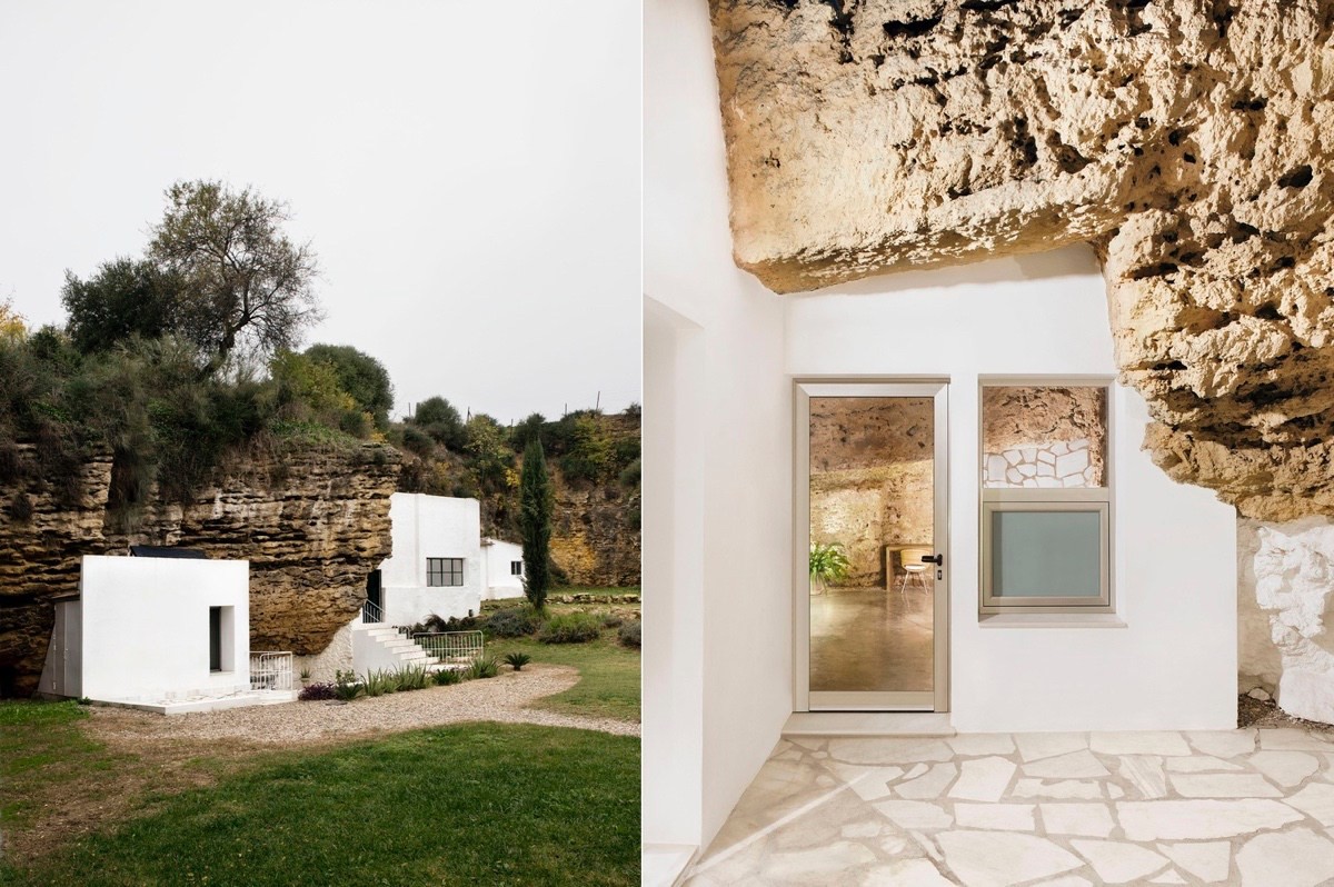
The marble and cement mosaic style floors are a contemporary aspect that level the uneven rocky floors for human feet. The uncovered windows and glass doors all face the south for the specific purpose of letting in natural light.
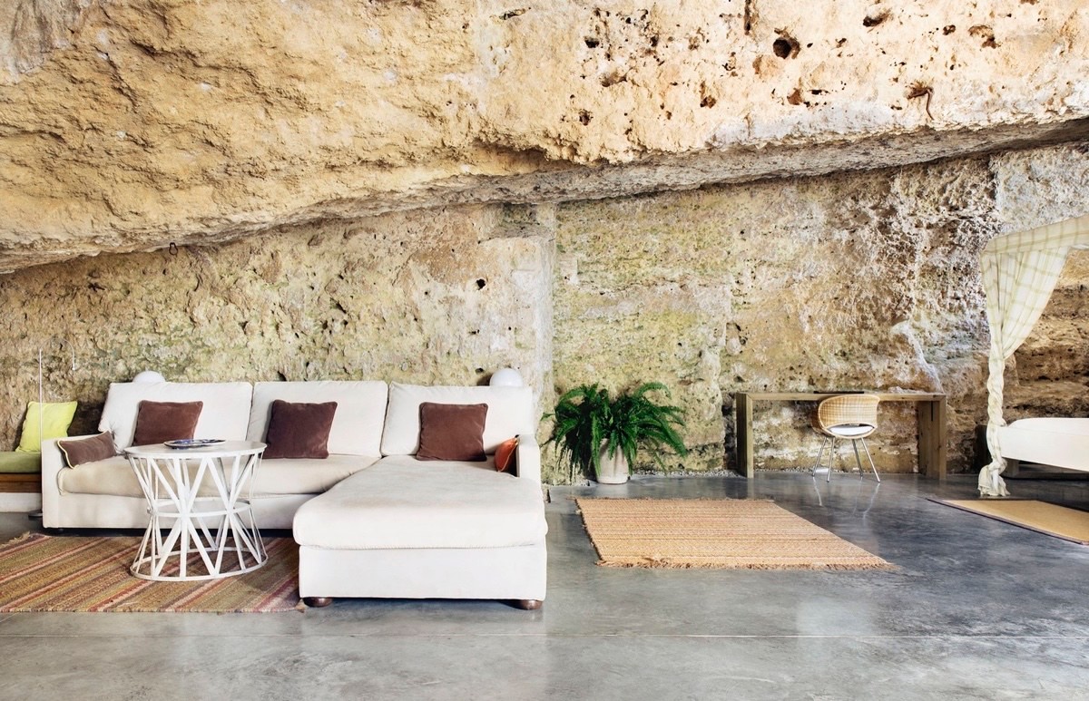
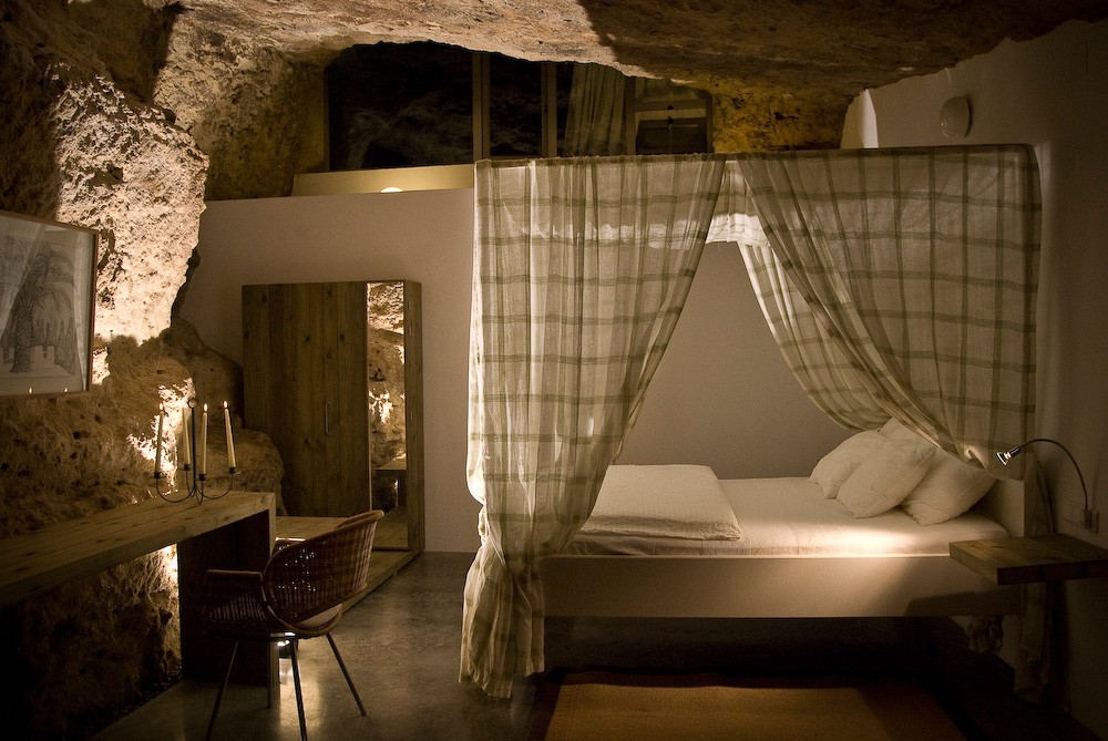
Here we get a look into the interior of the house. The walls have been kept natural and this has been the main design concept. The walls are an accent in itself, so the furniture are mostly complements of the exquisitely raw nature of the cave.
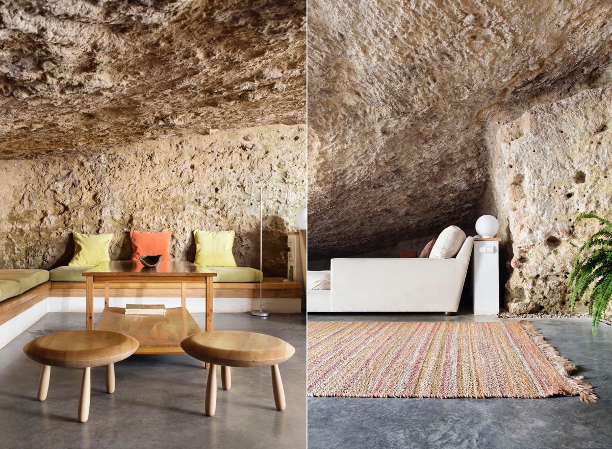
Handcrafted wooden furniture endows the whole house with warmth. Woven carpets brighten up the space without being obnoxious. The cave may be ancient but the furniture is state-of-the-art and comfortable. Just because the house is in a cave doesn't mean you need to live like a caveman, and so modern comforts are a key facet to the space.
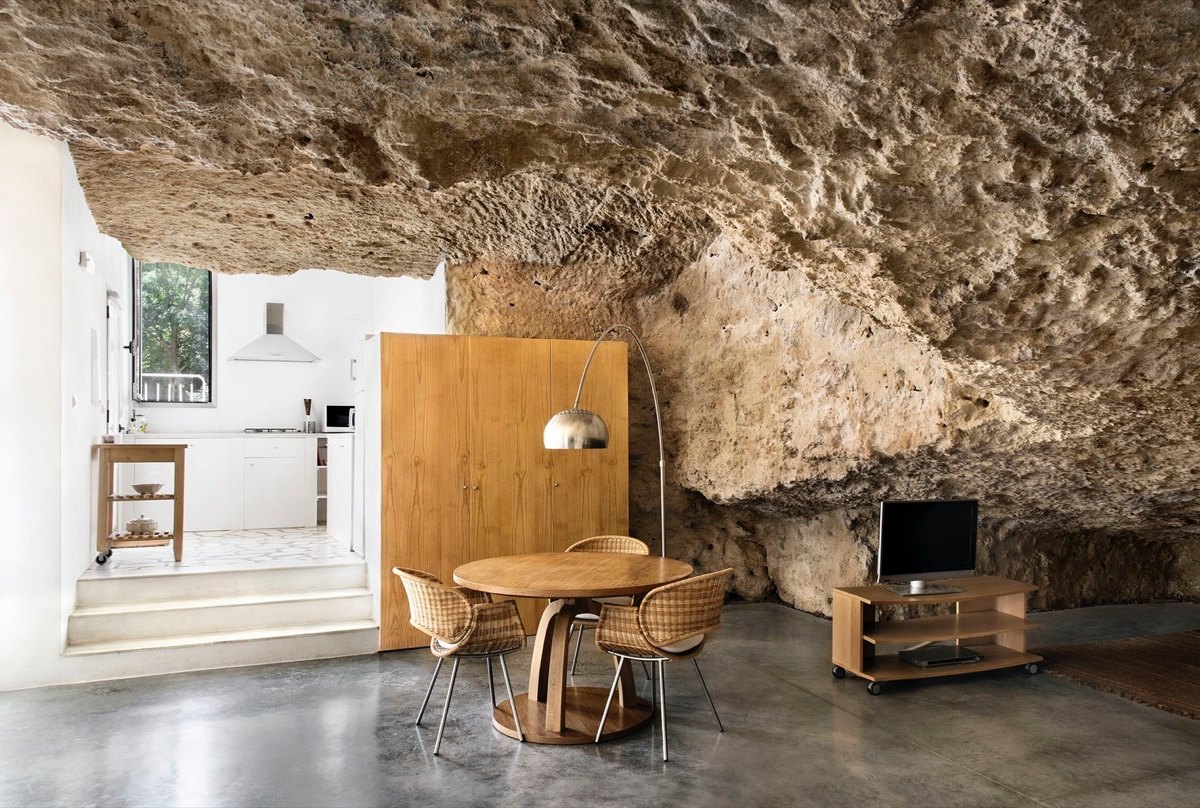
The idea was to achieve a wide diaphanous space with present day amenities. To respect the existing curves of the cave, designers fit furniture into the current arches of the walls. The walls were slightly straightened, but mostly they were left alone to retain the genuine roughness of the cave.
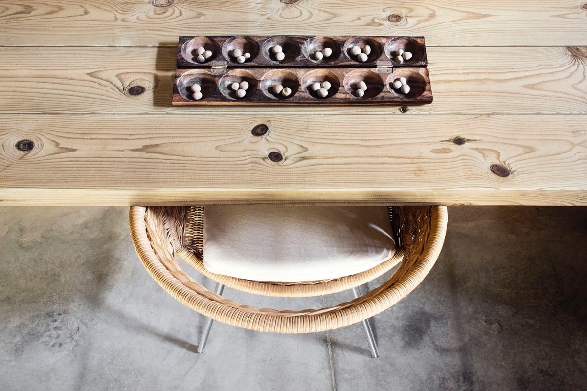
Although the house focuses on the natural beauty of the house, some decorations have been added to prevent the space from relying too heavily on the actual cavern. A subtle centerpiece, this aesthetically pleasing ornament keeps this table from being empty and boring.
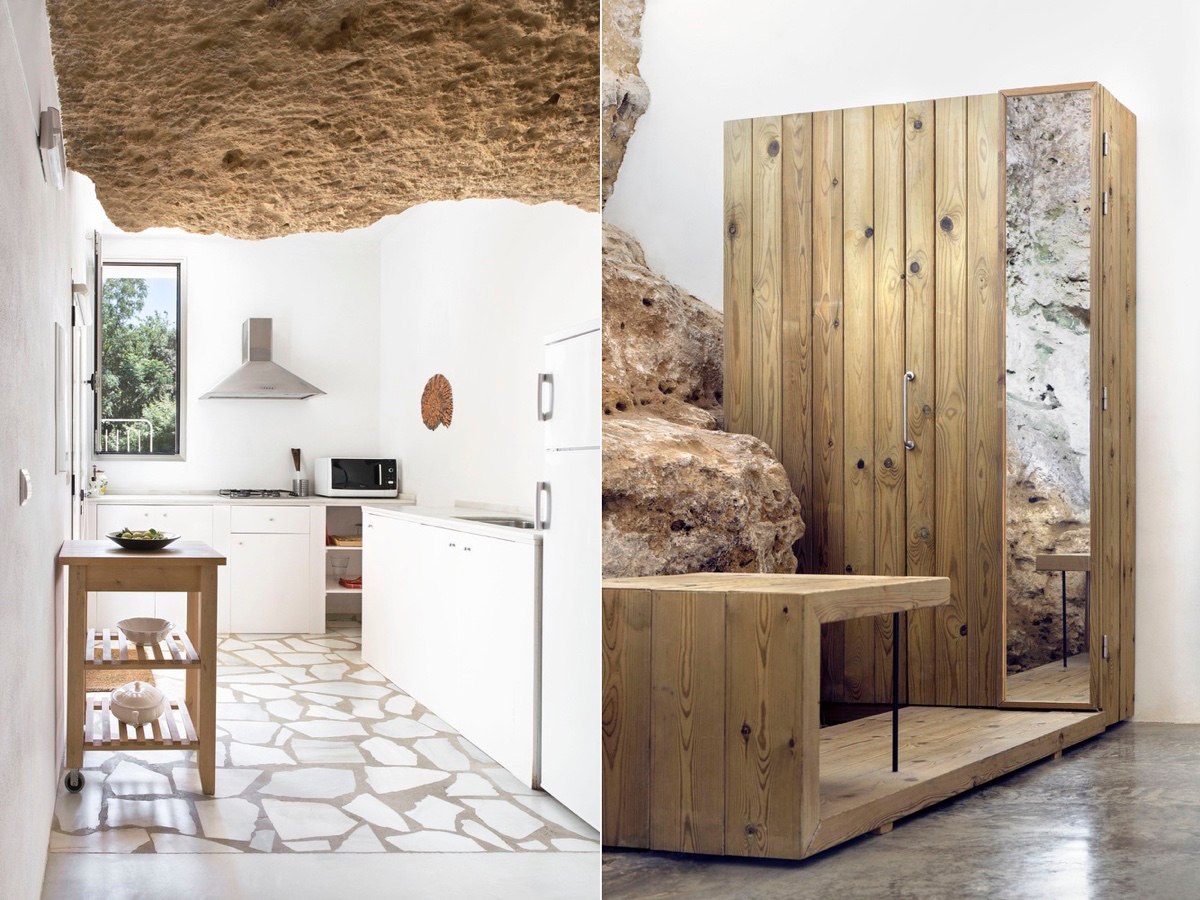
The kitchen is the heart of any house, and also the space where most of the activity of a household takes place. So it makes sense to position the kitchen in the place where the most light comes in, by putting it into it's own space, the kitchen still feels part of the cave but isn't restricted in any way. The designer cupboard to the right can be found in the bedroom, the raw wooden planks and mirror continue the flow of organic walls onto the plain white canvas. The cave wall here hasn't been altered, the cupboard was built into the wall so as not to remove a unique design feature.
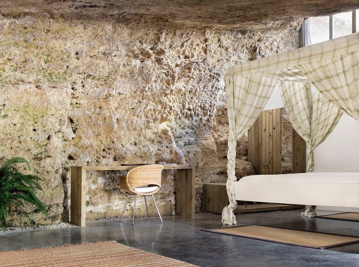
A wide window built into the cave wall is uncovered and so the bedroom area receives an ample amount of natural light. The patterned curtain on the four poster bed and the woolen floor rug invent a snug little corner for the house owner to enjoy at the end of the day.
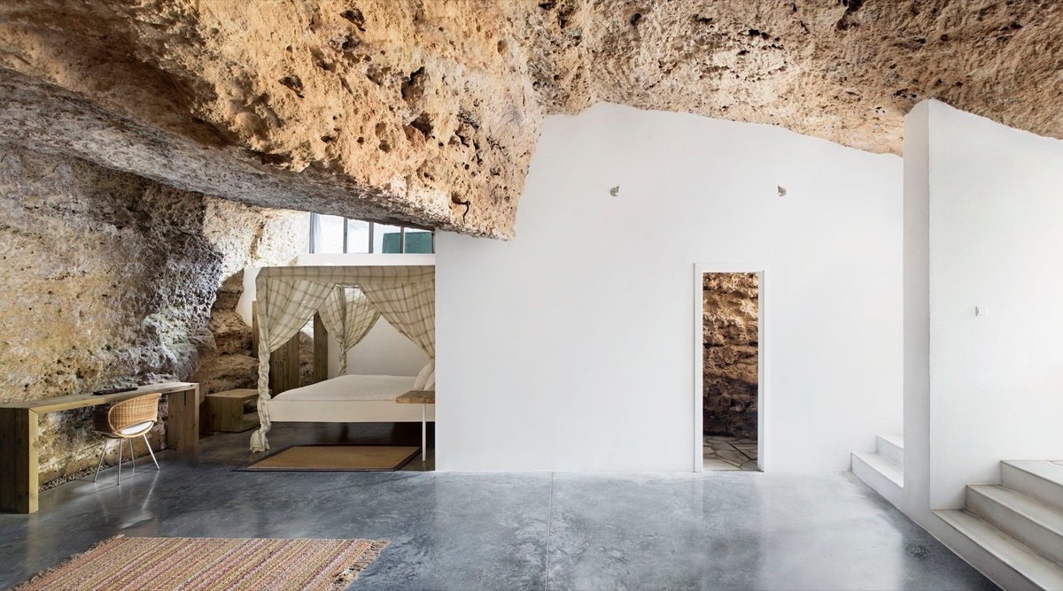
A minimal amount of furniture was added so as not to clutter the space. In this part of the house we can see the design concept achieved. The marble floor and white walls are an element that make the room make bigger and lighter. The original roof has been left untouched removing the need for any unnatural decoration, while the furniture softens the the entire space.
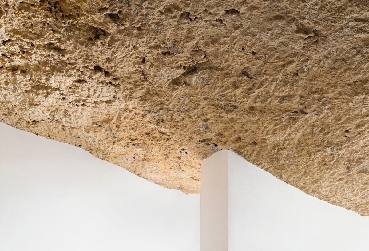
A proverbial combination of old and new, the rock ceiling softens the white wall while the white wall brings light to a spot that's never seen the sun before.
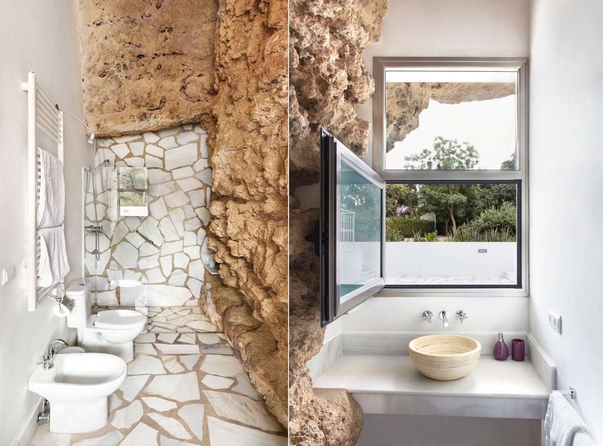
The bathroom has been built into the rock, with a marble and cement mosaic floor to keep the house owner from slipping into a painful fall. The self standing amenities were built into the walls to combine the two design schemes. The open window incorporates the scenery into the layout, while a yellow clay bowl for a sink and purple soap containers are bright dash of color. The white towel railings are a practical element and the chrome taps and shower head are a sleek and luxurious addition to the bathroom.
