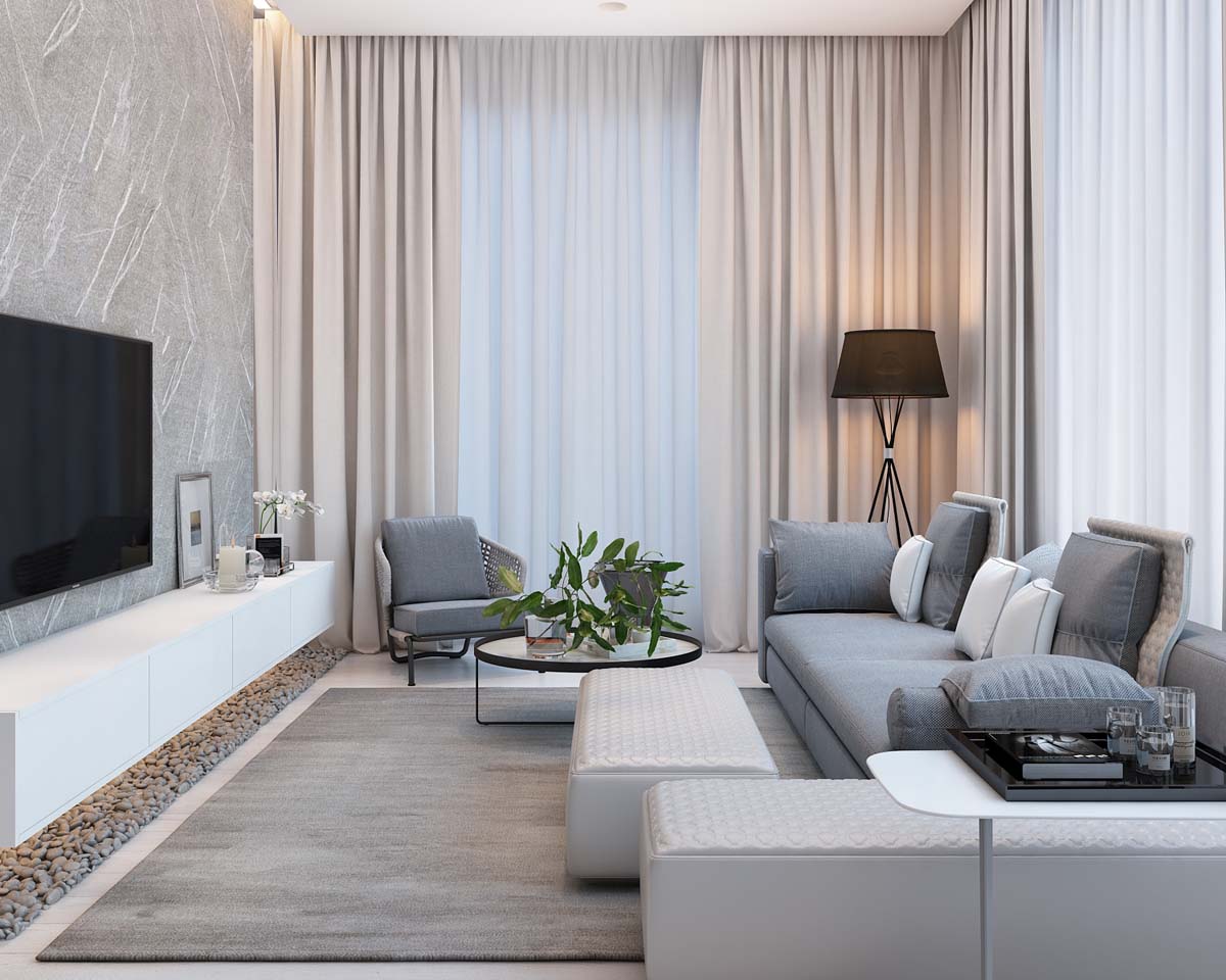
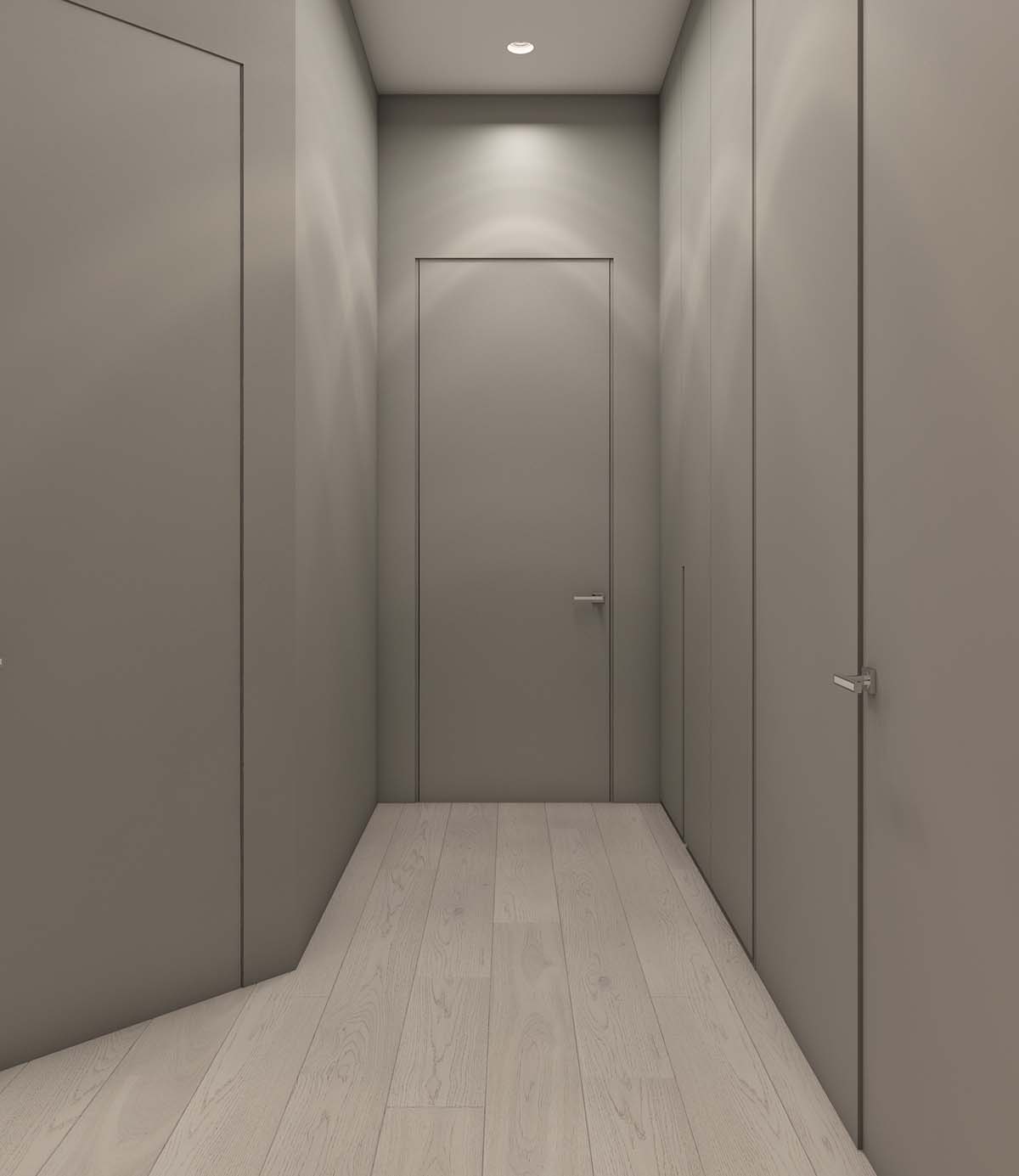
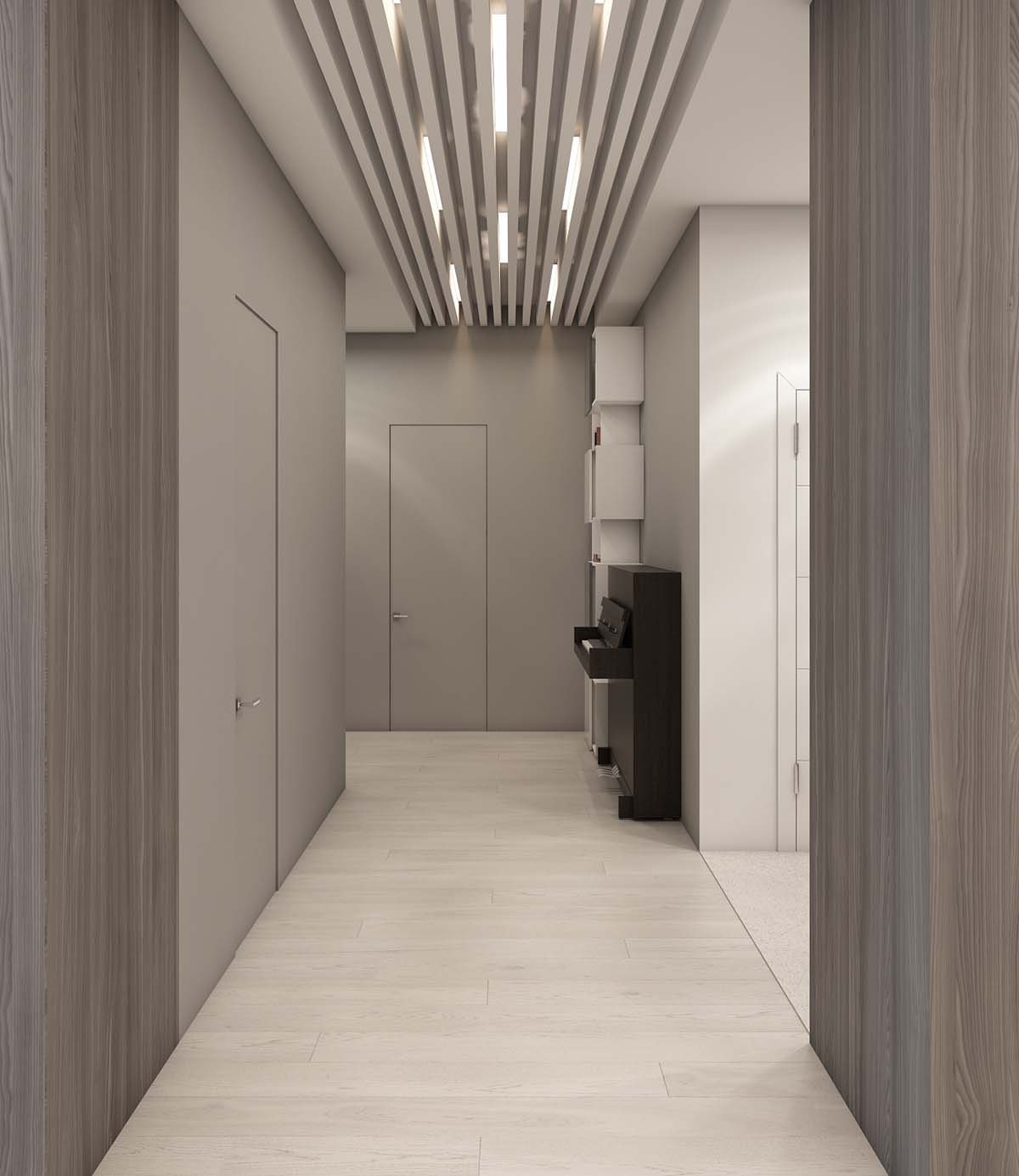
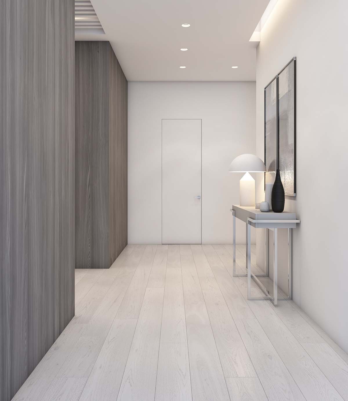
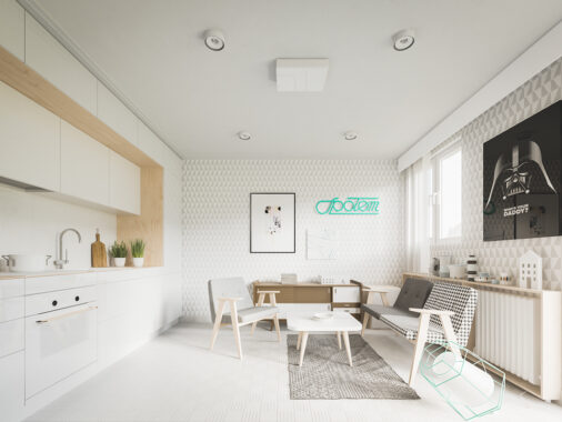
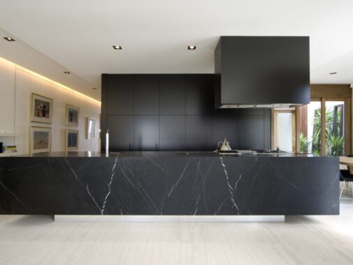
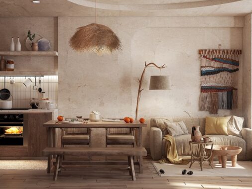
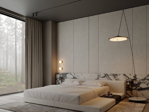
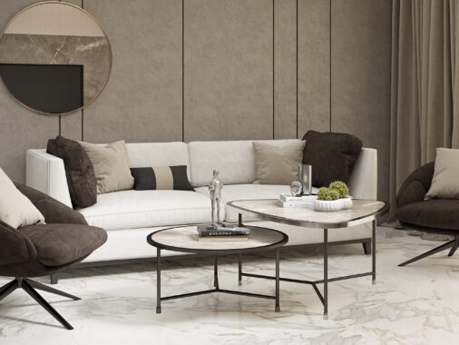
Beautiful design never means the same thing to two people. While one person may covet the simplicity of Scandinavian styles, another may long for ornate chandeliers and Louis XIV chairs. The design featured here, from visualizer Anastasia Skoblik and designer Julia Lapteva is not, perhaps, most people's conception of beautiful. With neutral colors and very few flourishes, this design is practical at its core. Still, the simplicity and modernity of the design are beautiful in their own way. This apartment is like a canvas, where any occupant could easily put his or her touch on top of the existing design for a strong shot of personality.
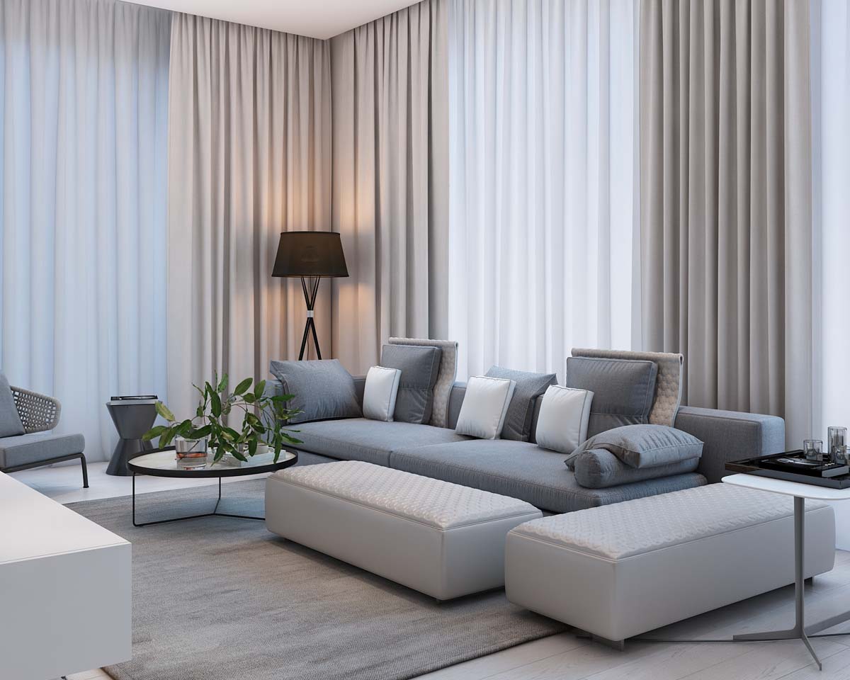
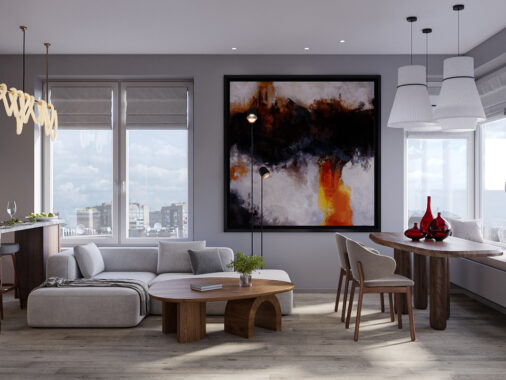
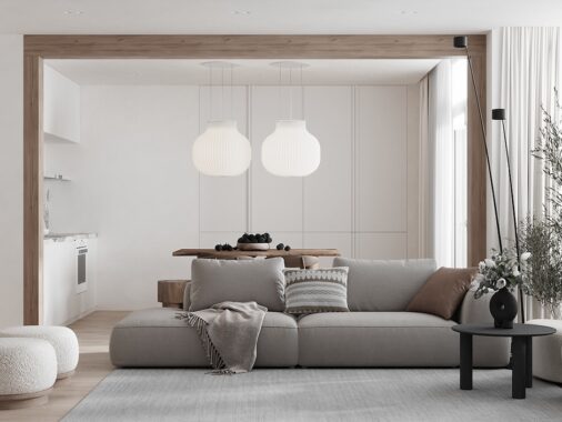
The use of unique floor lamps adds a warm element to the main living space that is mainly done in cool, neutral colors.
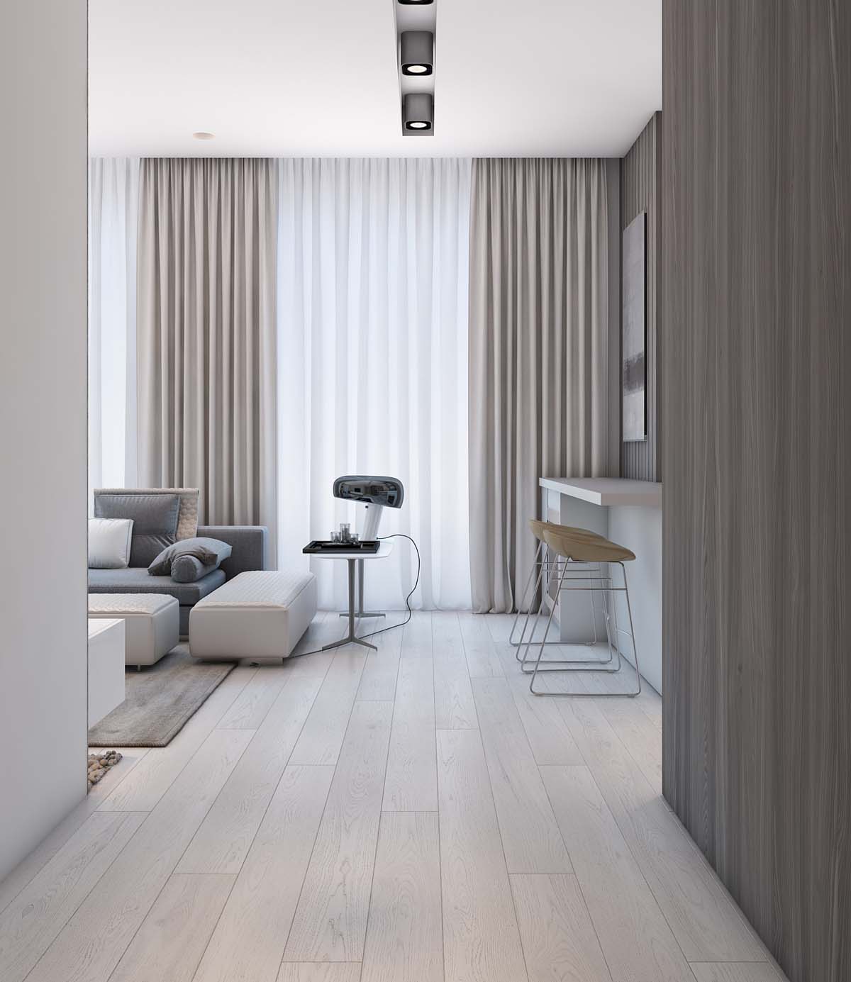
The apartment is quite spacious, meaning there is a lot of room for seating in every area of the home.
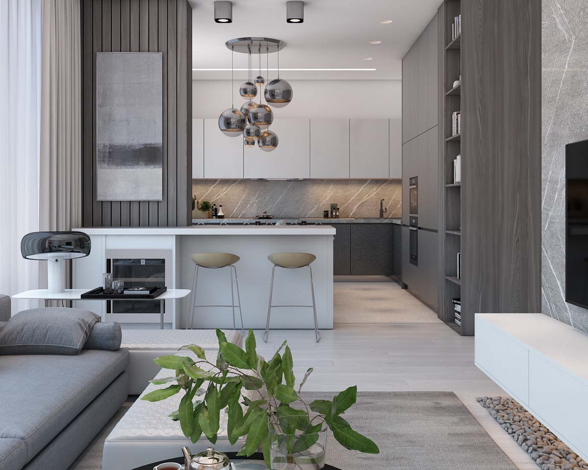
For example, kitchen bar stools are simple but ideal for enjoying a quick breakfast at the bar.
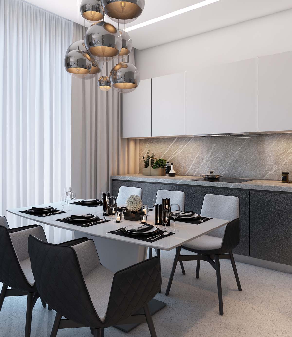
In the dining room, dining room pendants dangle in a modern cluster of the dining table, which has plenty of room for 6.
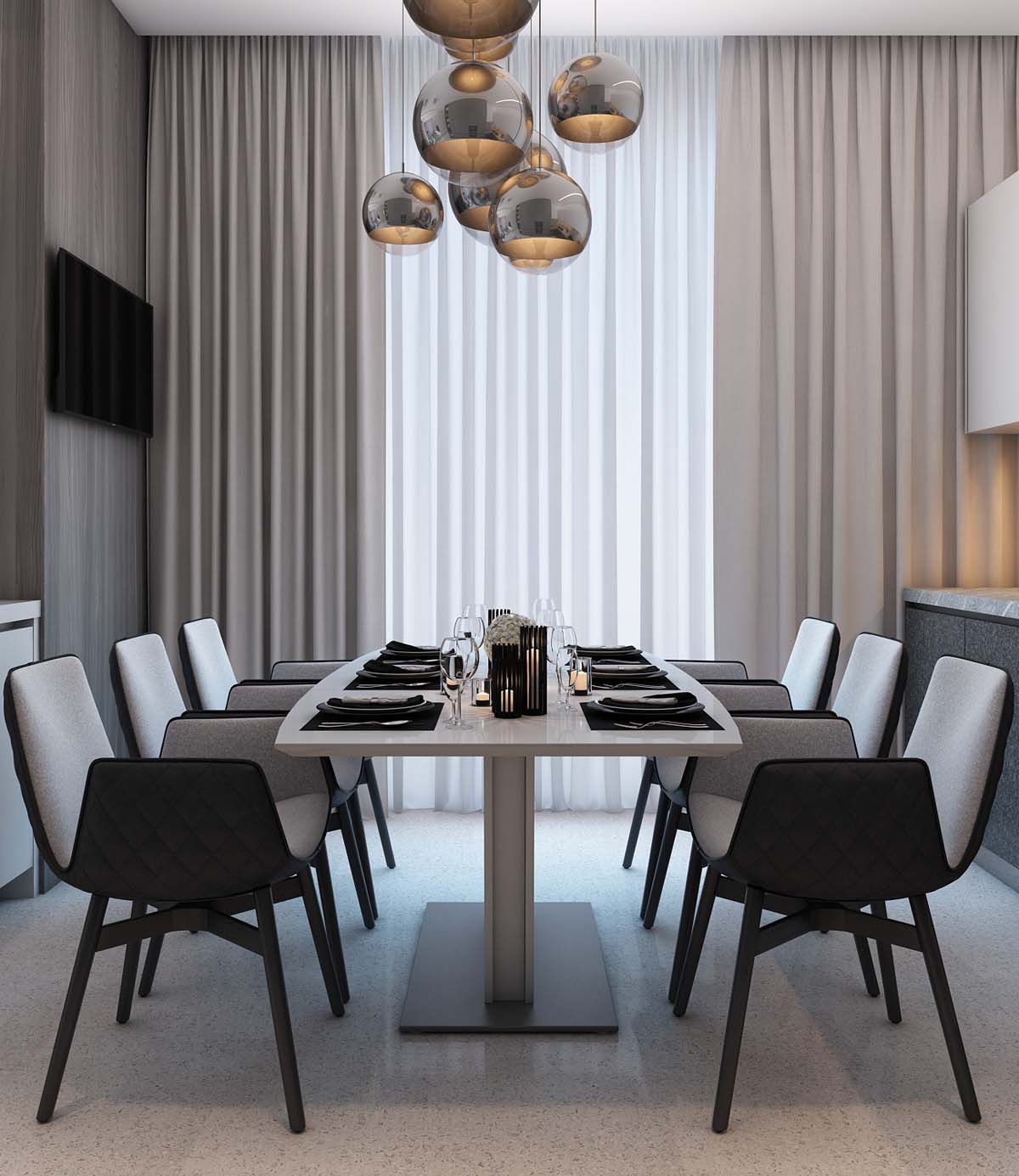
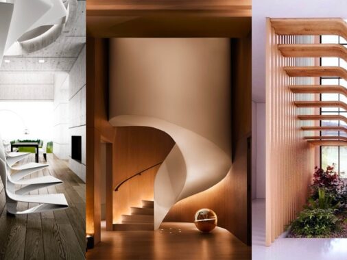
The modern dining chairs have a unique folded design that adds both comfort and style.
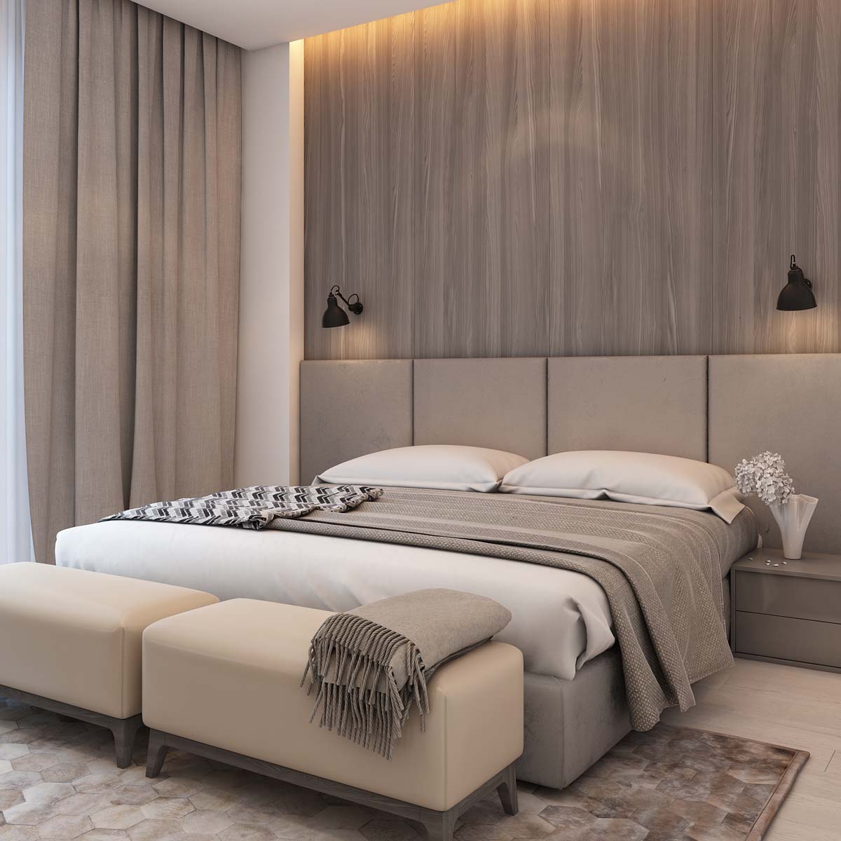
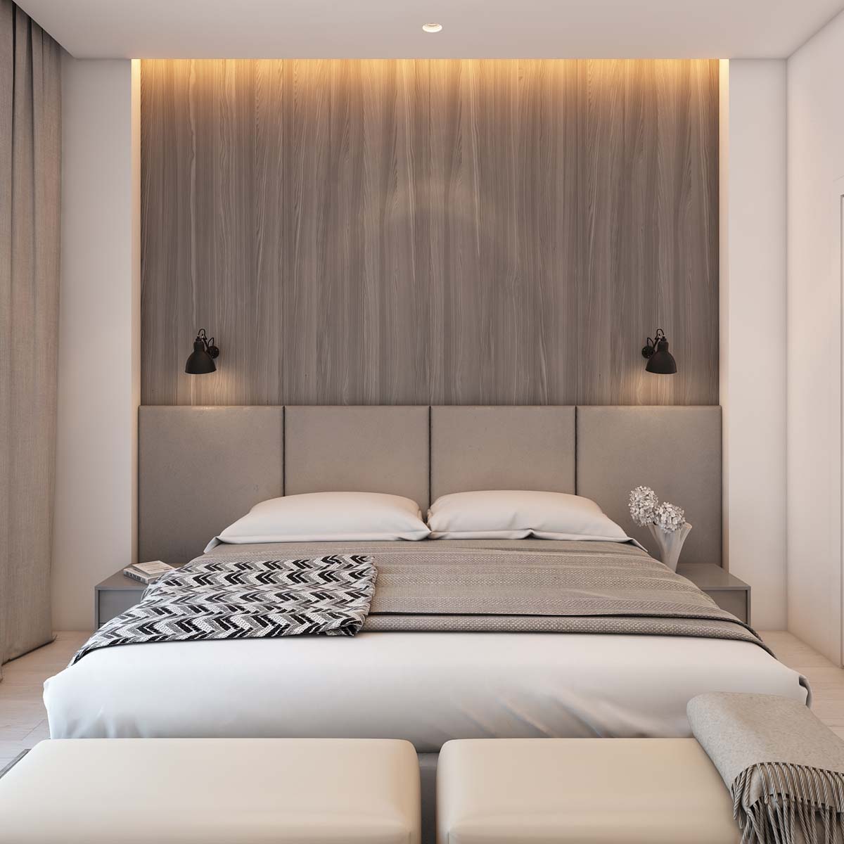
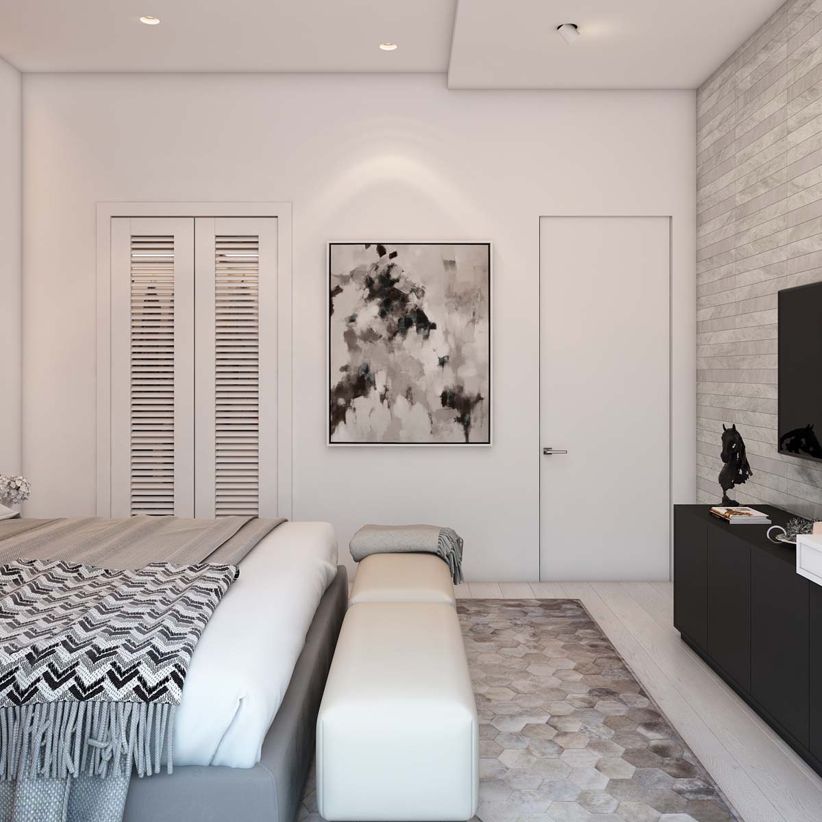
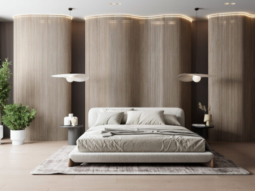
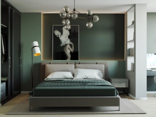
From bedding to rugs to the natural wood accent wall behind the headboard, this is a room that does not believe in color.
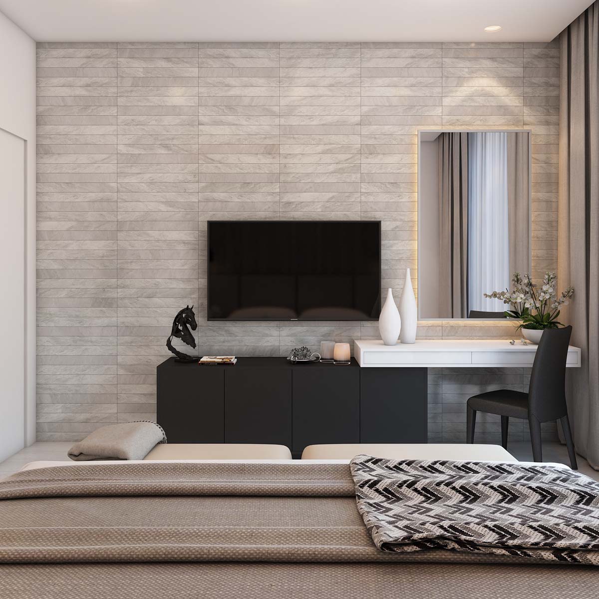
The room does, however, have unique vases that add a bit of personality.
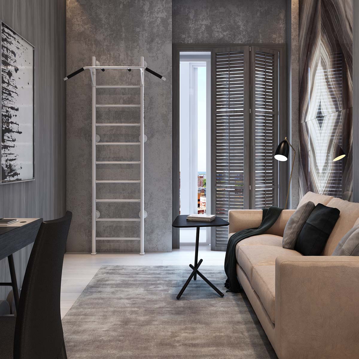
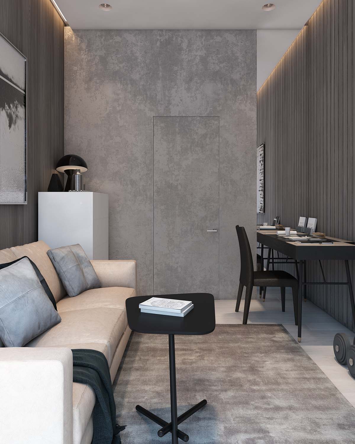
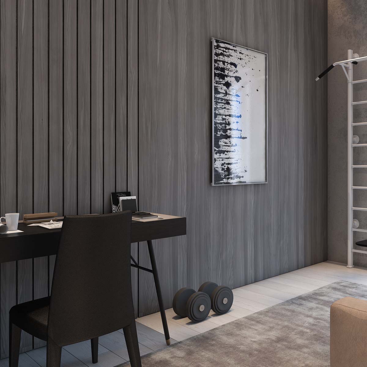
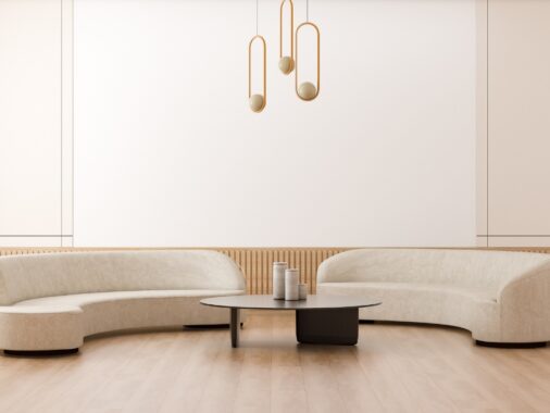
The slat design is also in use in the den, where anything from a relaxing nap on the sofa to a full workout session is fair game.
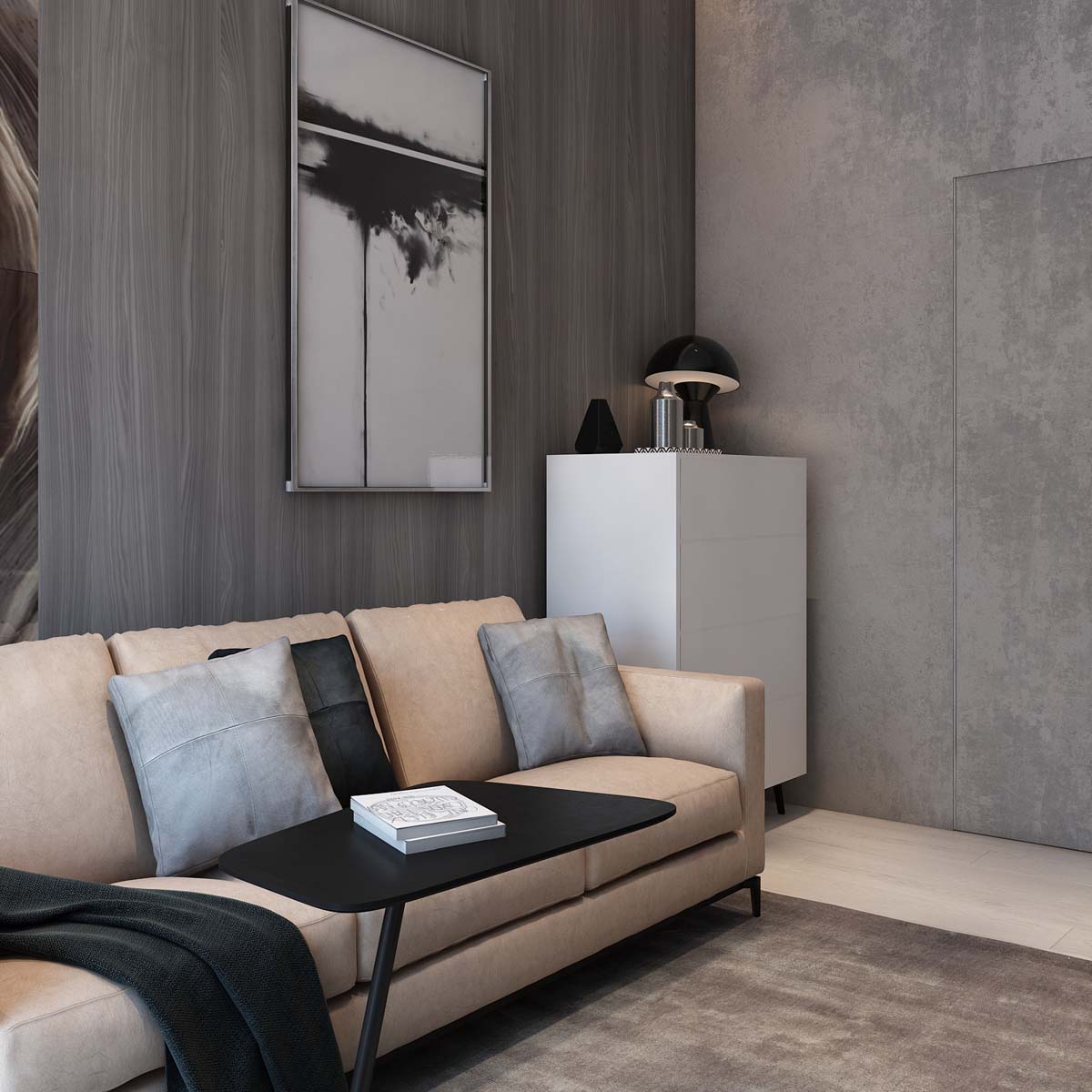
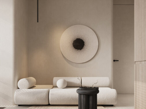
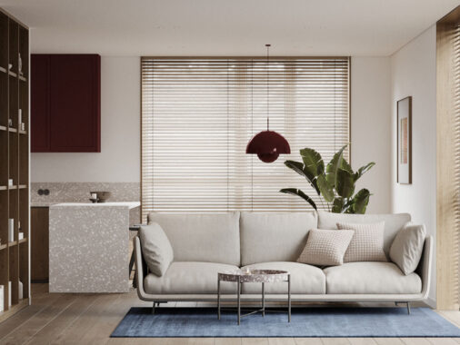
The warm beige of the sofa makes it look supple and inviting. A minimalist mid century modern dresser provides extra storage in place of a side table.
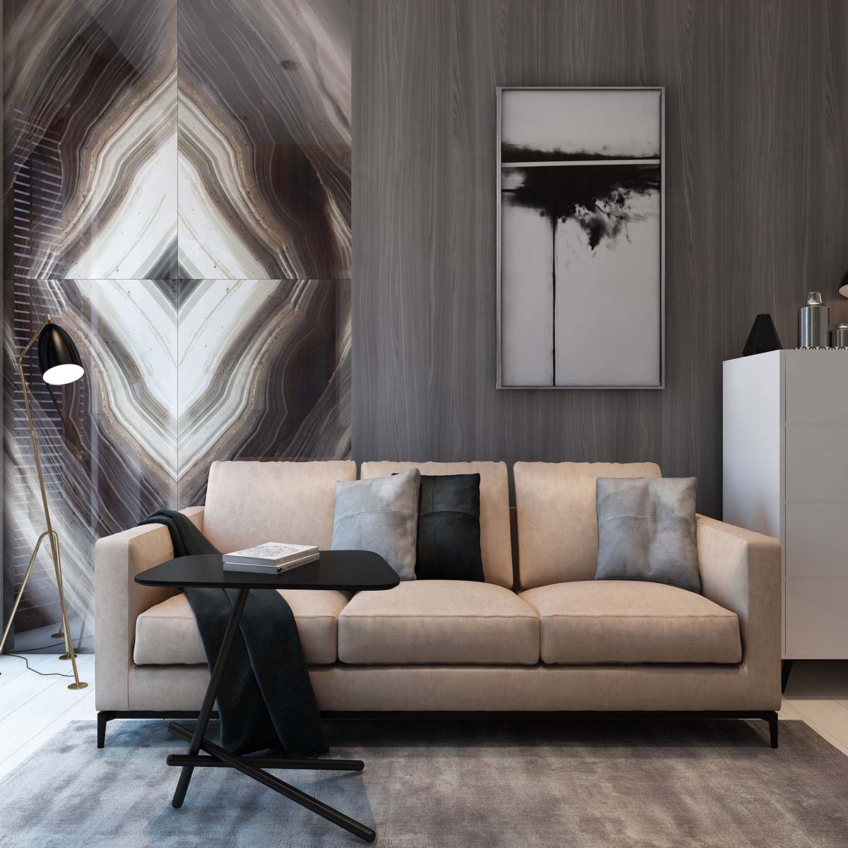
like the AJ Floor Lamp lend a practical but sophisticated air to this multipurpose room.
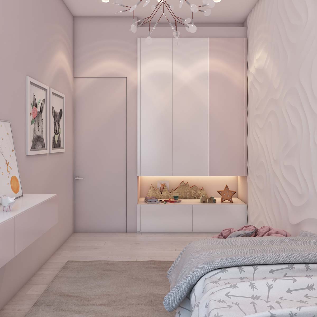
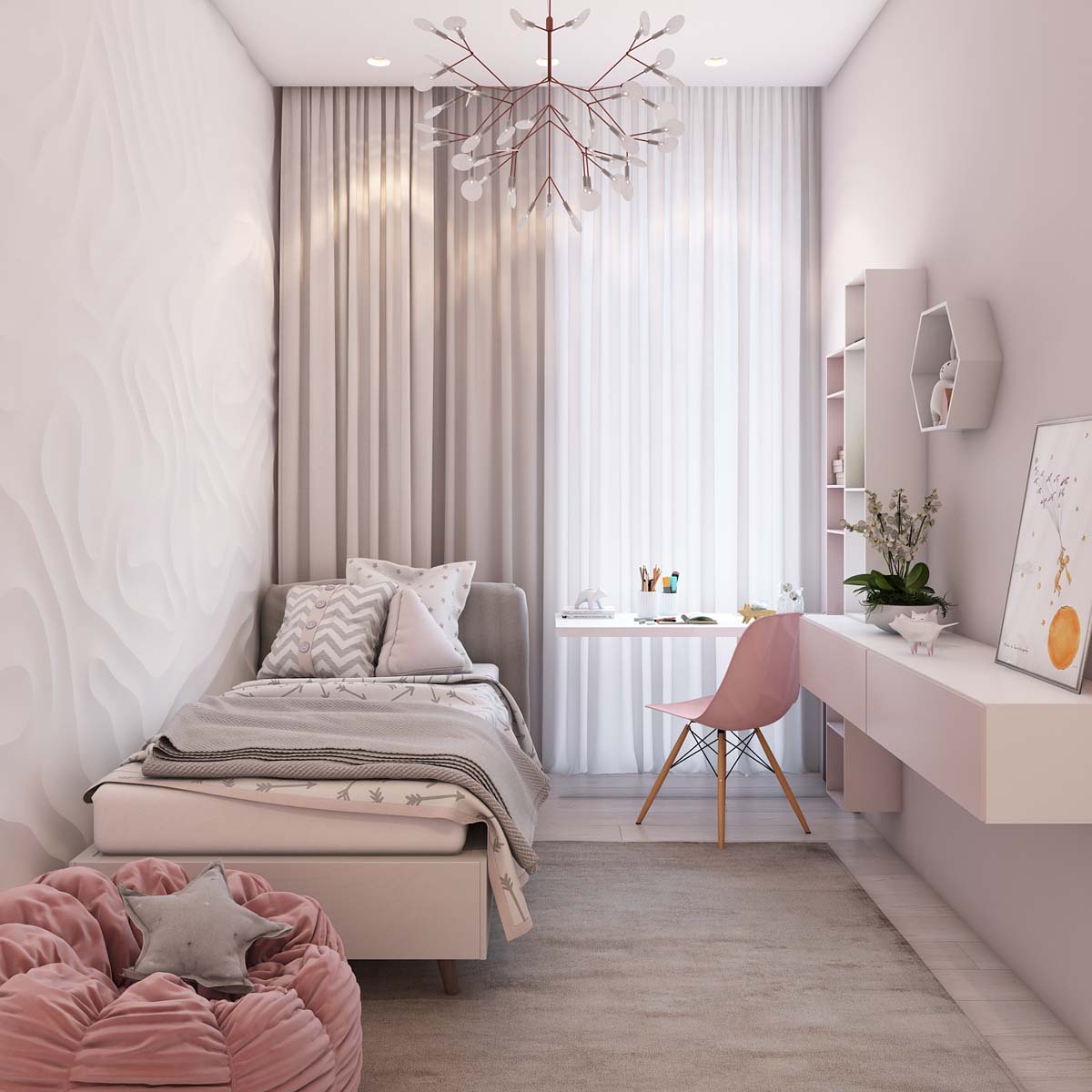
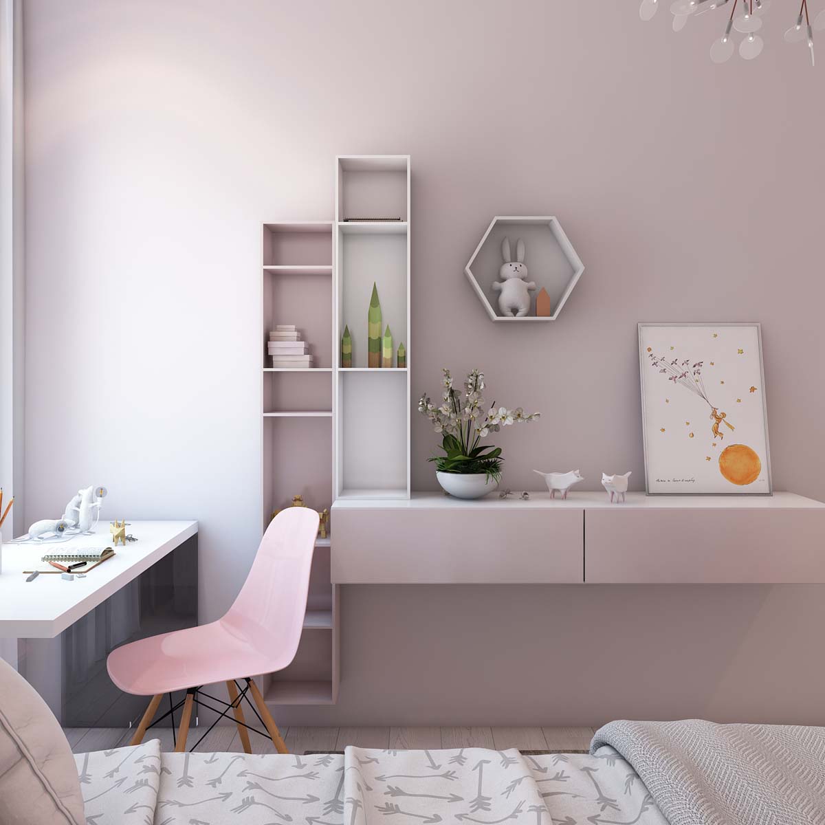
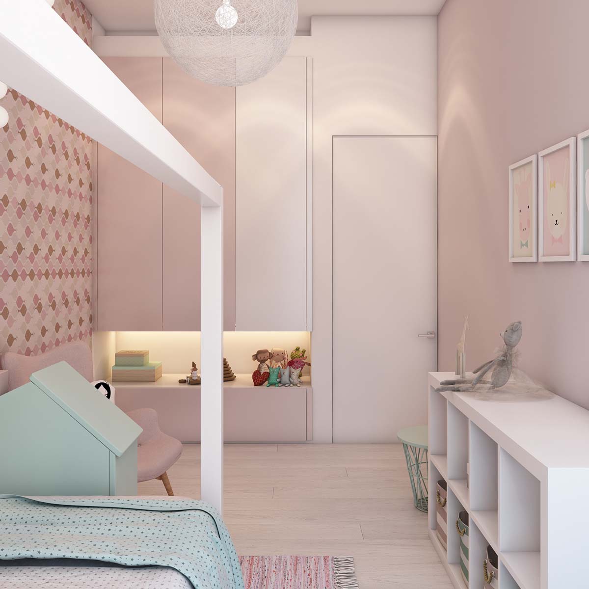
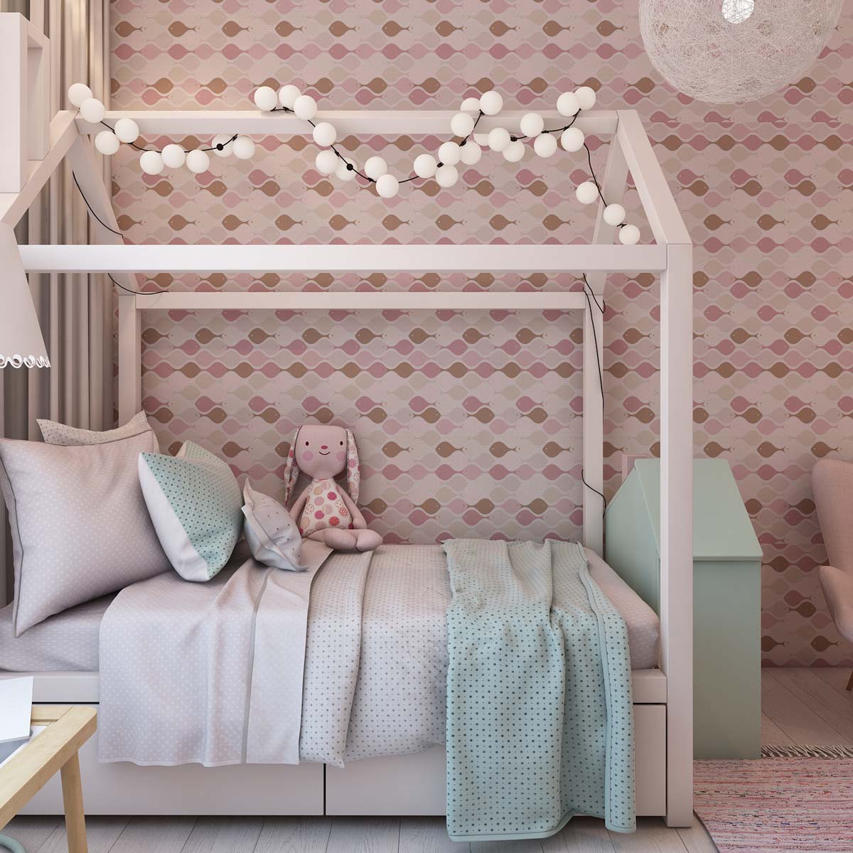
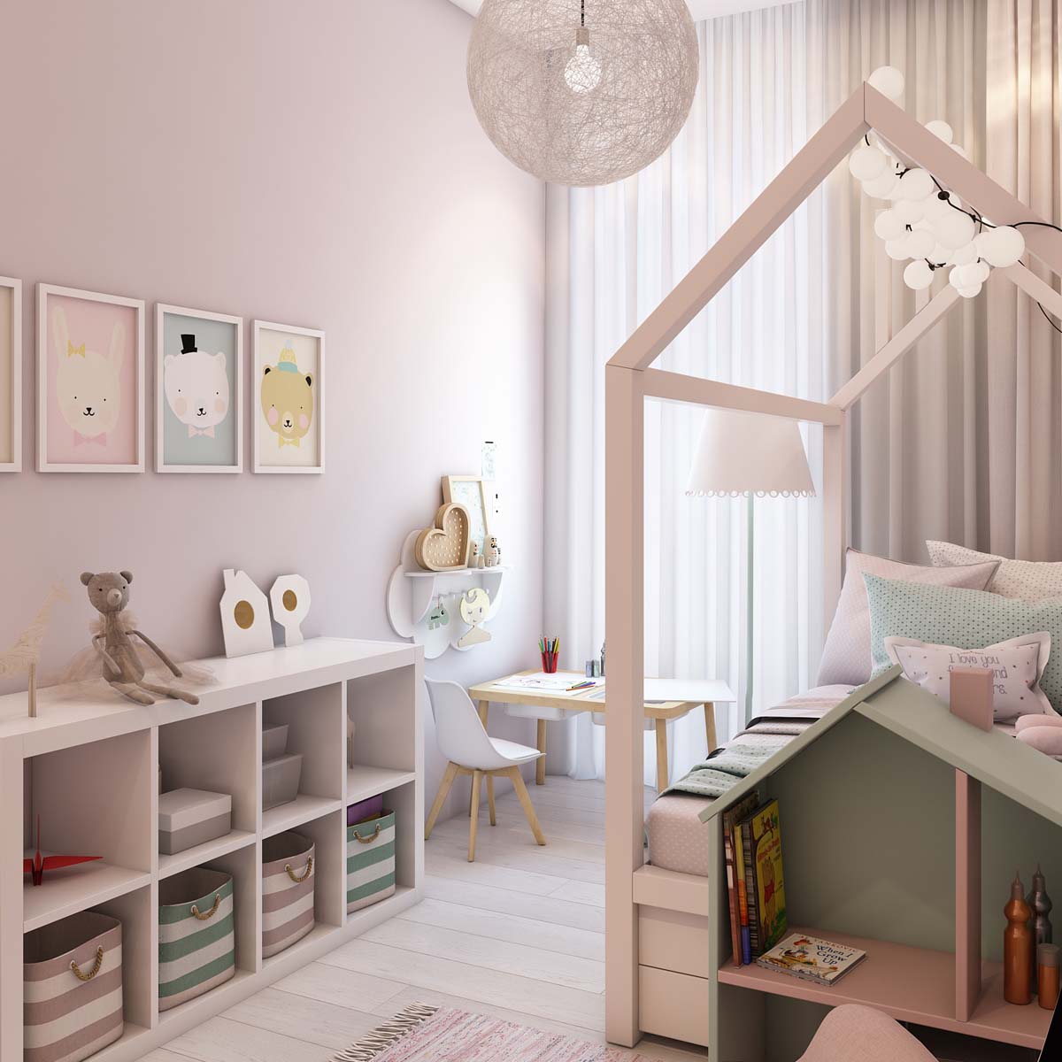
The lovely pink walls are still within the realm of neutral, but bring a bit more life to this youthful space.
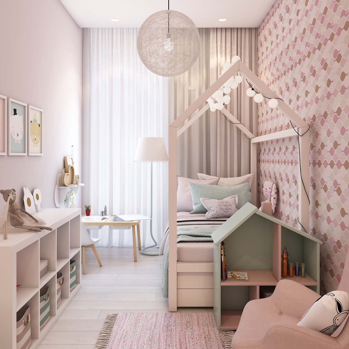
Most kids beds are a lot simpler than this pretty canopy frame, but this one will be much more memorable.

