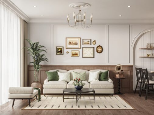
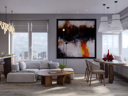
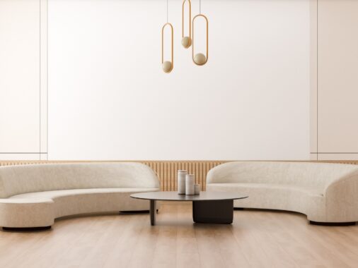
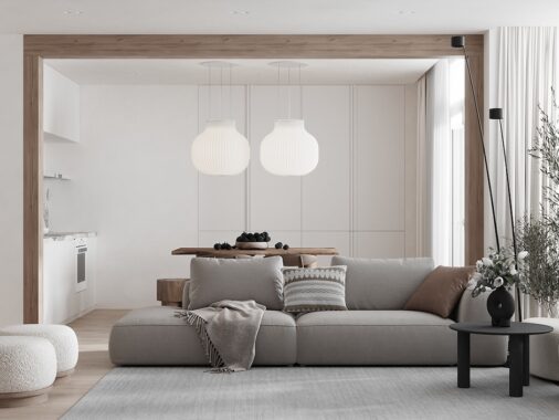
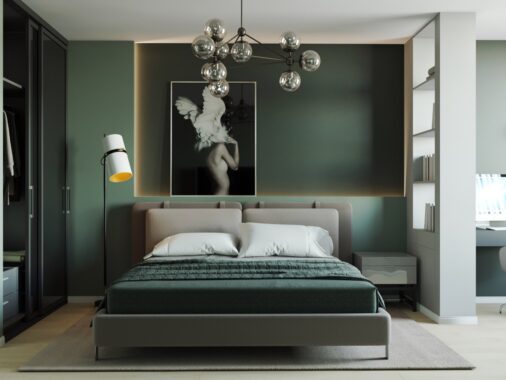
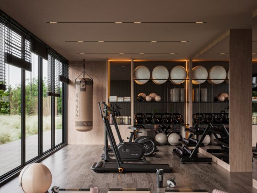
Apartments are not known for their spaciousness – inner-city locations, compact-living and budget-friendly spaces are more their forte. Living in a space under 50sqm, however, doesn’t mean that your apartment can’t look spacious. Elegant, modern designs with minimalist details are the key to creating space where little was before. Clever functionalities, such as creating two, or even three, living spaces in the one area leaves breathing space between key area transitions, giving the illusion of room. Muted hues and subtle details such as patterning add interest, without clutter. These four stylish apartments under 50sqm give a guide on how to make the most of your everyday spaces.
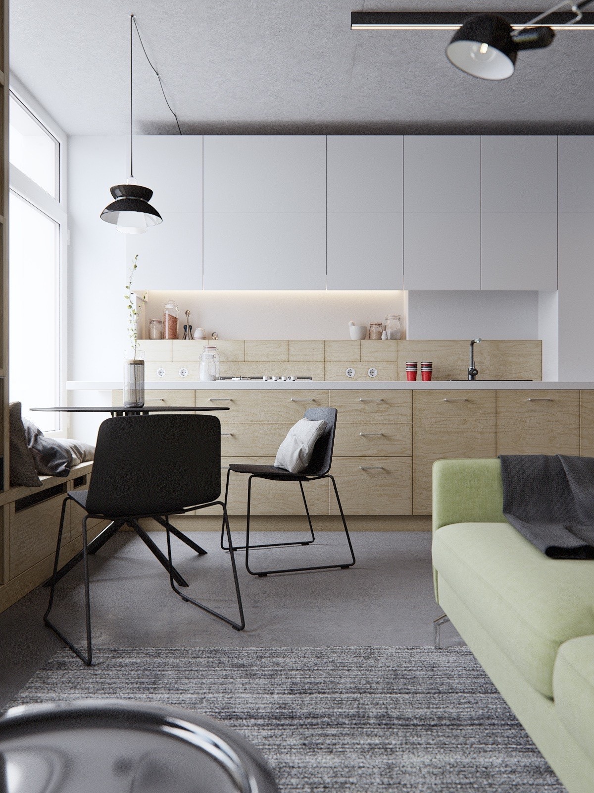
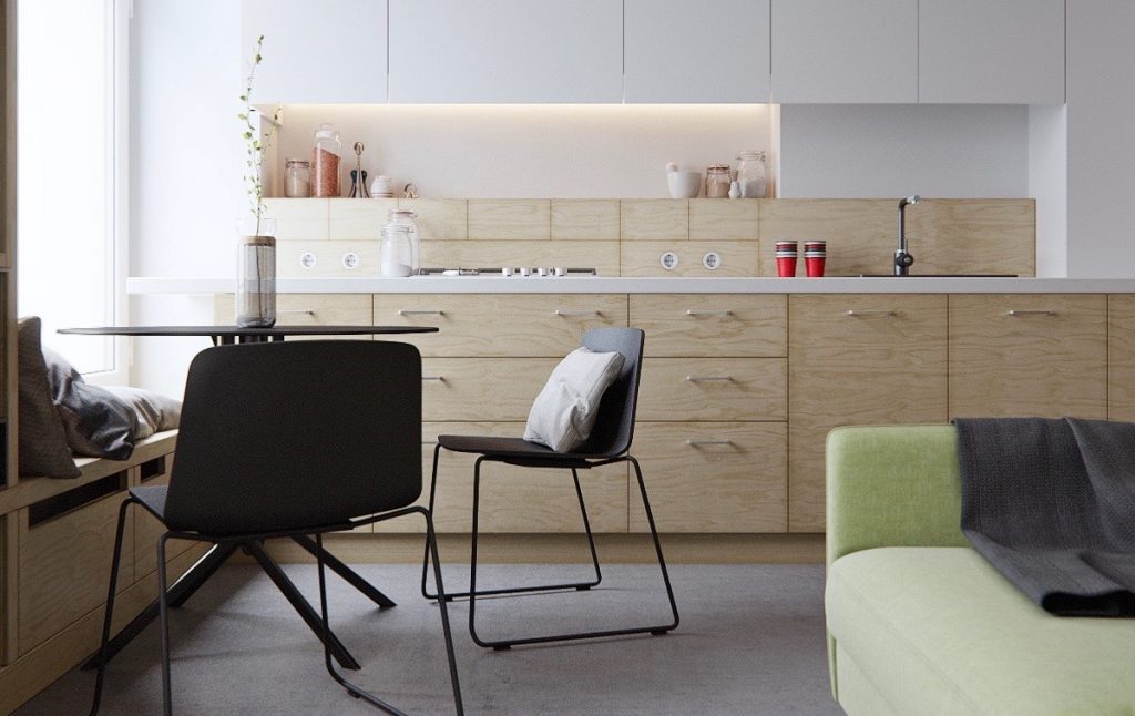
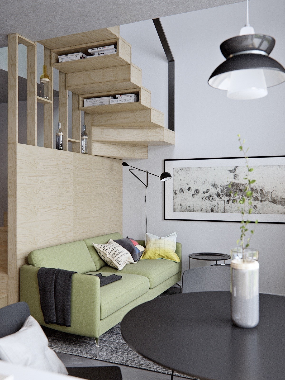
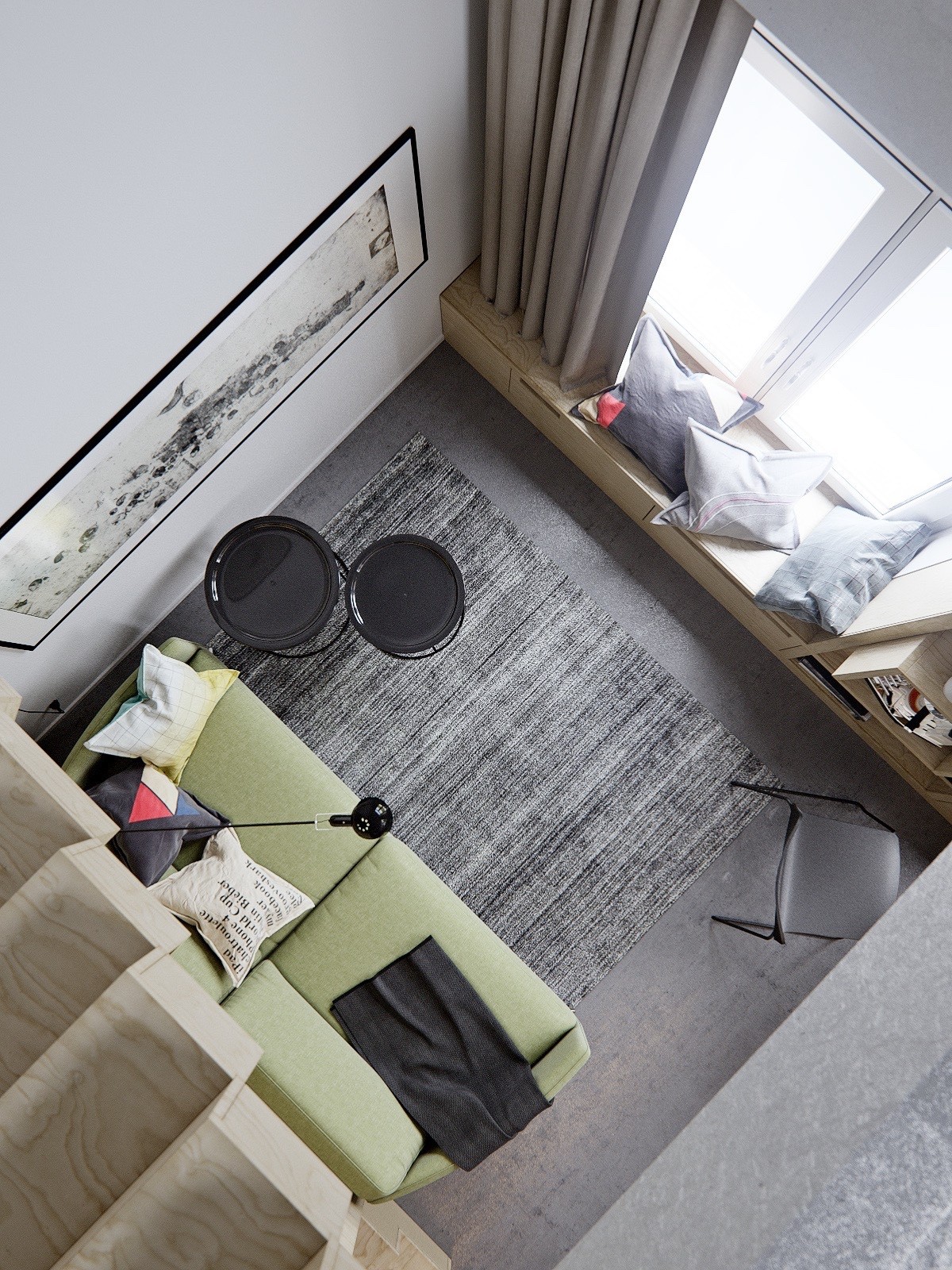
This 40sqm, two-level studio apartment plays with a cool background palette, allowing more unique-coloured furnishings to shine. Here, a wide avocado-hued sofa makes its mark on the main living area, while minimalist grey patterning and simple wooden textures give the room breathing space.
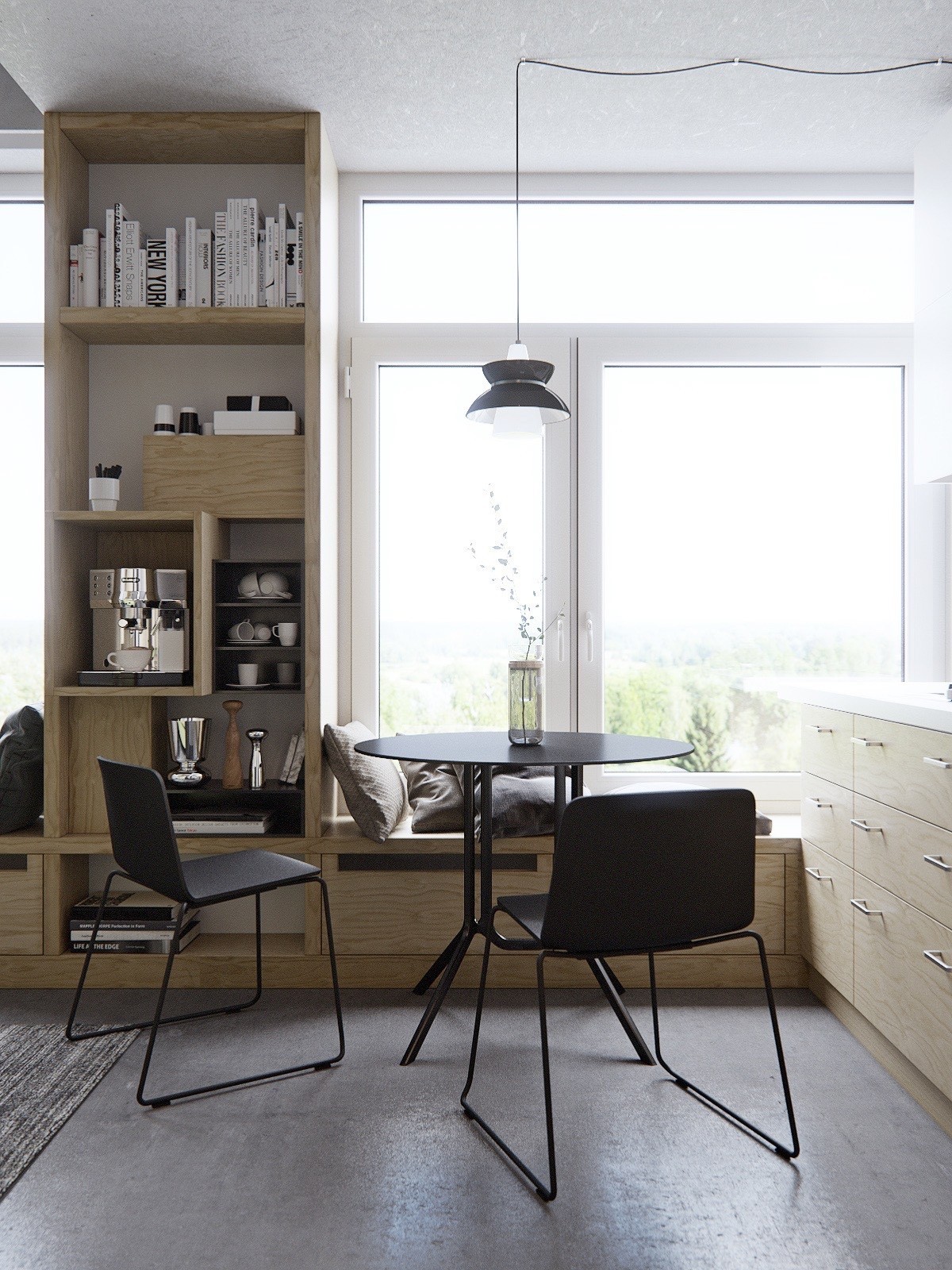
Design features can be kept to a minimum when spaces are at their tightest. A stencilled kitchen table makes a less dramatic impact, while the thin design introduces elegance.
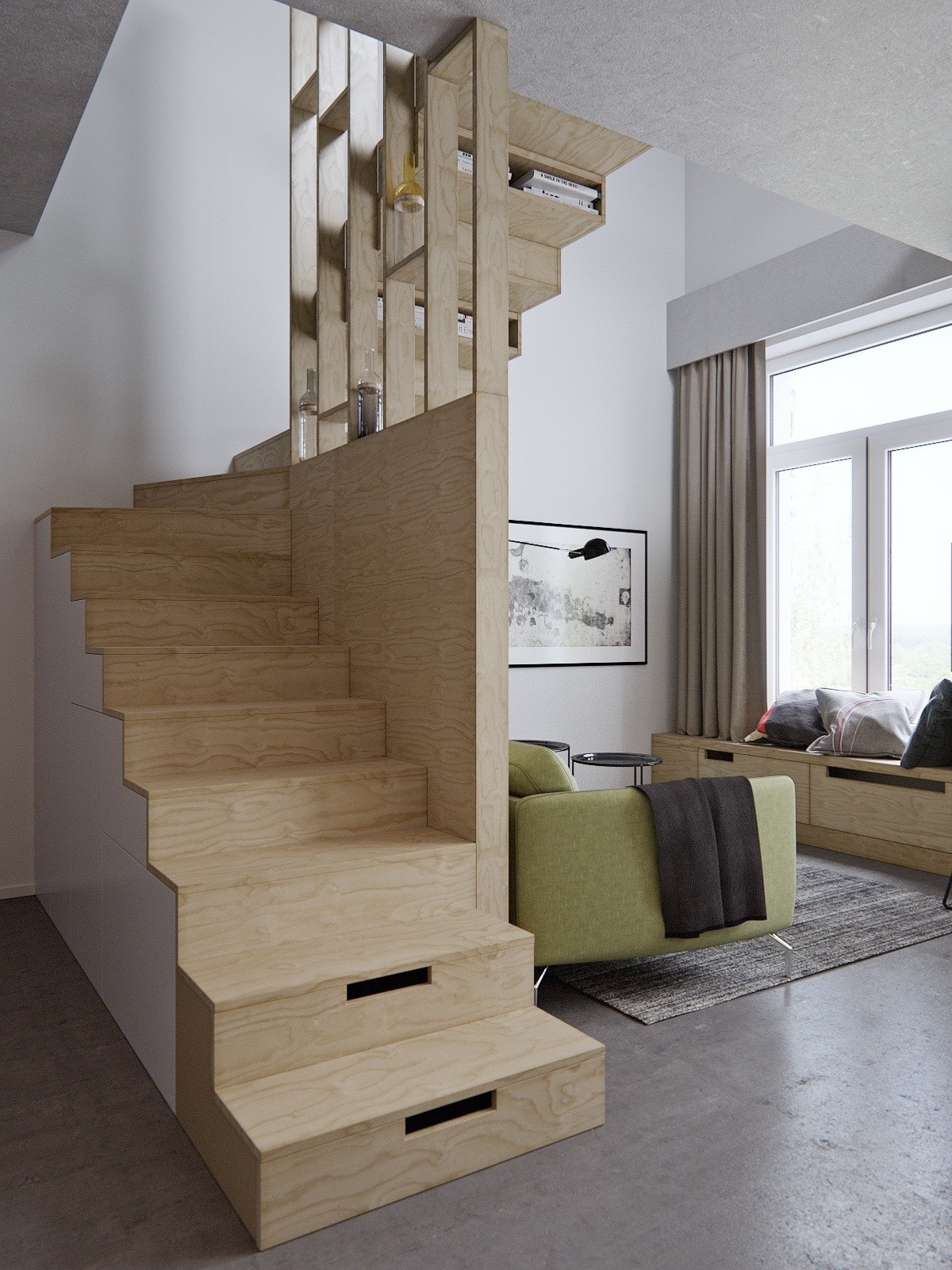
A grand feature in an apartment can make a space look larger. The winding, wooden staircase makes a statement while affording a clean, non-intrusive backdrop for other elements.
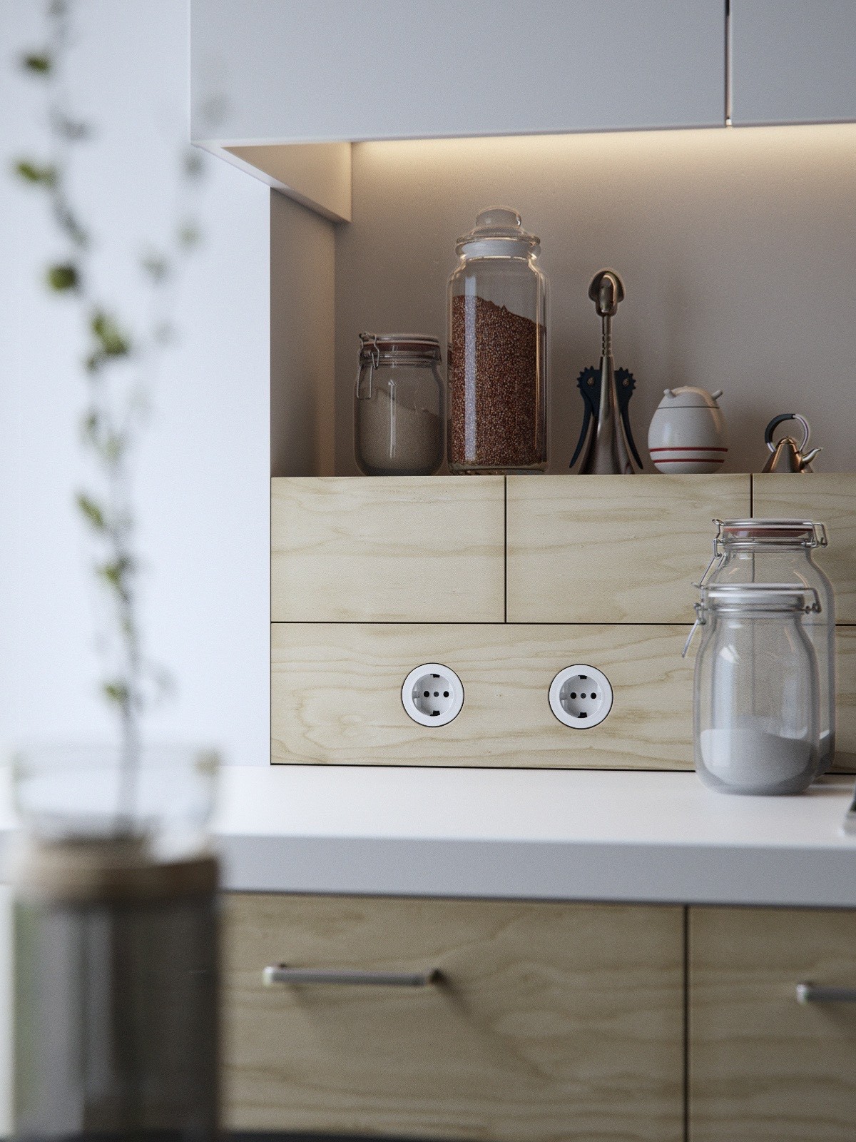
Finer details polish up a space just as much as a grandiose staircase. In the kitchen, simple mason jars reduce clutter.
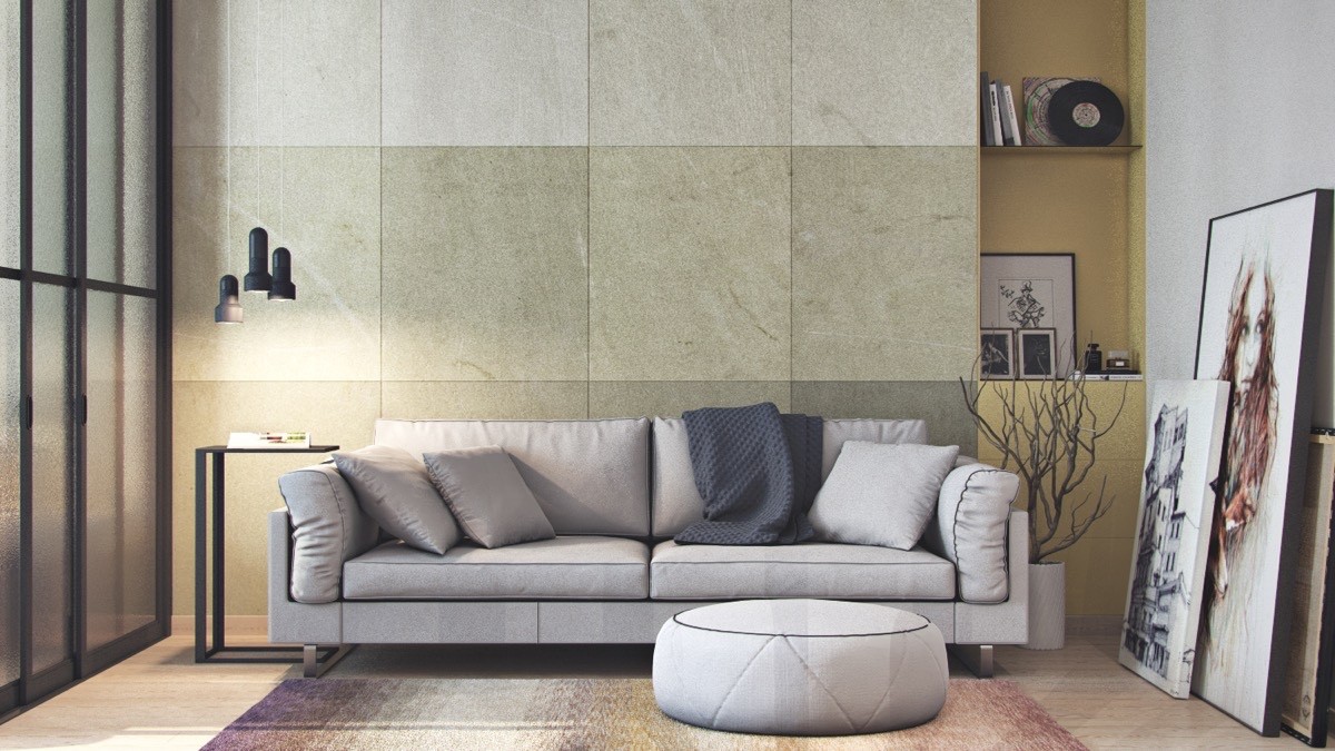
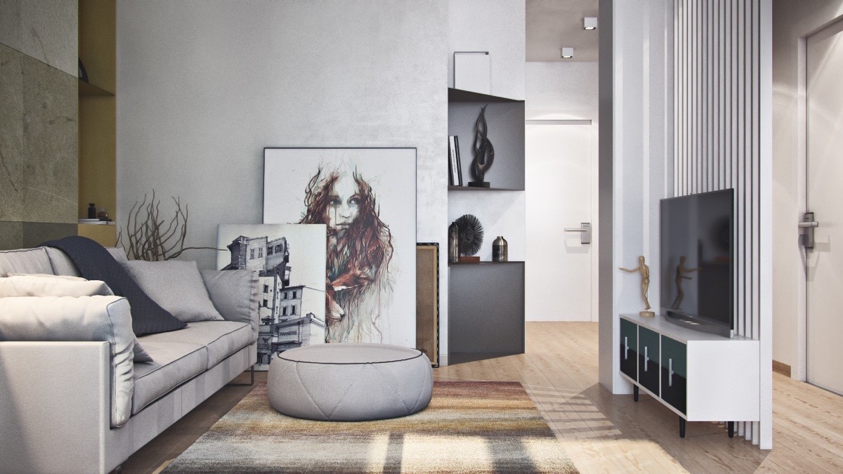
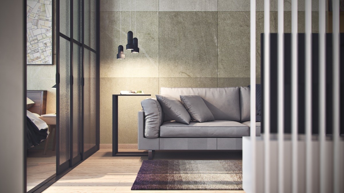
A slightly larger space, this 45sqm home is able to play with more textures and subtleties, while still aiming for greater spaciousness. In the living room, large-format tiles in slightly-differing hues line the feature wall, tricking the eye into seeing more widely. White-slat and glass-windowed partitions let light and extra space into the area.
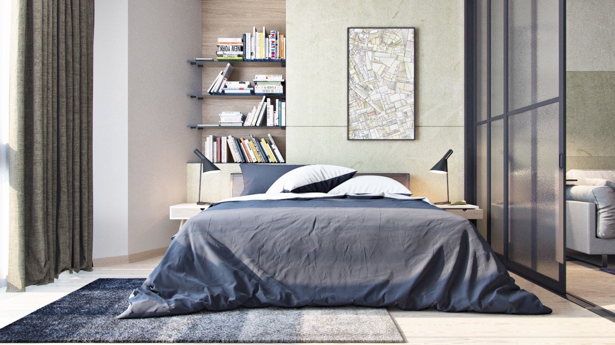
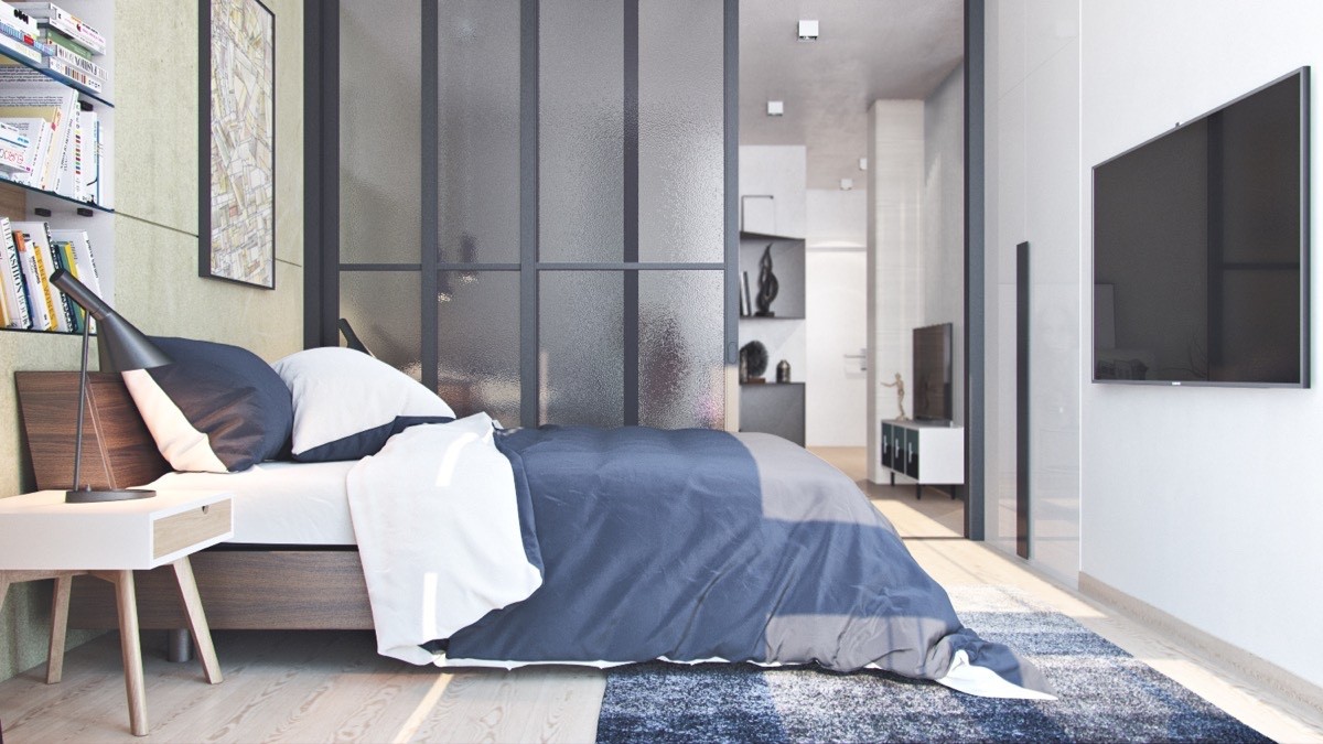
The bedroom segues from the living room, sharing the same glass wall partition. A wide bed takes centre stage, giving the impression of ample square meterage. A bookcase behind the bed utilises an inlet wall space, while muted, charcoal tones inject both warmth and a feeling of calm.
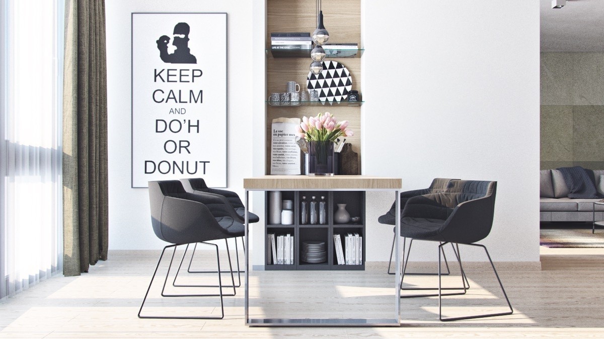
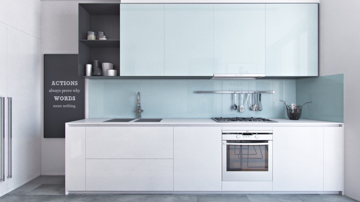
The home’s dining area and kitchen play on the same theme – white space dotted with interesting and eye-catching detail. The dining room keeps it simple with a wooden frame table and black pod chairs, while monochromatic prints lift the eye. The kitchen’s cabinetry appears in plain enamel, offering small breaks in charcoal quotations, shelving and saucepans.
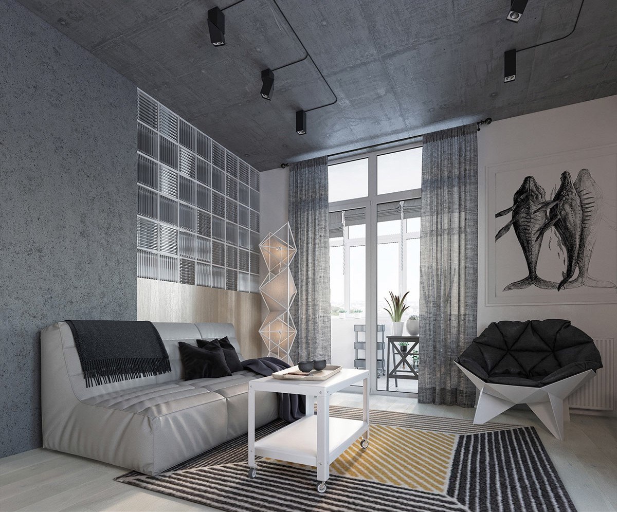
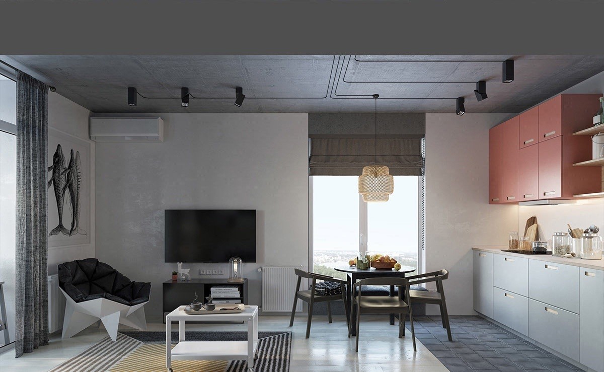
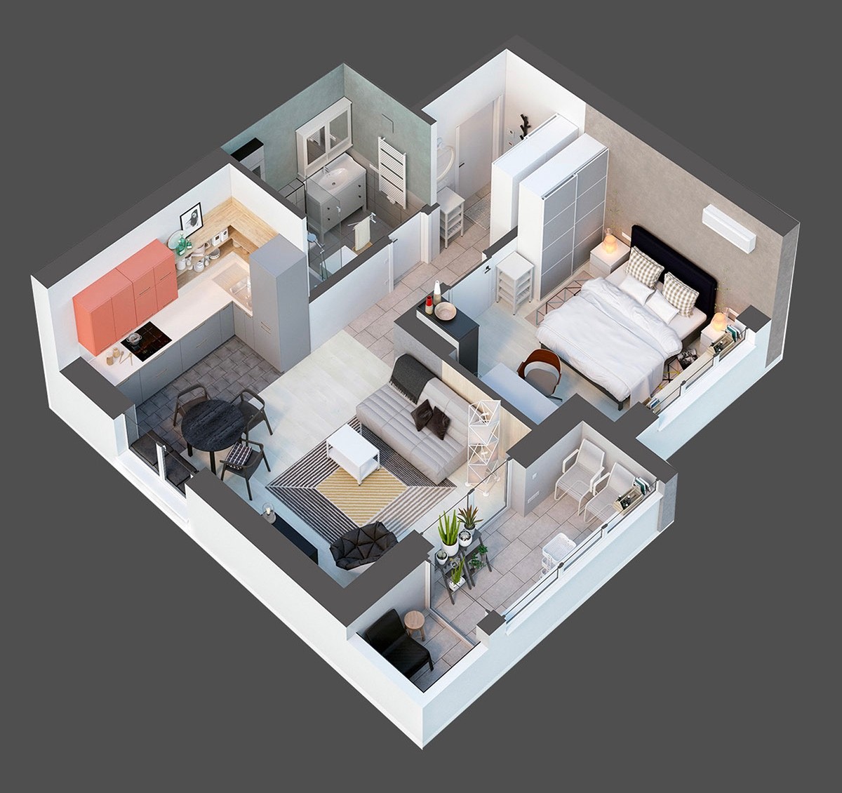
Our third space, a 49sqm loft in Lyiv, Ukraine, uses geometrical shapes to frame a range of reserved hues. The living, dining and kitchen areas are made larger by separations in the shapes, all tied together by their outlines. The living room boasts an octagonal chair upon a lined rug; the dining room a plus-shaped light; the kitchen a series of coloured blocks which act as its cabinetry.
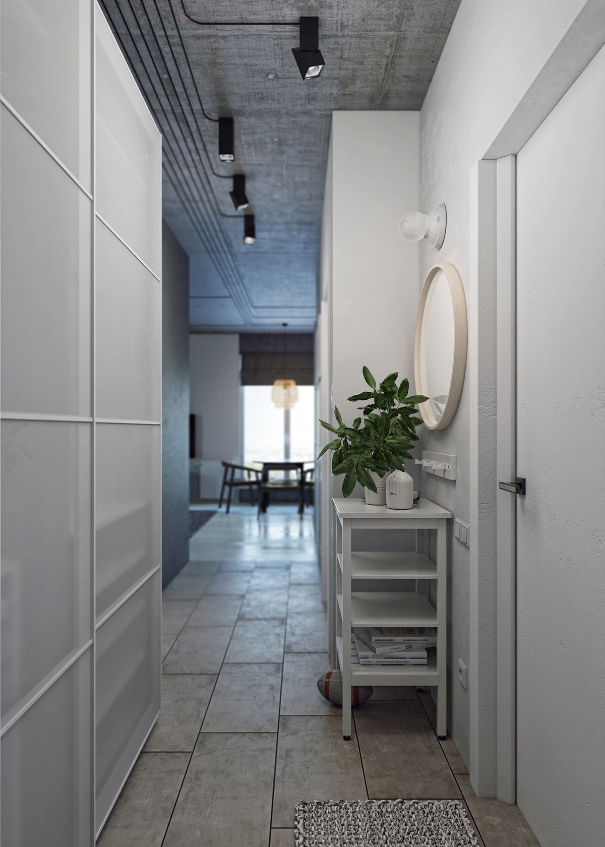
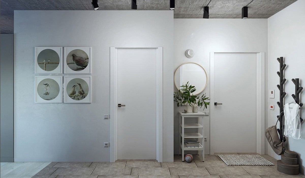
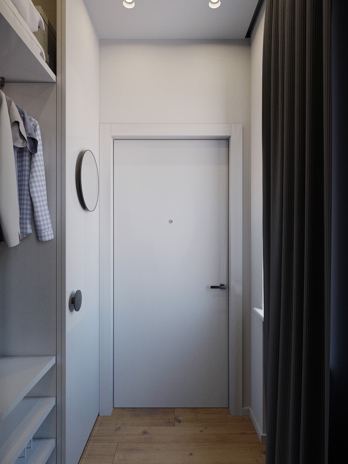
The hallway and entrance area offers a breathing space before the main area, while still following the same theme. Circles form mirrors and art on the walls, while the white backdrop affords space for the unique branched coat rack.
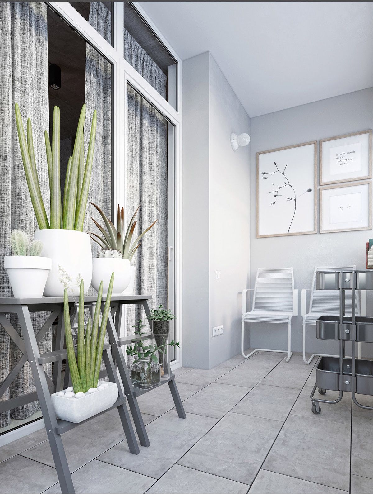
An outside patio is a segue between the main area and hallway, remaining light but not white. Green potted plants in solid forms introduce the outdoors.
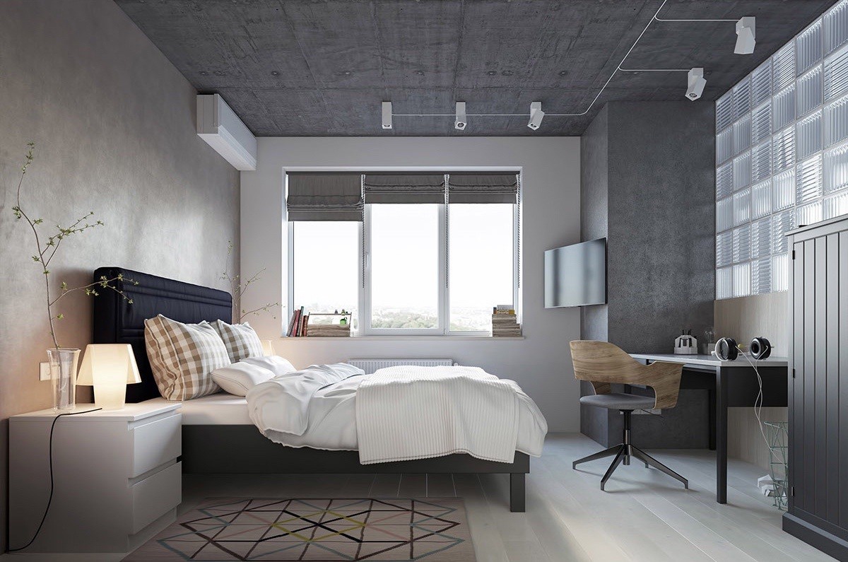
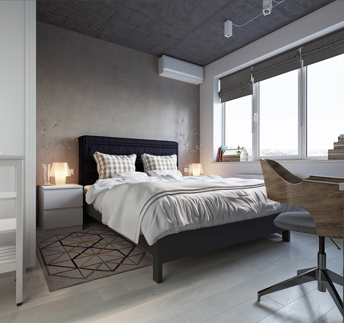
Inhabiting the other side of the living room’s glass partition, the bedroom is darker again, a perfect climate for sleeping. Triangle and diamond shapes cover the rug, while a wooden geometric chair, a series of rectangular windows and differing textures fill the corners.
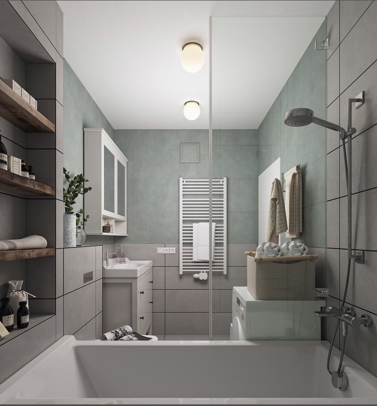
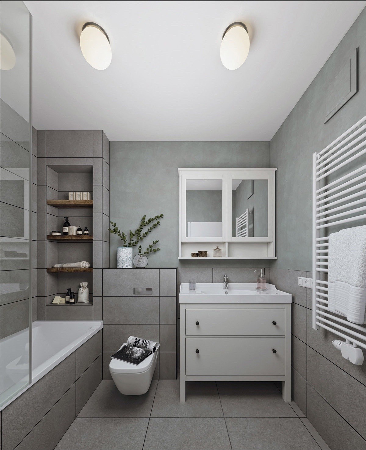
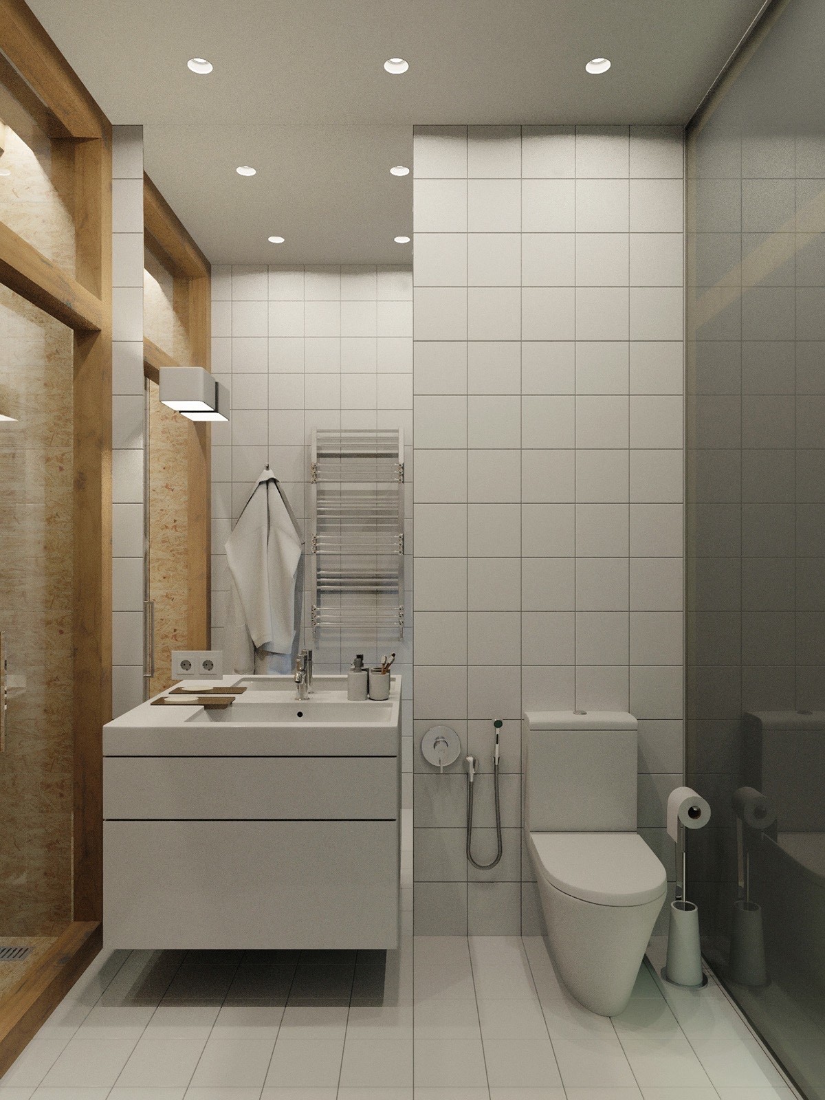
The bathroom takes on a softer side to framing, with a block cabinet and bath in white ceramic. A light teal tint and towelling offers a feminine touch to a space for pampering. Wooden shelving and small potted plants fill the room with nature.
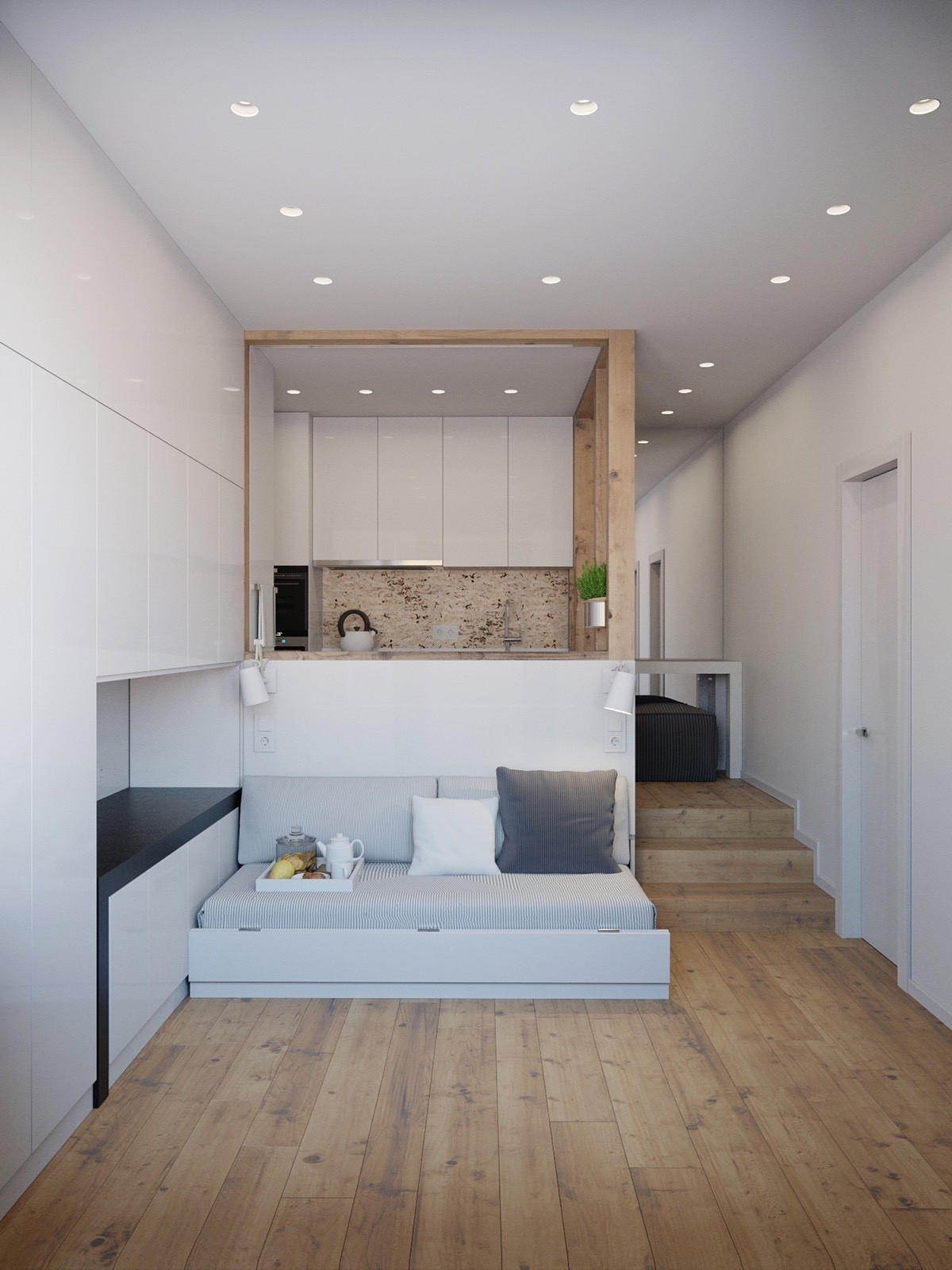
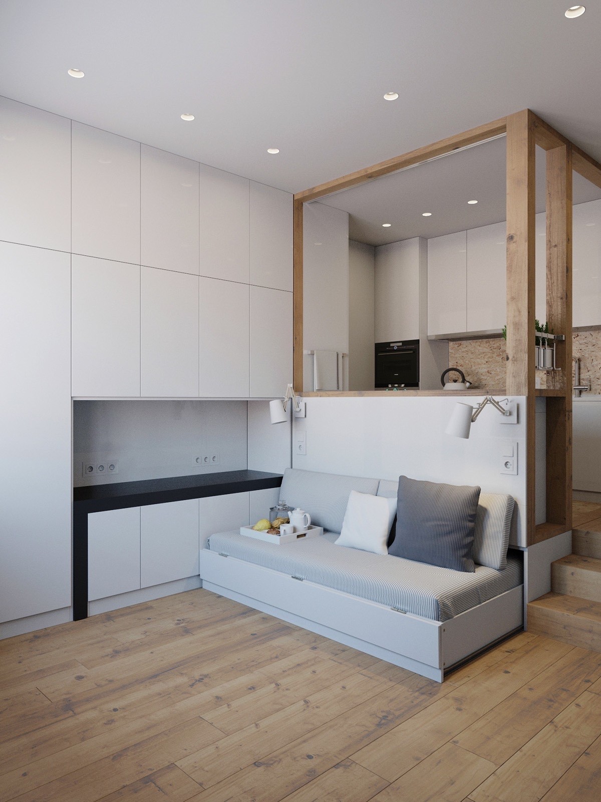
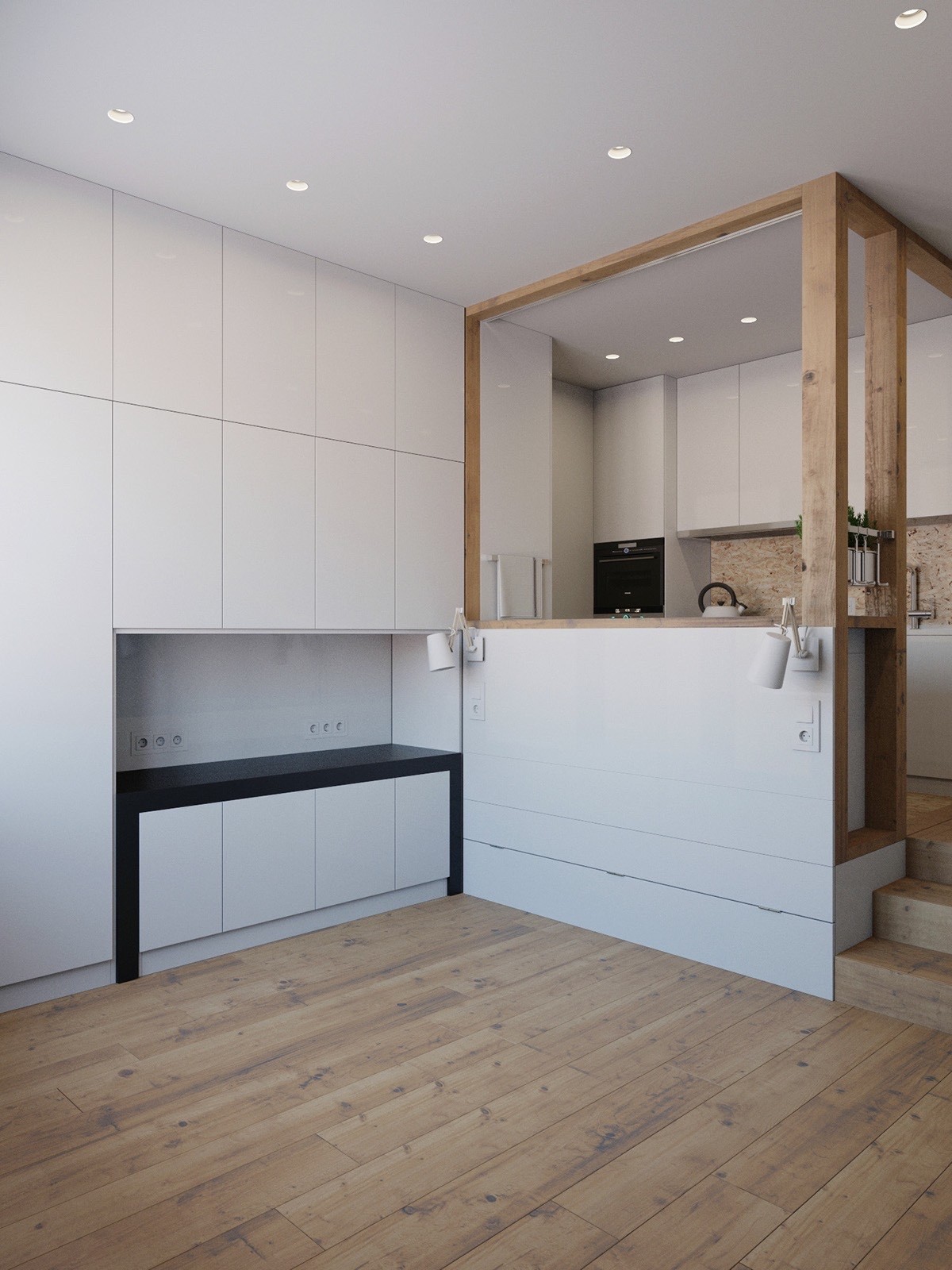
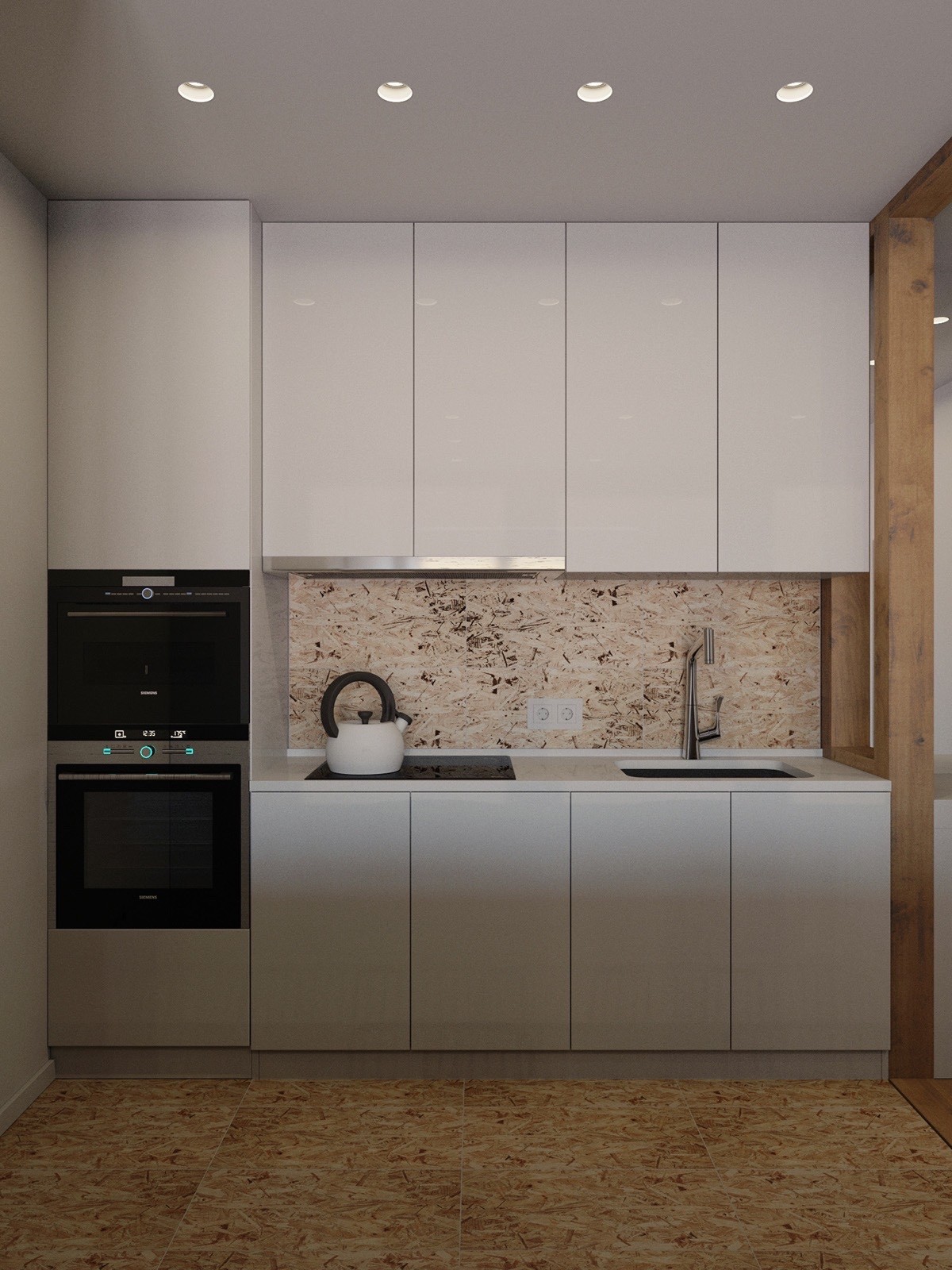
Our final living space, coming in at 25sqm, is a truly innovative use of space. White-walled interiors showcase a kitchen and living space, with the kitchen bench an additional backing for the lounge. Corked kitchen tiling draws the eye.
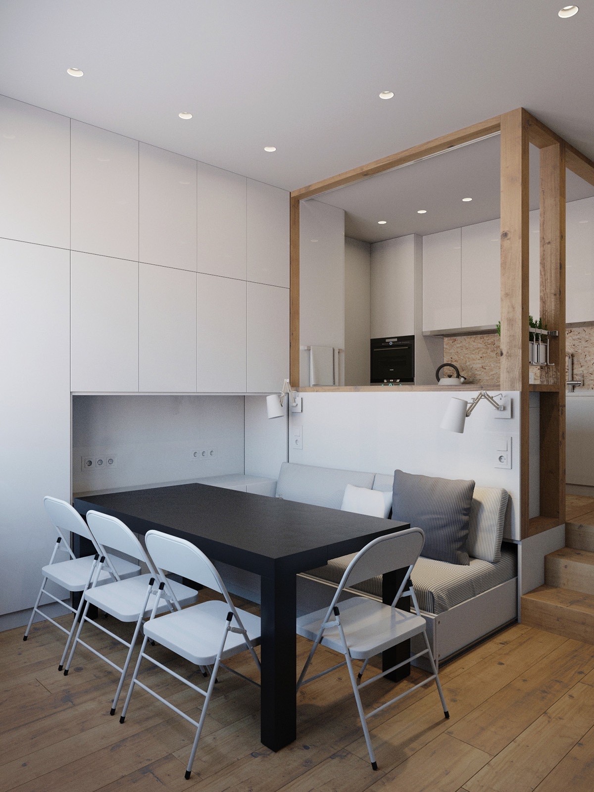
Stored in the living room inlet, a black table and white chairs form a dining space. The pale-coloured couch fits in thematically, offering seating for the other side of the table.
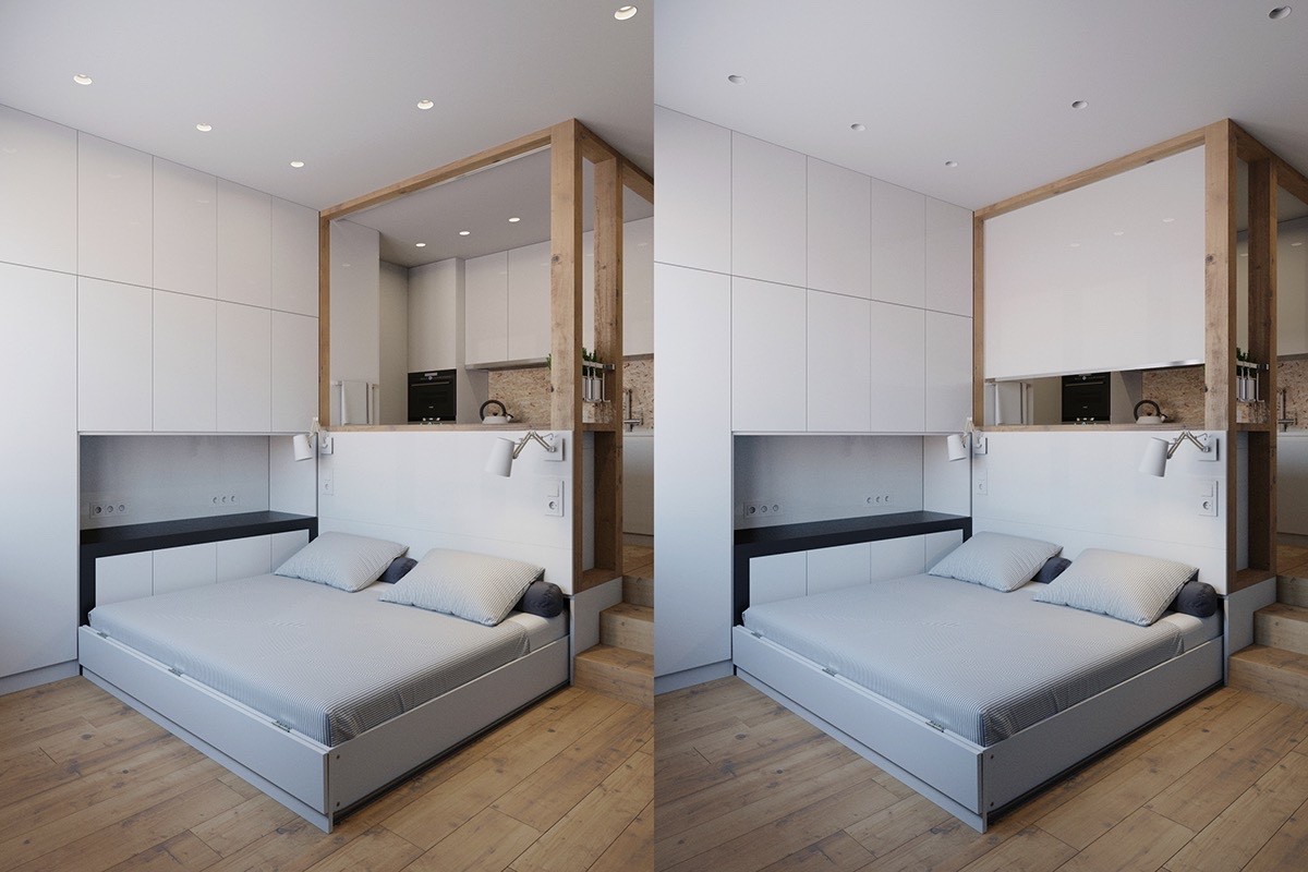
Able to fold away or further extend, the original couch seating folds out to a bed. Clothed in the same colour bedding as the lounge, the stowaway acts as a side table.
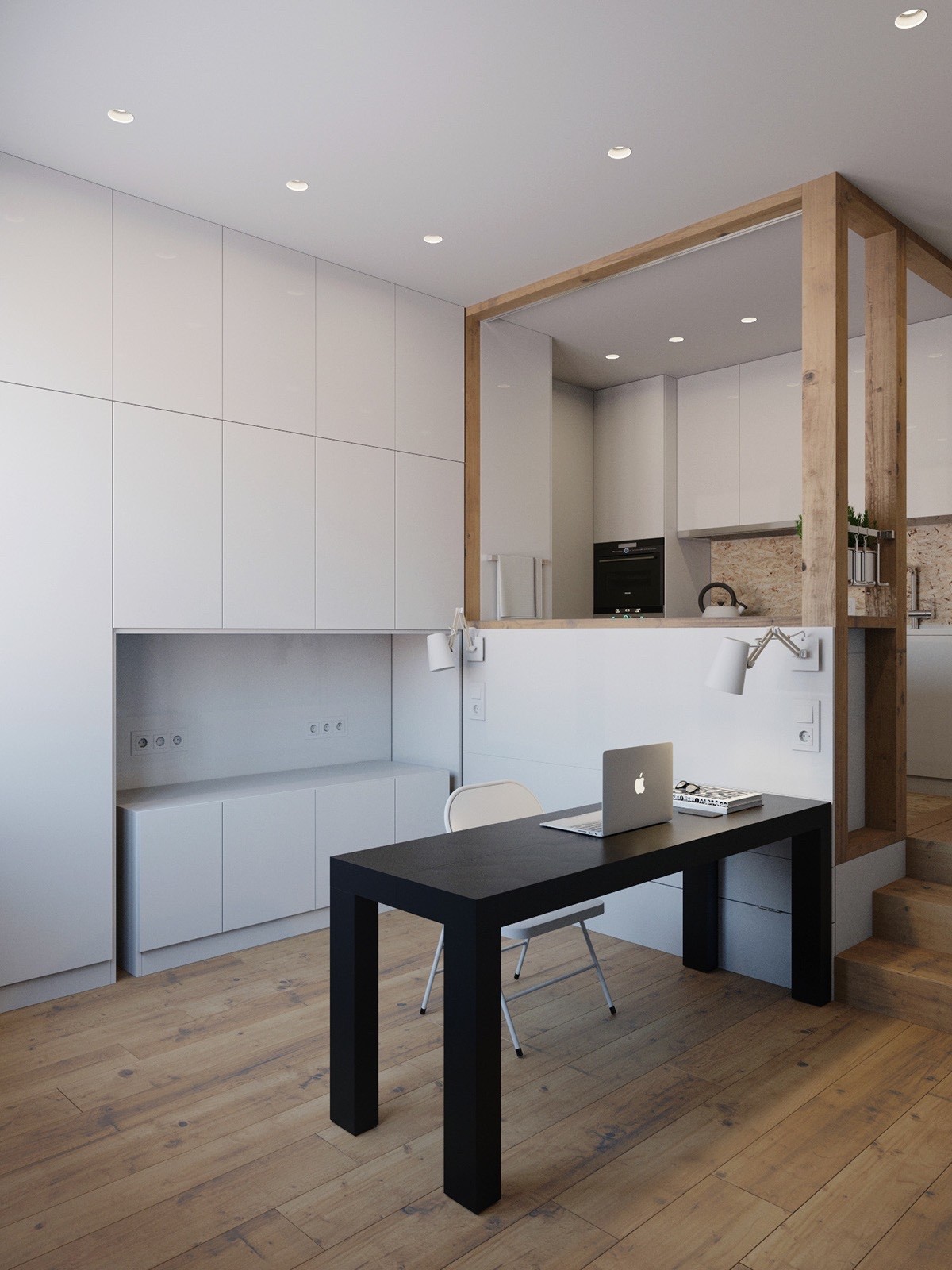
Not only a bed header, the reverse of the kitchen sink forms a partition for different living spaces. Inserting a table and chair, the space becomes an office, with the inlet behind a new filing cabinet.
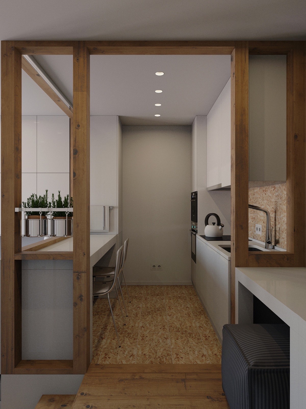
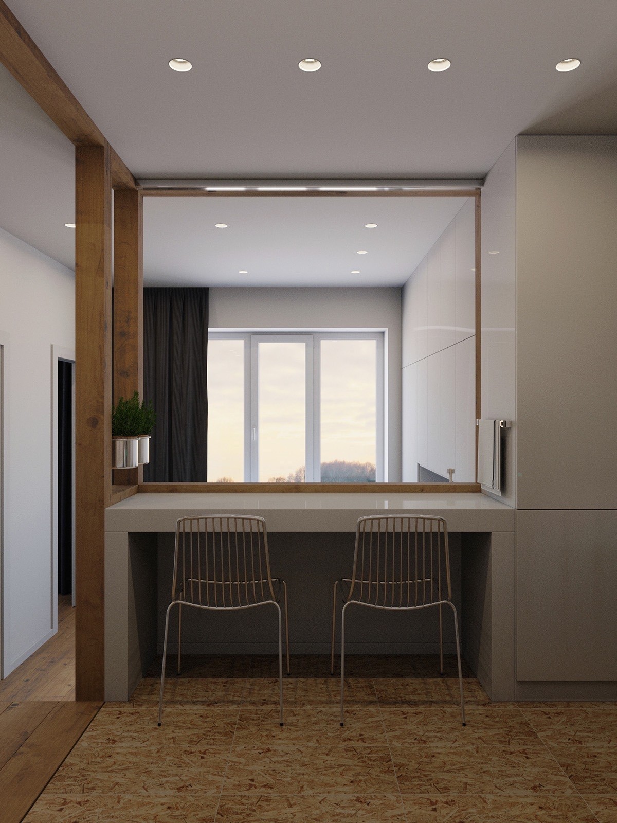
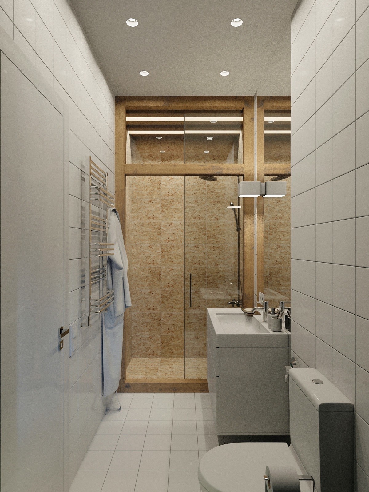
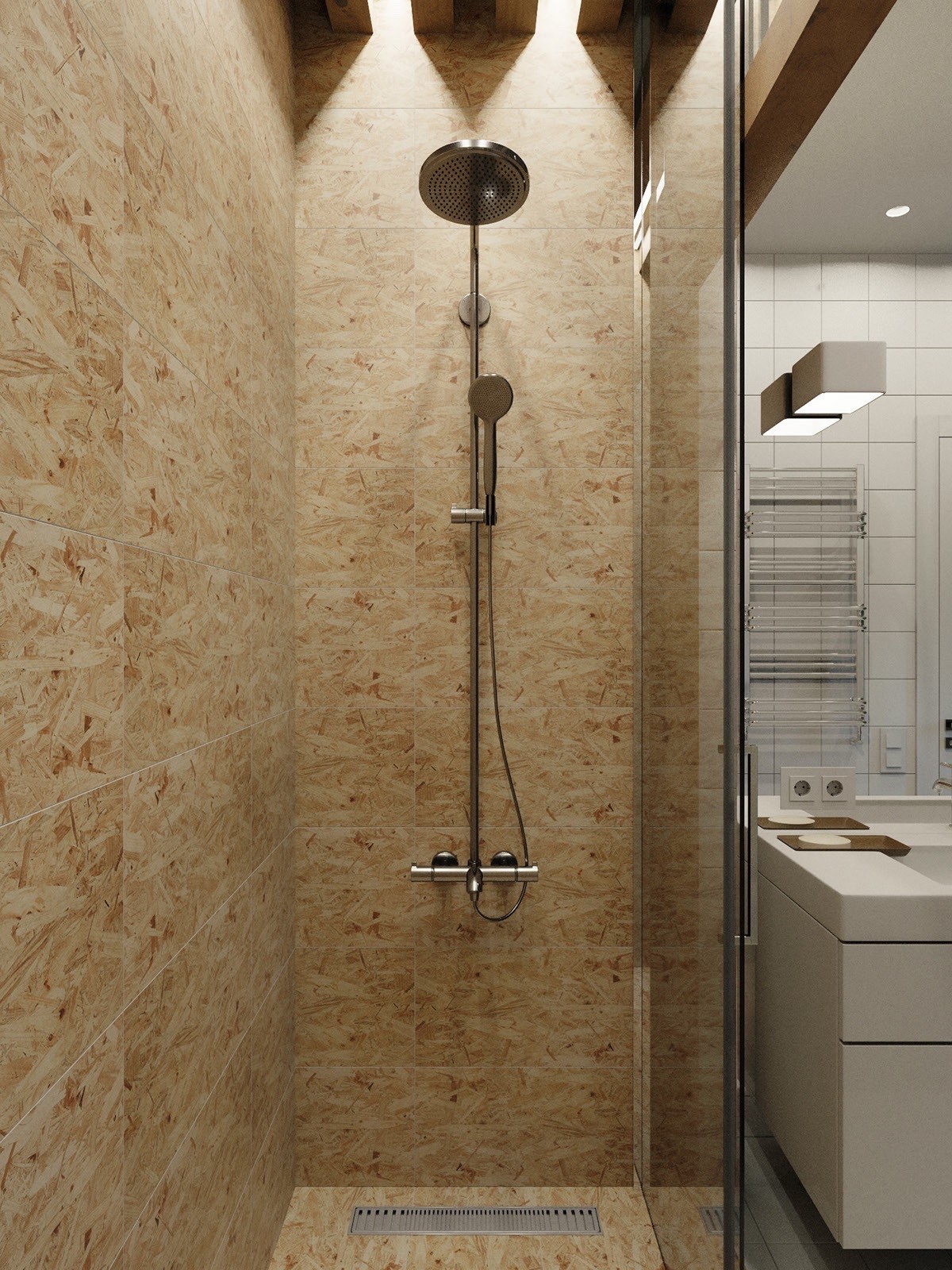
Framed by wood stencils with a cork inlet and floor, the kitchen is a feat of design ingenuity. A wide passageway gives the feeling of space, with appliances neatly tucked away in cupboards. A preparation bench doubles as a breakfast table, with spare seating available just outside its walls.
