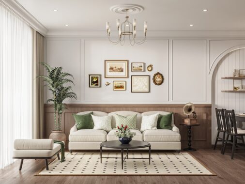
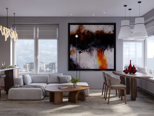
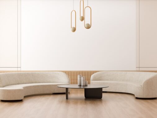
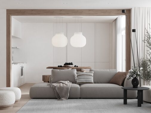
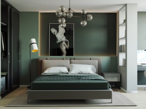
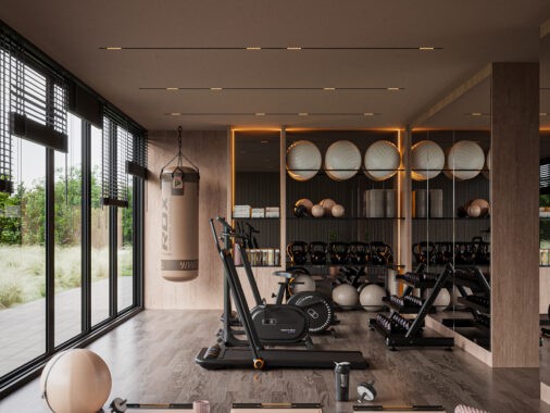
Spring is arguably the best season. It is that magical time after winter when the sun slowly comes out and the world is bathed in an infinite amount of colors. It is that wondrous time when the world is bathed in light and everything seems promising. It is wonderful- until it isn't anymore. The problem with Spring is that it is either gone too soon, or the fact that it is outside. Daria Zinovatnaya understands this perfectly, and decided to do something about it. With stunning design ability and skill, she has captured all the best part of Spring within the confined space of four creatively different apartments.

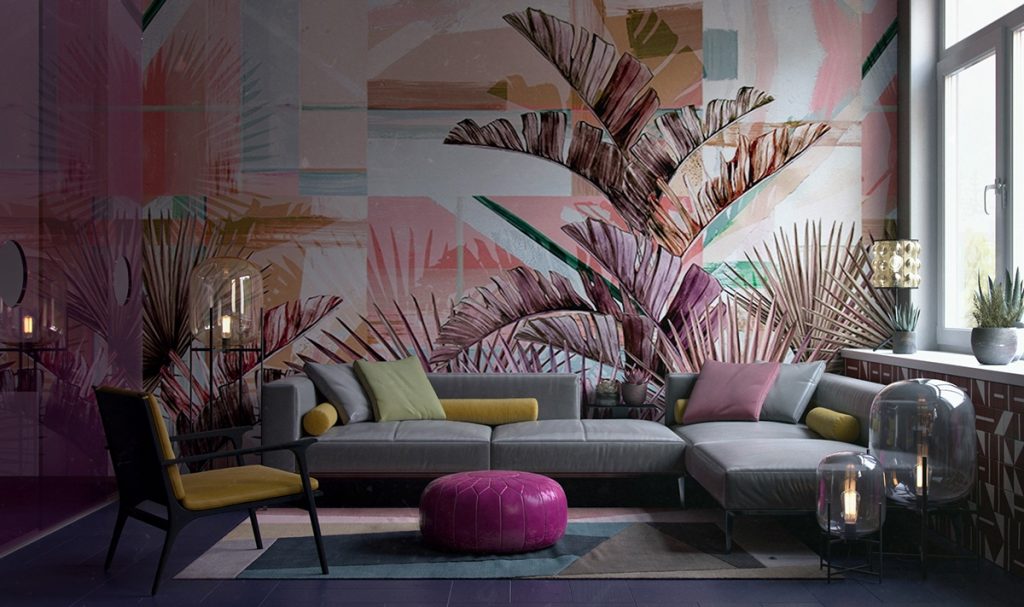
What is the best way to introduce an everlasting Spring into your home? A magnificent wall length print depicting an idyllic scene of course! The plants never die and the colors never change; a beautiful constant in an ever changing world.
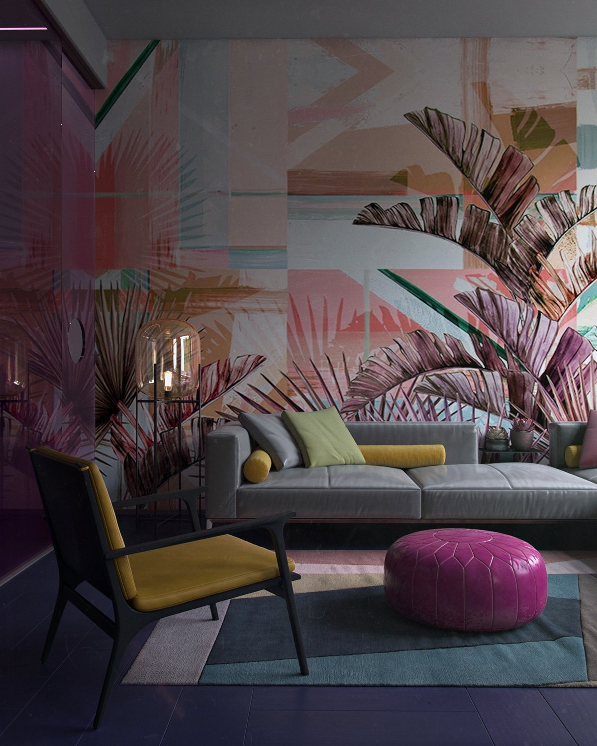
The furniture is comfortable and stylish, the bold colors fitting into the theme and creating a bright and engaging room.
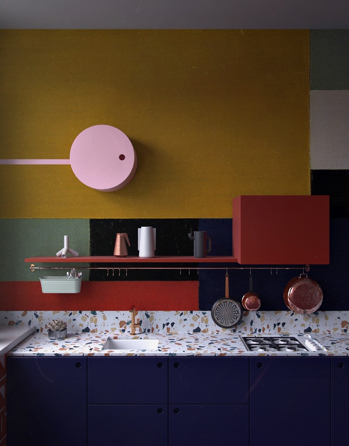
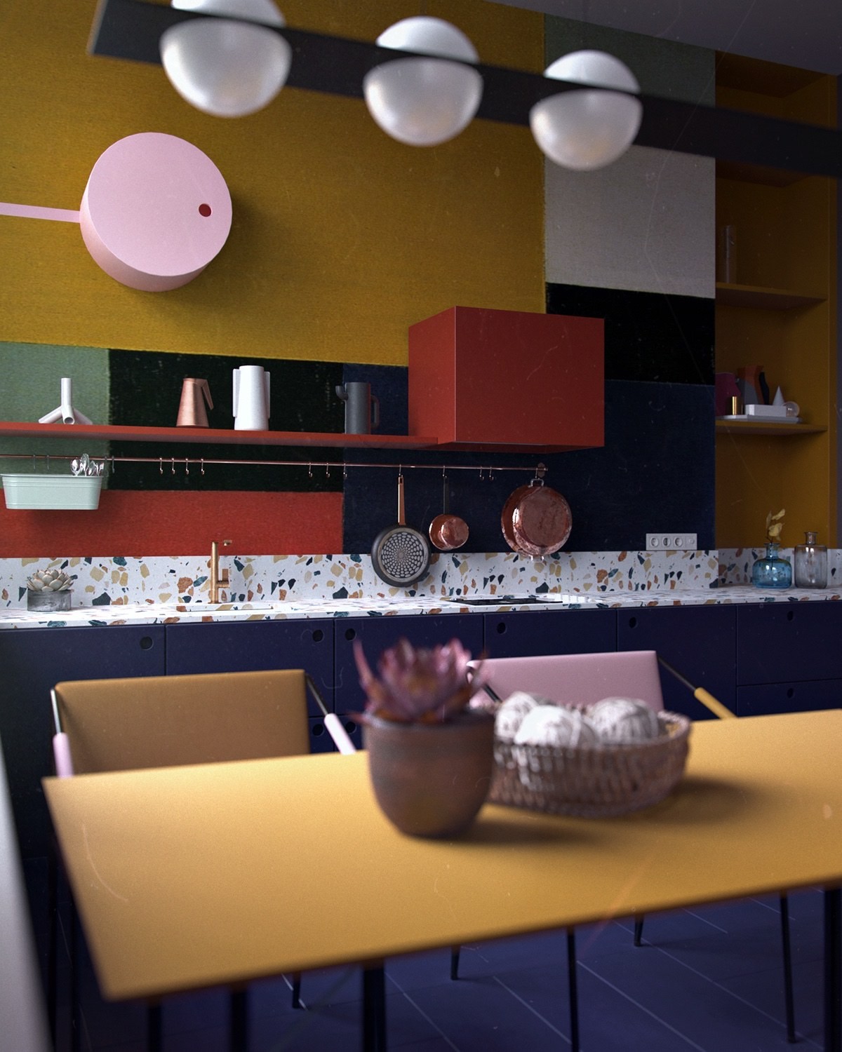
The mix of colors on the wall are paired together with careful abandon to create an enticing and interesting accent wall in the kitchen that reminds us of the riot of colors that Spring brings us once a year.
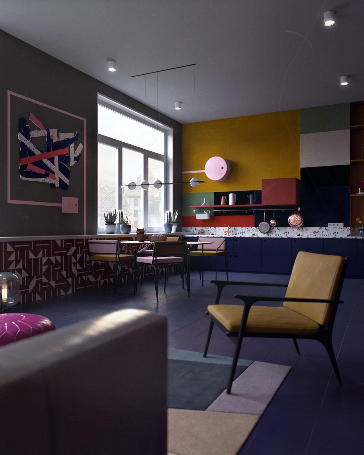
The entire apartment is built up of different components that in any other circumstance might be too busy and disjointed, but under the designer's expert care, the room is lively and fascinating.
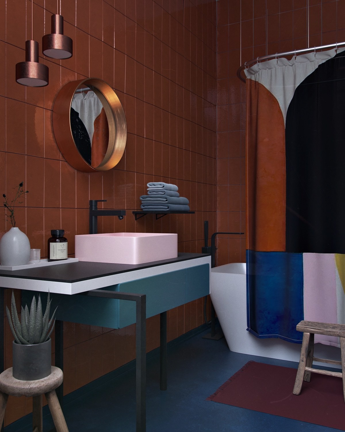
The bathroom is just as dynamic as the rest of the apartment and makes use of a variety of different colors to create an enjoyable overall aesthetic.
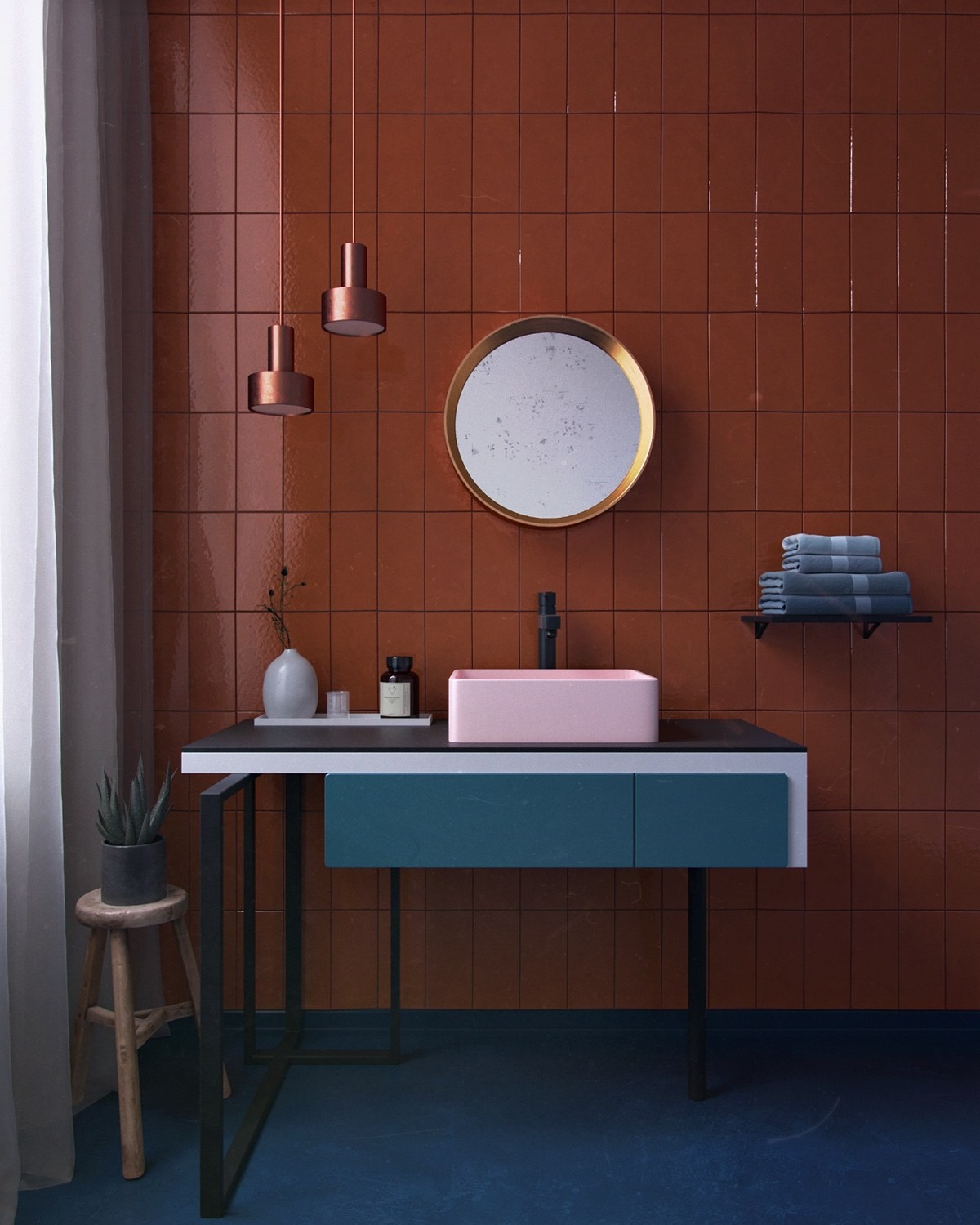
A bronze mirror and light features look lovely when paired with the tiles in the background. The blend of colors looks classy and elegant, while still retaining a lot of personality.
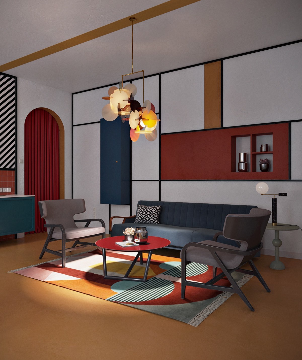
The next apartment is a little more composed, but no less exciting. The general interior looks as though it has been largely influenced by the De Stijl movement with its strong Mondrian compositions. This is not the first time we have come across interiors that strongly reflect the aesthetic of a particular art movement. Do check out the Cubism in Interior Design article where we cover Gemelli Design Studio's venture into Picasso territory.
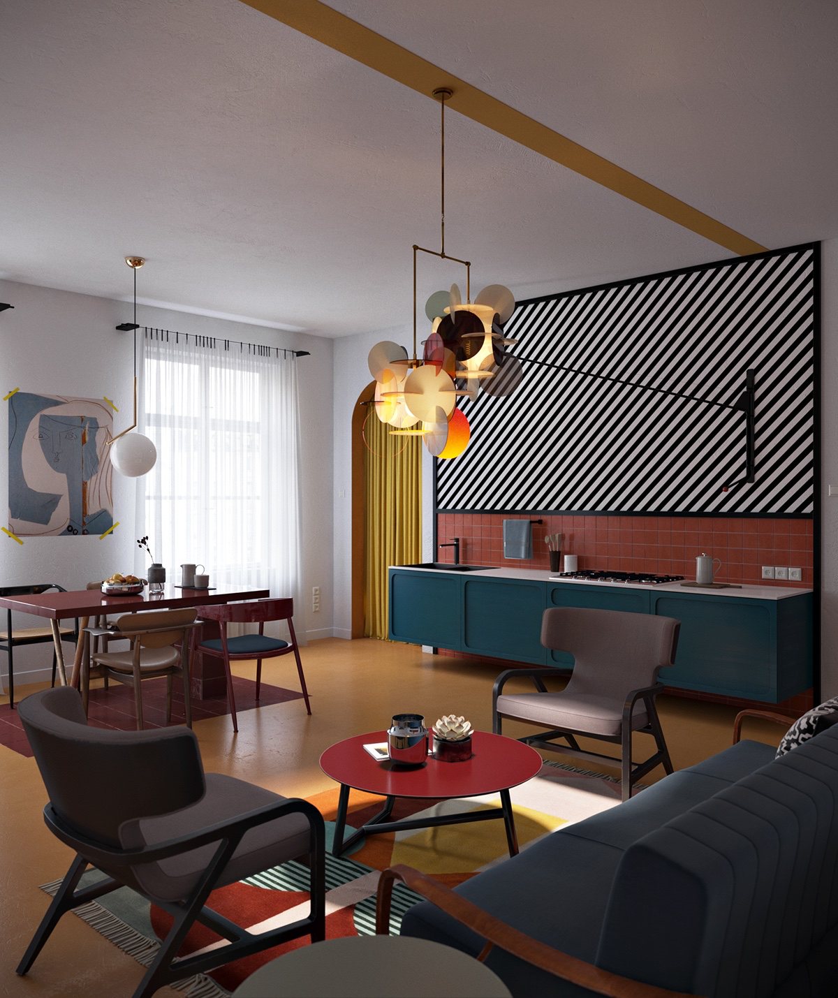
The apartment is very cheerful, this is achived through a brilliant light fixture and varied colorful/patterned elements.
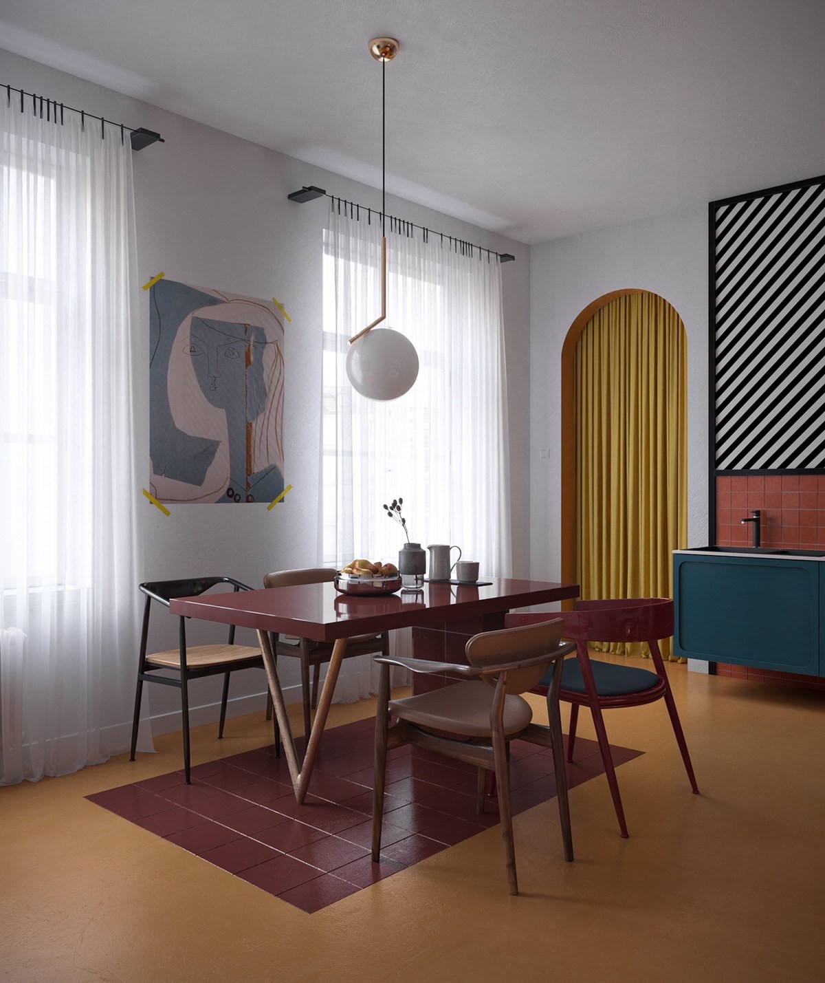
The dining room is simple, yet dynamic. The red tiles negate the need for a rug and fills the same purpose. While a simple spherical light fixture is elegantly simple, while a contemporary print livens up the space between the windows.
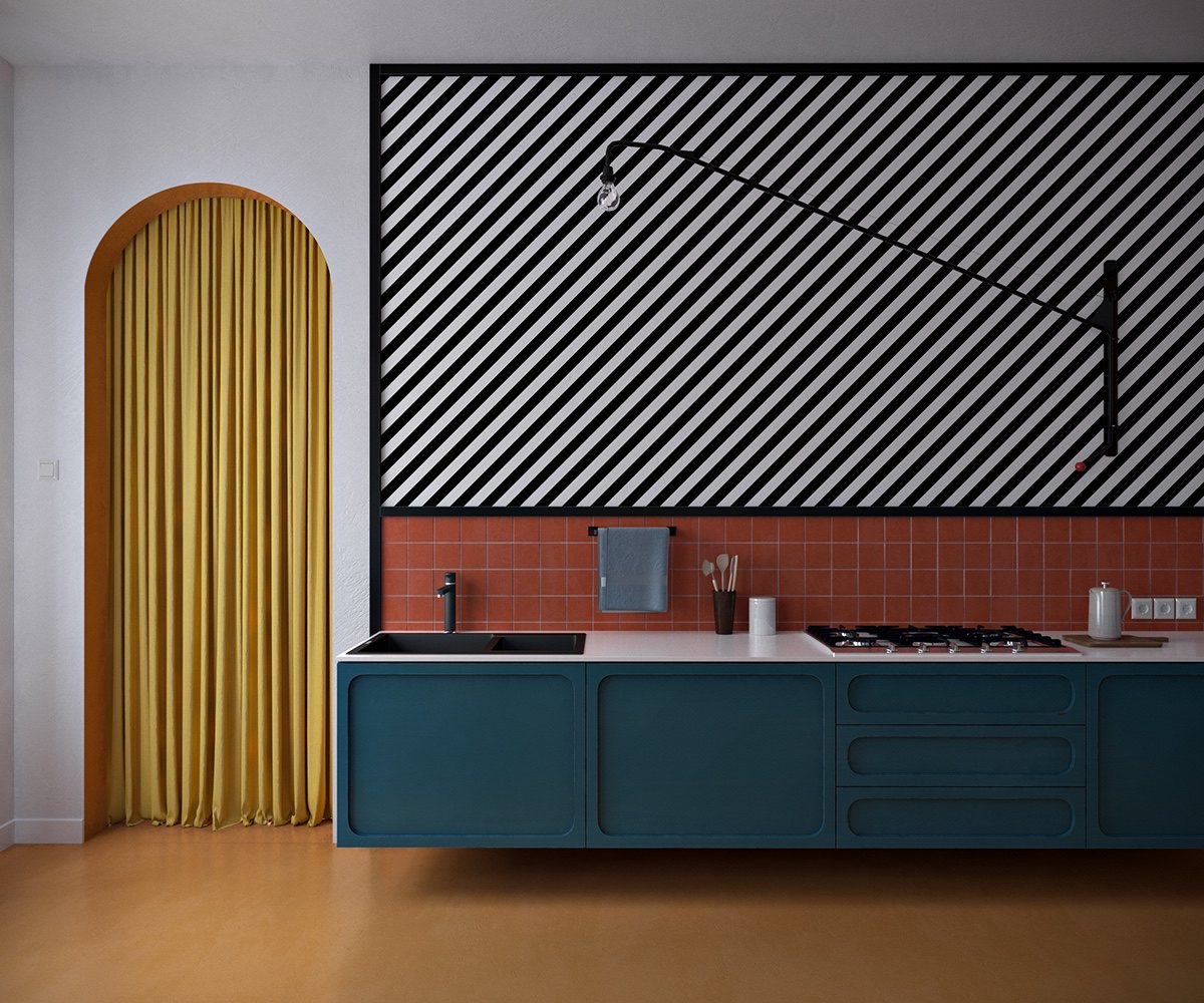
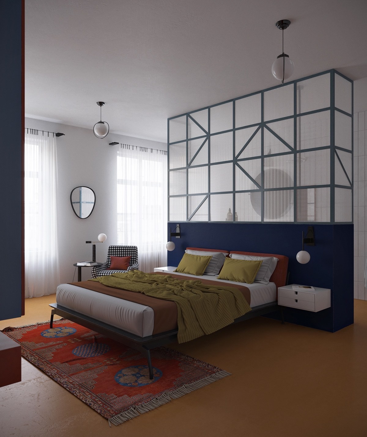
The best design features are often the most simple. A black frame wall captures the attention and is a visually appealing aesthetic.
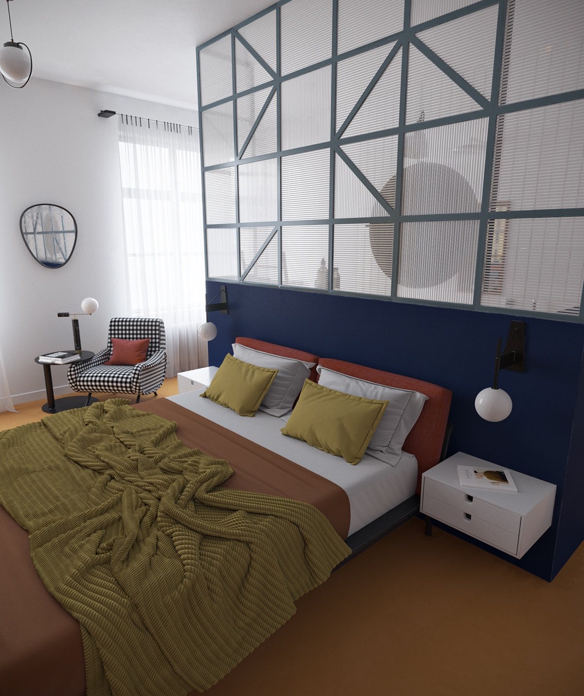
The bed is a mix of different colors and looks magnificently inviting. The accent wall is completely modern and one of the best parts of the room.
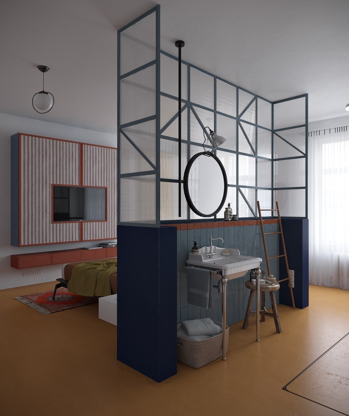
The accent wall also doubles as a partition for the ensuite bathroom that looks stylishly straightforward.
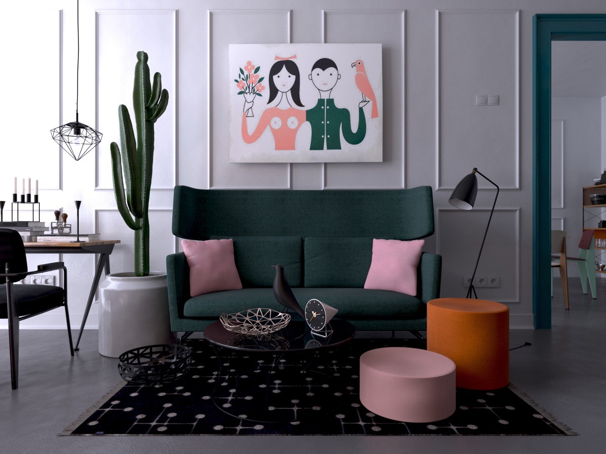
This apartment is colorfully snug and comfortable. The mixed elements work together to make for a chic, modern design that manages to look homely and neat as well.
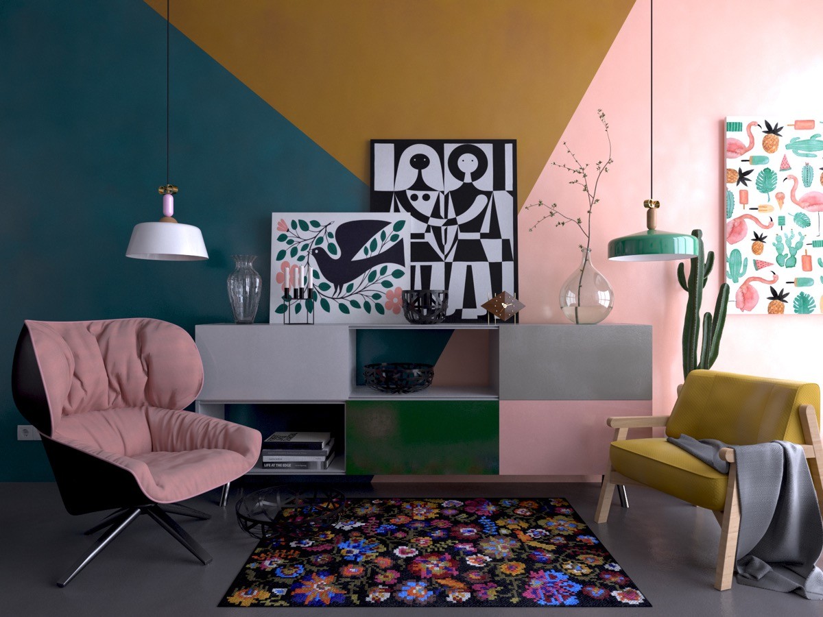
Usually, pink is reserved for a little girl's room, but used in such subtle and innovative ways- it actually really works in this living room. The flower patterned rug introducing the aspect of an eternal Spring.
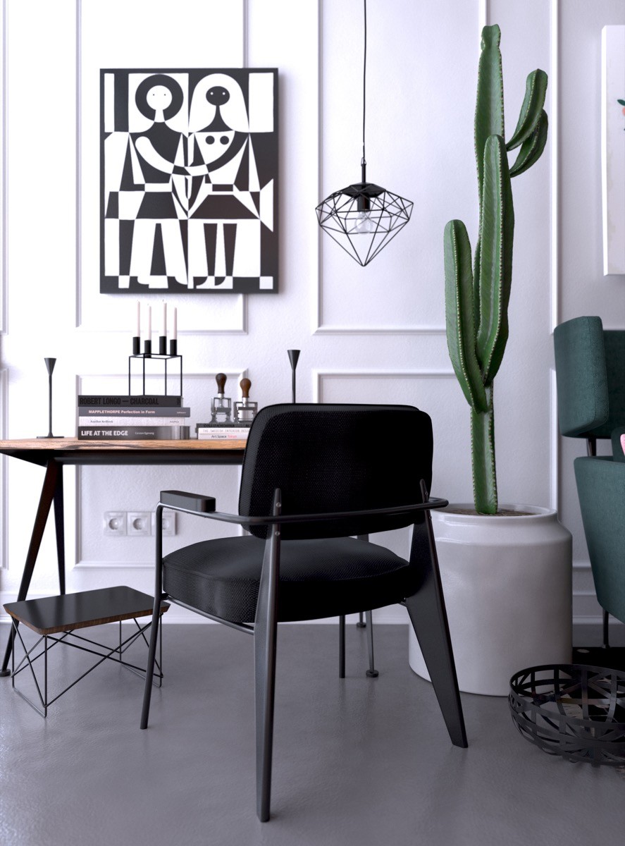
The small study is a little more serious, but does not detract from the apartment's theme. A geometric light fixture is captivating and livens up the entire room.
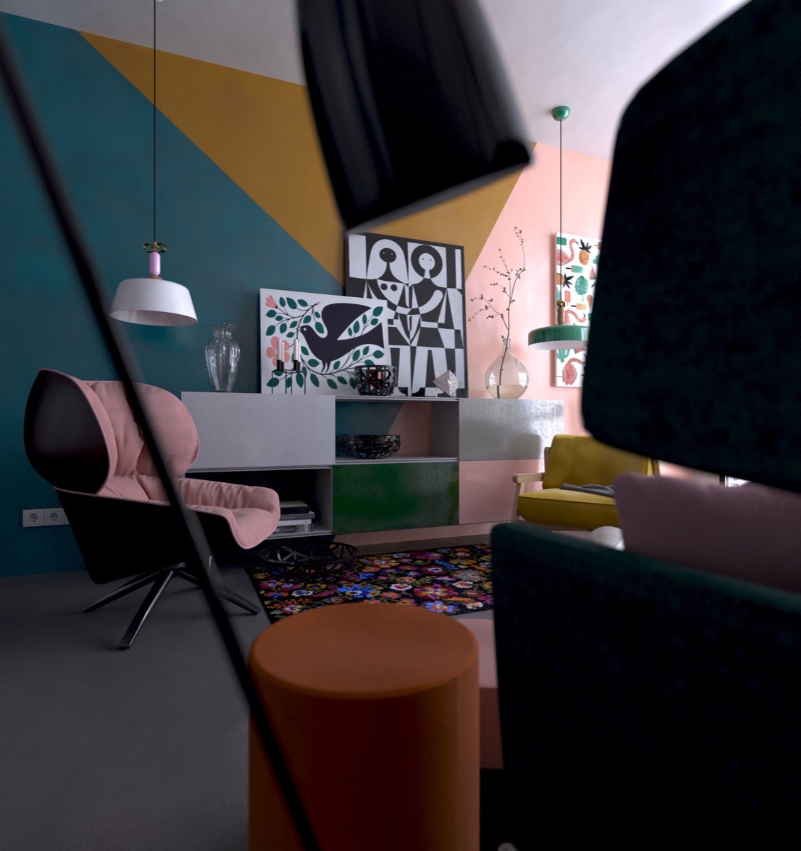
The living room is just that- a room that is meant to be lived in. This is evident in the room's design, we see it in the comfortable chairs and general homely appeal.
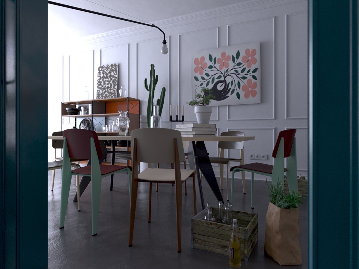
The dining room has a vintage/mismatched design that is both endearing and timeless. With cheerful Alexander Girard art prints that grace the walls, this home is perfect for the homeowner who enjoys walking on the fun side of life.
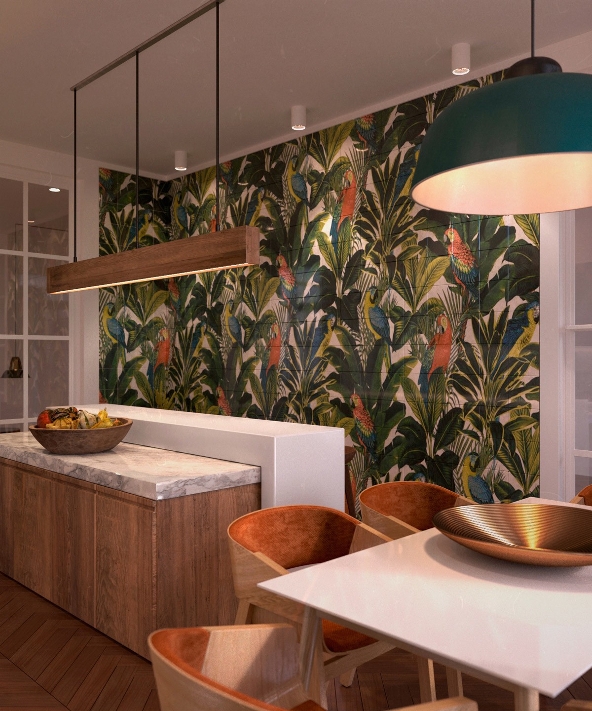
The final apartment recreates Spring in the abundance of upscale organic features that make the apartment feel almost exotic in its appeal.
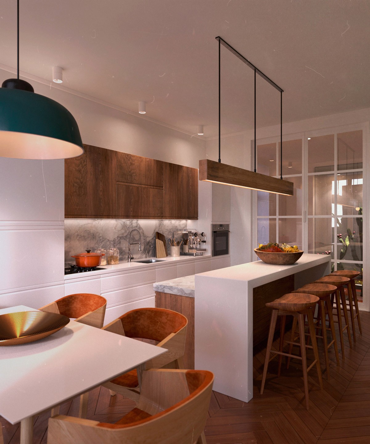
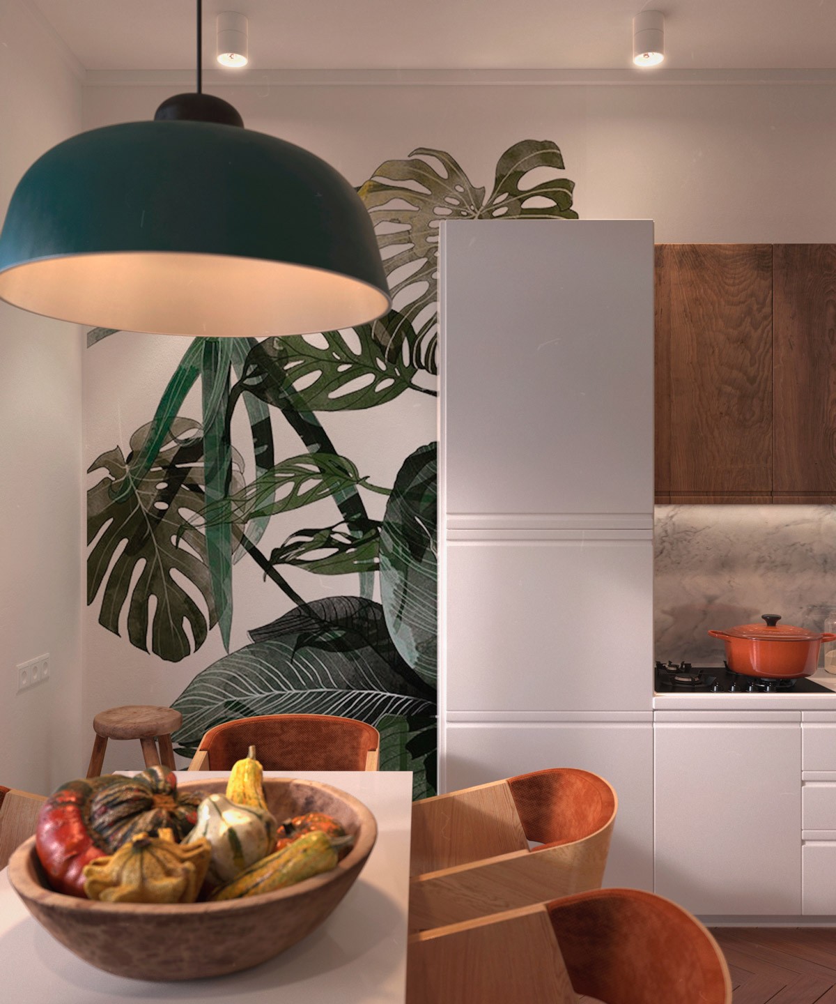
The apartment is a vivid blend of modern furniture and timber components. This is perfectly showcased in the kitchen where we find white countertops with wooden embellishments and barstools. It is dapper and it works.
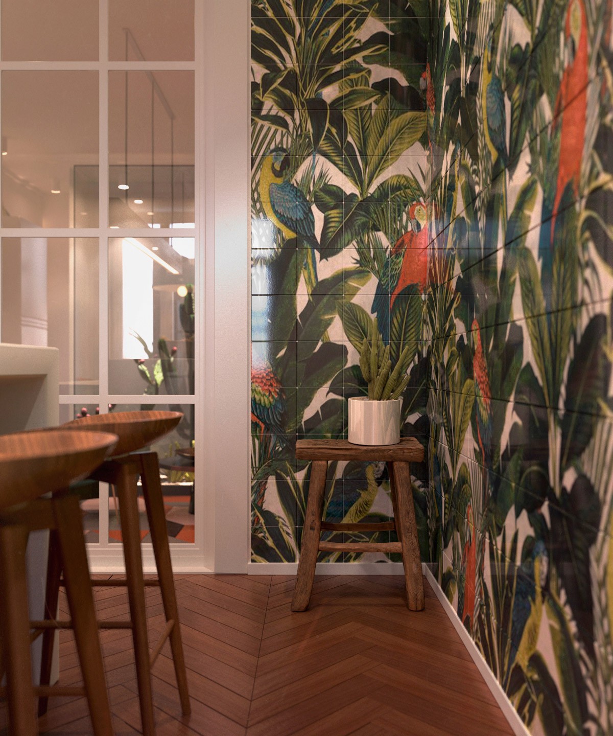
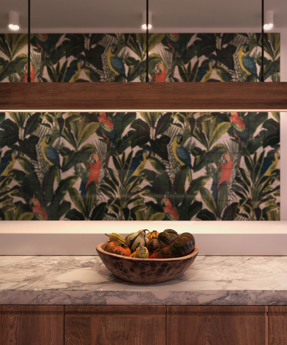
A tropical still takes up most of the kitchen, bringing the jungle into a modern apartment, while a lush houseplant lounges in the corner, so that the apartment has a larger than life scene with the real deal right next to it.
