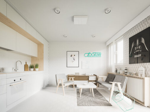
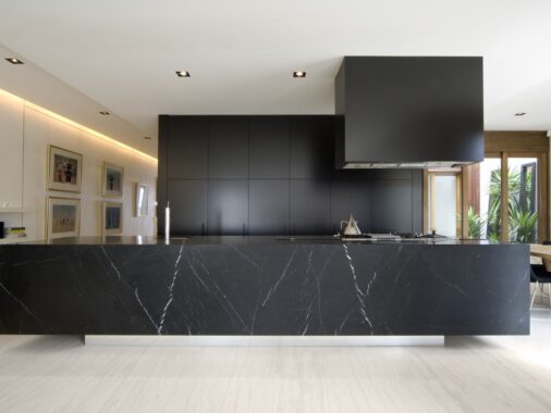
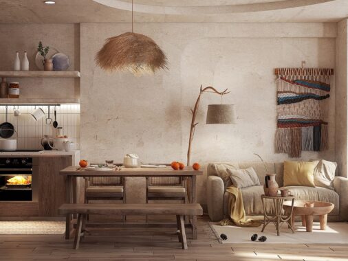
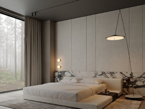
Small apartment living is a lifestyle all its own – without much space for furniture and everyday objects, the impact of every single choice grows exponentially. This post explores three compact apartments that make the most of their small floor plans by using creative space-saving techniques, creating multipurpose spaces, and smartly utilizing the simplest color and decor schemes. And despite their restricted sizes, none of these homes sacrifice even an ounce of character. If you're looking for small apartment inspiration to guide your own decor decisions, this post is a great place to start.
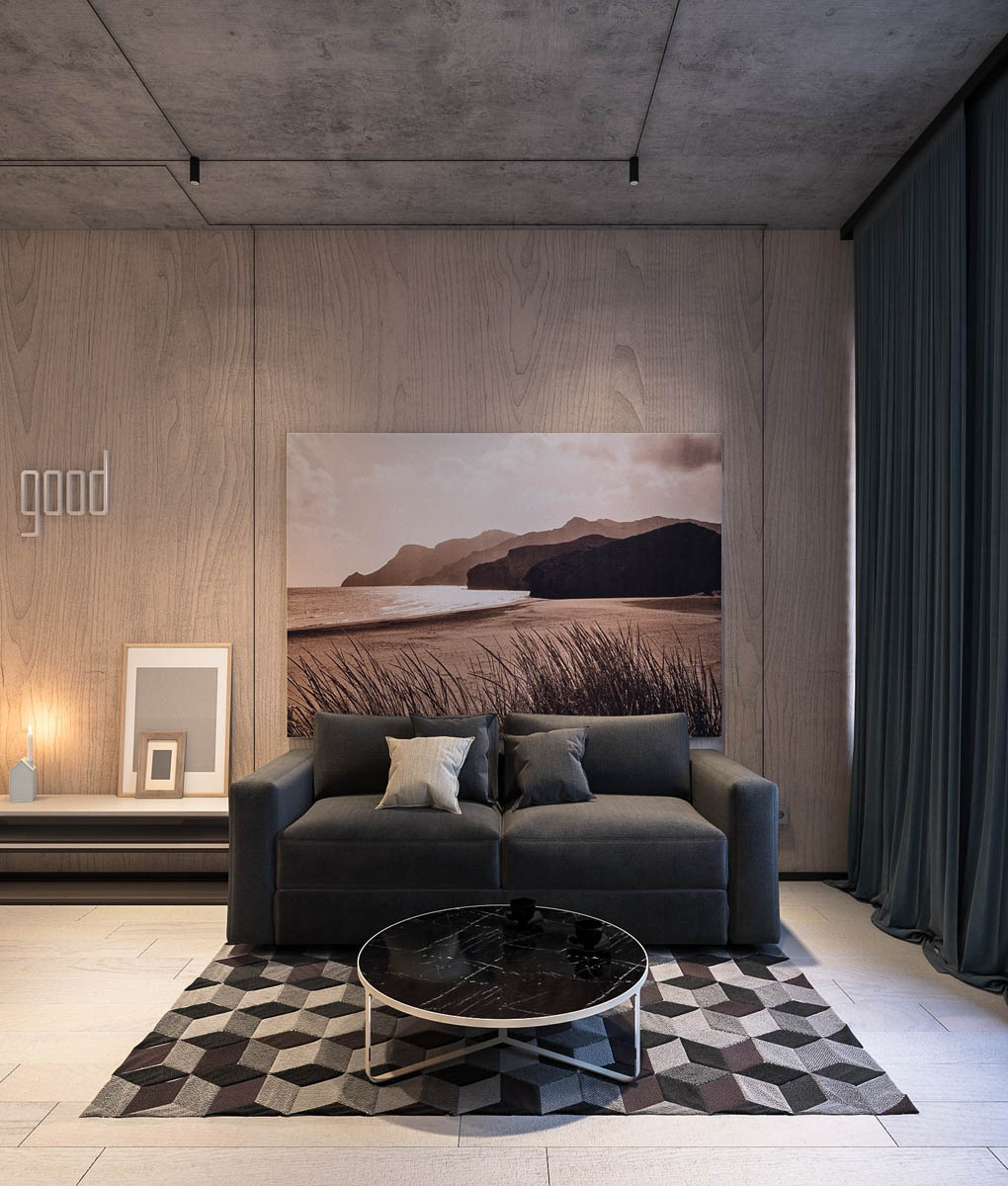
Cladding materials serve as a strong source of contrast as well, pairing natural wood with concrete, and just a touch of luxury like the black marble of the coffee table. At night, the residents must move the table to make room for the fold-out sofa bed.
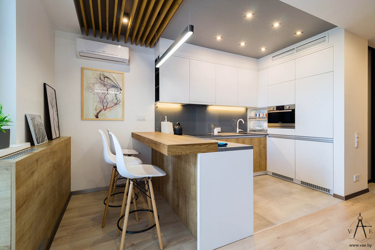
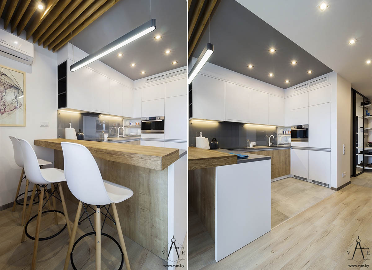
Although it doesn't support as many guests as a traditional dining table, this breakfast bar offers a comfortable place to enjoy family meals.
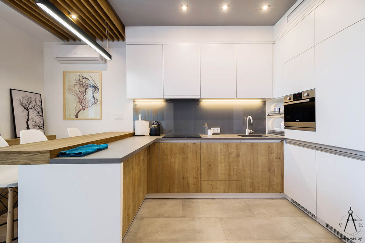
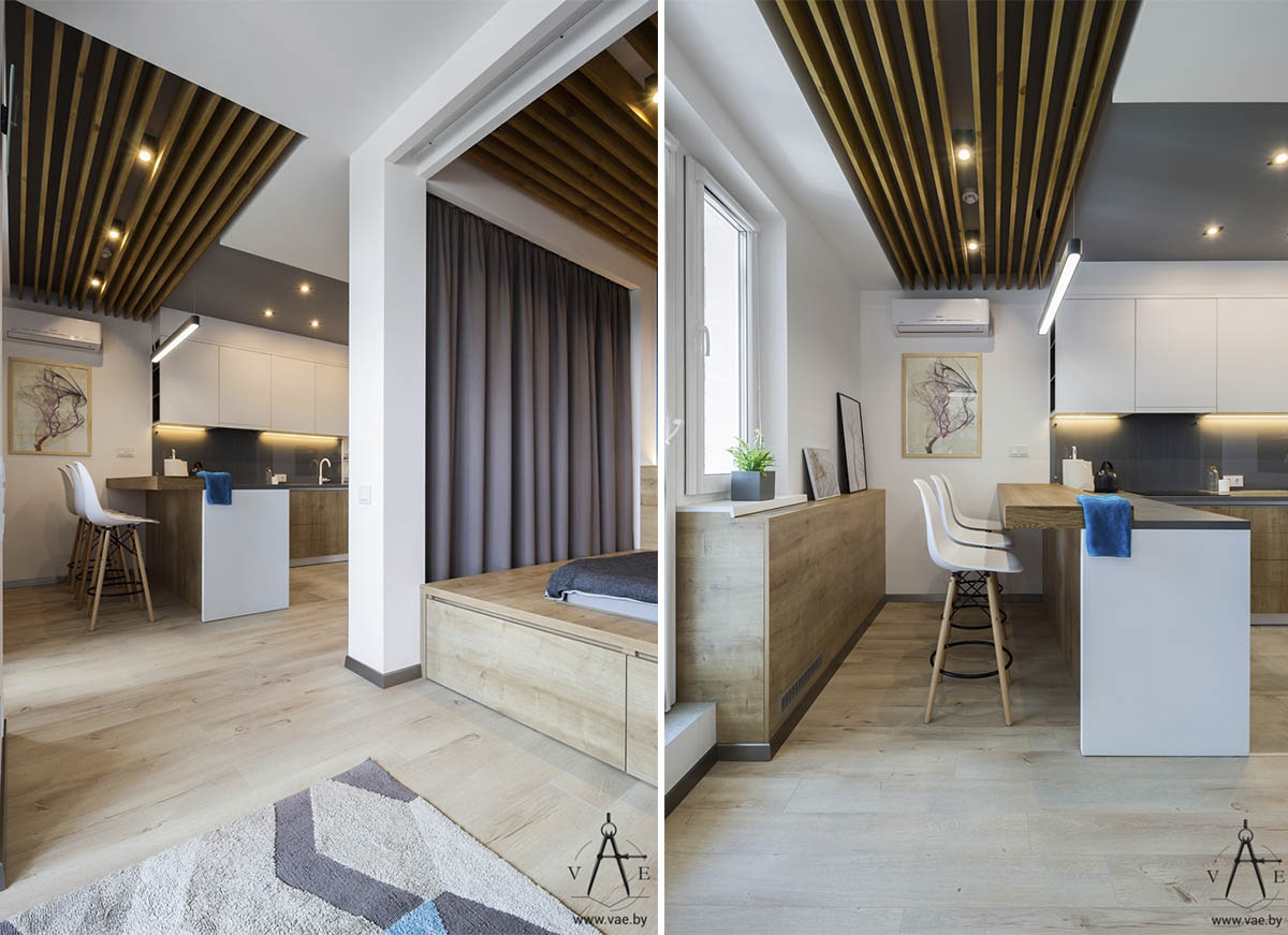
Because the cabinetry blocks the natural sunlight that filters in through the window on the left, warm wood cabinetry helps to hide the appearance of shadows and makes the space look brighter.
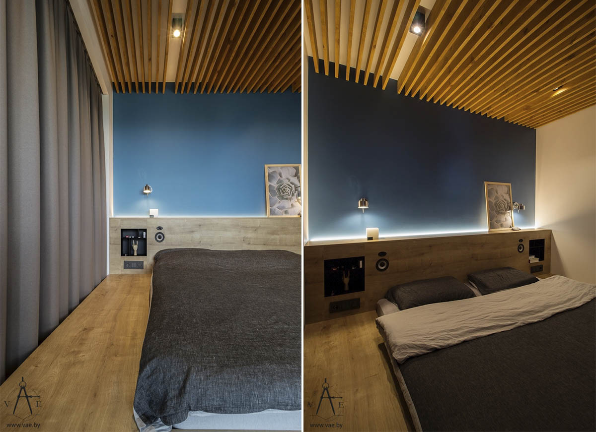
While the bedroom area doesn't enjoy any natural sunlight with the curtains drawn, its blue accent wall and wooden elements definitely imbue the space with the charm of the outdoors.
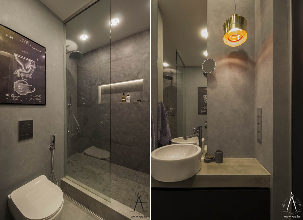
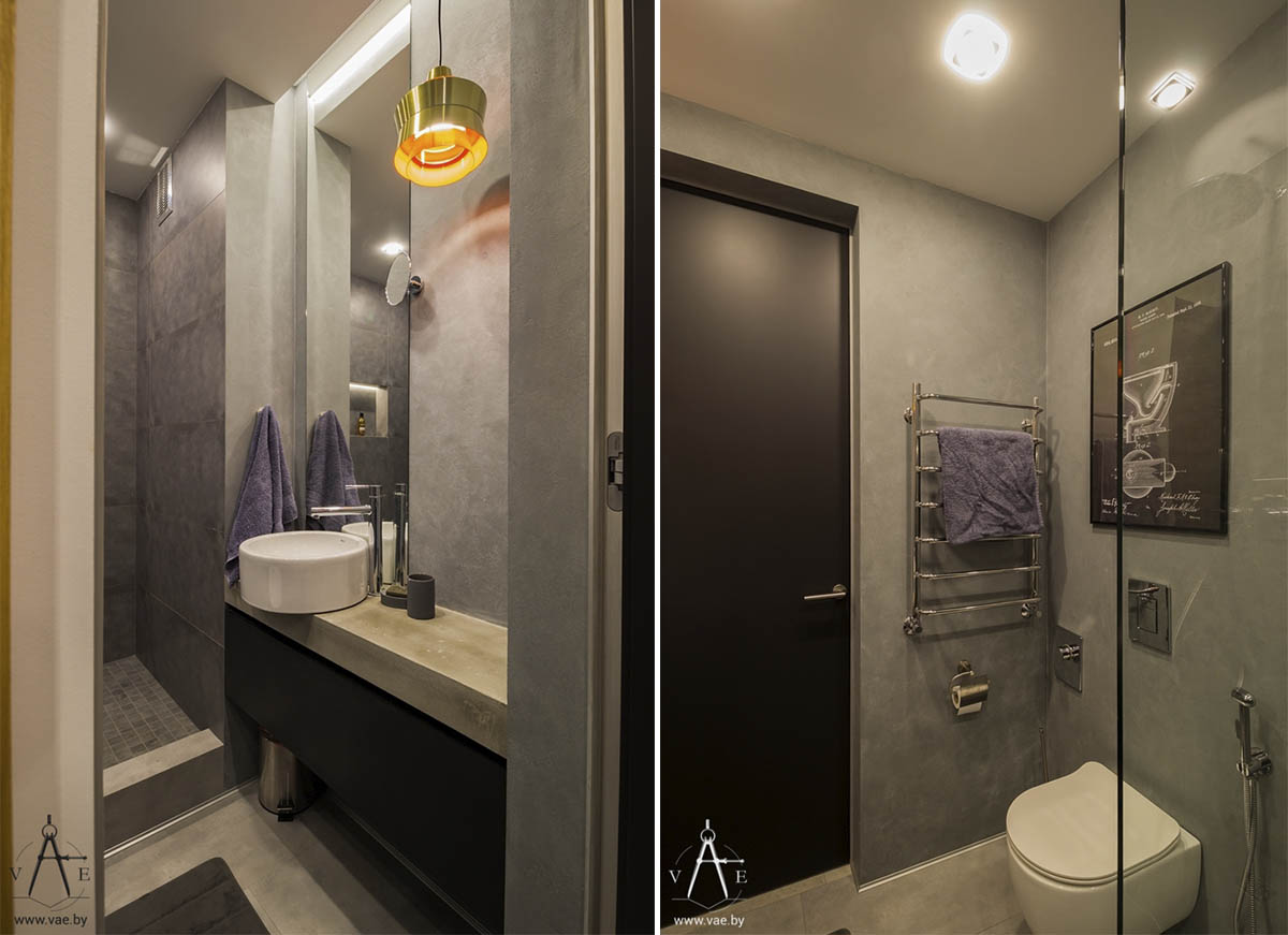
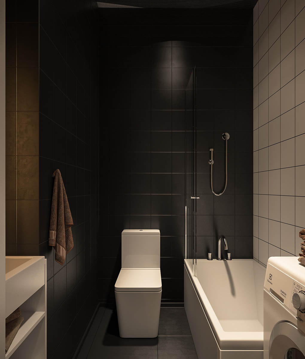
And finally, a look at the grayscale bathroom. The artwork is definitely unexpected – a diagram of the inner workings of the toilet lends a touch of industrial appeal.
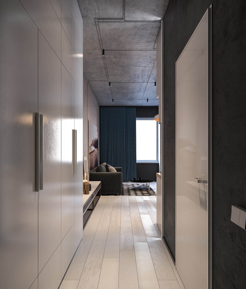
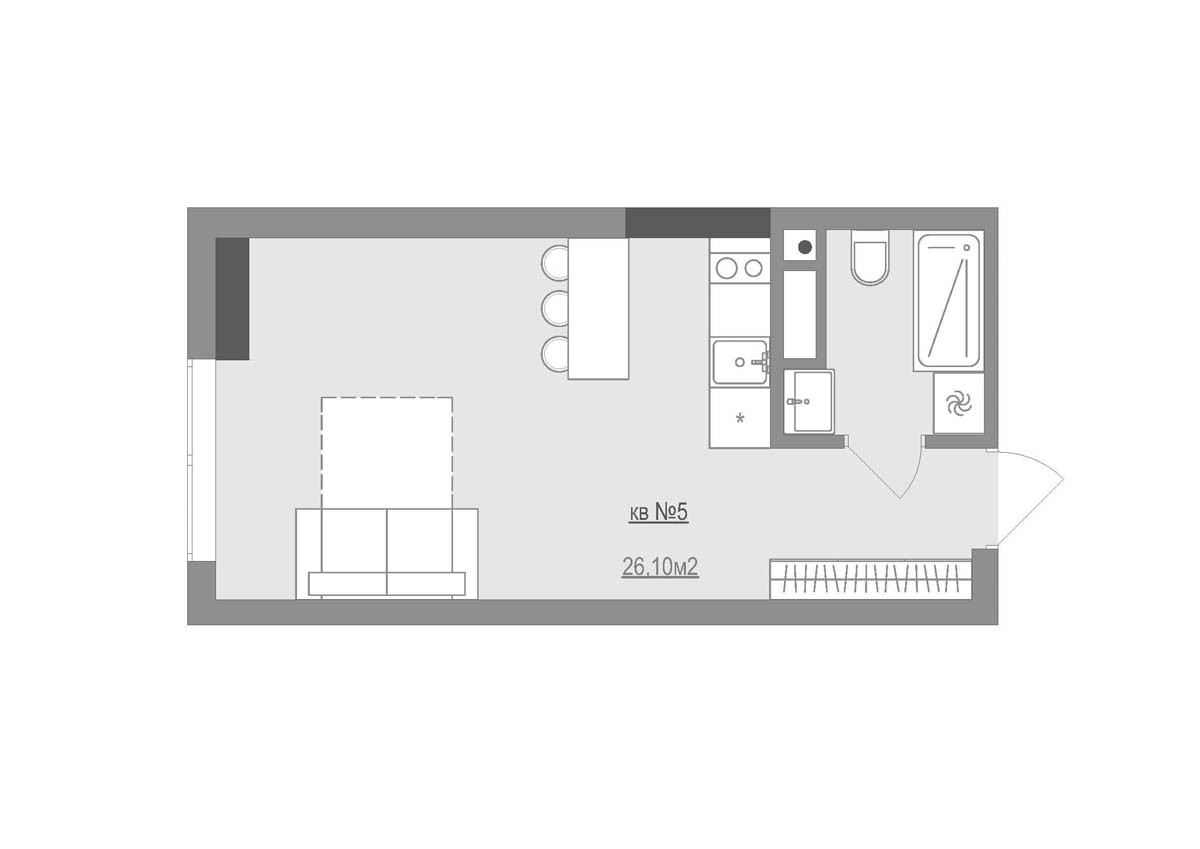
At a modest 26 square meters, this compact apartment makes bold moves with a high-contrast color scheme. While using dark colors can often make a small space feel even more cramped, this apartment balances the effect with large swaths of glossy white surfaces to catch and extend the natural sunlight.
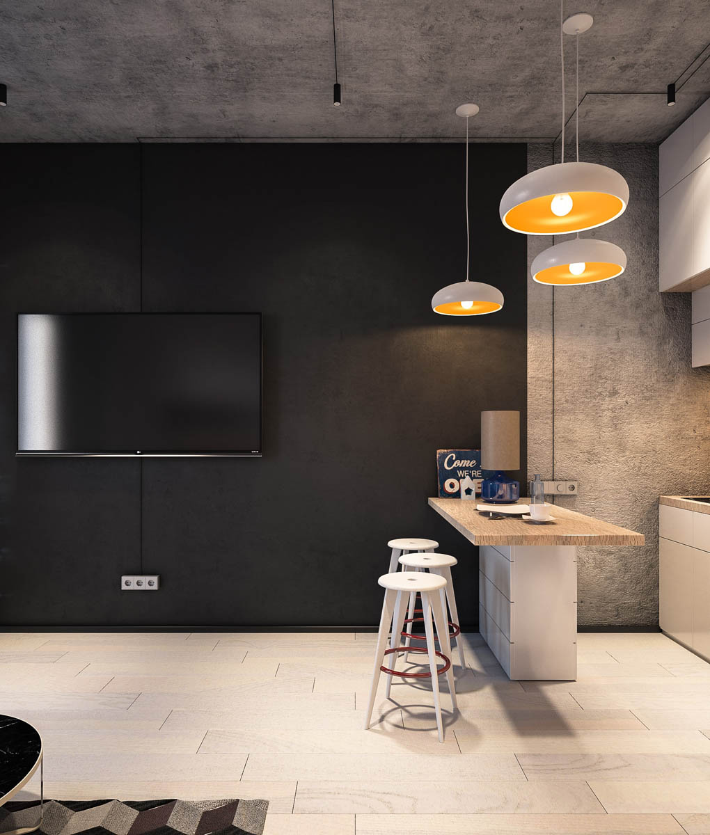
This matte black accent wall offers a dramatic backdrop for objects like the smooth white kitchen pendant lights.
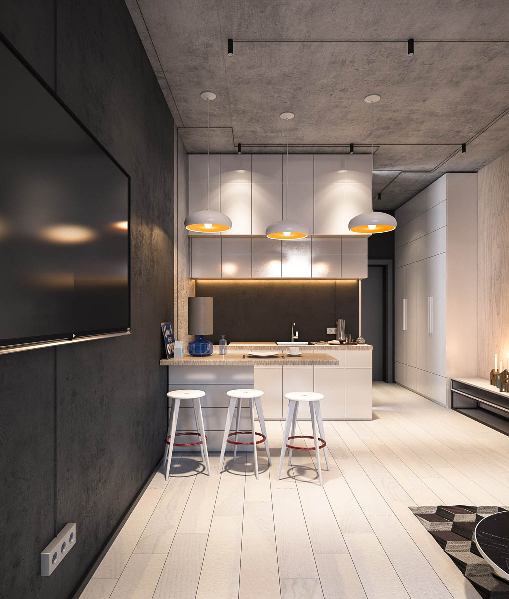
To save space, this design foregoes a traditional dining table in favor of an island and simple kitchen bar stools.
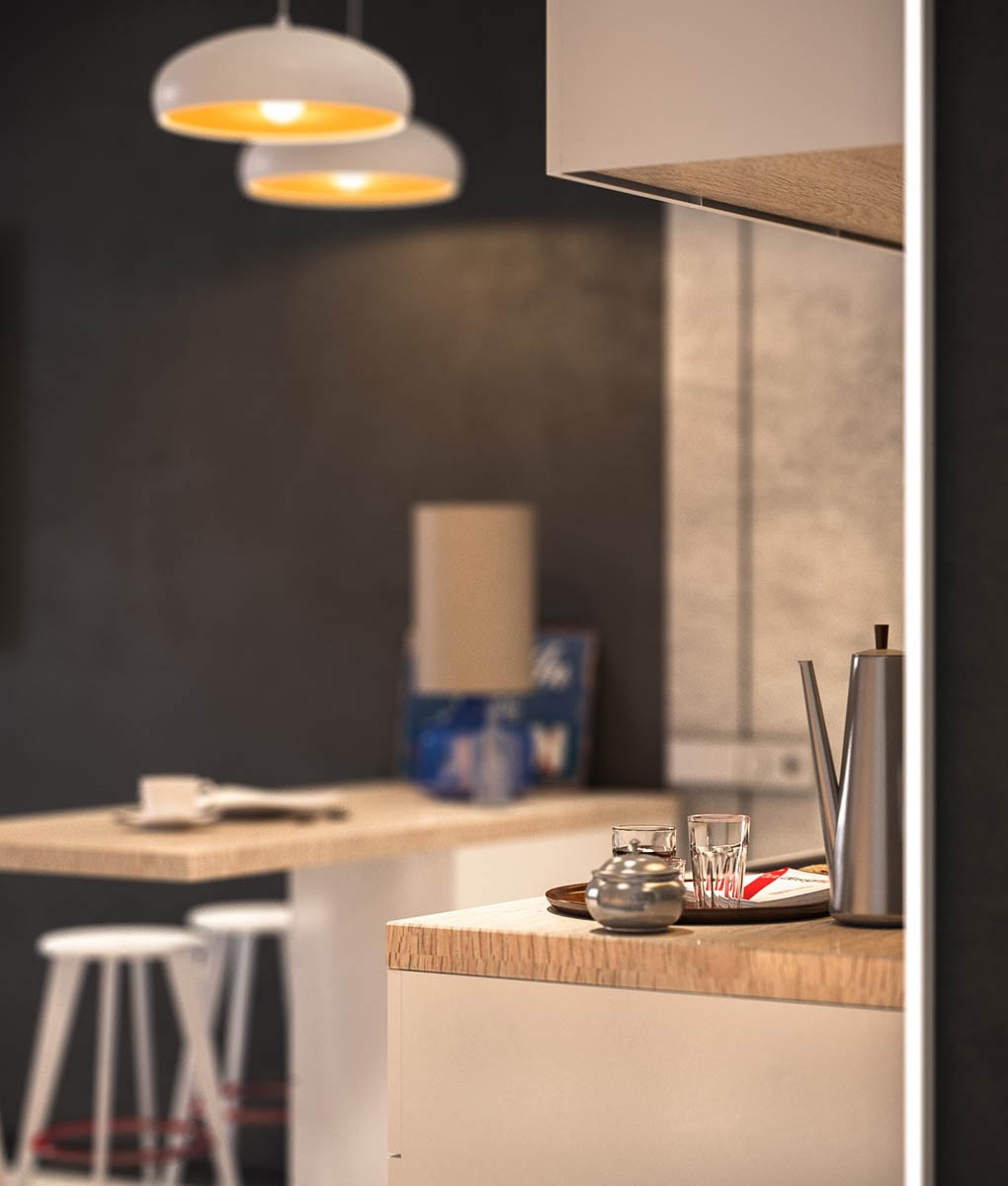
Even the supplies that remain out on the counters follow the same no-nonsense motif as the rest of the home, like this streamlined pitcher.
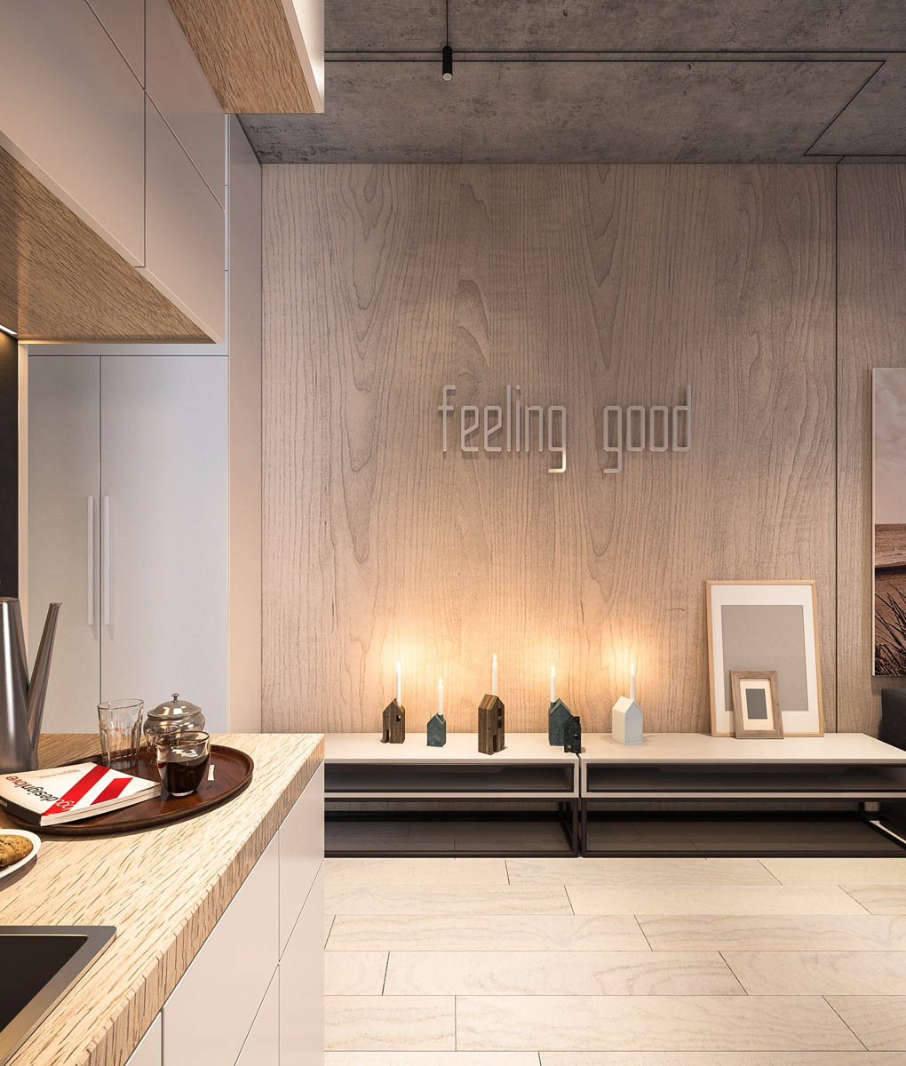
Rather than hanging a large print, the decorators decided on a motivational "feeling good" motif. Creative candle holders and color block prints sit on the tables below.
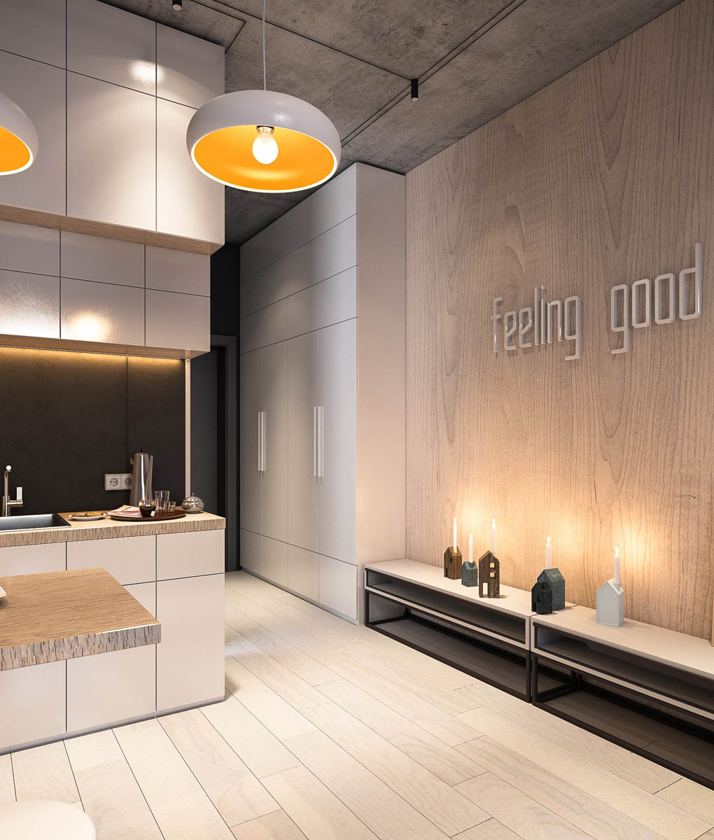
The space beneath the tables could double as a convenient place to store shoes, with the tabletops serving as a place to sit and put them on. Gloves, wallets, and pocket items can go in the cubby.
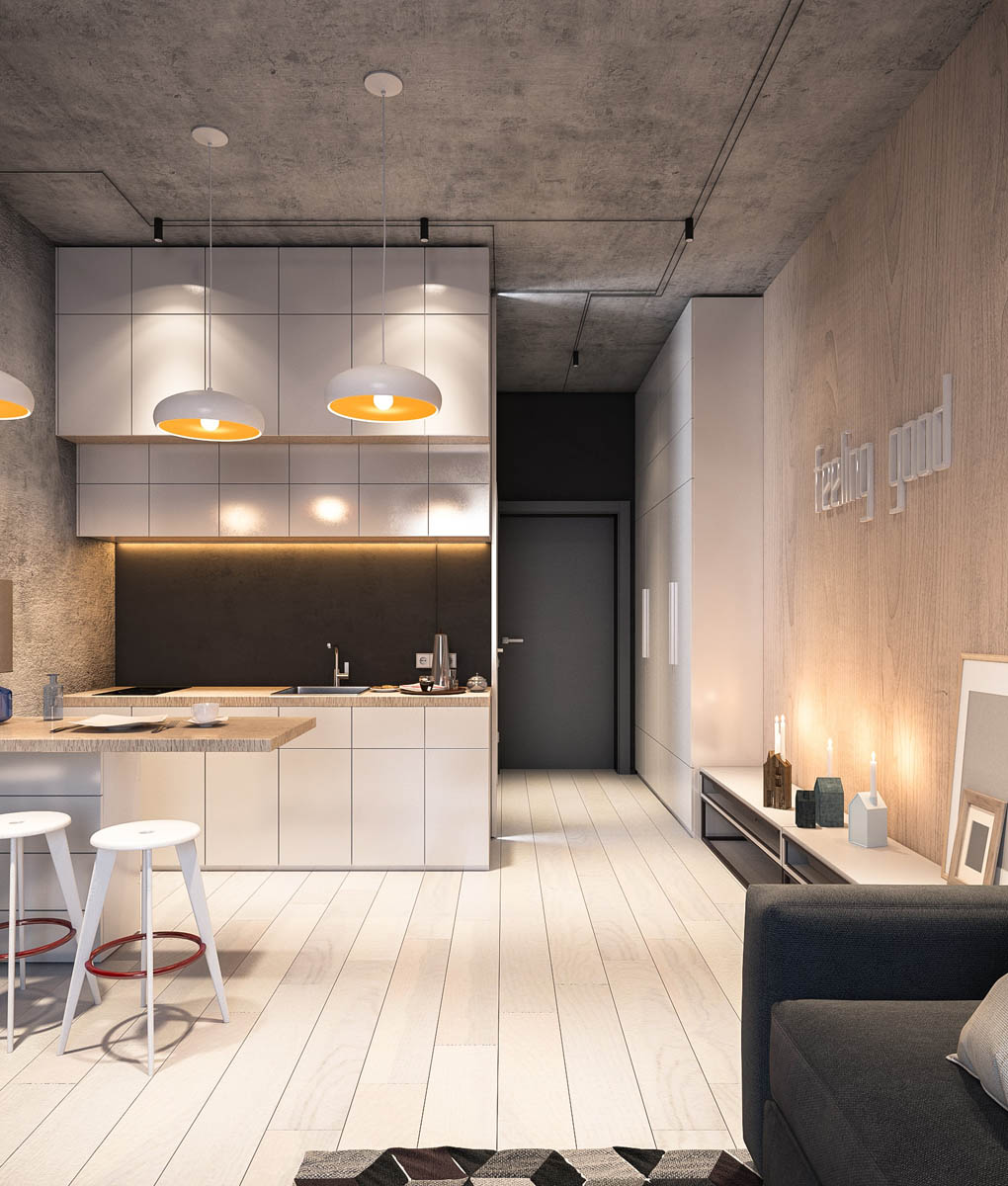
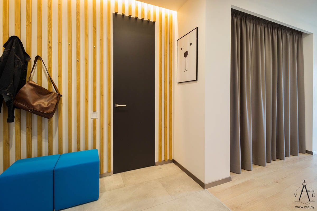
At the other end of the home you'll find the black entryway, storage cabinets, and a bathroom tucked in behind the kitchen.
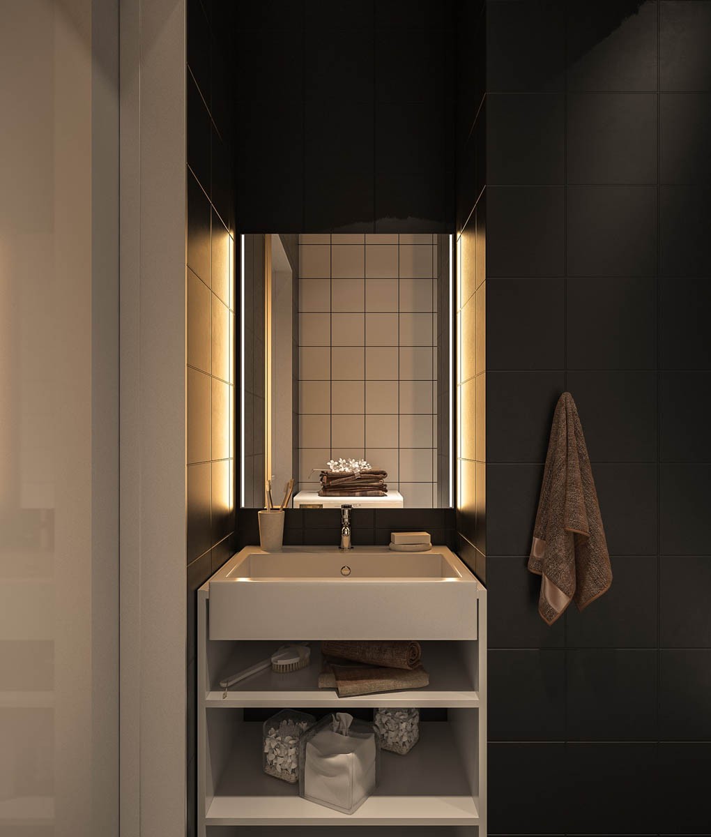
The bathroom is dark, moody, and relaxing. The only objects that stand out from the dark background are the furniture and fixtures.
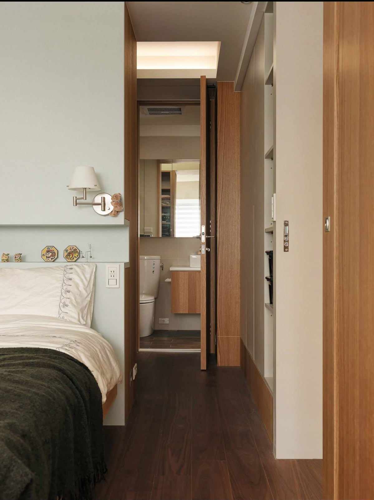
Thanks to a handsome adjustable wall sconce, it's easy to either light the bed or light the hallway to the bathroom with the same fixture.
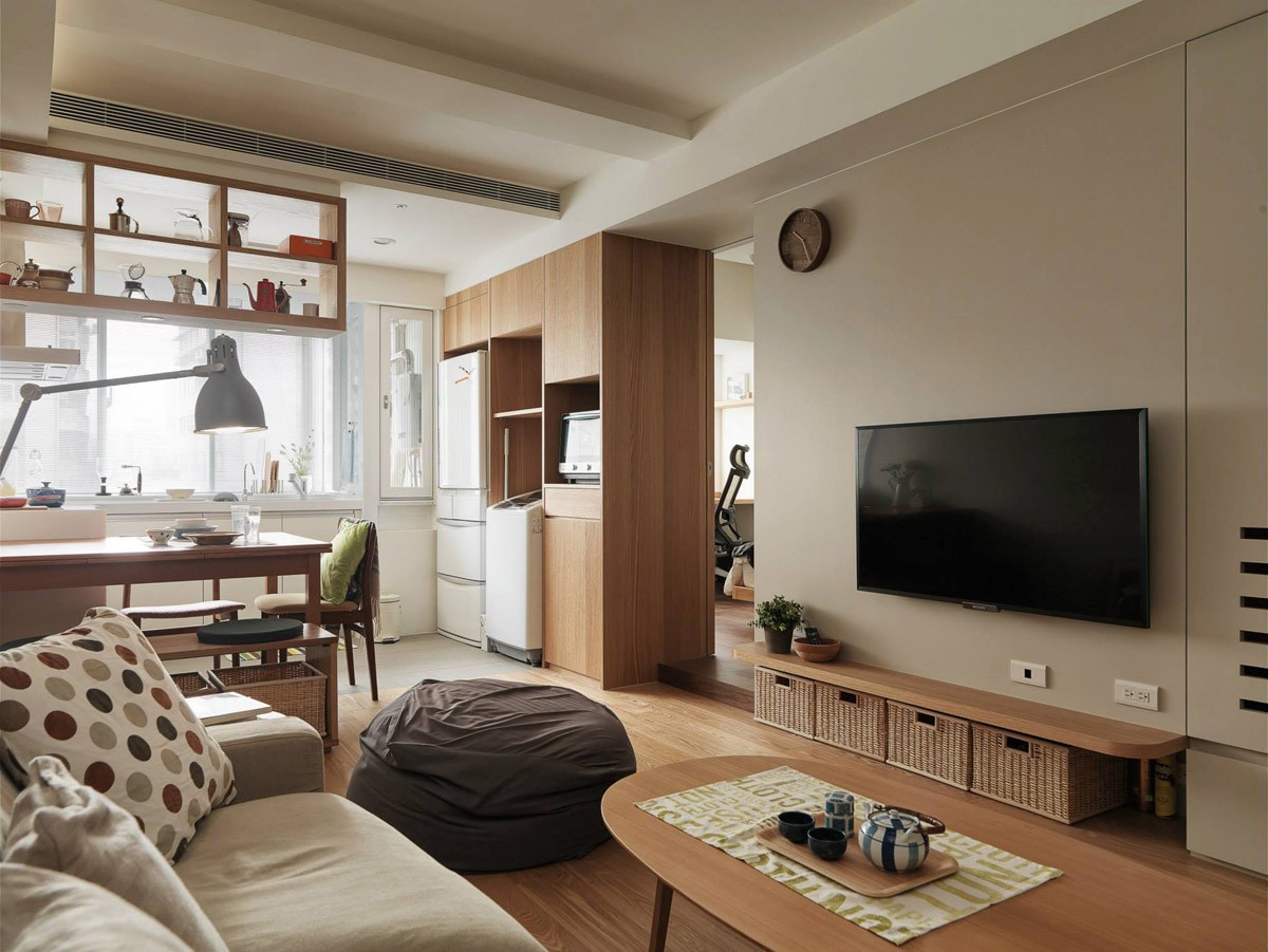
The interior is split into two parts, with living spaces on the entry side and private spaces behind the bisecting wall.
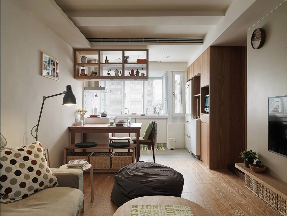
Bright windows flood the kitchen with ample sunlight, while the living room enjoys a darker and cozier atmosphere.
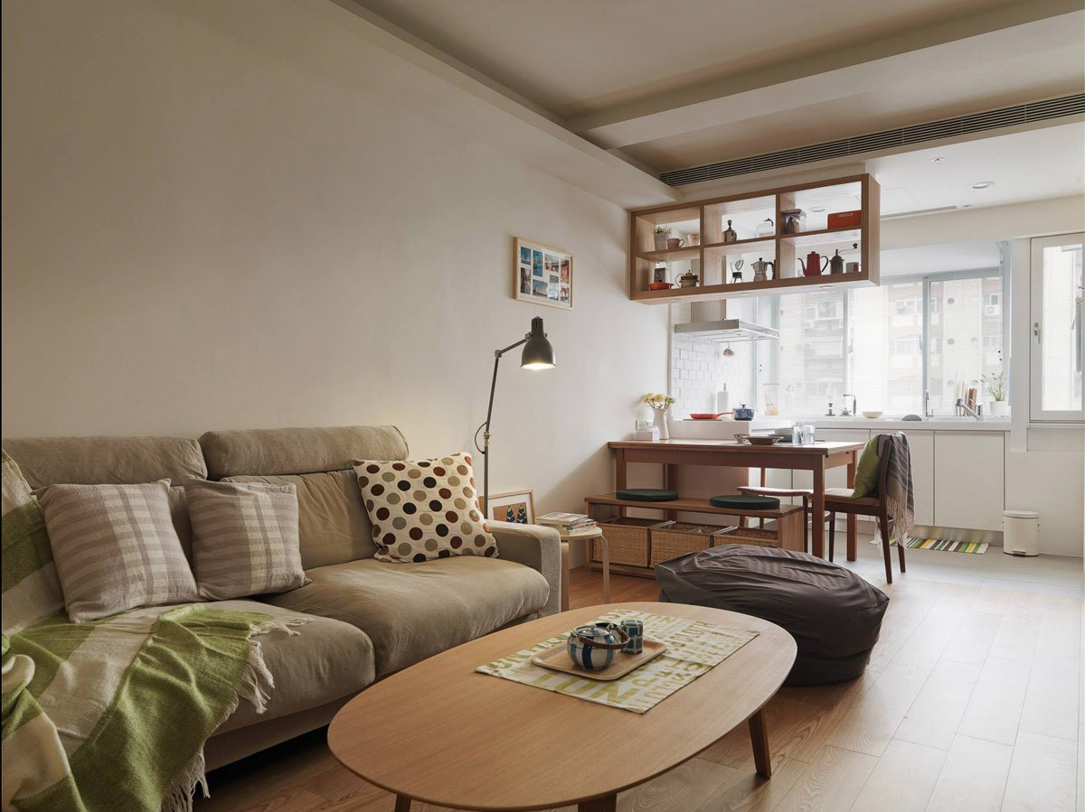
It's important that each object serves a purpose in a space that has such little room for decor. The handsome teapot set serves as a great example.
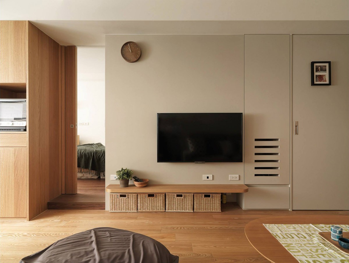
Keeping things organized is a hugely important part of maintaining a minimalist home. These wicker baskets neatly stow away beneath the low table, easily holding extra throws or decorations.
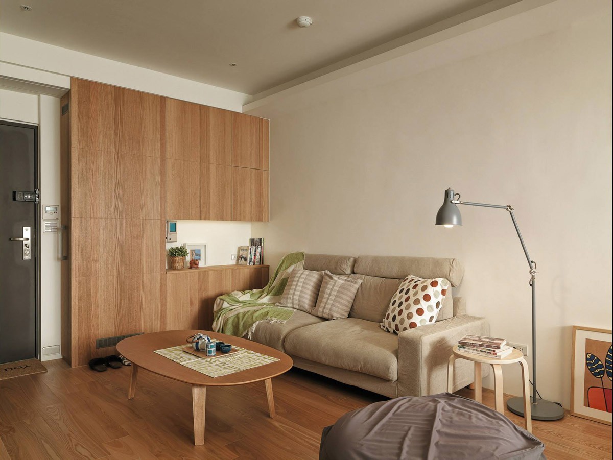
Plenty more storage occupies a wall near the sofa. The adjustable floor lamp easily provides light for a variety of tasks, from reading to preparing tea.
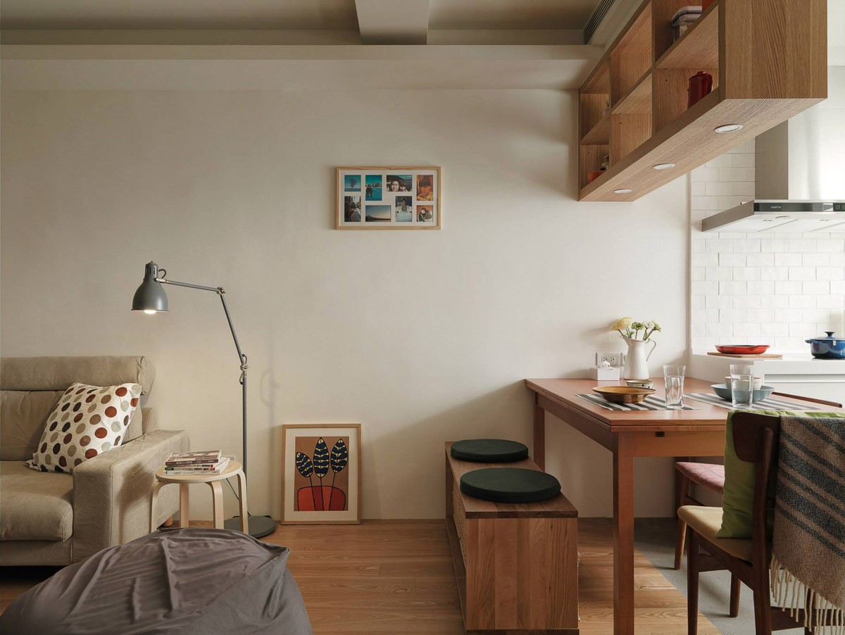
The cozy dining table creates division between the living and kitchen spaces. By moving the chair on the rightmost side, the table becomes an extended work space for meal preparation.
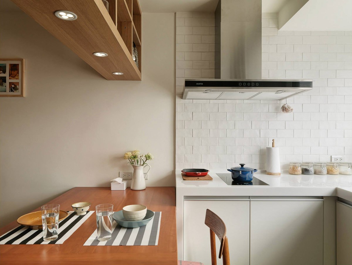
Table decor remains simple, with clean striped place mats and a plain white decorative vase.
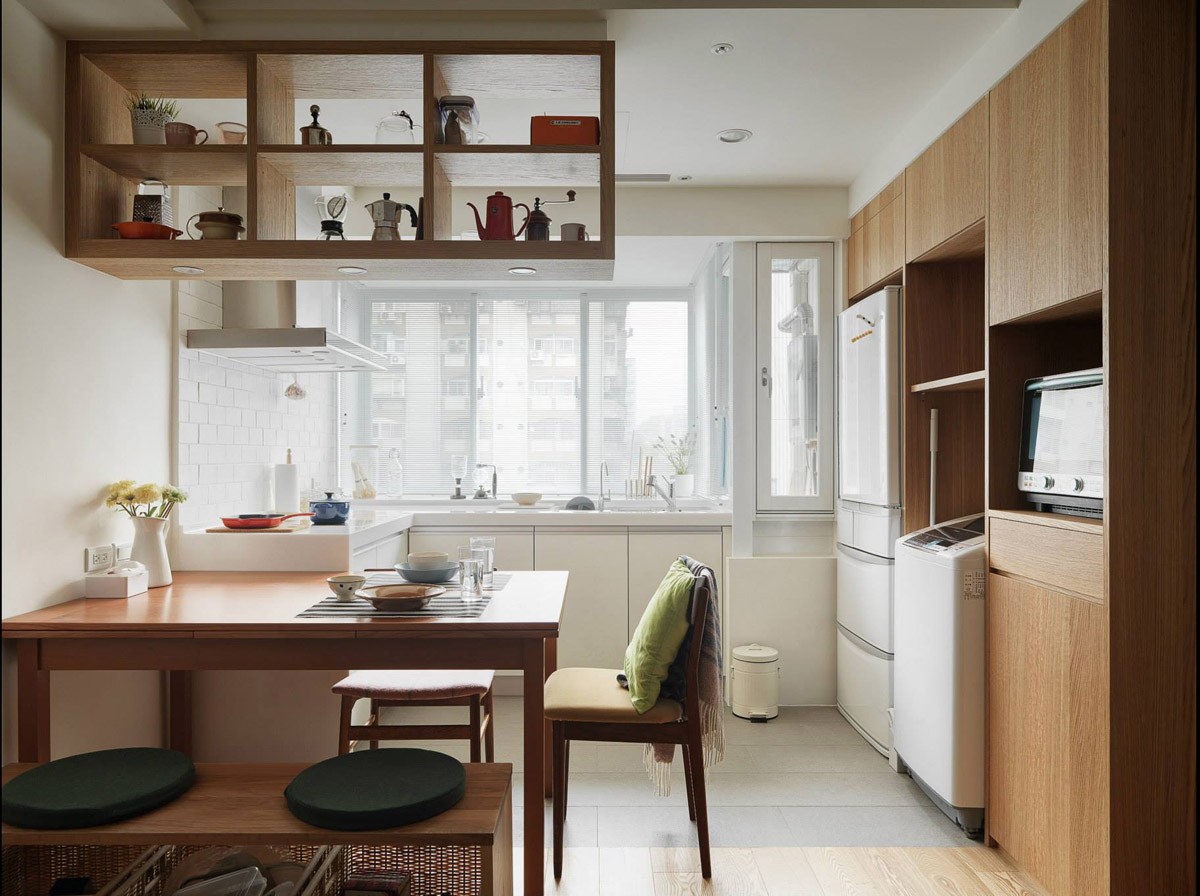
Below-counter cabinets and tall wooden units offer plenty of space for storage. The residents further maximize space by keeping necessities, like the trash can, at a compact size.
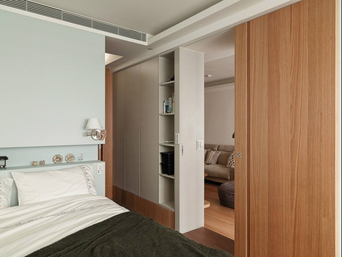
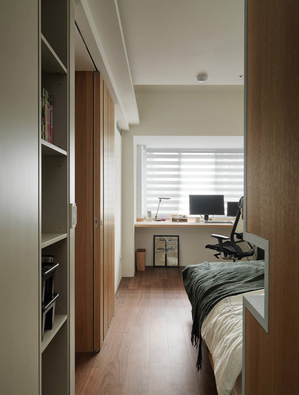
The bedroom occupies the space just on the other side of the dividing wall. Wardrobe space hides in the small hallway that leads to the bathroom.
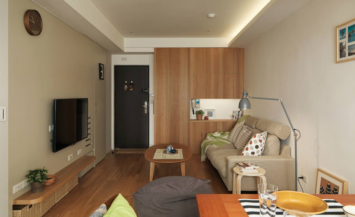
This lovely small apartment doesn't have a super-open layout so popular in interior design today, but it still feels open and spacious considering its relatively restricted floor plan.
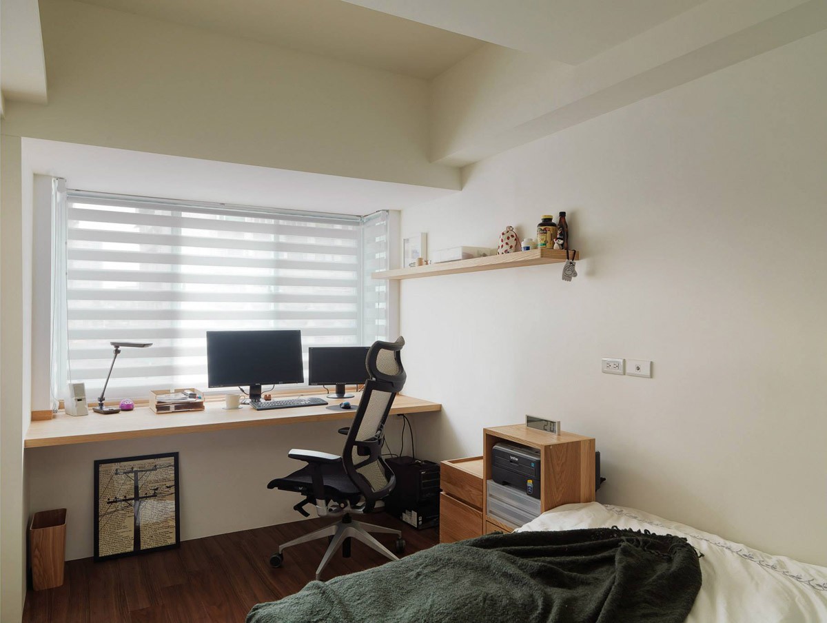
And what a nice home office it is! A small wall shelf displays homey personal objects, while the ergonomic desk chair keeps things comfortable.
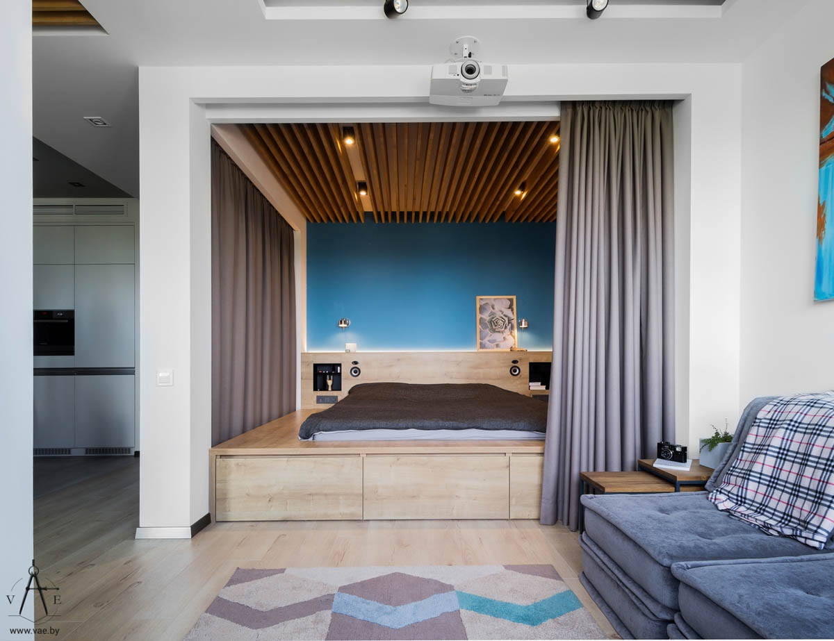
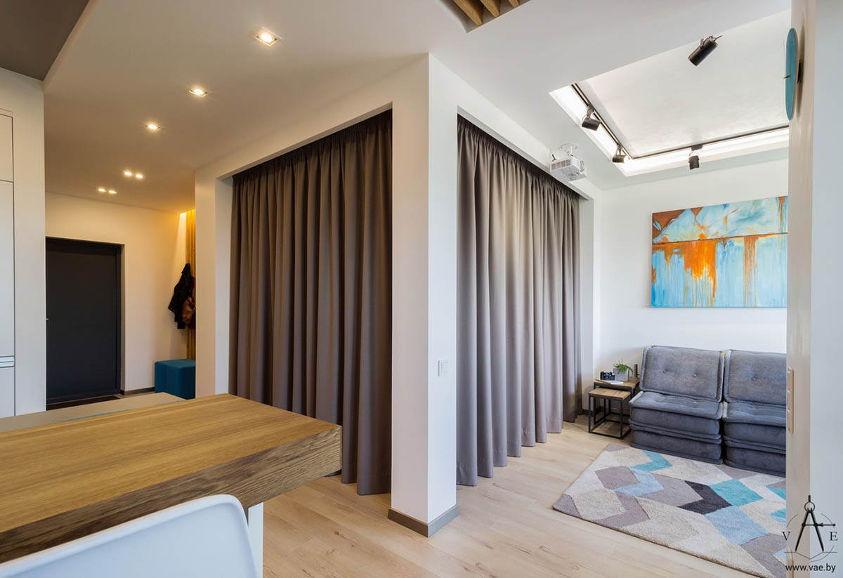
At just 48 square meters, this unique studio apartments offers an uncommonly high standard of comfort and luxury for its size. The tour opens with a shot of the living room and bedroom combination, with the bedroom portion surrounded by curtains that can open to increase the perceived size of the space or close to offer privacy and soundproofing.
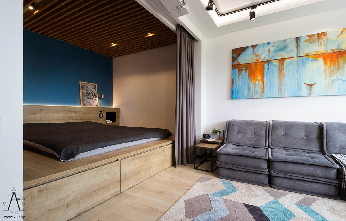
One of the most innovative features in this apartment is the overhead projector. Instead of casting to a screen, it projects the media onto the blackout curtain that covers the window.
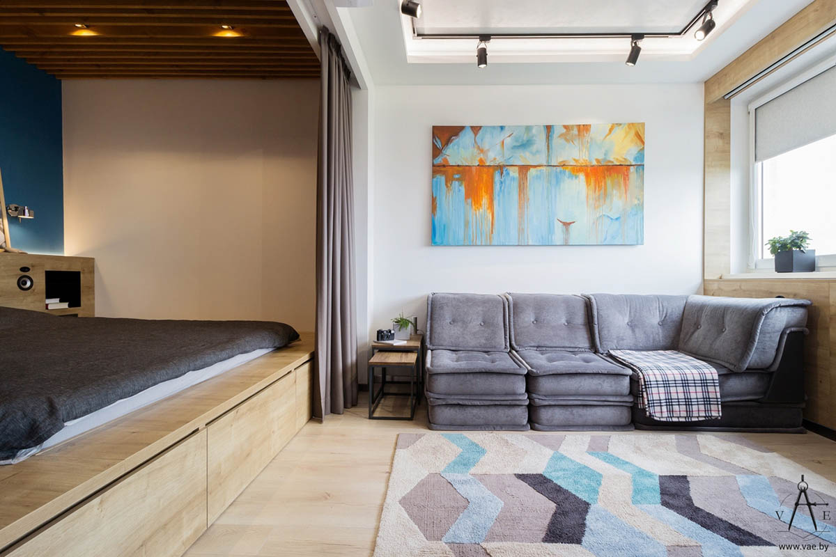
If you're looking for space-saving techniques, this room has ideas in spades – including the under-bed cabinets and the handy nesting end tables.
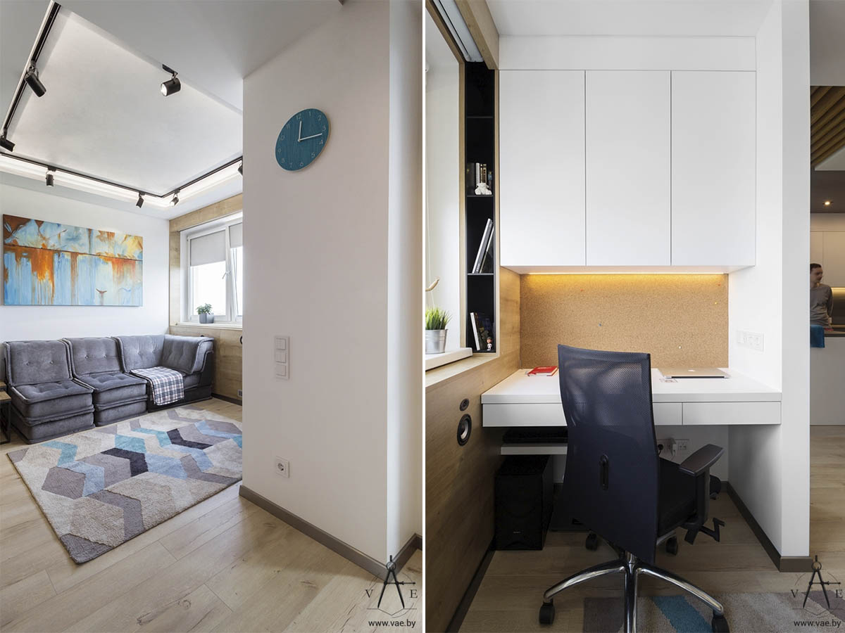
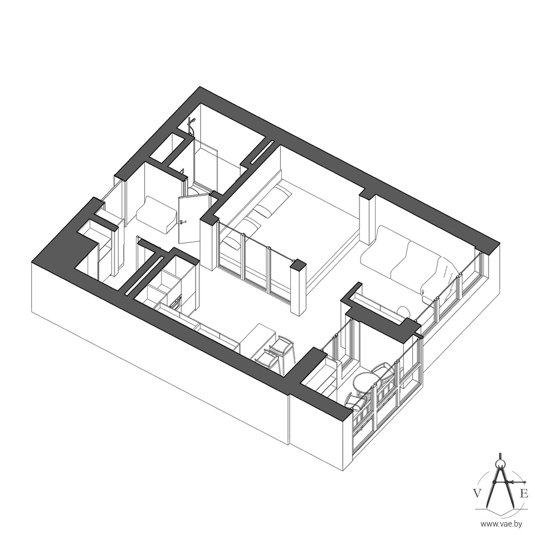
The living room, bedroom, kitchen, and office all occupy the same open area, but they feel distinct thanks to the partial walls that divide them.
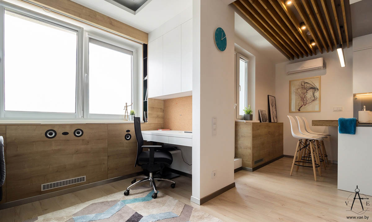
Decor remains simple. The wall clock adds a splash of color, the artwork in the dining room captures the eye.

