Are you looking for ways to make your open layout apartment feel a little more open and spacious? This post looks at three apartments that get it right – from smart storage solutions to hideaway beds and multipurpose furniture, these homes have plenty of inspiration to offer. But that's not all! Each one takes a different approach to naturally influenced color palettes and decor, so you can find ideas for larger houses and apartments as well. Stop by the comment section to let us know if you found any of these design techniques worth trying.
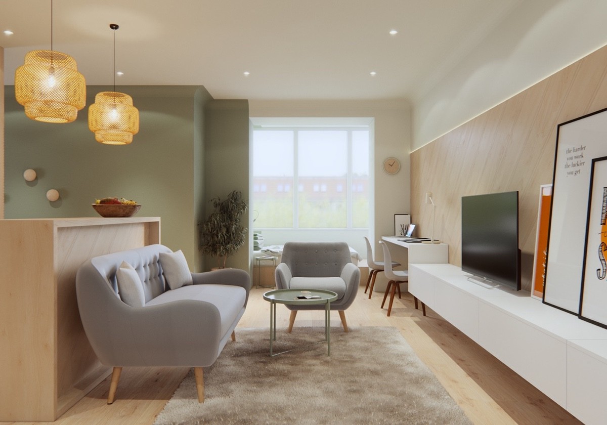
Let's start with a studio apartment that goes light with natural wood finishes and calming pastel green walls. It's a cheerful space that makes great use of color blocking to define each functional area within its small interior footprint, easily appearing larger than it really is.
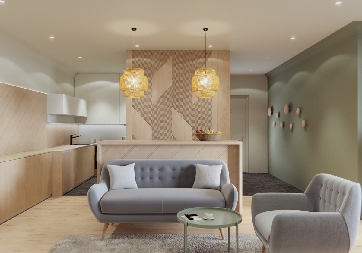
The interior is open but each functional area feels distinct thanks to the clever division created by the geometrically clad wall that stands in the center of the living area.
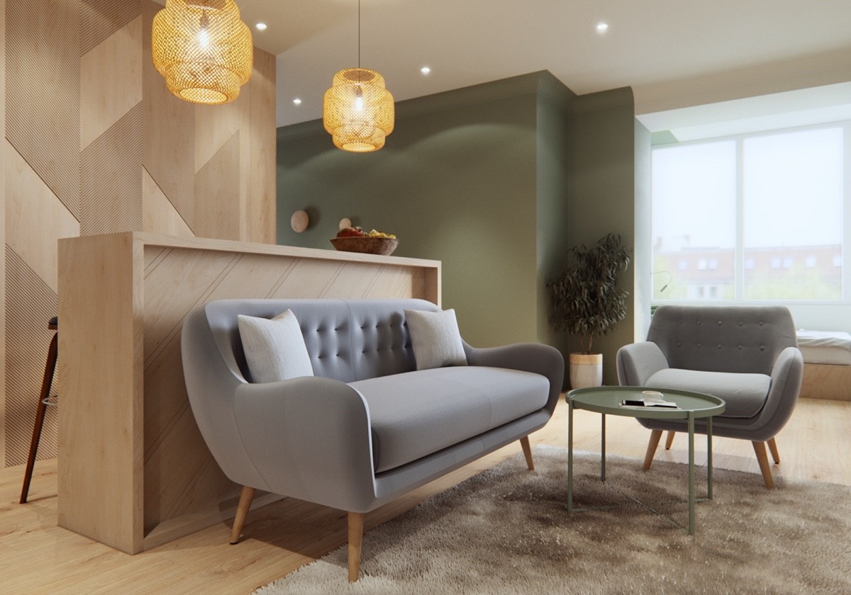
Rounded forms and wooden legs give the furniture mid-century appeal. Even the pendant lighting and bar design furthers this influence.
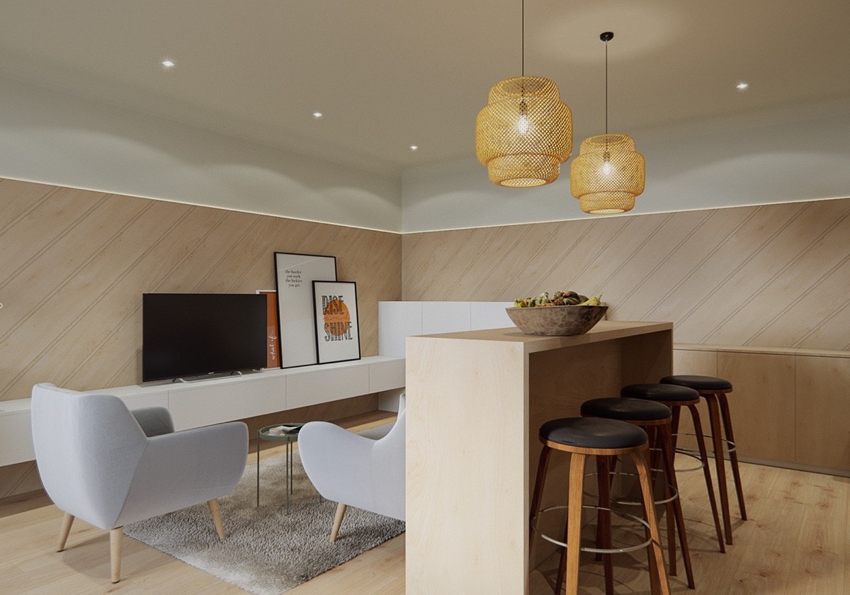
The bar's convenient location allows it to serve as extra seating in the living room while allowing residents to watch television while working, eating, or playing.
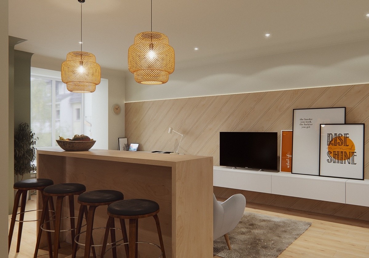
Typographic art always make a great addition to interiors inspired by minimalism. These prints also serve to distribute color balance (especially white).
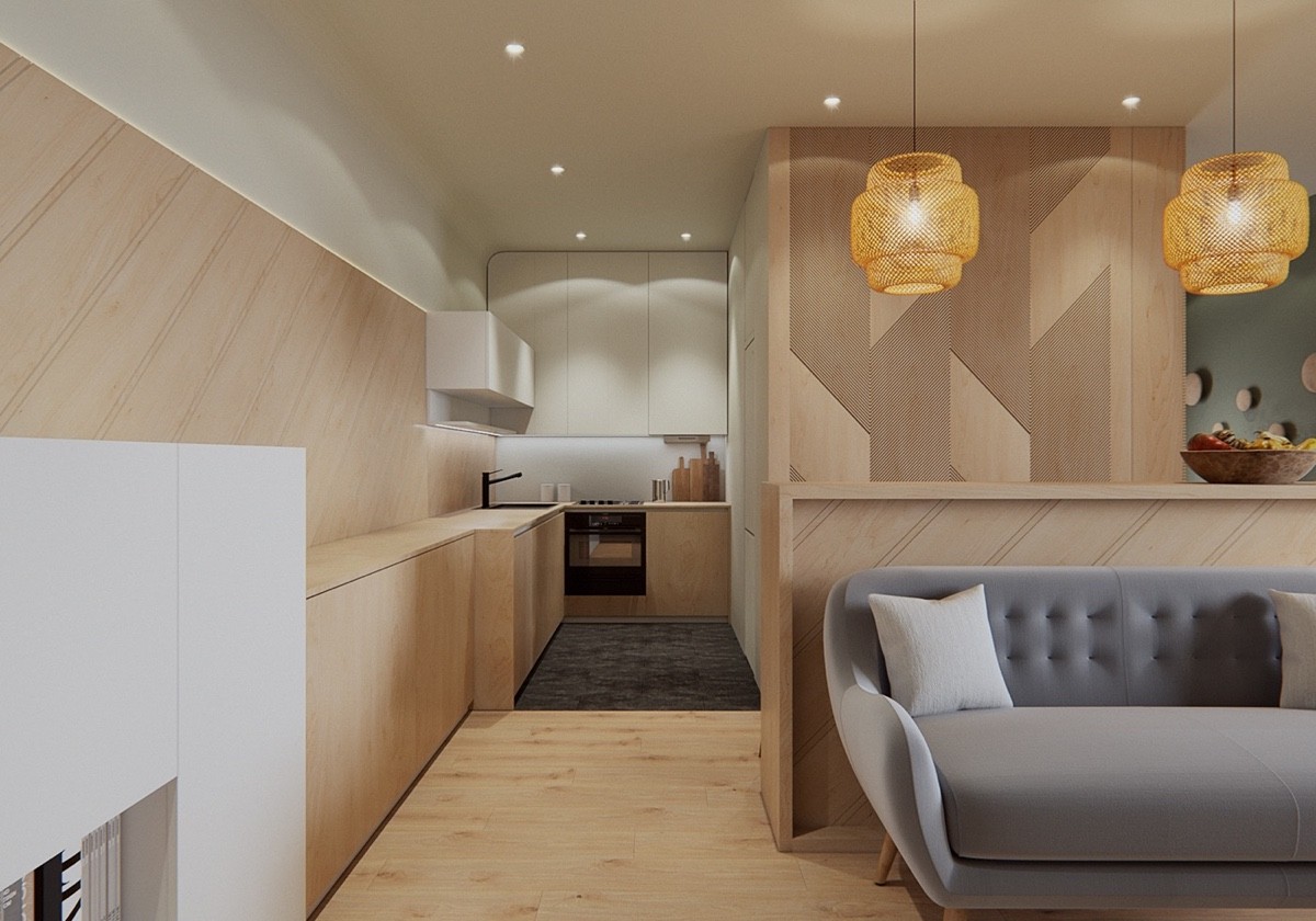
Tucked away as cozy as can be, the kitchen occupies a small space to the left of the central volume. It might look small, but the layout offers plenty of workspace and storage.
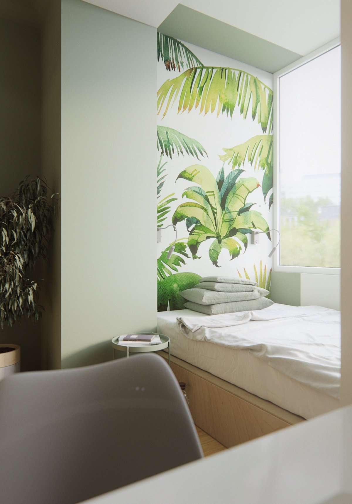
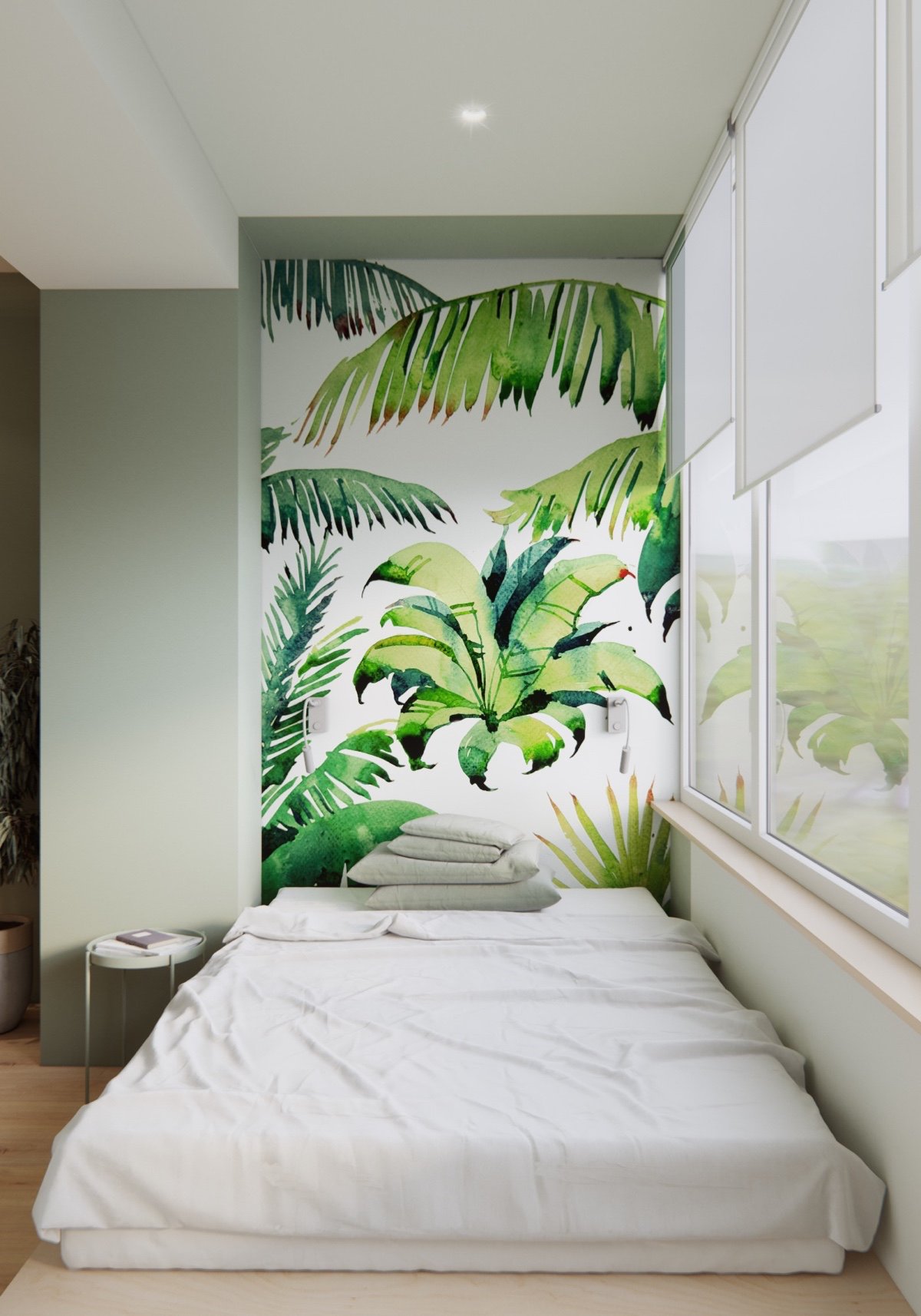
Perhaps the most surprising part of this little studio is the bed – it occupies a very compact footprint but its position near the window opens it up to the entire world outside. Storage hides within the platform beneath.
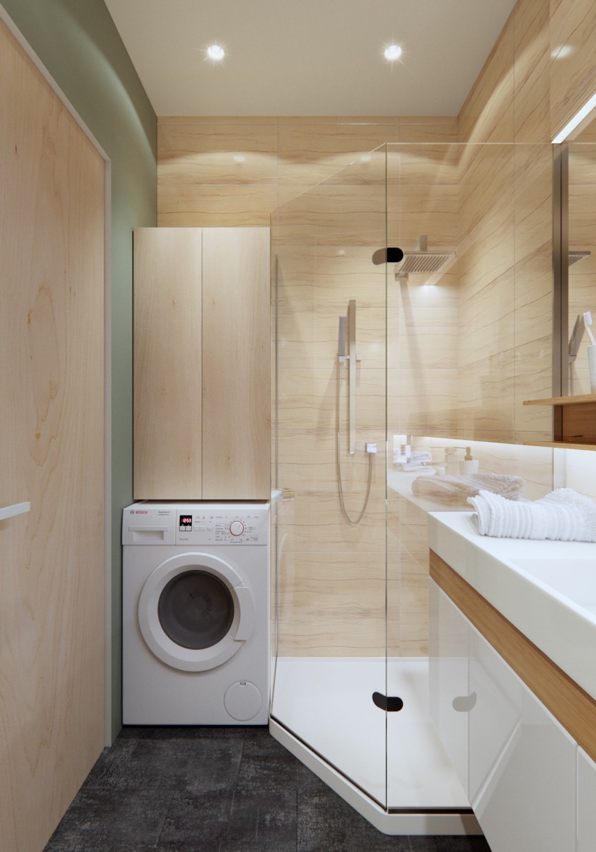
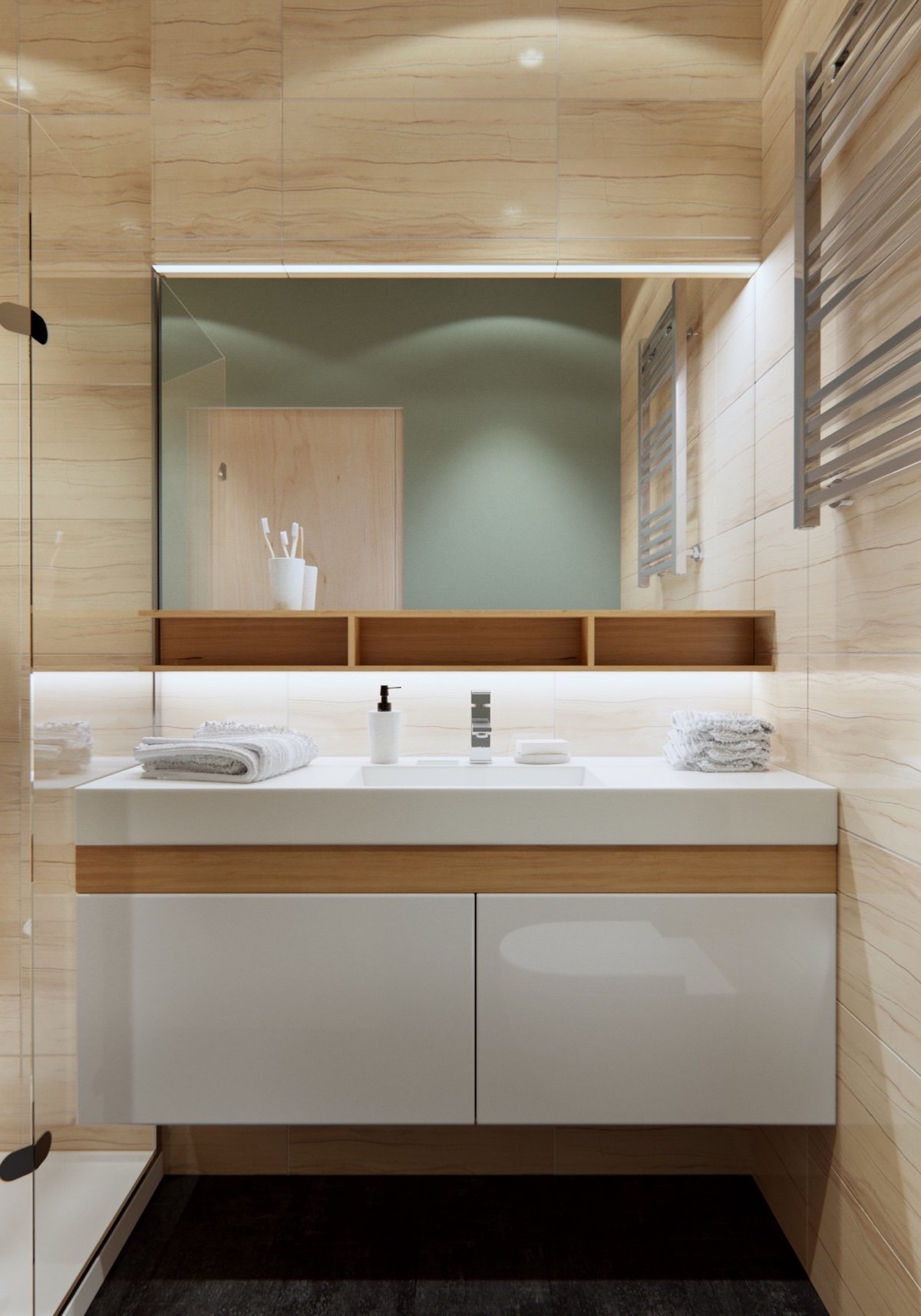
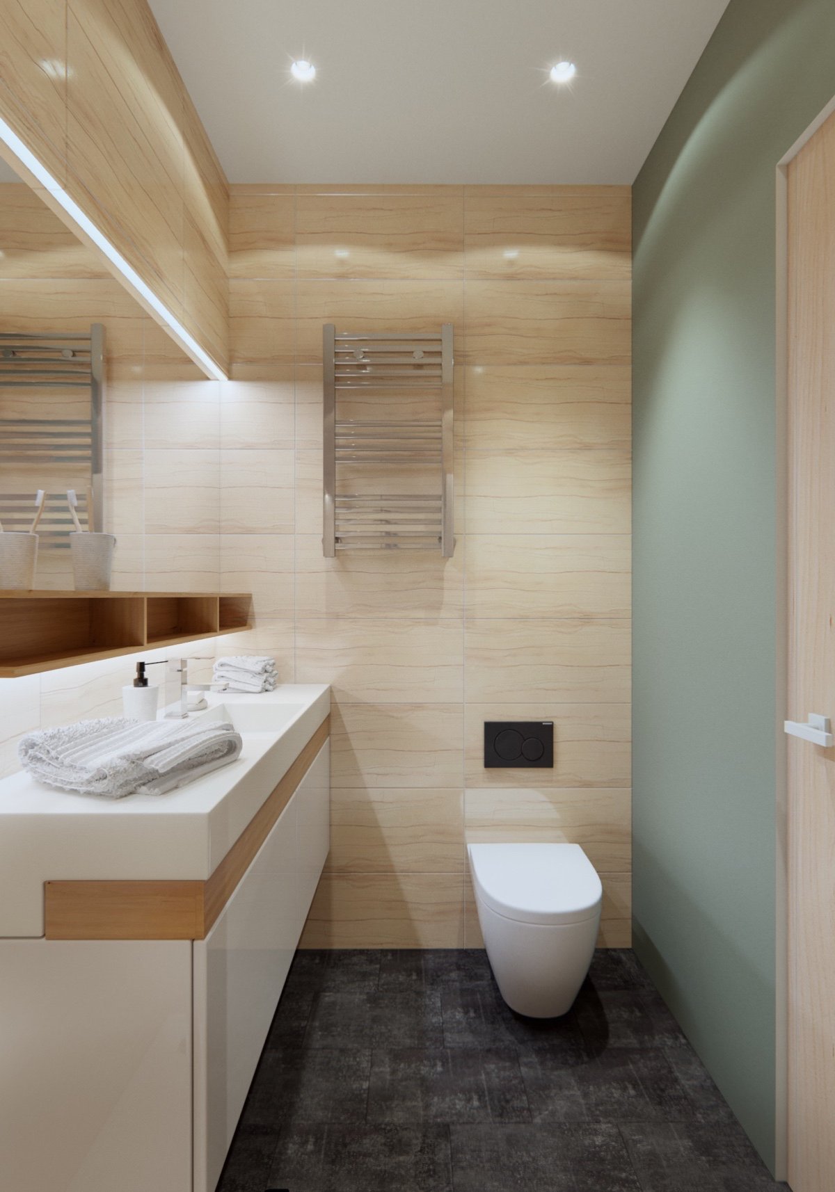
A corner shower, compact washer, and convenient storage solutions ensure the bathroom feels spacious despite its small footprint.
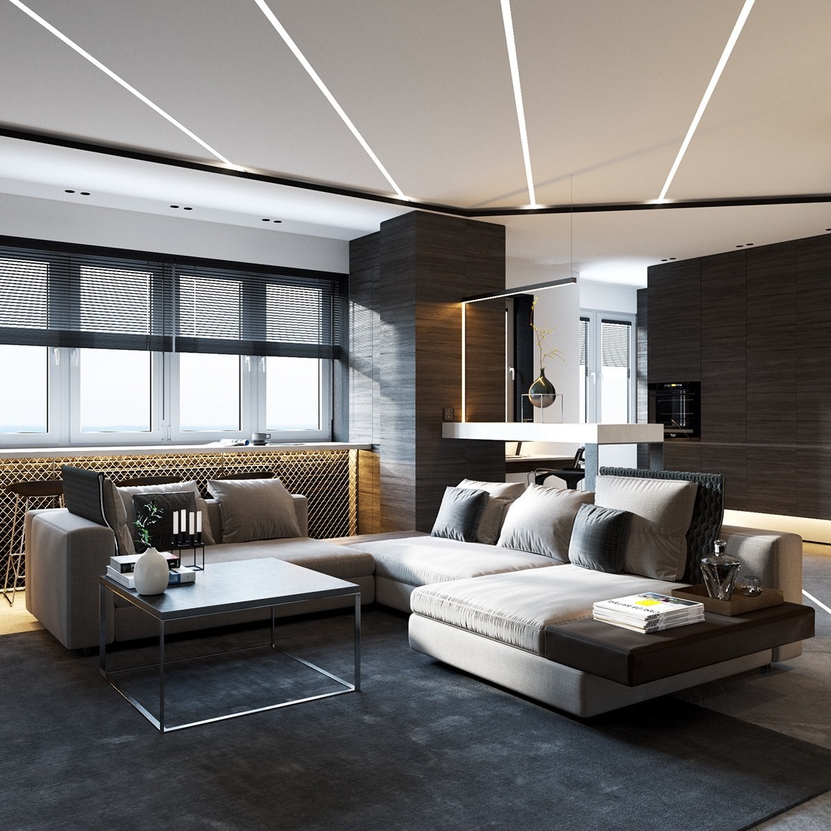
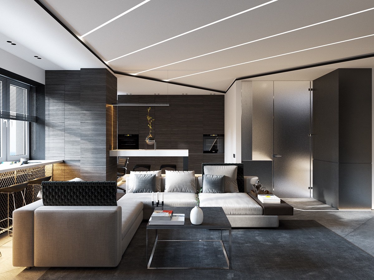
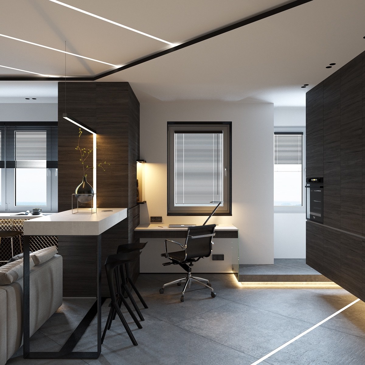
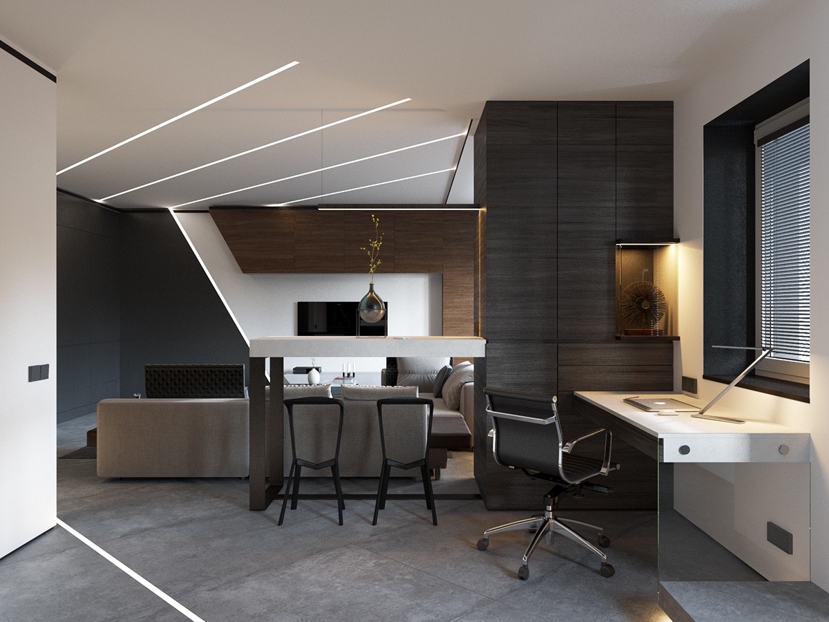
If you're looking for a home that pulls off wooden wall panels without pushing into rustic territory, this space combines those luxurious dark wood boards with greyscale tones to create an aesthetic that feels warm and comfortable without sacrificing an ounce of modern appeal. The space-saving features in this apartment are detailed later – some are quite surprising.
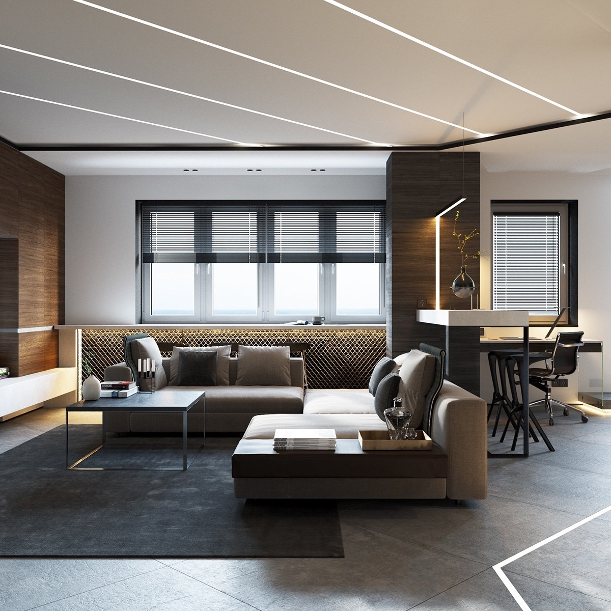
Chain link fencing is a strong addition, an easy DIY project for anyone who wants to cover a radiator or add a cool industrial effect to the home.
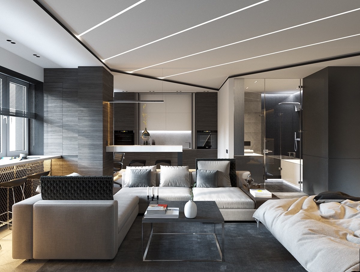
One of the most striking and hard-to-replicate features is the abundance of inset lighting that traces the ceiling and even parts of the floor. These strips likely contribute to a moody atmosphere in the evening.
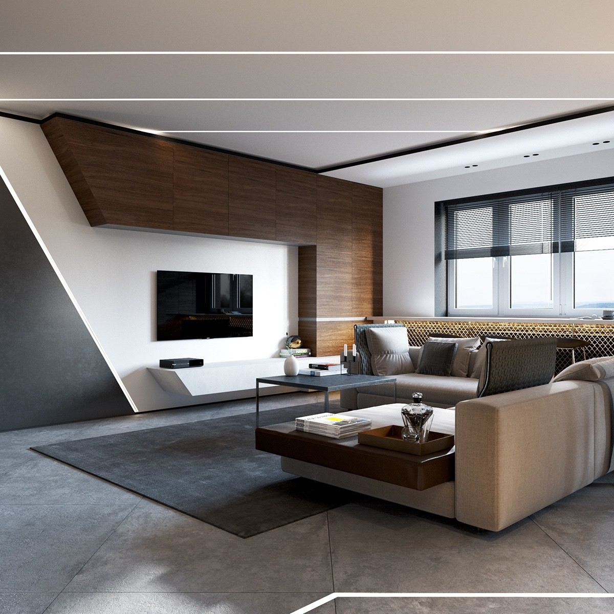
The open seating area extends its functionality with plenty of storage above the television and versatile multi-purpose trays that attach to the sofa.
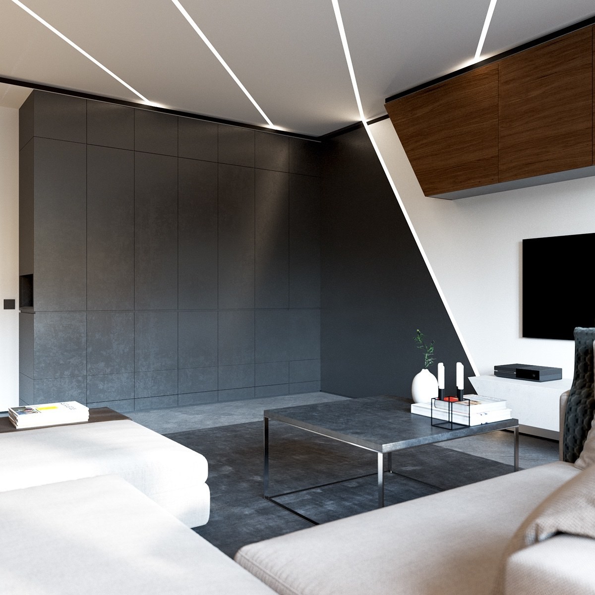
It may seem like this wall remains intentionally blank just for visual effect, but it's actually just a very clever disguise for a Murphy bed.
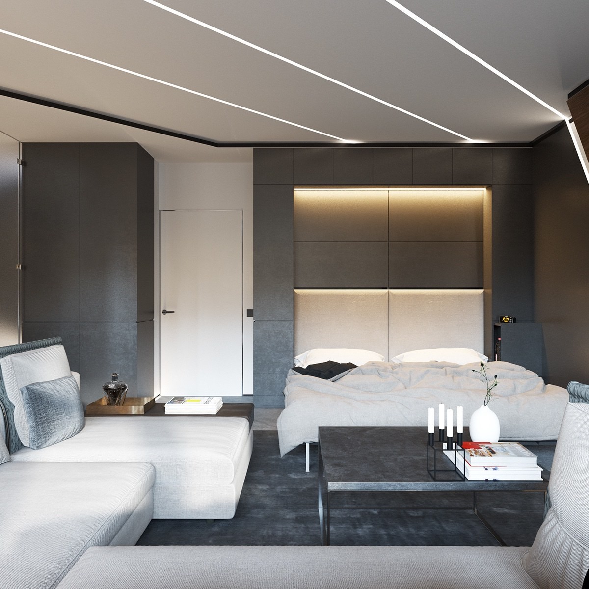
Without relying on a hideaway bed like this one, the entire attitude of the apartment would feel altered. It saves an incredible amount of space.
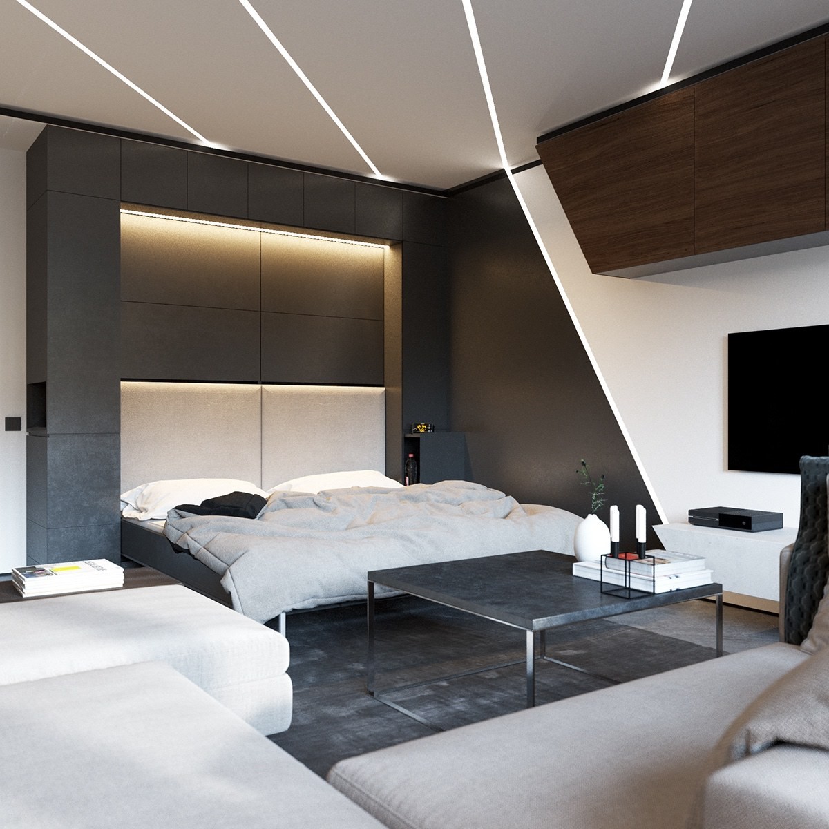
The addition of extra lighting elements hidden in the headboard portion of the wall serve as a fantastic complement to the stripes that trace the ceiling, walls, and floor.
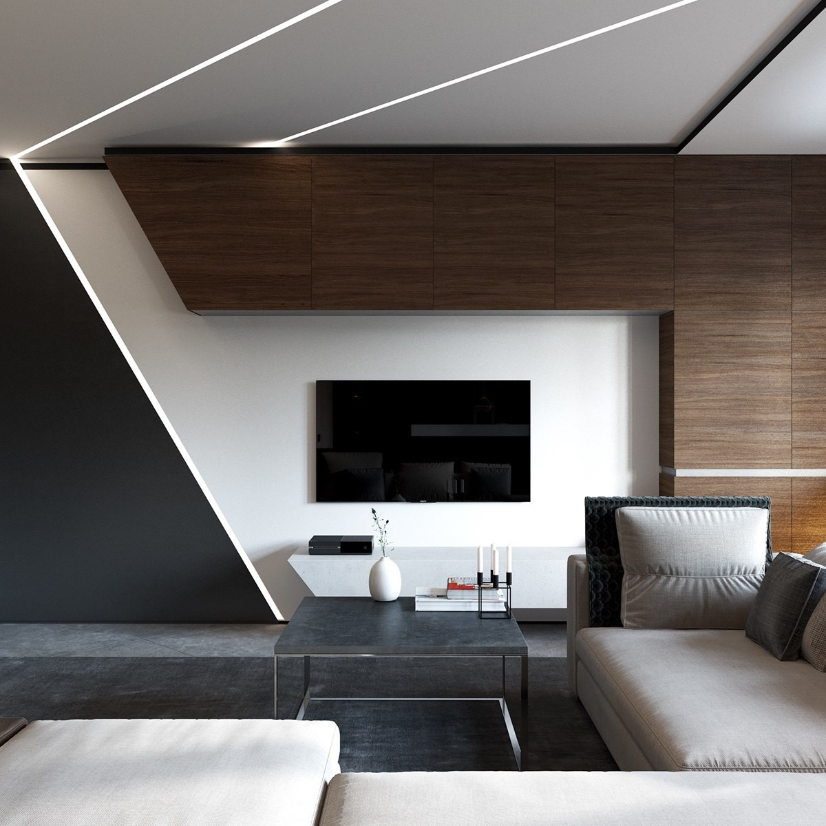
While this half of the room lacks the dividing walls that mark out the other functional areas of the open layout, this one separates living room from bedroom with a transition from matte black to white and then to those gorgeous wood cabinets.
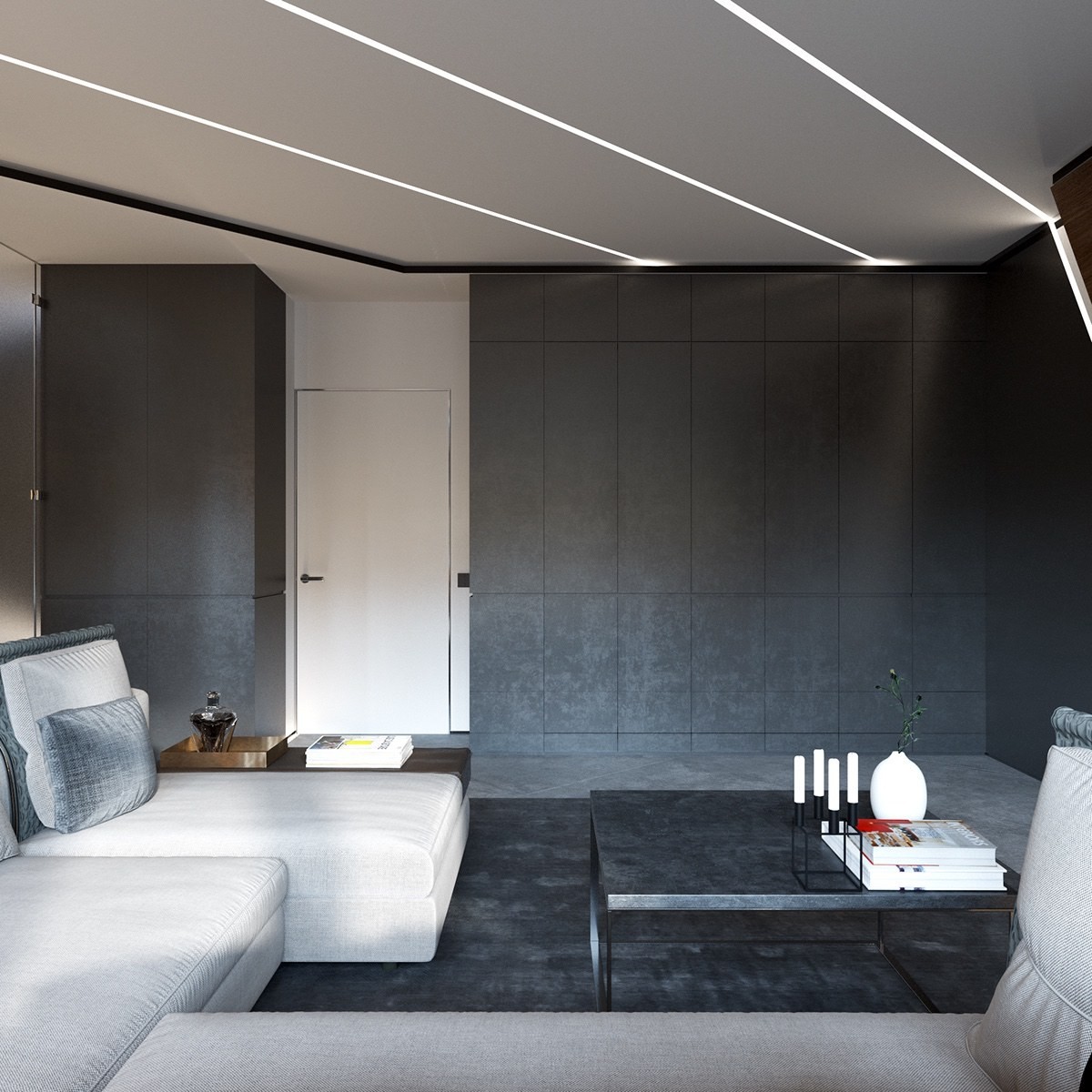
If perfect coordination were not a concern, a lift top coffee table would have been the perfect continuation of the transformation theme. On the other hand, the existing choice is an unbeatable match for color and texture.
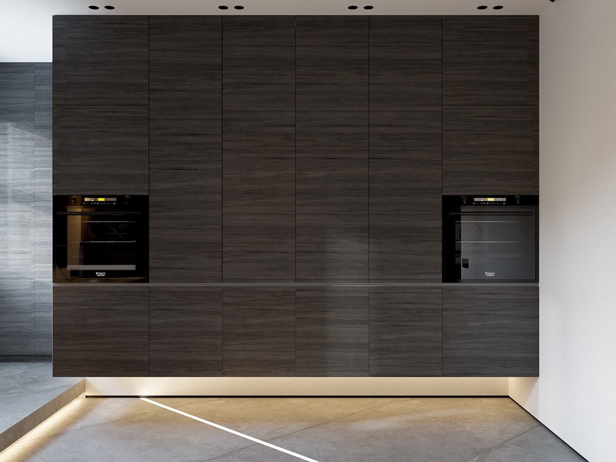
At first glance, the kitchen looks like one smooth expanse of cabinets with no worktops in sight. It allows for a clean and minimalist appearance, but the real surprise hides inside.
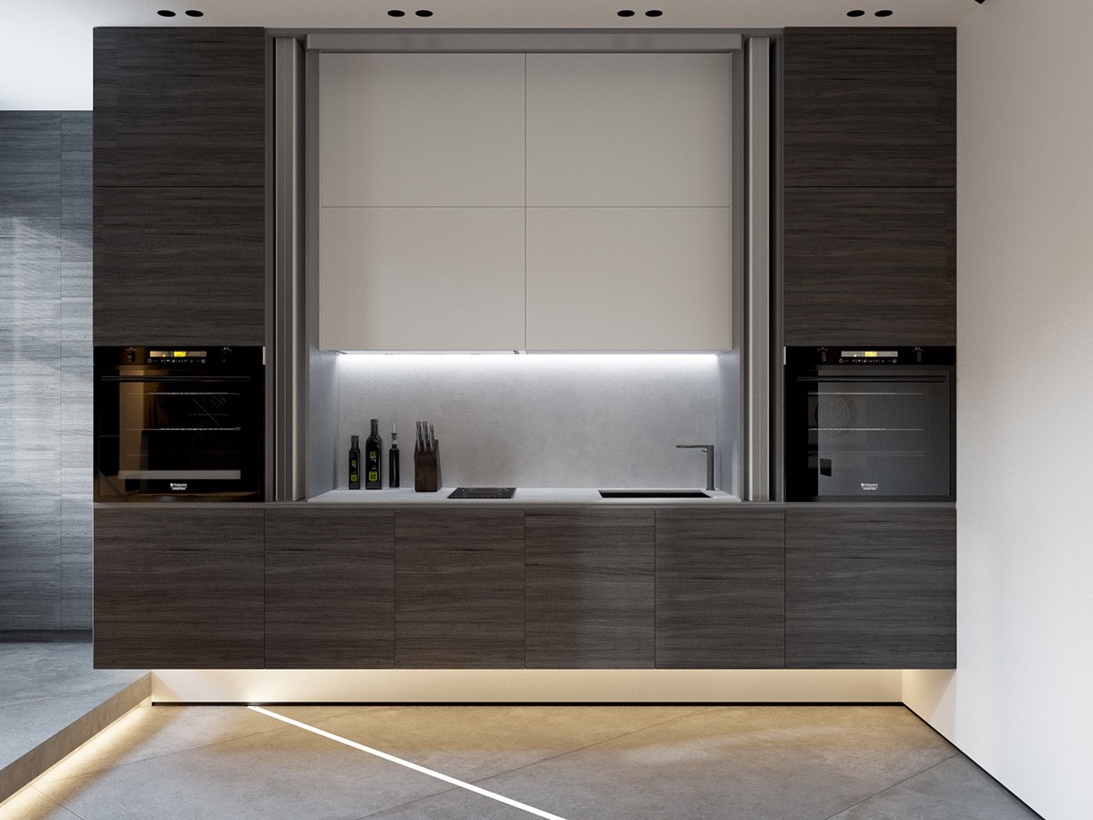
Sliding doors reveal a fully equipped workspace with a small range and sink. Large cabinets expand storage space overhead.
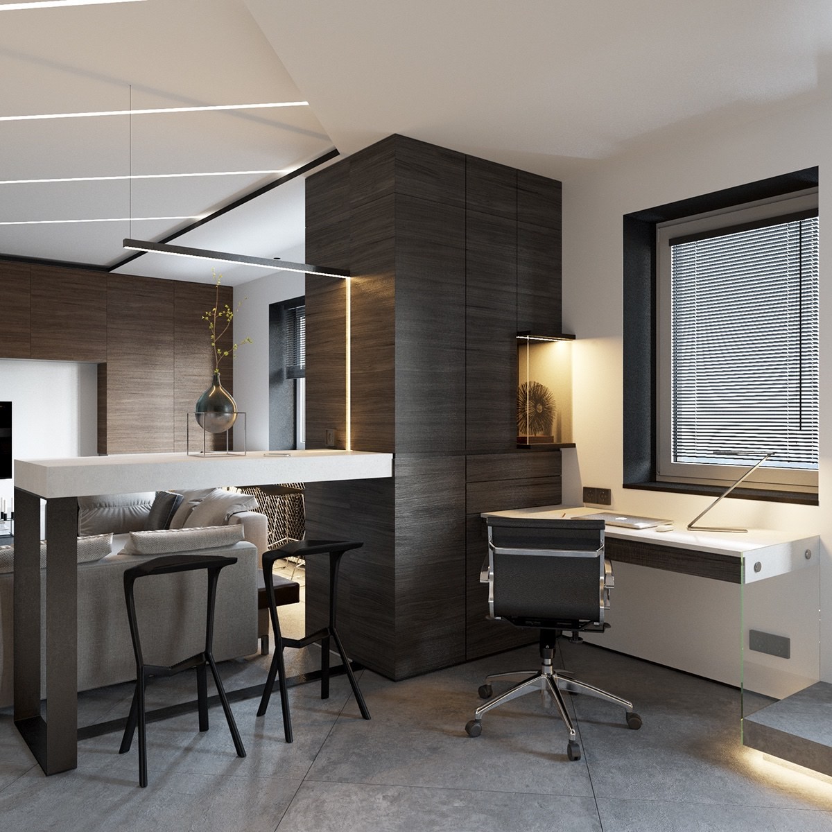
Dining and office areas share the same general area. The breakfast bar easily looks over the living room, outfitted with practical stools from the MIURA collection by Konstantin Grcic.
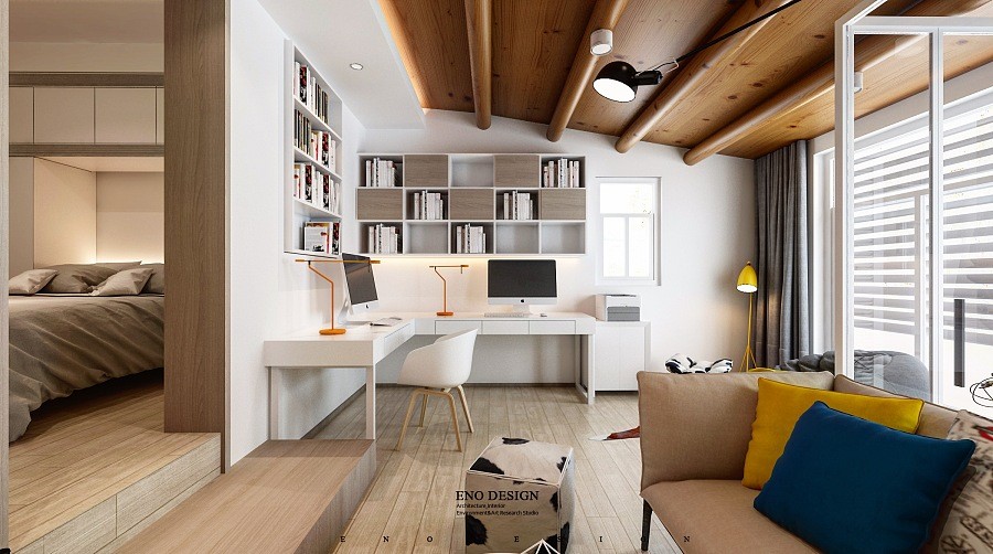
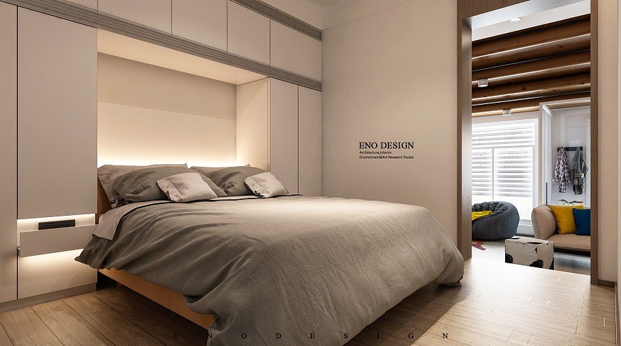
While this living space approaches almost studio-levels of openness, a sense of division also allowed the designer to choose two different takes on a natural color theme to suit the distinct needs of private and public areas. Private spaces adopt an earthy neutral theme while the living room goes big with bright and vivid colors reminiscent of summertime. You'll notice this interior does a lot within the primary living space – it's multipurpose and very flexible.
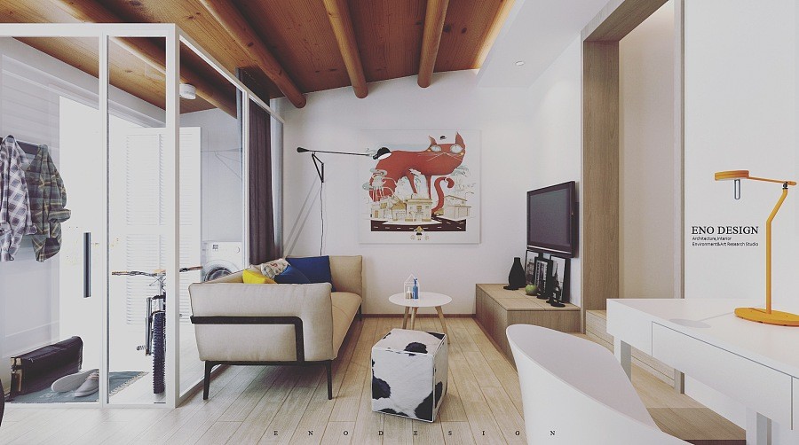
Eclectic decor gives the eye a unique focal point from every angle. And of course, it's impossible to overlook that fabulously unique cabin-style ceiling! Combined with the animal prints and patterns, this style seems like a modern take on the lodge look.
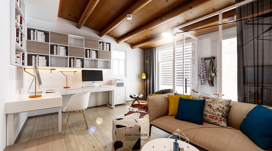
This color theme is especially admirable because of its sense of thematic integration. Without those rustic elements, the bold primaries might have instead evoked a more of a rigid Mondrian-esque attitude.
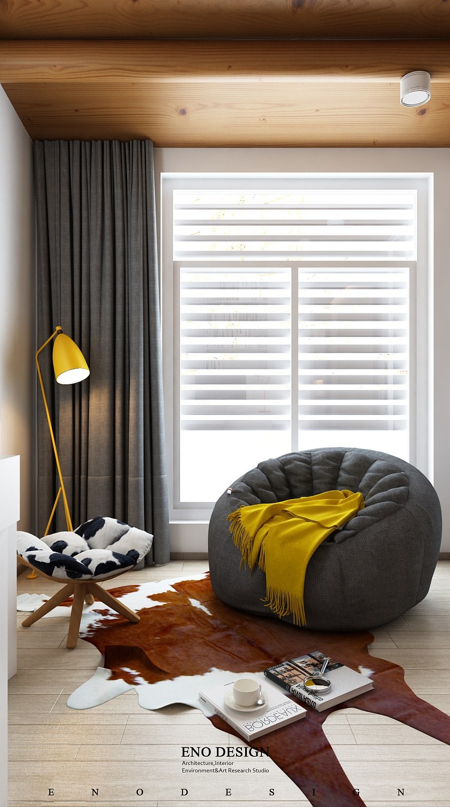
This combination of color and pattern comes together brilliantly in the tiny corner reading nook. Urquiola's famous Husk ottoman, an oversized beanbag chair, and a handsome Grasshopper floor lamp all contribute their own distinctive appeal.
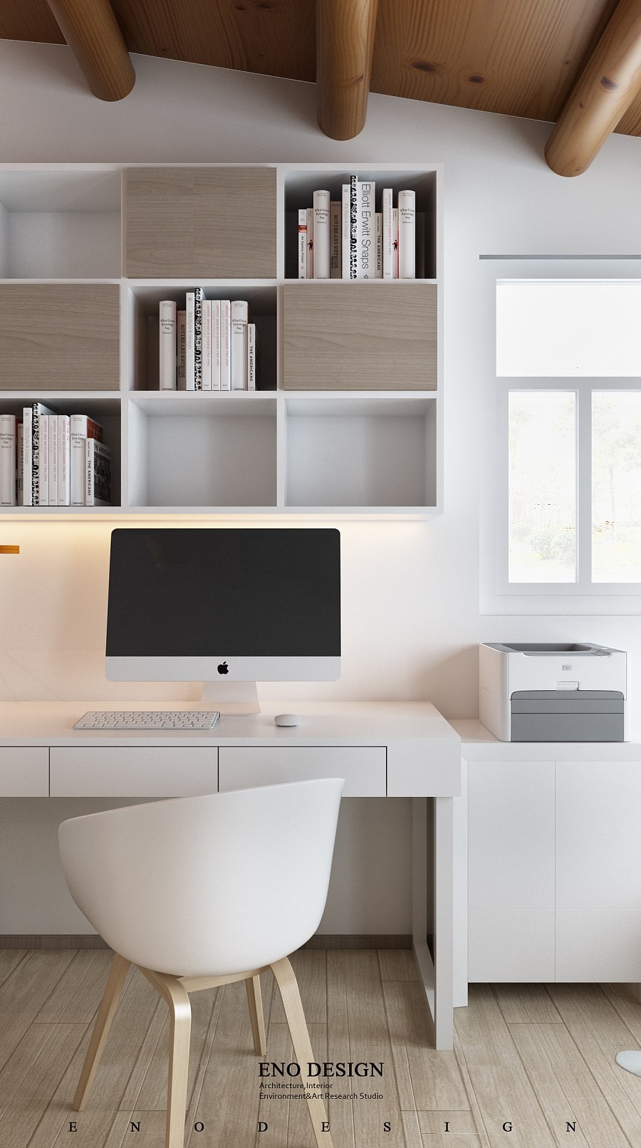
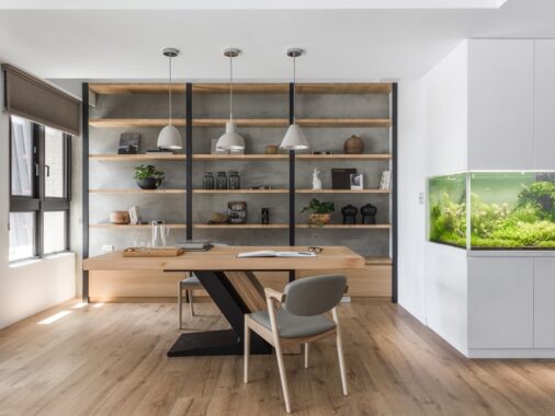
The little office has a few inspiring details as well. The storage system offers a mix of open and closed cubbies to keep things looking tidy, and the furniture itself is quite minimalistic.
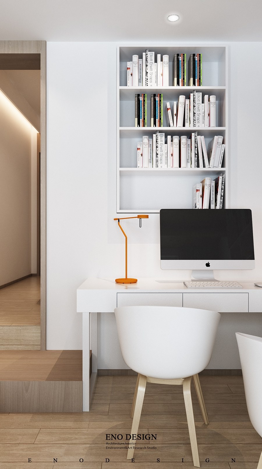
Both seats are from the About a Chair collection by Hee Welling. You can buy those from here. If you are a fan of minimalist scandinavian style chairs like these, do check out our post: 50 Stunning Scandinavian Style Chairs.
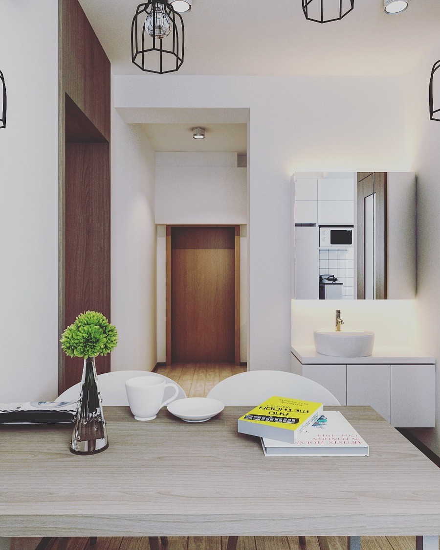
The kitchen occupies a little space down the hallway from the living and bed areas. It's exceptionally simple and compact.
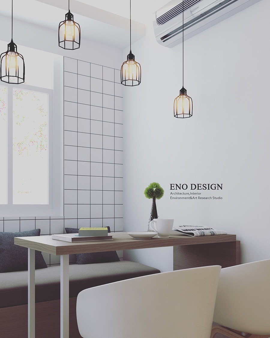
Hee Welling's chairs join a comfortable upholstered bench, working wonders to save space in an already small area.
