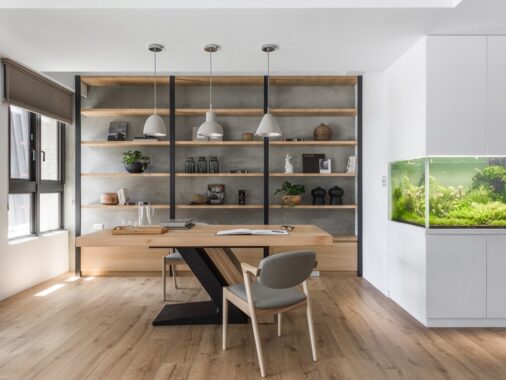
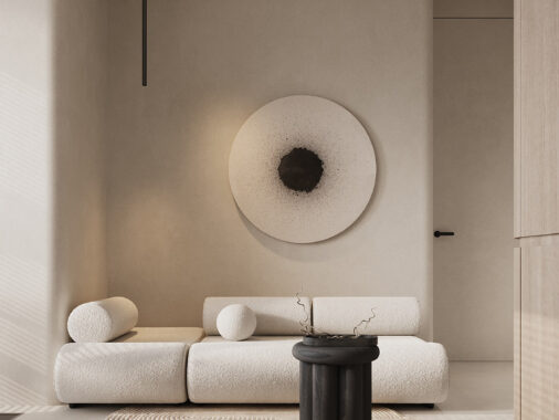
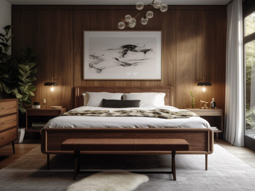
While a 750 square foot floor plan isn't exactly restrictive – especially when it comes to apartments with only one bedroom – it's still compact enough to require a little extra care and attention when it comes to layout, decor, and atmosphere. This post looks at three single bedroom homes that tackle the problem with ease, each one demonstrating its own distinct decorative motif that remains cohesive throughout. The first is a warm and natural space, the second exhibits a touch of industrial decor influence, and the third home goes in a completely different direction with a bold color scheme.
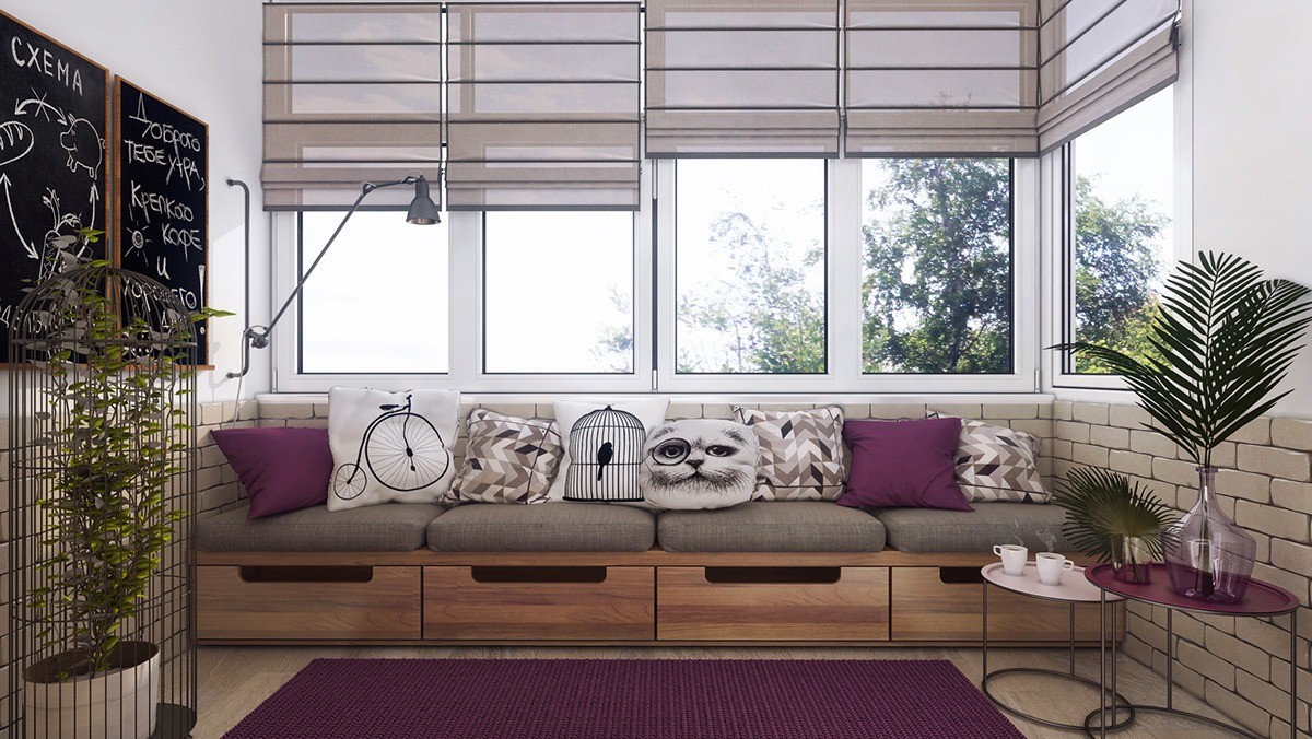
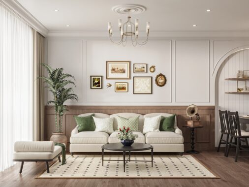
And check out these adorable pillows! A mixture of patterns, playful prints, and solid colors keeps things interesting. The bench itself contains four drawers to contain extra pillows, throws, and anything else the hosts might need for entertaining.
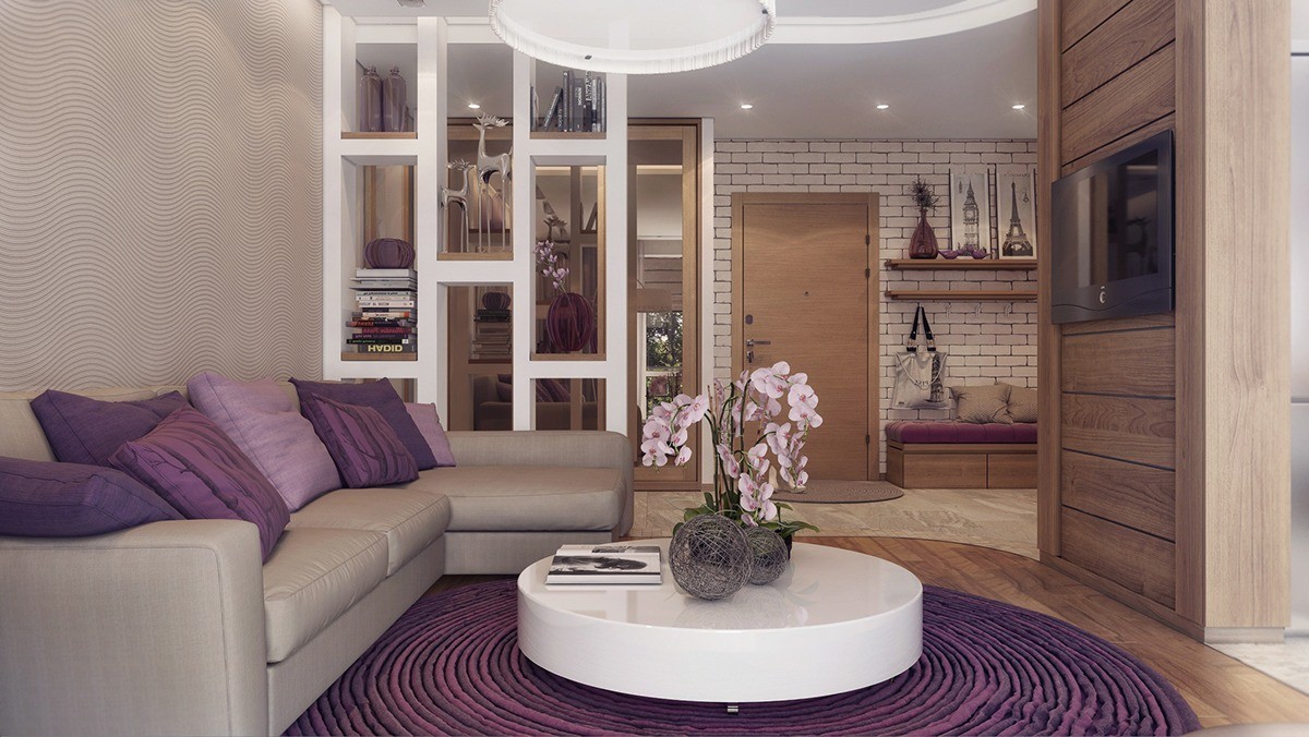
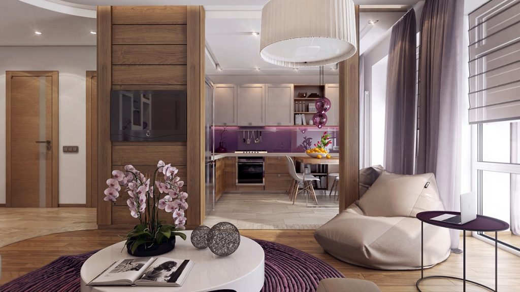
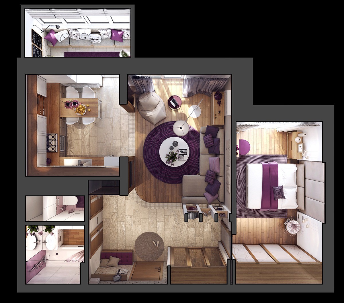
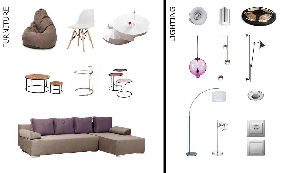
Last up is a handsome apartment concept for a young couple in Moscow. It offers a floral take on nature-inspired decor, with rich lilac accents bringing warmth to the neutral wood and sand tones throughout the interior. It's not minimalist by any means – texture, color, decoration, and furnishings all showcase a strong personality without straying too far from simplicity.
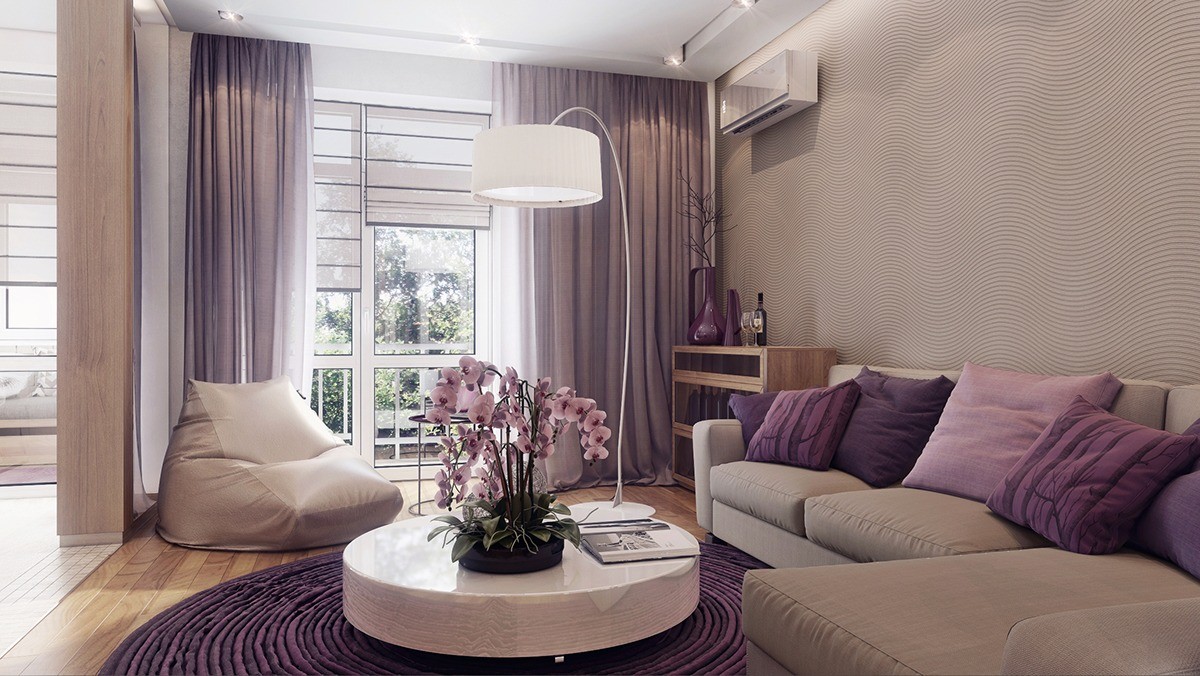
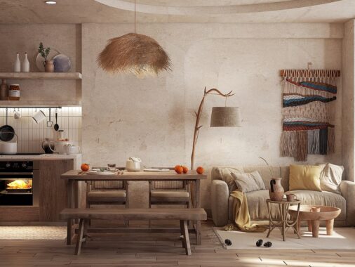
Although there isn't much room for decoration, subtle patterns happily make their mark. Forest prints bring life to the sofa pillows, the ruffles of the rug hint at flower petals. A unique floor lamp towers above to lend a special aesthetic.
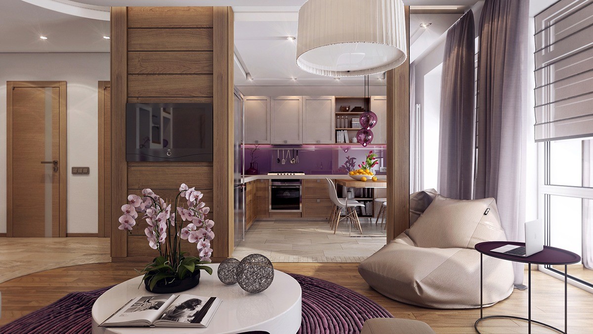
Continuing through the living room, a spacious kitchen occupies a sunny corner of the home. It includes an eat-in dining table that can be transformed into extra usable workspace simply by removing the chairs.
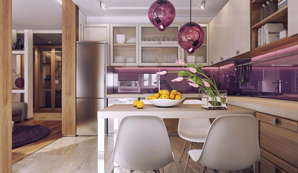
The backsplash shines like brilliant amethyst, an effect created by a coating of paint protected by glossy sheets of glass or acrylic.
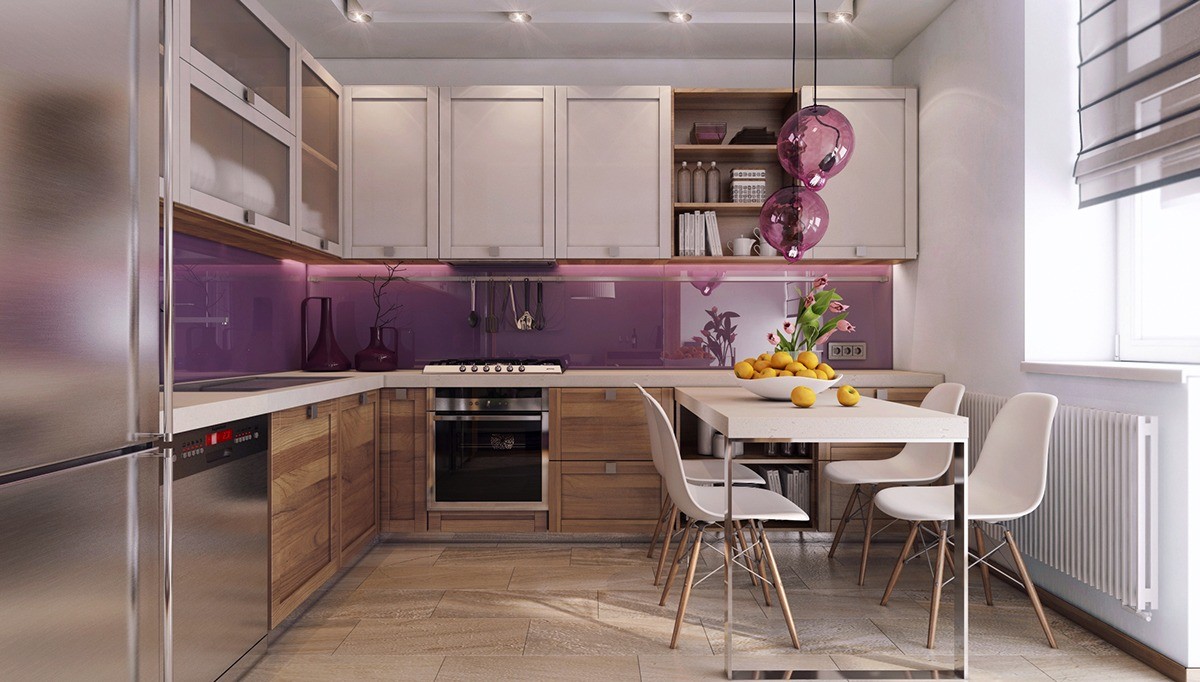
Of course, there's plenty of storage to go around. The upper cabinets demonstrate a mix of both traditional and open shelving. Drawers, shelves, and cabinets hide behind the rustic wood cabinetry below.
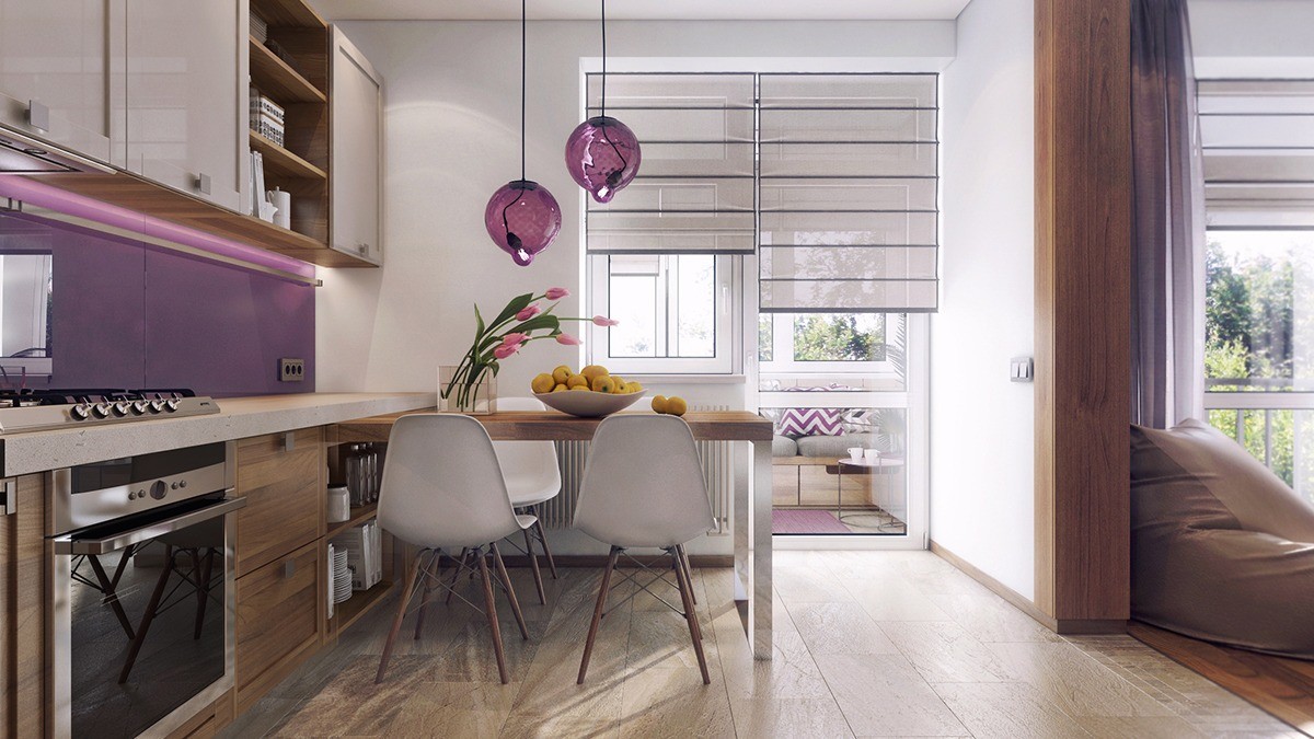
Just beyond the modern dining room, a bright little veranda gives residents and guests a place to enjoy coffee or tea in the sunlight.
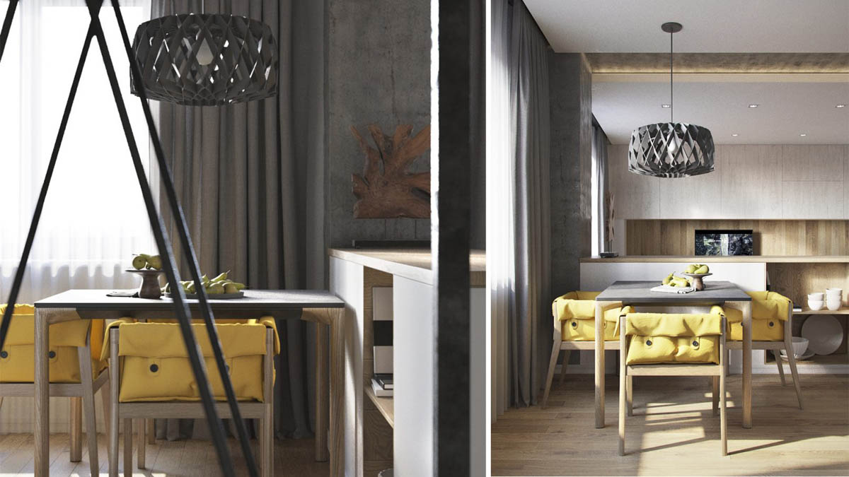
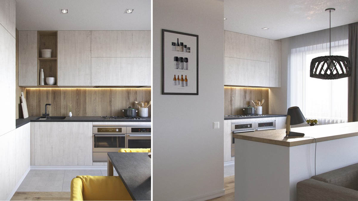
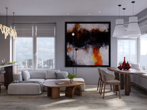
That handsome low counter plays an important role by hiding the table and chairs. The pendant, on the other hand, enhances the entire open living space – dining pendants are always a useful focal point.
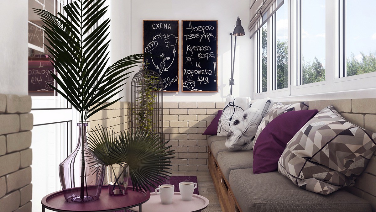
A pair of tall chalkboards accommodates notes like grocery lists or reminders, but can also serve as a canvas for impromptu artwork to enhance their cheerful little home.
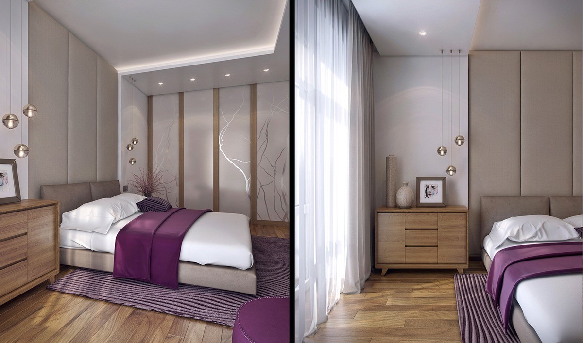
The bedroom goes for a softer and more subtle natural motif. The same lilac hues draw the eye, surrounded by warm honey-toned woodwork for a welcoming effect. Branchlike patterns stand out from the frosted glass closet.
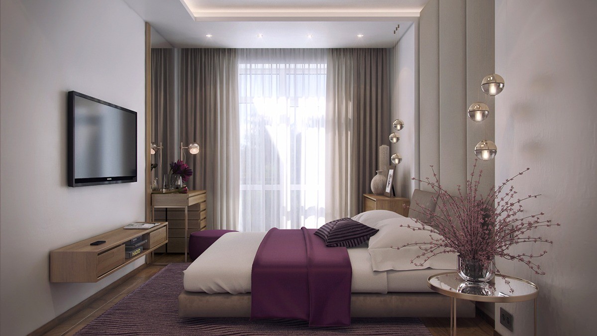
Creative bedroom pendant lighting provides focused task illumination for the side tables on either side of the bed.
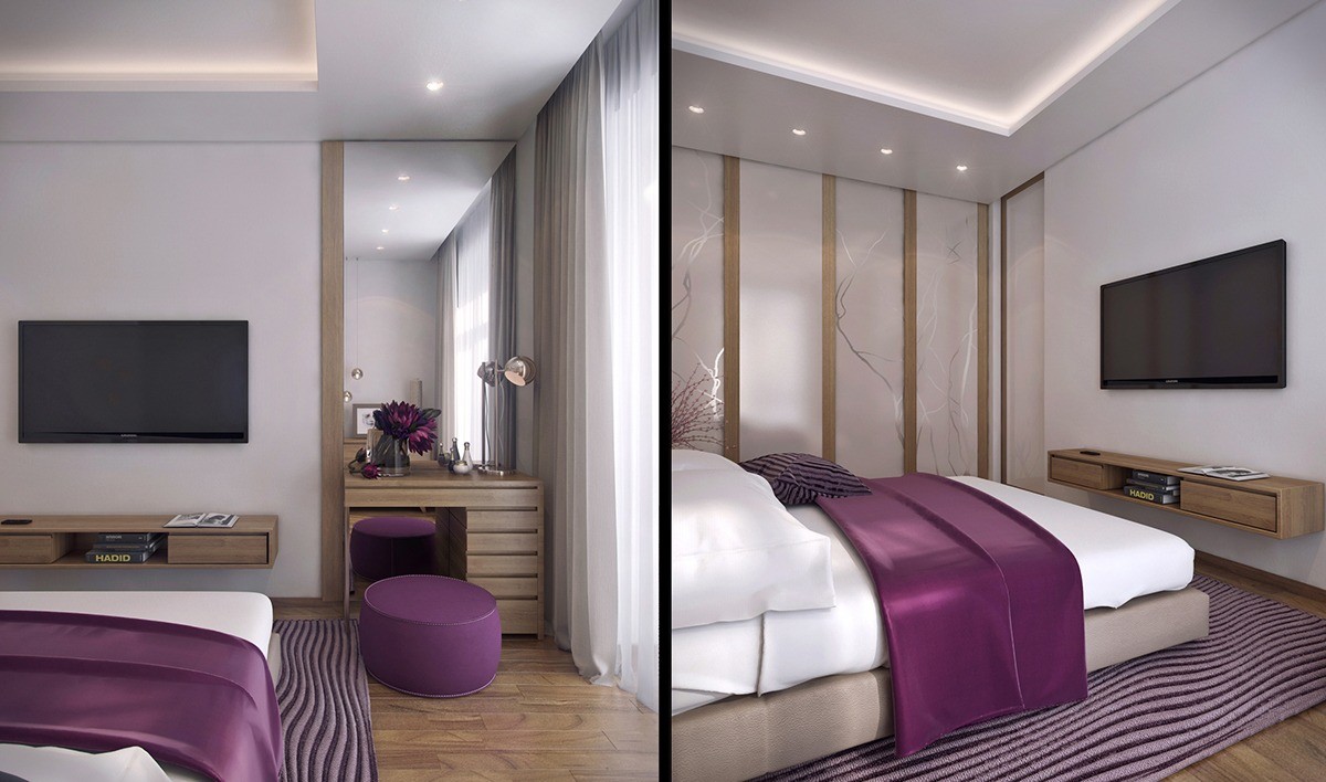
The small vanity doesn't take up much room but serves the necessary functionality all the same. And what an adorable little ottoman for seating!
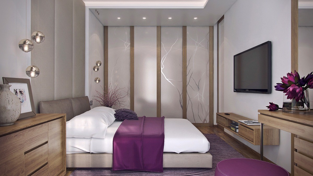
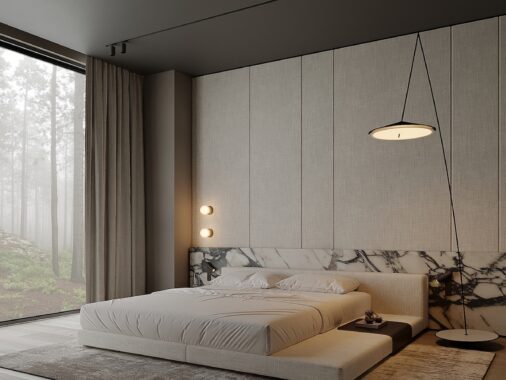
Soft fabrics also play an important role in this beautiful bedroom. An upholstered section of wall reaches to the ceiling behind the bed, a textural rug below ready to warm feet on chilly mornings.
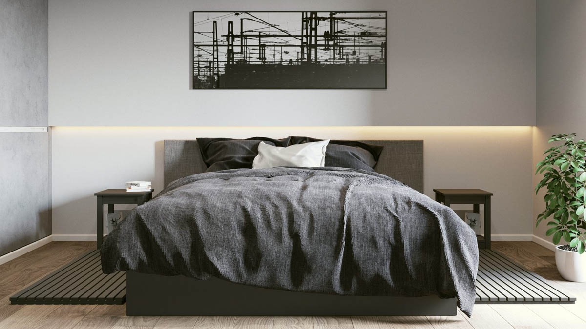
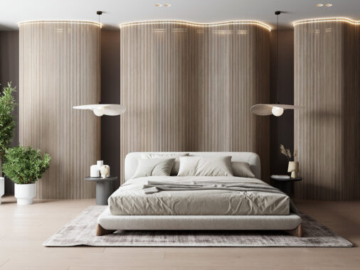
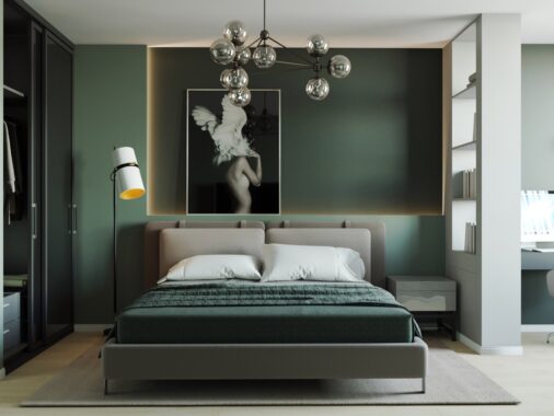
Sleep takes priority. There are no exciting decorations, bright colors, or extra furnishings to distract attention. Even the bedroom lighting fosters a comforting atmosphere – soft, inset lighting creates a relaxing mood.
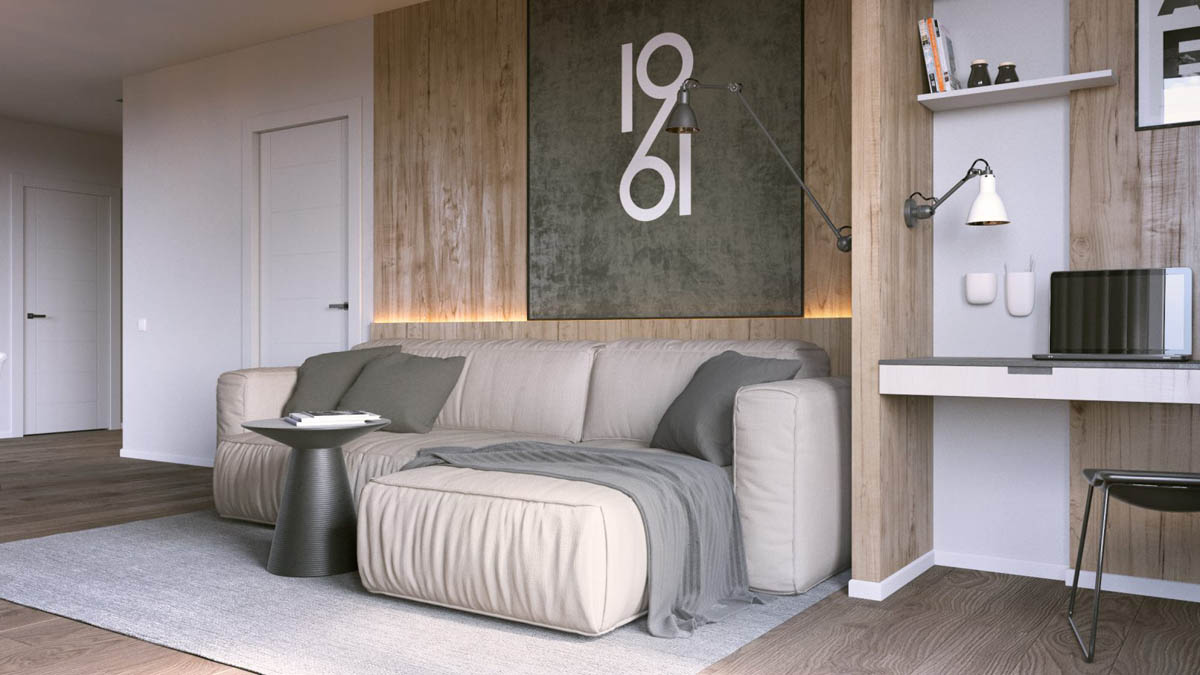
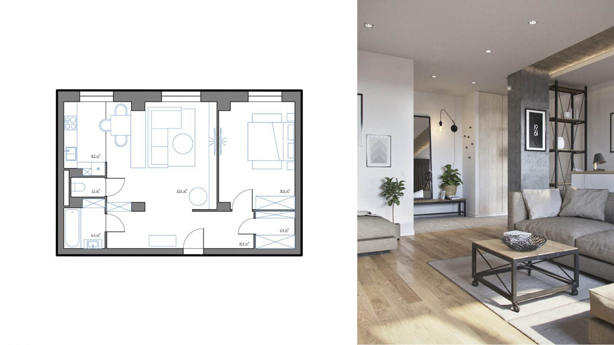
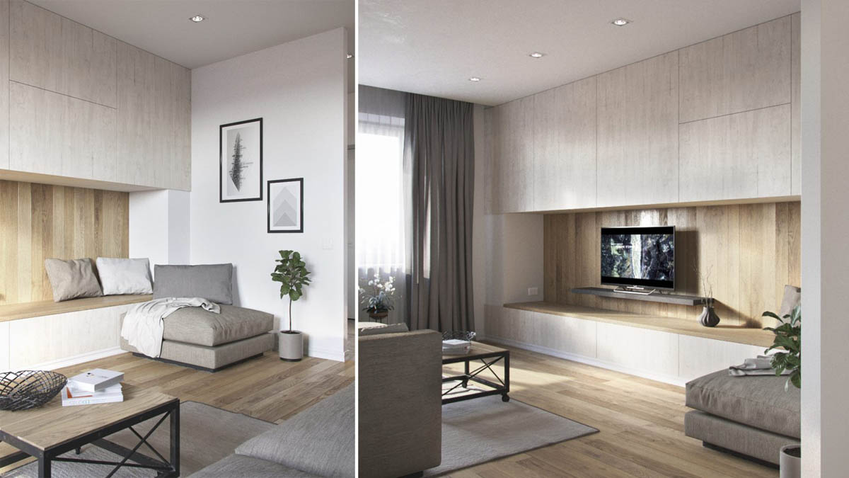
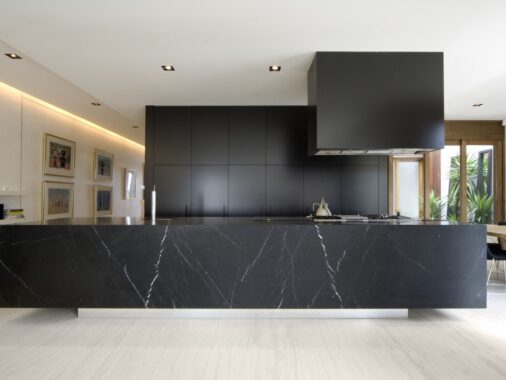
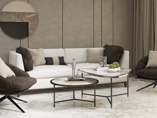
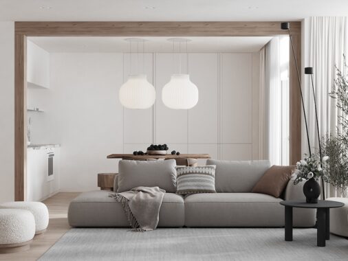
Cool neutrals make up the basis of the interior color palette while warm wood veneer and clever lighting brings warmth to the theme.
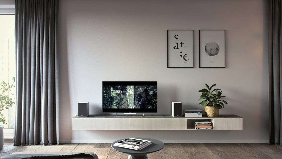
The media center avoids clutter with a simple cantilever table for storage. A pair of black and white prints add balance to the abundance of empty vertical space above.
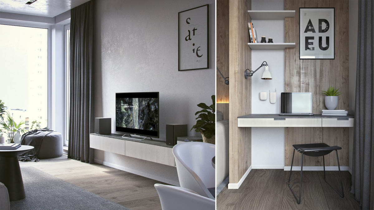
With such expansive wooden elements, it makes sense to add a touch of greenery as well. Those who travel often might find self watering planters to be a helpful tool.
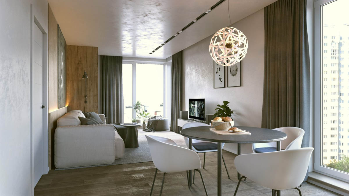
You'll notice that the living room not only sticks to strong color, texture, and material themes, but also stays consistent in terms of form – most objects are rounded or otherwise curved for a smooth look.
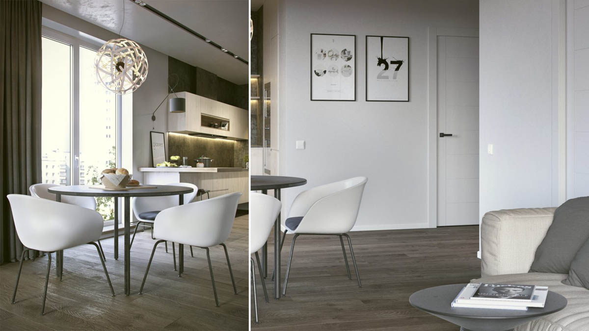
The modern dining chairs exhibit the same curves as the living room furniture, centered by an open spherical pendant light hanging above.
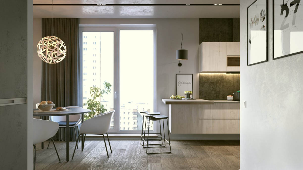
You'll notice that the kitchen immediately transitions to a layout more focused on linear forms. Those lovely kitchen bar stools are a nice intermediary between the two styles.
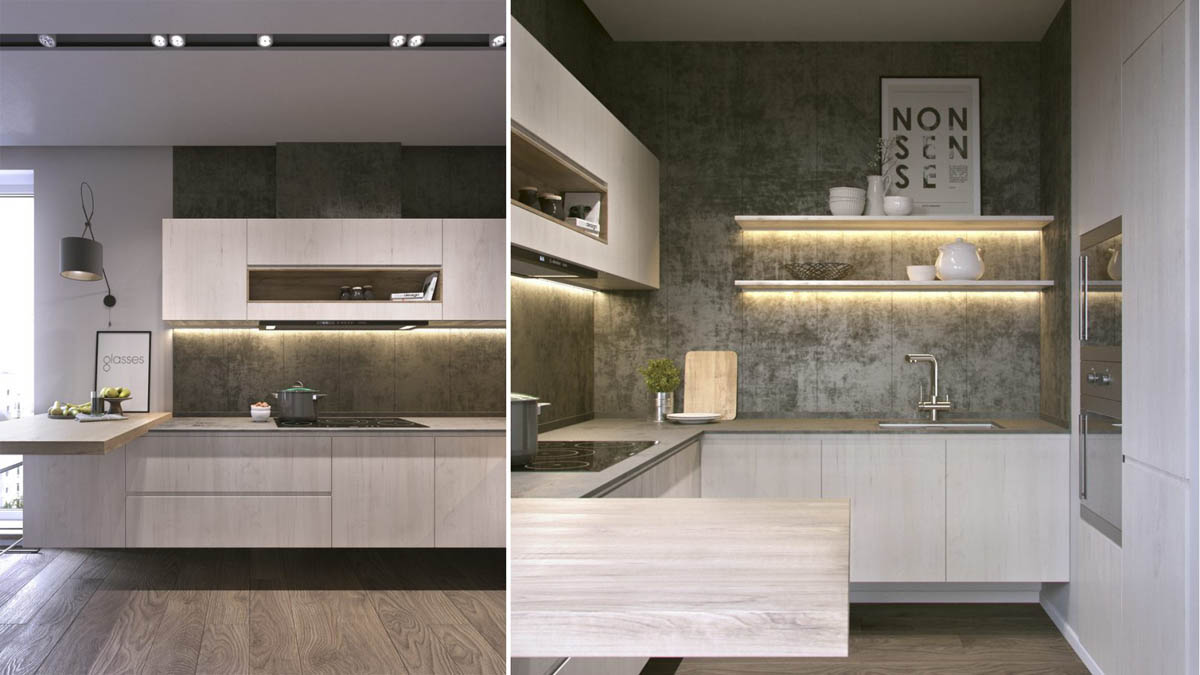
Another difference is that the kitchen goes a little heavier with the industrial influence. The textural concrete walls embrace the kitchen's darker atmosphere while the recessed lighting makes it more functional.
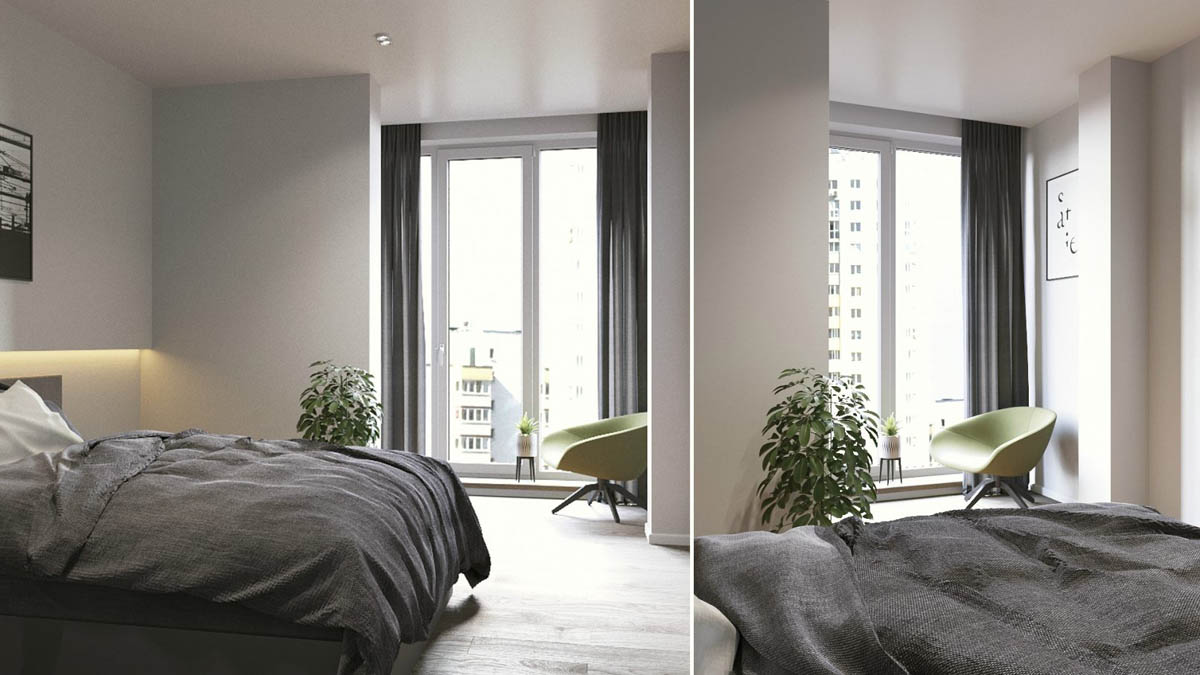
And finally, a look at the bedroom. The living room hosts the social spaces and the office, leaving this room to remain a focused single-purpose retreat.
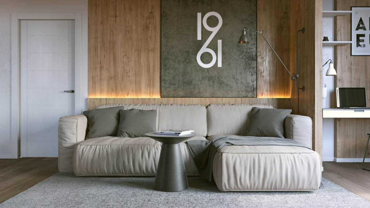
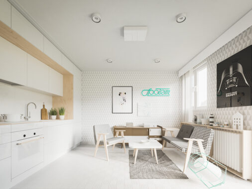
Designed for a young bachelor, this Minsk apartment concept measures in at just short of 68 square meters but enjoys an exceptionally open atmosphere thanks to its simple decor and sensible modern furnishings. It's a practical space but carries no shortage of character thanks to typographic decorations and distinctive contemporary accents throughout.
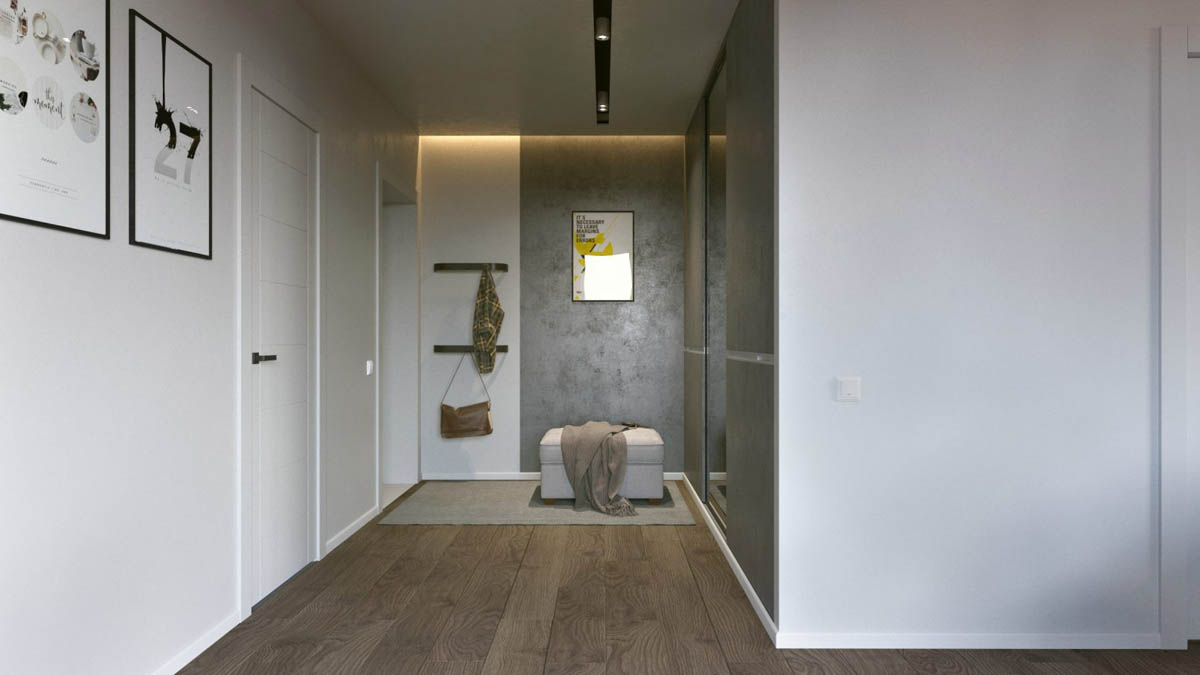
And here's a look at the practical entryway, outfitted with hooks to hold coats and accessories and a simple ottoman for removing shoes. The full length mirror to the right makes it easy to give an outfit a final once-over before heading out for the day.
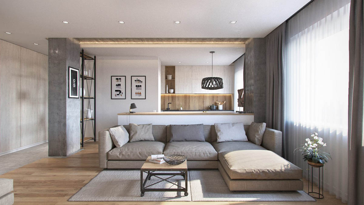
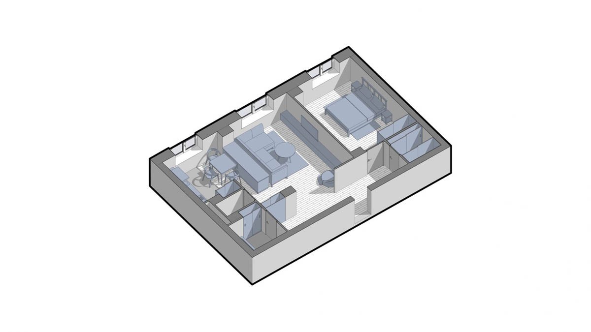
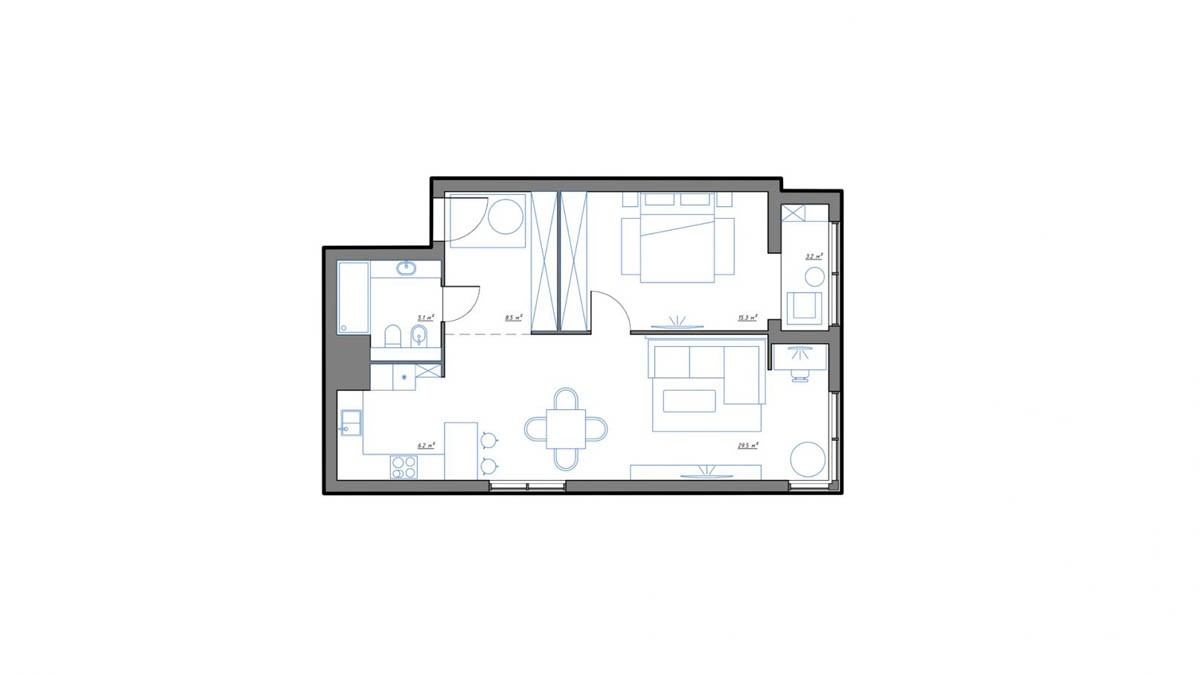
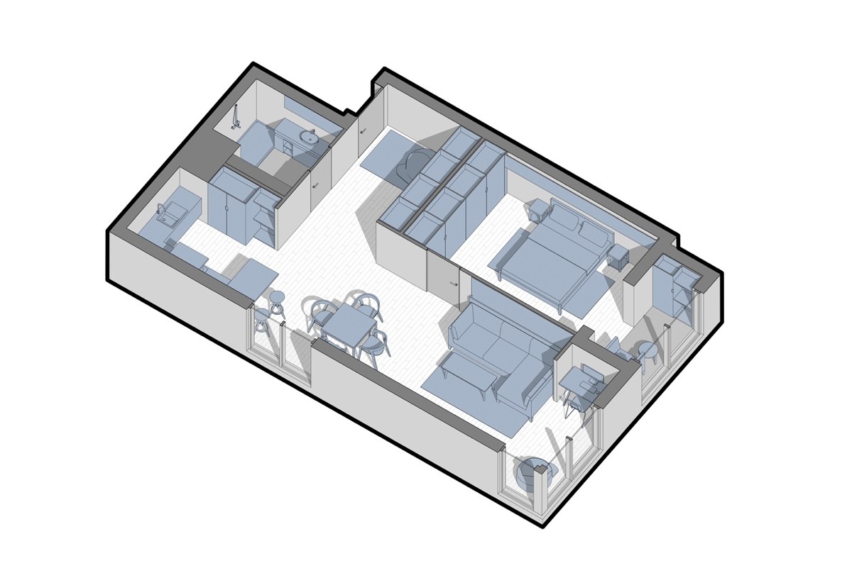
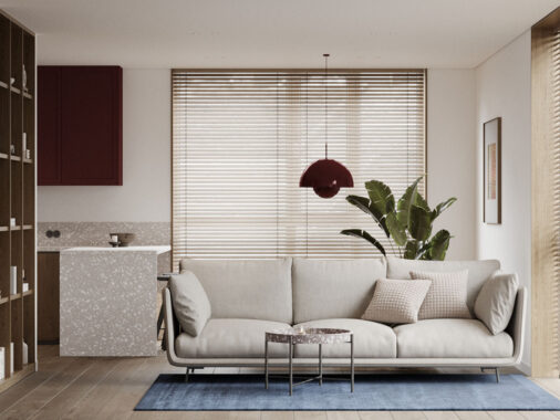
This apartment concept was designed with a young couple in mind. This one is actually a little smaller than the previous apartment at 65.5 square meters, but the linear open layout makes it feel even more spacious. The layout features the living room on one side, separated from the kitchen by a small counter that conceals a dining table on its other side.
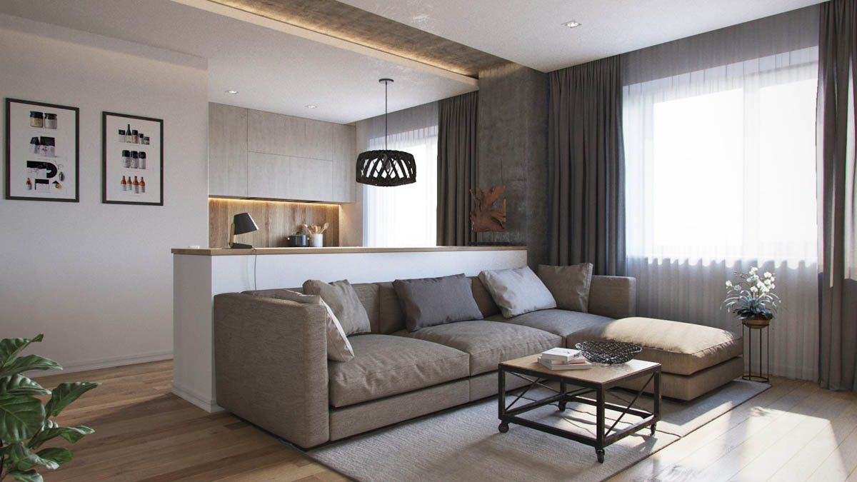
While the theme mostly relies on earthy neutrals and warm wood to weave a natural aesthetic, the occasional concrete accent lends a touch of urban industrial flavor.
