Did you ever think that an apartment of tiny size can't pack a big style punch? Well, you're wrong. These three are all under 50 square meters but are stylish and thoughtfully designed. There are many different ways to make a small space feel larger. To begin, you may want to have a space have multiple uses. An example would be a wall which can hold a T.V. and hold a desk for an office. You can also use vertical storage instead of laying everything on the ground. After moving around furniture and looking at layouts, you’ll be ready to make a small space look massive!
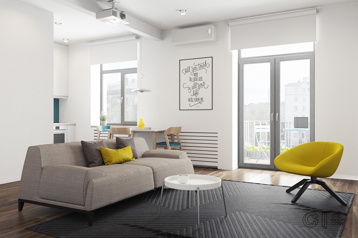
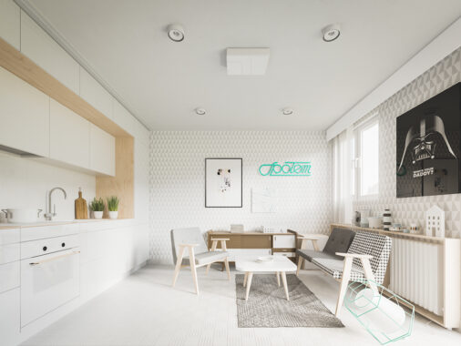
This bright and tiny apartment is located in Kyiv, Ukraine. Visualized by The Goort, this home is only 48 square meters.
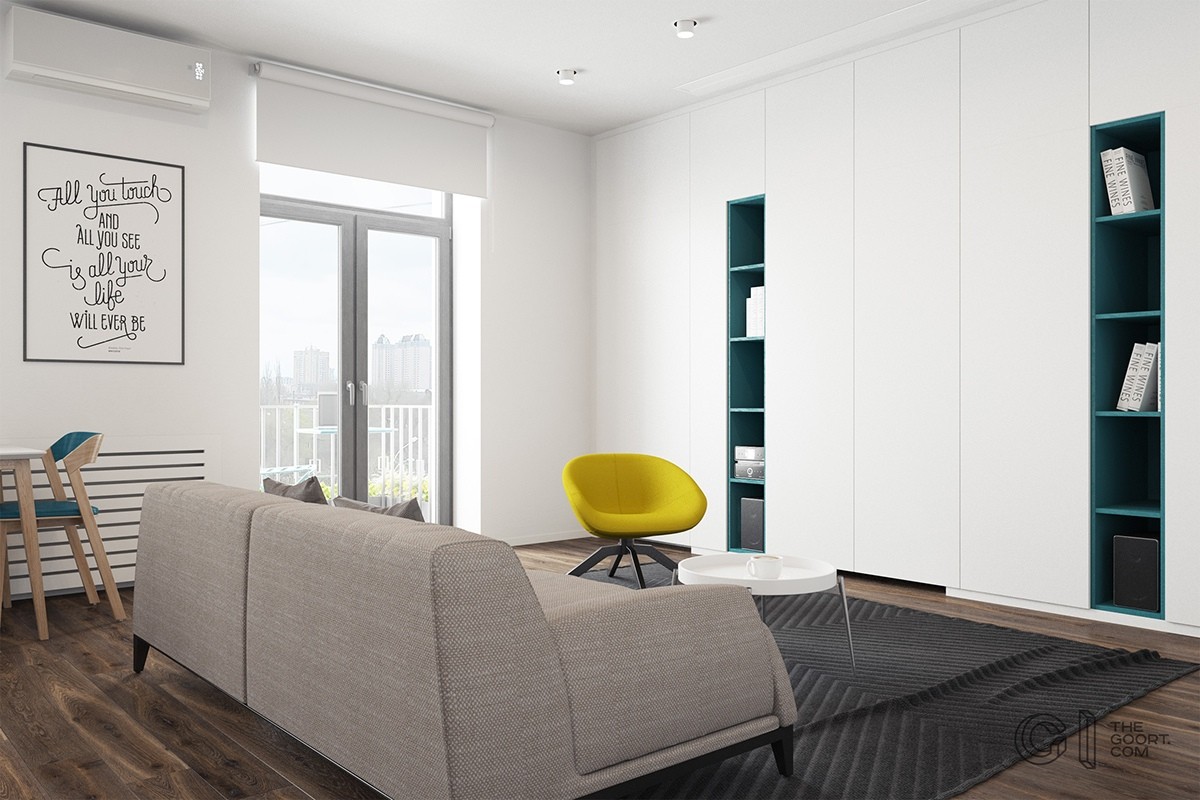
This is one of the simplest ways to enjoy this multi-use room. The wall in the back, where the couch faces, has white storage closets and teal bookcases. It looks sleek and simple in this photo.
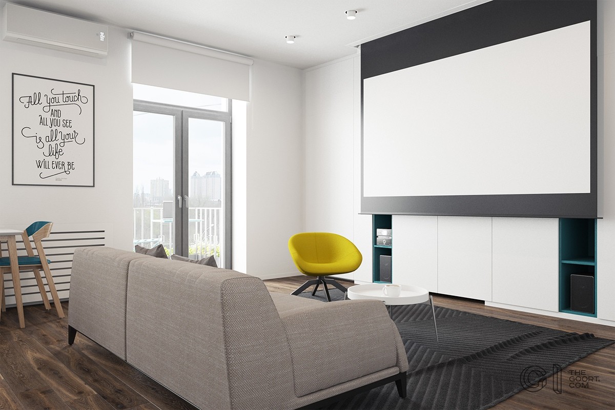
The designer makes the most of the space by having it serve different purposes. Here, a screen comes down from the ceiling. Movies and games can be projected onto this screen. Once you're done using it, put it away to save space!
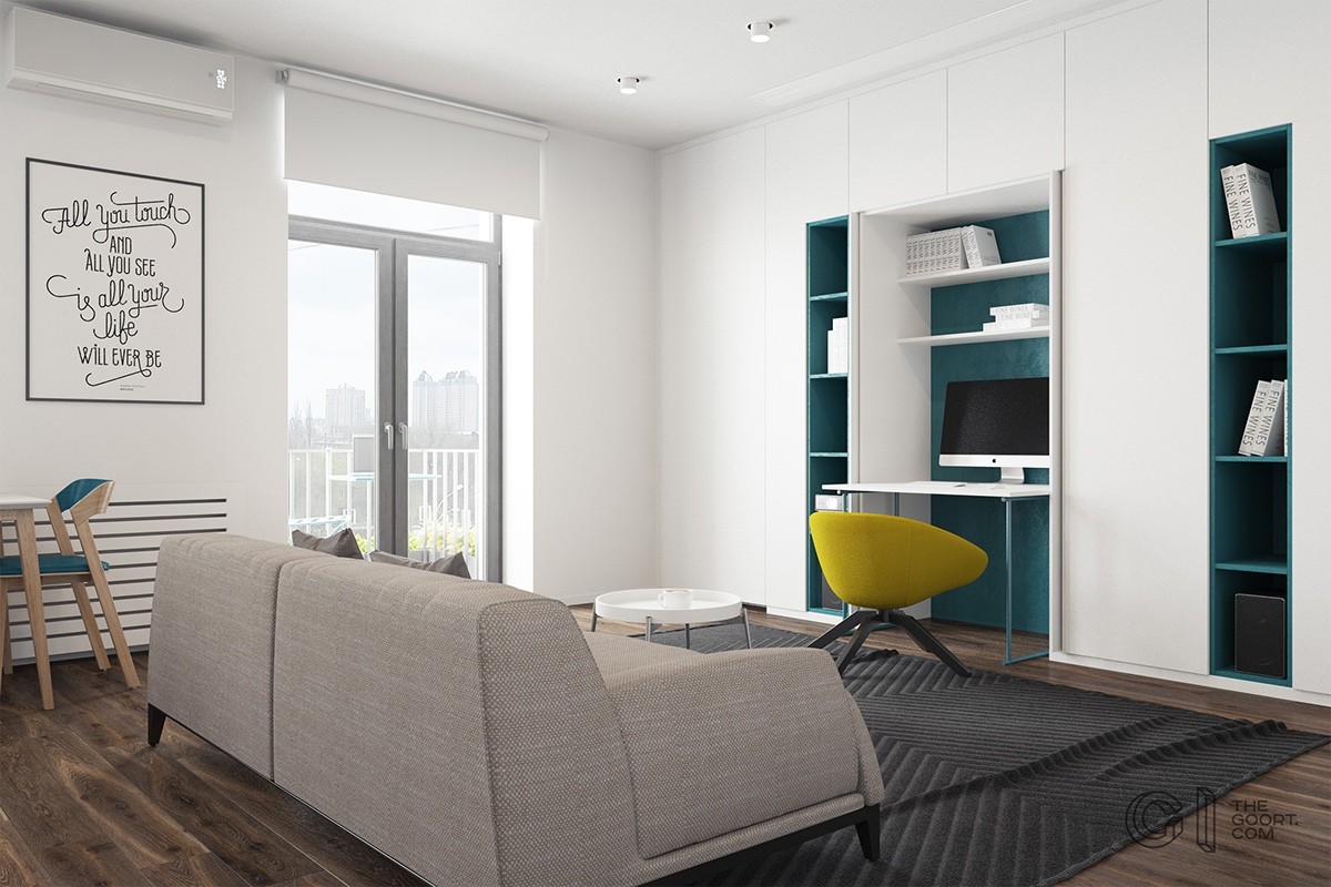
If you're not watching TV or enjoying the simplicity of the space you can move the closet to reveal an in-home office! The teal blue background compliments the yellow accents and makes the surprise more stylish! The yellow side chair can be moved to be an office chair in seconds.
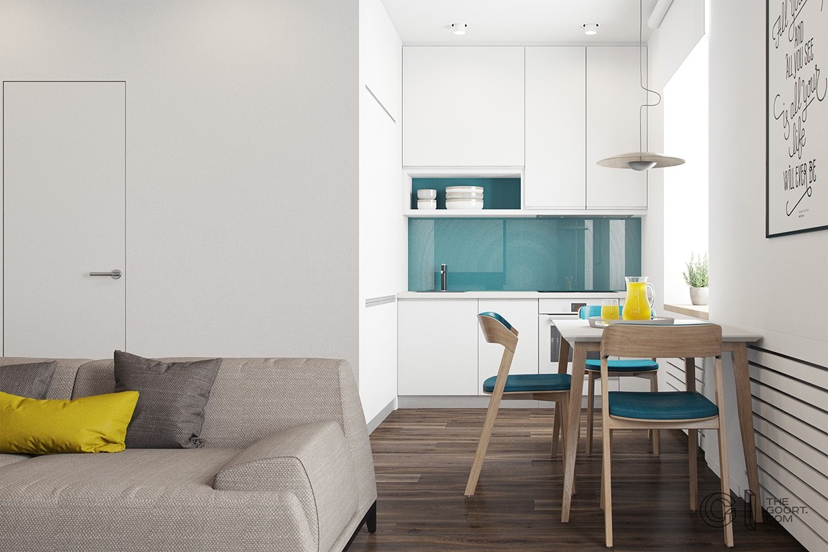
A peek around the corner of this tiny apartment reveals a cute kitchen. The teal backsplash matches the inside of the living room office. The small dinette chairs also match.
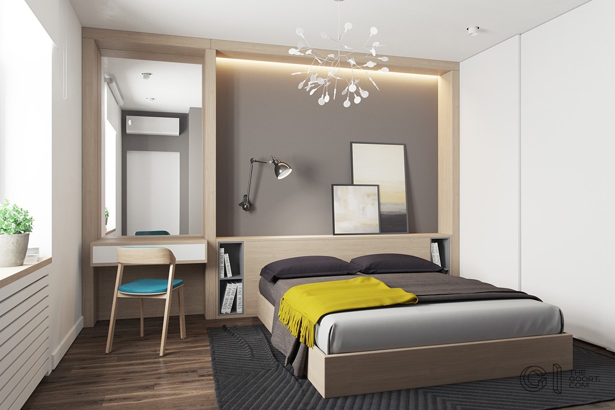
Tall ceilings in this small apartment are highlighted by lighting behind the built-in headboard. The room feels bright and full of color, even though there is only one yellow throw and a blue chair. This is proof that sometimes less is more.
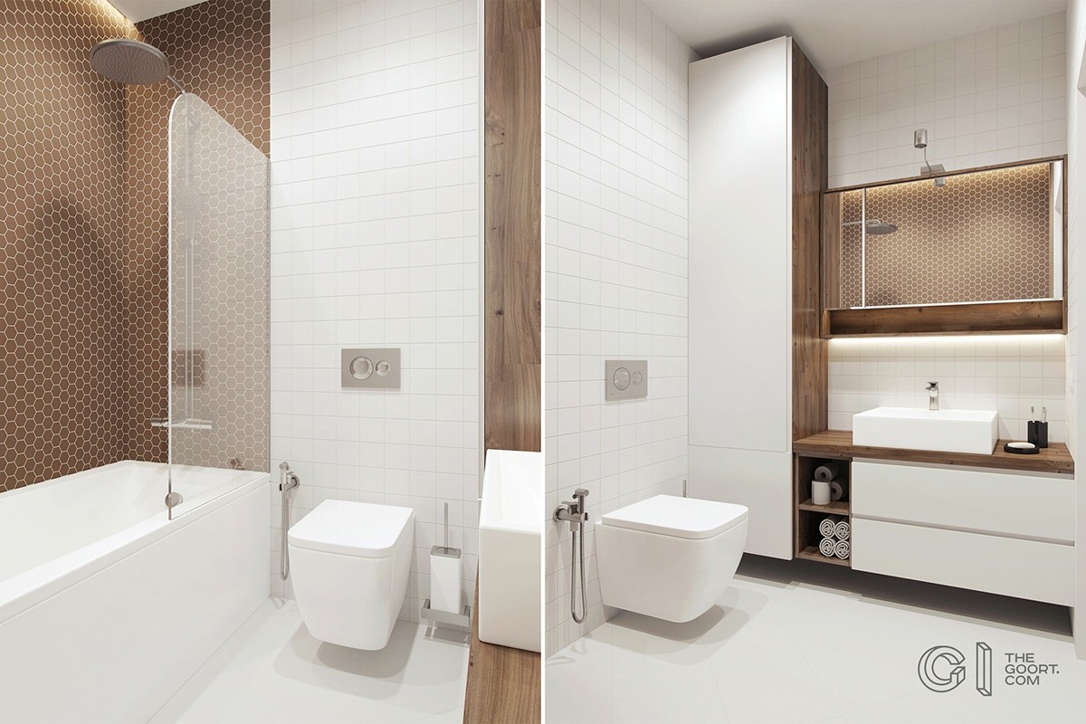
Surprisingly, the bathroom has brown as an accent. The toilet and tile behind it are white but the rest of the room has brown accents. This gives the space an open feel and doesn't overdo the teal and yellow.
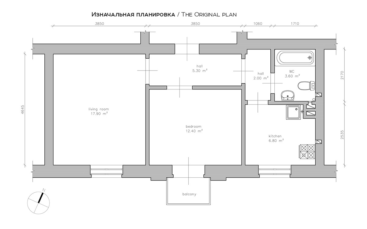
The original floor plan of this small home was awkward and didn't flow well. When you walked in the front door you walked into a closed off hallway. The kitchen and living room were separated by the bedroom.
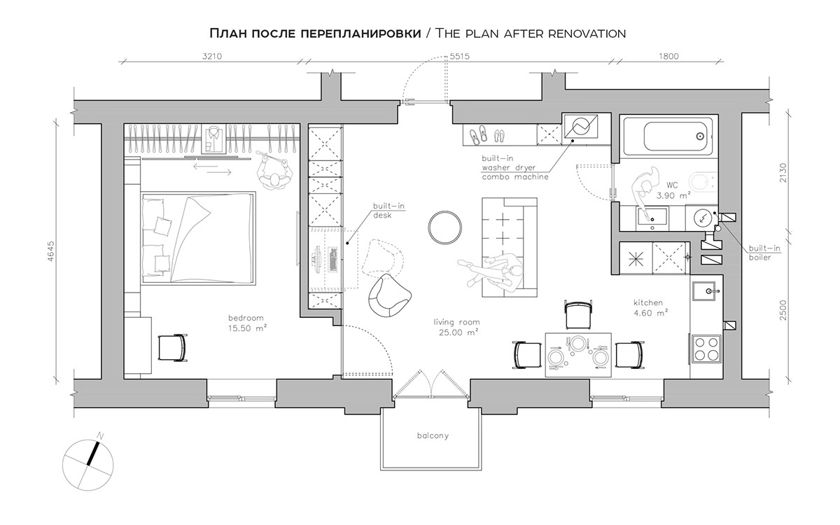
The revised floor plan made the most of the space. Now, when you walk into the home you are walking into the living room. This is open and makes the space feel bigger. The bedroom has more privacy being in one corner of the home instead of in the middle.
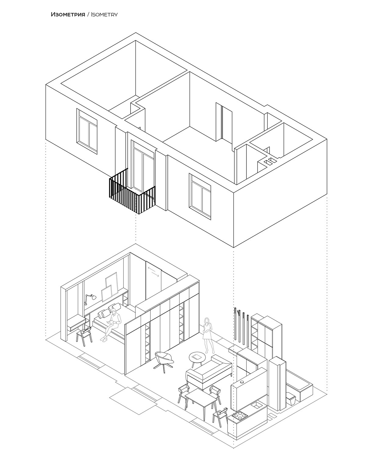
Another great aspect of having the bedroom on one side is that the balcony is central to the living room and can be accessed from the main living space and not just the bedroom. This is good for entertaining. By moving the bedroom, the kitchen looks larger too.
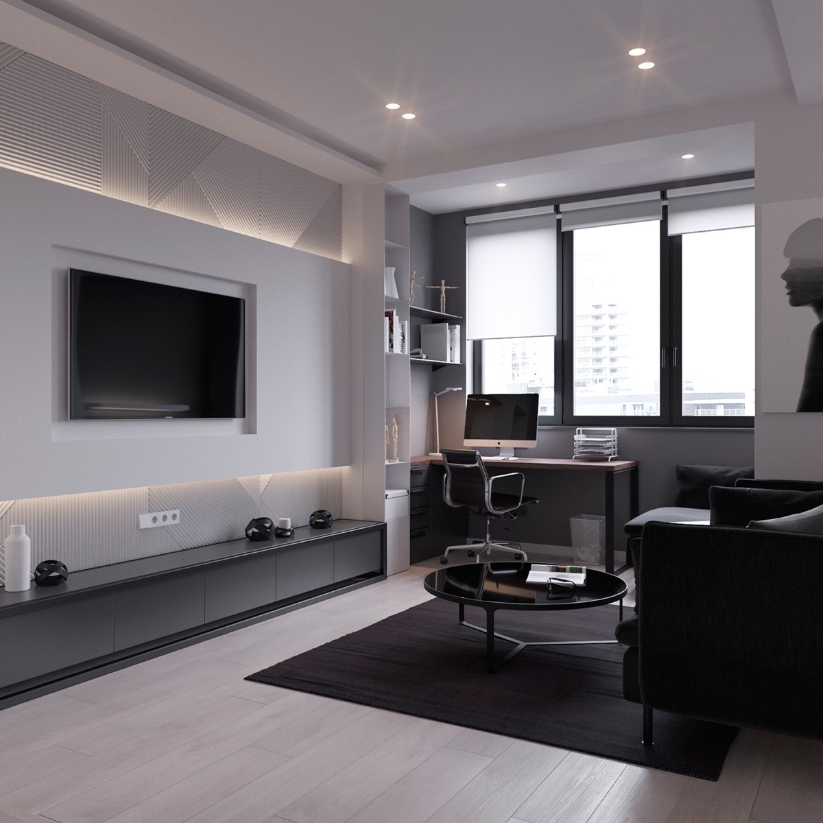
This apartment is much more moody and masculine than the first. Visualized by Maxim Nizovkin, this home is only 45 square meters!
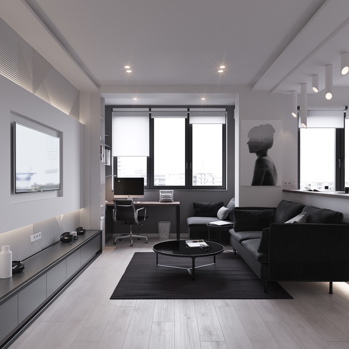
Blacks, grays, and whites are the only colors you see when you look at this Moscow apartment. In contrast to the darkness and masculinity, there is a photograph of a woman on the wall as the centerpiece. Although it brings a womanly touch to the room, it, too, is black and white.
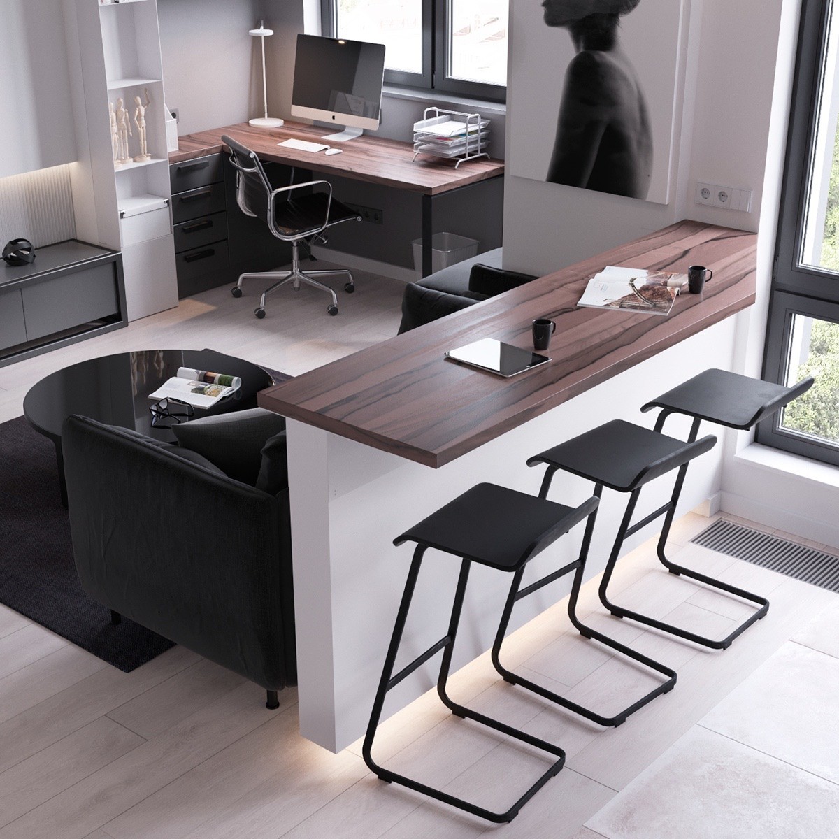
A wooden countertop with barstools adds more seating for the living room and also opens the space up. The countertop is the same wood as the desk, which brings some consistency to the space.
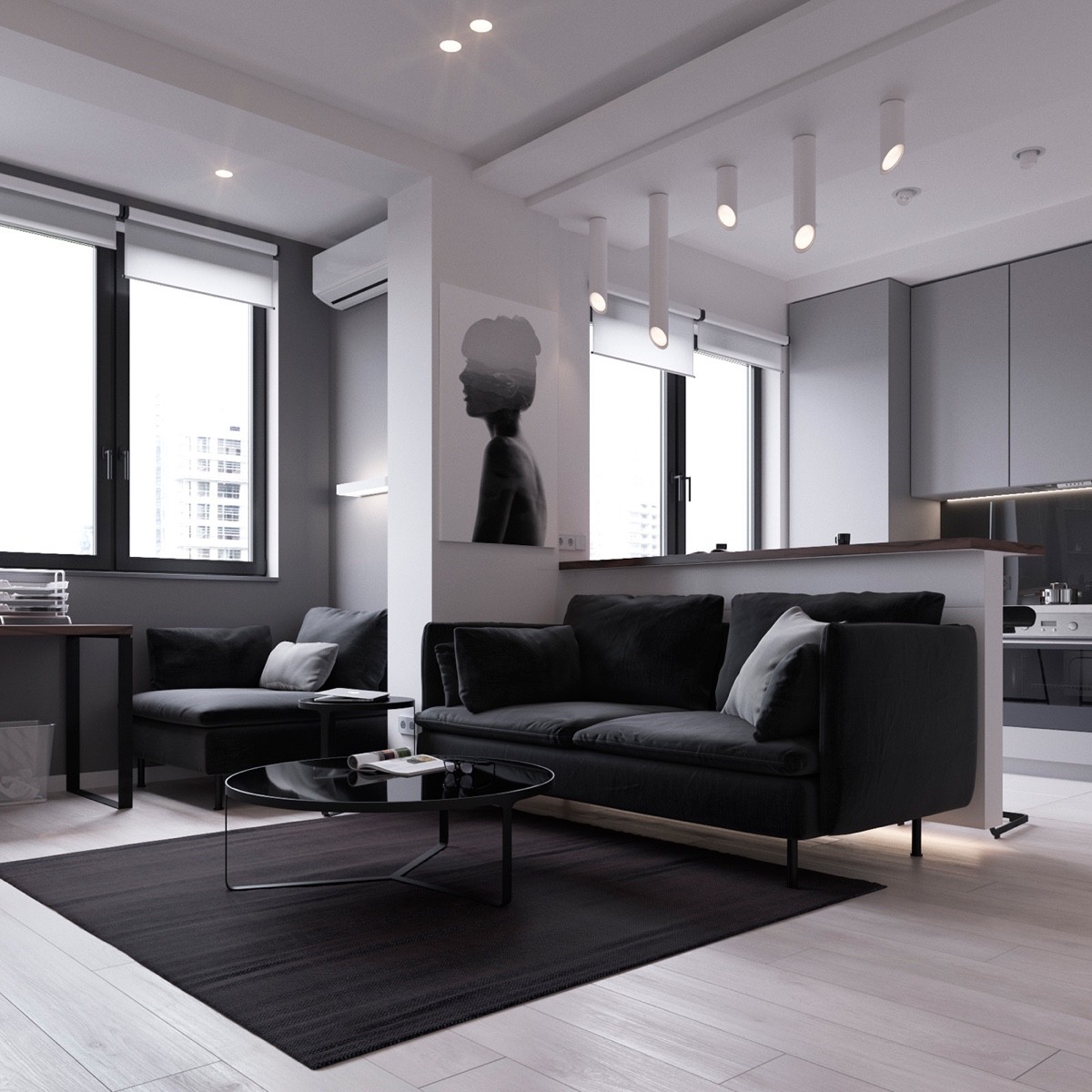
Even though the apartment is made up of straight lines and shadows, there are elongated tubular lights hanging from the ceiling. These lights hang at different heights and are unique to the room.
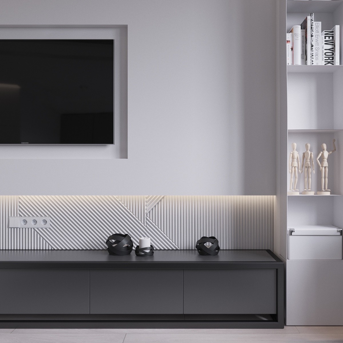
Limiting the amount of accents make the ones that are included have more authority in the small apartment. Sketch figurines and black candle holders are simple, yet elegant.
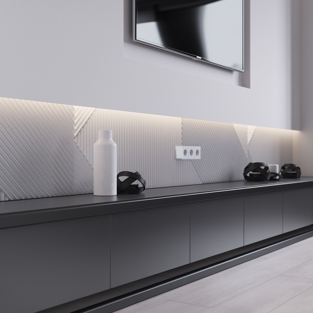
The fun texture below the mounted T.V. is showcased with lighting. This makes the items on display feel as if they are extra special. A white vase breaks up the darkness of the candle holders.
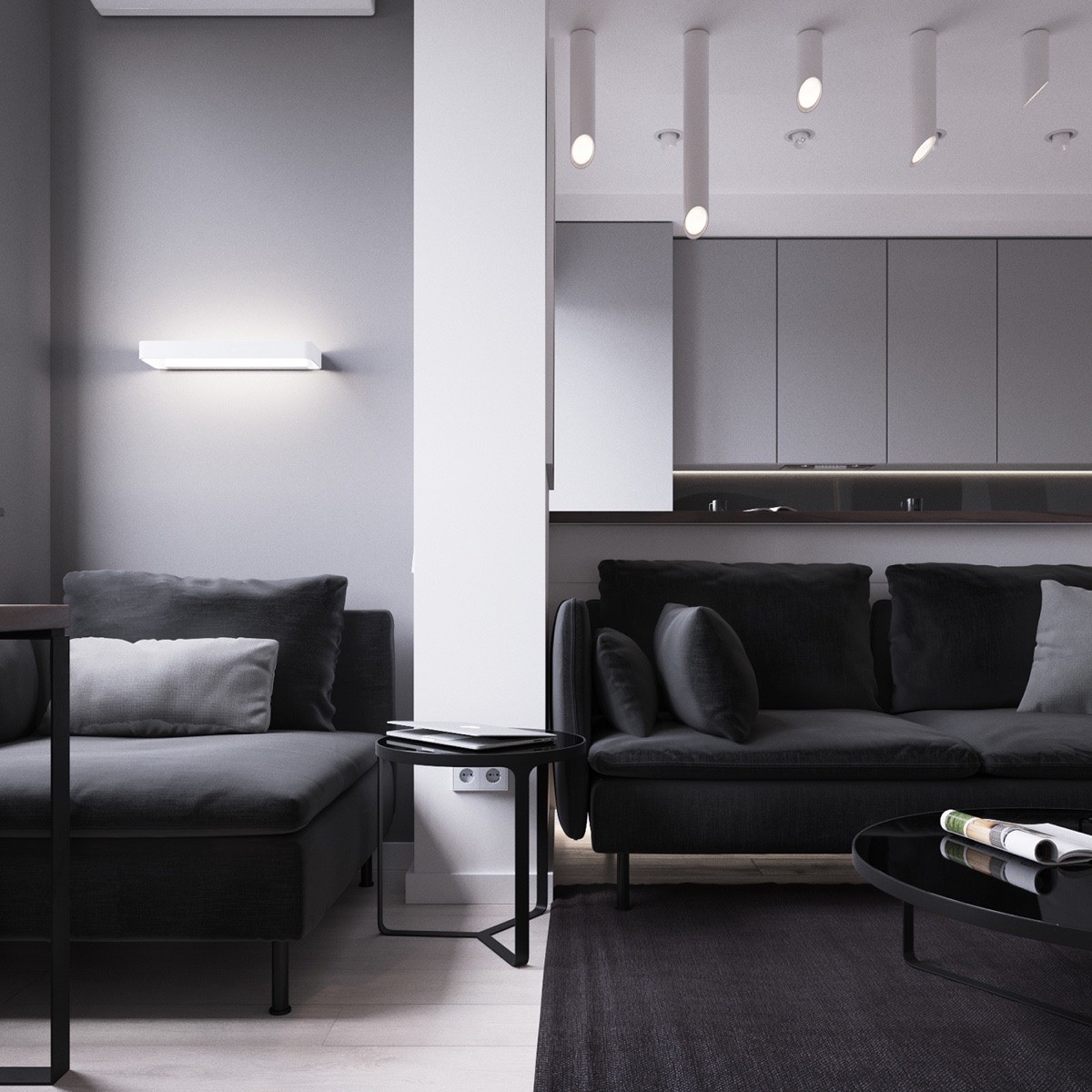
By matching the couch and chaise lounge chair, the designer makes the furniture appear to be attached visually. This keeps the room from looking cluttered.
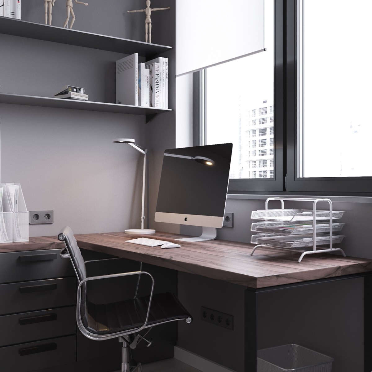
A home office has everything needed to get work done. Facing the window, this space is one of the main "zones" in the small apartment. When not in use, the chair can be swiveled around to offer extra seating in front of the television.
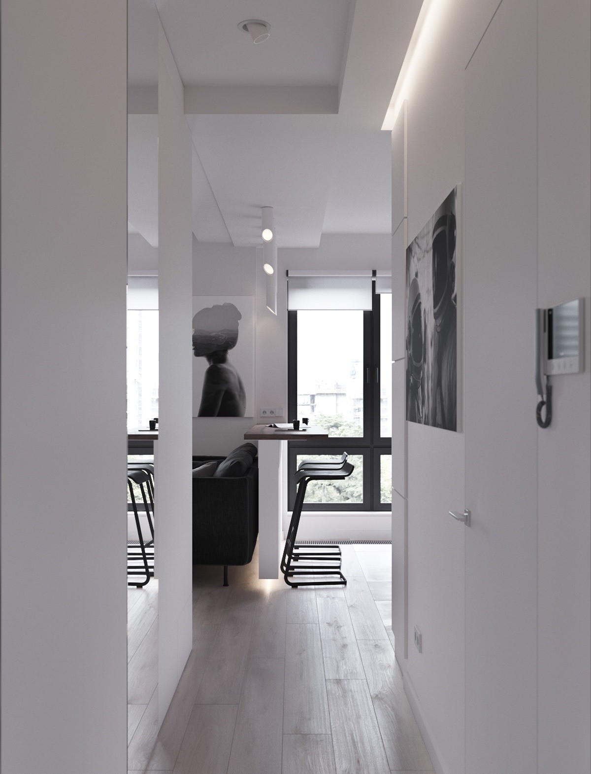
A white entryway draws attention to the mounted black and white photographs. There is a photograph of a woman, that defines the space, and a supporting image of two men in helmets.
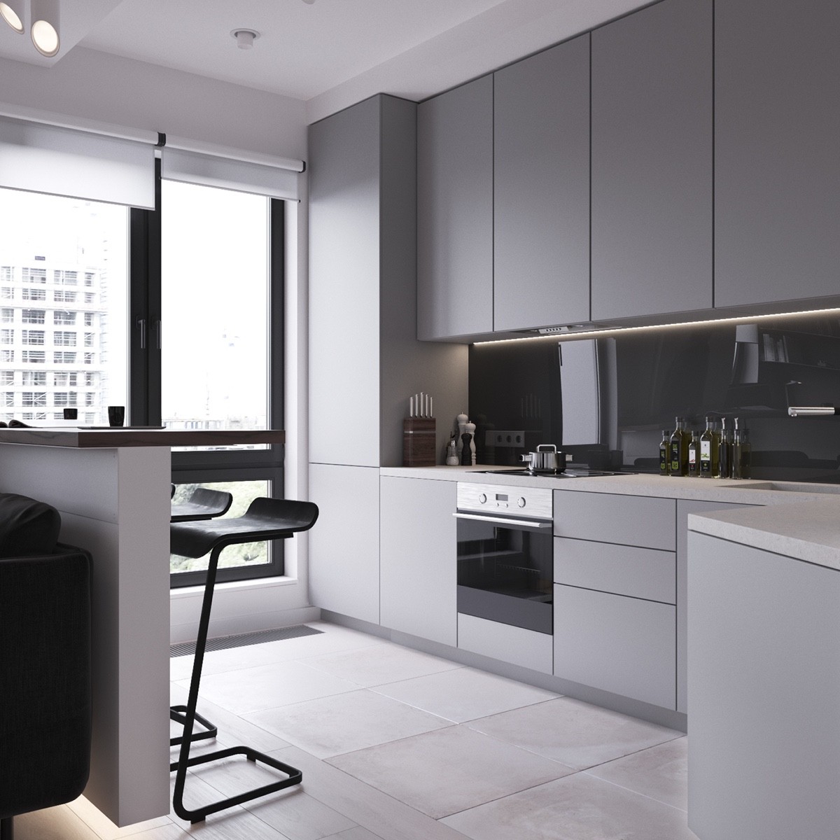
The kitchen is filled with lots of light thanks to the oversized windows. The black window outlines give a fun architectural tie-in to the black accents and dark gray cabinets of the apartment. A high gloss backsplash reflects the rest of the room.
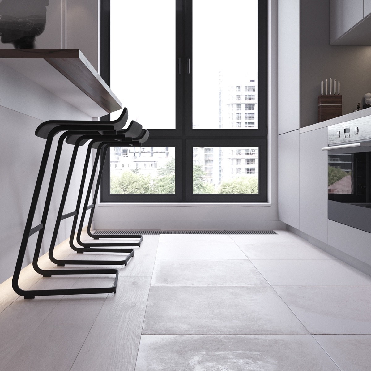
Black barstools make room for lots of guests and also offers a place to sit and enjoy a meal. The appliances in this apartment are tiny, but sleek and built-in with the rest of the kitchen.
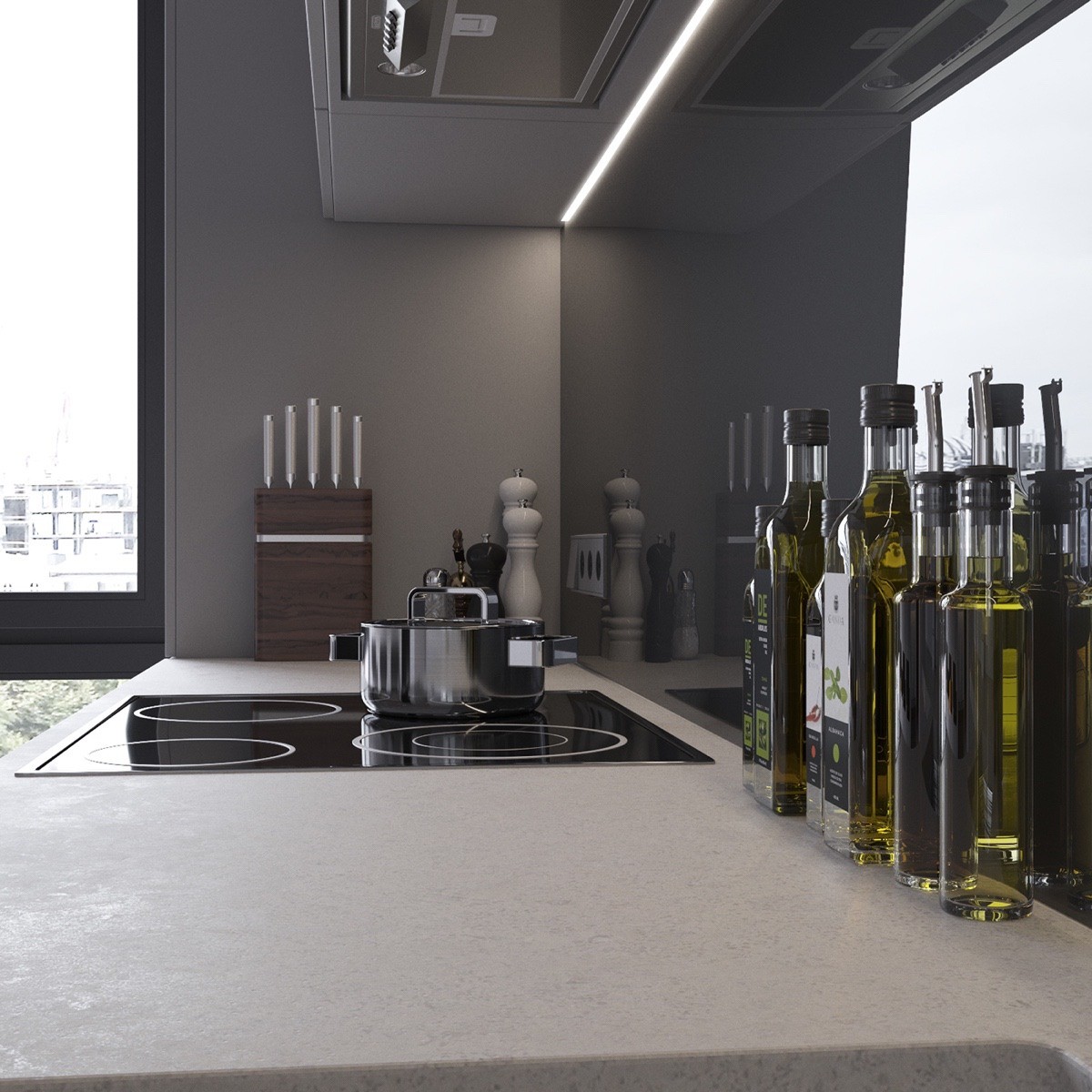
Interestingly enough the high gloss backsplash of the kitchen makes the space feel bigger. It doubles everything since it's mirrored and gives the illusion of more counter space.
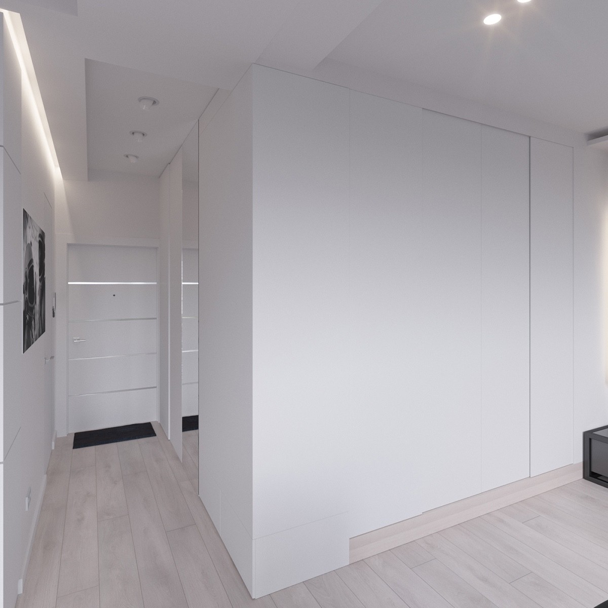
You wouldn't know a bedroom was hiding behind this large white wall in this Moscow apartment. Left to the entryway, your attention is brought to the kitchen and living room. You don't realize there's space that's hidden.
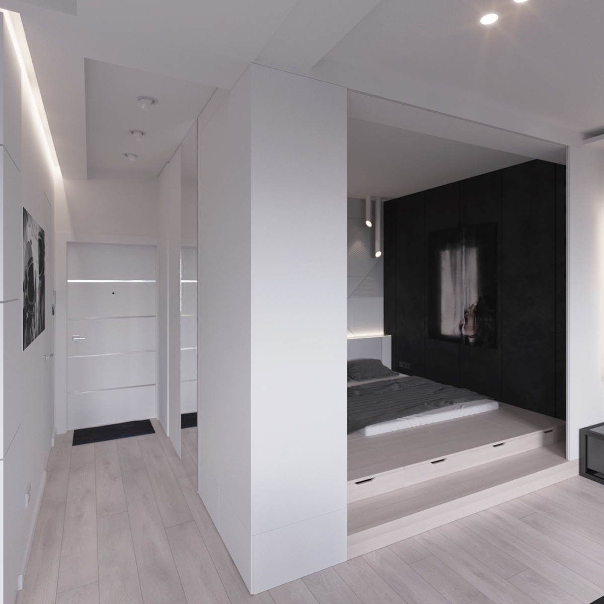
When the wall is pulled back there is a step up bedroom! The bed is placed in a platform, which makes the room seem larger. There are drawers built into the platform which is perfect for extra clothing.
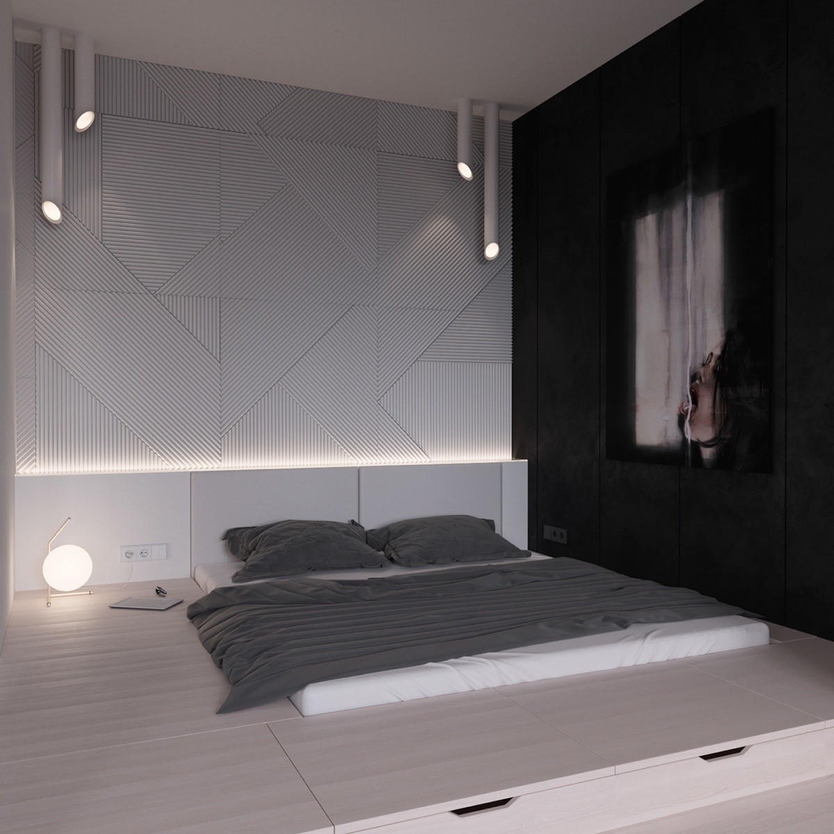
Both the tubular lights and the wall texture are repeated in this room along with the living room. Another feminine art piece, this time a painting, is hung in this room to combat the dark masculinity. Gray bedding is perfect and matches the rest of the home.
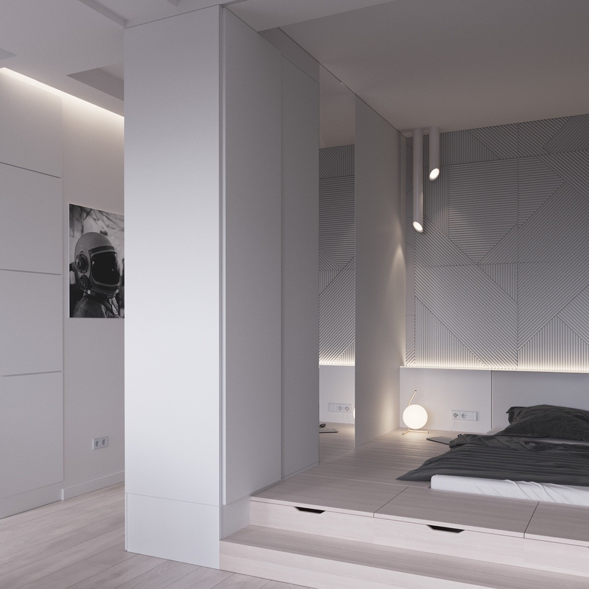
In this image you can see how the owner can close off the bedroom or keep it open when guests come. Sliding panels reveal the additional space and create privacy.
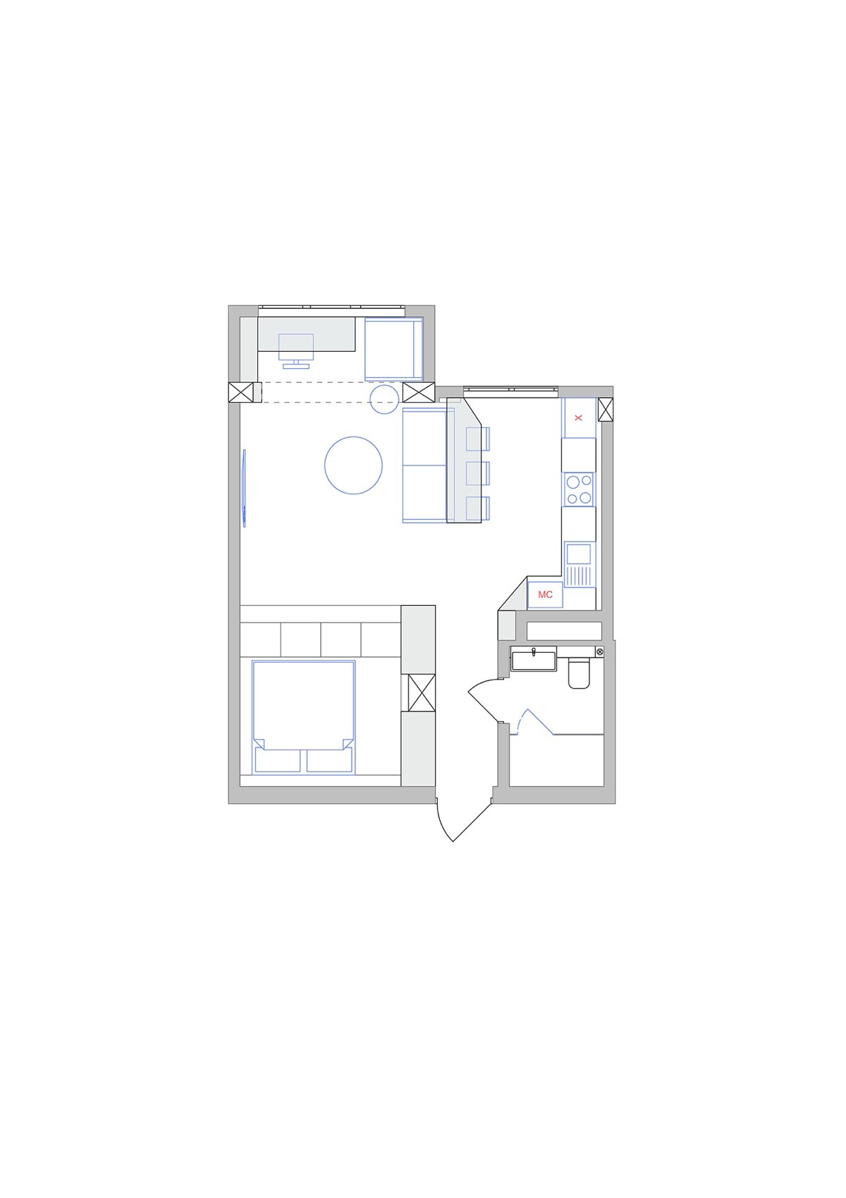
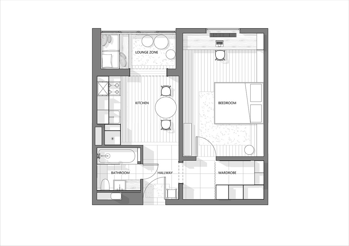
This floor plan shows how you would walk into the space and not realize there is a bedroom to your left. The bedroom is hidden until the panels are pulled back. This puts the focus on the main living spaces.
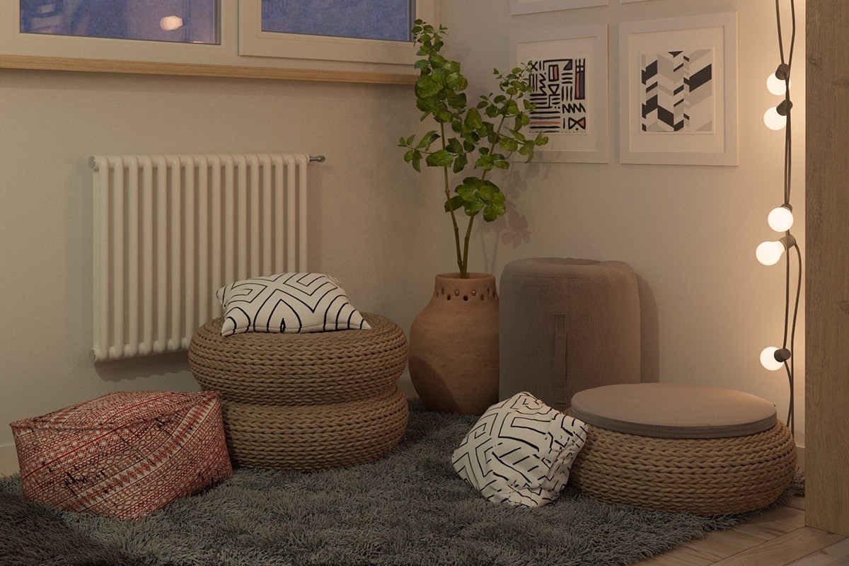
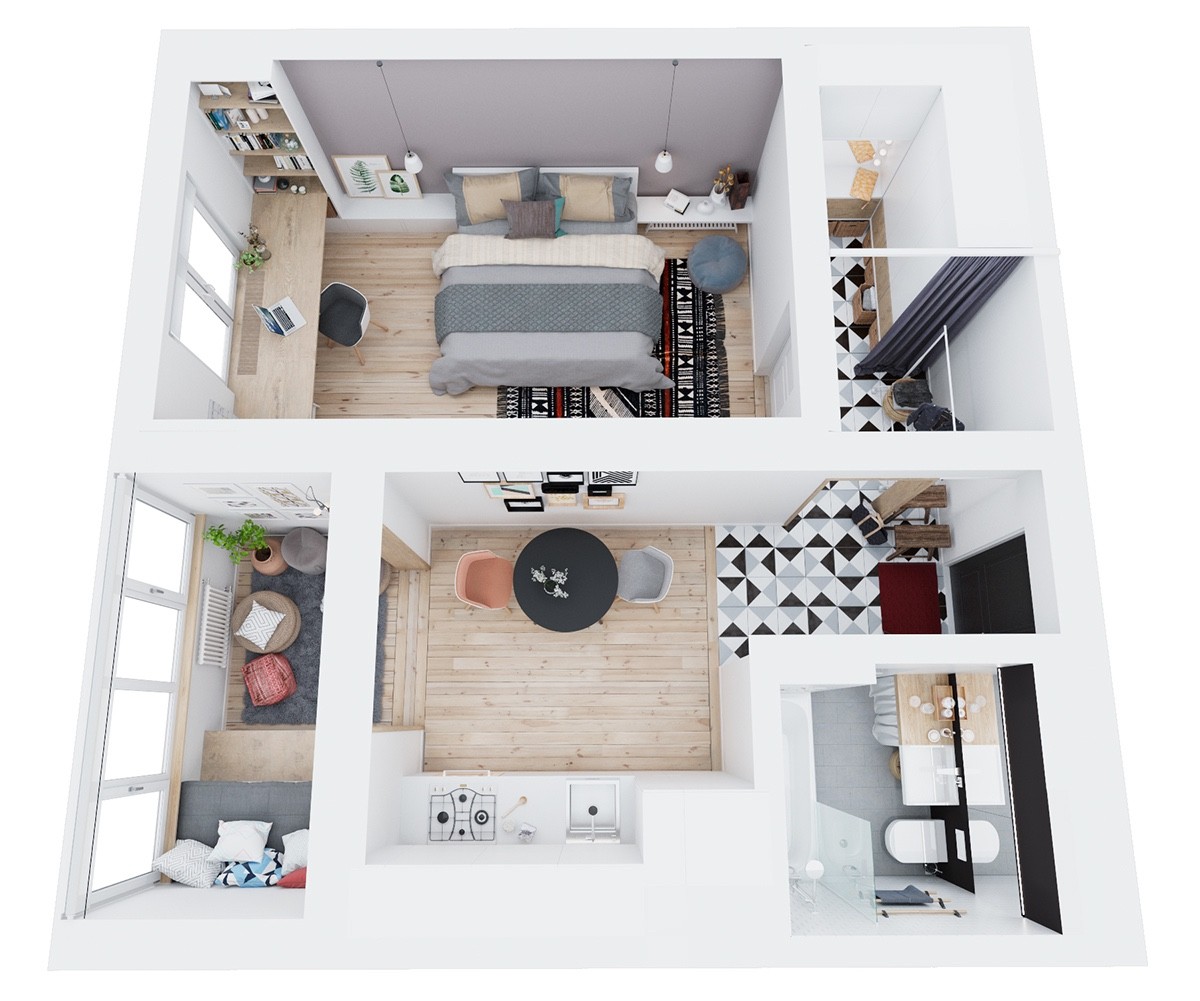
A cozy space is created in this small apartment which is create for a young couple. A thick rug is accented with pillows and low-to-the-ground seating.
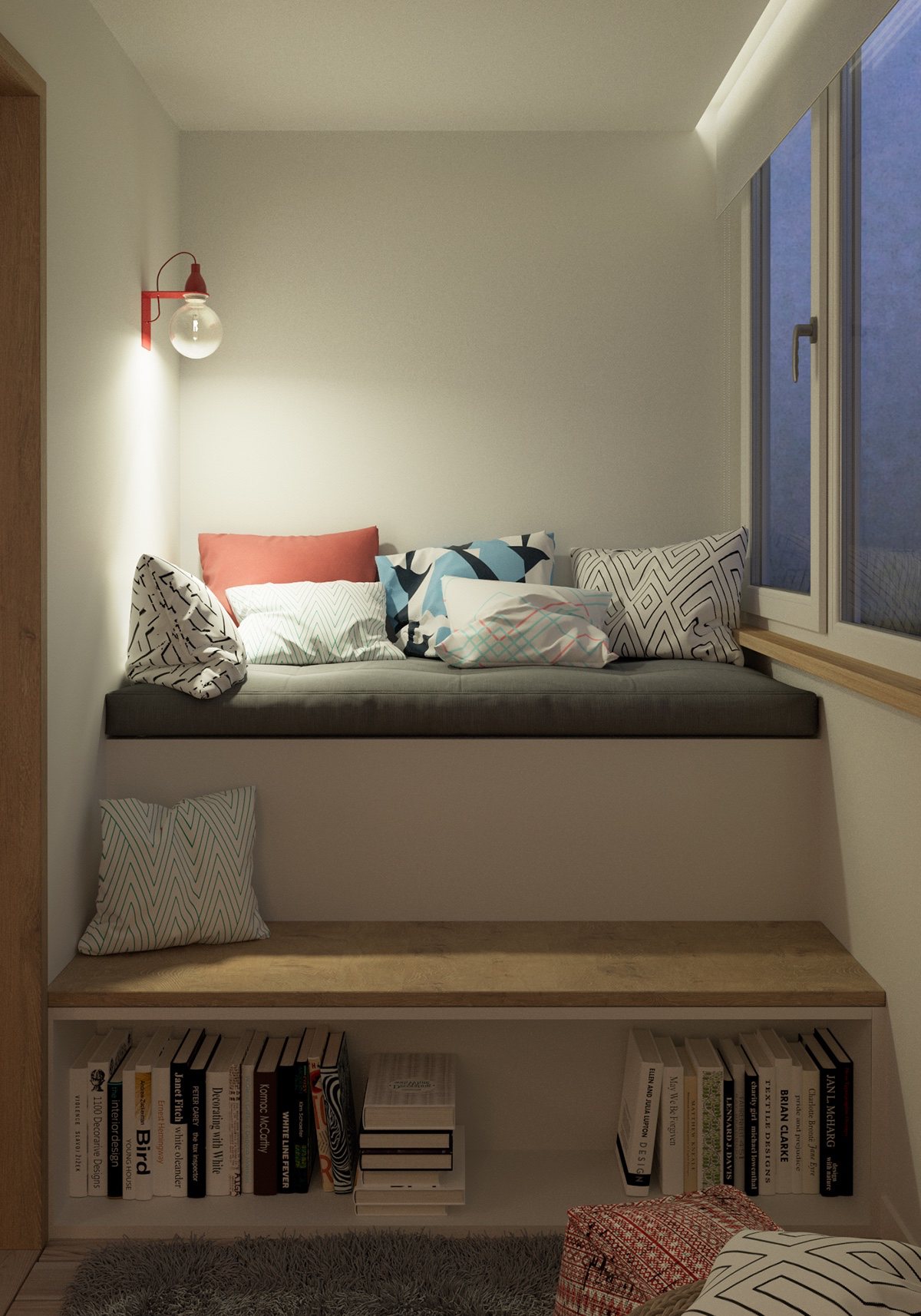
More nooks and crannies invite the homeowners to curl up with a good book. This window seat has coordinating pillows and a fun red reading light.
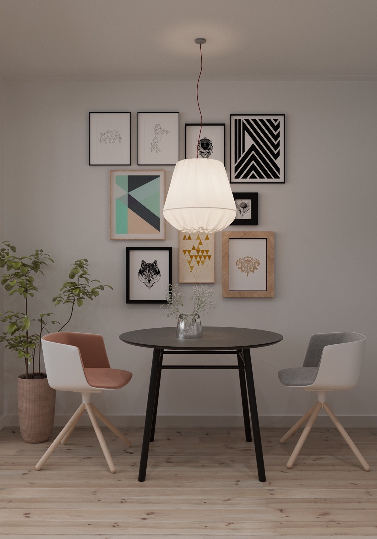
A gallery wall in a small space can be pulled off! These art prints are carefully hung behind a kitchen table and chairs. There's a good mix of white, pastels, and wood grain to keep the gallery from feeling too heavy.
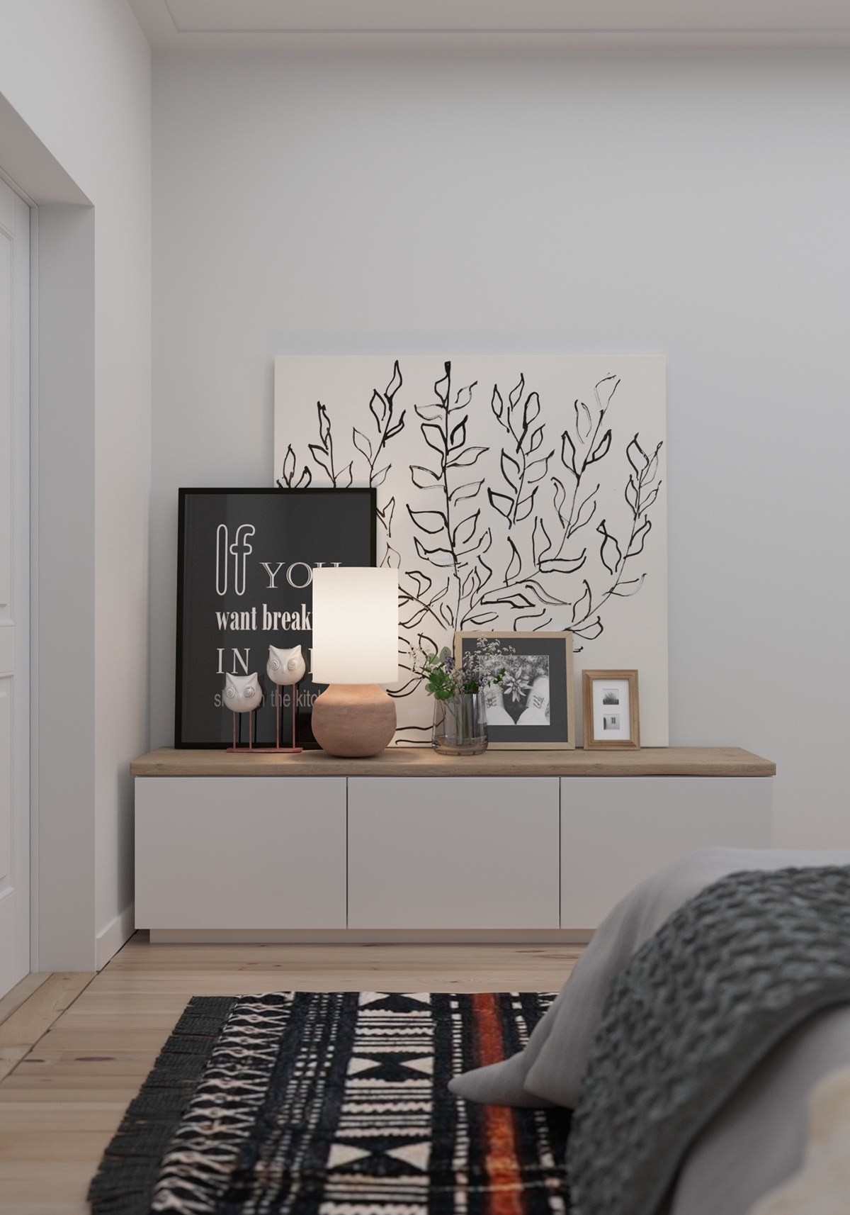
When decorating a small space, remember to add varying heights with art. These art pieces are varied and added on top of each other.
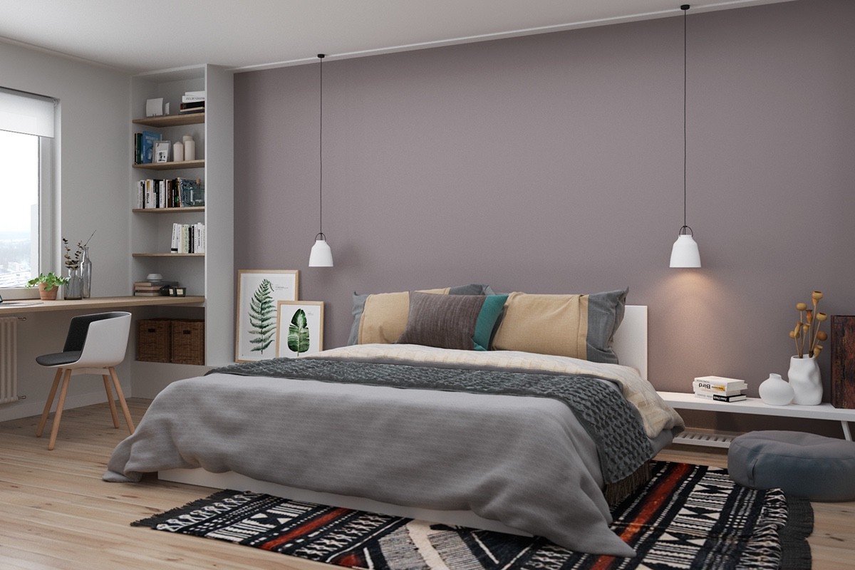
This bedroom has an accent wall behind the bed and a fun rug to anchor it all together. The ceilings appear larger because the bed is nearer to the floor and so are the other seating options. Built in shelving that raises to the ceiling exaggerates the height as well.
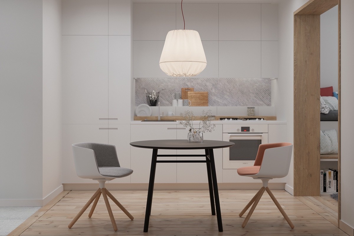
From the other angle of the kitchen table and chairs you can see into the kitchen. White cabinets hide clutter but a bamboo shelf holds most used items for accessibility.
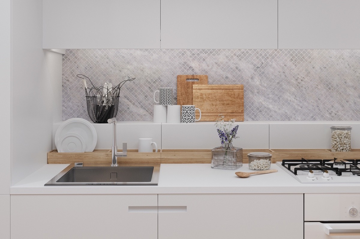
Don't be afraid to leave pretty dishes out! This adds personality to your home and helps it look lived in. The fun geometric mugs balance out the organic bamboo cutting boards perfectly.
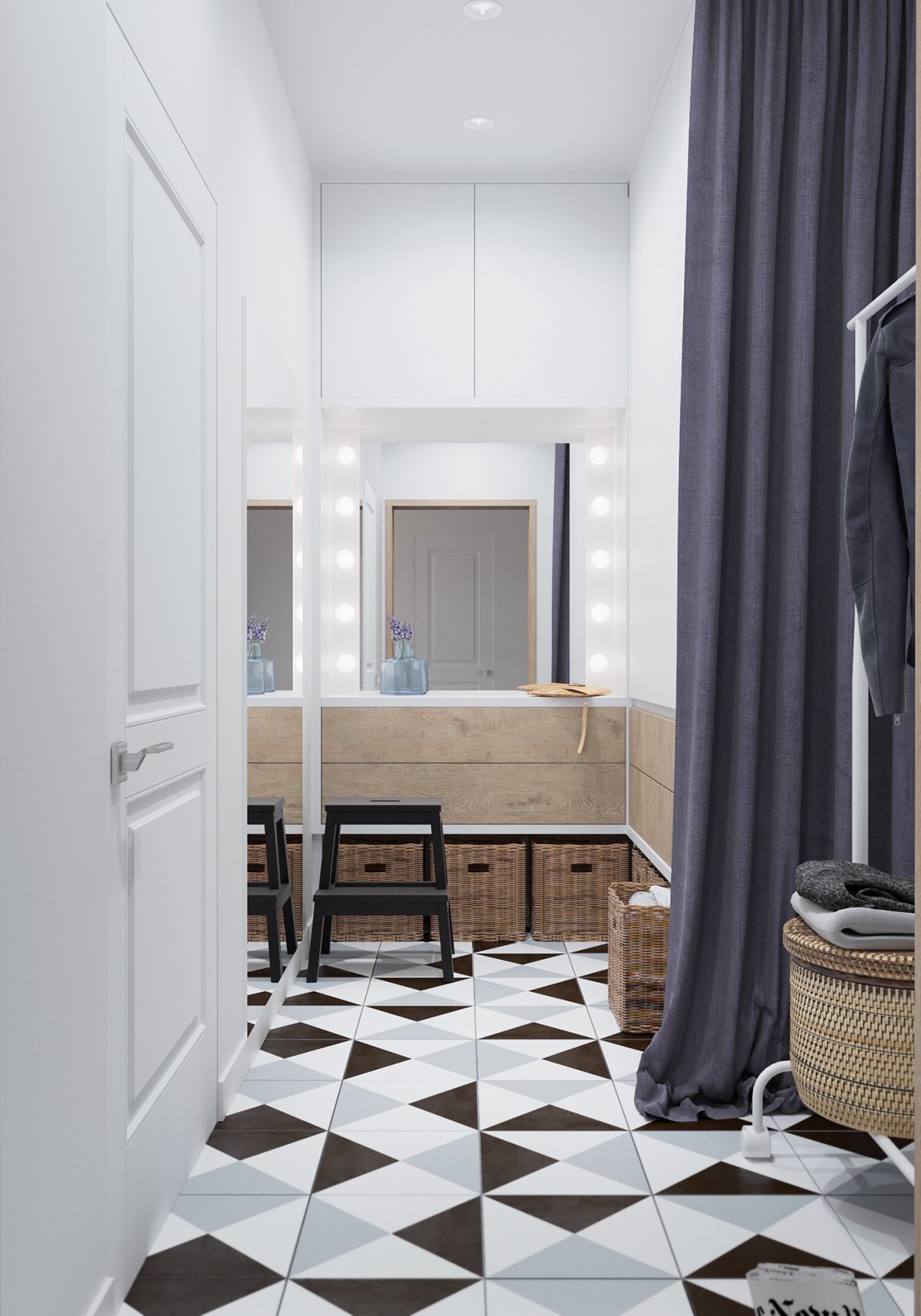
When you're in a small space sometimes there isn't a lot of closet space. Even if that isn't the case in this home, there is an entire extra wardrobe room! A large mirror lets the homeowner get ready quickly. Large baskets keep seasonal clothing organized and put away.
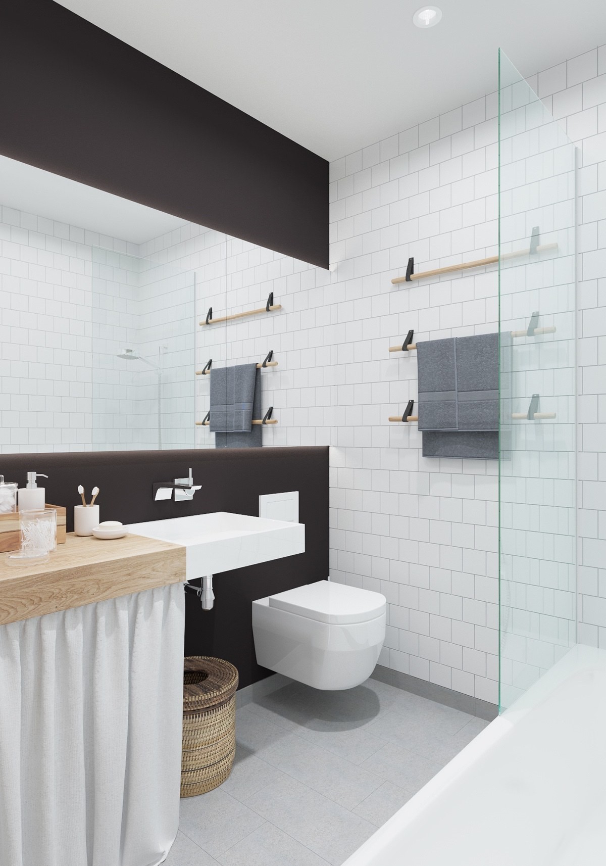
The bathroom in this home is peaceful. White tile and a woven trash basket make this space feel relaxed and serene. When you have a small space, sometimes it's best to keep the bathroom simple.

