Of all the accent colors you can choose for an interior, red stands above the rest as an especially bold and daring choice. Red is a color that invokes a wide range of expression depending on context – passion, action, emotion, luxury, and so many others depending on context and atmosphere. The visualizations below showcase three homes that use red as a central theme. And each one chooses a different approach! Whether you’re looking for red accent inspiration or want to integrate red as a primary part of your home décor palette, these spaces might spark some ideas you can use along the way.

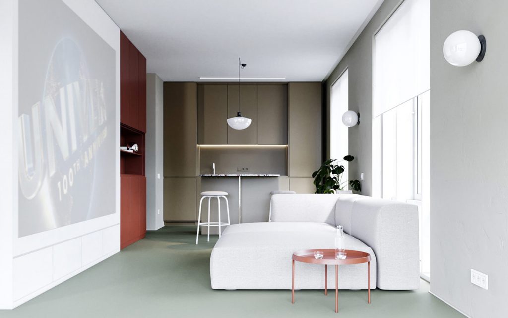
Let’s start with an interior visualized for a residential project in Kiev. The goal was to conceptualize an interior where every object proves worthy of attention. And what better way than to choose a distinctive color palette? This space starts with floors in a muted olive green, a choice that makes every red accent pop.
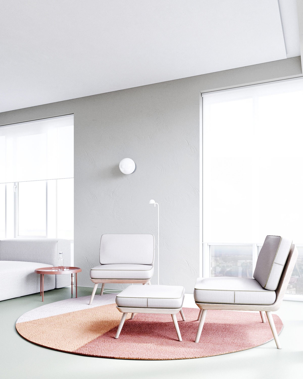
The living room is split between two seating areas – a sofa, and this handsome seating arrangement centered over a red and orange circular rug. Rounded edges serve as a recurring motif throughout the interior.
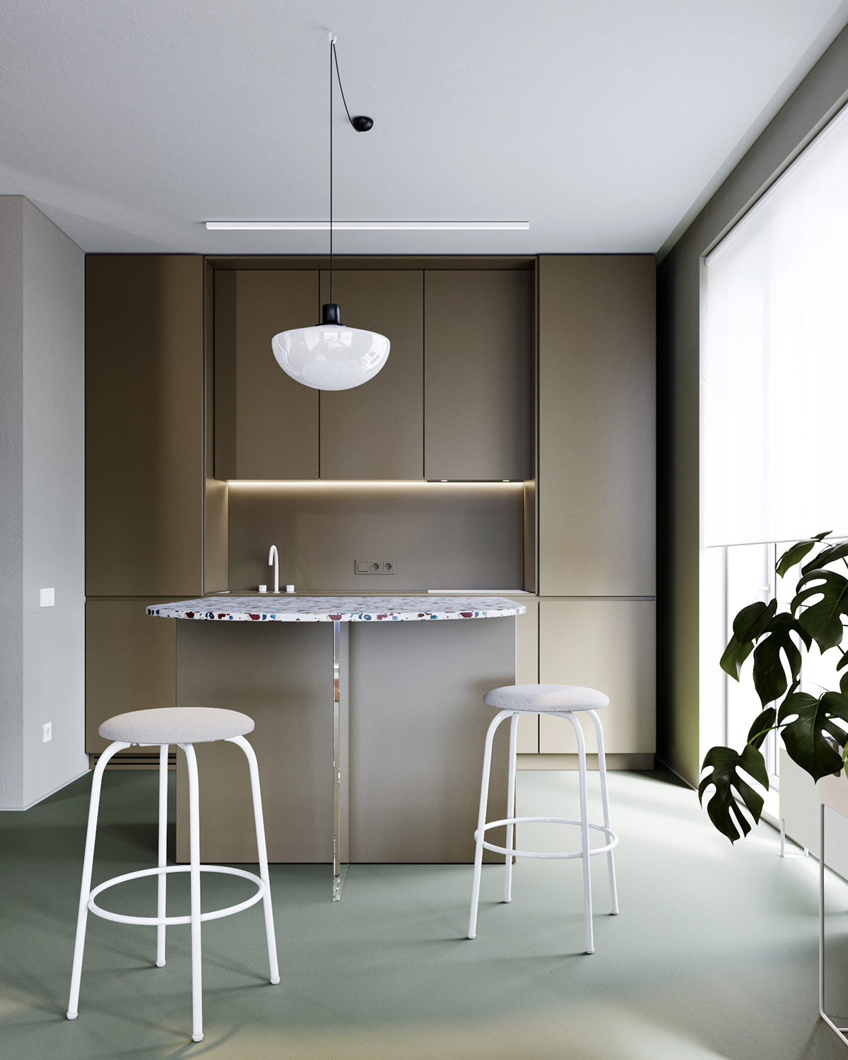
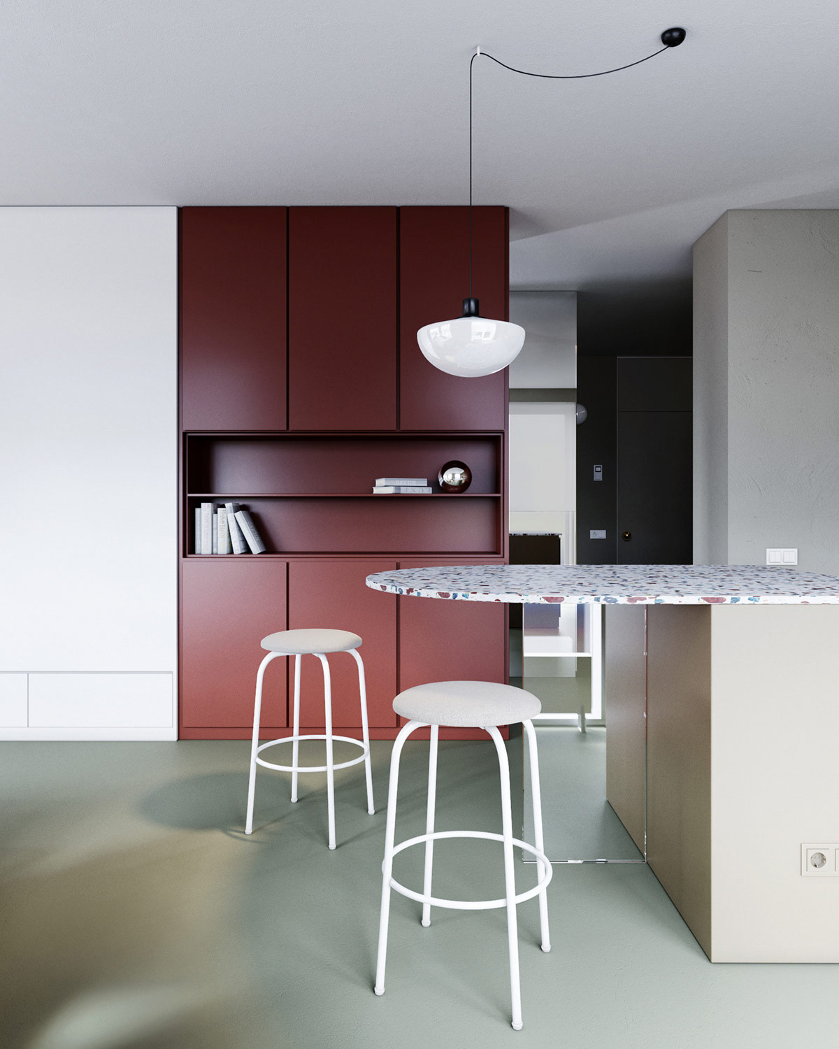
While bold colors grace the major architectural elements, primary furniture pieces relish the sleek simplicity of white. These handsome kitchen bar stools are a great example – this model is the Afteroom Stool produced for MENU.
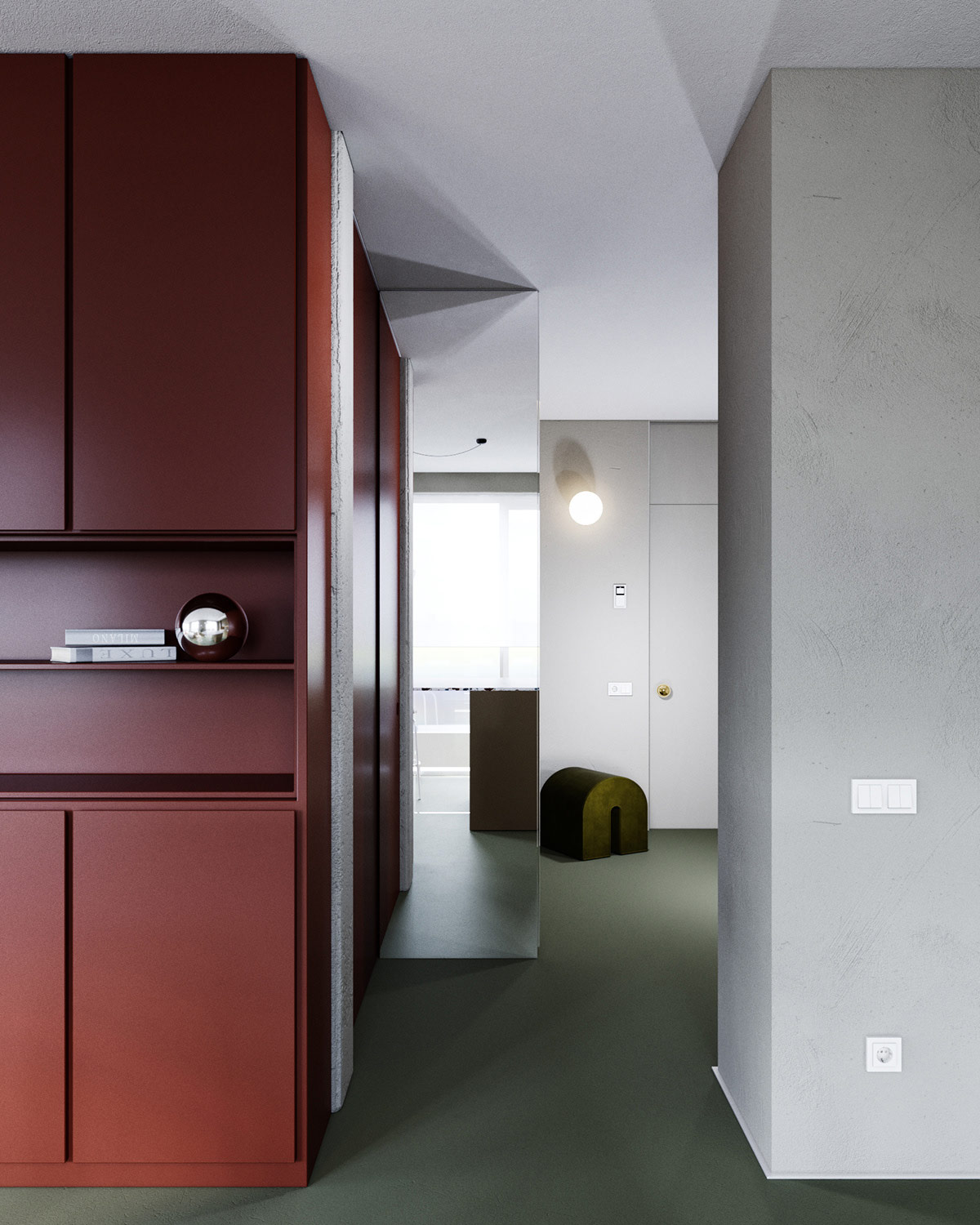
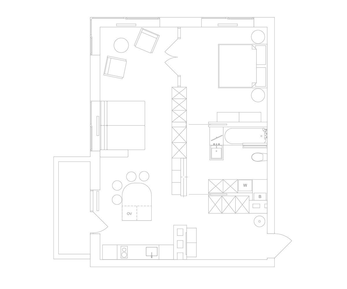
While you may notice the rounded accents immediately, the apartment itself is laid out in a circular arrangement as well. This bold red cabinetry frames the door leading to the private areas of the home.
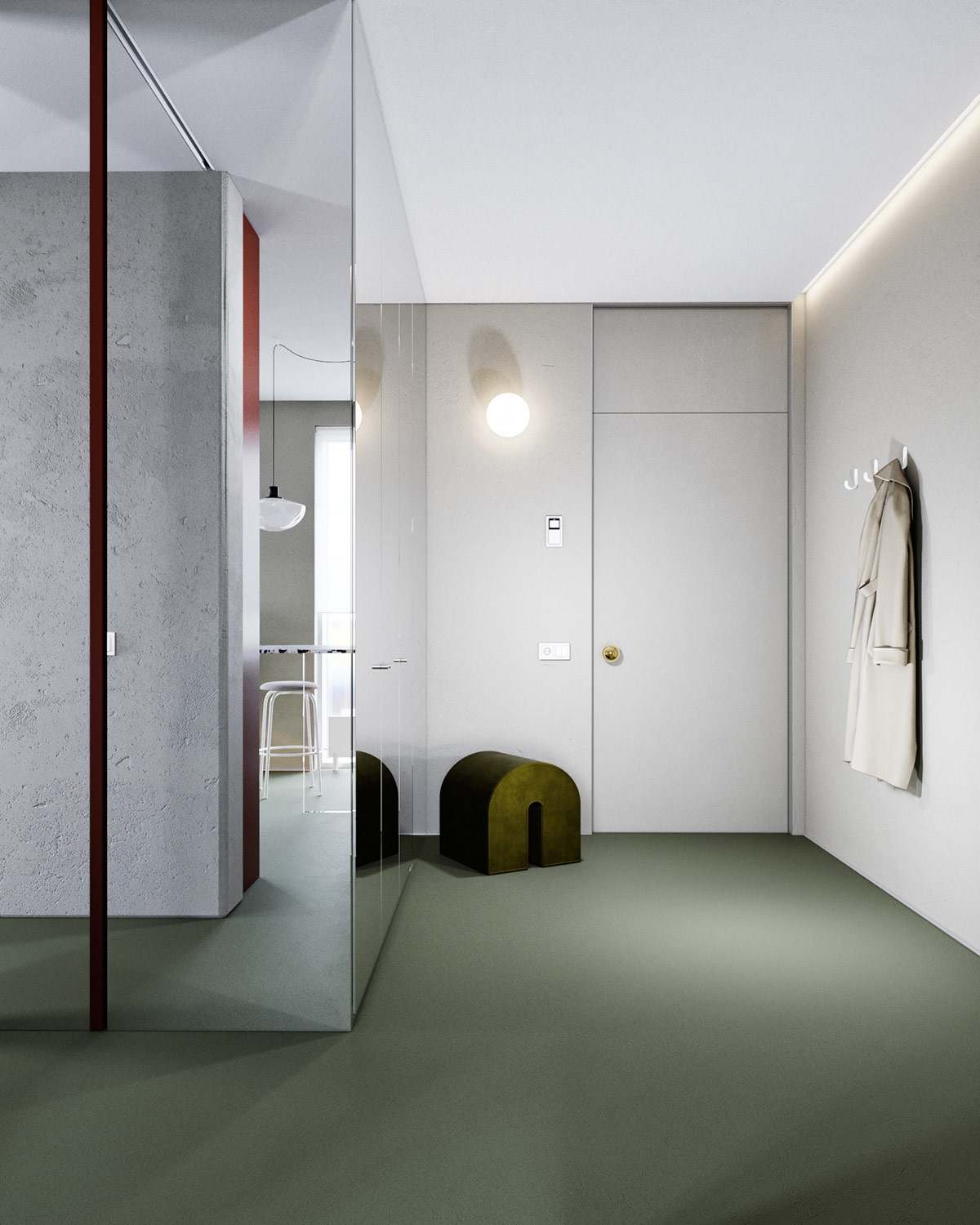
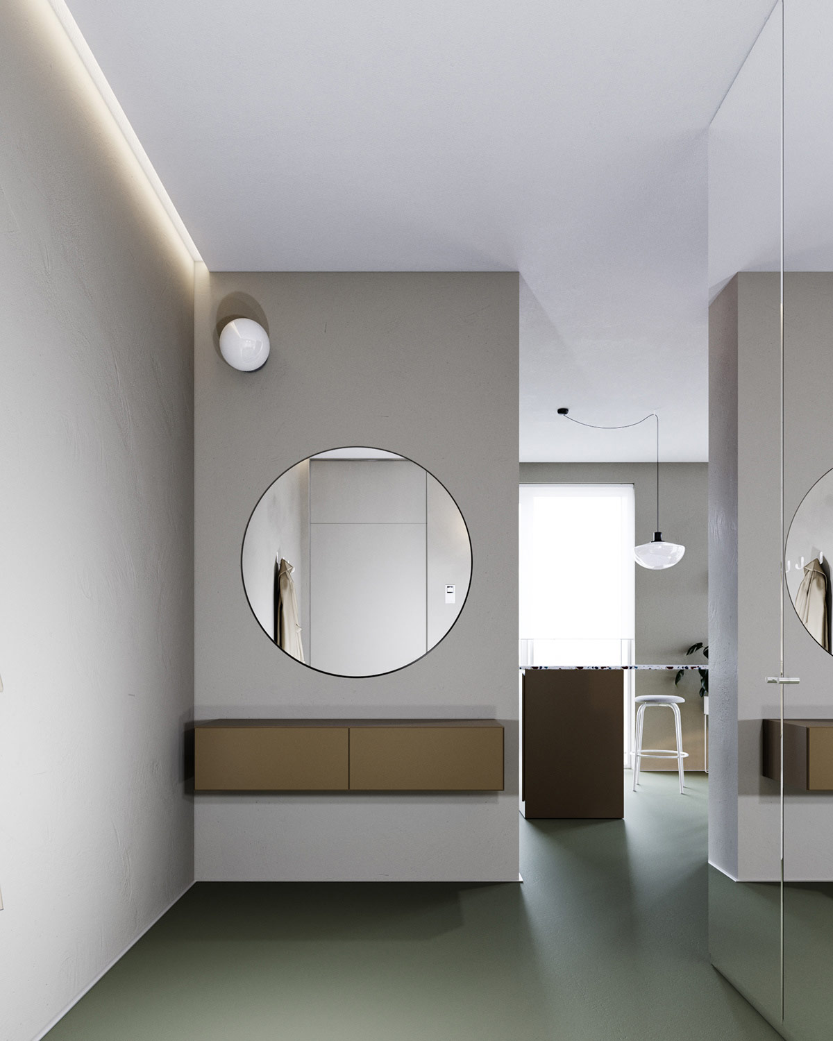
With very little access to natural lighting, the hallway makes great use of floor-to-ceiling mirrors to maximize the light it does get.
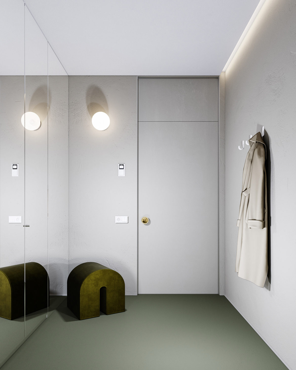
The entryway is clean and artful. A small u-shaped stool sits near the door, a sculptural piece outside of its utilitarian context.
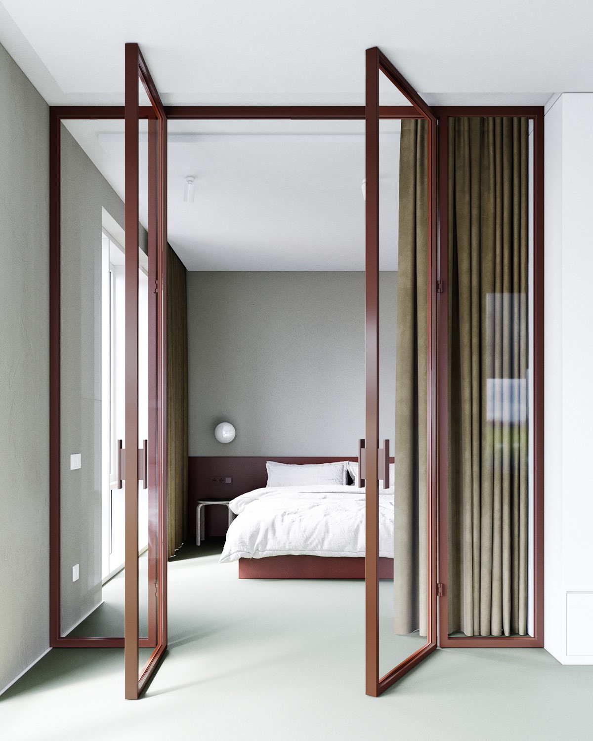
The glass wall bedroom is visible through a frame of red.
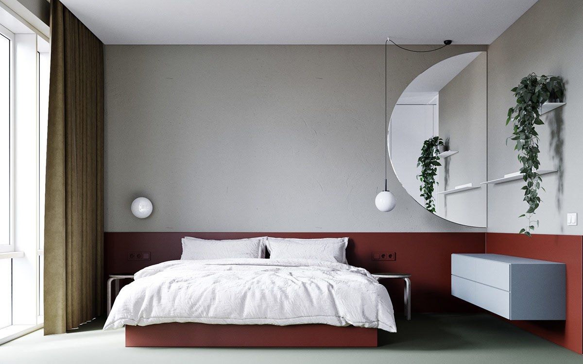
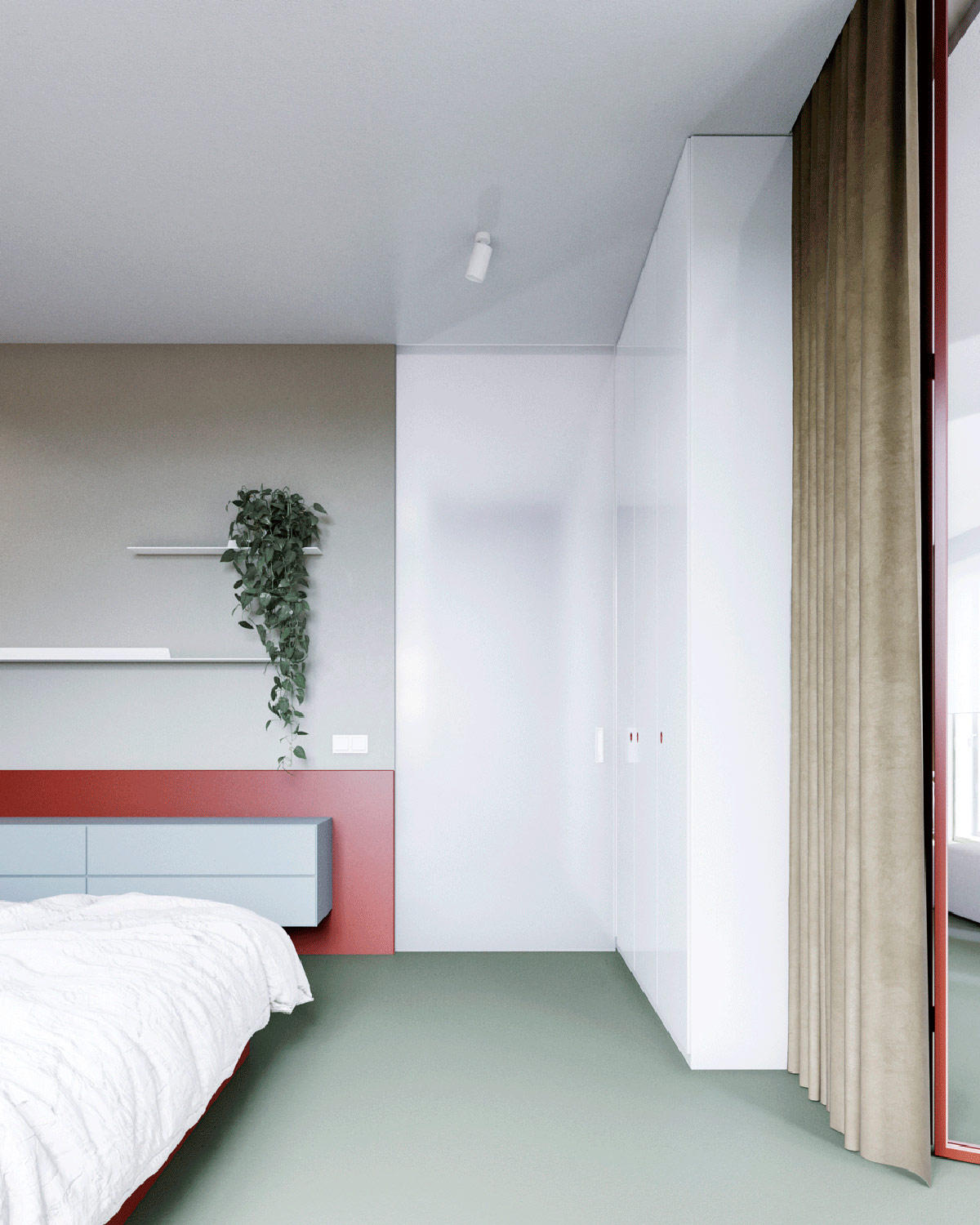
A red border centers this space around the low-profile platform bed. Rounded elements reappear here – the wall sconce, bedroom pendant light, mirror, and side tables.
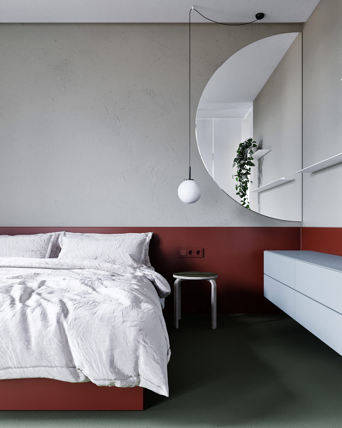
The decorative wall mirror is more than just an aesthetic detail. It updates the traditional dresser mirror concept with a surprising twist.
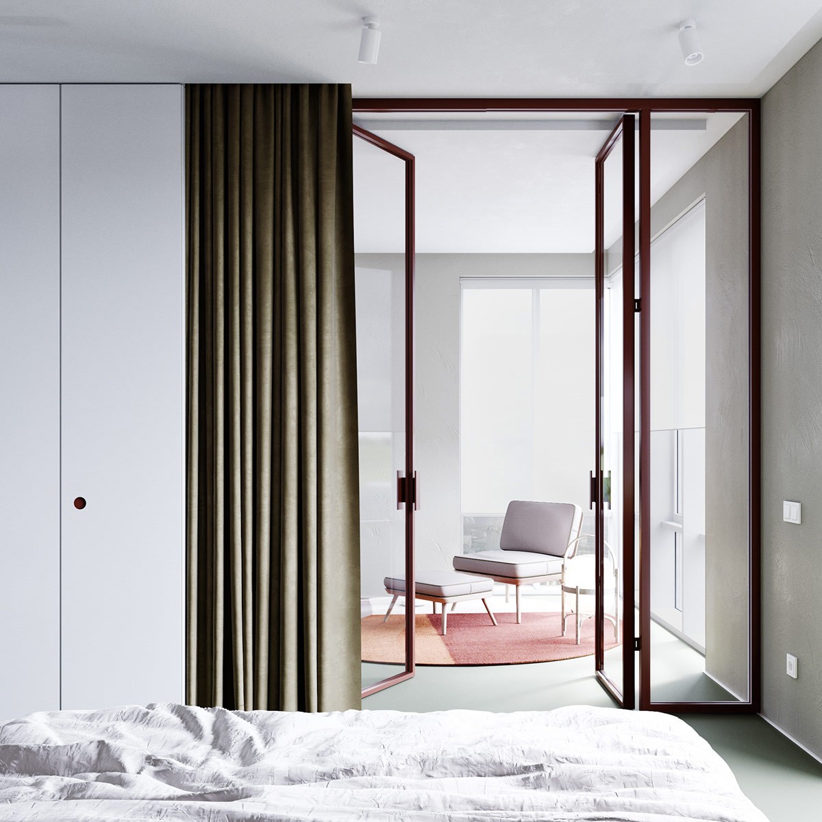
When the thick blackout curtains are drawn, the bedroom becomes a private retreat away from the openness of the main interior space.
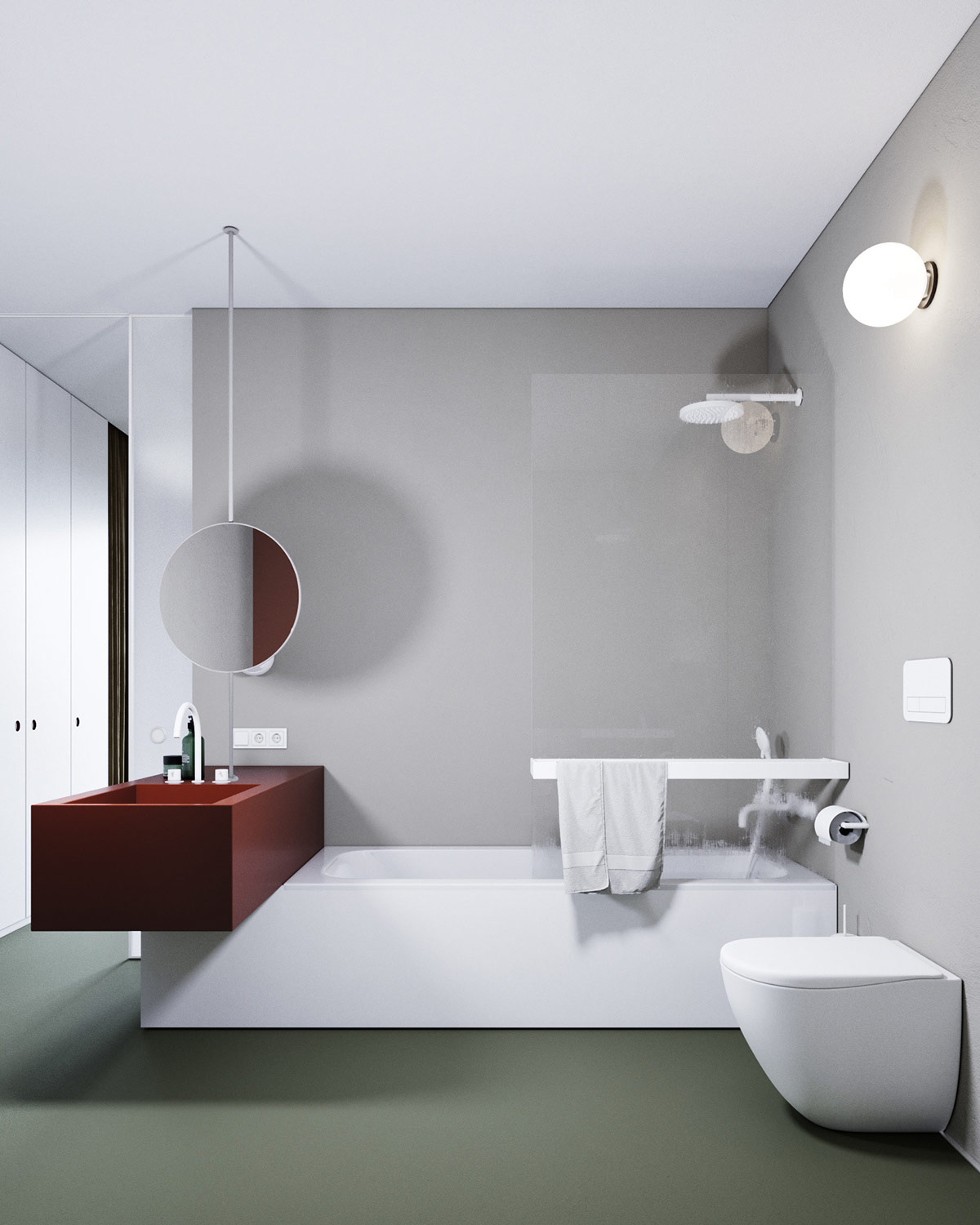
This minimalist bathroom features a bold and adventurous approach to layout. The sink projects from the end of the bathtub enclosure, its cantilever basin extending into the center of the room.
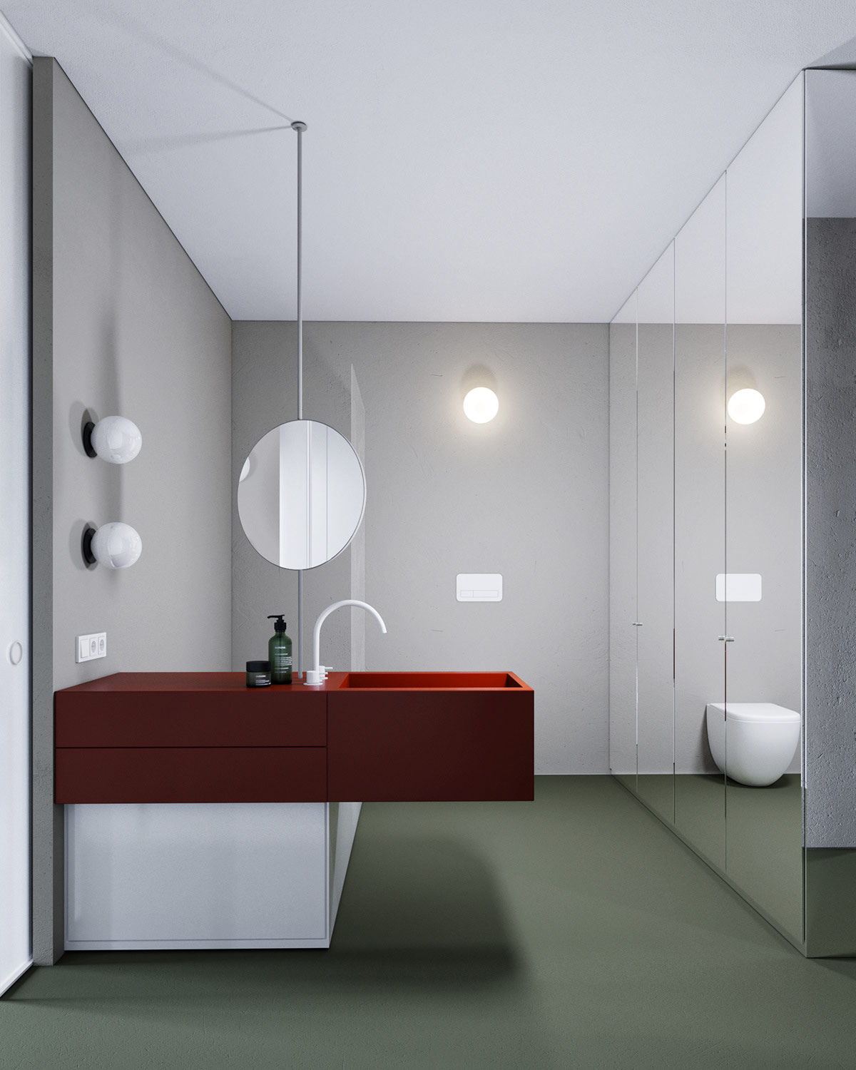
This unique layout also has functional advantages. The sink is equally accessible from every angle – whether residents are just stopping by to quickly rinse their hands or brushing teeth after a shower.
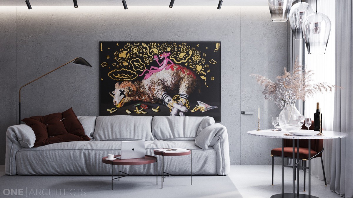
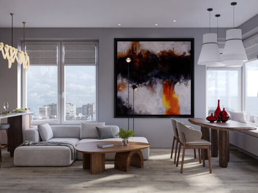
The next home takes an approach that is anything but minimalist. Red accents bring warmth to this concrete-clad interior, pops of ruby hues springing up in the most surprising places. This living room is the perfect example of the dramatic and eclectic style. Red nesting coffee tables, elegant plumes of flowers, a playfully slouchy sofa… each piece has character. A unifying feature brings everything together beautifully – a large print of Don’t Let It Go To Your Head by Kathy Ager.
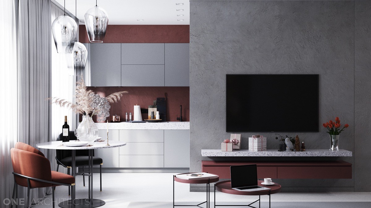
The distribution of red creates subtle contrast between the living space and kitchen. In the living room, the red is restricted to accents – in the kitchen, it flips to become the wall color.
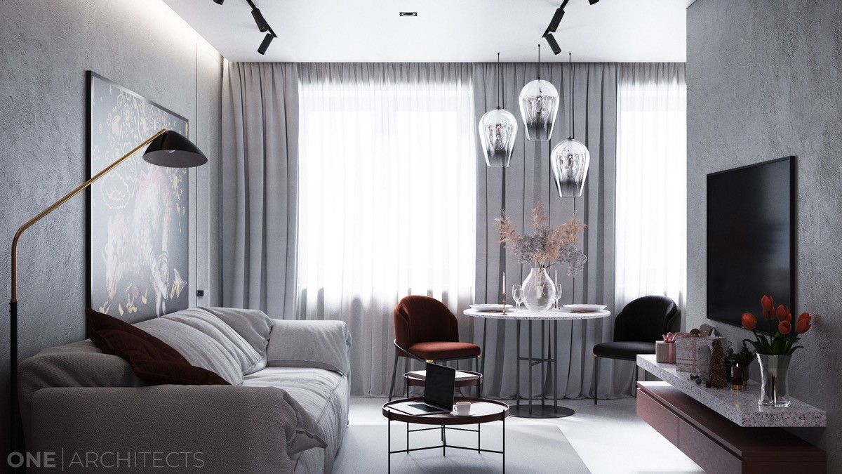
Subtle curvaceous details serve as another way to soften the concrete treatments and sharp architectural lines. The chairs, tables, and pendant lamps all work to break those clean lines into a more comfortable and welcoming atmosphere.
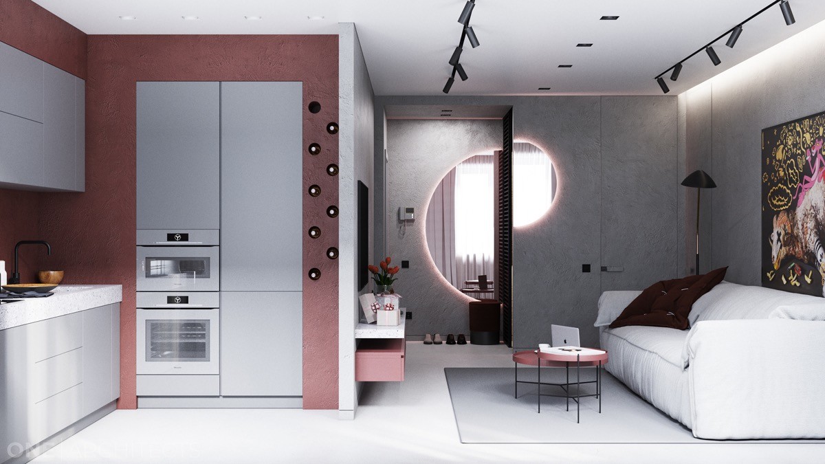
Round accents are everywhere. Niches built into the wall near the appliances hold wine bottles, while half mirrors on the far wall maximize natural light in the darker corners.
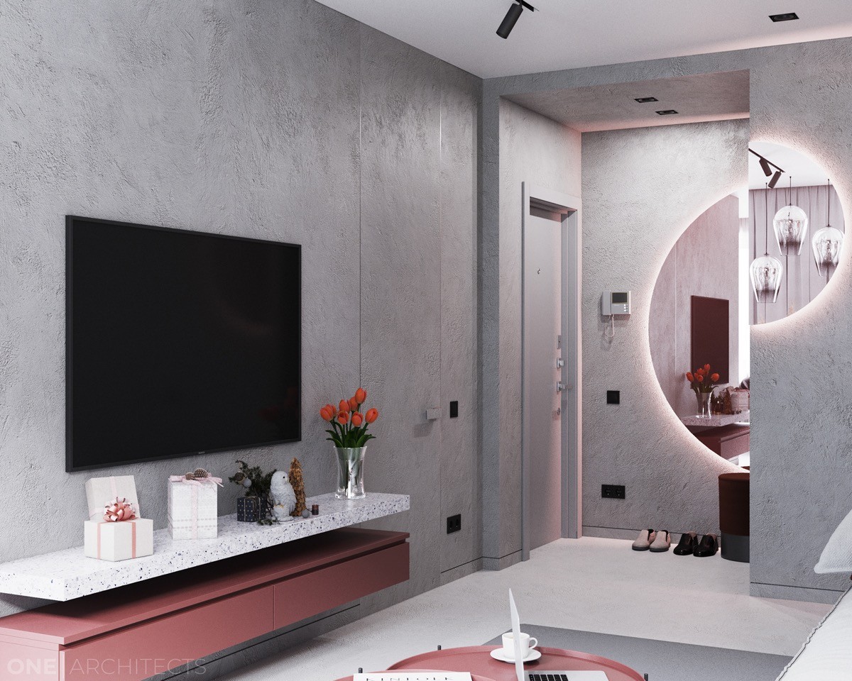
The media area is smart and streamlined. Wall-mounted storage keeps the space feeling light and clean, the television mounted to the wall out of the way.
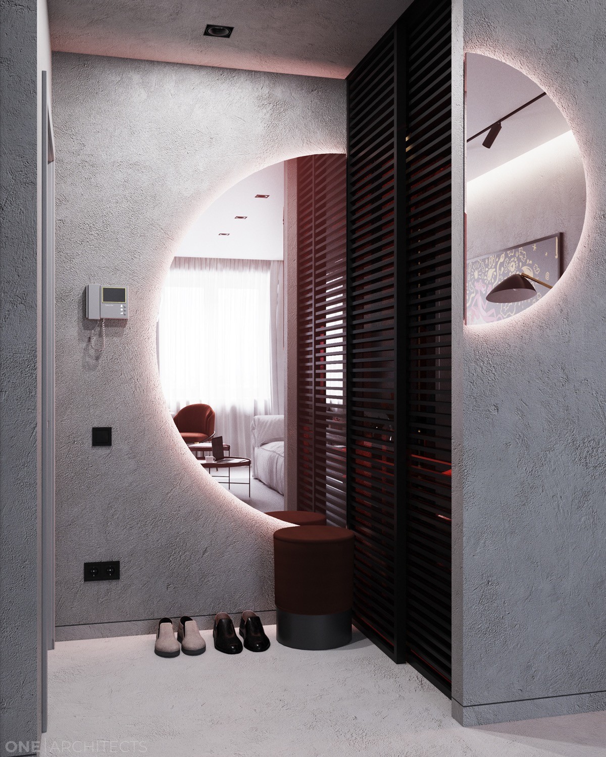
A closer look at the entryway reveals a stylish yet cozy arrangement. The decorative wall mirror offers a quick outfit check before heading out for the night, while the small pouf provides a place to sit and remove shoes upon returning.
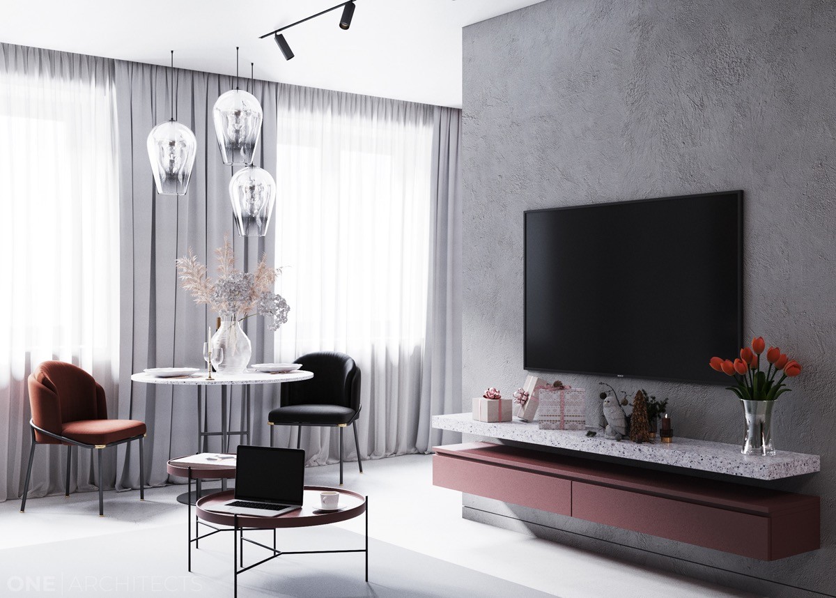
Placed neatly between the living room and kitchen, the dining area overlooks both areas – ideal for social gatherings.
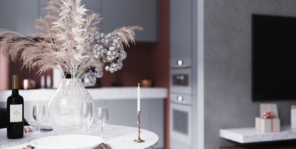
While hosts prepare drinks and snacks in the kitchen, they can easily keep in communication with guests at the table. Guests at the table can chat with those seated on the sofa.
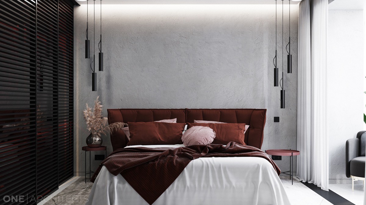
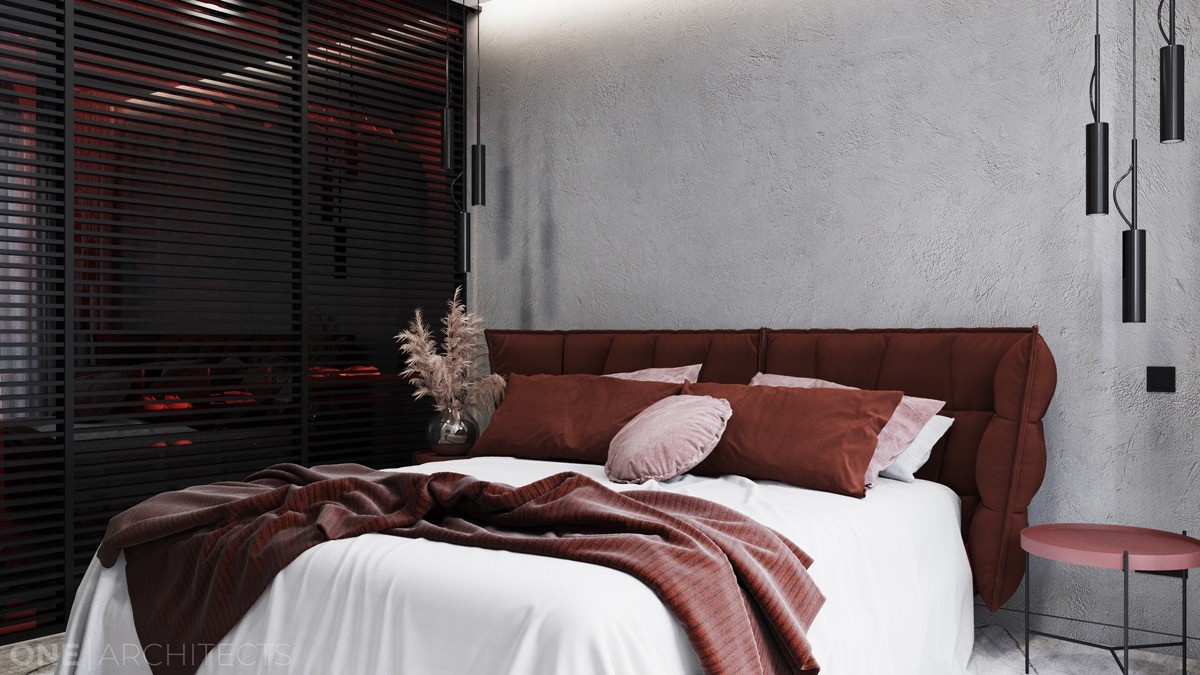
A look at the bedroom reveals the same design techniques translated to a smaller and more intimate space. The same round side tables return, illuminated by modern bedroom pendant lights from above.
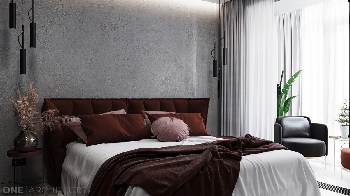
Red is often associated with energy – but it can also feel warm, welcoming, and intimate. These deep spice-like shades look luxurious here.
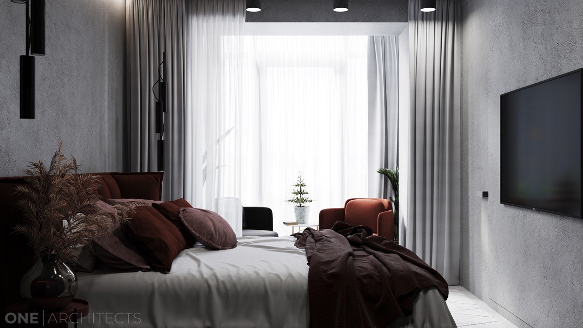
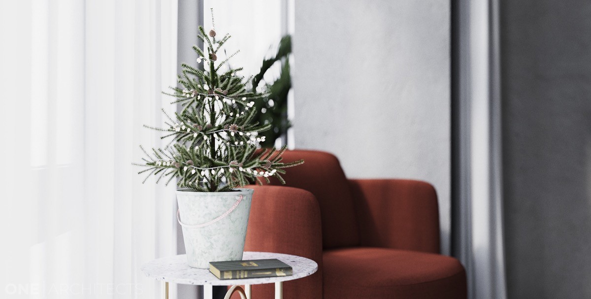
Between a set of interior curtains and the exterior curtains, two chairs create a quiet little reading nook.
For a bedroom shared by two people, this is a smart way to make sure that one partner has a bright place to enjoy a morning cup of coffee without disturbing sleep for the other.
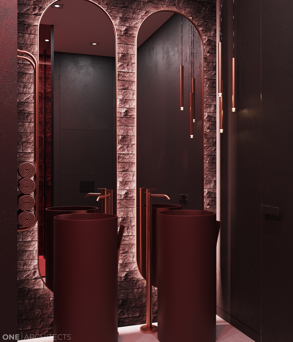
The bathroom takes the red theme to the next level with dramatic red lighting for an intense visual effect.
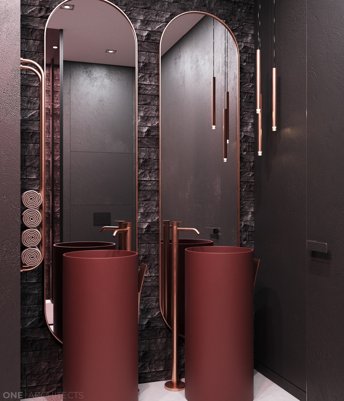
A look without the red light reveals the beautiful copper accents. The double sink bathroom vanity is especially distinctive – smooth and sculptural.
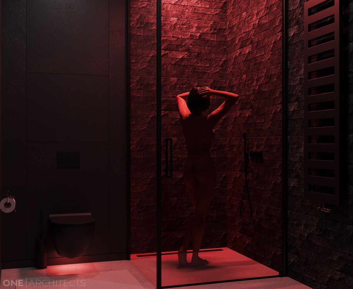
Red light would be ideal for those who shower in the evenings – blue tints tend to keep people awake, while the red light and warm water would surely invite a more relaxing effect.
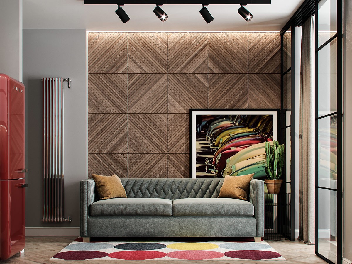
This interior takes the most eclectic and varied approach to red accent colors. Here you’ll find a diverse range of retro influences, sharp modern styles, and a whole palette of reds from deep burgundy to the palest saffron.
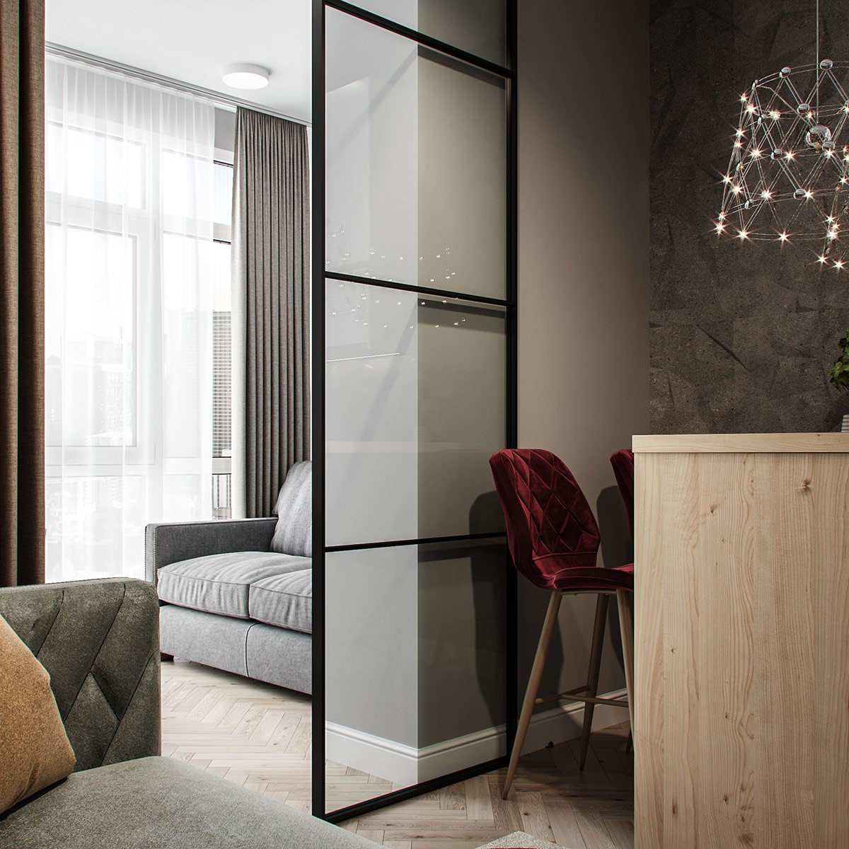
It is also an apartment that uses its conservative footprint efficiently and creatively. This sliding door separates the open concept living and dining room from a smaller office area.
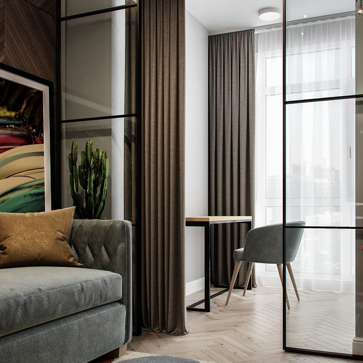
Residents can leave the curtains open and let the natural light flood the interior. Or, when working from the office, can close the curtains to create full separation with no distraction.
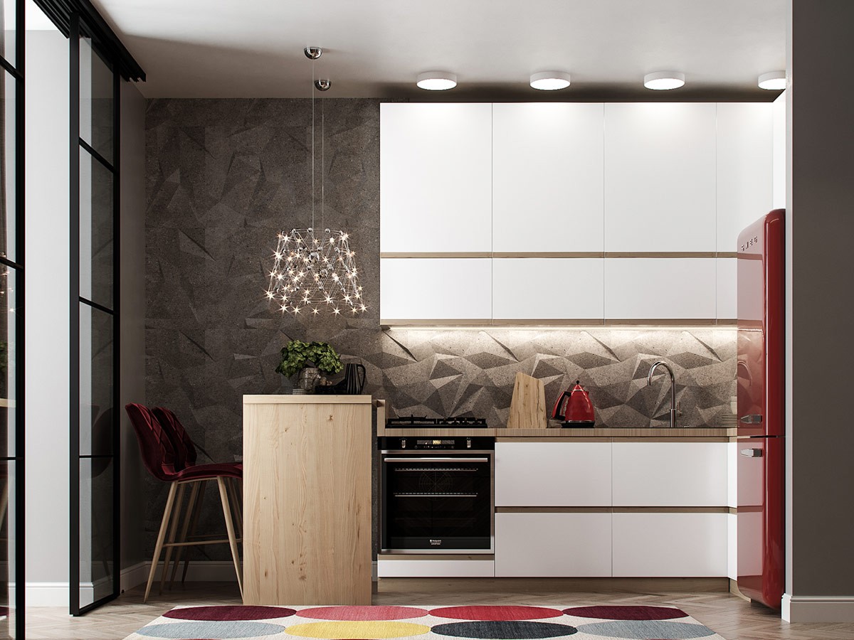
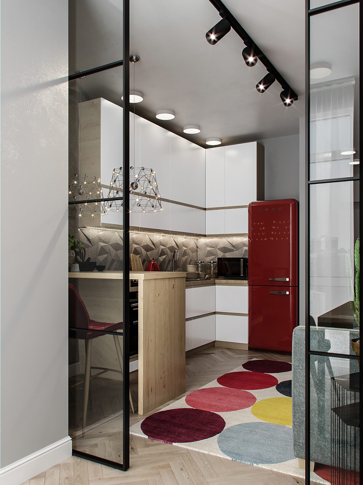
The gorgeous grey kitchen creates a modern impression with its geometric accent wall, tempered by retro influences like the red velvet upholstered chairs and the iconic Smeg fridge.
