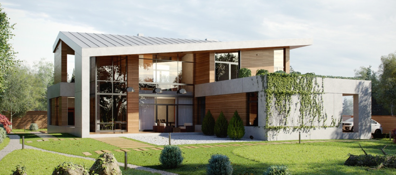
is known to be born out of the 1930s. In this style, everything is functional and simplified. Here we introduce you to two homes that embody these ethos. One is visualized by aTng 糖 and another by Aleksandr Vezlomcev. The first home uses more colors to highlight the design while the second only uses colors to highlight the child’s room and furniture items. Both homes showcase framed art and respect greenery. Take a look.
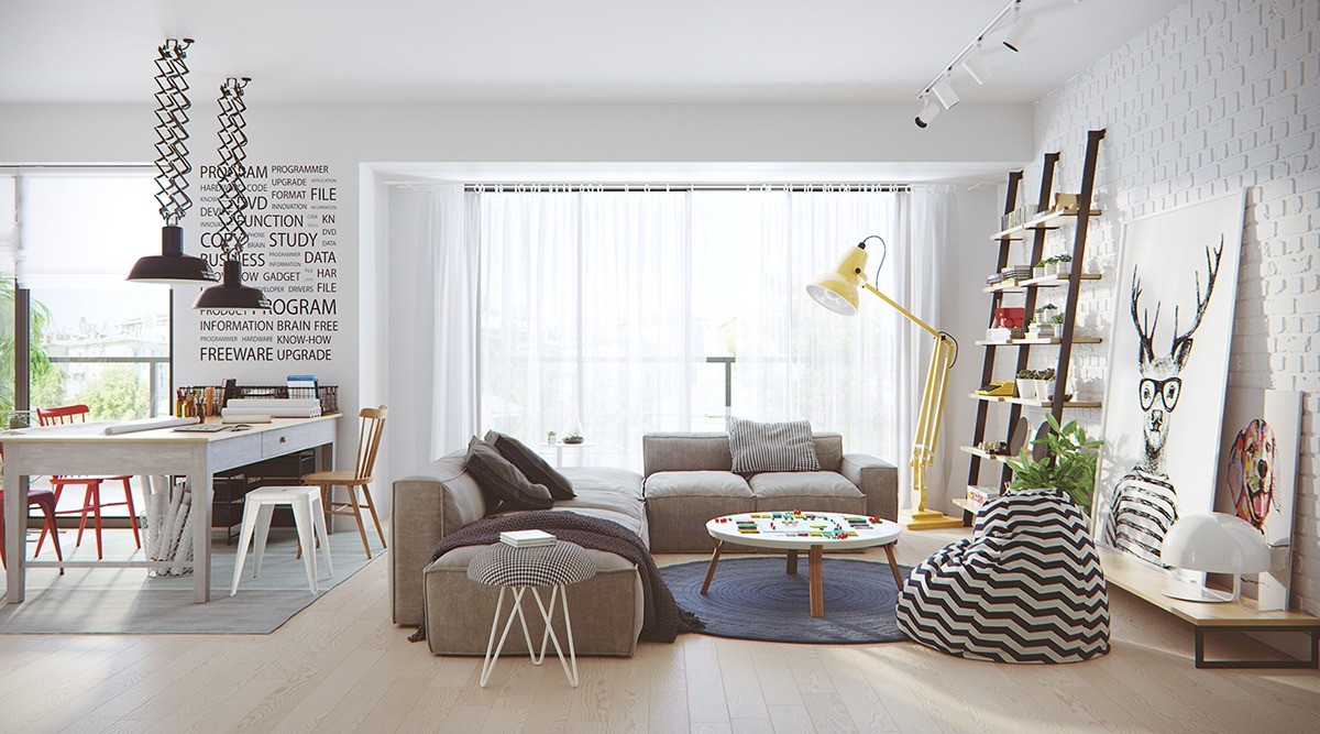
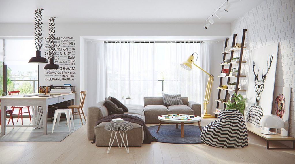
A bright and open floor plan is the perfect setting for the modern Scandinavian style. This room welcomes both a family room and an in-home office.
When you look at this room, your eye immediately hits the hipster deer with oversized glasses. This piece of art is fun and makes the space feel less serious. The yellow lamp adds a burst of color and also serve the task of a (giant) floor reading lamp.
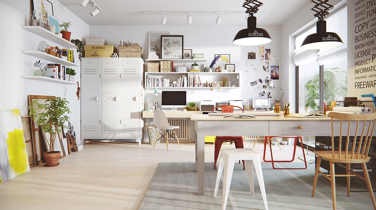
This home workspace has everything you need to be productive! White lockers hide important paperwork and keep everything organized. Art set alongside the wall adds personality. Living plants also interject life into the room which is connected to an outside balcony.
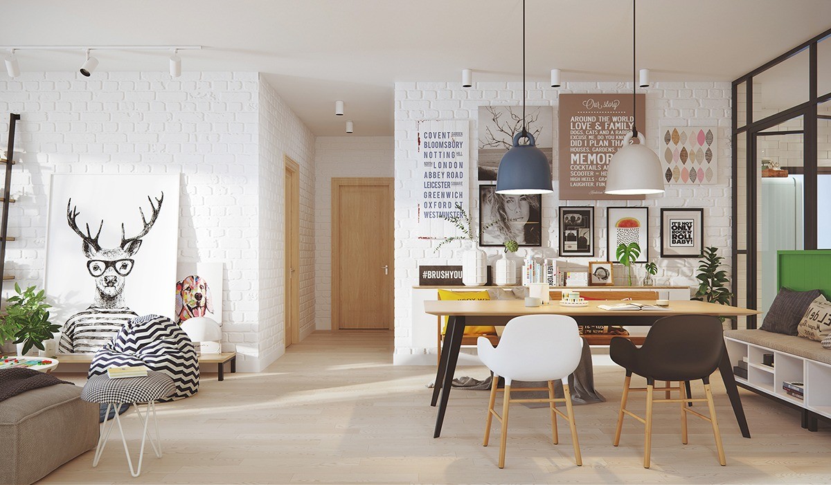
In this photograph, you can see both the living room and the dining area. The designer was smart to tier the artwork on the exposed white brick walls. On the left side, the deer art piece and the dog are lower to the ground. On the right side, gallery-style images and art pieces are hung higher. This is a great use of contrast. The higher hung artwork also draws attention to the two hanging pendent lights which are two different colors.
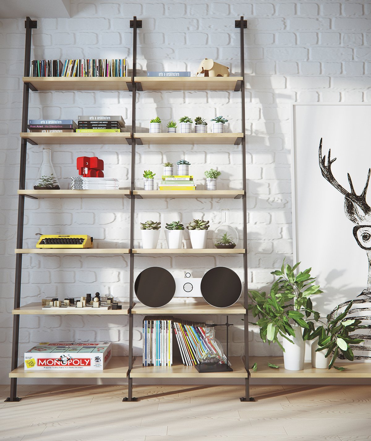
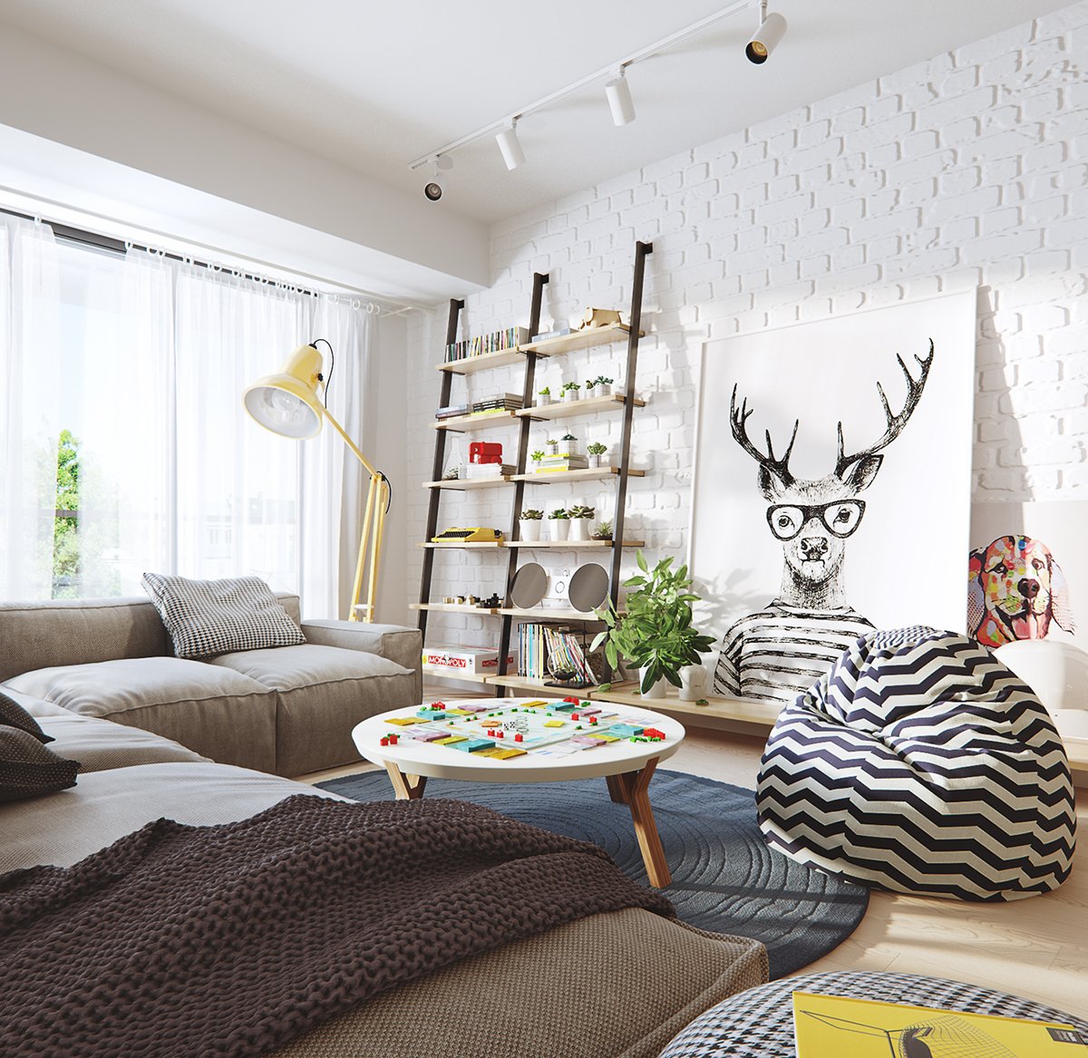
This bookshelf is artfully compiled. There is the perfect balance of greenery, bright colors, and simplistic pieces. Books are stacked on different shelves in different ways. The colors yellow and green are the loosely defined color scheme here.
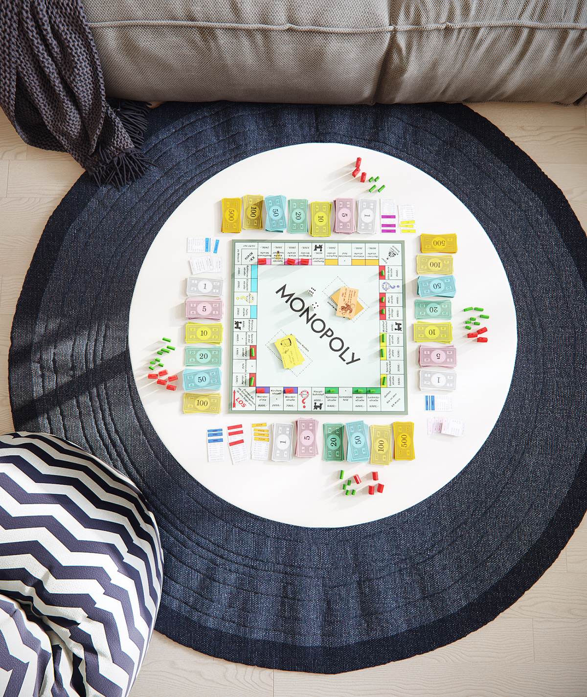
Modern Scandinavian design has always been about functionality and finding the beauty in basic items. This image of the game of Monopoly showcases the idea that this space is meant to be lived in. The beauty of the game pieces stand out on the simple rug. A family can easily surround this rug and enjoy a game night in!
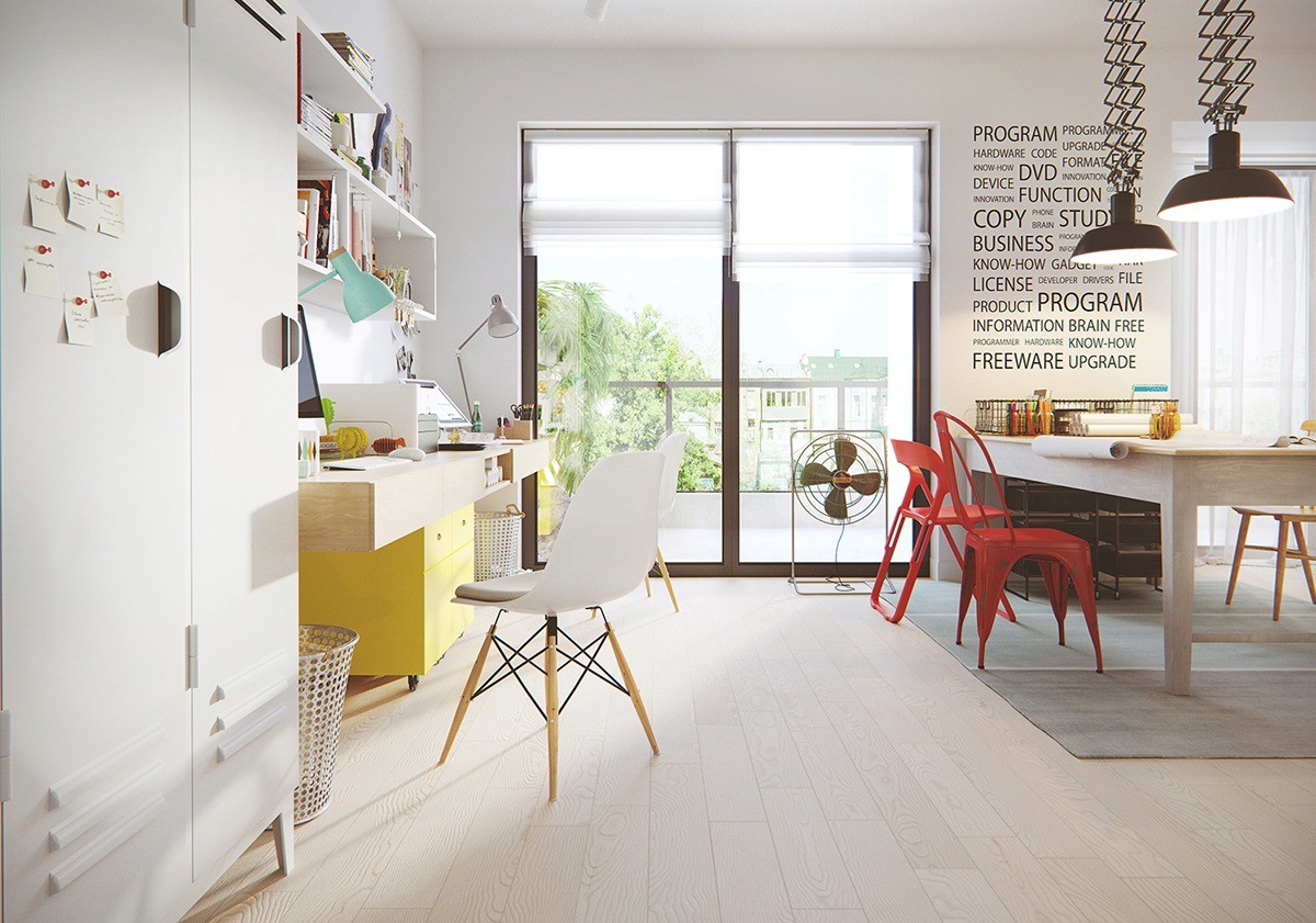
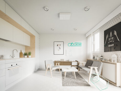
Using yellow to add color to a room is an easy way to update a space. This office had a base of white and then adds pops of colors in. A teal lamp, yellow filing cabinet, and red industrial chairs give dimension to the room. Adding greenery around the office also connects the inside to the outside balcony. Another favorite in this room? The text wall. Simple text can become art when you use black against a white wall.
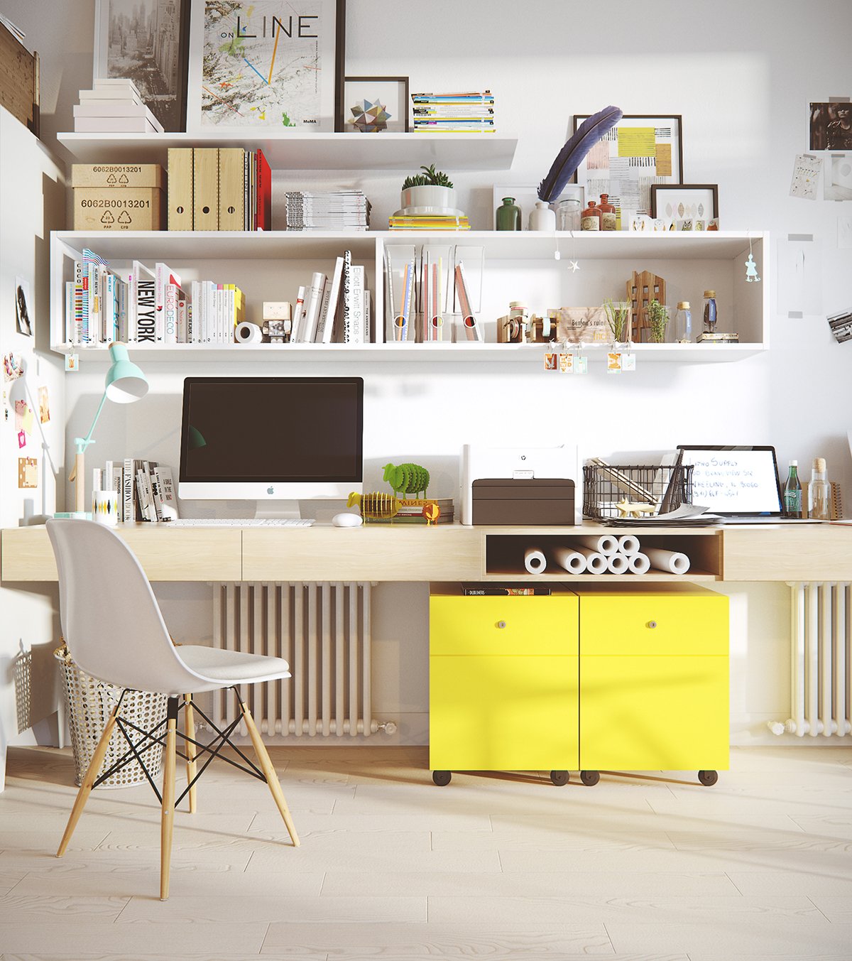
Every modern Scandinavian designed home usually has an IMac. Why? Apple embraces a lot of the same principles as the design style. Simplicity is beautiful and there's no need for frills. An IMac is sleek and chic. It blends into its environment but also stands out because of its prestige. It helps that this computer is silver or white!
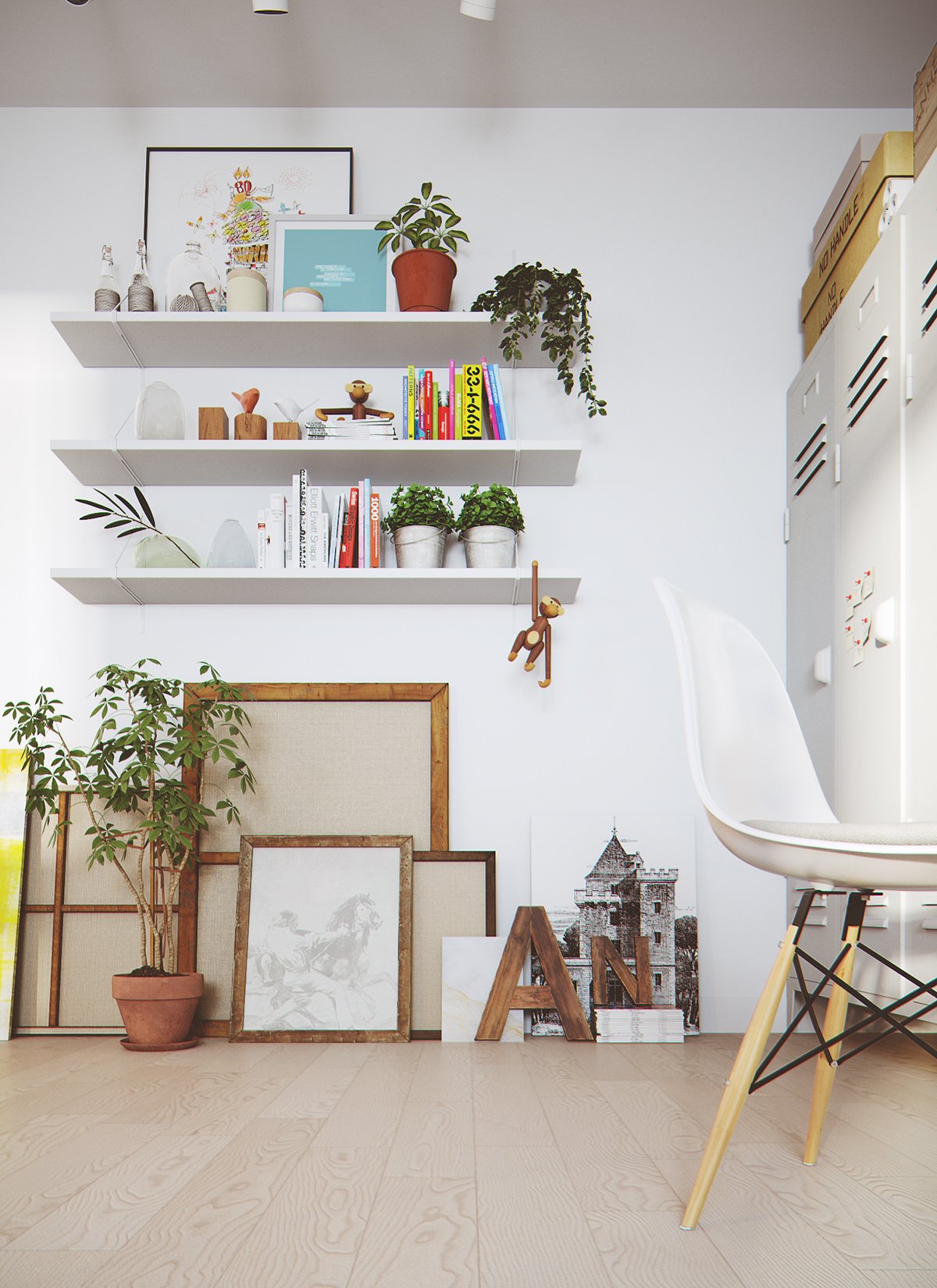
Art doesn't always have to be hung. In this office, you can see that the shelves are filled with brightly colored books and accents. Under, there are organic wooden picture frames that are stacked upon one another. This creates a sense of style. If you add a living item in front, you have a masterpiece yourself! It's all about adding variety and textures.
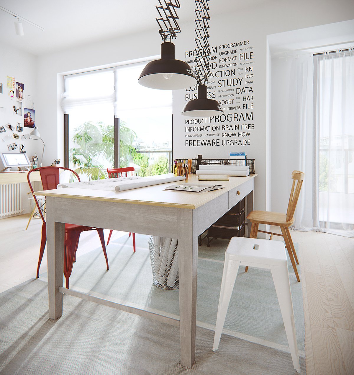
With this style, it's OK to break the rules. Chairs don't always have to match and art doesn't always have to be in a frame. You can see in this work space that each seating option is different. You have two red chairs that have different styles, a wooden chair, and a white stool! The art hanging above the computer is also unframed and thrown up there. This shows the spontaneity of art and how within it's certain space, Scandinavian design embraces creativity.
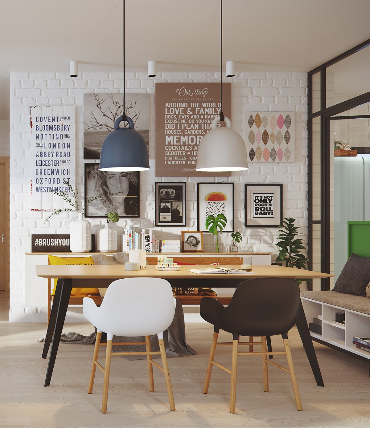
This dining room is open to the rest of the large space in this home visualized by aTng 糖. When creating a gallery wall, like the one behind the dining table, you can cover the entire wall or just part of it. The designer has mixed pictures, wooden signs, and canvases to tell a story. Spotlights above the art make the set up dramatic.
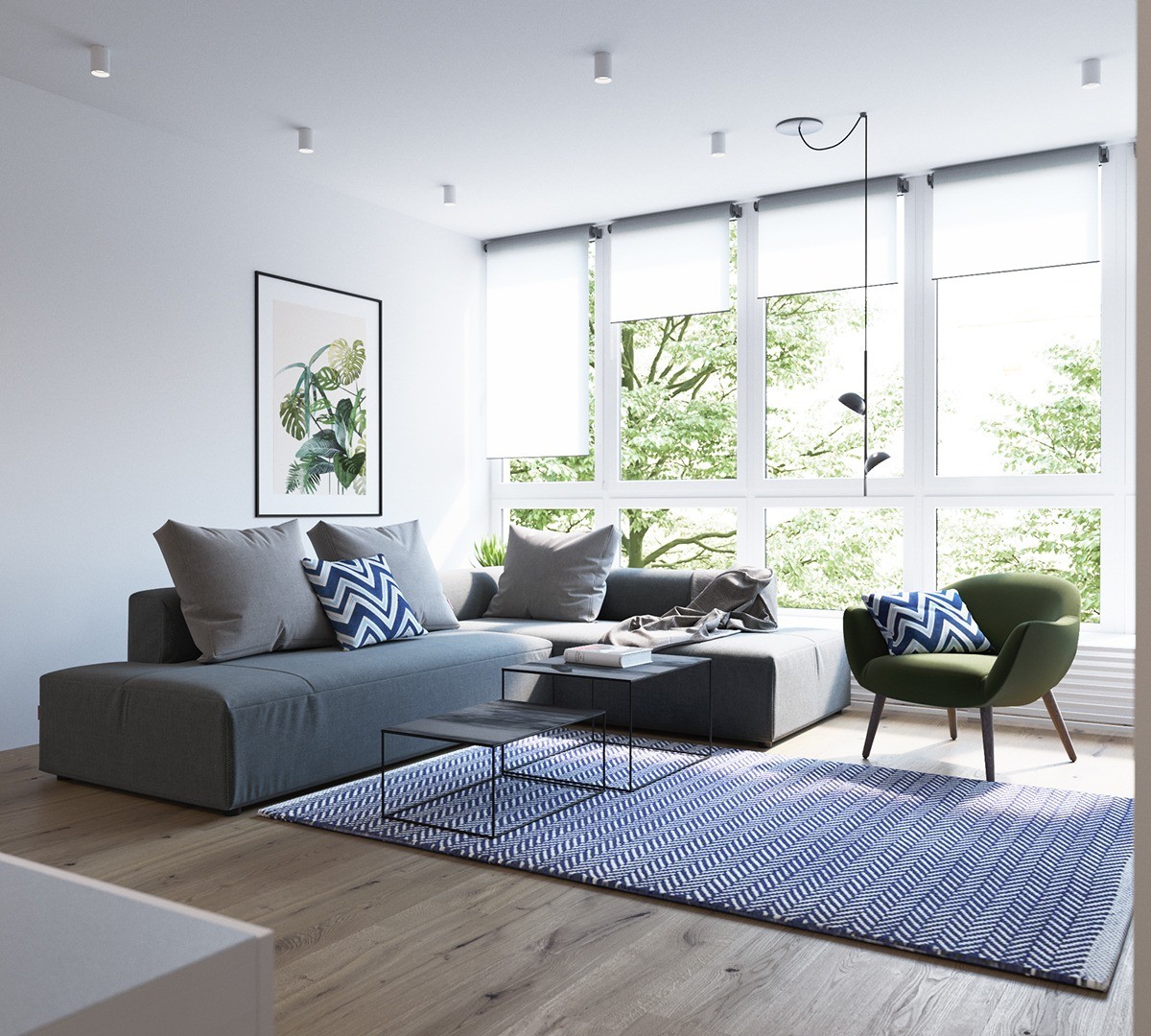
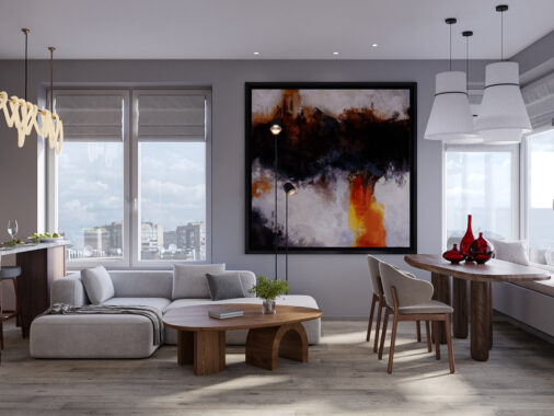
This home is visualized by Aleksandr Vezlomcev of Line Design Studio. This home is similar to the first, but doesn't use as many bright colors. The colors used the most to add life to the rooms is yellow and green. In this living room. The large windows revealing green trees are complimented by the painting that's hanging above the gray couch.
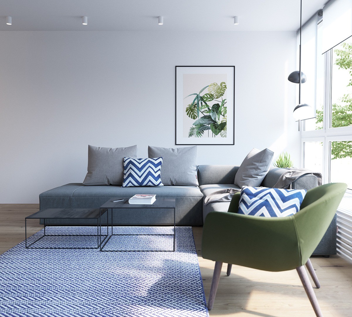
At this angle of this modern Scandinavian room, you may not realize it has large windows that open to the outdoors. To remind you, the art on the wall is magnified by the natural green shade of the accent chair. Blue chevron throw pillows give the room more texture.
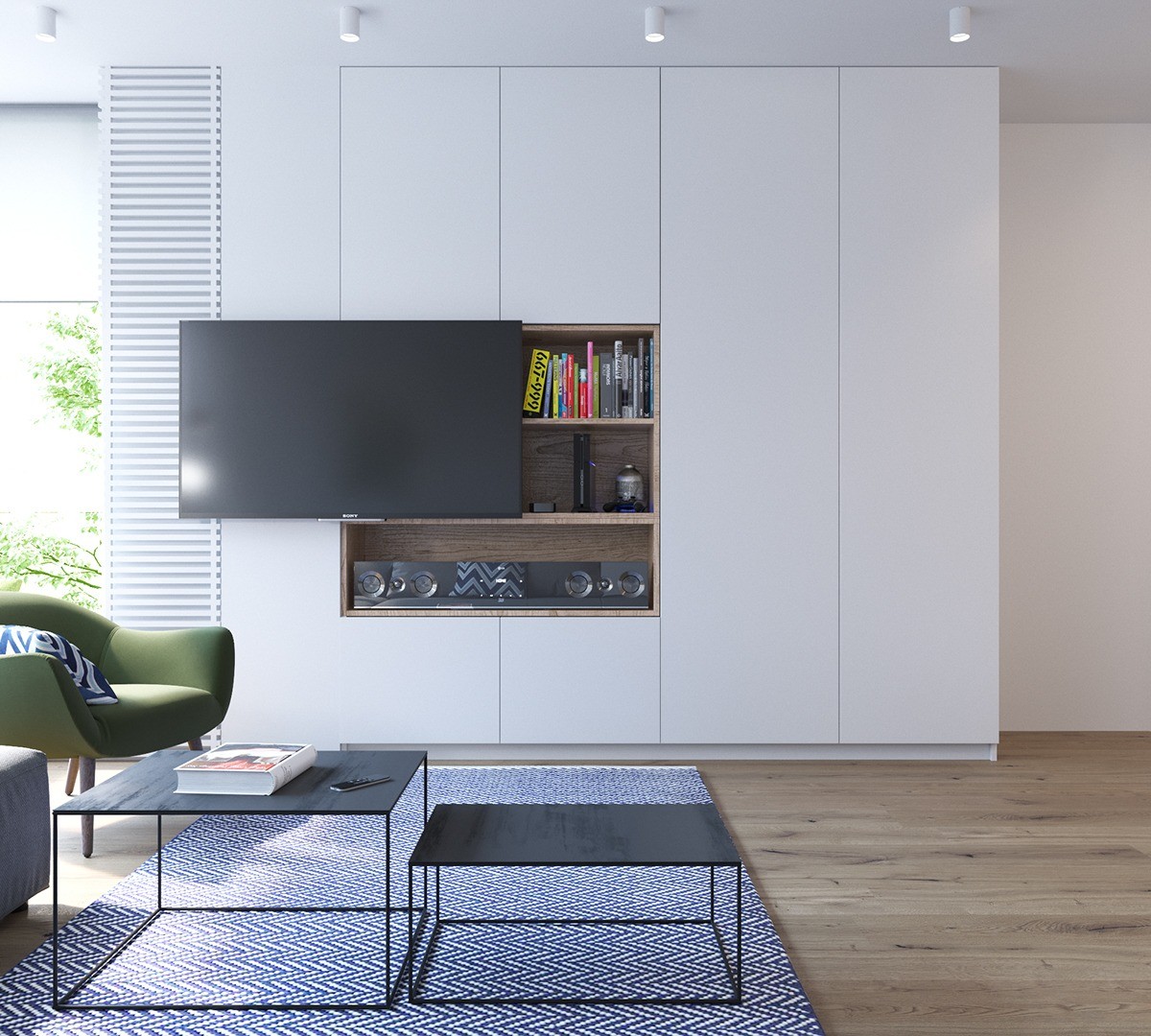
Thera is a lot of white in this modern aesthetic. This lays the foundation for bright colors and functional, yet stylish items. This TV is mounted off to the side and reveals a wooden media cabinet. Bright colored books peek out and add more color to this seemingly boring wall.
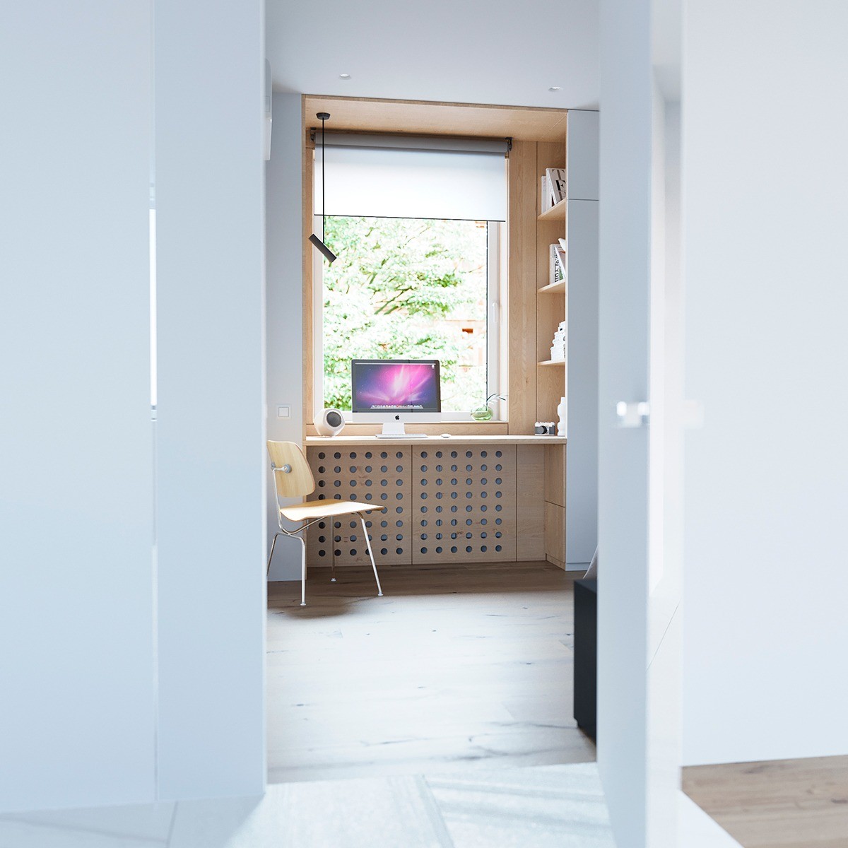
Both homes showcase their Apple computers! This office has less colors than the first, but is simple and sleek. A large window keeps the focus outside and the natural wooden accents give the room an environmental element.
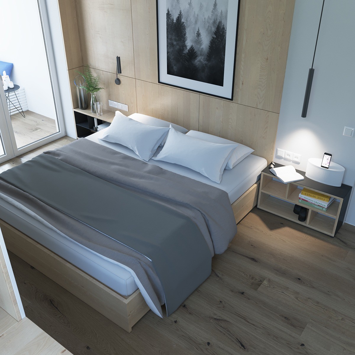
Bedrooms should be a place of simplicity and recharging in a modern Scandinavian home. This bedroom has crisp, linen sheets, and gray bedding. Only one art piece is hung above and even that's kept less busy. Each accent points you back to outside, from the tree photograph to the ferns placed in glasses on the night stand.
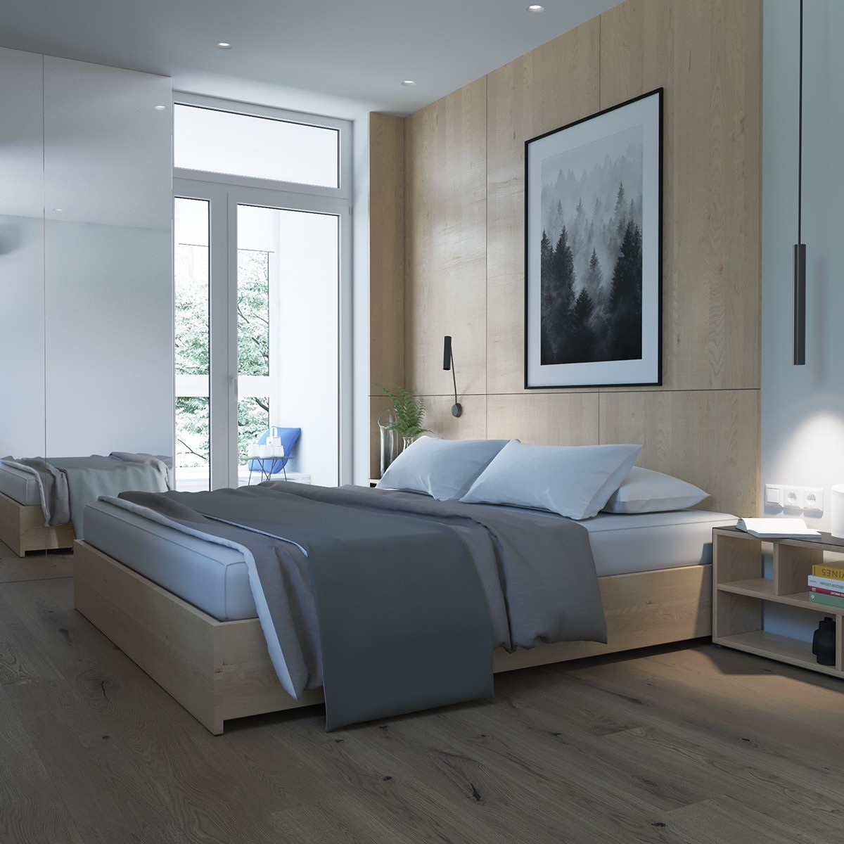
The outdoors played a very special part of the design of this entire home. In addition to eluding to beautiful outdoors in the art of this bedroom, there is a balcony. You can see that the owners spend time there because of the furniture.
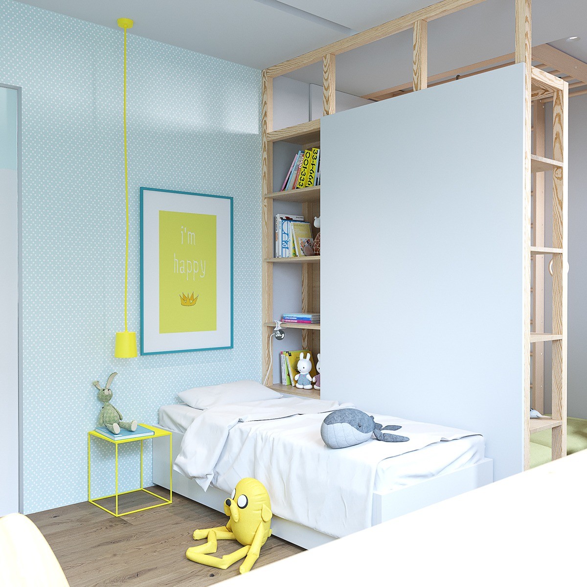
This child's room matches the rest of the home but uses bright yellow to bring fun and playfulness to the space. The bed is kept simple while the large bookshelves are filled with children's items. A yellow nightstand matches a hanging print perfectly.
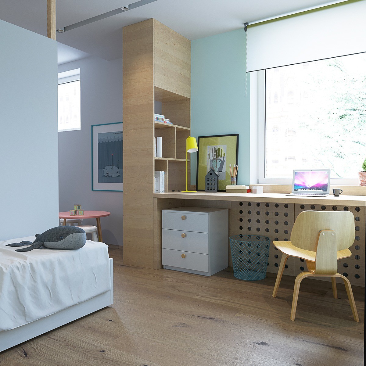
Instead of messing with a desk that has to be moved, this designer choose to built in a desk alongside the length of the room. This desk is the perfect size for a child and the window lets lots of light into the room.
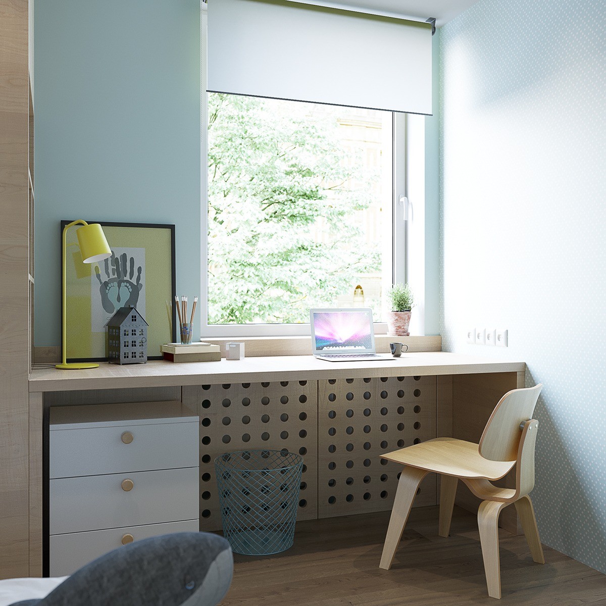
Even though there isn't a lot of yellow near this side of the child's bedroom, it's made its way over in the artwork. Along with the artwork, the study lamp is also yellow. The rest of the homework space is kept simple and natural.
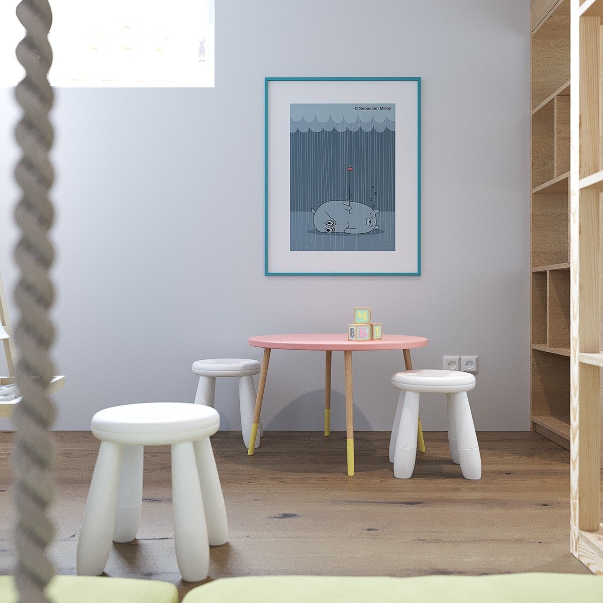
A child's playroom has small stools and extra large artwork. The light blue print hanging on the wall helps define the space as kid-friendly and also gives the room more color. Built-in shelves offer space to stow away toys.
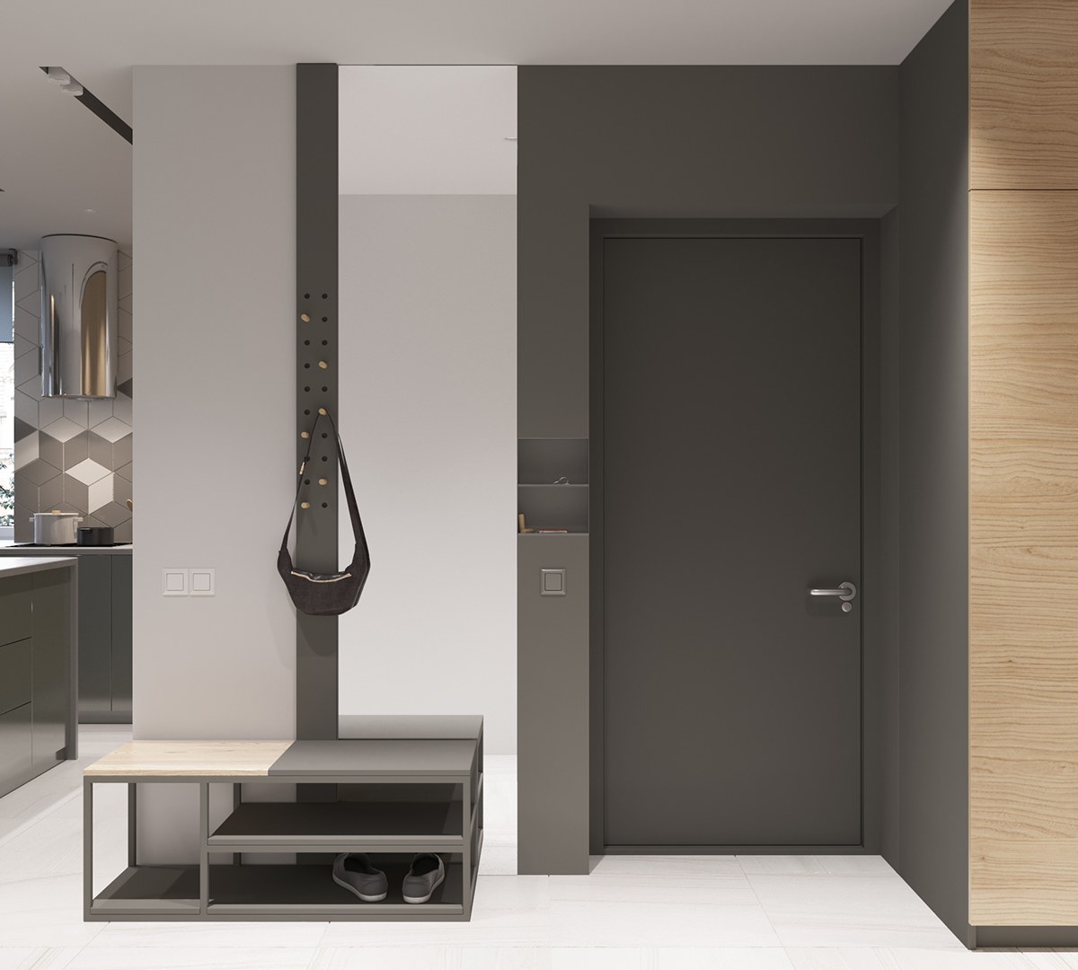
A gray entryway is understated in this home. It's not busy and almost reminds you of an industrial loft. There is a bench to sit on and a hanging rack for coats and purses. An unexpected built-in near the door holds keys and other out-the-door items.
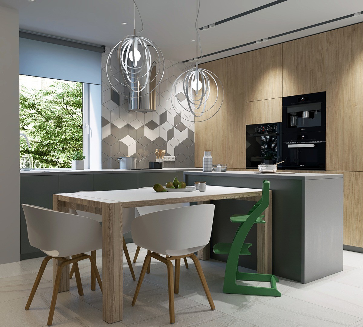
This kitchen is fun without being over-the-top. Circular chandeliers hang above the dinner table and a green highchair lets everyone know that little ones eat here. Appliances are built into the wall to save space and a geometric tile design adds interest. Again, a large window welcomes the green trees into the room.
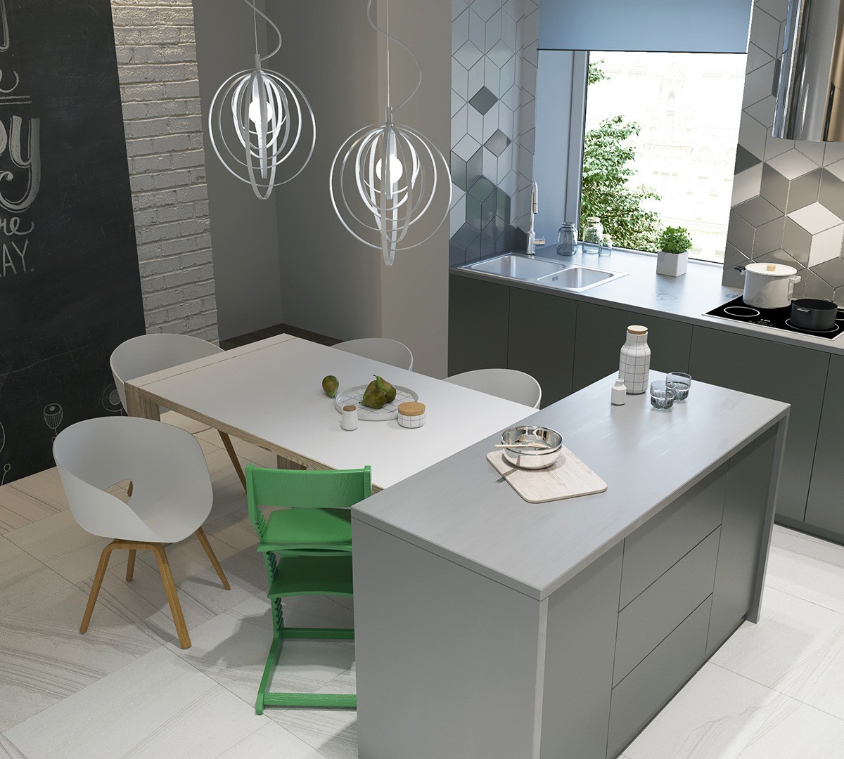
Looking down at the table, you can see the striking contrast the green highchair makes in the room. On the left you an also see that a black wall can be drawn on with chalk!
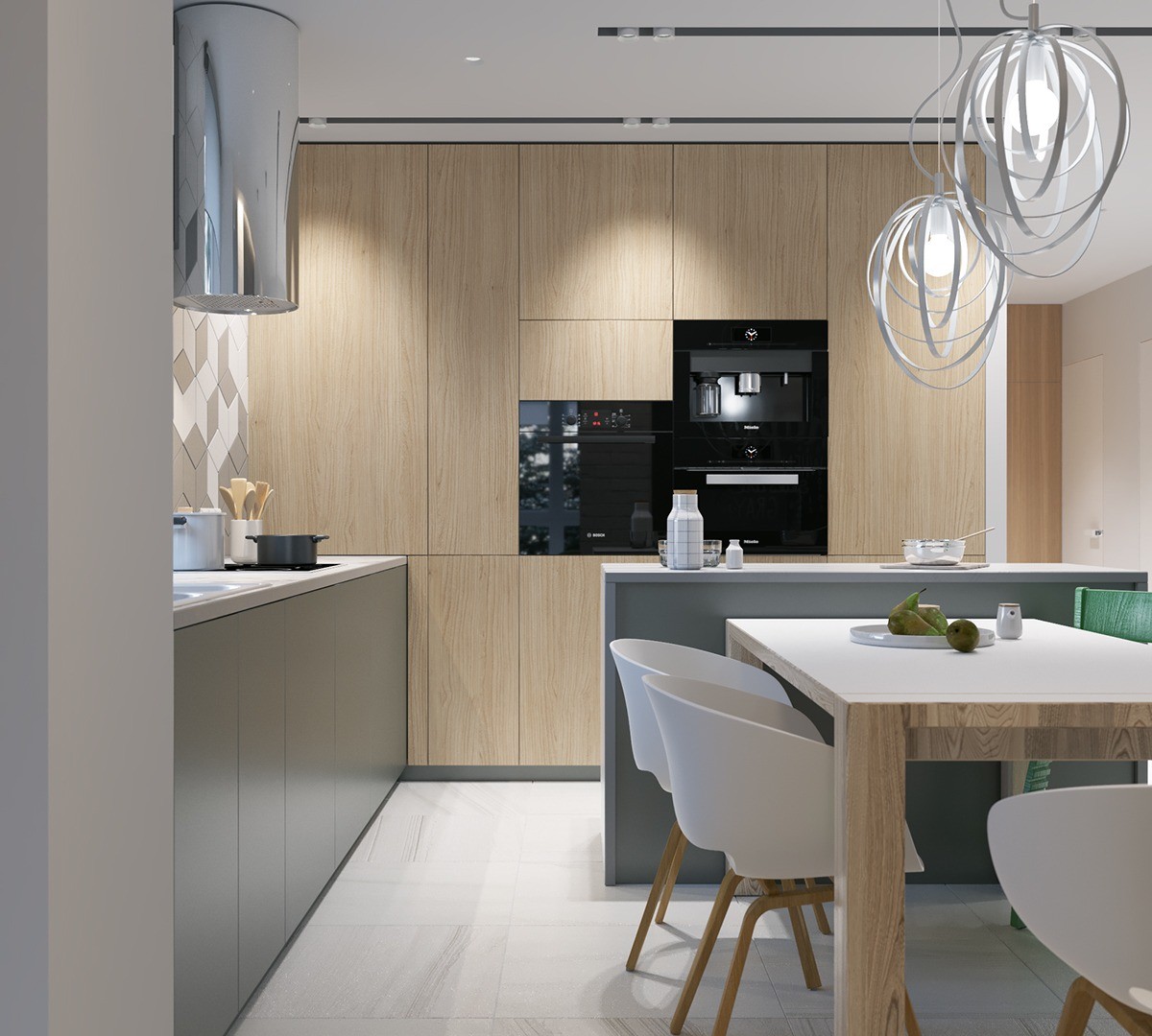
The kitchen in this home appears much larger than it is thanks to tall cabinets. The lines on the cabinets bring the eye upward. The appliances are built-in, which also saves space.
