Chinese decor and architecture is many things: sometimes humble and sometimes opulent, exciting or subdued, colorful and textural, and always thoughtful. This region's trends have changed throughout history but there's always room to re-explore the aesthetics of times past. This post looks at two modern Chinese home designs that take cues from traditional styles, blending old and new in a beautiful and refreshing way. Both homes are the work of designers based in China for new projects in the area. If you're looking to introduce Asian decor in your own home, this pair of lovely interiors is sure to inspire.
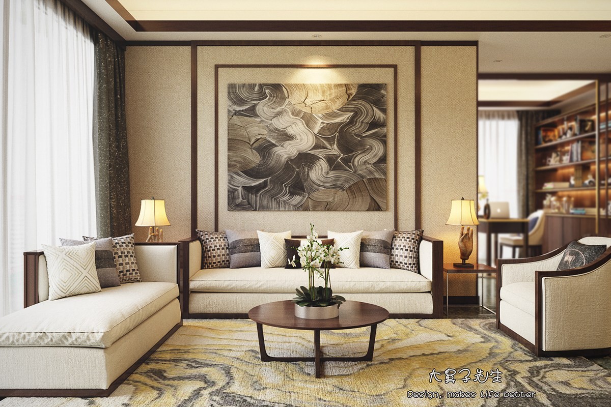
This home offers a modern interpretation of traditional Chinese decor, created by Shenzhen-based designer "Big Nose". Warm neutral colors and artwork inspired by nature certainly take cues from classic Chinese design theory, while the modern textiles and contemporary furniture feel fresh and new.
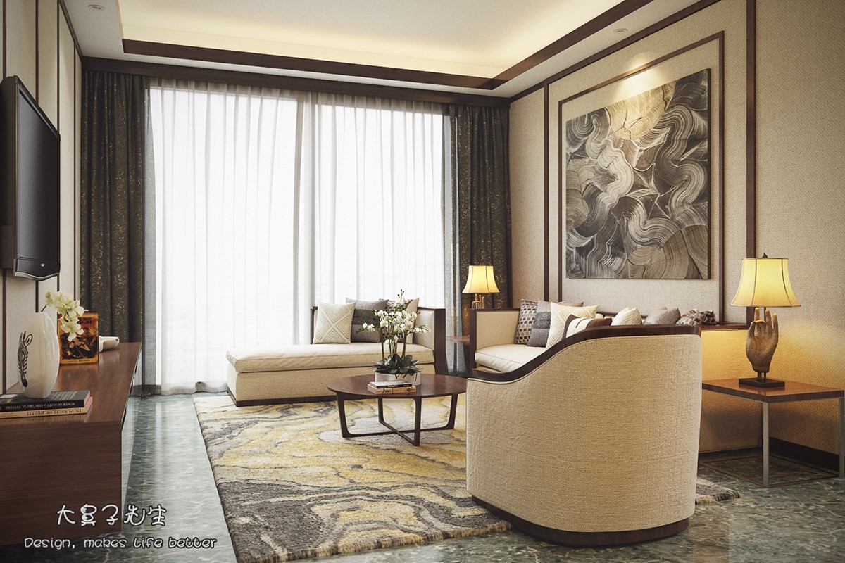
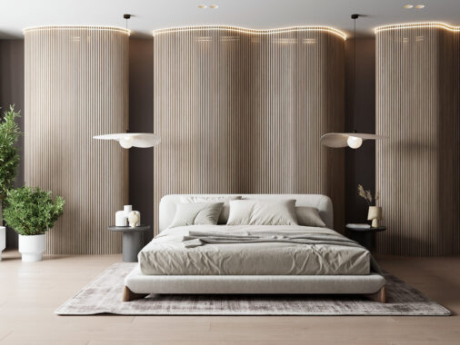
Classic influences find their way into the very heart of the home. This includes the paneled walls, reminiscent of the decorative screens popularly used in Chinese homes since antiquity.
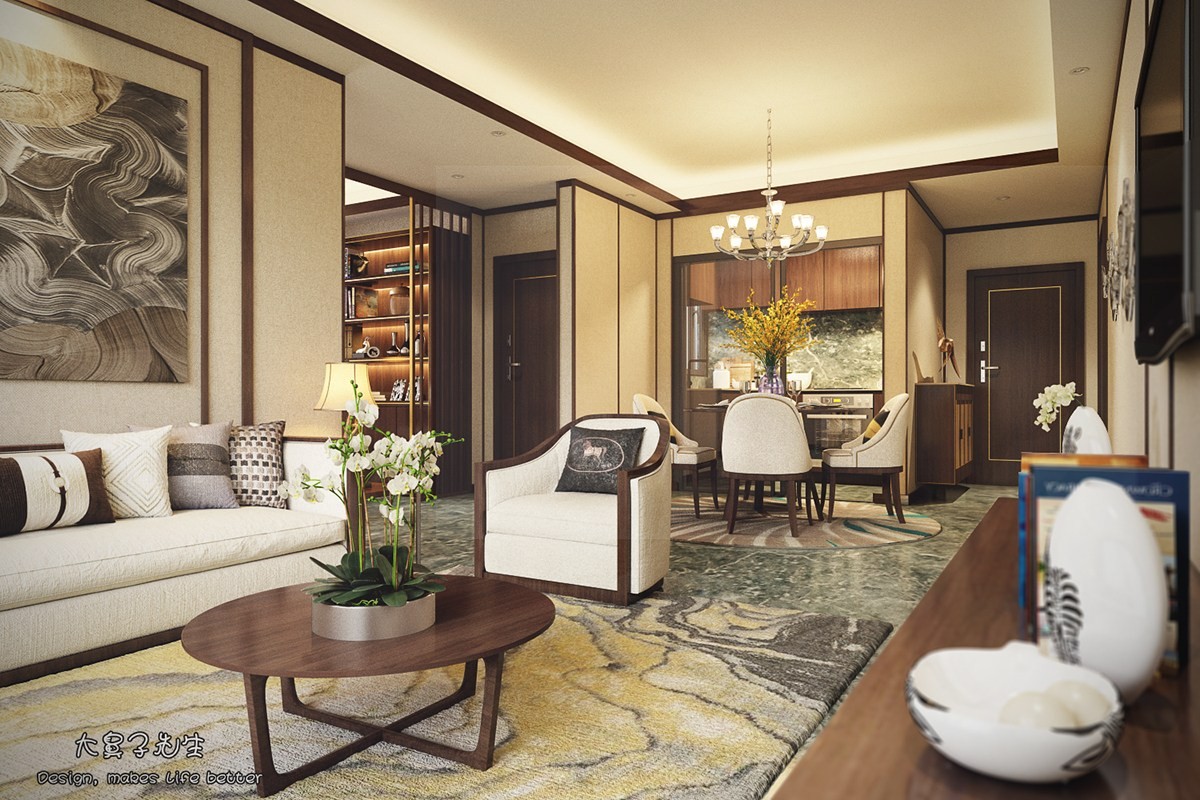
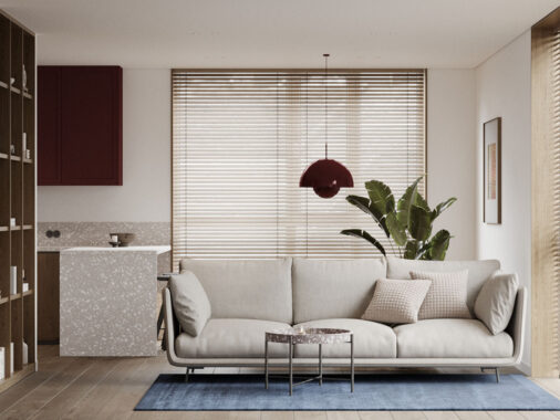
The open living room and kitchen maintains a unified theme of textural white furniture, beige walls, and wood trim. It's sophisticated but still approachable.
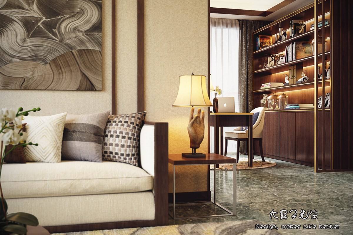
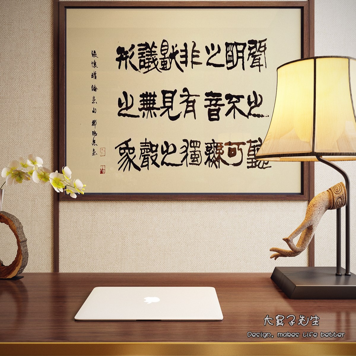
Mudras are gestures said to facilitate the flow of energy through the body, often used to reinforce and communicate symbolic meanings in Hinduism and Buddhism. This lamp features the Karana mudra, intended to expel negative energy.
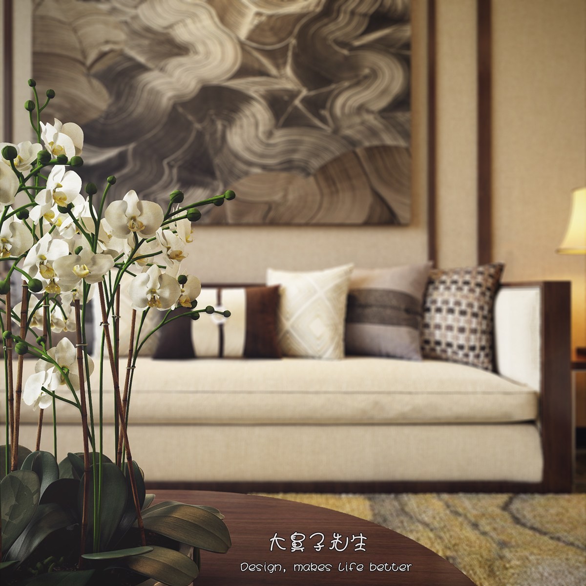
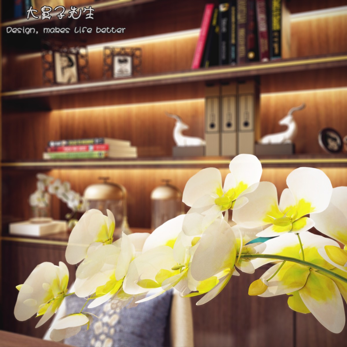
Orchids are perfect for an elegant home like this one. Later in this post, we'll explore some of the reasons this flower is so popular in Chinese-inspired interiors.
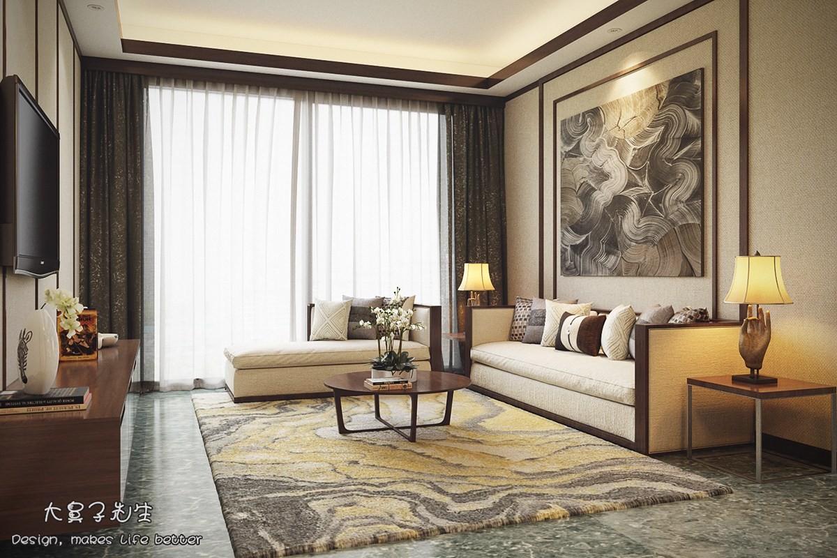
If you're looking for the five elements of the Chinese zodiac (Wu Xing), you'll have to look for subtle abstract representations. Wood, fire, earth, metal, and water all shine through the patterns used throughout.
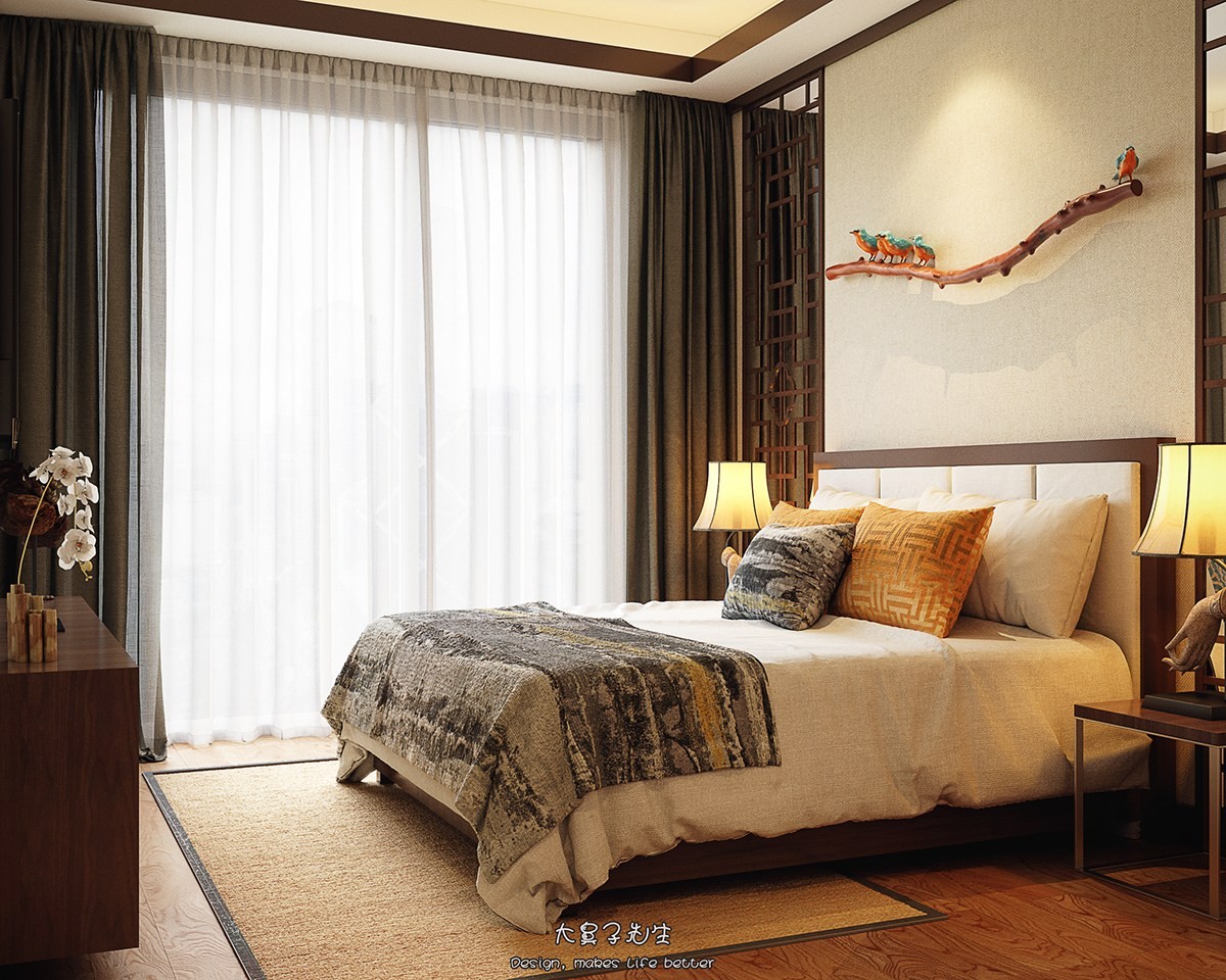
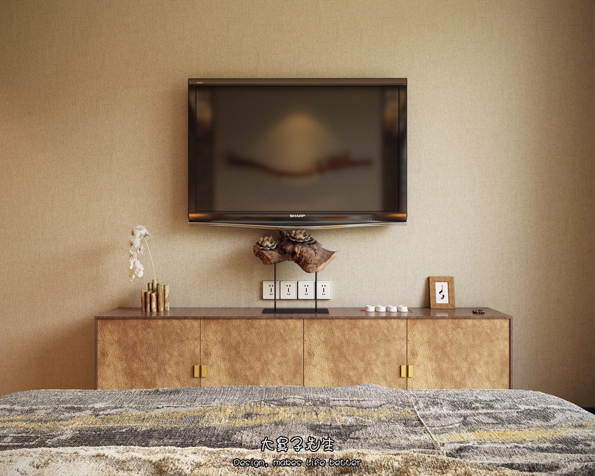
The master bedroom is warm and inviting, boasting a subdued sense of luxury thanks to the addition of gold textiles and artistic details. Each of the patterns have deep historical roots.
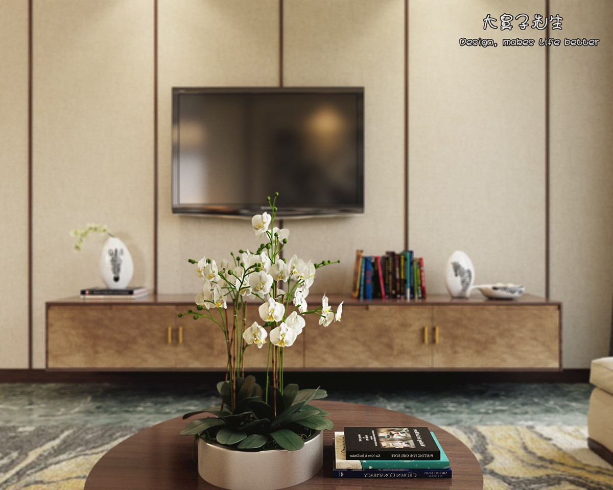
Orchids have a long and colorful history in Chinese culture: as an herbal medicine, as valuable gifts, as a booming international industry, and as a source of pride for competitive growers.
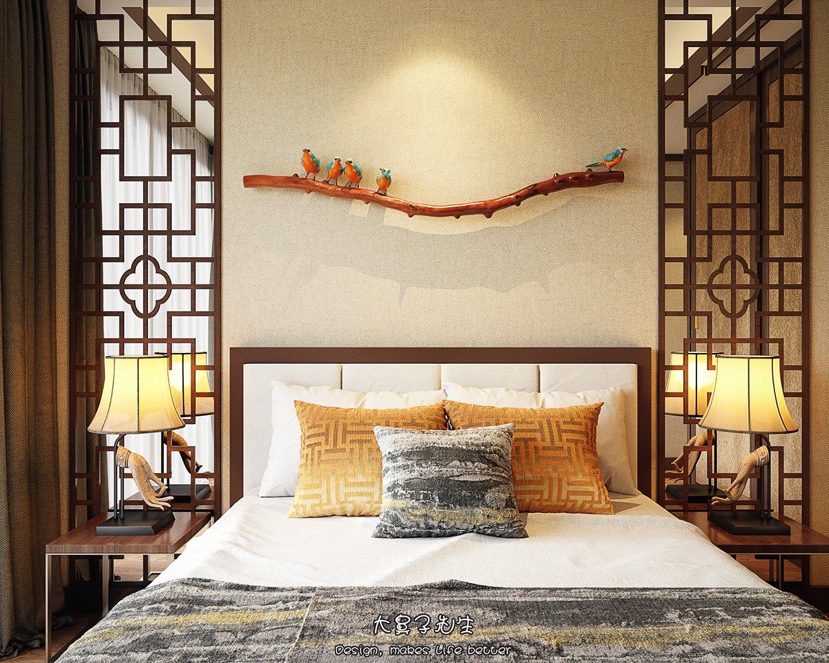
Although feng shui isn't widely practiced anymore, practitioners often warned against hanging a mirror facing the bed. These mirrors reside on either side – a more acceptable placement.
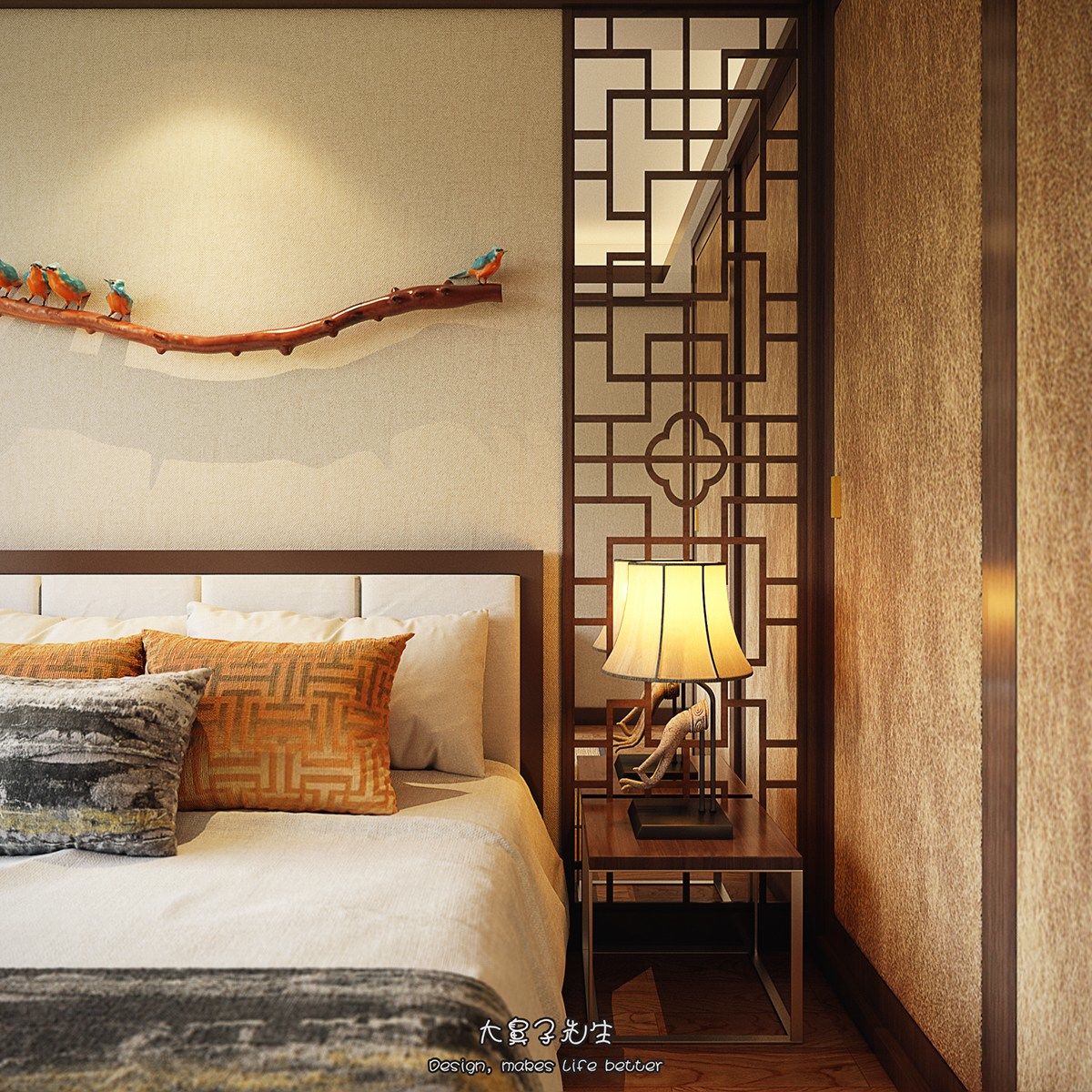
Do you remember the mudra lamp from the living room? These symbols are a recurring and auspicious theme. This one represents the Vitarka Mudra.

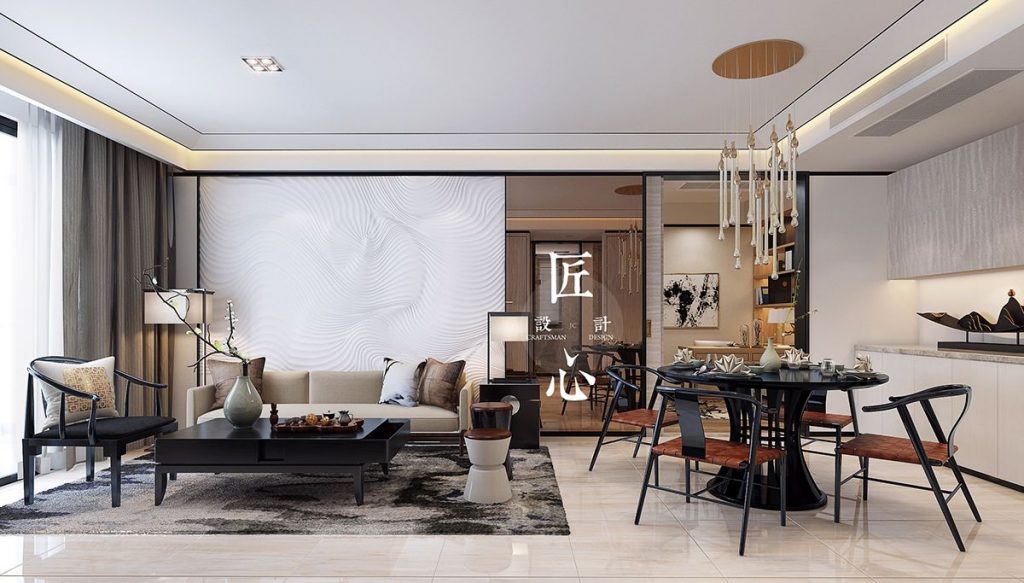
Here's a home with an even more modernized style. This delightful space is the work of Hangzhou-based designer Xiang Chen for a new project in Nanjing. This home feels bright and spacious despite its modest floor plan – it's more minimalist than the previous home, but the magic is in the details.
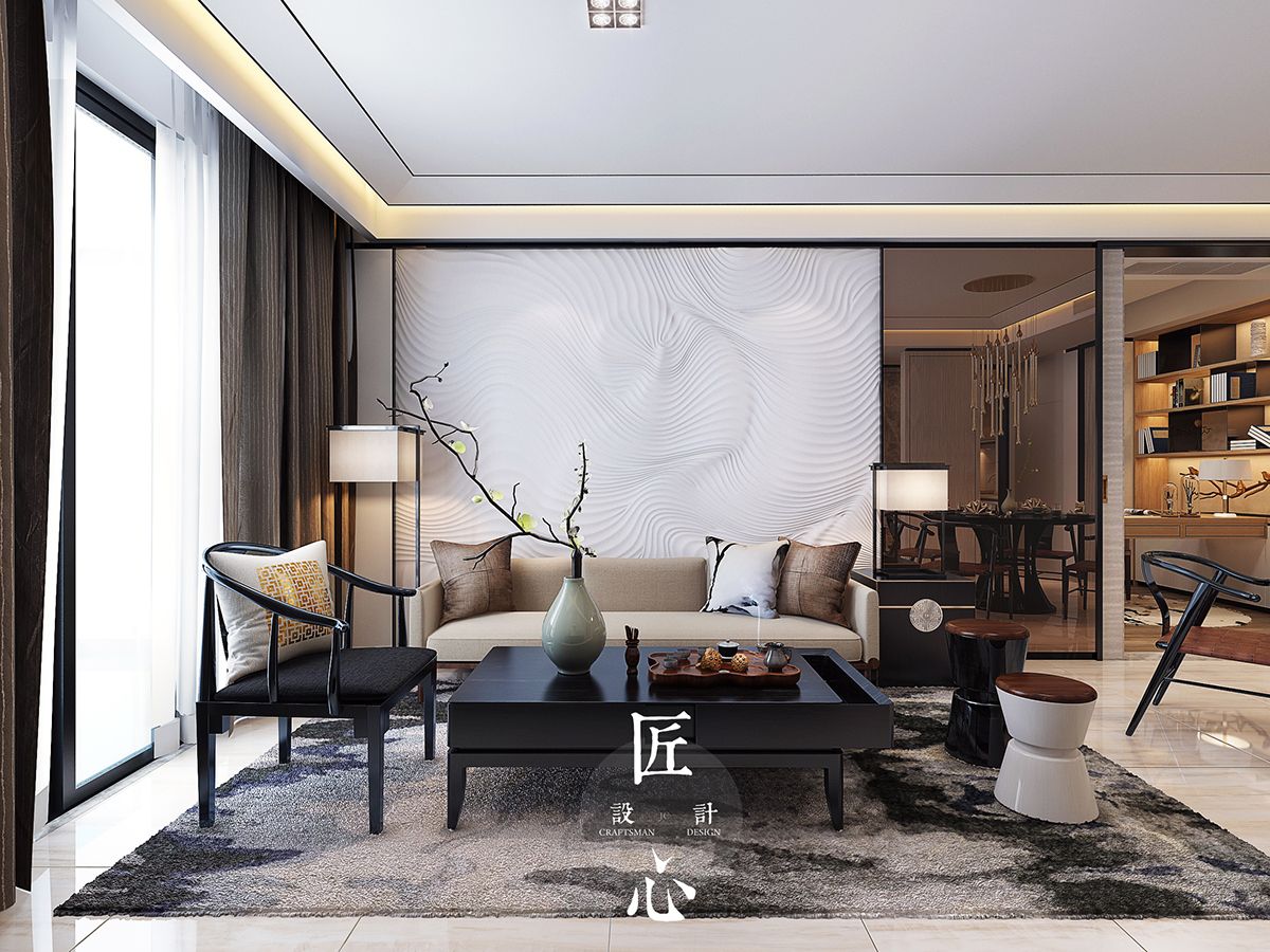
In 1944, iconic Danish furniture designer Hans Wegner created a series of chairs inspired by Ming dynasty. The chair on the left is an example from this famous collection and a great demonstration of how this home combines modern and traditional influences.
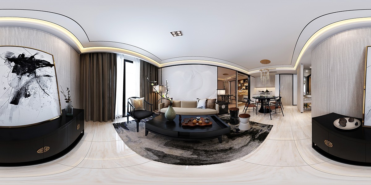
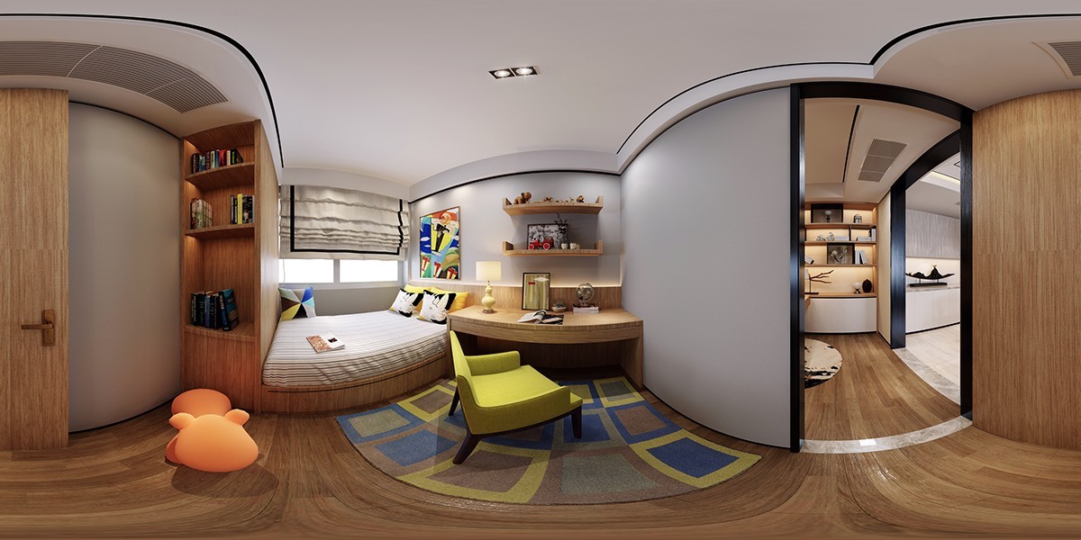
Panoramic visualizations are difficult to parse at times, but this image does help give an idea of the home's layout. It's kind of neat how the flowing effect of the walls matches the textural backdrop behind the sofa.
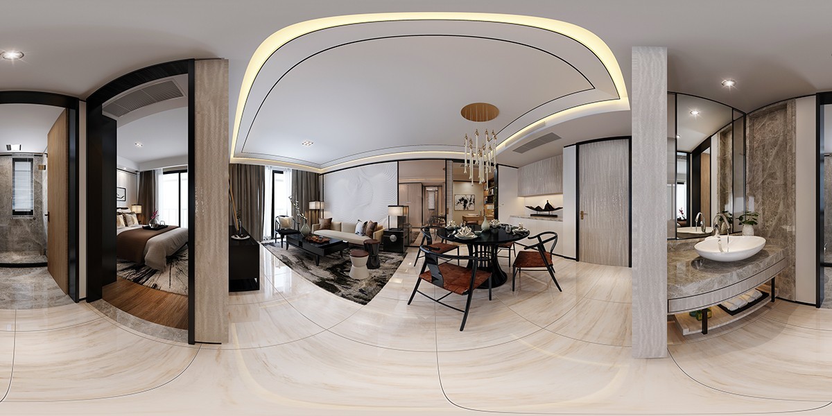
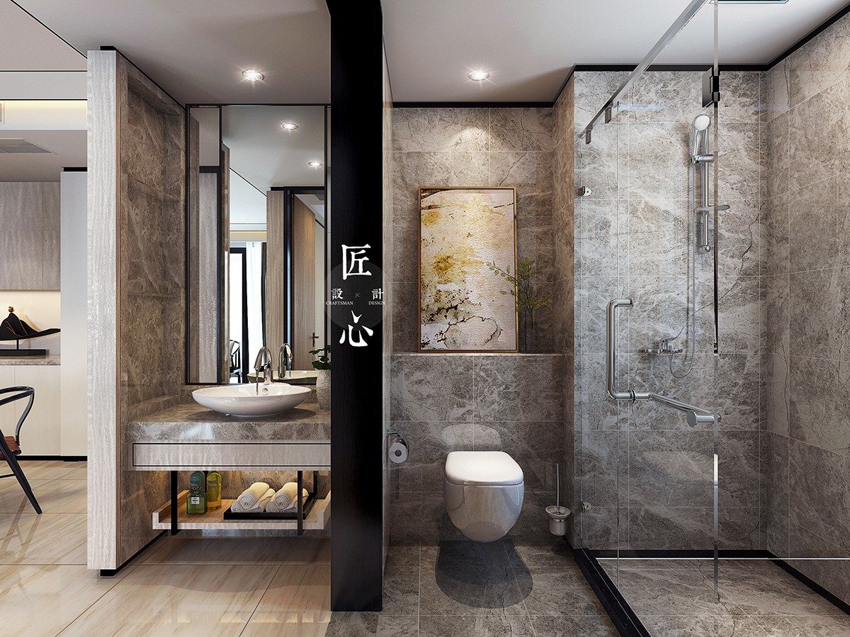
Although the interior material theme feels cohesive throughout, this side-by-side view shows that each room emphasizes a different element. The bedroom uses wood boldly, the living room is light and airy, and the bathroom embraces stone details.
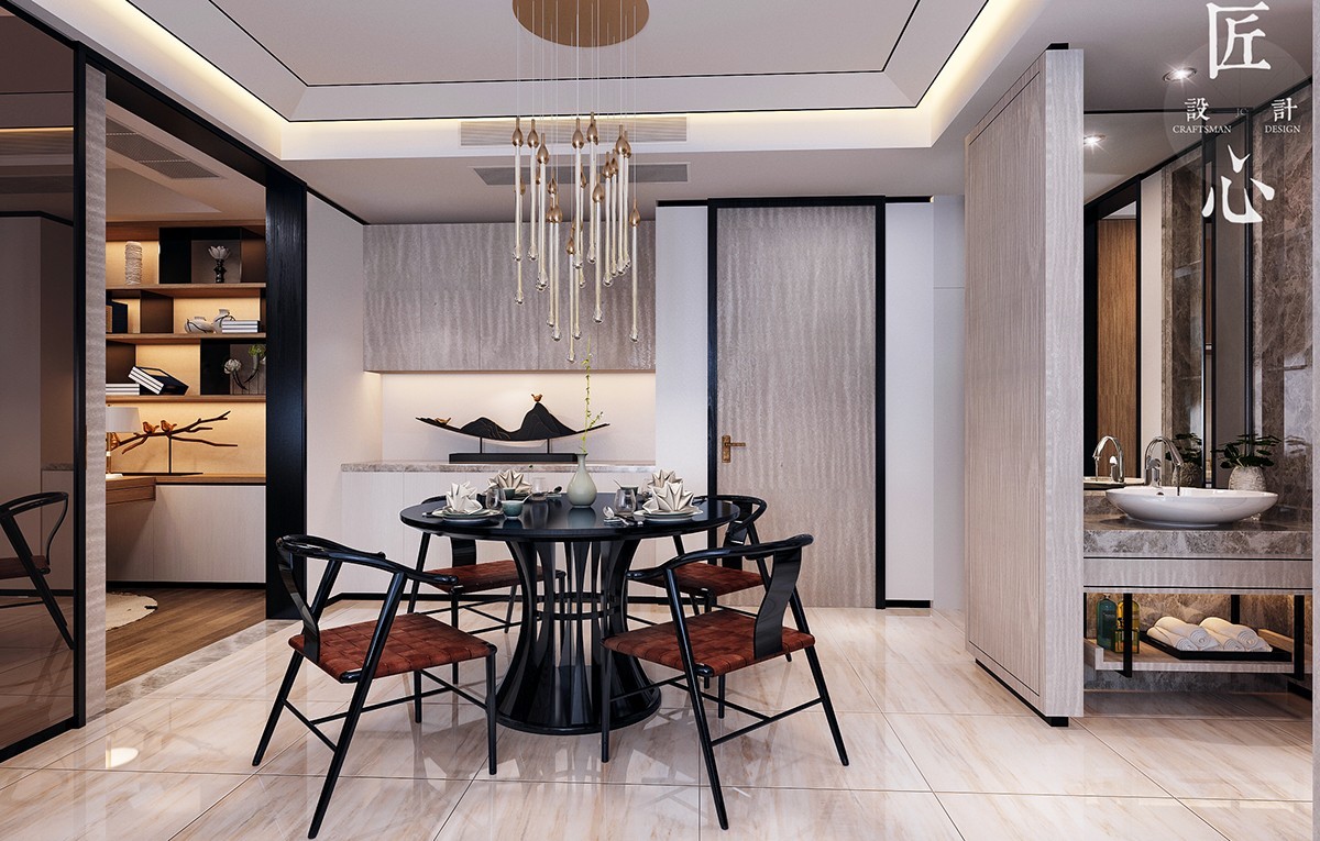
Here's a clearer view of the dining room, separated from its neighboring rooms by sliding doors where appropriate. In terms of furniture selection, these choices would look wonderful in any modern home regardless of region.
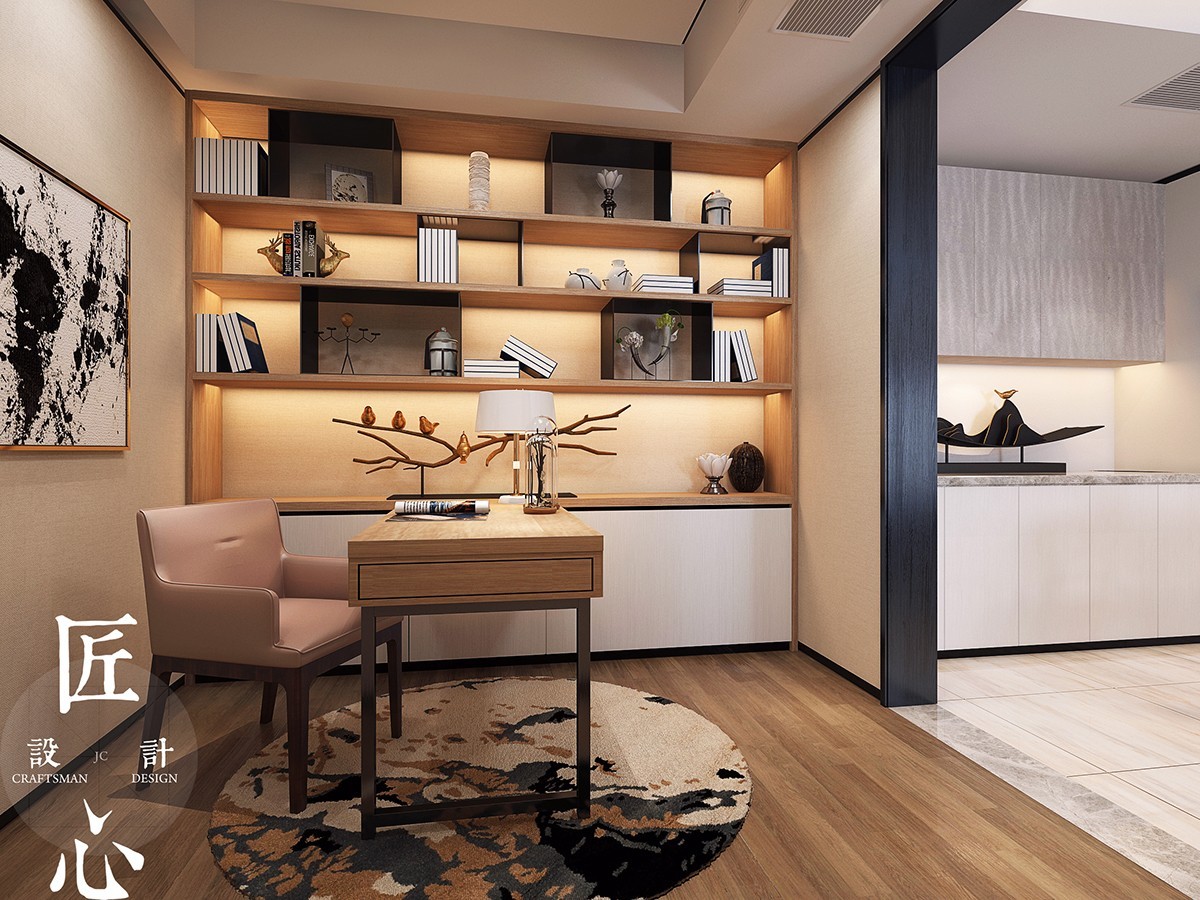
A cozy office resides in a private nook off the kitchen. It's beautifully appointed with subtle gold details. The horns, lotus flowers, and small pots are all auspicious symbols in Chinese decor.
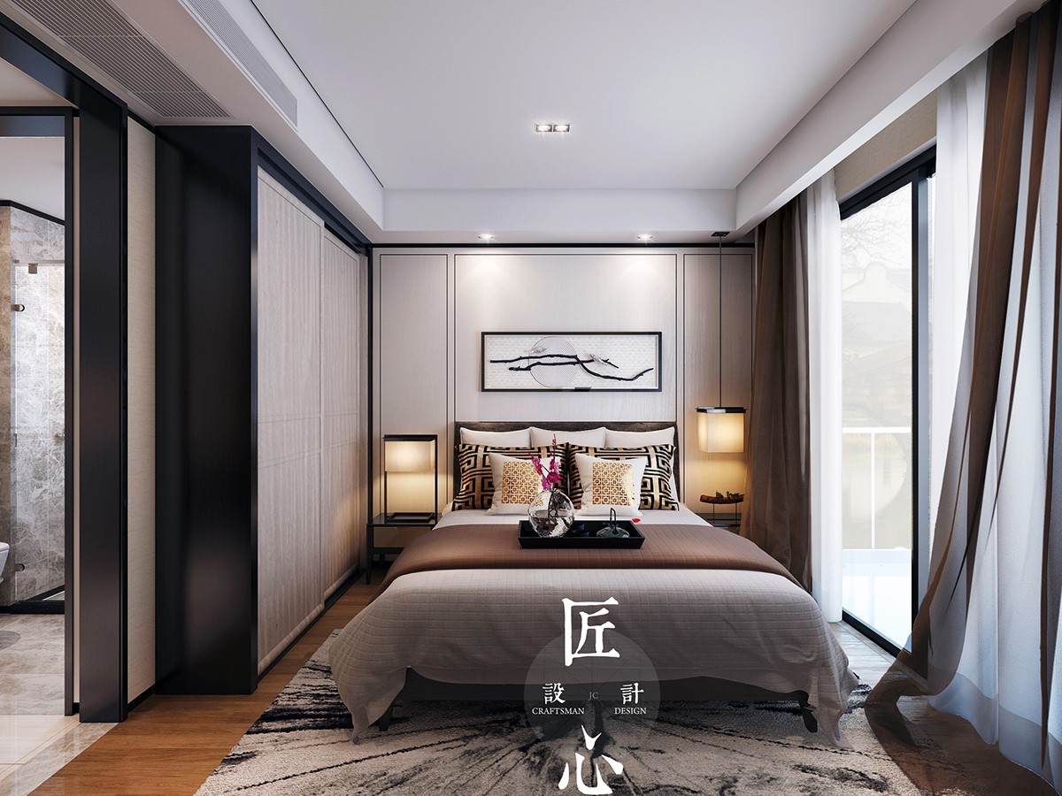
In the bedroom, neutral tones stand out against vibrant wood floors. The lighting is soft and warm to facilitate a relaxing atmosphere in the day and night alike.
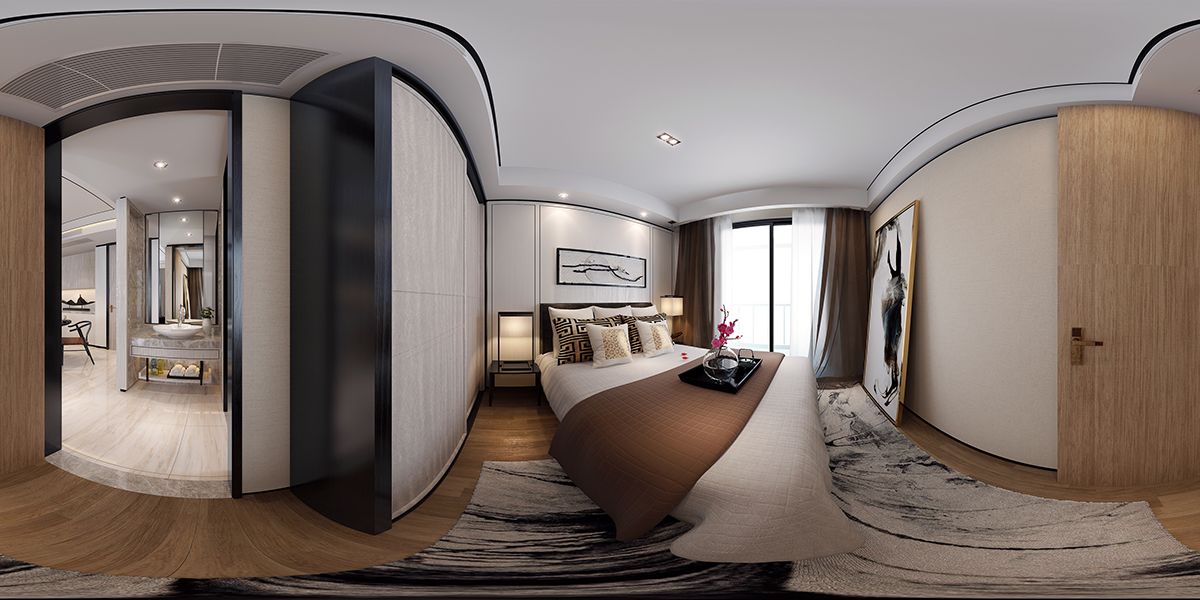
In context, the bedroom appears to have a darker theme than the adjoining dining room – but both spaces are pleasant and bright thanks to smart layering and color choices.
