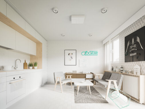
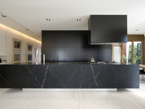
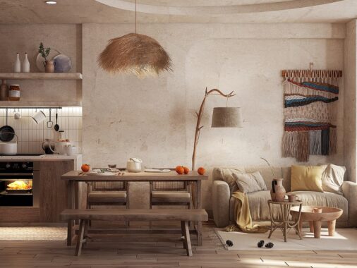
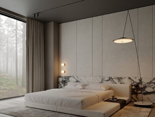
These three homes from M2 Architecture, Mihail Vasin, and Dorota Pilor essentially define the modern minimalistic style. Each home embraces the simplicity of white and build upon it with grays and other monochromatic hues. Even architectural elements like exposed brick and concrete are painted white to coordinate with the rest of the spaces. Impressive lighting accents, expansive master bathrooms, and open staircases all keep these spaces from being plain and too basic. As you read this article, learn how to re-create the modern minimalistic style in your own adobe.
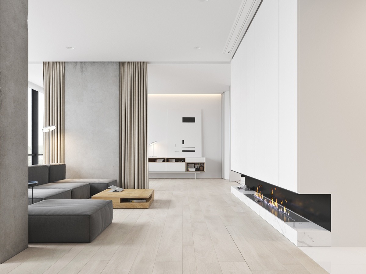
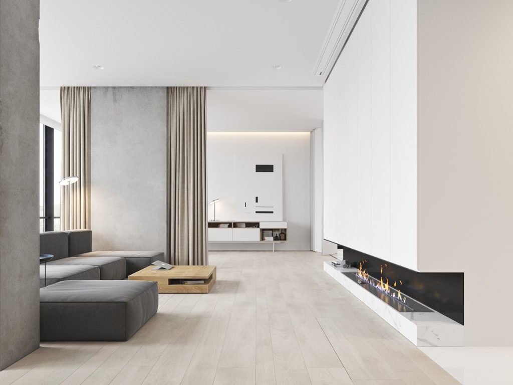
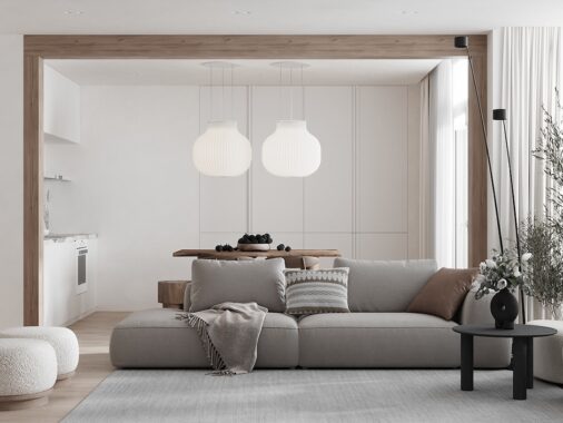
At this angle, you can see into the entire living space of this home designed by M3 Architecture. The white walls are broken up with the grey couch and taupe curtain dividers.
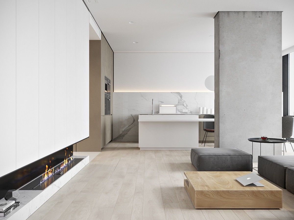
When the space opens up to the kitchen, you're ready to host friends and family gatherings. This minimalistic design showcases the marble accents in the kitchen. The fire is one of the only accents that isn't a neutral shade.
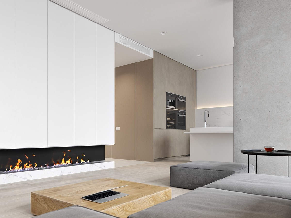
Appliances stacked together in even numbers adds a punch to the modern feel of the kitchen. Stainless steel accents the white and gives the entire home an industrial feel. Lofty and open, you can take a breath and not feel overwhelmed in this living room.
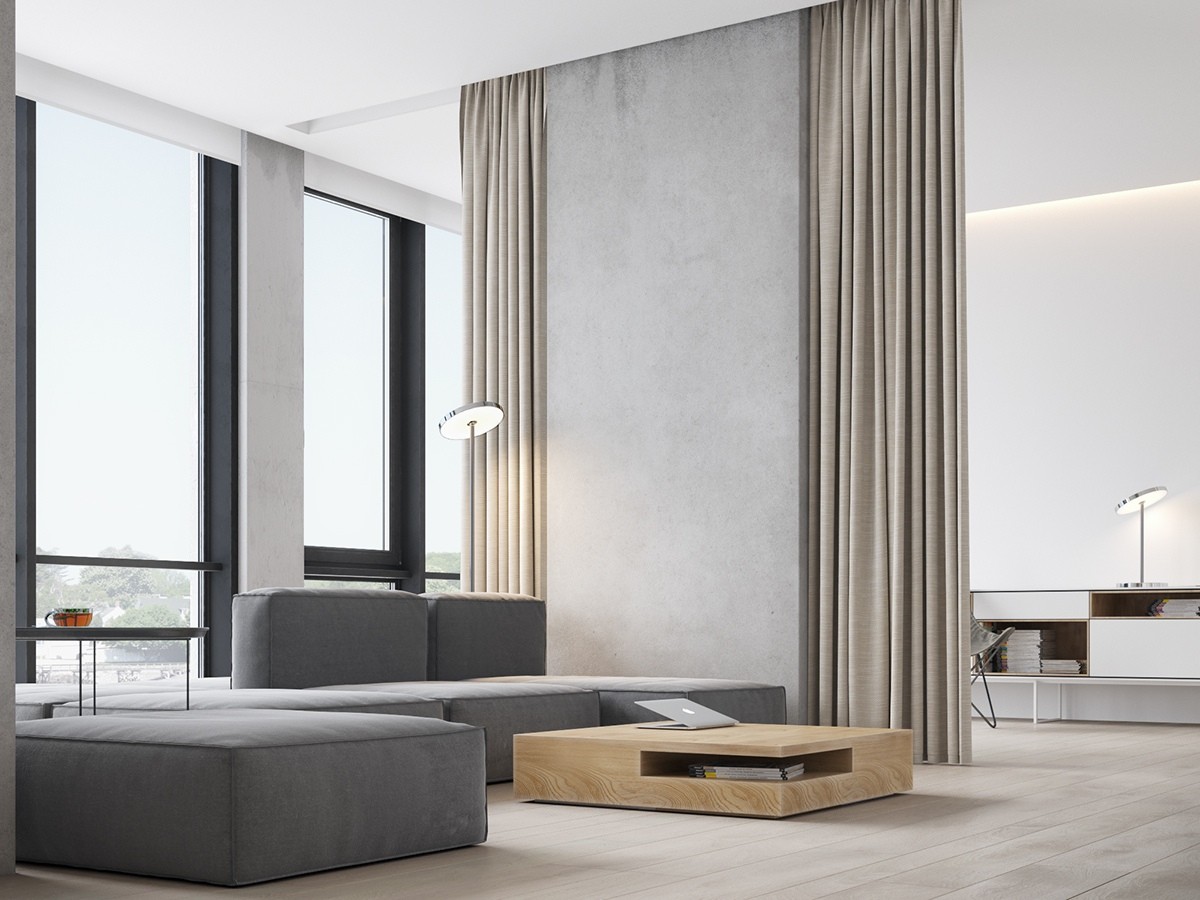
A grey couch that's lower to the ground can be rearranged to your lifestyle. Having a movie night? Take the backs off of the couch and have everyone lounge on it as if it were a large bed! The floor-to-ceiling windows also give the space a wide-open feel.
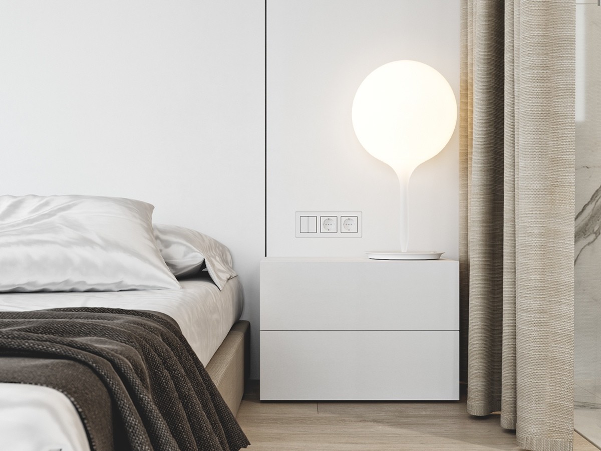
Just because the colors in this home are simple, it doesn't mean you can't have fun with other accents. The balloon-like bedside table lamp on the end table adds a sense of whimsy. Keeping with the modern minimalistic aesthetic, the electrical outlets are kept simple and flush with the wall.
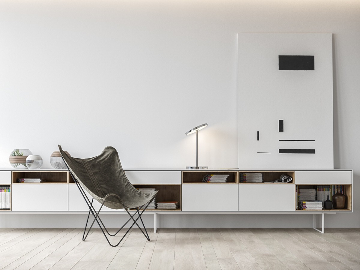
Lower shelving makes the ceilings look larger in a loft-like space. Instead of adding visually heavy chairs, this butterfly chair takes up less space and can be moved to different rooms.
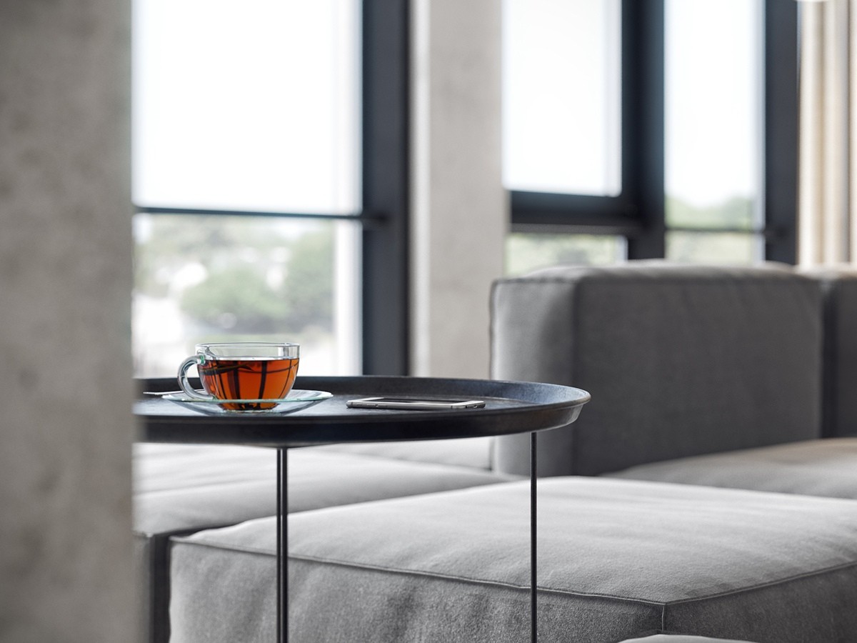
When your entire home is white and black, any other color grabs your attention. Can you imagine how relaxed and worry-free you'll be when enjoying a cup of hot tea in this impressive room?
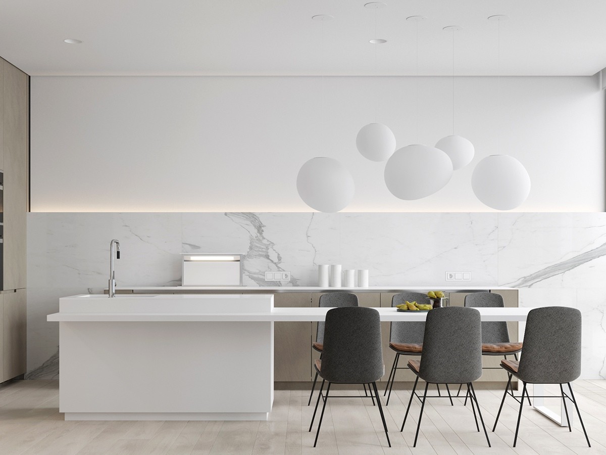
In this kitchen, the only colors other than white are the gray chairs and fruit. This makes the room look extra large and fresh. The organic shapes hanging above the dining table is a welcome contrast from the straighter lines.
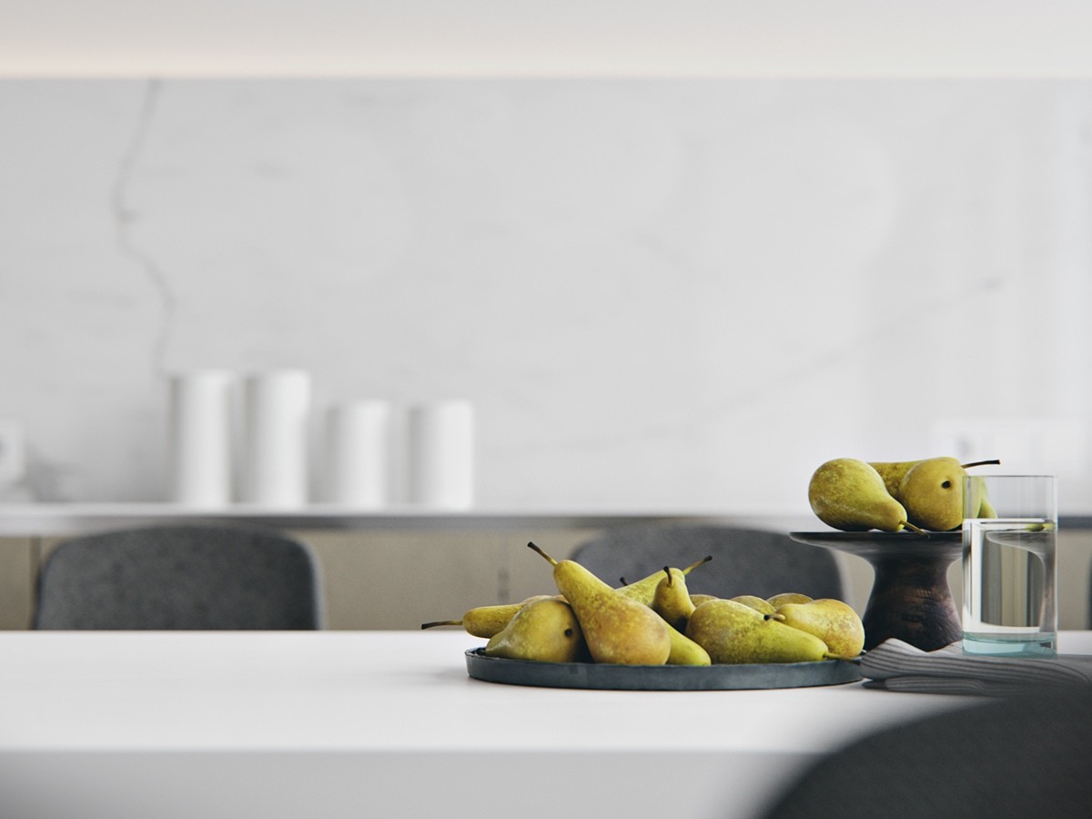
Don't have fresh fruit to lay out on display? Don't worry! Instead, invest in quality fake fruit and keep them out all the time. You'll never have to worry about the fruit going old and guests will assume you just got home from the farmer's market (until they try to take a bite)!
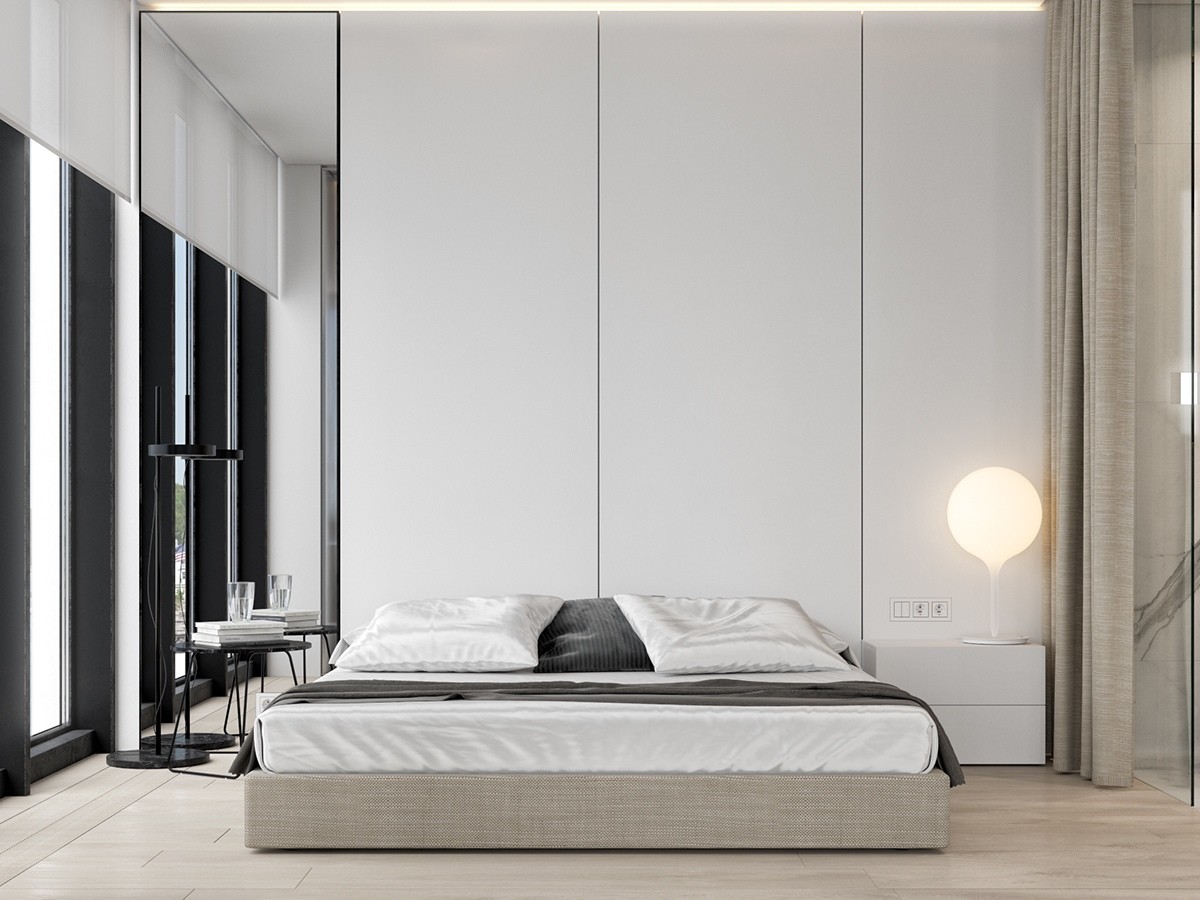
There is no need for a headboard if you are keeping things minimal in the bedroom. The large white walls behind the mattress make a statement on their own. White shades on the tall windows can be utilized at night and also match the rest of the home.
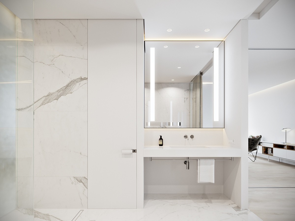
Marble bathrooms are timeless. This space feels like a spa. Unique lighting behind the mirror gives the space a more relaxed mood.
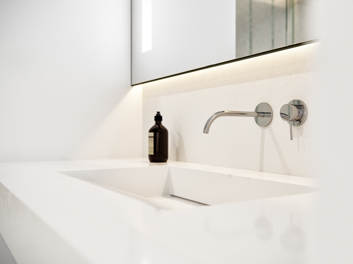
Keep soaps and toiletries to a minimum to keep with the modern aesthetic. A simple soap bottle that has a beautiful design will suffice. A rectangular sink matches the rest of the home's square shapes.
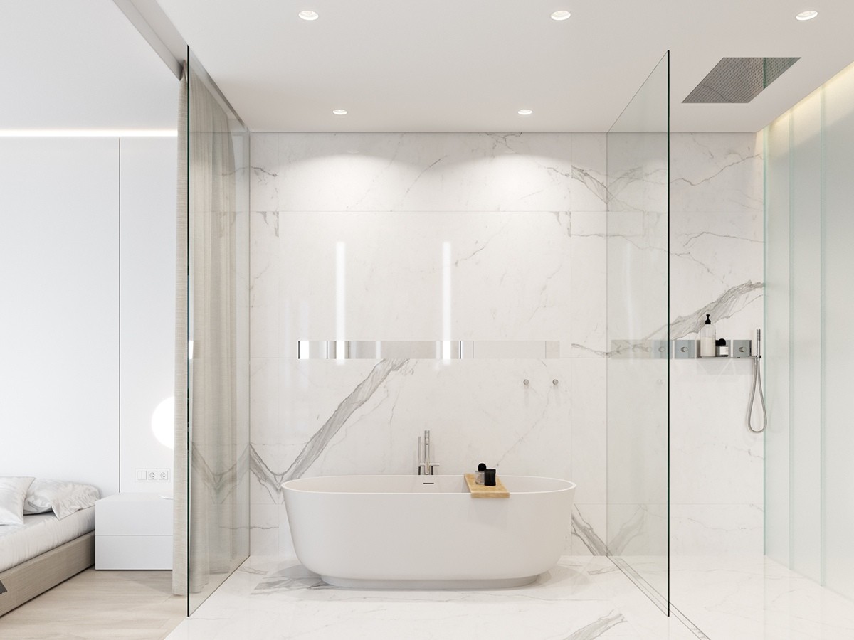
One of the only organic forms in this home is the bathtub. Freestanding, this tub looks like it belongs in a magazine. A wooden shelf contains favorite bath salts, a book, or a glass of wine.
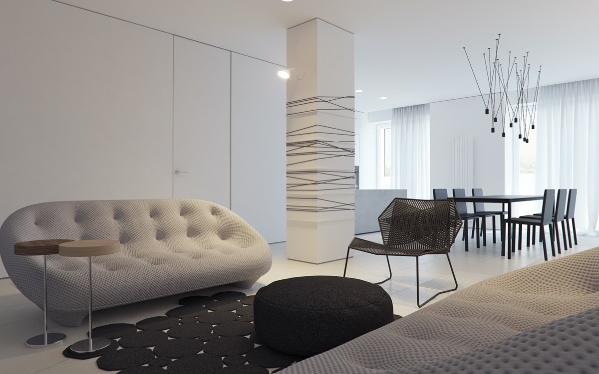
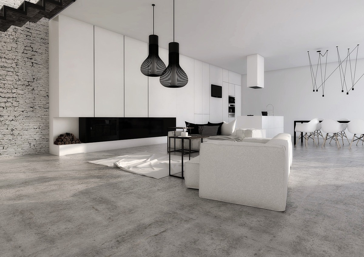
This next home is visualized by Mihail Vasin. Similar to the home by M3, this space embraces white and also has statement lighting accents. The large column in the middle of the room is broken up with black stripes.
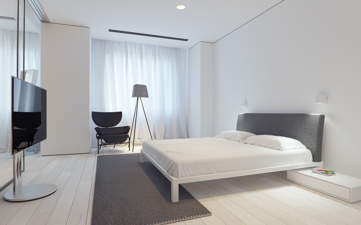
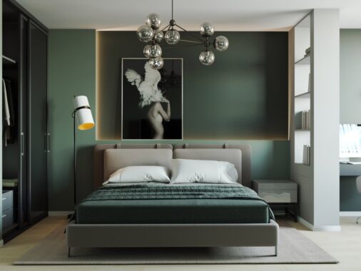
A gray headboard in this master keeps the room from being too white. This then matches the chair and floor light. A gray rug anchors the whole design.
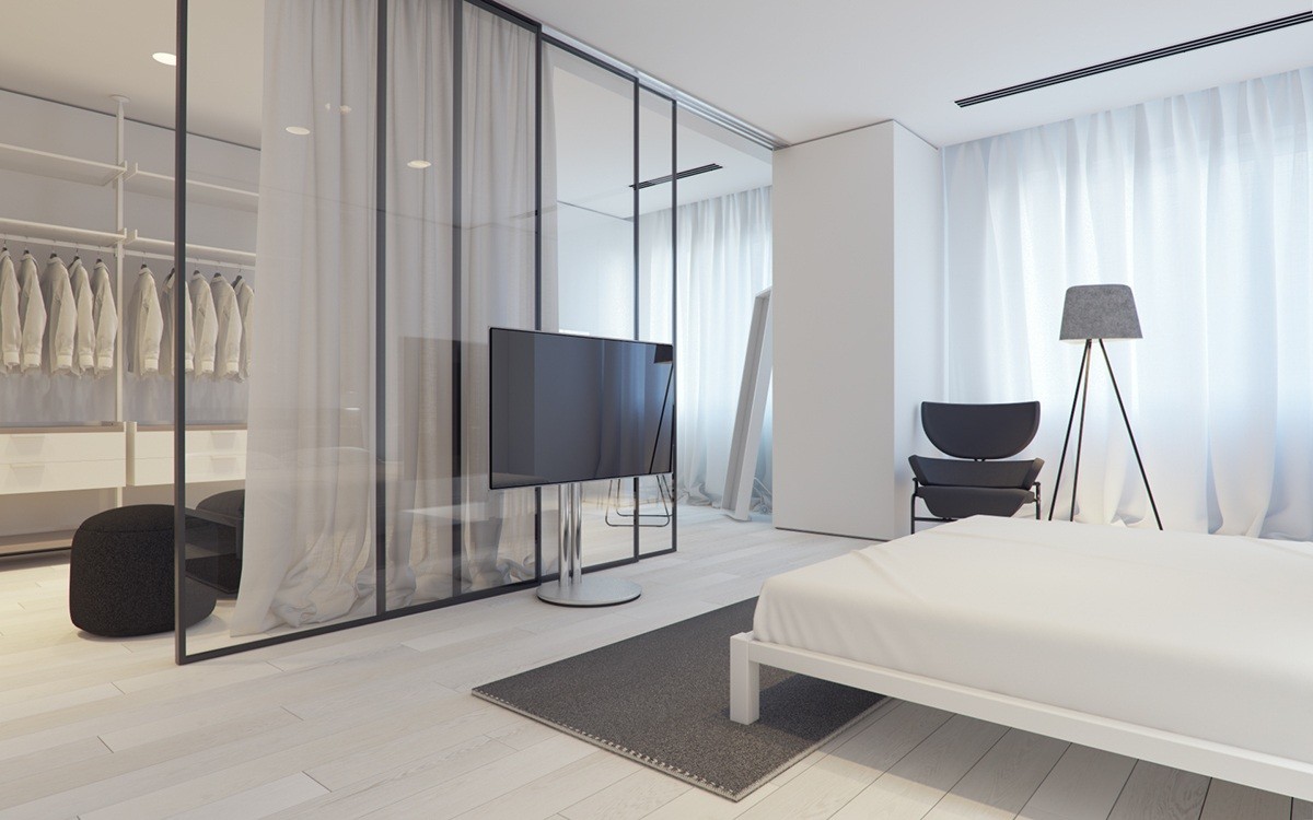
Think of all the clothing articles you could place in this massive closet! Hidden behind the flatscreen T.V, this closet would delight any fashion lover. The best part is that you can open the curtains to see in or keep it blocked off from the rest of the retreat.
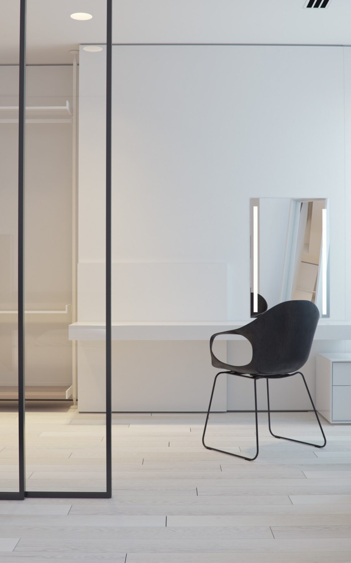
Just because it's a closet doesn't mean it can't serve more than one purpose! A black chair and desk offer the perfect place to flip through a magazine or write a quick email to a friend.
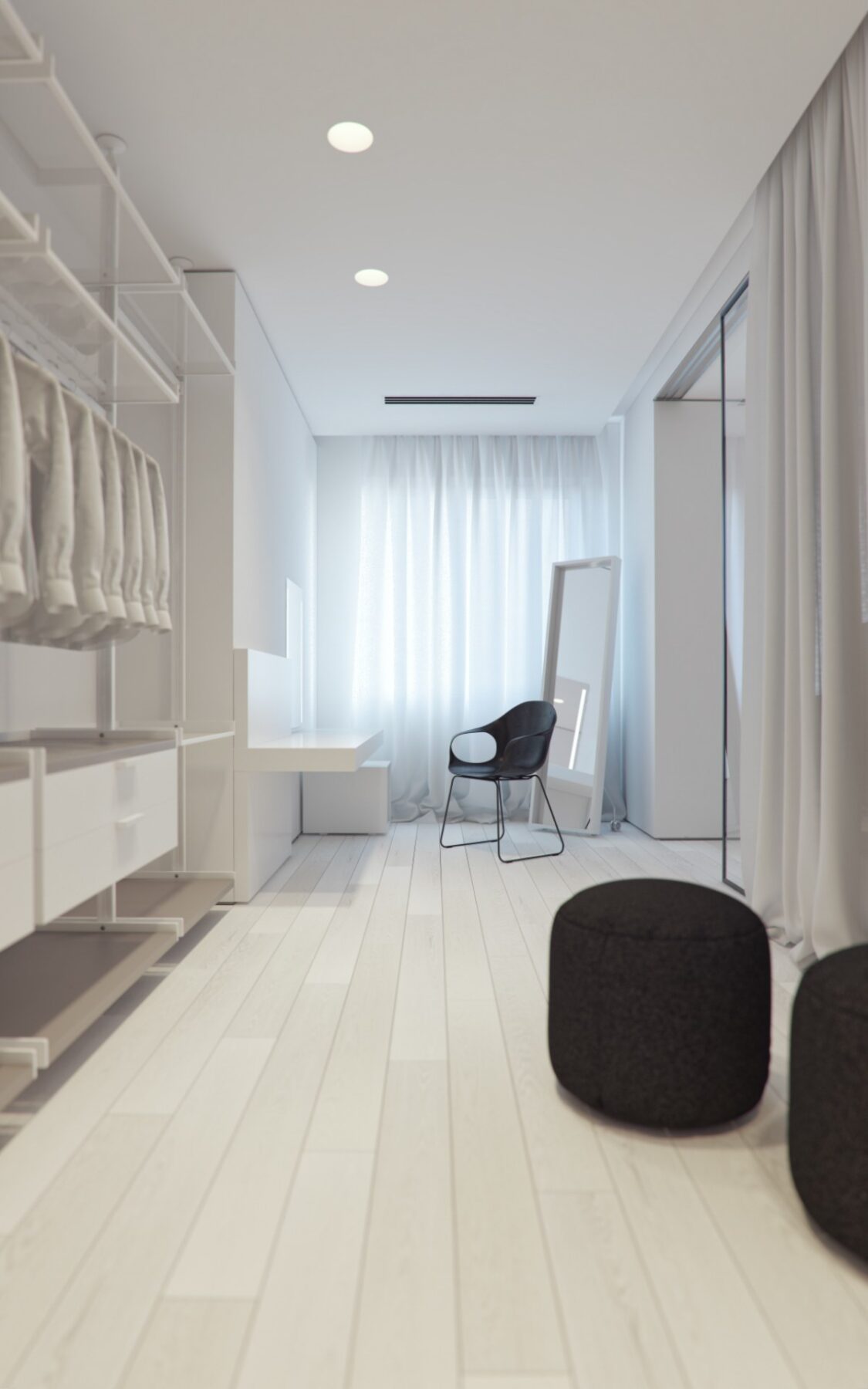
You won't have to worry how you look with the lighted up standing mirror in the corner of this closet. White wooden floors keep the eye moving to the window, which is covered with flowy white material. Both the dark chair and ottomons give the room style.
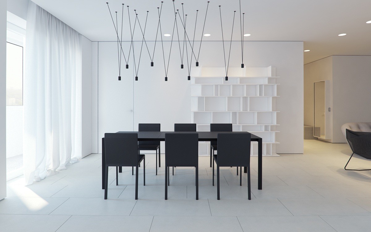
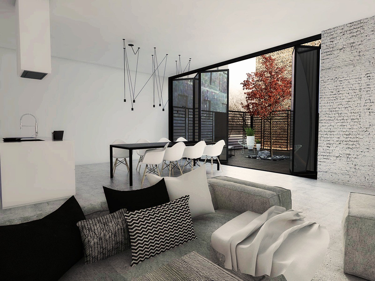
This space is all about contrast! The black table and chairs along with the black lighting take a one hundred and eighty degrees from the rest of the room. The white walls and black make a dramatic effect.
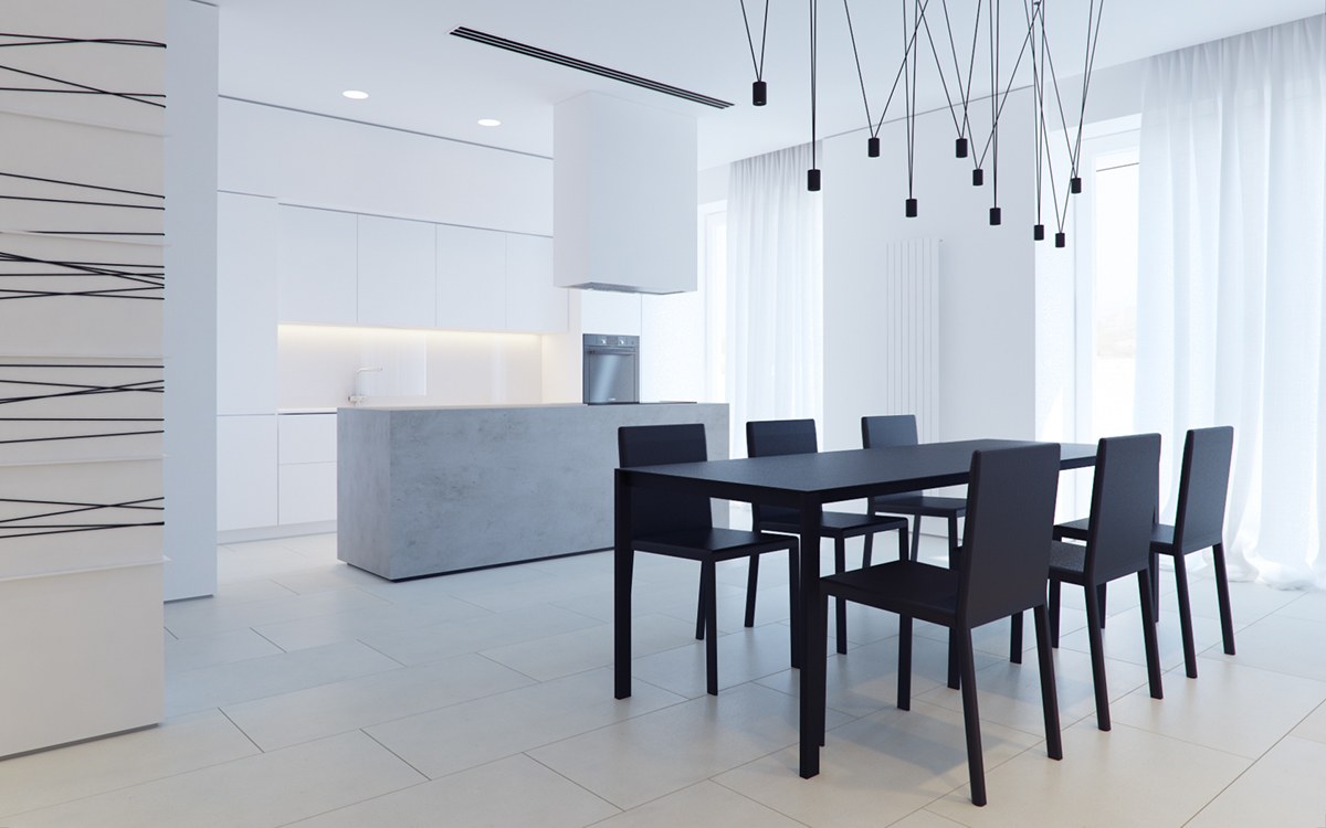
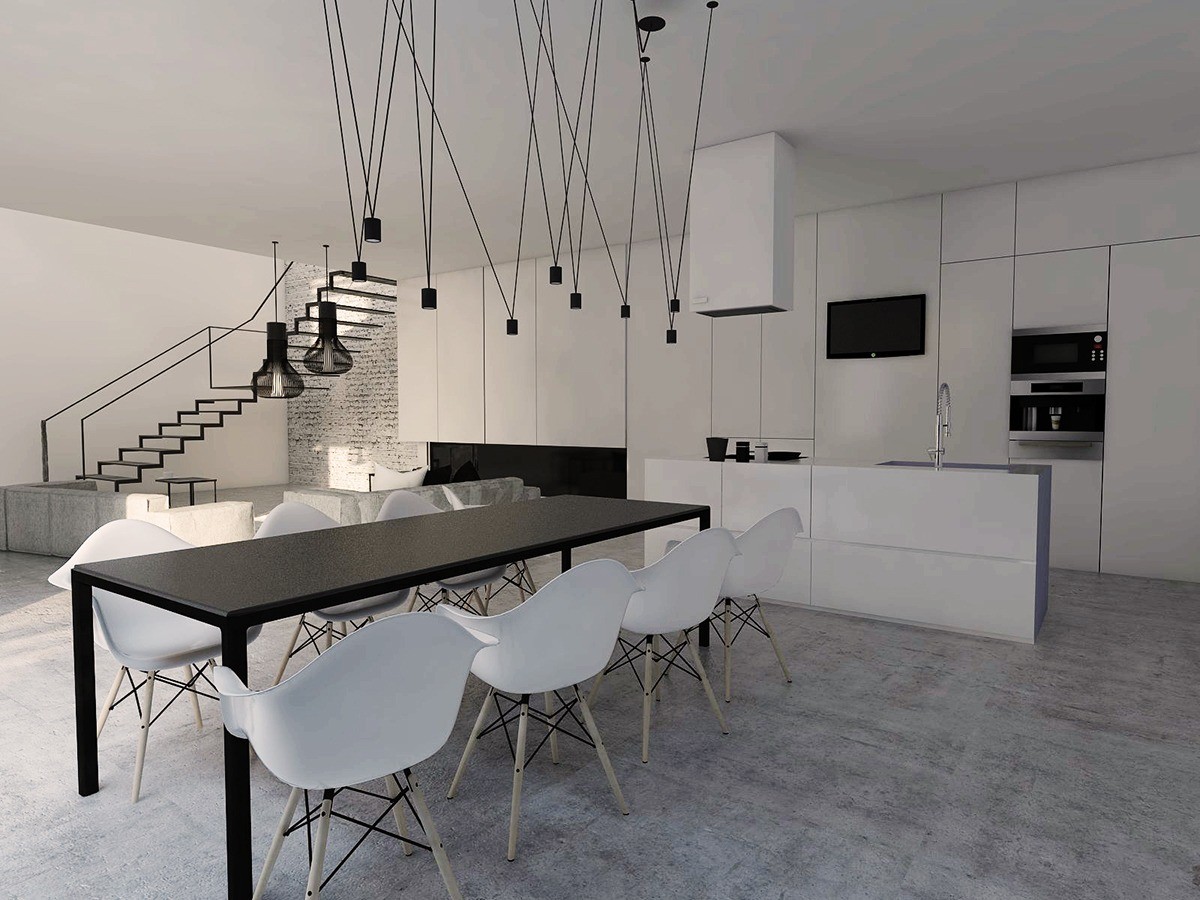
Looking into the kitchen, you can see the home designer has included under-the-cabinet lighting to add another light source in the room. This works together with the other canned lights.
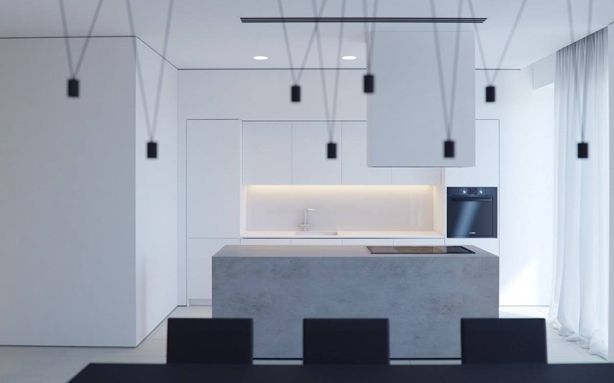
Even though the cook top exhaust takes up a lot of space, it doesn't seem like it because it is painted white. The color helps it blend in with the rest of the kitchen.
