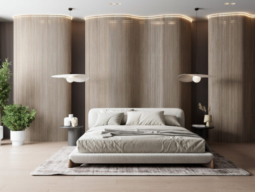
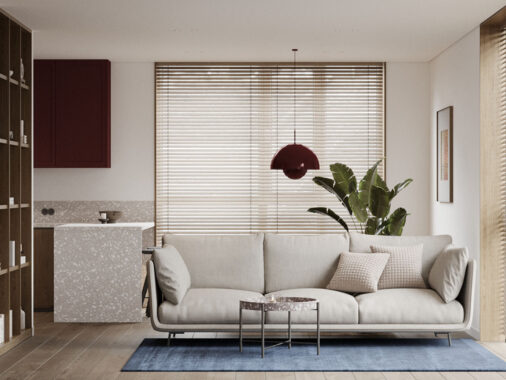
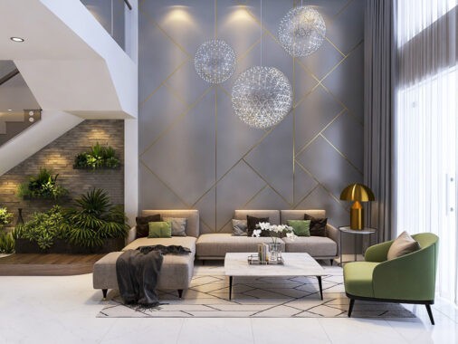
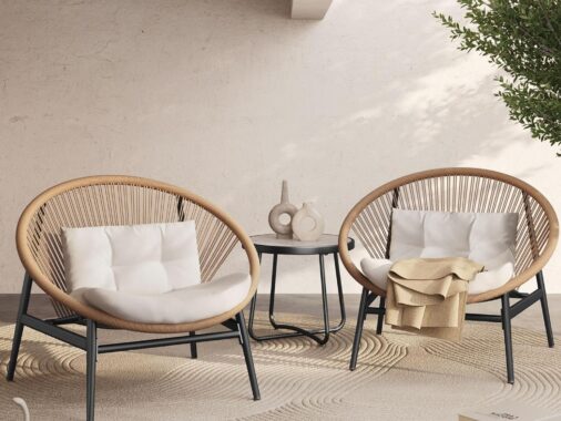
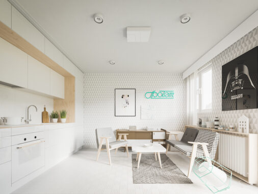
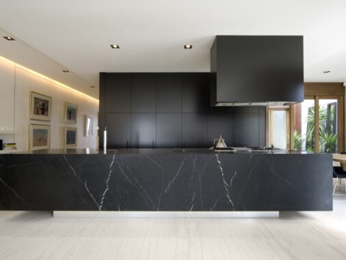
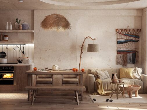
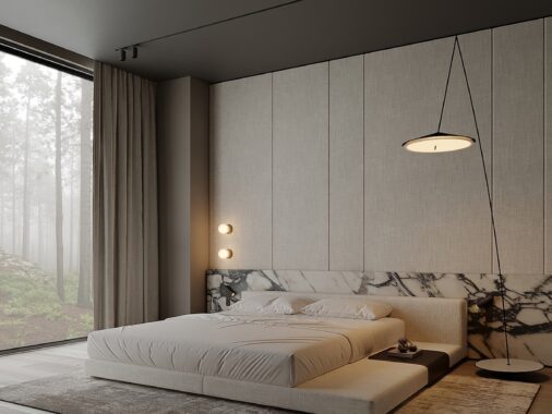
Neutrals are great choice for designers who want to make a modern first impression, while still leaving plenty of flexibility for future changes or updates down the road. Neutral themes are just so simple to work with, a distinction they share with the equally easygoing range of natural color options. Nature and neutrals might not seem like a common pairing, but you may have already used this functional color palette without knowing it - especially if you ever decorate with muted floral hues, dazzling gem tones, or even the basic brown of finished wood. Each of these color-coordinated homes takes a different approach.
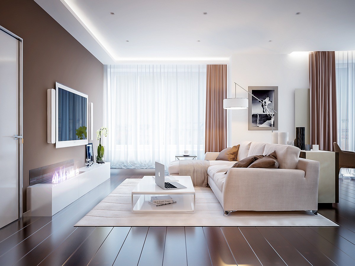
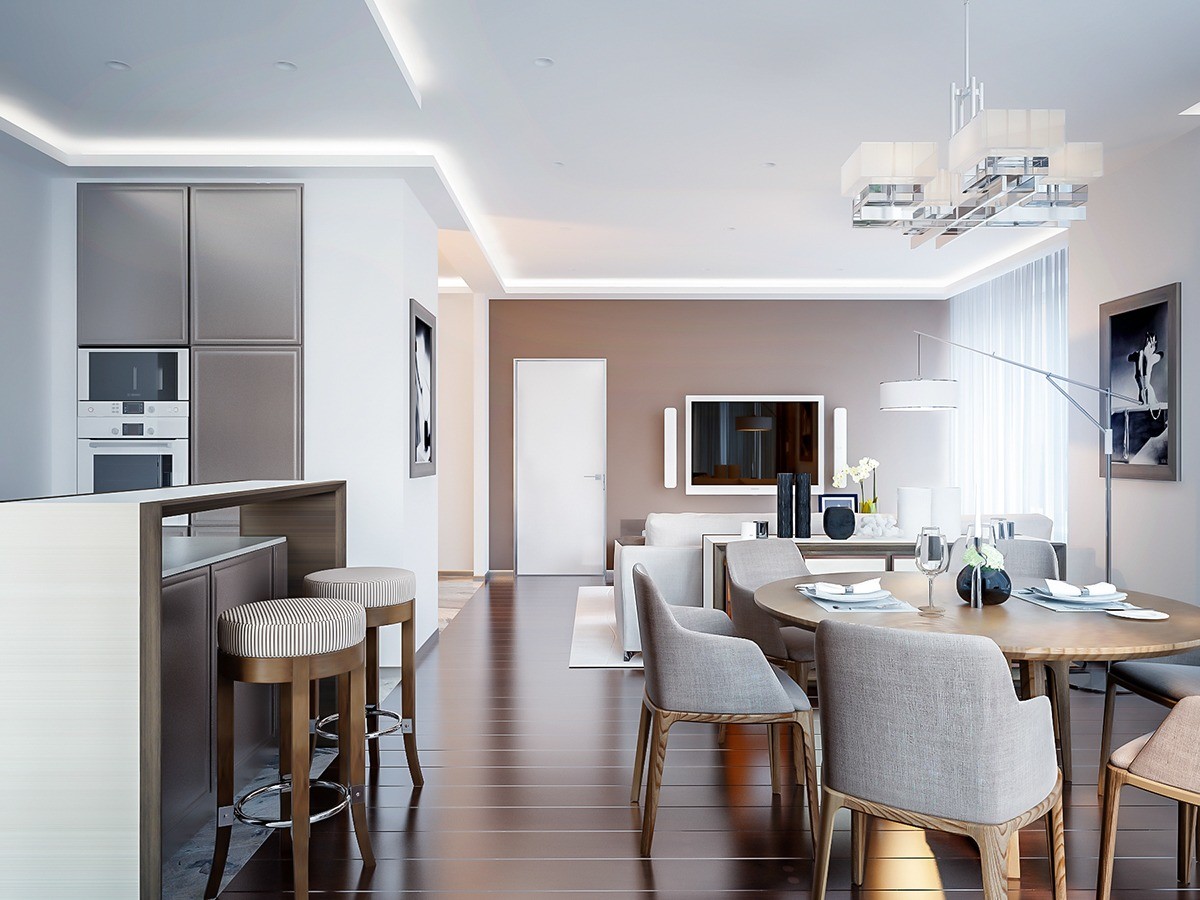
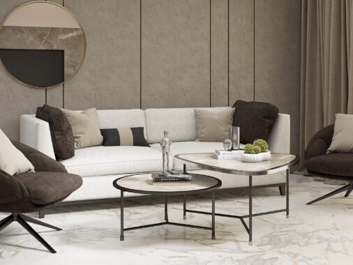
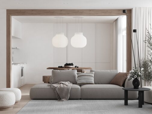
These warm neutrals span a range of tans, some even bordering on mauve. A combination of matte and semi-gloss textures help the darker shades feel more vibrant and more luminescent than they really are, making the room feel dynamic despite its limited palette. This comfortable composition remains easy on the eye through and through.
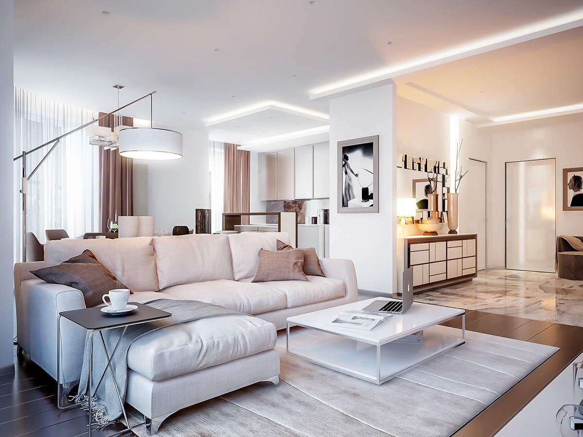
Without the full expression of warm tones, the white interior and grey accents may have felt a little too cold or strict.
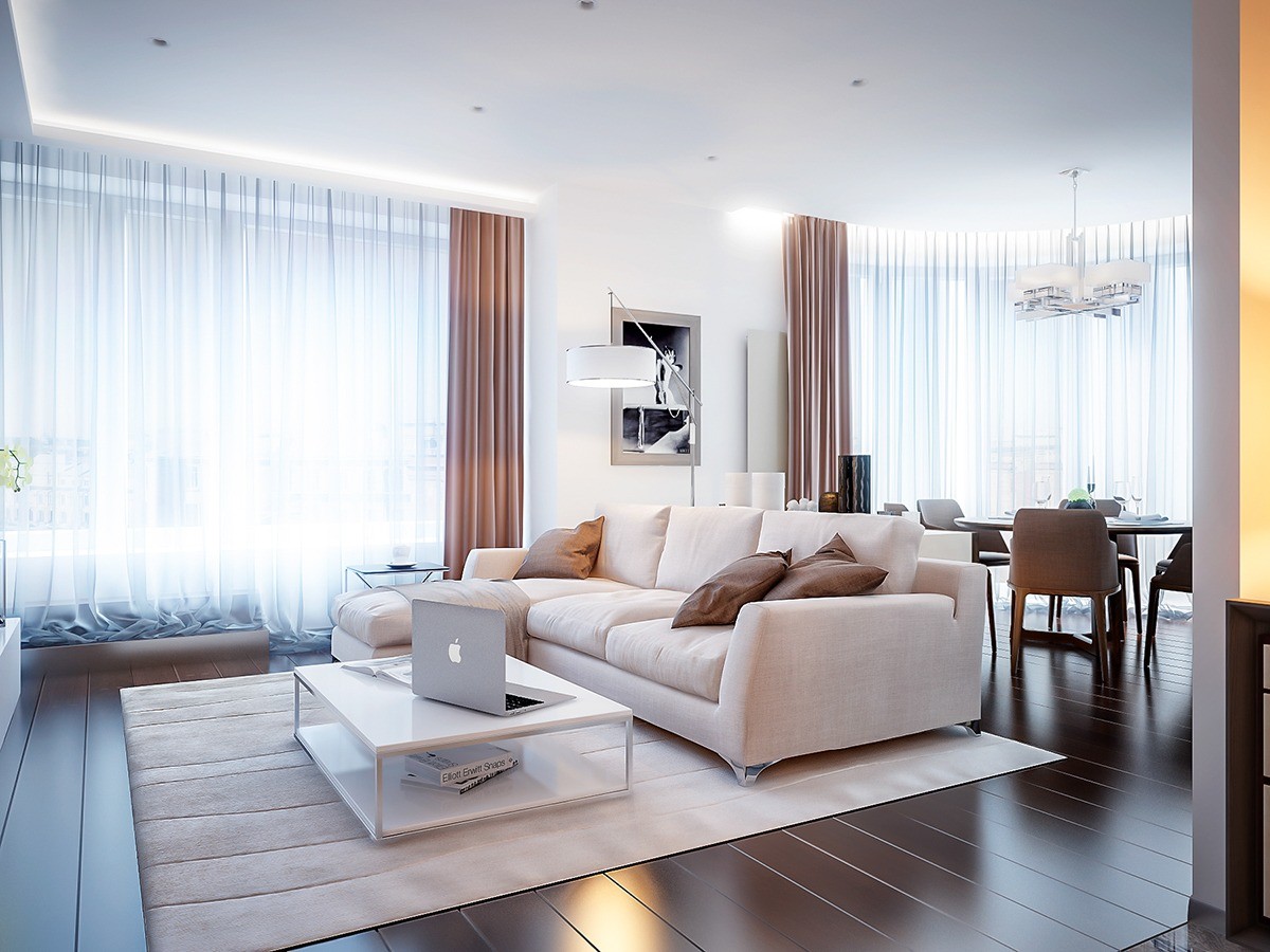
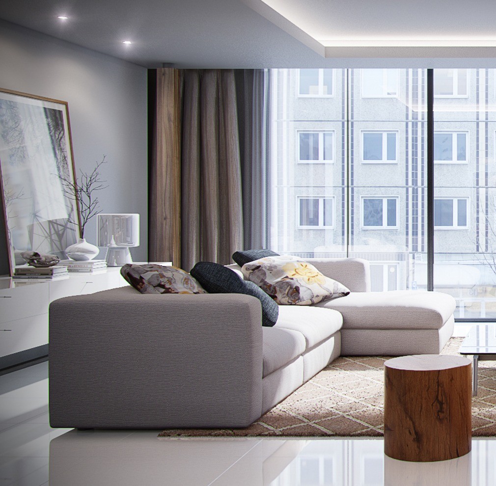
One half of the open plan living room is bordered almost entirely by curtains, impossibly sheer and light to provide just enough privacy while still enhancing the effect of the large windows. The entirety of the wall looks like a sheet of pure sunlight.
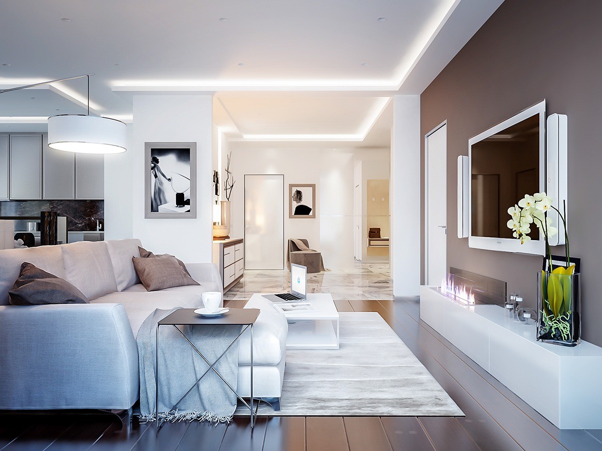
Even cozier, a fireplace takes center stage in front of the media cabinets. Those television speakers are pretty cool too – all white with rounded corners for a sleek and modern appearance.
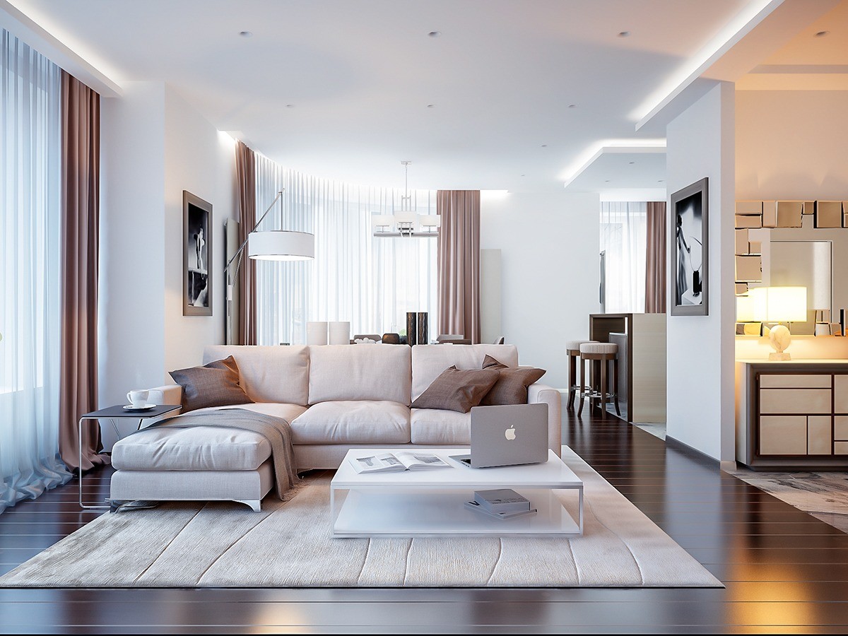
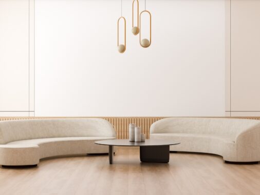
Shapes remain just as soft as the color palette. Curved accent lighting, round candles and stools, and even the edges of the sofa curve gently in toward one another.
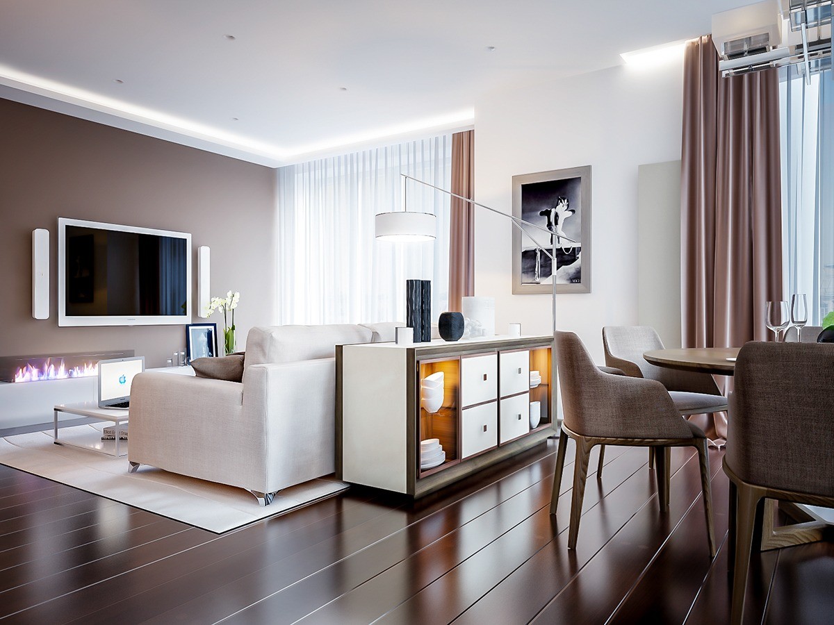
Because it's an open layout bordered by windows on one side, there wasn't much choice but to put the sofa in the center. This sideboard cabinet takes advantage of its placement.
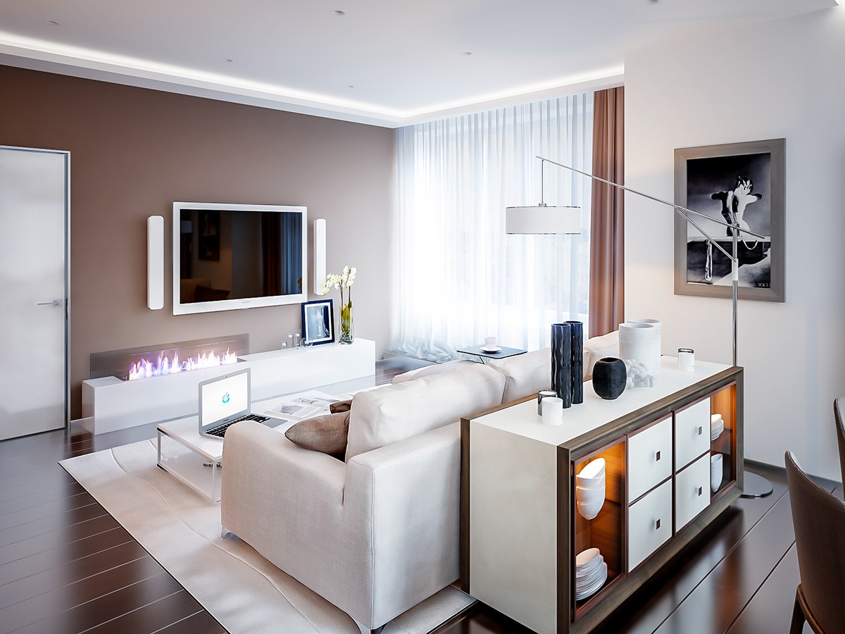
While the sofa is beautiful from every angle, this sideboard trick is a great technique for anyone whose seating doesn't look quite as nice from behind.
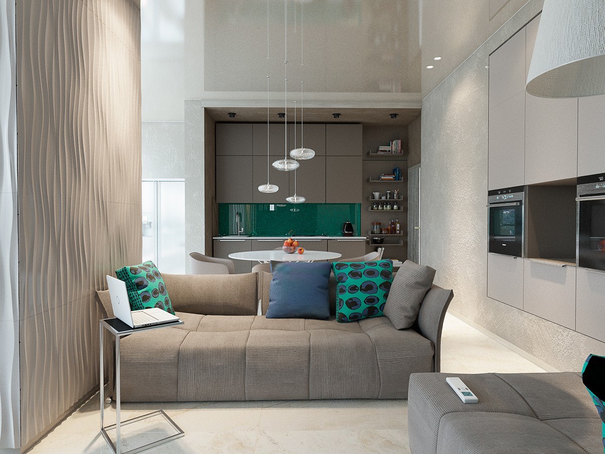
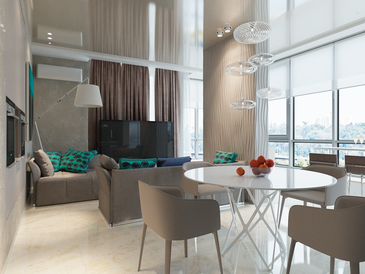
Next, the same neutral palette takes on a completely different personality thanks to the addition of teal and blue accents. While the previous home felt warm, this interior maintains a decidedly cool attitude. Textures also play a central role by echoing various materials found in nature and breaking down the strict feeling close walls can impart.
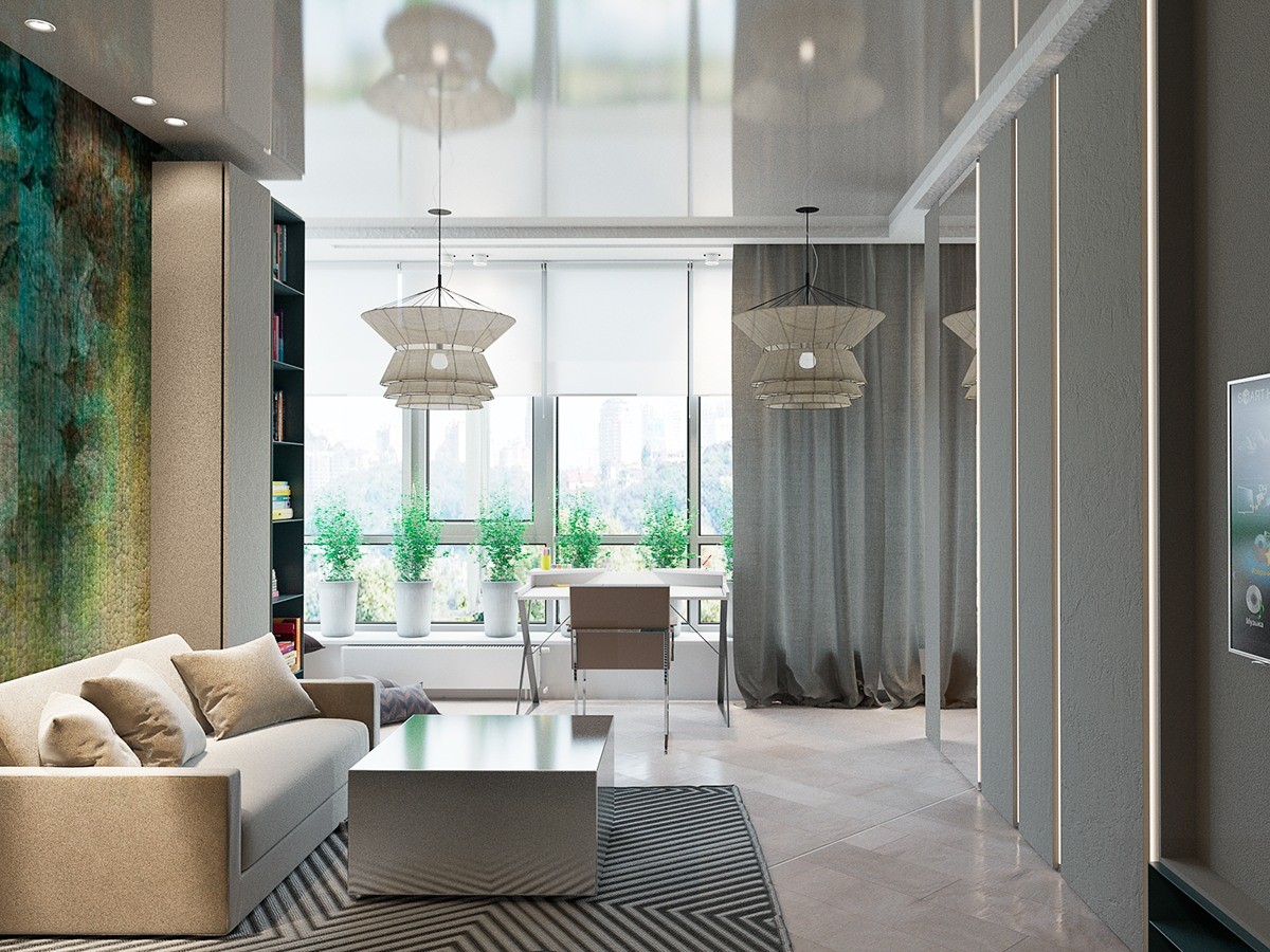
Here's another take on the natural neutral palette, this time from another part of the apartment building. Green plants and organic artwork bring to mind images of cool ponds filled with life.
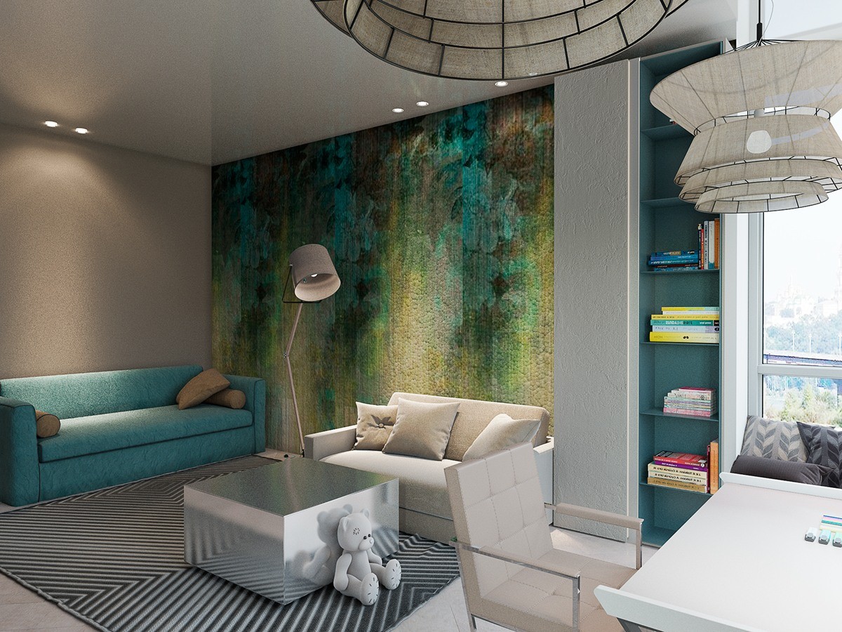
Other interior elements, like the geometric rug and metallic table, inspire an opposite atmosphere with urban undertones. Grouped blue accents help pull the living space together.
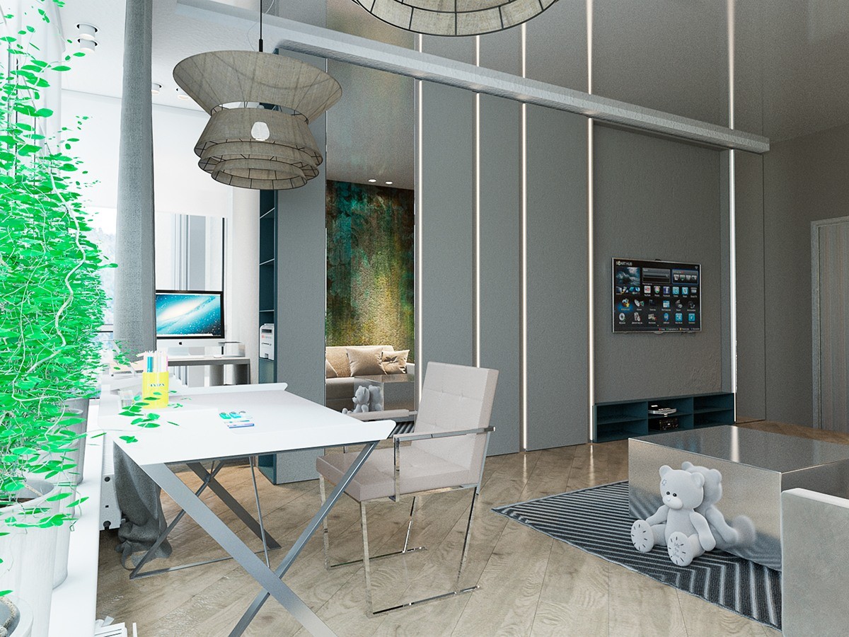
A convenient desk takes its place near the window, energized by the presence of a lovely view and plenty of lively plants.
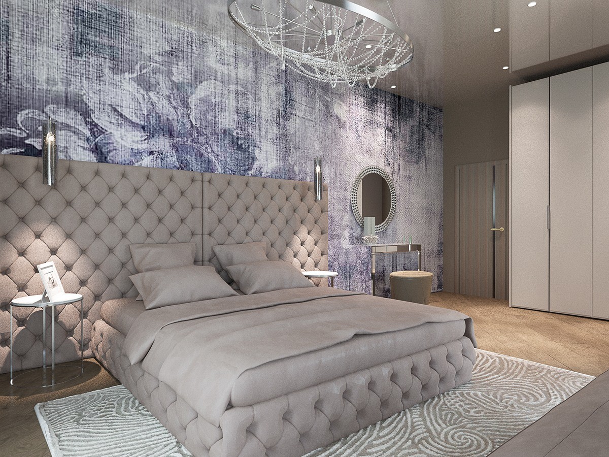
Natural colors continue into this luxurious bedroom, this time with a floral inspiration to suit the violet-tinted accent wall.
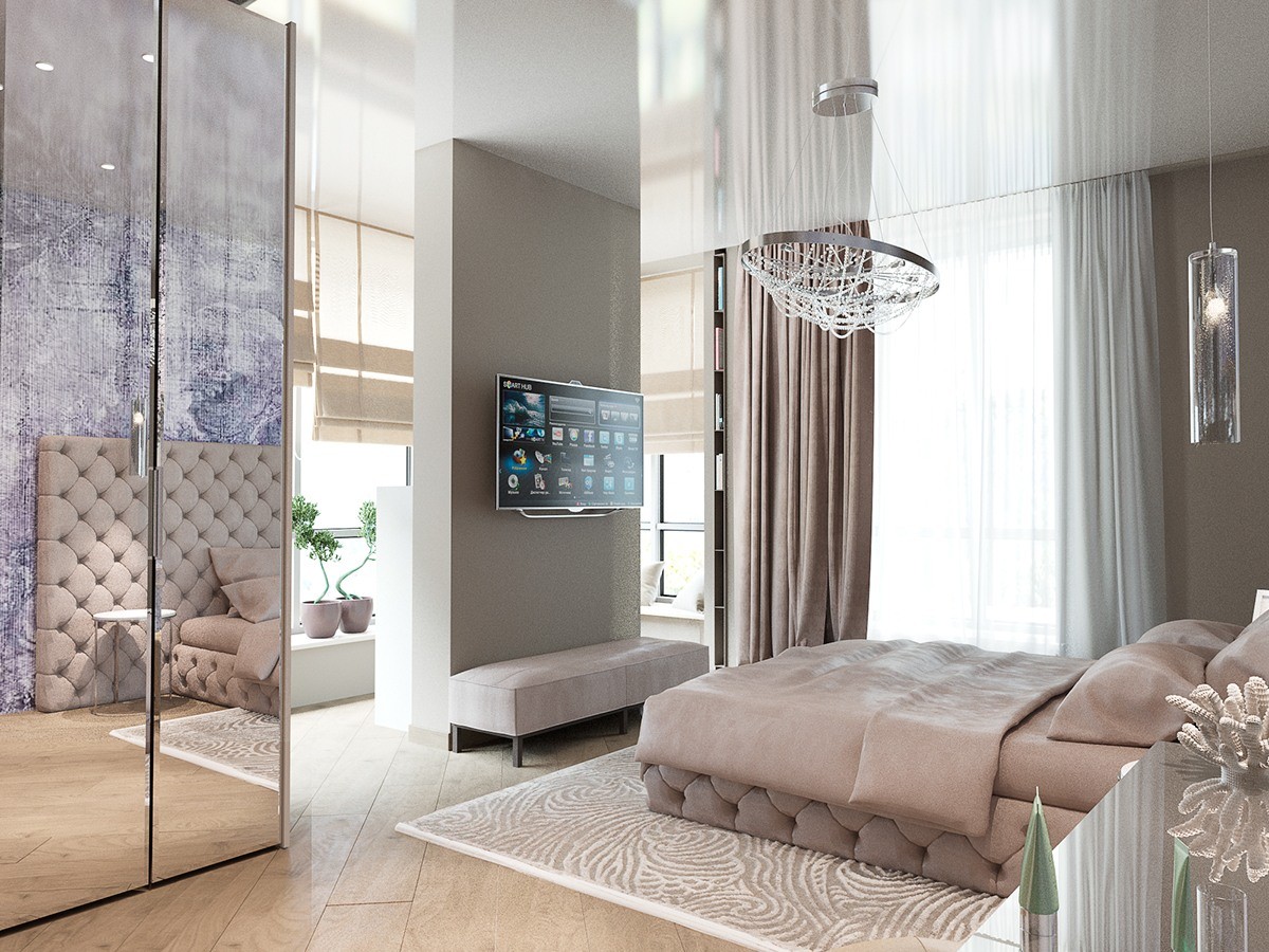
Residents gain extra window privacy from the accent wall, which doubles a convenient mount for the television.
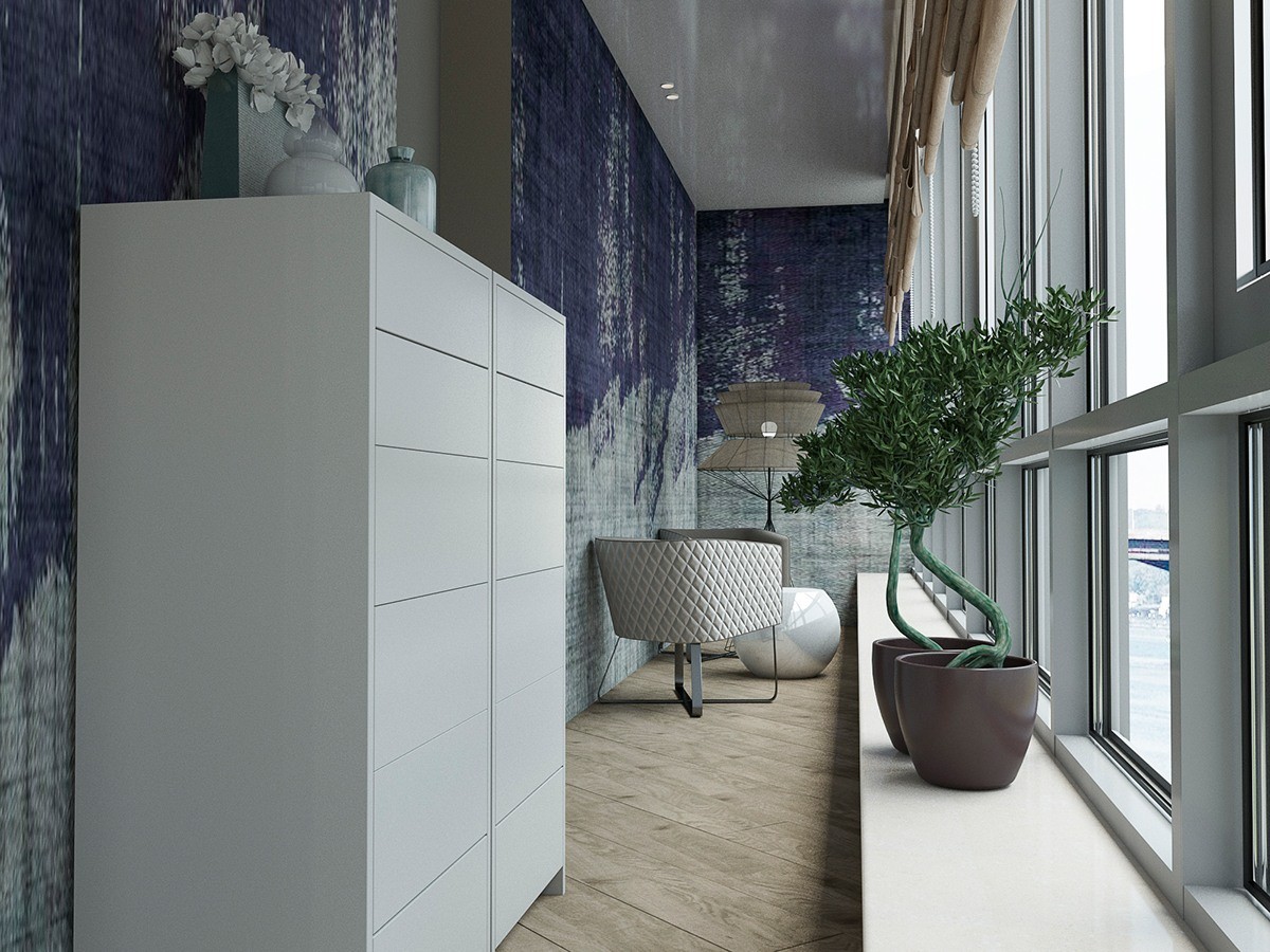
One extra window-bordered room serves as an enclosed viewing deck for relaxation or having tea with a friend.
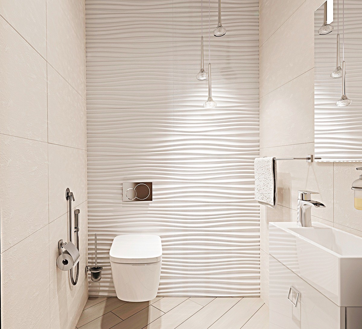
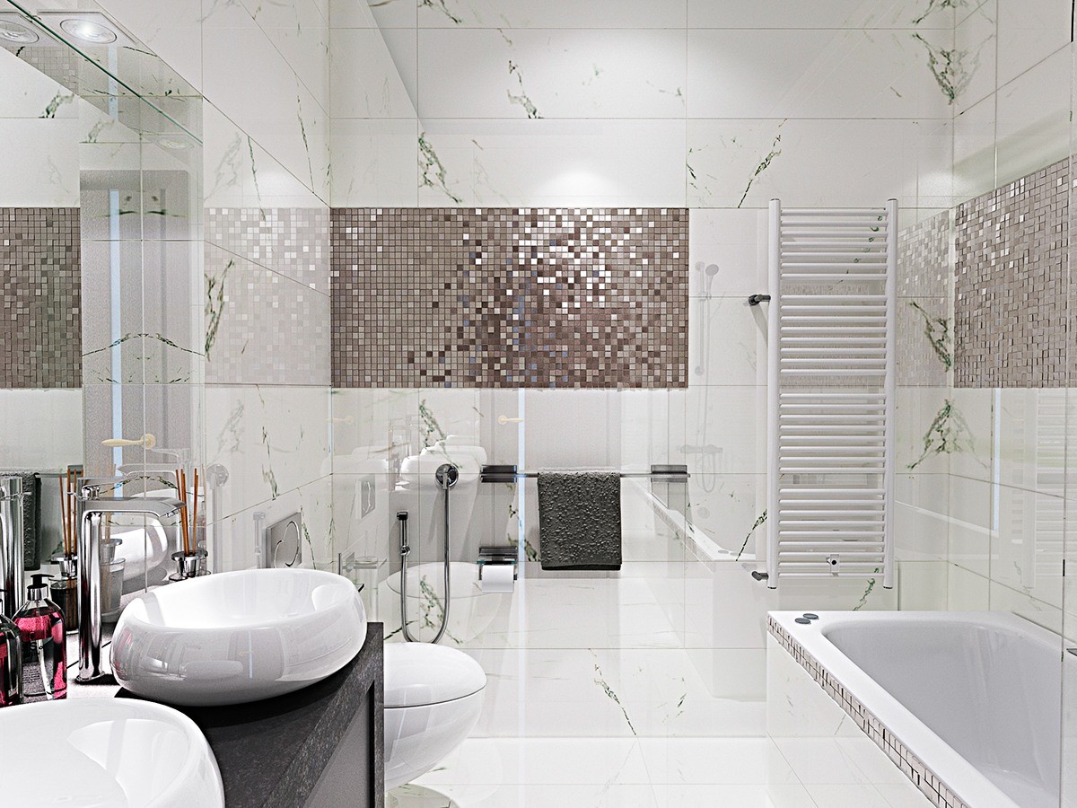
The other bathroom is smaller, and benefitted from a wall treatment that gives off the peaceful vibes of clean sand.
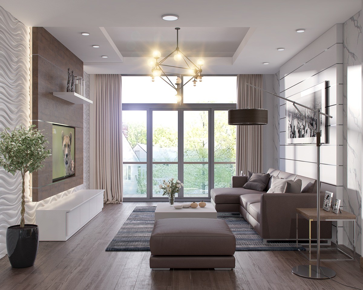
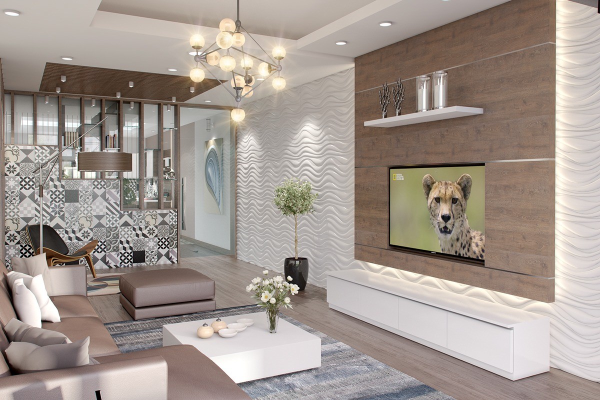
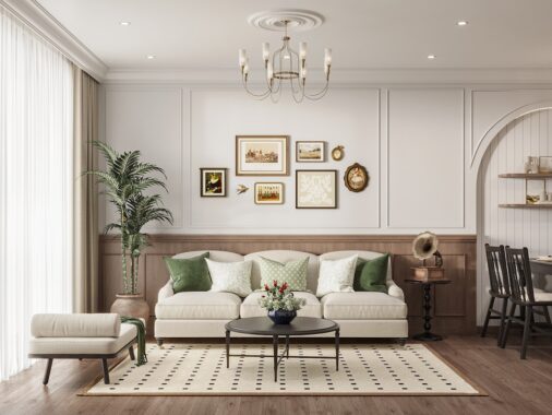
Each detail in this living room seems curated to embody peace, sophistication, and comfort. Mauve-tinted neutrals are easy on the eyes and lend themselves well to variation – you may even notice a tiny hint of peach here and there. It wouldn't be hard to walk into this home and find tranquility at the end of a tough day.
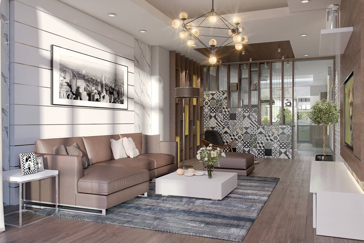
Interesting details on the other side of the room emphasize character and fun. Perhaps one of the most striking features is the chandelier with its Art Deco influence, along with the jazzy tiles beneath the bookshelves on the half-transparent dividing wall.
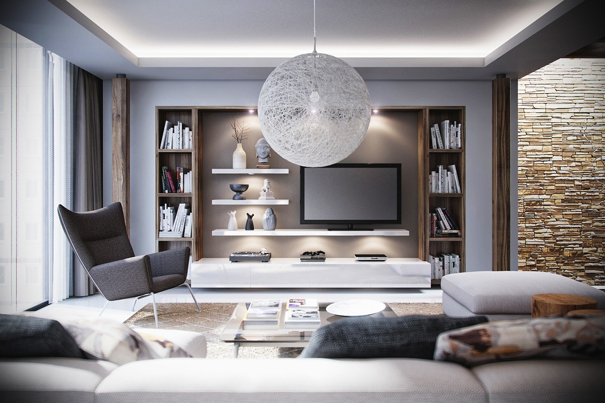
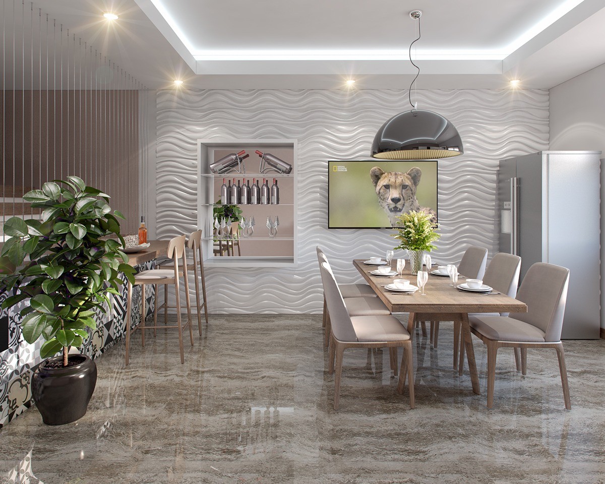
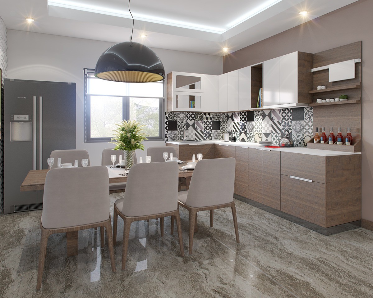
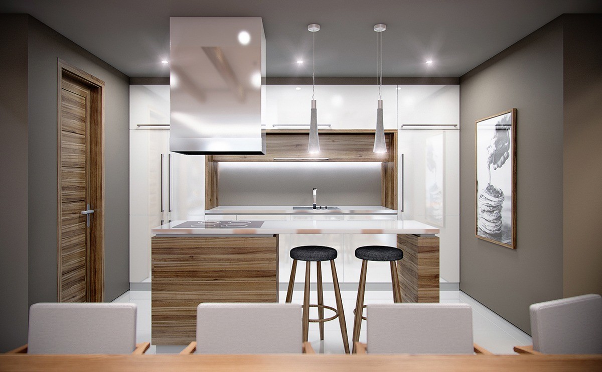
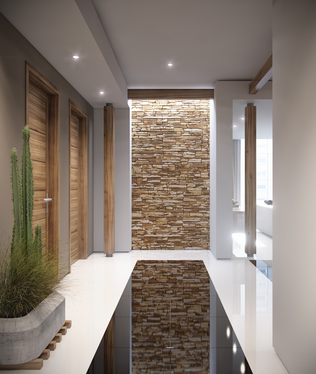
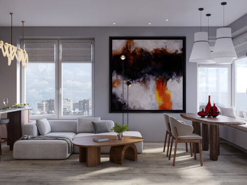
Wood and stone make up the palette sources for this home's beautiful color theme. Both natural elements make an appearance in grand fashion, showing up in the brilliant trim and accent wall combinations. Accents include rich charcoal and a shade that falls between mauve and tan, just enough variation to prevent the interior from looking too stark or minimalistic.
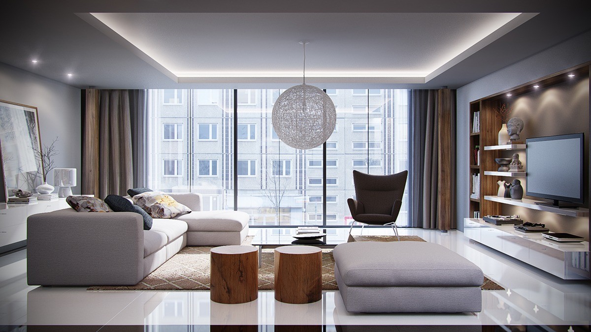
Organic features catch the eye throughout. The spread includes two smoothed wooden stools, the delightful Random lamp from Moooi, and small natural features on the sideboard cabinet to the left.
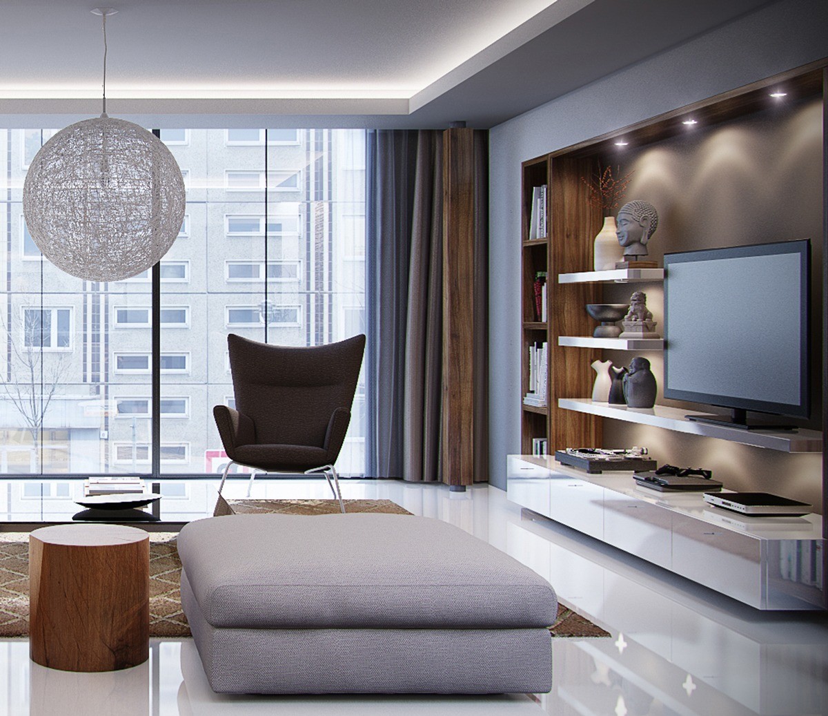
Lighting also plays a crucial role in this design. Indirect illumination highlights the art collection on the shelves, and a strip of LEDs enhances the depth of the ceiling.
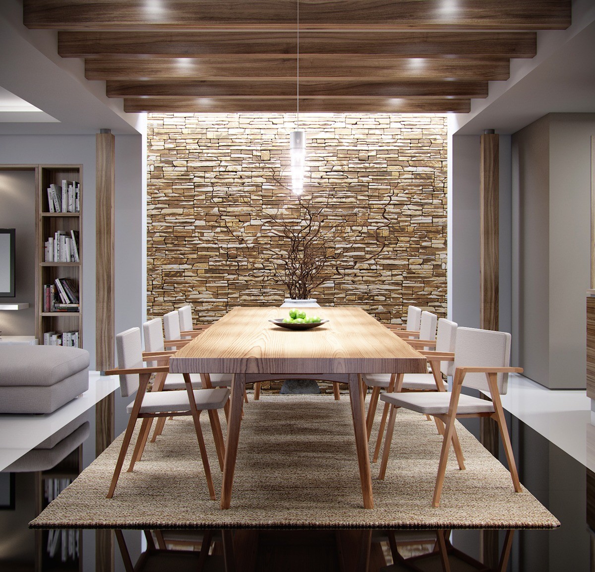
The dining room's rugged stone accent wall serves as an ideal backdrop for the natural table and chair set.
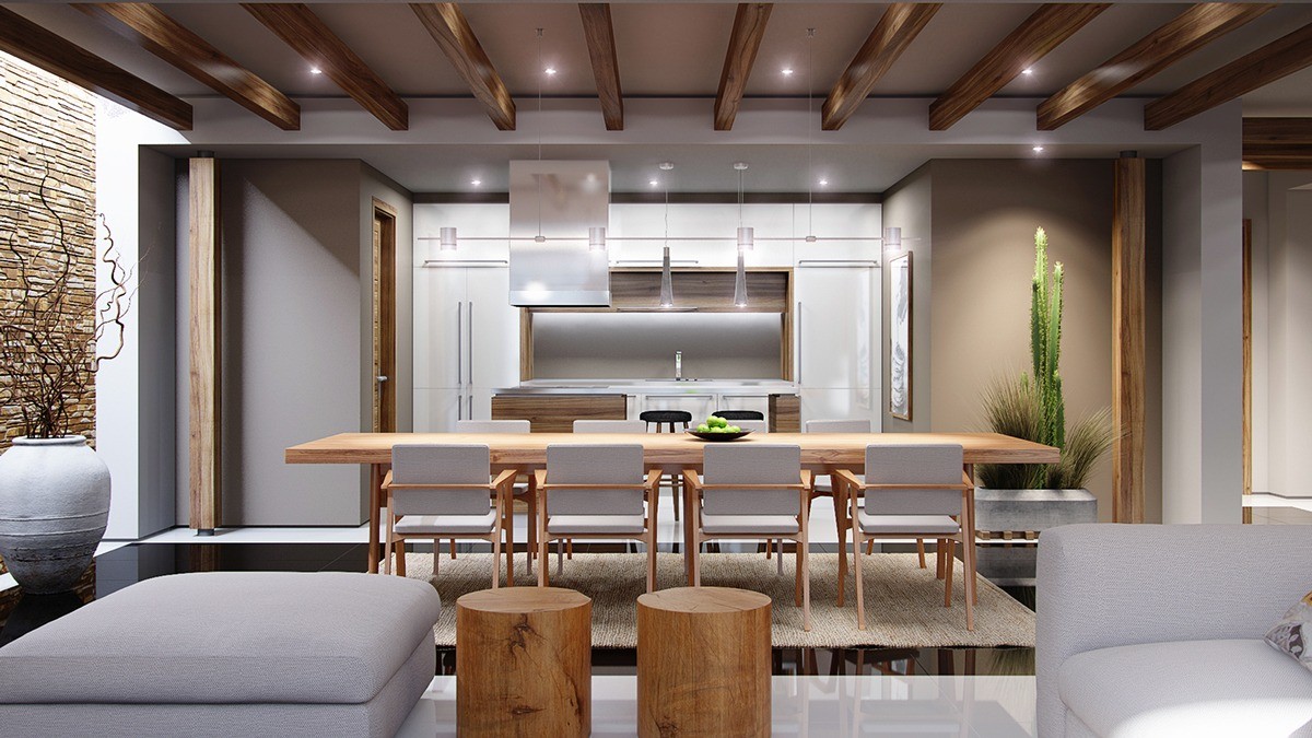
Perfect wooden beams decorate the ceiling and the interior corners, a smooth basis for the furniture choices.
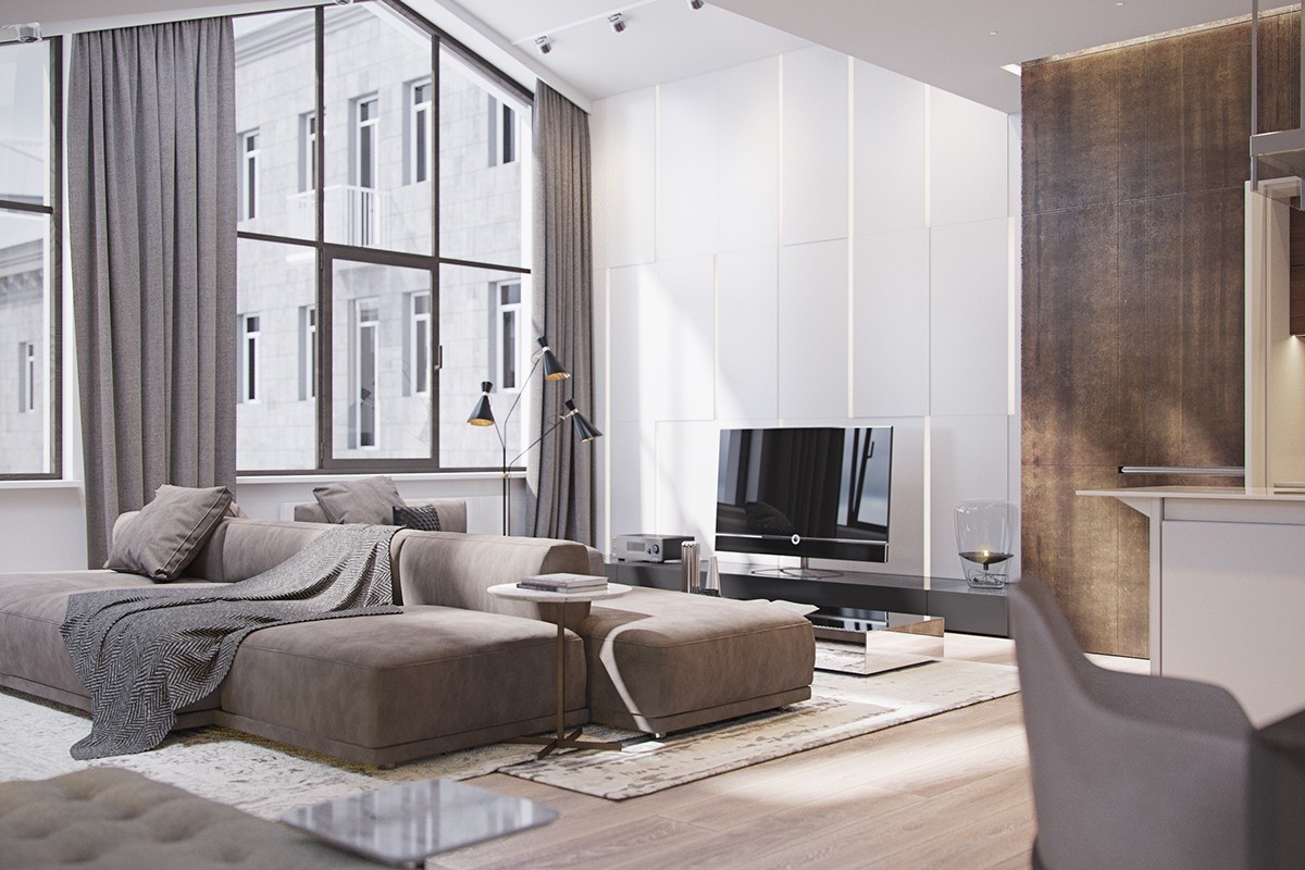
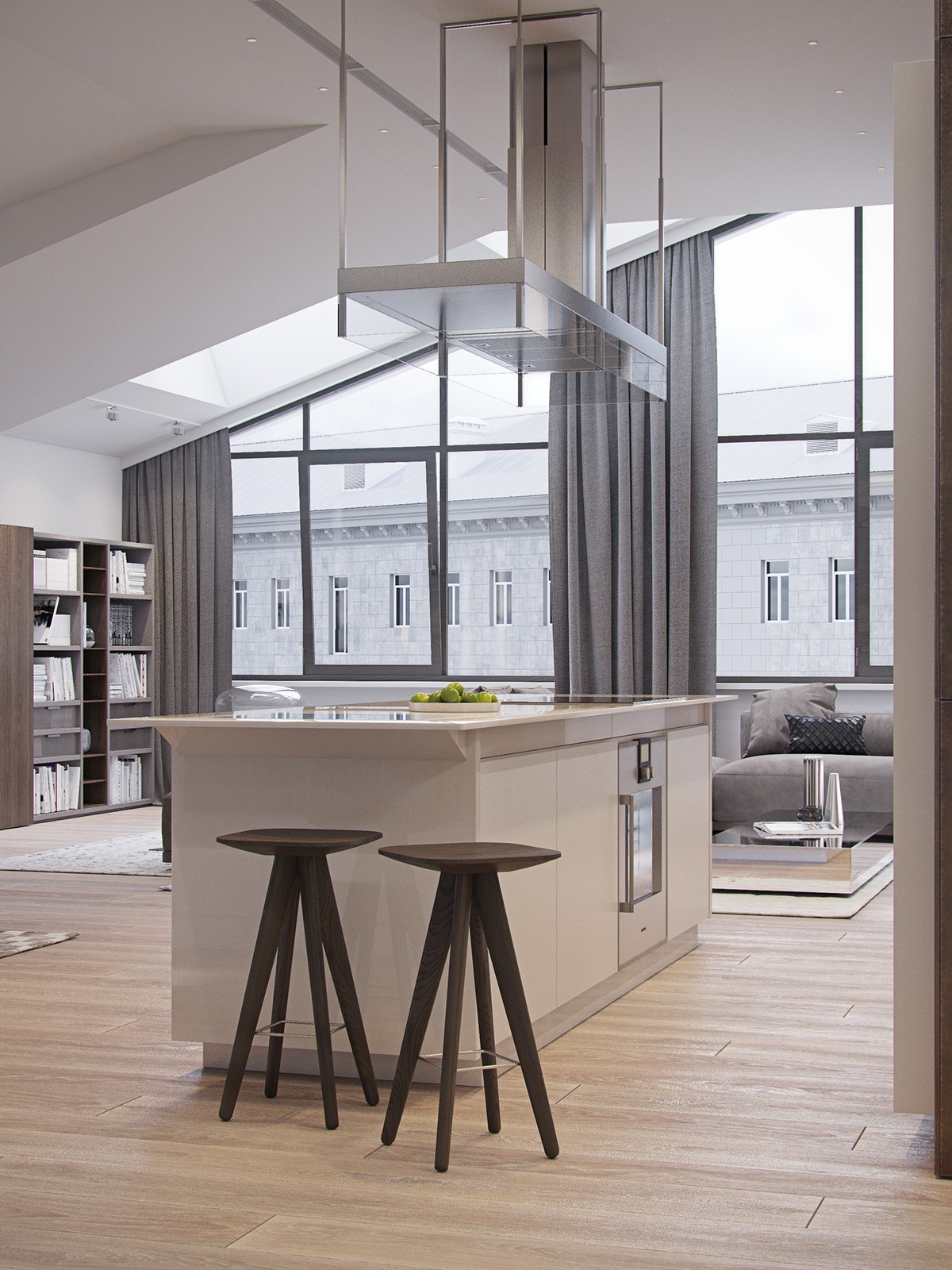
Finally, the last home gains its color palette from the mineral side of nature. Sandy browns, cement grey, and rusty details may bring to mind mountain ranges or creek beds alike. The architecture is worth admiring as well – windows continue all the way up toward the pinnacle of the vaulted ceiling, with solid grey curtains hanging down dramatically at either side.
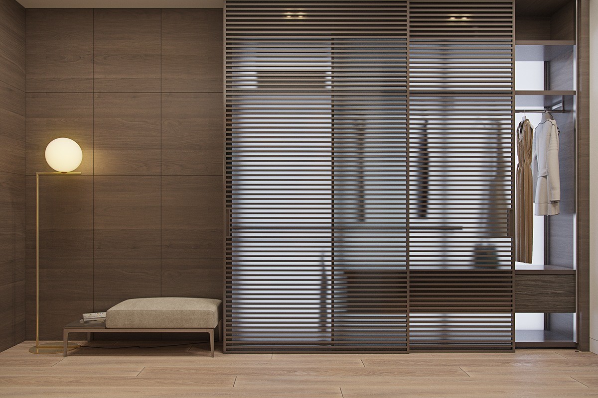
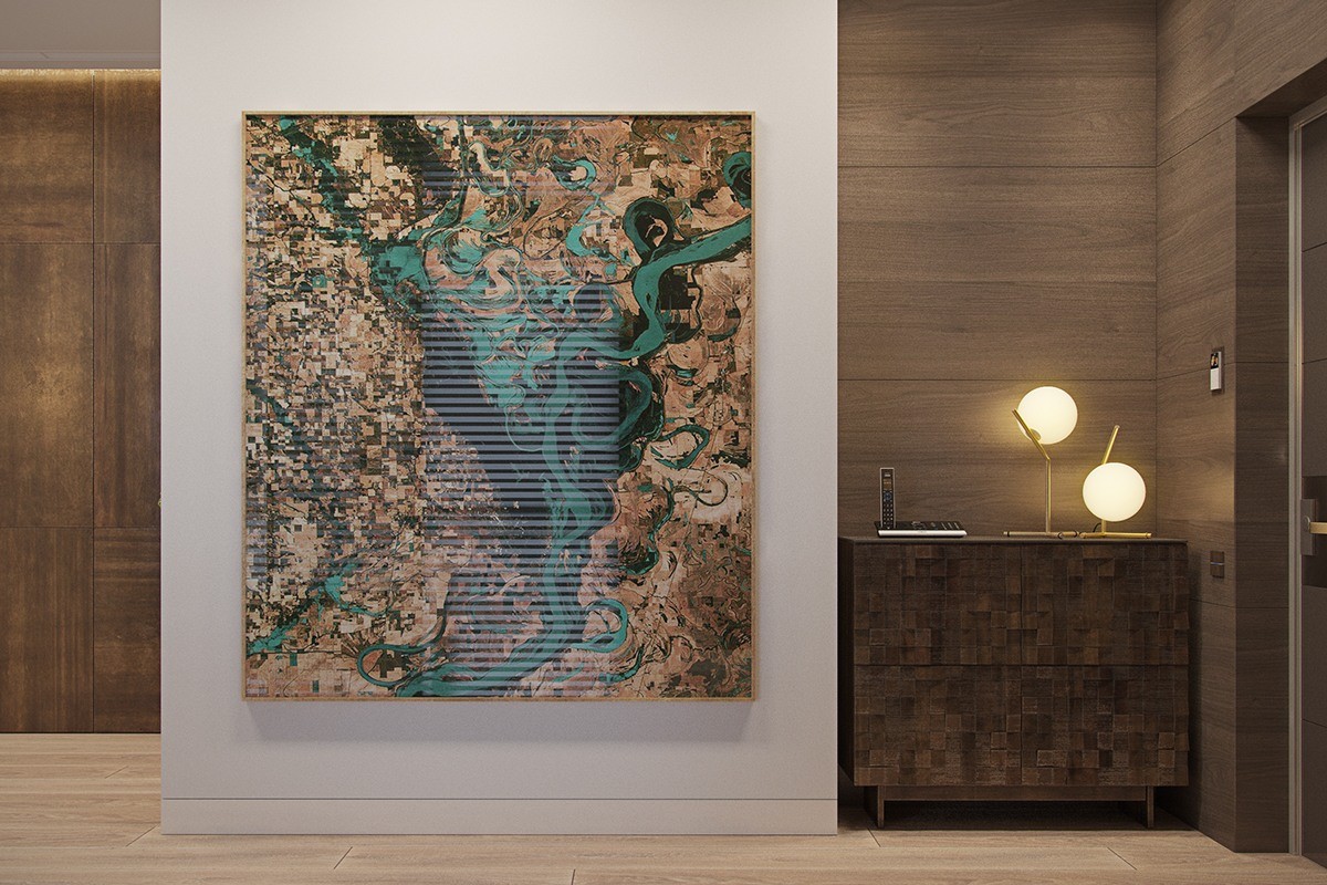
The rest of the home plays to a different tune – dark and moody. Yet it stays true to the organic neutral tones used elsewhere, but this time with an emphasis on wood.

