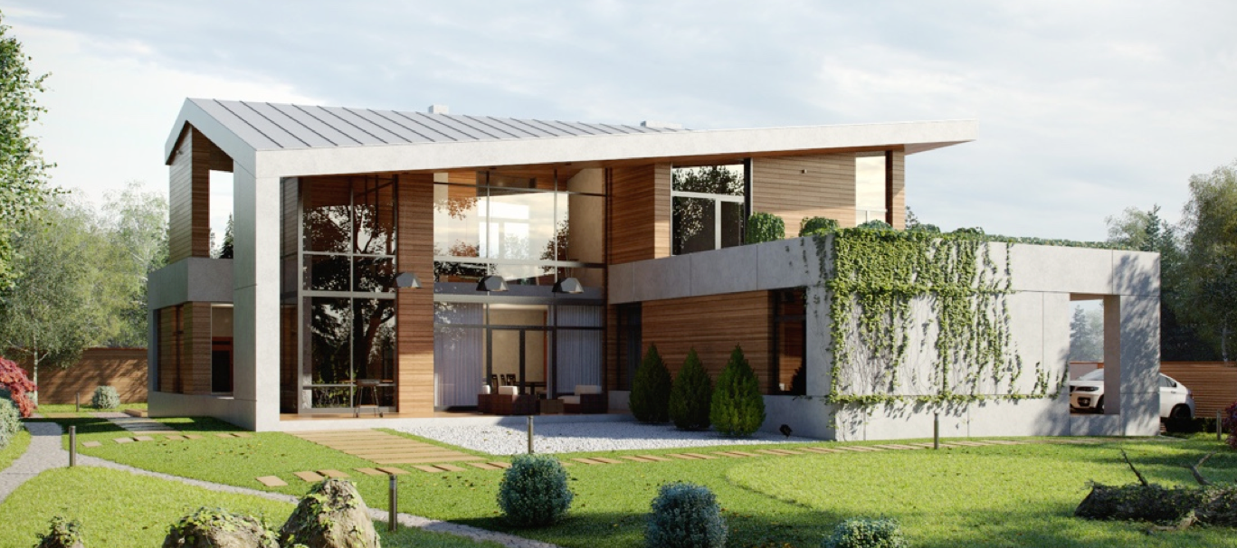
Designed by Yevhen Zahorodnii & Sivak Trigubchak, this 180 square meter home offers some exciting inspiration. Fascinating decor stands out against its minimalist backdrop. This contrast between complexity and simplicity enhances the effect of its carefully curated color palettes and sleek designer furniture. Each room takes a different approach. The home includes a bedroom for each of the two children, a luxuriously appointed suite for the parents, and vibrant social areas for entertaining kids and adults alike. You'll find lots of great lighting fixtures and stunning artwork within – this tour is a treasure trove of lovely interior design ideas.
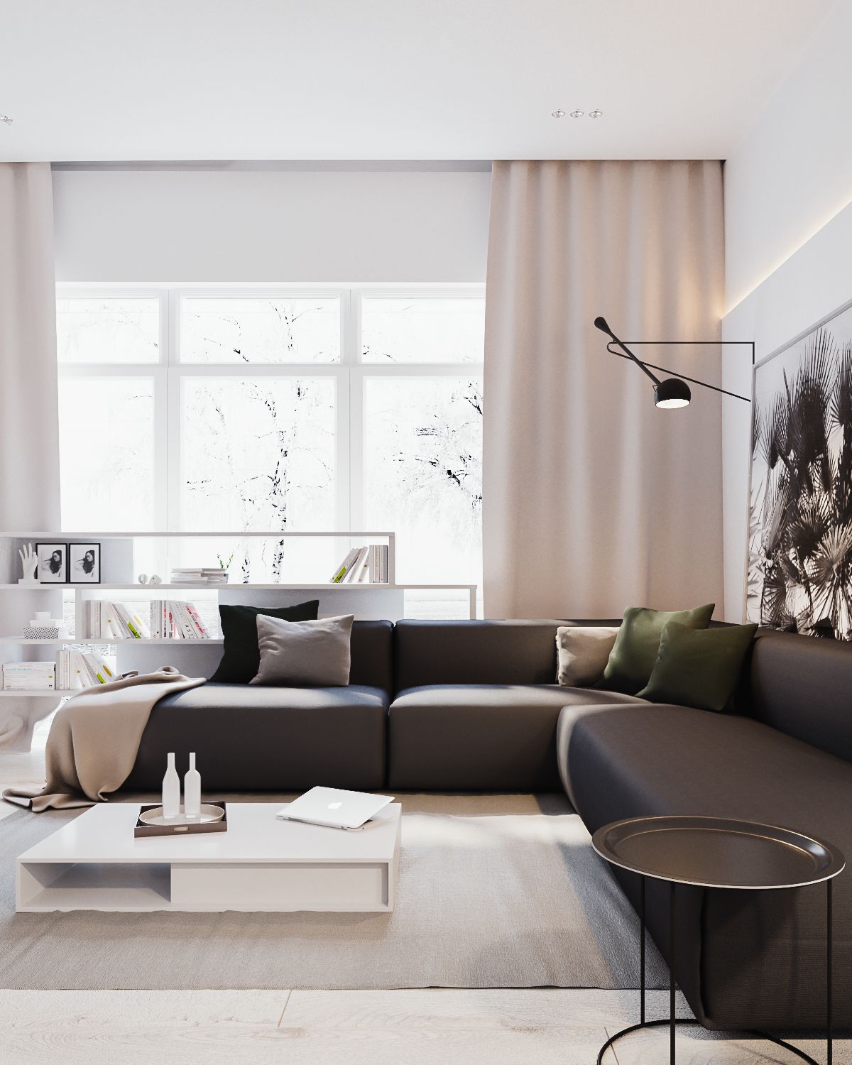
The tour opens to this brilliant view of the corner sectional sofa, its ultra-smooth upholstery allowing for breathtaking curves. Behind, staggered shelves provide extra storage without obstructing the window.

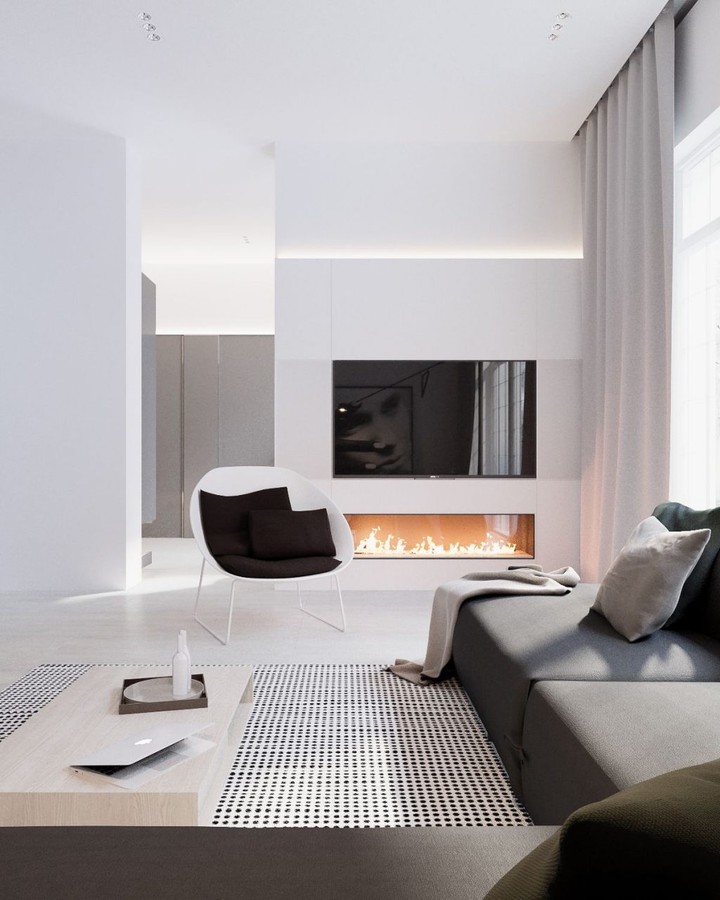
Polka dots, a lovely glass-encased fireplace, and clever lighting features provide decoration within an otherwise minimalistic environment.
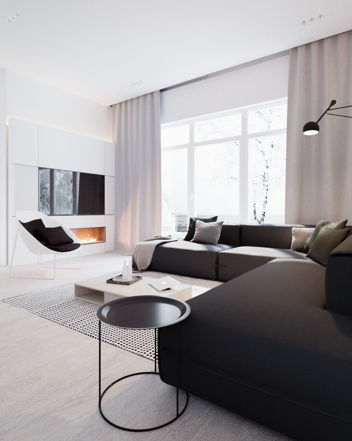
Streamlined furniture allows the sunlight to filter right through, without heavy lines to obstruct it.
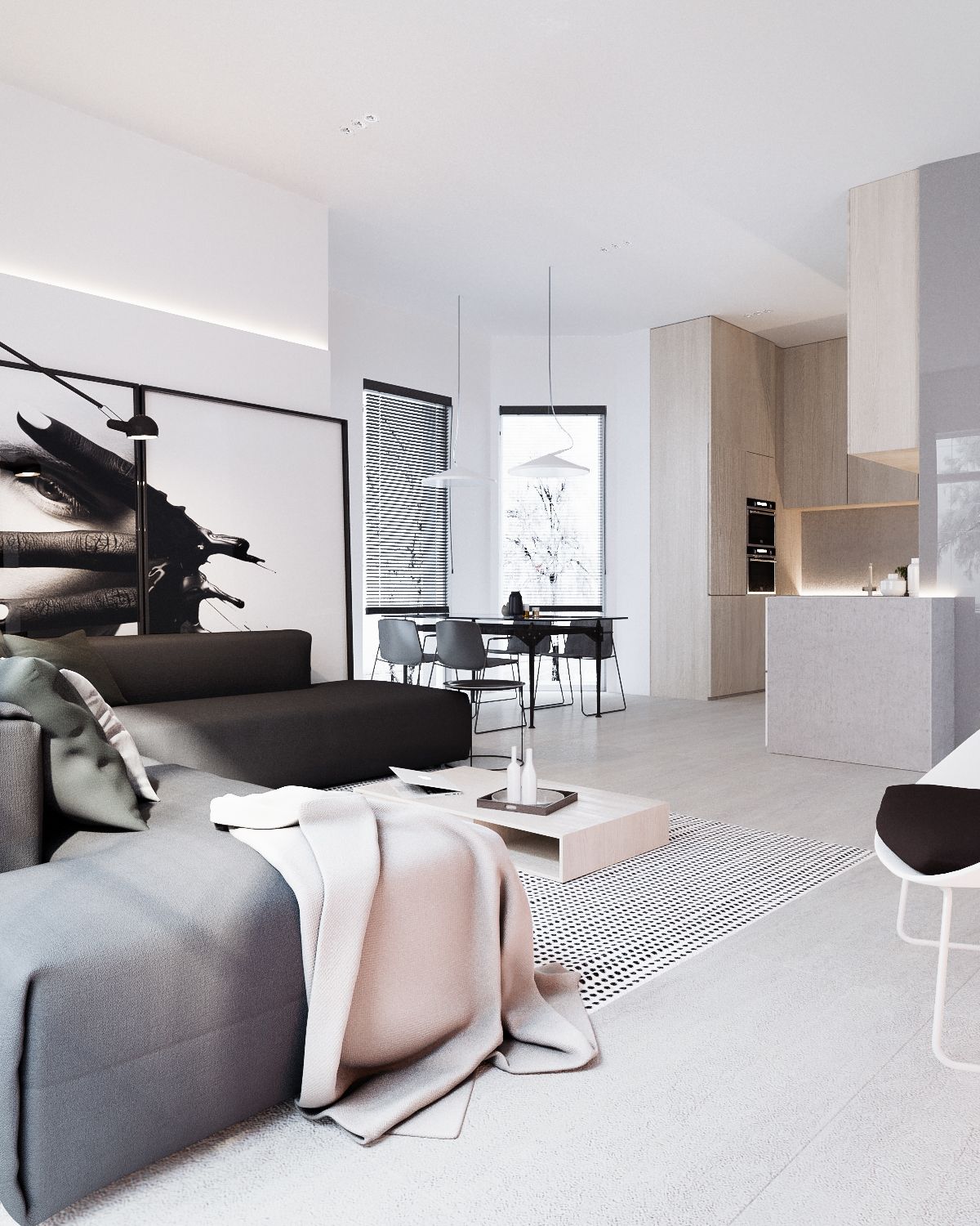
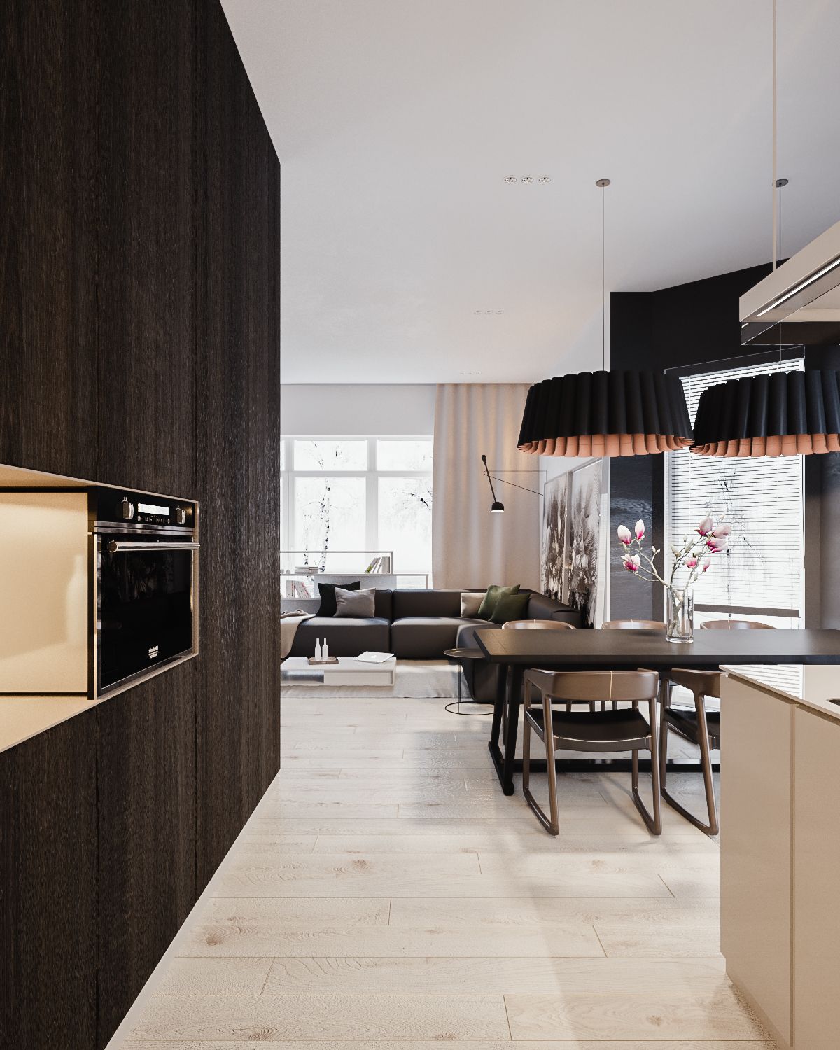
The open layout is dynamic and perfectly connected. Parents can easily keep an eye on the children while cooking, dining, or entertaining friends.
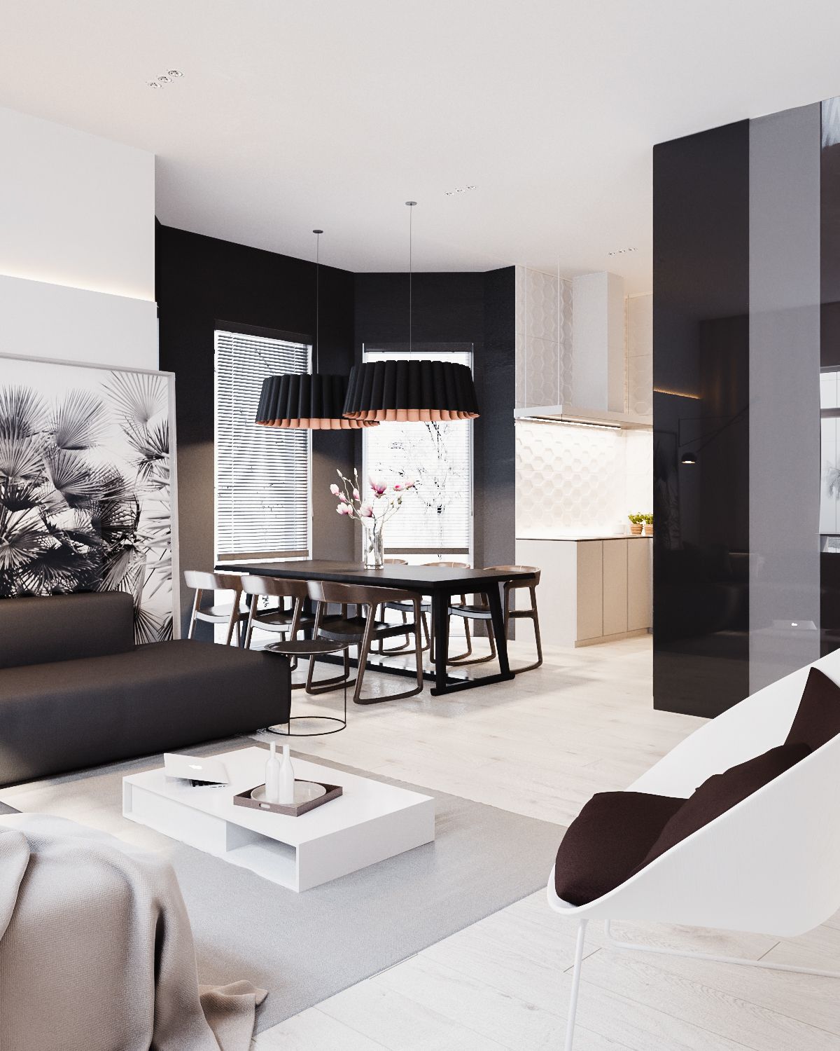
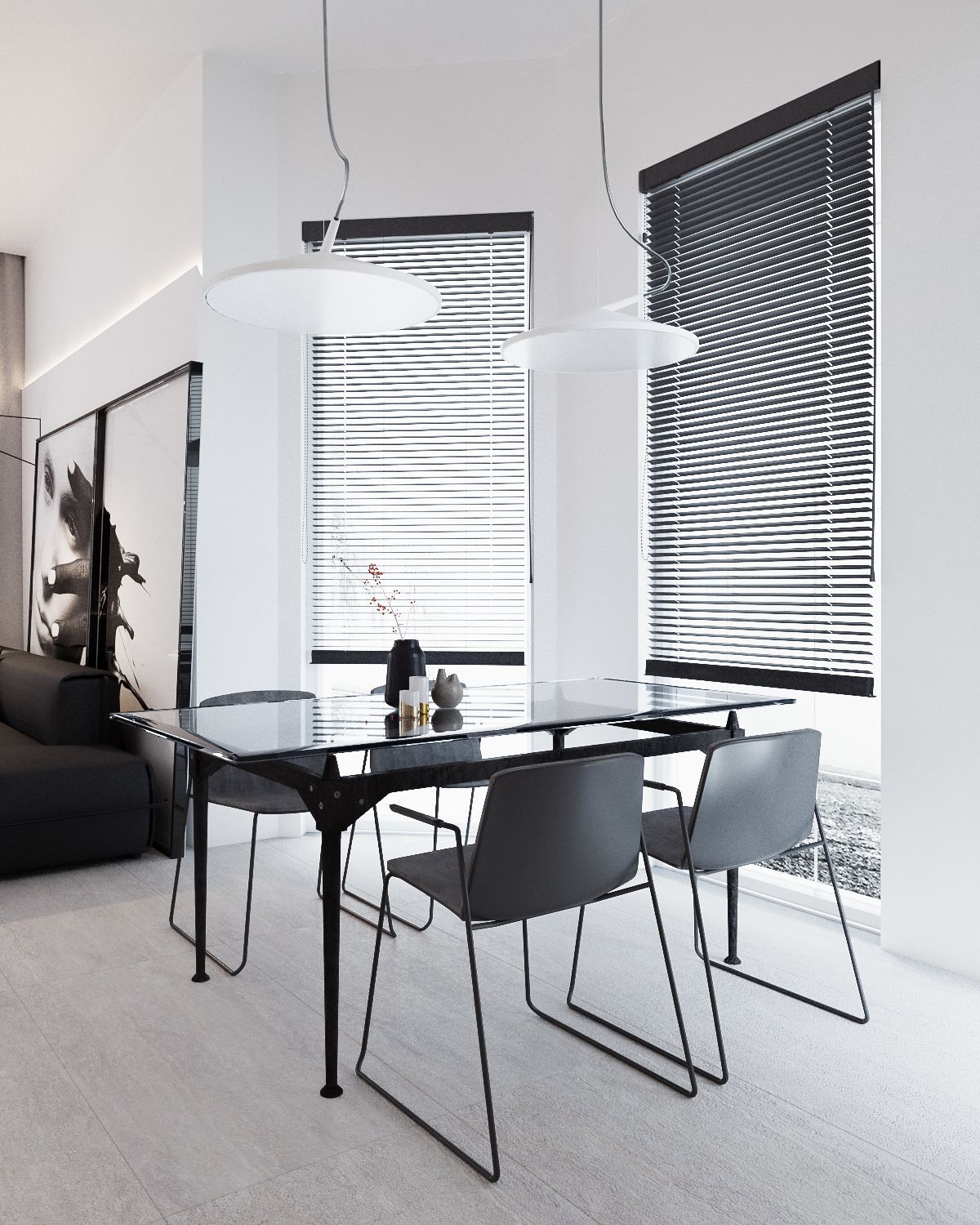
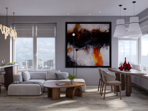
Here's another take on the living room, this time with different artwork and a different dining room layout.
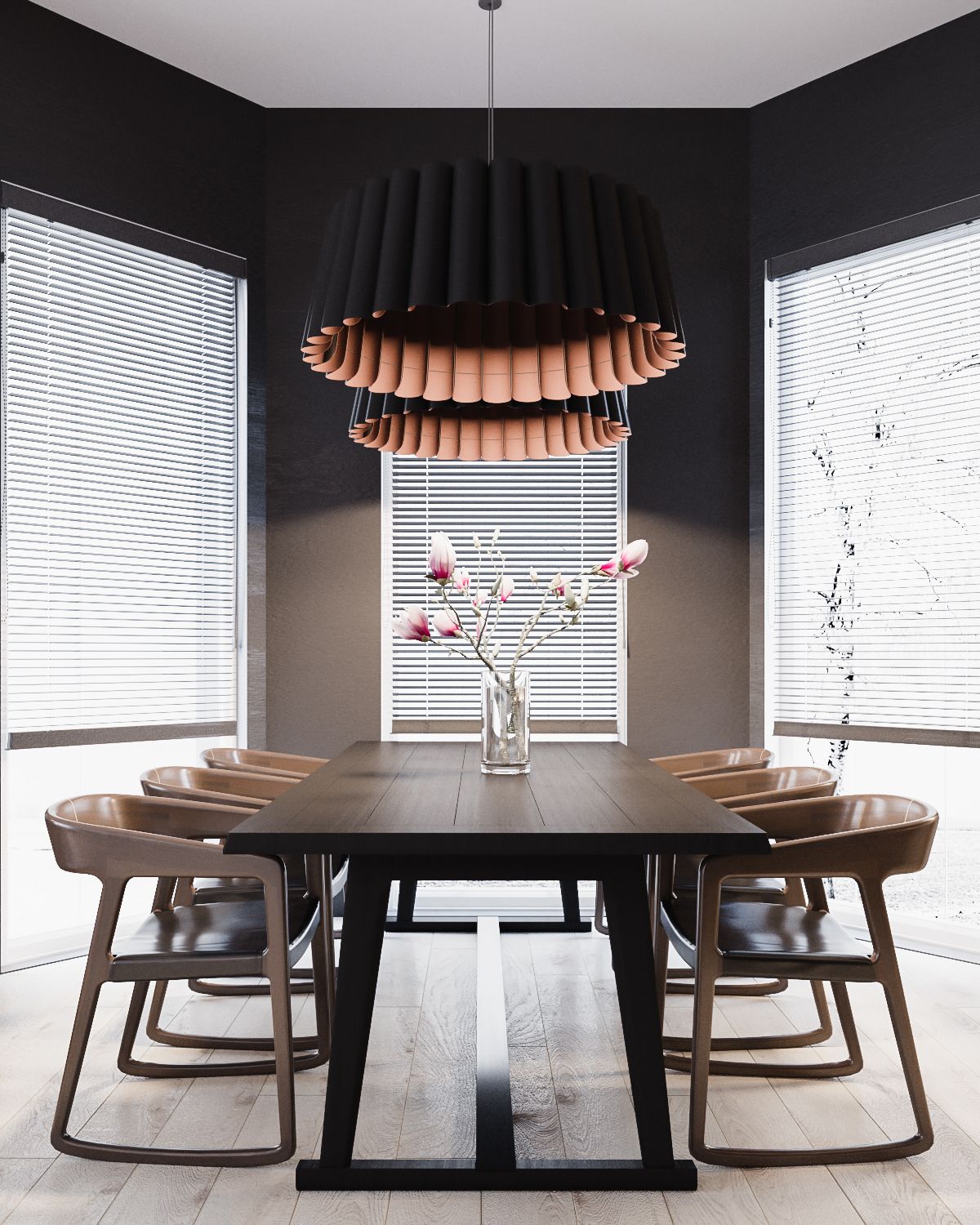
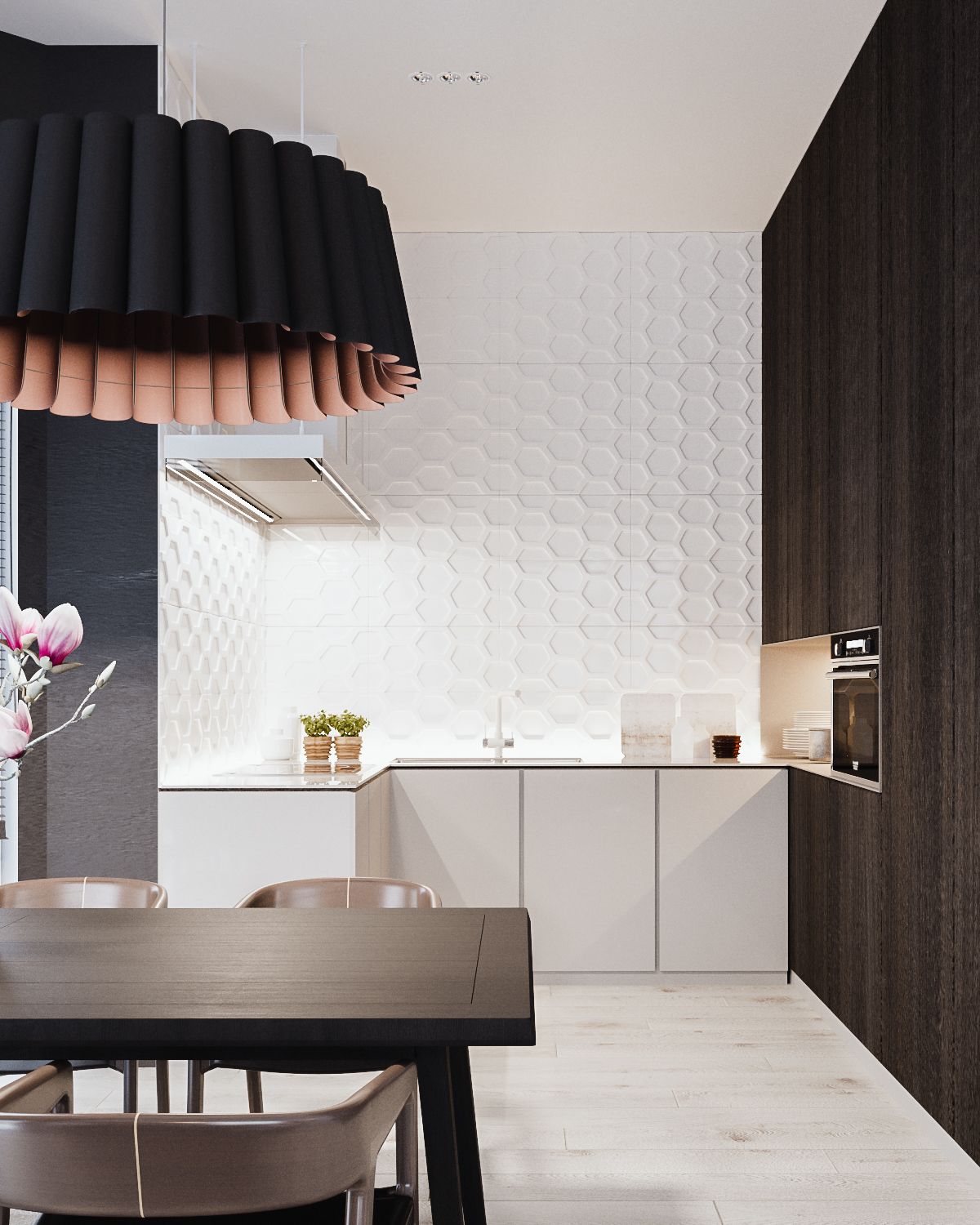
With dark dining room pendants and more substantial furniture, this space has a heavier but more formal aesthetic.
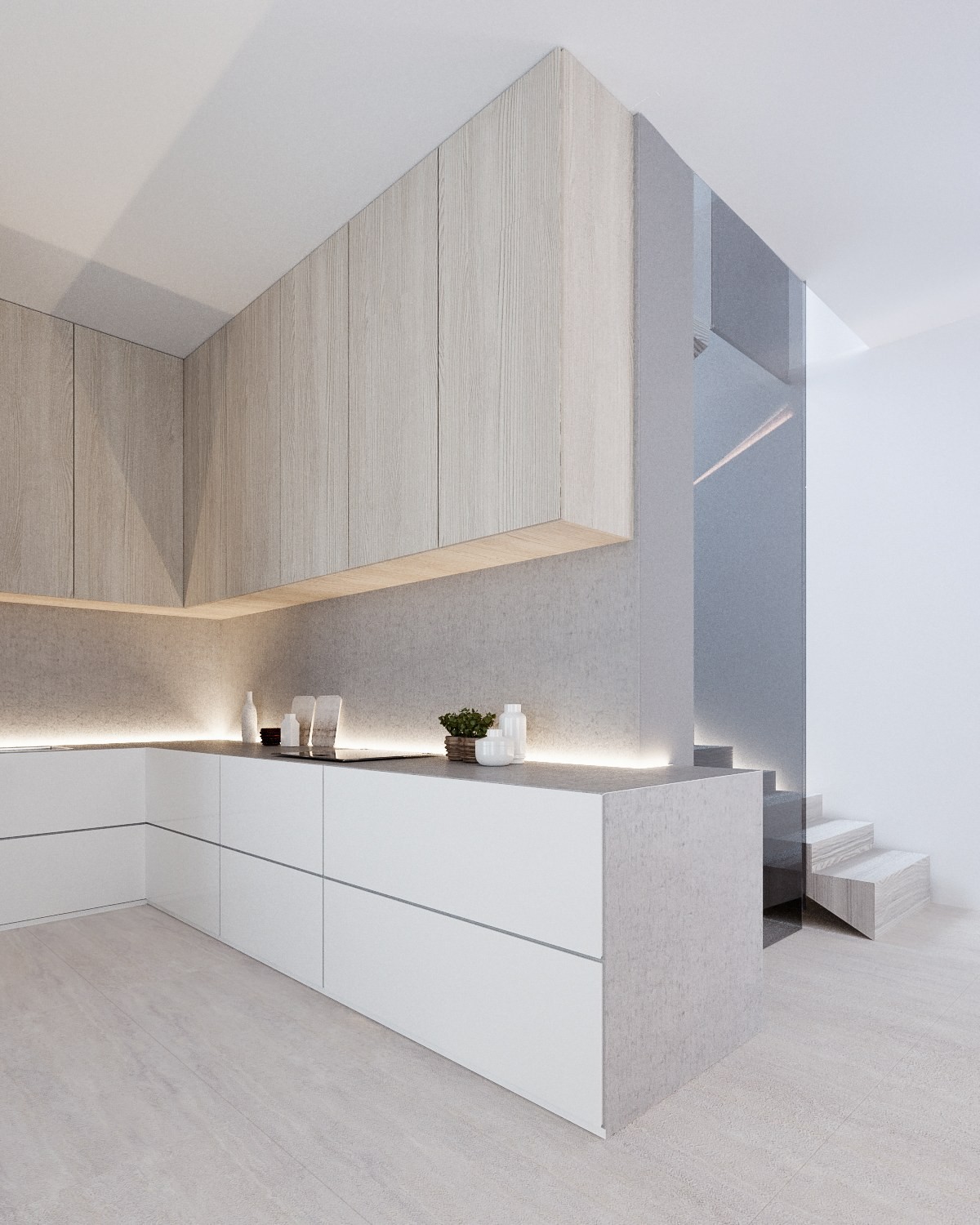
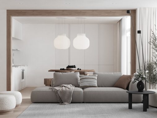
But what if the kitchen instead employed a lighter design? This visualization demonstrates the difference.
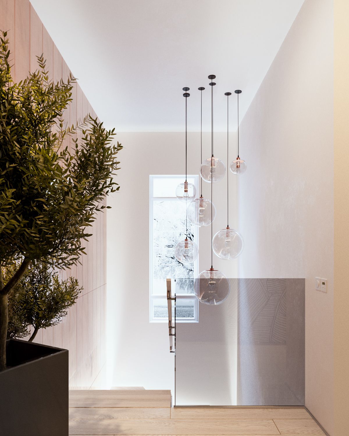
Private areas occupy the upstairs spaces. Here, in the stairwell, Selene lamps by Sandra Linder light the way.
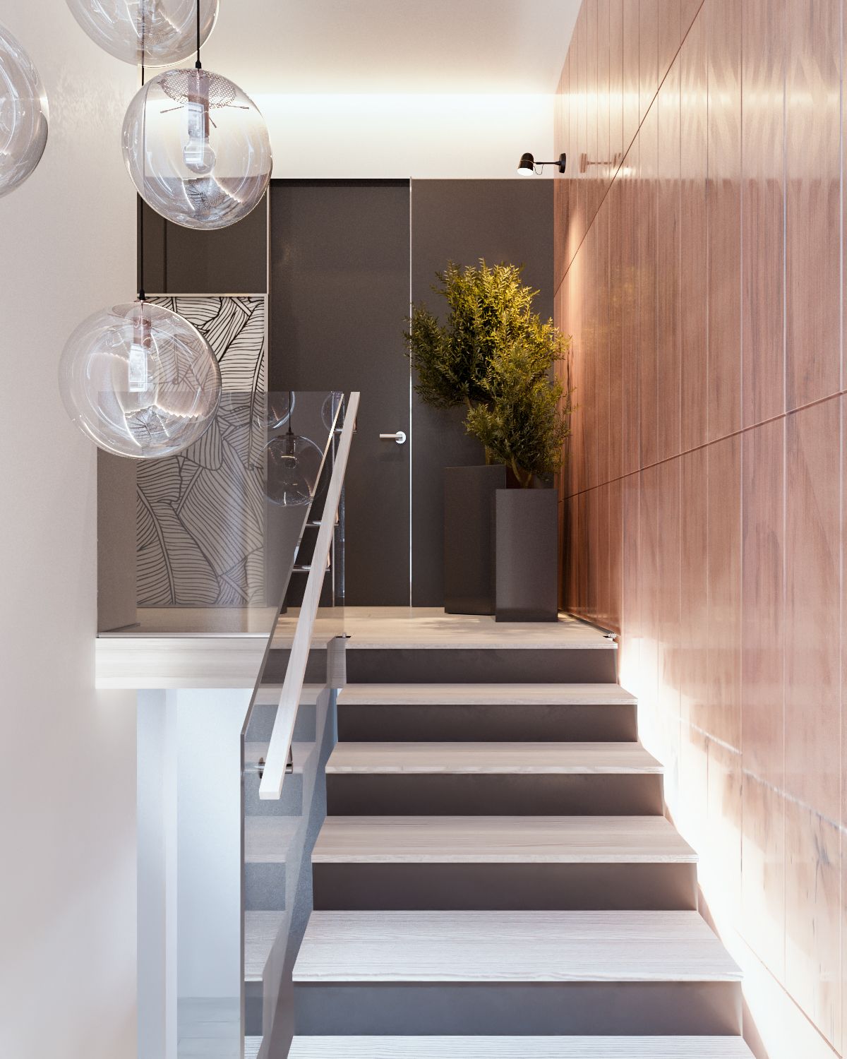
Indirect lighting plays off glossy wood walls, while black stair tread backing continues in the hallway theme.
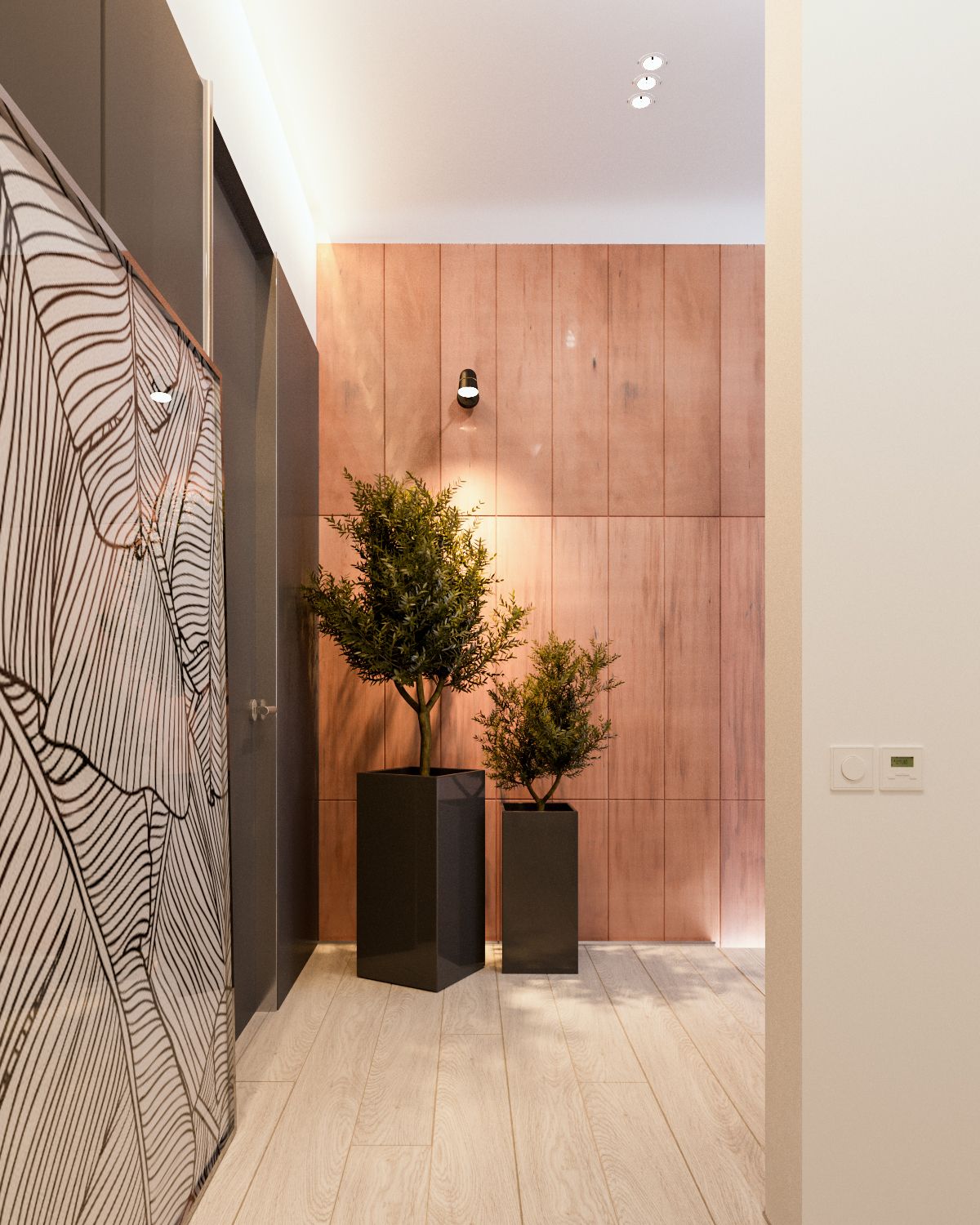
It's hard to overlook the artwork and sculptural planter pots. Although this home feels minimalistic, these details bring plenty of life to the interior.
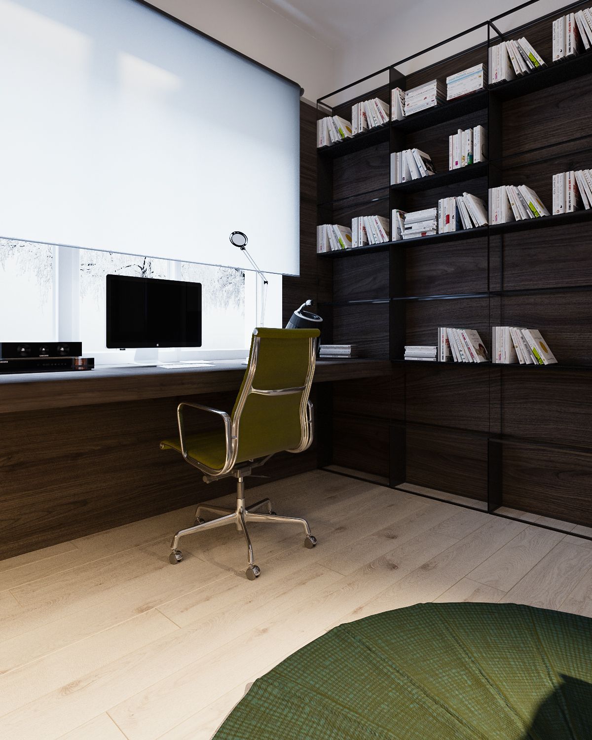
The first stop on the upstairs tour is this tasteful home office. Dark wood, green accents, and ample designer shelves all contribute to the aesthetic.
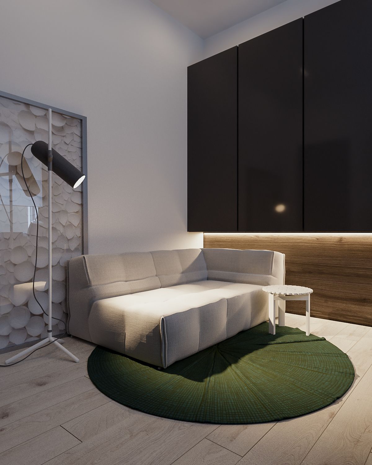
Business guests can appreciate the inclusion of this sofa. It probably doubles as a helpful spot for the resident to relax and regroup concentration on a long workday.
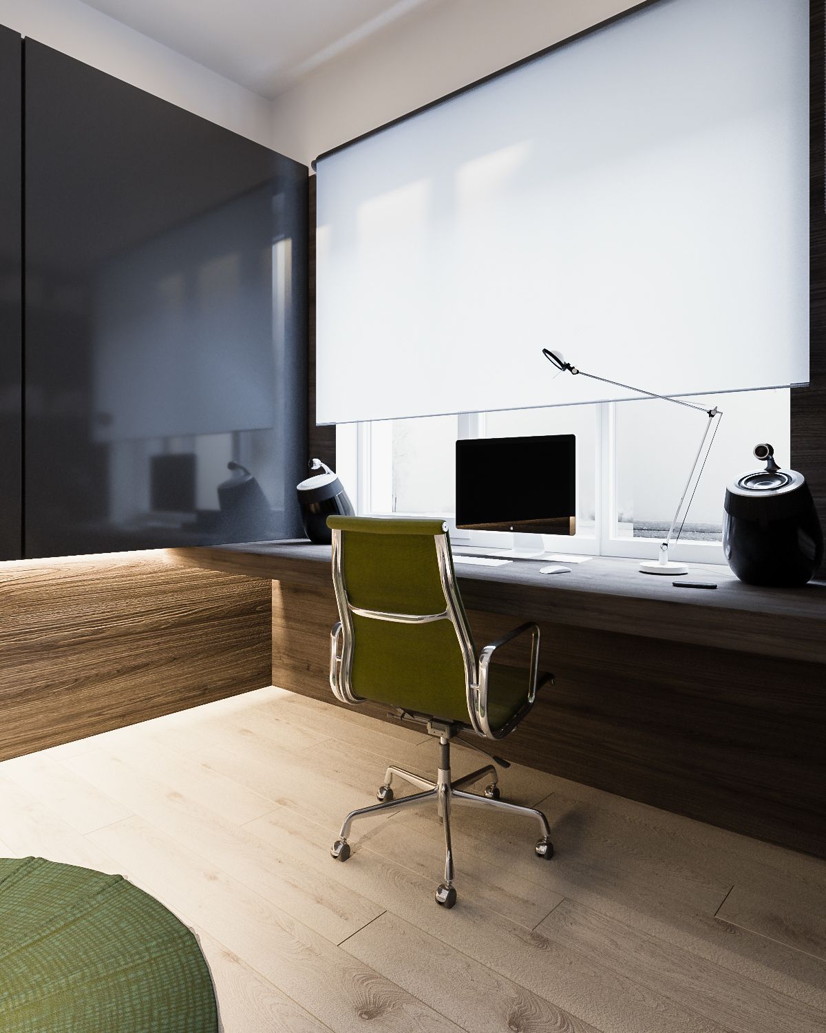
Rather than opting for typical curtains, this office uses a semi-transparent screen to preserve light while locking out any distraction from the exterior.
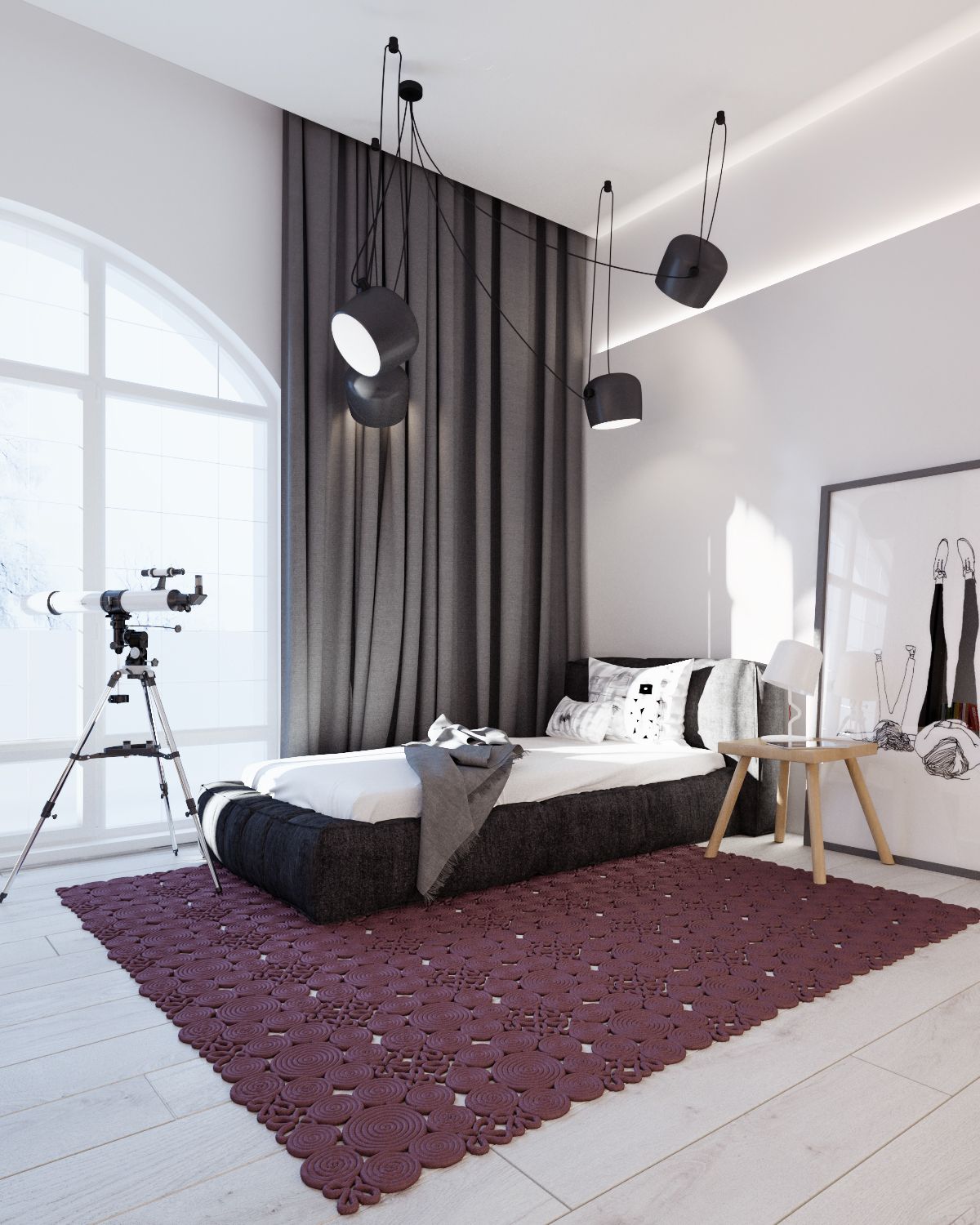
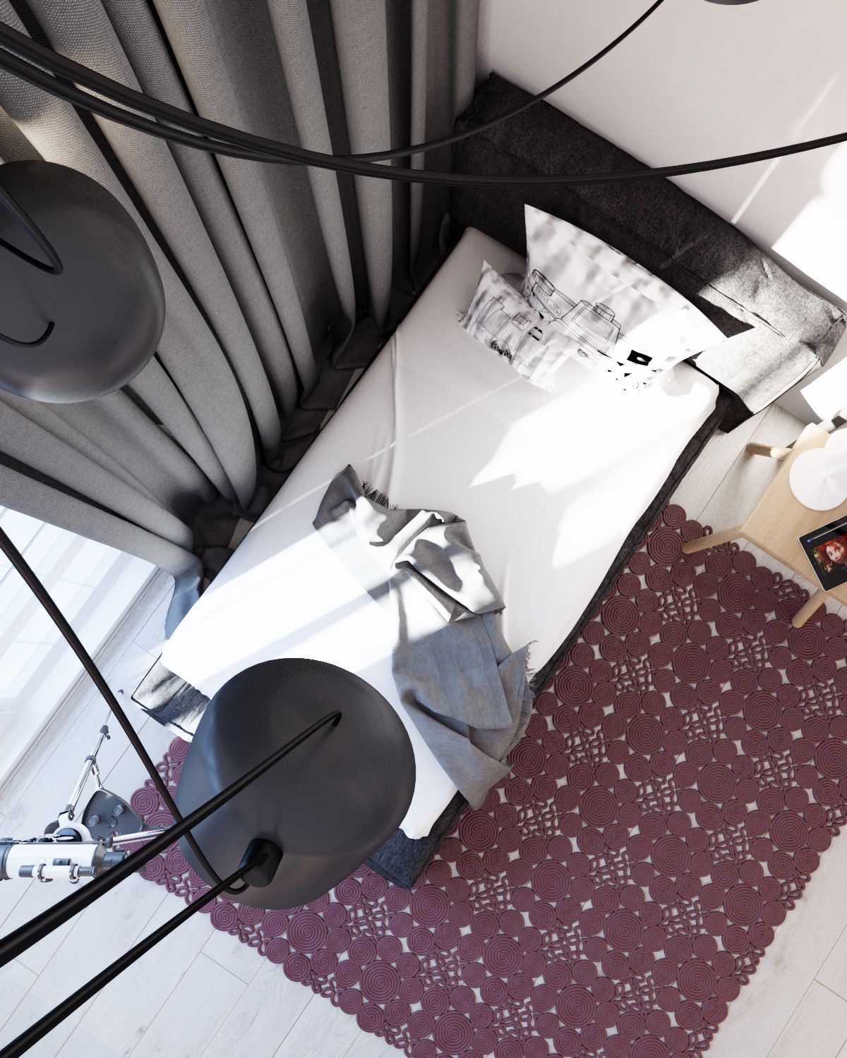
Here's a look at one of the children's bedrooms, complete with playful details like the cut-out rug, charming illustration, and stylish AIM pendant lights.
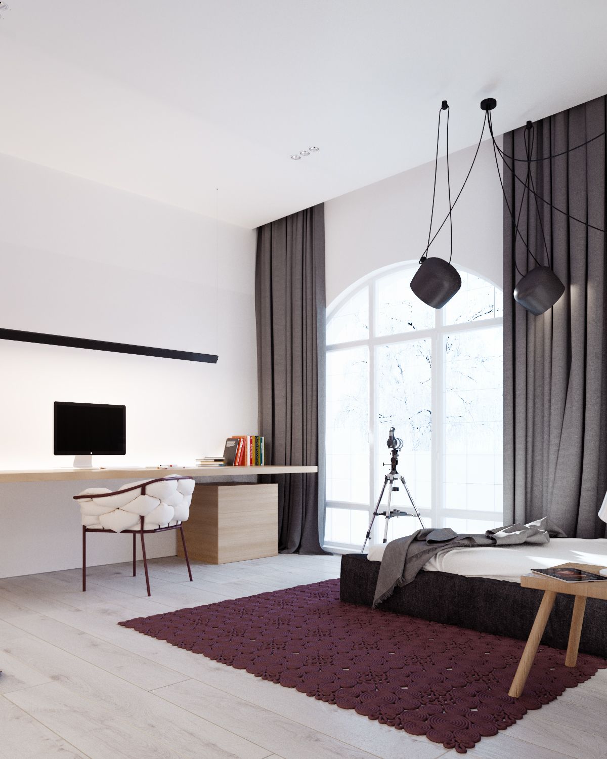
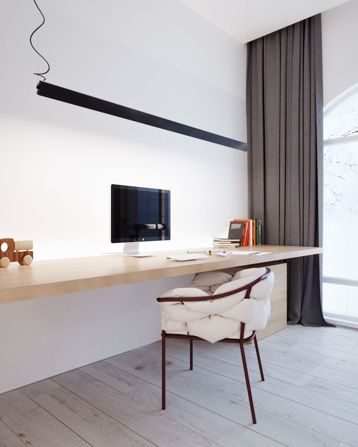
The cozy office arrangement features a cantilever desk with storage sitting on the floor beneath. Comfortable seating comes by way of the gorgeous Serpentine chair by Éléonore Nalet.
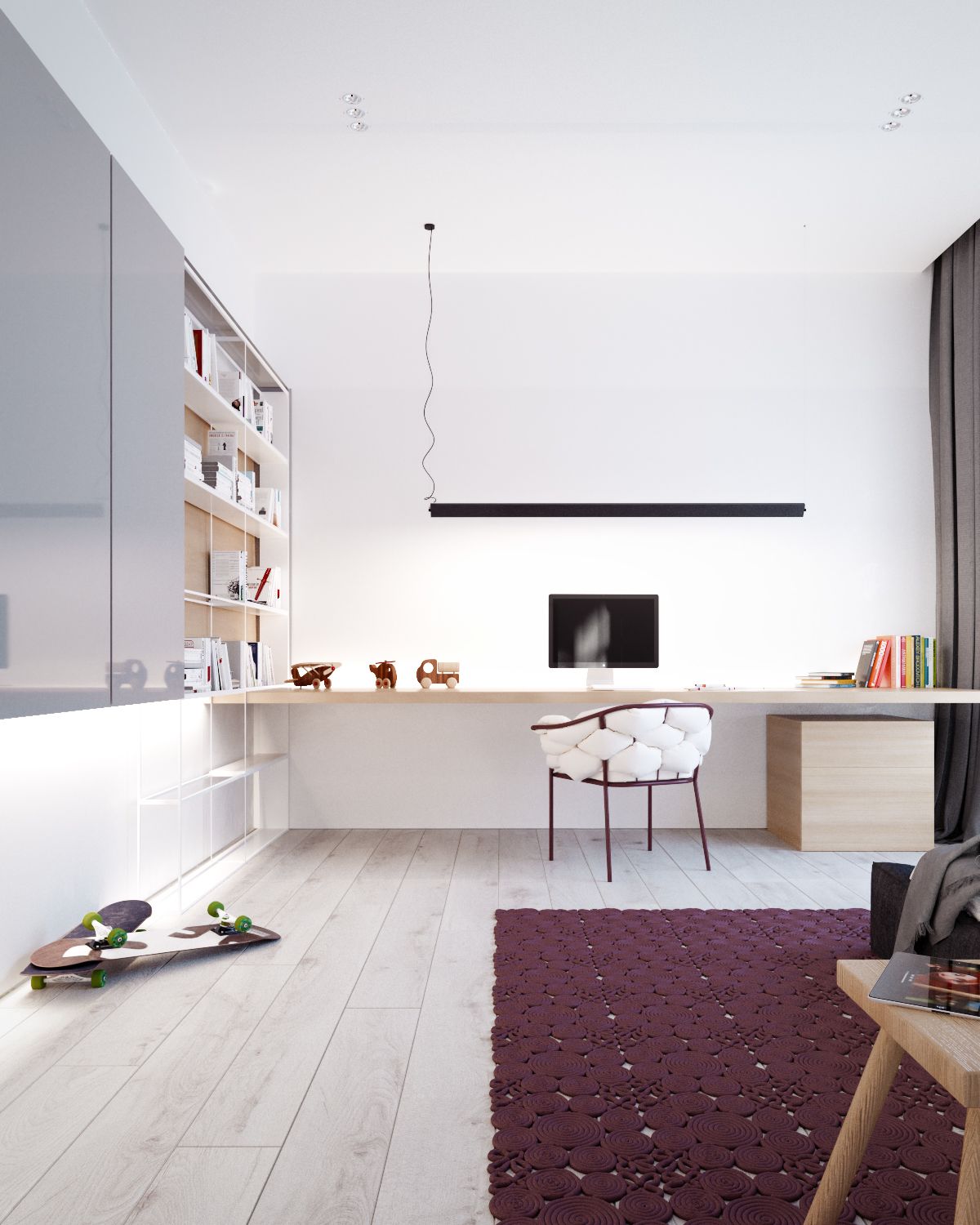
This linear suspension lamp is a neat touch – the bolder black cord stands out while the thinner white cord blends into the background, making it look precariously balanced in the air.
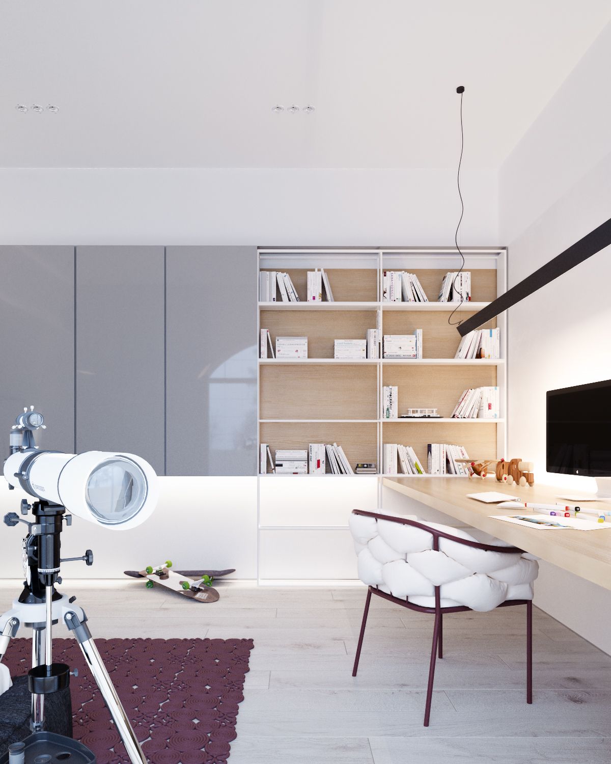
Although the perfectly coordinated bookshelf probably isn't easy to pull off in a kid's room, the ample storage space does make it easier to keep things tidy.
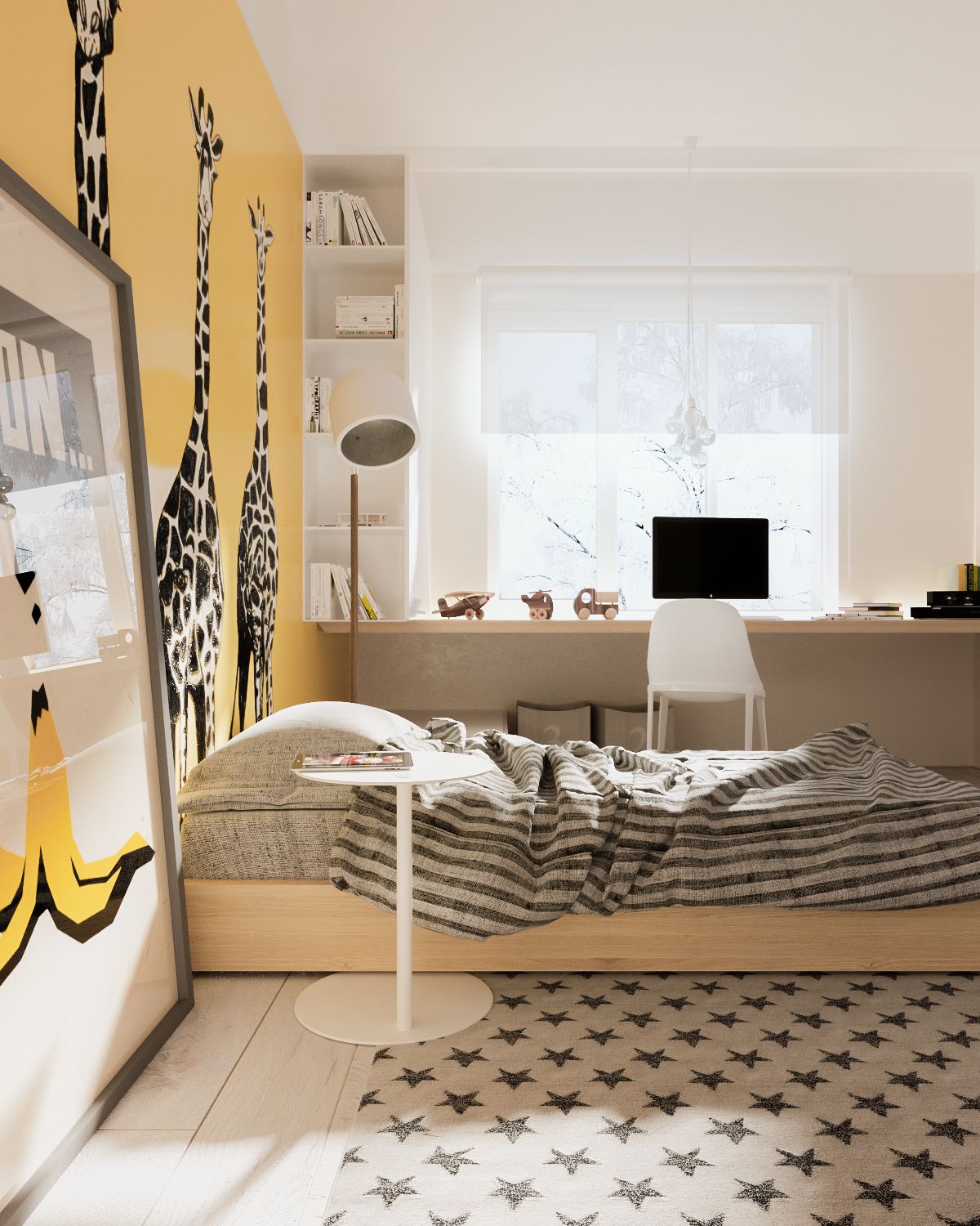
Here's another stylish children's bedroom, this time with an adorable zoo theme! The bright yellow accent wall and tall giraffe decals definitely make an exciting impression.
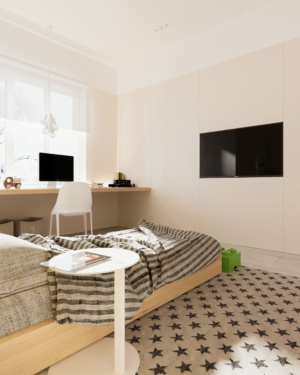
The textile theme is fun too. Greyscale stars and stripes are almost reminiscent of a big-top circus.
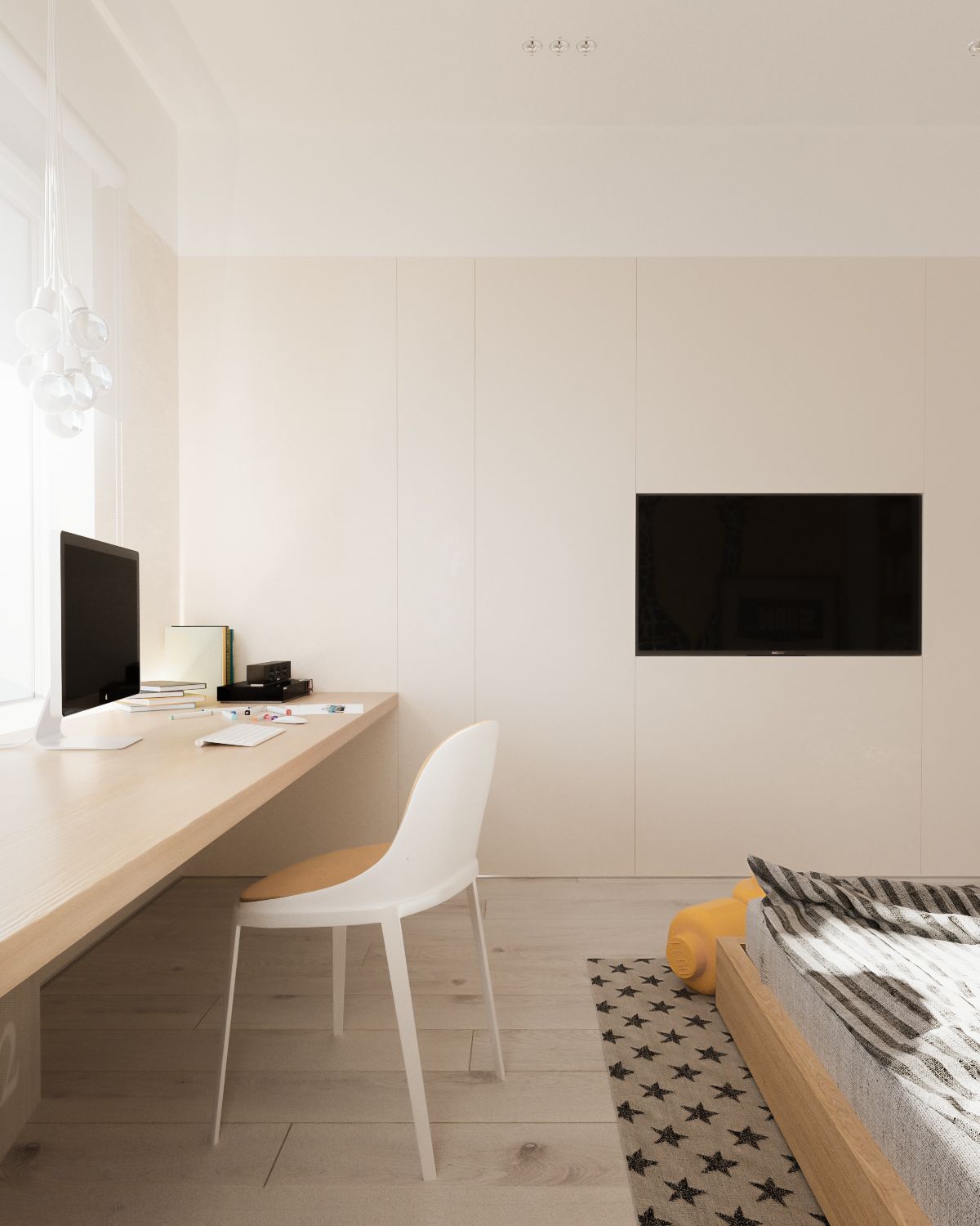
Expansive workspace ensures this young resident has plenty of room to spread out with books, paints, and anything else.
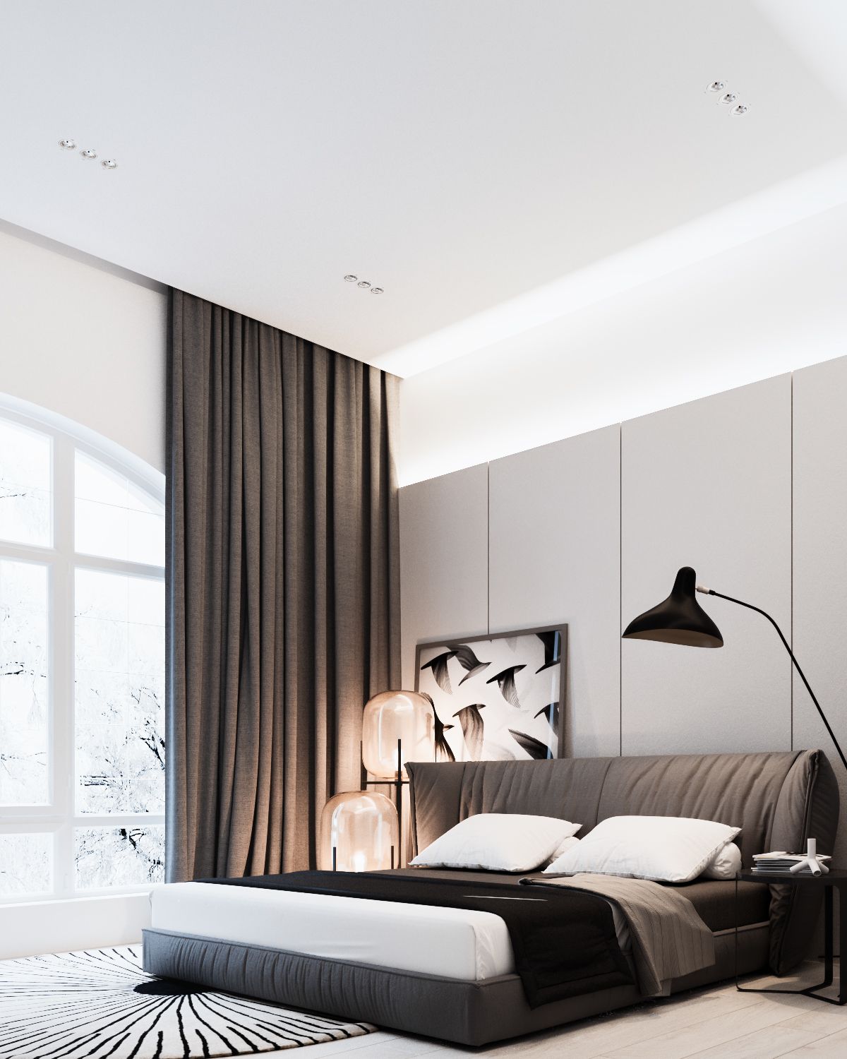
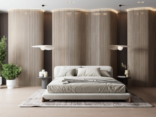
Parents deserve a well-appointed bedroom too! This lovely space uses a calm palette of white and dark grey. The bed's upholstered headboard doubles as a comfortable place to sit up reading books after the children have gone to sleep.
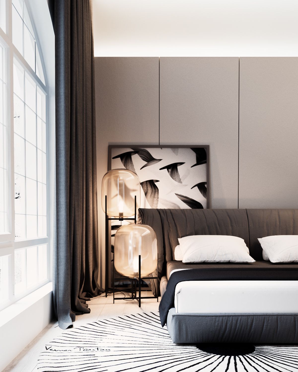
The lamps are from the Oda collection by Sebastian Herkner, and the rug is from the Verner Panton design house.
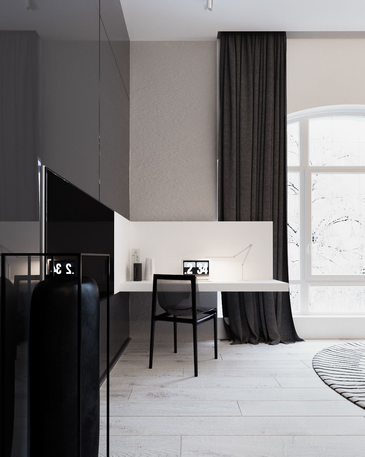
One part of the desk actually sticks out in the front of the window so the resident can soak up the sunlight while doing creative work.
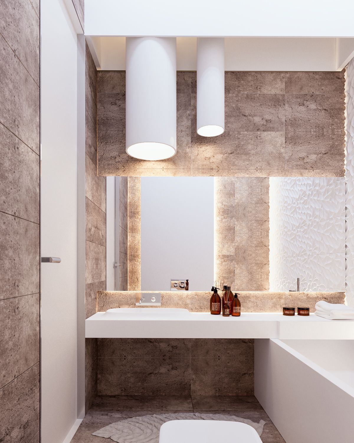
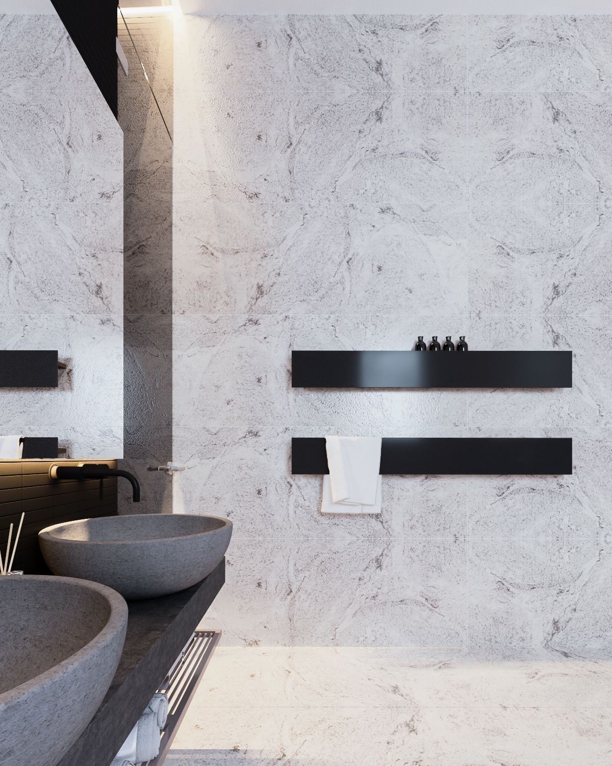
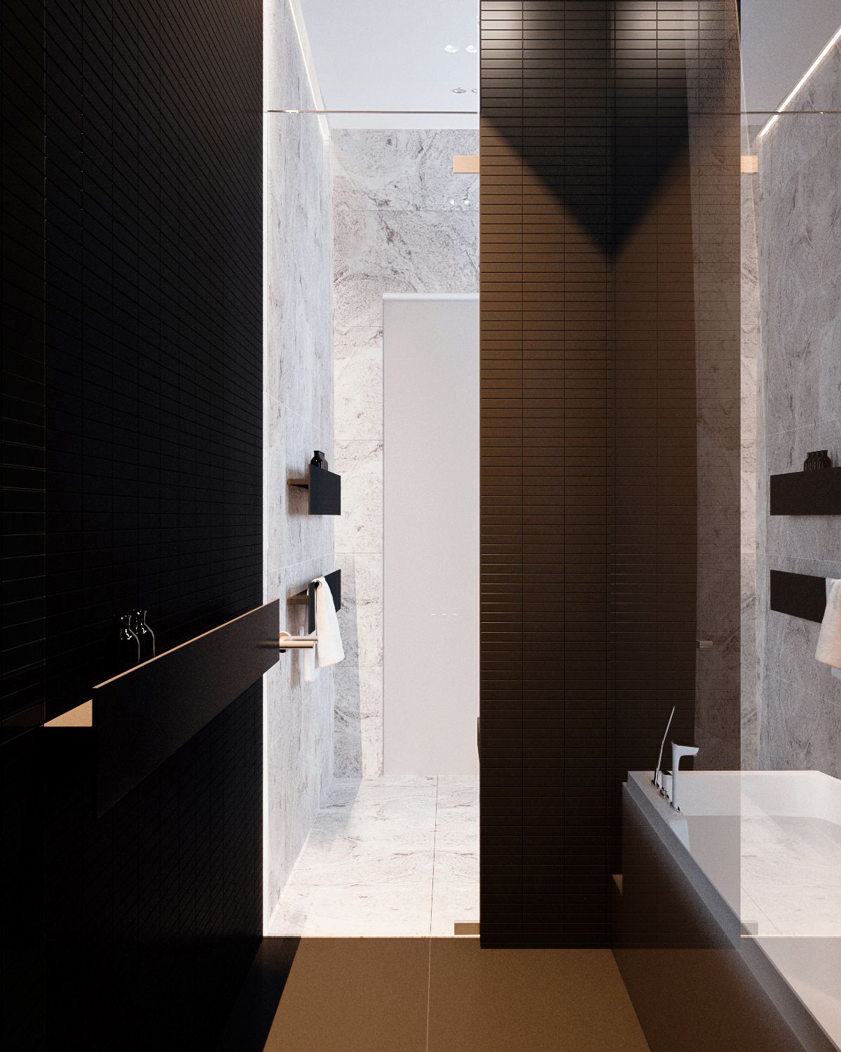
The home has many bathrooms, each one unique. This one uses warm stone tiles and textural wall cladding to create a welcoming and relaxing environment.
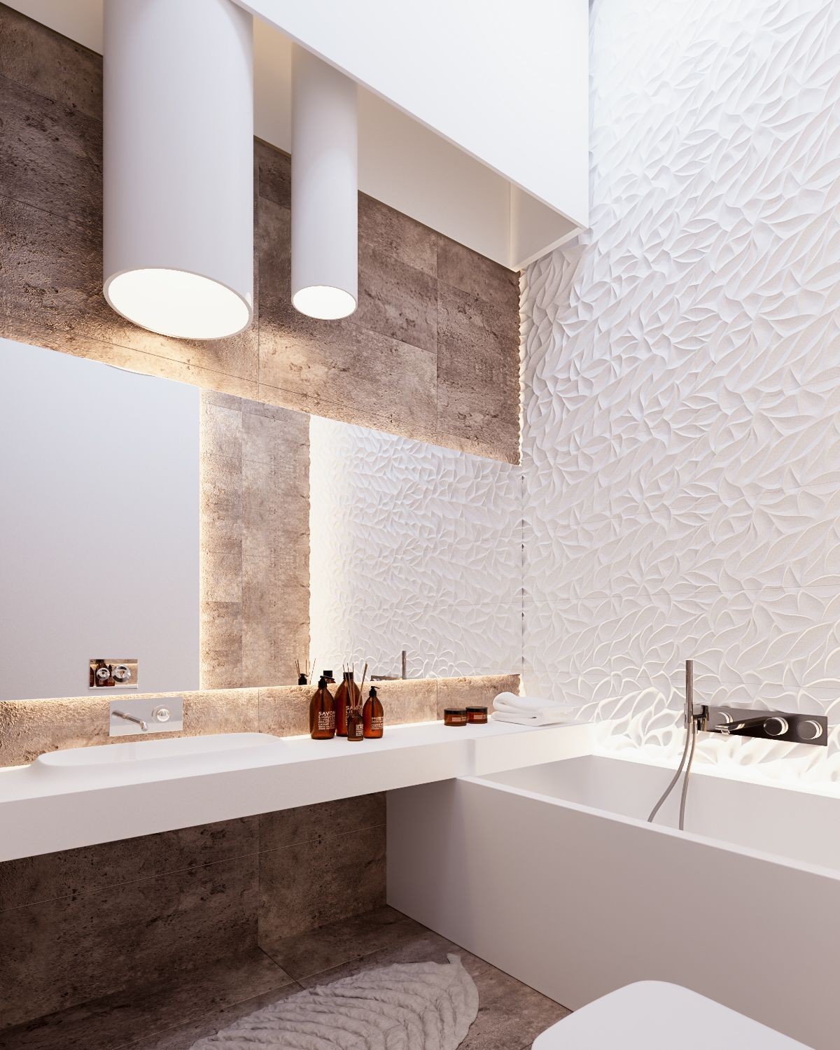
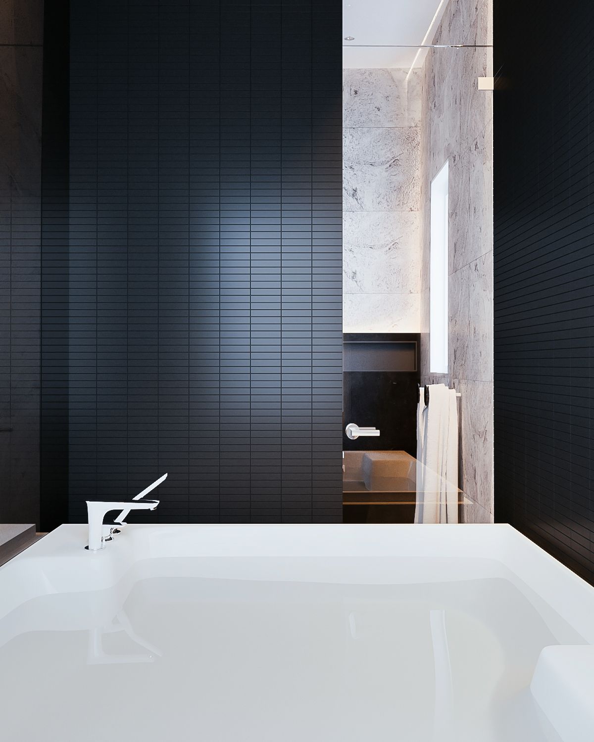
While the walls are fabulous, the vanity is interesting too. The sink melts right into the surface, and a portion of the vanity extends across the tub to serve as a convenient spot for towels or a book.
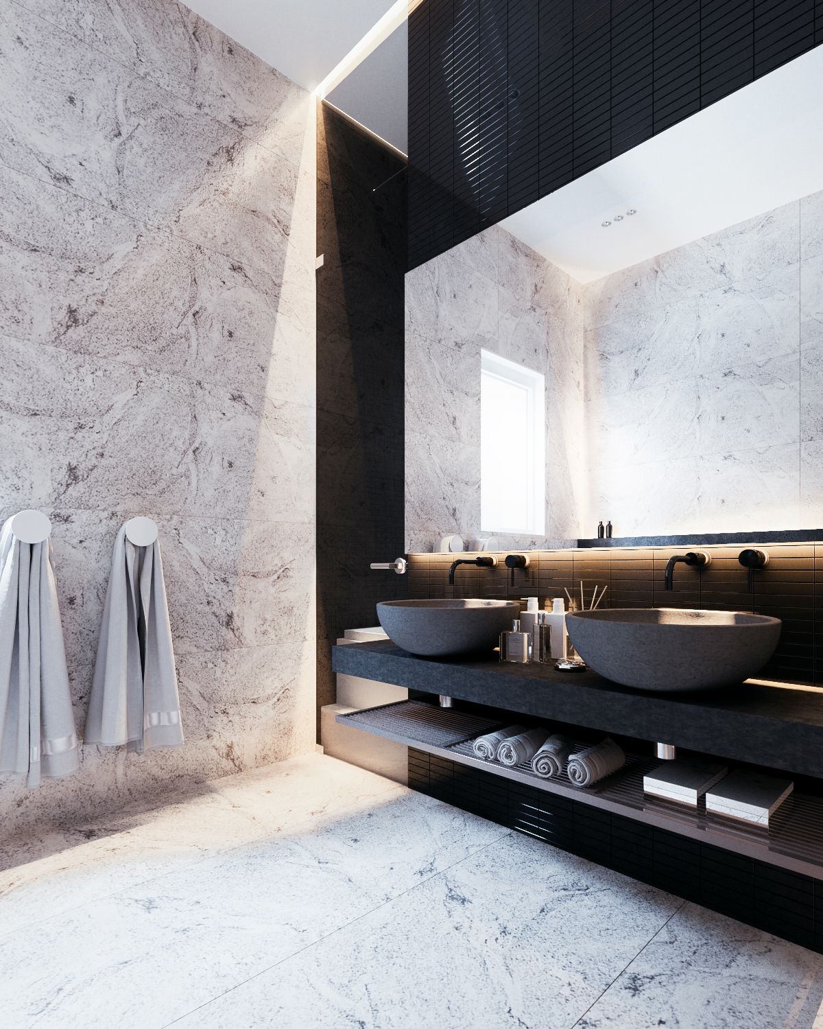
Oversized stone vessels give the sink area an undeniably luxurious appeal. Varied materials make up the dynamic storage area below.
