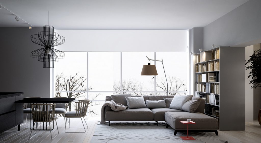
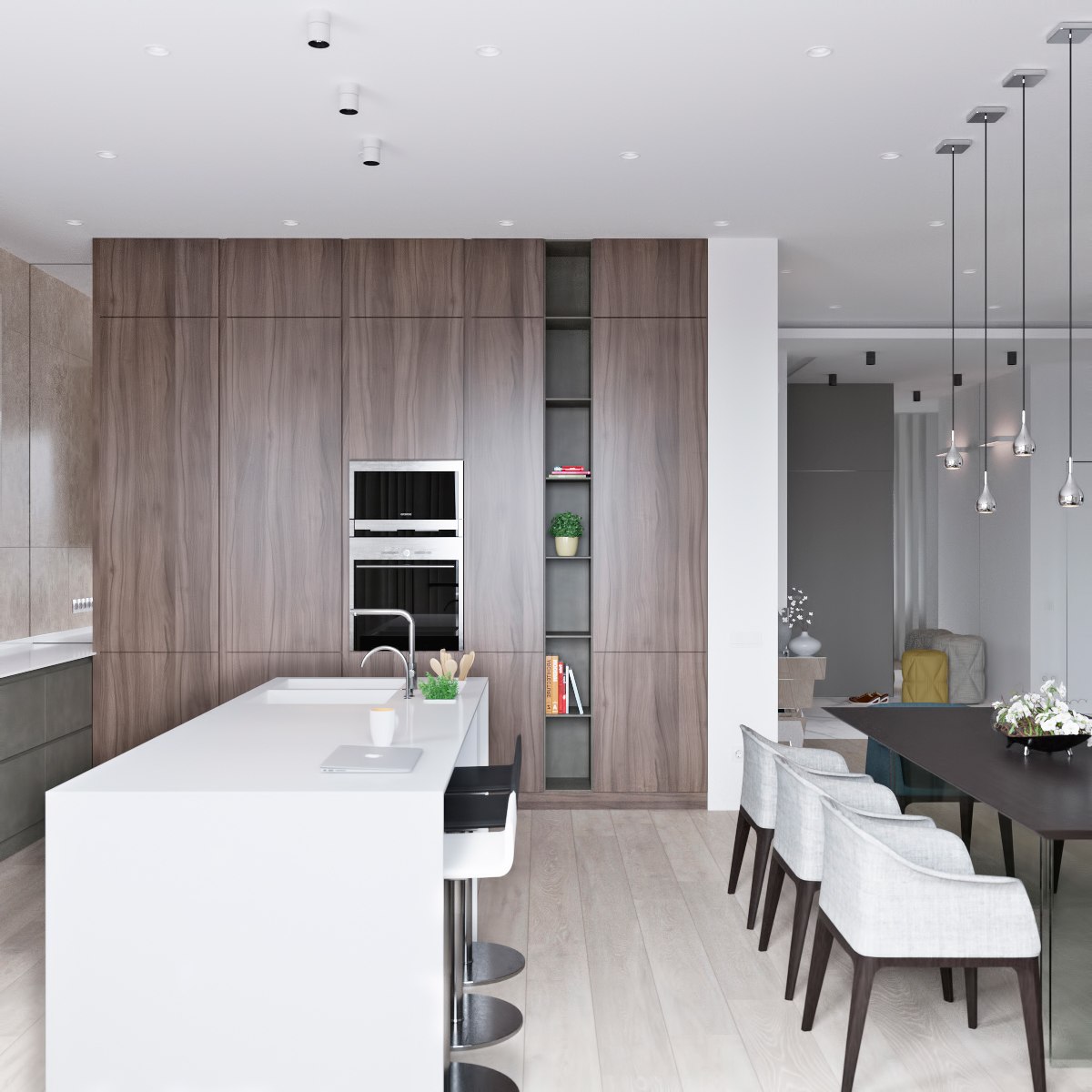
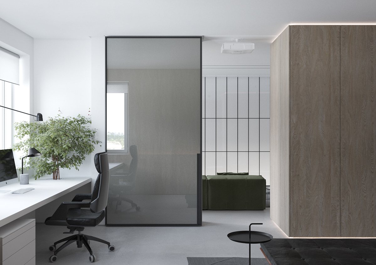
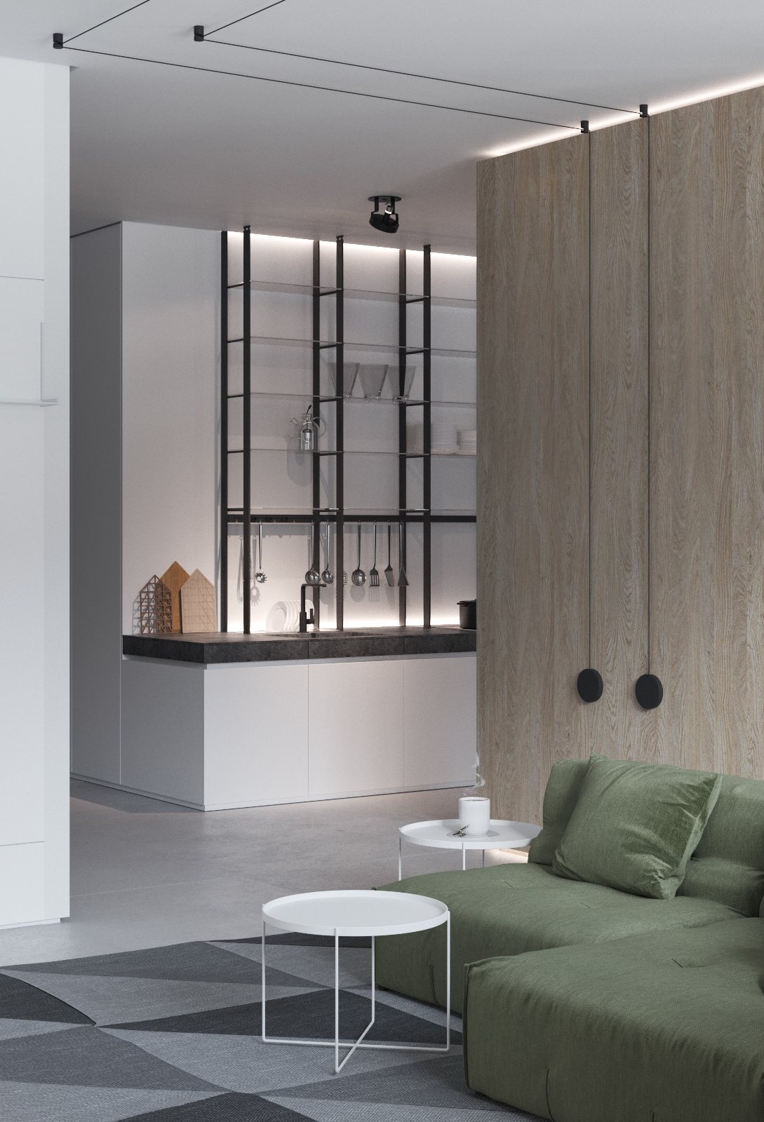
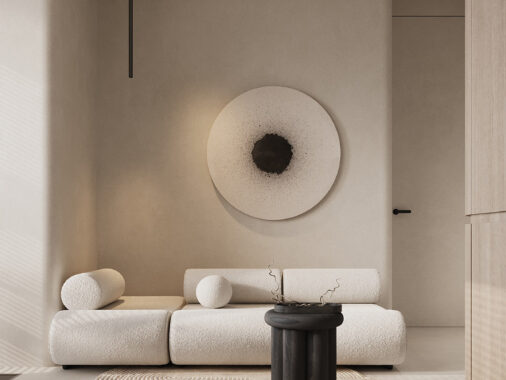
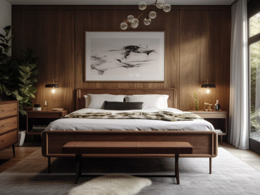
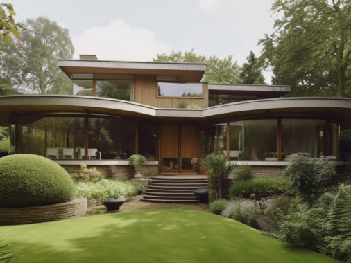
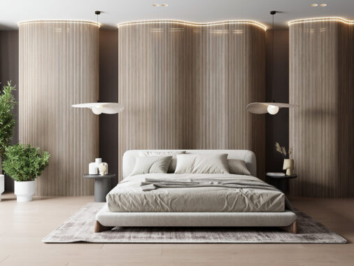
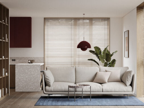
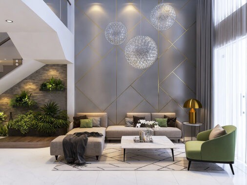
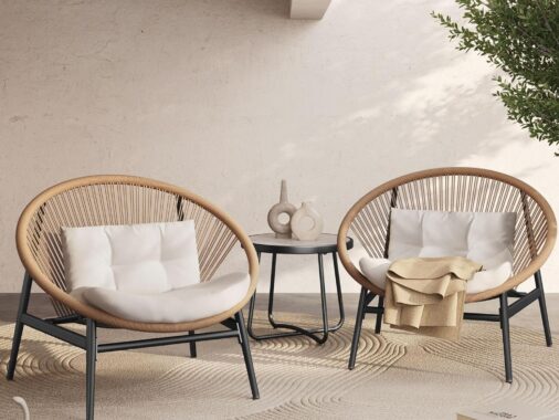
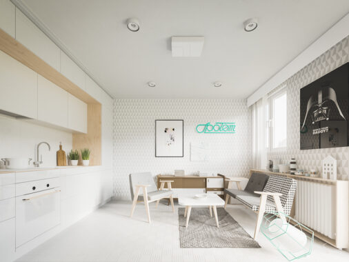
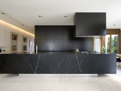
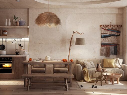
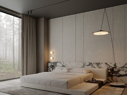
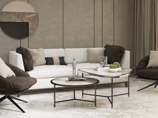
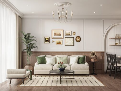
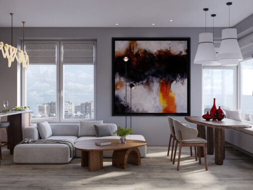
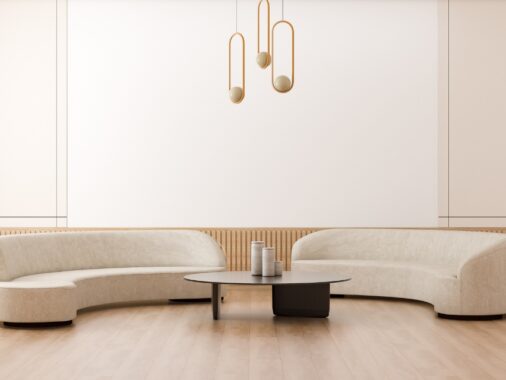
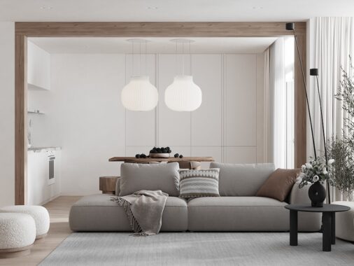
These simple interiors are a nice palate cleanser after a long day of looking for more complicated design ideas. Each one is unique but they all share a common theme: a fresh and light atmosphere bursting with the energy of a few colorful accents. If you're lucky enough to have a neutral interior, you'll find this strategy easy to use – especially if you have an eye for placement, contrast, and color theory. But what if you don't have the well-honed intuition of the designers featured in this post? Worry not, because these bright homes offer plenty of flexible ideas to help you get started.
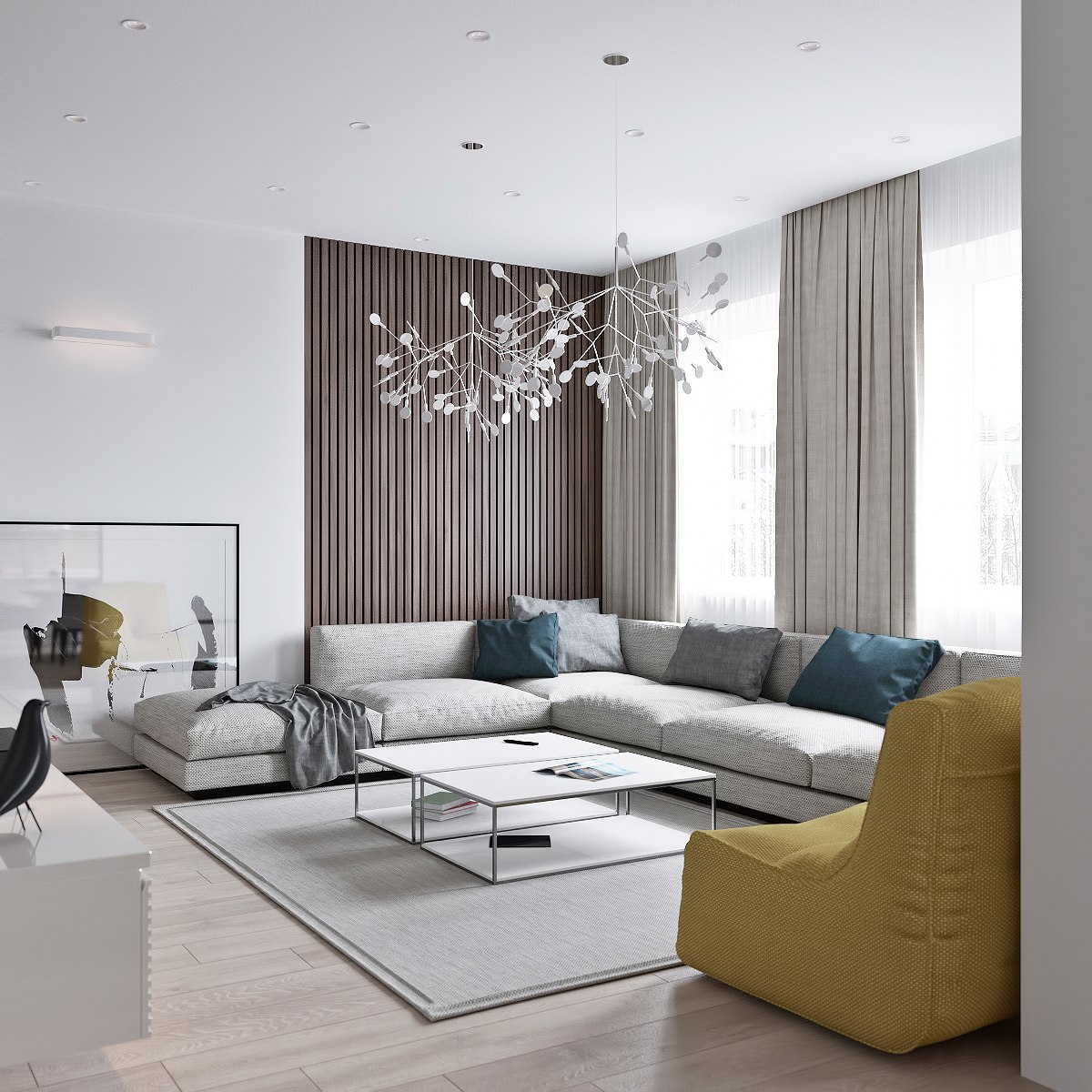
Pale yellow and deep blue are a great choice for decorators who want to incorporate nature-inspired colors without giving up a refined sense of modernity. Sunshine and soulful skies rule this interior, and the result is well worth emulating.
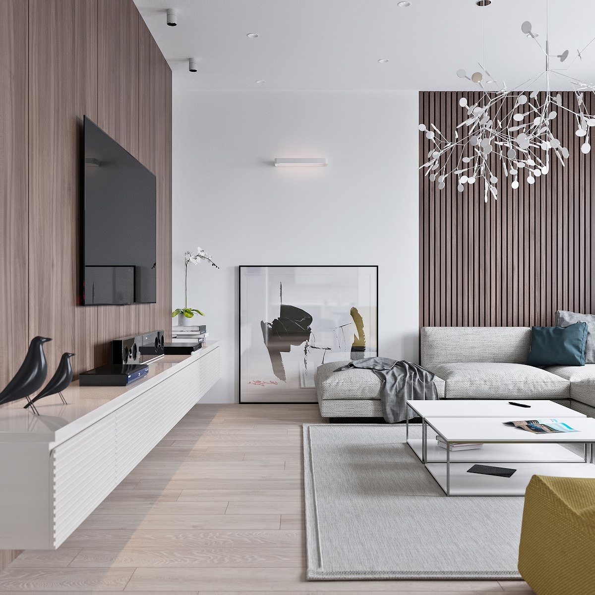
A calming background of varied wood tones keeps things soft and light, helping the more energetic elements stand out with emphasis.
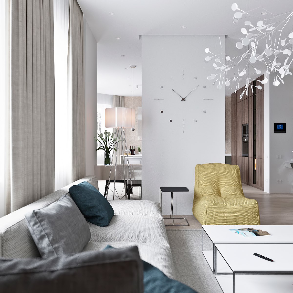
Because the open living area occupies a relatively small footprint, the designer worked to keep furniture simple and streamlined in form.
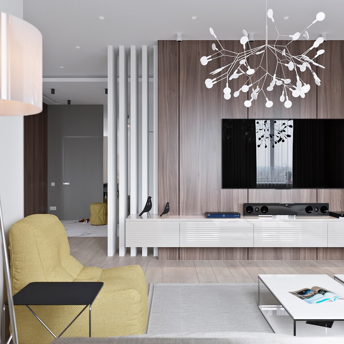
The intricate Heracleum Pendant Light by Bertjan Pot is one of the flashiest pieces of decor in the home, and even it remains subtle compared to possible alternatives.
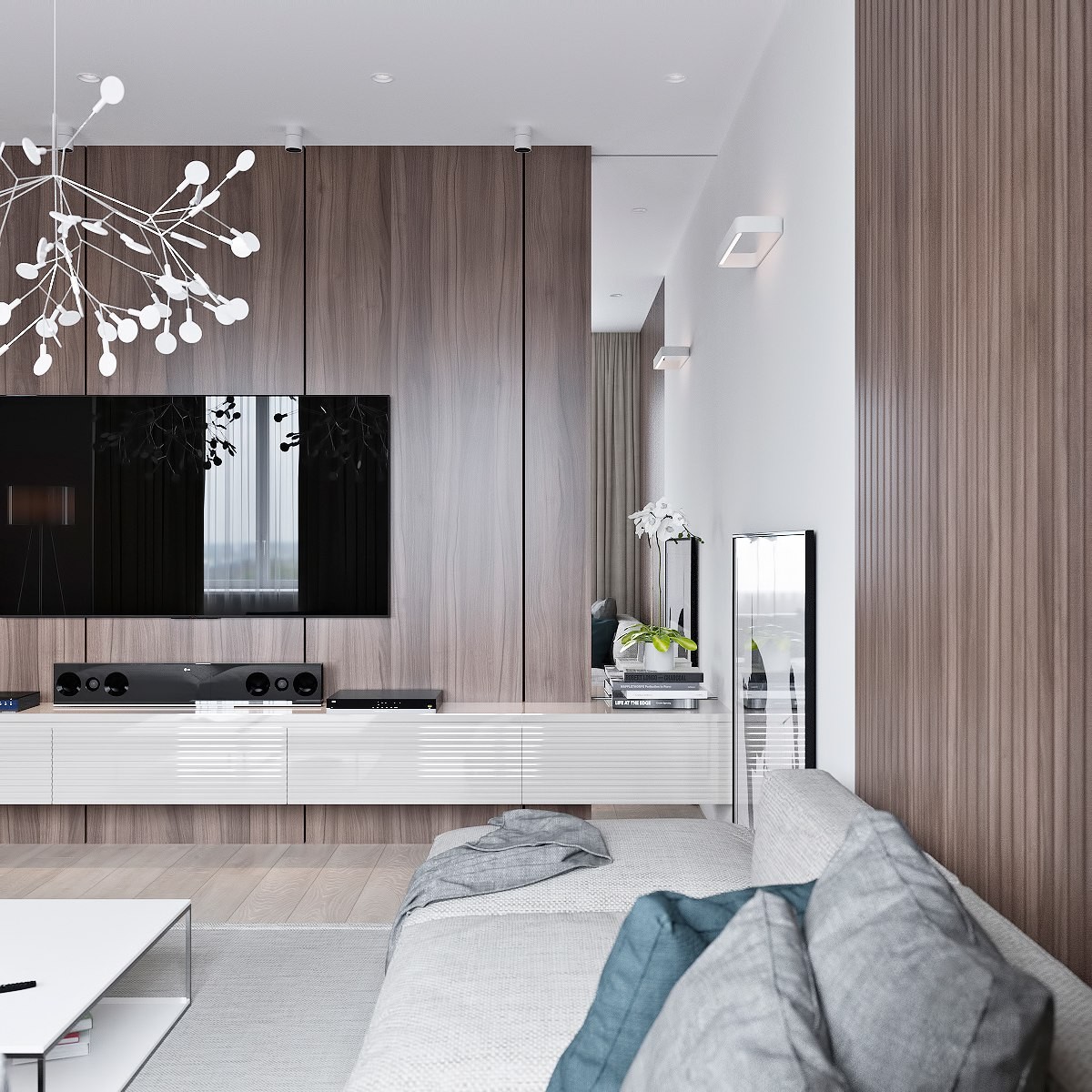
Outside of the playful color accents, the rest of the decor remains minimal and mostly emphasizes texture and composition.
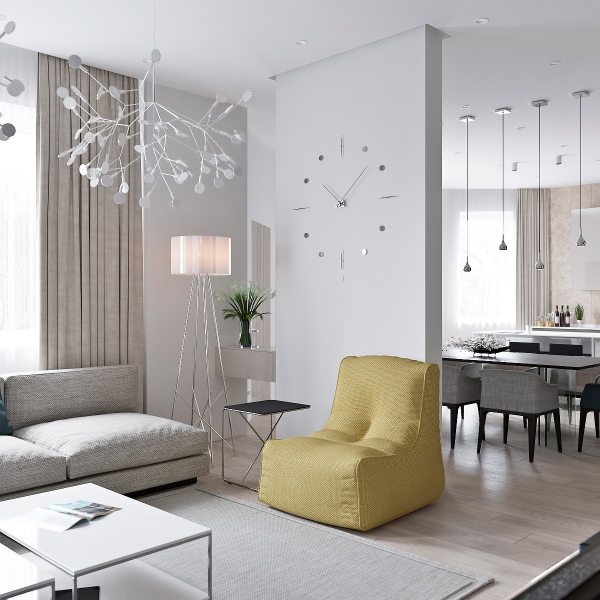
Partial dividers help break the line of sight without making any area feel too closed off from the rest. This thin wall proves to be the perfect place for an oversized clock.
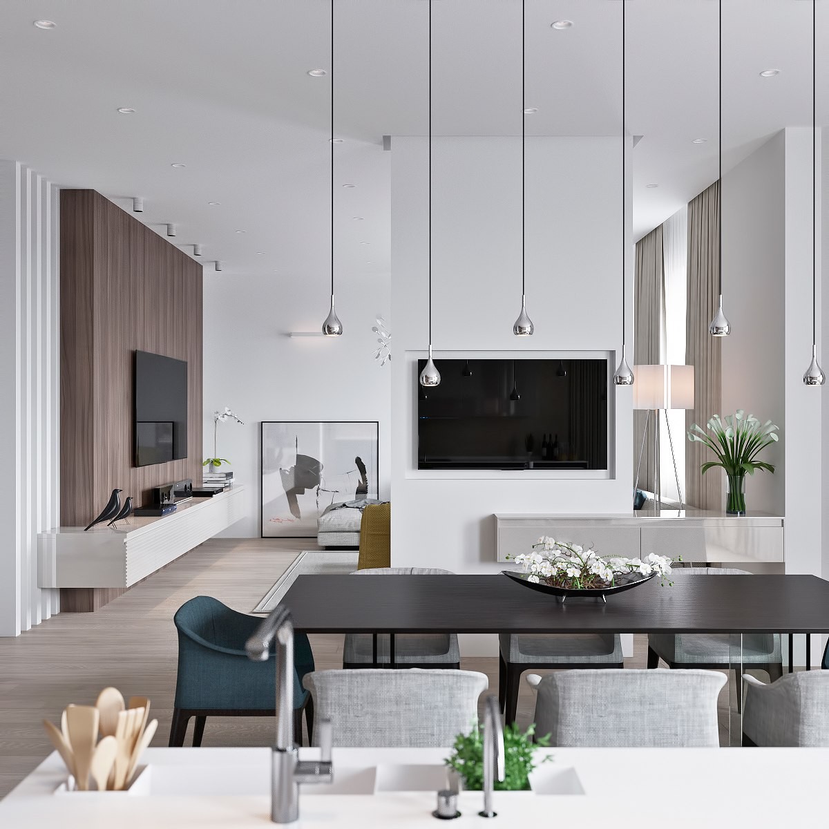
The other side serves as a mounting point for the television. Because the kitchen and dining areas share this space, residents can continue their movie will preparing a meal or catch up on the news during dinner.
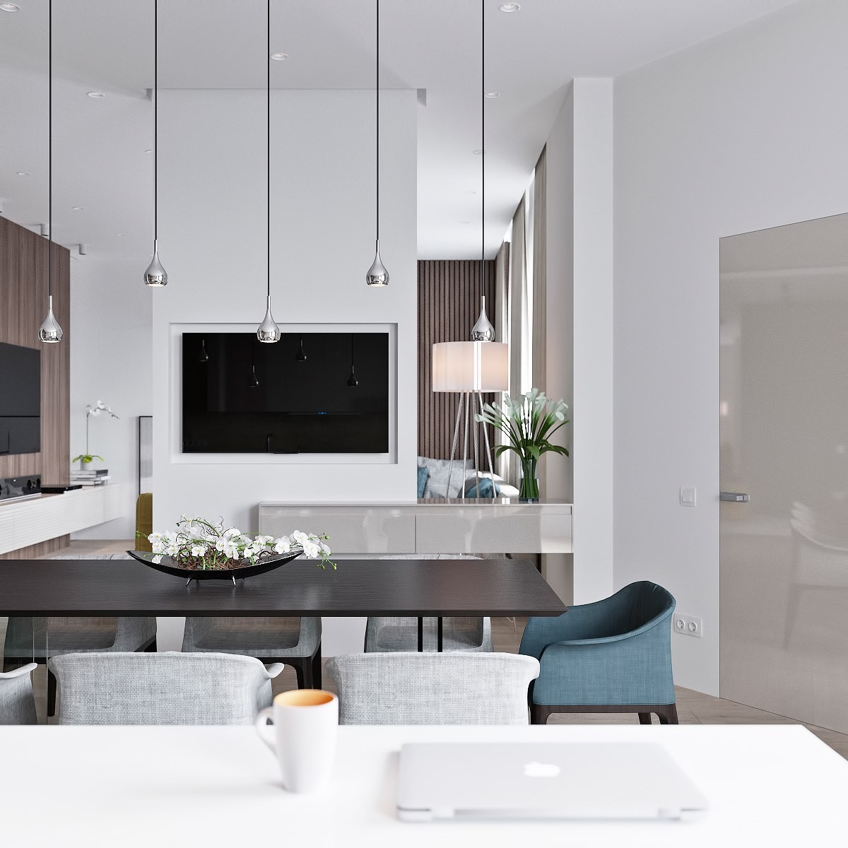
Color becomes even more rare on this side of the open layout. A blue-grey chair punctuates each end of the dining set while beautiful flowers bring their own accent colors to the table.
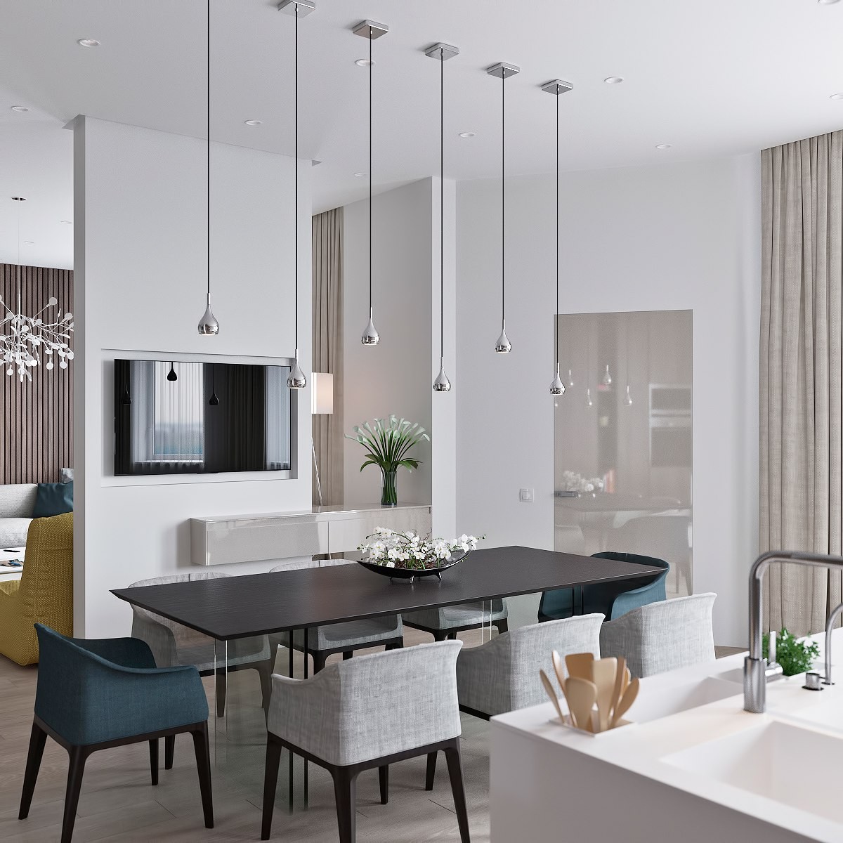
Simple forms and materials play an important role in a space as compact as this one. Even the mini pendant lights above the dining table play their part without becoming an immediate focal point.
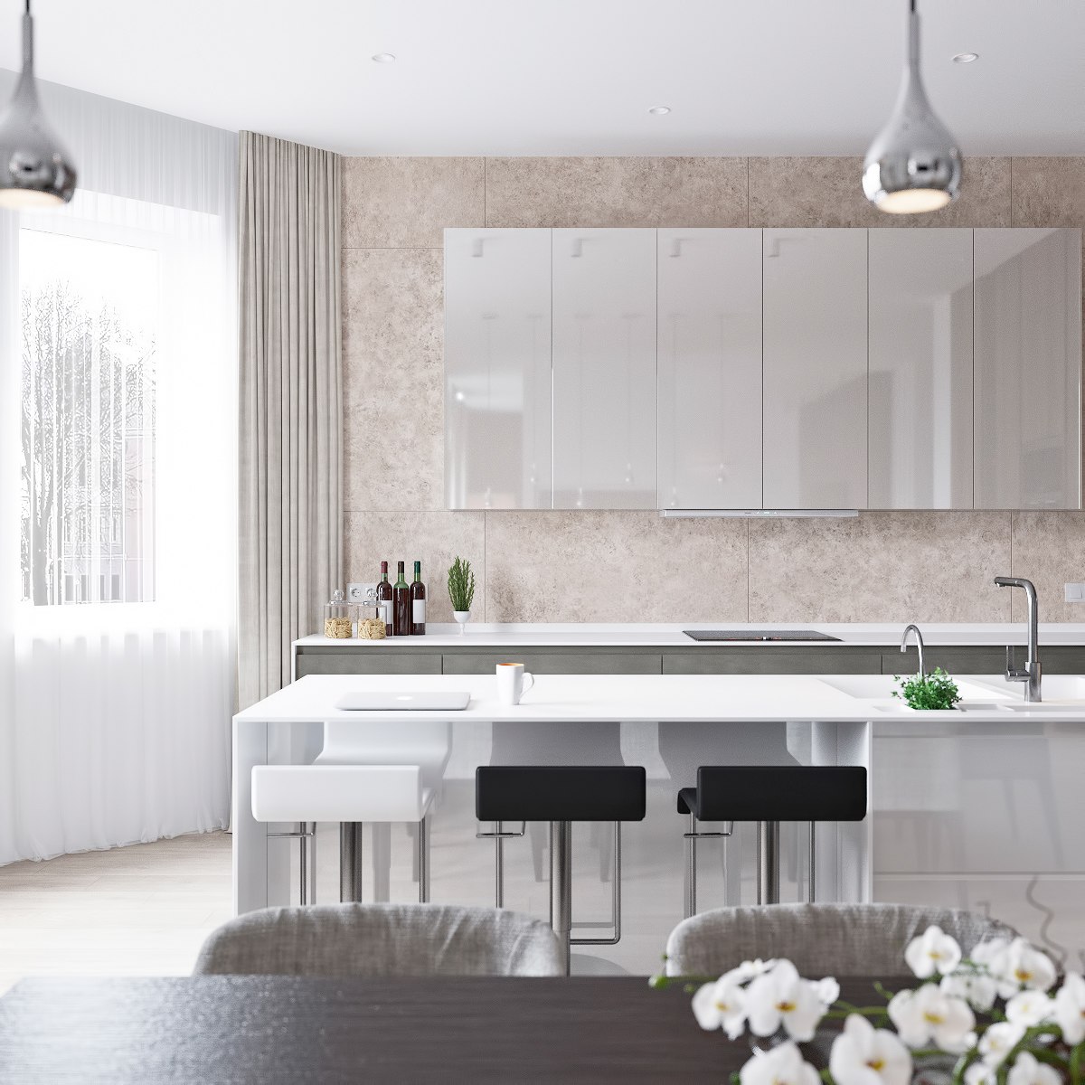
Glossy worktops and modern stools ensure the kitchen remains bright and looks clean. Warm stone-tiled walls break away from the greyscale theme, an inviting and comfortable backdrop in an otherwise minimalist space.
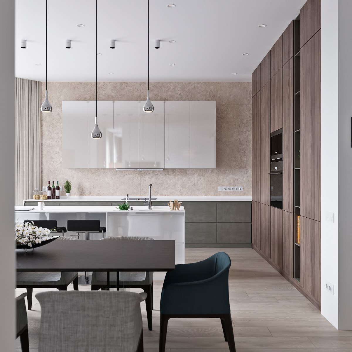
Varied textures make up for the lack of ornament. Smooth wood cabinetry, concrete-effect drawers, mottled stone tile, and reflective cabinetry are just a few of the major players.
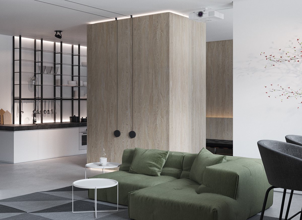
Light-colored lumber and forest green upholstery infuse this urban home with organic charm. The concrete floors, routed wires, and scaffold-like shelves hint at industrial design influence but the overall atmosphere says "home" loud and clear.
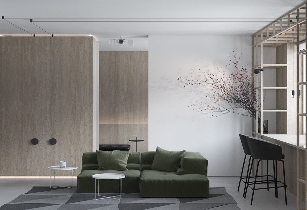
The tessellated rug directs the eye toward the seating arrangement, its lovely middle tones bridging the gaps between the color palette choices.
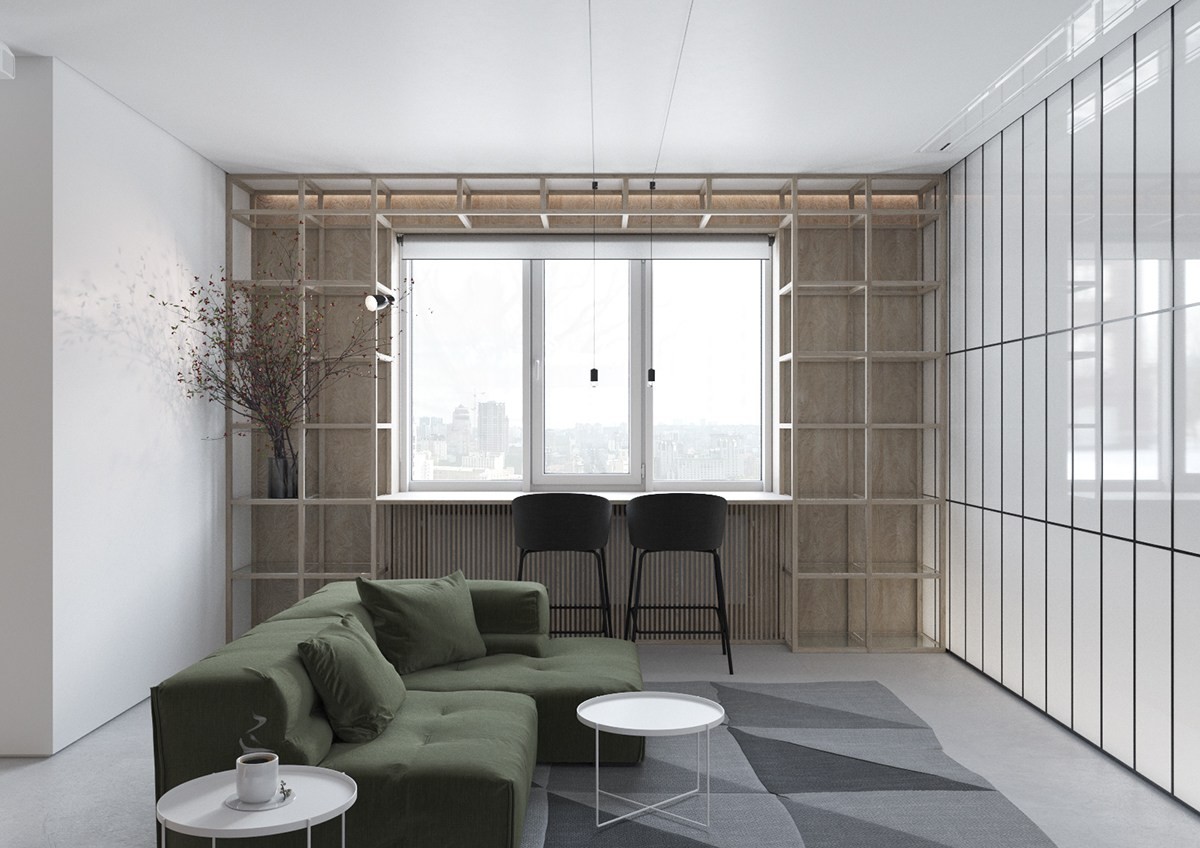
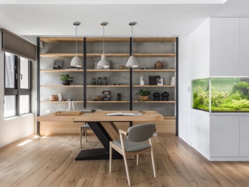
These tall shelves are especially interesting – thin framing and unfinished wood give it a rough and rugged look, perfect for an industrial theme.
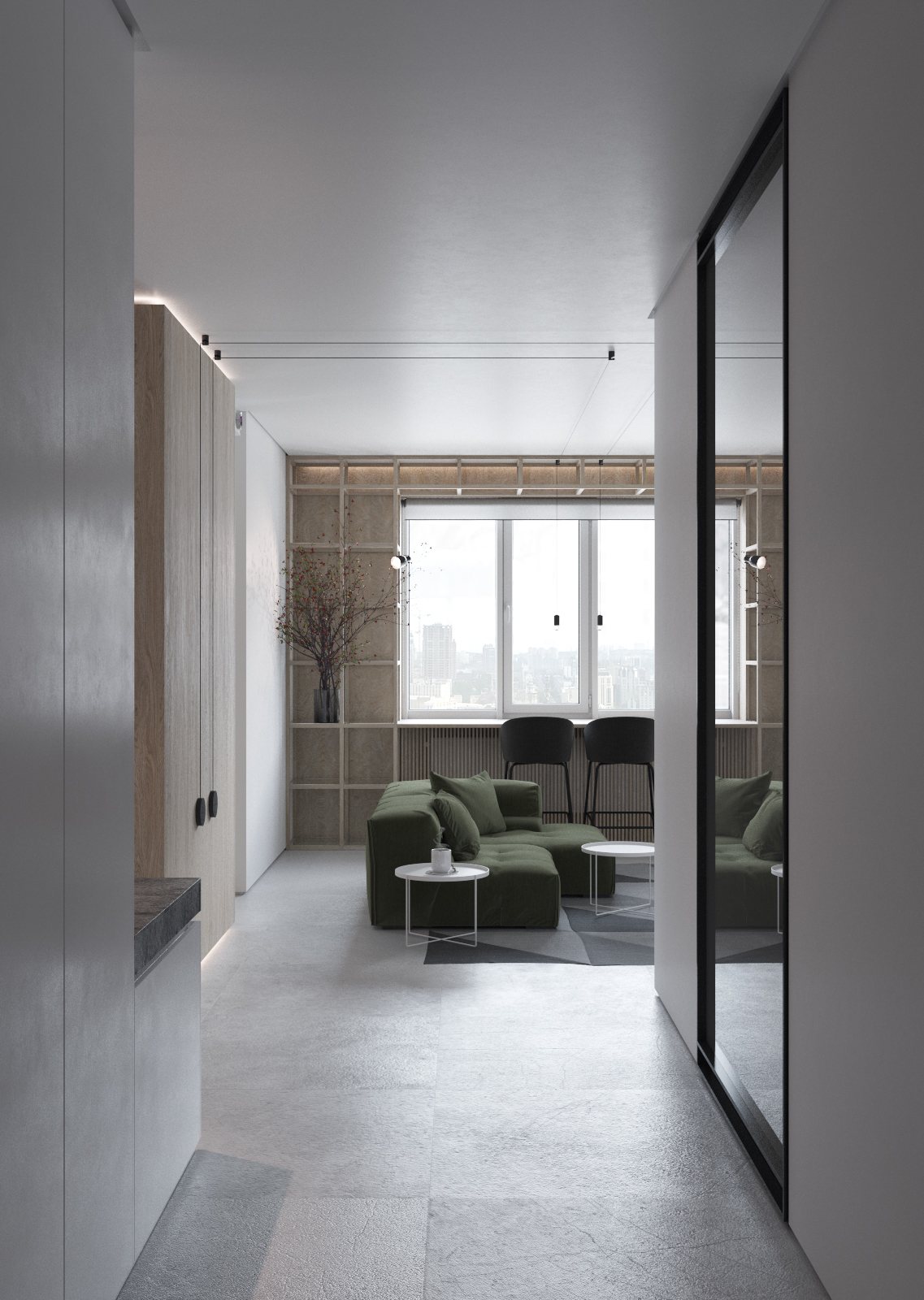
Texture reduces the severity of the concrete floors, giving them a softer and more approachable aesthetic suitable for a comfortable home environment.
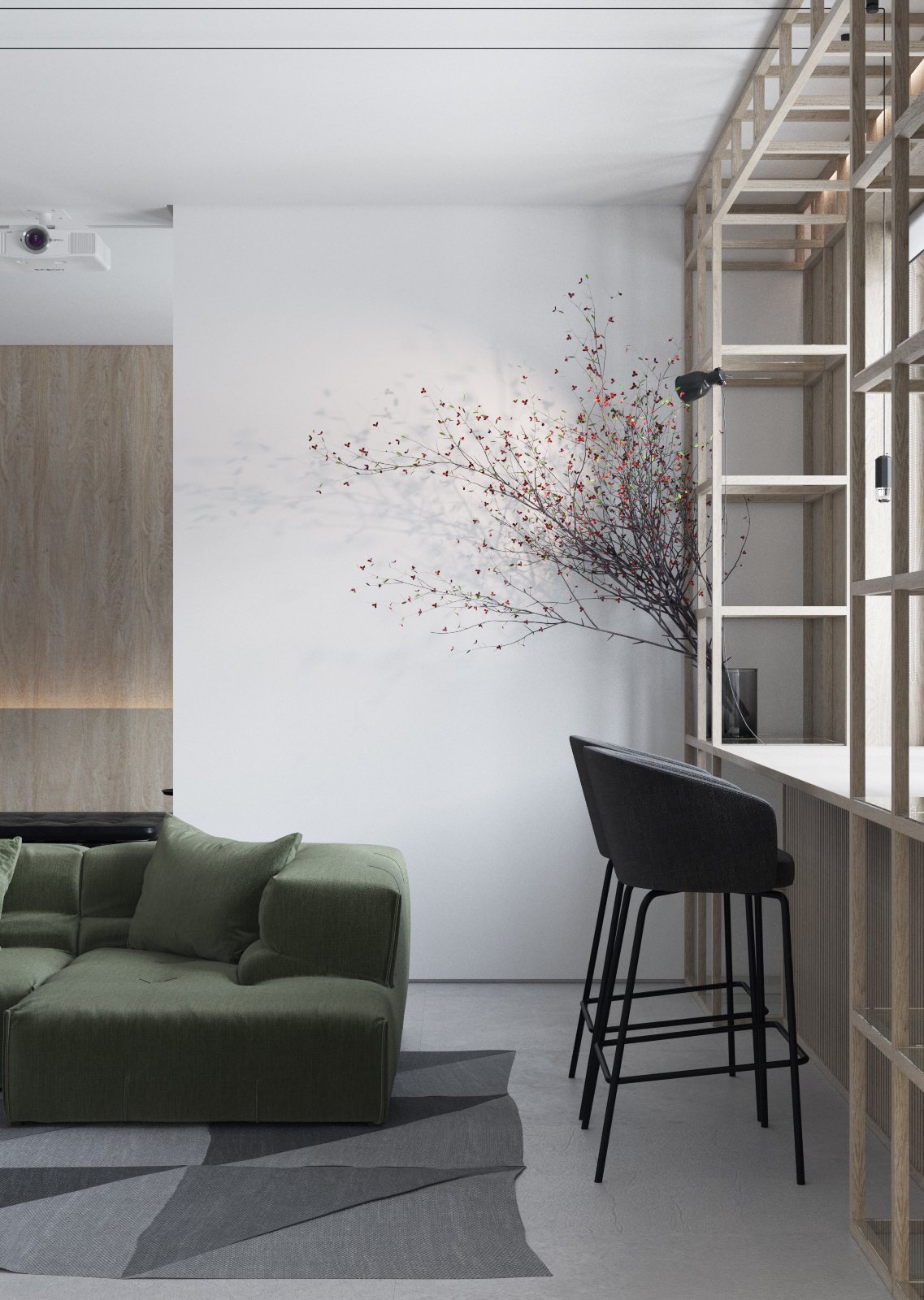
Anywhere you look, linear forms are so important in this interior. Each angle directs the eye to another functional space, making movement just as crucial to the design as the colors are.
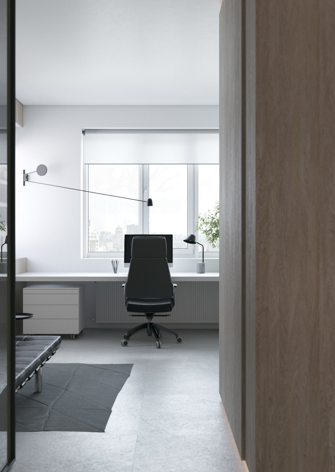
Industrial elements remain tame, but the same emphasis on sharp lines continues. The swing arm wall lamp is from designer Daniel Rybakken.
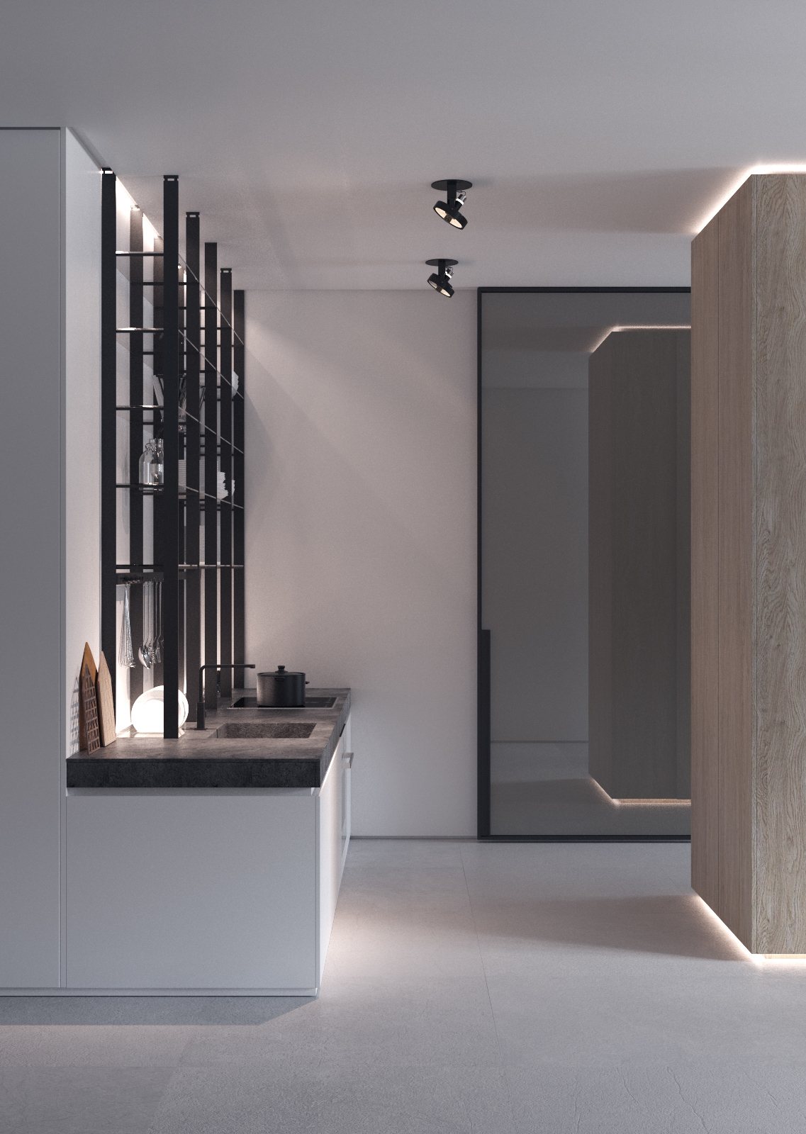
Blending flawlessly with the worktop, the sink and range serve their function without distracting from the home's efforts toward minimalism.
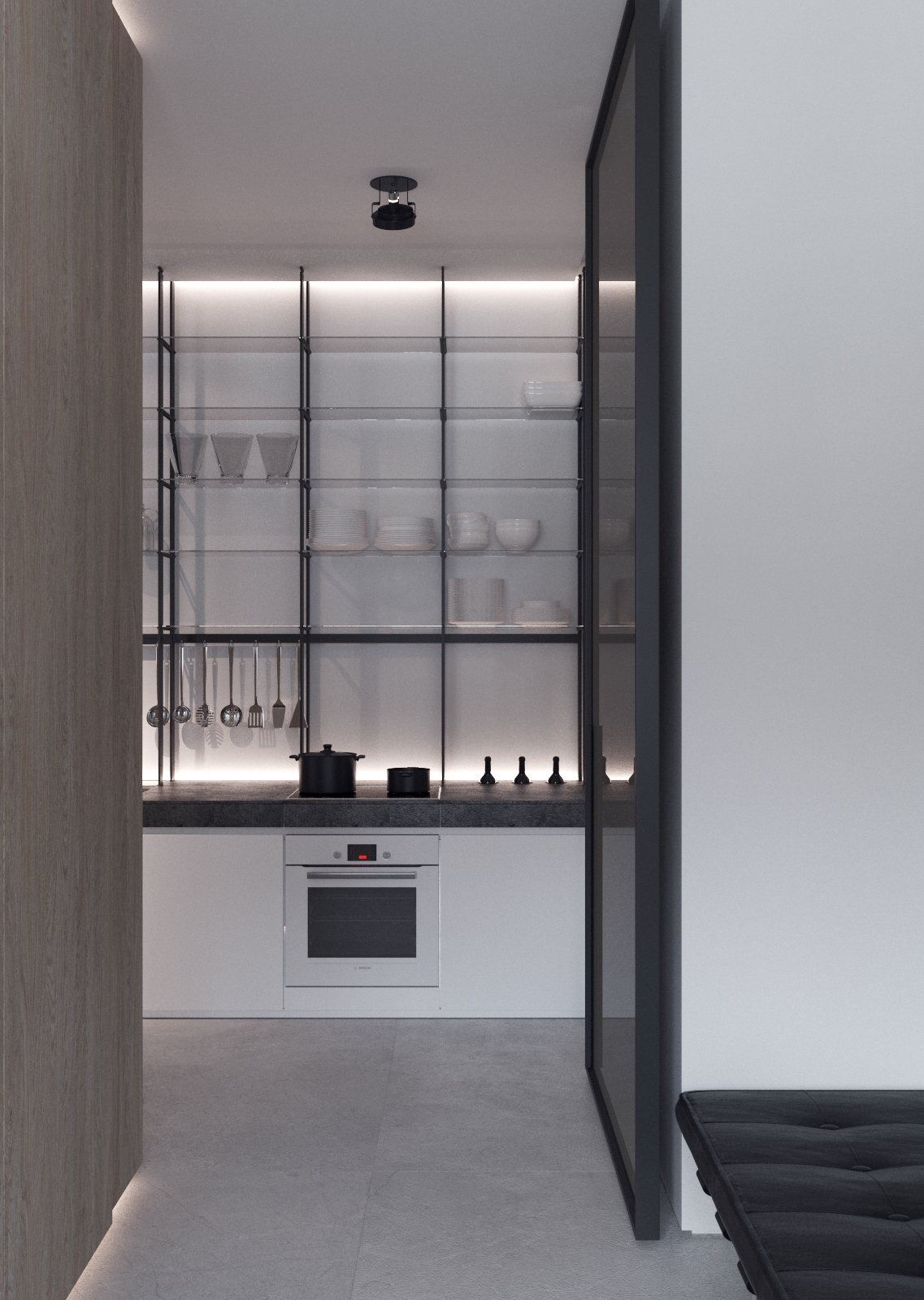
In fact, the impressive shelving seems to work as the anchor of the design. Careful dish coordination is the most important skill for anyone who wants to adopt this striking style.
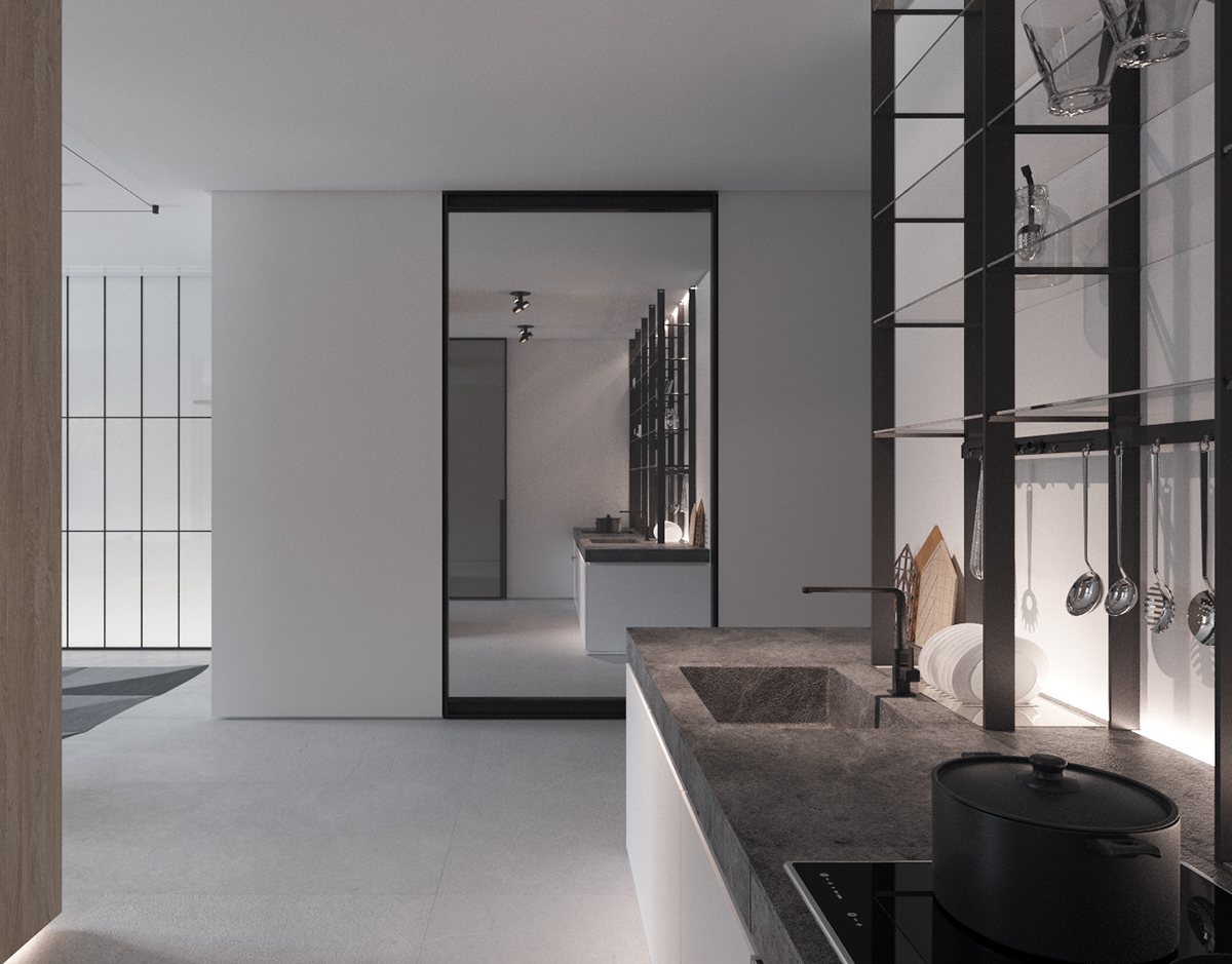
Did you notice that this lovely kitchen doesn't have its own window? This mirror helps reflect some of the light from the living room.
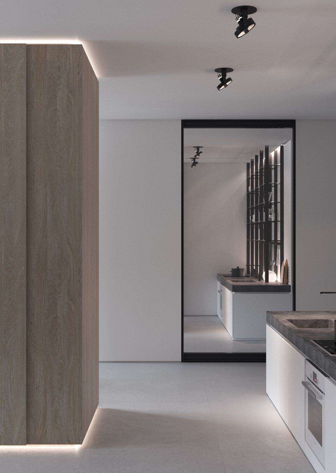
Of course, smart sources of indirect lighting do a great job of banishing harsh shadows on their own.
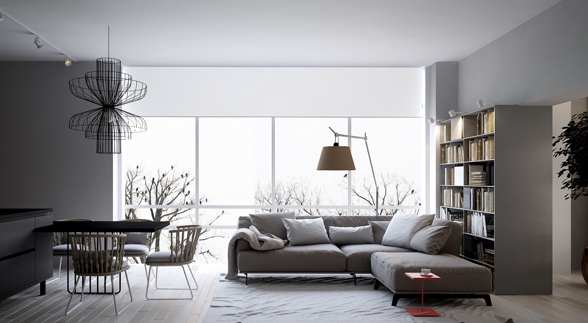
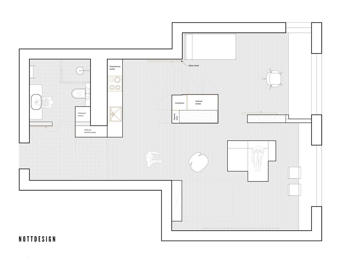
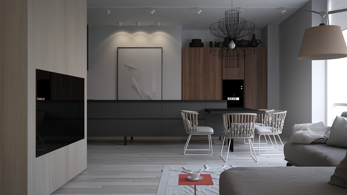
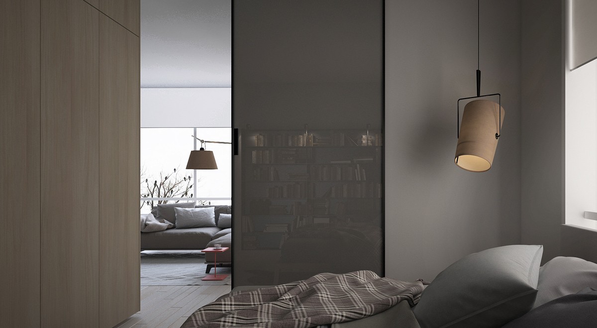
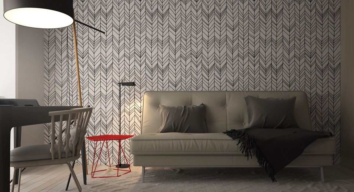
Finally, a look at the last home – this one has the most reserved color strategy of them all. The living room basks in its relaxing greyscale color palette, with the only dash of color coming from an unassuming side table near the sofa. This interior proves that even the most utilitarian object can fill an important aesthetic role.
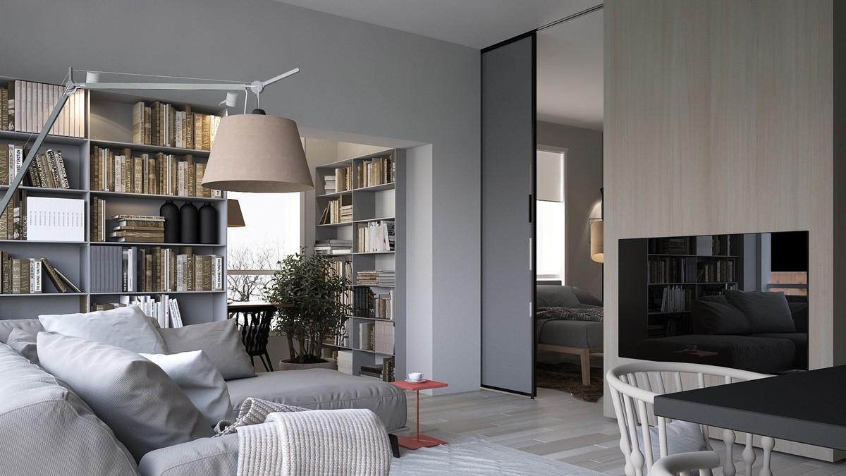
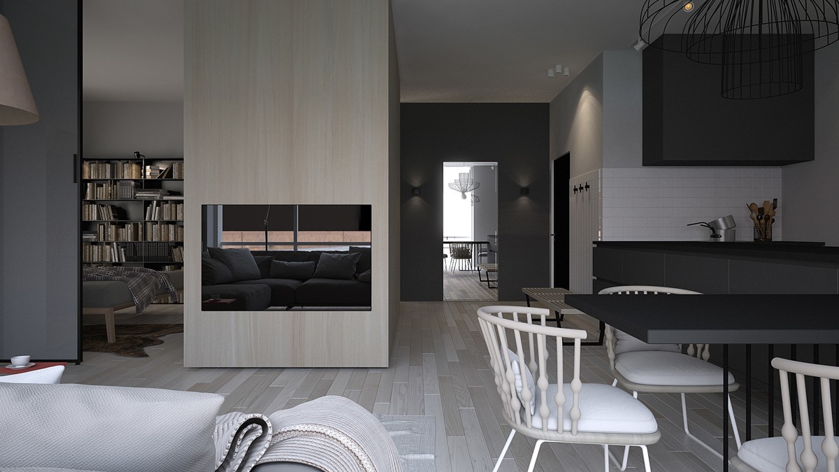
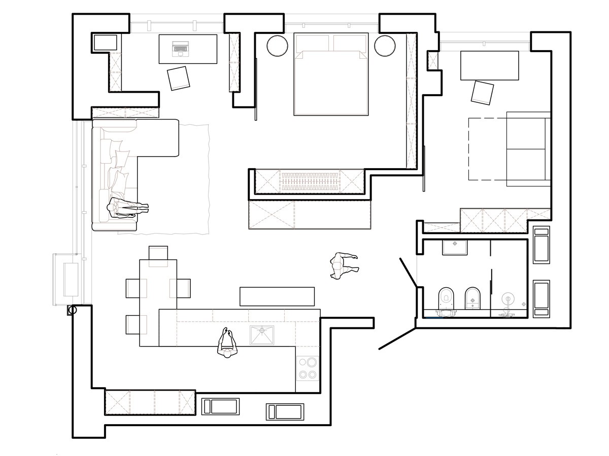
It's a compact space – not much room for a bolder color theme, really. The wooden media wall serves as a central axis with functional areas on either side.
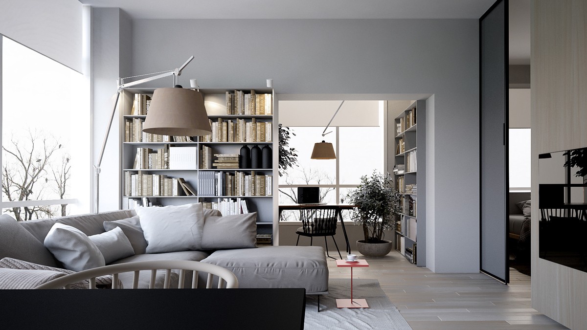
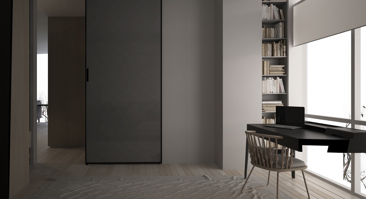
Through the wide doorway, a small office and library enjoy their prized spot overlooking the world outside.
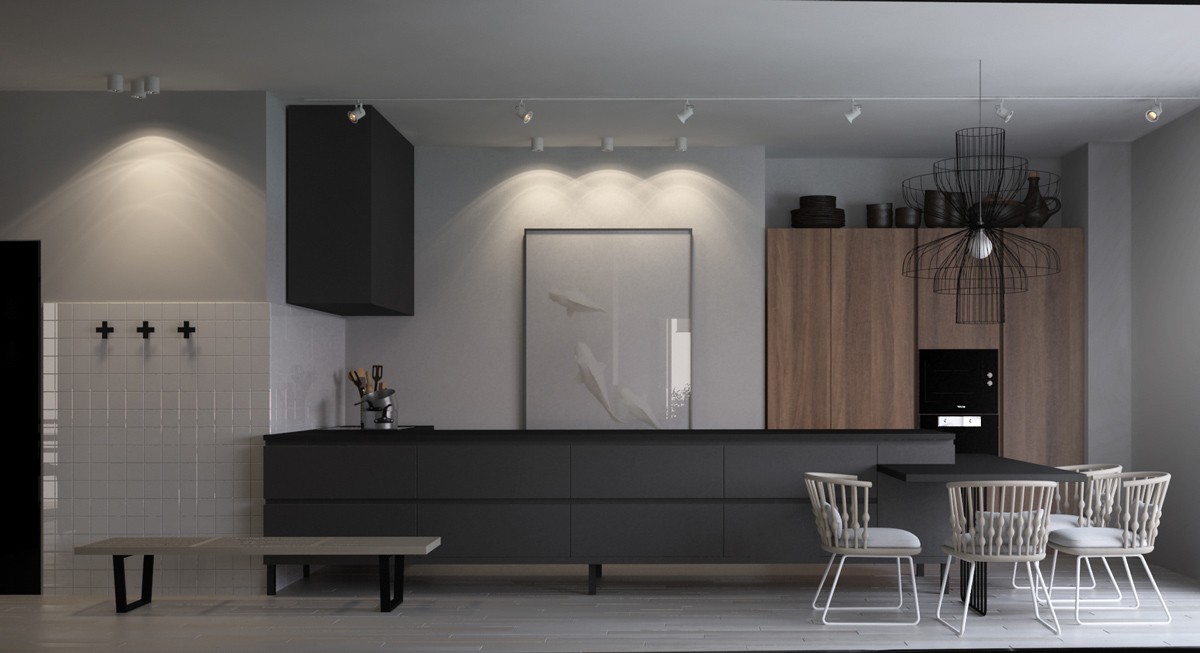
Layered and functional, the work area revolves around a long central island that reverses the form of a more traditional kitchen. Patricia Urquiola's stylish Nub chairs surround a built-in breakfast table on the right.
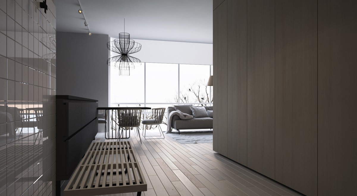
Natural lighting can transform a dark hallway. The dining arrangement, pendant light, and even the entryway bench all feature airy structures to let the line shine right through.
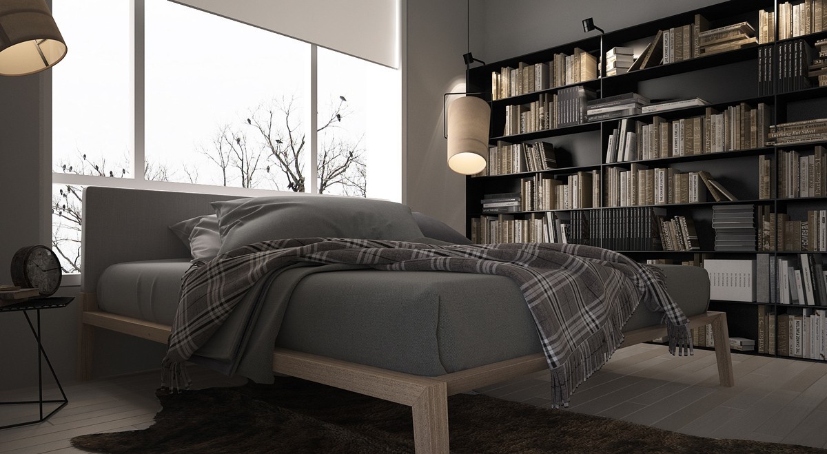
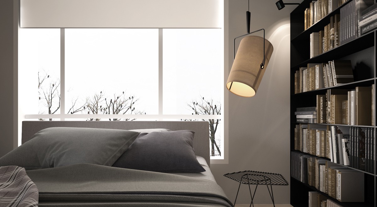
Voracious readers take note: this bedroom not only includes its own personal library but also accommodates late-night reading with adjustable pendants on either side of the bed.
