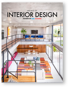
Luxury doesn't have a single meaning – a luxurious interior could be ornate and extravagant, or subdued and subtle. Details like material quality and design seem to make more of a difference than brand name alone, a factor that allows designers to create something worth admiring on any budget at all. This photo tour explores two inspirational homes, the first taking the decorative approach and the second sticking to a more atmospheric standard. Both can help you identify the focal pieces used in each space so you can easily recreate these looks at home. Get excited! These homes demonstrate two unique sides of luxury.
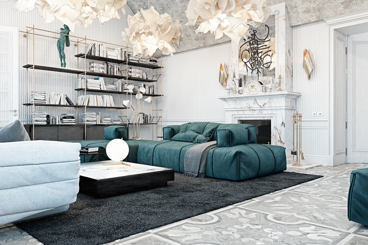
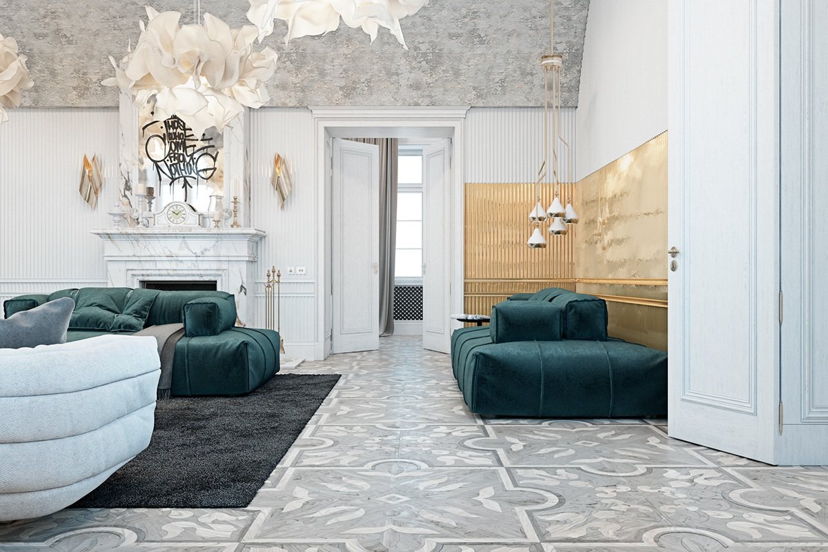
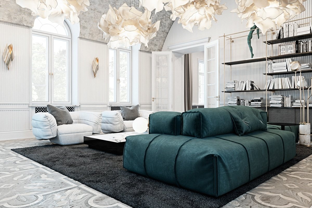
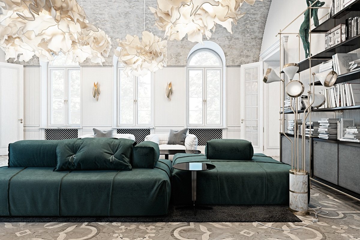
Right from the first glance, it's easy to see that this home eschews the ordinary in favor of personal expression. The interior theme features plenty of modern furniture and lighting fixtures yet carries the classic flourishes and asymmetrical hallmarks of the rococo style.
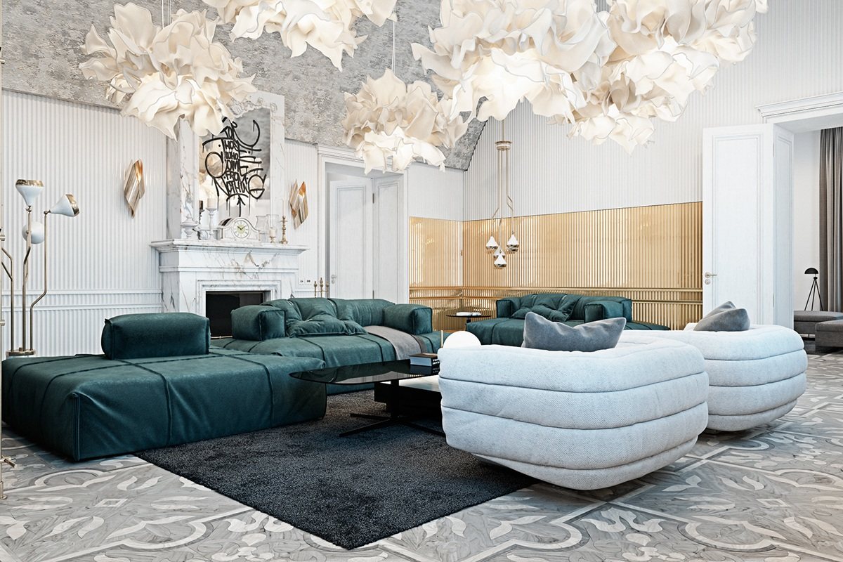
The result is fabulously unique, the light color palette allowing decorative touches more room to breathe.
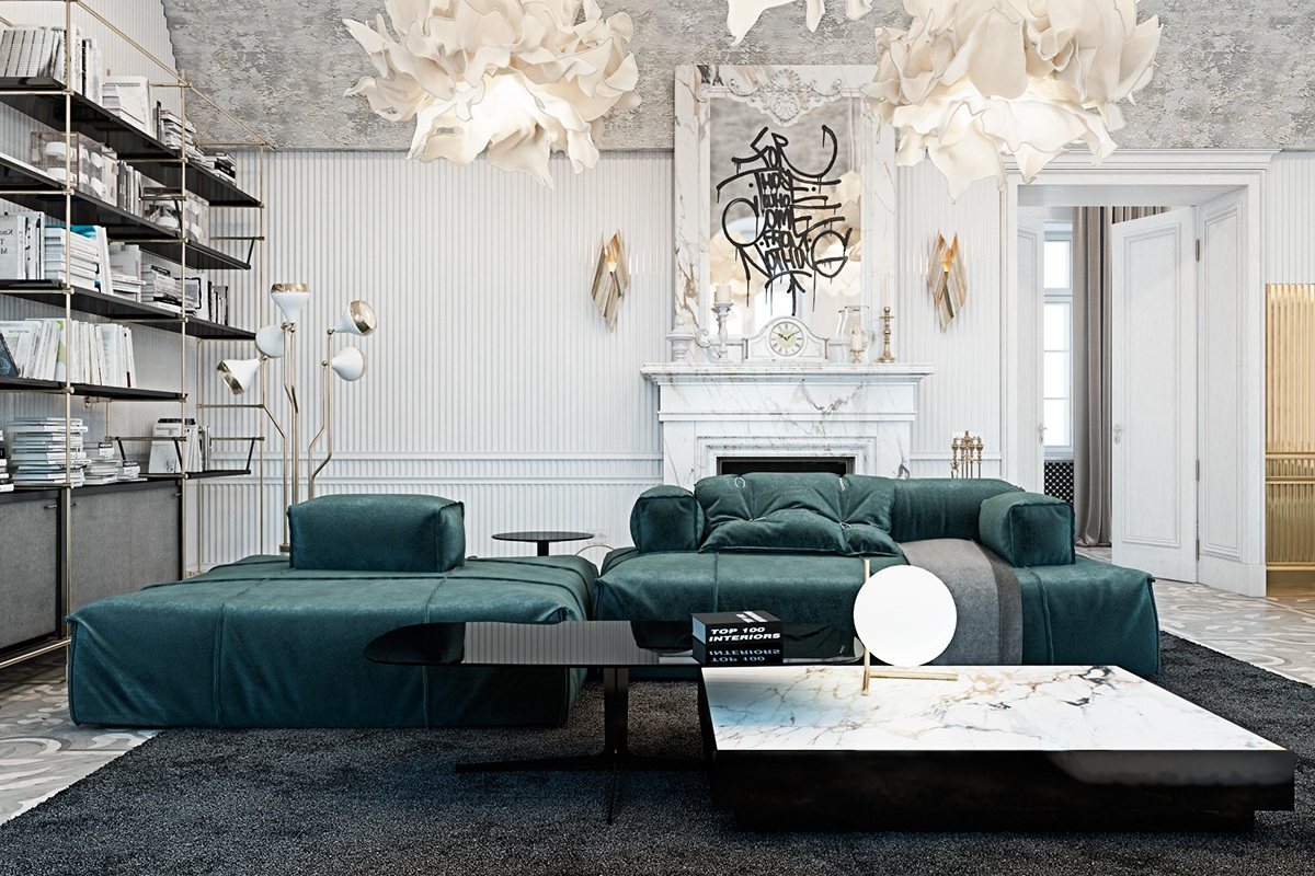
Classical features set the stage for luxury, with modern furniture and urban details infusing the interior with renewed life – the spray paint on the mirror would make for a fun DIY project.
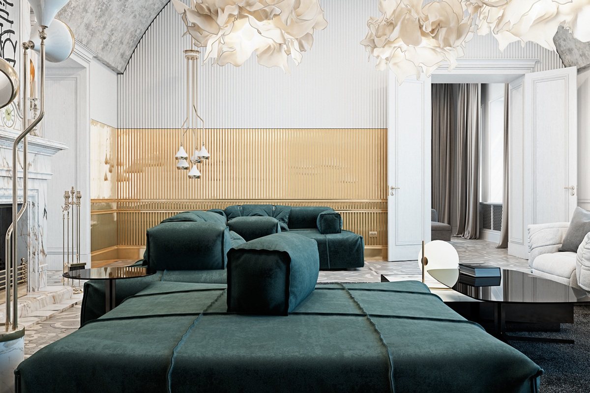
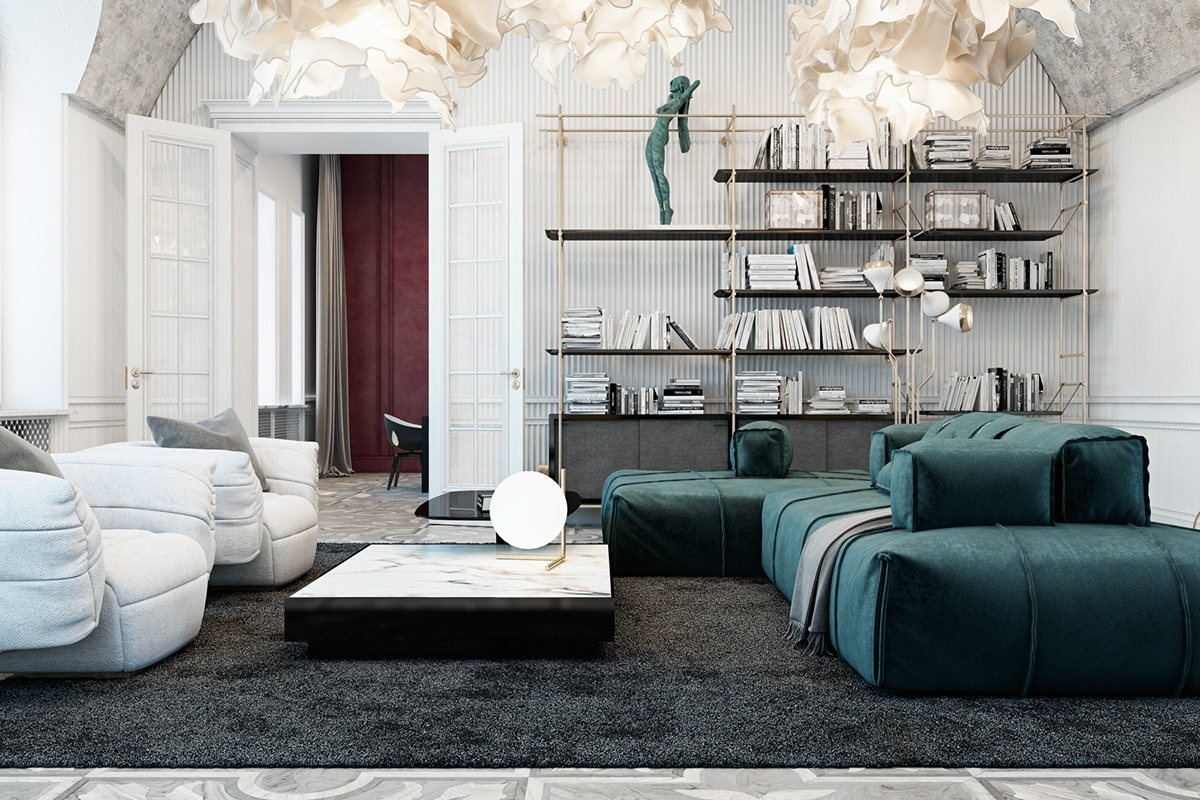
With a central position and seating facing toward every angle, these types of sofas are perfect for a room with so much to offer. The inward-facing seats accommodate socialization, the back side offers a cozy spot by the fire, etc.
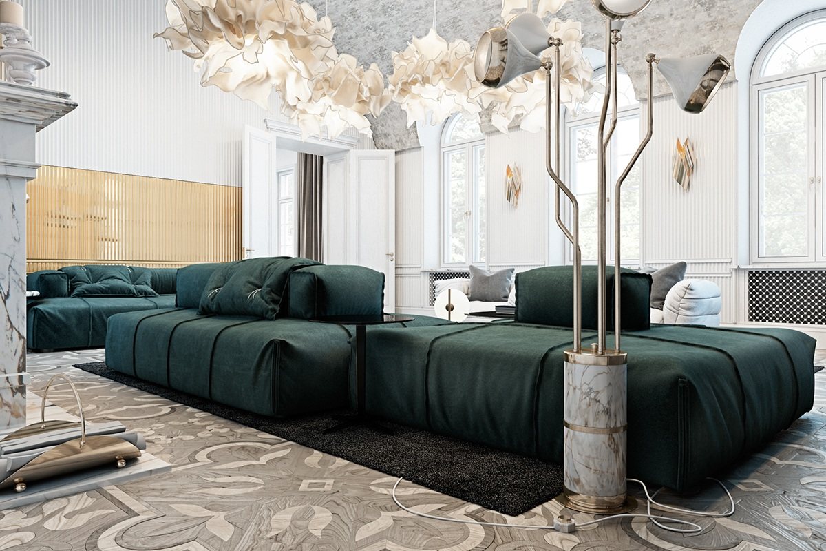
With its gorgeous marble base and gold details, the Hanna floor lamp embodies the energy and rhythm of its namesake: jazz drummer Jake Hanna.
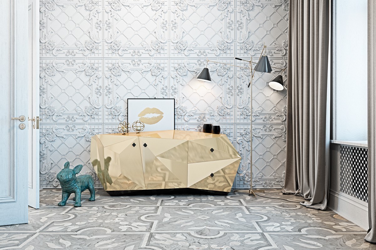
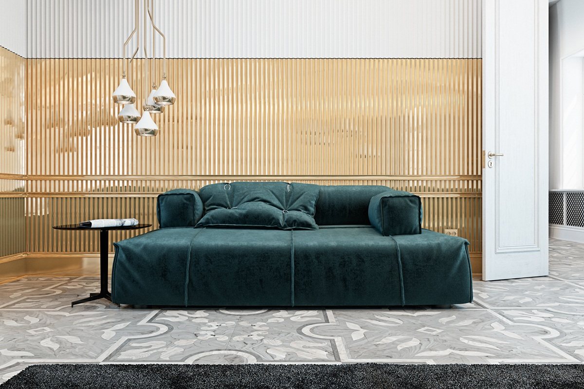
Intricate strapwork makes the wall paneling stand out. Ordinarily, it would be difficult to place a focal point in front of this beautiful pattern, but these radiant pieces work well here.
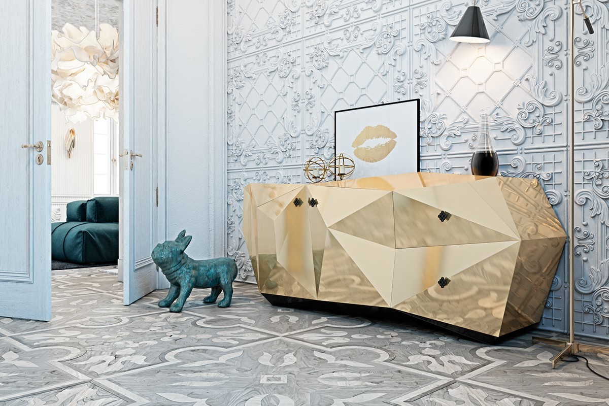
Looking for a showstopper like this geometric sideboard cabinet? It's available under the name "Diamond Emerald" – although normally available in green, this gold leaf option was a worthwhile upgrade.
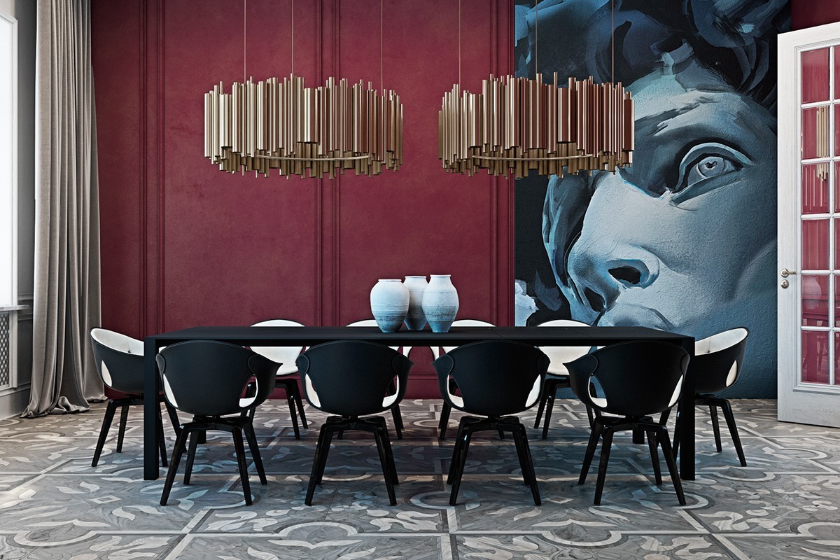
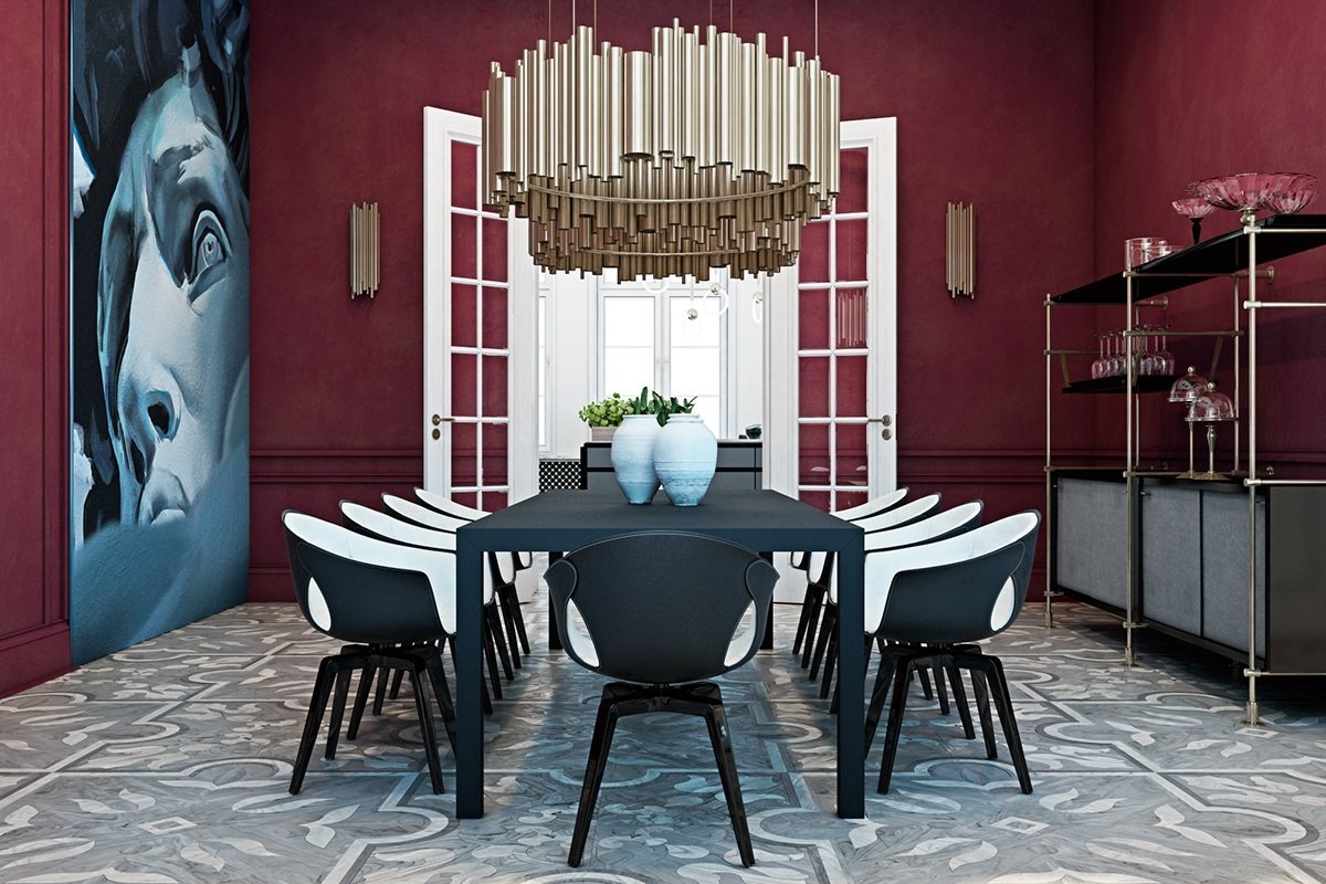
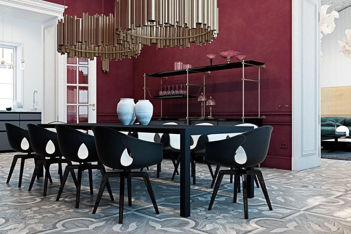
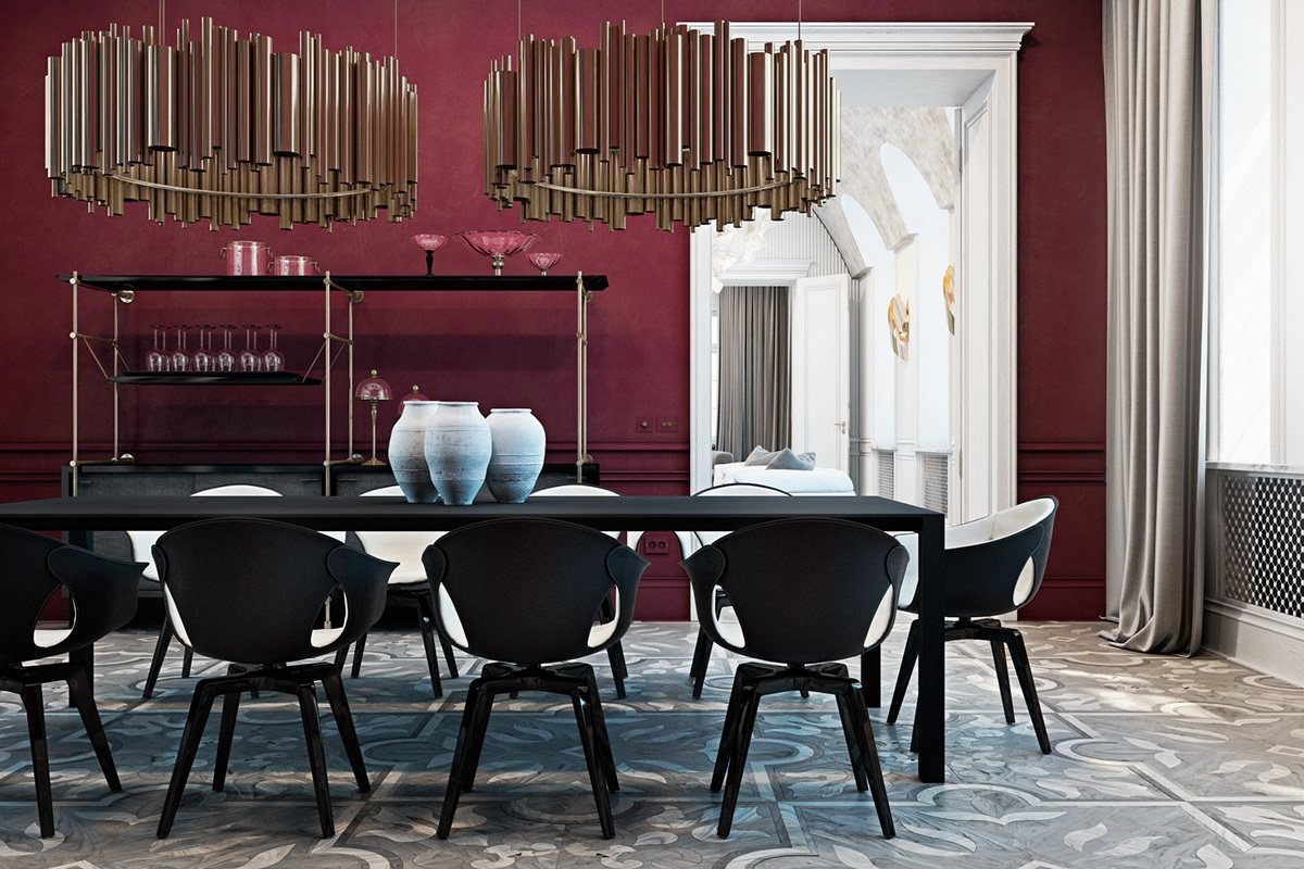
Wine-red walls make this space especially memorable, alongside a full-wall mural painted in cooler tones. Blue vases tie the theme together.
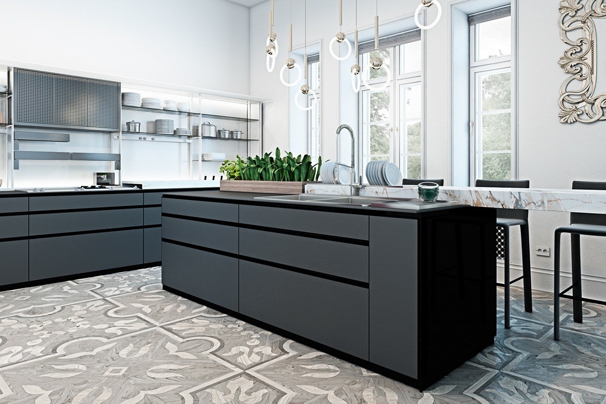
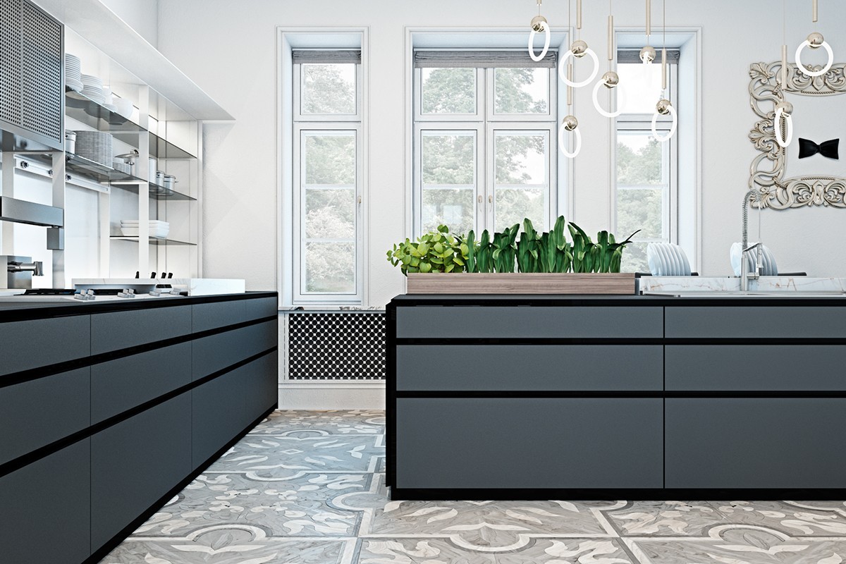
While the rest of the home relishes ornamentation, the kitchen remains relatively simple and straightforward. Stainless steel shelving and tasteful marble countertops merge beauty with functionality.
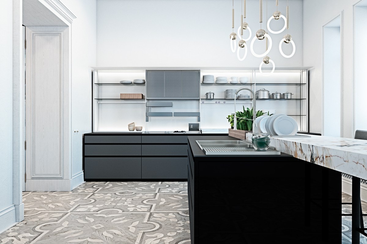
Lee Broom created this Ring Light pendant series to merge classic and contemporary design, a style that perfectly suits the atmosphere in this fresh kitchen.
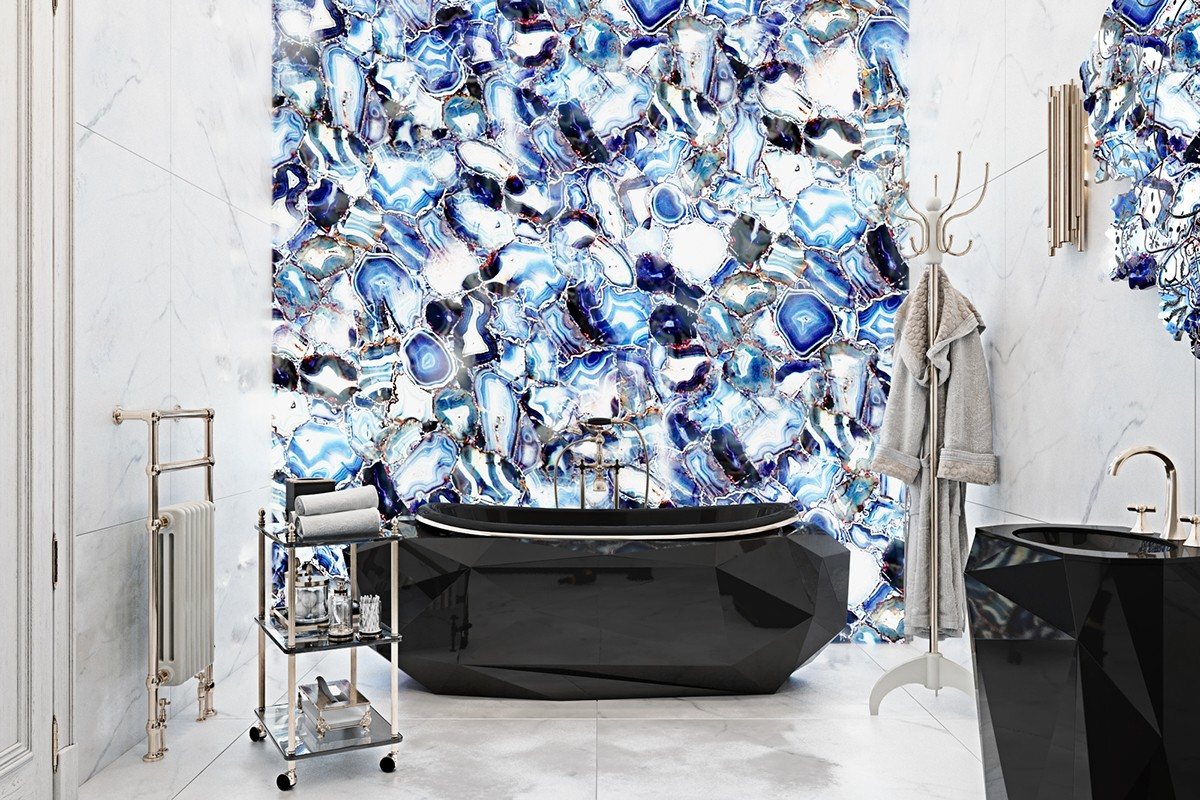
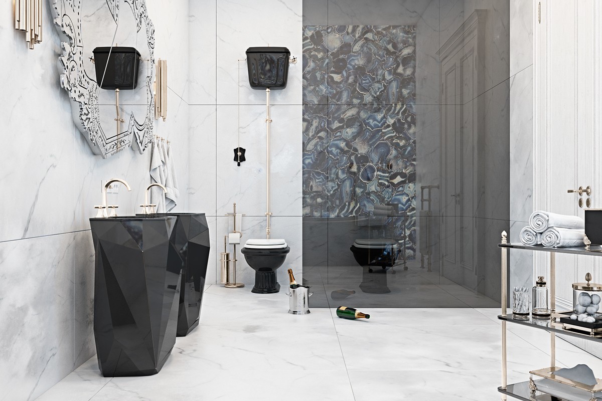
Blue agate makes up the entirety of the accent wall. These ultra-thin slices work well with a backlight for a spectacular effect. If you're looking for a unique high-luxury material, this is it.
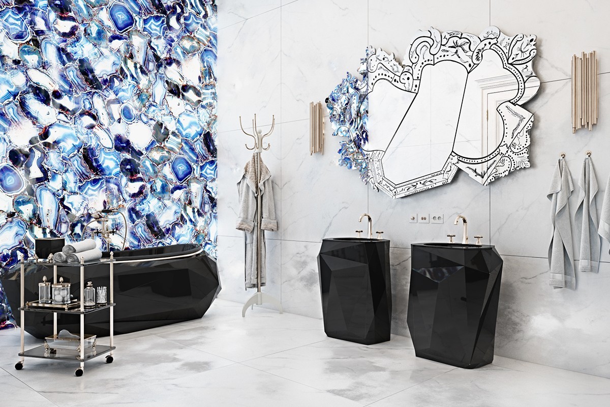
The tub and basins are from the same Diamond line as that brilliant gold sideboard cabinet featured earlier.
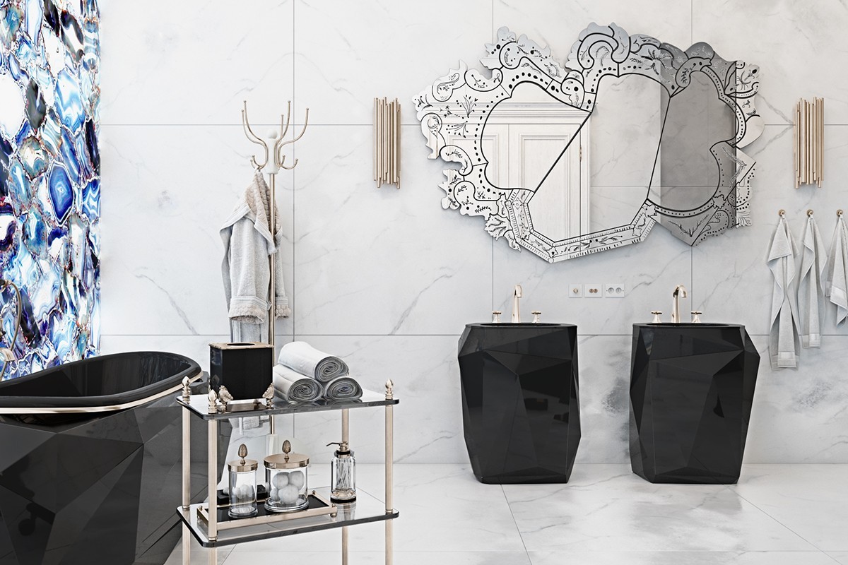
Rococo style really shines through in this feature mirror: each edge takes on the form of a different classic mirror frame for an exciting asymmetrical look.
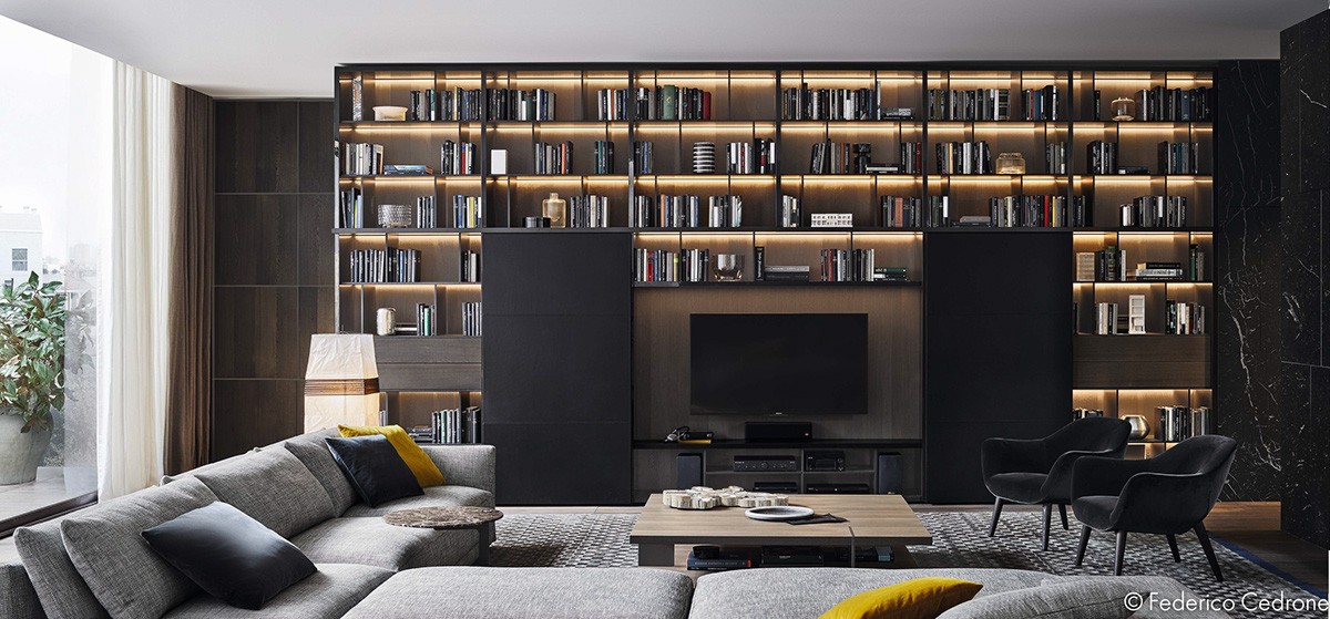
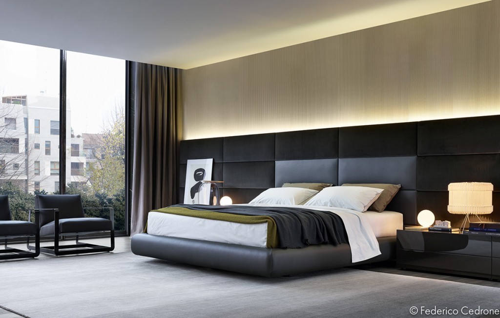
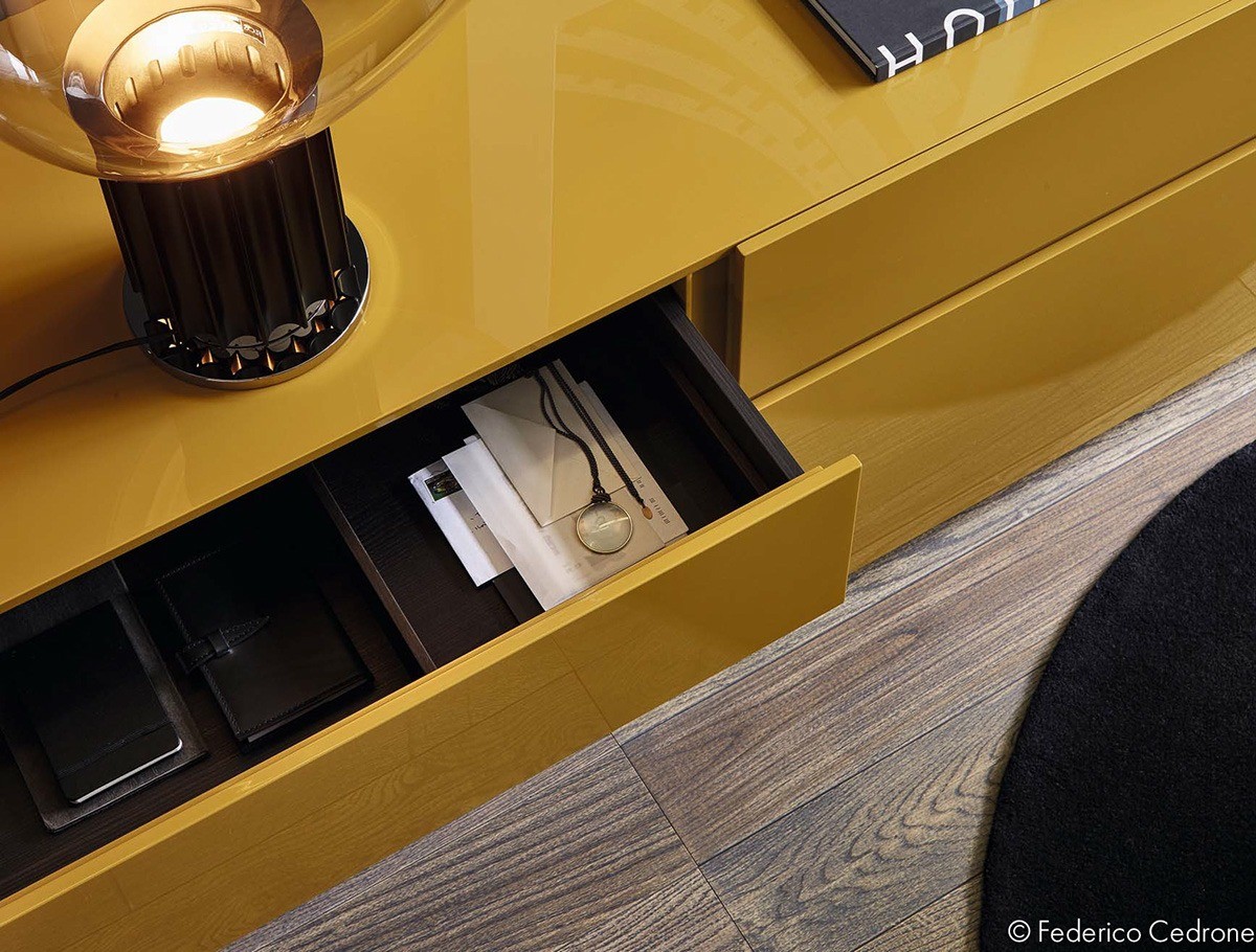
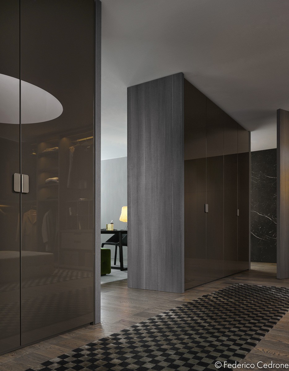
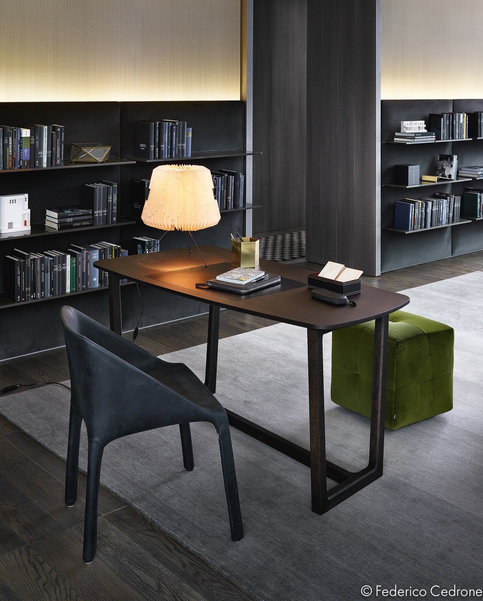
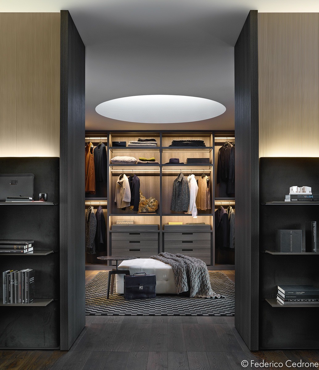
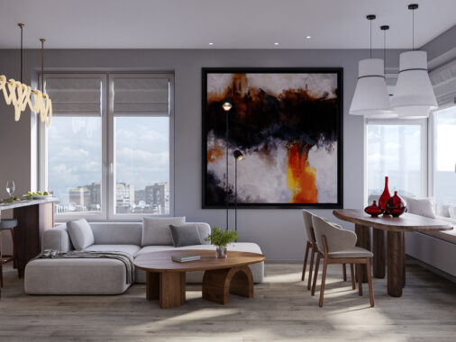
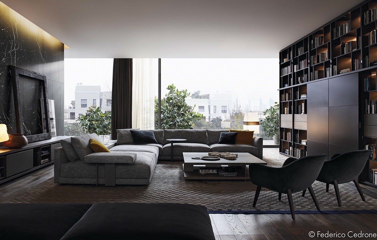
Photographer Federico Cedrone captured these images for Poliform in order to show their stylish furniture in a natural habitat. The composition is wonderful, the furniture ideas are dream-worthy, and the overall style is definitely worth study. This home looks livable, demonstrating a gorgeous luxury atmosphere without sacrificing comforting. It takes a far more casual approach compared to the previous home.
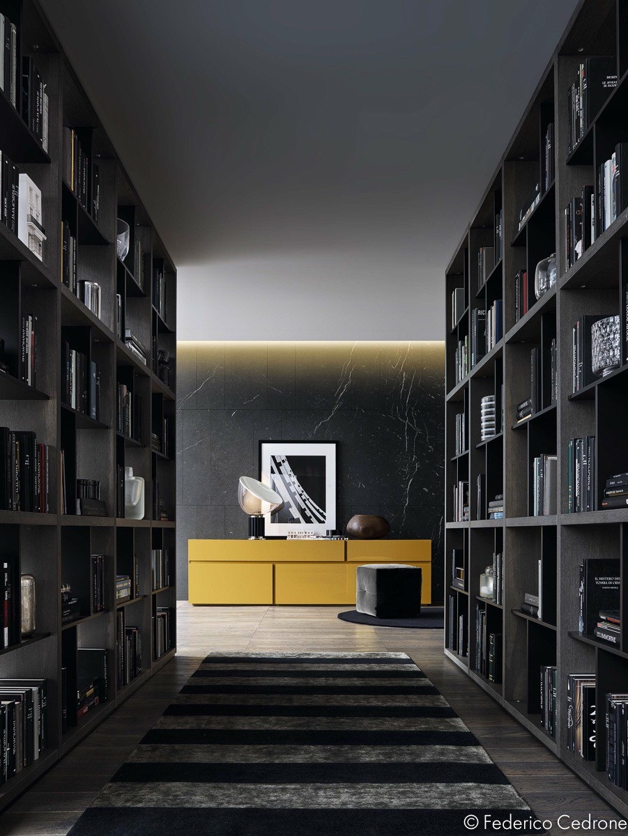
A spectacular library fills half of the room, hiding the television behind matte black panels. It serves as an all-in-one solution for entertainment and enrichment in the home.
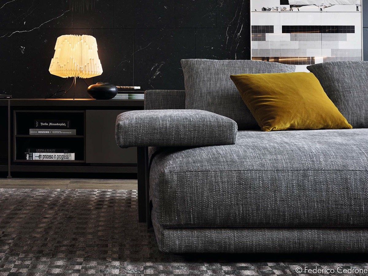
Check out the neat paint swatches to the right – an easy DIY decor idea anyone can accomplish with a free weekend.
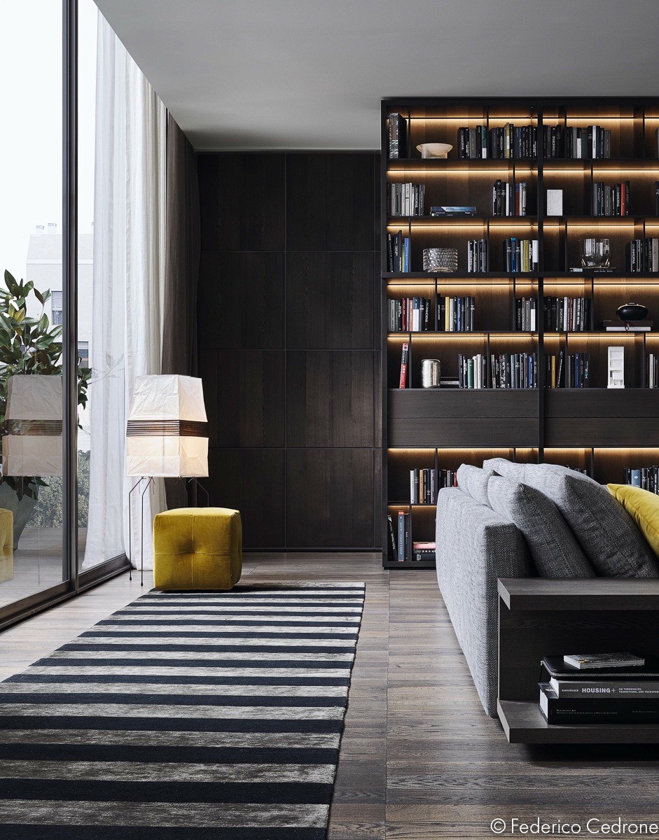
Stripes always seem to give off a bold, adventurous, and youthful vibe.A horizontally-striped rug works wonderfully with the gold-yellow accessories.

The intended client is obviously quite fond of books. These open-back shelves allow natural light to filter though for the type of ambiance any library would have difficulty recreating.
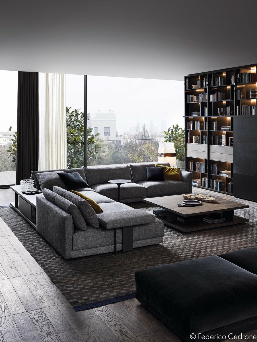
And it's hard to ignore that view – a home with windows like this has every reason to opt for a more subdued interior theme.
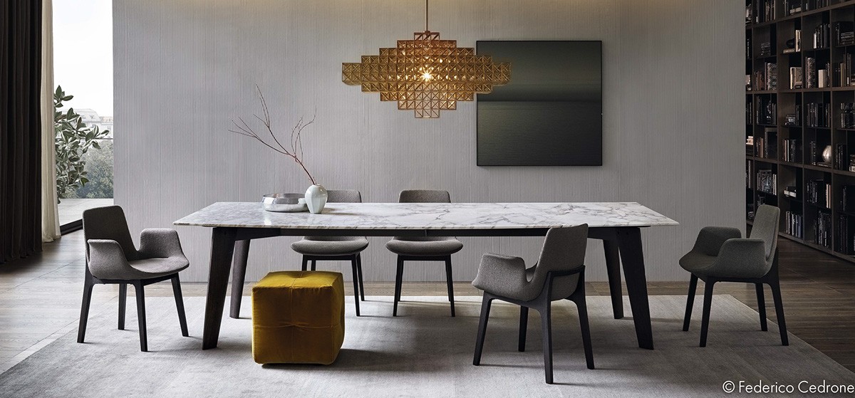
Even the dining room features a bookshelf within easy reach. Jean-Marie Massaud's Ventura chairs line the table.
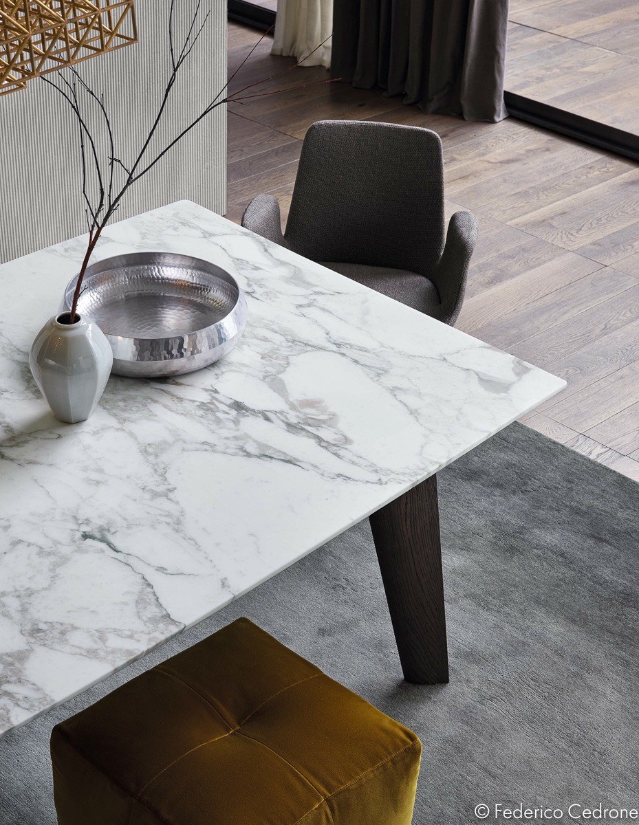
Topped with marble and gorgeous with every angle and curve, you can find this table under the name Howard by Jean-Mari Massaud.
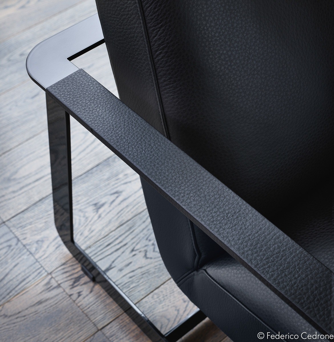
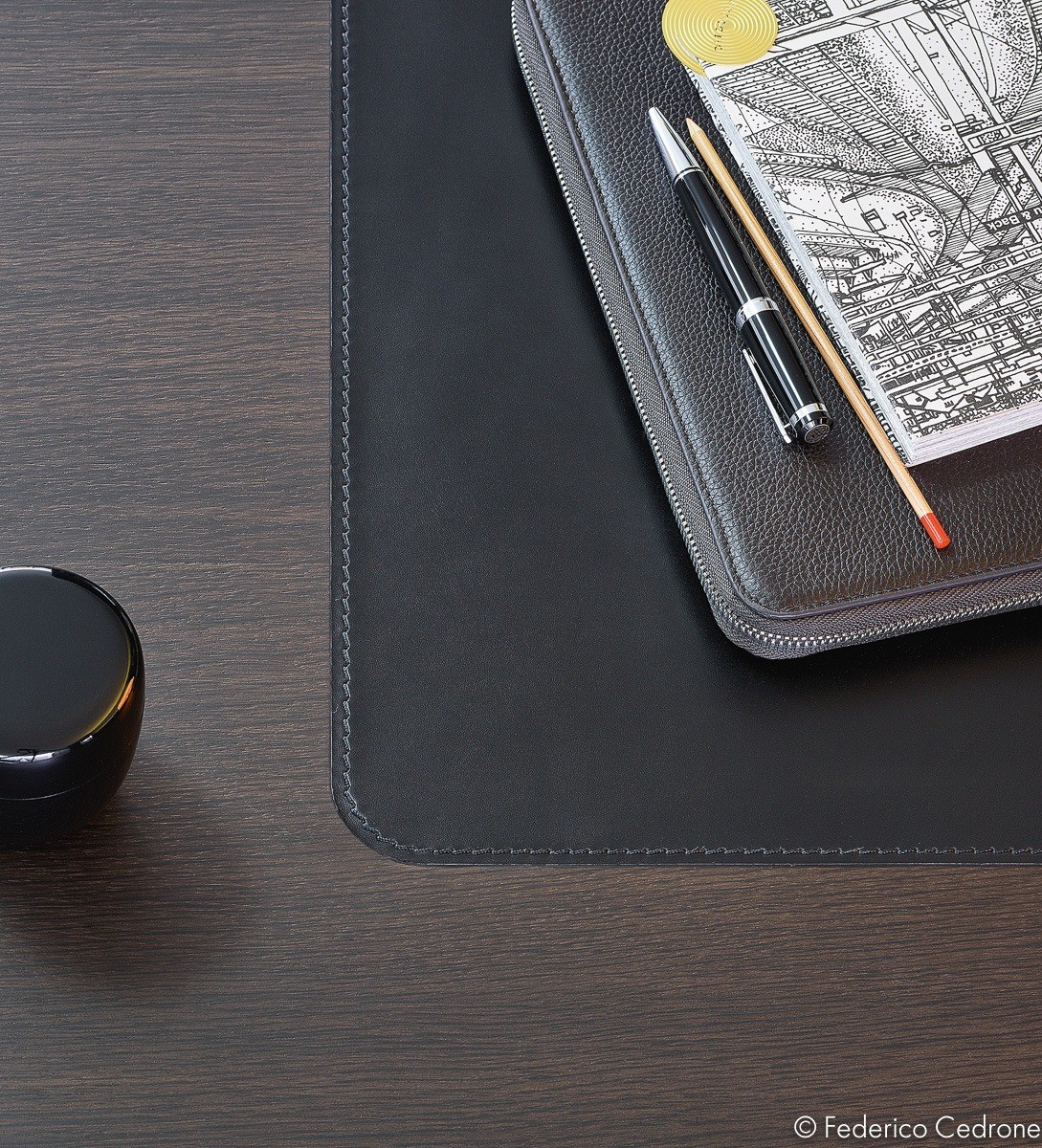
Detail makes all the difference in the world within an interior as minimalistic and balanced as this one.
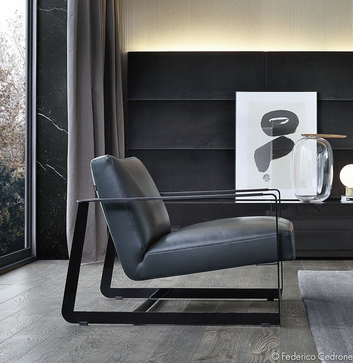
Gaston is a chair by Vincent Van Duysen. It takes inspiration from classic mid-century pieces, refined down to the most basic elements.
