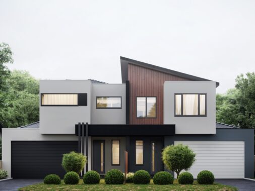
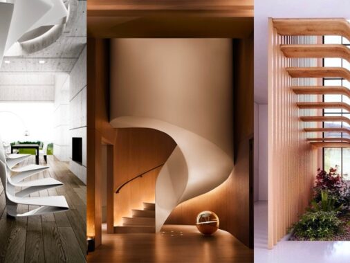
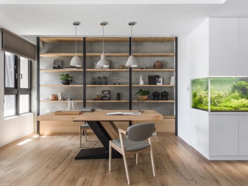
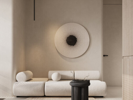
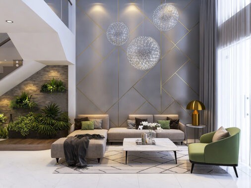
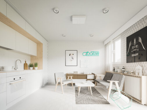
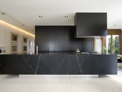
Homes with dark color palettes invite a sense of mystery, confidence, and adventure. Even within a lighter overall theme, dark accents add a punch of contrast to draw the eye and enhance the effect of the lighter tones. The four homes in this post demonstrate both tactics quite nicely. If you've been looking to avoid the all-white interior trend while embracing something that stands out from the rest, these homes might give you the confidence and inspiration to switch to the dark side. Greyscale interiors aren't the first thing people consider when searching for "outside the box" solutions, but these styles might change your mind.
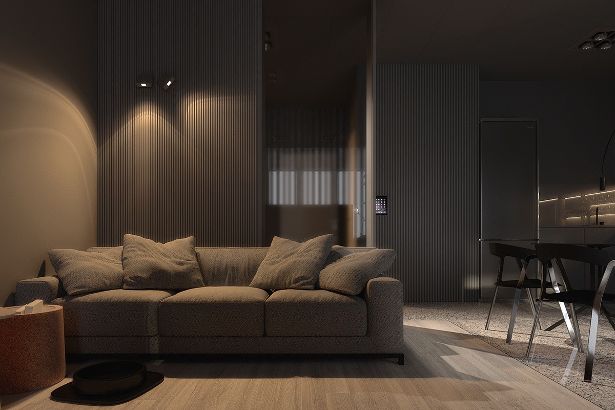
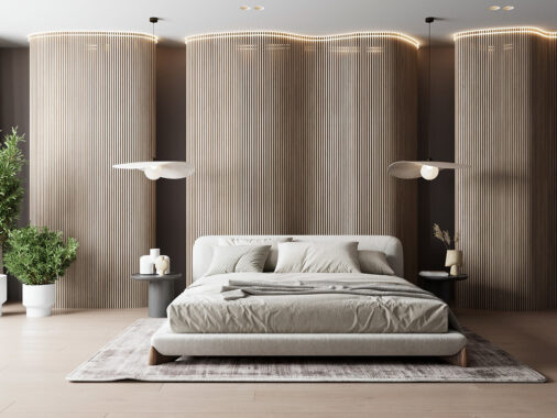
Dark and atmospheric – this home embodies relaxation with its moody grey palette and careful lighting choices. This is a great example of a minimalist design that doesn't go overboard with glossy white surfaces and hard lines. It achieves a comfortable middle ground between spare and decorative, especially where those beautiful striped accent walls take center stage.
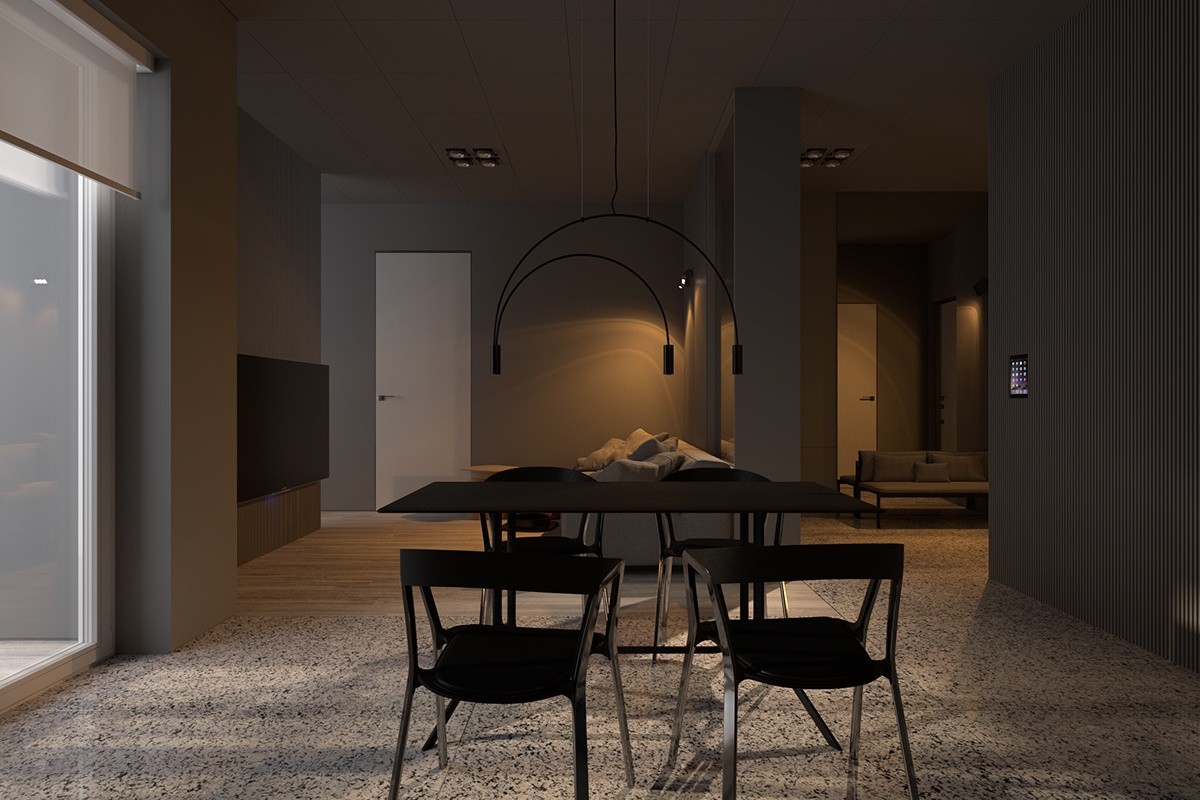
Warm-toned lighting is perhaps the biggest contributor to the unique mood. It also preserves the richness of the greys whereas white lights would have washed them out.
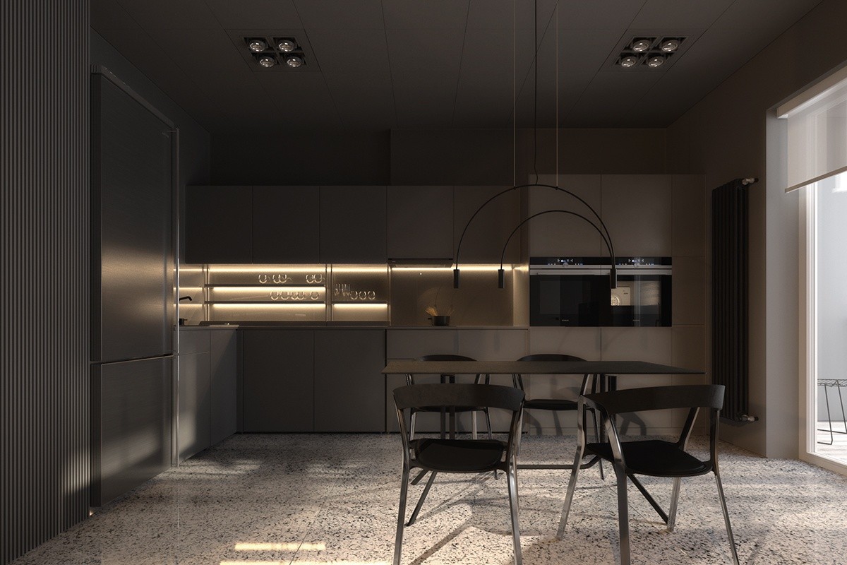
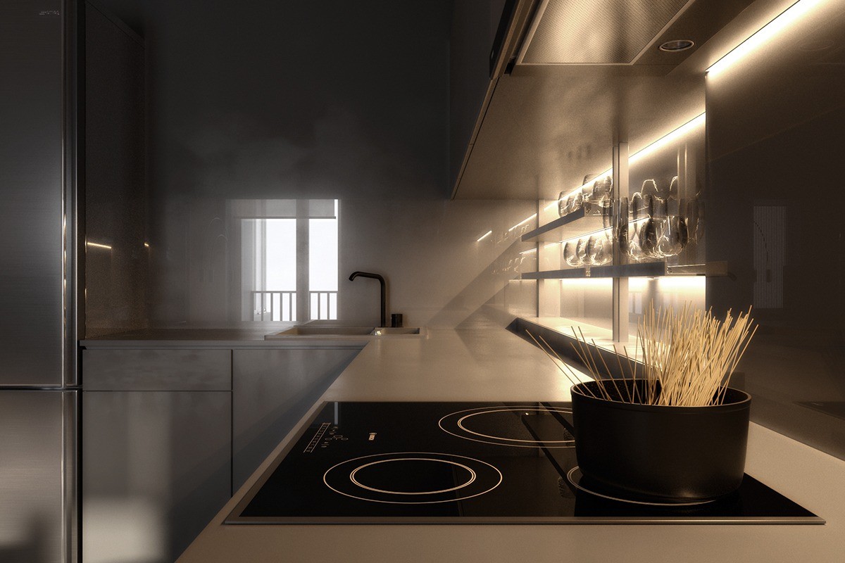
The kitchen can afford to be a little more dramatic with its lighting choices. Bright indirect strips illuminate the shelves without flooding the cabinet faces.
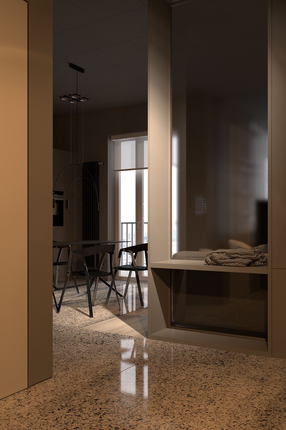
Smoky glass separates the main living area from the rest of the home, softening the light but not eclipsing it.
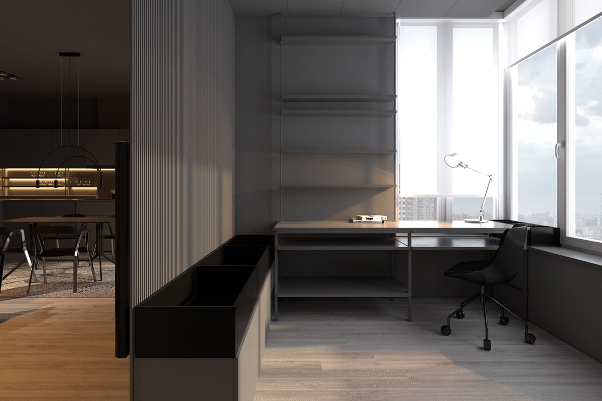
The office is connected to the rest of the home but still maintains its privacy thanks to the partial enclosure wall. The view through the corner window is unmatched. .
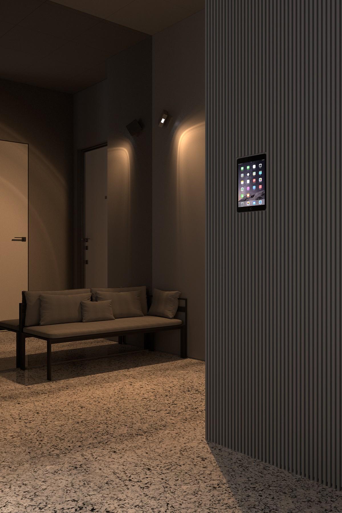
An integrated smart home control panel makes it easier to maintain the gorgeous low lighting effect.
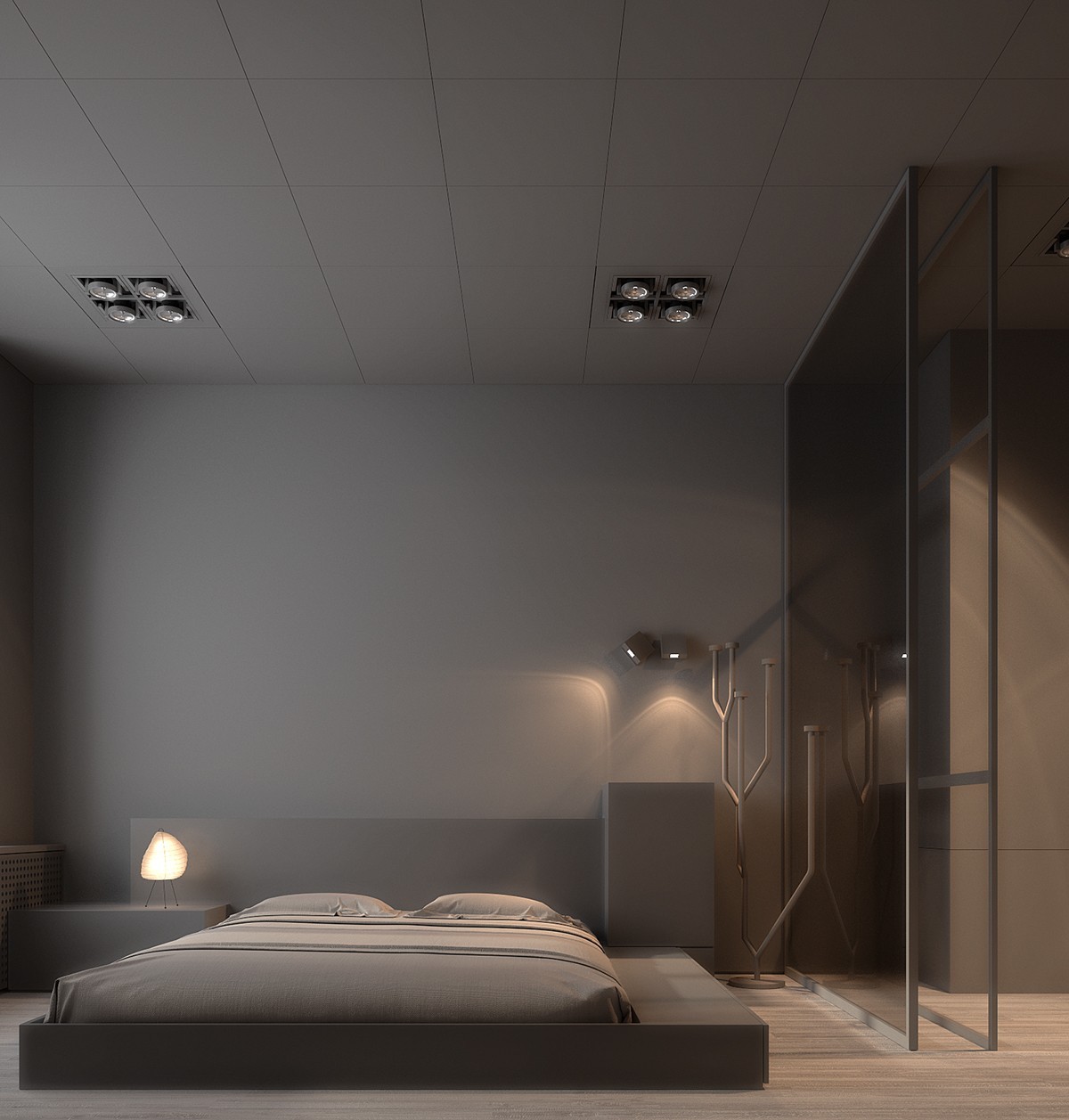
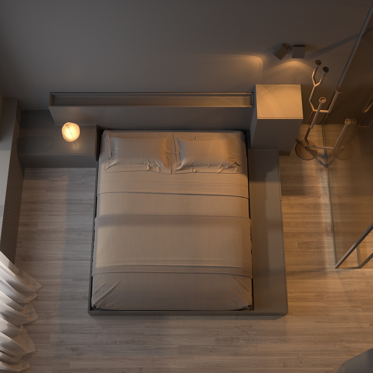
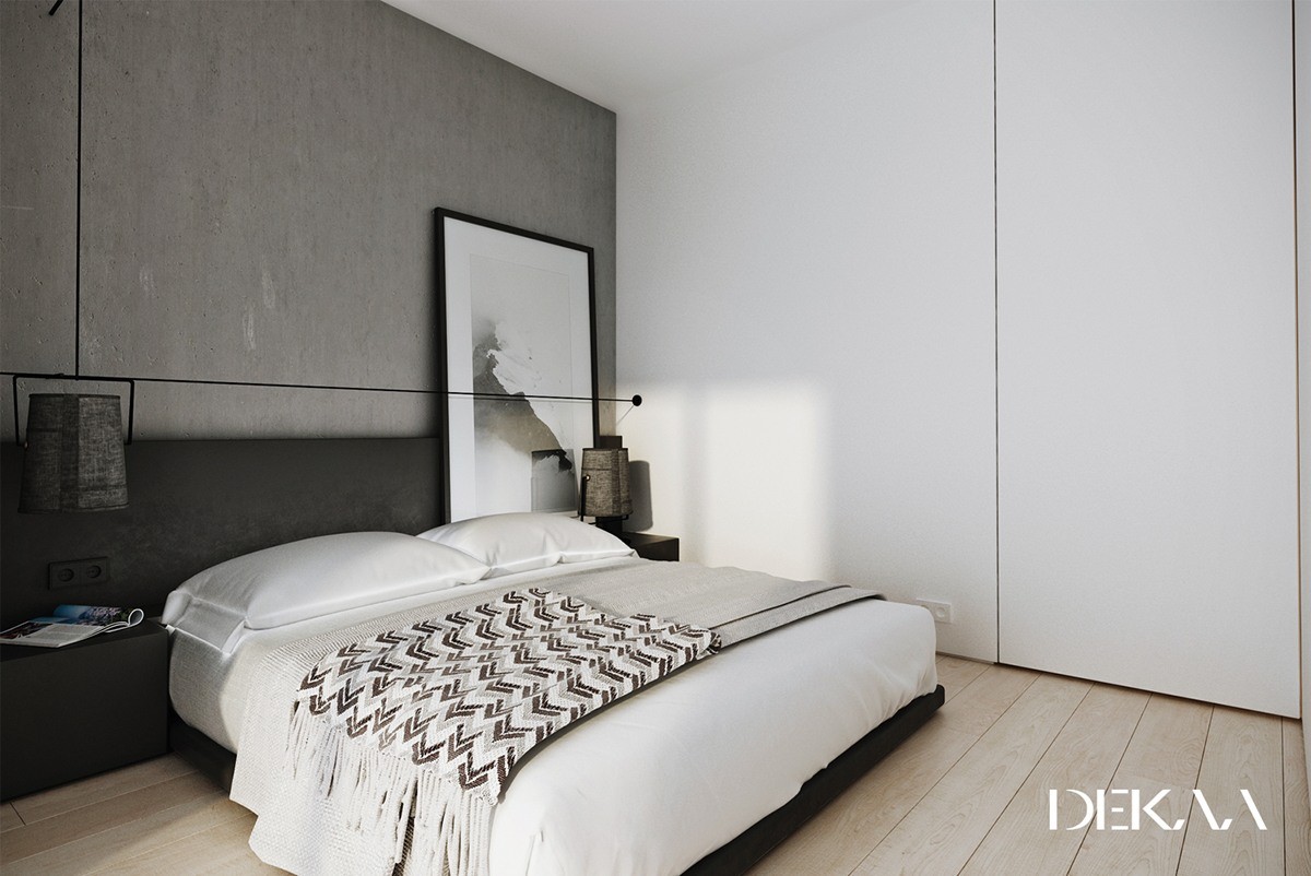
In the bedroom, textural walls are replaced with a more streamlined and minimalistic aesthetic. Light and shadow give the smooth gray surfaces a life of their own.
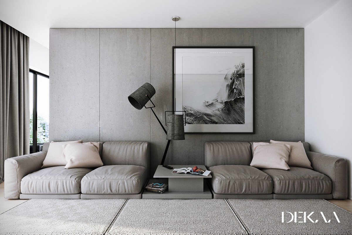
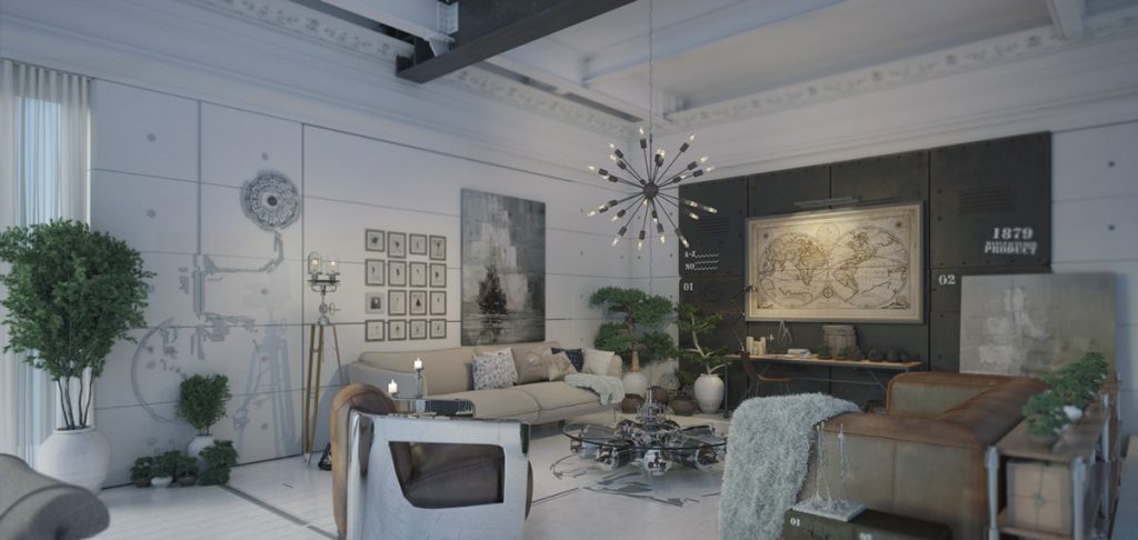
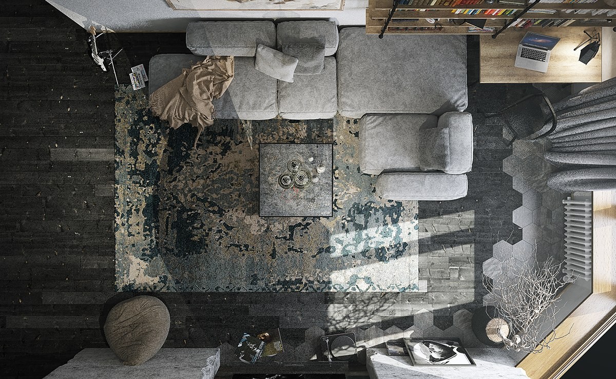
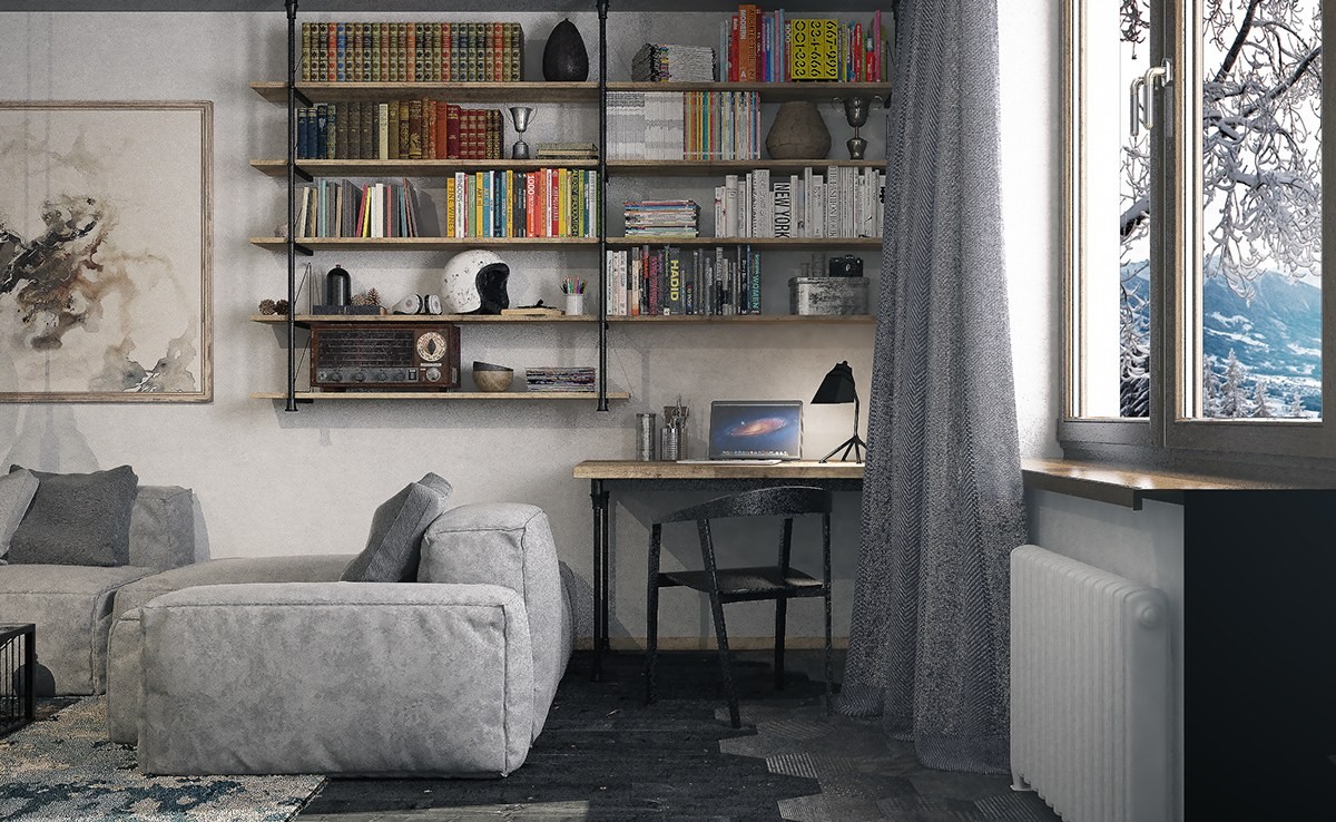
This home goes in a different direction with a combination of industrial style and classic influence. It's hard to go wrong with concrete accent walls in a grey-themed home, and this space pulls it off quite well. Notice the warmer tone to the throw pillows – a nice example of mixing color temperatures even within a grayscale theme.
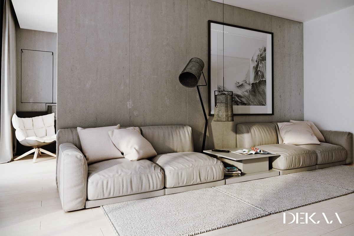
Black accents like the frame on the artwork and the body of the lamp help draw attention to some of the room's most engaging features.
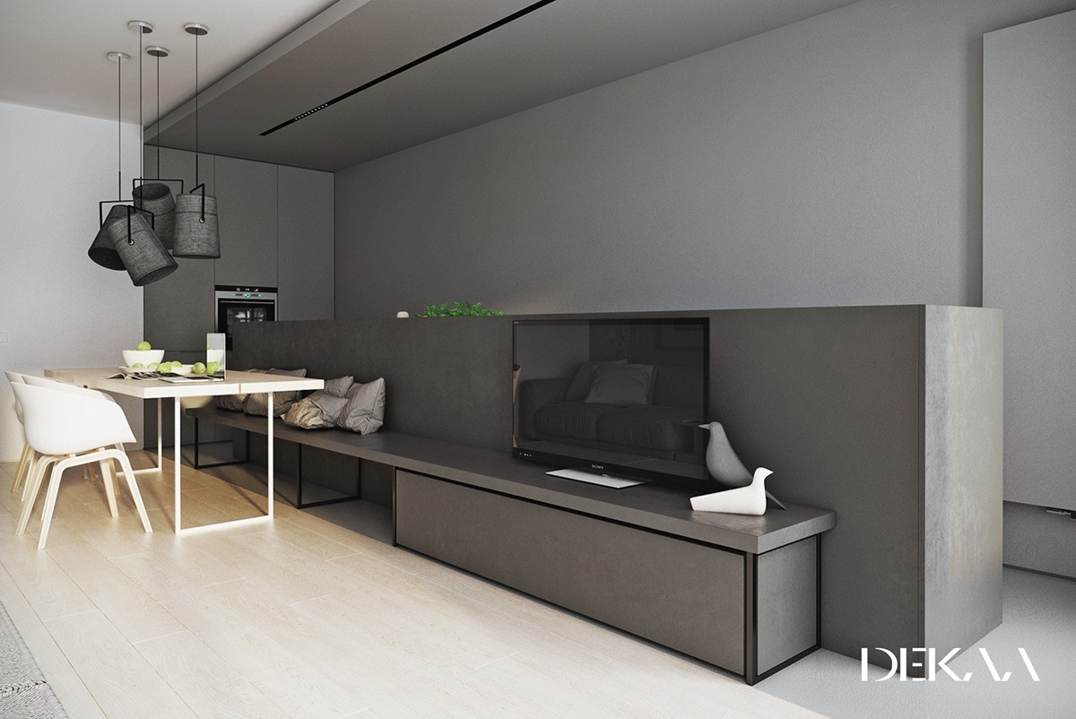
Decorations remain spare but each contributes to the design in a tremendous way. The white bird is by Ronan and Erwan Bouroullec, and the gray one is an interpretation of the famous Eames house bird. Both are extremely iconic designs.
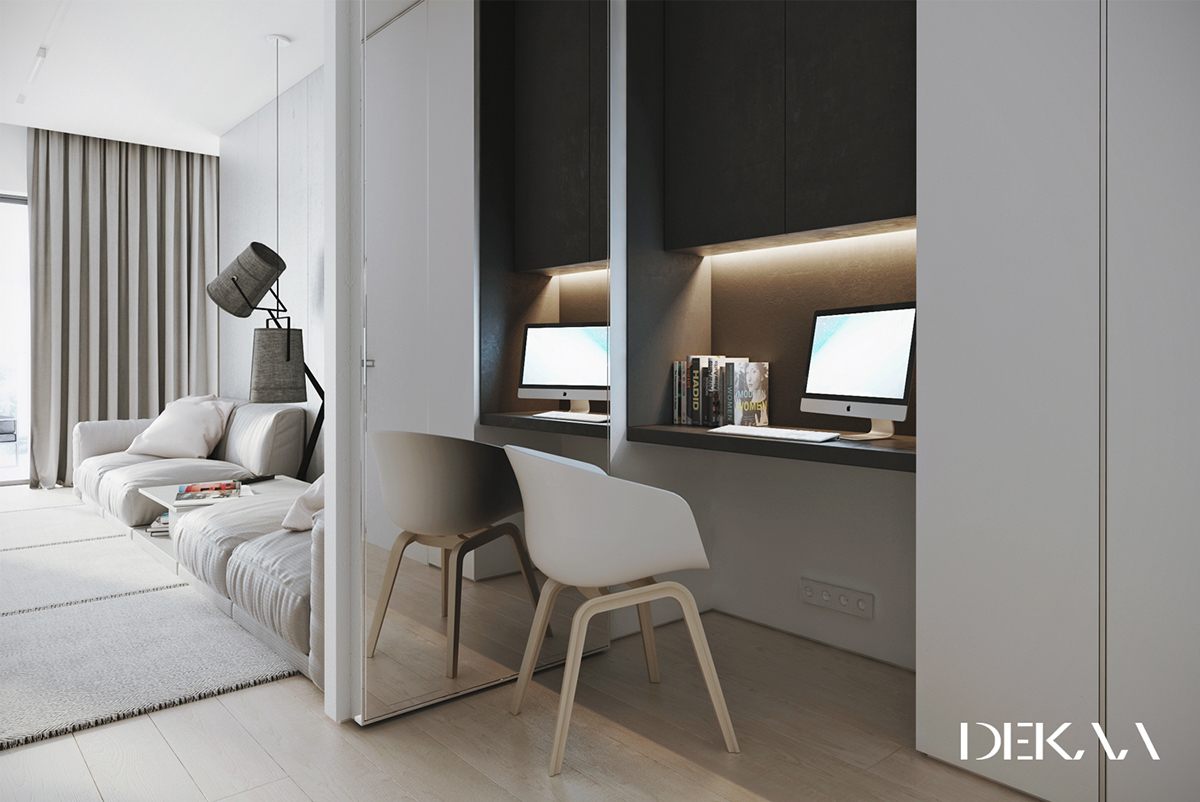
A mirrored wall right next to the desk might prove distracting for some, but it won't get in the way at all when the sliding door is closed for privacy.
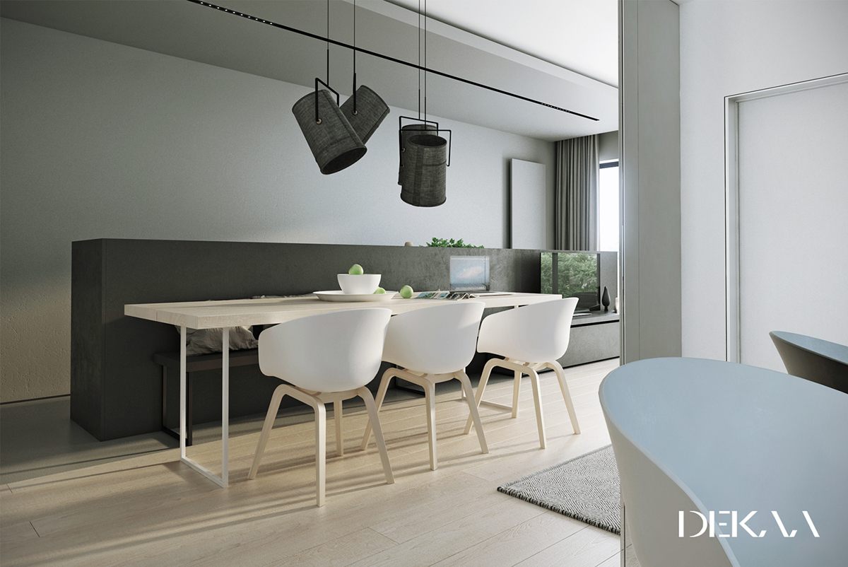
The dining table pendants are from the Fork line by Foscarini. The chairs were designed by Hee Welling. Pay special attention to the bench made from the half-height dividing wall.
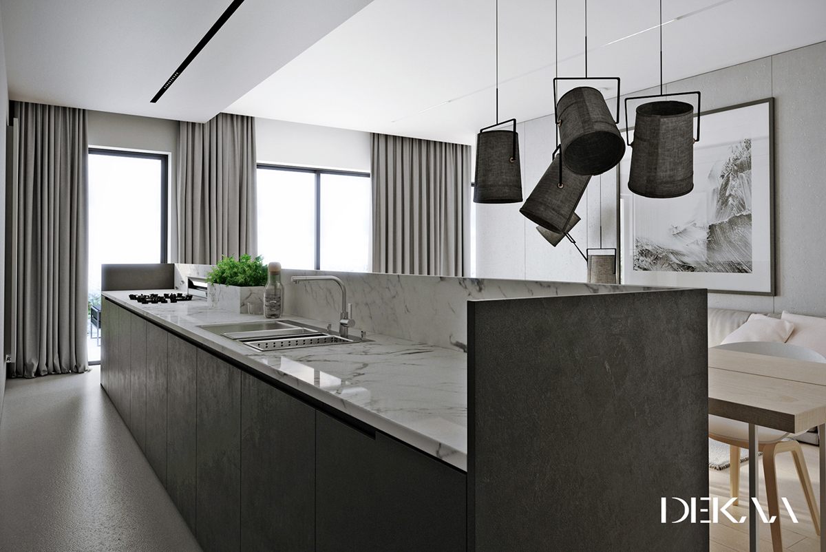
Isn't that cool? The divider actually shields the small kitchen island. A short backsplash reduces visual clutter from the living room side of the layout.
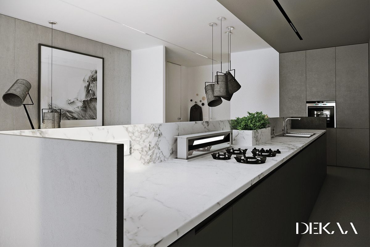
Perfect for convenient herbs, the matching herb planter is another fun and surprising detail.
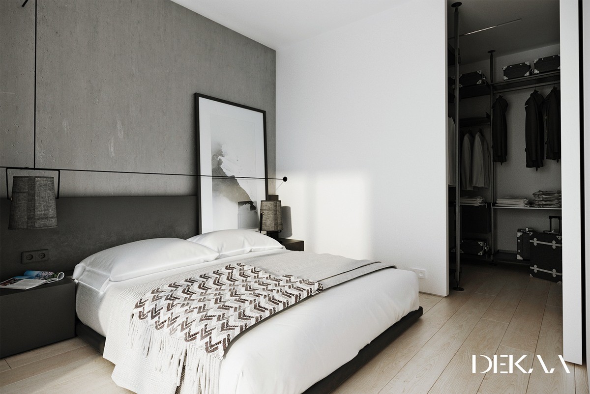
The routing of the lamp cords is especially unique, coming down from the ceiling and crossing over above the bed.
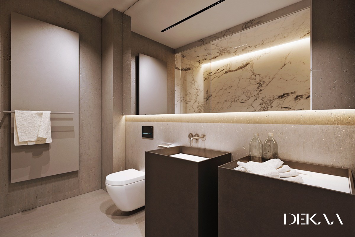
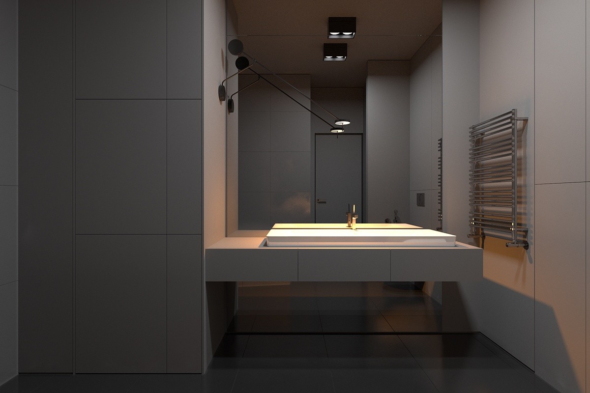
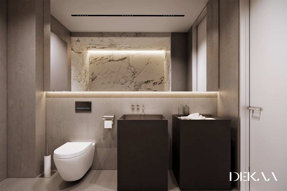
Pocked concrete decorates the bathroom as well, and even the floors imitate the same texture. A panel behind the towel rack matches the sink and counter, and a large mirror doubles the impact of the marble.
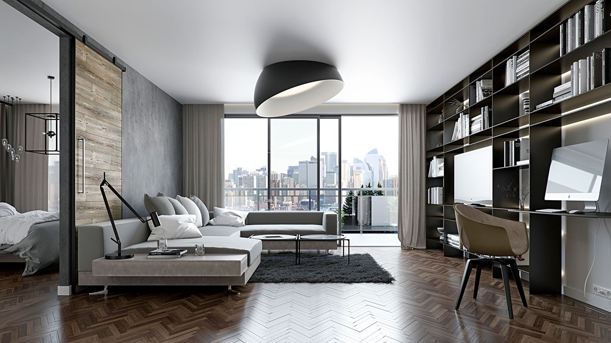
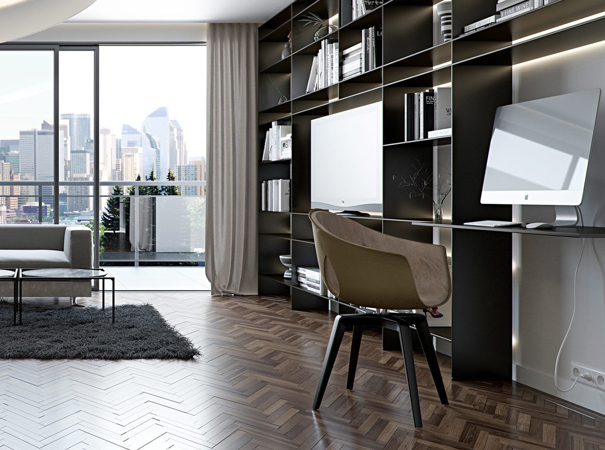
Dark gray and wood are wonderful partners. Here, the aged lumber softens the effect of the textural concrete accents without completely disrupting the contemporary theme. Both materials can be elegant on their own, but this combination ensures a comfortable living environment – powerful yet easy on the eyes.
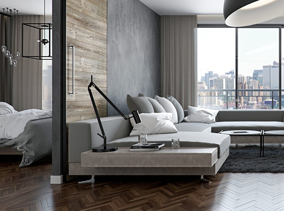
The wooden panel slides to the side to separate this smartly decorated living space from its matching grey bedroom.
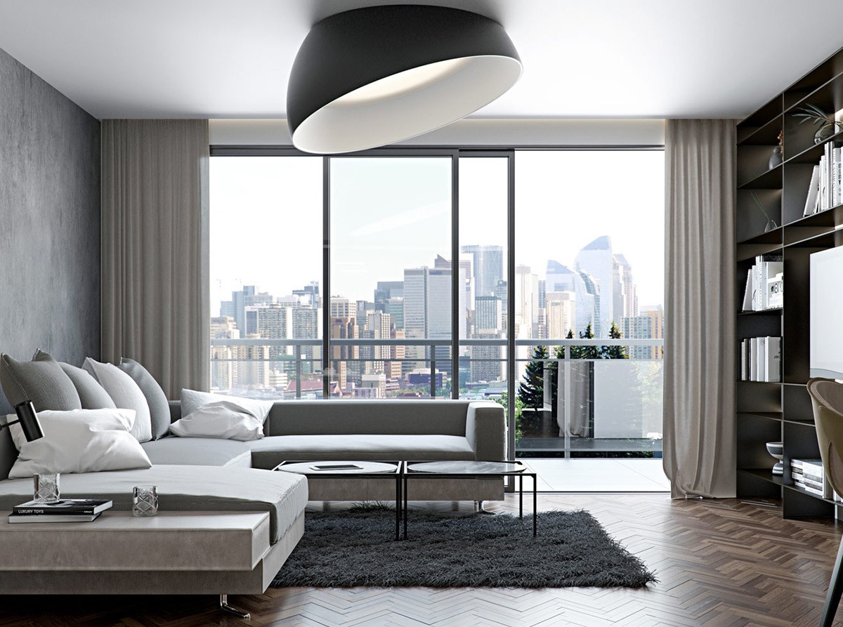
This oversized dome light is breathtaking! The eye darts straight to this showy piece, surprised by the optical illusion of recessed construction combined with the classic dome shape.
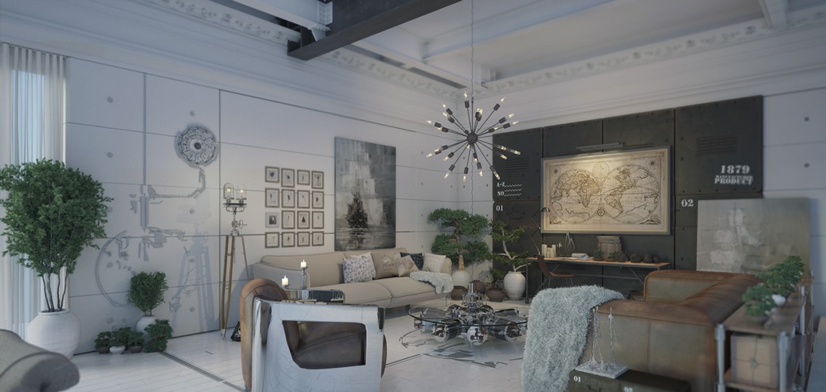
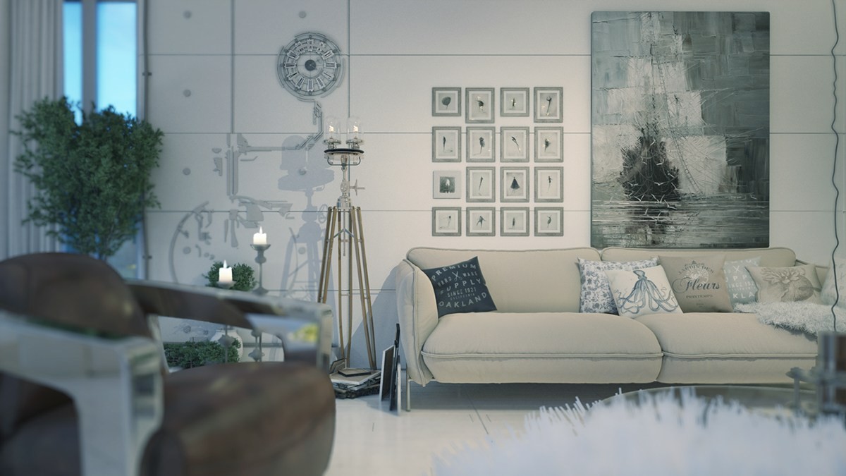
Although must lighter than the other homes featured in this post, this space is far from the usual white interior and uses darker grey accents in powerful ways. The color theme is well suited to its uniquely dramatic style, a cross between steampunk and high fantasy, almost monochromatic but certainly not lacking in variety and charm. The space belongs to a collector of bonsai trees and antique maps along with repurposed machine parts.
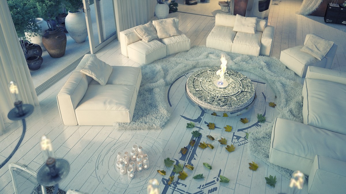
Check out this amazing indoor fire pit! The white shag rugs and unique floor paint transport guests to a wonderful and mythical world filled with good conversation and fascinating stories.
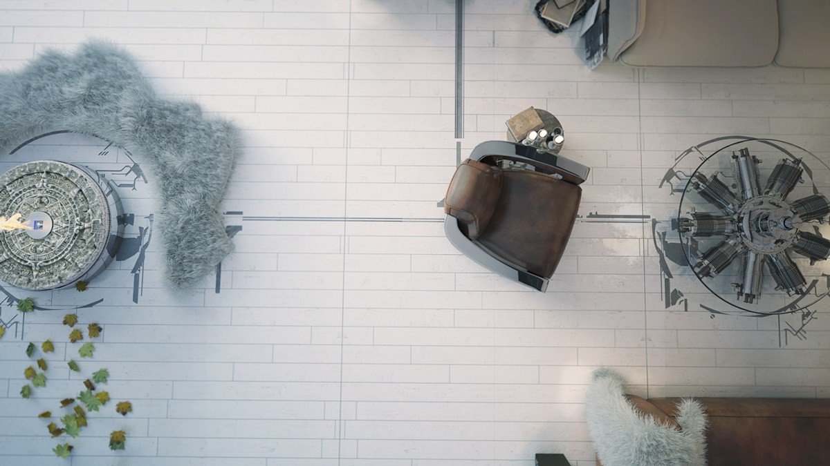
The lines on the floor connect each central piece of furniture, adding a sense of organization to an otherwise eclectic arrangement.
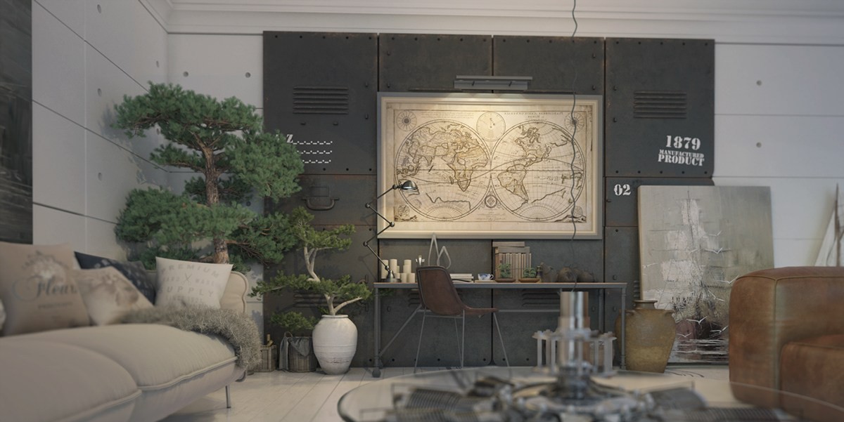
With storage cabinets built from distressed metal, the desk area feels especially industrial and moody. Tall trees give it a surreal post-apocalyptic vibe.
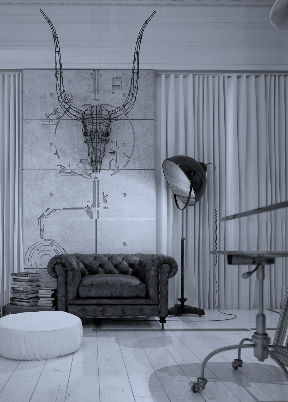
With all of the emphasis on paper and wood faux-mounts, this wire sculpture is a refreshing choice – sculptural and engaging.
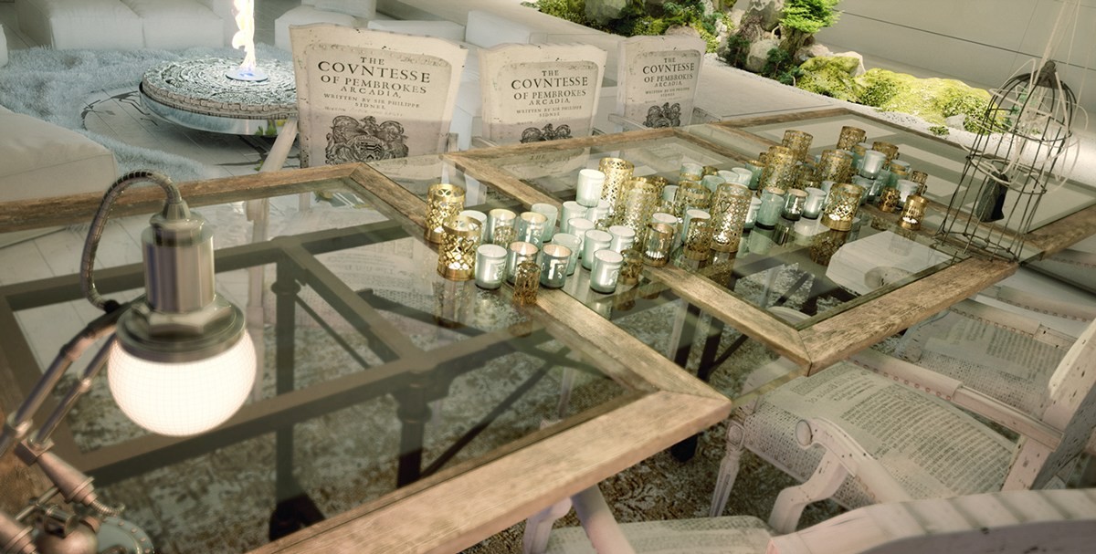
Candles and unique vintage-inspired lighting bring a sense of tradition and classical charm to an otherwise very cutting-edge interior design.
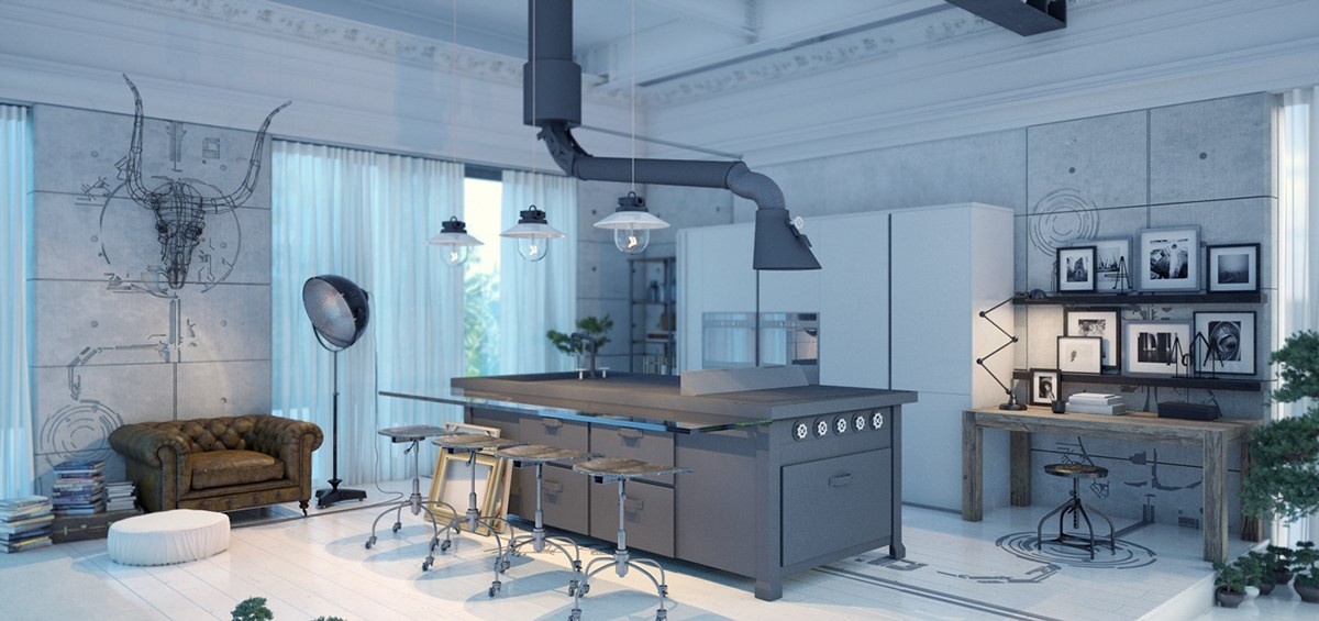
More classic inspiration meets industrial design in the kitchen. The leather chair, the winding range hood, and the distinctive stools all make a brilliant first impression.
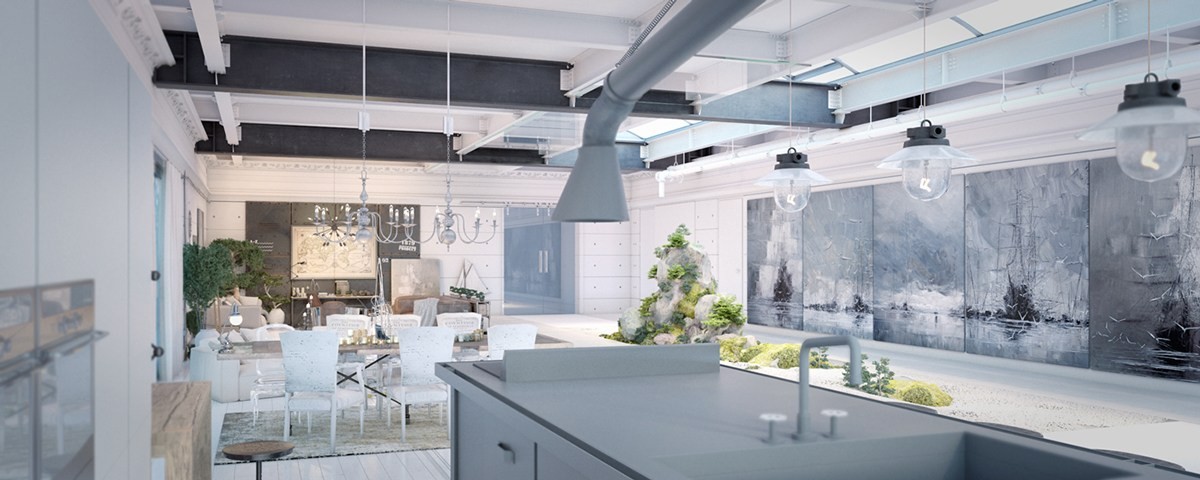
The ship paintings do a wonderful job of unifying the various neutral shades found throughout the interior.
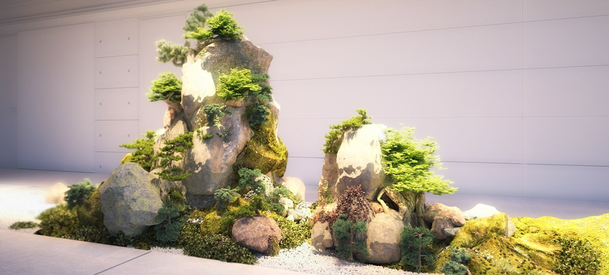
Rocks, moss, and bonsai trees bring this interior garden to life. Tending this living artwork would be an incredible experience.
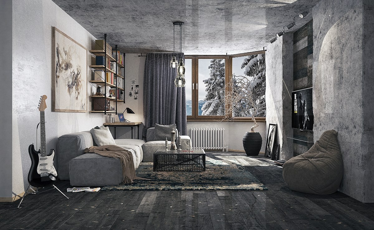
Here's another grey home that doesn't lack character in the slightest – creative materials and distressed surfaces catch the eye, and modern furniture keeps it fresh. Adventurous choices like the rough stone effect feature wall and concrete ceiling ensure that guests will leave the home inspired.
