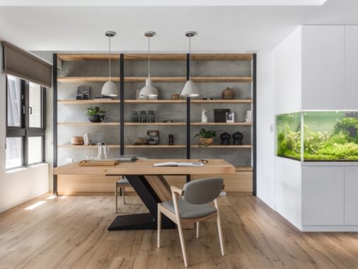
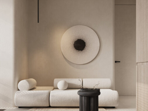
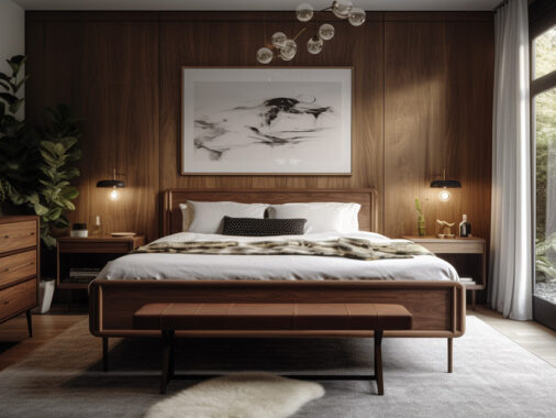
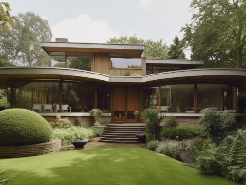
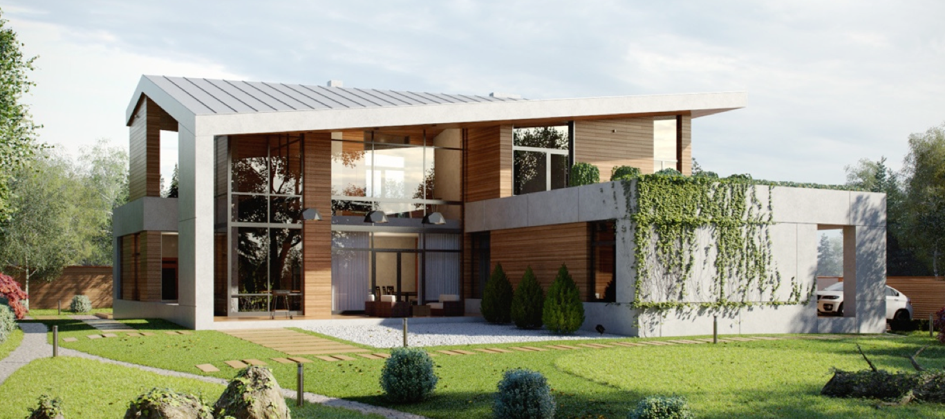
These three luxury homes all employ an important unifying factor: intimate communication with the immaculately sculpted courtyards that surround them. Each one offers visual and physical freedom to transition between indoors and outdoors with very little effort – allowing residents to enjoy the best of both worlds. These homes also share similar stylistic choices, emphasizing unfinished concrete and expansive glass walls throughout. Streamlined interiors remain modern and minimalistic yet still express their own distinct personalities through the careful arrangement of furniture and attractive accent materials. If you've been scouting for incredible architecture inspiration, these properties just might spark some fresh ideas.

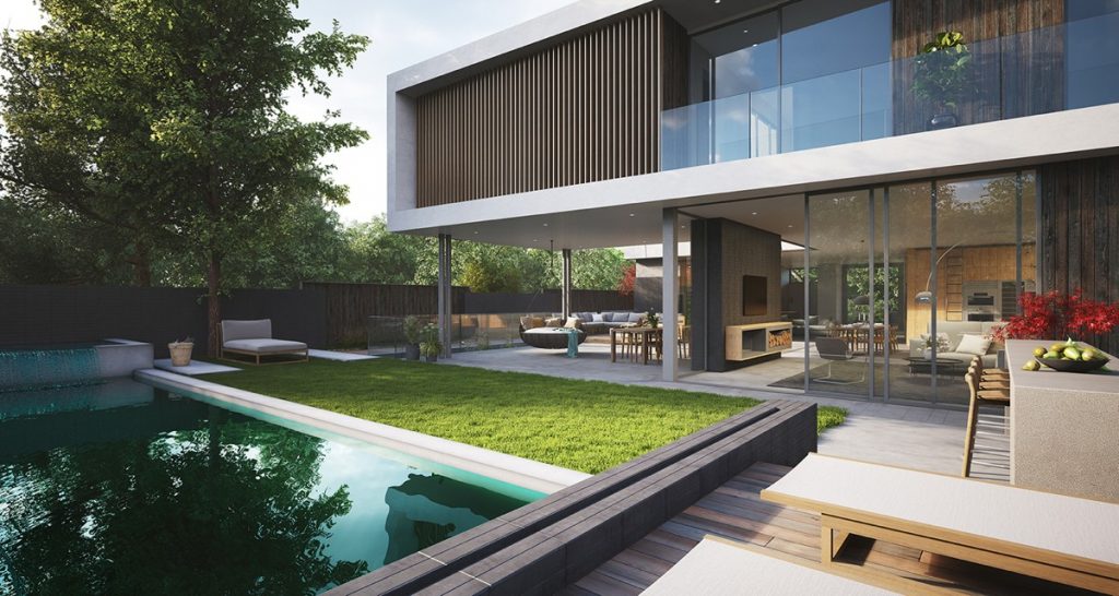
This tour begins with classic mid-century style architecture given a modern interpretation. Tall pillars hold the cantilever portions of the building aloft - a hulking task for such slender beams.
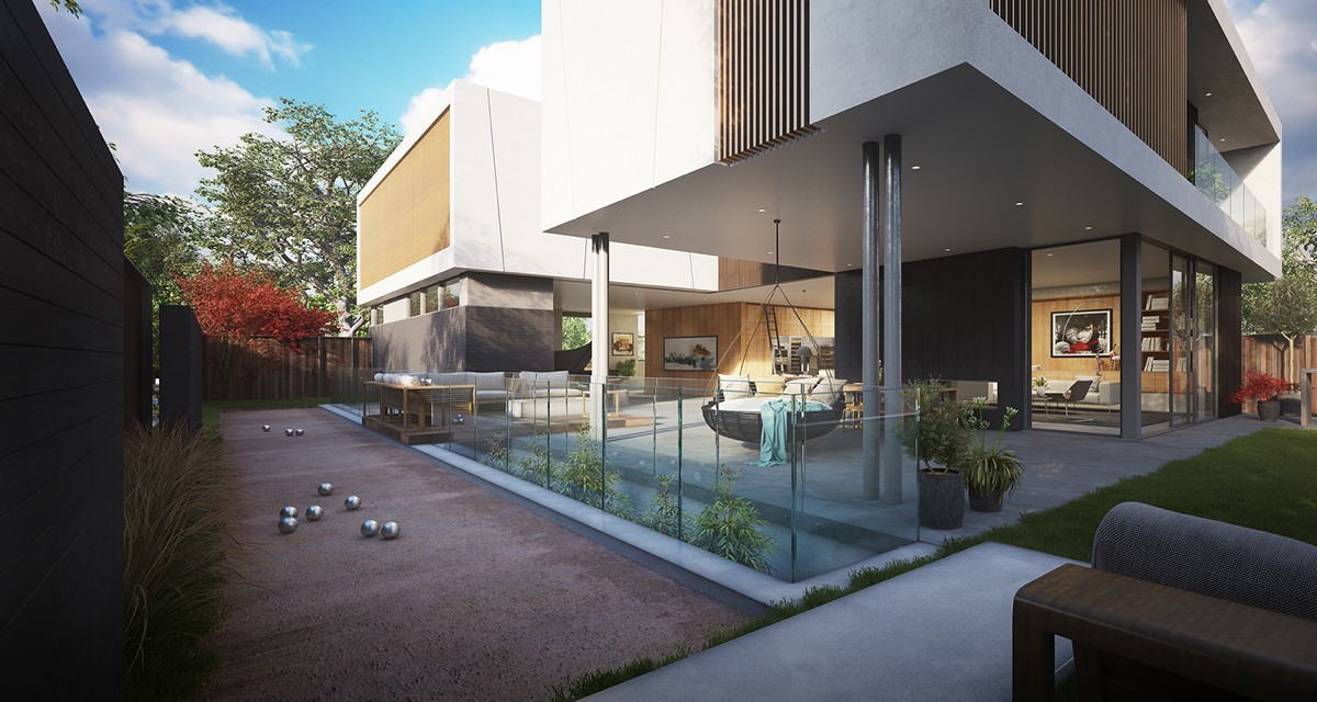
The lines between the indoors and outdoors are not strict: it's hard to tell where one ends and the other begins. Here, it's possible to see through the main living areas and out toward the other side of the yard. A covered patio provides the best of both worlds, outfitted with modern outdoor chairs tucked into partial shade.
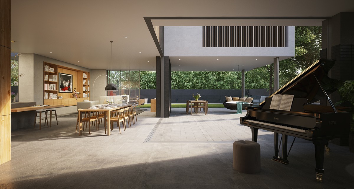
On the main floor, dining and living areas merge seamlessly with the outdoor patio areas. Sliding doors provide protection against the elements – otherwise, the space is entirely open and invites a cool breeze to soothe the soul.
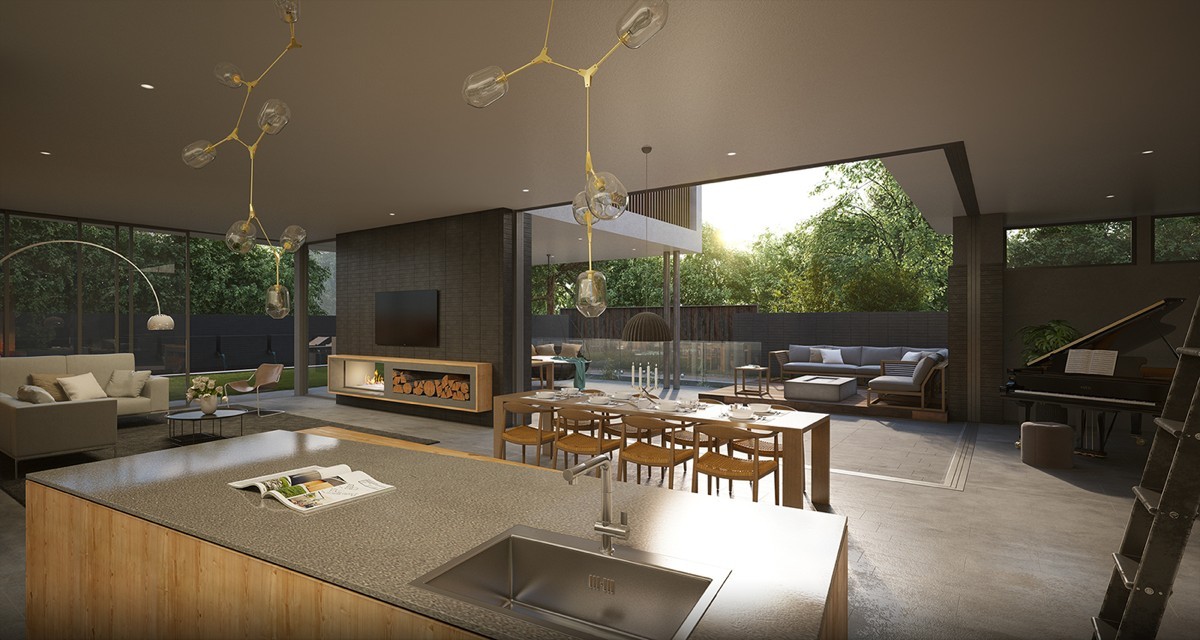
Light wooden elements keep the interior feeling free and natural. The entire living space is elevated by luxury details like the Lindsey Adelman chandelier and the Arco floor lamp.
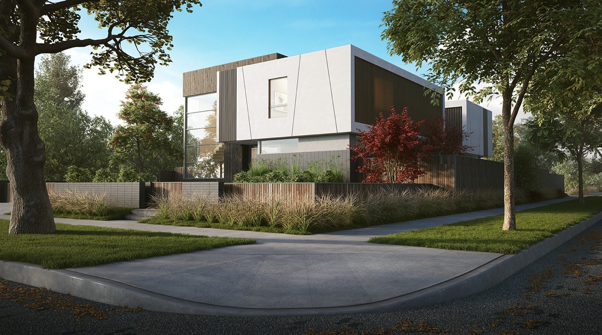
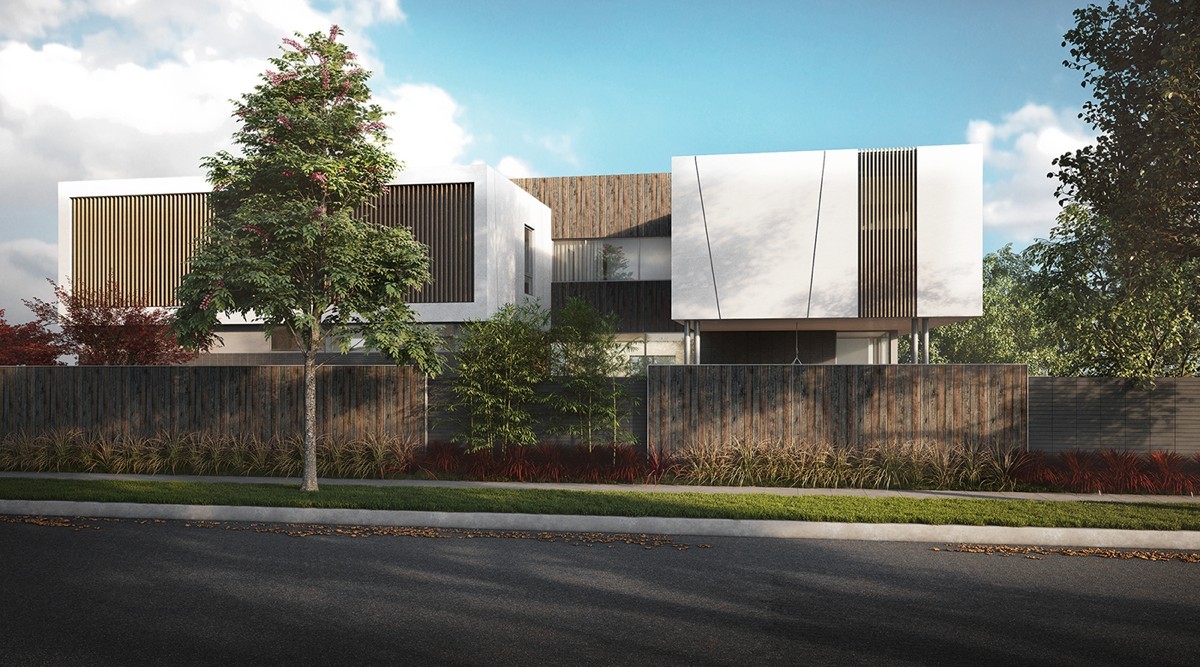
Back outside, a contrast of materials and forms helps the home blend into its surroundings a little more naturally, despite its impressive modern presence.
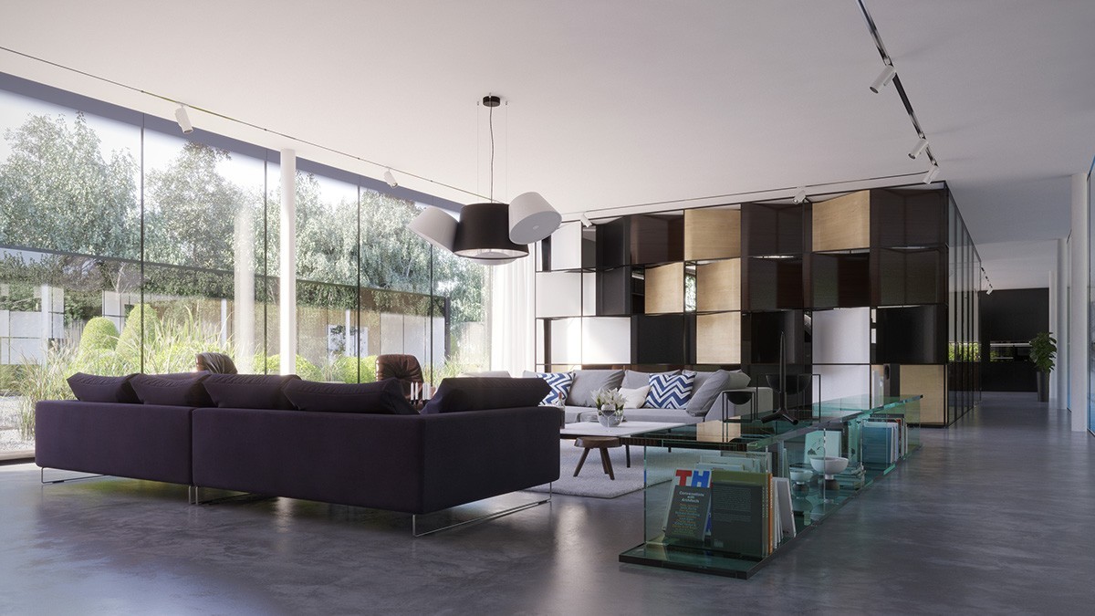
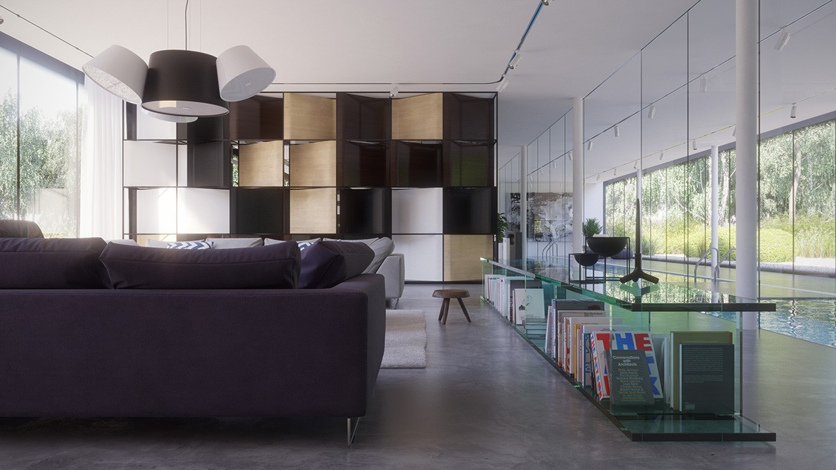
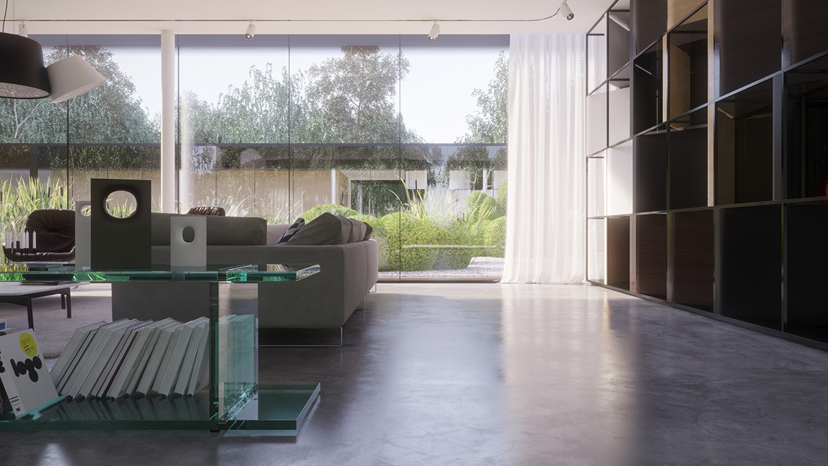
This minimalistic villa enjoys a unique layout as well. Flanked by gardens, the interior is open to the landscape. Glass and wood make up the overall material theme, further reinforcing the smooth connection between the home and its surroundings.
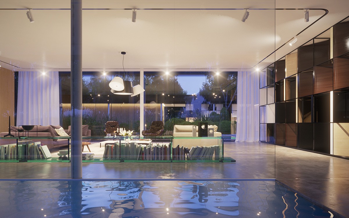
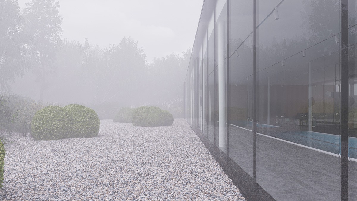
Guests are sure to appreciate the entertainment-friendly layout. People who prefer swimming won't feel separated from the socialites indoors thanks to these incredible glass walls.
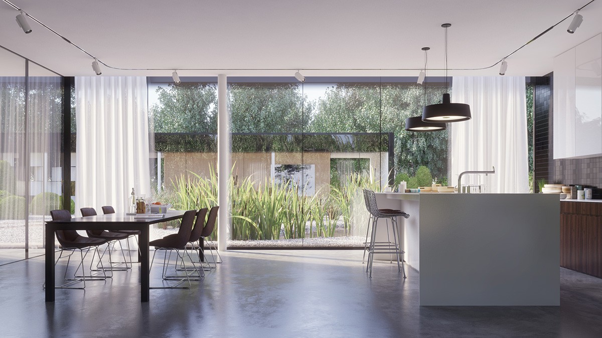
Simplicity rules the kitchen. Each form is refined, without a single unnecessary detail to distract from its connection with the garden outside.
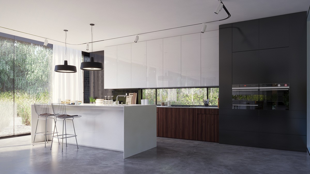
Forgoing a traditional backsplash, this kitchen uses a long and low window to illuminate and open the counter worktop.
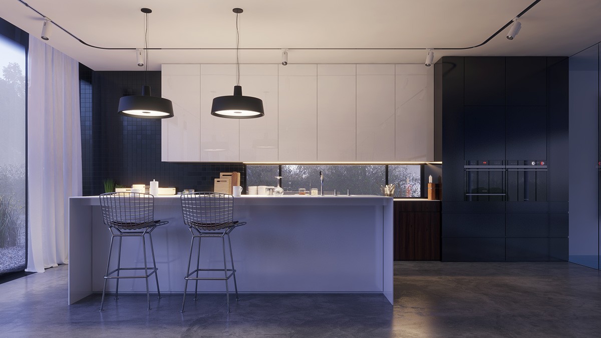
Vintage furniture, like these stools from Harry Bertoia's 1950 wire collection, keeps the entire arrangement grounded.
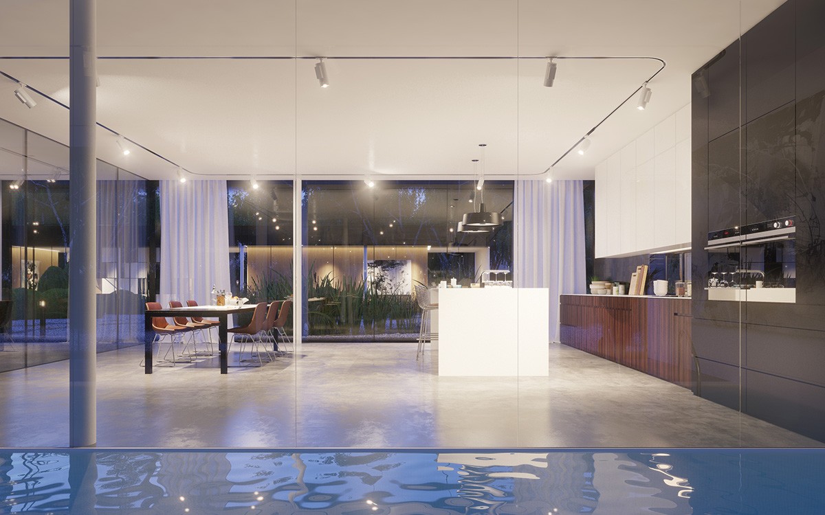
Of course, the pool stretches past this part of the home as well. Water seems to complete the very relaxing aesthetic this home has going for it.
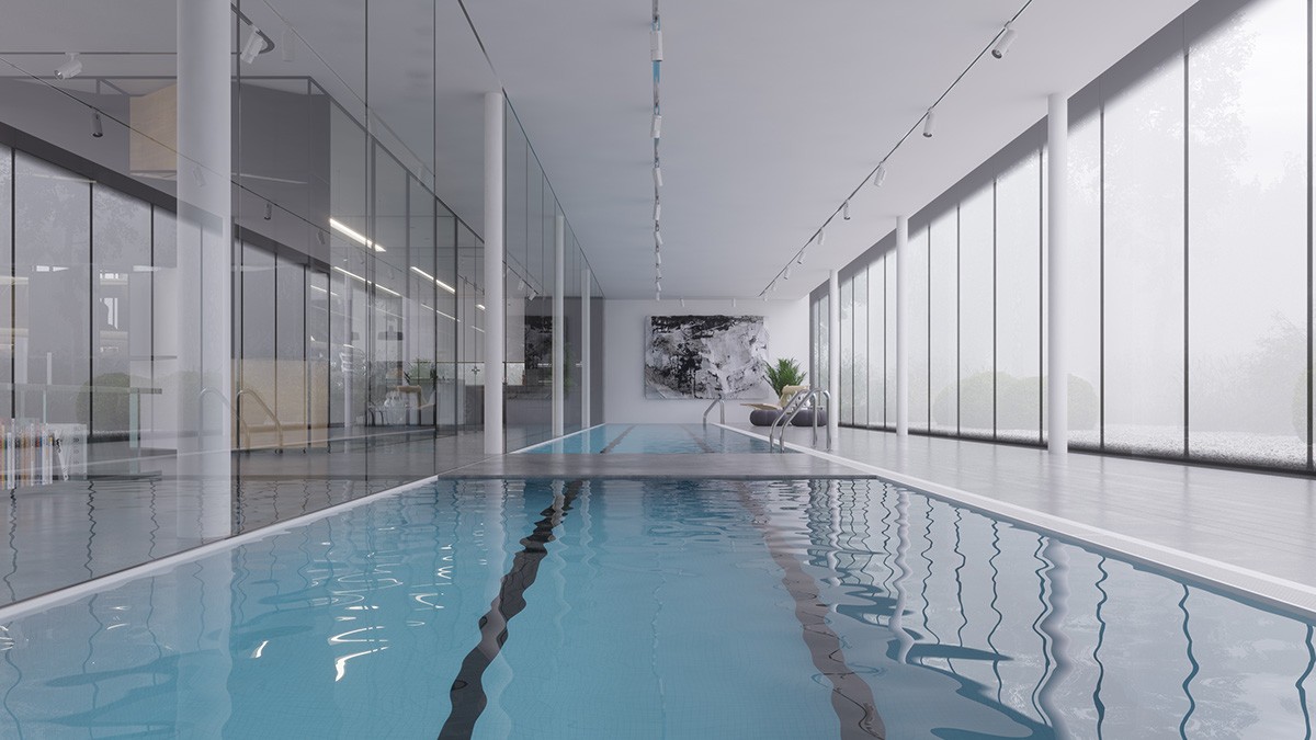
A bridge over the pool makes it easy to cross over without obstructing the lane while swimming laps.
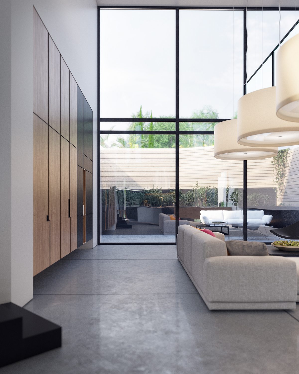
Finally, the fourth home frames its courtyards with concrete and wooden elements just like the other homes. The difference here is the exceptionally tall windows that reach toward the apex of the living room atrium – allowing residents to enjoy the sky and the gardens alike.
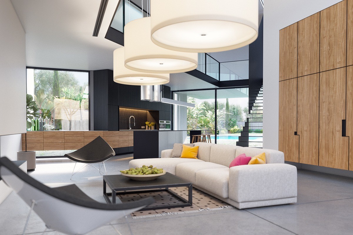
This home boasts some unique decor, but its structural creativity is even more fascinating. Major walking paths follow the gap of the atrium and the gathering spots shelter under a lower ceiling.
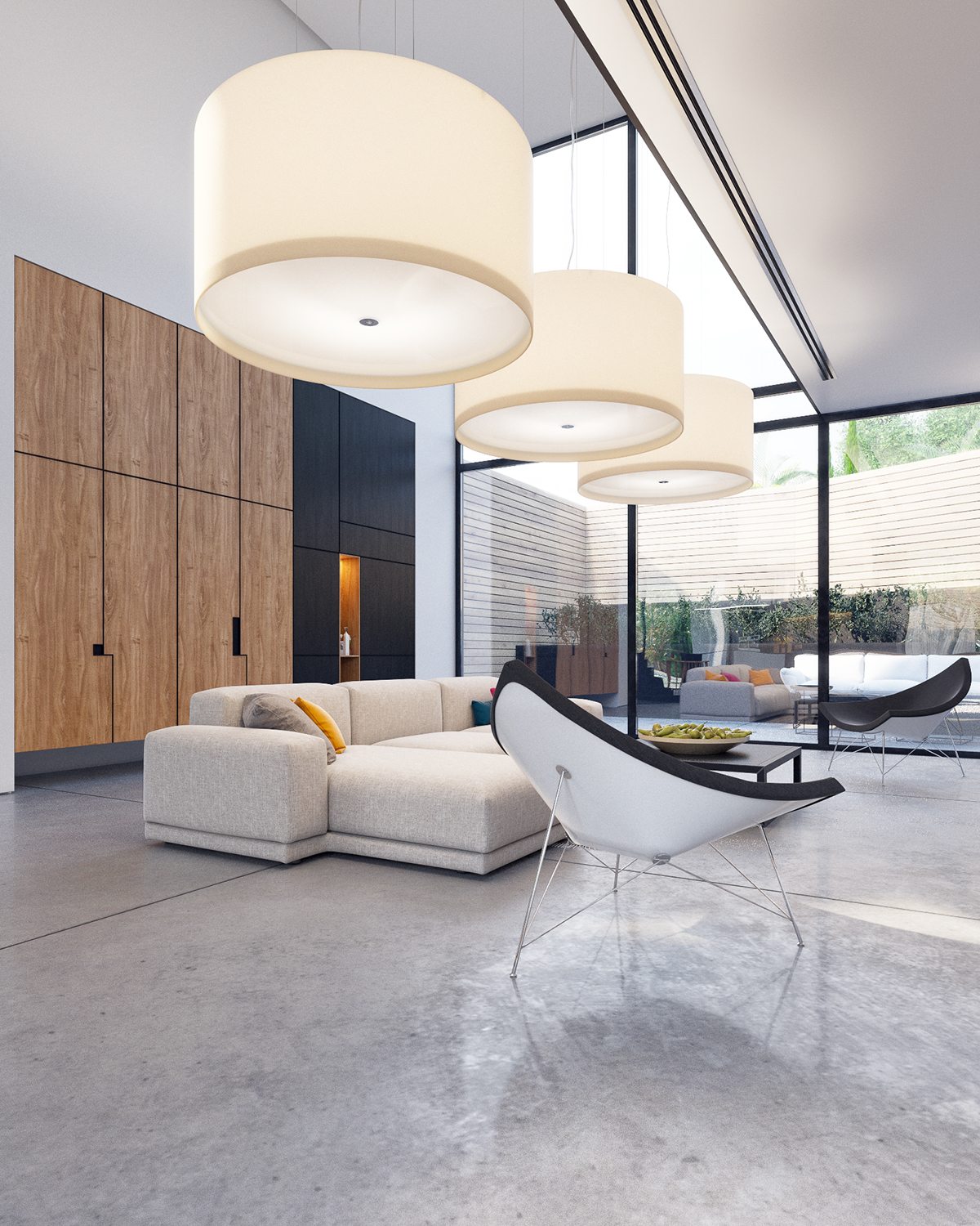
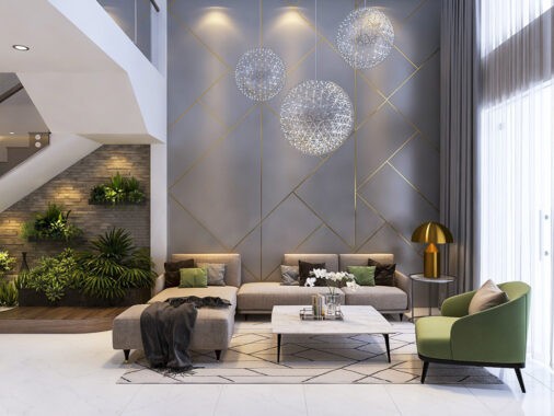
Furniture choices demonstrate a mixture of simple forms and creative sculptural pieces. A handful of a bright color accents brighten the mood.
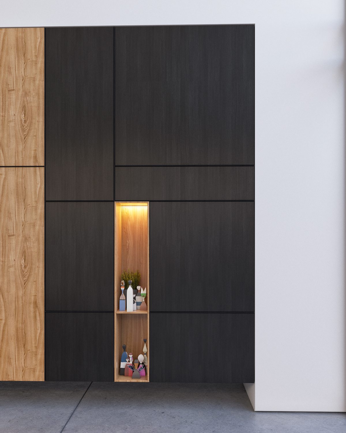
Collectibles and sculptures remain in their own designated areas. While other homes do pull off the highly decorated look quite well, this kind of organization ensures there aren't too many different elements competing for the eye's attention.
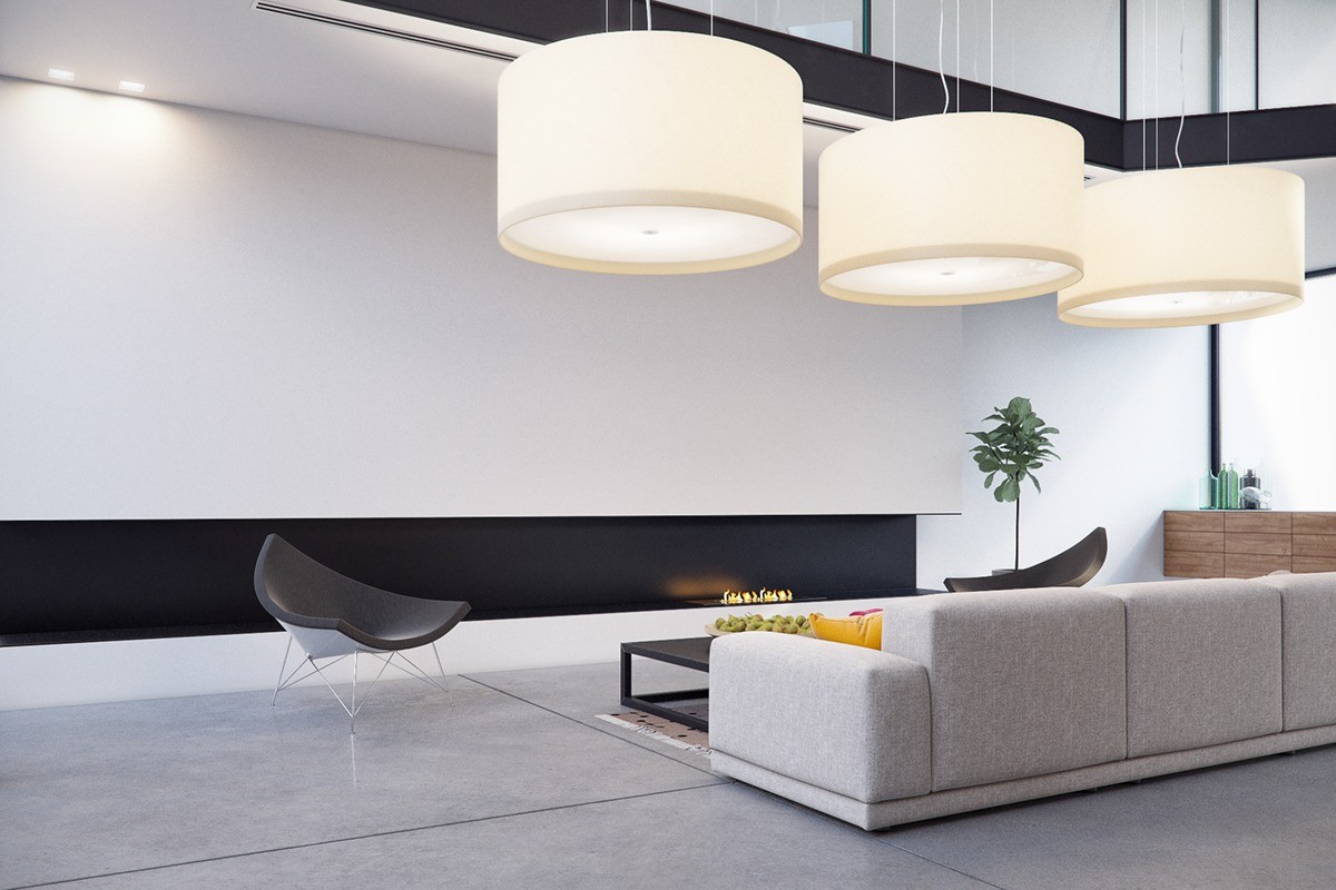
Gigantic oversized pendants help fill some of the empty space in the atrium void. The hanging position doesn't block the view – an important consideration in a home like this one.
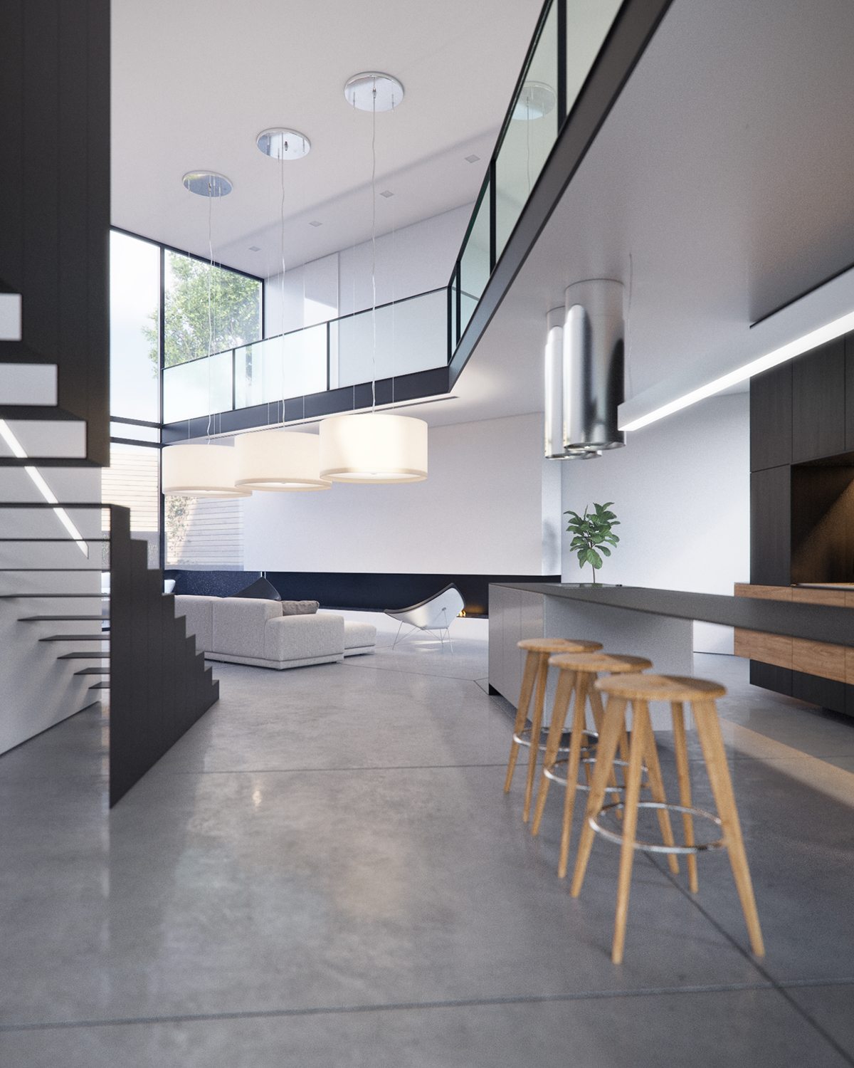
But where this interior really shines is its layout and creative architecture. Unusual angles play with perspective, guiding the flow of movement and energy throughout the home.
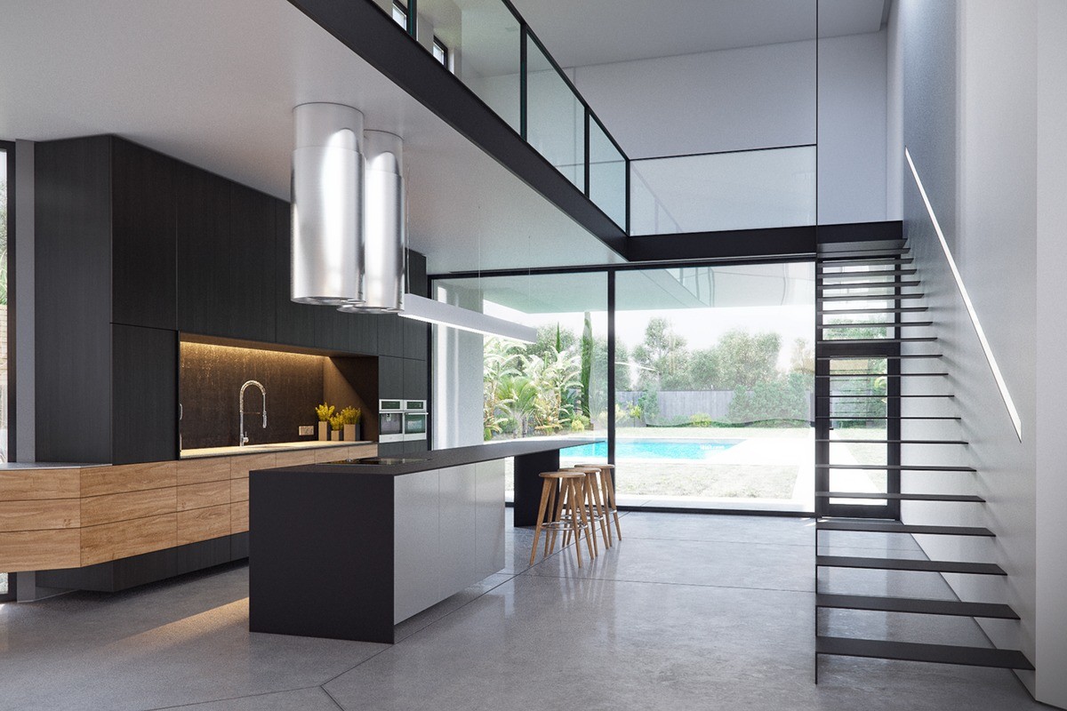
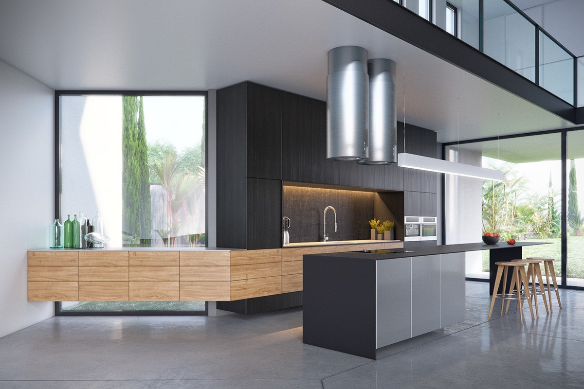
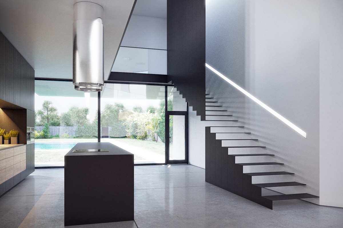
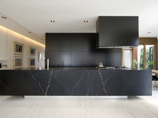
The kitchen occupies a covered space beneath the stairwell that leads to the private areas on the second floor. Strong black and concrete lends the space an industrial feel, softened by the elegance of wood drawers.
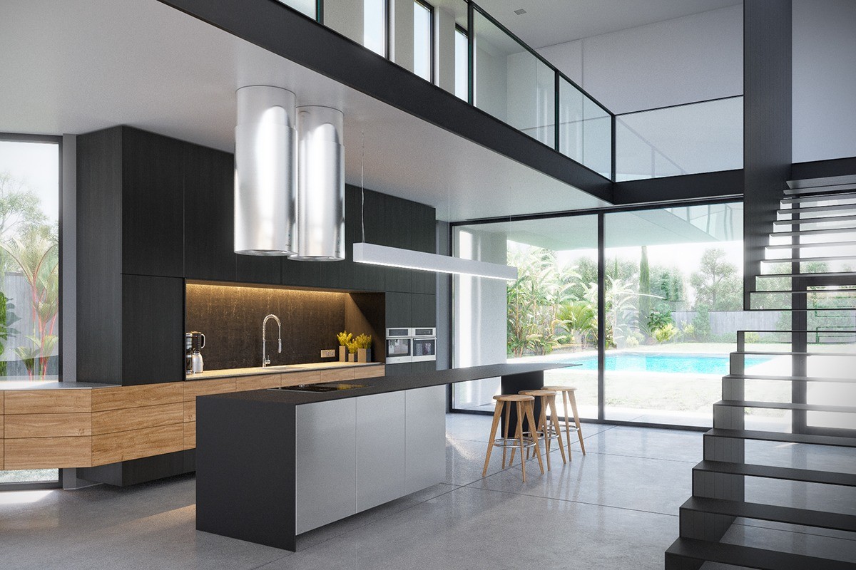
Flanked by tall windows on either side, this crucial family space feels open and central despite its location at the corner of the house.
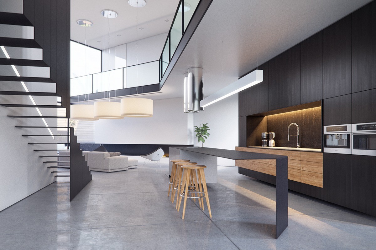
Note the angle of the mezzanine hallway above, and how the angle of the kitchen island reflects a similarly rebellious path.
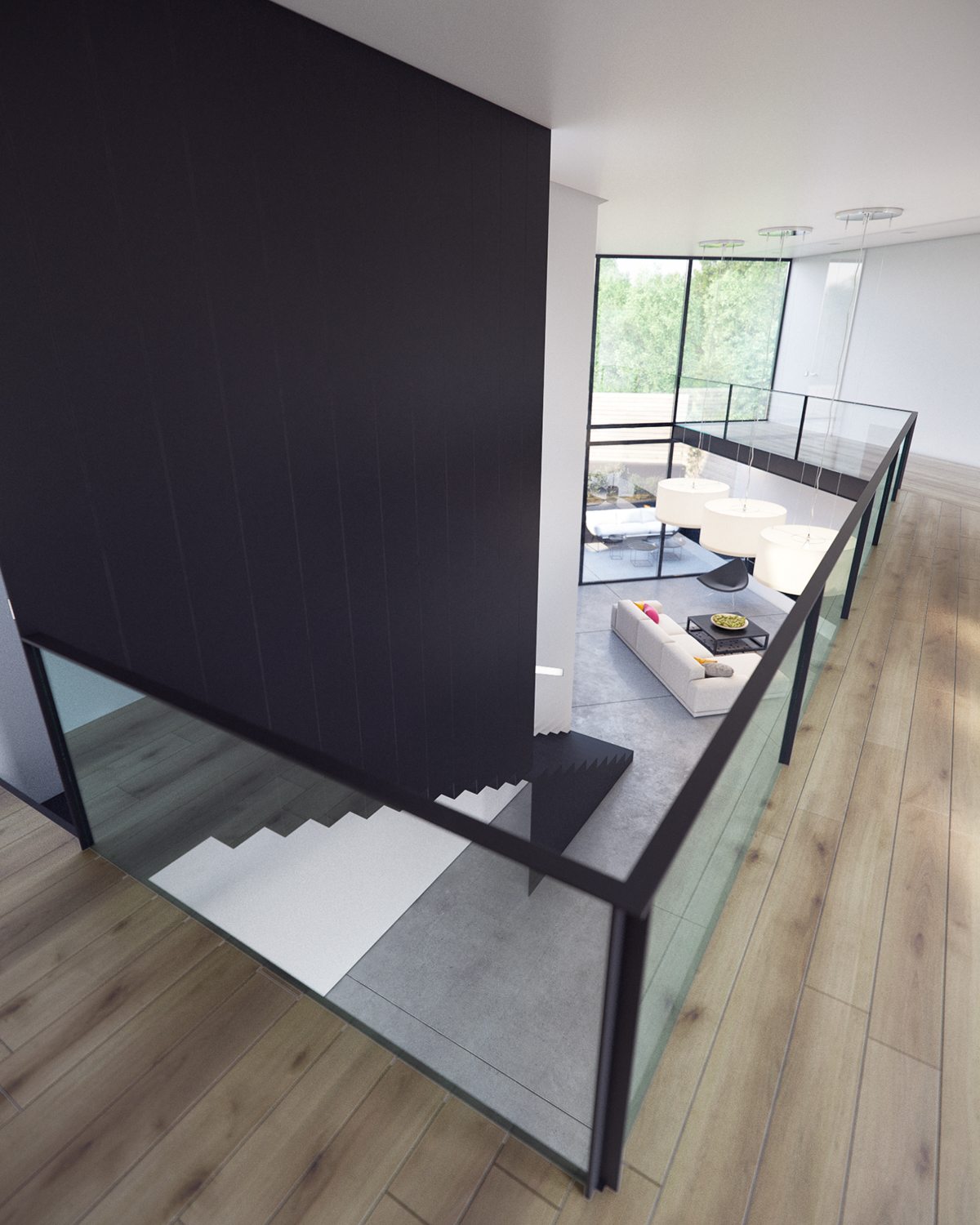
Visually stimulating, the stairwell suddenly transitions to an enclosed space while preserving the shape of the treads. It even looks a little like an optical illusion at first.
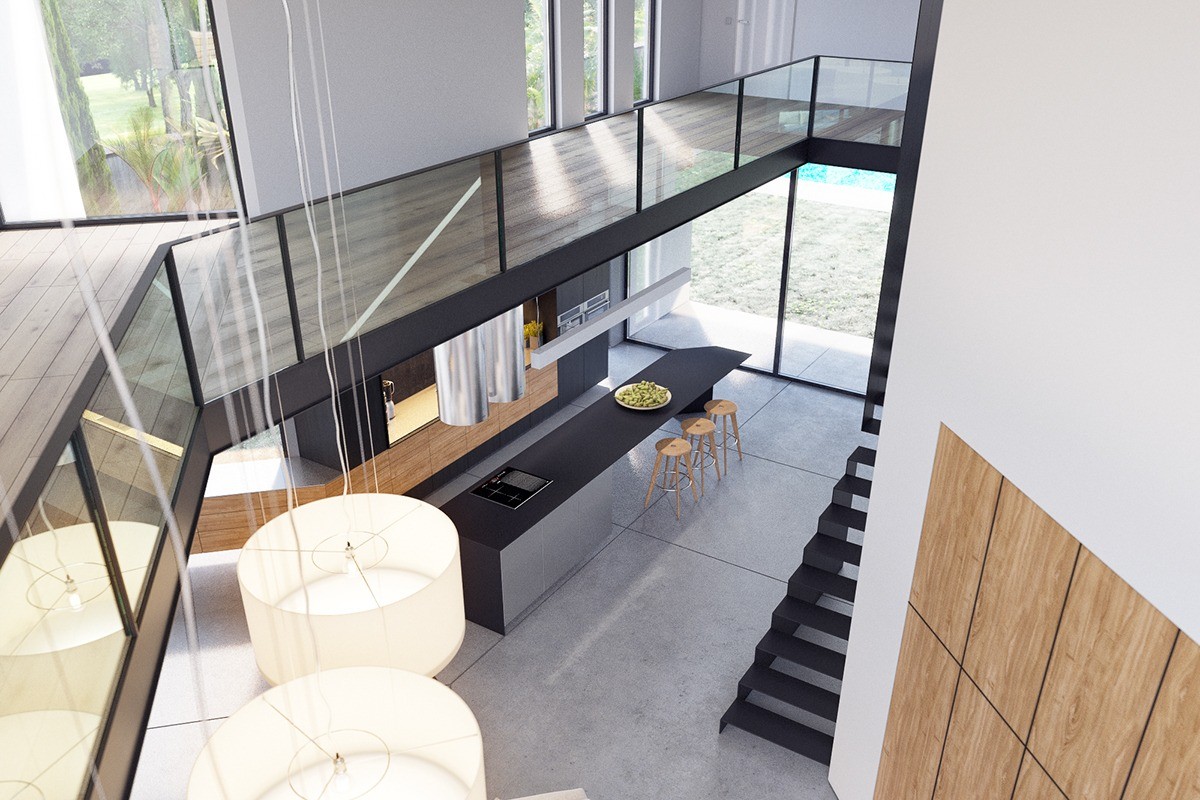
Actually, the mezzanine level does a fantastic job of putting residents and guests in visual contact with any part of the main floor where others might be hanging out.
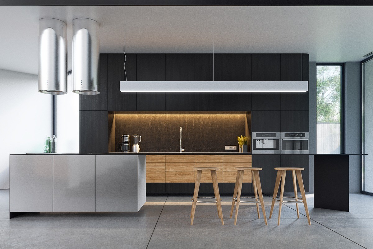
Decoration remains spare but there's no reason to clutter a kitchen as beautiful and engaging as this one.
