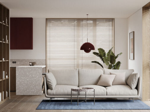
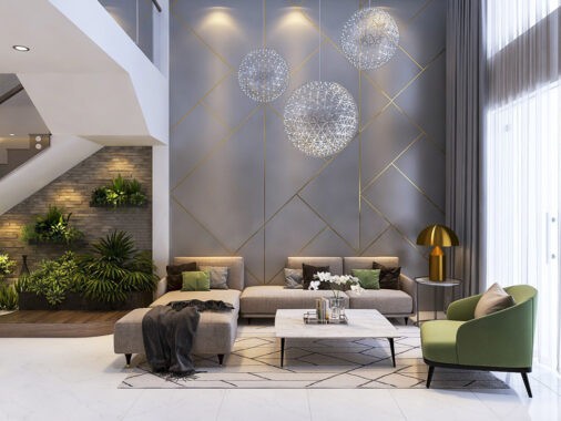
Designed for a growing family in Zhubei, Taiwan, this modern home maintains a clean canvas to put life and love at the forefront. The relationship between space and form becomes more important than decoration itself, relying on natural materials to provide the texture and color that makes this space interesting. The creatives at Phase 6 worked to instill this home with the perfect balance between comfort and luxury and the result seems to hit the target head-on. Fun details hide around every corner to delight the children and parents alike. If you love the natural and easygoing side of minimalism, this space is sure to spark ideas.
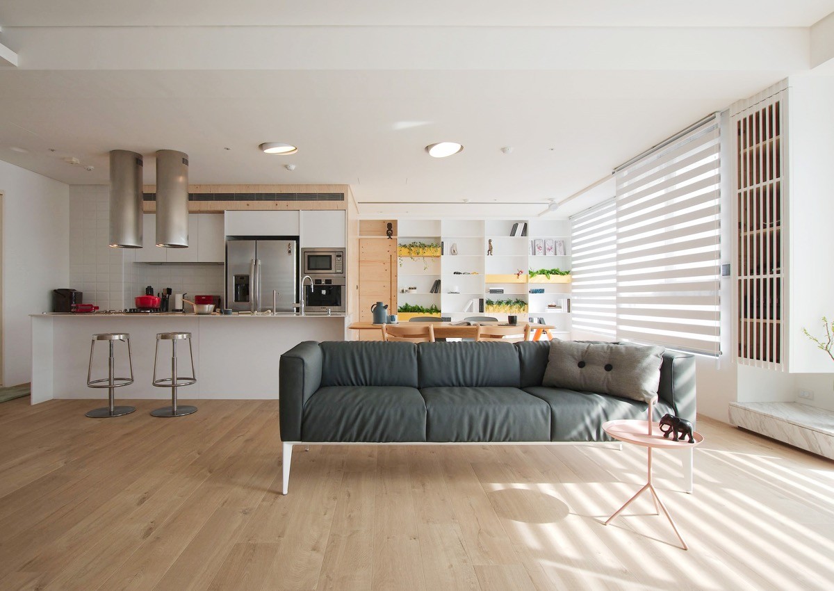
Family interaction is a central theme. This wide-open layout allows family members to feel a sense of togetherness even while enjoying different activities: play, work, cooking, entertainment, etc.
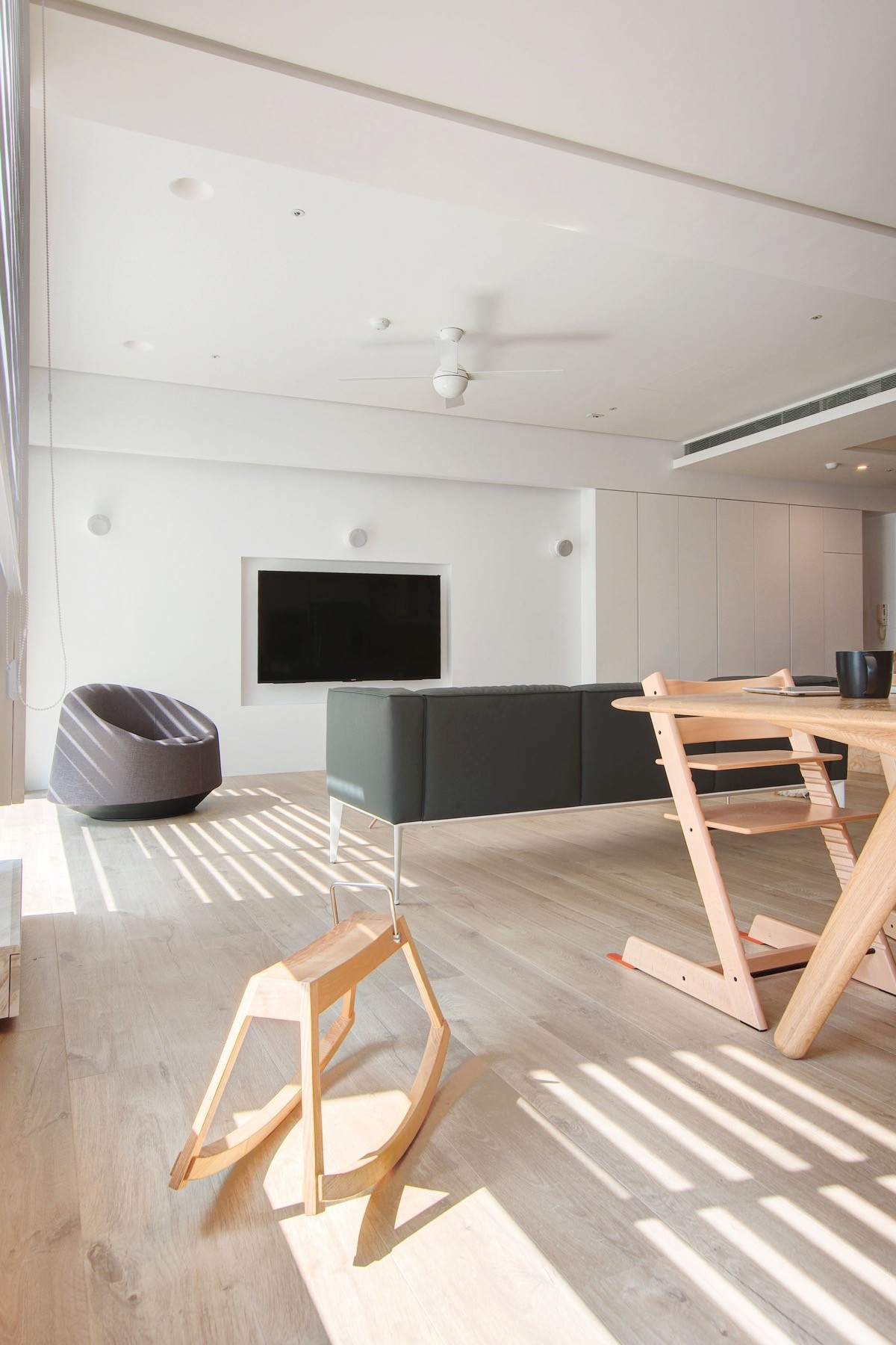
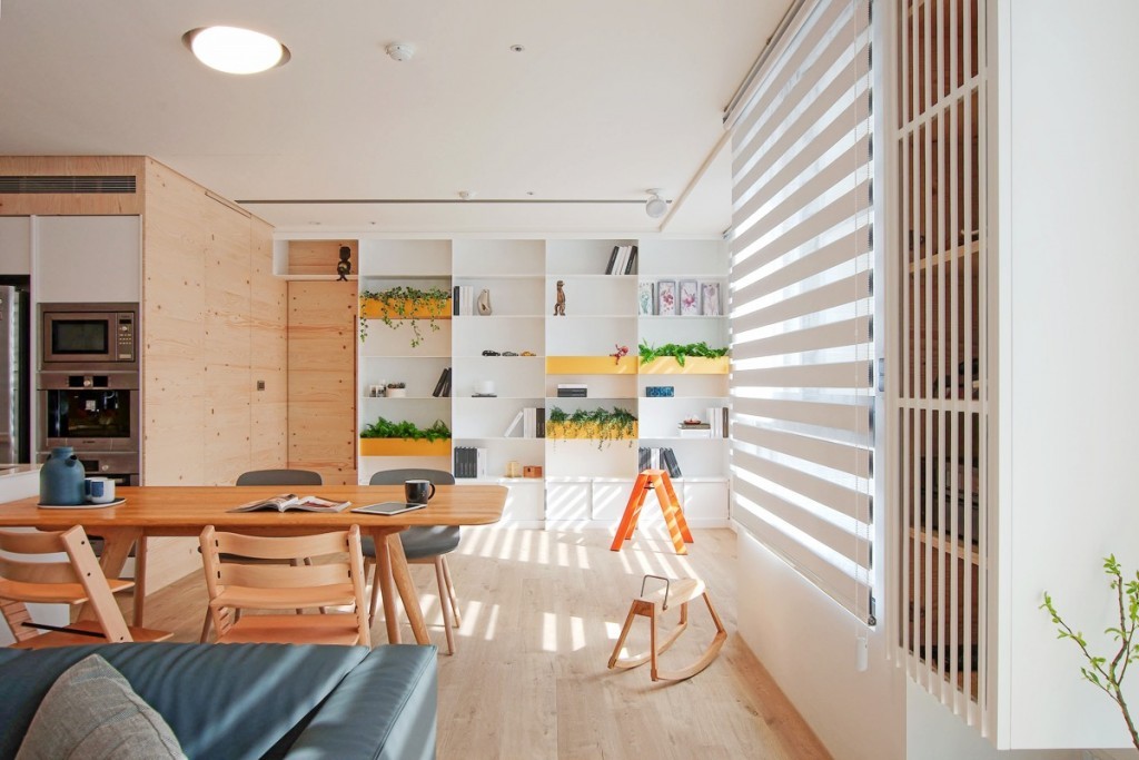
To reduce visual clutter, some of the furniture serves dual purposes. The stylish Sibis Rosa rocking horse combines art and fun, and the innovative Tripp Trapp high chairs adjust to suit adults as well as babies.
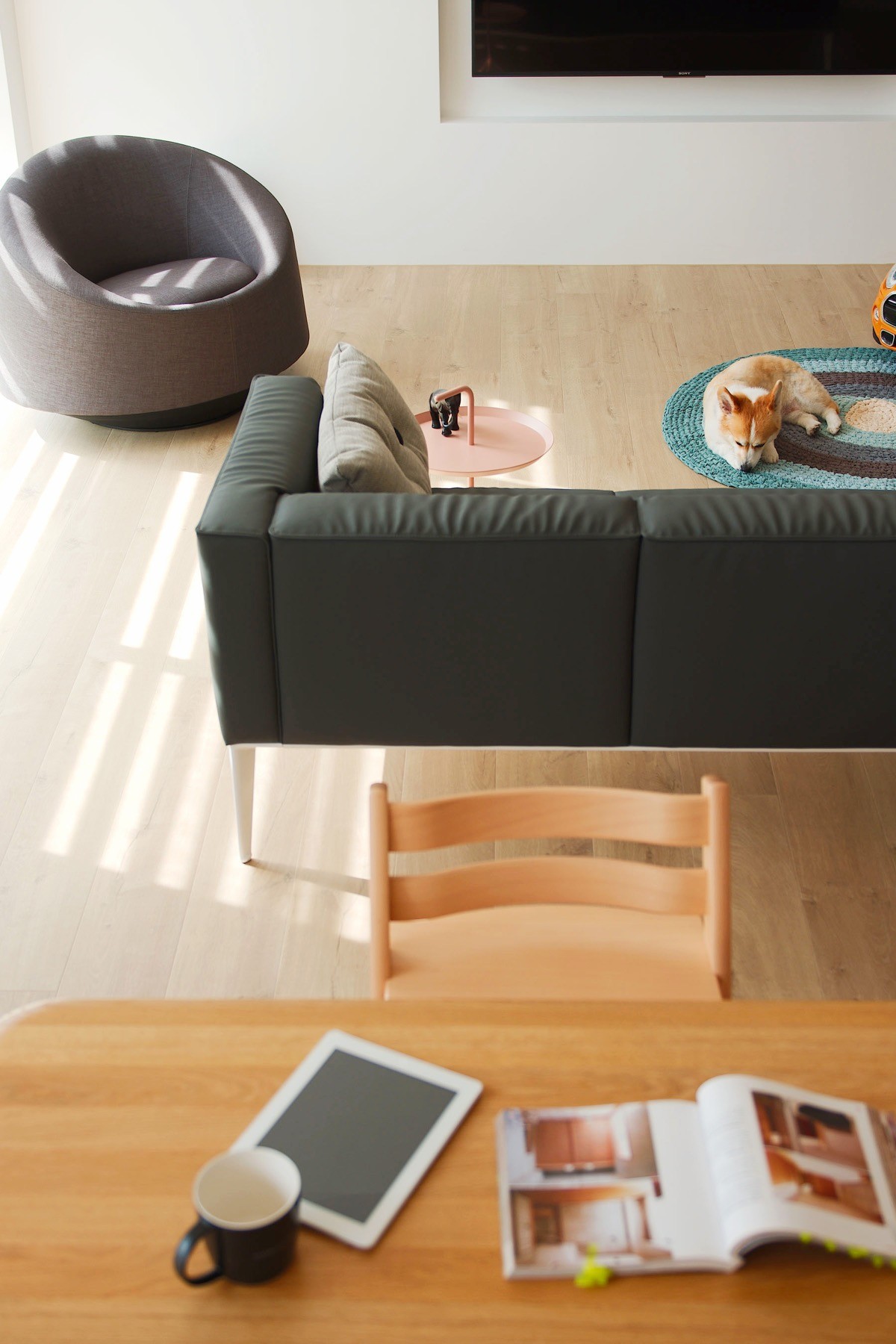
Both furniture and layout focus on functionality and simplicity first without sacrificing aesthetics.

The space to the right of the kitchen leaves plenty of open space for activities, while the colorful bookshelf prevents the area from looking underutilized. Those yellow planters are gorgeous!
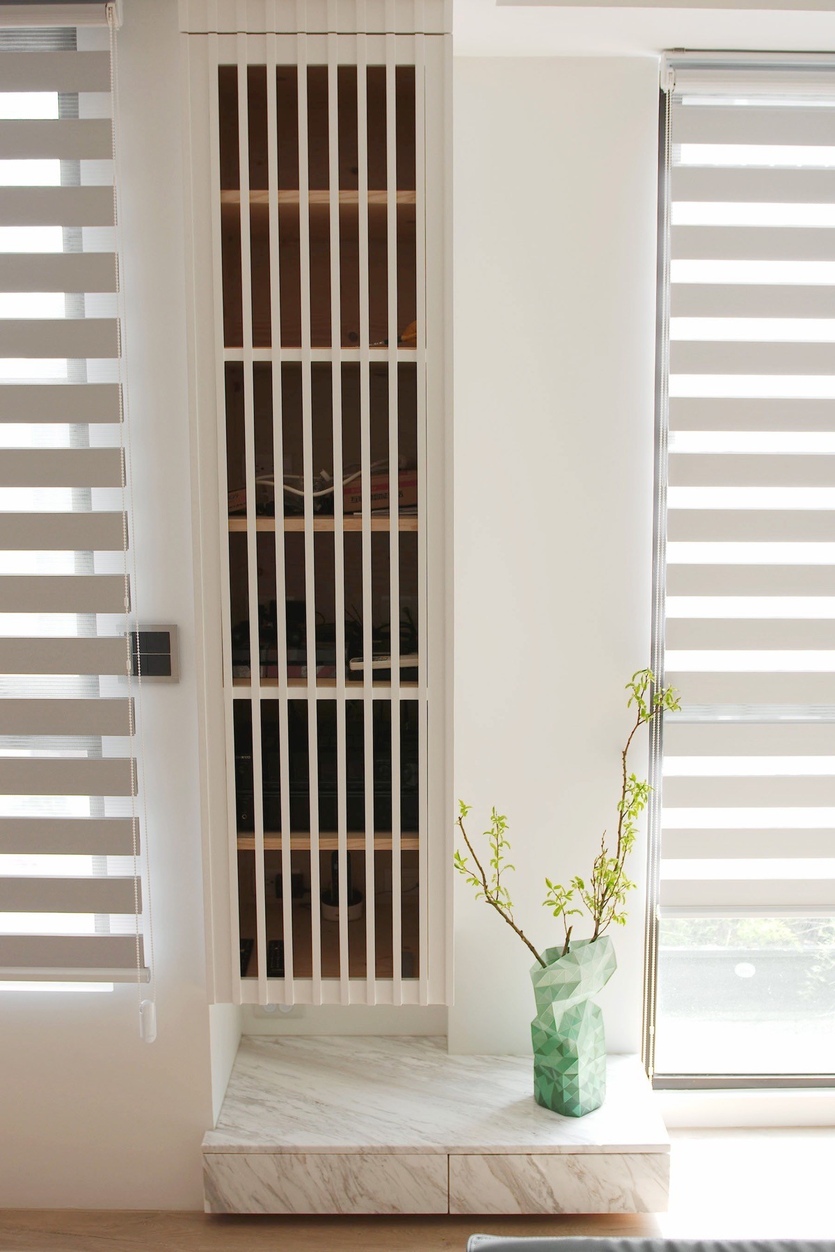
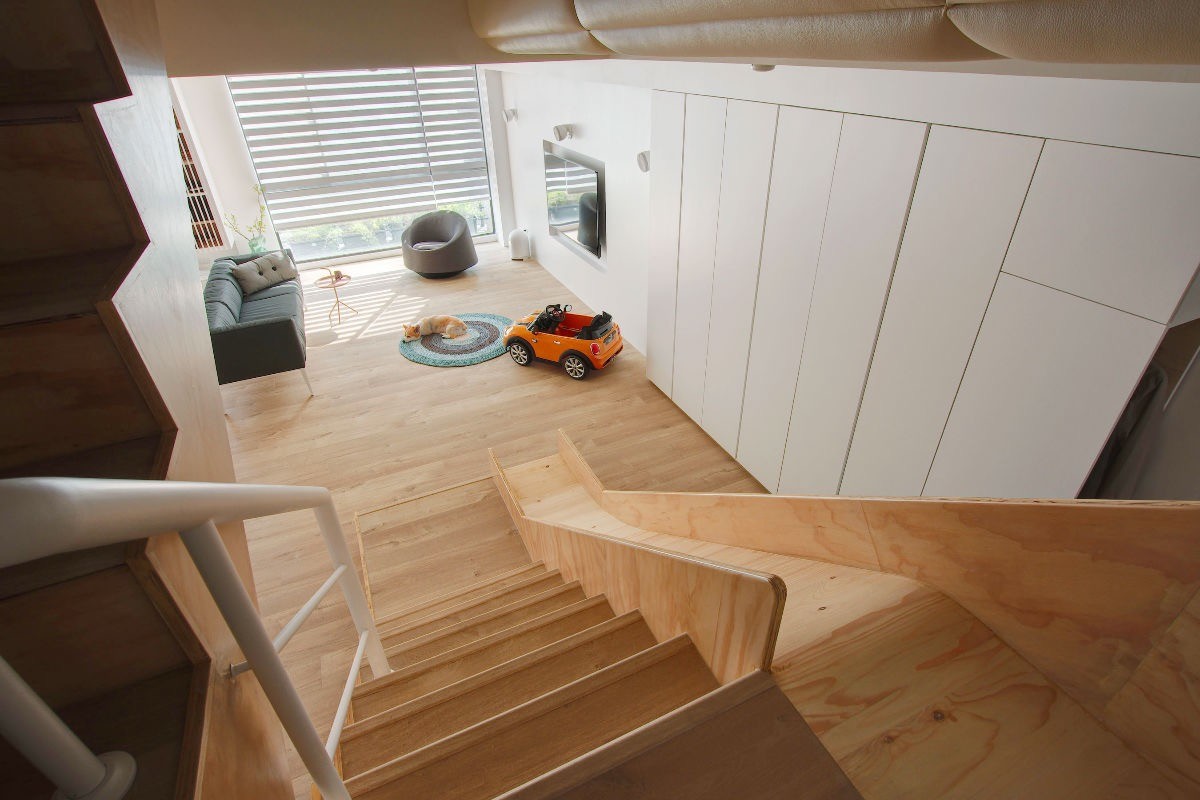
Here, audio-visual equipment hides within a slatted cabinet – the elegant marble drawers catch the eye instead.
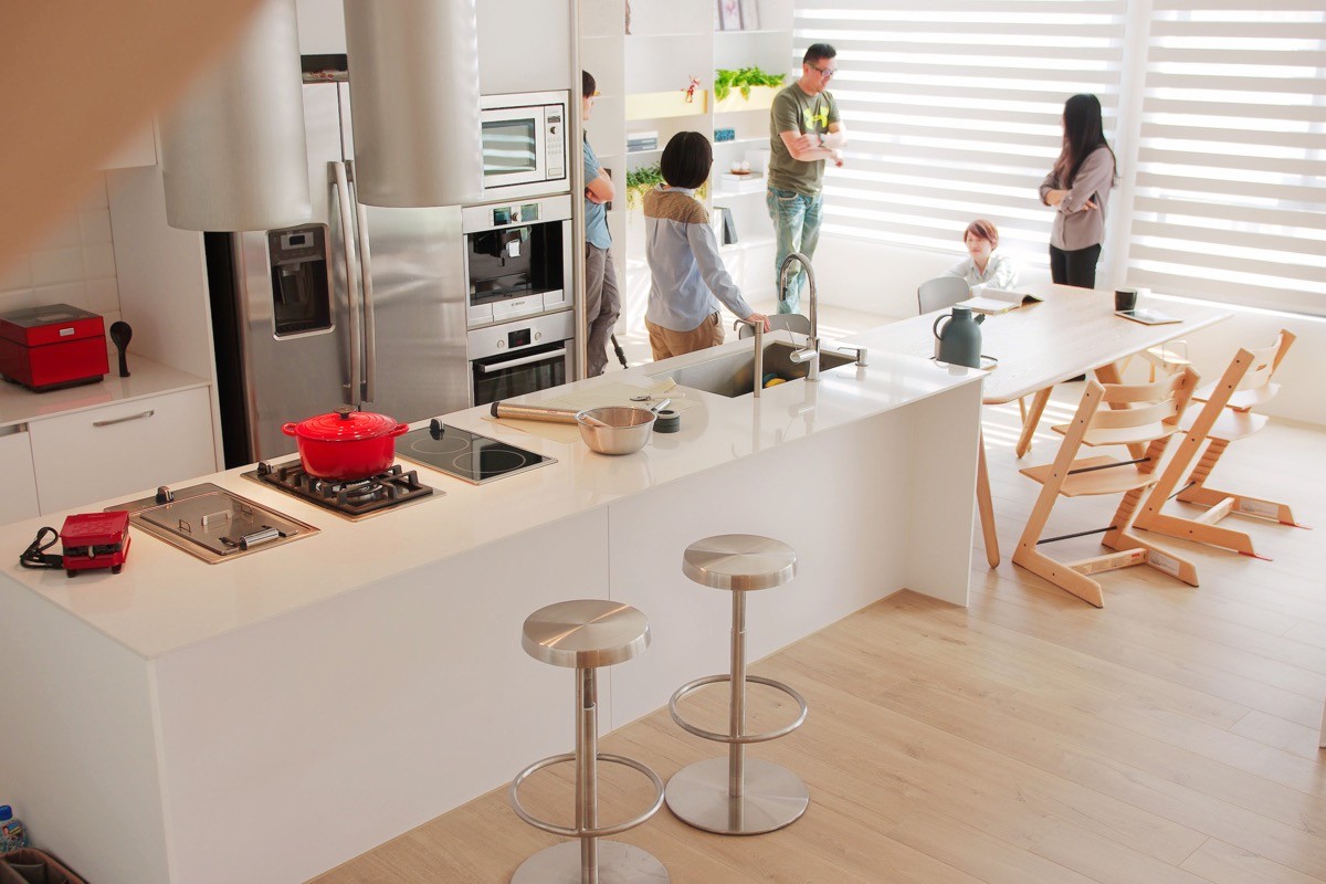
Kitchen and dining come together quite smoothly. Everybody can easily congregate in this well designed gathering space.
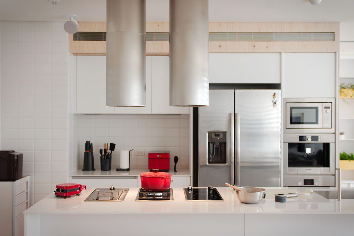
The kitchen feels large within the context of the room, but further inspection show it is relatively compact – workspace is somewhat limited on the inner half of the island but there's plenty of room to work on the outer edge.
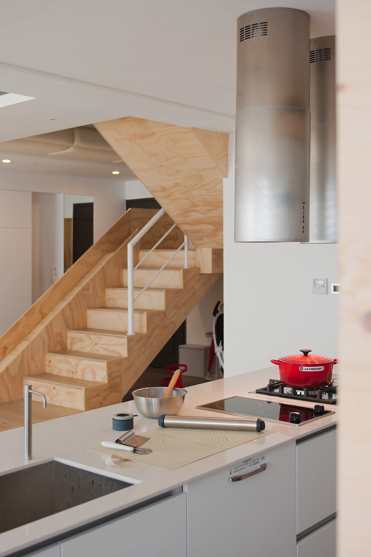
Because most of the functional kitchen tools are located on the side of the island facing outward, the parents can watch television or watch the children play while food is cooking.
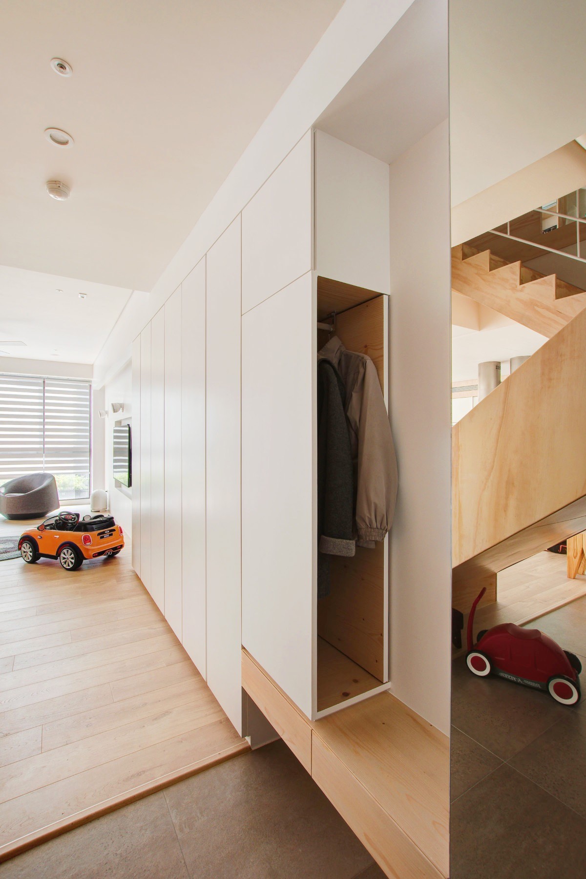
In a family home like this one, storage is a necessity rather than a luxury. The entrance features a coat locker and a long bench with drawers to make getting ready even easier.
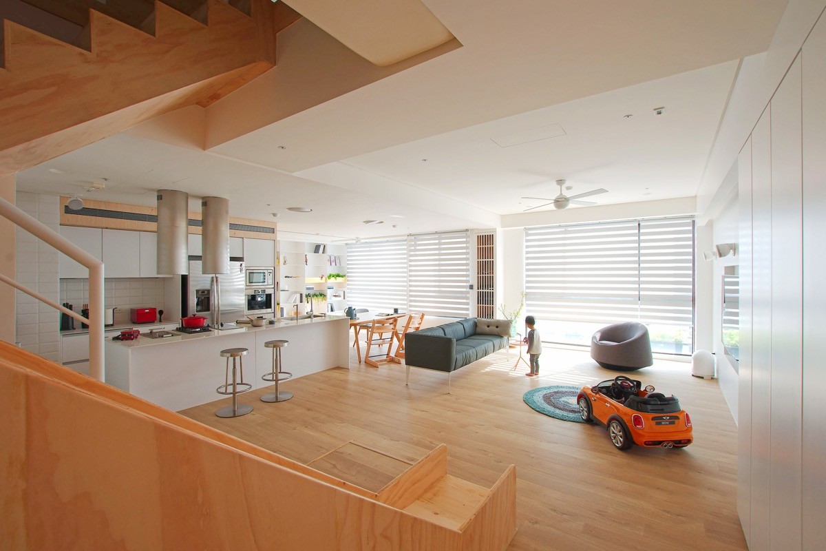
Check out this incredible slide! It would be easy to get kids to come down for breakfast with something like this.
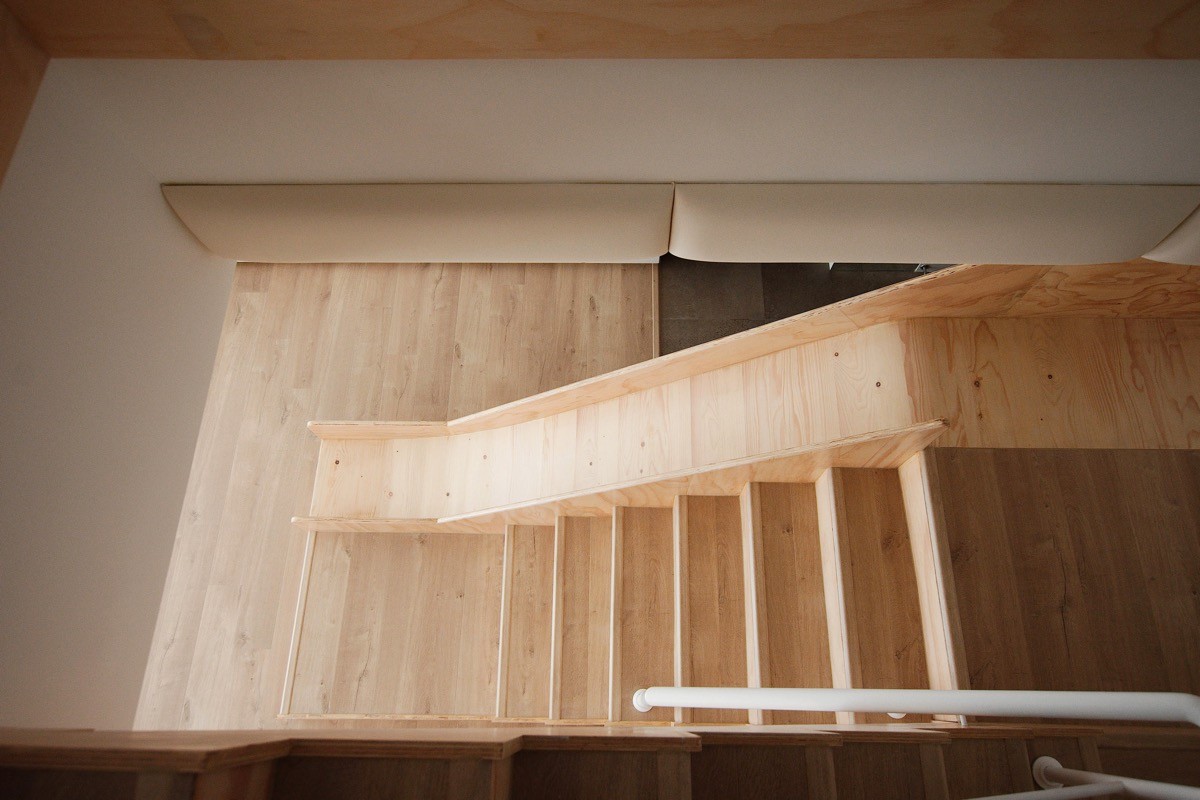
In addition to sliding down, children can also use the slide as a ramp for toy cars and other games.
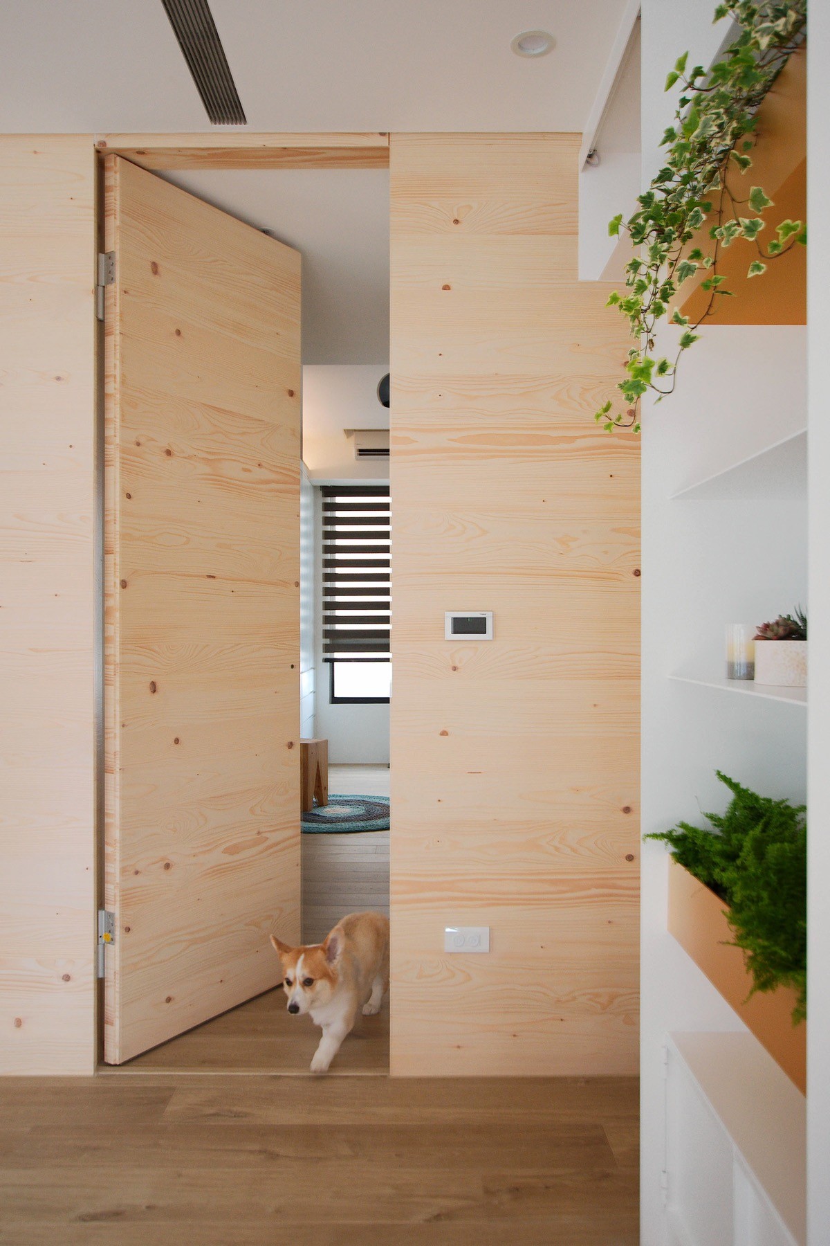
Bedrooms enjoy the privacy of their first story location. First, let's peek inside the bedroom of the youngest family member.
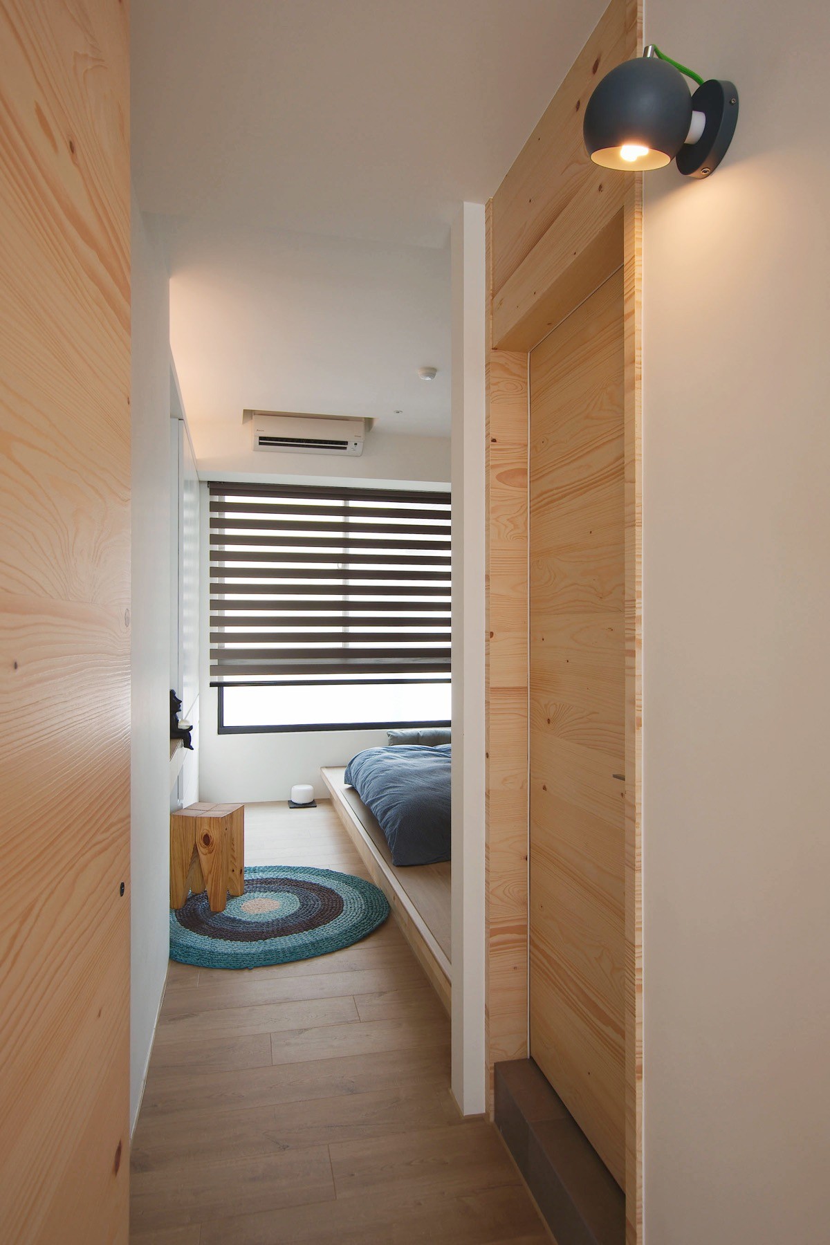
A comfortable blue bed rests on a low platform across from a handy desk area to the left. Striped blinds adopt stronger contrast than those in the living room for added decorative appeal.
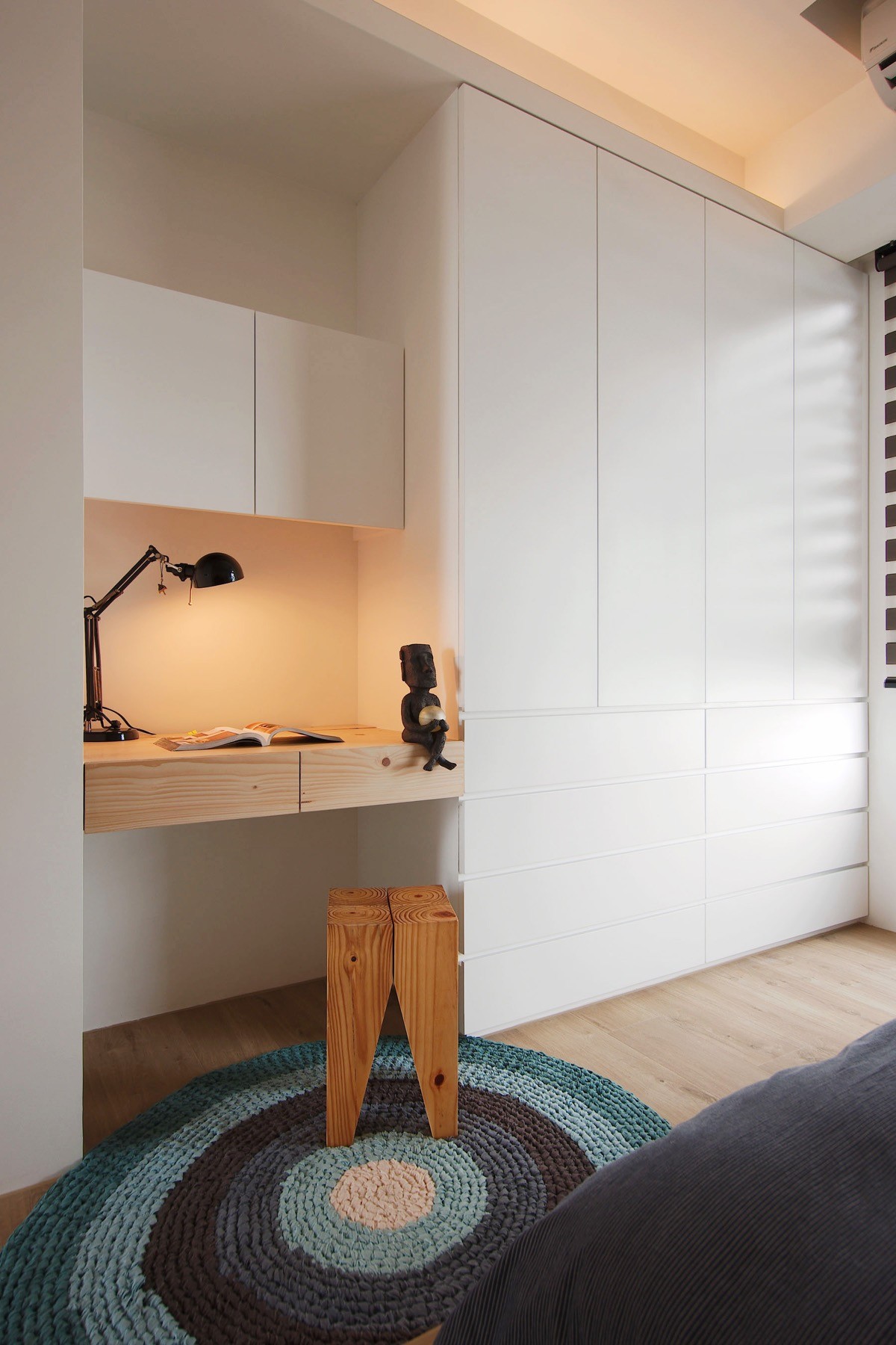
The desk is compact but perfectly functional, occupying free space between built-in cabinetry. Philipp Mainzer's iconic Backenzahn stool doubles as functional artwork.
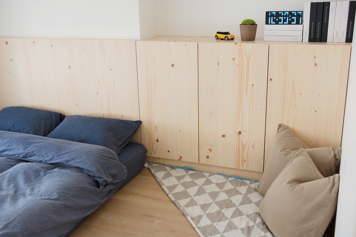
Cute and comfortable, a folded blanket cushions a little reading spot in the corner near the cabinetry.
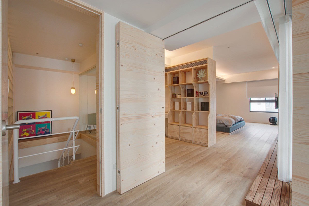
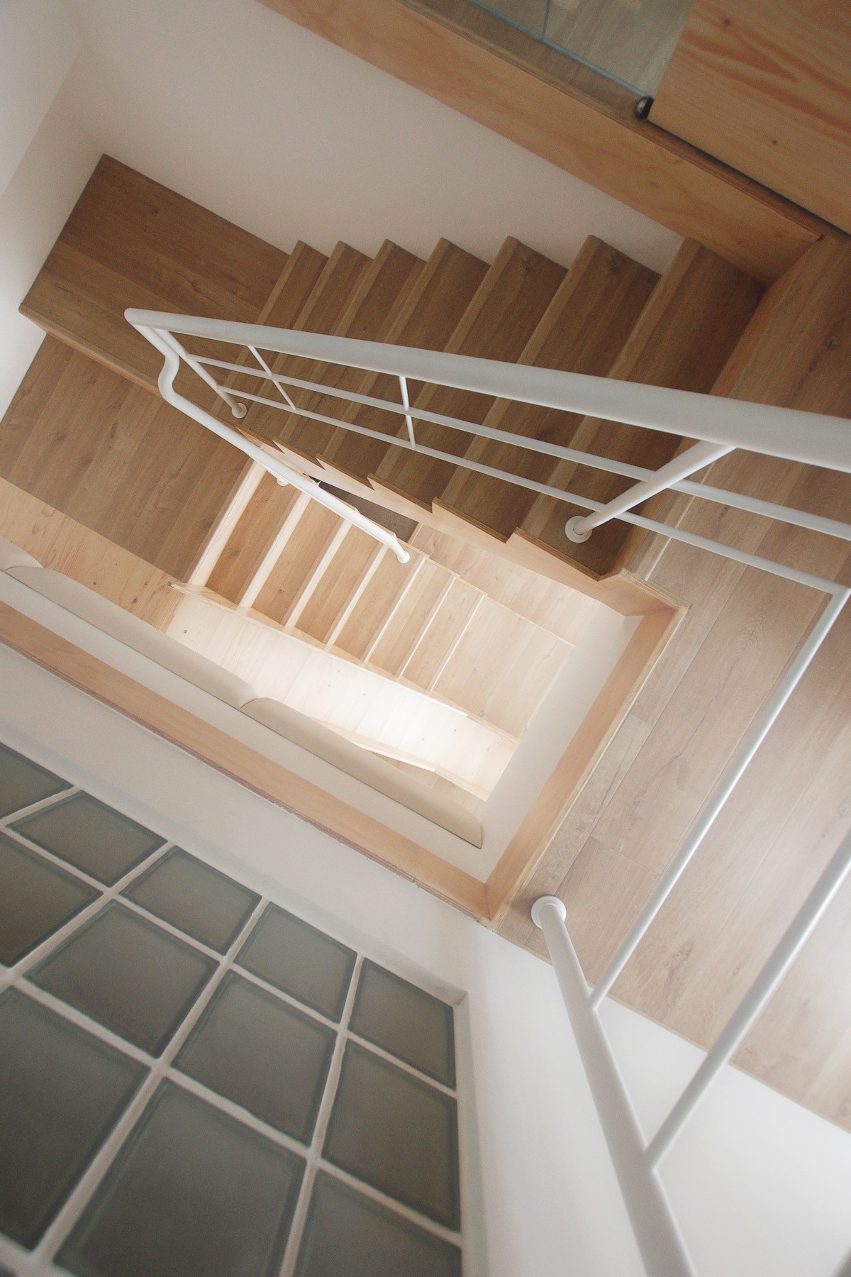
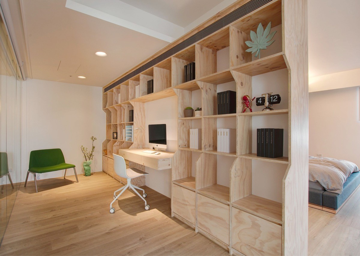
The master bedroom takes a position at the top of the stairs. At the landing, a folding door serves as a sound barrier for the office between the stairs and the shelves.
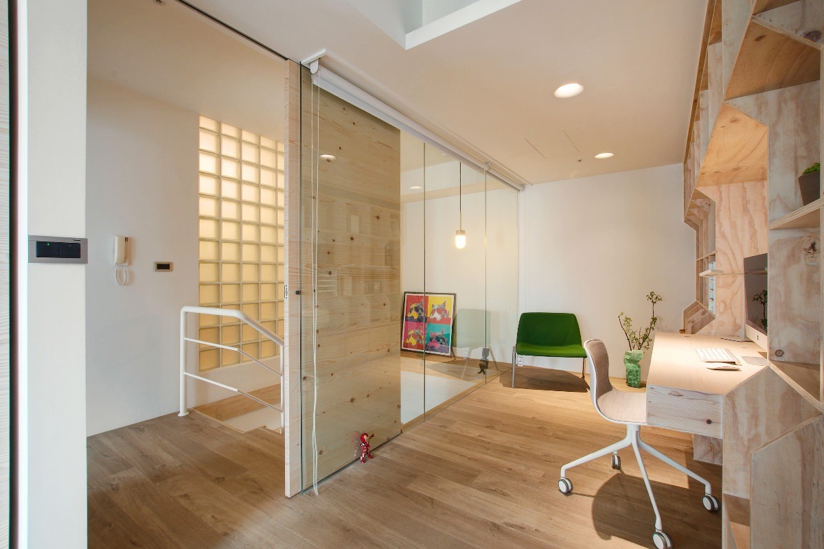
Children can look through the glass for a visual connection with a working parent without actually disturbing the parent's productivity.
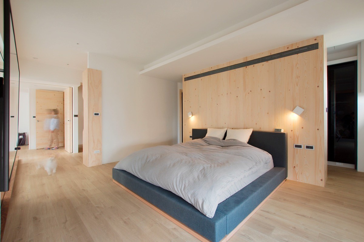
Another unique feature is this headboard wall – it separates the dressing area from the rest of the bedroom.
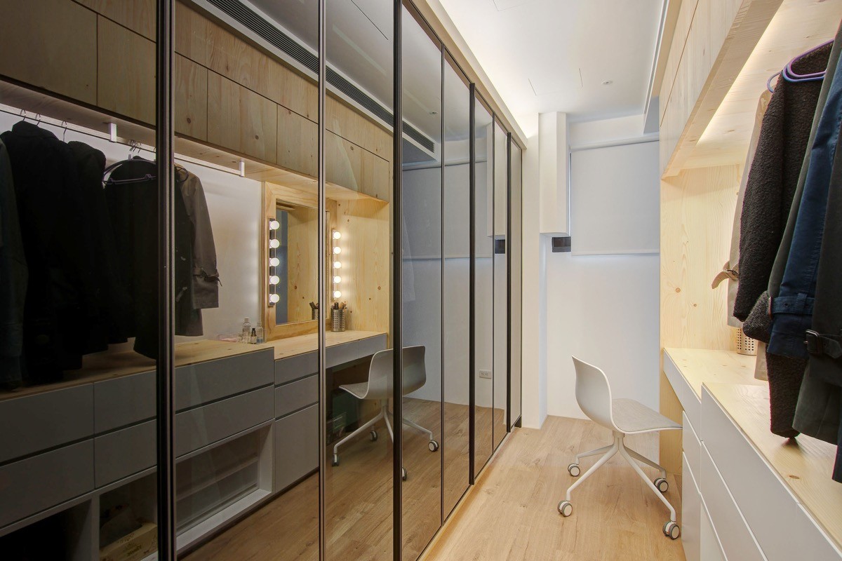
Although there are plenty of inspiring features to acknowledge within this dressing room, the small vanity area is especially unique.
