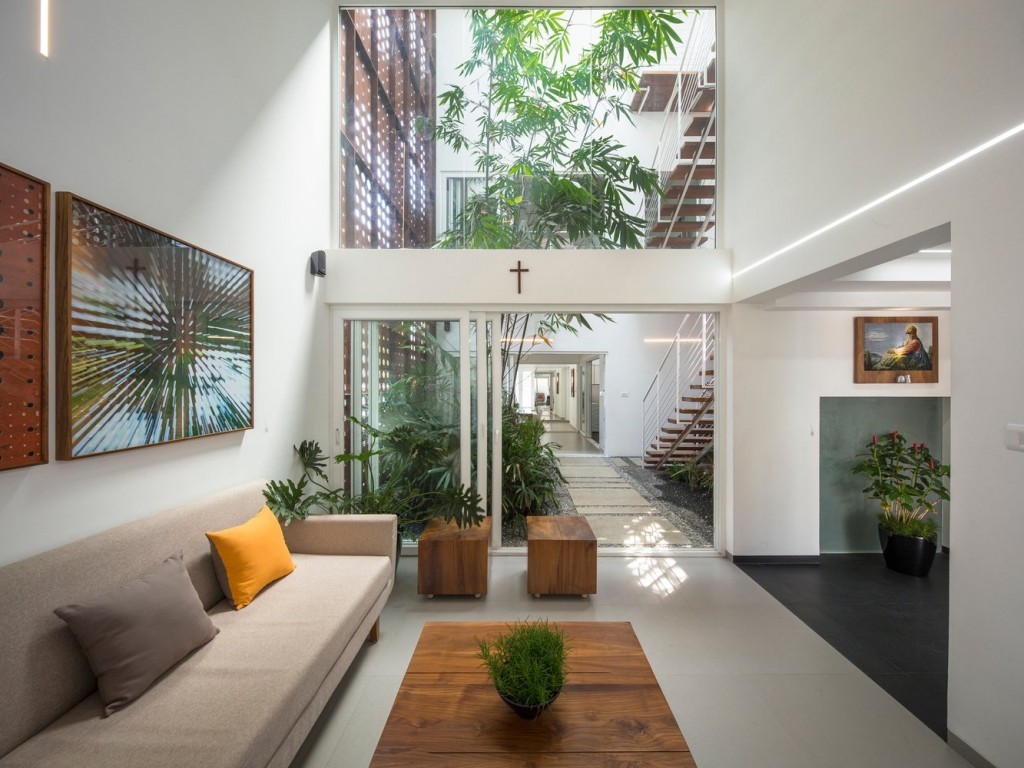
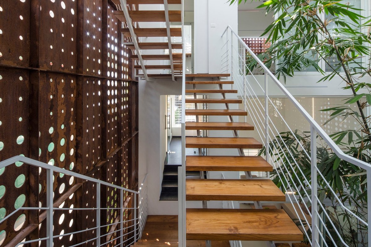
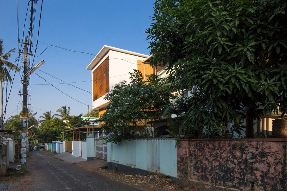
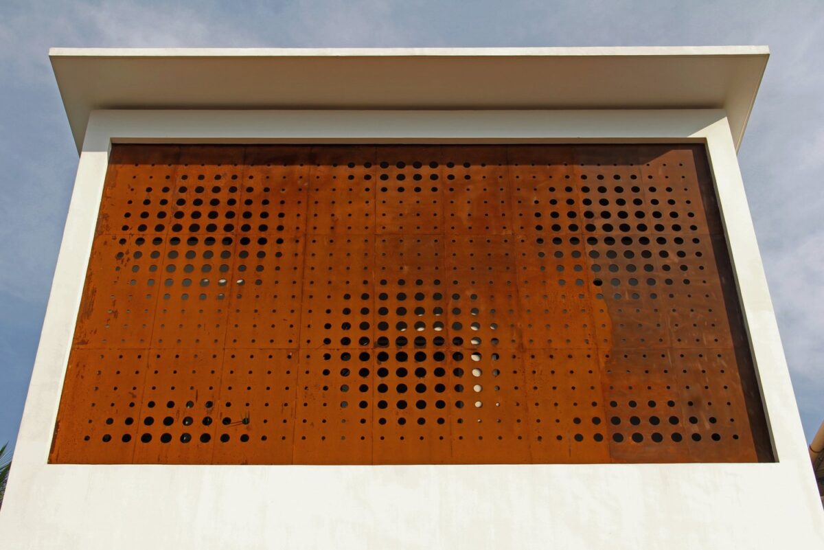
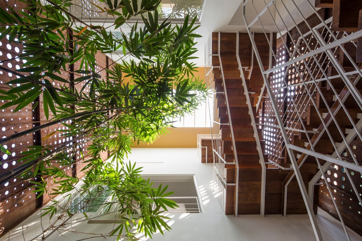
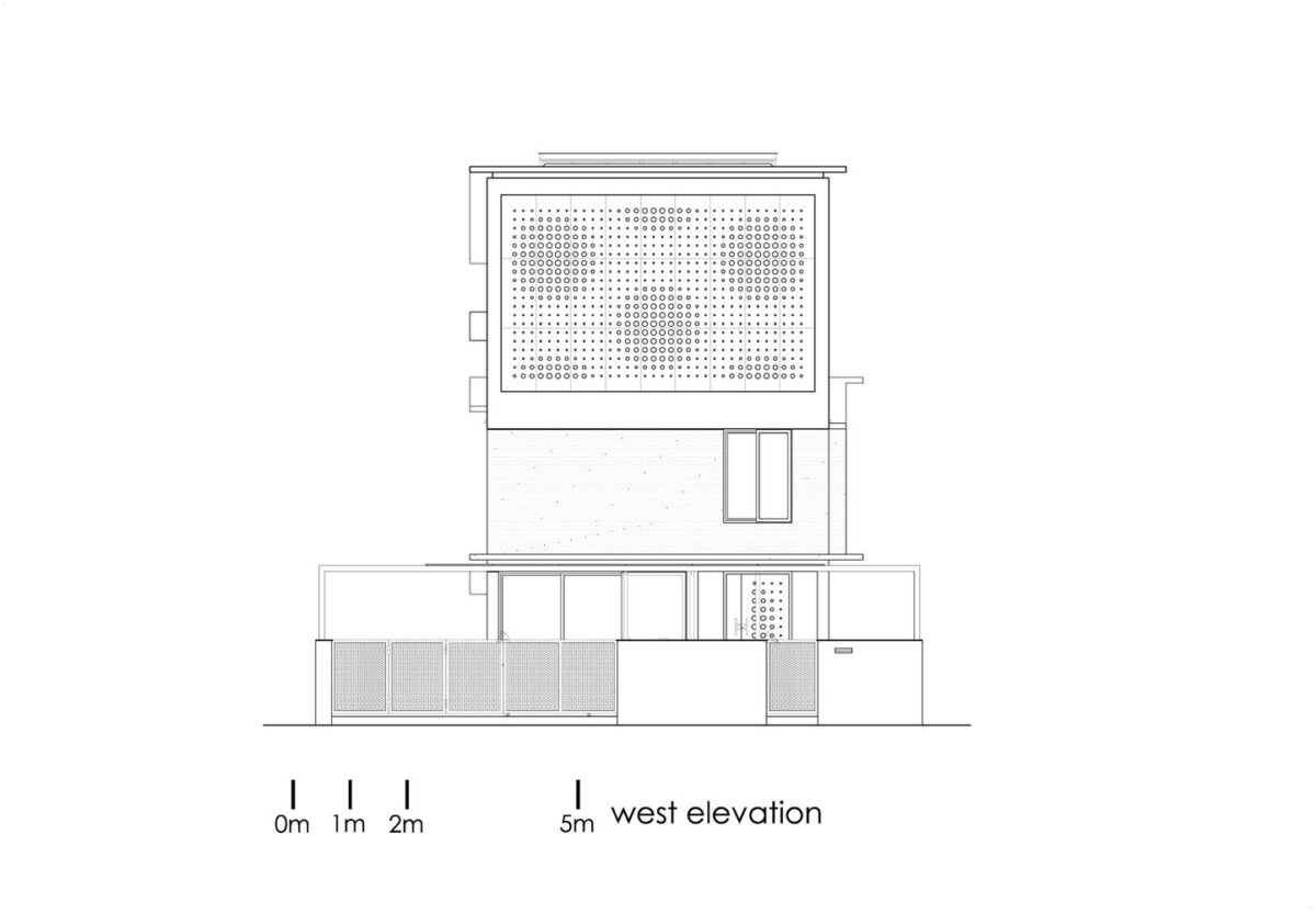
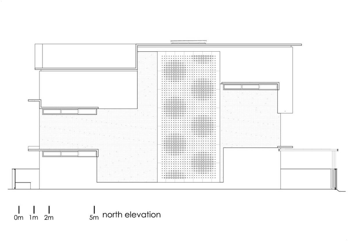
Situated on a narrow plot flanked by public roads and neighboring homes on all sides, this residence would have languished in such a constricted space – but LIJO.RENY.architects had a creative plan to break down boundaries in a beautiful way. The structure consists of two volumes that flank an incredible atrium with towering plants reaching toward its three-story apex. The windows and atrium are clad with secure steel panels, their varied perforations allowing fresh air to circulate throughout the building. But just wait until you see the interior design! This home unifies aesthetics and function with an emphasis on quality of life.
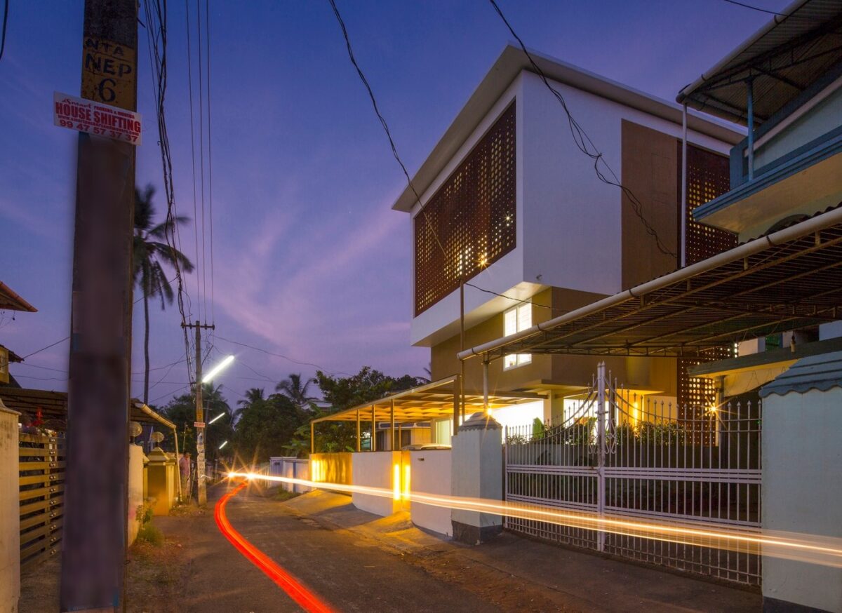
Beyond these white walls, the home interior spans 2,200 square feet including the gorgeous atrium area.
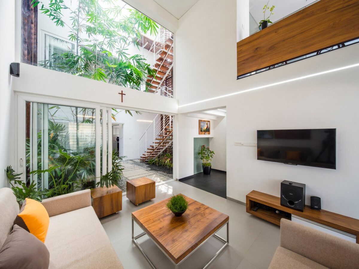
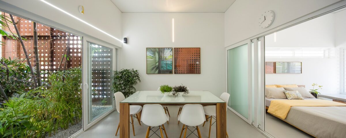
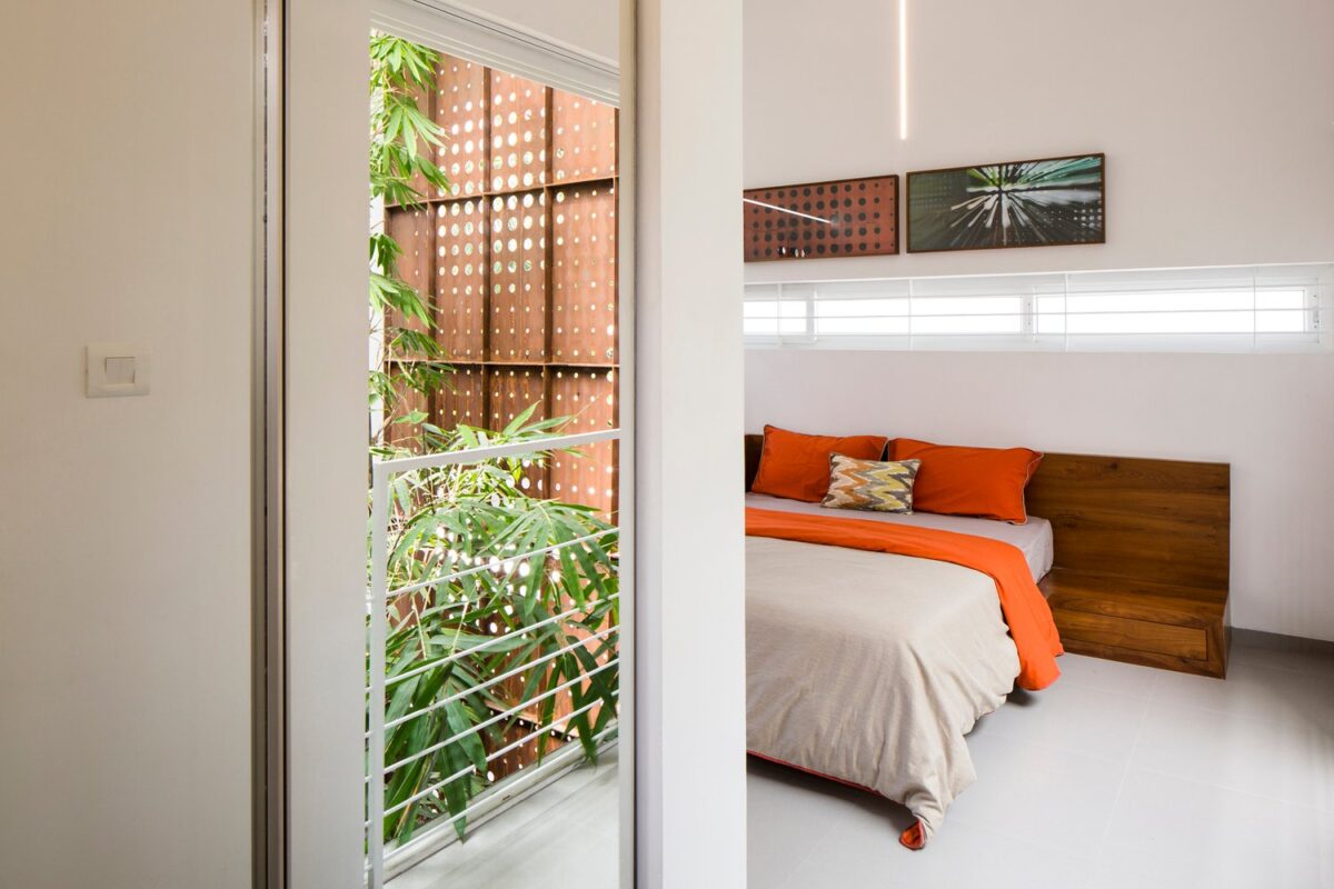
Inside, each room enjoys a constant connection with the outdoors. Spaces facing the garden enjoy the freedom of sliding doors.
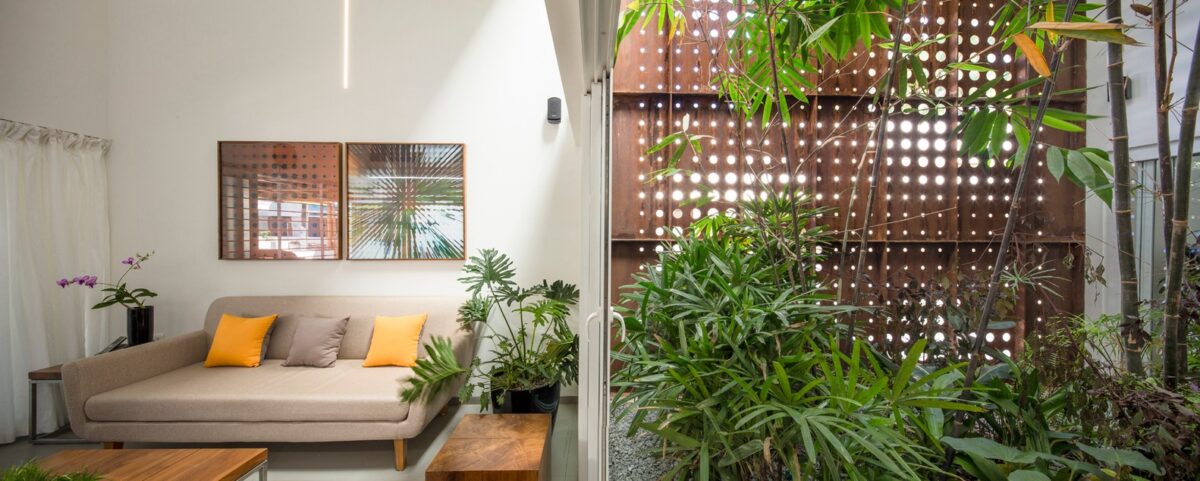
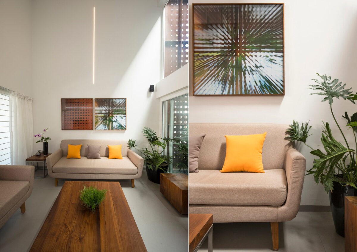
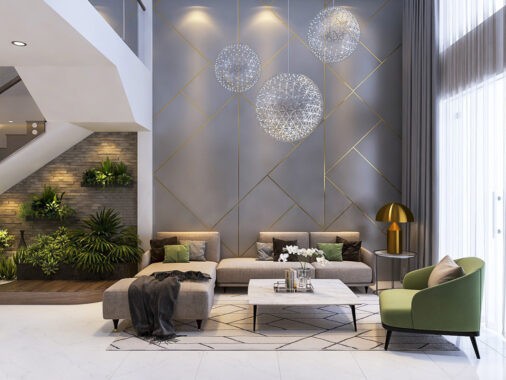
Modern furniture demonstrates a sense of orderliness that differentiates the interior from the central atrium, but the potted indoor plants reinforce the connection to the outdoors.

While the smaller volume contains the living room, a short walk across the garden path leads to the larger structure that contains the dining room, kitchen, and the majority of the bedrooms.
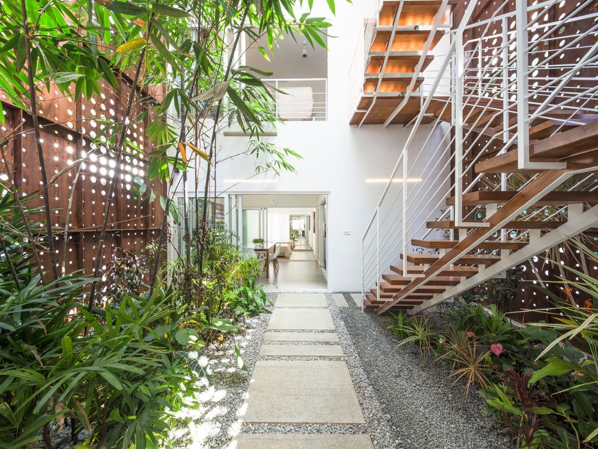
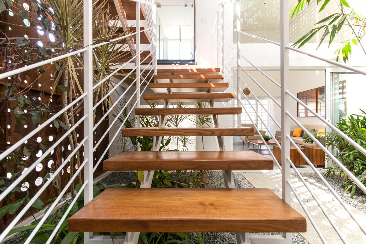
Diagonal banisters crisscross as the staircase ascends, mimicking the complexity of the plants that surround. A short walk across the paving stones leads to the dining room.
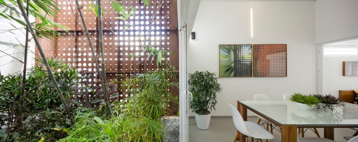
The dining room, like many of the functional areas in the home, borders the interior atrium directly.
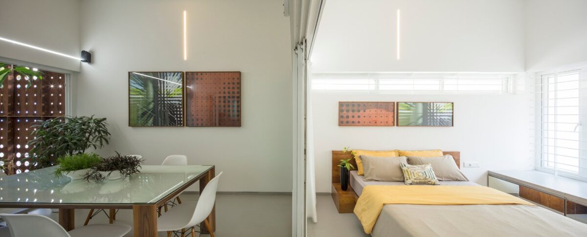
Private areas enjoy the lower-trafficked positions bordering the street-facing parts of the building.
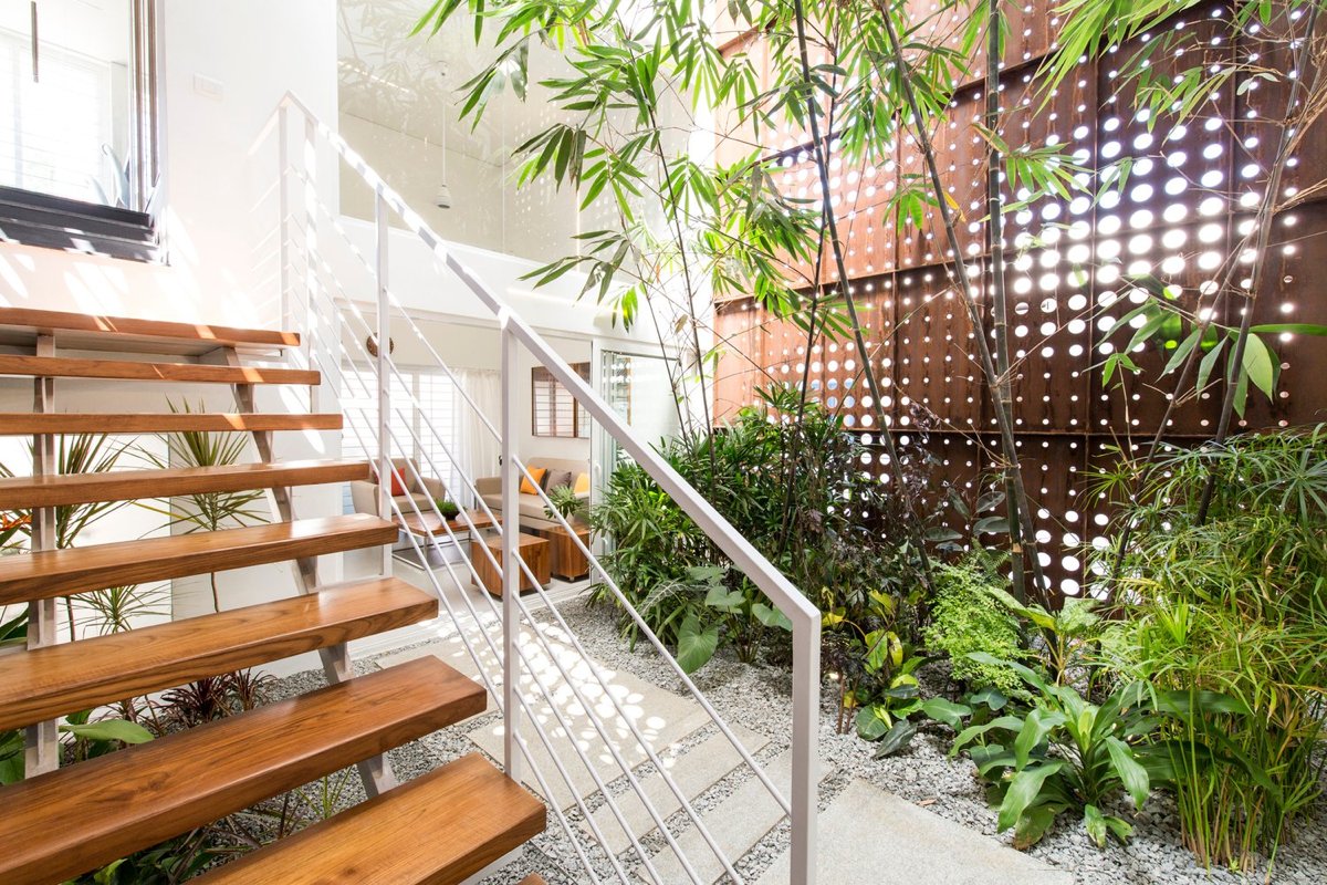
Going to the second level requires entering back into the garden and ascending the gorgeous wooden staircase.
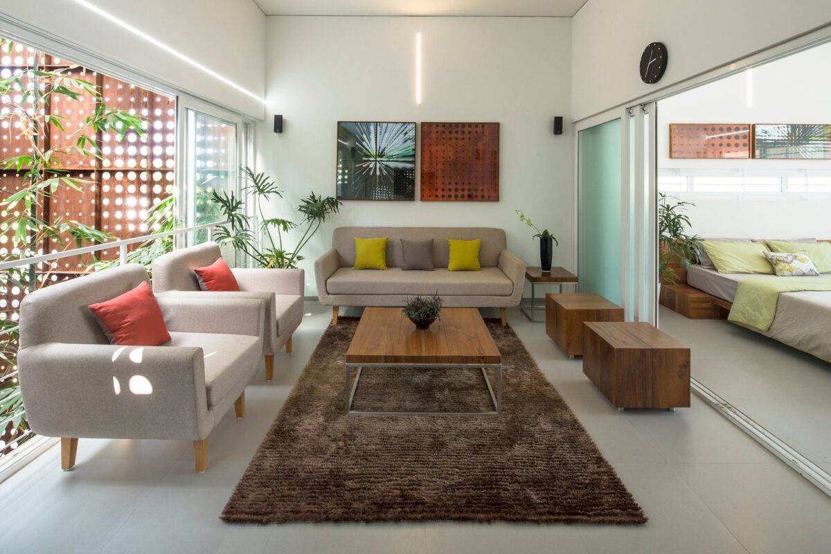
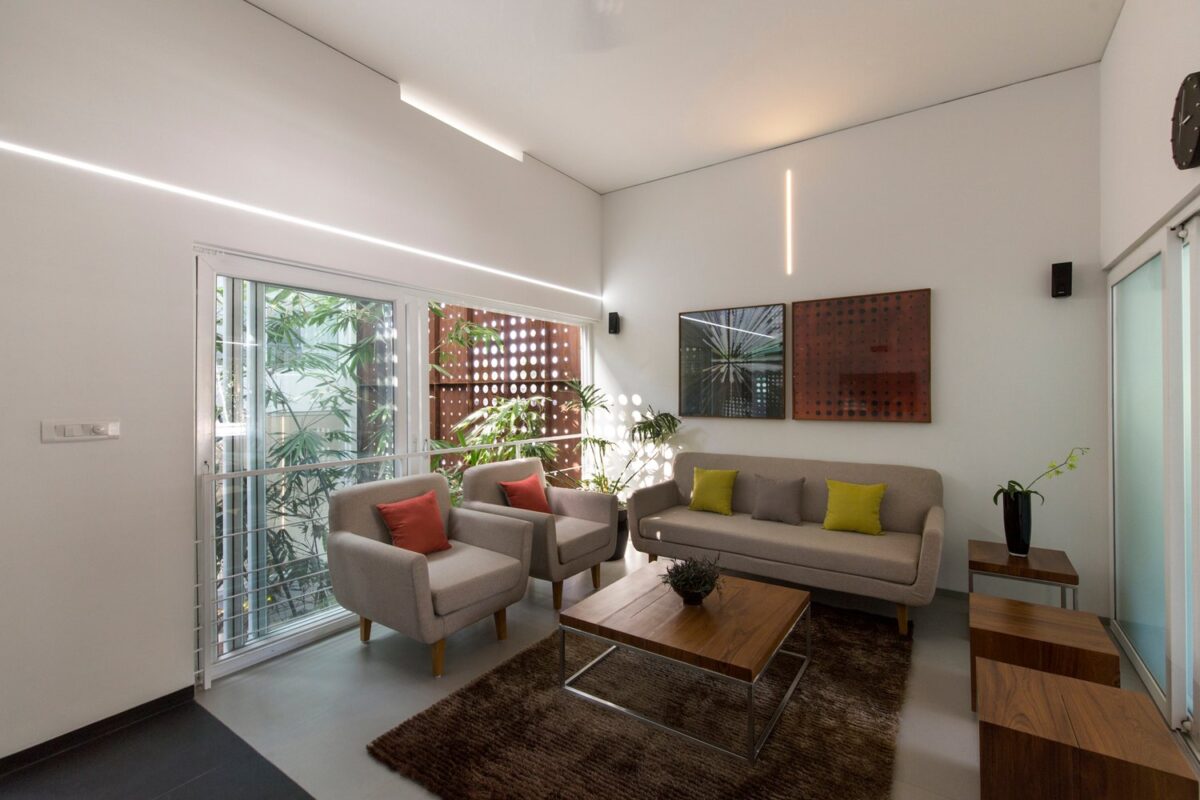
Ascending the stairs toward the larger volume leads visitors to a secondary living room with accents in tropical red, lime green, and rich wood tones.
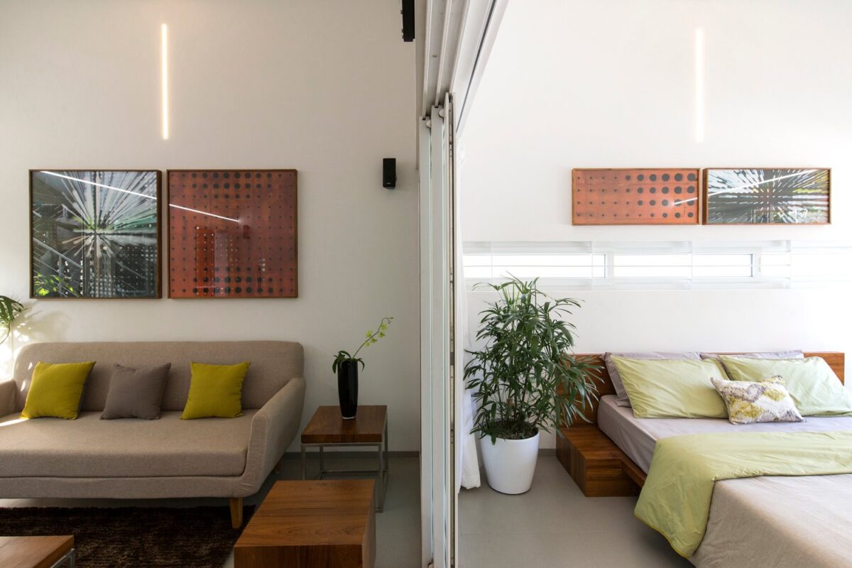
Recurring artwork captures texture of the perforated screens and the effect of the light as it filters through.
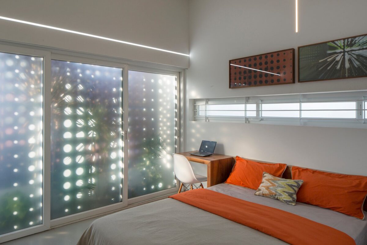
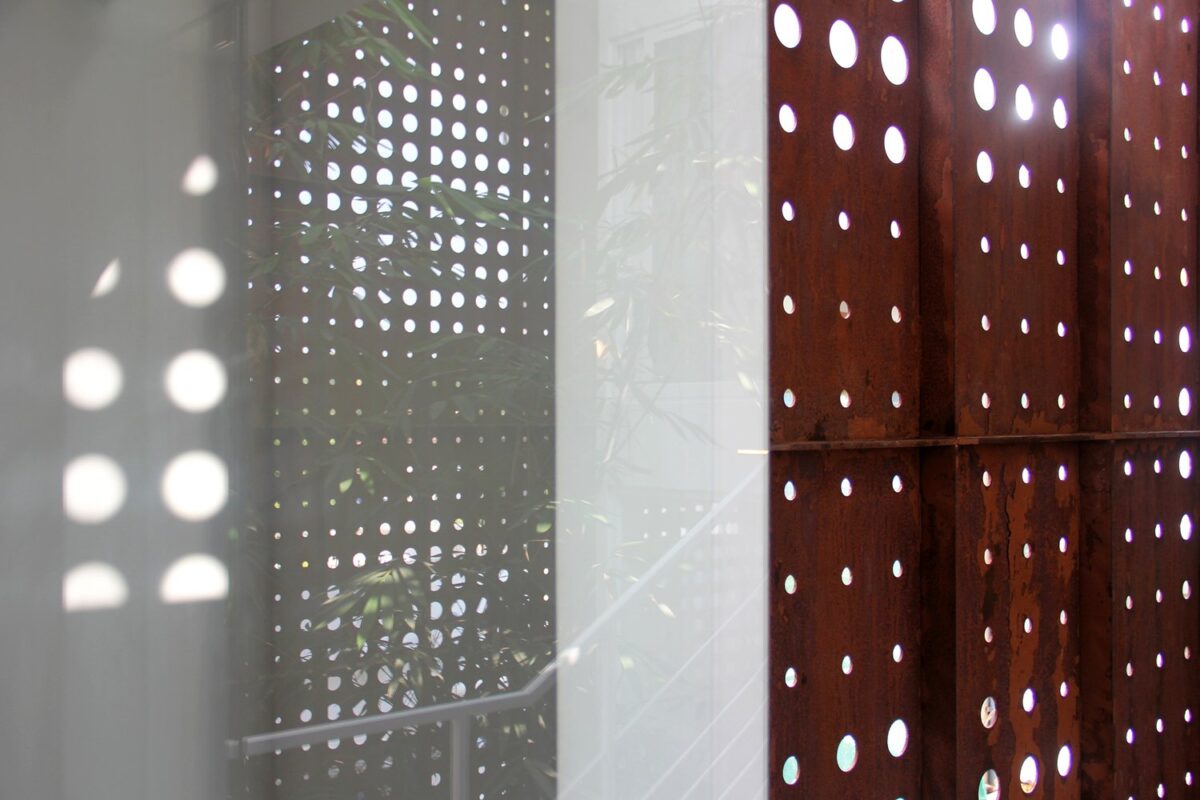
Through frosted windows, pinpoints of light create a dazzling "breathing" effect as the trees sway in the breeze.
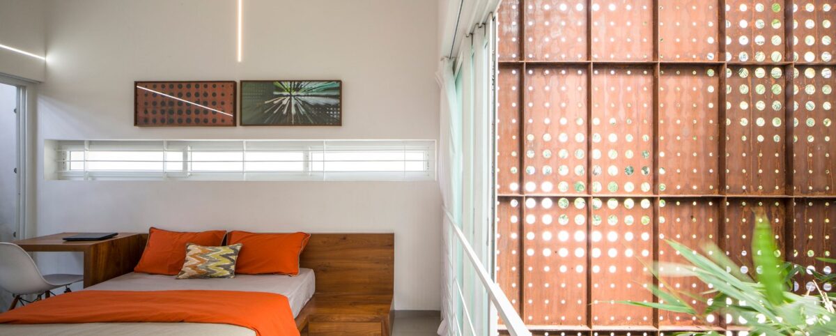
This is a great chance to point out that barred windows don't have to look intimidating. This grille enjoys a casual aesthetic with its low-profile design and fresh white paint.
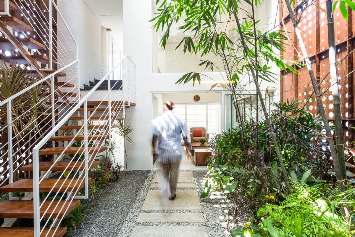
In this home, simply traveling from one room to the next is an experience that brings the residents closer to nature.
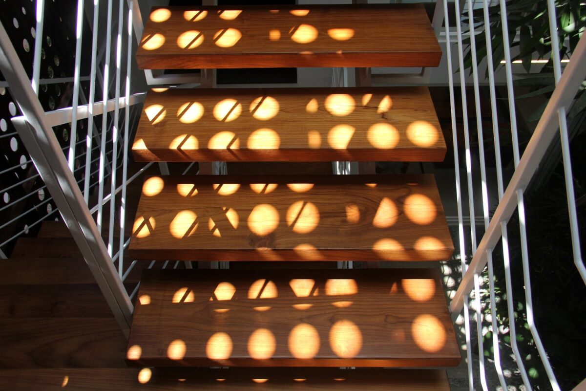
As the sun shifts throughout the day, the beams of sunlight paint different parts of the home for an aesthetic that constantly reinvents itself.
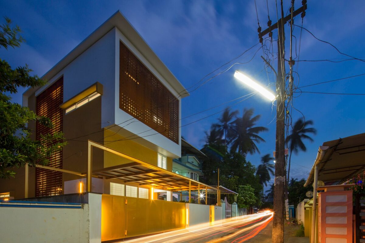
At night, the glow through the perforated screens creates an effect similar to the look of dappled sunlight filtering through the palms.
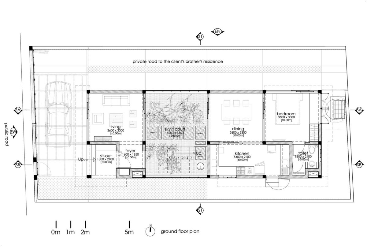
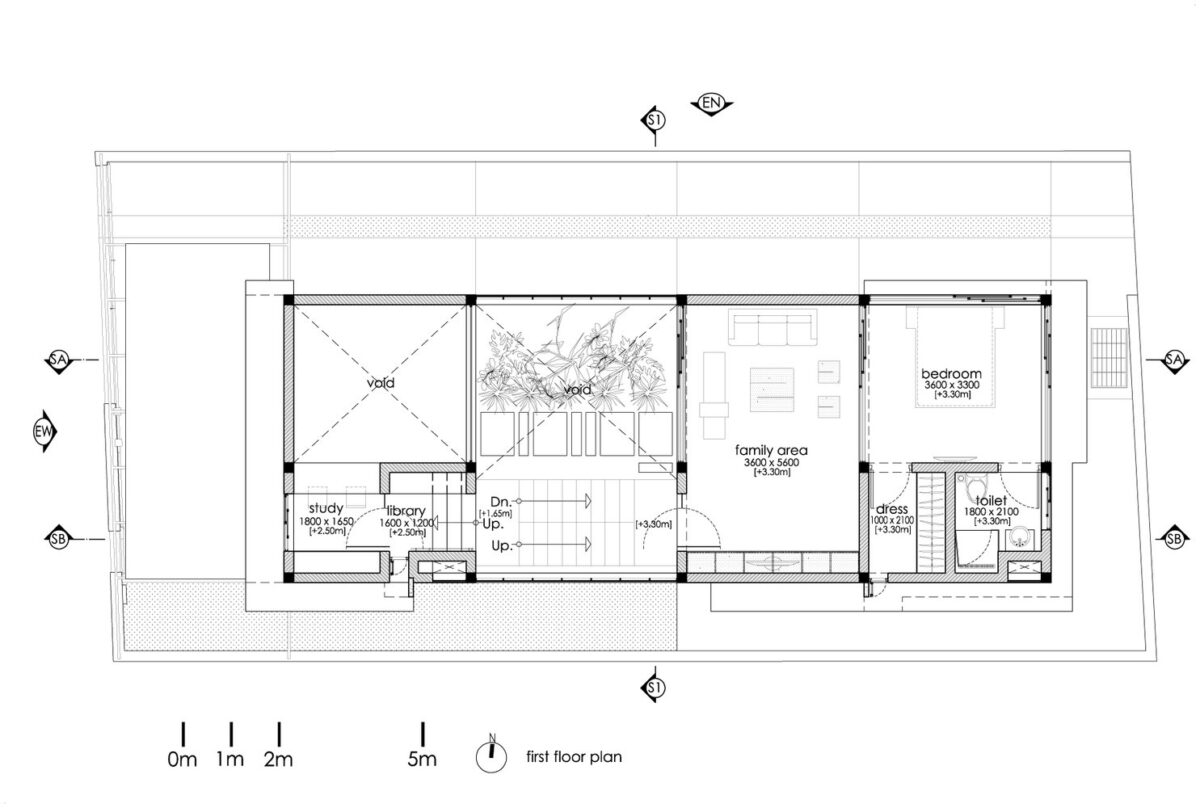
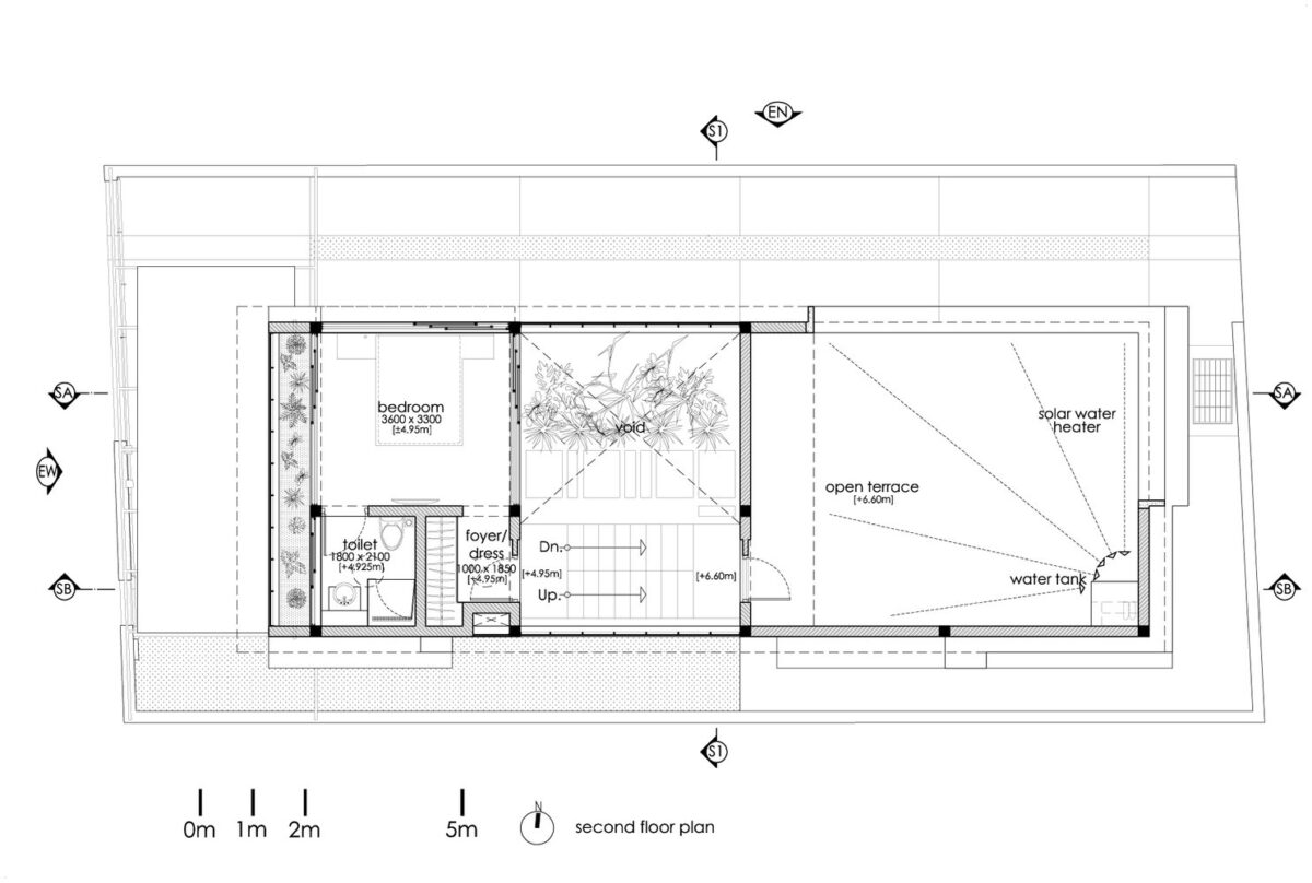
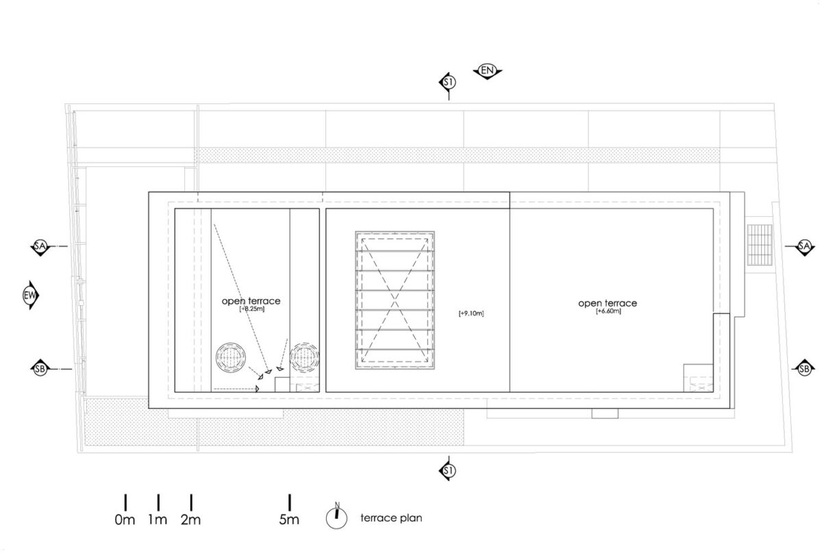
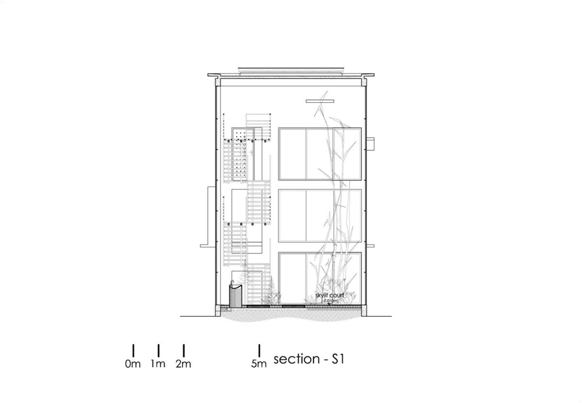
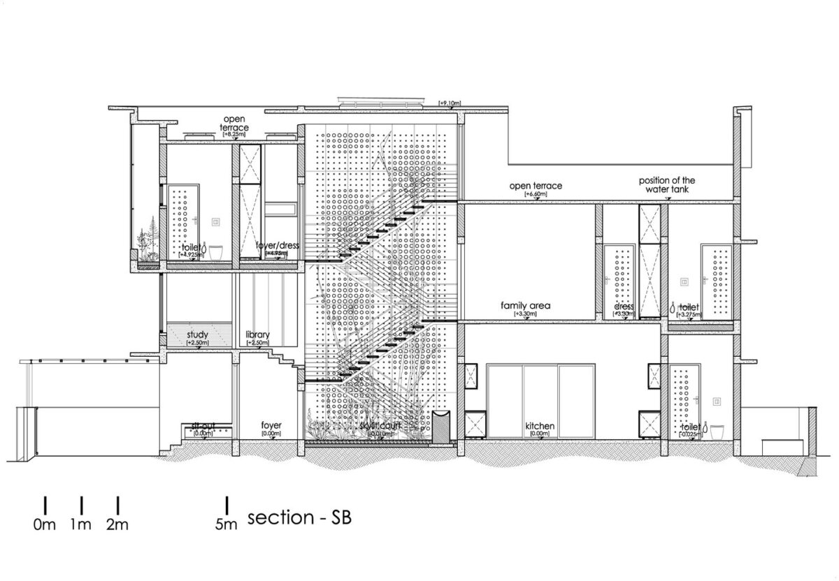
Now for a look at the bones of the building – it's always nice to see how each space interacts in context. Guests can experience the atrium on their way to the dining room while the kitchen and bedroom remain private.
