This fresh modern home is the work of the interior design superstars at Polish creative agency PLASTERLINA. The project, titled U.S.S. Home, is an exciting concept for a housing project based in Kraków. The interior makes fantastic use of smooth white surfaces and matte black paneling, its contrast softened by the addition of wood elements and brilliant turquoise tones. Its furniture gains its character through a sense of natural simplicity – yet the result looks bold as can be. Looking for a way to explore an adventurous decor theme without going over the top? The U.S.S. Home definitely has plenty of inspiration to offer.
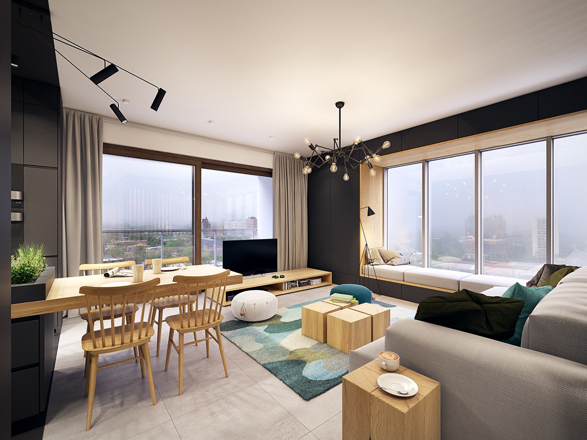
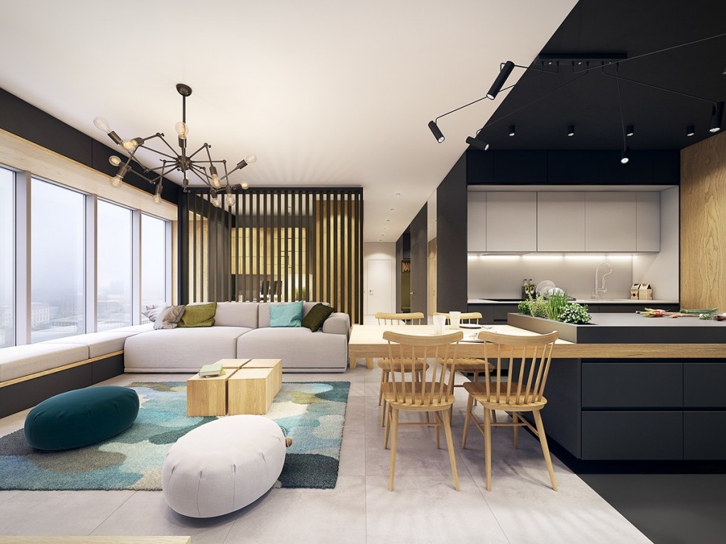
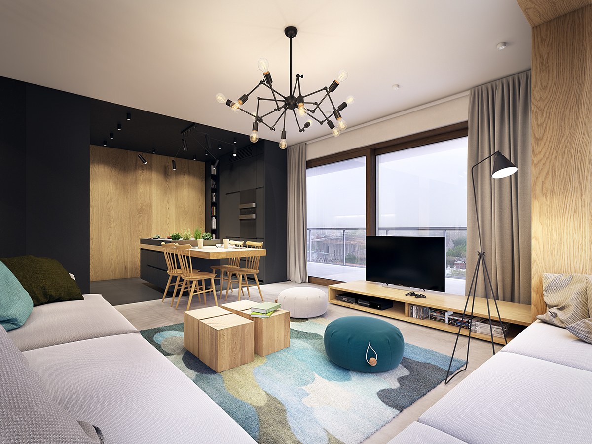
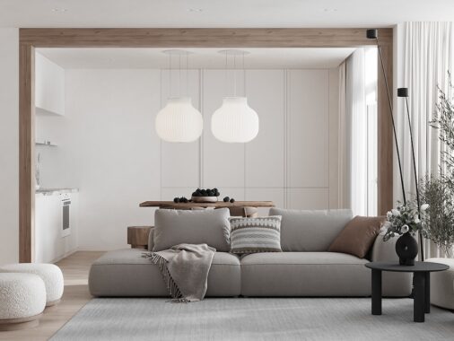
The living room makes an immediate impression with a playful vibe brought to life with colorful accessories, fun poufs, and a modular coffee table set. Its layout is open and free yet divided in a practical way.
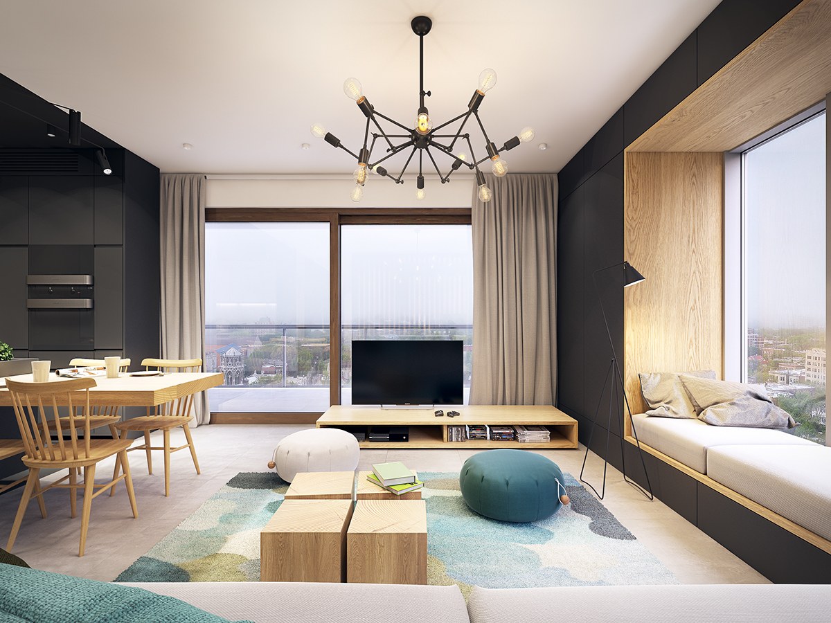
Turquoise hues play an important role throughout the home. The rug is the most obvious example – it even includes the copper and green accents found in especially beautiful samples of the natural stone.
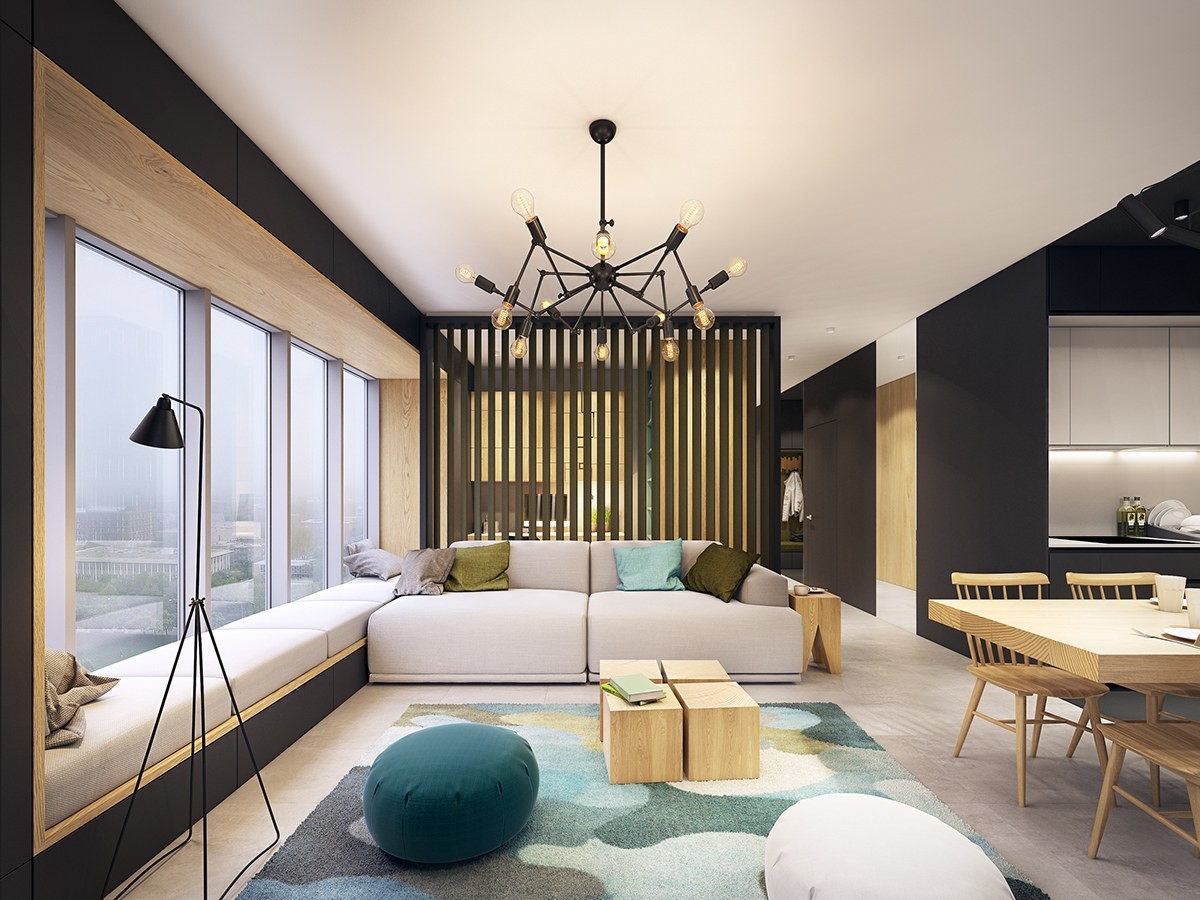
Impossible to overlook, the modern chandelier serves as an energetic focal point. Designed by Seyhan Özdemir and Sefer Caglar in 2005, this fixture is becoming quite an iconic piece.
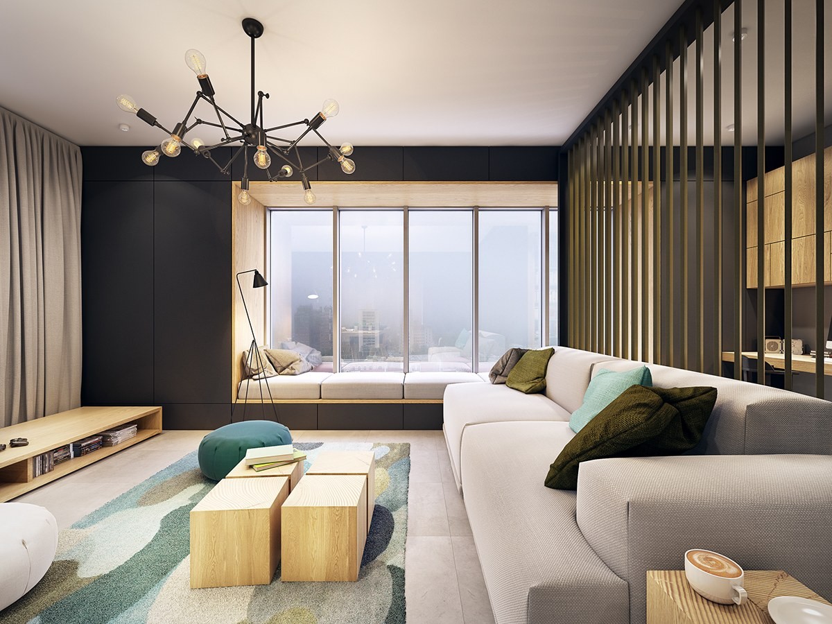
Also very creative, the bench seating near the window occupies a recess framed by ample storage hidden in matte black drawers and cabinets.
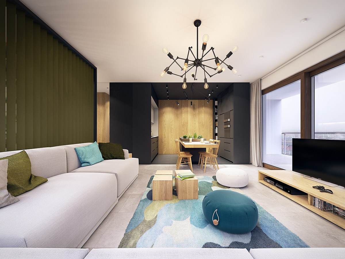
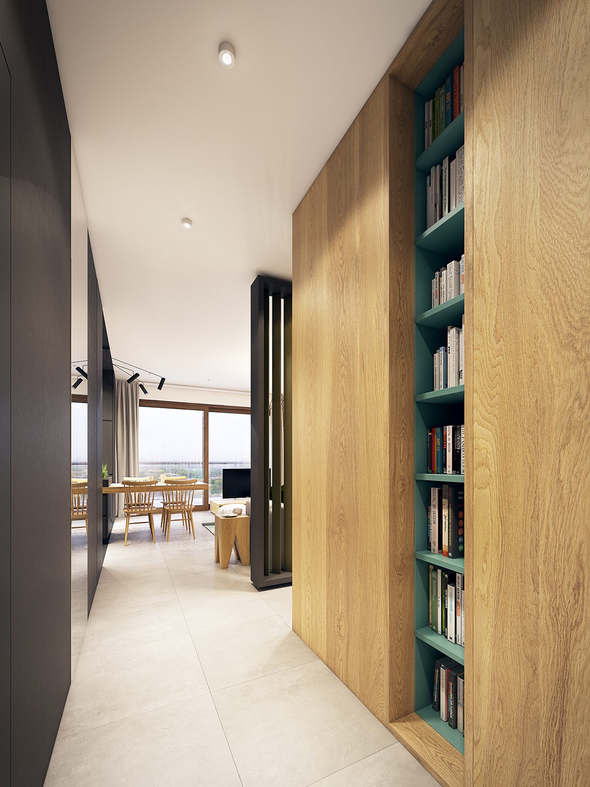
Olive green accents continue throughout the divider wall, throw pillows, and the kitchen herb garden.
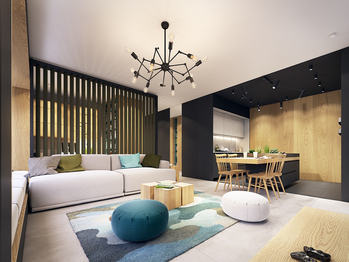
Did you notice the office peeking out through the green divider? We'll examine that space in detail a little later in the tour.
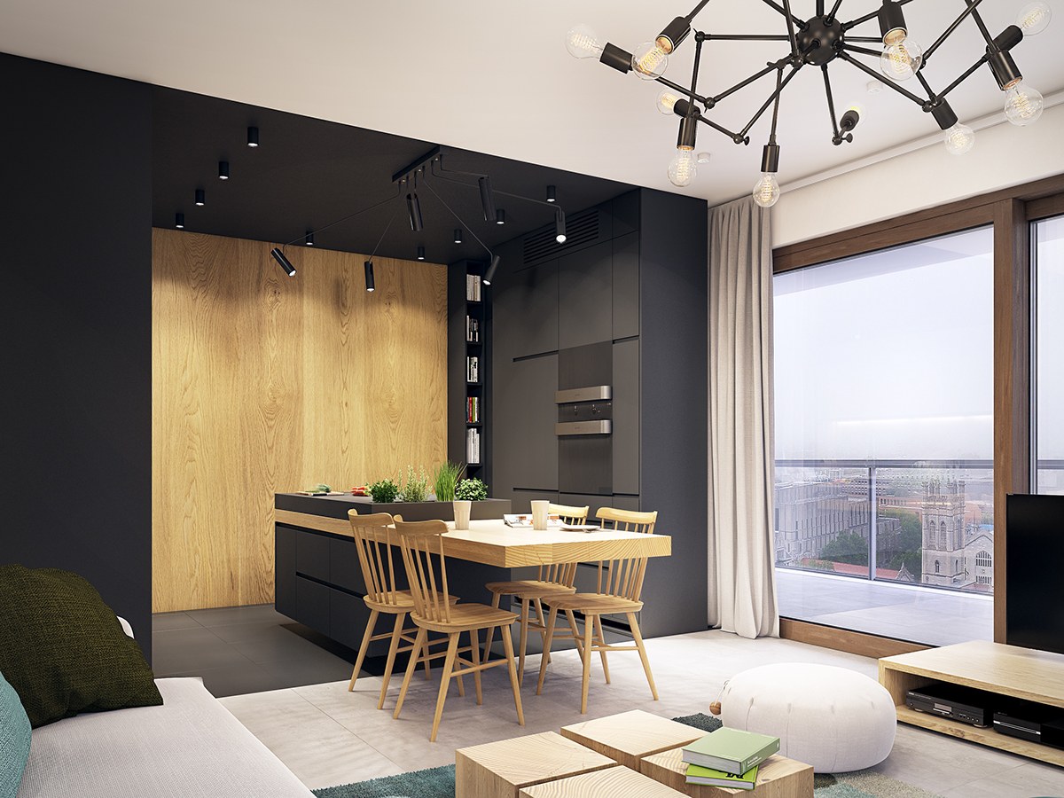
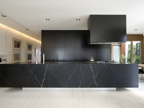
Framed in black, the kitchen almost seems to have a stage-like quality that firmly draws the eye toward it.
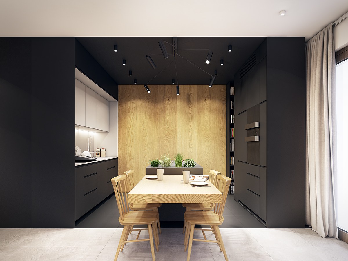
aren't exactly commonplace – at least, most homeowners opt for a bright place to cook when given the choice. But because this kitchen already lacked natural sunlight, the designer chose to embrace this unique aesthetic.
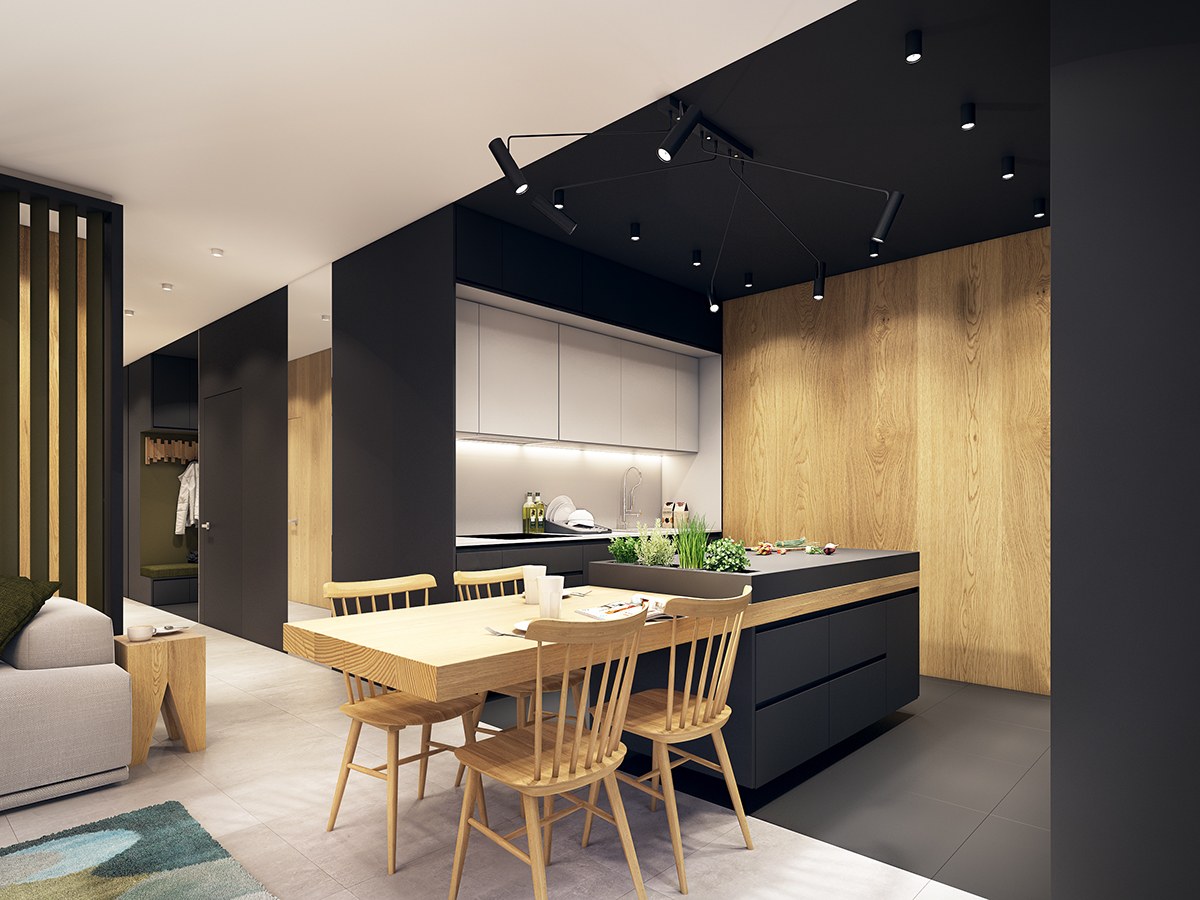
A bright white backsplash and wood accent wall stand out comparatively brighter thanks to the ample studio lighting provided.
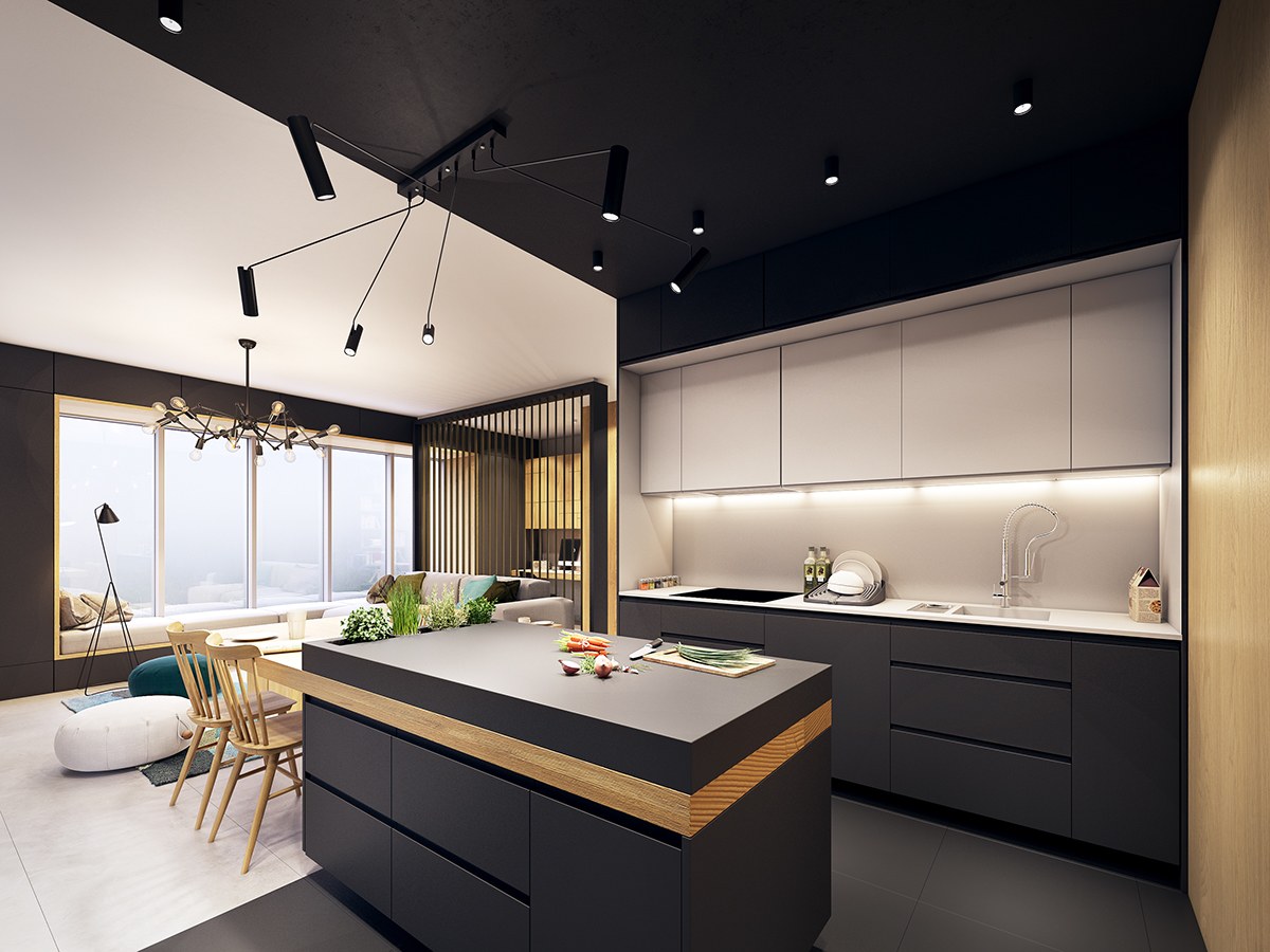
The central island also enjoys intense lighting to make up for the stylish matte black worktop. The chandelier above is adjustable, perfect for sharing light between the island and the small dining table.
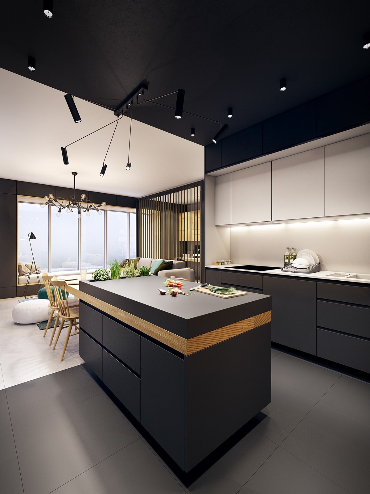
Quick shout-out to the neat topographical dish drainer in the background – it's a smart look for such a smooth and detailed space.
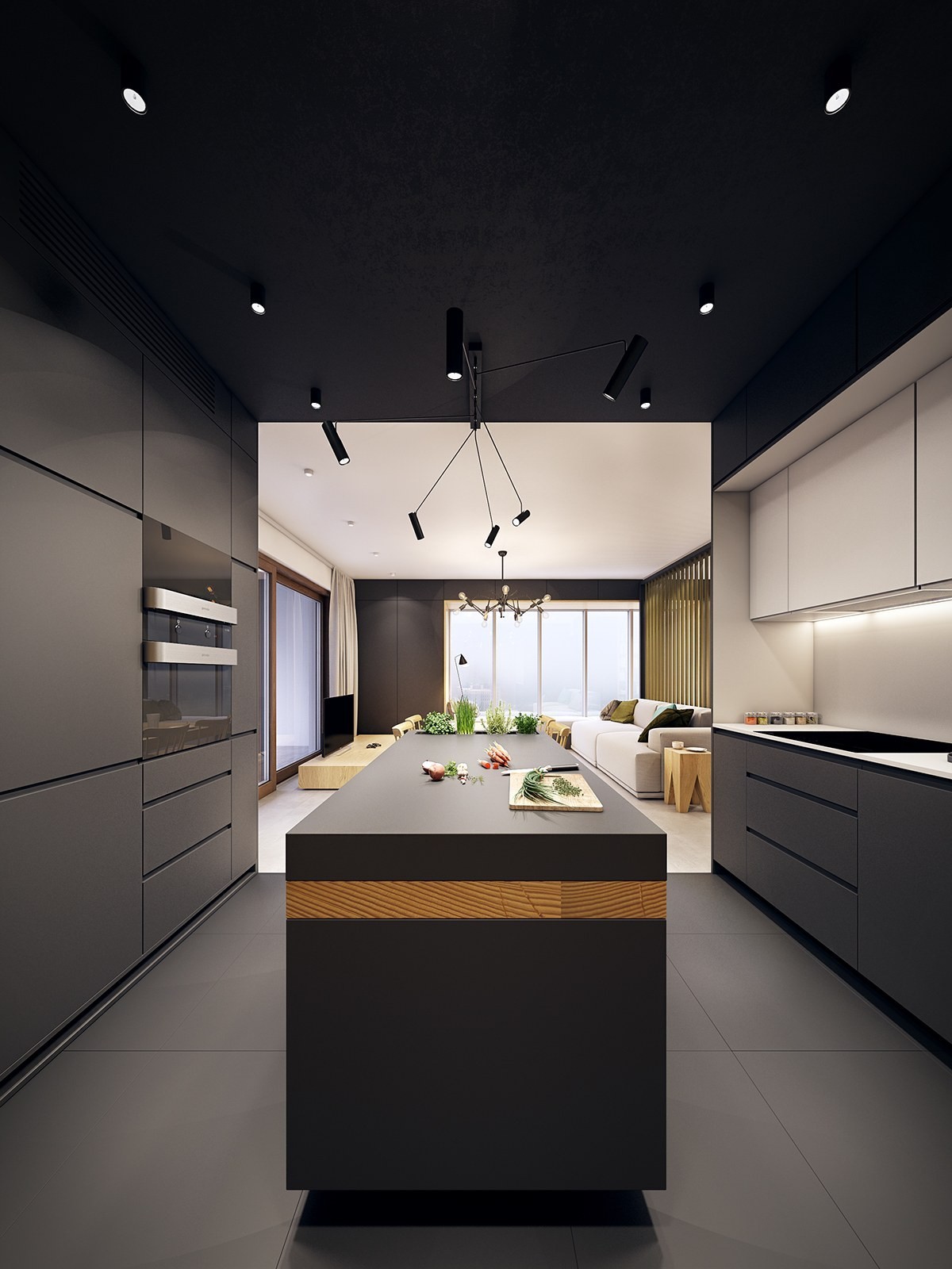
Of course, the dark colors enhance an even cooler feature – the stripe of wood that runs through the length of the island just below the worktop.
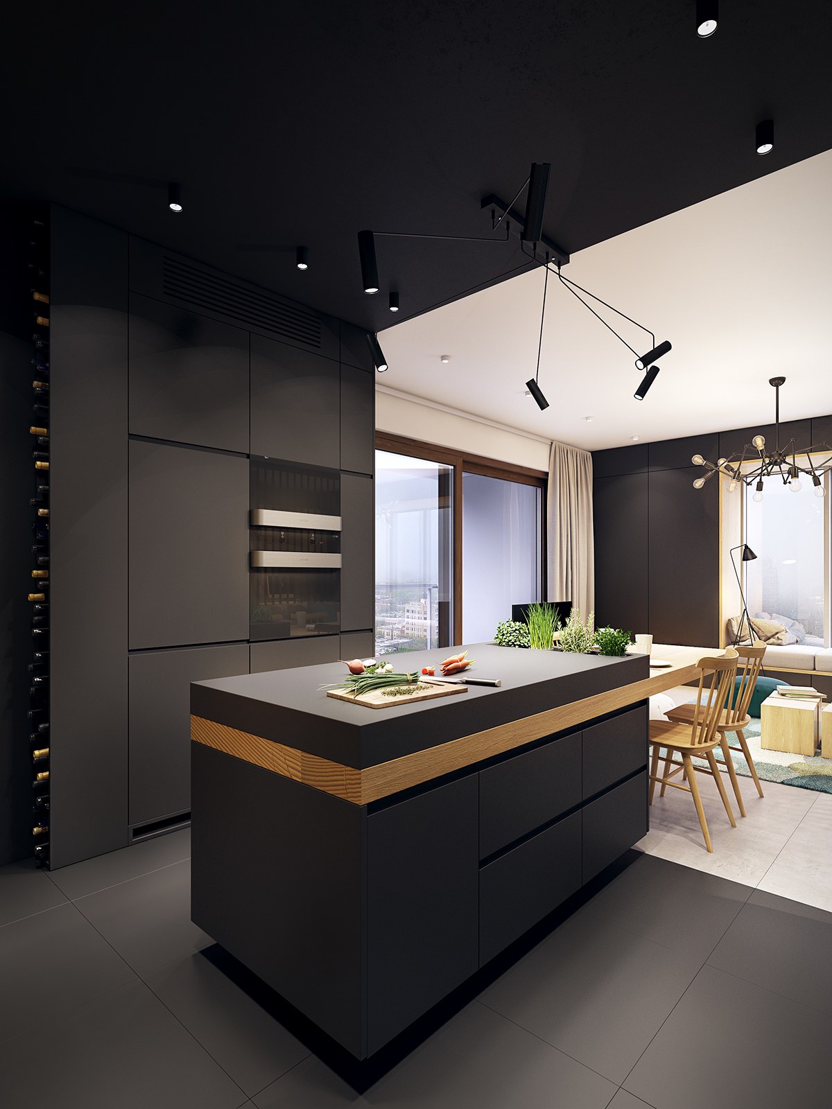
Its extension forms the body of the dining table, its cantilever construction avoiding the need for busy legs and allowing just an extra touch of space for the classic chairs.
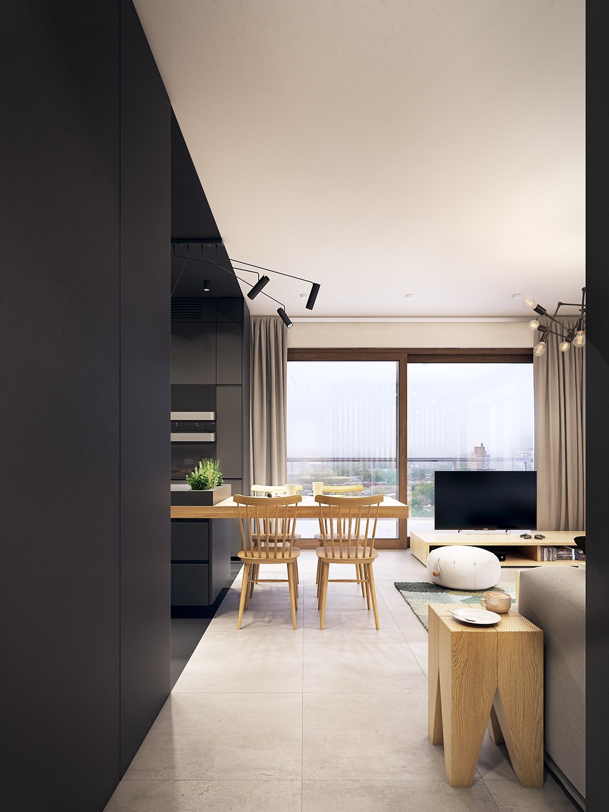
Because the dining table extends outside of the dark kitchen, it gains the advantage of a subtle distinction and division between spaces despite the physical connection between the two.
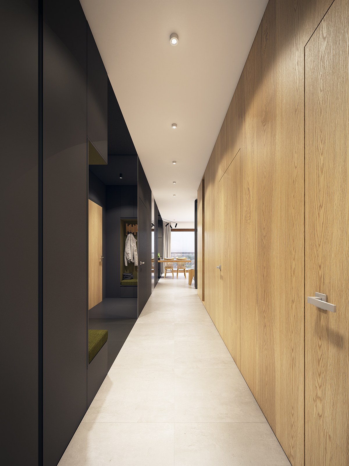
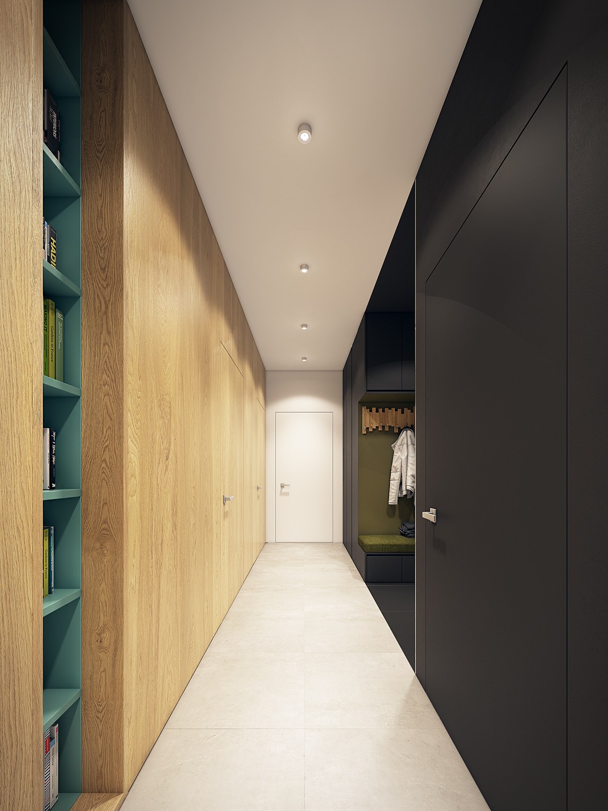
The dining table is definitely worthy of its place as the focal point at the end of the long and dualistic hallway.
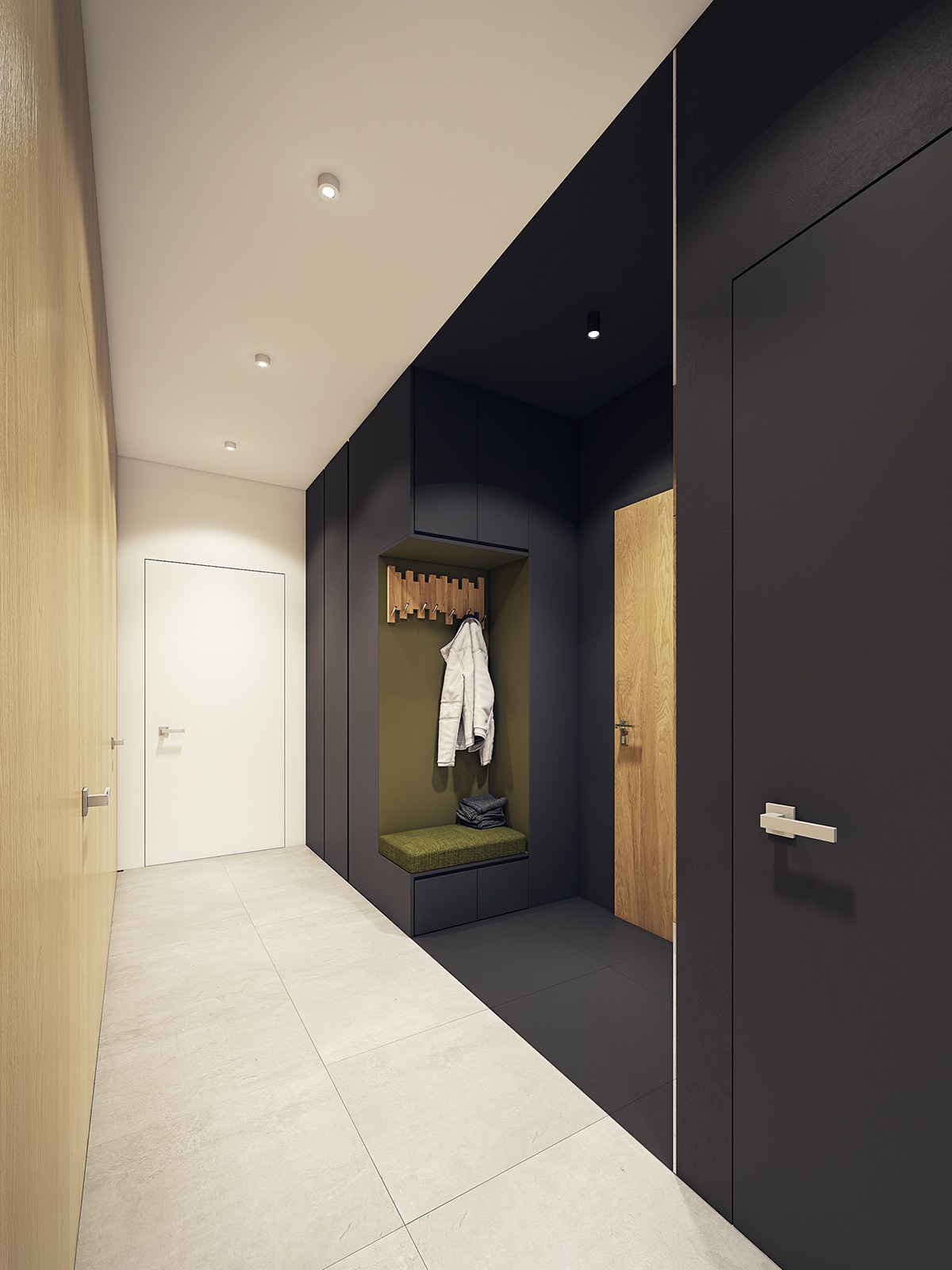
But it's not all minimalistic. A corner-cut niche provides seating near the front door, and includes a handy hangar for coats. The olive green accent color definitely adds to the personality of the space.
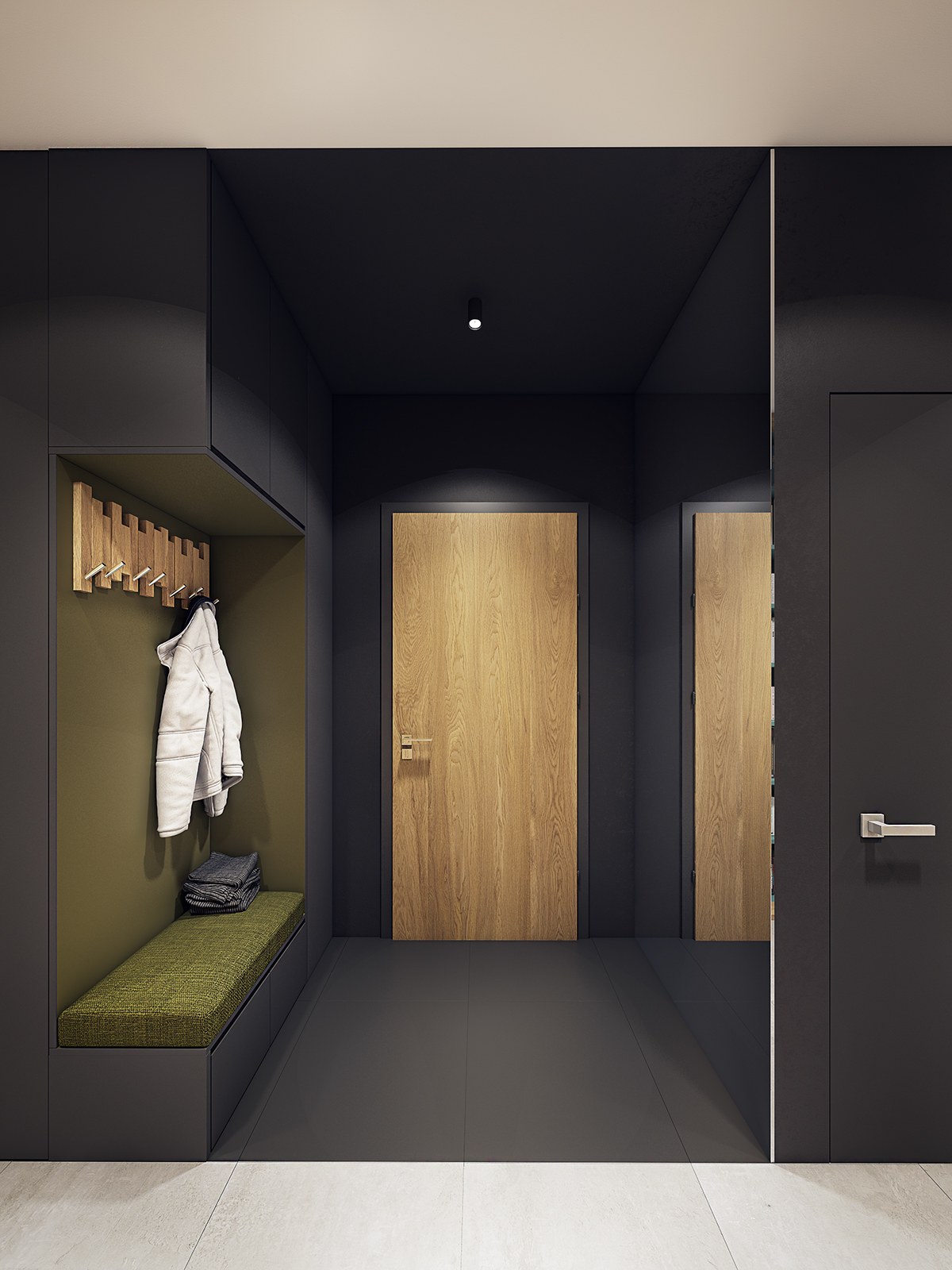
Like the kitchen, the entryway also makes fantastic use of black surfaces to create a sense of division without actually enclosing the space with walls or other physical barriers.
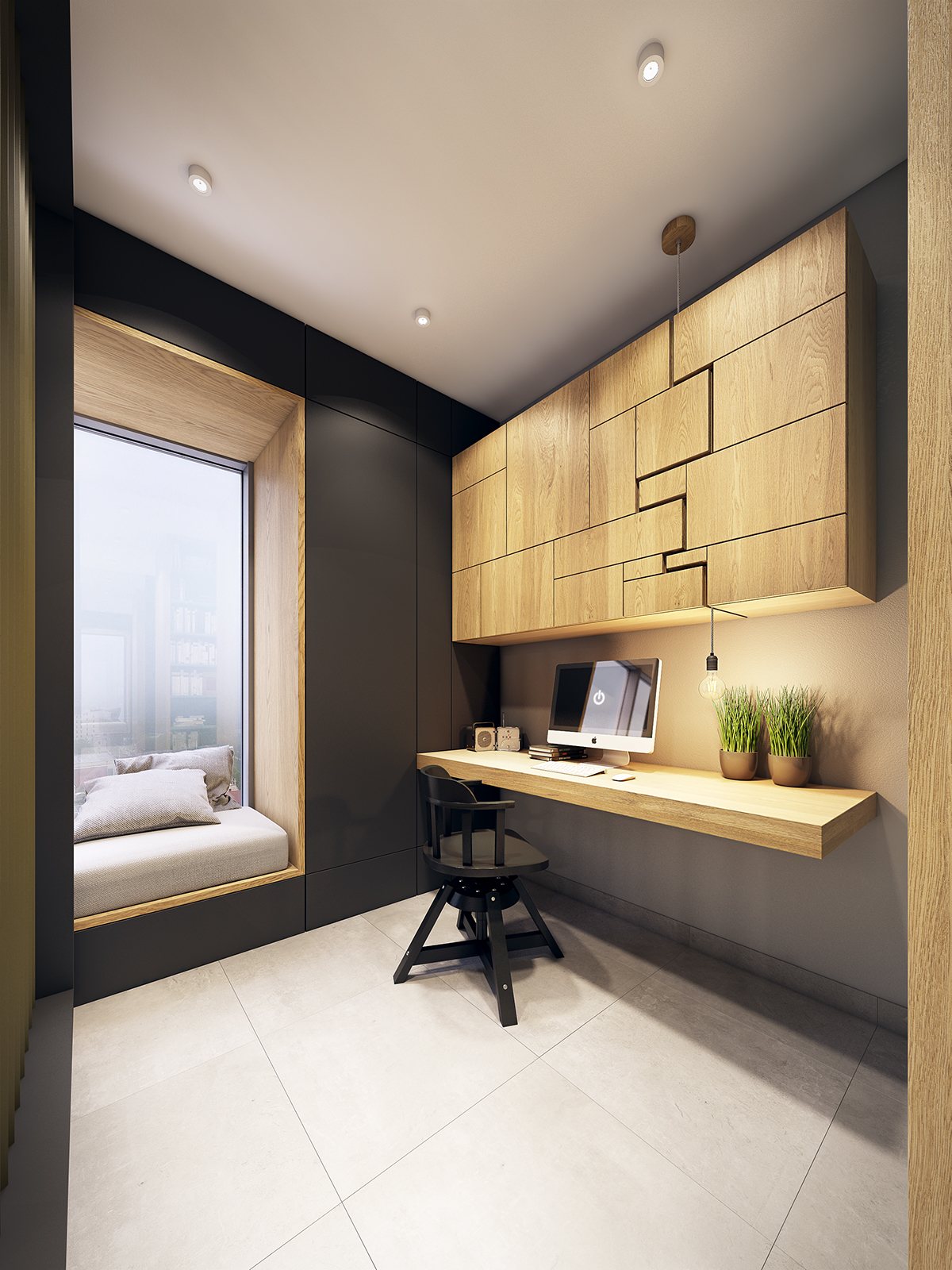
Doesn't this office look dreamy? A window seat gives the resident a nice place to sit down and relax for small breaks at work.
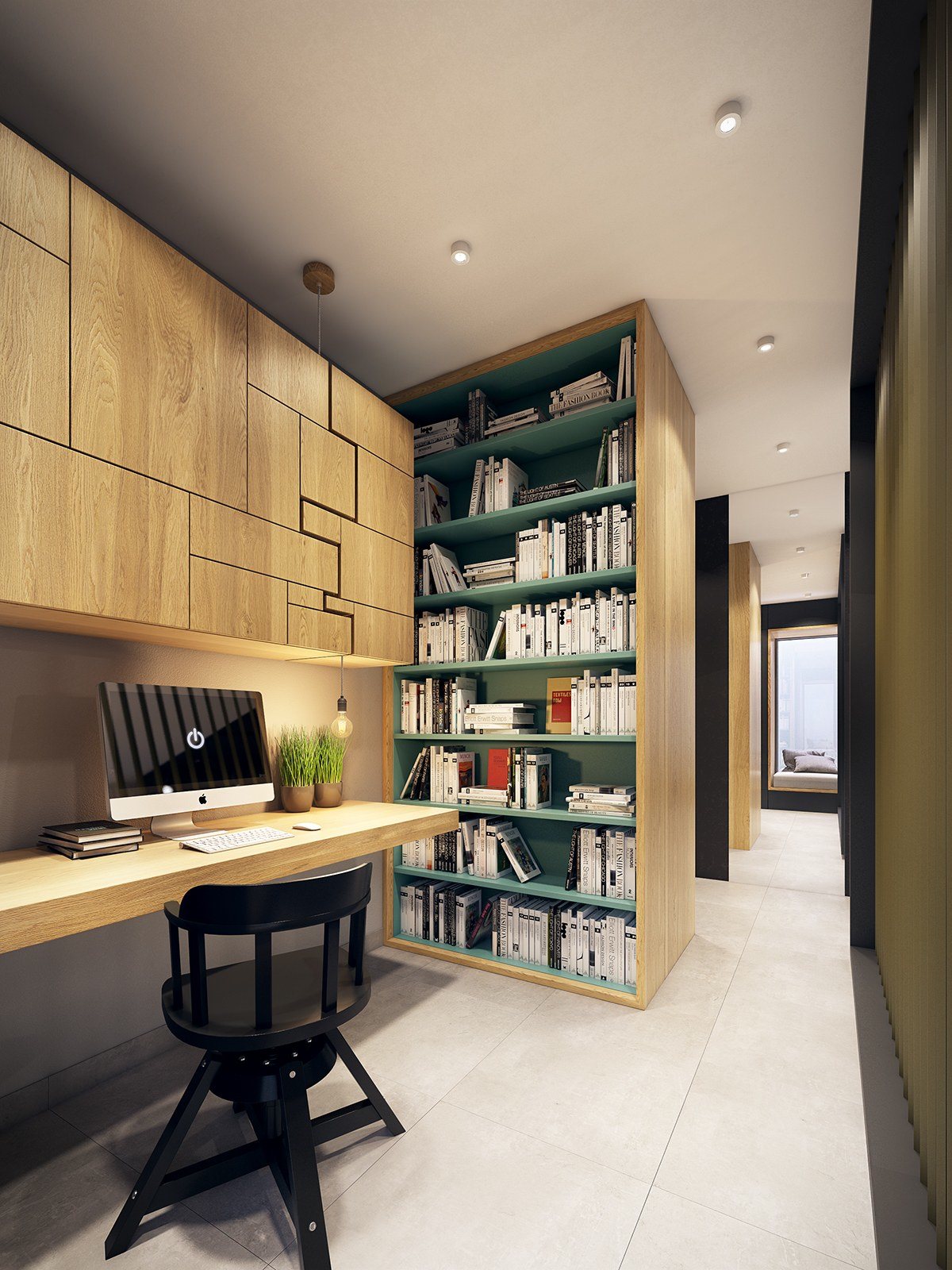
Blue shelving and potted plants add a dash of color and charm, welcoming creative energy into the room.
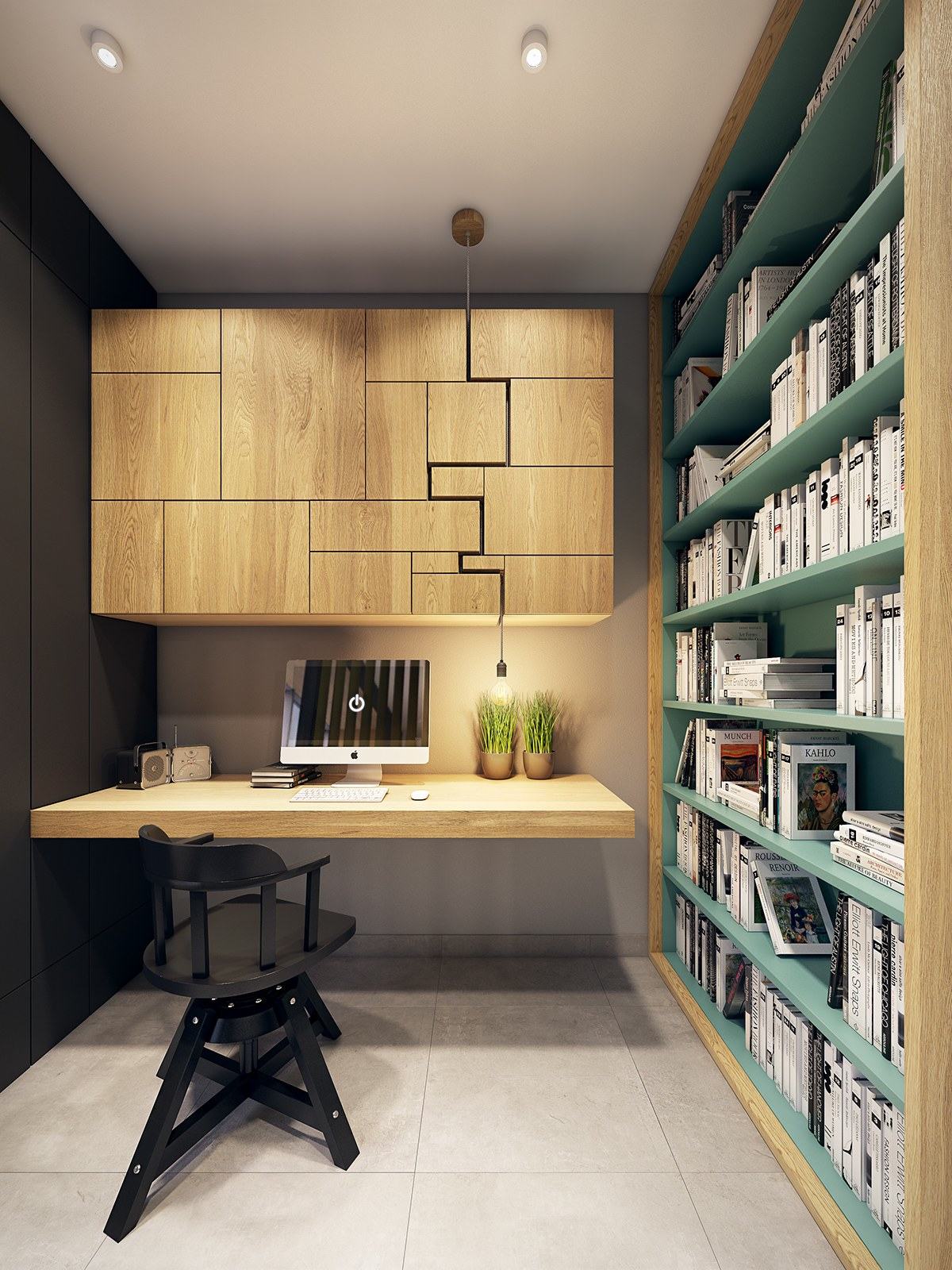
But perhaps the most striking and hard-to-recreate feature is the desk lighting – its cord begins at the ceiling and snakes its way through an eye-catching gap in the cabinetry.
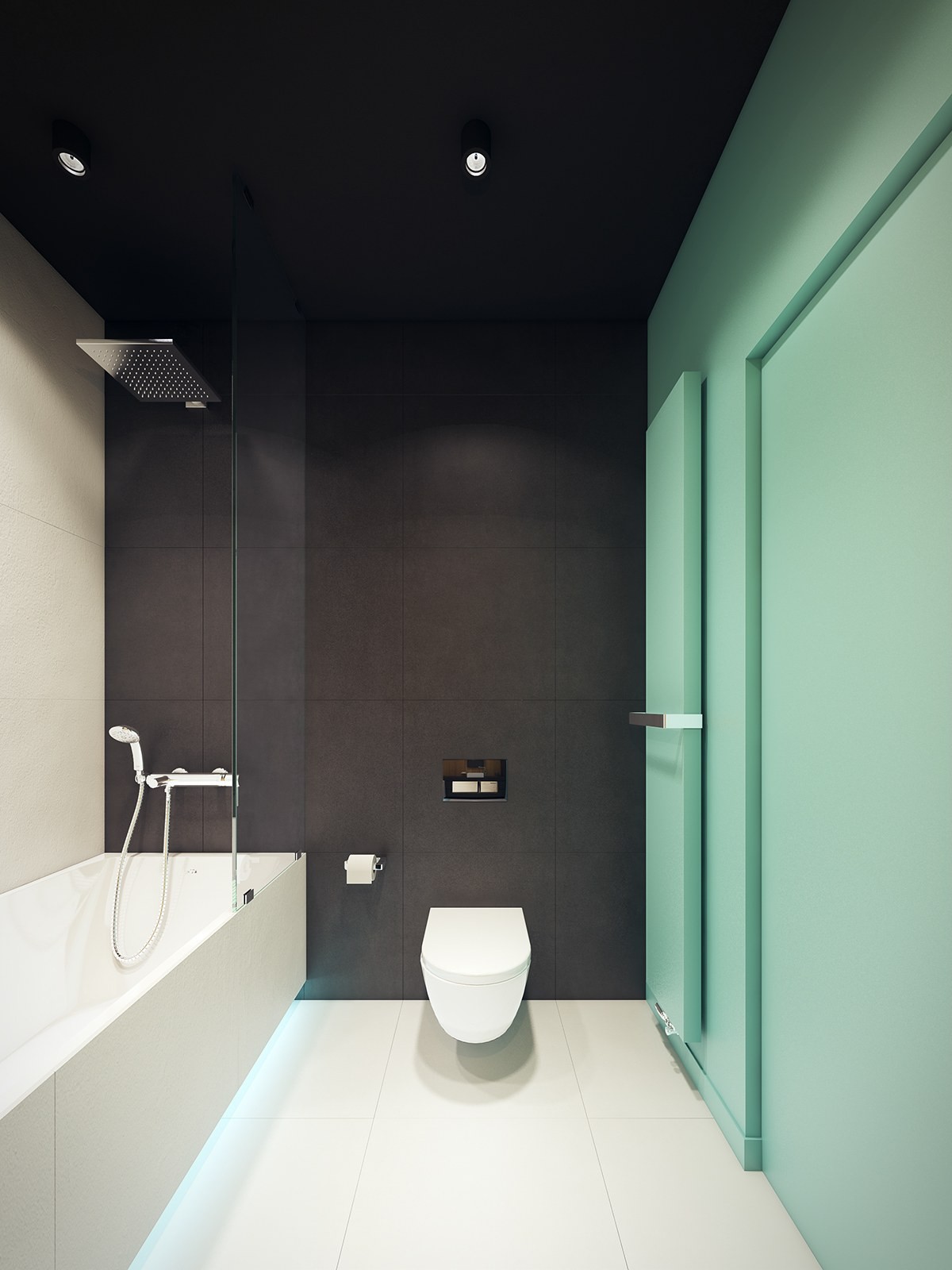
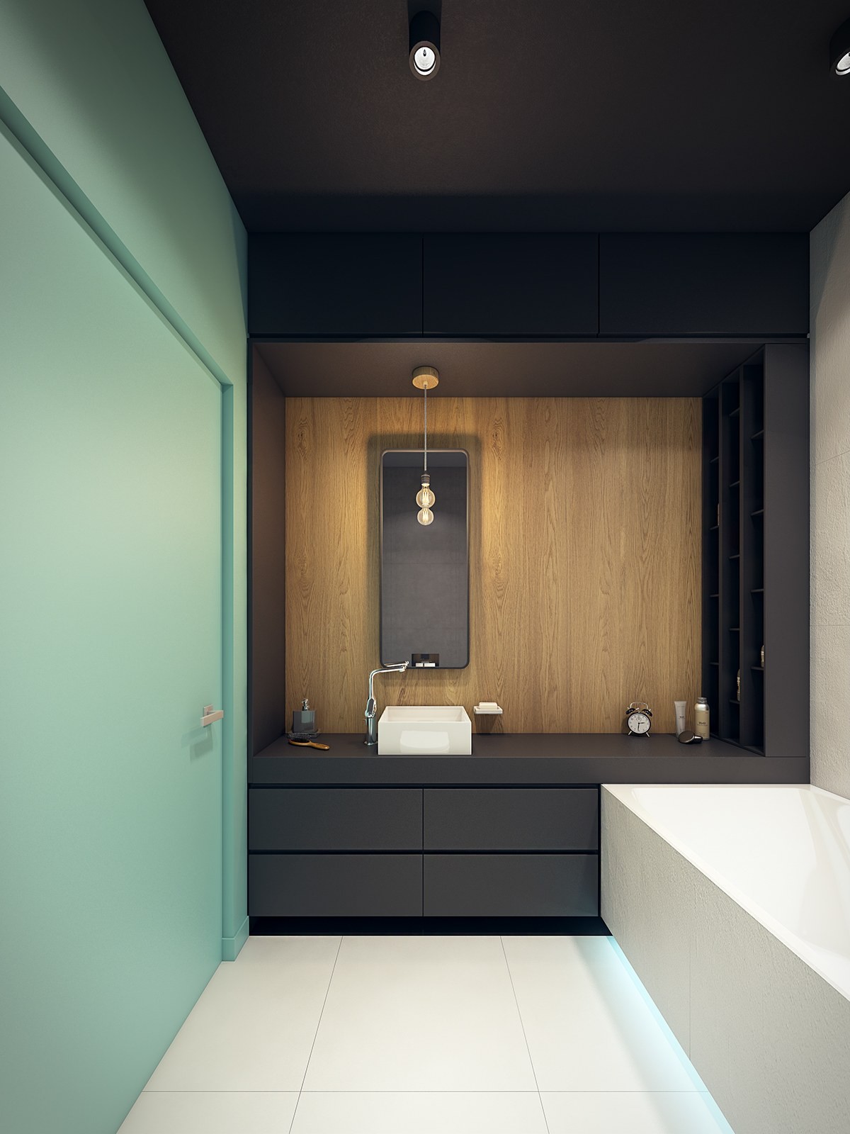
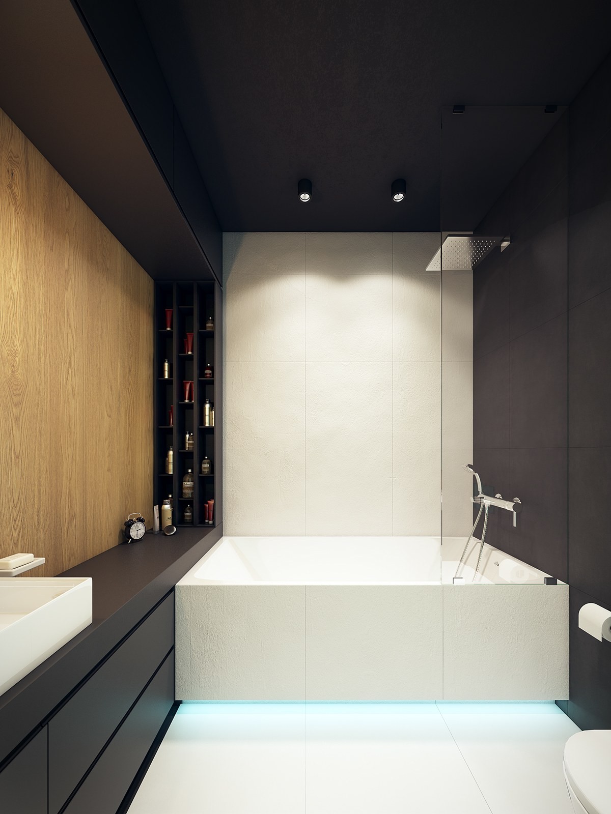
Additional blue accents energize the bathroom. The bold interplay between matte black tiles, clean white surfaces, and an adventurous color accent wall contribute to a sharp and clean atmosphere.
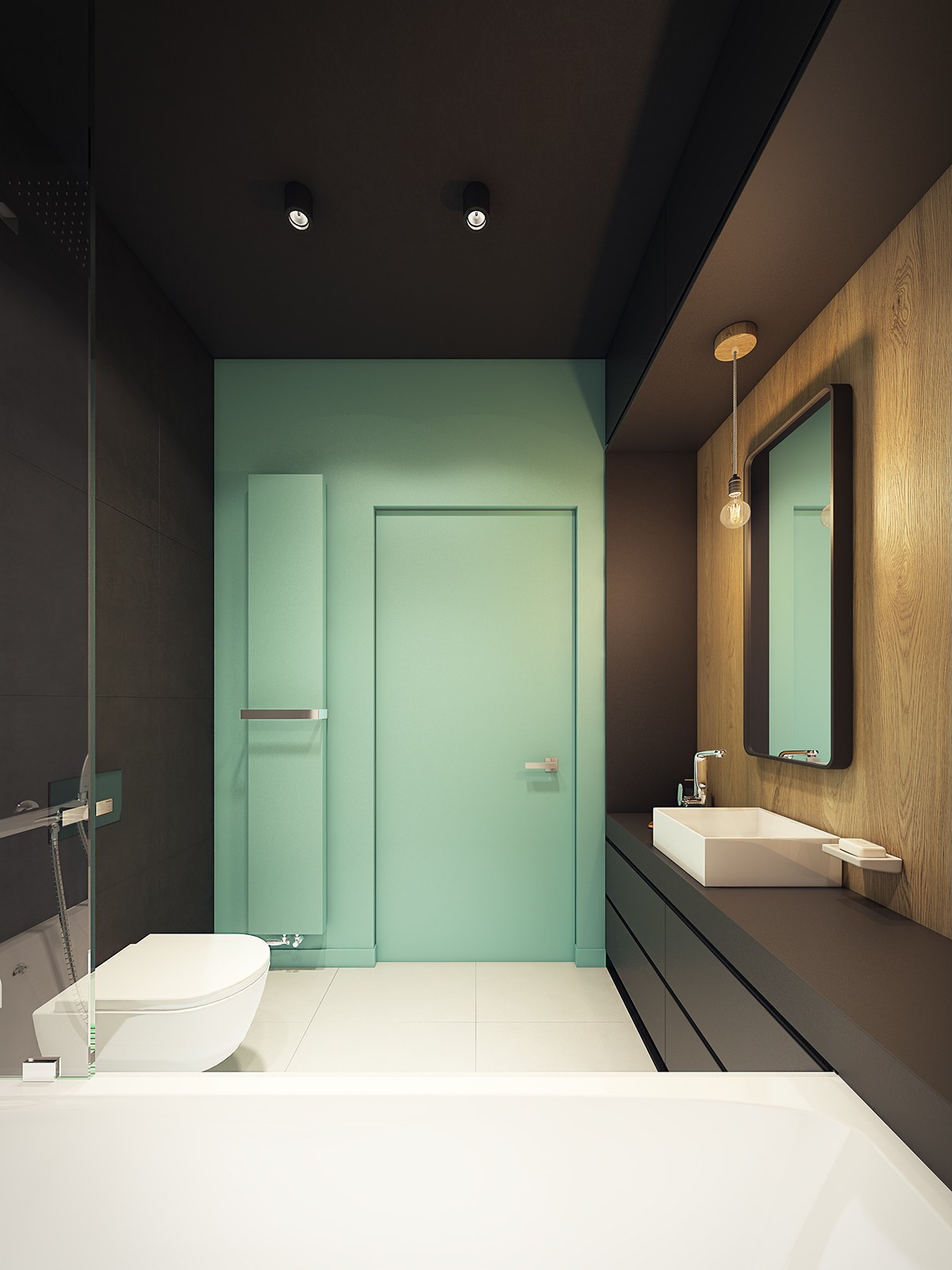
This time, the turquoise hue chosen definitely tends toward a more aquatic influence ideal for its application here.
