Have you ever decorated with vibrant primaries? They're so much fun but they're a little tricky to get right, especially within the context of a small apartment where there's very little room to hide the details that don't quite flow. Primary colors are bold, showy, and impossible to ignore wherever they're used. This post examines two compact apartments with primary colors, each approaching the challenge in a different way. The first makes a statement with straightforward fire-engine red accents, and the second uses a cerulean blue interior theme to make its secondary colors pop.

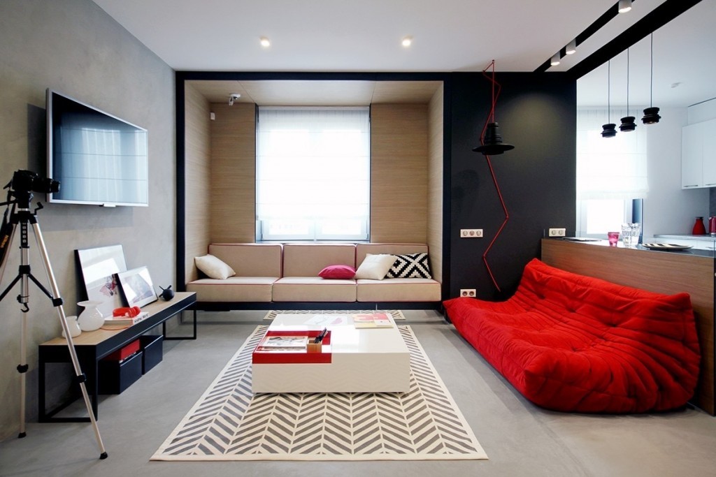
First, let's look at a home that packs tremendous character into a modest yet versatile 56 square meters. Nika Vorotyntseva designed this apartment for a young woman who lives in the city. Energetic red accents ensure the home's unique personality speaks out through every detail. The color theme is mostly uniform all the way across, with just a few dashes of secondary accents employed in surprising places. Red is a rare interior theme because it's difficult to work with, but this apartment makes it look like a breeze.
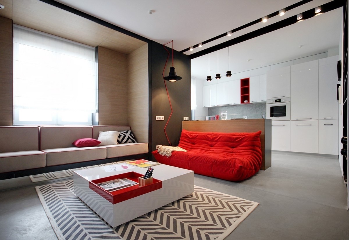
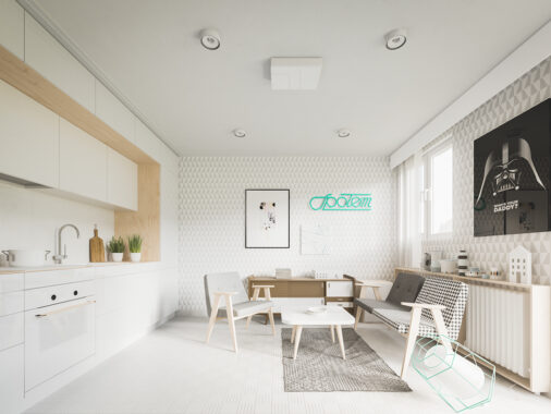
Chevron stripes, zigzags, and diamond patterns give this otherwise minimalist space an extra spark of liveliness. Geometric patterns serve as a counterbalance to the bold red details used throughout this simple and streamlined home.
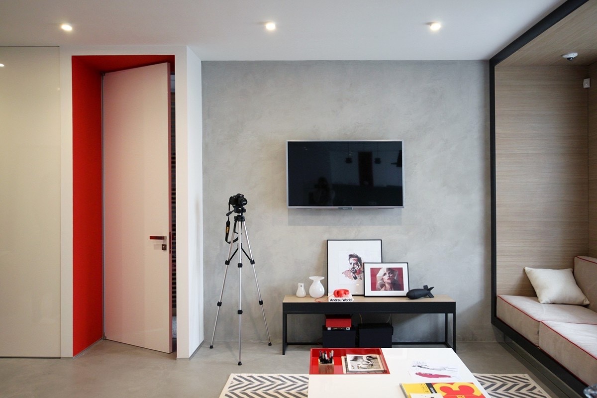
Furniture arrangements remain simple, but the composition is incredibly detailed and well planned. This space offers useful inspiration for those who cannot hang artwork on the walls because of material and rental concerns.
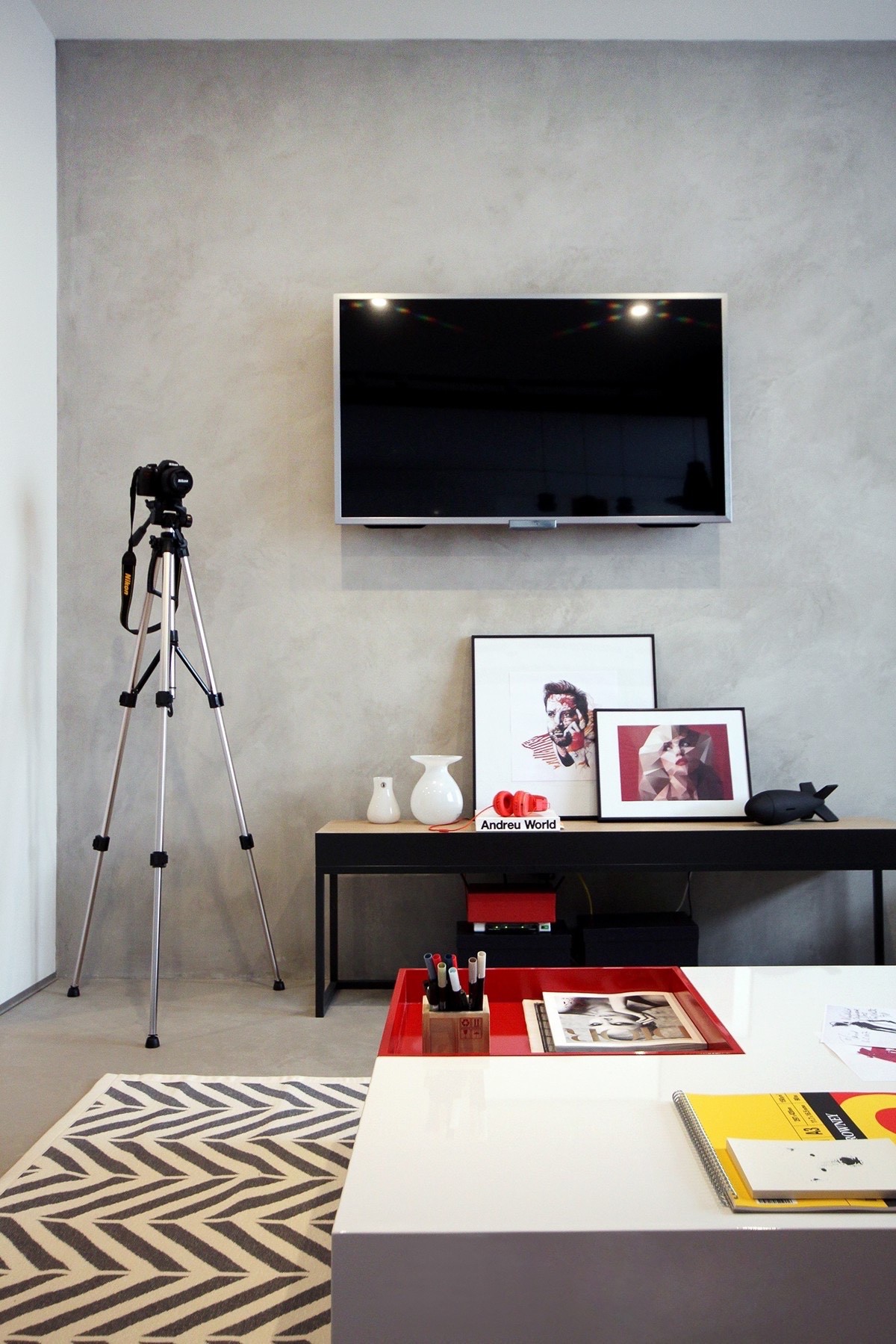
Modern artwork lends its bright and edgy personality wherever it possibly can. Keep an eye out for more – this collection encompasses a wide and exciting variety of themes and styles.
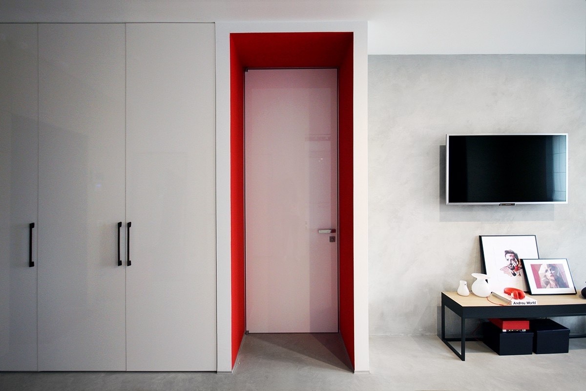
Red accents do more than just add excitement to the interior theme – they also help draw attention to distinctive features. There's no specific reason to have an interior wall here, but the red paint makes this door an irresistible focal point.
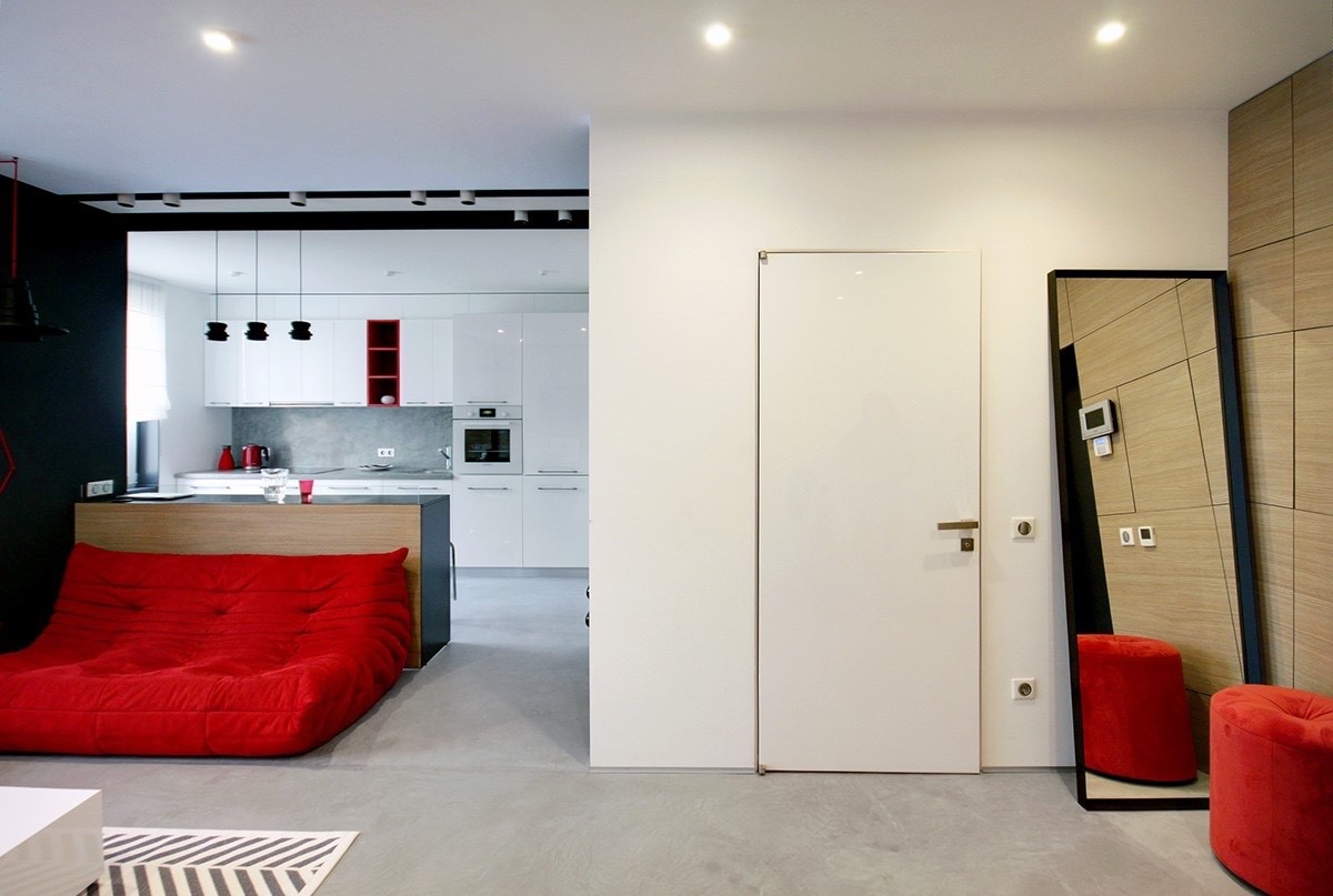
Check out that plush beanbag sofa! Although the industrial theme is rather stark and minimalistic, comfortable accommodations don't slip by unnoticed. The pouf to the right also plays into this casual theme.
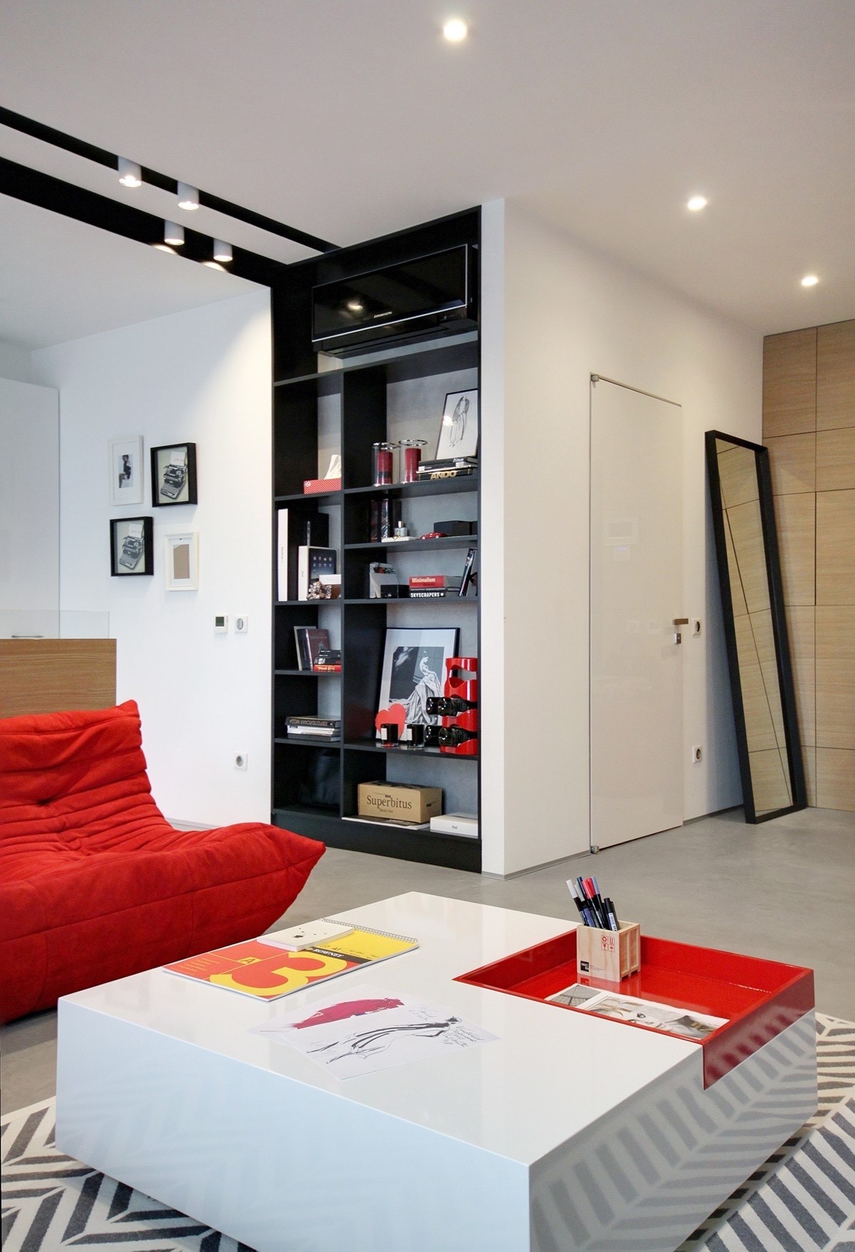
But with so much emphasis on overarching themes, it's nice to take some time to appreciate the carefully curated details. This little recessed tray in the coffee table offers an ideal spot to stash supplies and other materials that you're currently using.
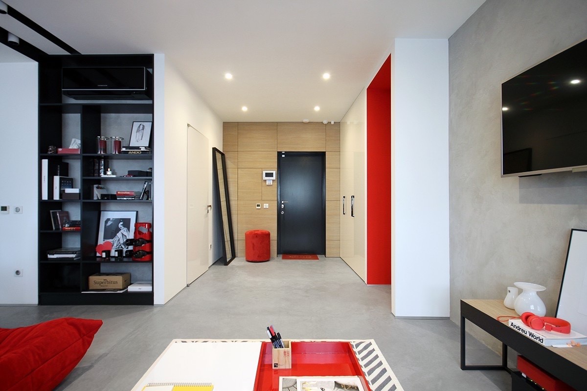
Storage space abounds to the left, red accents define important areas to the right, and natural materials create a comfortable focal point right in the center. The mirror propped up against the hallway wall is sure to prove useful for checking outfits before leaving the home.
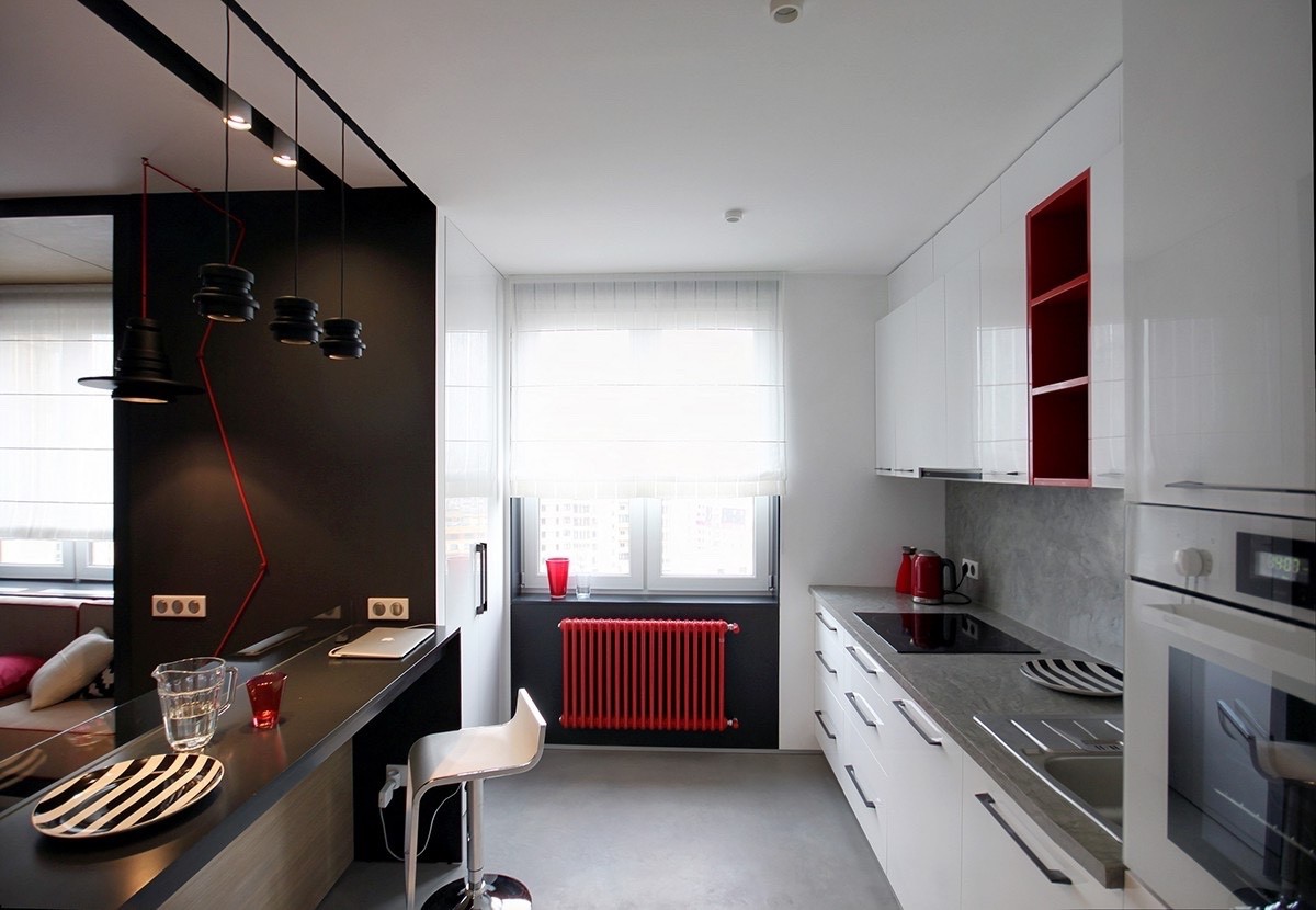
Architectural details, like the radiator pictured here, definitely didn't get passed over for the colorful accent treatment. A little color can turn any utility into an interior decor feature, much like the trend toward colorful cords in lighting design. Why hide a feature when you can embrace it?
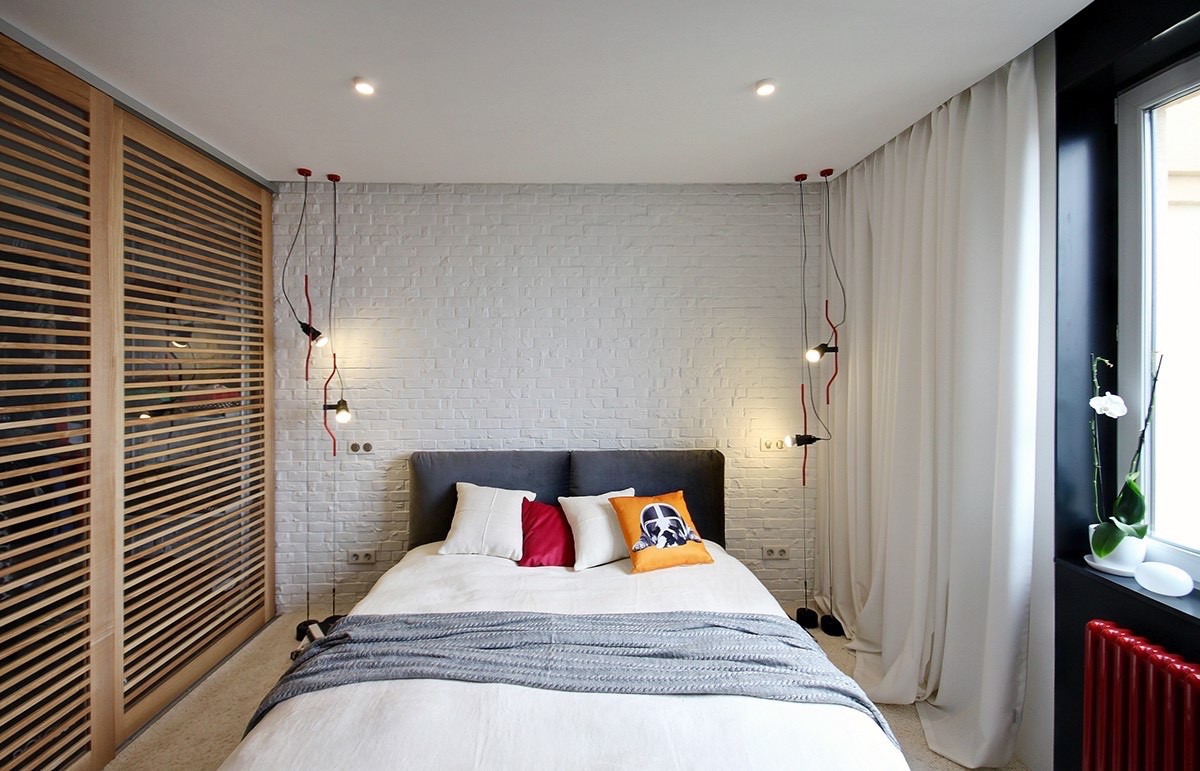
Chic materials and bright accent colors give the bedroom a comfortable and welcoming vibe, while a number of bold accent pieces express the personality of the resident. This portion of the room is spare on furniture but big on character.
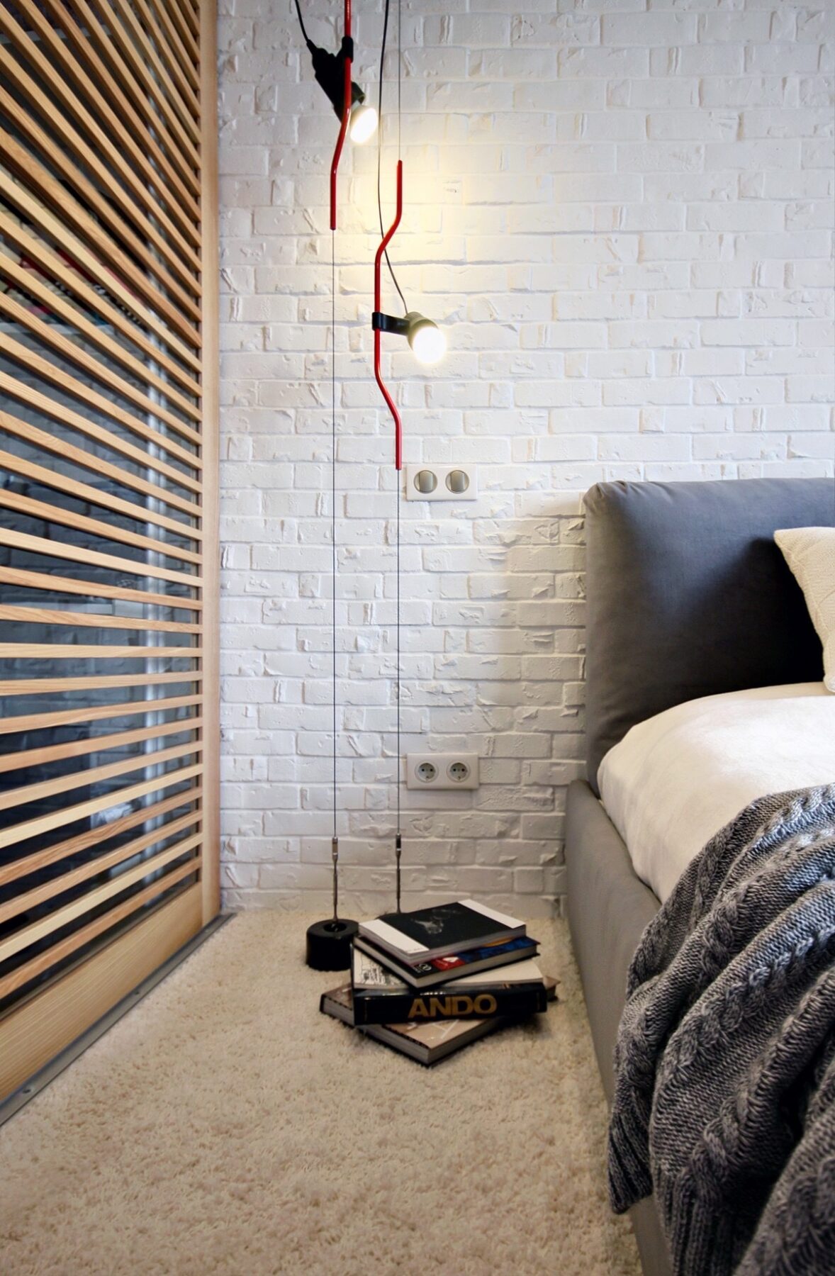
These unique pendant lamps were designed by Pio Manzù and Achille Castiglioni, and were named Parentesi (Italian for parenthesis or bracket) in reference to the curved tubing that allows for movement of the lighting fixture. There are no bedside tables to obscure the cool floor-to-ceiling design.
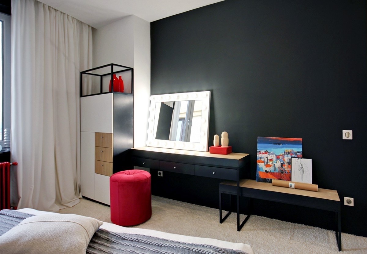
While the headboard wall remained minimalistic with its white painted brick, the other side of the room makes a more adventurous impression with colorful details against a backdrop of matte black.
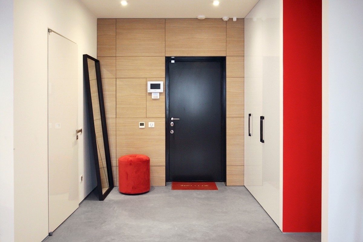
Although this home doesn't have heaps of integrated storage like other more spacious properties, this one does make good use of closets. This one is jazzed up with a little red.
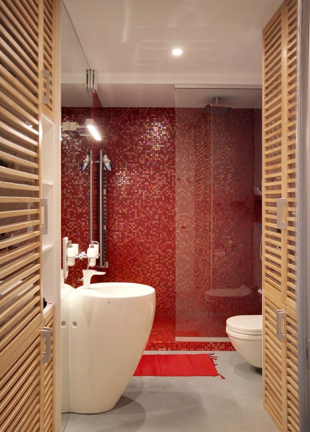
And finally, a look at the bathroom! These sparkling red tiles add a whole new dimension to the primary color theme.
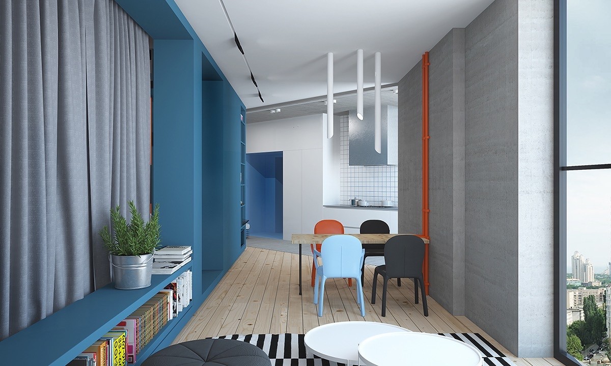
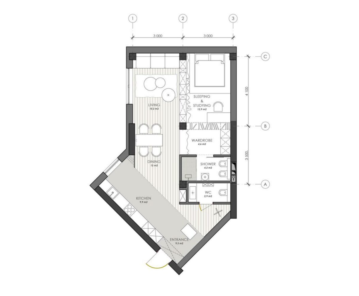
At 67 square meters, this blue apartment (also by Nika Vorotyntseva) enjoys a distinctive layout that wraps around a central volume. Despite the fact that adding interior walls can make a home feel smaller, this apartment uses its sunny windows and bright contrasting colors for a more spacious and energetic effect. It's not a small apartment by any means – and it's hard to find a space with a bigger personality than this one.
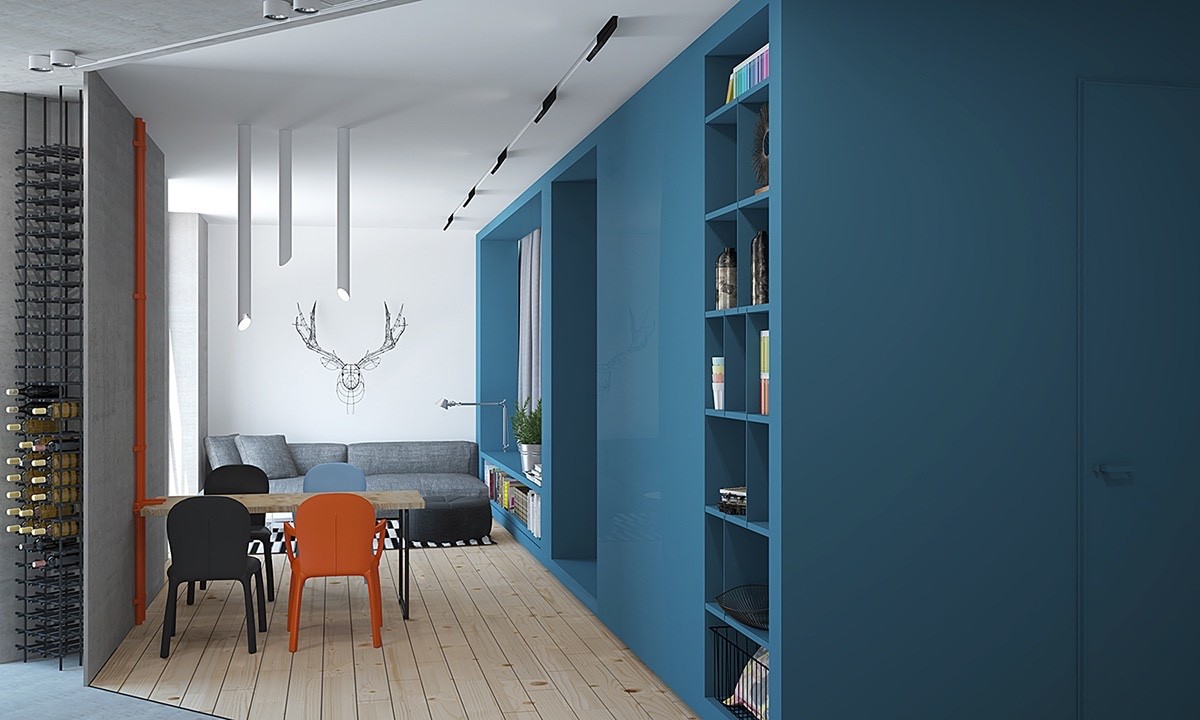
The architectural details are impossible to ignore. Notice the exposed pipe attached to the table to the left, with its orange paint and matching chair creating a powerful balance to the expanse of blue to the right.
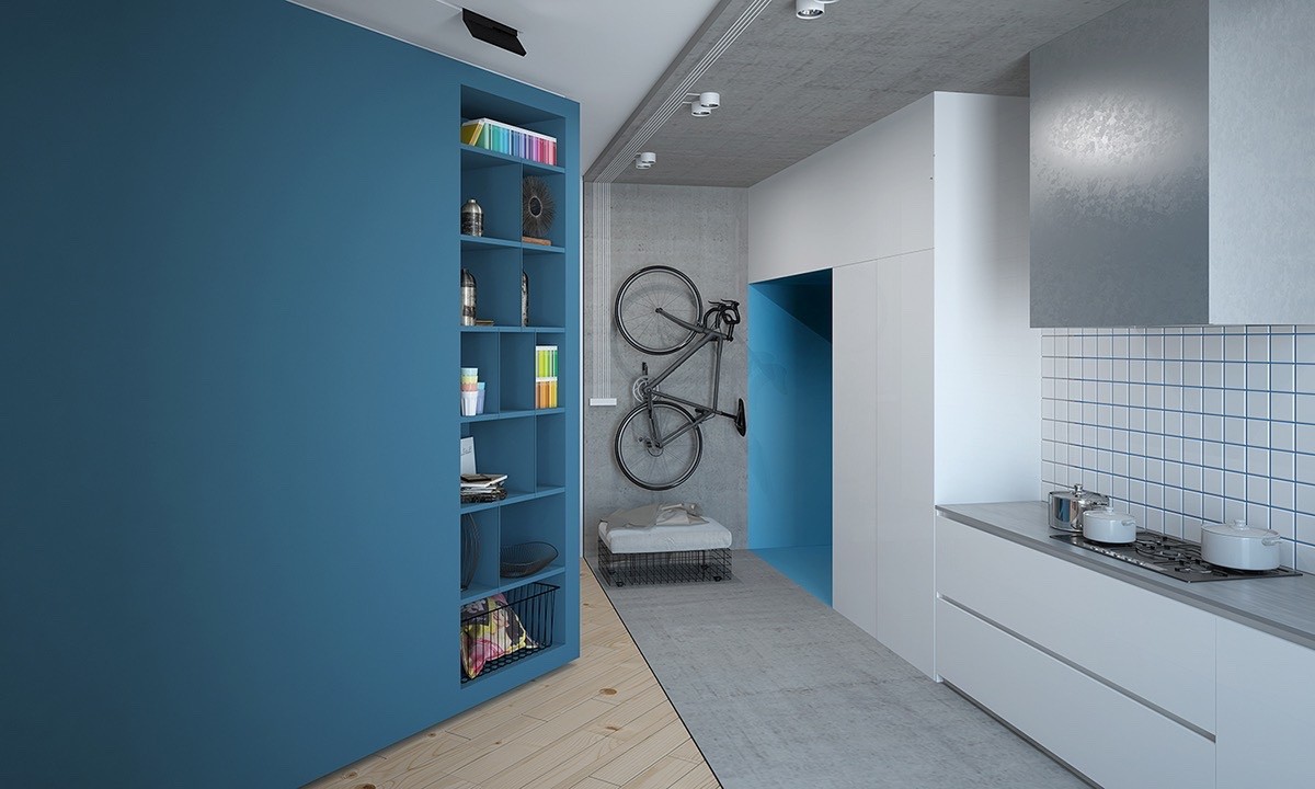
The kitchen, on the other hand, remains relatively low-key and simple. Here the blue accents seem to invoke a streamlined Scandinavian vibe. The open shelves are a shared feature, offering decorative effect for the living room while displaying useful tools for the kitchen.
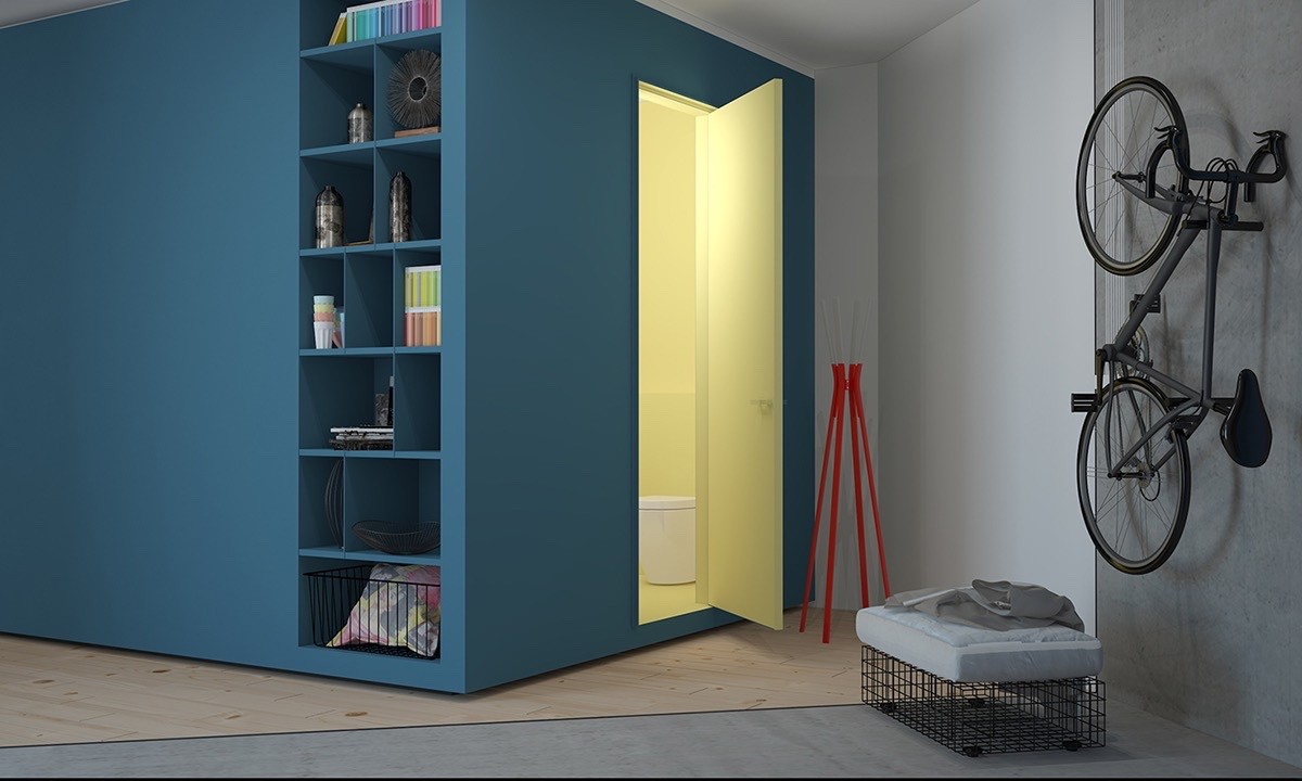
One purpose of the central volume reveals itself with this guarded peek into the bathroom. Pale yellow contrasts against the blue exterior yet embraces the orange accents nearby.
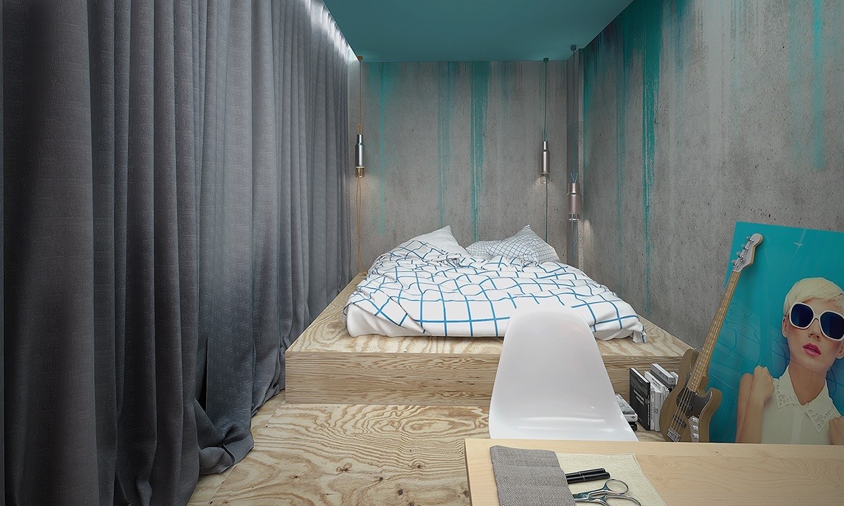
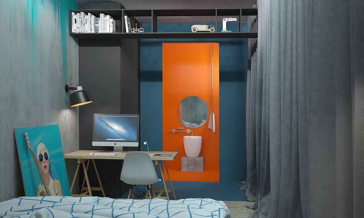
The rest of the central volume contains this fabulous concrete and plywood bedroom. Splashes of teal bring character to the otherwise industrial material theme and the result is quite powerful.
