Simple, soothing, and warm - it's nearly impossible to resist the welcoming qualities of timber construction whether in reference to furniture or floors or (in this case) the walls. The four homes examined in this post don't rely on complicated scrollwork or colorful finishes, but instead explore a range of layouts for the planks themselves. Three of these spaces even pair wooden wall panels with wood flooring, not always an easy look to pull off, yet these interiors make it work beautifully thanks to their refined modern styles. And if your interior already features wood walls, these lovely homes just might inspire your next decor theme.
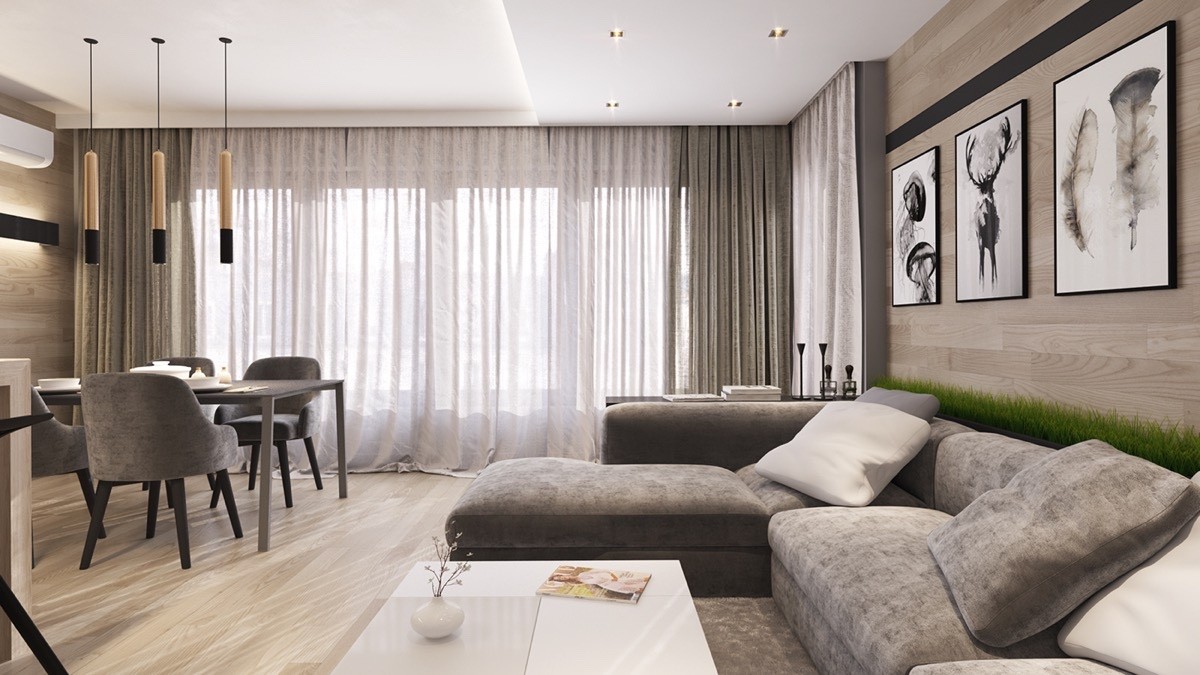
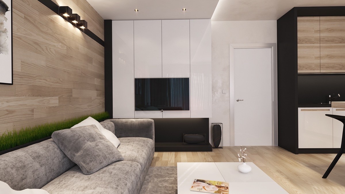
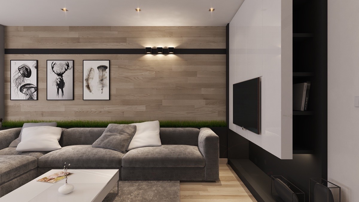
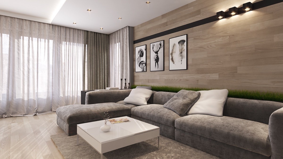
This light and airy neutral interior is a nice place to begin. Horizontal wall planks reinforce the linear decor theme used throughout the open living area, and help lengthen the room to make it feel more spacious.
Both the wall paneling and the flooring direct the eye toward the windows, which when not covered by curtains would likely reveal a lovely view.
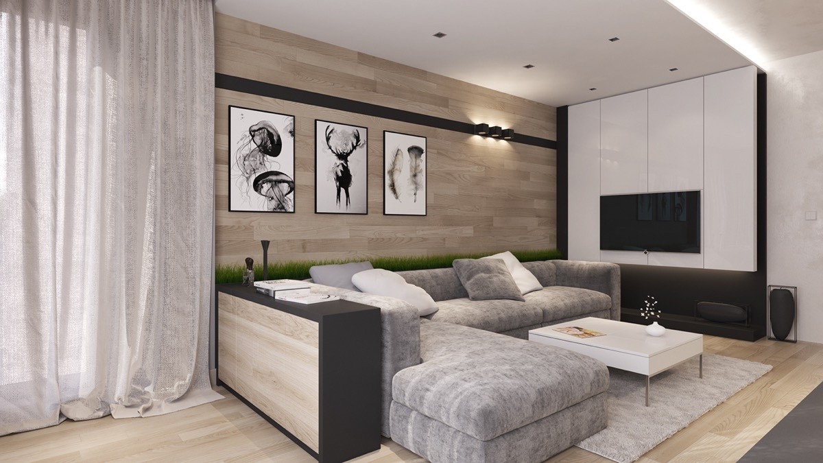
Aligned perfectly with the back of the sofa, the sideboard table even integrates matching wood, this time in the form of sheets rather than boards.
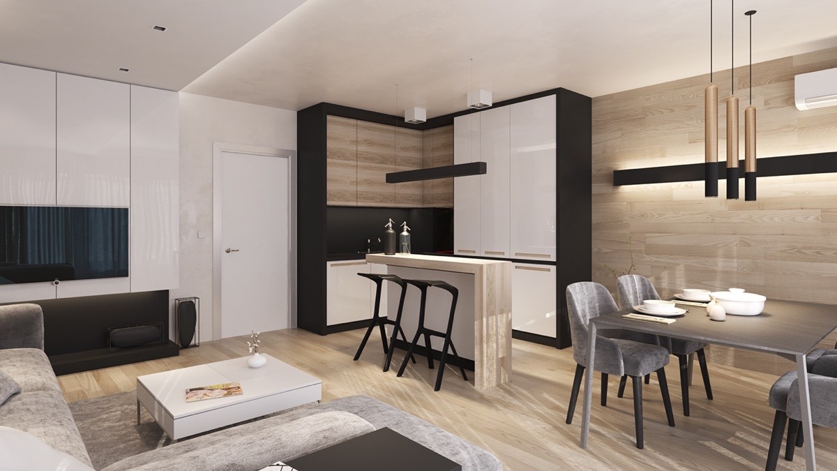
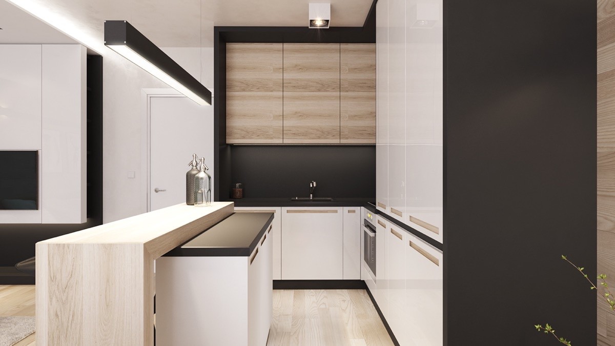
Glossy white paneling continues in the compact kitchen, outlined with bold black accents to dramatic effect.
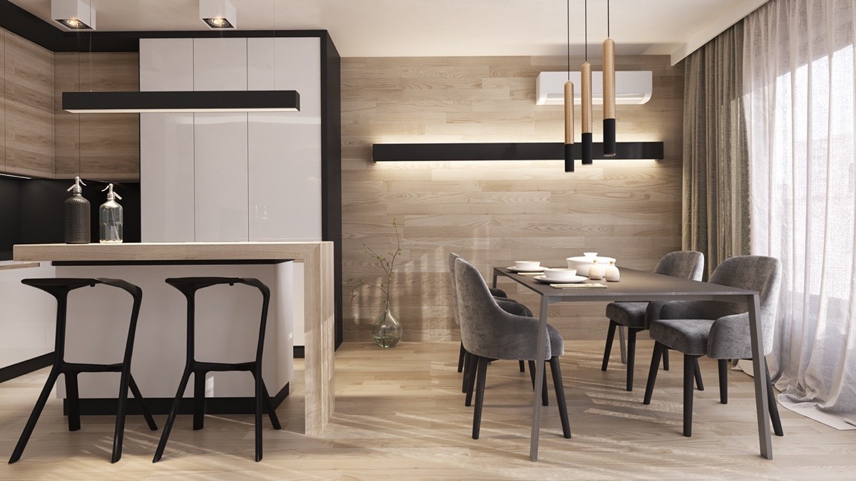
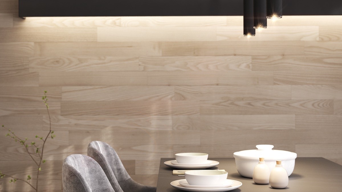
Additional black and white contrast helps the gorgeous Konstantin Grcic breakfast stools stand out while a backdrop of wood paneling warms the atmosphere of the dining arrangement.
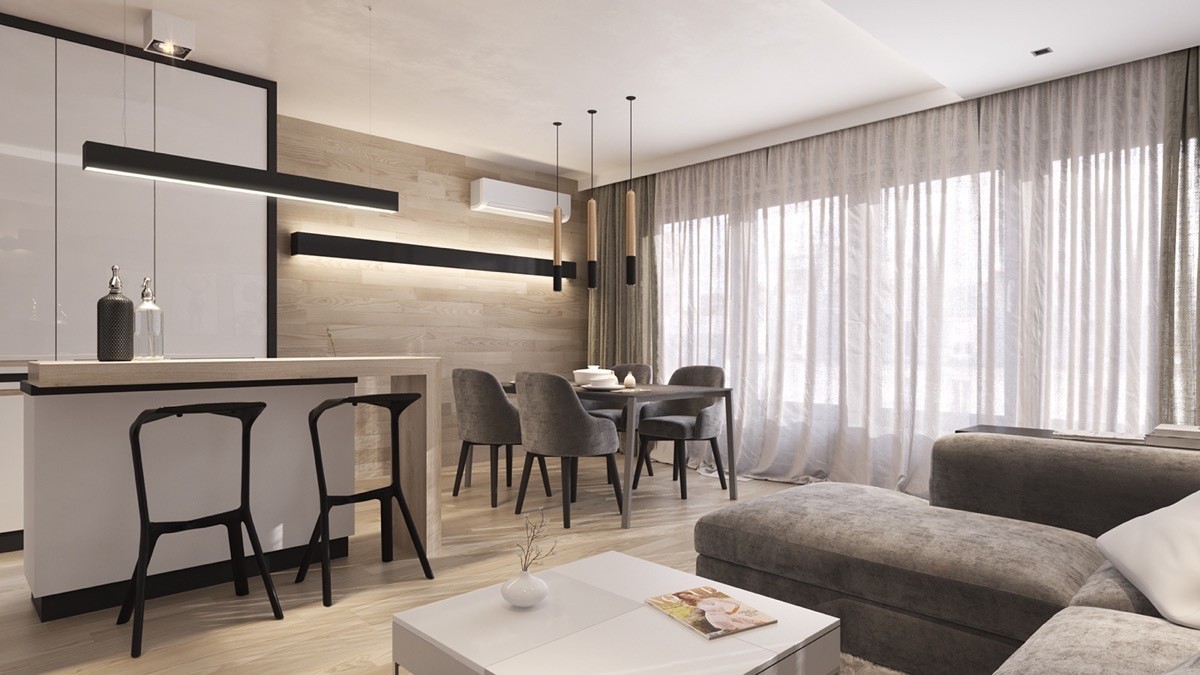
Remember the mention about how the paneling elongates the space? It makes a huge difference in this compact and efficient apartment layout.
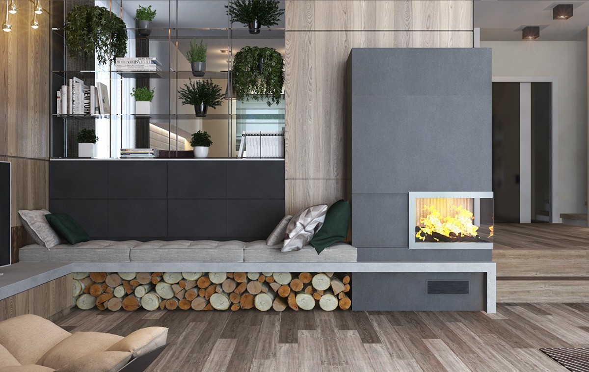
This gorgeous home uses a richer and more varied timber for its wood walls and floors, and takes advantage of many forest-green accents as well. Here, the tour starts with a nice seating niche near the fireplace with logs stored beneath for effect.
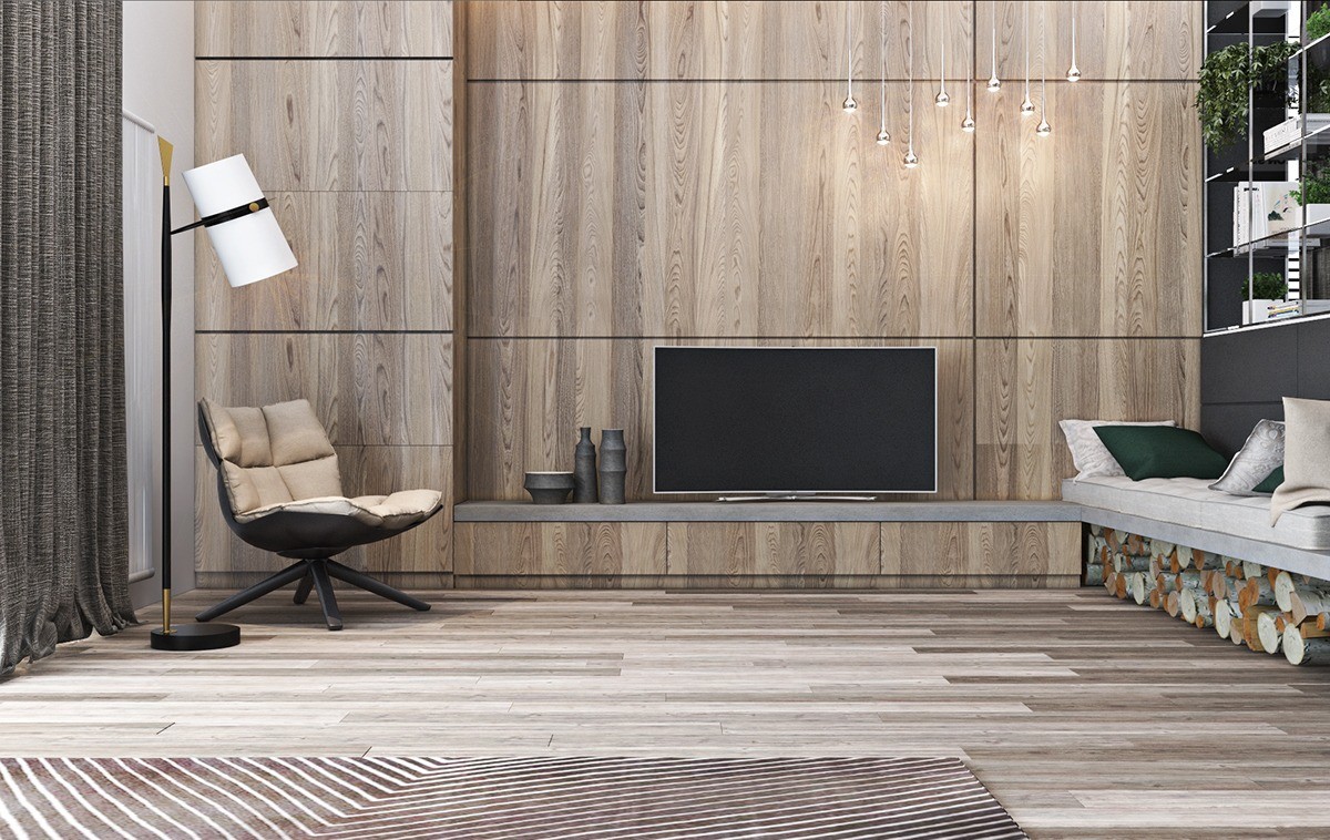
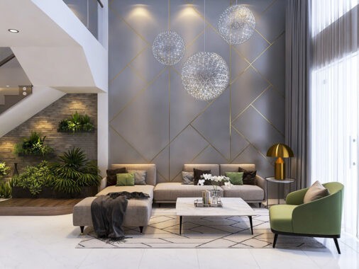
The wood panels are divided into strong and symmetrical squares, echoed by the pattern of the Husk Chair from Patricia Urquiola.
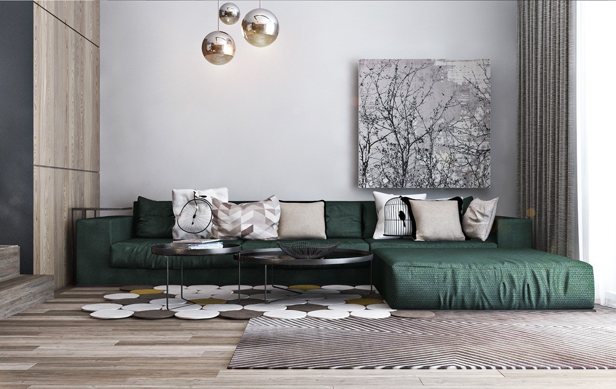
A low green sofa makes good use of goldish tones as secondary accents, found in both the rug and in the brass pendant lamps by Tom Dixon.
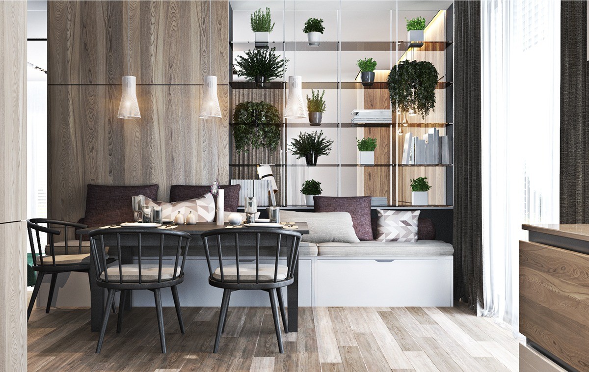
Open-face shelving serves as a smart and stylish way to share the indoor garden between the dining room and the living area; it also creates a screen without totally closing in either space.
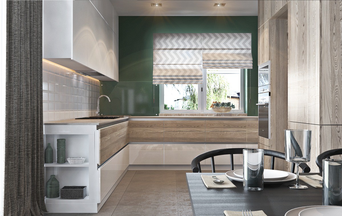
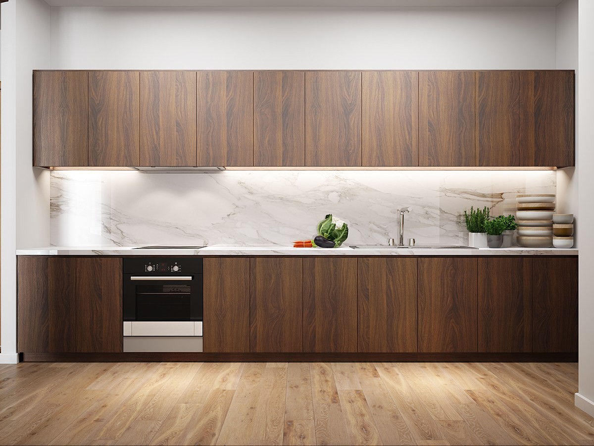
Wood makes a very strategic appearance in the kitchen, occupying only the standing storage units and the upper drawers.
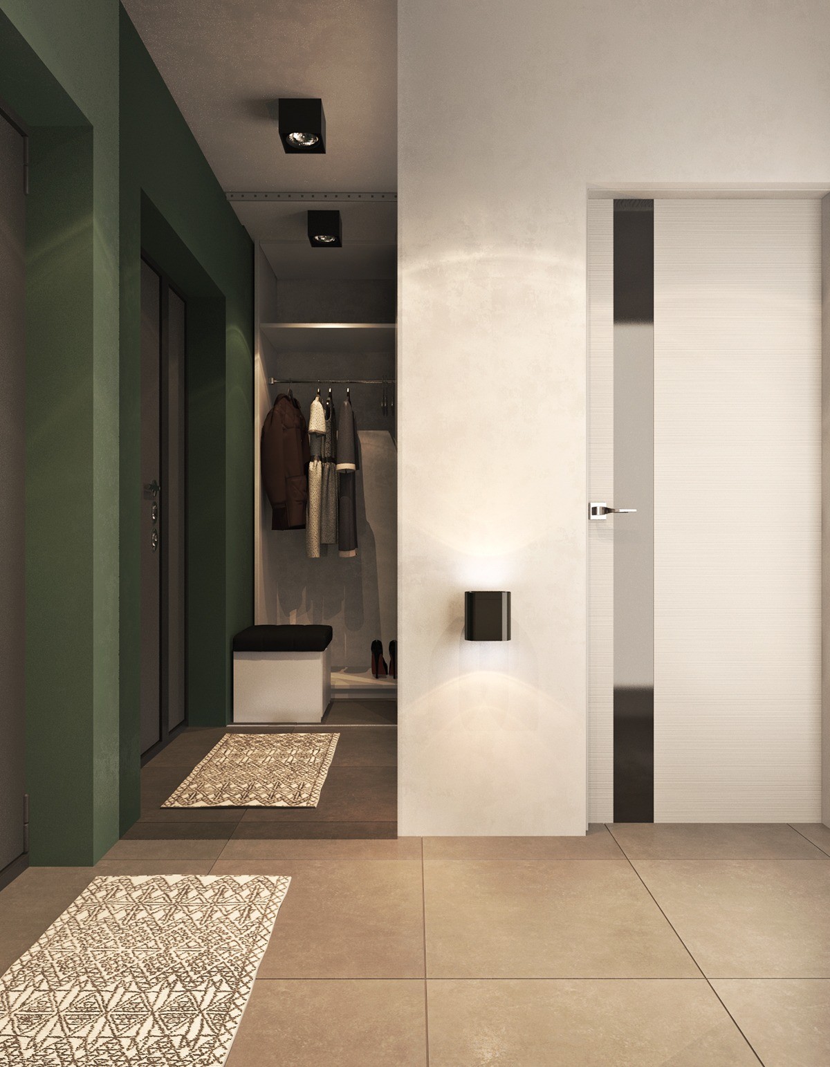
Interestingly, no exposed wooden features appear in the entry hallway. But it does have wonderfully subtle textures and a rug that draws the eye.
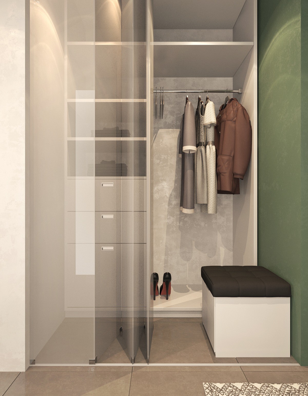
Have you ever seen an accordion-style folding glass door before? It's definitely an interesting take on a classic design.
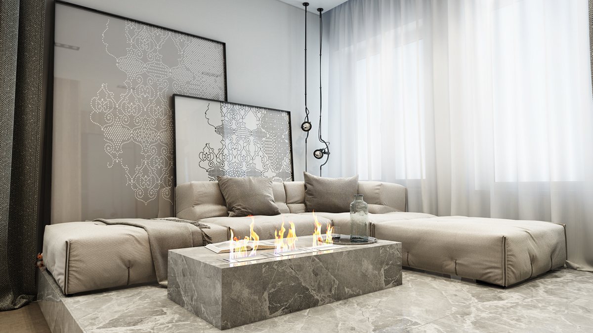
This third property is actually an open-plan suite within a larger home, and includes all the amenities including a functional living room, office, and bedroom within an open space. Some of the walls are bright white (like the ones backing this unique sitting area) but fabulous exotic wood graces the others.
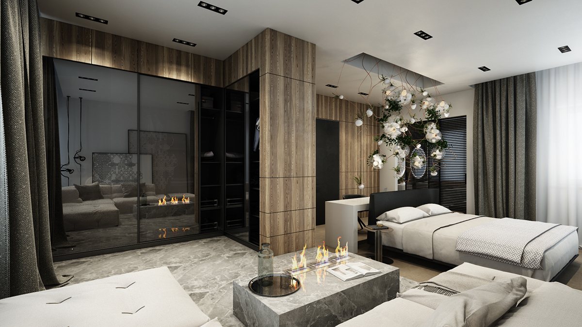
Dark wood and stone accents offer a hugely luxurious appeal. Here, a stone table hosts a freestanding faux fireplace – light reflecting off the fine mist of water creates a strikingly realistic imitation of the real thing.
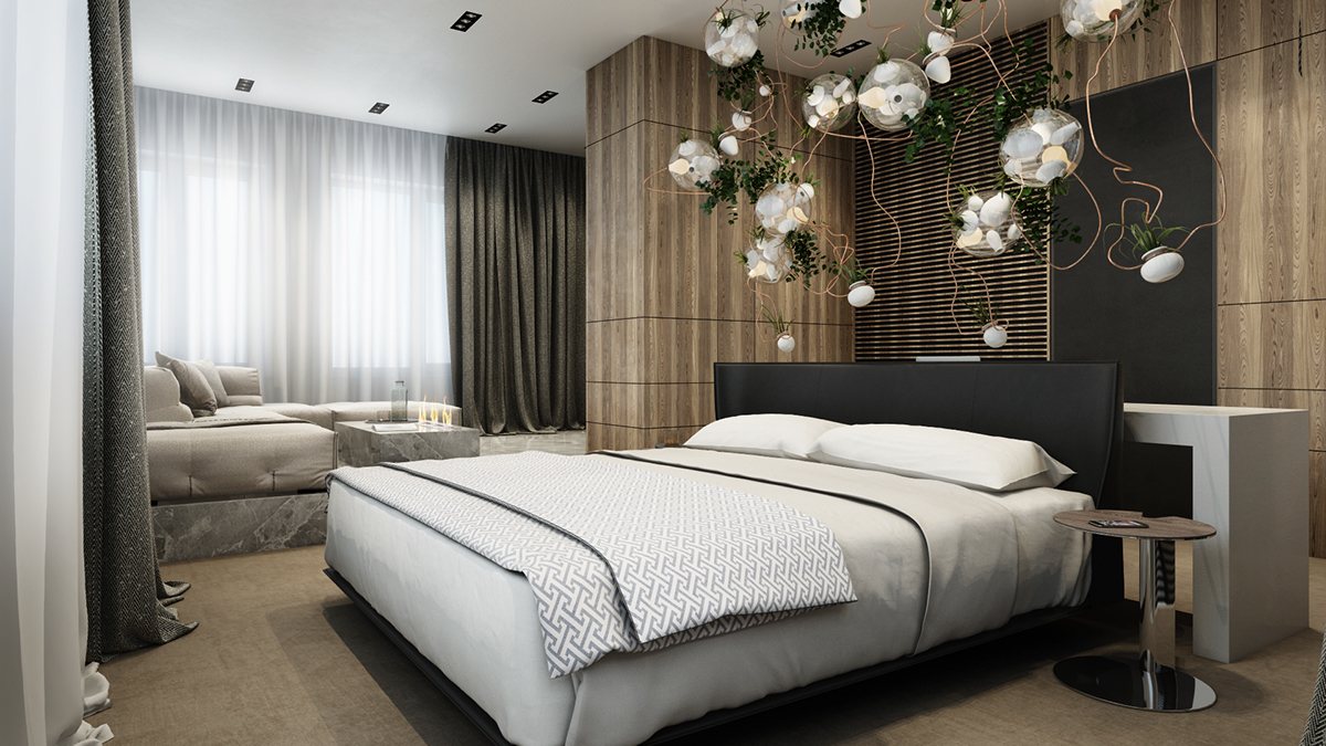
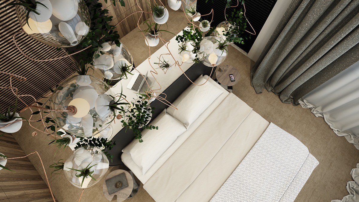
The amazing planter chandelier is from the 38 collection by Bocci, a thriving jungle of low-maintenance tillandsia.
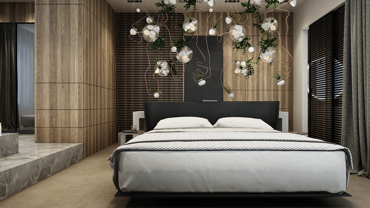
Pairing the air plants with the water vapor fireplace in the seating area was a fantastic idea. The subtle humidity likely provides all the water these hardy air plants need to thrive.
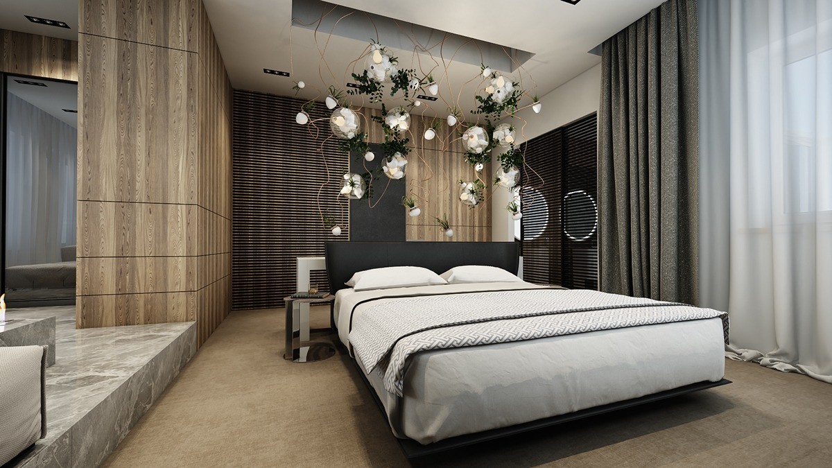
The bed maintains a crisp and refreshing look, its clean lines and structured Greek key accents standing in contrast to the organic lines of the chandelier.
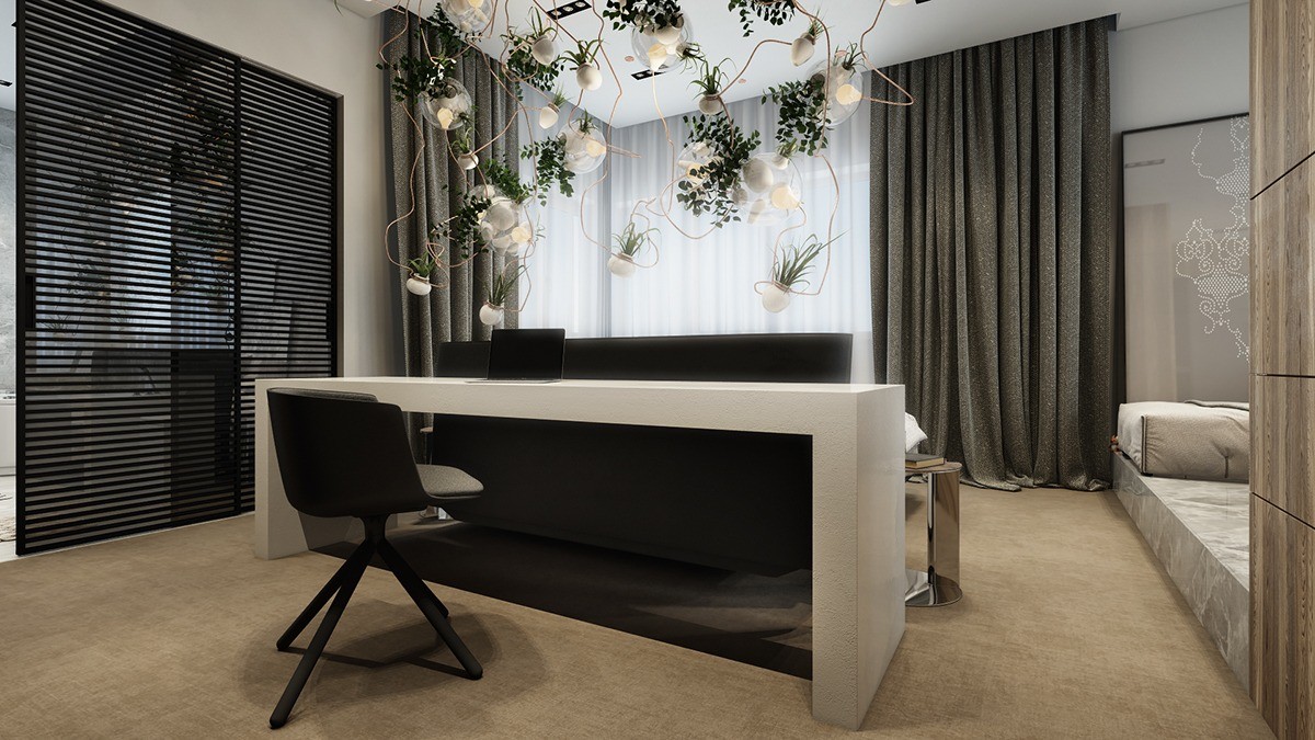
Tucked away behind the headboard of the bed, a simple office gets to enjoy the fascinating feature light as well.
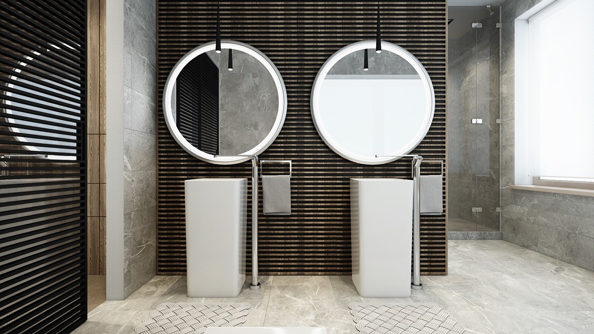
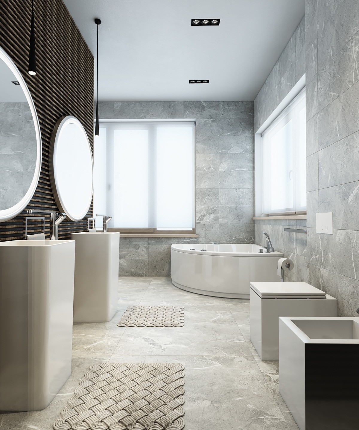
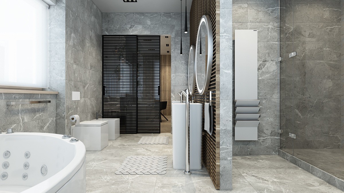
Of course, the suite also includes a bathroom, and it's quite gorgeous. More wood peeks out from between the black slats on the wall.
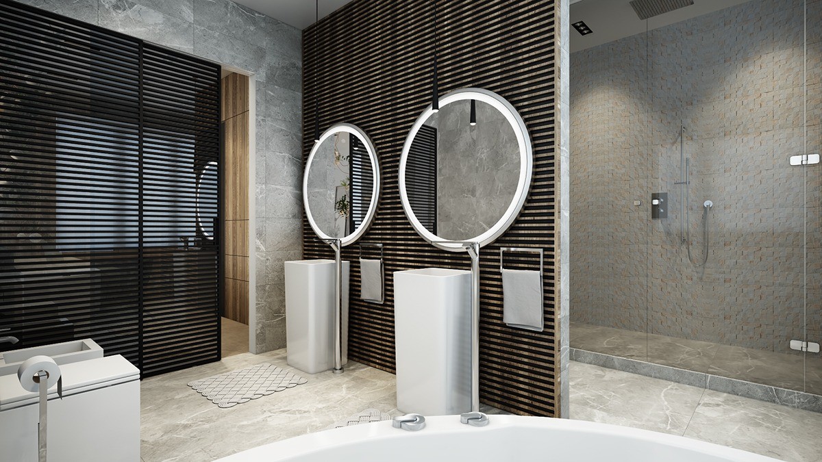
The rest of the bathroom is refined and minimalistic but the circular mirrors and distinctive accent wall offer a bold focal point.
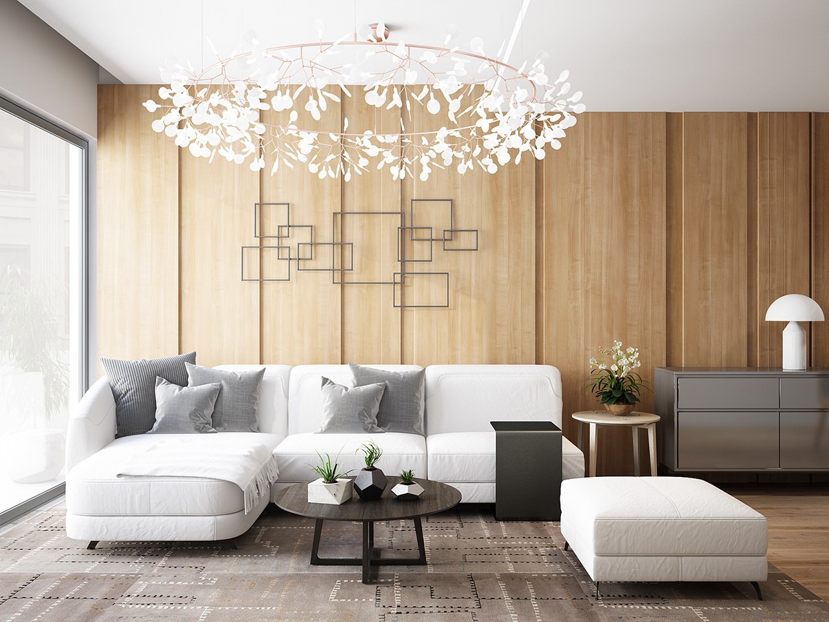
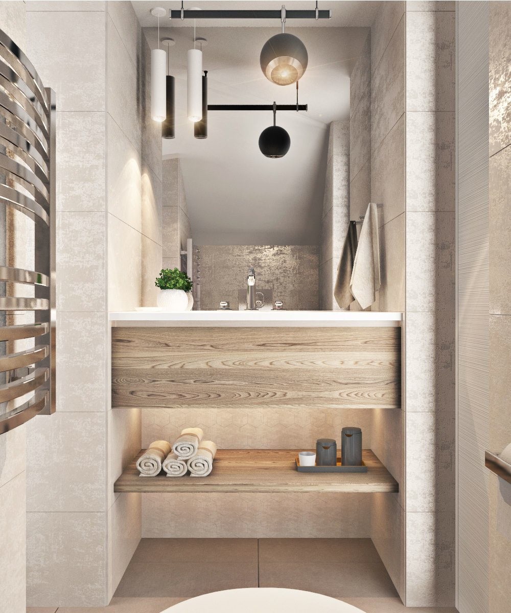
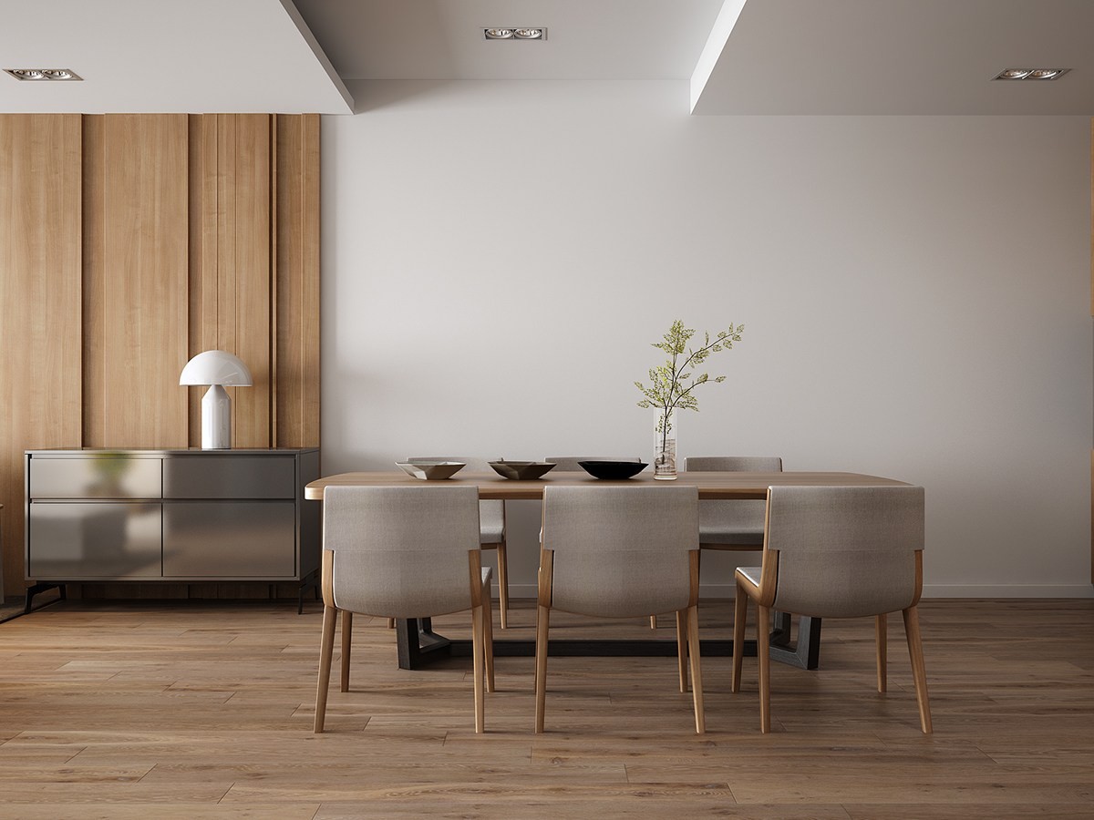
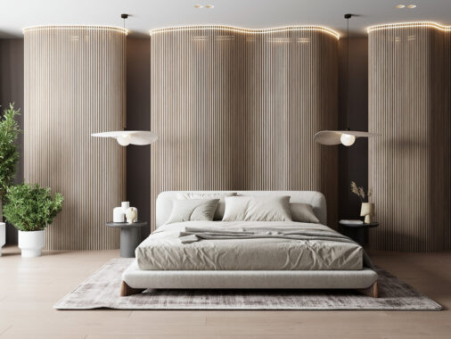
Softer and more delicate than the homes that came before it, this welcoming interior utilizes a light touch. Layered wooden wall panels vary in width for visual interest while the rest of the space remains very simply decorated.
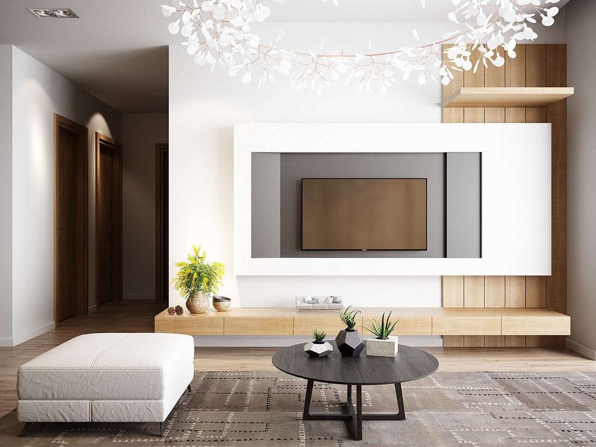
The television area is clean and smooth, with just a hint of wood paneling to the right tying into the thin sideboard cabinets below.
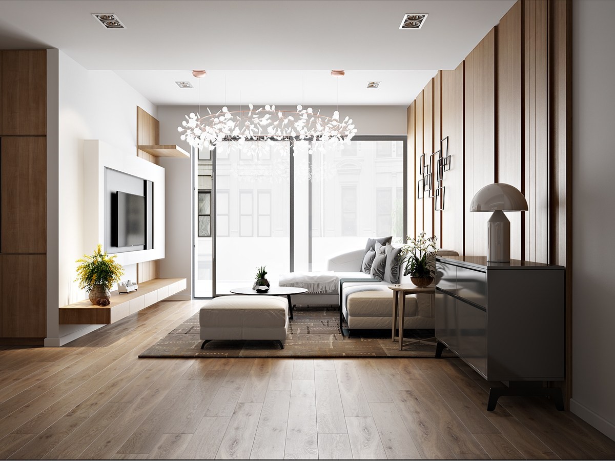
Wondering about the gorgeous chandelier? It's called Heracleum, designed by Bertjan Pot & Marcel Wanders.
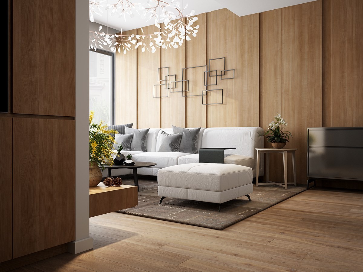
Perhaps not immediately obvious, but the subtle connection between the square wall sculpture and the varied pillow sizes also reflects the variation in wall panel sizes.

