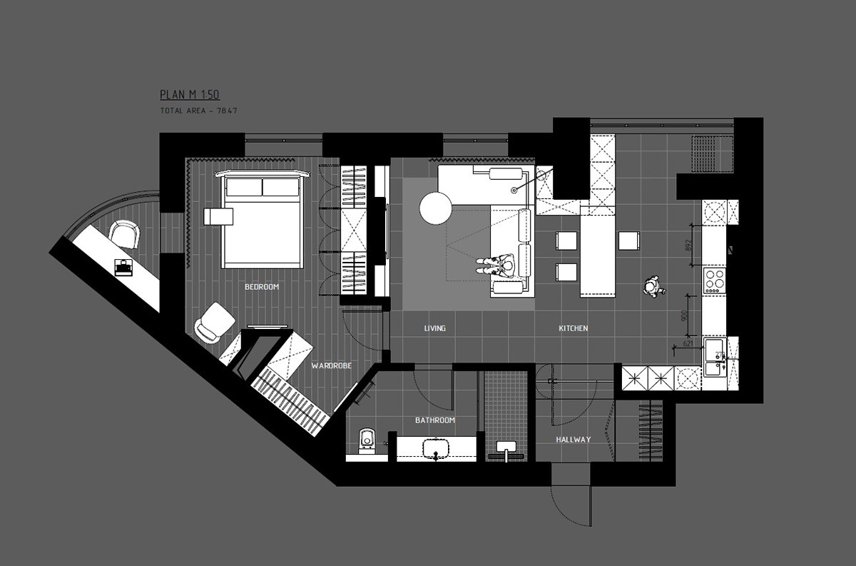
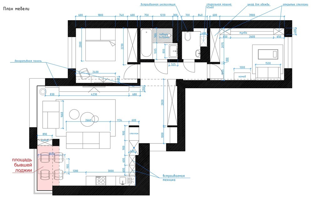
Finding a quiet place to concentrate is of the highest importance for those who work or study from home. But more than that – it needs to be well equipped for the task, capable of containing the books or computer accessories necessary for productivity. This post examines five one-bedroom apartments with a home office dedicated to creative concentration. Many of these spaces even include secondary areas outfitted for work or thinking, a nice strategy for those who need a change of environment from time to time. Look for the provided floor plans to inspire the addition of a study within your own home.
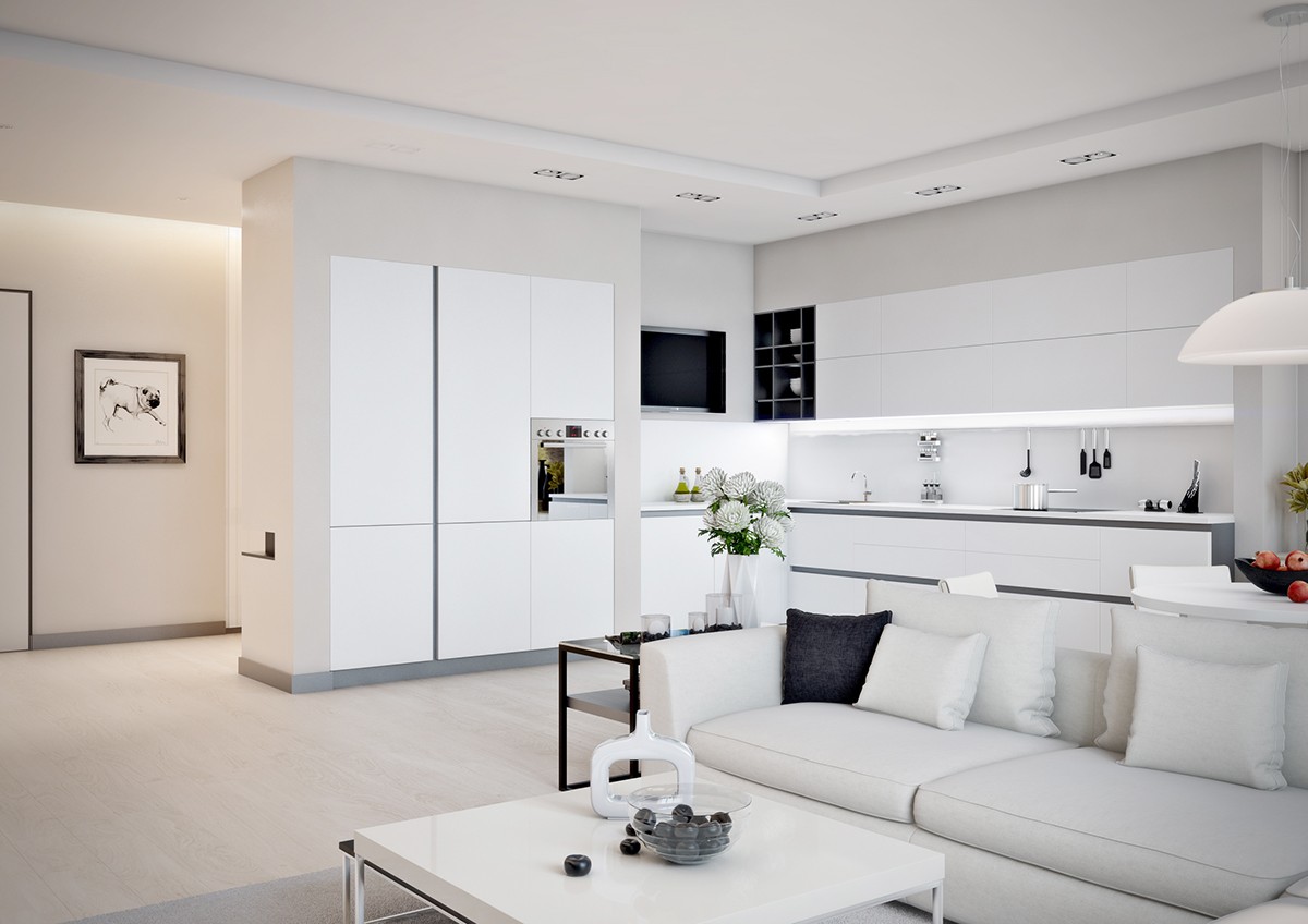
This apartment features a spacious layout with a combined living and dining room, one bedroom, and one well-appointed home office. White walls and light wood floors lend a weightless appeal, with black and gray accents bringing the theme back down to earth.
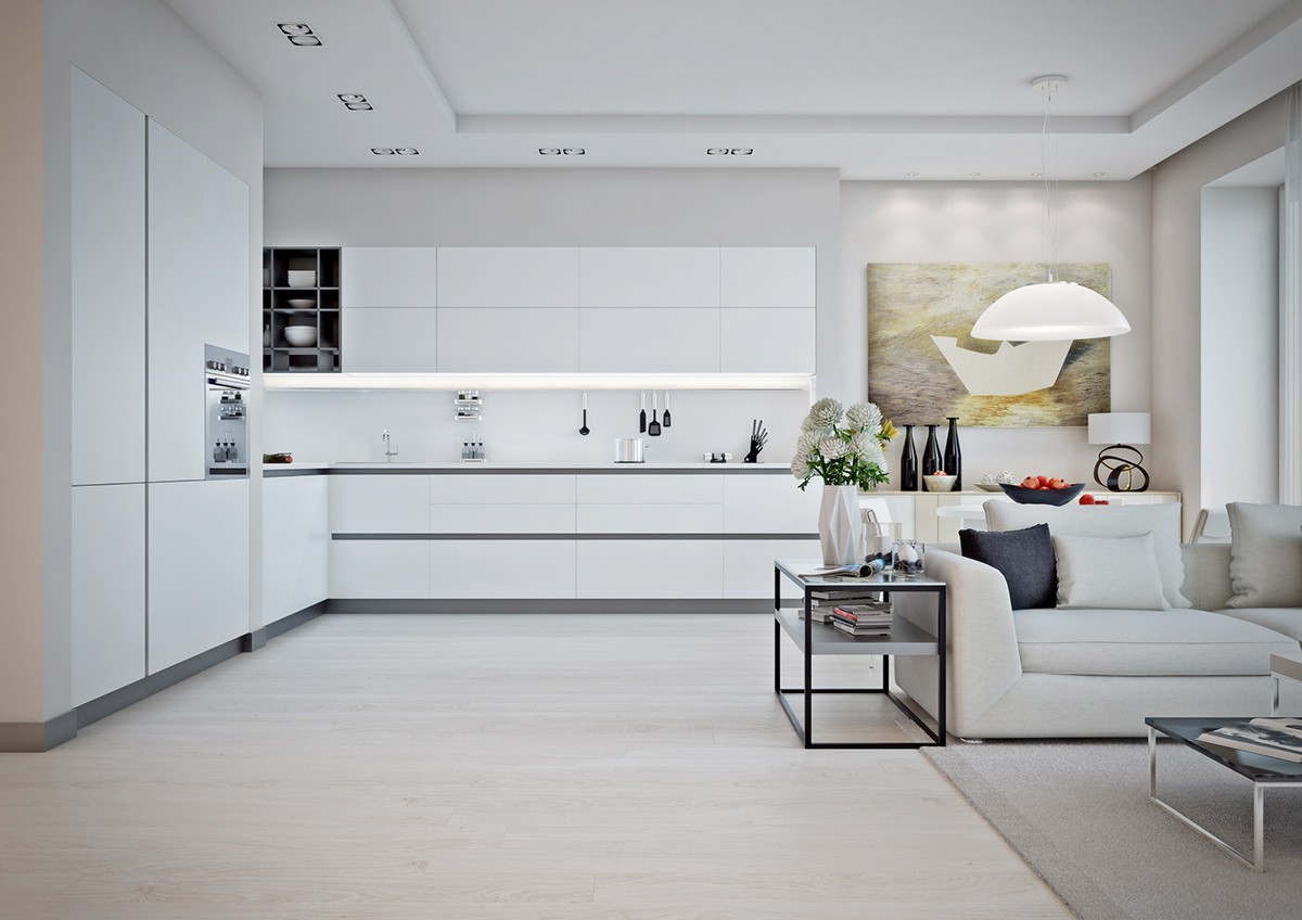
Strong lines play an important role throughout. In the kitchen, the baseboards and cabinet pulls draw the eye horizontally and then vertically.
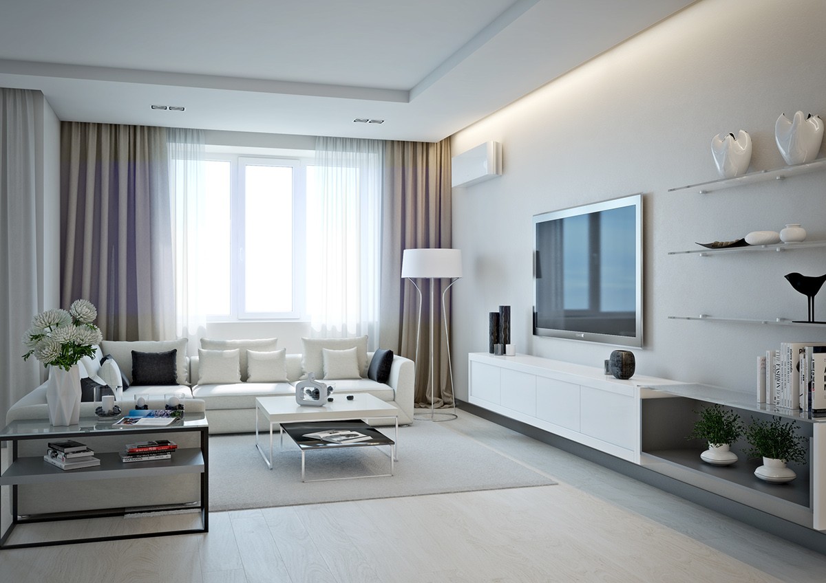
Brown curtains add just a touch of warmth to frame the sunlit windows. The decor in the living room is sleek and chic, with metallic accents contributing a slight industrial appeal.
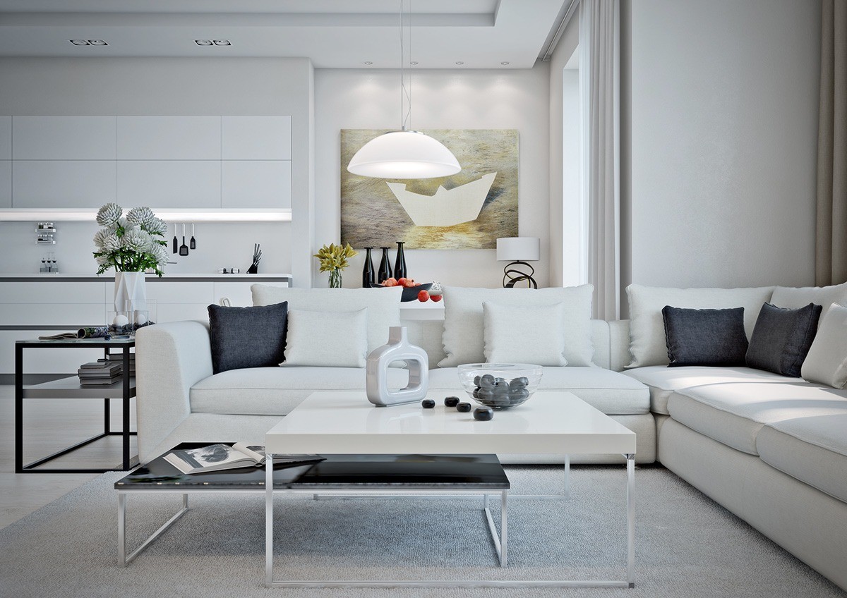
Nesting tables are always a smart way to save space. With this particular pair, the size gap allows the bottom table to serve as a hidden shelf when not in use.
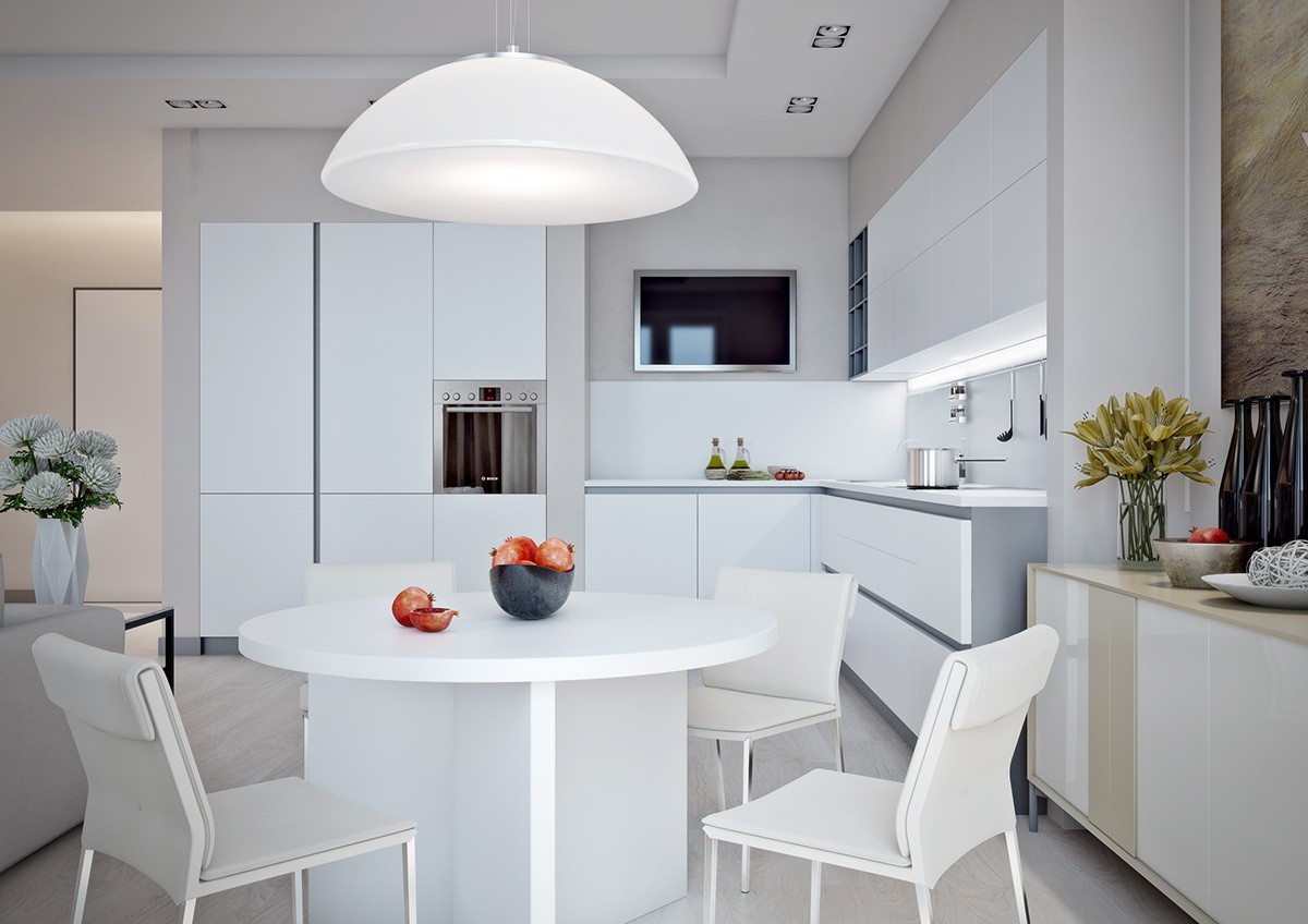
The dining nook is cozy and efficient. A round pendant lamp reflects the shape of the tabletop and centers the arrangement with ease.
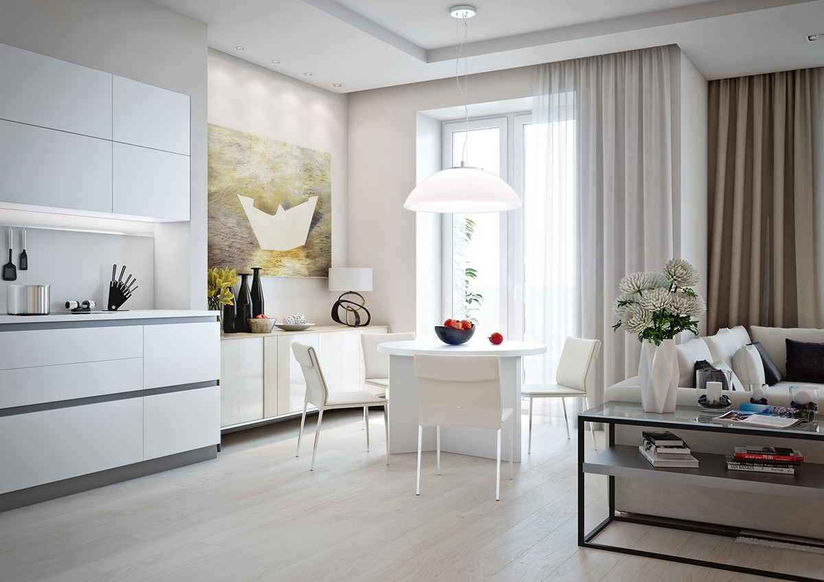
The sideboard is a very natural fit for the area, with its neutral tones continuing the organic theme lent by the artwork to the left and the brown curtains to the right.
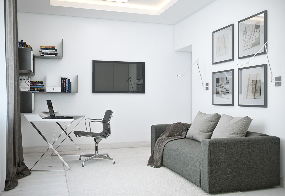
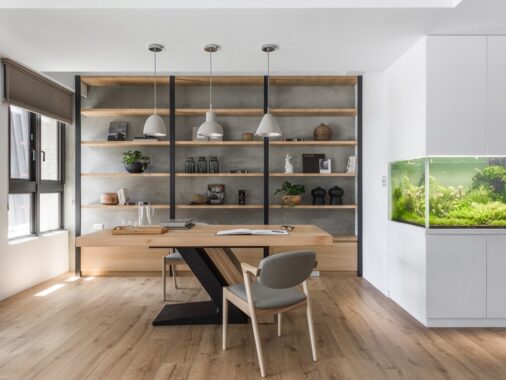
Here's a look at the stylish home office. Its look is subtle yet striking, with the modern home office desk and unique corner shelves drawing the eye immediately.
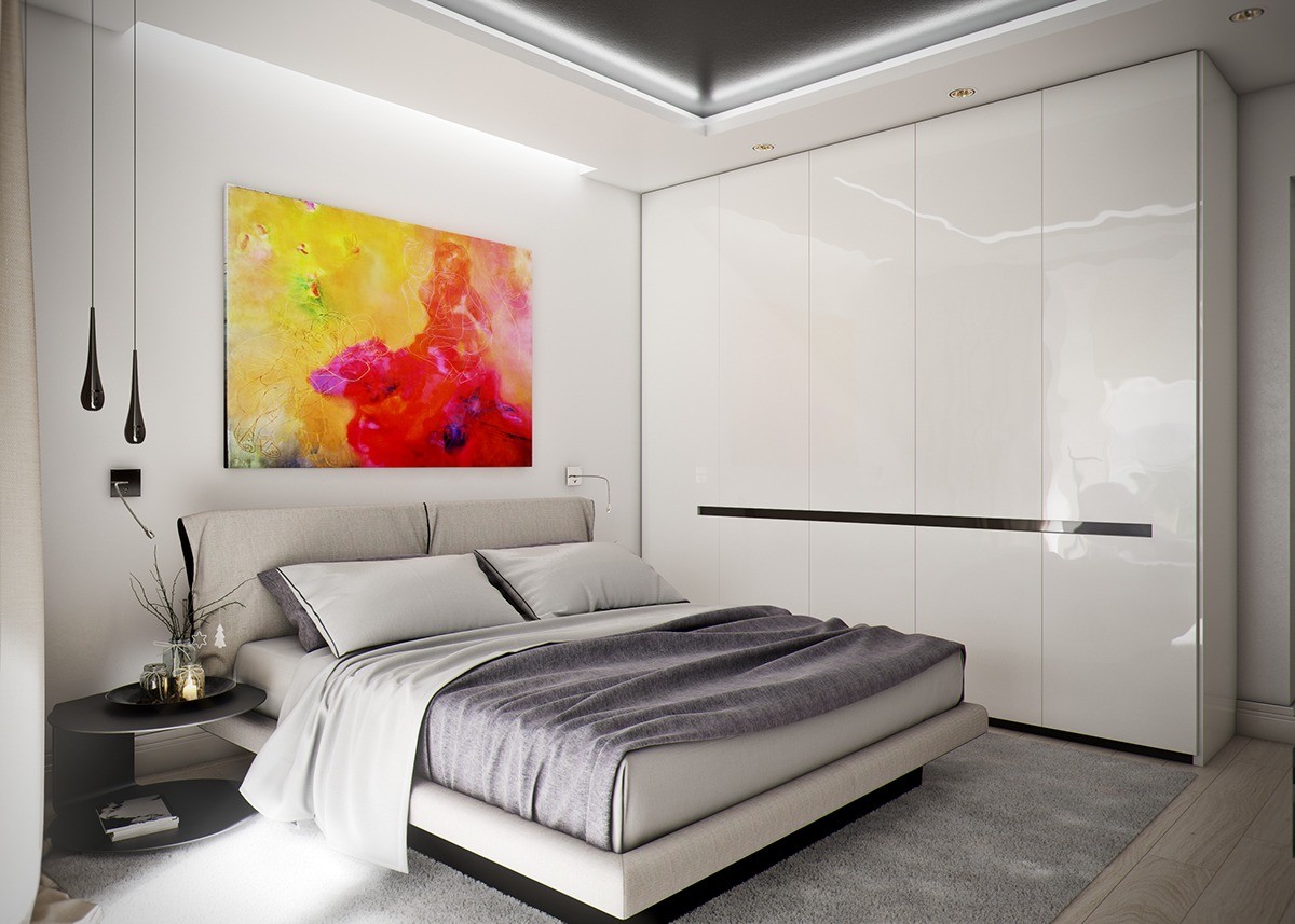
The bedroom makes a big first impression with a vivid watercolor canvas above the bed. Glossy storage cabinets to the right emphasize the strong horizontal lines used in the main living space.
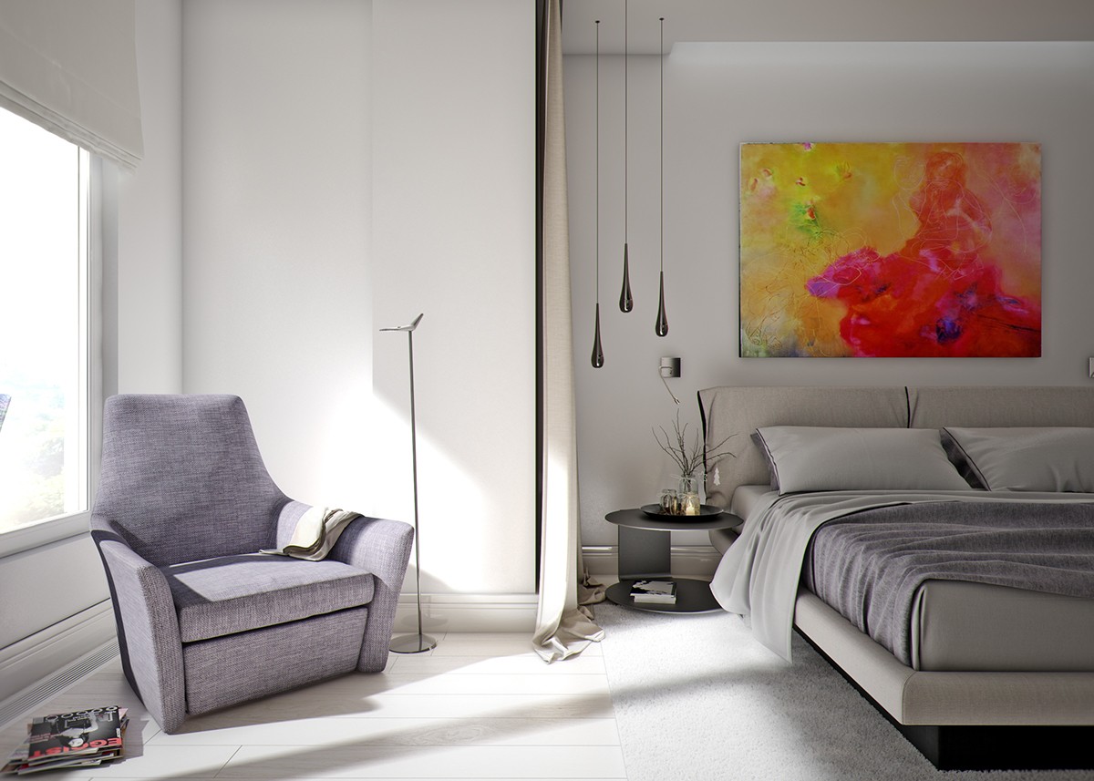
A curtain runs along the division between the seating area and the bed area, rather than the window. This would be useful to divide a shared bedroom when one resident wants to read while the other sleeps.
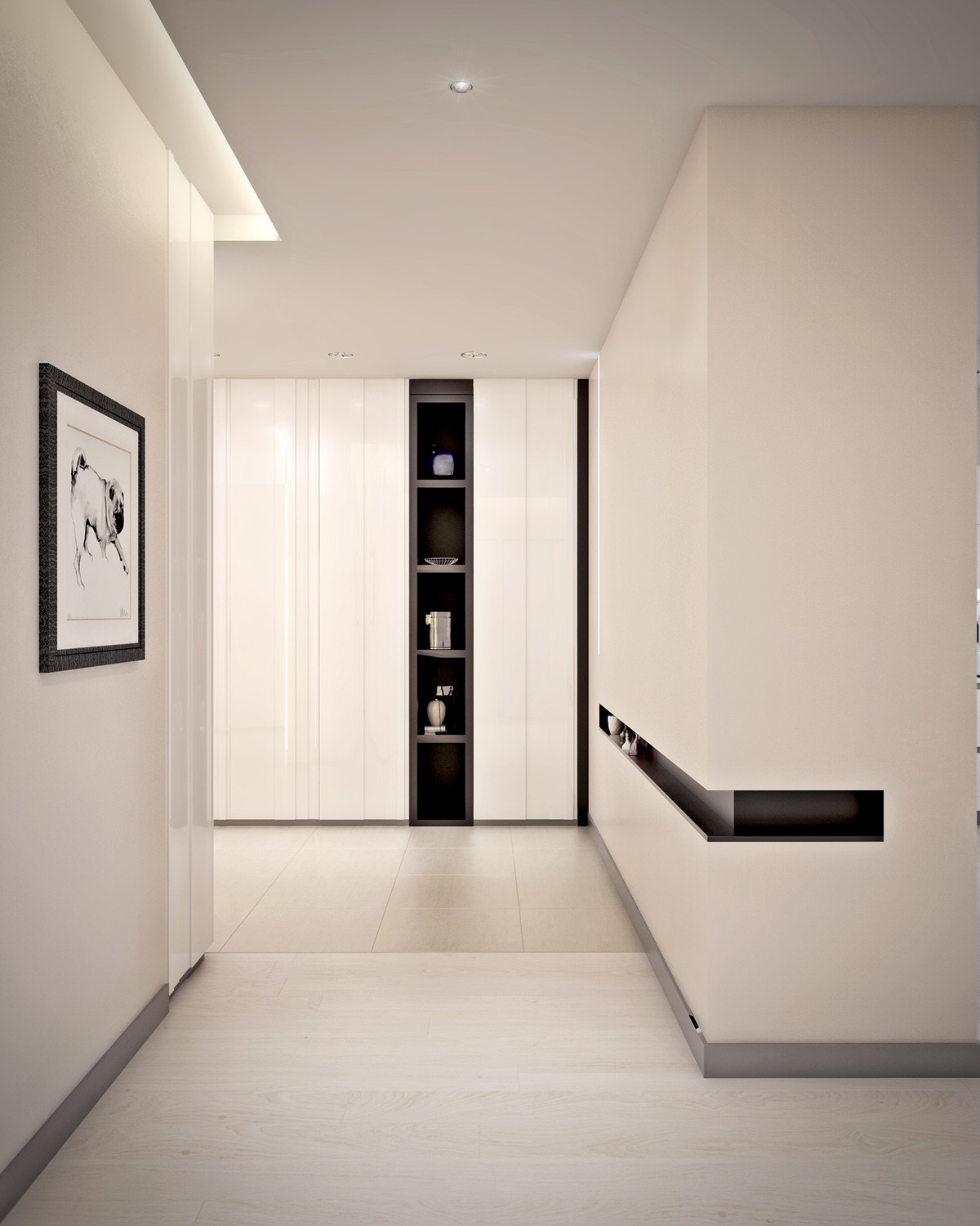
Don't you just love hallways with a little decoration? This one is minimalistic, yet includes a running niche for small decorations.
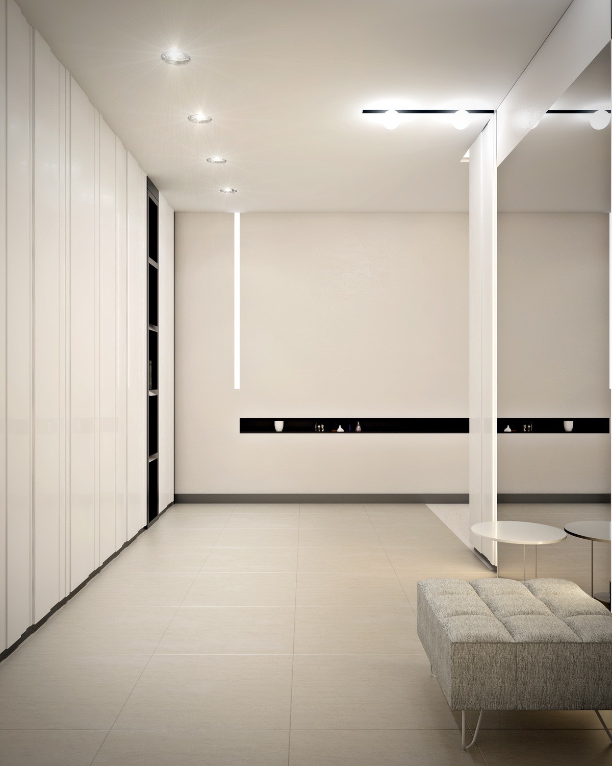
Panels in varied widths and depths prevent this initial view from looking too rigid – a real risk when decorating with glossy white.
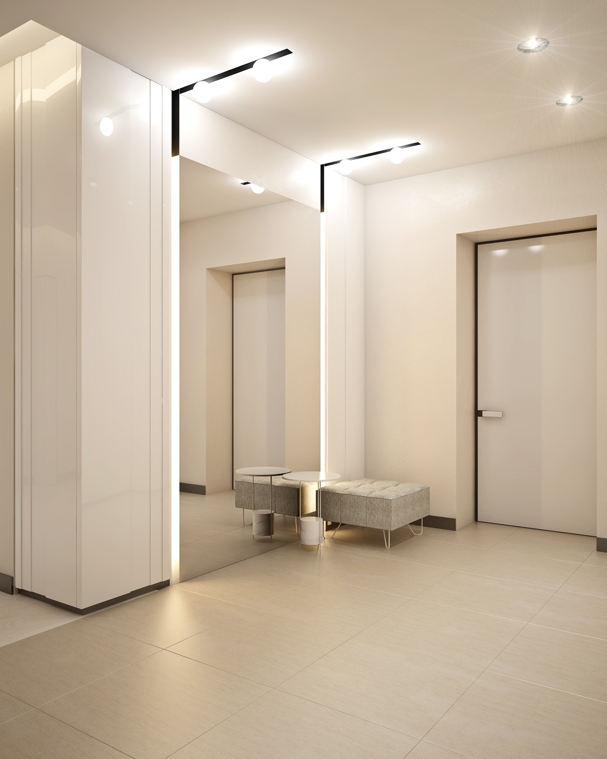
Warm and welcoming, the entryway adopts a slightly different color palette in a slightly richer shade of cream.
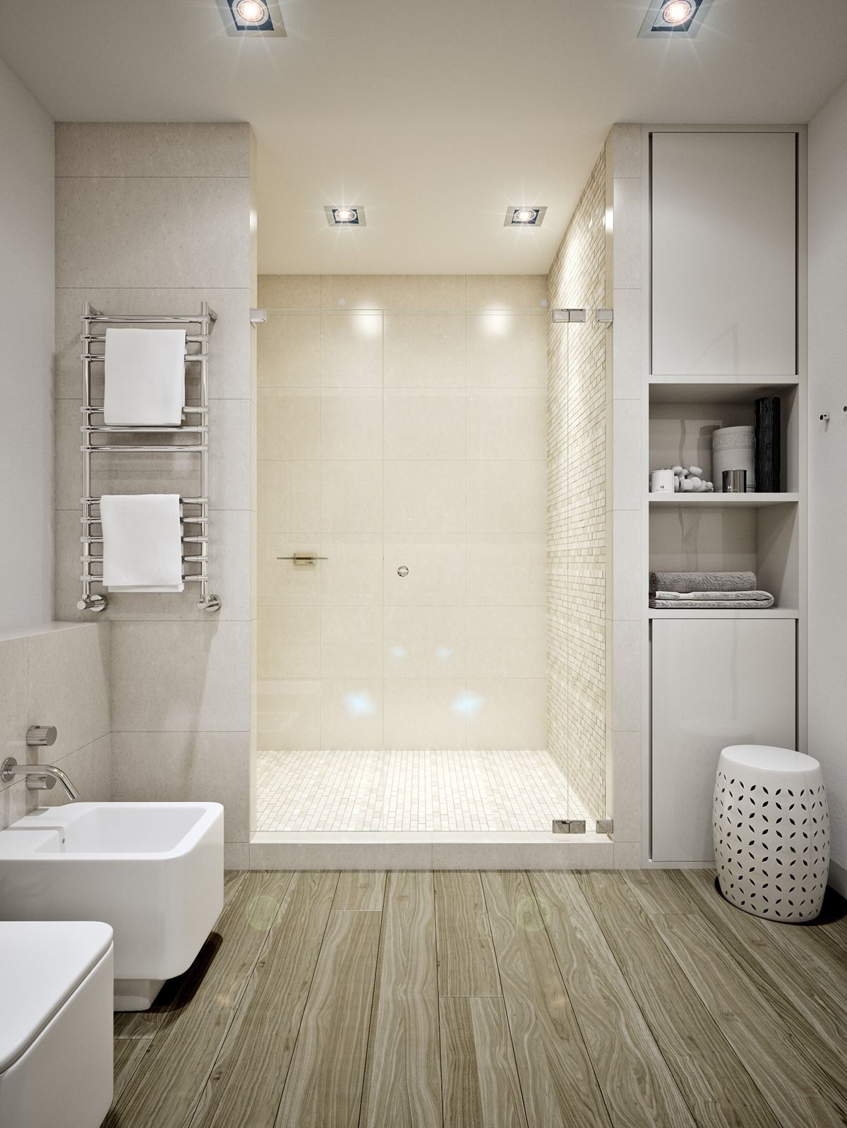
The bathroom embraces a more natural aesthetic with darker floorboards and small tiles in different shades of sandy beige.
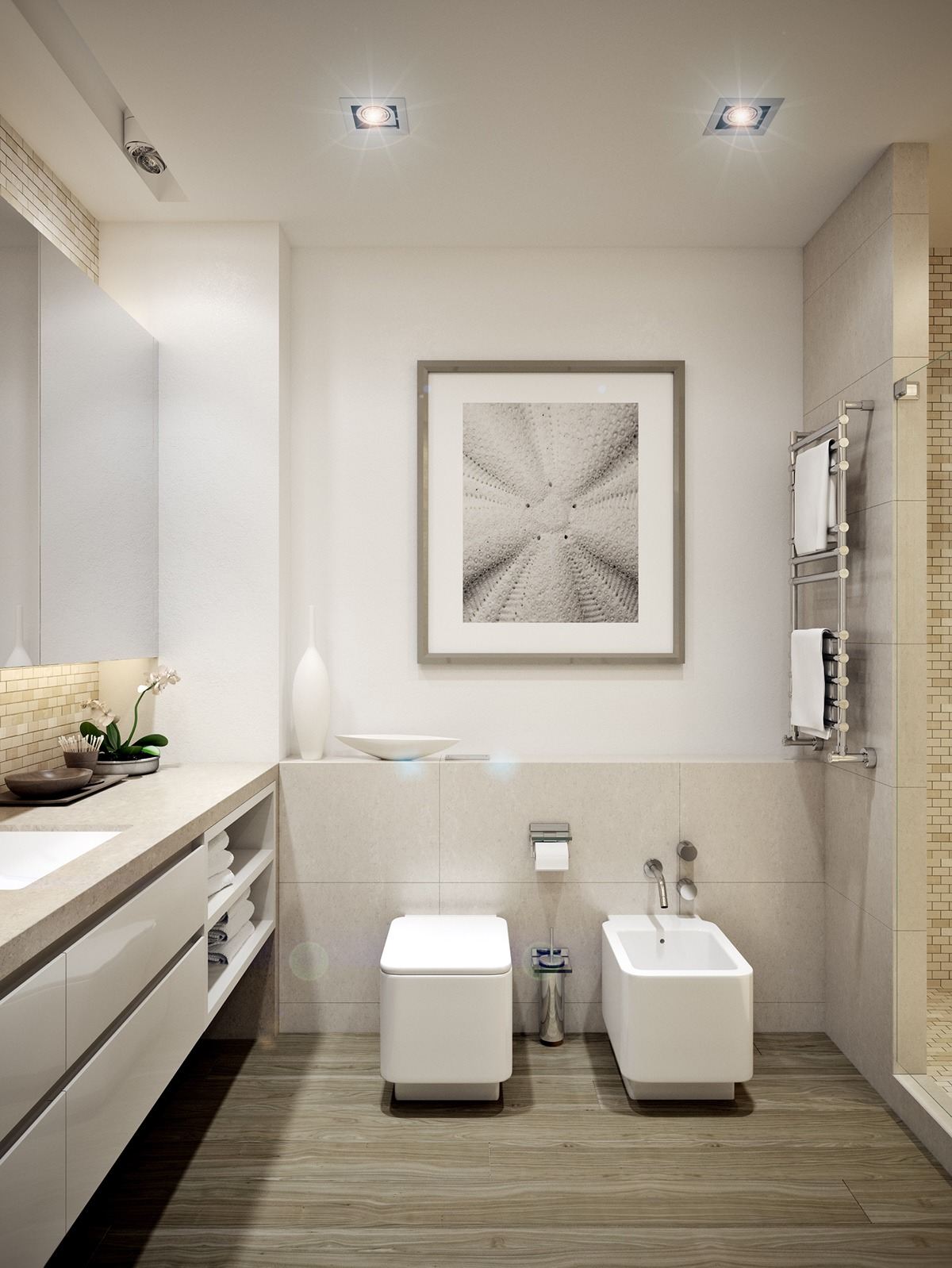
Nautical themes are always popular for bathrooms, but this up-close shot of a sand dollar (a type of flattened sea urchin) takes a very subtle approach.
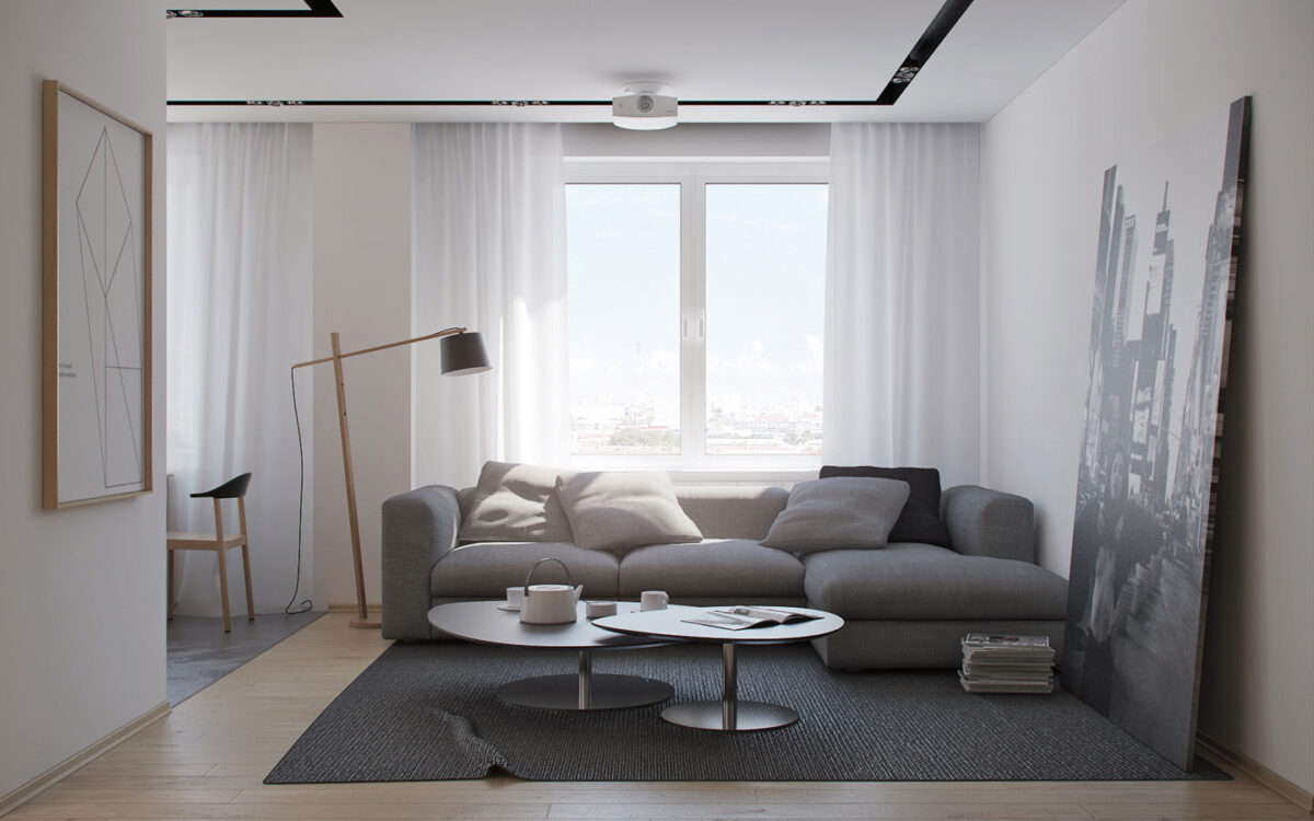
Our second tour explores an apartment designed for a young couple in Minsk. The clients prefer a minimalistic style but wanted something a little warmer and more comfortable than minimalist interiors usually provide. To accomplish this, the designers opted for an abundance of natural wood tones and gray accents.
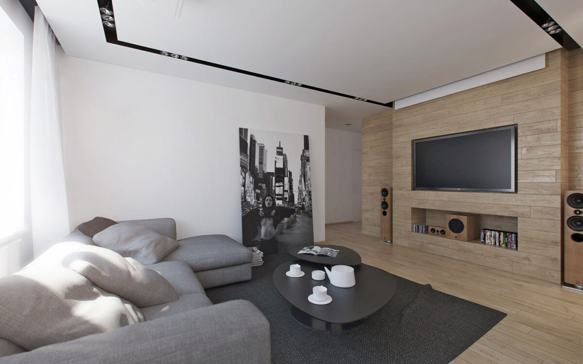
Stark black and white surfaces brighten one side of the room and horizontal wood panels make a welcoming statement on the other side.
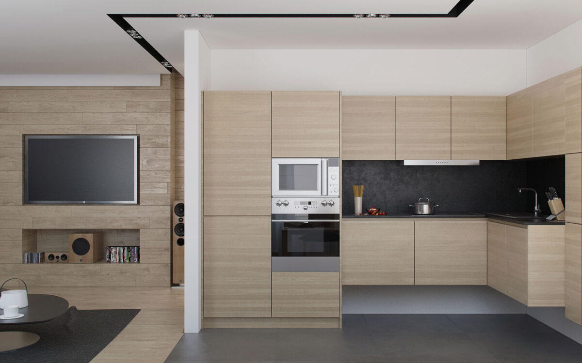
This wood treatment continues into the kitchen, with distinct boards transitioning to smoother panels.
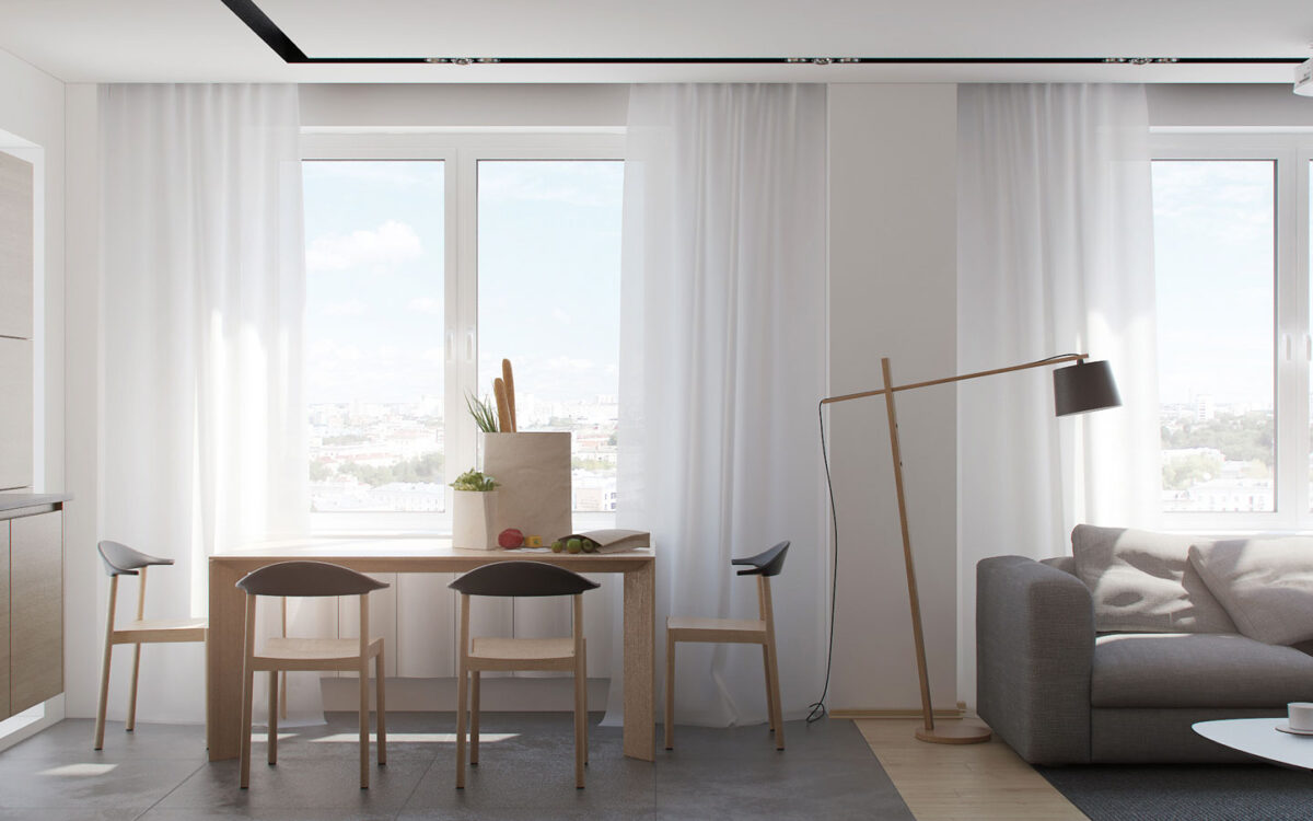
The floor lamp to the right is neat and useful – the upper portion can slide forward or backward through one of three holes in the base for low-tech adjustability.
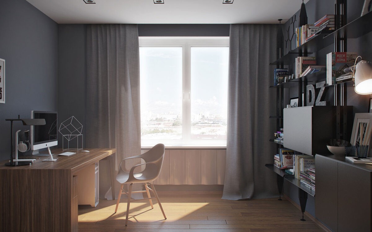
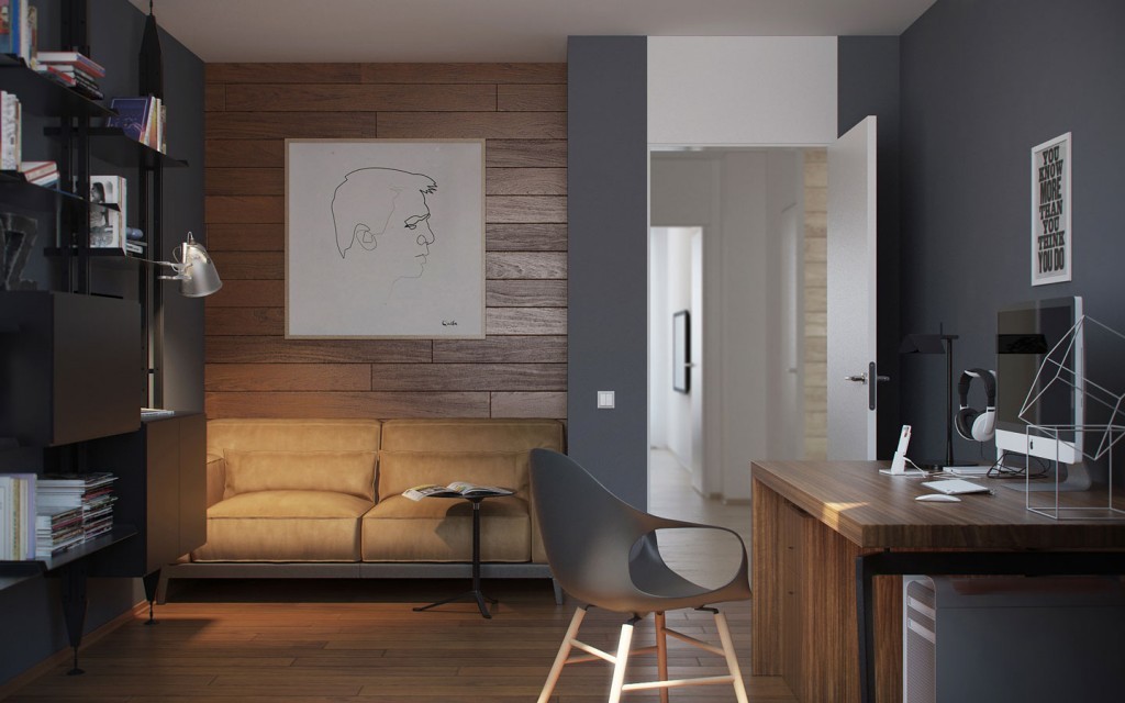
The office is sleek and dark with a smart arrangement. You'll notice the desk faces a clean slate, while all the storage and decorative elements remain behind the chair. This accommodates stricter concentration.
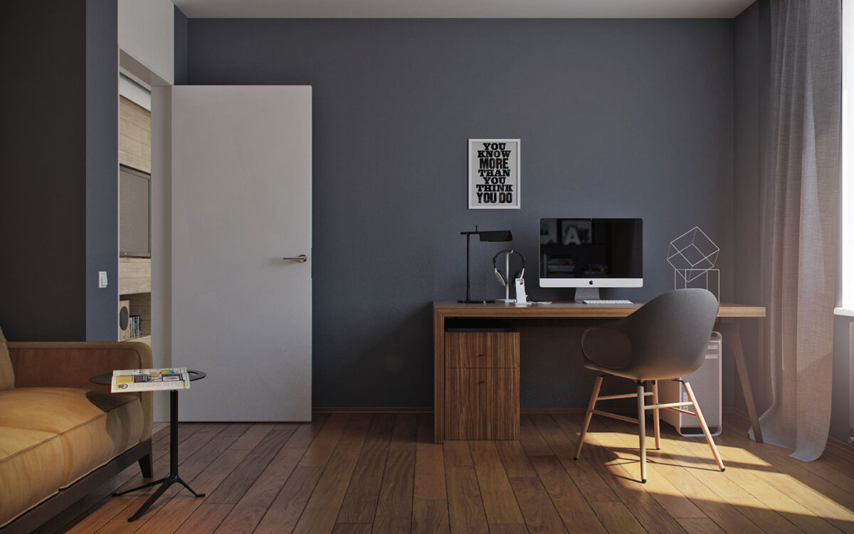
A little motivational poster and a geometric wire sculpture are the only decorations viewable from the chair besides a cool headphone stand.

With seating space to accommodate visitors, this office owner can easily host casual meetings from home.
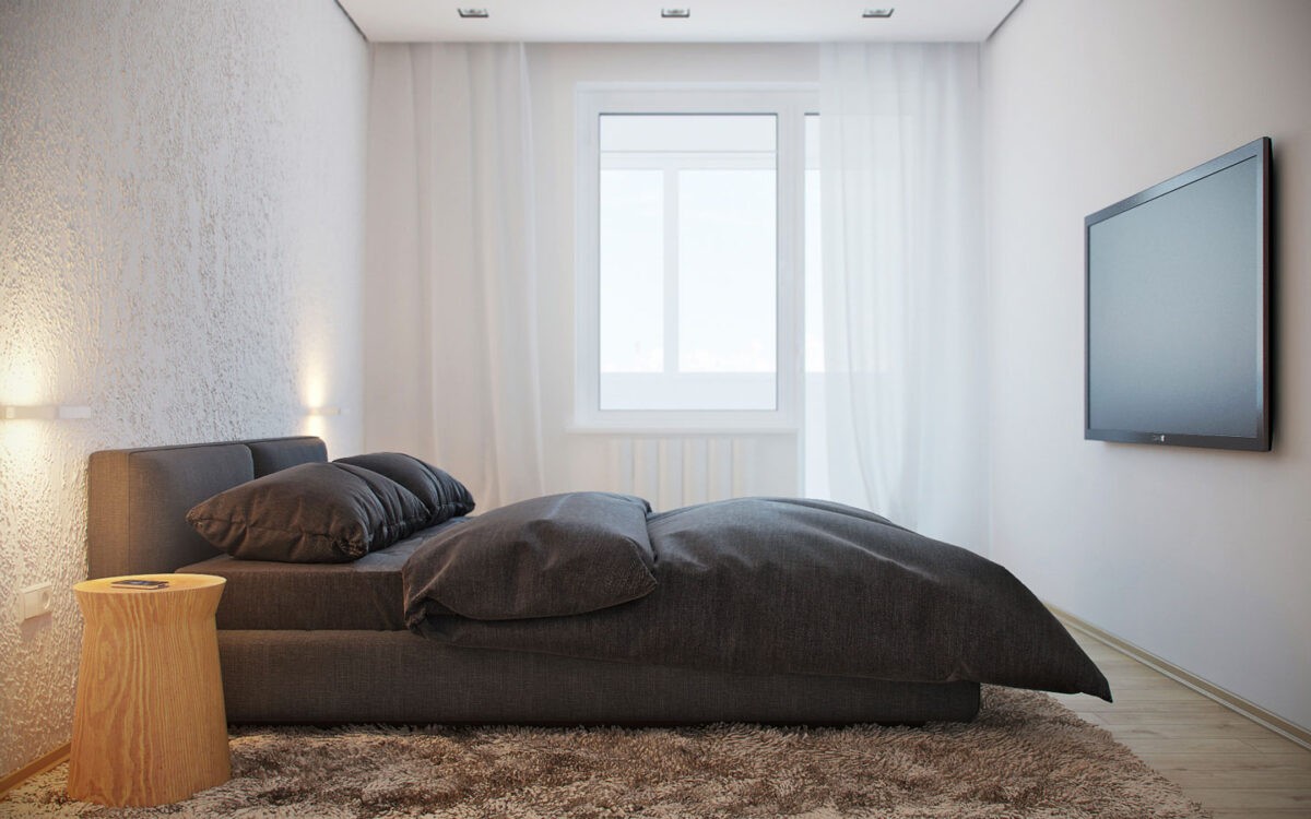
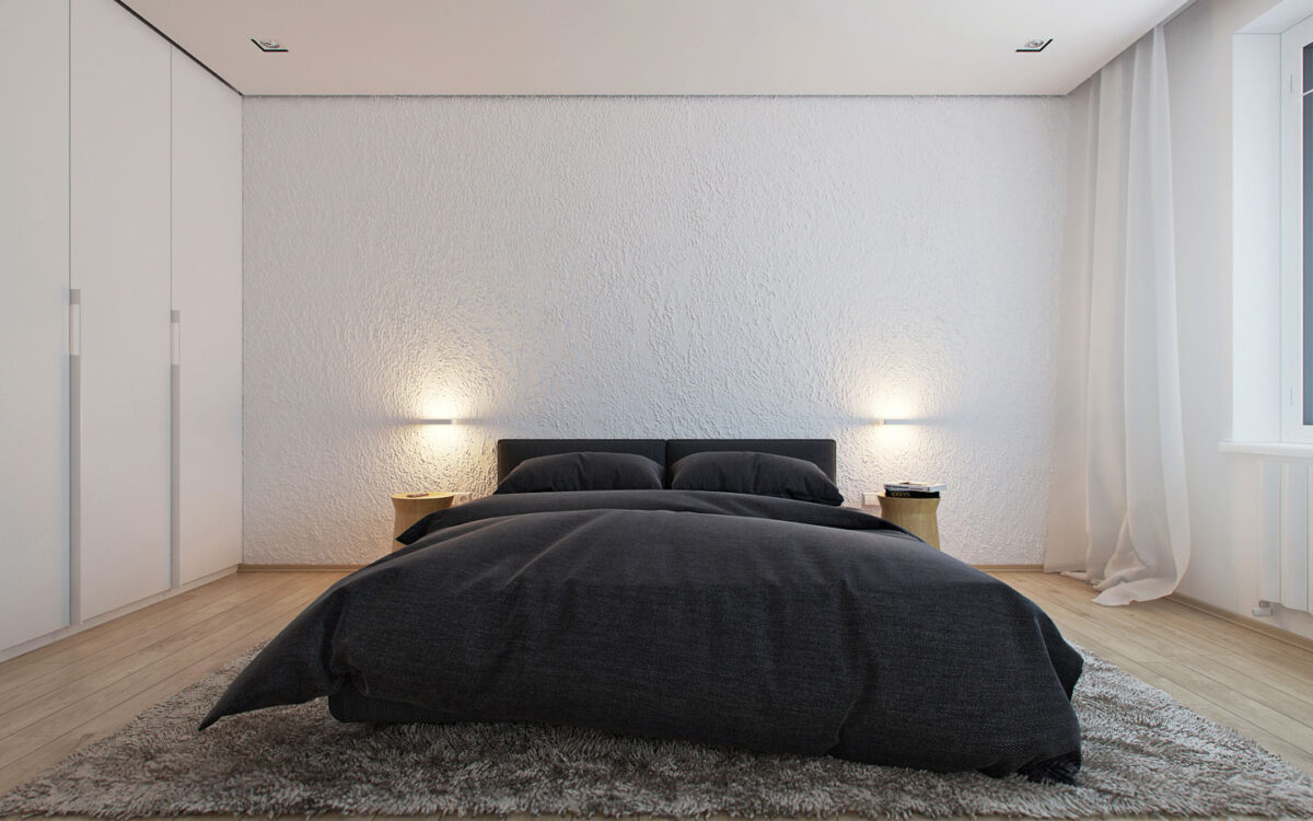
What a lovely minimalistic bedroom! When the television is off, there's not much to distract from peaceful sleep. With the television on, there's nothing to distract from the media experience.
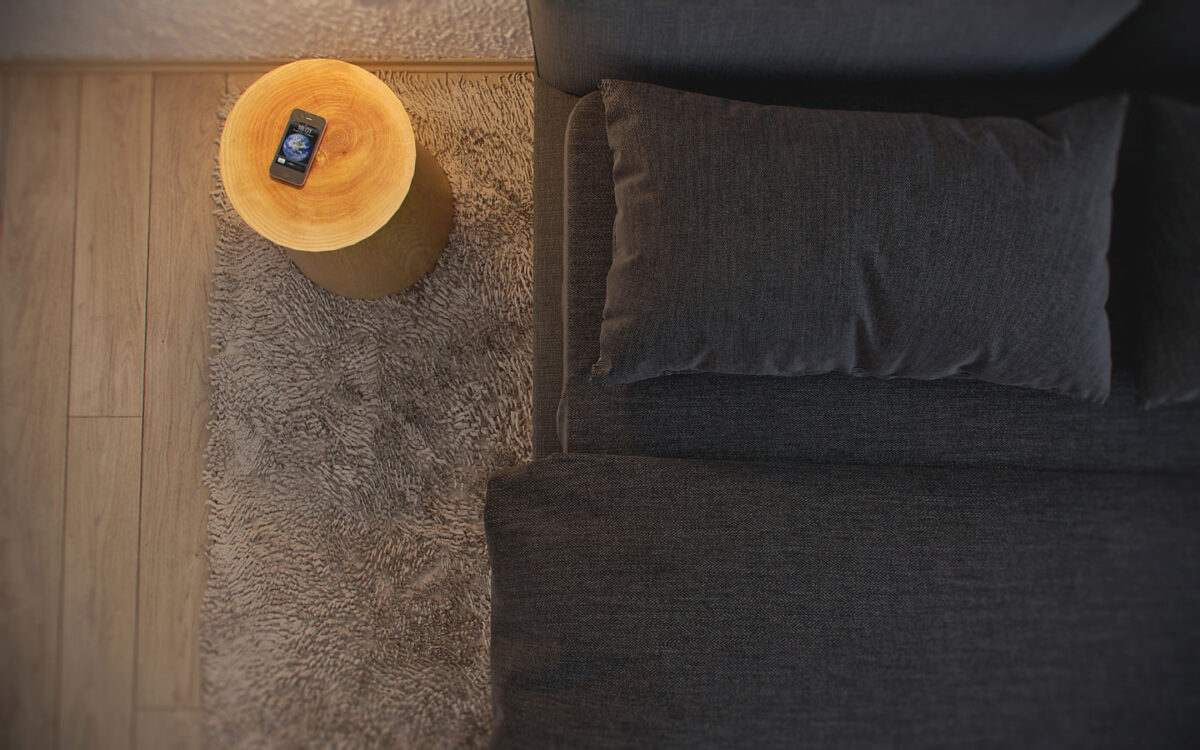
Modern bedrooms only really need one piece of technology – a phone. They replace the old handset and alarm clock and could even replace the television if desired.
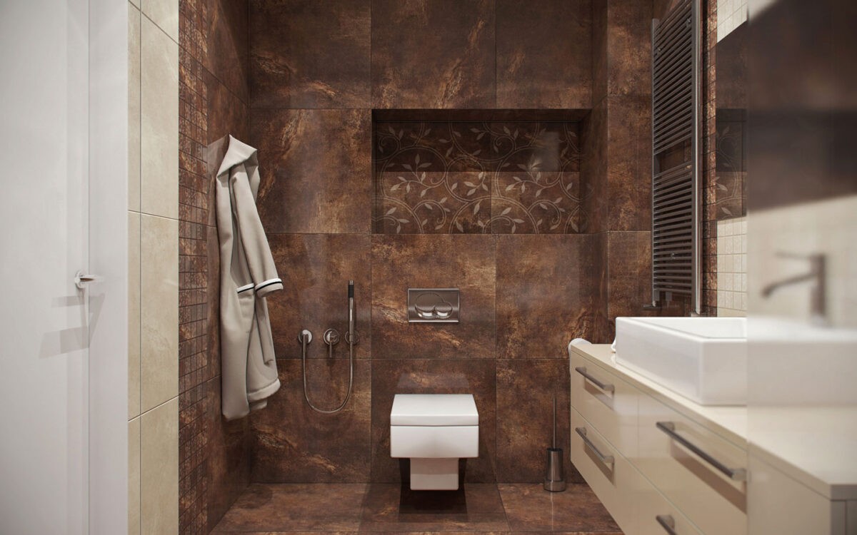
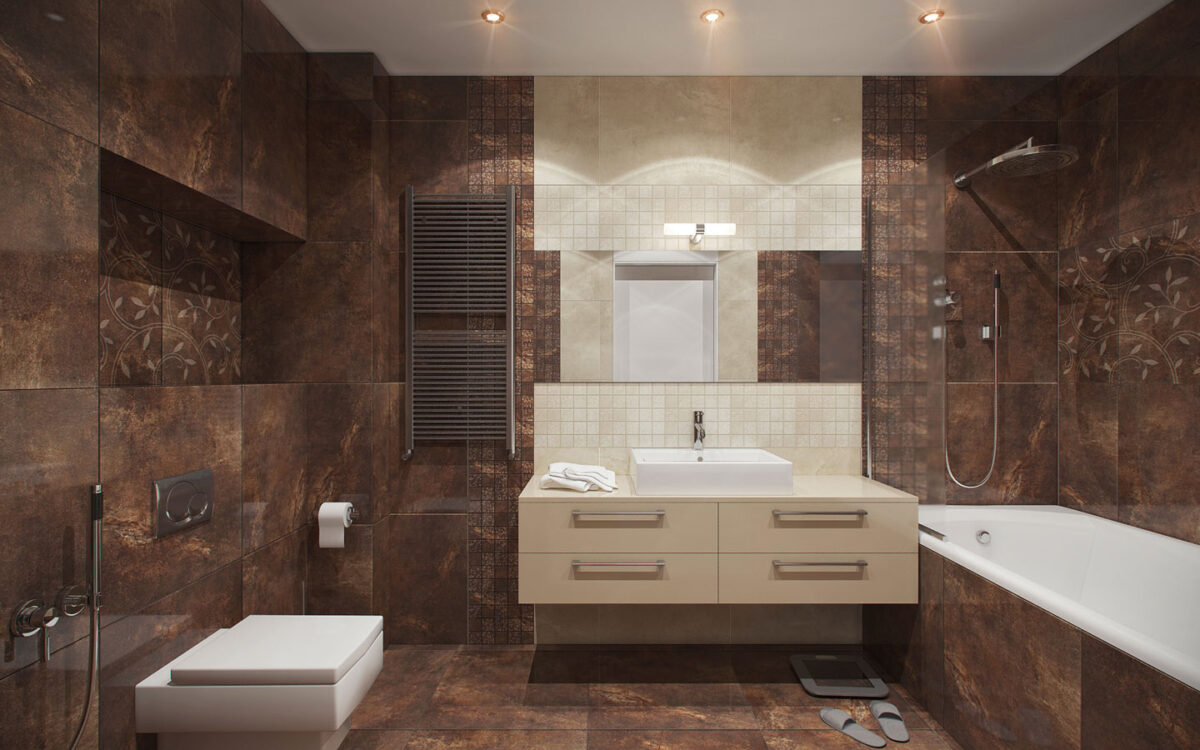
Wow! Brown stone tile in various sizes and levels of decoration give the bathroom a style different from anywhere else in the house.
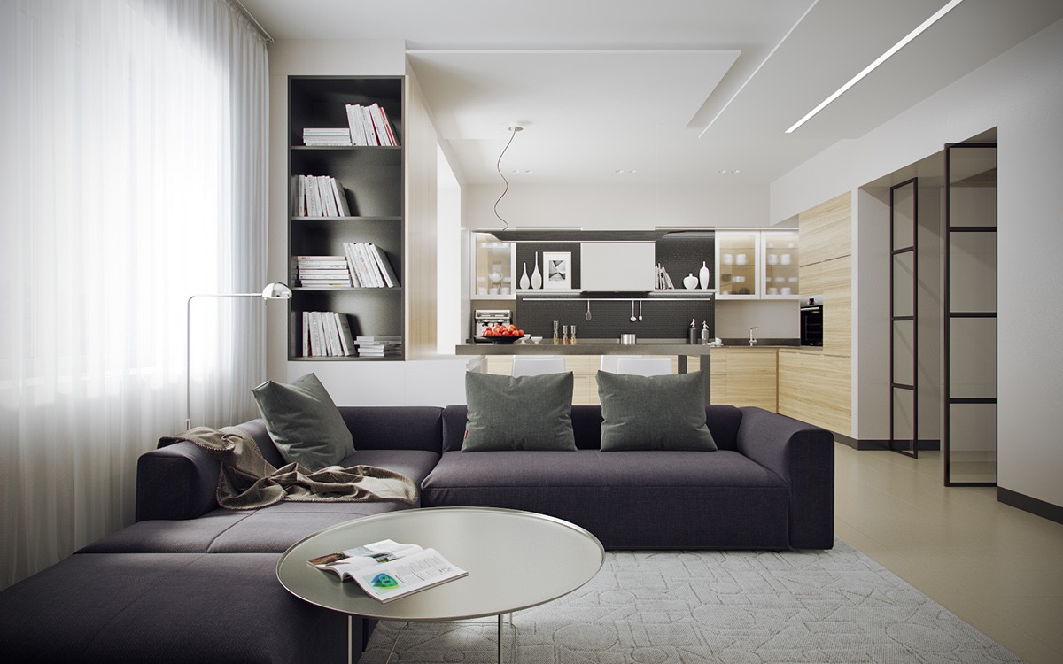
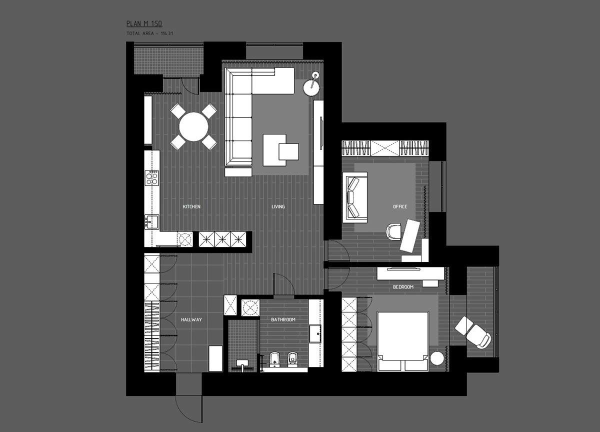
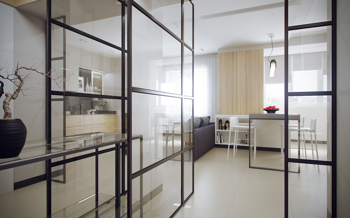
This home seems like it has a rather traditional layout when viewed from the living room, but the layout unfolds into distinctive angles the deeper a visitor wanders.
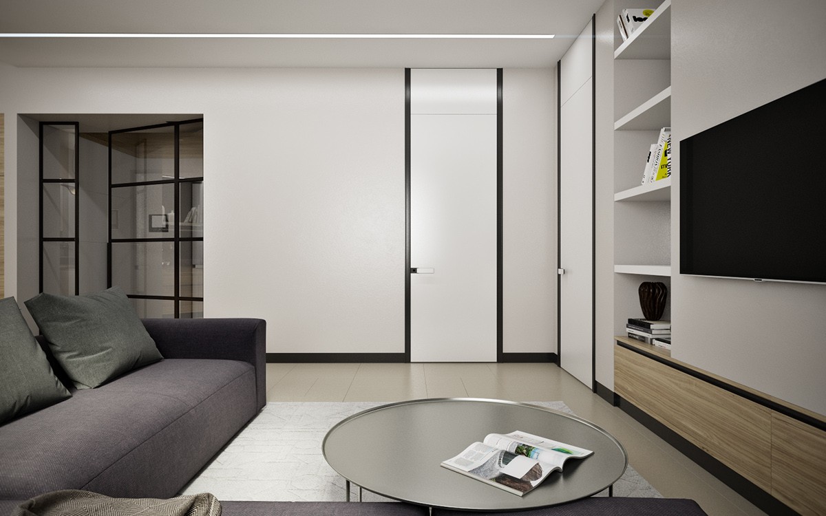
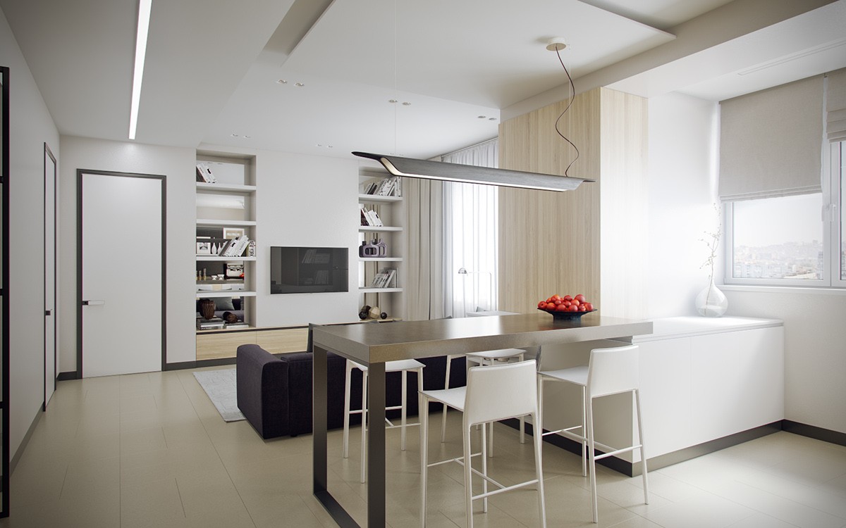
Bold dark lines are a recurring theme – here they outline the tall doors, the baseboards, and draw the eye along the storage beneath the media center.
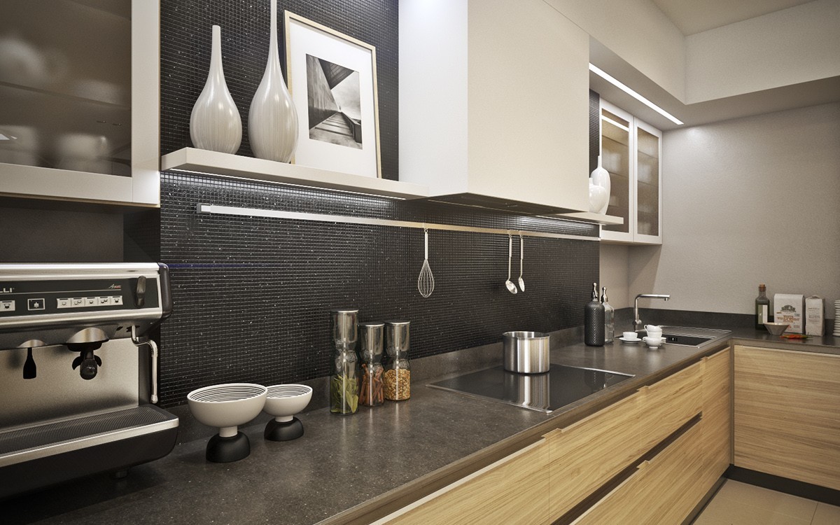
At the other end of the open plan living space is a kitchen outfitted in wood and white. It dazzles with a little glamor thanks to sparkling tiles within the black backsplash.
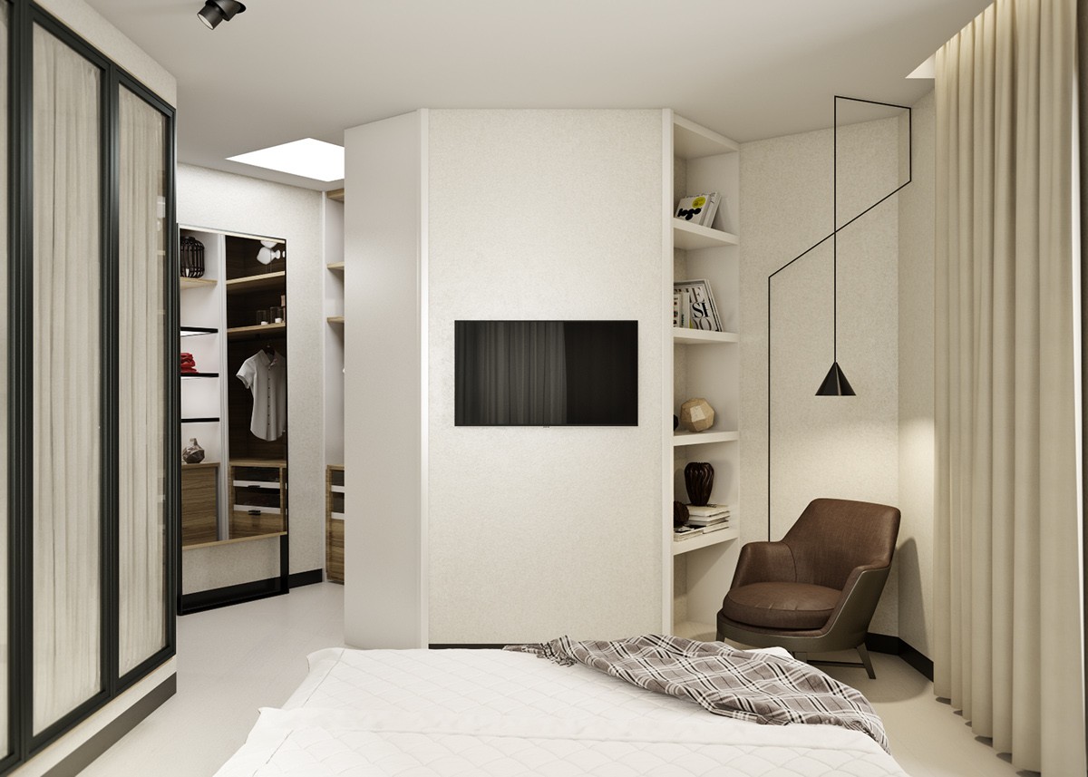
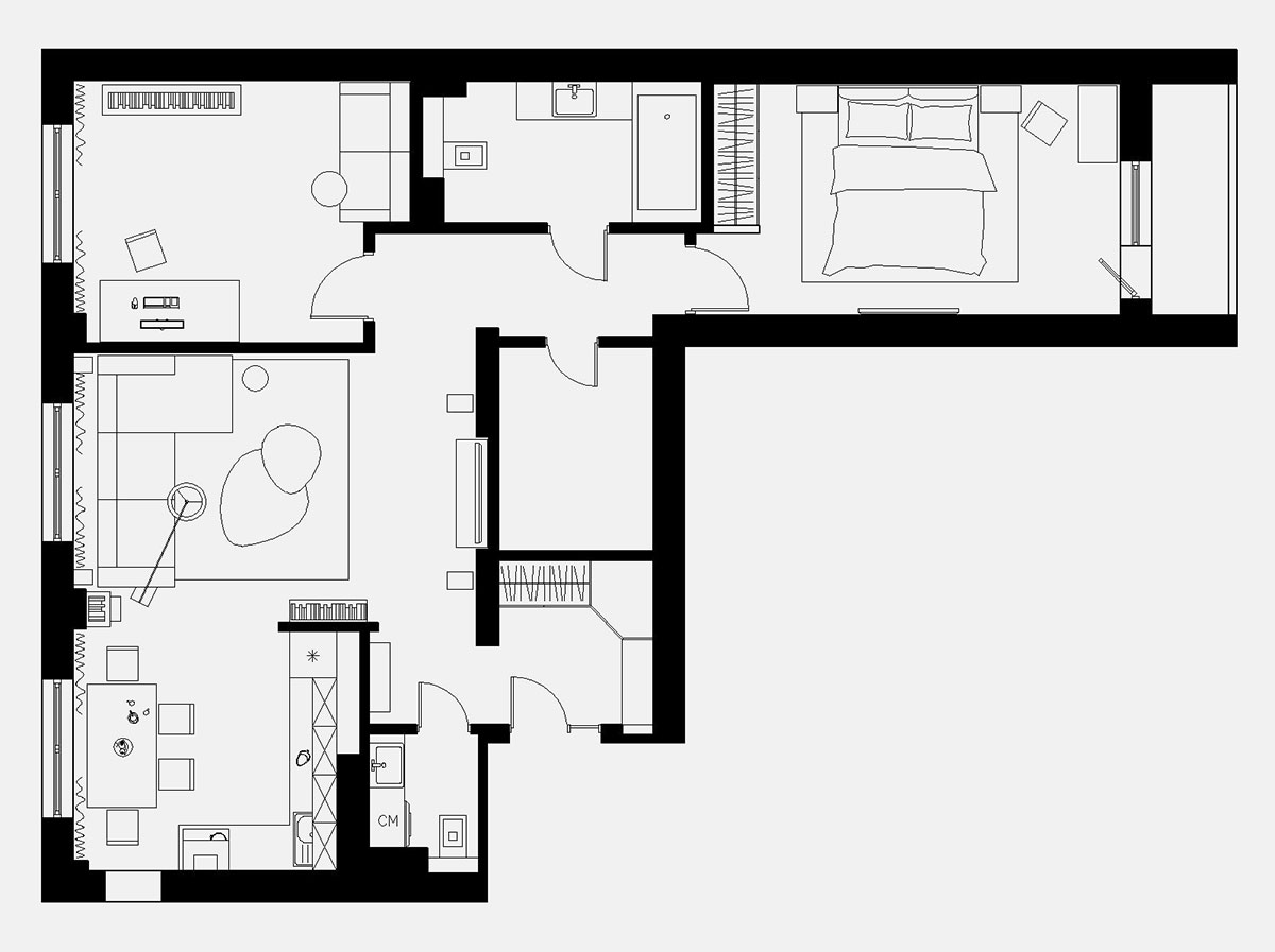
Here, the distinctive layout reveals itself, with a lovely little study tucked into the corner. Unfortunately, there is no visualization of the home office in this series but it does appear in the floor plan at the end.
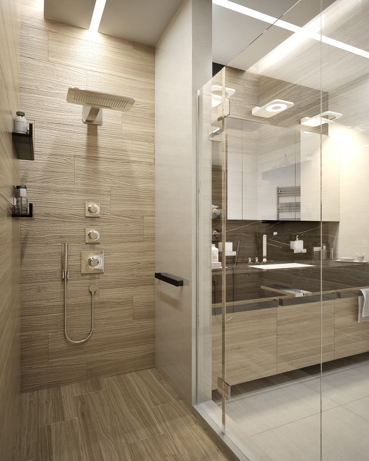
Wood-effect showers are growing more and more popular these days, propelled by the manufacture of convincing tiles that look just like the real thing.
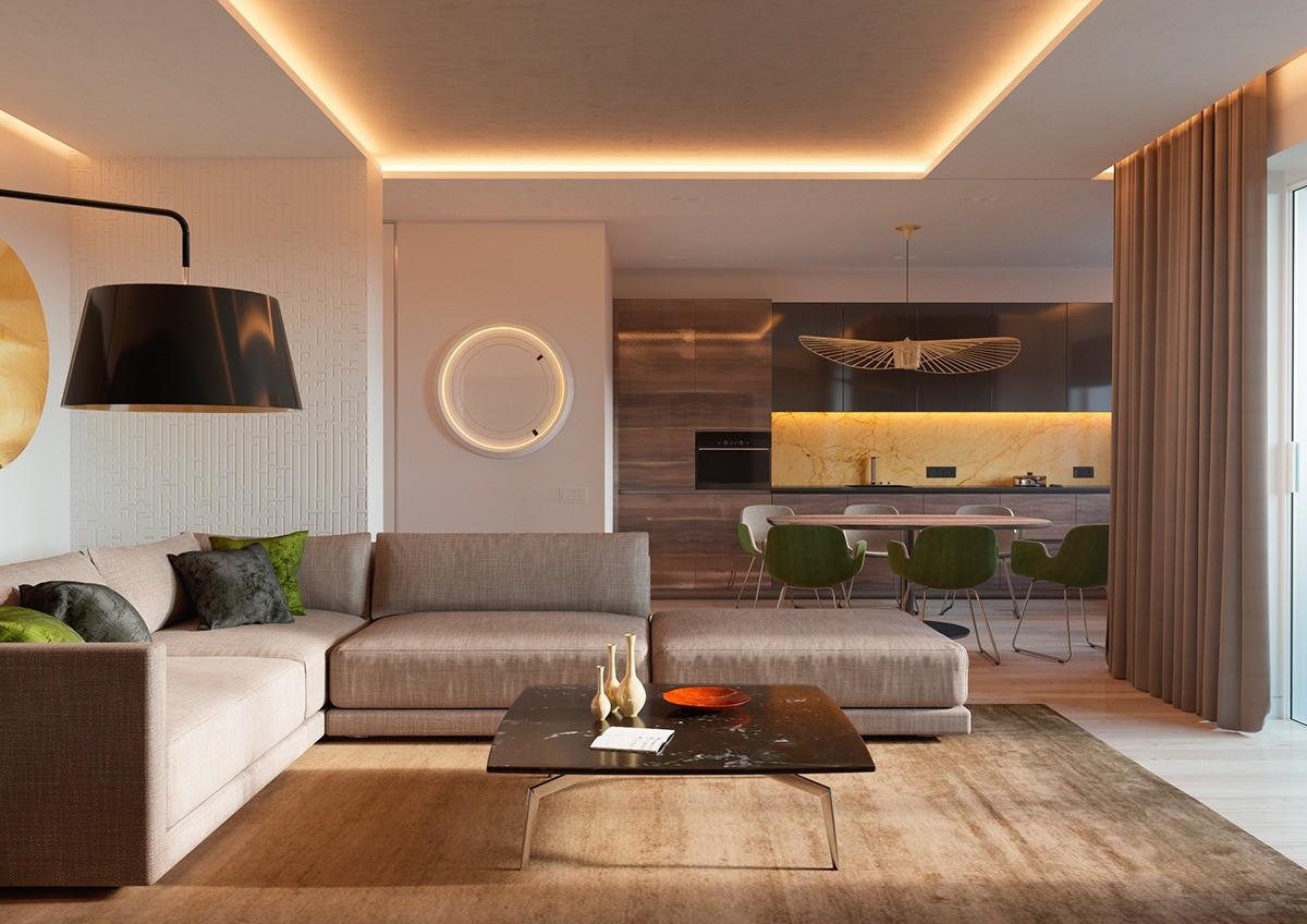
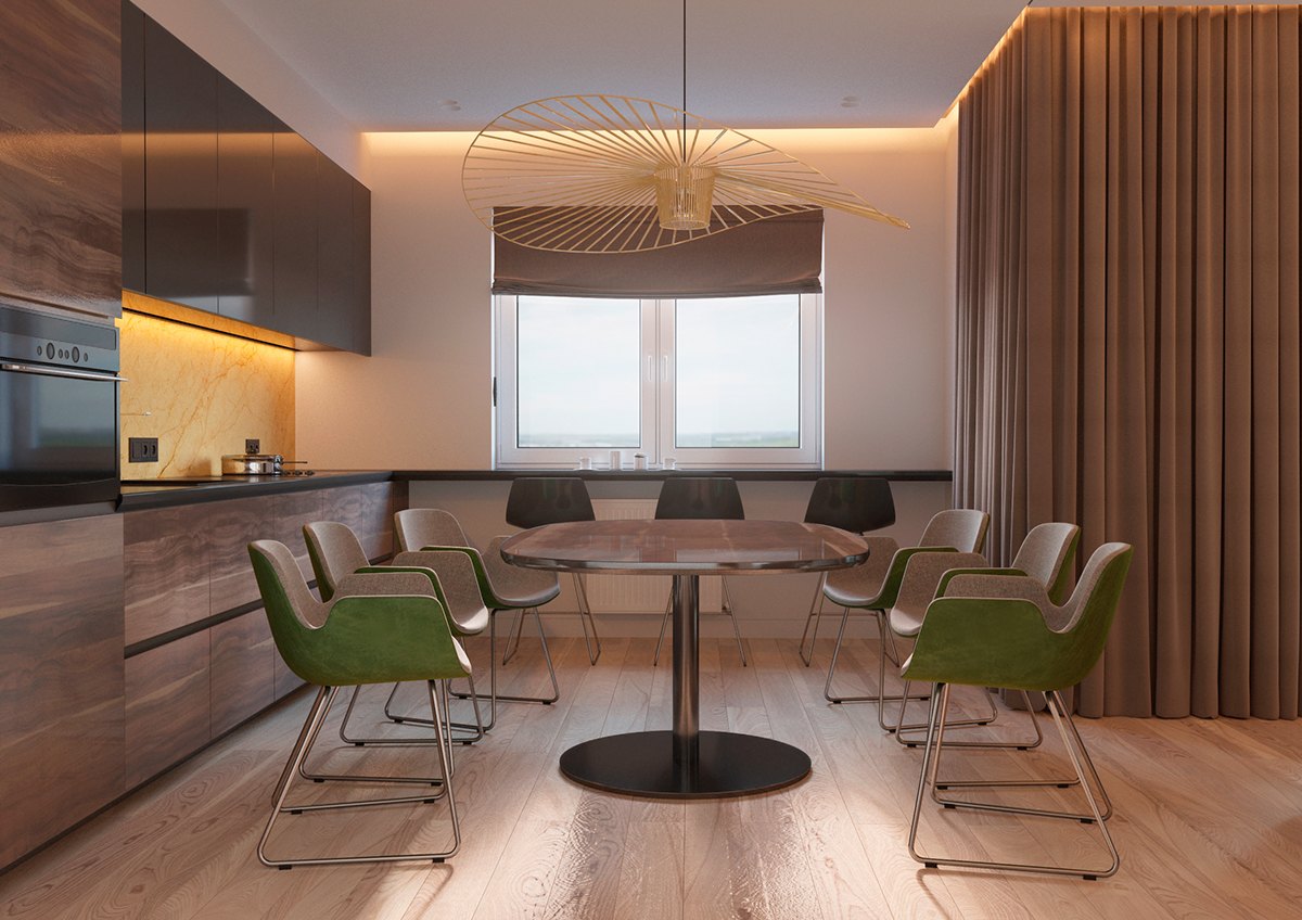
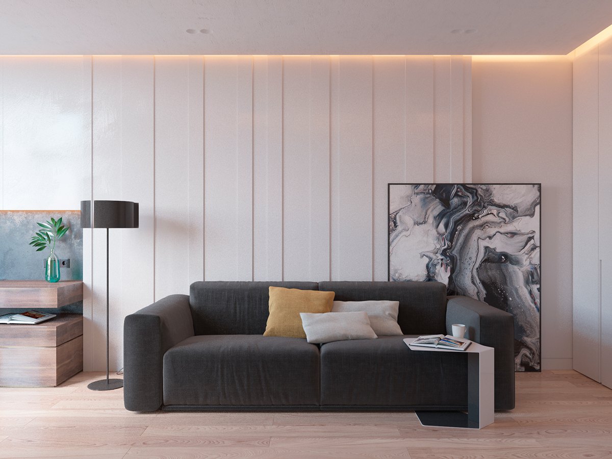
Such an inviting space – this Kiev apartment makes fantastic use of warm colors, including the yellow tinted lighting elements used liberally throughout. It seems like almost every niche and every recess glows with recessed lighting.
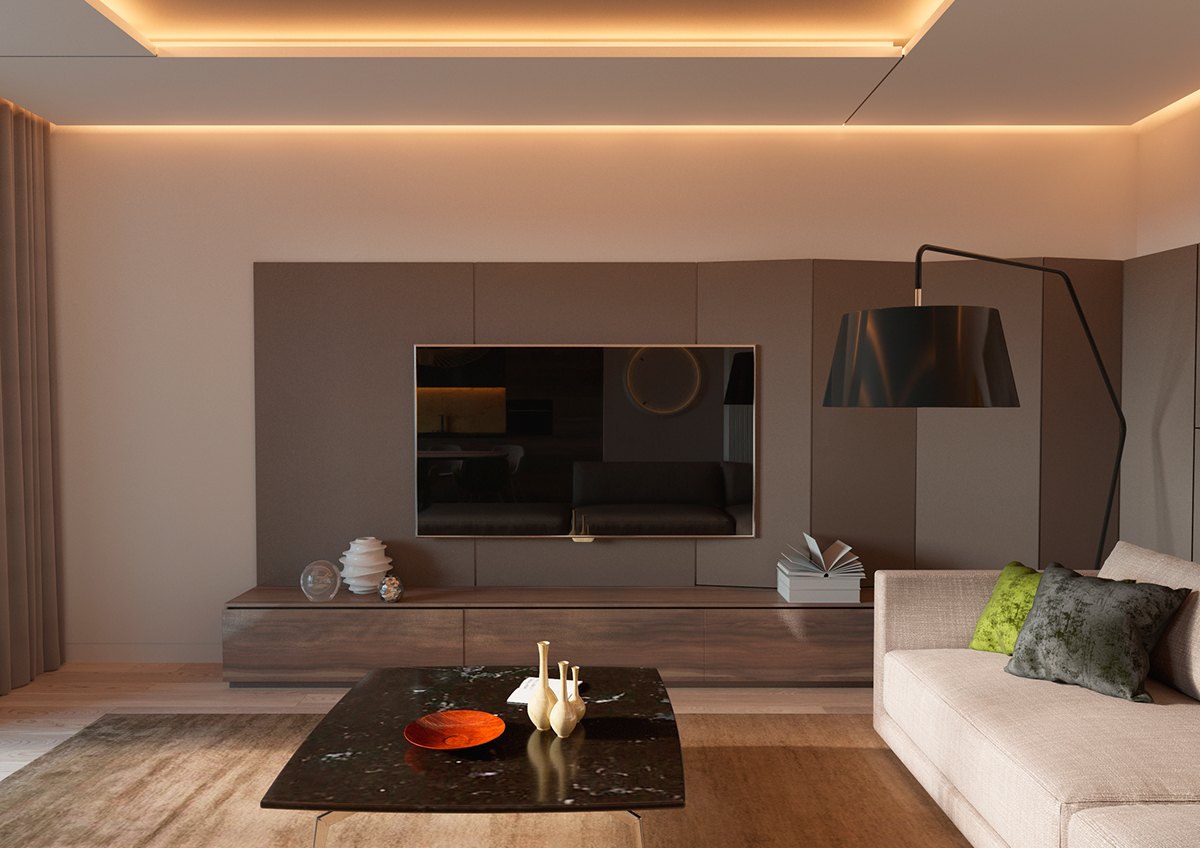
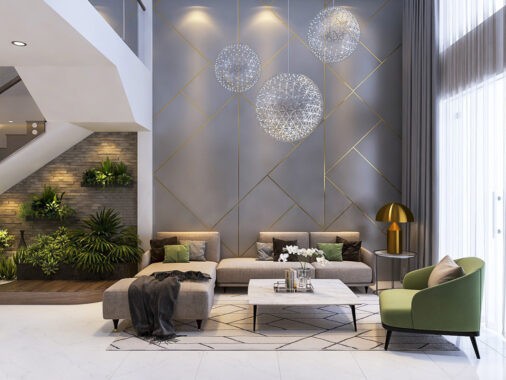
Tilted paneling brings a distinctive character to the media center background. Those angled elements would be a smart place to hide a little extra storage.
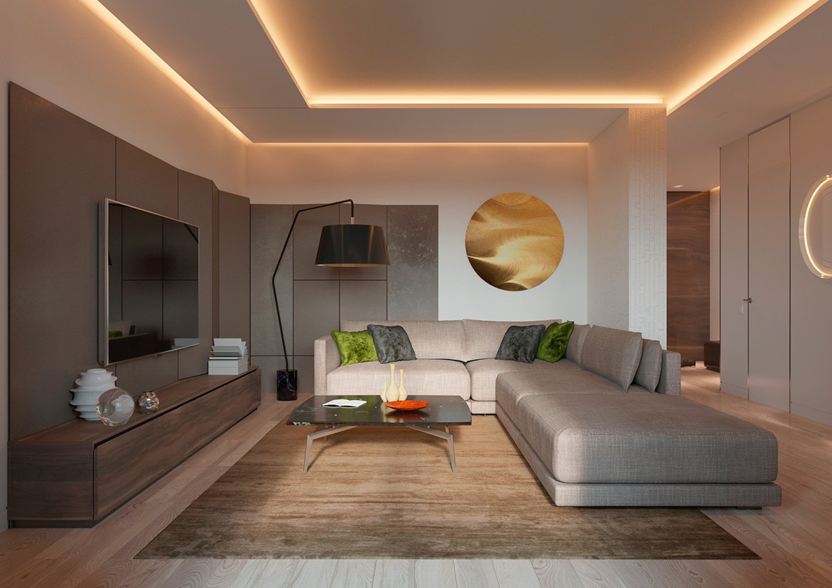
Colorful accents seem to catch the window lighting just right from this angle. The vivid green pillows and gold wall art really add to the personality of the room.
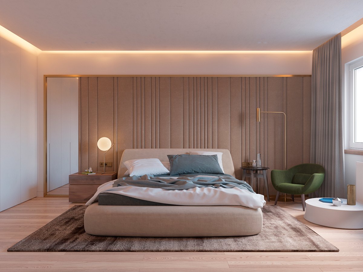
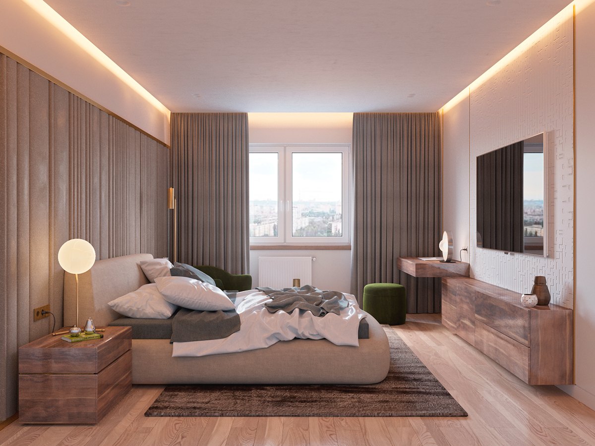
Here's a look at the bedroom, adding to the gorgeous integrated lighting theme with a few standalone fixtures from Michael Anastassiades (left) and Michaël Verheyden (right).
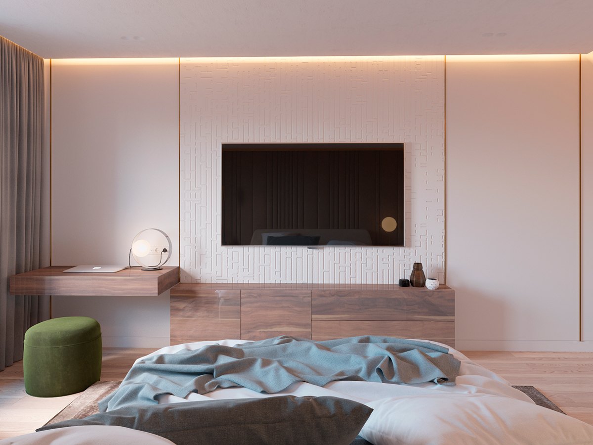
The vanity doubles as a nice place to check email before heading over to the home office in the morning.
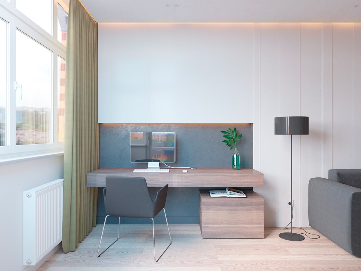
Here's the main home office, its wall-mounted home office desk made from the same wood used in the bedroom.
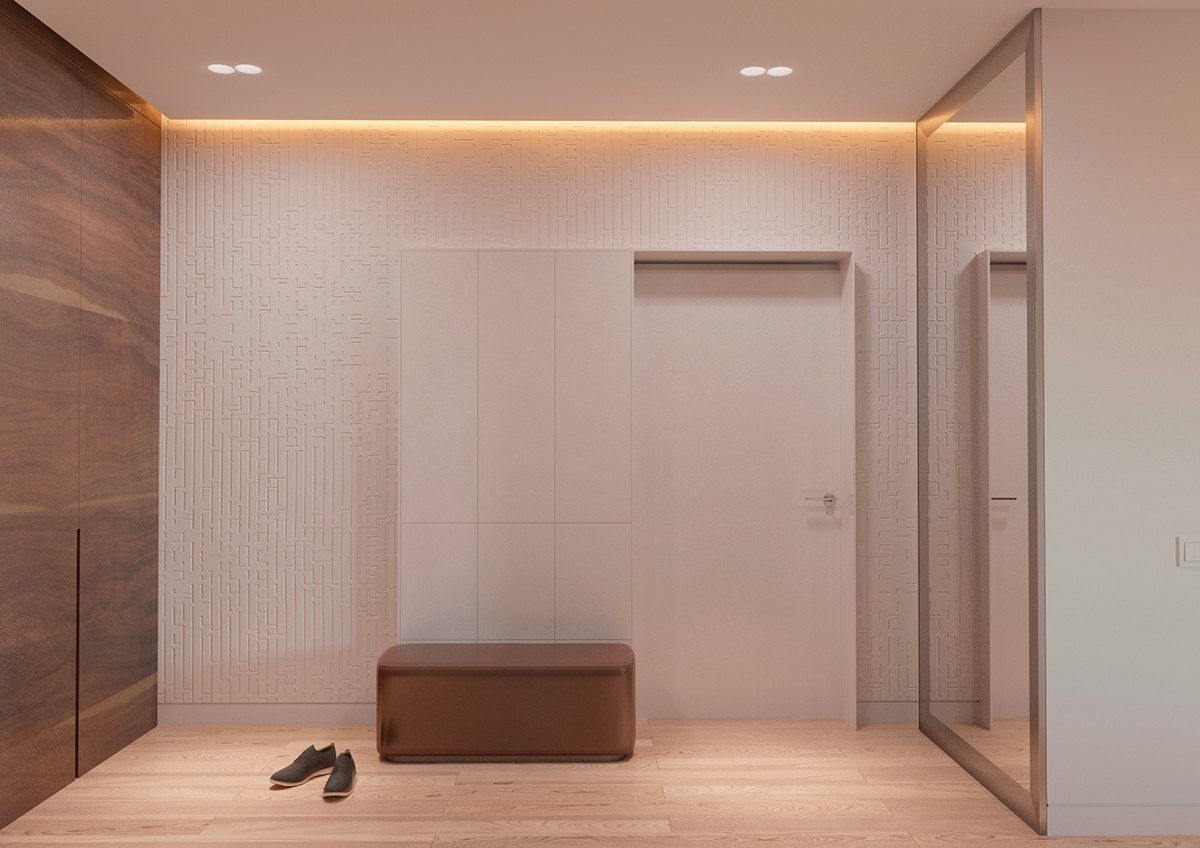
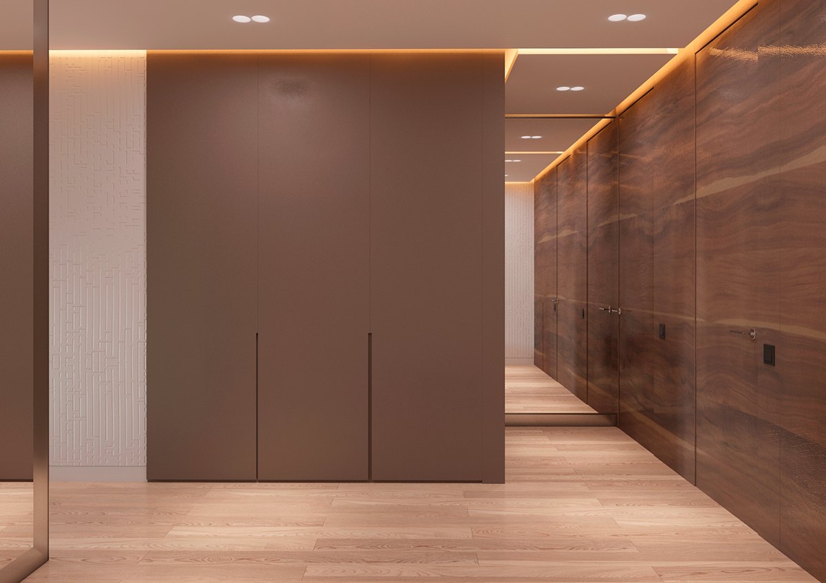
High ceilings and a distinctive accent wall come together to create a very dramatic entryway, sure to capture the imagination of any guests the moment they arrive.
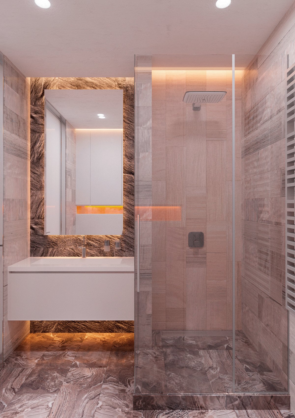
At least three types and textures of stone make the bathroom stand out. Just when you thought this home couldn't up the luxury factor anymore, this space defies all expectation.
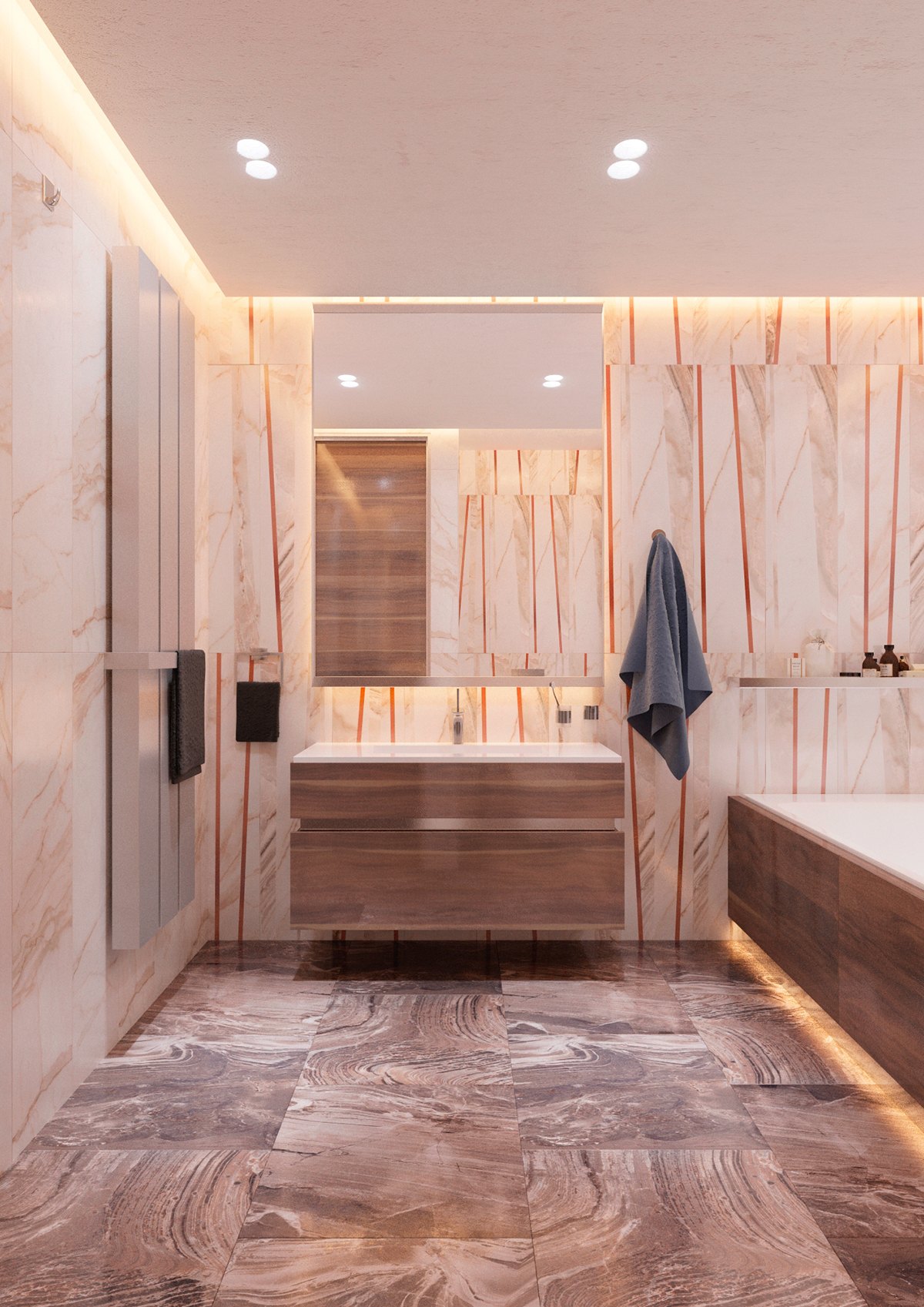
Now for a look at the master bathroom – this home just continues to impress. This one makes use of larger tiles, and includes some interesting vertical stripes for effect.
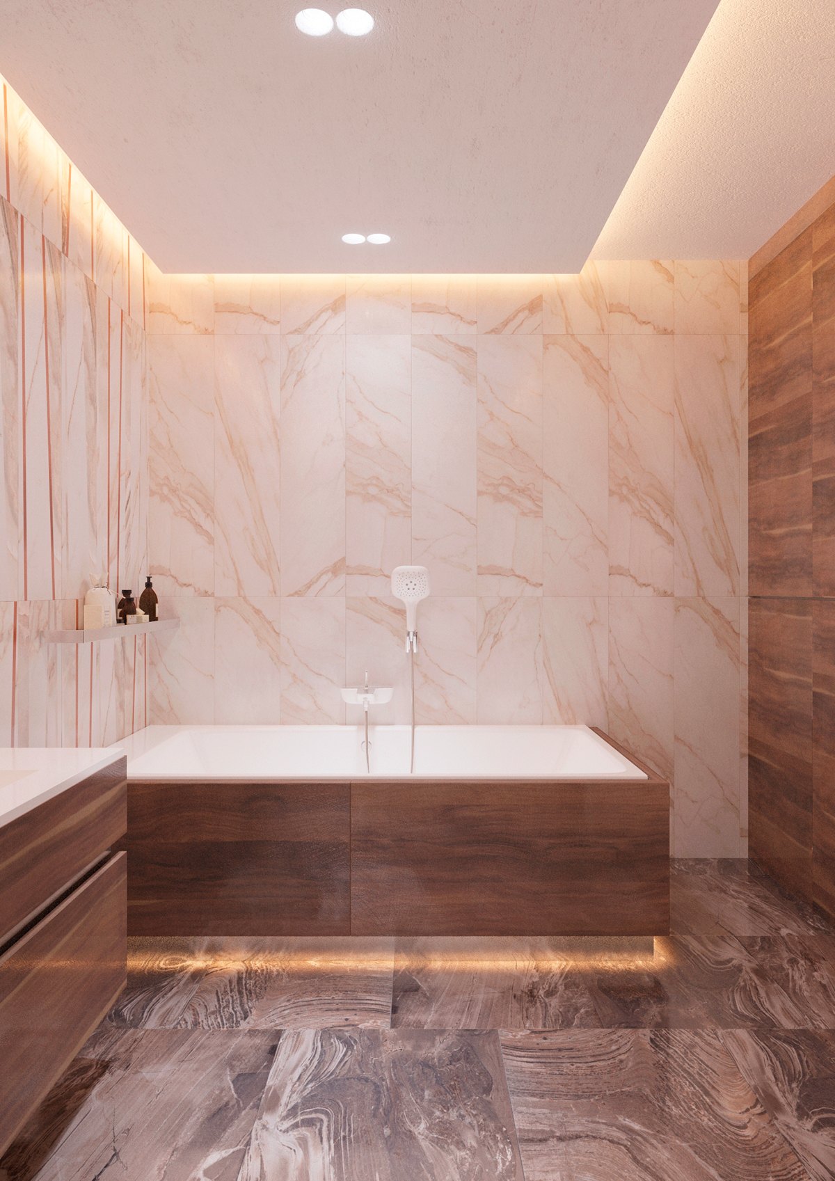
A combination of indirect light on a metallic recessed backing gives the illusion that the tub is floating inches above the tile.
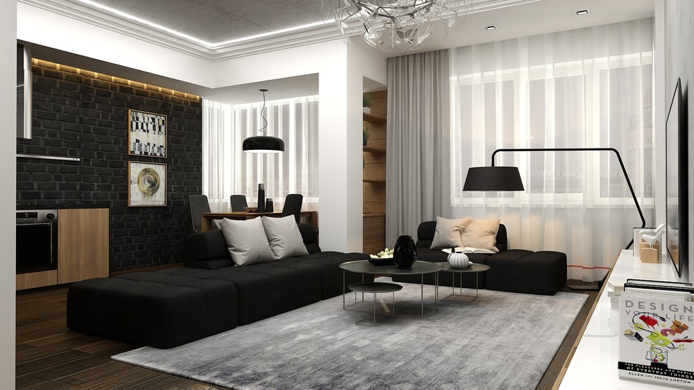
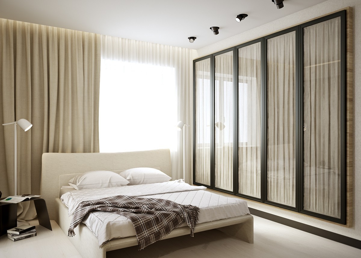
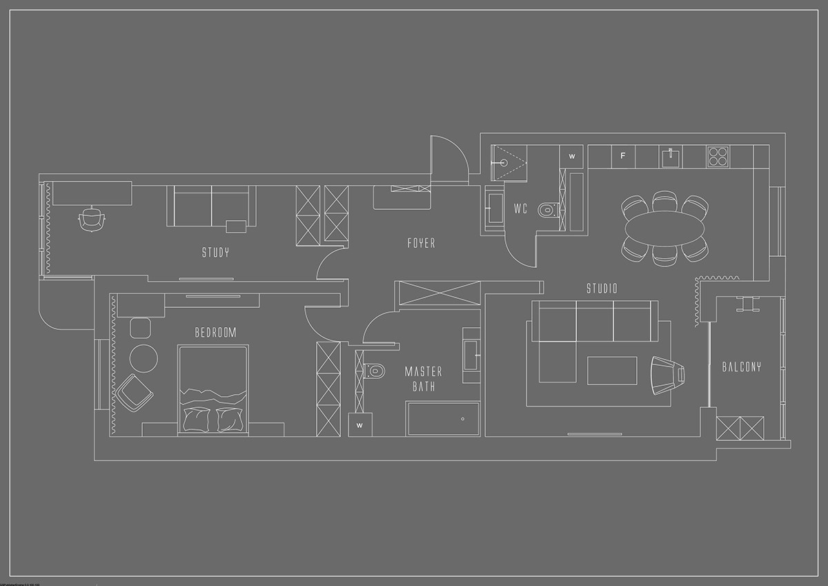
The final home tour explores a space much more compact than the previous spaces, yet it doesn't sacrifice an ounce of style or sophistication. Strong black, white, and wood decor appear in different concentrations to make sure each angle presents a unique visual experience.
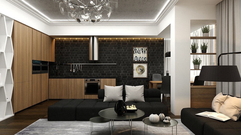
Matte black brick facilitates a dark and dramatic style in the kitchen, emphasized by an edge of yellow lighting toward the top.
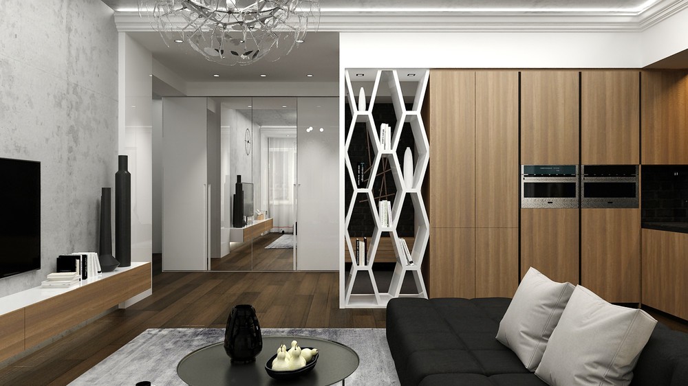
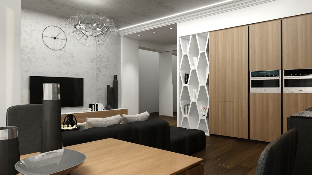
Although this series of photos does not include a view of the study itself, the proximity of the sofa to the bookshelf does accommodate reading and working.
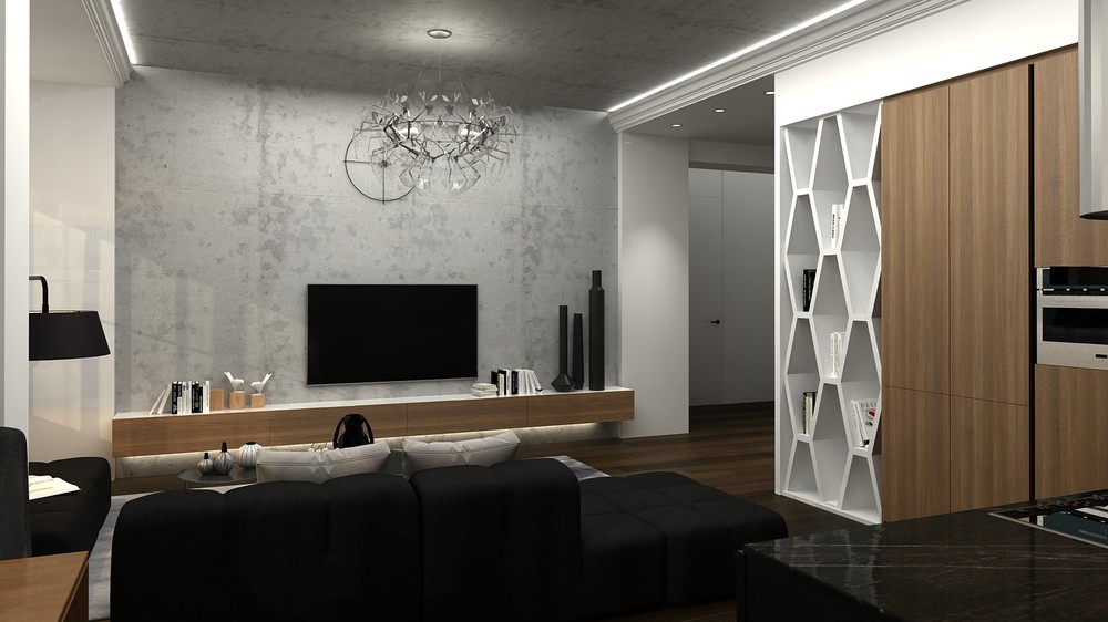
The chandelier and the industrial clock behind it offer different central focal points depending on where the viewer is standing.
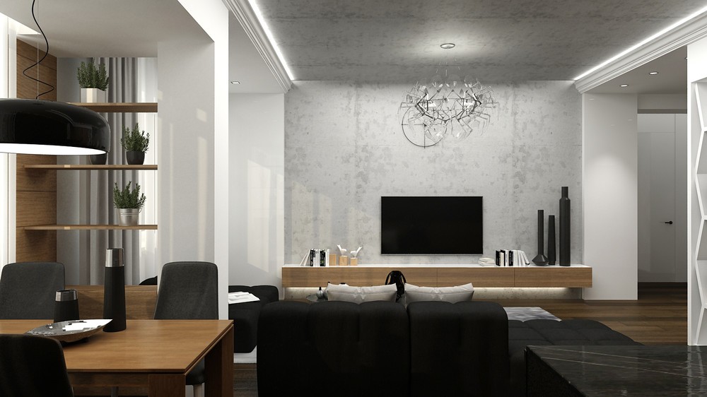
But let's not ignore the distinctive interior architecture. Concrete climbs the wall behind the television and envelopes the ceiling above, flanked on either side by lower white ceilings.
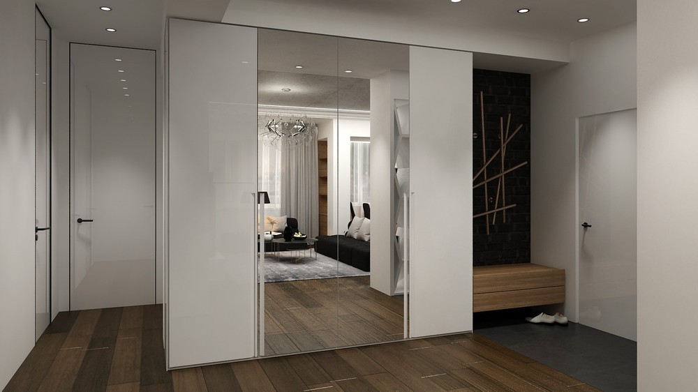
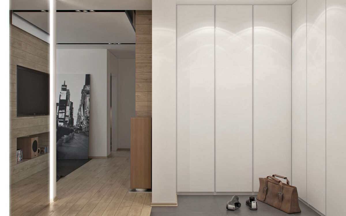
The path to the left of this closet leads to bathrooms and a private study, and the door to the right leads outside the apartment.
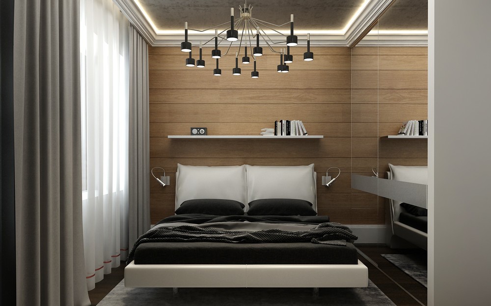
Compact, but not cramped – the bedroom makes good use of mirrored closet doors to extend the visual real estate.
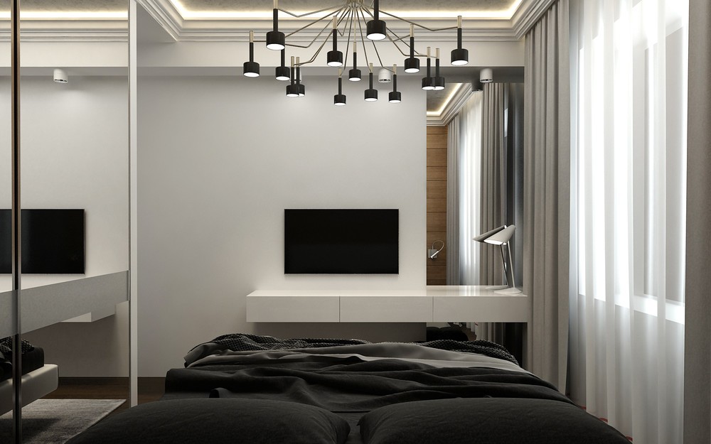
Likewise, the modern chandelier enhances the room's personality without the need for excess decoration.
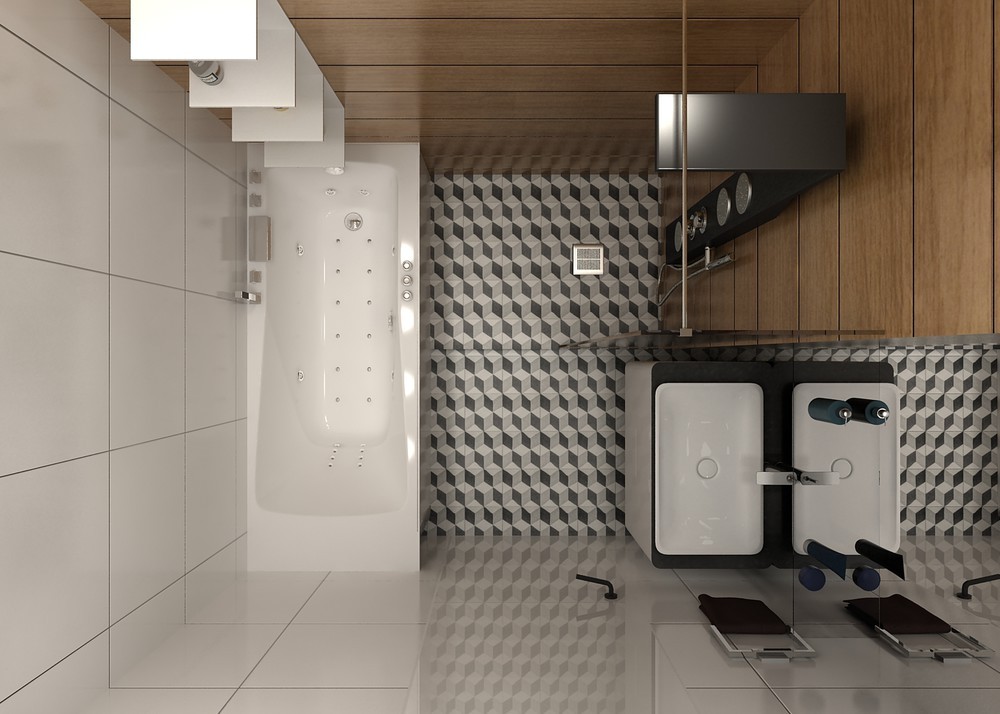
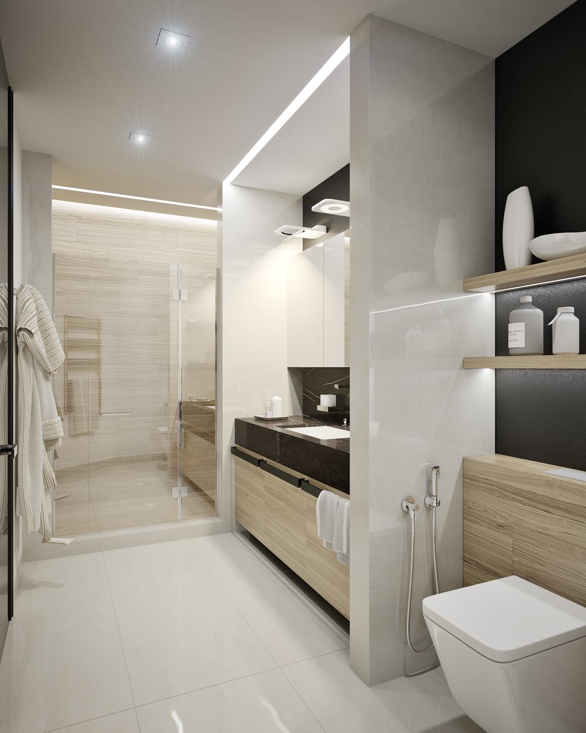
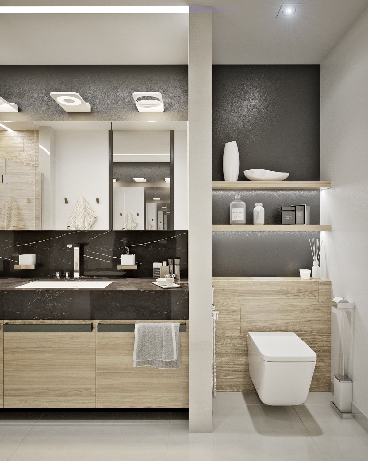
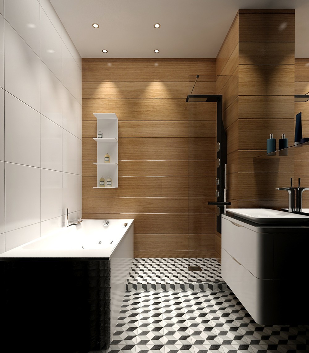
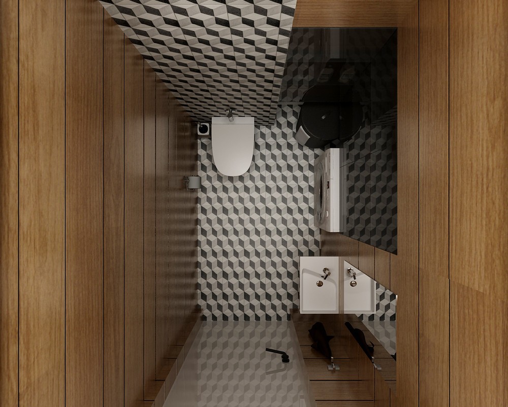
Both bathrooms are extremely compact. This half-bath includes a tub and a separate shower, only partially enclosed to preserve as much floor space as possible.
