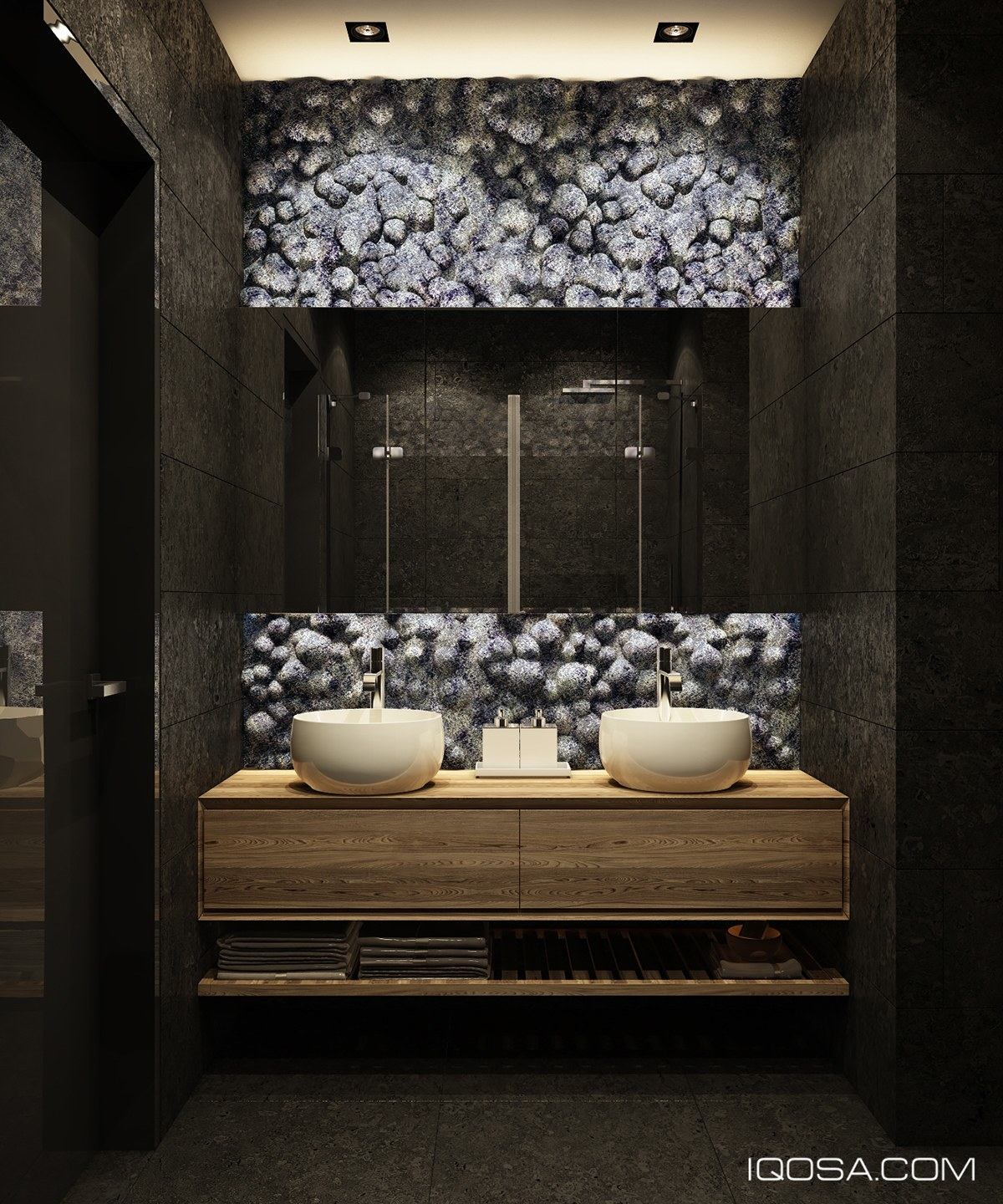
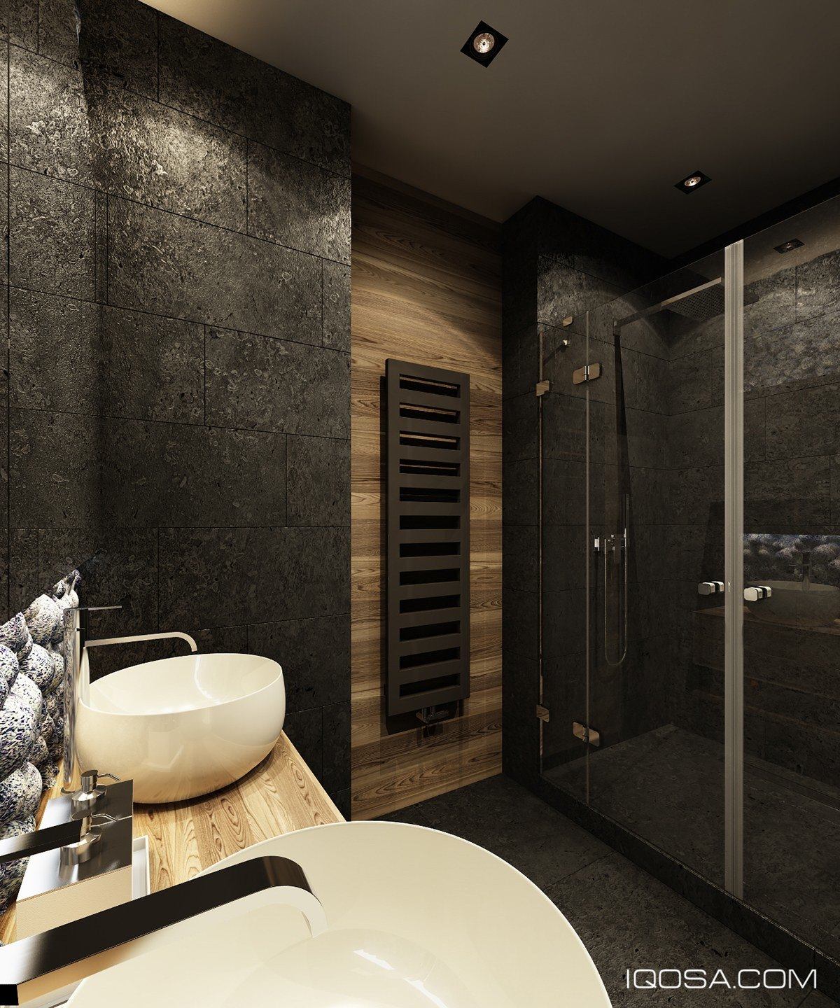
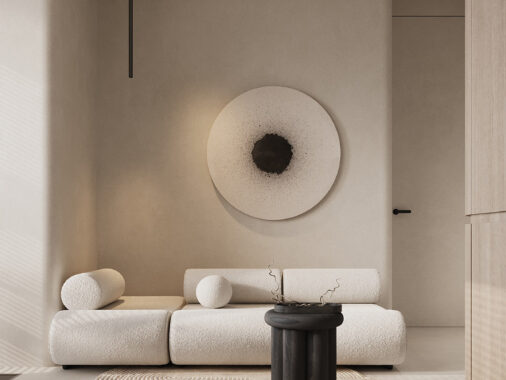
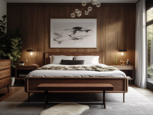
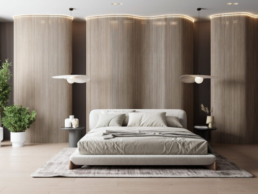
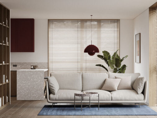
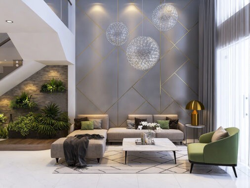
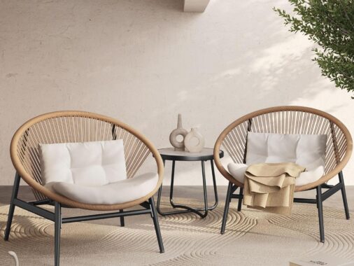
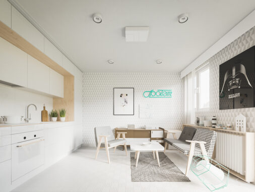
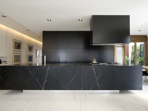
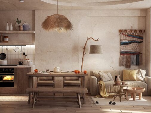
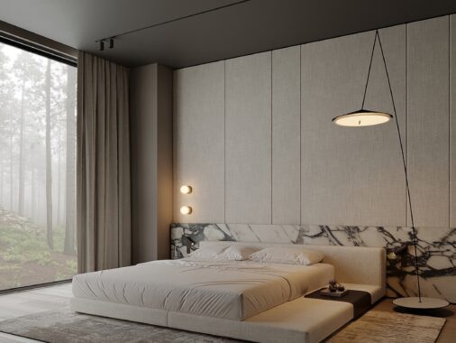
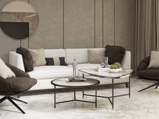
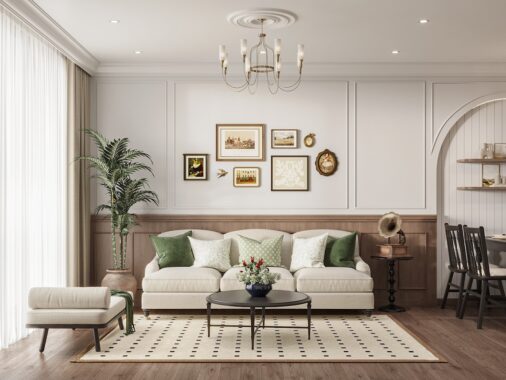
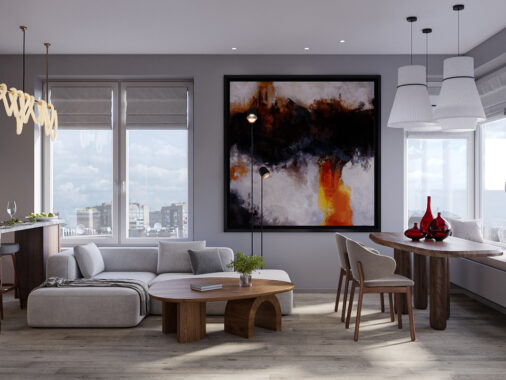
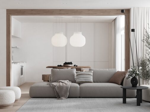
Neutral color palettes are among the most flexible out there. They're easy to adapt to changing trends, they allow for colorful experimentation options, and they work well to emphasize the artwork or accents you want visitors to notice and enjoy. But perhaps the best part is the atmosphere they create – neutral interiors can be light and welcoming or dark and dramatic, luxurious or softly chic. The three homes highlighted in this post explore several different ways to play with decorative accents and each one offers inspiration to borrow for your own neutral-themed interior.
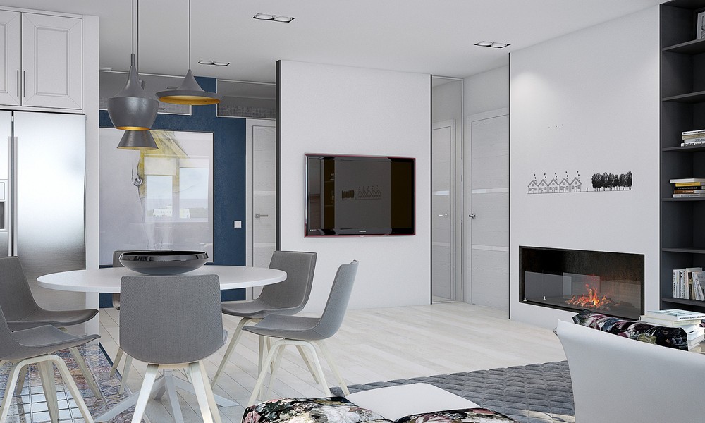
Both the living room and the kitchen get to enjoy the warm aesthetic of the fire. Of course, the flame is faux – this electric fireplace is from Dimplex.
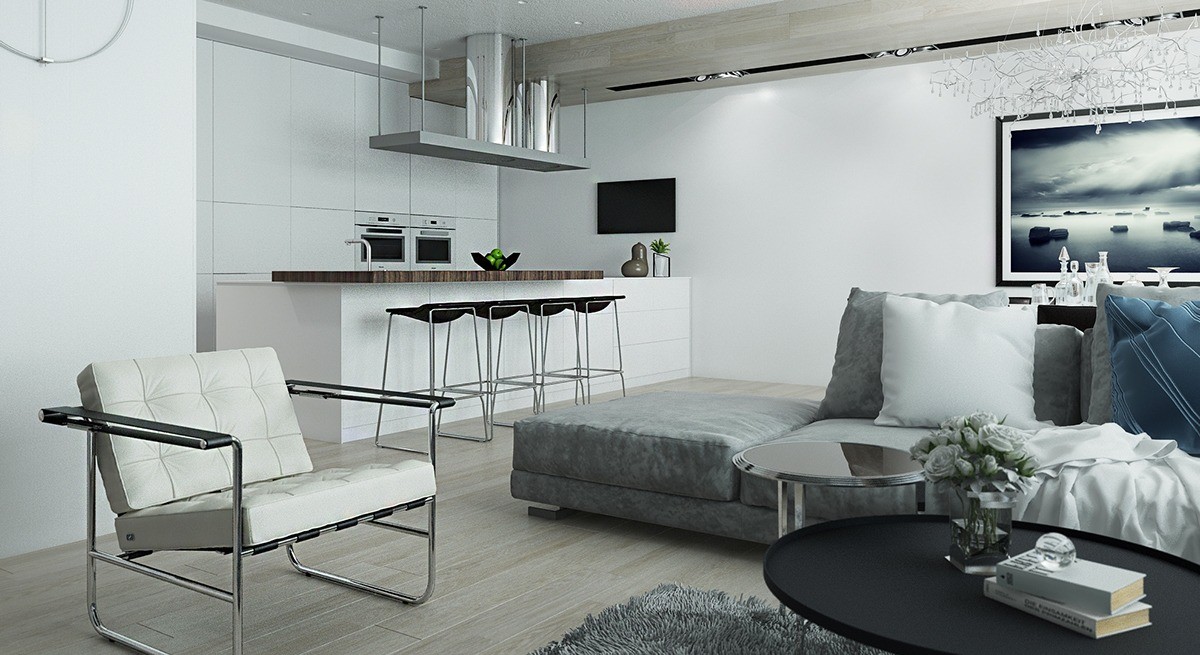
The only exceptions to the sleek industrial aesthetic are the soft textiles and the easy-on-the-eyes wood tones.
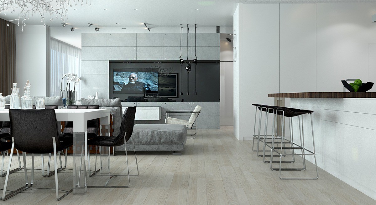
Here you can catch just a hint of the luxurious pendant light and the fascinating interplay between its radiant crystals and the transparent legs of the table.
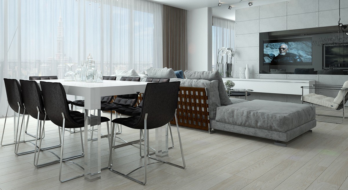
The entire open living area is expertly coordinated. Yet it features just the right amount of variation to invoke a distinctive personality, such as the unexpected hint of red on the sofa straps.
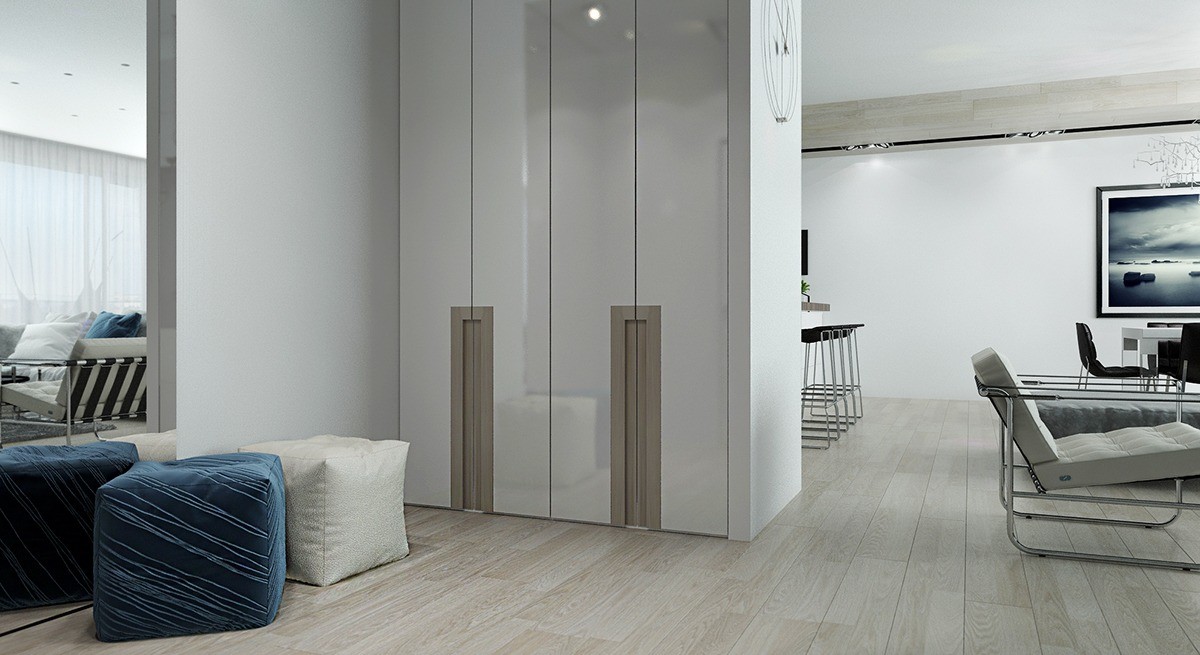
Storage, seating, and a mirror to check for last minute outfit malfunctions – all the necessary ingredients for a perfectly functional and minimalistic entryway.
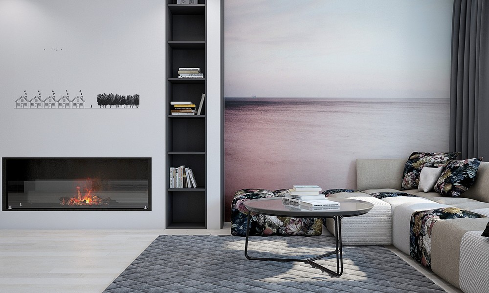
Gorgeous! This home features some of the most creative accents yet. Its simple monochromatic interior unexpectedly bursts into a drama of sunsets and flowers, creating cozy visual retreats that lift the mood but don't overwhelm the eye. The designers catered this aesthetic to the resident's desire for a space that feels bright and spacious without resorting to subtraction or minimalism.
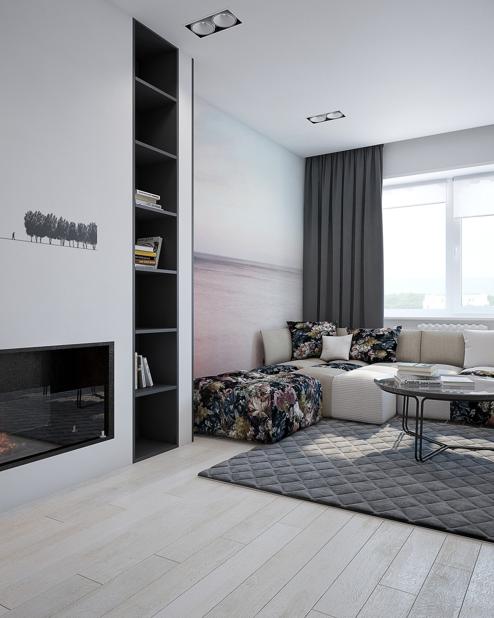
It's quite pleasant to see the muted blues and pinks of the sunset reflected in the floral sofa print, brightened by the contrast of yellow blossoms.
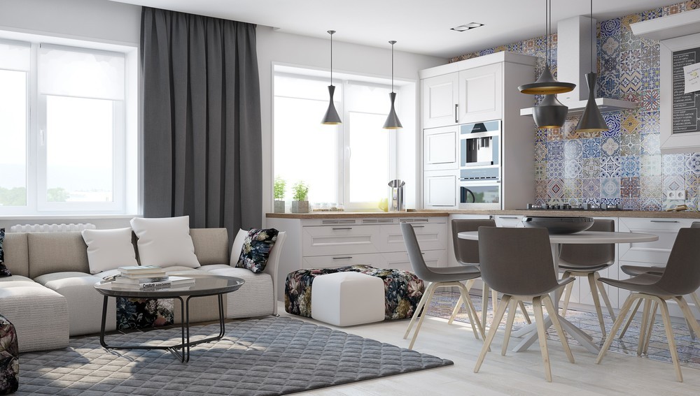
To the right, the kitchen enjoys a row of windows to one side and a full wall of eclectic mosaic tiles on the other.
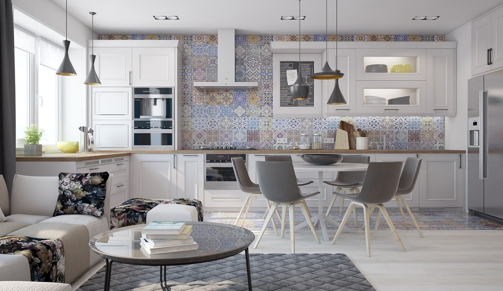
By concentrating the colorful accents into distinct zones, the design team was able to delineate each functional space with fluid but well-established boundaries.
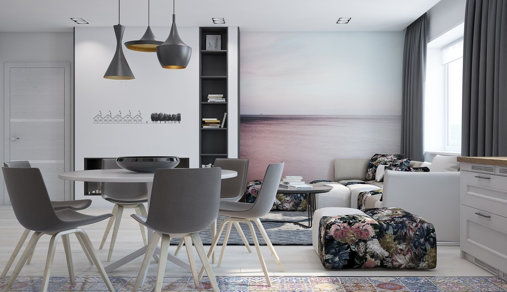
The kitchen tiles seem to reflect the palette of the accent wall, while the sofa's dark upholstery helps the arrangement stick out as a focal point.
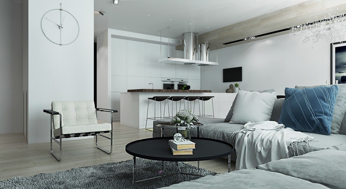
Another thing this home has in common with the last one are the sparing blue-blue accents enhanced by the warmer neutral theme.
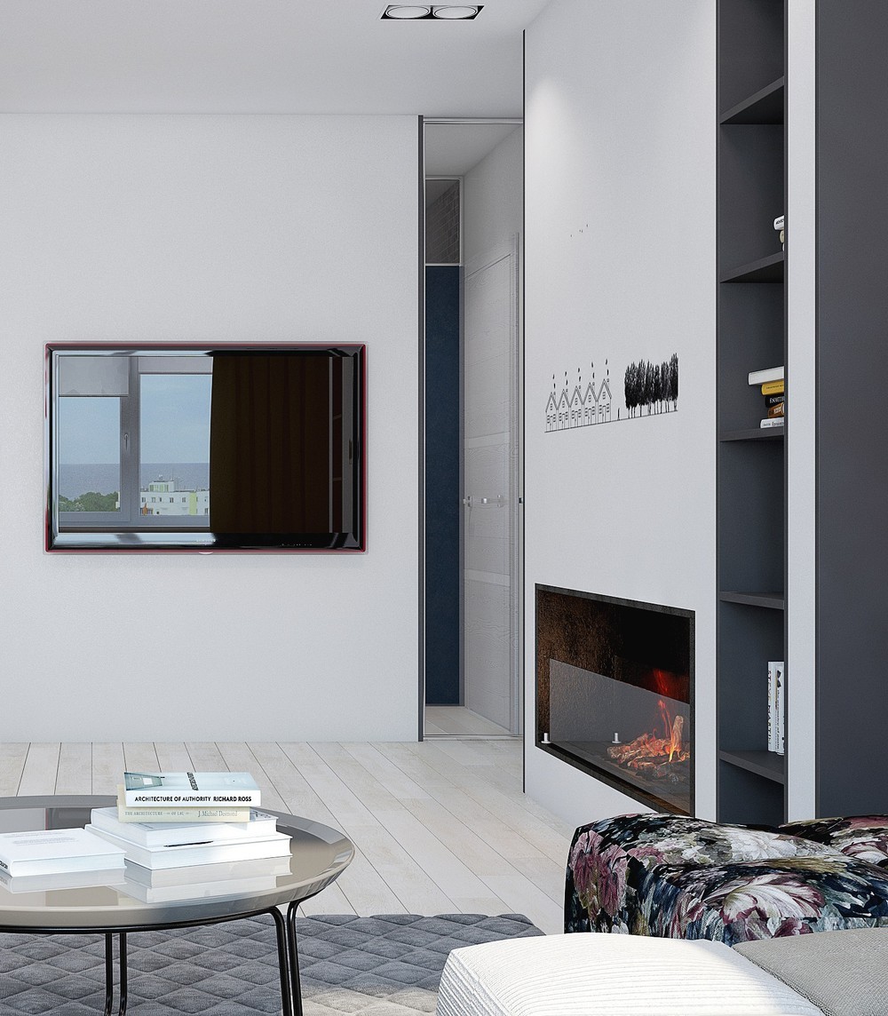
Charming rows of houses and trees make for a lovely accent decal. And we always love to see the thin built-in bookshelf trend everywhere it pops up.
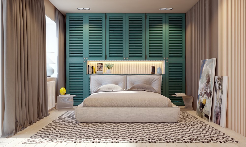
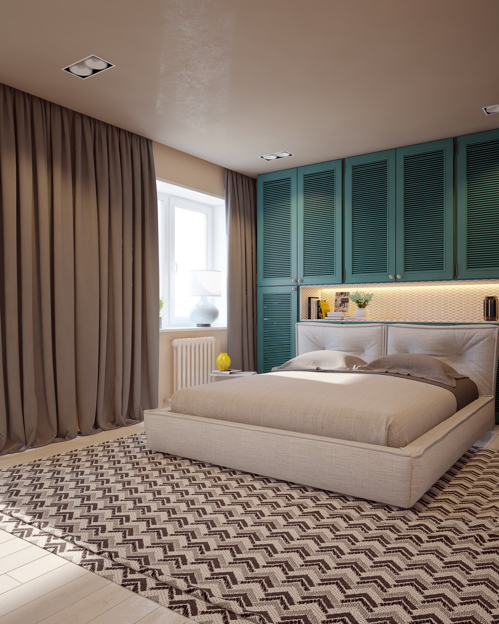
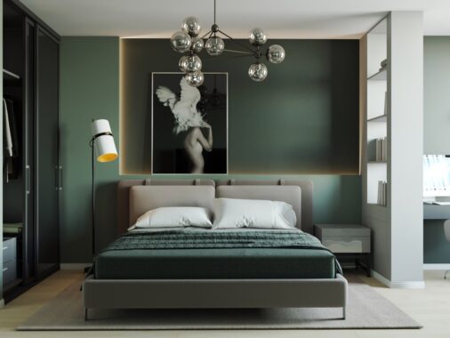
Here's a room to inspire all of the fans of earth-toned neutrals out there. This bedroom features a functional accent wall made up of shuttered cabinetry, finished in a delightful shade of teal green.
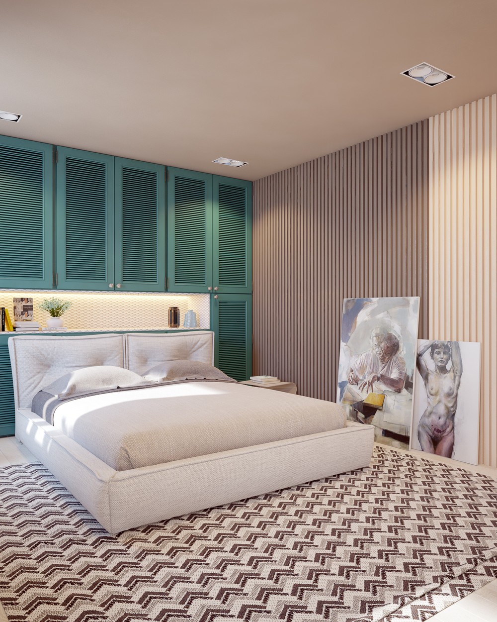
Dramatic paintings break free of the soothing chic vibe with their powerful presence. Yellow and blue highlights bring out the accent colors of the feature wall.
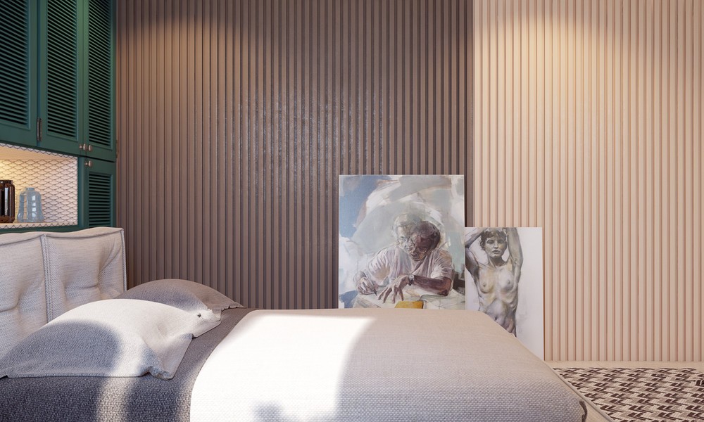
Neutrals can make an incredible impact – they don't have to be quiet or subdued. This bedroom makes fantastic use of contrast to enhance the relatively simple palette.
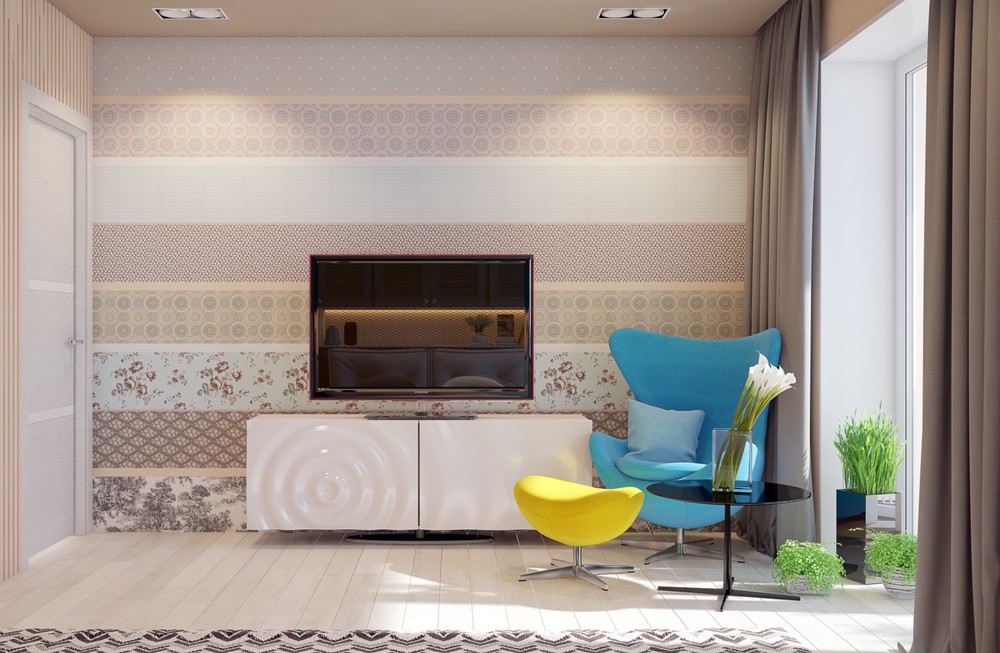
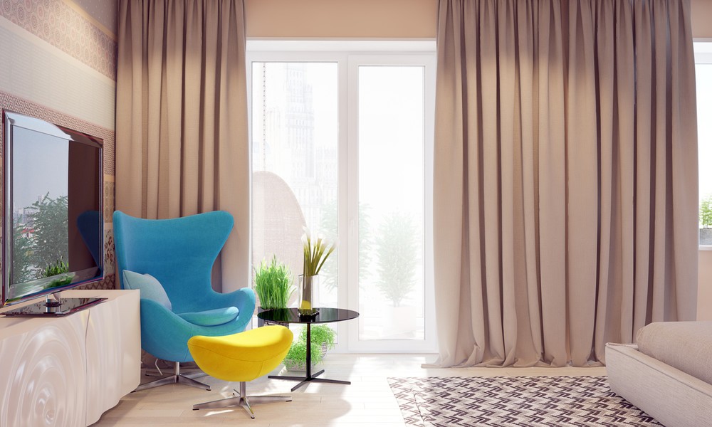
Vivid and impossible to ignore! Here, the iconic Egg Chair set makes steals the show upholstered in charming blue with its famous curved footstool outfitted in bright yellow for an intense effect.
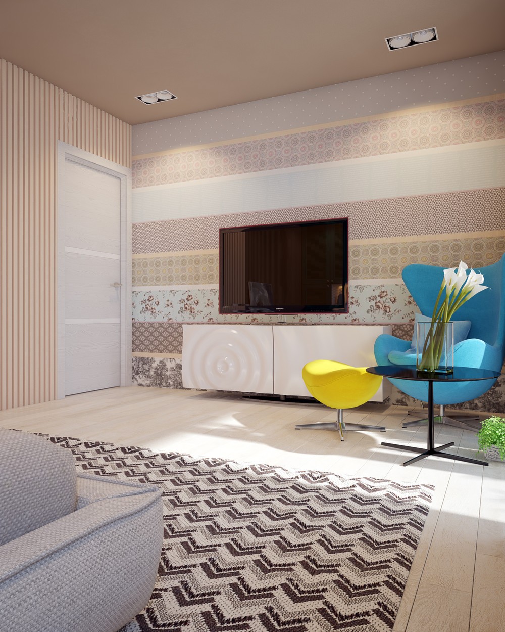
Stripes of patterned wallpaper brighten the far accent wall for a softer appeal. This would be such a rewarding and affordable (but labor-intensive) DIY project to try at home.
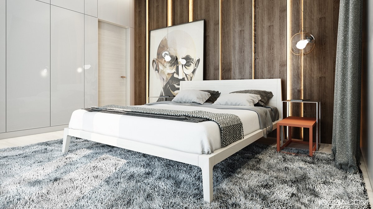
Here's where the accents get really adventurous. Each bedroom uses a different method to spice up a neutral color theme. This one features a wooden accent wall with stunning integrated lighting and a modern print of Mahatma Gandhi.
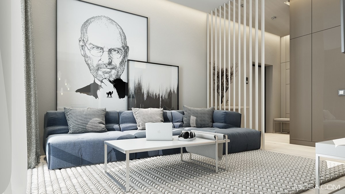
A divider made of vertical slats divides the living room from the entryway while preserving the passage of light. It also works to reinforce the strong emphasis on vertical lines.
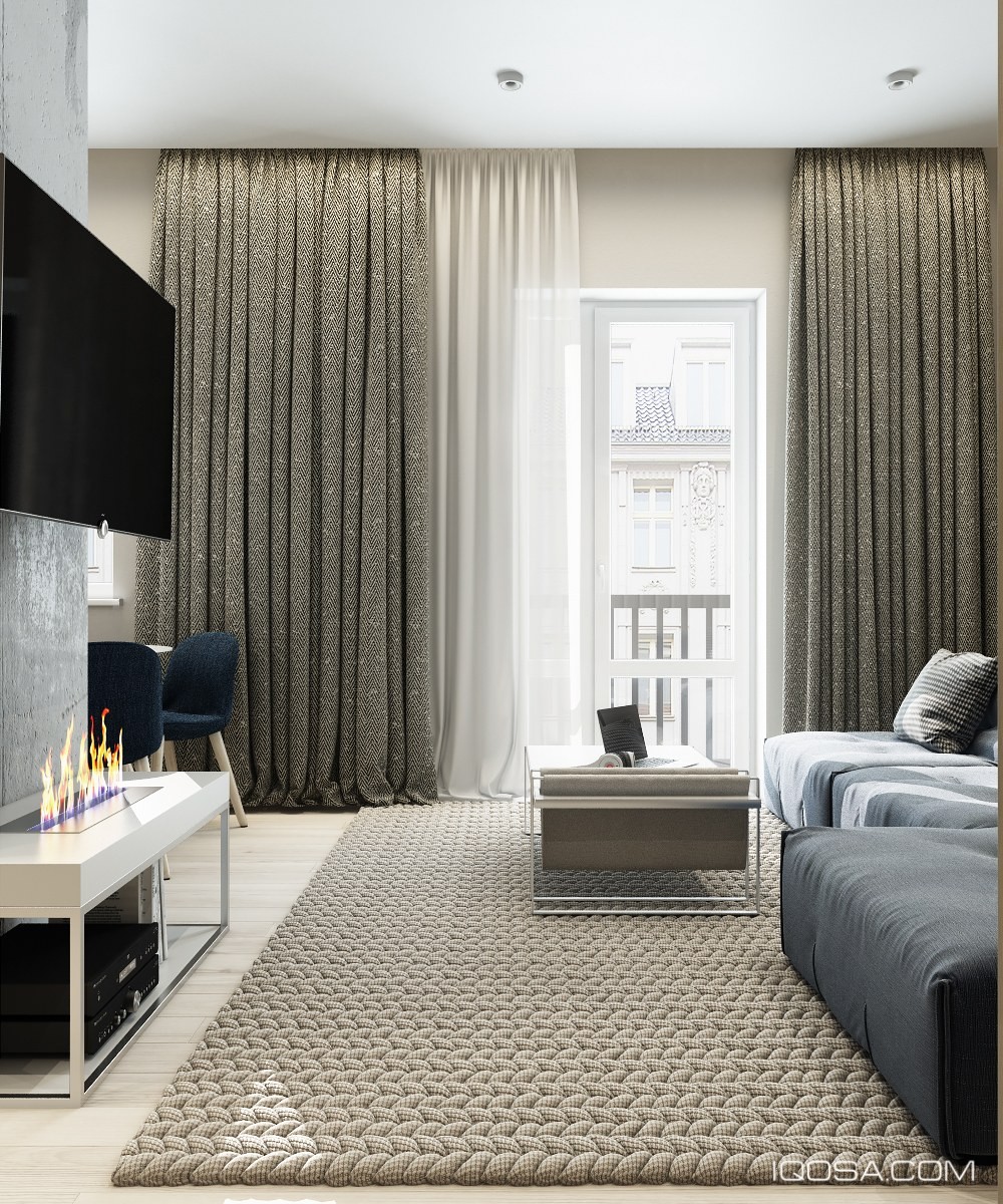
Occupying the space below the television, an electric fireplace takes advantage of its unfinished concrete backdrop for enhanced effect.
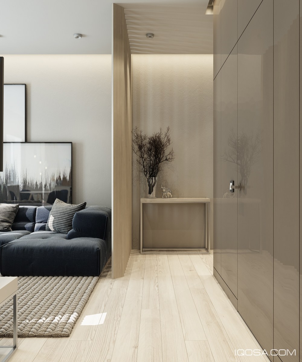
The entrance remains completely neutral, its slightly darker tone making for a welcoming introduction to the home.
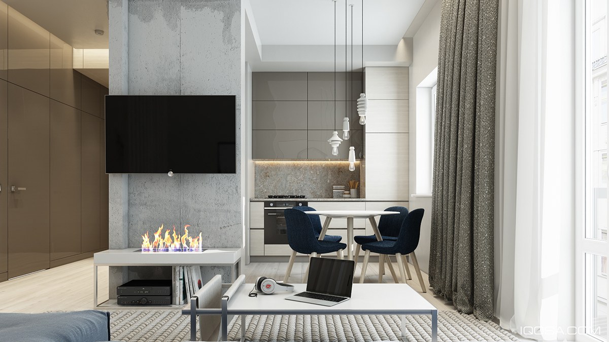
In the dining room, cool blueish gray again stands out against the temperature-neutral surroundings.
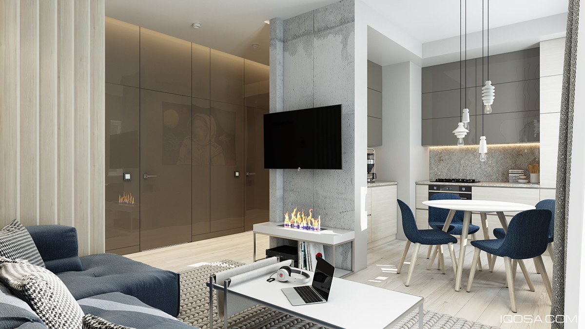
Glossy cabinetry reflects the natural lighting back toward the viewer while indirect cove lighting wards off unwanted shadows.
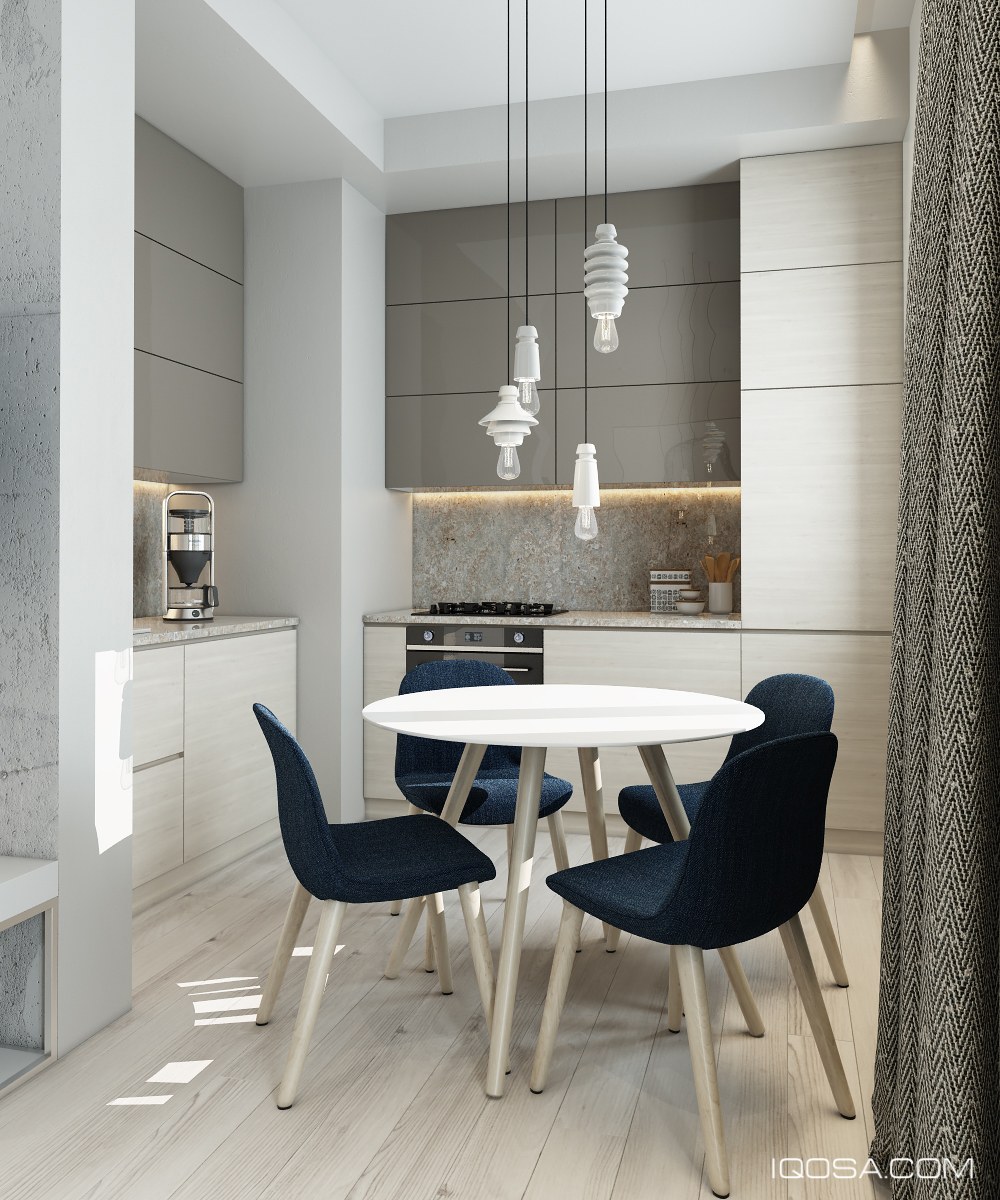
Encased by clean lines and perfect angles, the dining arrangement adopts a rounder and softer theme compared to the kitchen cabinetry. Big stubby furniture legs and curvaceous pendant lights seem to say "Sit and stay a while."
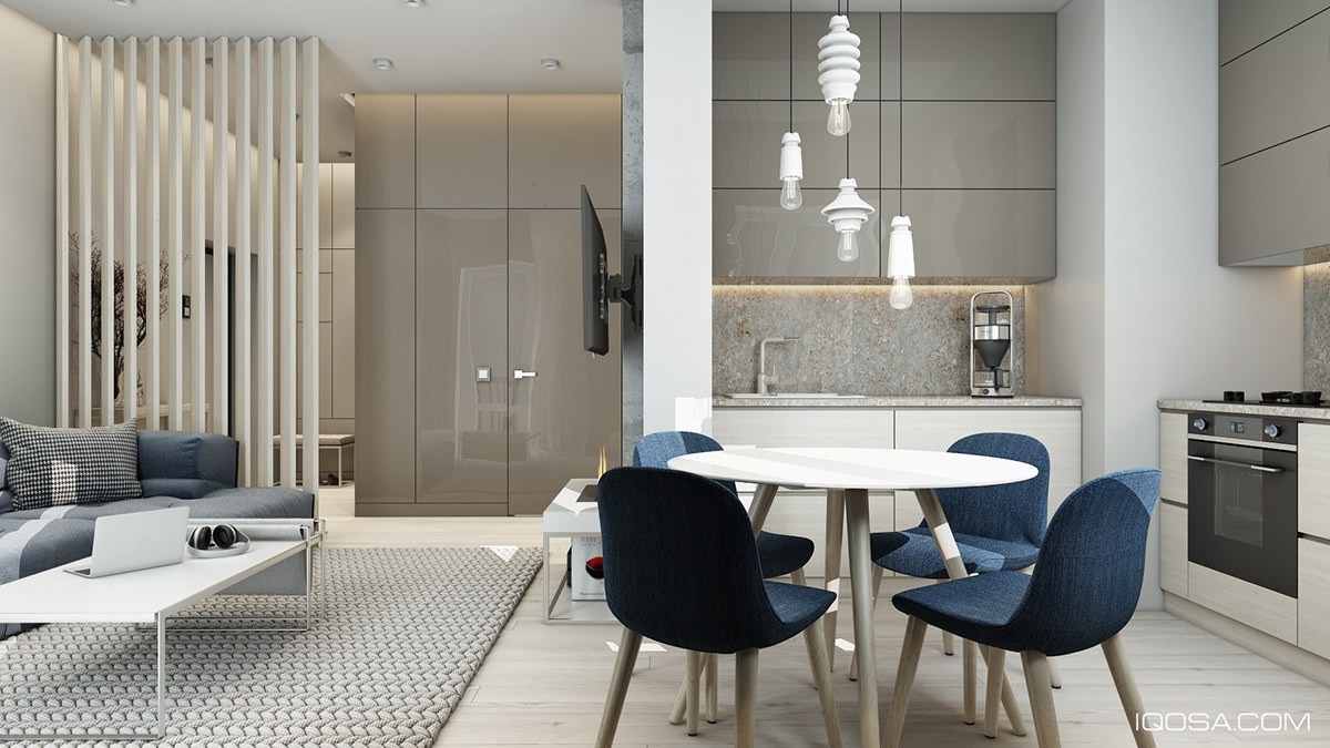
Yellowish indirect lighting helps to enhance the contrast between the true neutral elements and the cooler-tinted accent pieces.
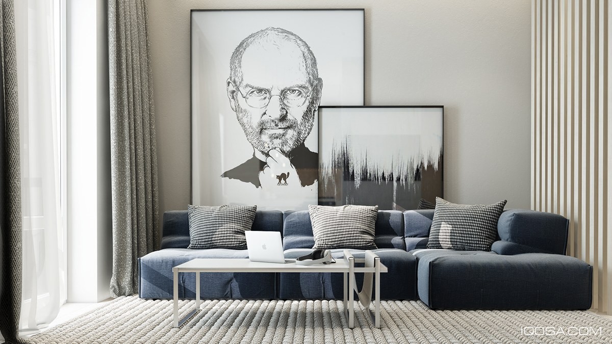
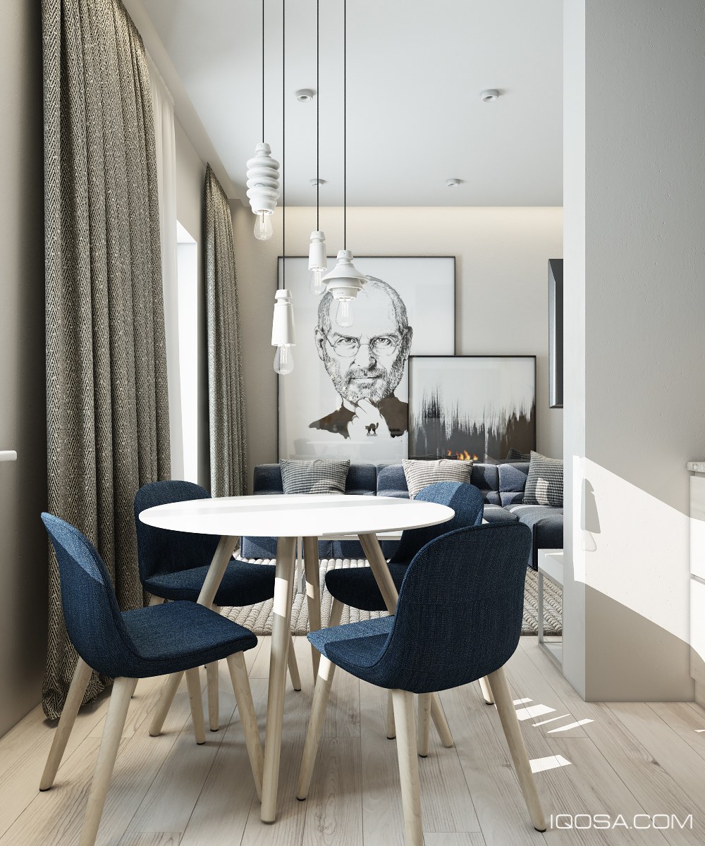
Color and texture work together to instill a strong personality within this neutral apartment theme. Blueish-gray tones and bold artwork stand out from the background of subdued grays used throughout, and the strong textile patterns (chevron and houndstooth) create an atmosphere of inviting warmth.
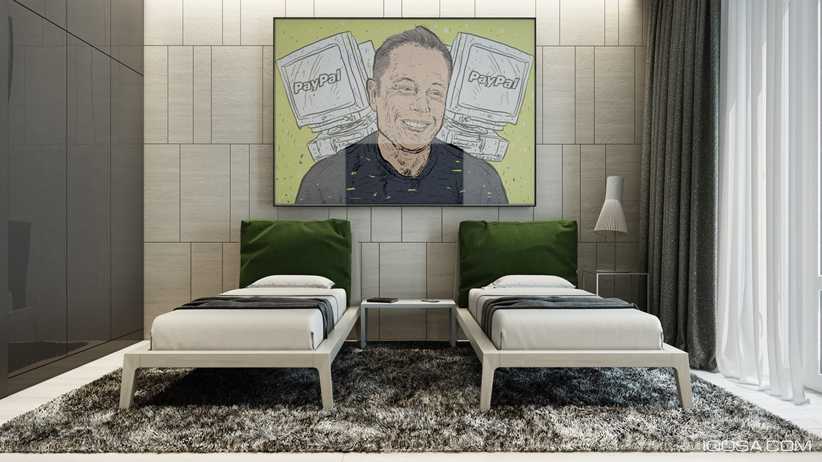
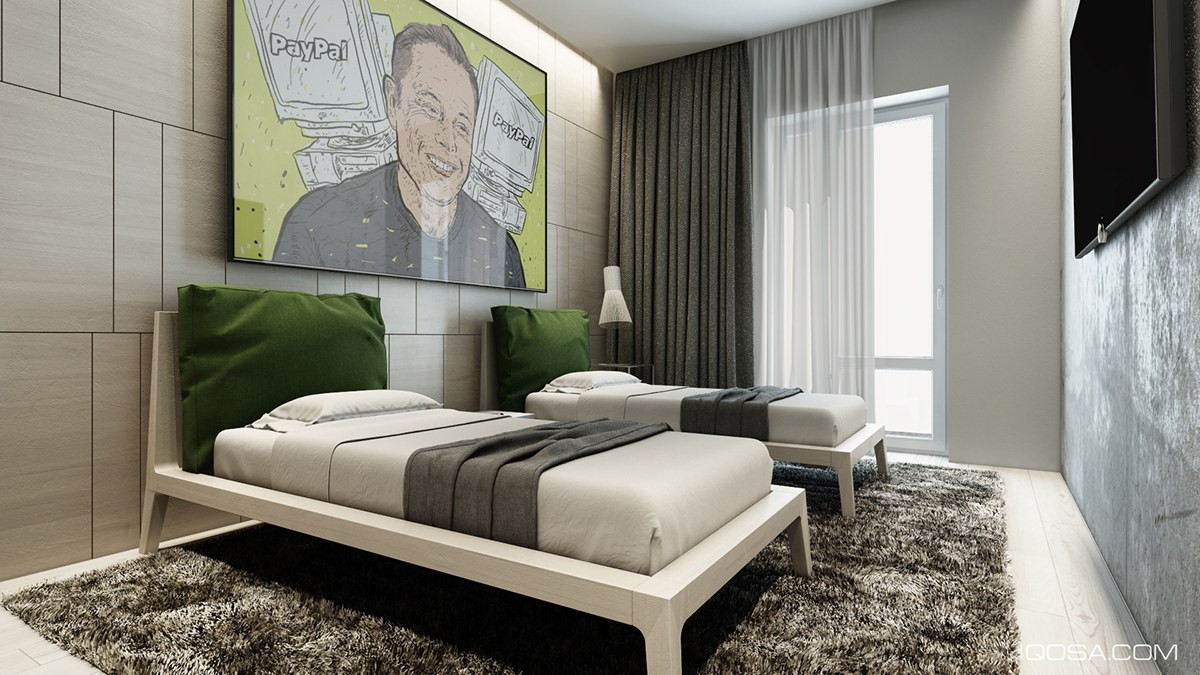
Other than the artwork and the color accents this room remains rather minimalistic, with interesting wall and cabinet paneling providing the main source of decoration. The fantastic designer table lamp is the work of Finnish architect Seppo Koho.
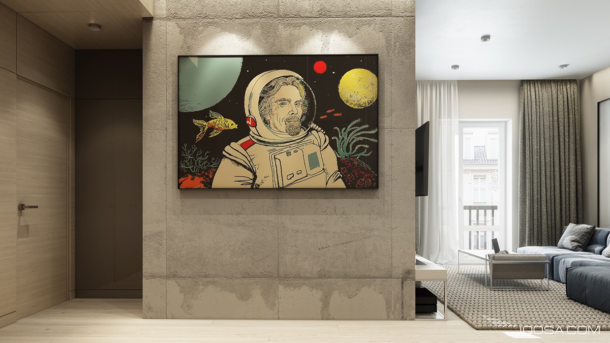
Guests are greeted by a pop art print of Sir Richard Branson, themed to acknowledge his contributions to commercial travel both in space and under the sea.
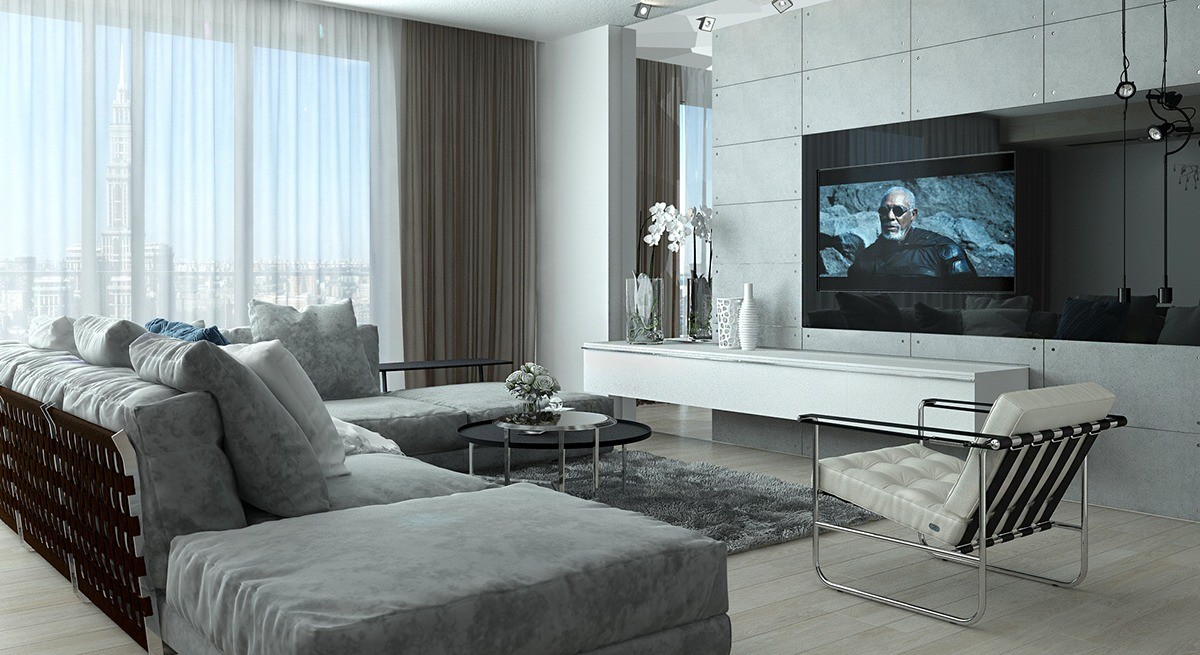
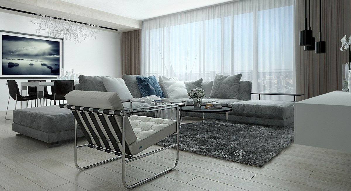
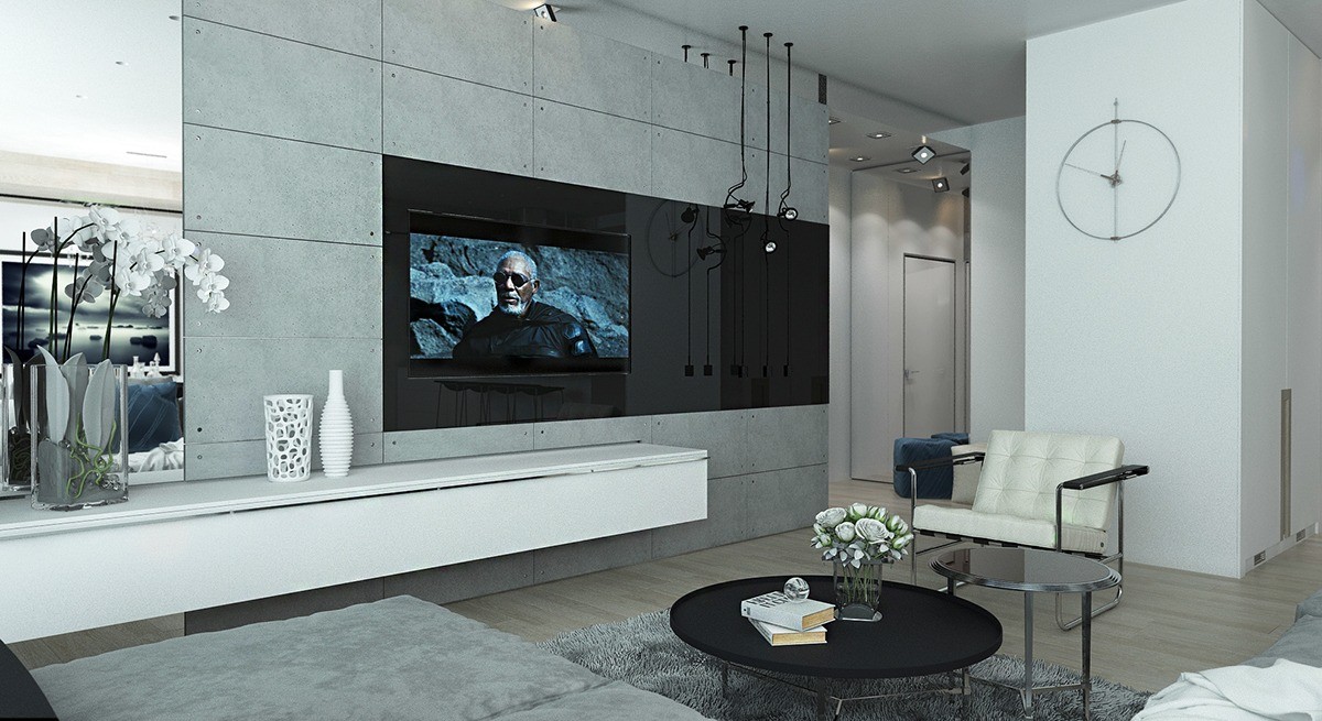
Like the previous home, this sophisticated apartment also takes a subtle approach to heighten its neutral color palette. Metallic and glossy tones take the place of an accent color for an overall style that feels like a lighter and more cheerful approach to an industrial theme.
