The oft-repeated advice about writing and art, "you have to know the rules before you break them" is a vital part of interior design theory. This saying is especially helpful to remember when mixing styles or eras – it's always better to have an intimate understanding of the styles you want to emulate before embarking to reinvent those time-tested concepts. But nobody needs to be an expert to simply explore the options. In fact, these eclectic dining rooms will help you learn the art of mixed-era design so you can adapt some of those transcendent dining room ideas to work within your own home.
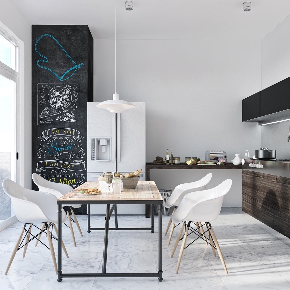
Iconic mid-century Eames chairs pair well with the distressed wood tabletop. More early modern influence comes from the 1925 PH 4/3 pendant light designed by Poul Henningsen. Even the chalkboard accent wall hosts a little vintage flair by way of classical signage lettering.
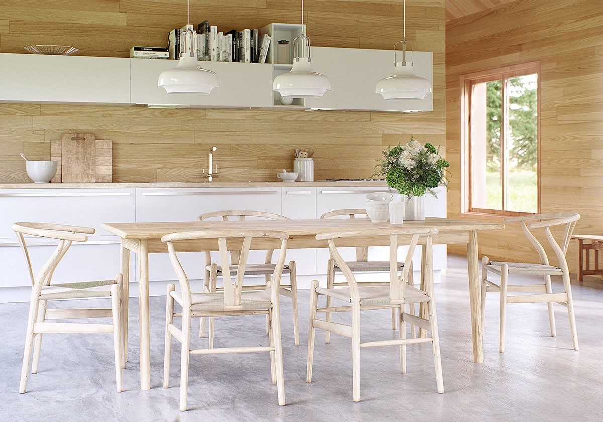
It's hard to go wrong with a wood and white theme. This one incorporates the trendy horizontal wall paneling but keeps its classic flair with a set of mid-century Wishbone chairs and retro-inspired pendant lamps.
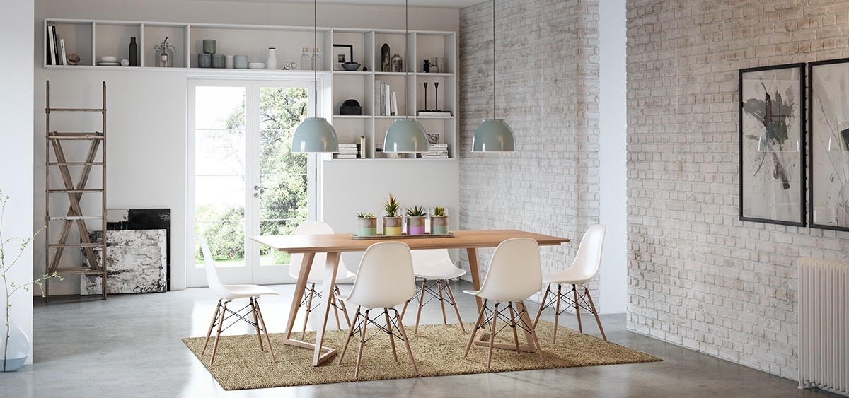
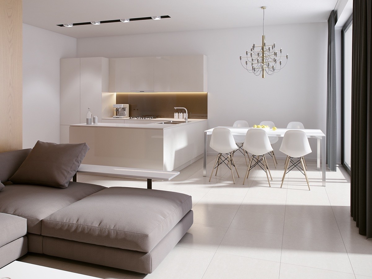
A bold and sophisticated brass chandelier adds a layer of tradition and charm within this minimalistic white dining arrangement.

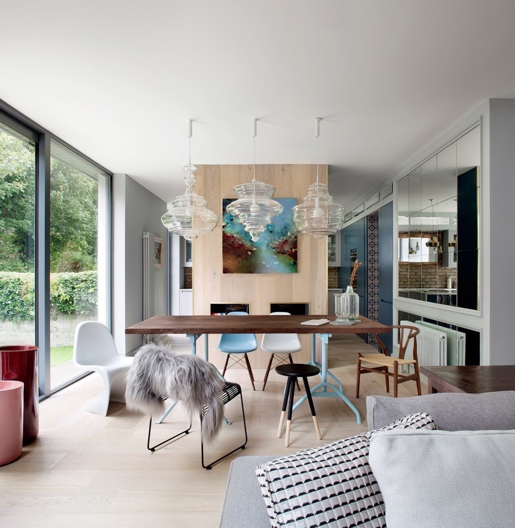
This modern dining room is a veritable gallery of classic chair designs, ranging from Wegner to Panton to Eames. The lamps are also a throwback of sorts - Jan Plecháč and Henry Wielgus designed these blown glass lamps as part of the Neverending Glory Collection, inspired by iconic chandeliers from the world's most important opera houses and theaters.
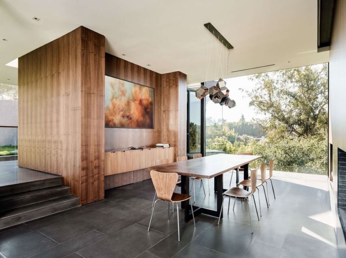
Capturing the atmosphere of a warm autumn day, this formal dining arrangement peers out of a spectacular picture glass window. To the left, a versatile storage unit serves to divide the social areas while contributing to the rich wood theme. Geometric pendant lights offer that modernistic spark that ties the vintage furniture back to today's favored trends.
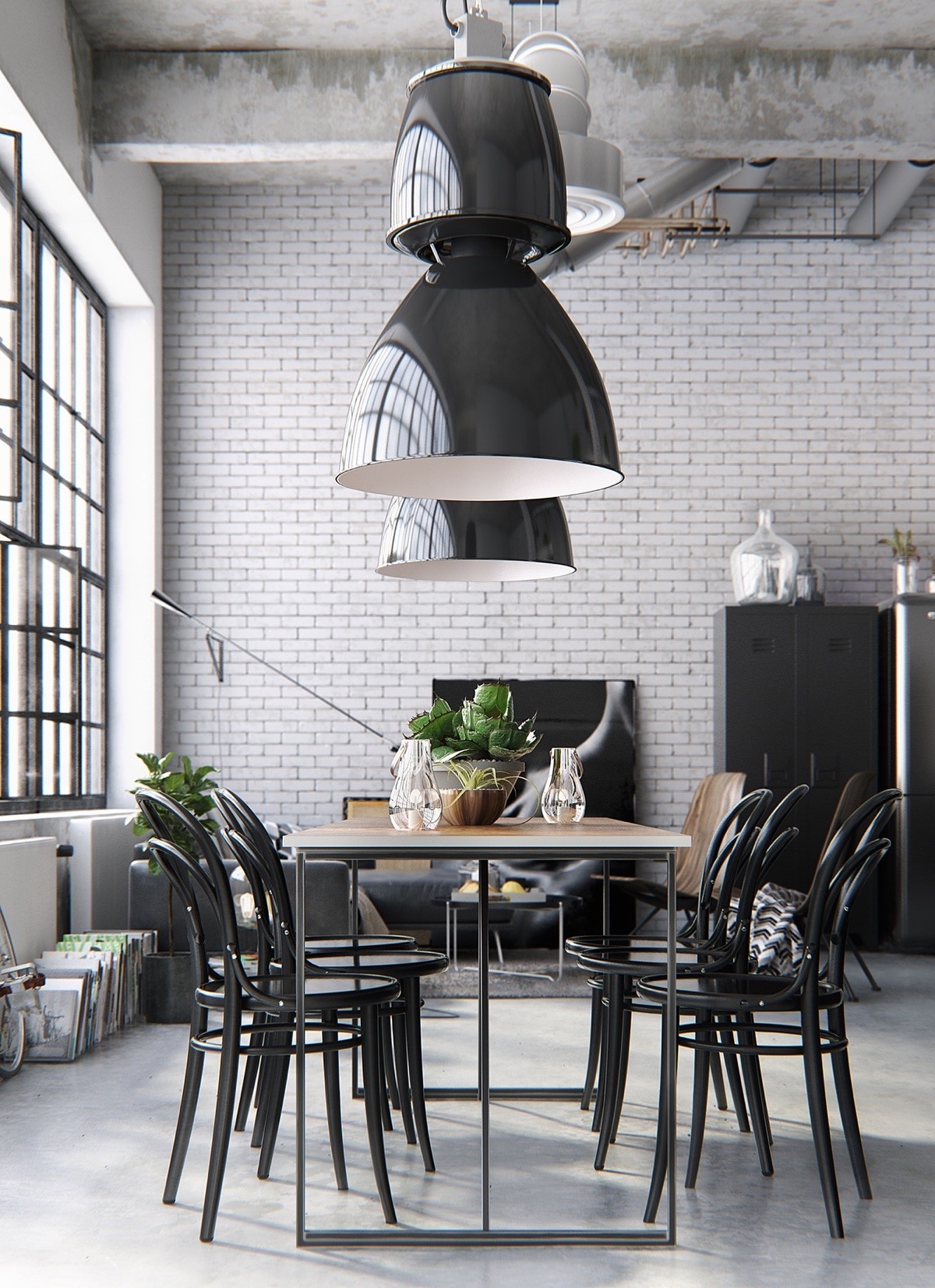
The chairs used in this design are one of the most successful designs of the industrial age, the famous 1859 Era Chair by Michael Thonet. Above, substantial metal pendant lights bring out the industrial attitude bestowed by the glossy black table and chairs.
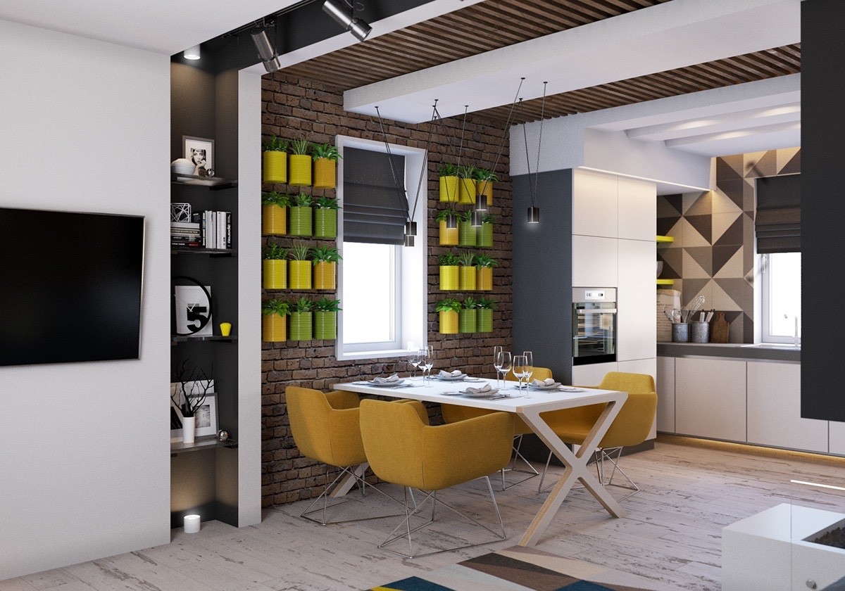
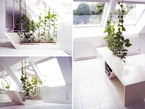
Harvest gold and pea green make up a vintage color theme nobody could forget, yet this arrangement feels perfectly fresh and vibrant. The clever vertical garden idea pulls double duty for functionality and aesthetics.
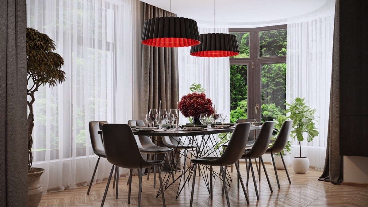
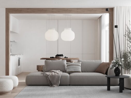
Beautiful wooden floors offer a classic touch, as do the flowing curtains and scalloped pendant lights. Everything seems so very elegant and warm despite the relatively minimalistic pieces used throughout.
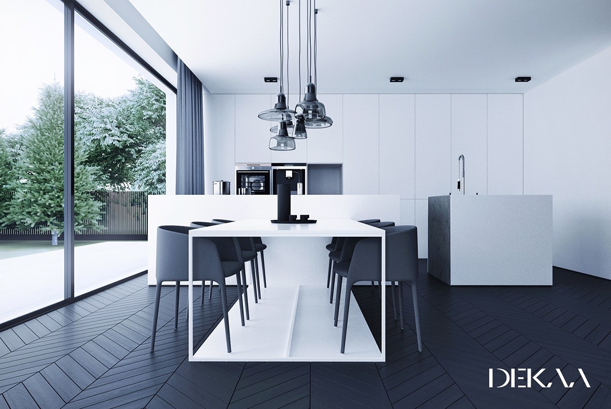
Ultra-modern interior styling displays only the most subtle influence from traditional design themes – like the parquet floor tiles, or the blown glass lighting collection. The lights are the work of Dan Yeffet and Lucie Koldova.
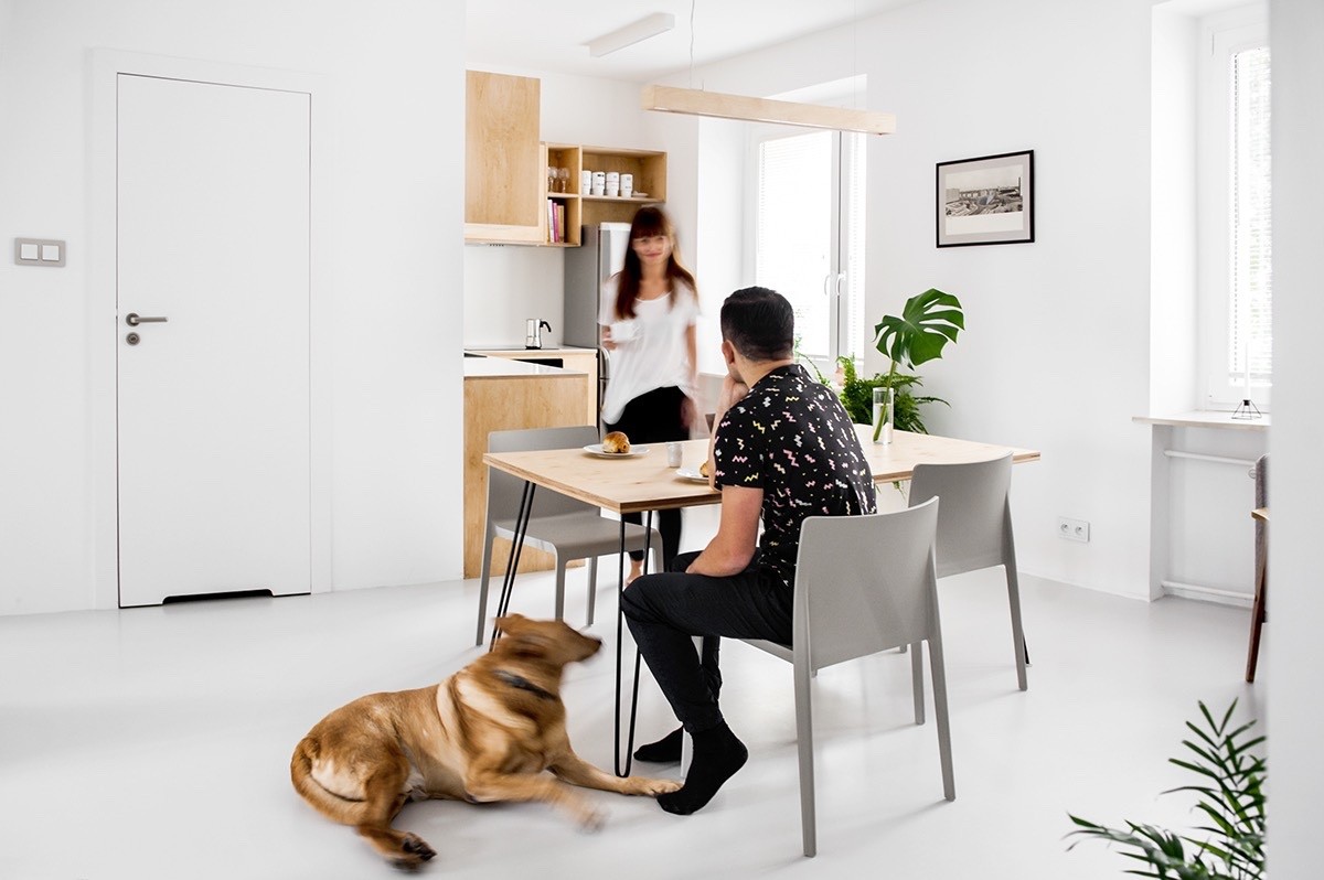
Hairpin legs are a distinguishing feature of mid-century inspired design, but the molded chairs that accompany the dining table are fresh and modern as can be. This space demonstrates the best of modern minimalism and an appreciation for organic materials all at once.
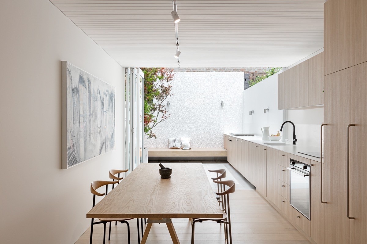
Hans Wegner designed the CH88 chair in 1955 but it spent its entire life available only as a prototype – until, in celebration of what would be Wegner's 100th birthday, when it finally enjoyed its public release.
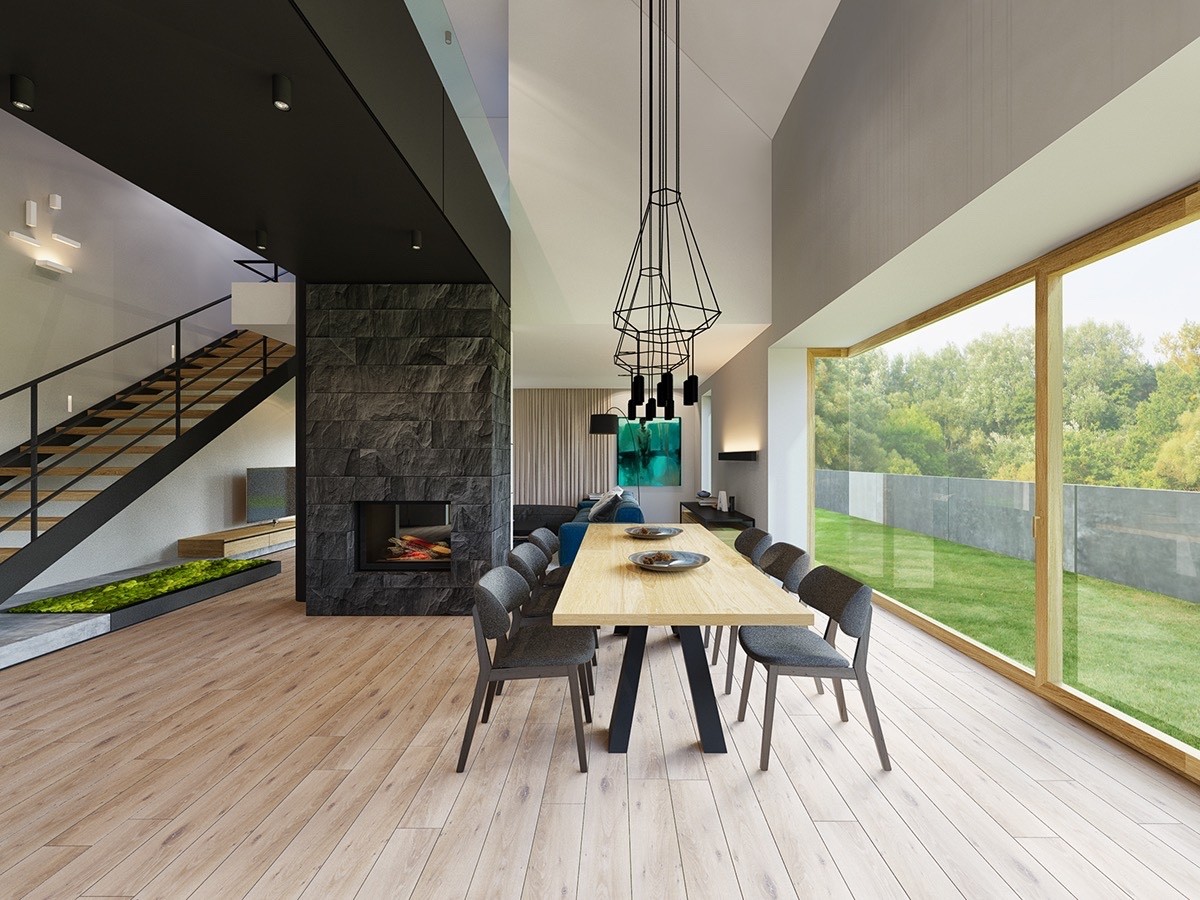
Our first dining room utilizes a crisp white and wood theme, separated from the parallel hallway by a black stone-clad fireplace. The dining table is illuminated with Wireflow dining pendant lights designed by Arik Levy.
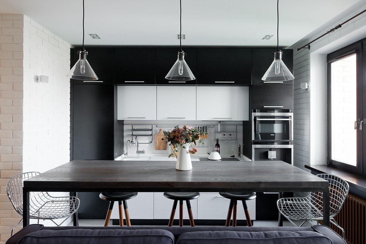
Low-profile wire chairs combined with classically styled dip-painted stools come together for a Bauhaus-like aesthetic, enhanced by the series of glass and black pendant lamps above. The kitchen itself is polished and current but outfitted with several cute vintage cooking implements.
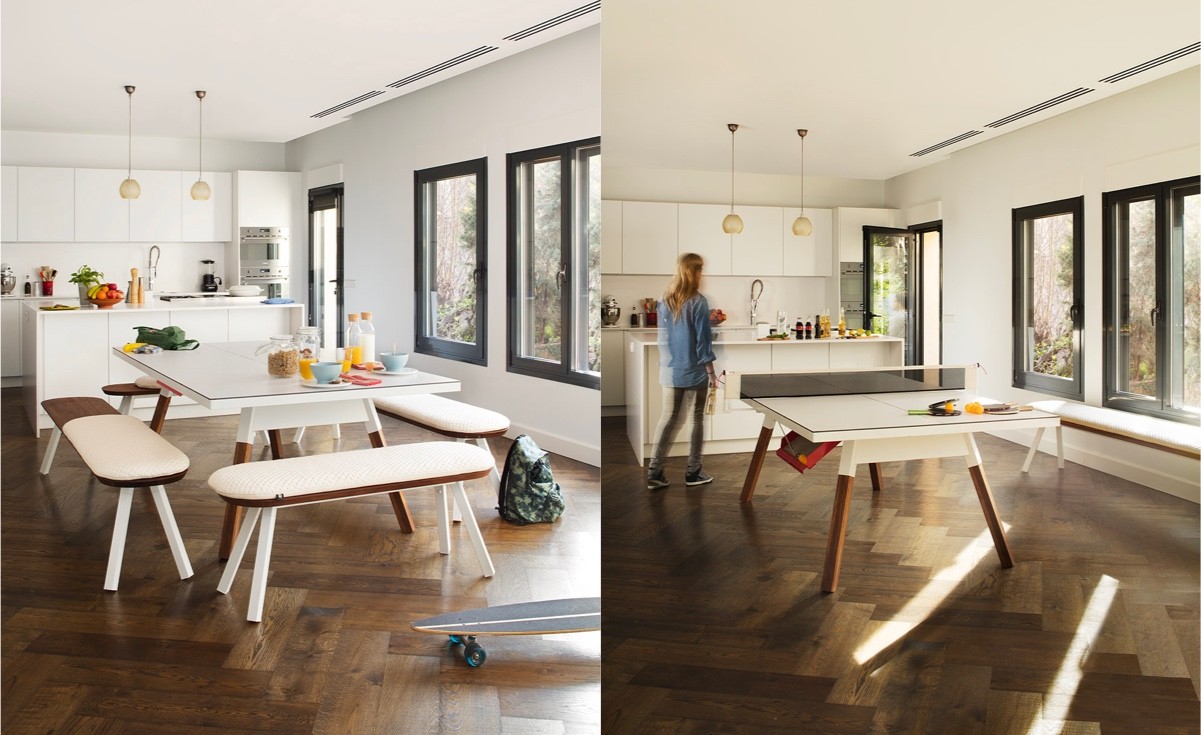
Herringbone floors in dark wood create a cozy and down-to-earth environment. The bench seats are used in an innovative way here, pushed aside when the table is needed for food preparation or other tasks.
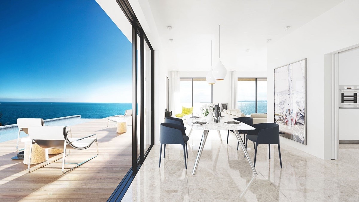
This dining room concept combines traditional materials and a retro-inspired table design with the recent Achille Armchair and Tom Dixon's popular Beat Lamps. With a view like that, it makes sense to keep the furniture as streamlined as possible.
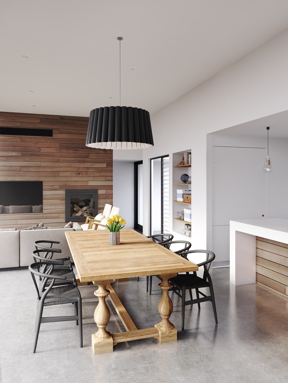
A sturdy wood table steals the show in this classically inspired dining room. The 1944 Wishbone chairs (by Hans Wegner) reinforce the traditional inspiration but utilize a gorgeous matte black color theme to bring them in like with contemporary trends.
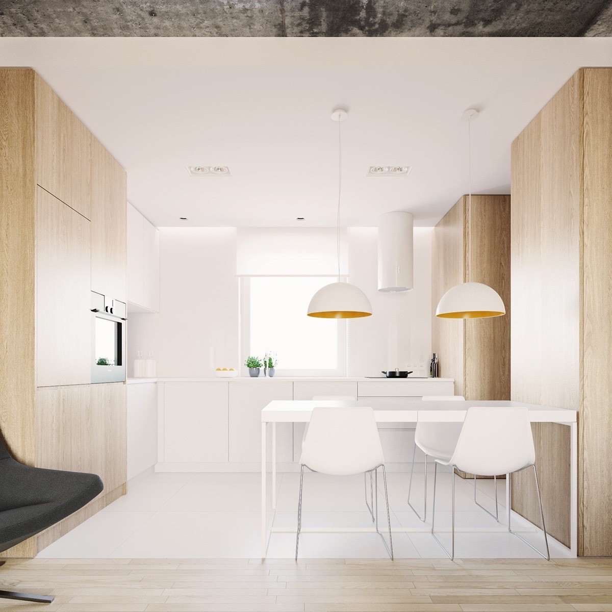
Simple wood paneling distinguishes the hallway from the kitchen, and highlights select cabinetry from within the kitchen itself. The white dining table, chairs and pendants stay true to the kitchen's theme.
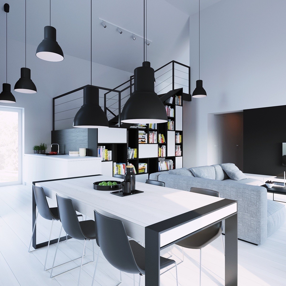
The only thing traditional about this dining room is the wood tabletop and wide-hewn wood floors. The suspended lighting does embody a retro form, but its materials are entirely contemporary.
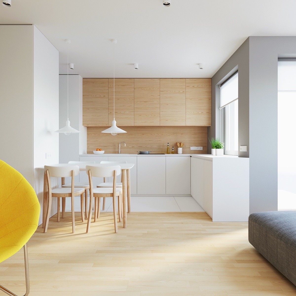
A simple kitchen and dining combination – this space uses a combination of traditional and classic materials to create a bright and spacious area anyone would love to occupy. Clean, functional, and delightfully subdued.
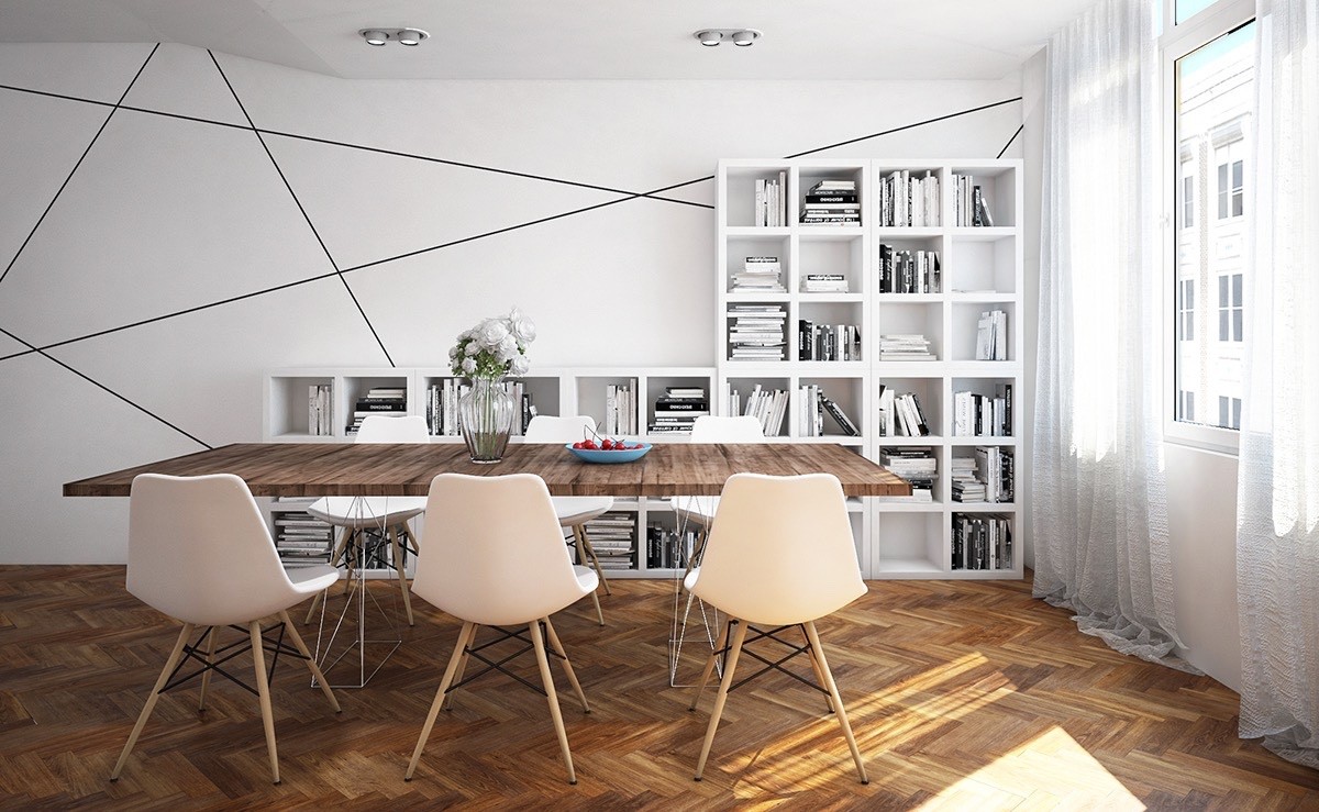
This dining room combines new and old in interesting ways: herringbone floor and reclaimed wood table alongside industrial-inspired wire and geometric wall panels. The series of square shelves are an undeniably minimalistic touch.
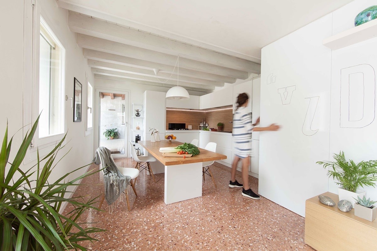
Composite stone floors take on a vintage-inspired salmon hue, juxtaposed again current dining room trends like the horizontal backsplash and the typographic wall decorations. Even the ceiling demonstrates a transition from old appreciated styles to a fresher aesthetic.
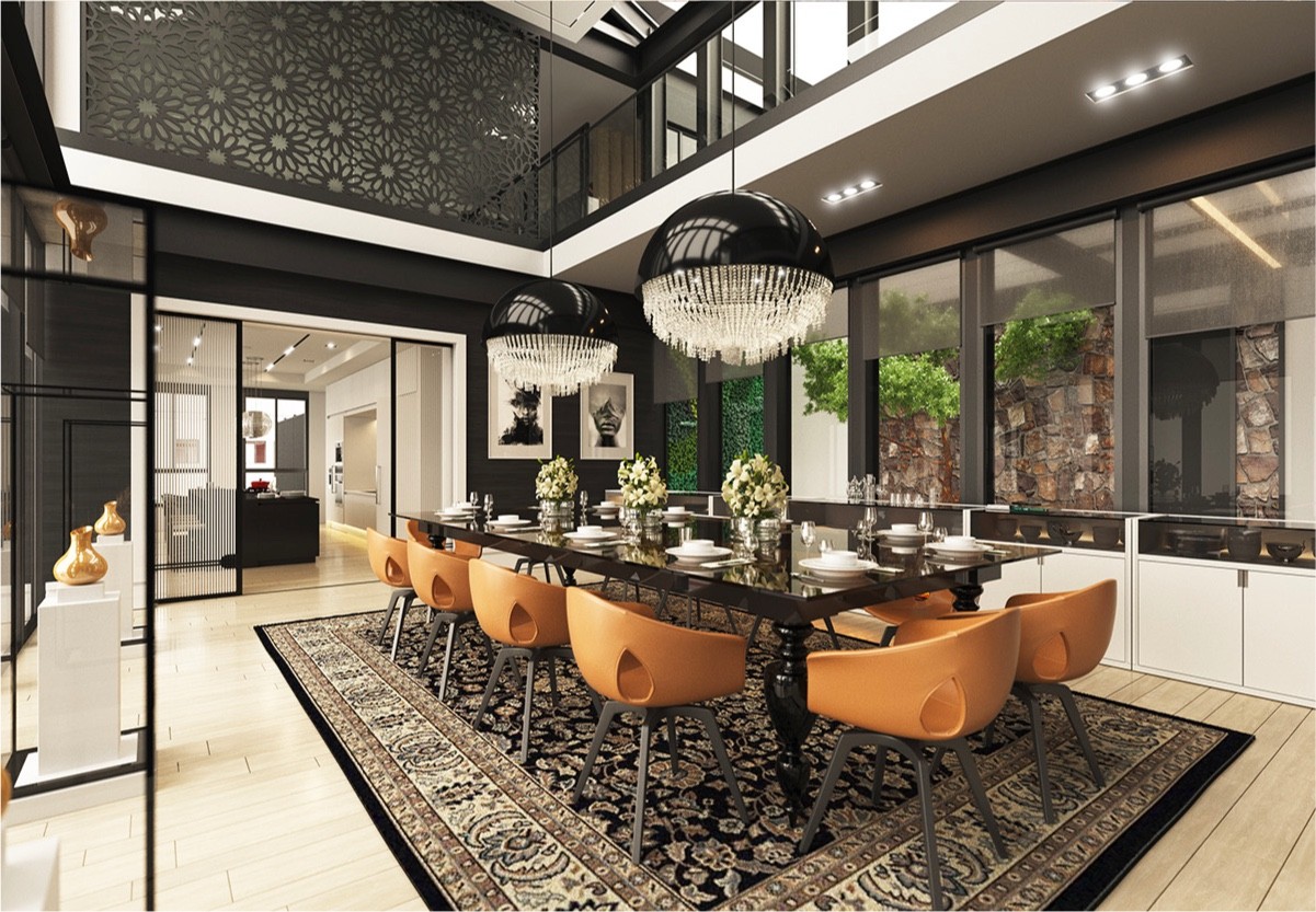
Classical elements like the large dining rug and the table's curvy legs offer a sentimental counterbalance to the ultra-modern chandeliers and the contemporary Ale chairs from Roberto Lazzeroni.
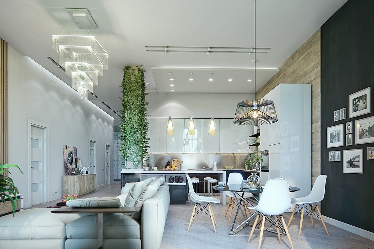
This next space includes plenty of modern high-gloss materials but tempers them with classic mid-century furniture (notice the Eames dining chairs?) and a perfectly classic arrangement of black and white photography on the black accent wall.
