Minimalism isn't going out of style any time soon. It's more than just an aesthetic – it's a philosophy, a lifestyle, and an art form. Getting started is as simple as decluttering and adopting a function-first approach to interior design but perfecting the minimalist style requires deep thought into the composition and purpose of each space. But if you're looking for specific minimalistic design trends, black and white interiors are always a great place to begin. This post examines six homes with stunning black and white palettes and a streamlined approach to decoration.

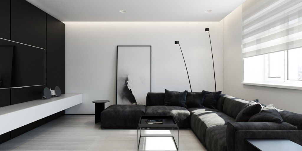
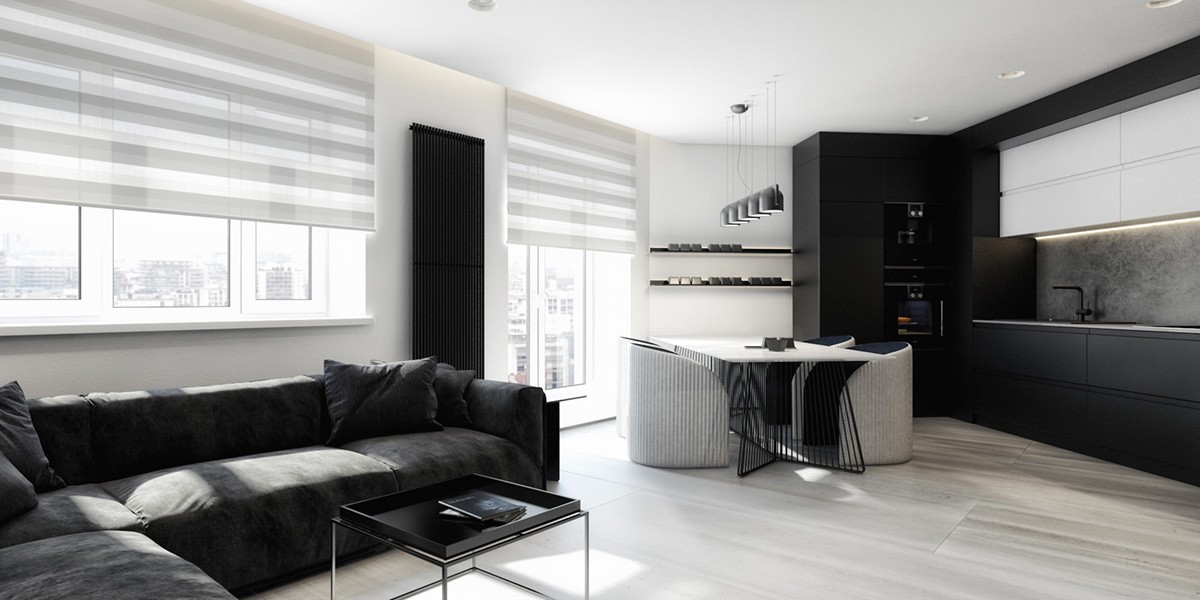
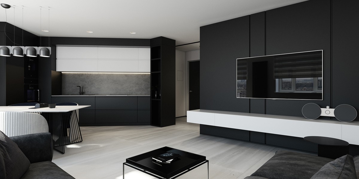
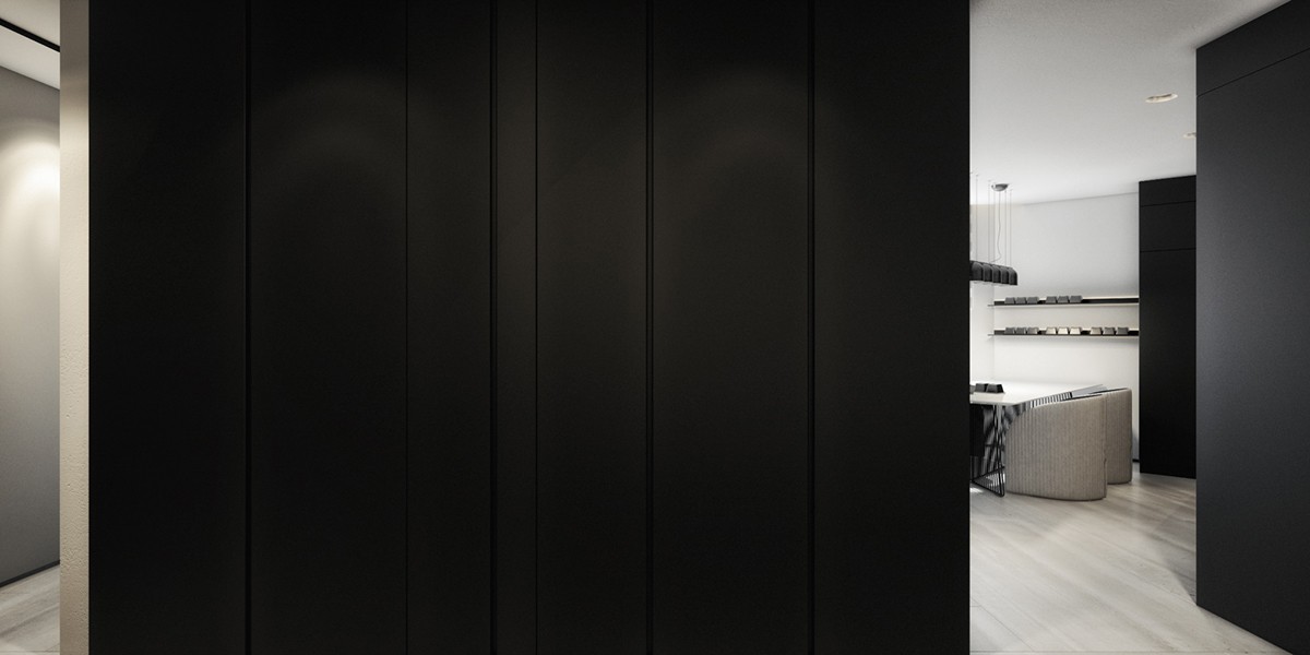
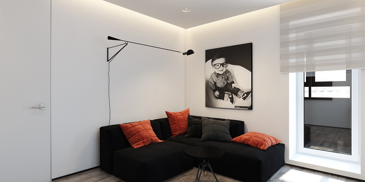
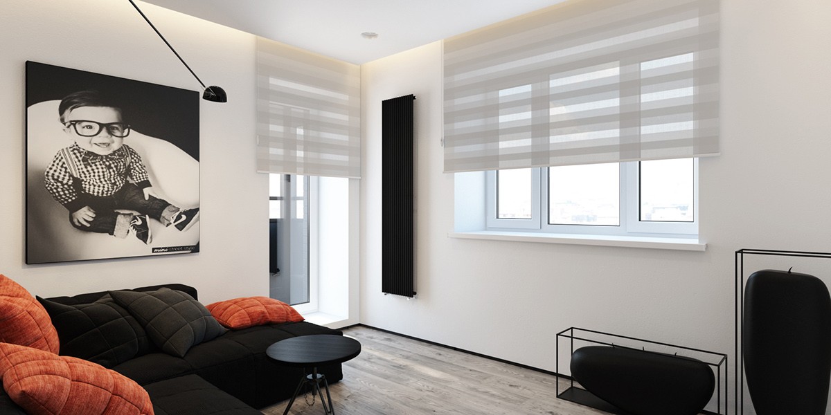
Let's start with a black and white home that tends toward the darker side. This home concept avoids middle grayscale tones within the overarching theme and instead uses them as subtle accents whenever possible. Even the artwork features a stark transition between dark and light – and the same goes for most of the furniture. Light gray stripes on the rolling shades offer the only variation from this angle.
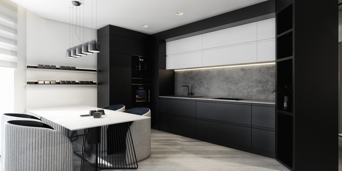
Notice how the chairs make up their color variation through texture alone. The arrangement of silver to black bars on the far shelf is fabulously inspiring.
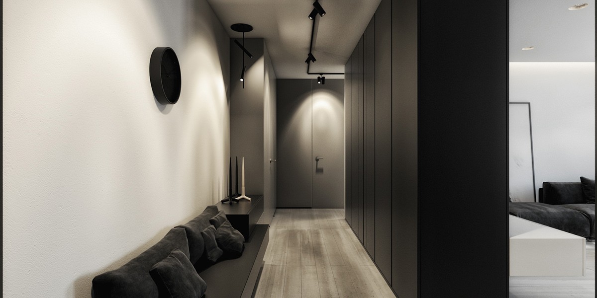
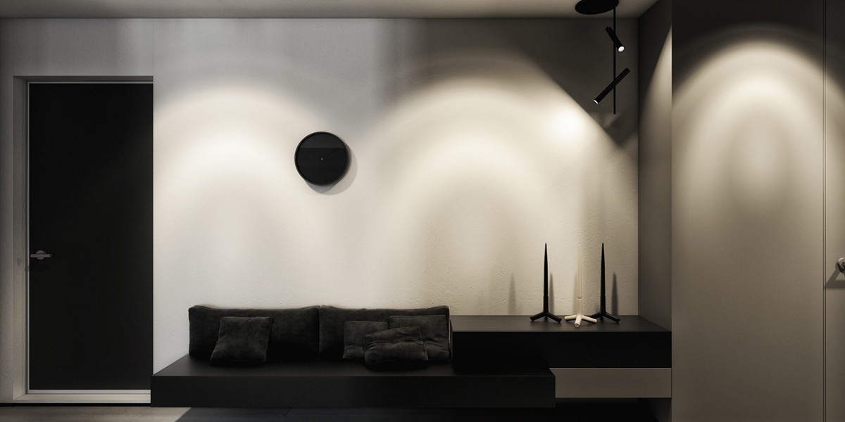
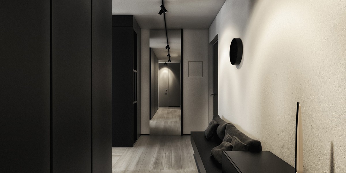
The hallway has a variety of functional details, ranging from the low-profile waiting bench to the diving wall made of matte black storage cabinets.
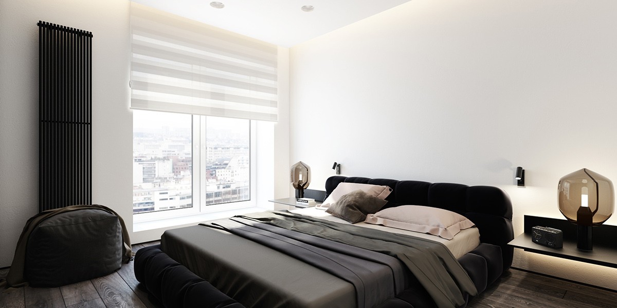
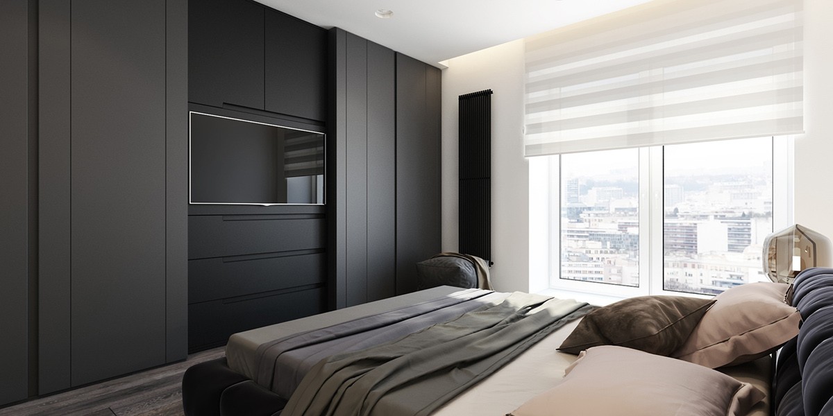
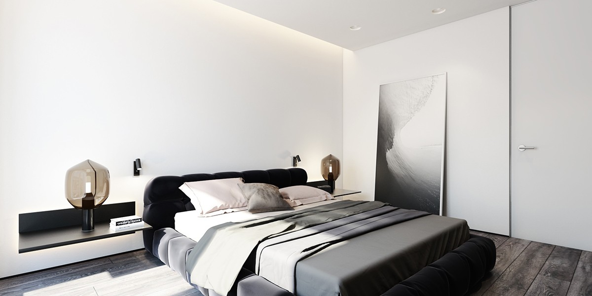
A wider variety of gray shades appear in the bedroom design. Although minimalistic in terms of decoration, this space feels warm and comfortable with its dark wood floors and generous use of layered textiles.
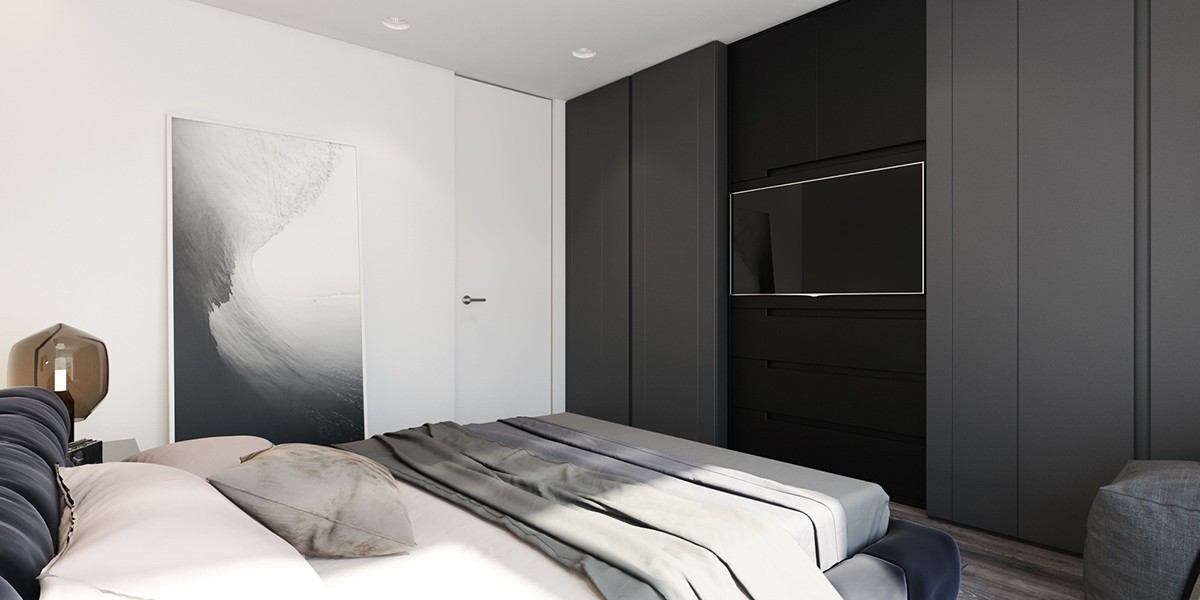
Like the living room, this space features artwork that embodies the full range of monochromatic tones used nearby.
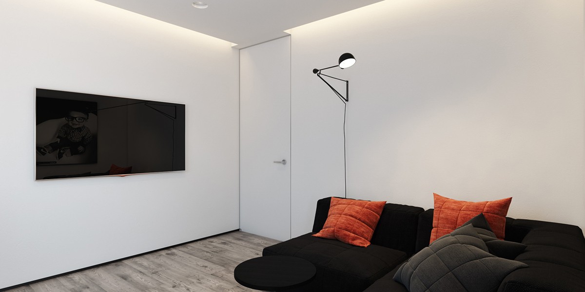
Here's a look at the guest suite. This space incorporates a bright accent color – orange – in contrast to the homogenous themes found elsewhere.
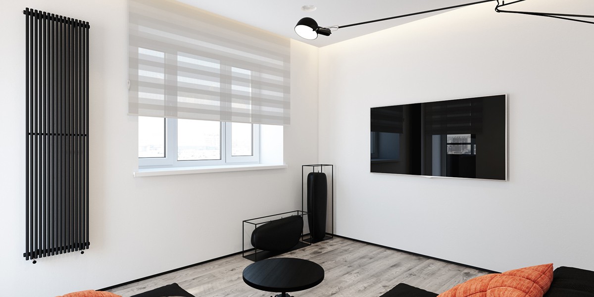
Adjustable task lighting projects far into the room. This lamp is from the 265 collection by Paolo Rizzatto.
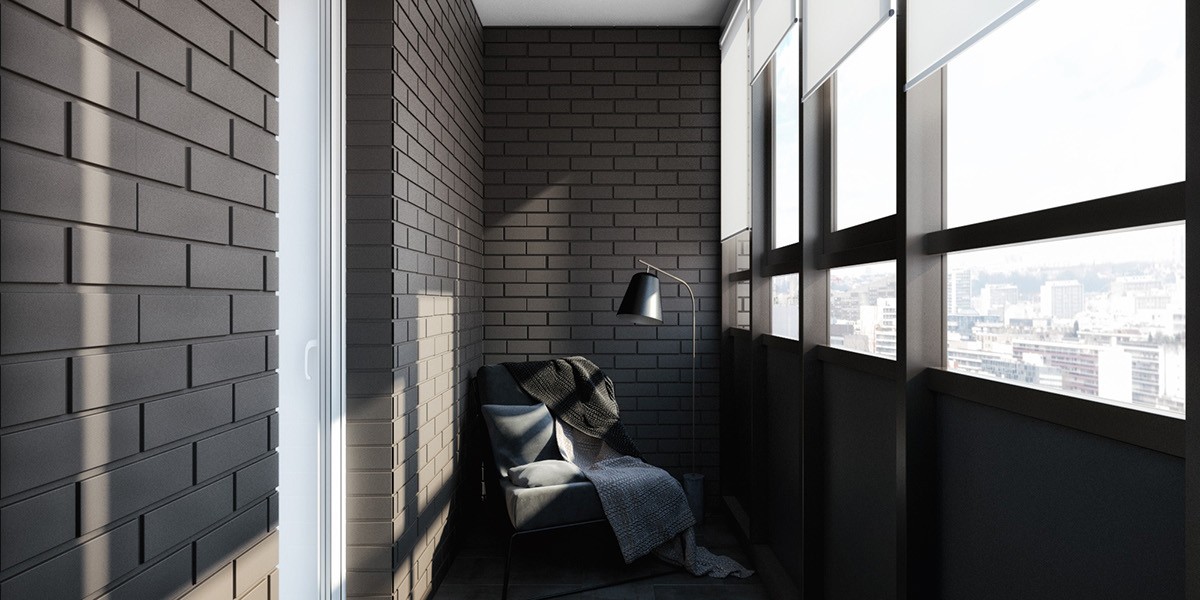
Here's a look at the exterior balcony, outfitted with the same matte black treatment as the rest of the home. The lamp is a design by Knut Bendik Humlevik and Rune Krøjgaard.
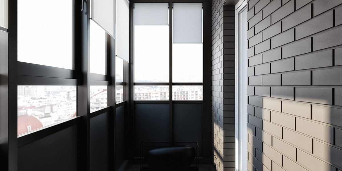
The dark theme makes this space feel close and comfortable even with an unbeatable surrounding view.
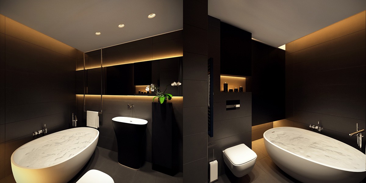
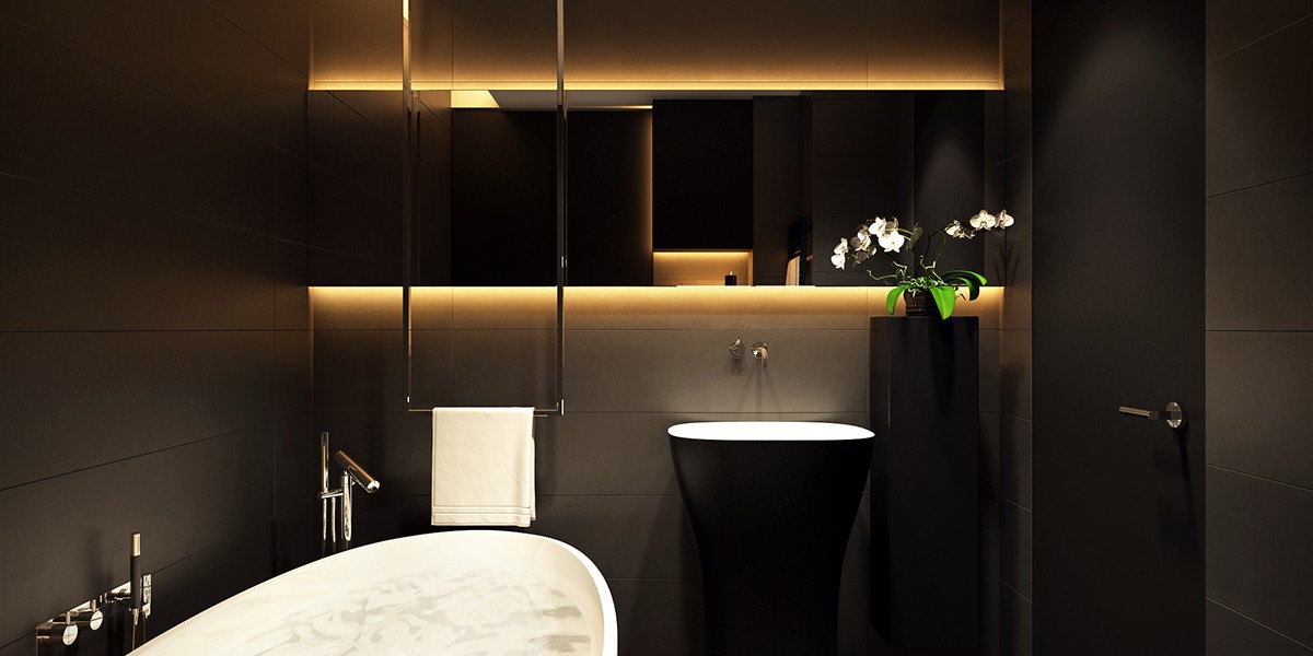
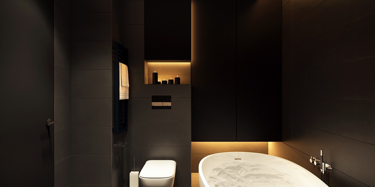
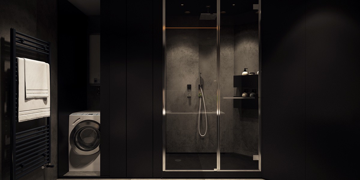
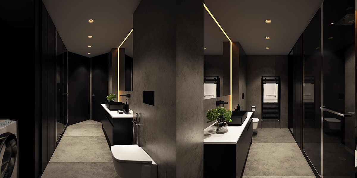
This home tour ends with a peek at the bathrooms with their immensely sophisticated dark interior design.
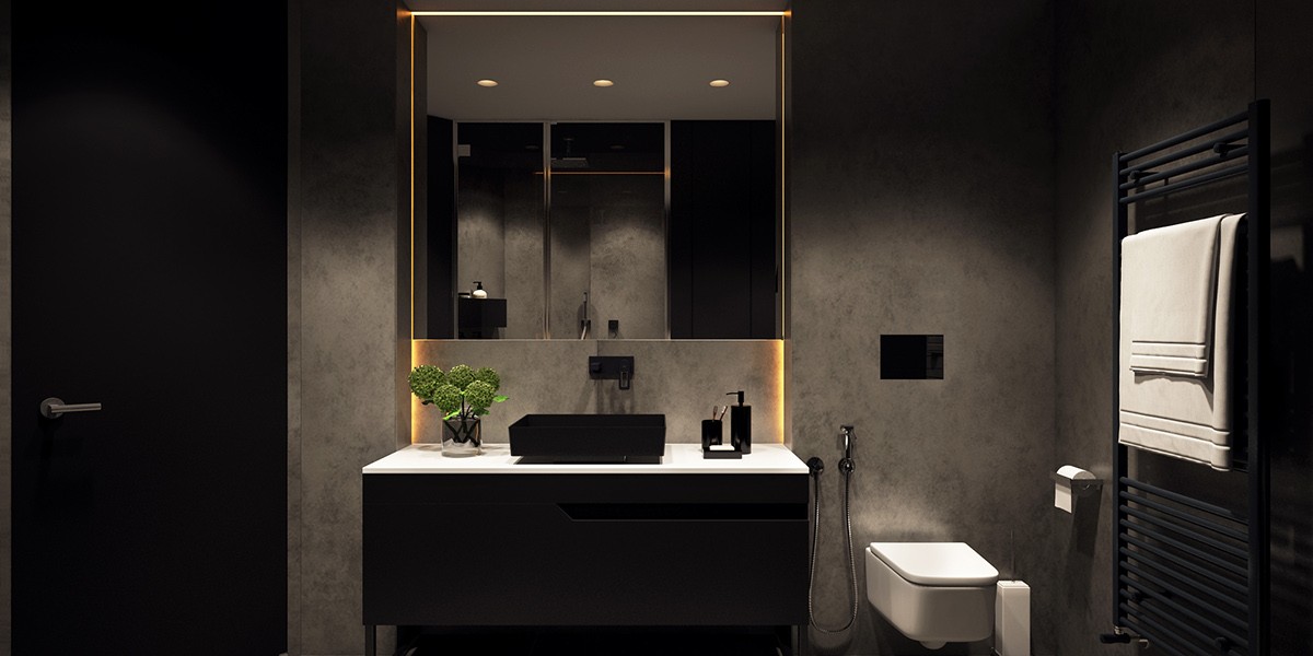
Here's the secondary bathroom – this design features a more industrial aesthetic than the previous one.
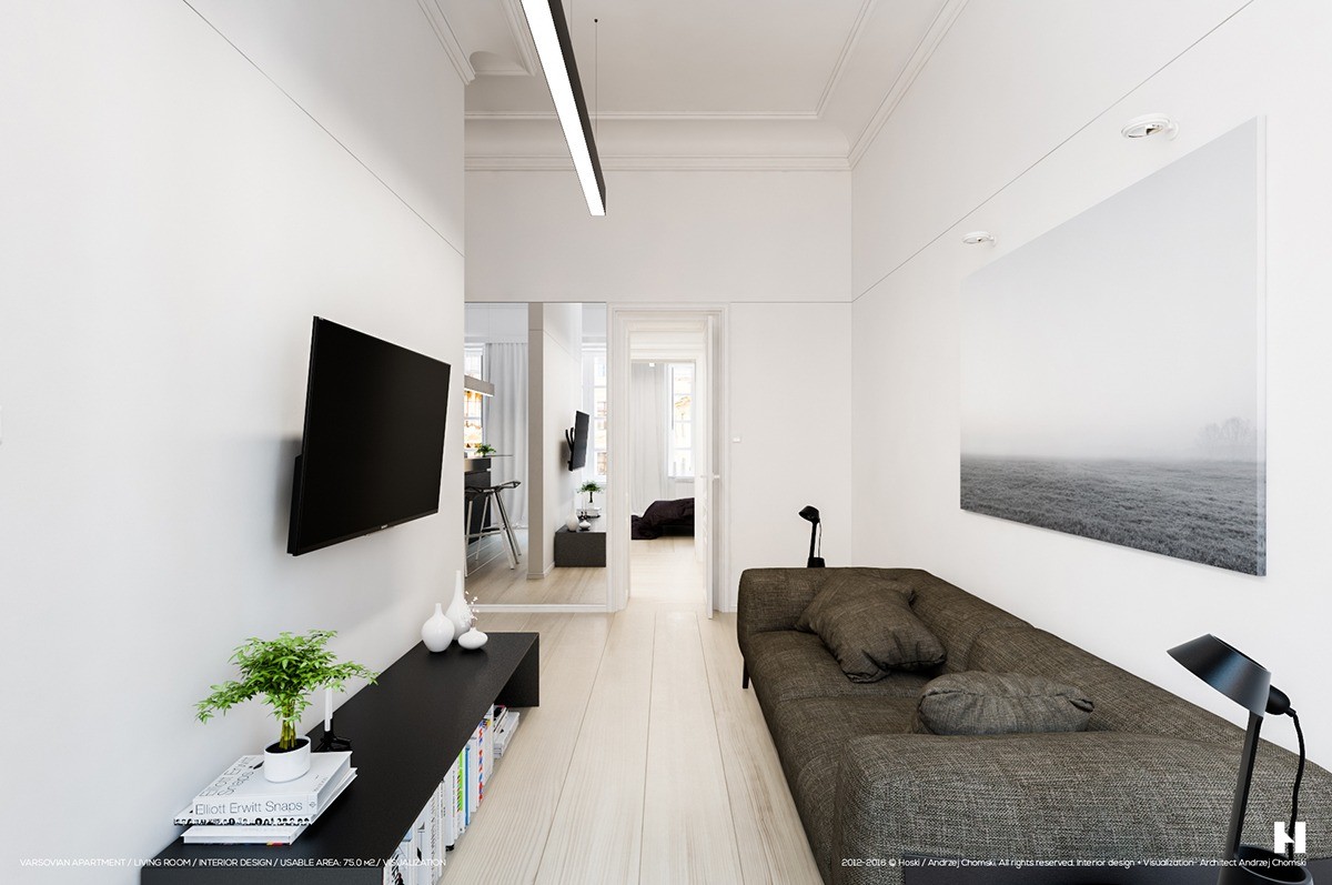
This next home takes a completely different approach, with bright white surfaces allowing the modest 75 square meter interior to feel as open and spacious as possible. Light wooden floors lend a sense of warmth and the textural sofa beckons visitors to sit down and soak up the positive ambiance. Talented architect Andrzej Chomsk designed this space for a tasteful middle-age couple.
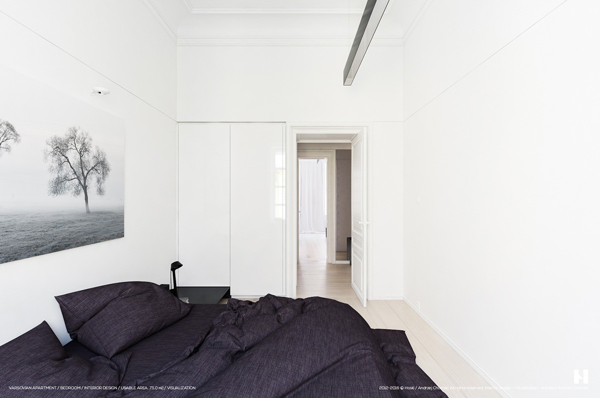
Note how the bedroom parallels the living room theme with precision, with the main piece of furniture embracing high texture and the walls maintaining a pristine white treatment.
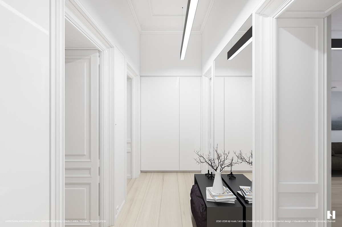
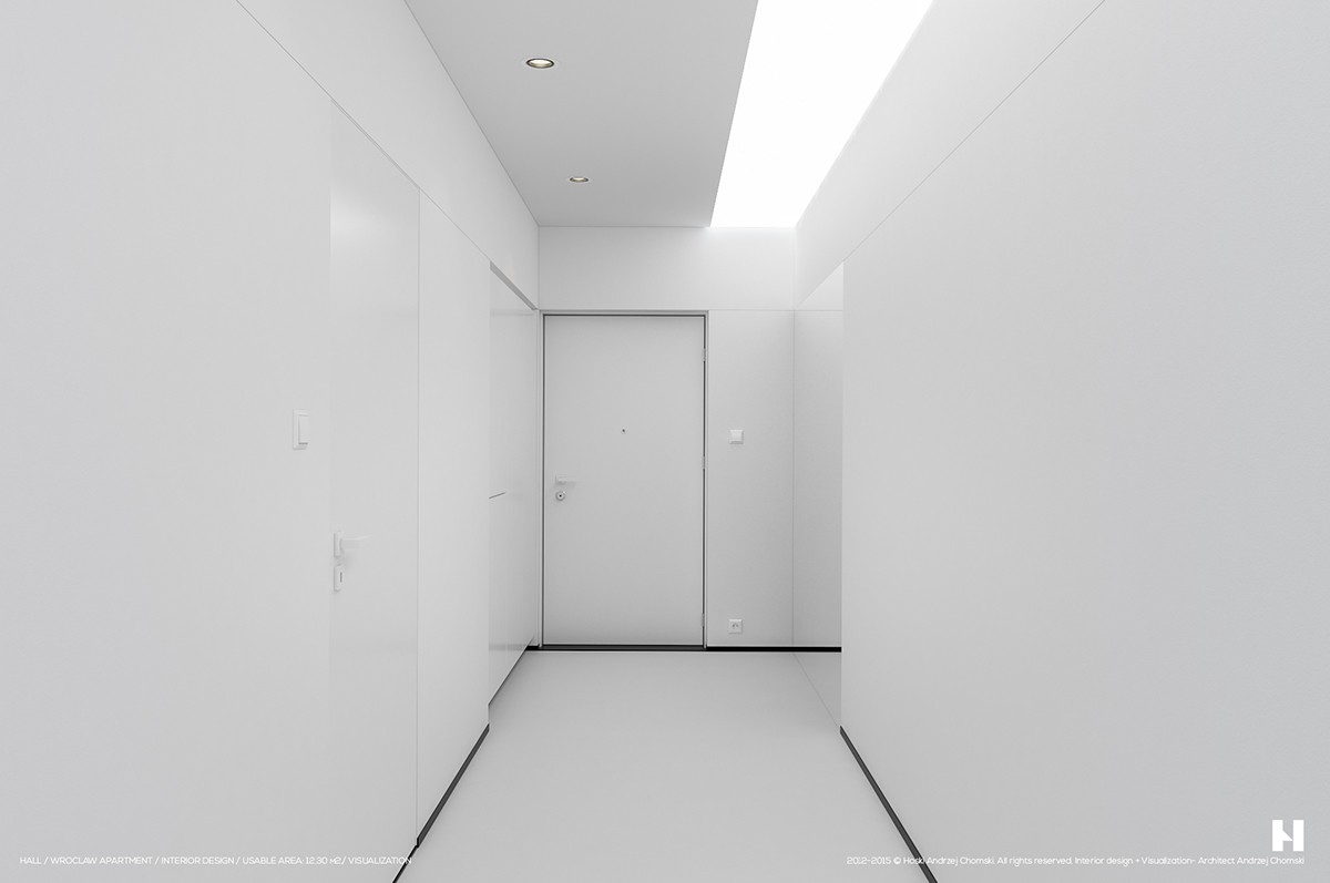
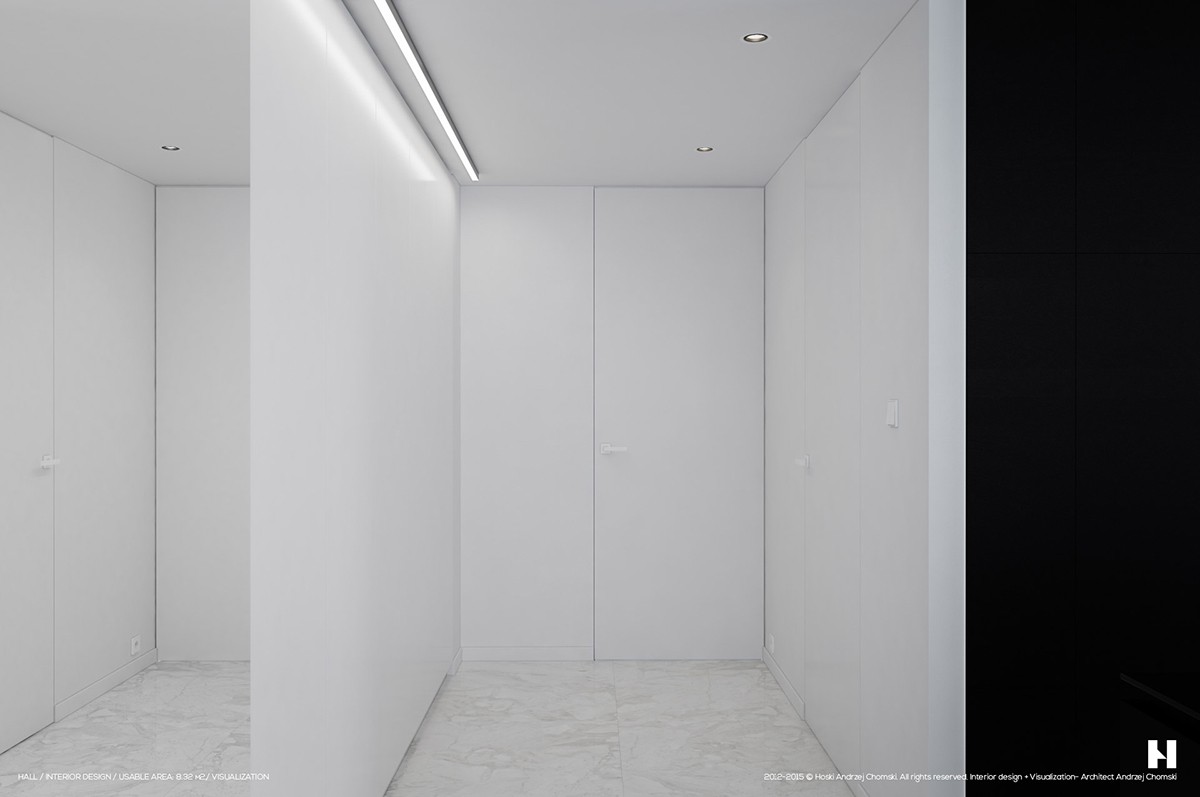
A look at the hallway reveals classically styled paneling in contrast to minimalistic storage solutions.
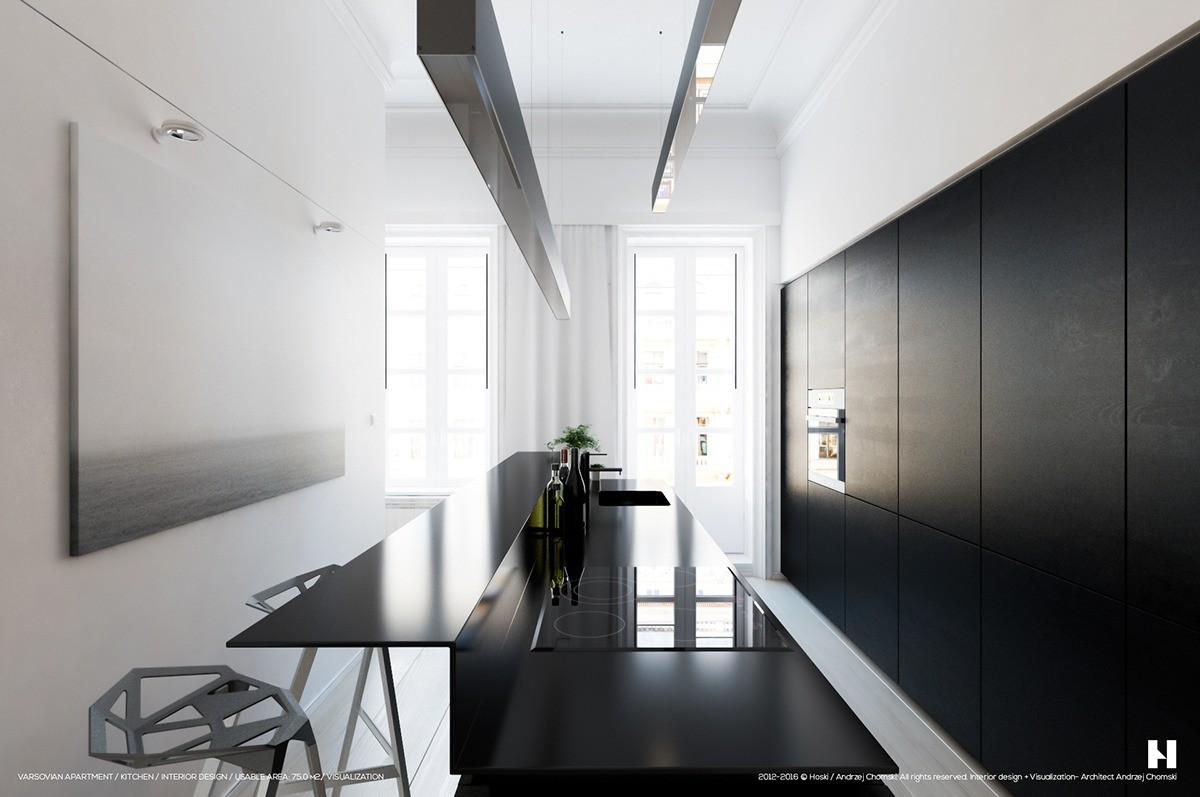
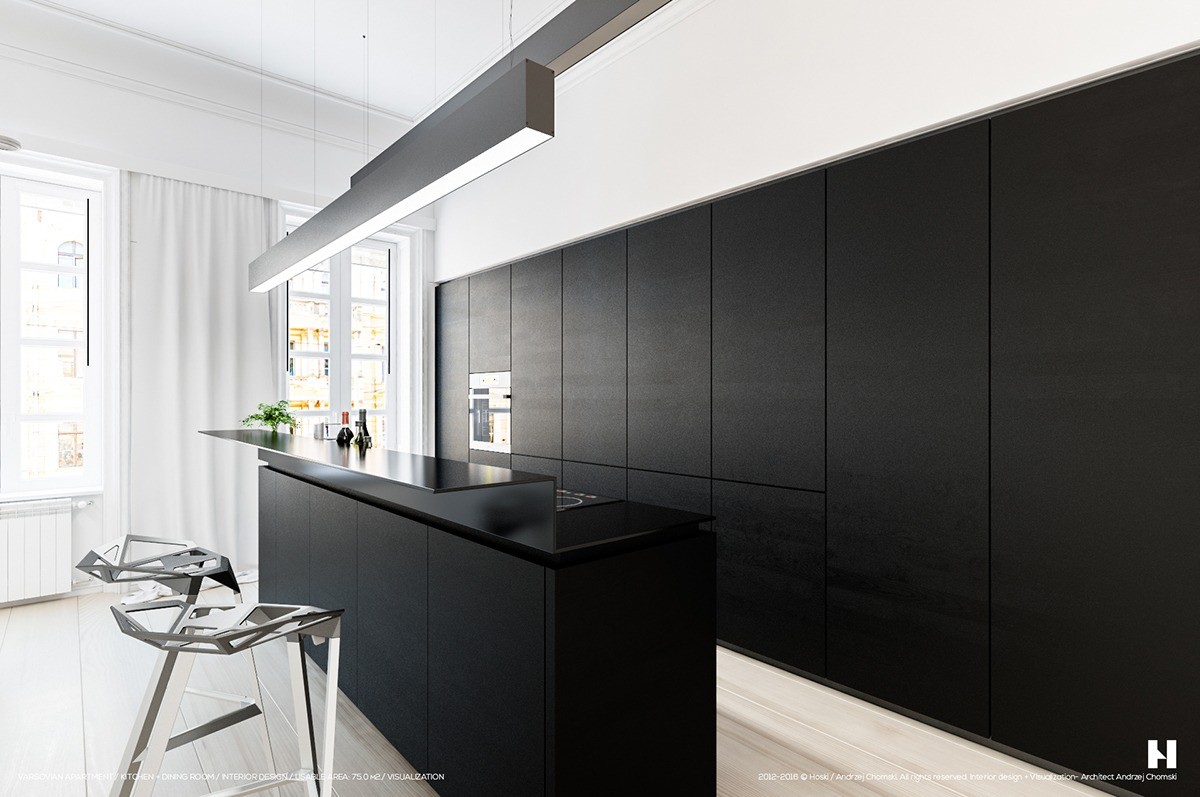
The breakfast bar is especially clever – ideal for serving directly from pan to plate. The geometric breakfast stools are from the Chair One series by Konstantin Grcic.
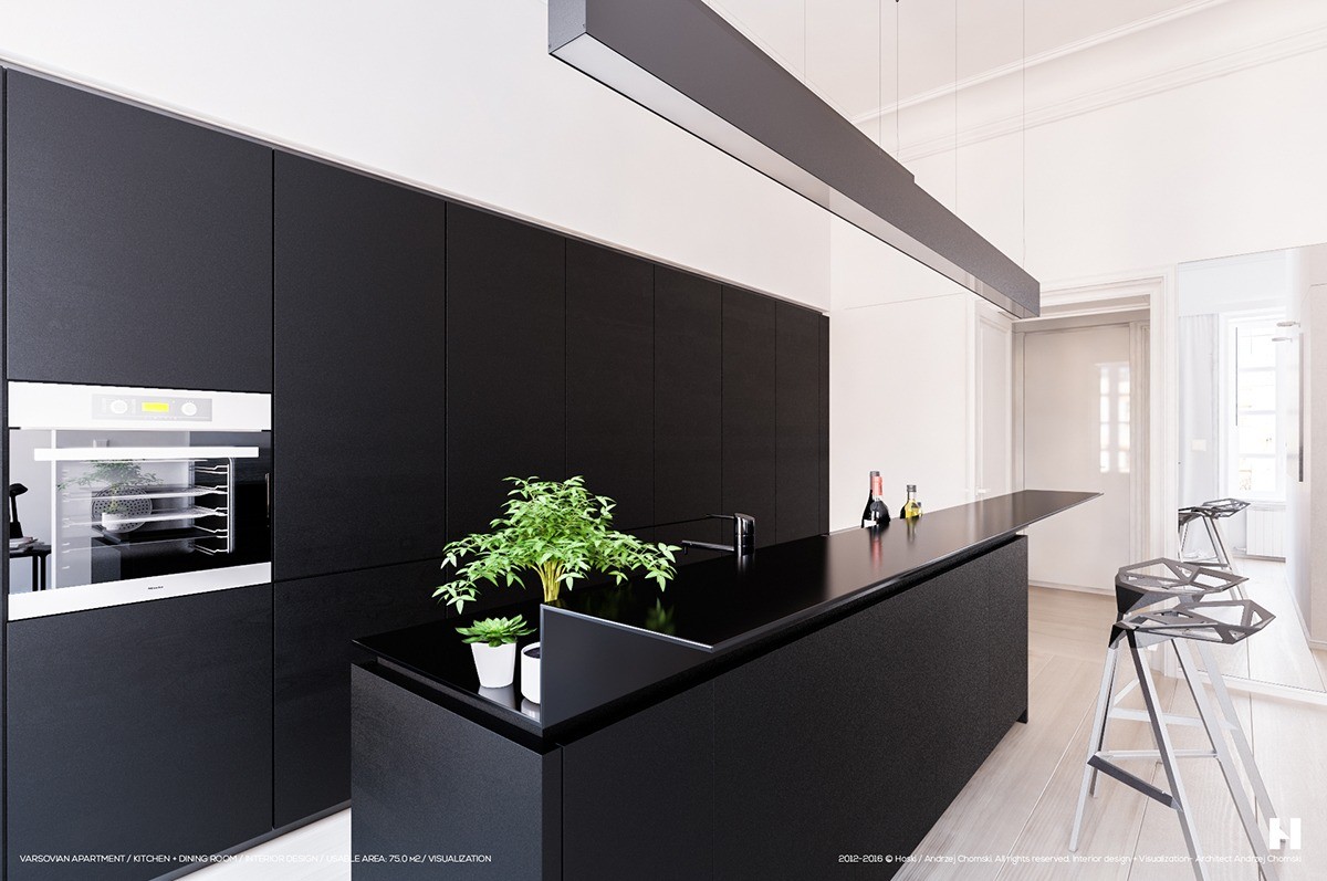
add a dash of color no kitchen could do without.
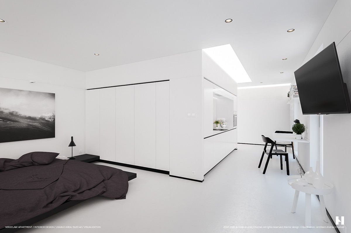
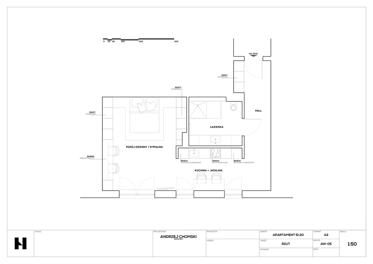
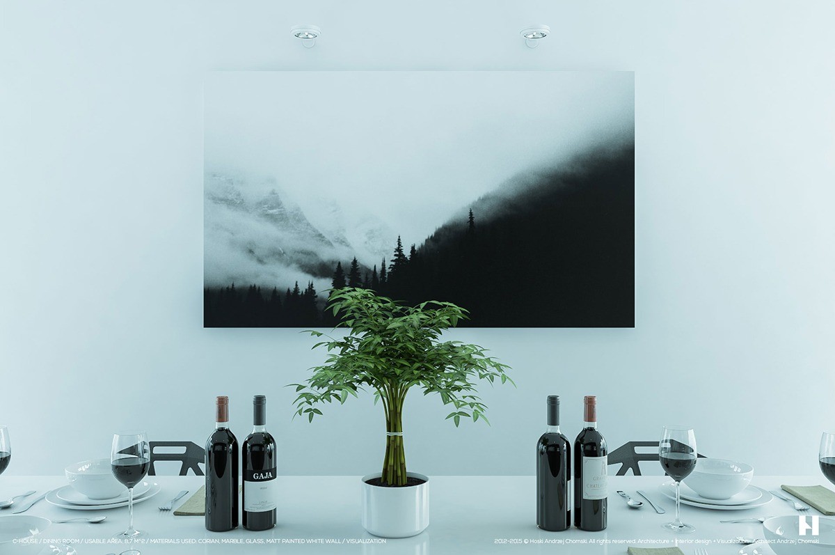
Glossy white surfaces and abundant lighting give this compact apartment a rather surreal quality. Crisp clean lines are perfectly in line with the ideals of minimalism – no unnecessary elements, very little extraneous decoration, perfectly streamlined for functionality. It's compact and efficient without looking like an efficiency apartment.
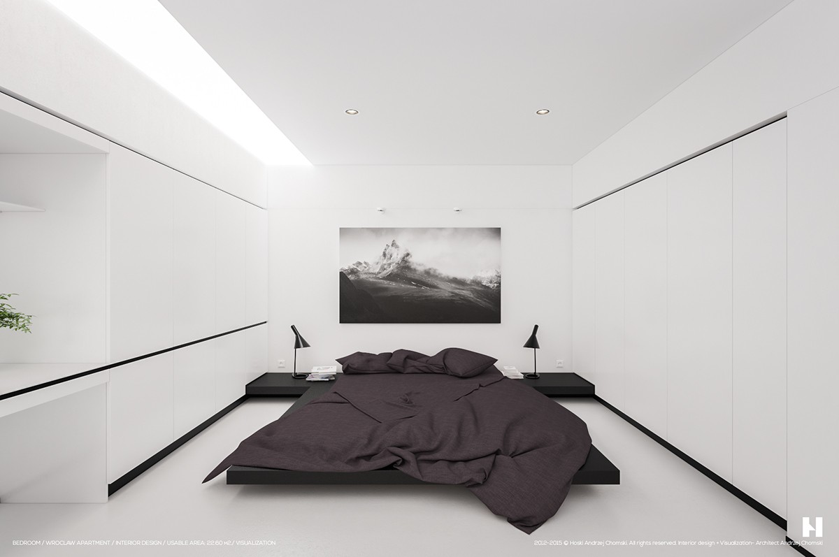
The bedroom area is tucked away in its own little cove, surrounded by integrated storage on all sides. Rather than a headboard, the low-profile bed centers on a black and white photo of a natural scene. Do check out more of these minimalist bedrooms if you are into this style.
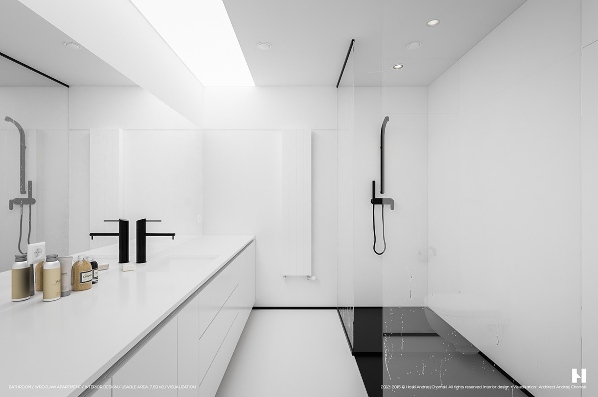
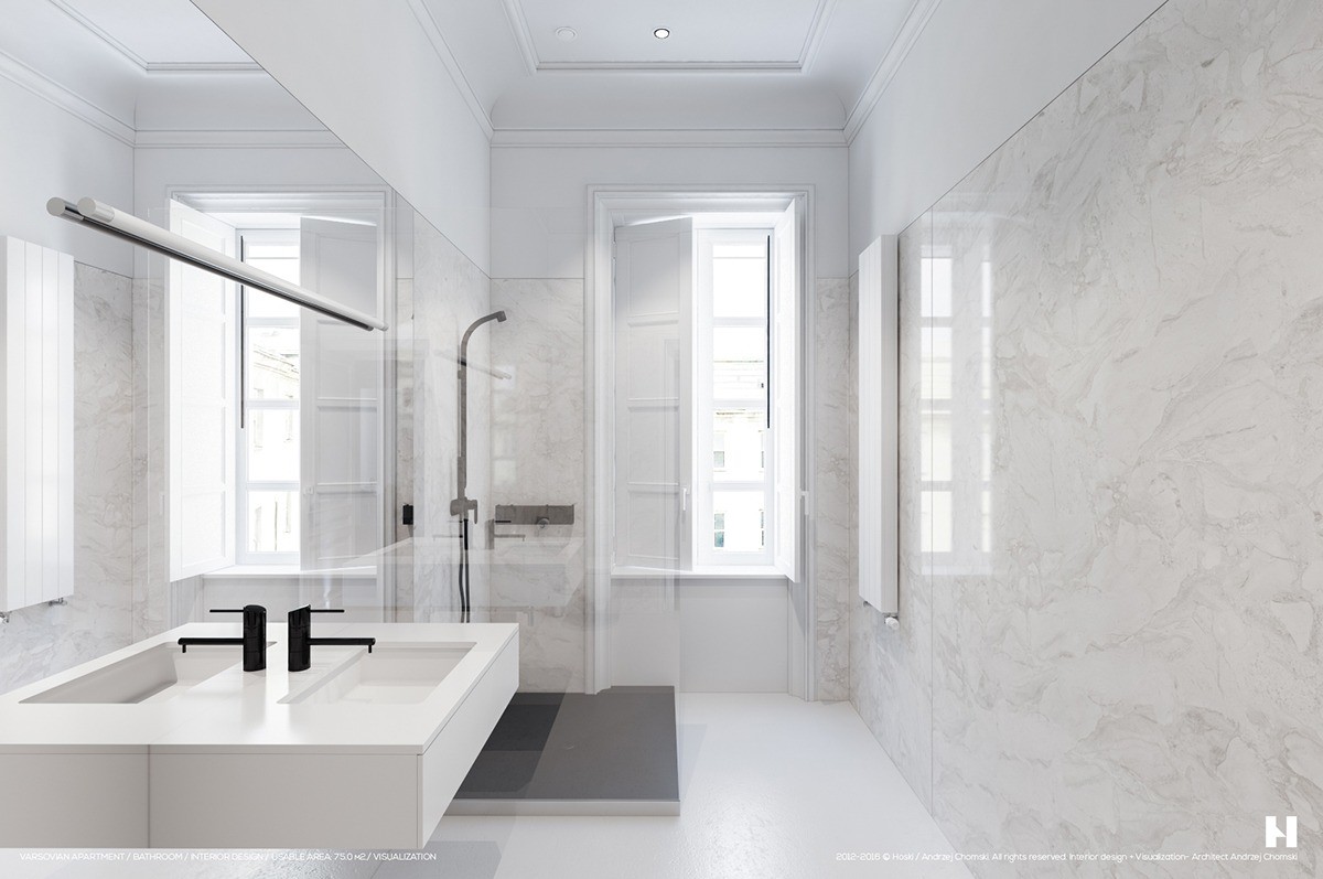
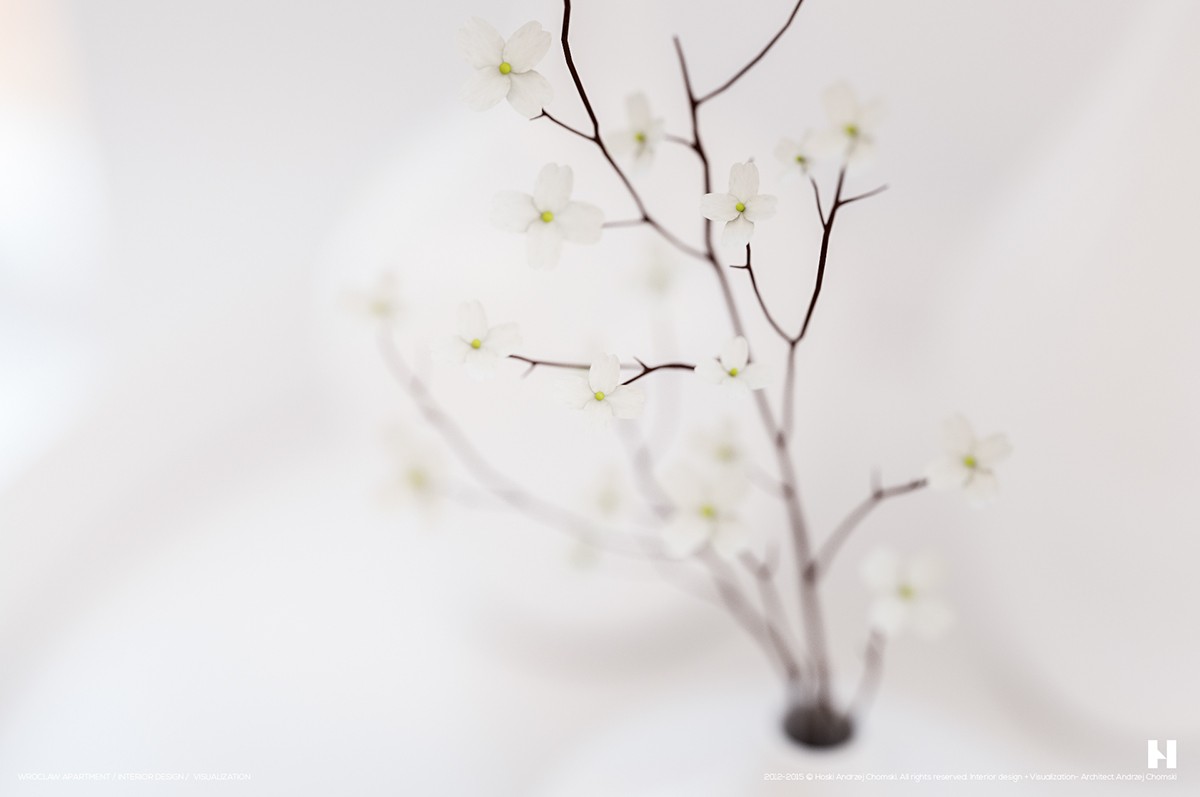
Before we move on to the next home, here's a peek at the bathroom. Minimalism clearly takes precedence here, with only a simple arrangement of supplies for color.
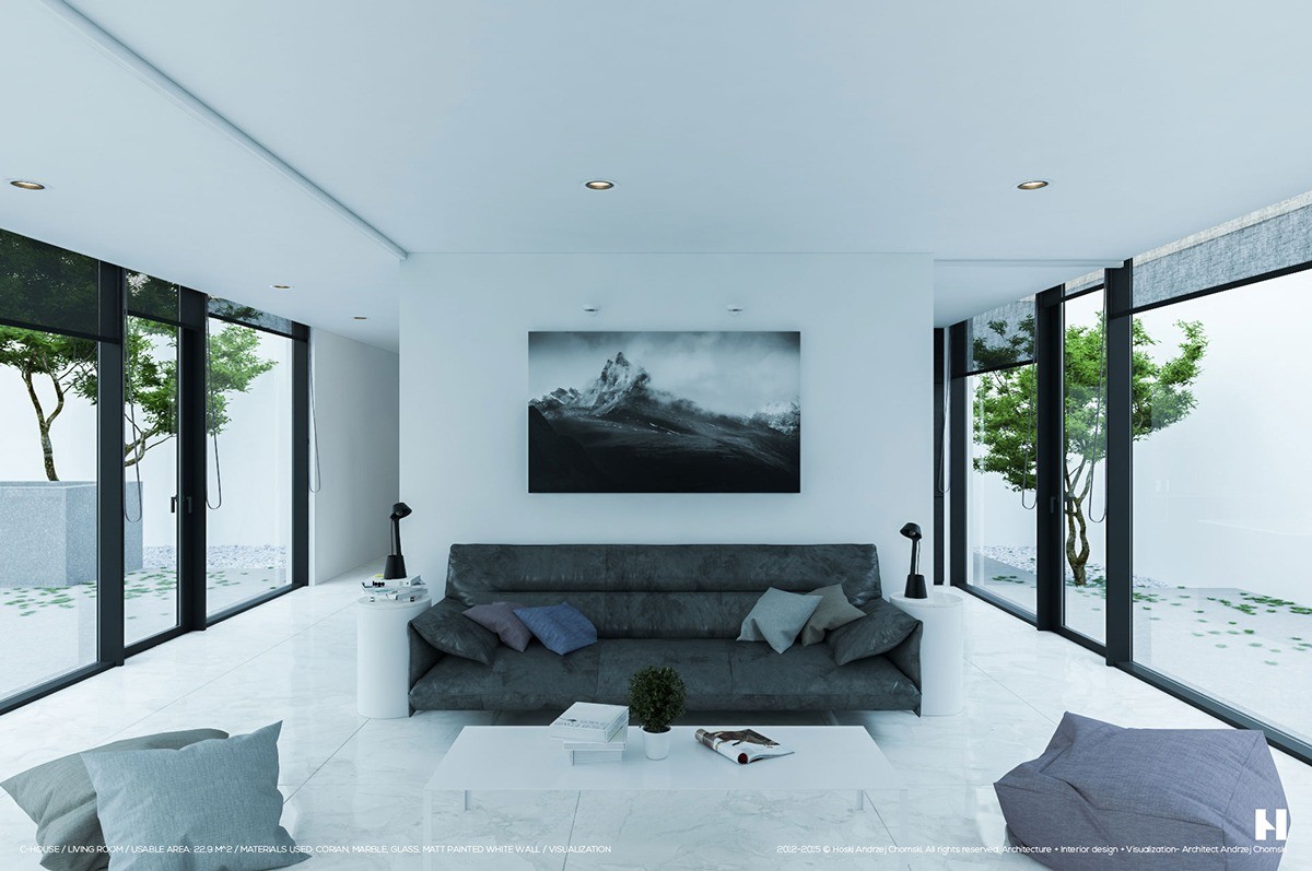
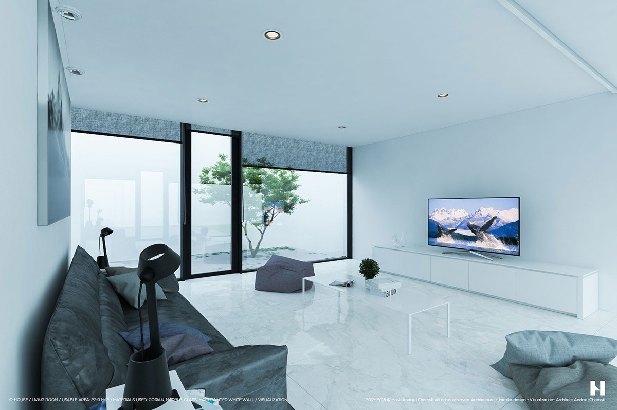
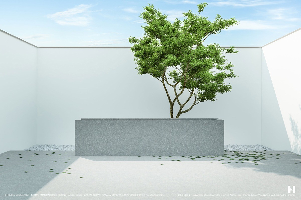
Brilliant! This home prioritizes its surroundings with spectacular floor-to-ceiling windows. The interior doesn't compromise an ounce of design to suit this need – instead, it creates a comfortable grayscale oasis that complements the urbanistic themes found in the exterior courtyards. Expertly shaped trees draw the attention outward while smart interior stylings satiate the soul.
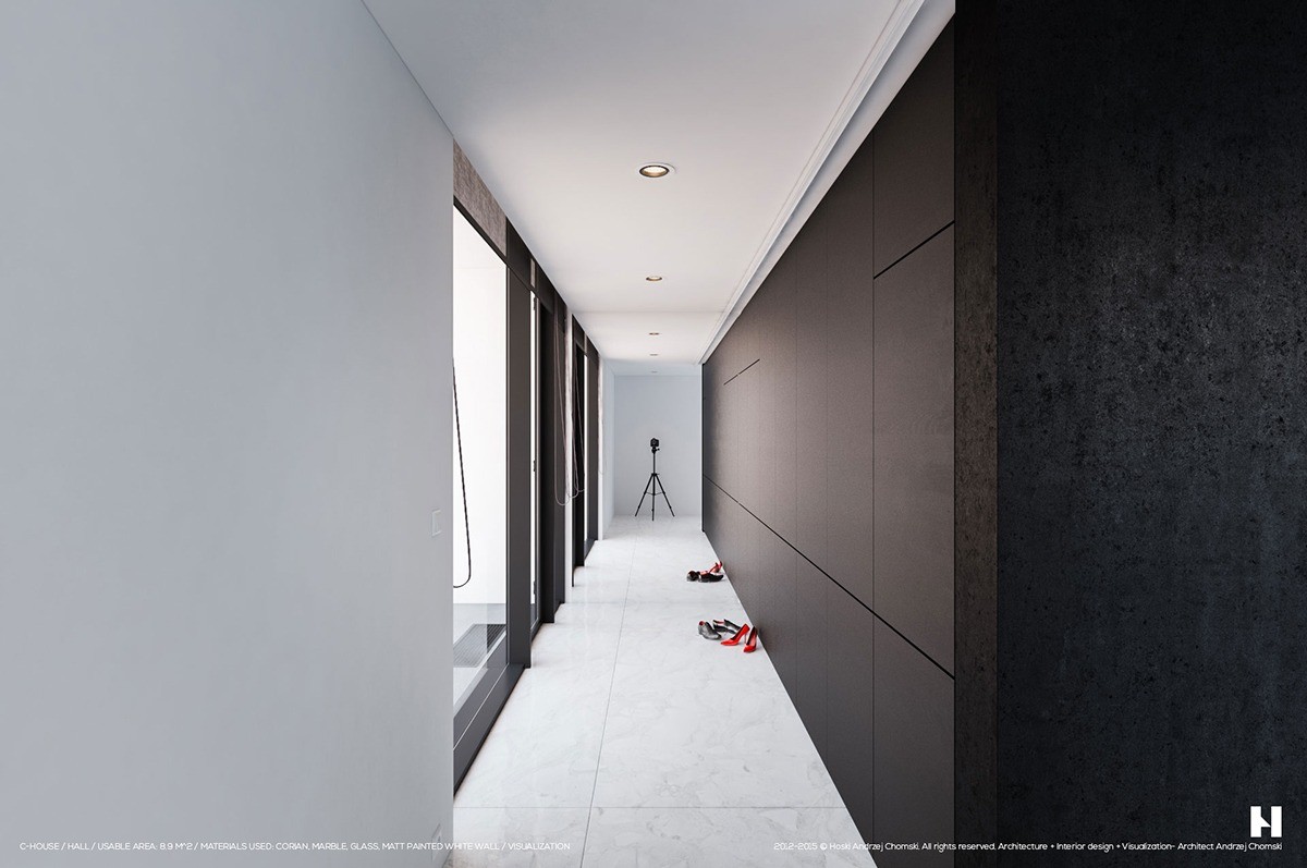
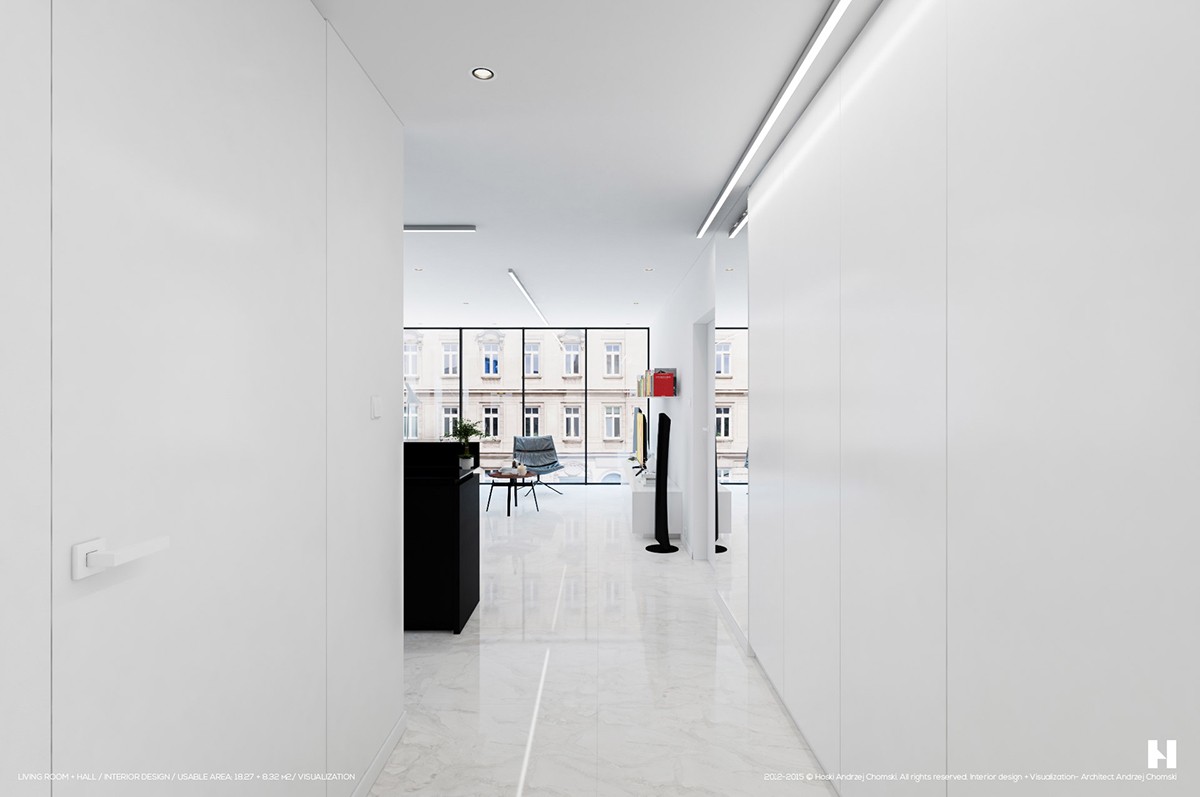
Here, the marble floors continue along the hallway flanked by windows on one side and matte black storage units on the other.
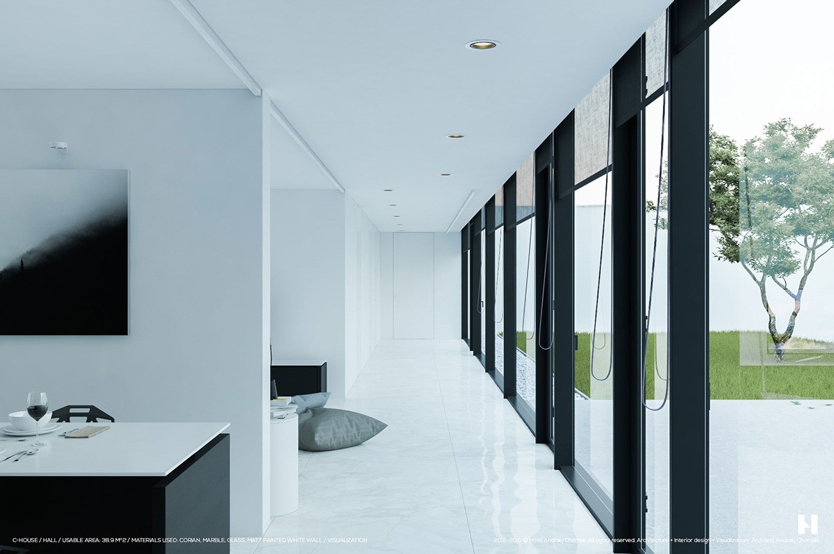
Even the exterior wall seems like part of the interior, its smooth white surface providing the perfect canvas for verdant expression.
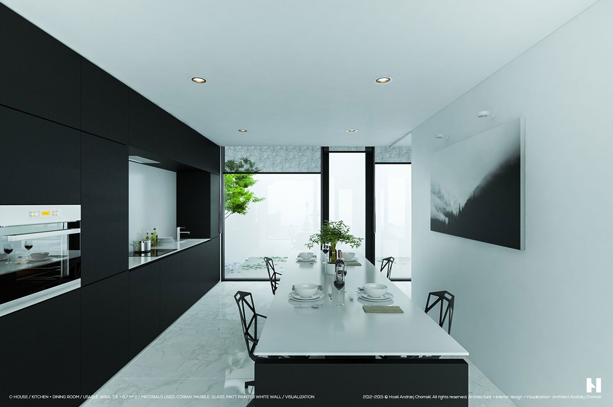
Here's a better view of the kitchen in full, with the black cabinetry and geometric chairs making a definite statement.
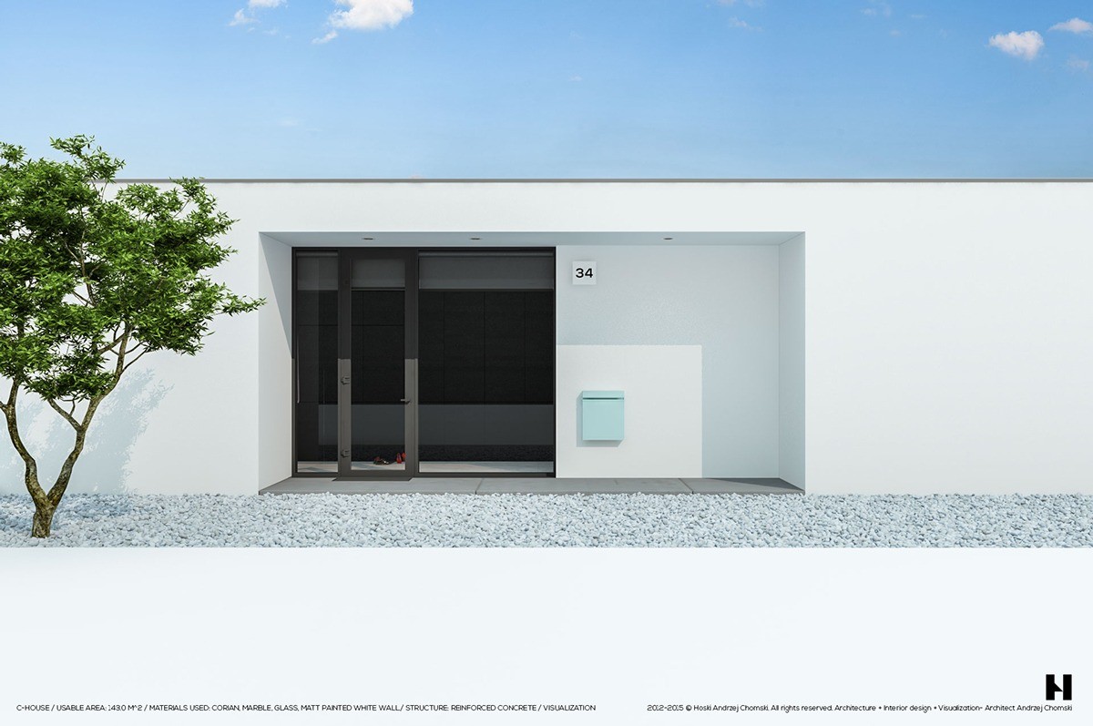
A view from the exterior reveals the all-encompassing minimalism that defines this home inside and out.
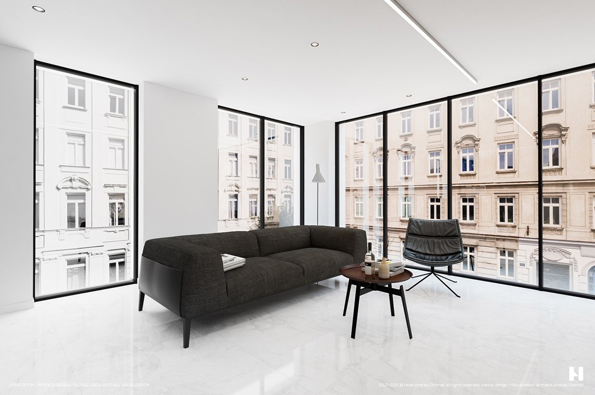
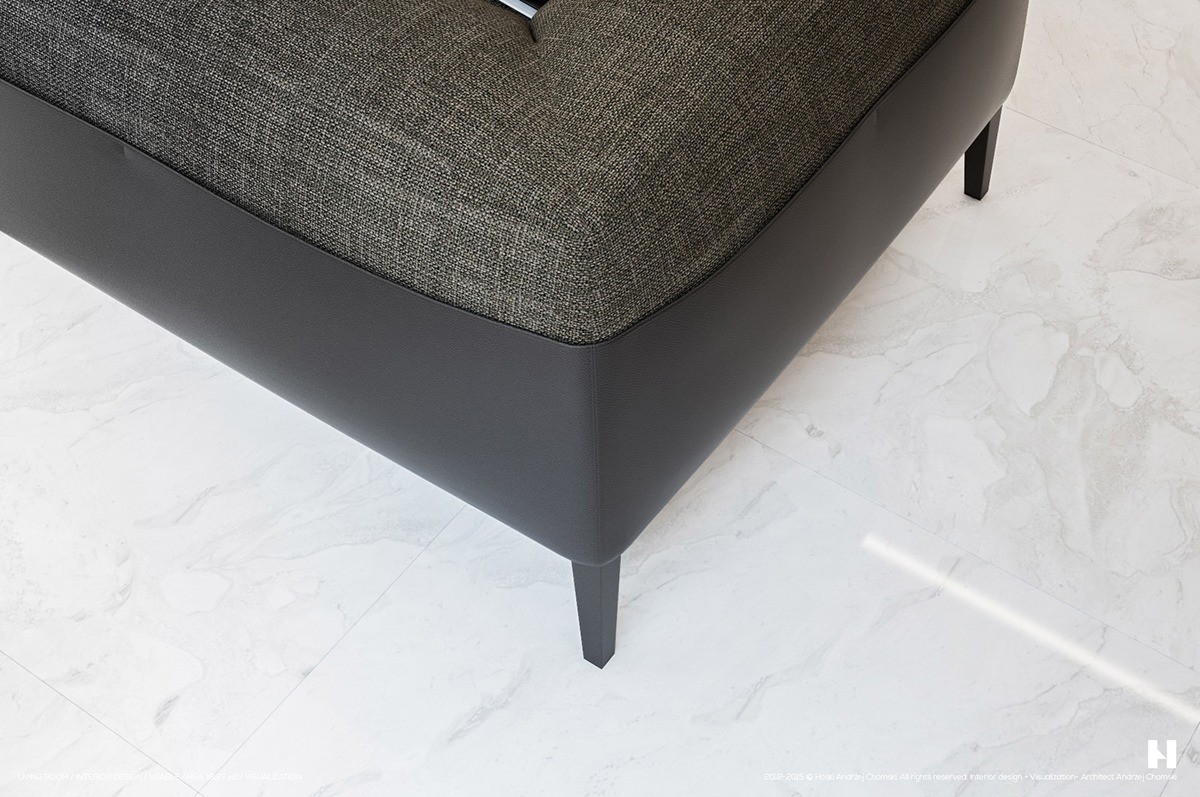
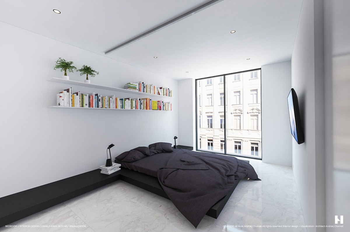
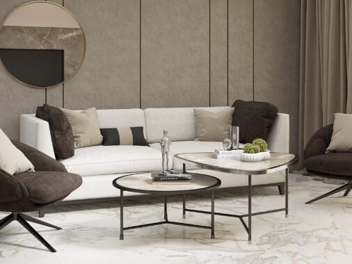
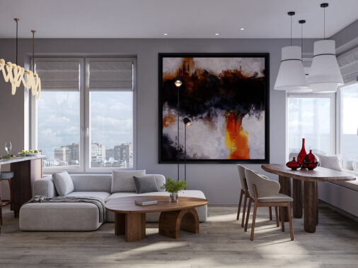
This home also features a bold emphasis on the surrounding view – this time the nearby apartments provide the decorative backdrop to the interior's dedicated sense of minimalism. Marble floors set a sophisticated tone and stylishly simple furniture allows attention to focus on the exquisite architecture outside.
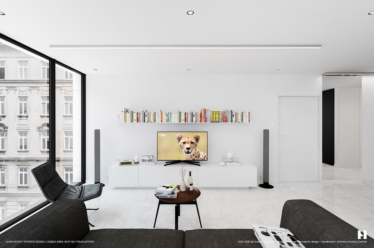
A row of open shelves allows the occupant a little room for self-expression and color. Although perfectly coordinated white-bound books seem popular in minimalistic interior design, this arrangement looks much more realistic.
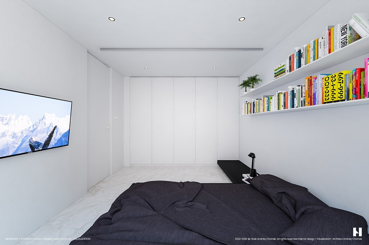
More colorful books appear in the bedroom. Like the rest of the home, this space features dark furniture against a backdrop of pristine white surfaces.
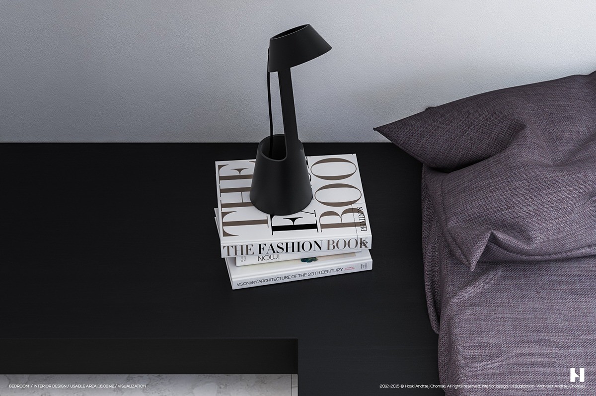
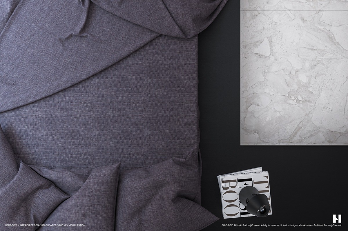
The smooth bed platform continues across the headboard wall to serve as side table with plenty of space for decoration.
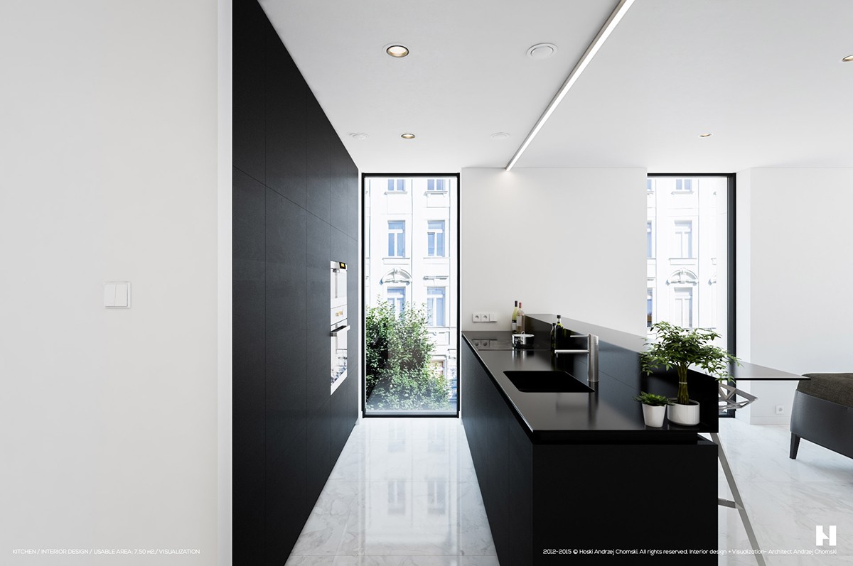
Within this apartment, you'll notice many details repeated from the previous homes. The same matte black cabinetry, the same versatile furniture, and even some of the same furniture makes another appearance here – a great example of how a new arrangement and setting can completely change the overall feeling of a space despite similar influences.
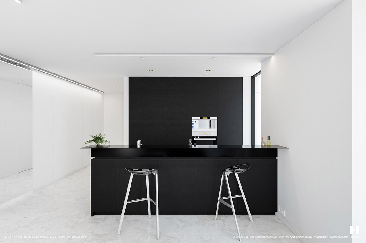
Remember this distinctive kitchen island setup? Here, it's part of an open floor plan rather than residing in its own separate area. If you are looking for similar black and white kitchen themes, do check out our post: 40 Beautiful Black and White Kitchens.
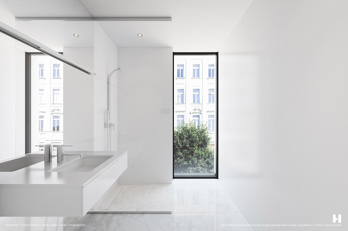
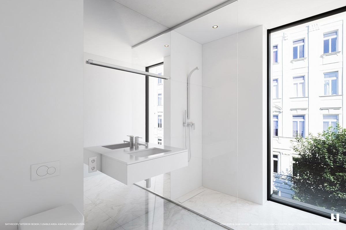
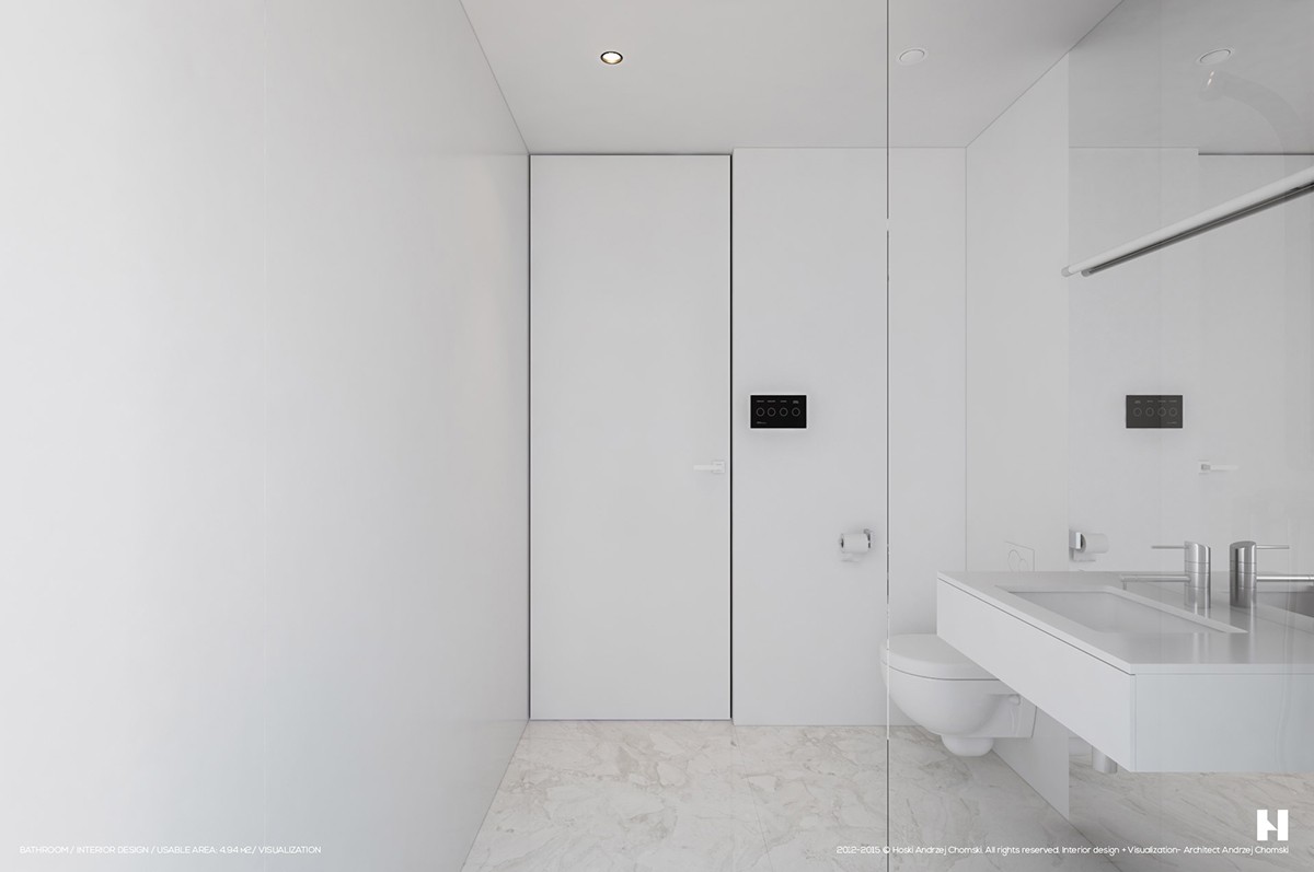
In the uncomplicated white bathroom, marble floors and blank white walls focus all attention toward the excellent outdoor view.
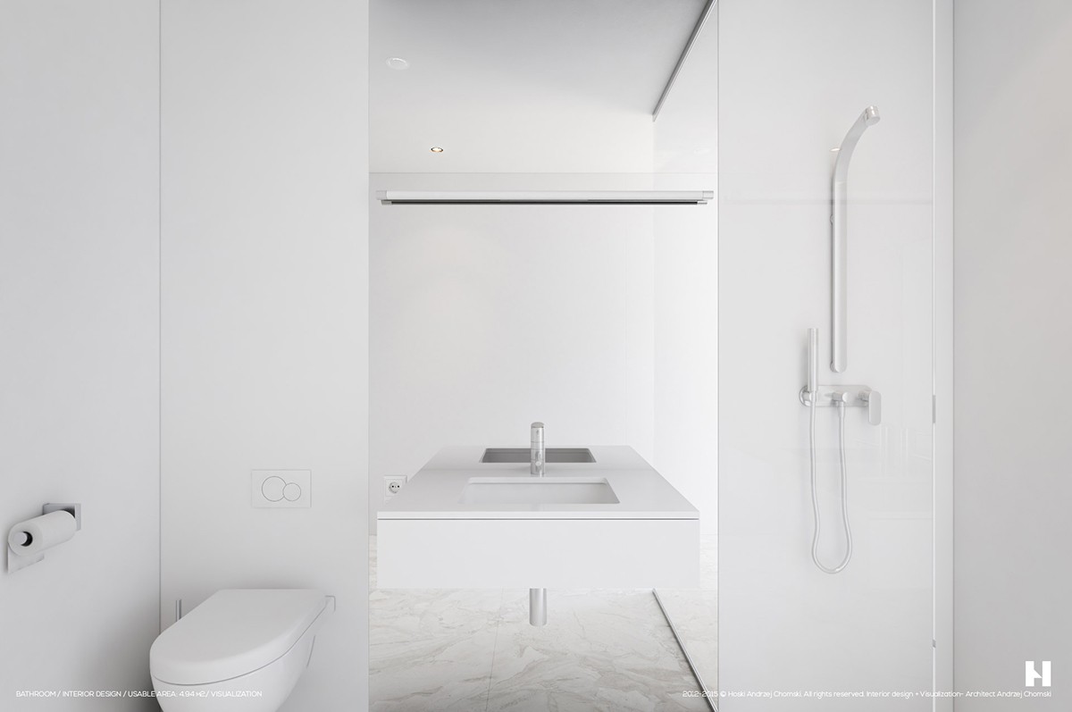
Note the simplicity of the fixtures – it's impossible to have a fully streamlined space without giving due attention to such small yet crucial details.
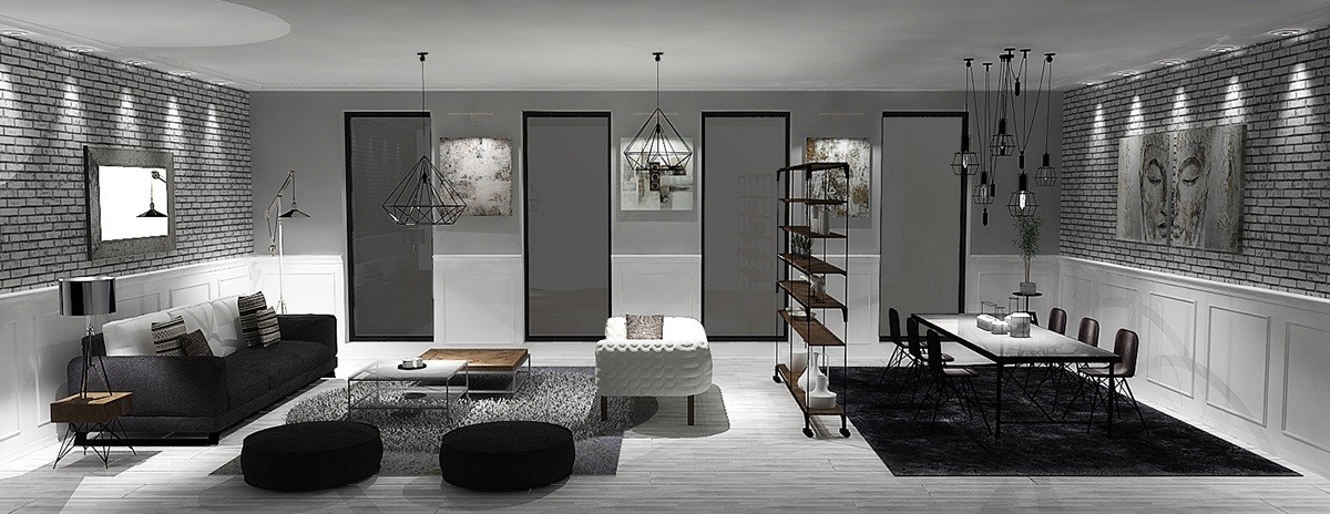
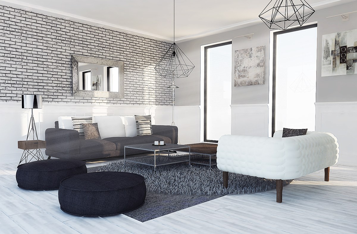
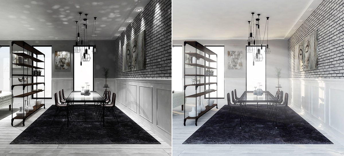
Compared to the other homes in this post, this space definitely embraces the full range of grayscale possibilities. It's not traditionally minimalist, but rather a minimalistic take on traditional interior design. Classic and modernistic elements combine to form a space that is visually engaging without overwhelming the eye.
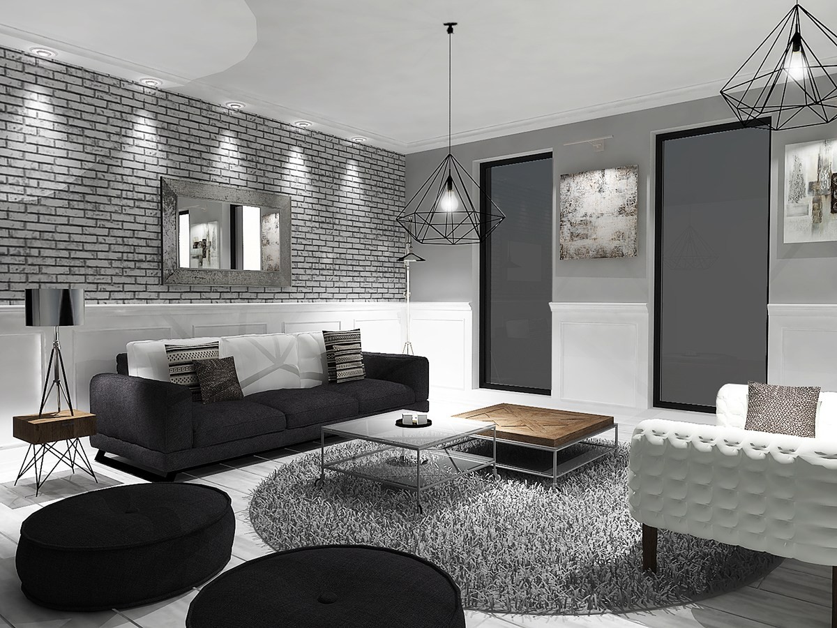
Deep textures, wire accents, and bold patterns draw the eye. Each element is carefully implemented with balance as a top priority.
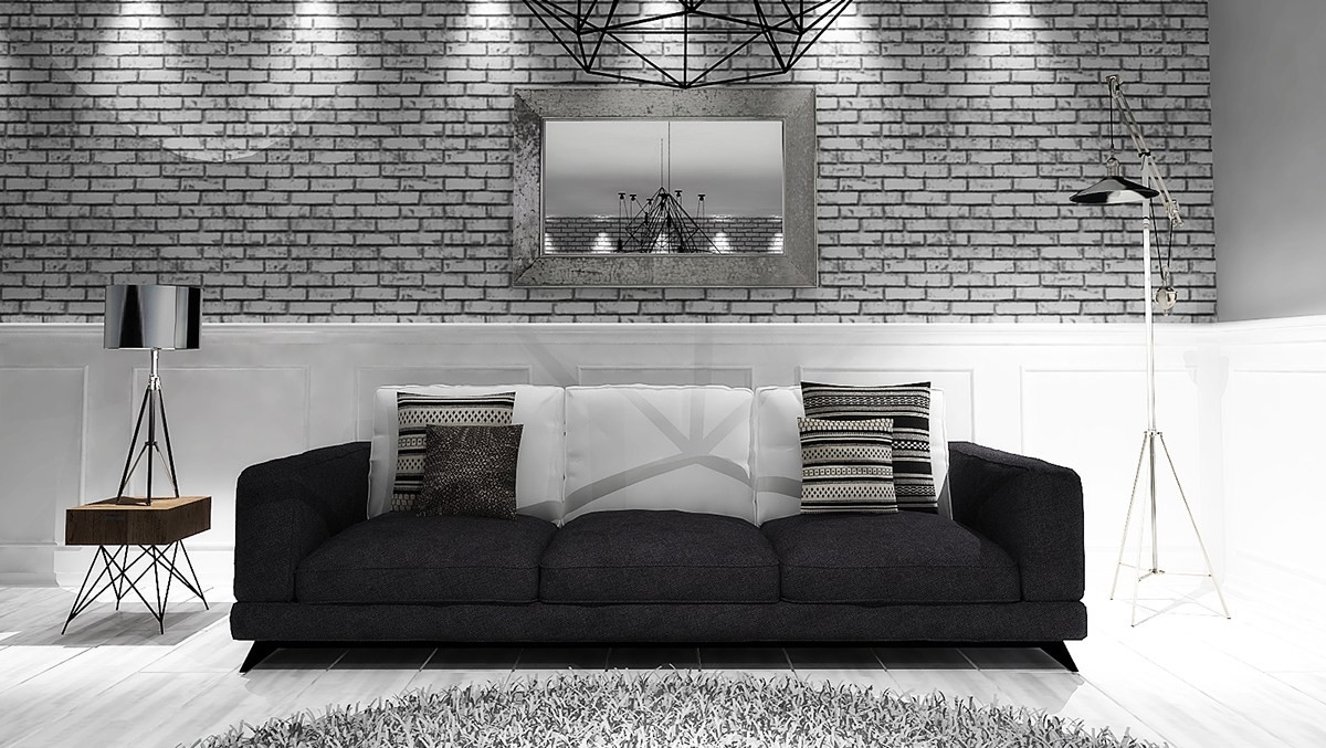
Exposed brick is extremely popular, and these walls translate that desired sense of weathered authenticity with carefully coordinated shades of gray paint and black mortar.
