Thinking about balancing your interior design with dark decor elements? Moving away from the familiar white and beige requires a little risk, but the potential payoff is more than worth it. Dark colors are sophisticated and comfortable, familiar yet distinctive, and always on trend. The four homes highlighted in this post offer abundant inspiration whether you're thinking about creating a sultry and stylish palette from scratch, or looking for ideas to work around the dark colors already within in your home. Exploring unconventional color themes is always an adventure - and these homes won't disappoint.
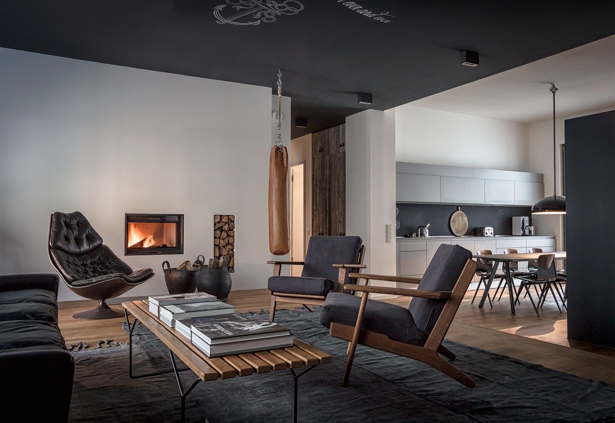
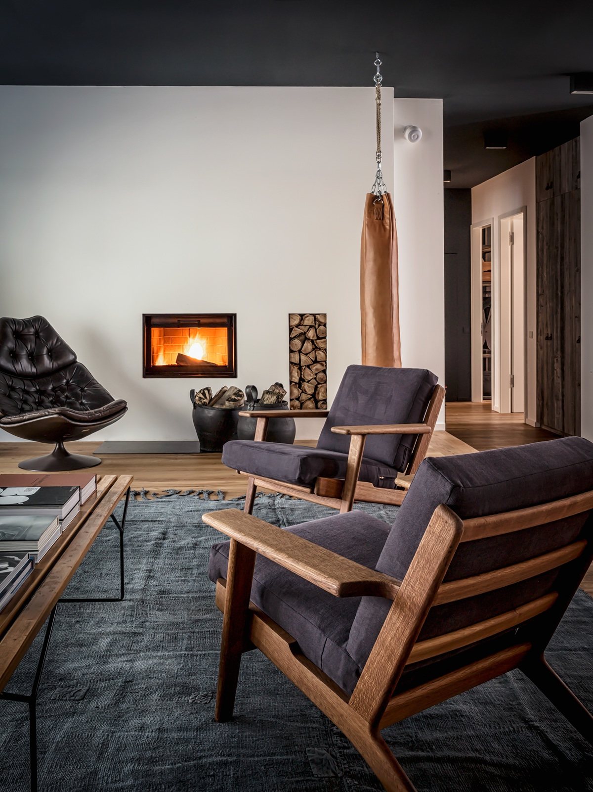
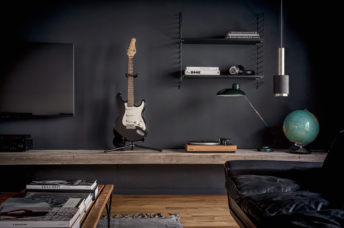
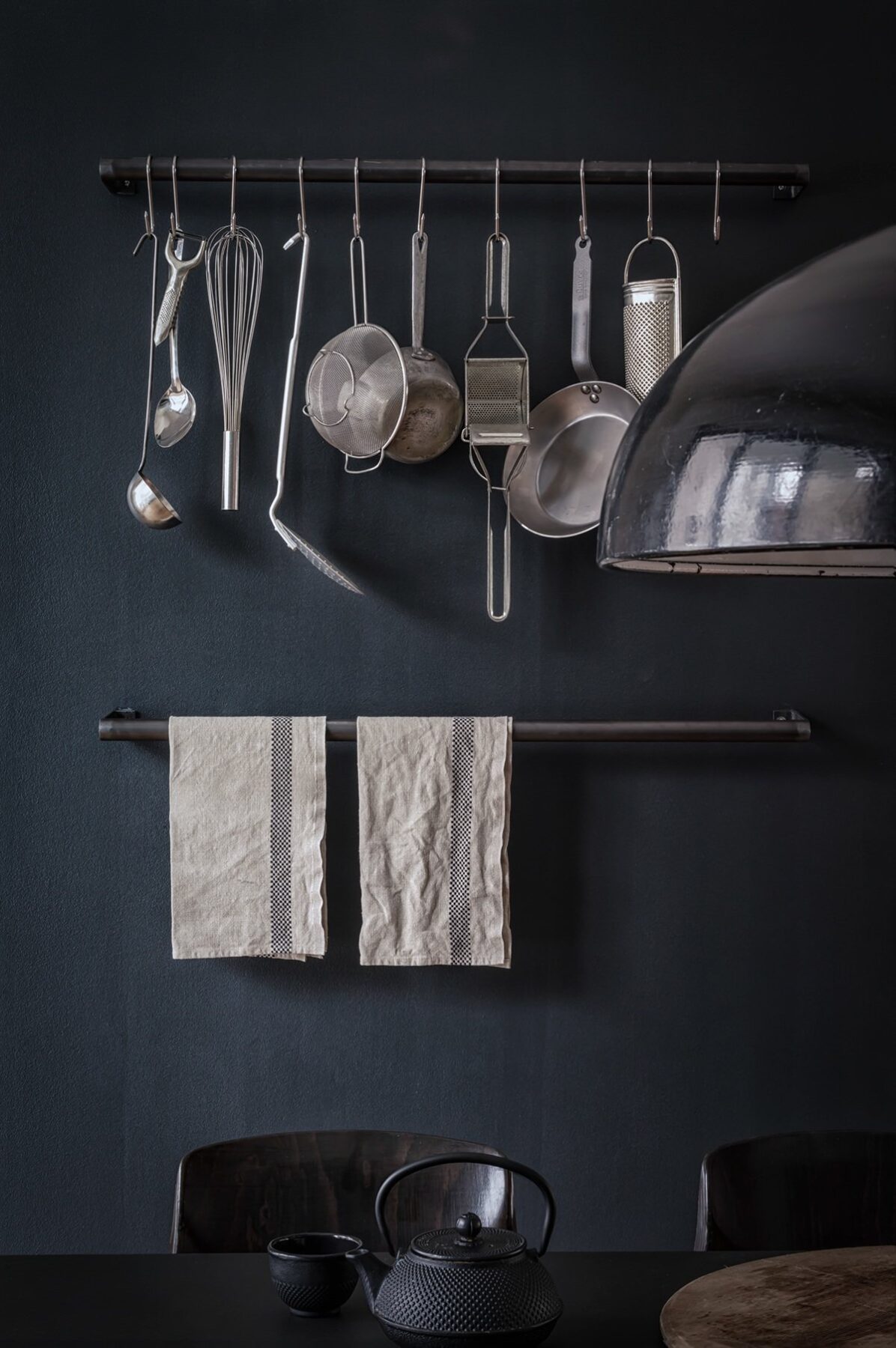
This stylish home combines the refined simplicity of a matte black and white color theme with the sophistication of timeworn leather and rich natural wood. Carefully chosen vintage decor mingles with modern selections to bring out the full range of personality this space has to offer. The designer, Annabell Kutucu, created this distinctive interior as homage to Berlin's creative diversity.
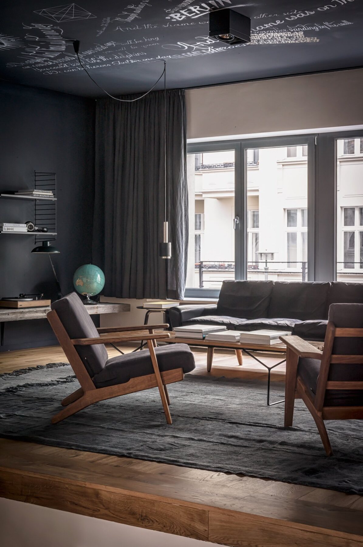
With chalkboard paint so popular lately, it's hard to find a novel application – but this chalkboard ceiling is a rare sight indeed.
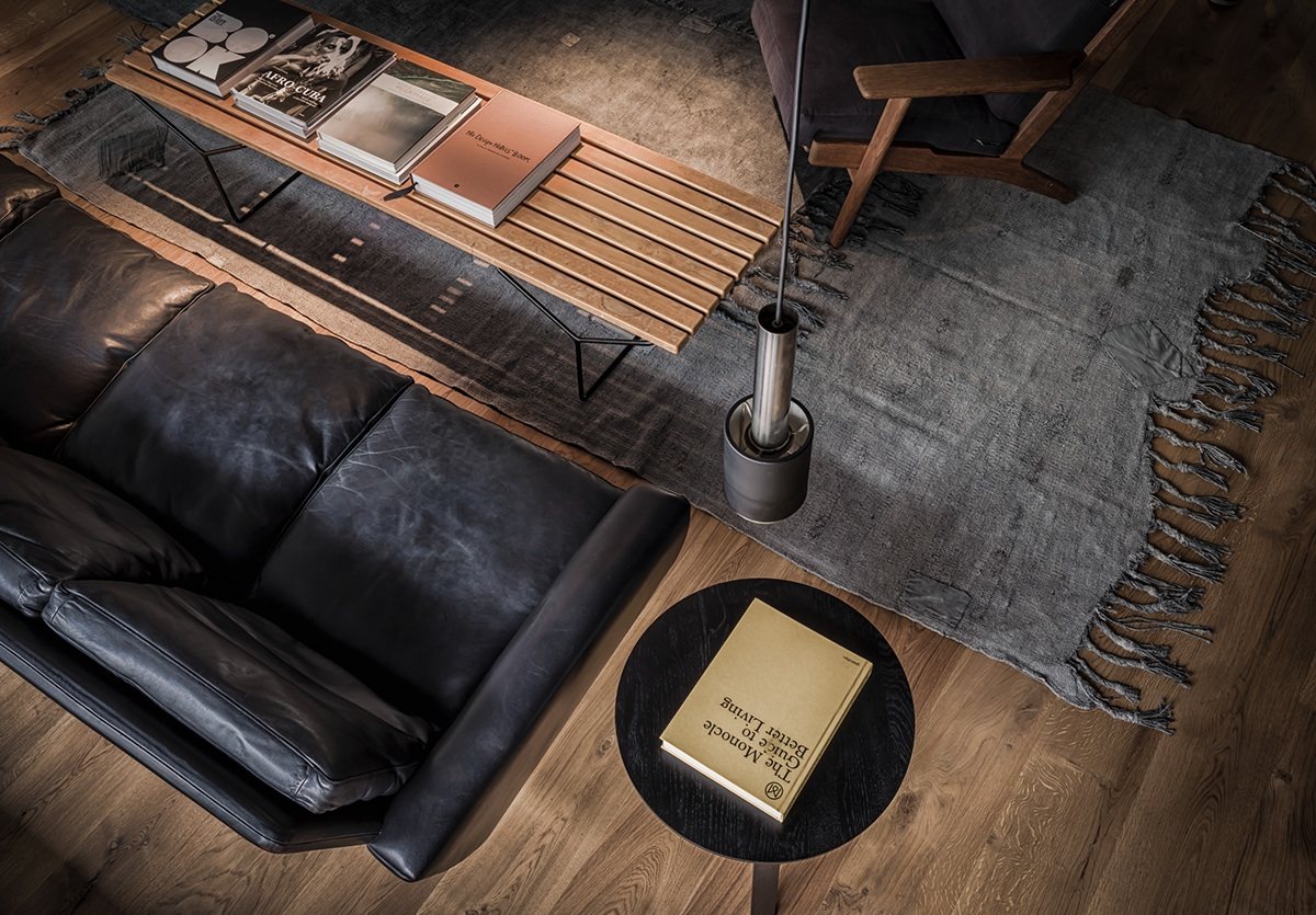
The beautifully distressed leather sofa and weathered rug give this home a strong sense of age and character.
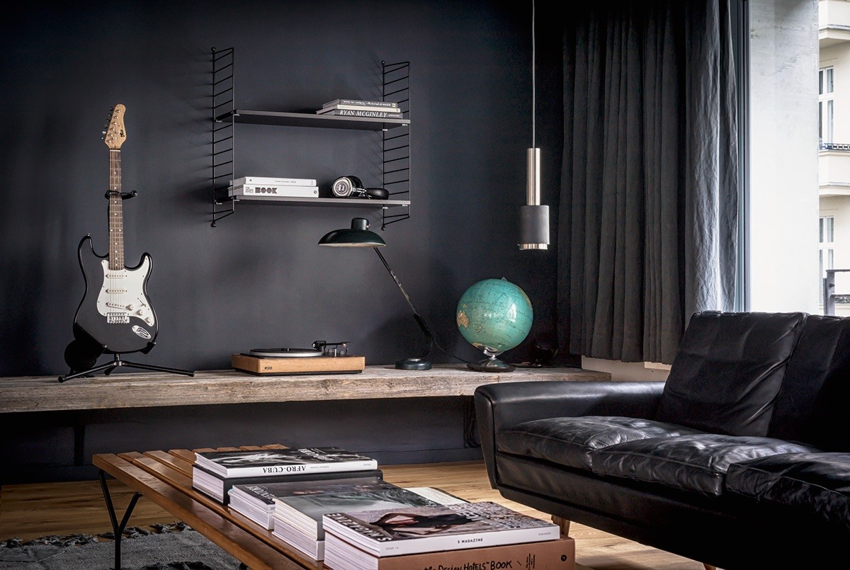
With electronics as attractive as these, they don't need to be tucked away somewhere hidden. They match the materials and decor like a charm.
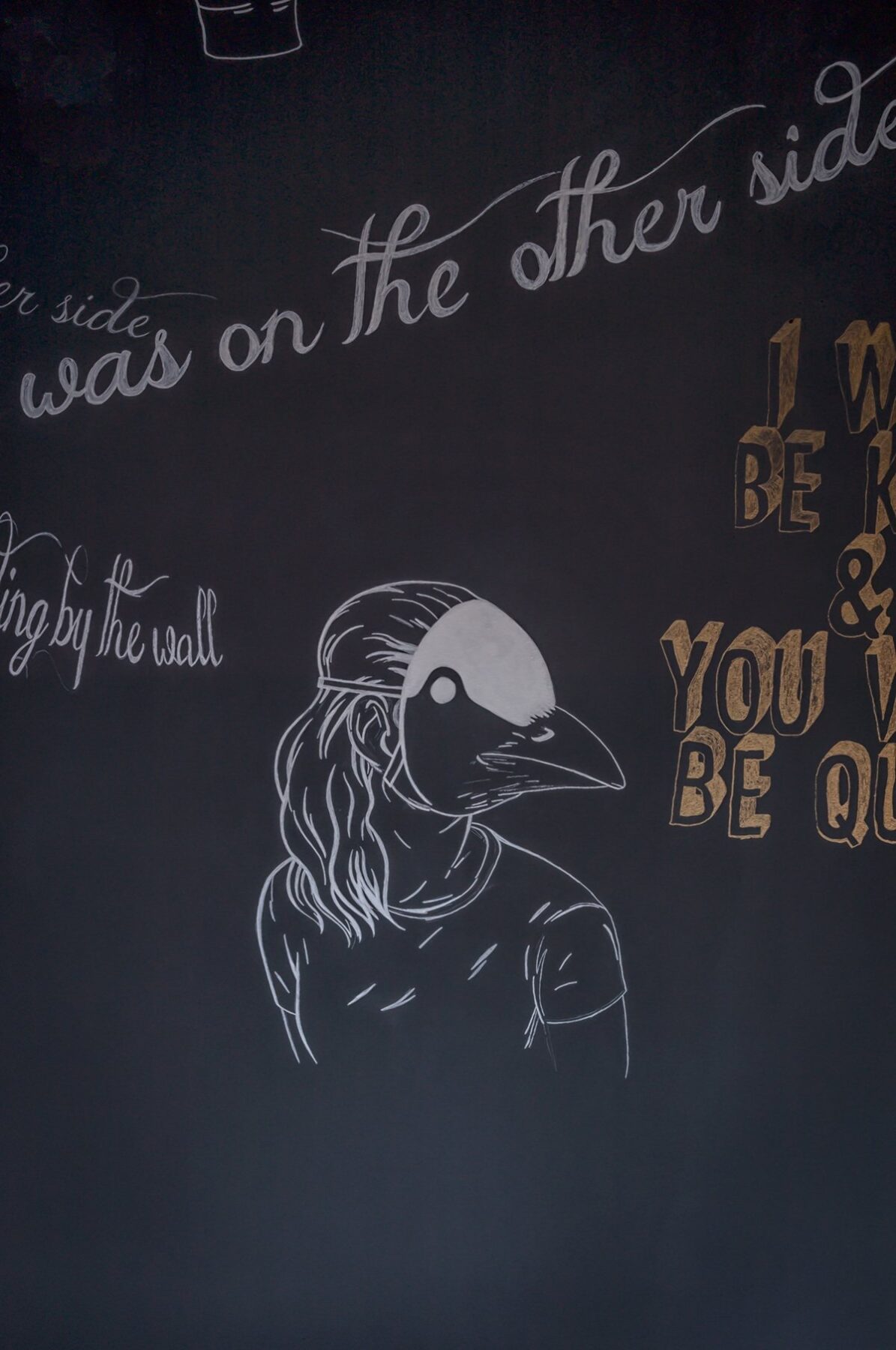
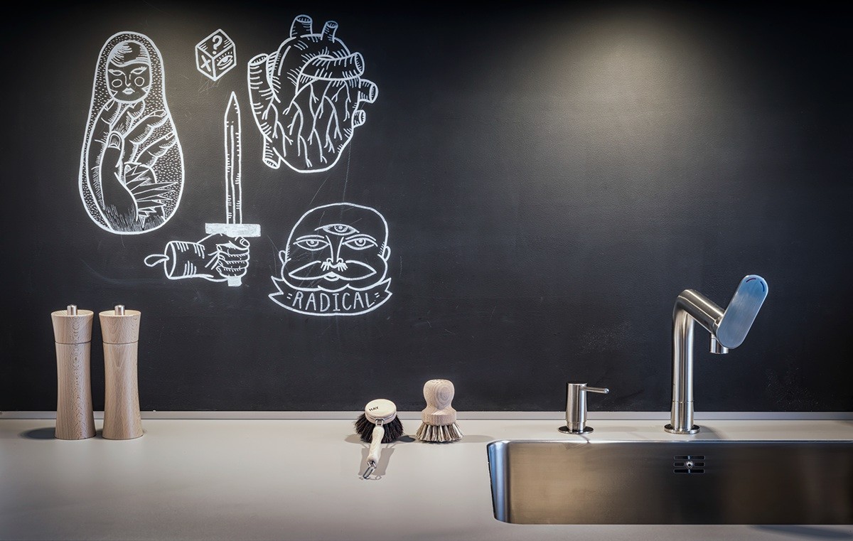
Note the coppery chalk used to the right – not too bright, not too plain, and adds just the right amount of spice to coordinate with the other accents throughout the home.
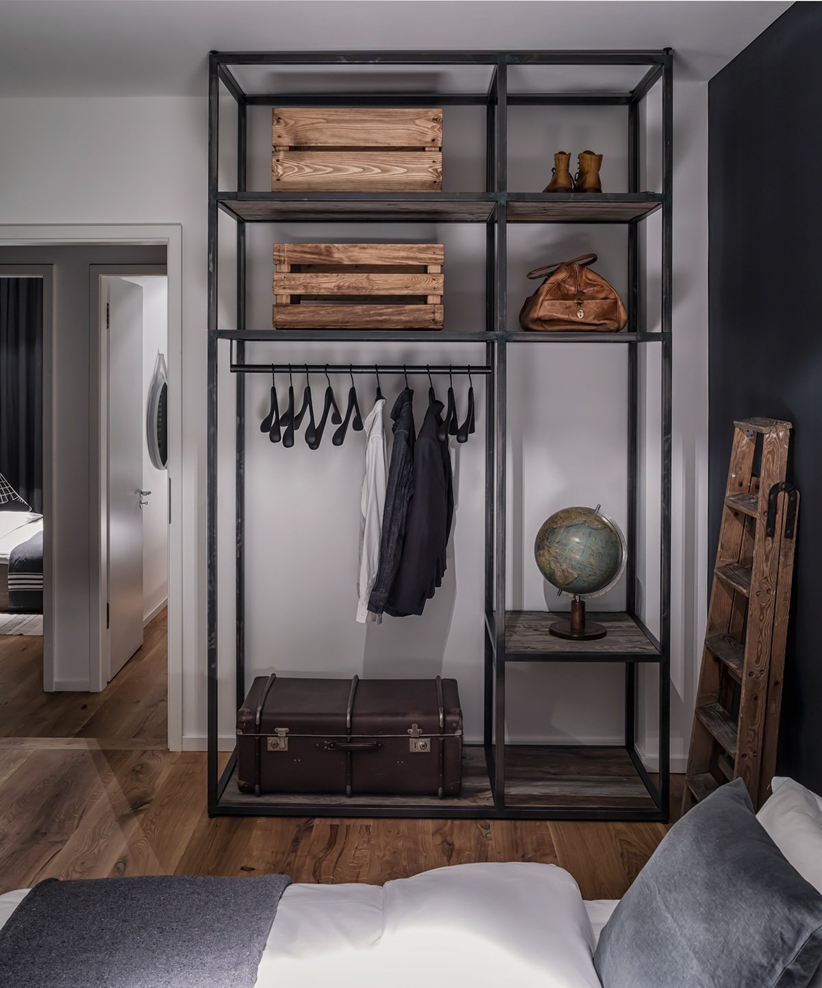
Boutique-style shelves serve as an open wardrobe in the bedroom, with milk crates and a leather trunk for a little extra storage.
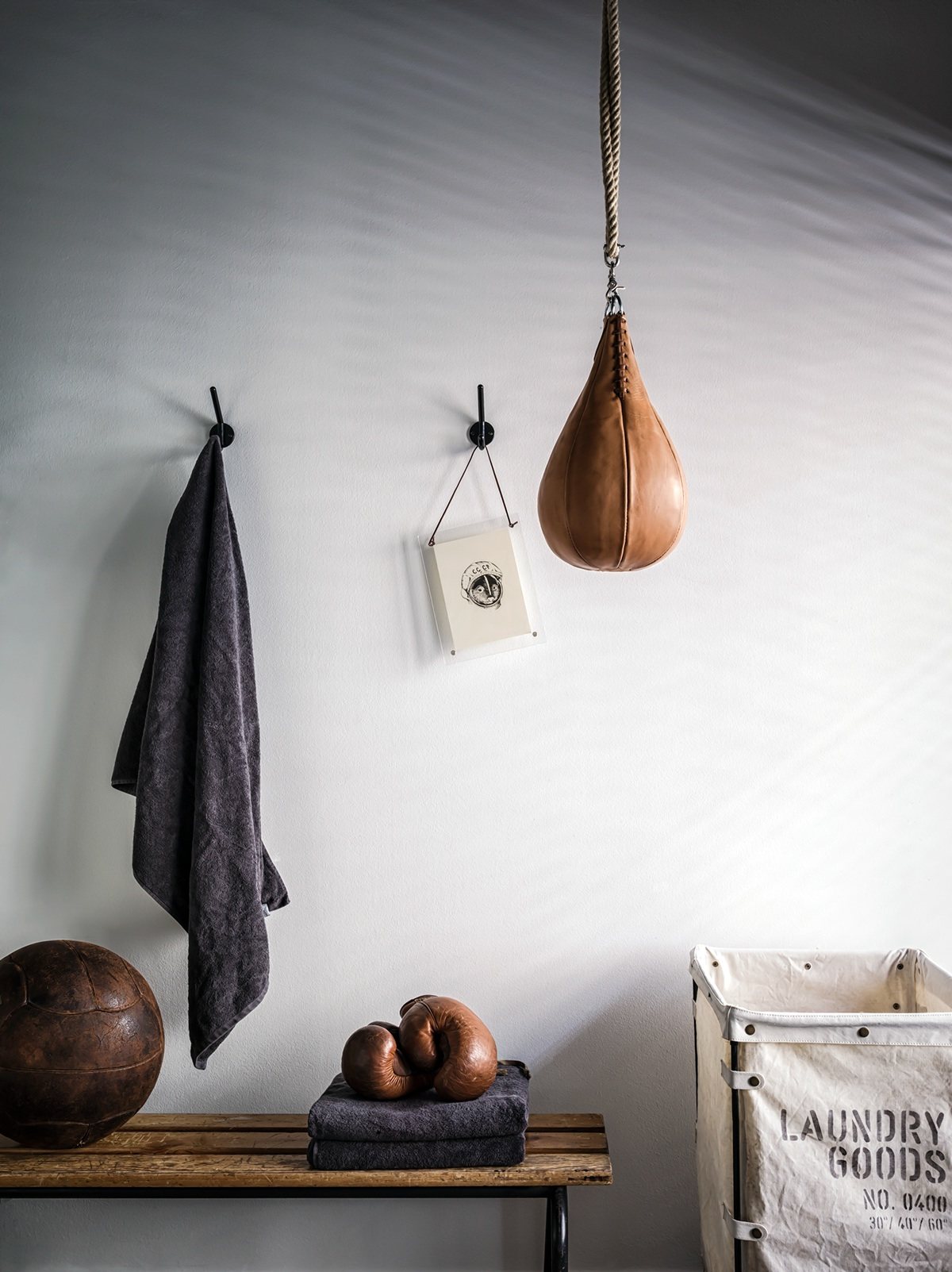
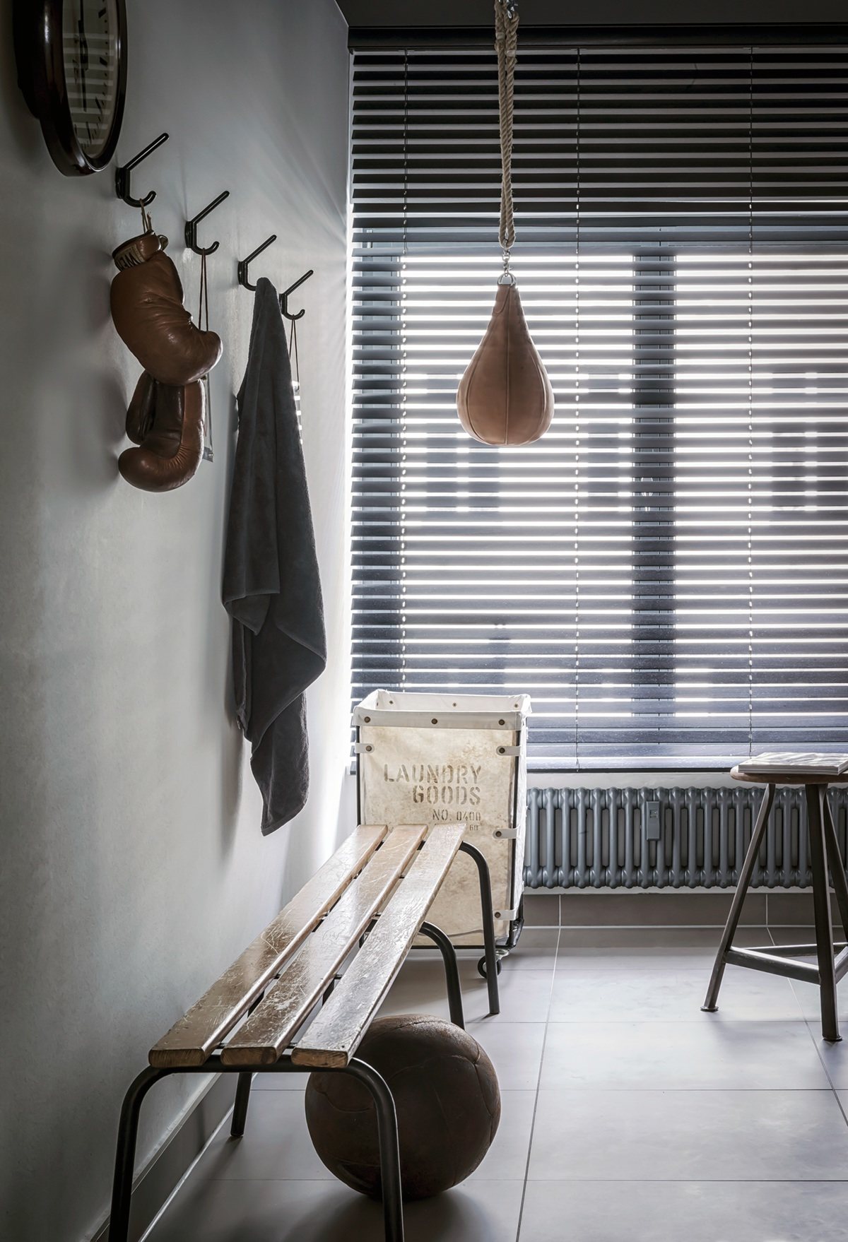
Worn leather and a vintage laundry basket give this space a classic boxing club feel.
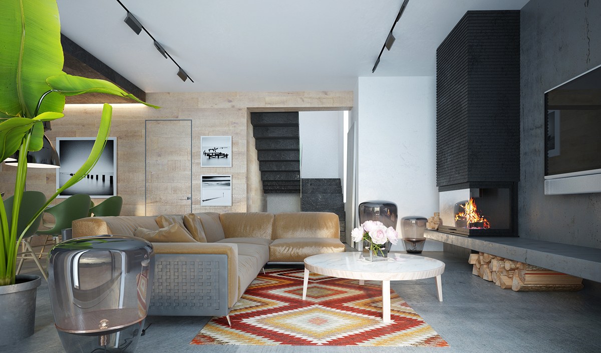
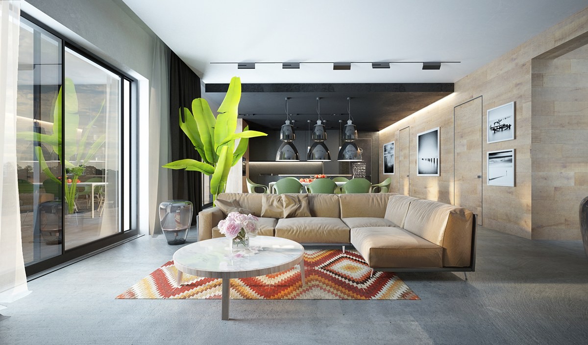
The gorgeous Strizh House, designed by Oleksii Karman, highlights its bright accents against a grayscale and wood background. While the rest of the home uses a green and grayscale color theme, the living room pictured here boasts a distinctive orange diamond-patterned rug that really brings out the subdued apricot tones of the leather sofa and the nearby firewood.
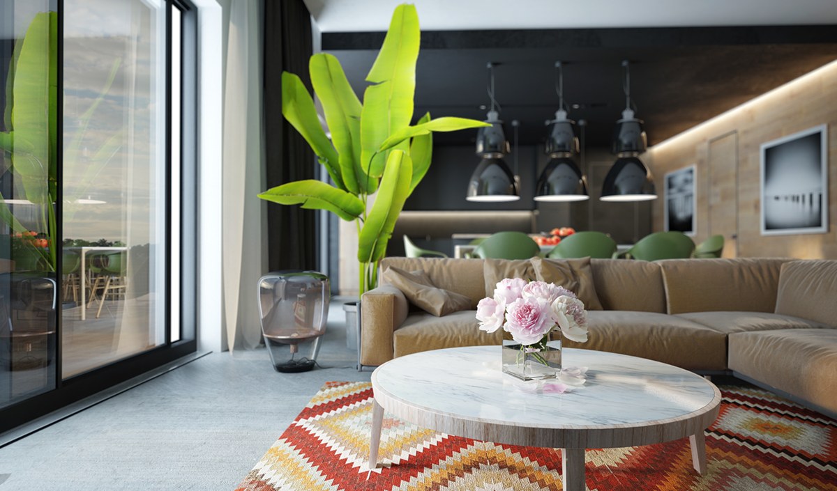
For the most part, the living room maintains a very light aesthetic with a nice view of the outdoors.
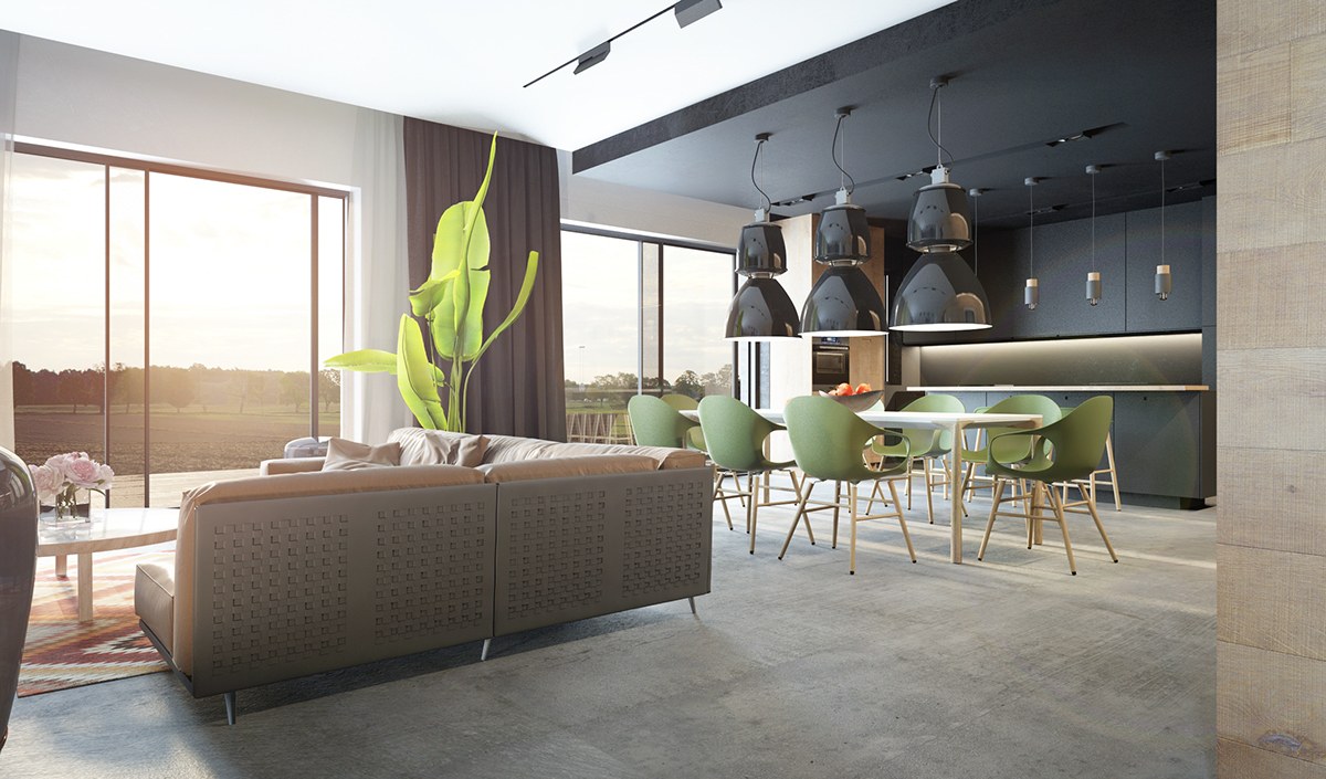
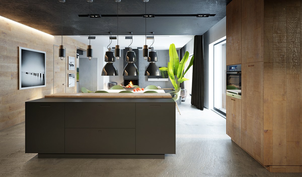
The darker color palette is far more evident in the dining and kitchen spaces. The two areas are open yet delineated by the transition from a smooth white ceiling to a lowered matte black "canopy", making this zone feel closer and more intimate.
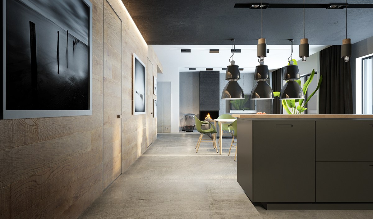
Unique lighting options really make this space! Three oversized industrial lamps in high gloss capture the eye immediately, and add a great deal of visual weight over the dining table. A series of smaller pendants illuminate the kitchen island.
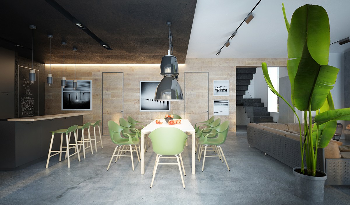
The transition from dark to light is especially powerful from this view – the indirect lighting along the left side helps to emphasize the effect.
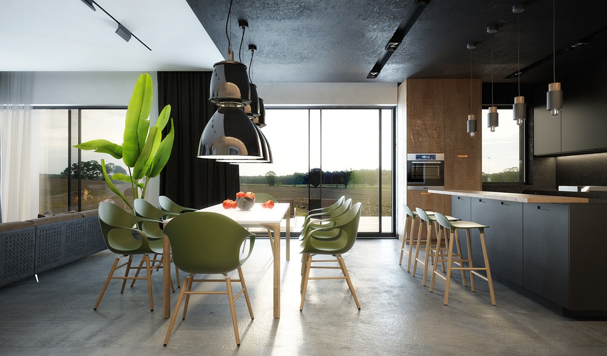
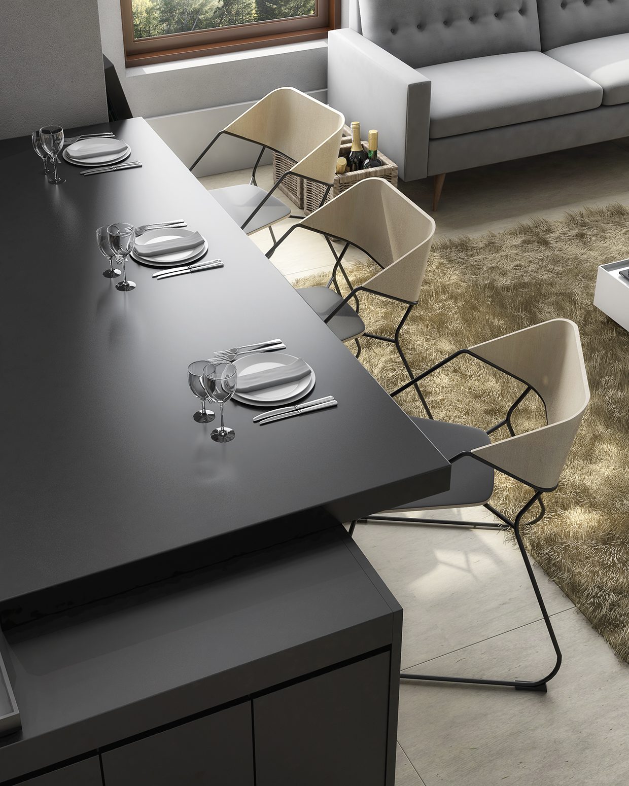
Although the dining chairs and barstools are from different designers, the thin wooden legs and smooth seats match brilliantly. The barstools are from the Form collection by Simon Legald.
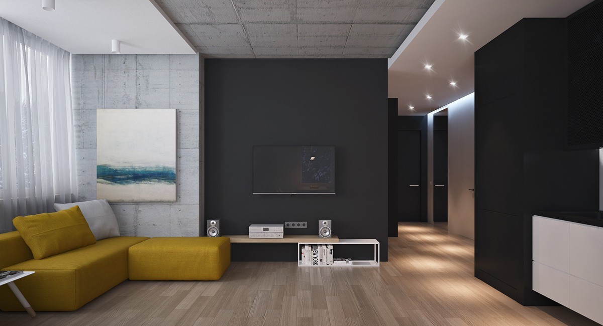
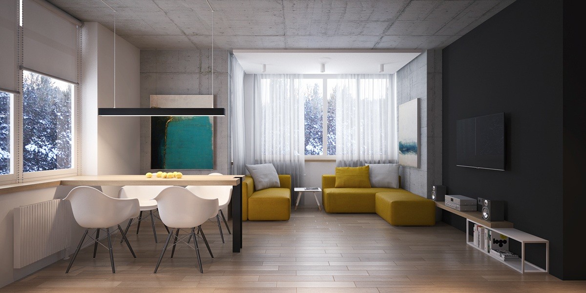
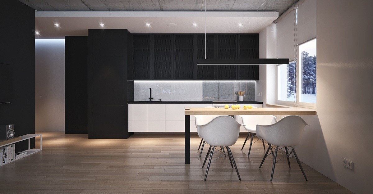
Here, UMKY Design visualizes a dark black and concrete home contained within an ample yet relatively contained 43-square-meter floor plan. Many people are hesitant to invest in a black interior palette for fear the dark colors might make the space look even smaller – but this gorgeous modern home demonstrates how clever composition (and tall ceilings) can assuage those worries.
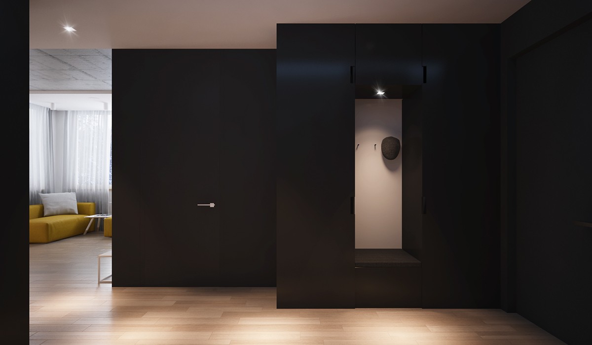
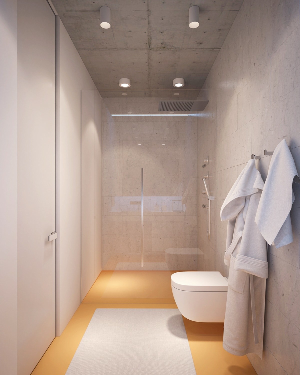
Even the coat hooks has a rather artistic look thanks to the stark contrast and dramatic lighting.
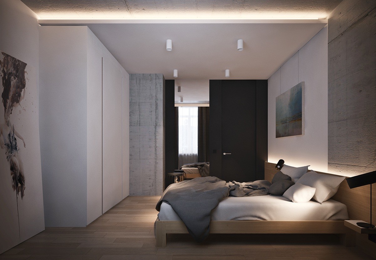
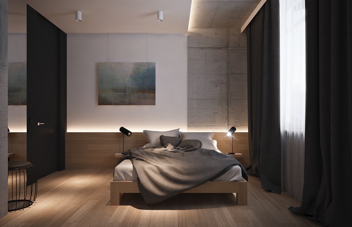
The bedroom is much lighter than the rest of the home, but still features a few carefully chosen dark elements.
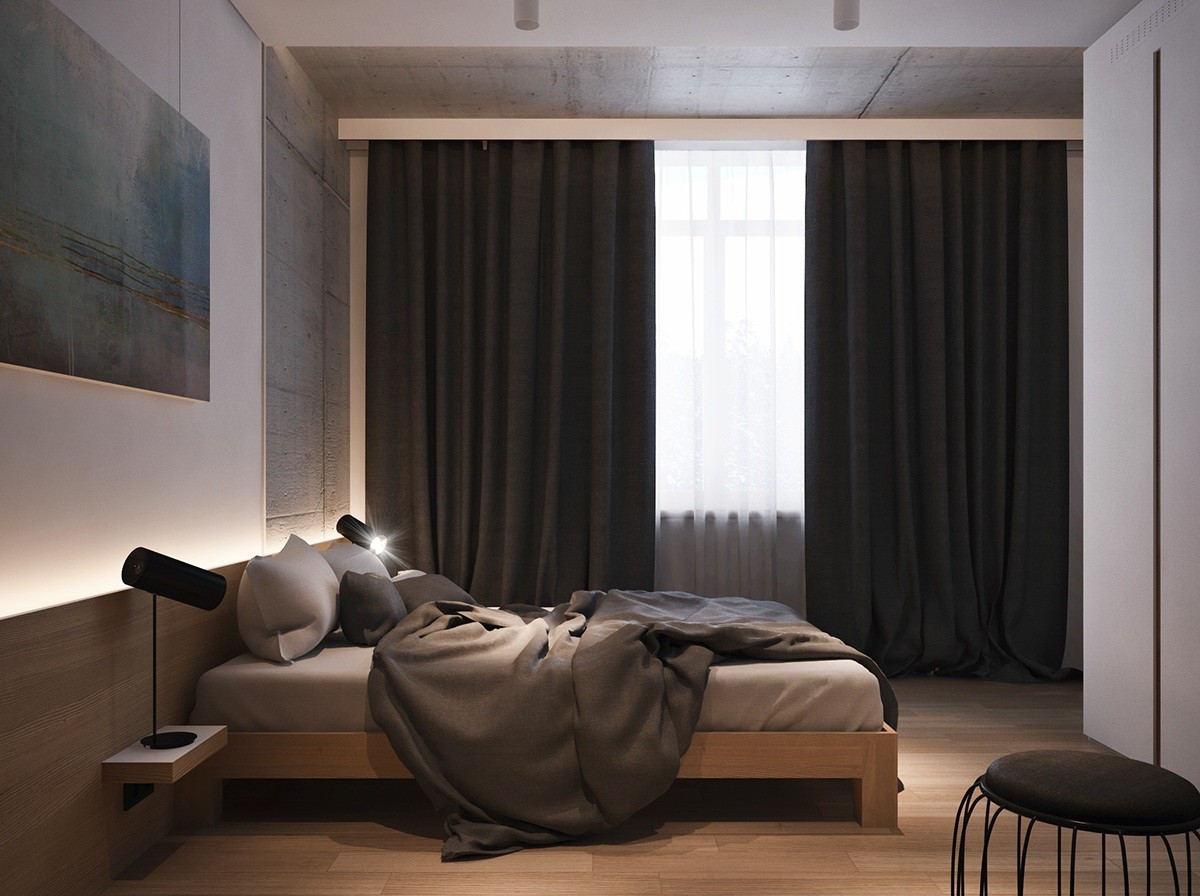
Black curtains contribute to a restful sleep (for those who sleep past sunrise, anyways). An interesting stripe of concrete reaches across the ceiling to frame the window.
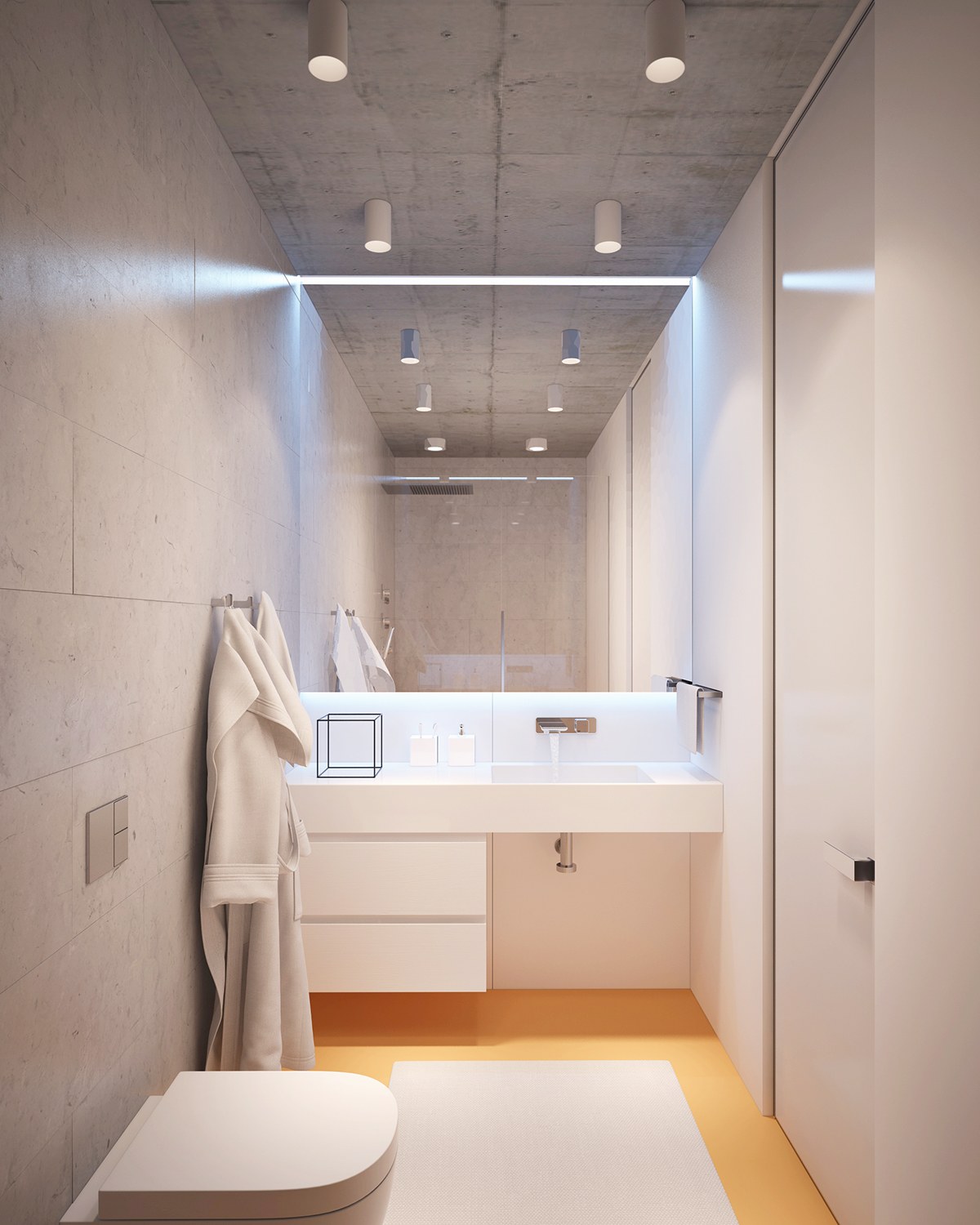
Very bright! The bathroom has all of the smooth white and concrete surfaces of current trends, brightened by a pastel tangerine floor.
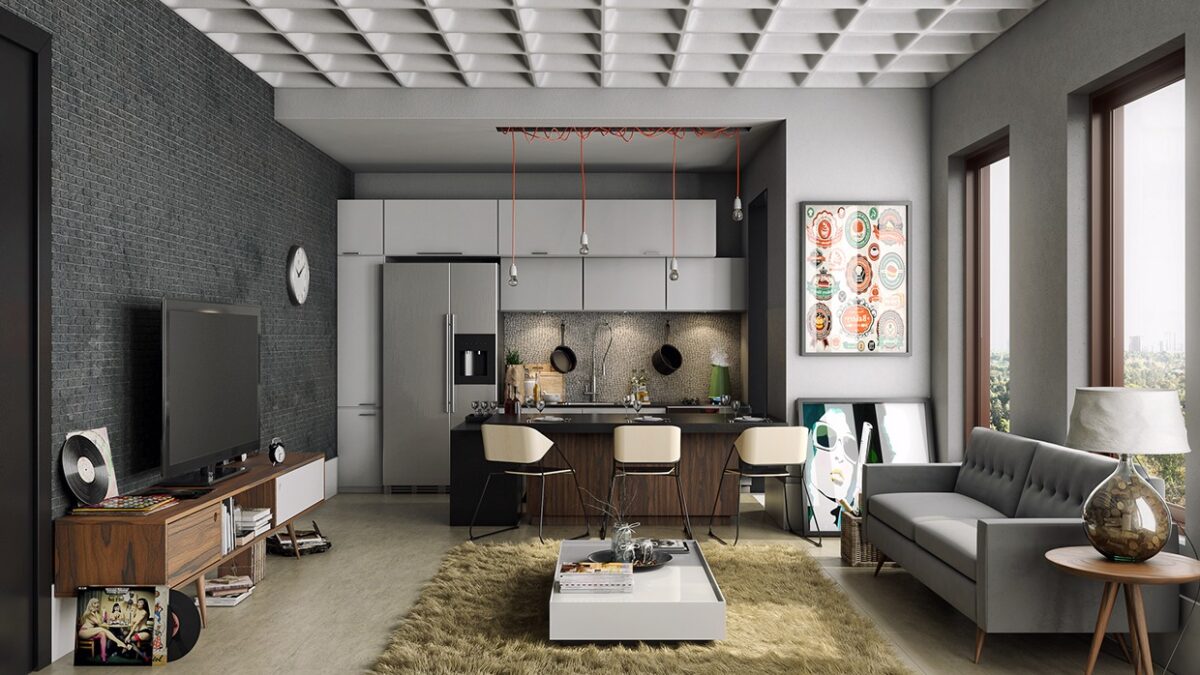
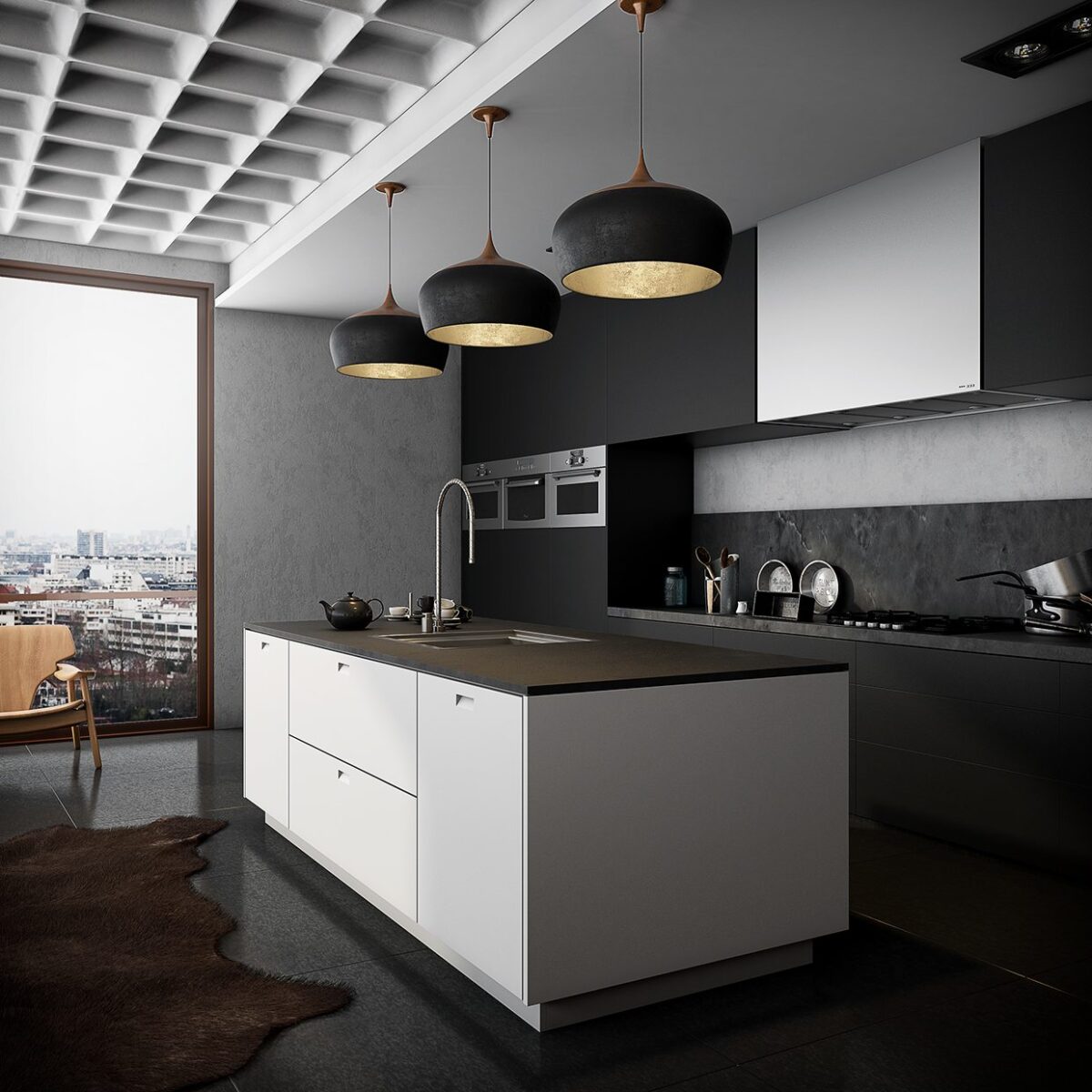
This final series of images does not depict the same home – instead, it looks at two homes and two offices, all by Jean Regauer, each decorated with dark colors. Perhaps they are all visualizations of concepts for the same apartment building? Both of the residential spaces feature the same modernized waffle ceiling as featured here.
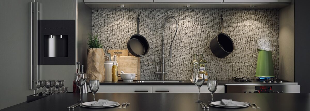
Naturally arranged stone gives this backsplash a unique sense of personality. No two could ever look exactly alike.
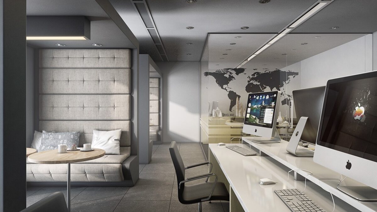
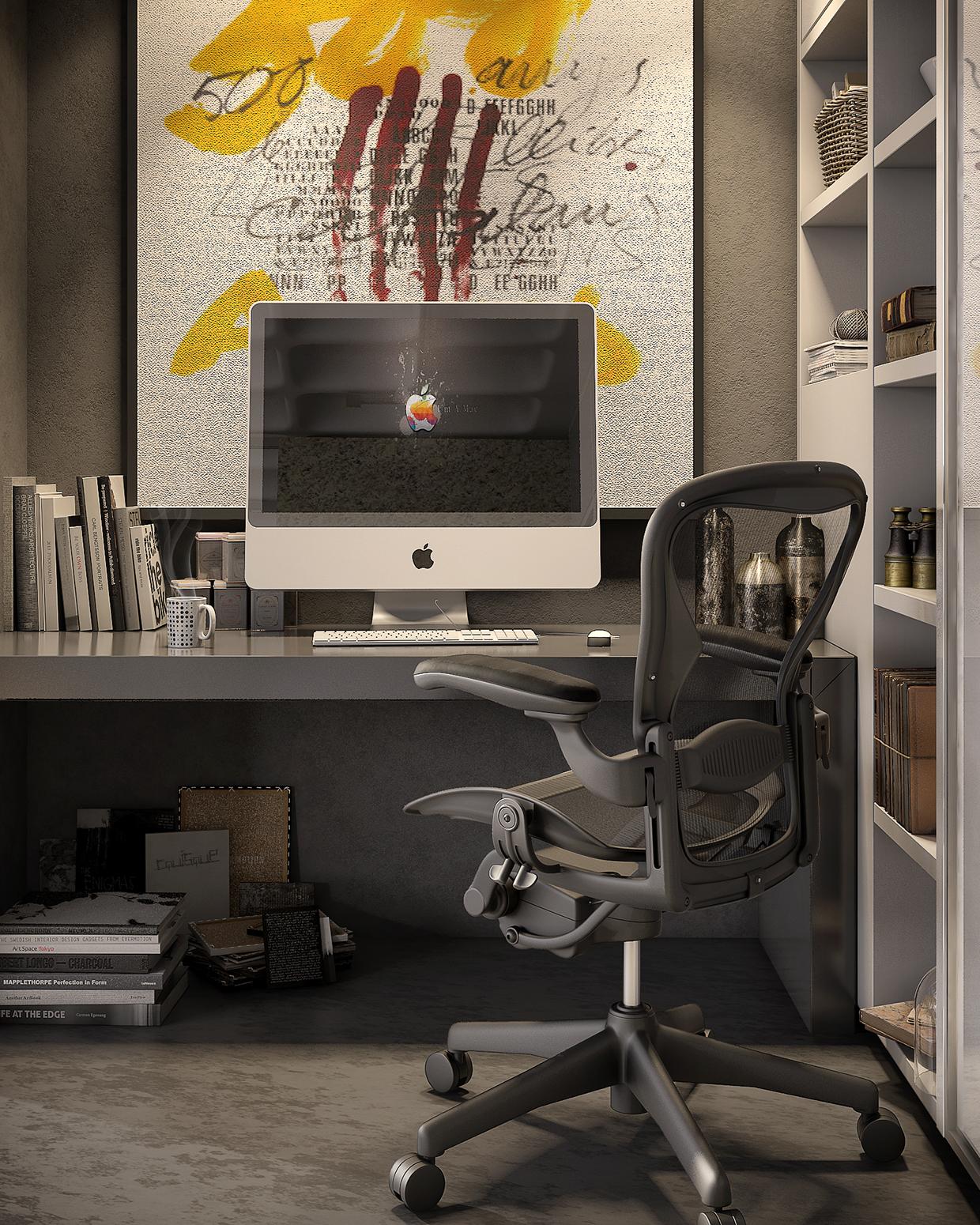
Here's the first office, a commercial space with a very home-like vibe. Dark coves to the left offer a relaxing place to work and socialize.
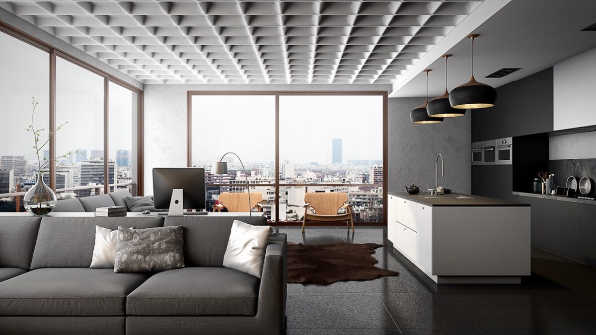
Now for a look at the second residential property! This one makes an immediate impact with that dramatic waffle ceiling and composite stone floors.

