Homes decorated with neutral color schemes don't have to be flat or minimalistic – they can be just as rich, vibrant, and full of life as any other. The two homes detailed below highlight the versatility of neutral colors with a brilliant width of tones and textures, enhanced by a selection of stylish lighting solutions and paired with gorgeous furniture from contemporary designers. Both apartments were expertly visualized by Nguyen Duy Khanh of Koj Design based in Ho Chi Minh City, a designer known for his smart and sophisticated interior styles. Don't miss these inspiring designs!

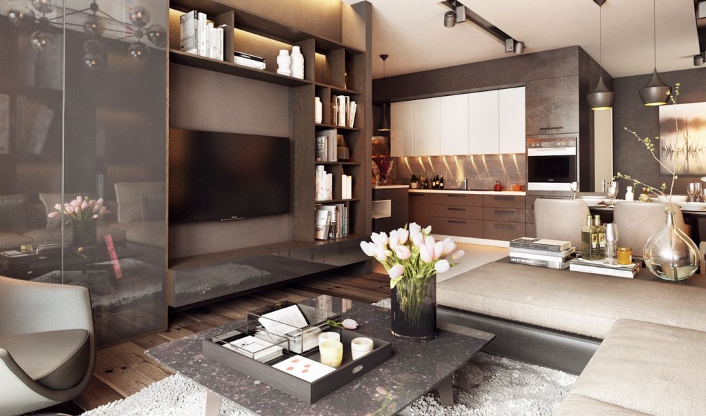
The first apartment creates a classic look with only the most modern materials and furnishings, a difficult feat to accomplish but executed perfectly here. An interesting layout allows the living spaces to feel cozy and intimate despite the scale of the space, and made even cozier by the addition of warm wood tones to the mostly gray and white color theme.
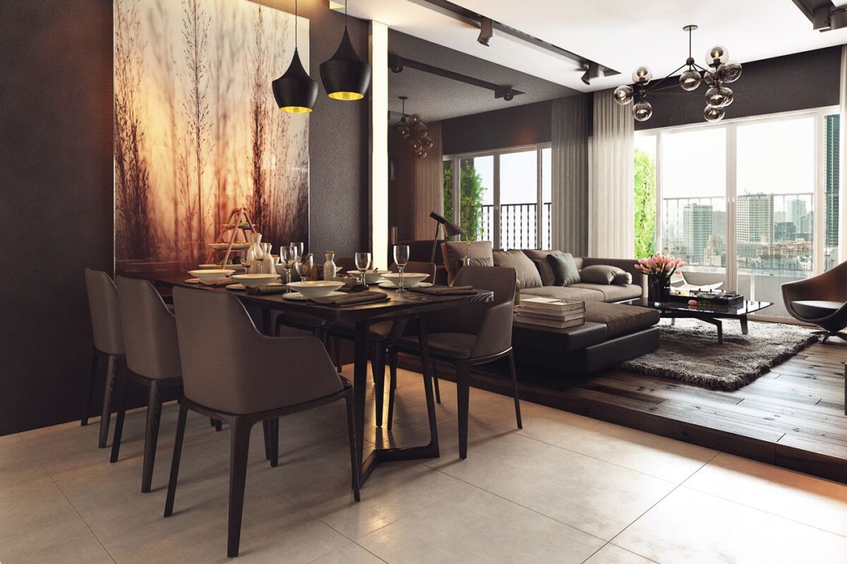
Where the dark hardwood of the living room floor ends, a small step leads to the dining and kitchen spaces. A lovely sunset nature photo centers the dining room table arrangement, illuminated by Tom Dixon's Beat lamps and surrounded with chairs from the Grace collection by Emmanuel Gallina.
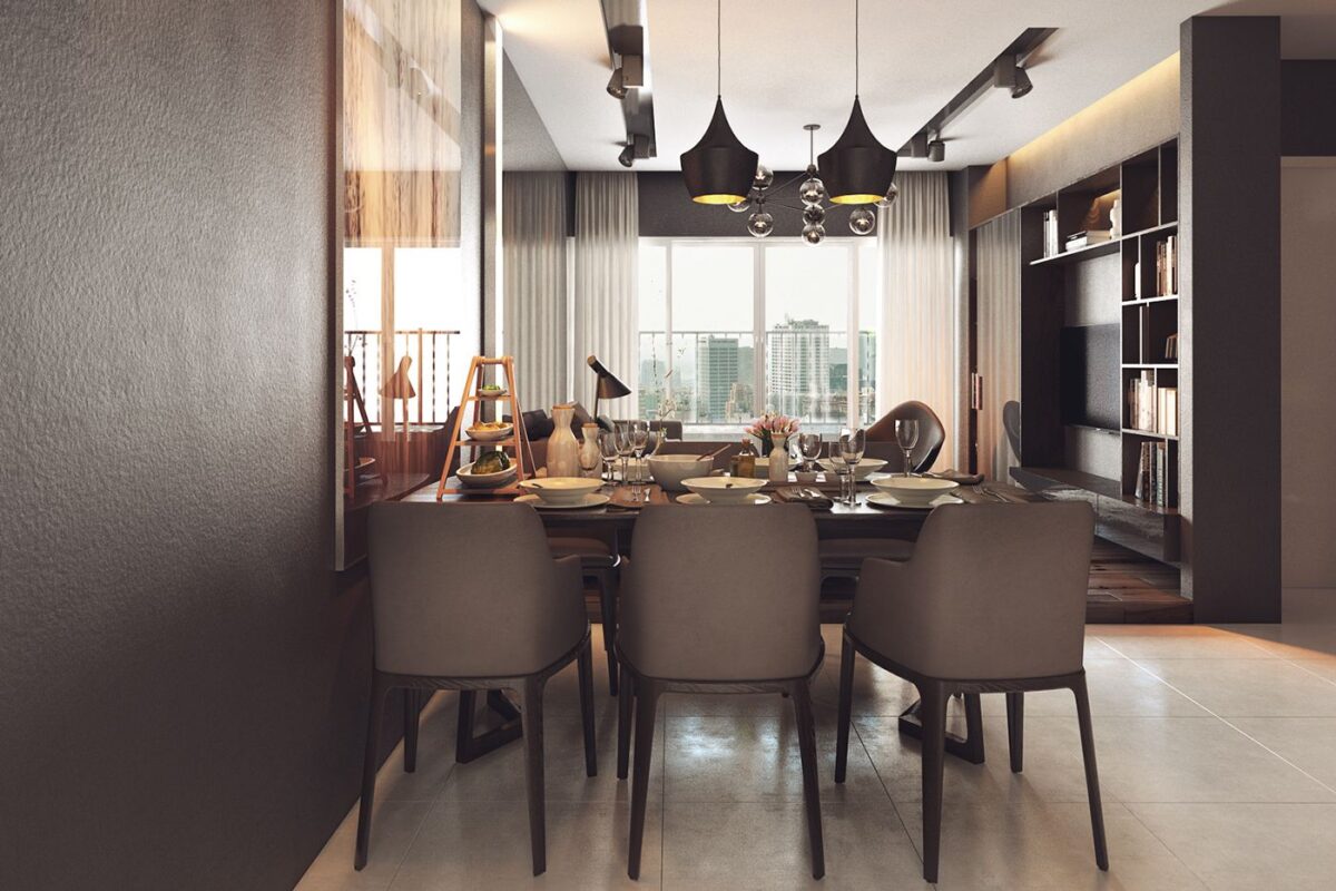
What an incredible view! The table could have fit any number of places, but this position is a clear winner.
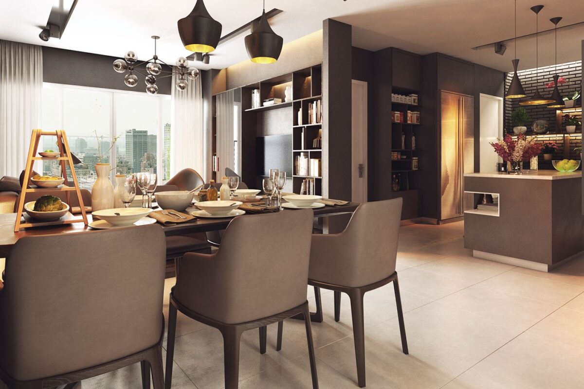
Although the table is immaculately set, our favorite addition has to be that 3-tier serving rack to the left.
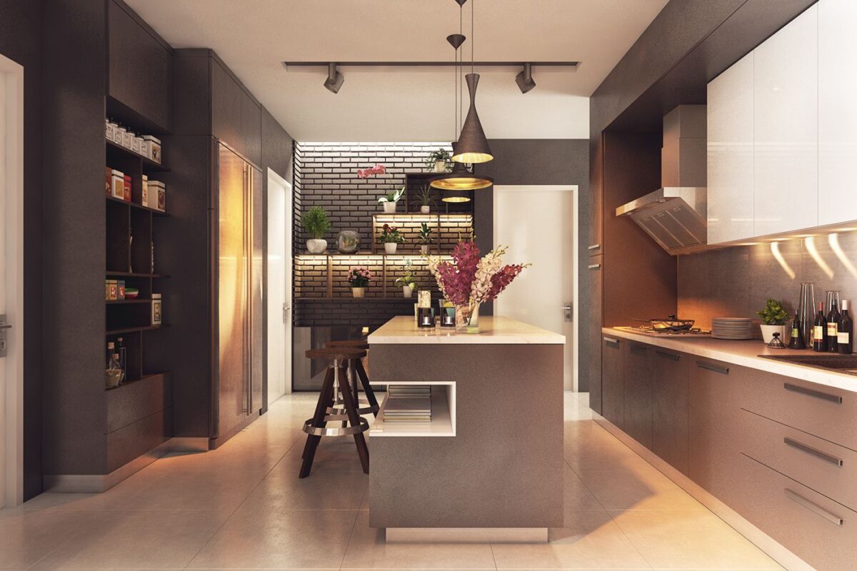
The kitchen is streamlined and efficient. Interesting features include the high-contrast white tile way in the back – black grout with white tile looks dramatic and the bright lighting really enhances that effect.
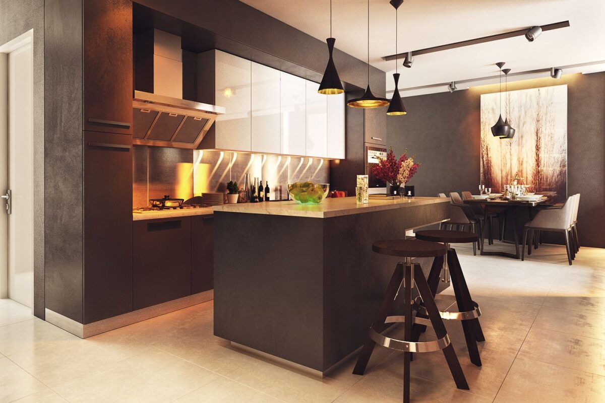
Dark gray and chrome elements make up most of the kitchen decor, with a row of glossy white cabinets to draw the eye.
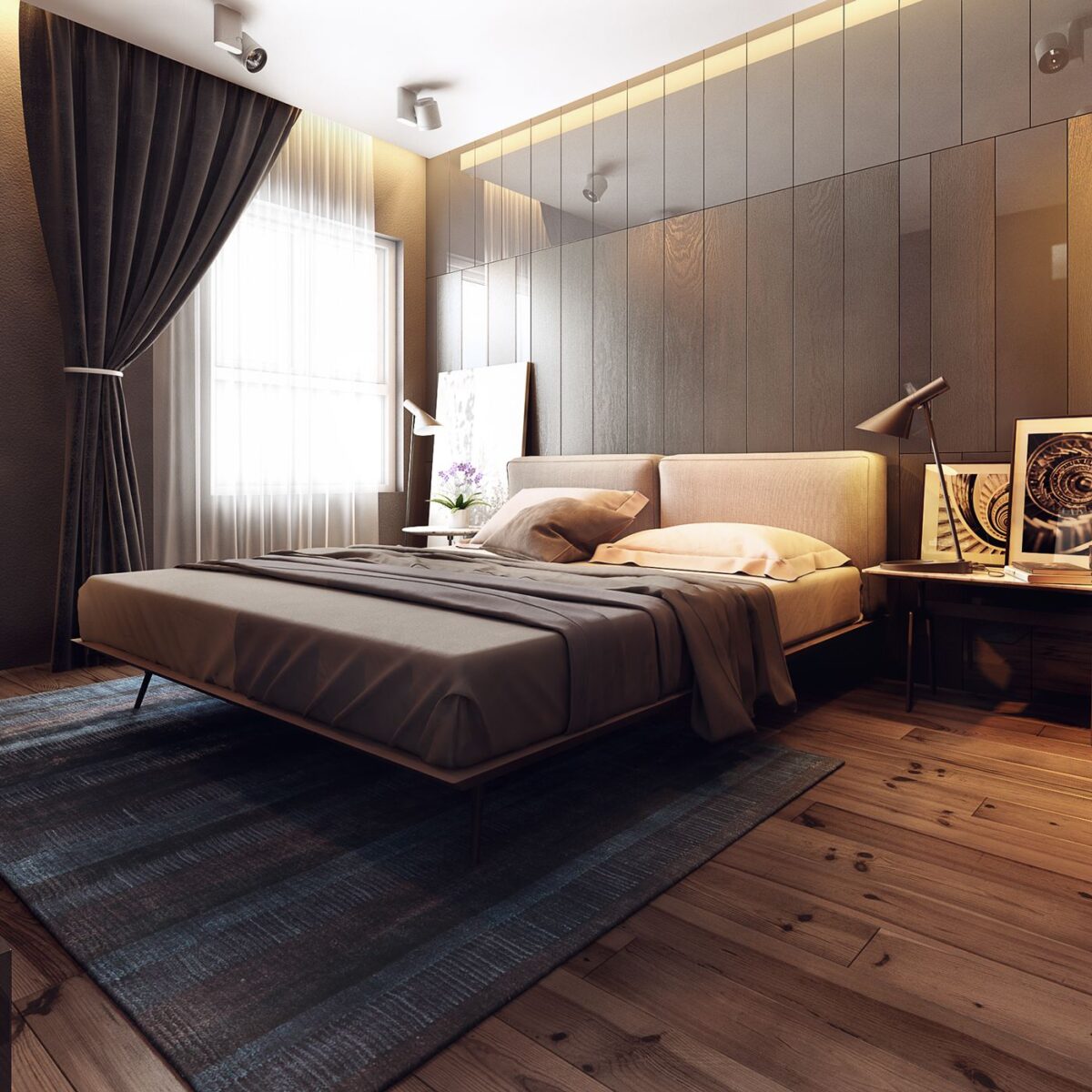
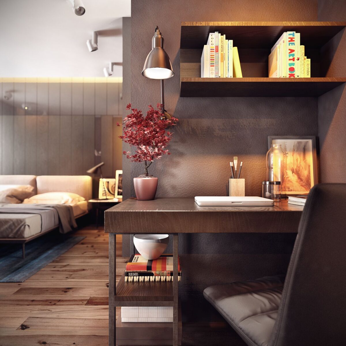
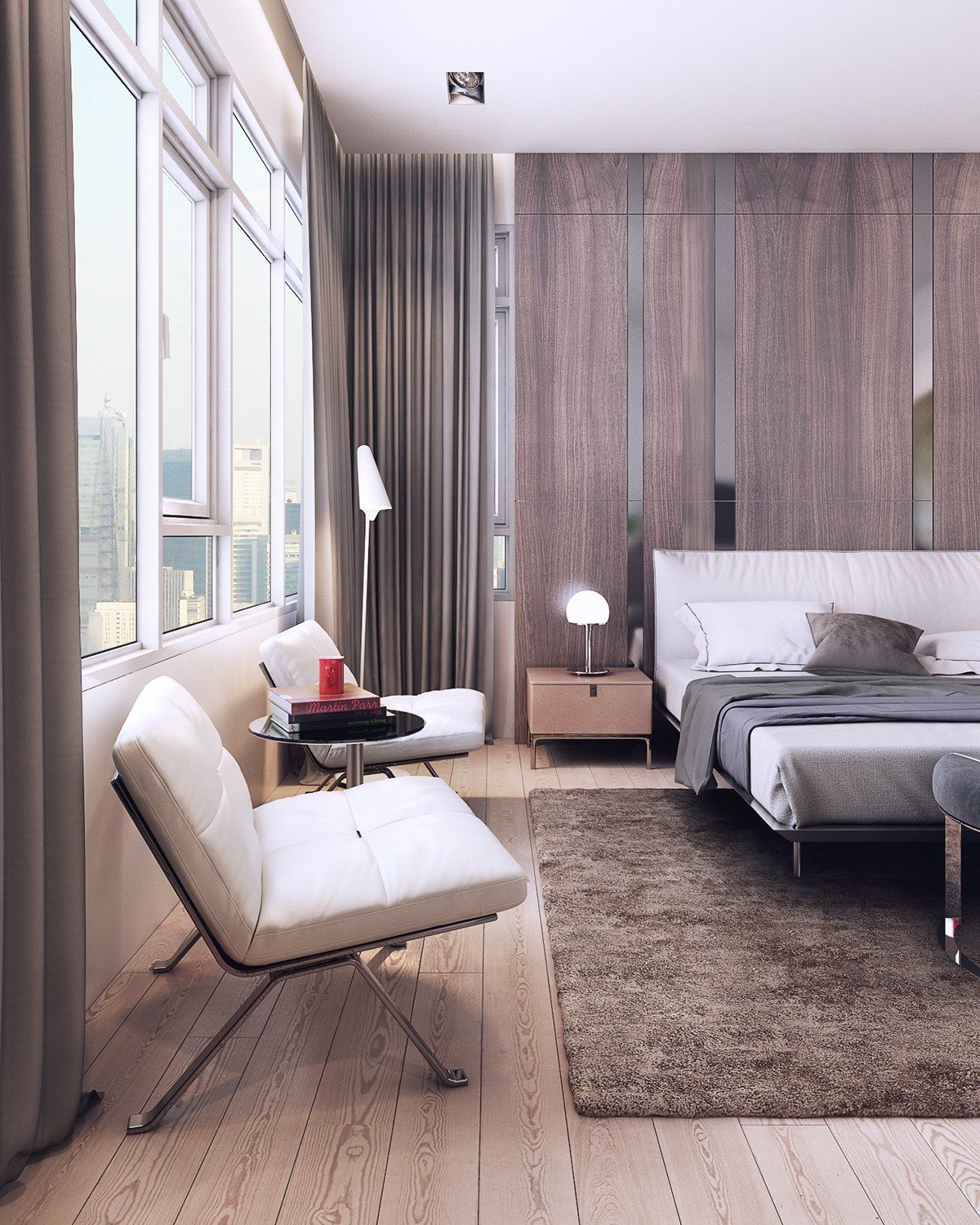
The bedroom is warm and relaxing. Here, opposing materials create an innovative and beautiful appeal – like the wall behind the bed, with an intriguing contrast between the organic grain of the wood and the sharp glossy panels above them. Thin bed platform contrasts with an overstuffed headboard, and spirals within the artwork play against the angular shapes of the furniture.
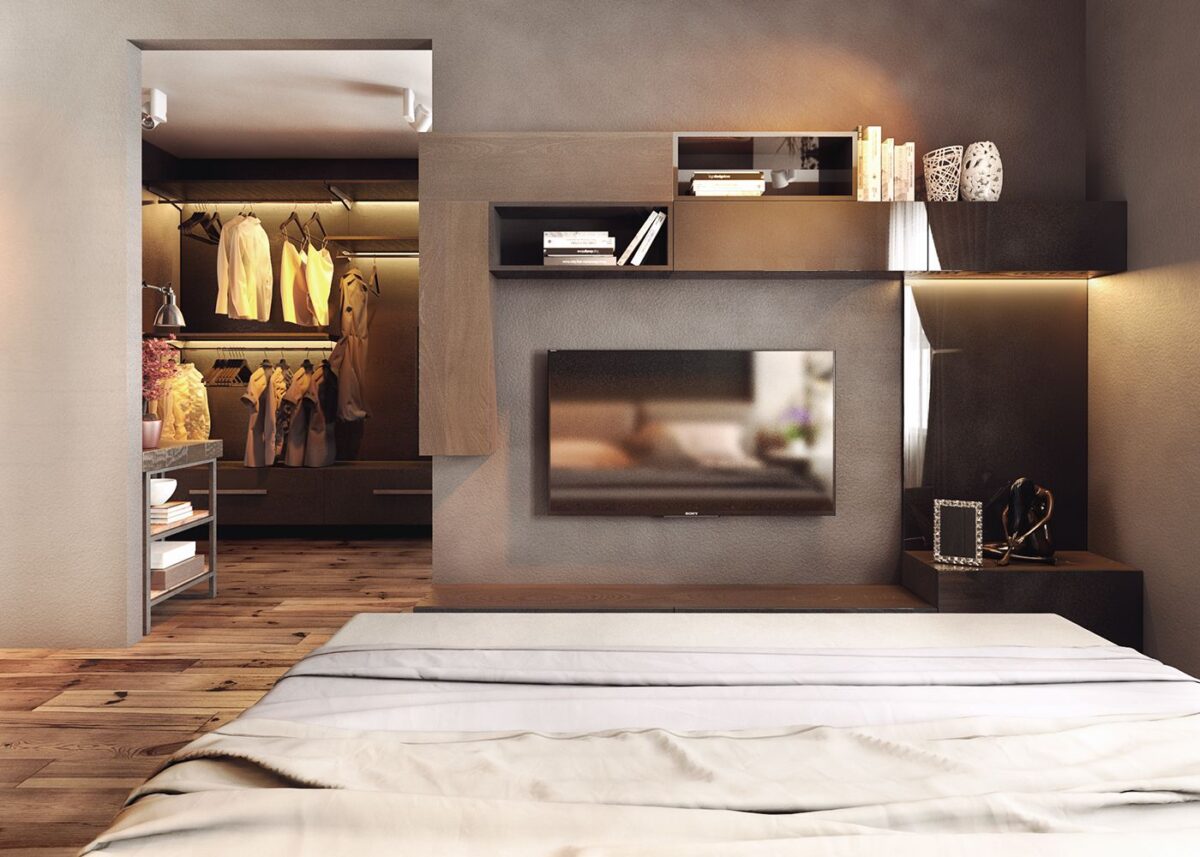
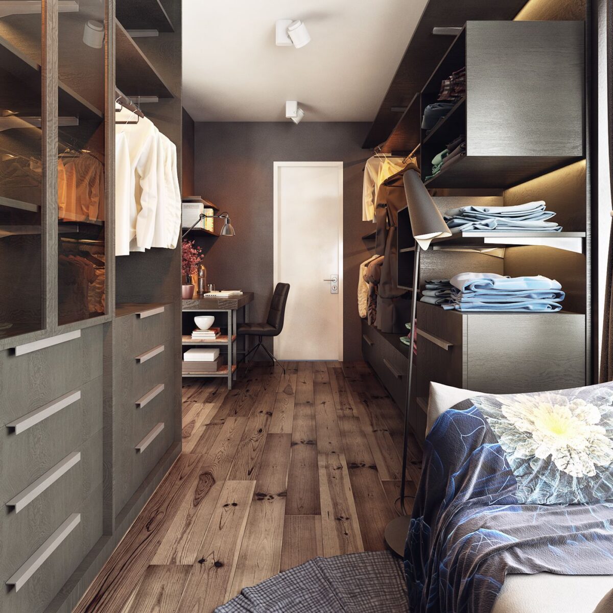
A modular shelving and drawer system frames the television nicely. Peeking through the door to the left, you can see a rather inviting walk-in closet.
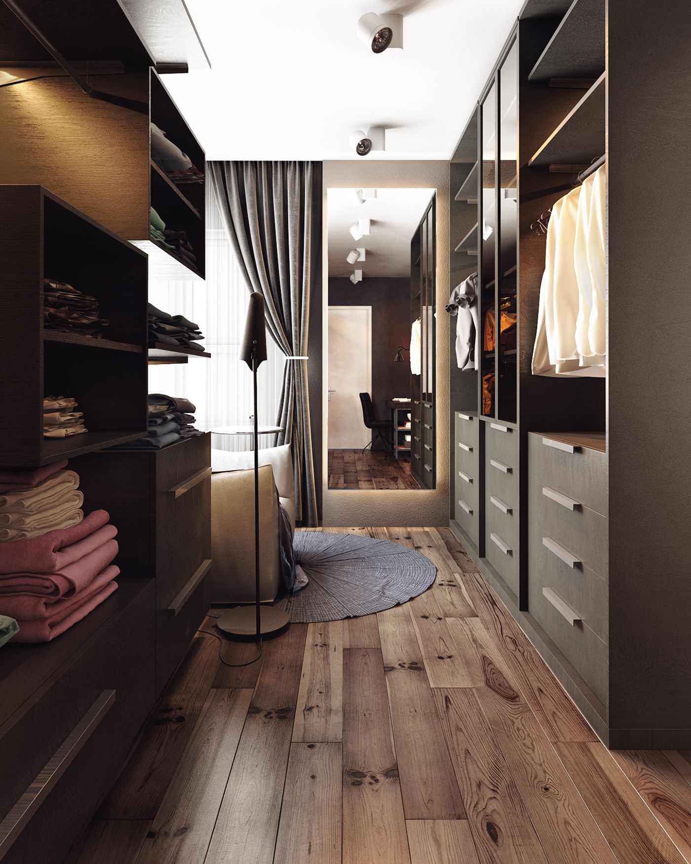
At the end of the closet space, a plush chair and table makes it easier to put on socks in the morning. Placing the mirror near the window was a great idea – the resident can easily see whether an outfit will look just as good in the daylight as it does under indoor lighting, useful for colorful wardrobes.
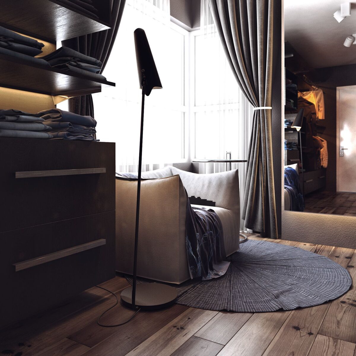
Because of its hidden location, this chair would also work as the ultimate space for quiet reading. Imagine being able to gain a little relaxation away from the worries of the world within your very own fortress of solitude.
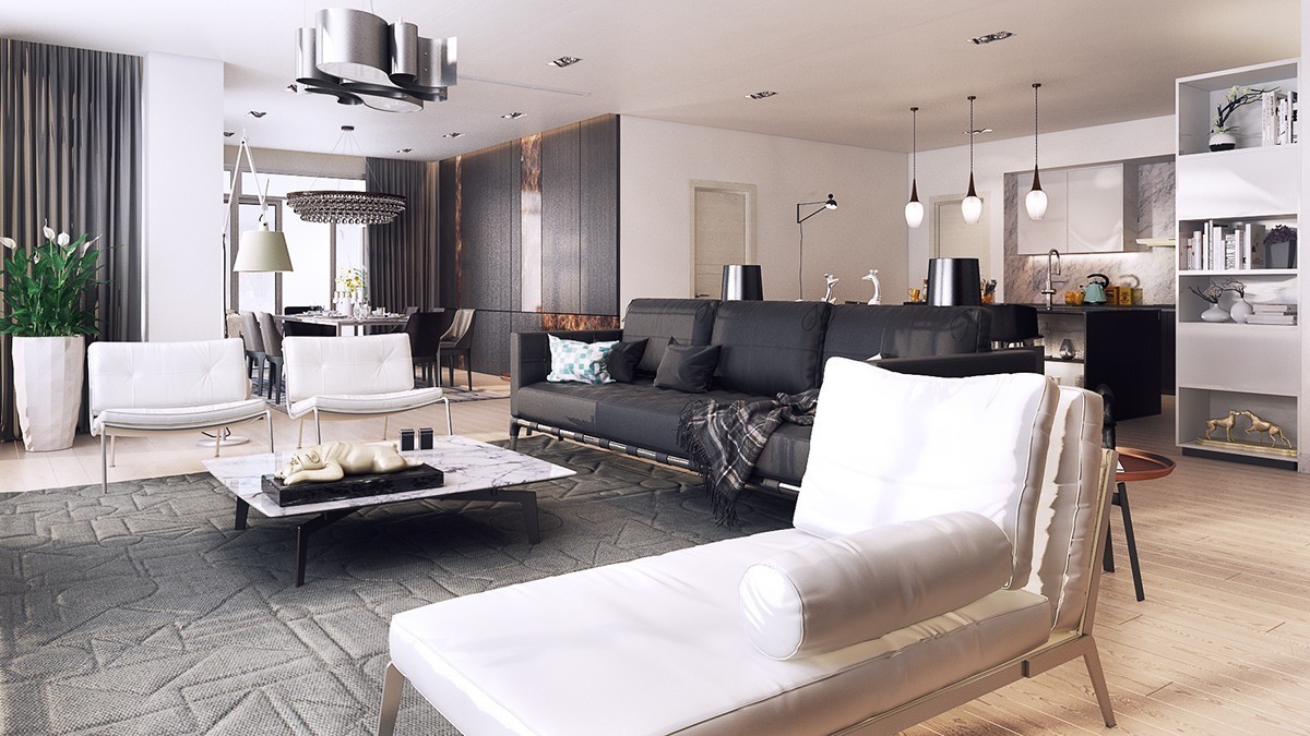
This next apartment, designed for a unit in the Saigon Pearl 1 tower, is decorated with a cleaner and brighter aesthetic to take advantage of the spacious floor plan. Although the overall materials are very similar, its textures are a little more subtle and the decor falls more toward the minimalist side. Even the lighting choices are simpler and more streamlined than in the previous apartment. But one thing the two homes have in common is the feel of classic luxury and the varied neutral palette.
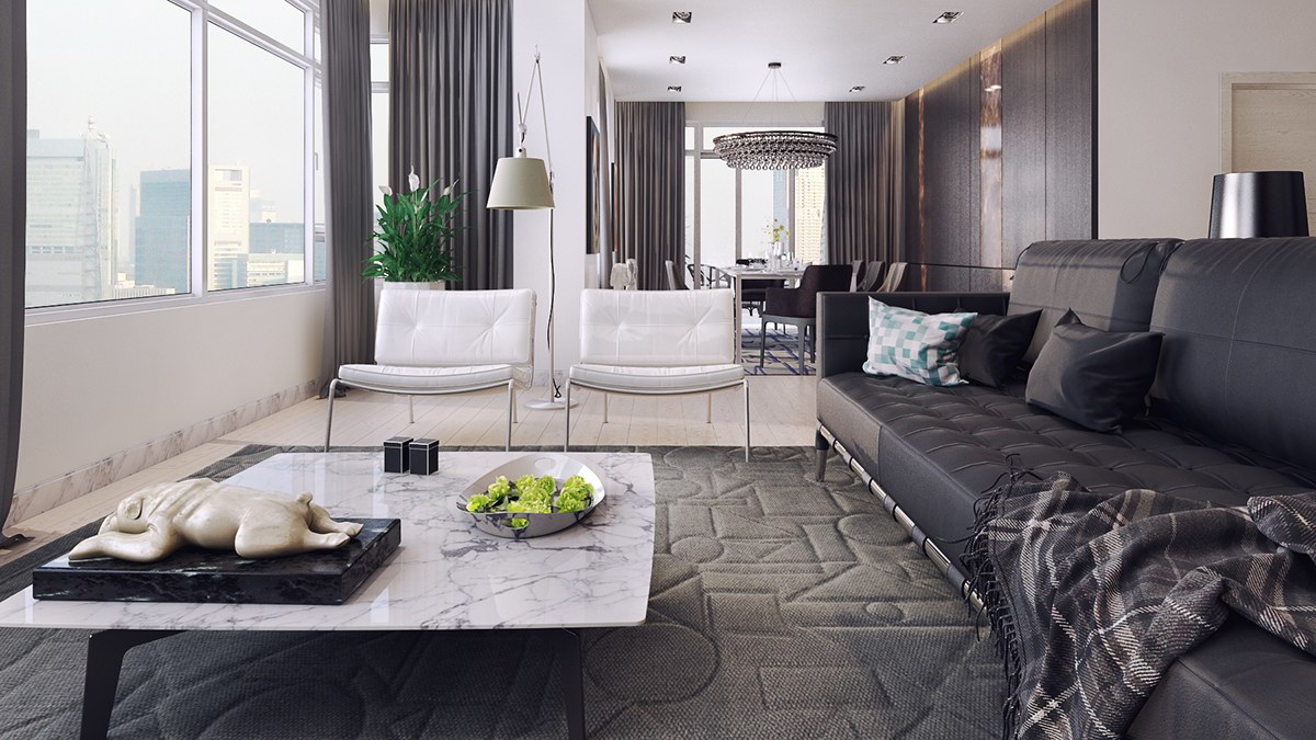
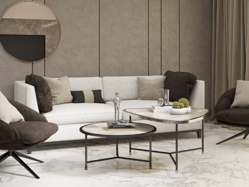
A marble table, geometric rug, and textural leather sofa show a good example of the variety of material and texture to be found throughout the home – but it's all so finely integrated that, from a distance, the differences seem to converge into one seamless and stylish aesthetic.
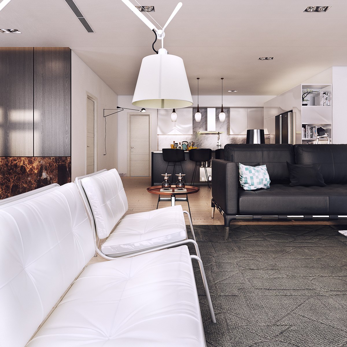
Industrial appeal hides within sophisticated materials, like the chairs that swing more to the chic side because of the clean white upholstery. The adjustable lamp above features a highly industrial design but the traditional lampshade offers a pop of "home sweet home" as a surprising touch.
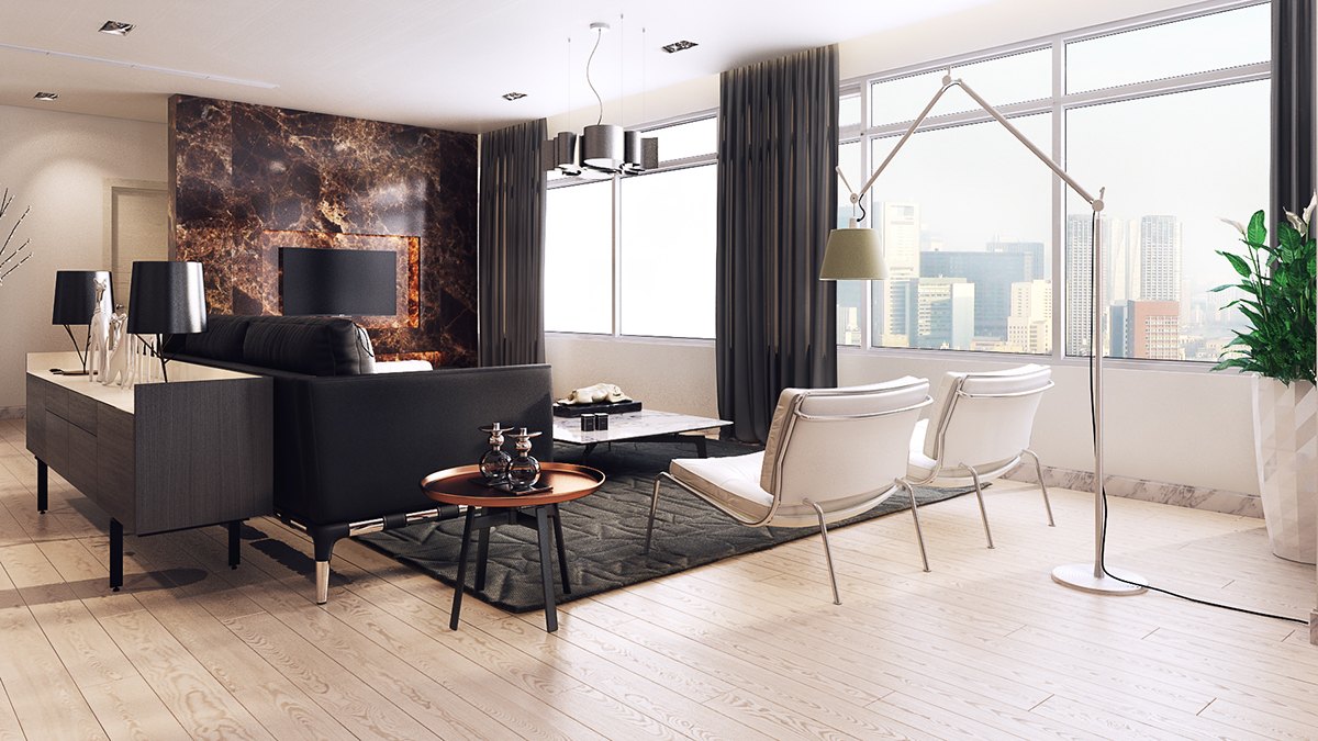
Note the fire-like marble behind the television, and the copper table to match. The table is from the Husk collection by Patricia Urquiola.
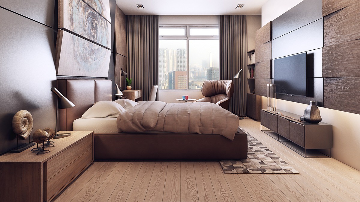
The master bedroom also hosts a gorgeous palette of texture. Angled wood panels play with the light and shadow for a more dimensional look, with satin-finish contemporary panels behind the television and on the wall to the left. A painting – its canvas split into three portions – also uses an angled arrangement to make it appear to burst out from the wall.
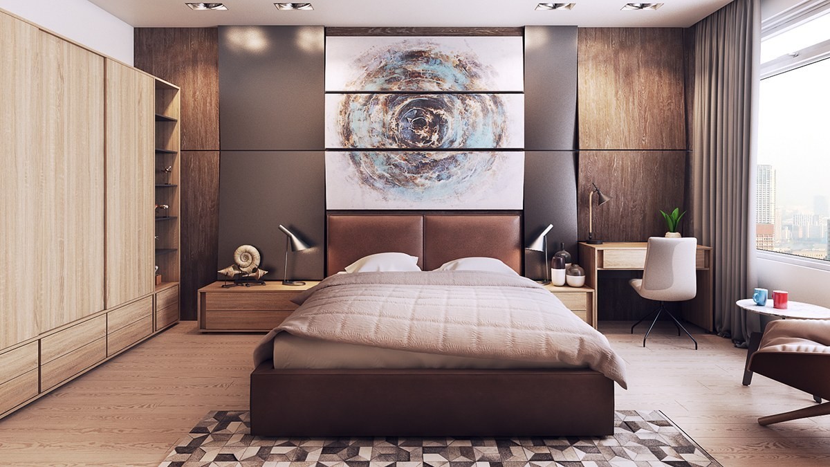
More angled panels catch the light behind the bed. Coordinated AJ table lamps provide flexible task lighting.
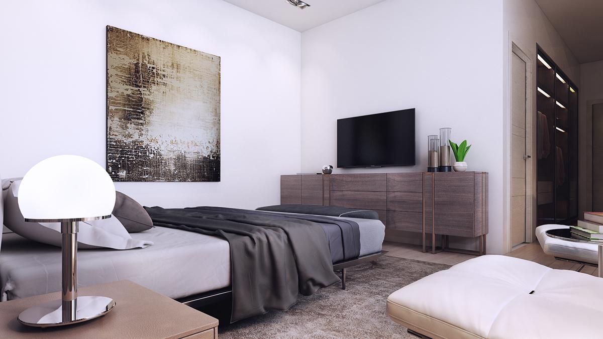
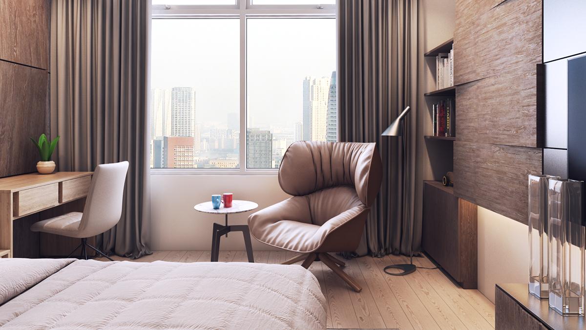
A second bedroom utilizes a lighter touch. The central painting consolidates the neutral color palette.
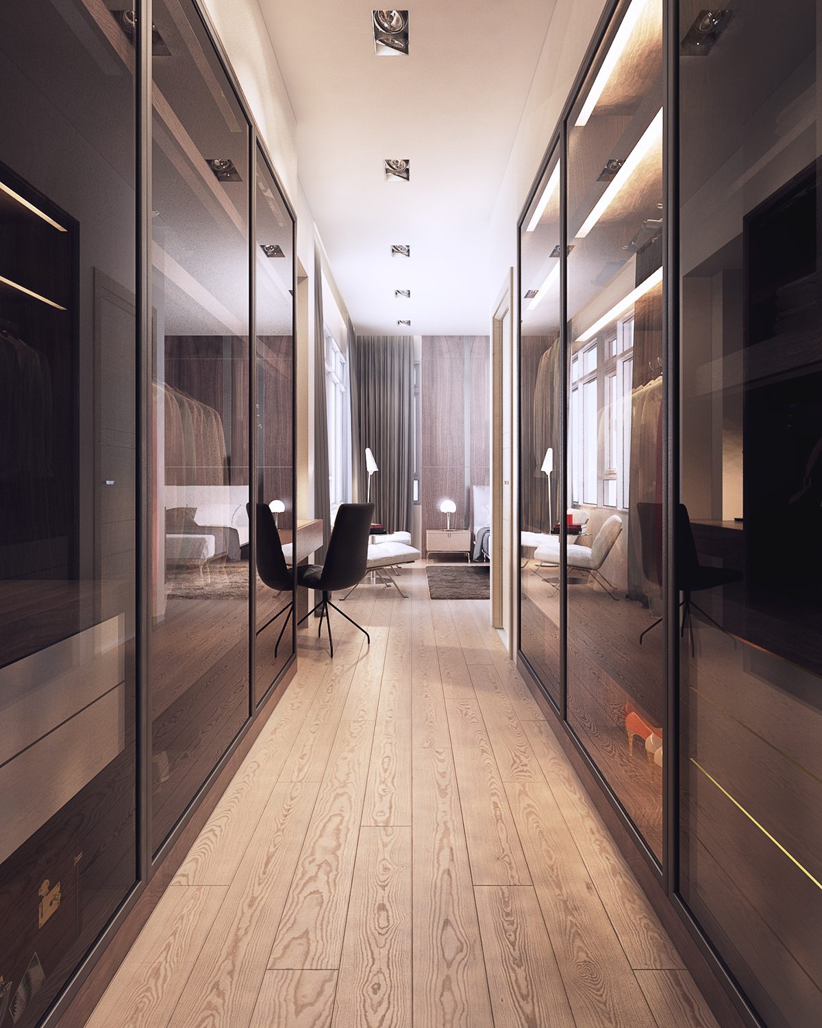
Reflective tinted glass and smart integrated lighting helps this walk-through closet look bright despite its dark tones.
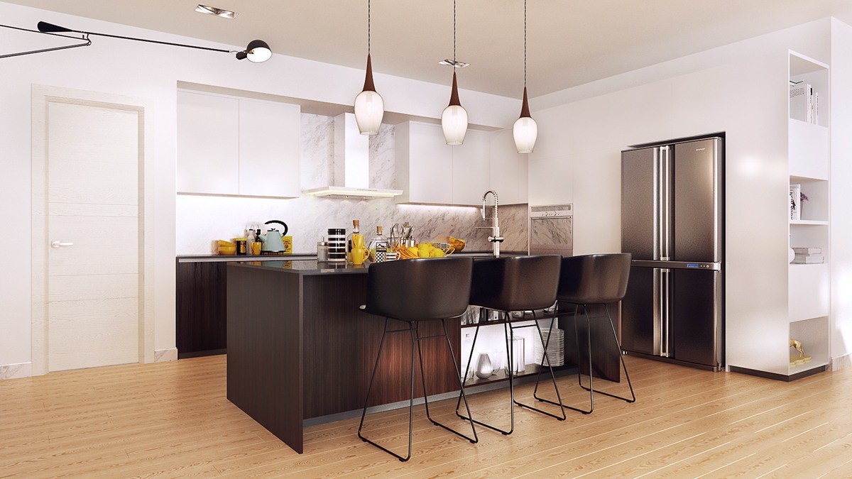
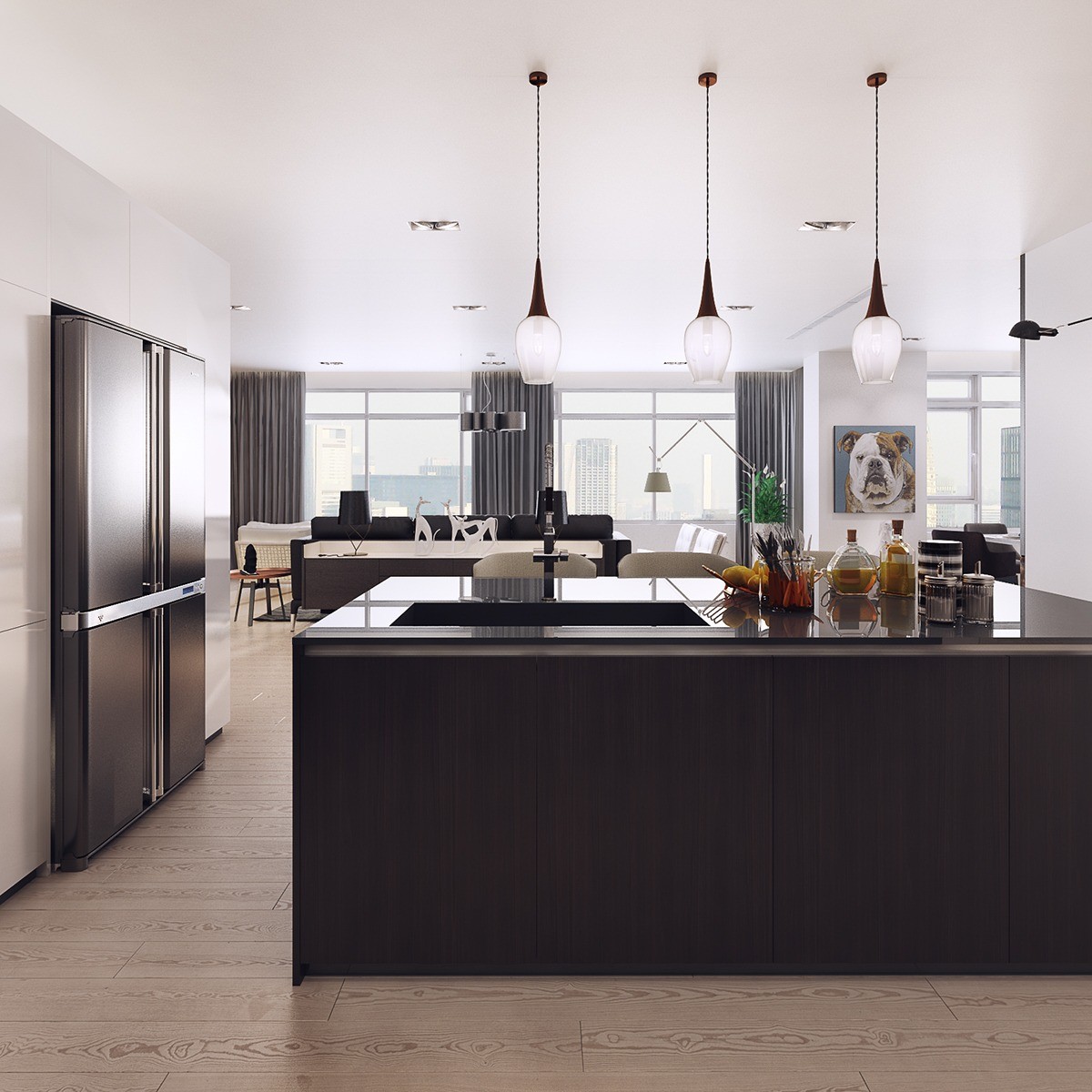
Bright white walls encompass the kitchen. The chairs and work surfaces are clad with darker materials, yet the upper cabinets and range hood are both white against a light marble background – this duality helps the kitchen maintain a lower profile.
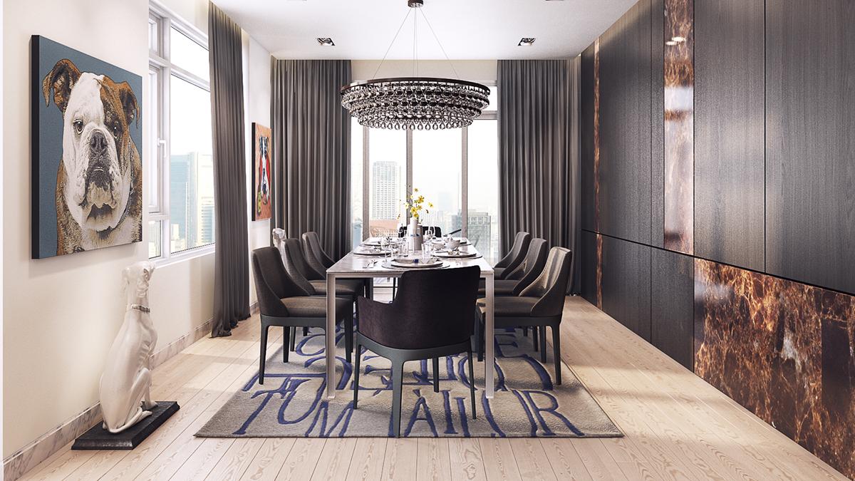
A handsome English bulldog greets dining visitors, a great conversation starter that leads the eye toward the other dog-themed artwork. Dark wood and copper colored marble makes up the storage wall on the right, and a rug from German fashion brand Tom Tailor makes a big statement beneath the table.
